Editing Your Images
It’s Lightroom Mobile’s Version of Lightroom’s Develop Module
SHUTTER SPEED: 1/800 sec | F-STOP: f/3.5 | ISO: 800 | FOCAL LENGTH: 14mm | LOCATION: Dubai, United Arab Emirates
I have to admit, I’ve been really impressed at how much of Lightroom’s Develop module has made its way over to Lightroom Mobile. Almost all of the things you’ve come to expect in Lightroom Desktop, from the entire Basic panel, the Tone Curve panel, and the Color/B&W panel, to Split Toning and presets, and even Local Adjustments, like the Graduated Filter and the Radial Filter, are here—but, for reasons I’ve yet to understand, Adobe decided to change their names to Linear Selection and Radial Selection. Those are the only two things that I can think of that have different names in Lightroom Mobile for the same tools in Lightroom Desktop. Well, with one big exception: In Lightroom Desktop, the panel with the Dehaze filter is named Effects, and that panel hasn’t made it over to Lightroom Mobile, but Dehaze has. But, in Lightroom Mobile, they changed the name to the Japanese phrase “shinnen omedetō gozaimasu,” which roughly translates to “Godzilla put an omlette on my shin.” Now, if you ask me, that’s a weird name for the Dehaze slider. Personally, for the sake of clarity, I would have named it the more obvious “yakushite kudasai,” whose literal translation is “I think a yak just pooped on your kudasai,” which I think we all can agree would be a far better name, especially for new users.
Editing Your Images

To edit an image using the same controls as you would in Lightroom on your computer, just tap on an image in Grid view to enter Loupe view (seen here), and then tap on the Edit icon in the Action options at the bottom of the screen. This brings up the same controls you have for editing in Lightroom’s Basic panel on your computer (it’s all there—everything from White Balance to Exposure; Shadows to Whites and Blacks; Clarity to Vibrance; it’s all there), in the same order, they just run across the bottom of the screen instead of along the right side like they do on your computer. Adobe calls each of these controls “adjustment tiles,” so you tap on a tile to access its features (or slider).
Setting the White Balance

This image has a yellow tint to it (as seen on the previous page), so we have to fix the white balance. In the row of adjustment tiles across the bottom, tap on the White Balance tile and a menu pops up with a list of White Balance presets and a thumbnail preview of how each would look if applied to your image. Just taking a quick glance at these, it looks like the Fluorescent preset would look best (well, at least the yellow tint is gone with it), so I tapped once on the Fluorescent preset to apply it (as seen here).
Using the Temperature and Tint Sliders

The nice thing about applying a White Balance preset like we just did on the previous page is if it’s not right on the money, you can still tweak it. In this case, it might be a little too cool now, but you can just tap on the Temperature tile and a slider appears right above the row of tiles. Just tap-and-hold on the little knob on the slider (seen circled in red here) and it works just like the sliders in regular ol’ Lightroom on your computer—drag to the right to make the white balance warmer; to the left to make it cooler (you’ll notice that the slider is colorized here, too, with blue on the left and yellow on the right). In this case, I dragged a little to the right, so it’s not so cool (the Temperature reading was 3800K, but now it’s up to a little warmer 4437K).
Resetting an Edit Slider

If you make a mistake, or don’t like the change you applied, just double-tap anywhere along the slider to reset it to where you started, as seen here (I turned on Show Touches in the Sidebar to get the red dots to appear), or you can just double-tap on the name of the adjustment tile.
Using the White Balance Selector Tool

One last thing about White Balance: the White Balance Selector tool is here in Lightroom on your mobile device, too. Look back on page 37—it’s at the top of the White Balance preset pop-up menu. Just tap on it, and it appears over your image. It has a loupe to help you isolate where you’re picking your neutral gray color from. Here, I tapped-and-dragged it to the right—as you drag-and-release, it gives you a live preview of what it would look like if you tapped on the white circle with the checkmark at the top right of the loupe (which confirms you’re choosing that spot to base your white balance upon). So, I guess you know now that when it looks good to you, tap on that checkmark to lock in your choice. When you do, the White Balance Selector tool disappears.
Adjusting the Overall Brightness (Exposure)

If you want to adjust the overall brightness or darkness of your image, tap on the Exposure tile, and then drag the slider to the right to make your image brighter, or to the left to make it darker. This slider doesn’t actually cover the darkest areas or the brightest ones (those are covered by the Blacks and Whites sliders), but it covers the midtones, and that’s a wide range, so it has a pretty big impact (in fact, in early versions of Lightroom, this slider was actually just called “Brightness,” but when you speak to us photographers and you say “exposure,” we know exactly what that means, so it’s probably better named now. But, just so you know—it controls the overall brightness).
Automatically Correcting Your Images with Auto Tone

If you’re looking at one of your images and you don’t know where to start, a good starting point might be to tap on the Auto Tone tile and see how that looks. It performs an auto-correction on your image and sometimes it does a surprisingly decent job. The key word there is “sometimes.” If it looks terrible—no harm done—just tap on the Auto Tone tile to turn it off. But, this doesn’t have to be a “it looks good or it looks bad” kinda thing. It can at least give you a starting place, which is especially handy on a tricky photo. If you tap on Auto Tone and it doesn’t do a good job, chances are it’s because it made the image too bright overall and, if that’s the case, you can usually get things back to looking better by either: (a) lowering the Whites slider amount back down to 0, or (b) dragging the Exposure slider back to the left to lower the overall brightness until things look good. It’s usually one of those two sliders that makes it look too bright and kills the auto toning job. So, pulling those back often gives you a better result (but again, only do this if it looks too bright).
Adding Contrast

If your image looks kinda flat, this will fix it fast. Tap on the Contrast tile, and then drag the slider to the right to add contrast (or drag it to the left if you’re going for that flat Instagram filter look). Not much else to tell you with this one, other than lack of contrast is pretty much the #1 post-processing problem I see when people send me their images and ask for a critique. In my own work, I pump up the contrast quite a bit for most images. Contrast, in general, makes the brightest areas in your image brighter, the darkest areas darker, and it makes your colors look richer and more saturated. I guess I did have a little bit more to tell ya after all. For more on contrast, see the next chapter on how to use the Tone Curve feature.
Fixing Brightest Areas (Highlights)

The very brightest parts of your image are adjusted using the Highlights tile (well, the slider knob that appears above the tile when you tap on it), so if things get too bright in your highlights (for example, they’re so bright that the highlights in your image start clipping, the same way you’d see with your camera’s highlights warning), this is the slider you’d use to bring back those highlights. Just drag the Highlights slider to the left to recover those highlights (see the next page for how to turn the highlight clipping warning on). Of course, if you drag the Highlights slider to the right, it will increase the amount of the very brightest areas in your photo. I rarely do this because we’re usually dealing with a highlight problem, so we’re reducing the amount of highlights—capturing highlights isn’t a problem for our cameras. In fact, our cameras’ problem is they often capture too much in the highlights, so we lose detail and dragging the Highlights slider to the left is how we get it back. So, don’t be surprised if you rarely find yourself dragging this slider to the right to add in more highlights.
Dealing with Highlight Problems (Clipping)

One of my favorite features in Lightroom on your computer is here in Lightroom on your mobile device—it’s just kind of hidden—and that’s the ability to get a clipping warning if you’re blowing out your pixels. You can see this warning onscreen when adjusting Exposure, Shadows, Highlights, Whites, and Blacks. Just press two fingers anywhere on the slider for that control (I turned on Show Touches in the Sidebar to get the red dots to appear here), and it will black out the screen and display only areas that are clipping, like you see here where cranking up the Whites too much clipped some buildings in just the Red channel, and some sky areas in just the Blue channel, but clipped all three channels in the other parts of the sky and in parts of the boats (the areas in white), which is some pretty serious damage, and now I know to back down the Whites to avoid this clipping.
Fixing Backlit Photos or Opening Up Shadows

Tapping on the Shadows tile lets you open up the shadow areas in your photo, and I use this quite a bit to bring out hidden details in dark areas, or to instantly fix backlit photos (it works wonders for this type of stuff). Just drag this slider to the right and the shadows are opened up and the detail comes out. Of course (and I know this goes without saying, but I’m going to say it anyway), if you drag it too far, not only can it start to look kinda funky (of course, it depends on the image—sometimes dragging it to +100 looks great), but it can also make those areas look a bit washed out. If that’s the case, and you have an image where you really needed to open up those shadows, and now those areas look washed out, tap on the Contrast tile, and then drag the slider a little to the right to bring back some of that lost contrast and counteract that washed-out look.
Expanding Your Tonal Range (Whites and Blacks)

You can expand the overall tonal range of your photos using just the Whites and Blacks adjustment tiles, and just doing this one thing can have a pretty dramatic effect on your photos (for those of you who learned Photoshop first, this is what we used to do in Photoshop’s Levels dialog by dragging the highlights slider to the left until we hit the edge of the histogram. Then, we did the same thing with the shadows slider, dragging it to the right until we hit the edge of the histogram, and then we tweaked the overall exposure using the midtones slider). We’re going to do a version of that here. So, tap on the Whites tile, then drag that slider to the right and stop just before it clips (you can see the histogram by tapping with two fingers on the screen to toggle through the readouts until it appears in the top-right corner, as seen above). Don’t let the right edge of the graph hit the right-side wall of the histogram. Do the same thing with the blacks, but again, don’t let the left side of the graph hit the left wall. Once you have those in place (which expands your tonal range), now you can go back and tweak your midtones using the Exposure tile. By the way, this is the order I use for tweaking my own images: adjust the whites and blacks first to expand my tonal range, then I usually just need a minor adjustment with the Exposure setting making it a little darker or brighter. Give that a try and see what you think.
Bringing Out Texture with Clarity

If you have an image where you want to bring out and emphasize detail or texture, this is the adjustment for you. Tap on the Clarity tile and then drag the Clarity slider over to the right and any texture in the image gets immediately intensified. This slider actually increases midtone contrast, but while doing that it enhances detail and makes everything look a bit punchier. Just a word of caution—you can drag this slider too far and things start to look funky. You’ll know you’ve gone too far if you start seeing a black glow or halo appear around the edges of stuff in your image. How far you can drag that slider and have it still look good really just depends on the image—landscapes, automotive or motorcycle shots, cityscapes, architectural shots, or anything with lots of very well-defined edges can usually take lots of Clarity. Images where the subject is softer (like people’s skin) usually don’t look too good with a lot of Clarity, so keep that in mind (the reason I’m warning you is, Clarity is pretty awesome. It’s so awesome that it’s easy to get carried away with it, and pretty soon that portrait of your newborn nephew starts to look like an HDR from 2008).
Adding More Color to Your Image

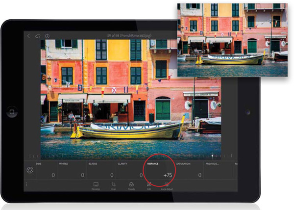
There are two sliders that add or take away color: Vibrance and Saturation. But, here’s my tip: If you want to add color, stay away from the Saturation slider. It usually does more harm than good because it’s very blunt, making every color in your image really colorful and clowny. Instead, use Vibrance. It’s like a “smart saturation” because it doesn’t affect colors that are already reasonably colorful. Instead, it focuses on increasing the color of dull colors in the image (that’s what you want, right?), and it has a special mathematical algorithm that avoids flesh tones. Tap on the Vibrance tile, drag the slider to the right, and your image gets more vibrant without trashing the color (it works really well).
Desaturating an Image

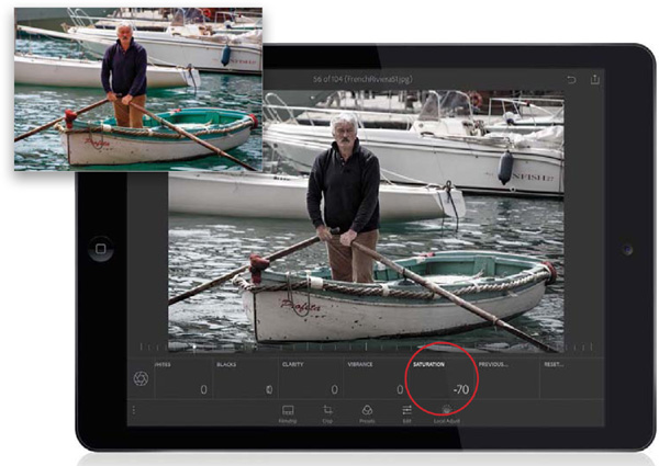
If you want to remove color from your image (I do this a lot with portraits since that’s kind of a “thing” right now), tap on the Saturation tile, and then drag the slider to the left. The farther you drag, the more color it removes. If you drag it all the way to the left, you remove all the color and you’ll have a black-and-white image. Now, at some point, you might be tempted to drag this slider to the right to make your image more colorful. Resist this temptation, and instead read the previous page about the Vibrance slider, which is its much smarter, much more accomplished, much thinner and happier sibling, which clearly went to a better school.
Adding Pick Flags and Star Ratings While Editing

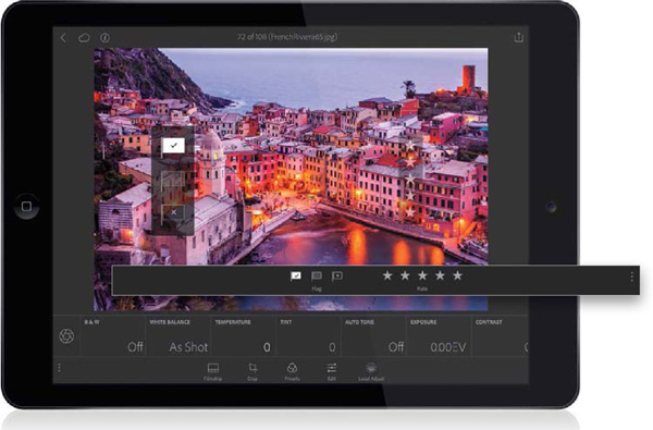
While you’re editing in Loupe view, you can also apply a Pick flag or a star rating. First, tap-and-hold in the center of the image and, from the pop-up menu that appears, make sure Enable Speed Review is turned on. Then, just tap on the left side of the image and drag up to add a Pick flag, or tap on the right side of the image and drag up to add a star rating. You could also add them by tapping on the three dots on the left side of the Action options. The options bar will slide to the right and you’ll now see the Flag and Rate options (seen here in the overlay). But, when you tap on the three dots now on the right side of the Action options, you’ll then need to tap on the Edit icon again to access the adjustment tiles.
Applying Changes Made to One Photo to Other Photos

One of the most powerful time-savers from Lightroom on your computer is here, too: the Apply Previous feature. It takes the adjustments you made to the previous image, and applies them to the current image with one tap (super handy and fast!). To use it, tweak a photo the way you like it, tap on the Filmstrip icon to bring it up along the bottom, then swipe to the image you want to apply this look to, and tap on it. Now, tap back on the Edit icon and scroll the tiles to the right (er, I mean swipe to the right) down near the very end, where you’ll see a tile named simply “Previous....” Tap on it, and a pop-up menu appears (seen here) asking if you want just basic tonal edits from the tiles below, or everything you did to the previous photo, including cropping, rotating, etc. Make your choice and the edits are applied immediately.
Seeing a Before/After

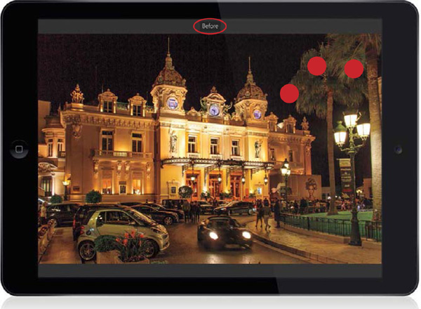
To see a before image (what the image looked like before you started adjusting it), just tap-and-hold three fingers right on your image, as seen here (I turned on Show Touches in the Sidebar to get the red dots to appear). You’ll see “Before” appear above the image (as seen circled here), and when you release your fingers, you’ll go right back to your edited image.
Resetting Your Image

If you swipe over to the very end of the Edit tiles, there’s a Reset tile, which lets you start over. Just tap once on it and a pop-up menu appears (seen here) asking if you just want to reset the Basic Tones, or reset everything (cropping including), or if you want to reset the image to how it looked when you first imported it in Lightroom, or when you last opened it. It’s great to know how to reset your image, but something that’s probably at least as, if not more, important is the curved-arrow icon in the top-right corner (circled here). That’s the Undo icon. Each time you tap on it, it undoes another step, so you can go back in time, step by step, and undo anything you didn’t like in the order it was applied.
Editing in Camera Roll

If you’re thinking of adding an image from your phone’s or tablet’s Camera Roll to Lightroom Mobile (by tapping on Camera Roll at the bottom of the screen in either Collections view or Lightroom Photos view), while you’re scrolling through your Camera Roll images, if you tap on a photo, you can actually edit it (even though you technically haven’t imported the photo into Lightroom Mobile yet) using all the standard editing tools (tap on the Edit icon along the bottom of the screen to bring up the adjustment tiles. Note: Currently, this feature is only available for iOS). Why would you want to do this? Well, one reason might be if you see an image that looks too dark, and you’re not sure if it’s worth importing at all. So, first you’d want to see if you were to brighten it up, or maybe crop it a bit, it might then be worth adding it (or not). So, I kind of use this the same way I would the Quick Develop panel in Lightroom’s Library module on my desktop, but in Lightroom Mobile, this actually has more control than Quick Develop—it’s almost identical to the regular Edit mode (I wish Lightroom on my desktop would find a way to add this feature).
Editing in a Web Browser

As you’ll learn later in this book, the collections you sync to Lightroom Mobile are also available through a web browser (called...you guessed it, “Lightroom Web”). But, it’s for more than just seeing your images in a web browser—you can edit them there as well, using many of the same Basic panel features (and basic editing features) that are in Lightroom Mobile (and in Lightroom on your desktop). Start by going to http://lightroom.adobe.com and logging in with your Adobe ID and password. On the Welcome screen, you’ll see the Your Synced Catalog panel near the top right that has icons that take you to either your synced collections or to all your images in Lightroom Mobile. When you click on any image, you enter Loupe view (a much larger preview of the image you clicked on), and in the top-left corner, you’ll see an Edit button. Click on that and out pops a right-side Panels area that looks an awful lot like Lightroom on your desktop. It has the full Basic panel (with regular ol’ sliders), along with a Color/B&W panel, a Split Toning panel, and an Effects panel. At the top of the Panels area (above the histogram), is the Crop tool, along with a bunch of one-click presets (like in Lightroom Mobile). The nice thing is, it’s very responsive since the images are already online—you just grab a slider and start editing. Now, you might be thinking, “When in the wide world of sports am I ever going to use this?” Well...I mean...ya know...well...um...heck, I dunno. Maybe you don’t have your tablet, or your phone, or your laptop, and you’re at a friend’s house and desperately need to edit a photo right then and there. Okay, this last part (the reason why) is a little weak at this point, but let’s not dwell on that. Instead, let’s focus on the fact that you can have Lightroom in a web browser. That’s all I’ve got.
Seeing (and Adding) Metadata in Lightroom Web

While you’re editing there in Lightroom Web, not only can you see an image’s EXIF data (the make and model of camera, f-stop, shutter speed, ISO, and so on), which you only have limited access to in Lightroom Mobile, but you can also embed an image title and caption directly in Lightroom Web. Just click on the image you want to add metadata to, to enter Loupe view (the larger-sized preview), then click on the Show Activity & Info icon (it looks like a little file drawer) in the lower-right corner, and another set of panels pops out on the right. Click on the Photo Info tab at the top and, in this panel, you’ll see fields where you can type in a title and caption. Below that, you’ll see an expanded EXIF metadata. When you’re done, click the right-facing arrow to the right of the image or just close the right side Panels area by clicking on the little file drawer icon again. Your caption or title will be saved automatically and synced back to your other devices (including Lightroom on your desktop, for those images in a collection).

