
Welcome

This introduction section, especially “Seeing Images as Data,” exposes how I think about and approach Photoshop, and how I try to get it to give up its secrets.
Personal Note
I’m an accidental artist. I love the act of creating, but I just don’t feel like I have much of an inner spark that drives me to start a project and direct my skill towards any particular vision. However, I am exceedingly prone to finding inspiration while doing other things in the context of digital art, and most of my portfolio is made up of explorations of tools and techniques. Nearly everything I’ve created artistically comes from some kind of dabbling.
If you’ve ever bought craft or art supplies without any prior experience just to see if you enjoyed the process, you’ll have an idea of how I approach Photoshop and digital art. Way back in the early days of the Internet, I found myself in a job that demanded I learn how to manipulate and create graphic elements, but I had no experience. I went online and found some fantastic communities that represented the best of creativity and willingness to share knowledge. I started out asking all kinds of questions, but soon enough I was helping others.
Every new question became a challenge for our small team to solve. I would spend hours sometimes trying to reverse engineer a particular effect or devising experiments to see how the various digital tools worked. Eventually, I realized I was more interested in learning how to control the tools than I was in the creative process. It also helped that I was fresh out of college with a physics degree but had not yet found a regular job.
Note
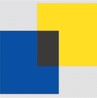
Throughout this book you will find graphics that demonstrate behaviors of adjustments and blending modes, such as this one that shows the effect of the Vibrance Adjustment on solid colors.
So it’s in my nature to explore and understand by breaking things down into bite-size chunks.

My teaching style is a direct result of my own path, and this book demonstrates the results of learning through discovery as well as through sharing. Many of the techniques you’ll find here are in common use by professionals, but you won’t often find them explained, applied out of context, or pushed to extremes. Throughout this work, I try to take the basic ideas and show you something familiar, then I build on the results to demonstrate the potential for pushing further into new territory.
Each recipe is designed to show you how the demonstrated features work, not just how to achieve a particular look or effect. Although you can stop at the basic achievements, your real goal should be to internalize how the tools behave under various conditions so you can not only solve problems more quickly, but also push creative boundaries without fighting with the things that are supposed to be helping you. Mastery of your tools is the key to supporting your own work.
Through experimentation, you’ll develop a feel for what’s going on behind the scenes. You don’t have to know anything about math or digital image analysis. It doesn’t matter if you understand (or don’t know) the difference between Porter-Duff blending and gradient-domain processing. Experimentation leads to familiarity, and familiarity to mastery. Eventually, you shouldn’t even think about your tools while using them to execute your vision. But it takes work and time.
In short,
Never let your tools get in the way of your art.
How to Approach this Material
I wrote this book, and most of my teaching material, as a way to help you get familiar with the fundamental operation of the blending modes and adjustment layers in Photoshop. The techniques and descriptions contained in the following pages are meant to help you see these tools from both problem-solving and creative perspectives. With that in mind, you can look for specific solutions to common problems that you may encounter, but the real goal here is to give you an expanded and hopefully deeper understanding of how the tools actually work so that you can apply them to new situations.

As you move through the book, think about how you might expand a given technique, add to it in some way, or maybe just change the order of operations. How would you use different tools to accomplish the same end goal? How many different ways can you solve the problem? What I’d really like to see you do with this material is to use it as a foundation to build a solid understanding of Photoshop’s tools and as a springboard for launching your own creative ideas.

With that goal in mind, the section “Creating the Workbench Files” in the “Project Examples” chapter will show you how to set up some of the experiment files, as well as what to look for in other images that might make them good candidates for certain tools or techniques. The experiment files are a great way to practice your problem-solving skills, but the real utility comes from abstracting the tools from your own artwork.
What does it mean to “abstract the tools?” One of the key challenges with developing facility with new tools in Photoshop is that we tend to be biased towards what makes our work look good to us. If we apply some new technique or tool to one of our own photographs and the results don’t meet our subjective standards, we are very likely to ignore and forget about that tool. That means we are preventing ourselves from learning how the tool actually works and potentially seeing how it might be useful in the future. Abstraction is a way of isolating the parts of a process to treat those parts individually. In this case, we need to isolate the tools and see how they behave by themselves, rather than focus on how we feel about their effects on a particular image.
By using files and images that you don’t have a personal attachment to, such as the example images in this book, you can see the effects of tools and techniques with more objectivity. Filing those observable bits away can pay off when you encounter new challenges in the future. It’s about exposing your mind to something new.

The majority of this book deals with using two core components in Photoshop: blending modes and adjustment layers. It presumes that you know how tools and layers generally work. While I do devote a few words to using other Photoshop features, such as brushes, selections, and filters, those techniques always rely on adjustments or blending in some way. In the case of the Stamped Portrait effect, Mixer Brushes and the Smudge tool are used after other features (filters, for example) have created a new starting point. In other examples, the use of tools is broadly described in support of the final effect.
My goal is to fully integrate your knowledge of blending and adjustments as part of your workflow, be that creative or utilitarian. So even though I don’t talk a lot about filters, that doesn’t mean you should avoid devoting time to mastering those as well. In fact, you should look for ways to make your work more enjoyable, whatever that means to you. If you find a panel that speeds up your workflow in a meaningful way, consider adding it to your kit. Plug-ins, filters, and other automation features all have their place, and nothing in this book should be taken to dissuade you from using any of them.
While giving a webinar once upon a time, I was really caught up in the demo and kind of left my viewers behind while I just improvised a problem-solving approach. After several minutes of my speedy delivery, someone raised their virtual hand and asked me to go back and list all the steps I had taken so they could reproduce the process. Before I could respond, another educator in the audience (one whom I greatly respect) piped up with “Don’t worry about the steps; pay attention to the possibilities and let your curiosity lead you.”
That turned out to be a pretty powerful and thematic statement. Although I tend mostly to teach a blend of actual steps with comments on further exploration, I really love to teach about possibilities. That’s the thing I most want to get across to people, but I recognize that it’s a high demand for any given audience. I live in the space of ideas and potential, rather than the stepwise world of education. Both are necessary, and you can’t really ignore either; it’s just that I find more satisfaction in seeing others nurture the seed of “possible” into “real.”
Over the years, I have developed a fondness for third-party tools that give me more control over my images, far more so than plug-ins that have lots of presets or come with canned effects. I like panels that expose or mix data in new ways, or hardware tools that open up more expression than you can get with a mouse. Here are some of the things I have centered on in the last several years as being critical to how I work in Photoshop.
Wacom Graphics Tablets
This single device revolutionized digital art more than anything since Photoshop first hit the market (in my humble opinion, of course). The ability to convert the motion of your hand into color and light is beyond useful and into truly liberating, making Photoshop almost a musical instrument. While Wacom is certainly at the top of the game, there are other options available at different price points. However, I will point out that to anyone in the industry, “Wacom” is part of the lingua franca of professional artists.

I have relied on the medium-sized tablets for years, and I currently rely on the Intuos Pro model. Many of my illustrator friends use one of the Cintiq lines, which let you work directly on a highly sensitive screen. In recent years, iPads and touch-screen tablets such as the Microsoft Surface have added this capability, enabling more mobile workflows.
Monogram Creative Console
For most of the year prior to starting this book, I used an external hardware interface from Monogram (previously Palette Gear). This is a modular system of buttons, dials, and sliders that can be assigned to virtually any control or function in Photoshop and many other desktop applications. Although the Wacom tablet gives you expressive control through a pen, Monogram gives you precision of tactile instruments that reduce the gap between your brain and asking Photoshop to do something.
The importance of this cannot be overstated. When you are working creatively or quickly, you do not want to break your line of sight to the screen. Reaching for keyboard shortcuts can certainly interrupt your flow. Having a configurable, assignable layout of hardware controls retains that visual connection without sacrificing any precision or expression.

Retouching Toolkit
At its heart, the Retouching Toolkit (RTK) is just a set of software buttons that run some scripts to do things on your Layers panel. Sounds boring, right? Except the things it does on your Layers panel save you dozens of clicks and minutes of time setting up common professional tasks. Even better, you can configure the layout however you like and save different configurations for different kinds of work.
Again, nothing in RTK does anything that you cannot do for yourself. The value here is that the panel enables a faster, smoother, more consistent workflow. For example, I used to apply visualization layers only now and then if I found I was really struggling with some delicate retouching or compositing work. Since starting to use RTK, I apply an entire stack of visualization tools with one click, and I can see real improvement in my work along with less frustration and eyestrain. I’m also far more inclined to make solid “best practices” choices for layer organization and processing. Simply making these features easy to use has encouraged me to use them and nudged me into far better behaviors.

Ergonomic Keyboard
You can find lots of ergonomic keyboards on the market. I tried the minimalist keyboards, which are great for hammering out instant messages or a couple of emails. For anything longer, I need something with better key response and a layout that doesn’t make my wrists and shoulders feel like I’ve been rowing a dinghy across the Atlantic Ocean. Even if you’re not writing a lot, having a keyboard that promotes good industrial hygiene is definitely worth looking into.
Adjustable Lighting
Eyestrain is a real thing that leads to real headaches. Indirect lighting that can be adjusted for both brightness and warmth should be something you consider if you work more than a few hours at a time on your digital images. My setup is fired directly up to the ceiling and reduces shadows, and I’ve loaded color-balanced, dimmable LEDs to help keep things as neutral as possible. Now and then I use a tungsten lamp behind my monitor to wash the wall with warm color to offset the typically cooler colors you get with email applications and social media.
Don’t forget to just look away from the screen every few minutes.
Your Brain
As you get more in depth with the approaches, I’d like to ask you to think about using Photoshop to visualize the information in your pictures. Consider this (footnote: this comes originally from the 1934 play in verse The Rock by TS Eliot, and the DIKW initialism which you see after was made popular by Russell Ackoff). Its use here is not meant to imply formalism or other structure; I’m using it simply to introduce the notion of viewing Photoshop as a data viewer, or more correctly, an information display):
Where is the Life we have lost in living?
Where is the wisdom we have lost in knowledge?
Where is the knowledge we have lost in the information?
Put more simply and less poetically, there is a progression on which we build:
Data
Information
Knowledge
Wisdom
Art (My personal addition to this time-honored stack)
Data is a pixel in your electronic image. At the most basic level, a pixel is really just a value of electrical charge coupled with a position in a grid. The sensor on your digital camera knows that the pixel has a particular colored filter over it, so that gets stored as part of the translation process. But data by itself is meaningless. It needs something to relate to.
Information is data in context. Your raw image is a collection of data (pixels) presented in context of color and luminosity values that we perceive as a photograph and can digitally alter in software. Information is where we as humans generally start to think of how our photographs exist.
Knowledge is information plus insight. Just because the pixels are arranged a certain way does not mean there is any inherent meaning involved. When you as the photographer, or your client or other viewer, see the image, a relationship is created in the mind of the viewer that associates the information with meaning.
Wisdom is knowledge plus experience. Molding knowledge into wisdom is not an easy or comfortable task, and you can’t really rush it. Wisdom is a unique perspective.
Art is using all of these elements as needed, when needed. Data, information, knowledge, and wisdom are really just concepts that we use to help us understand distinctions, and art is the way we express them.
How does this relate to Photoshop and photography? One way to view Photoshop is as a lens itself. You can ask much of Photoshop, and one of the most critical things you can ask as a photographer is to see your images differently. When you think of Photoshop as a lens, you get to choose what it shows you, and that’s kind of like a super power. This will become more apparent in later conversations about isolating and manipulating the various characteristics of your images—color, tone, brightness, scale of features, composition, and so on.
A Note on Language
I tend to refer to brightness as value and colors as tone. These are not fixed terms, and you’ll find that many sources use them interchangeably. Color Theory outlines the following terms:
Color: A general term that may refer to any combination of hue, tint, shade, or tone.
Hue: The dominant color family. In the additive model of screens emitting light, that is red, green, blue as primary, and yellow, cyan, and magenta as secondary.
Tint: Any hue mixed with white
Shade: Any hue mixed with black
Tone: Any hue mixed with neutral gray
When I talk about tone in this book, I’m including both tint and shade. Adjusting tone in the context of digital art frequently simply means adjusting saturation, but sometimes it is used for making minor adjustments to hue. Yes, it’s kind of sloppy and inaccurate, and I have no good argument for defending my own bad habits here. To confuse matters even further, when digital artists use color grading that implies an overall cast to an image (say a slight blue haze in a landscape shot), you will also hear about tone as a description of the cast, even though other hues are present. It’s simply a shorthand way to describe a dominant hue.
I also distinguish often between brightness and luminosity. Brightness typically refers to perception of individual colors, while luminosity is a reference to the absolute values in gray scale of each color channel. This is different than luminance, which is a description of the actual energy of light being reflected from a surface.
The reason for my choice here is that luminance is the raw lightness value without Photoshop interpretating a color. When Photoshop shows you a color, it is artificially changing the luminosity value based on a perceptual model of human vision. So luminance is more properly the power of reflected light coming from a surface, regardless of color. But because human vision is not uniformly sensitive to all colors, brightness is the converted color’s appearance as corrected by Photoshop and luminosity is the grayscale representation of each primary color.
All of this boils down to a relatively simple axiom: How you think about the goal affects the path you choose. Having a broader vocabulary leads to better descriptions of those goals, and having a deep understanding of your tools opens new possibilities, new descriptions, and ultimately new goals.
How Photoshop “Sees” Your Images
Digital image processing can be quite math intensive. After all, the computer is trying to figure out how to arrange zeros and ones in a way that makes sense to human vision. Fortunately, we have tools like Photoshop to help us poor humans understand what the computer is trying to say. But even the presentation of that data in Photoshop takes a little getting used to.
Without falling too far back into the basics of how Photoshop operates, take note that Photoshop presents color as a combination of channels that are each represented in grayscale, and that Photoshop uses the concept of layers to stack up image elements and adjustments. These concepts are important to remember because adjustment layers in Photoshop frequently include the option of operating independently on each channel or on all of the channels cumulatively. However, blending modes are effective only when you use multiple layers together. Finally, the concept of a layer stack is that image elements get “stacked on top of each other” and elements at the bottom maybe hidden by layers above them. Imagine a stack of acetate or glass, where each sheet has a different image element; what you see looking down through the stack is the composite of all the sheets together. In this way, image information moves from the bottom of the layer stack to the top before finally being displayed on the Photoshop canvas.

Adjustment layers are really just data controls. They take information from your image, such as brightness and color, and give you specific controls that allow you to modify these characteristics. What’s cool about these adjustment layers is that they give you different graphical ways to see and affect the data in your image. Sometimes simply having a different way to look at information affects how you perceive and manage it.
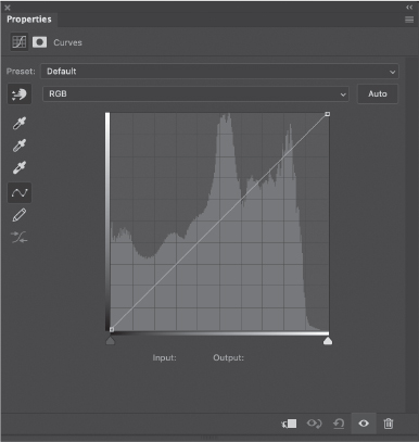
Probably one of the most popular and powerful adjustment layers is Curves. This adjustment allows you to see the relative brightness of all the pixels in your image and adjust them in a smooth, well-controlled fashion. Having this kind of manual control also allows you to be more involved with the editing process.
Curves (and Levels) are explored in more depth in the next section.
Blending modes on the other hand are mathematical functions. Like adjustment layers, they take input, do something with that input, and give a new output. However, rather than sliders, buttons, and lines to manipulate the image data, the controls are made up of the pixels you put on a given set of layers—the layer content. The color and brightness values in each layer are used as input for the unique equation of each blending mode.

By default, Photoshop shows you images in a common Red, Green, Blue (RGB) color space. While other spaces are indeed important, this book sticks with RGB, as it is the most typical working space for digital artists. Many of the techniques shown in this book will work in CMYK, but because of various limitations, I recommend sticking with RGB through as much of your process as you can, converting and correcting CMYK or specialized outputs at the end. The reason for this is that RGB is specifically designed for displays that rely on mixing light rather than pigment.
Related to this topic, however, is something that you’ll run into now and then: unexpected results. To a computer, all three RGB channels are “pure” and equal. Human vision does not agree. This gives rise to so-called “perceptual models” of color that try to correct any misalignment between computer screens and eyeballs. Many years ago, some very smart people came up with a method that associates the different wavelengths of light reflecting from objects to the relative perception in human vision. This model, called CIE (from the International Commission on Illumination, known in French as the Commission Internationale de l’Éclairage), gives rise to a set of values that are multiplied by “pure” RGB values to give a luminosity or apparent brightness value. The reason for this is so that we can perceive images on a computer screen in a way that simulates the real world in terms of color brightness.

Photoshop uses multipliers for each of the color channels to give them appropriate luminosity on the screen to approximate human perception:
Red: 0.30
Green: 0.59
Blue: 0.11
To arrive at a display luminosity value, the gray level value on a channel is multiplied by the factor given above. These numbers quantify the relative sensitivity of human vision to each of these primary colors. Our eyes are generally more sensitive to green, then red, and finally blue. An example using pure white would look like this:
R: 255 * 0.30 = 76.50
G: 255 * 0.59 = 150.45
B: 255 * 0.11 = 28.05
Adding the results together gives us a composite gray level of 255. The multipliers alone add up to 1, meaning 100%. So each multiplier is a fraction of 100%, or pure white. This fact is used in the blending mode math explained in the Reference section, and is useful in understanding why certain blending modes behave the way they do.
In the end, what you need to know is that Photoshop breaks your images down into components it can deal with using math, and that having some insight to how that math behaves gives you power over the tools.
Seeing Images as Data
Now that we’ve talked about how Photoshop sees your images, let’s try some tools to help you see your images as data. Most of this section deals with little experiments to show how various Photoshop features work, which means using some simplified files to remove distraction and make the changes created using those features more obvious. Although it’s certainly not necessary, I find creating a measure of abstraction helps me gain better insight to exactly what’s going on when I make changes to adjustments or blends. If nothing else, using a plain, simple file removes the bias we all tend to feel when evaluating changes against our own images. There is a tendency, when trying out new tools or techniques, to first decide whether we like a given result or not. More often than not, if we don’t like the results we tend to abandon the pursuit and try something different.
That’s fine when working creatively or under a deadline, but it doesn’t really help us expand into new territory. However, looking at something in which we’ve invested no emotional content can make it easier for us to imagine new uses or chase down little bits of inspiration.
If you have an affinity for gray bars and plain color spectrums, then I may not have a solution for you. Just hope for the best, I suppose?
The Reference chapters later in this book describes some of the mechanics behind the blending modes and adjustment layers. This section is basically a rewording of the Photoshop Help files with a touch of opinion and suggestion sprinkled throughout. It gives a few of the more interesting and possibly mysterious tools a visual element, complementing what is sometimes pretty dry text. I highly encourage you to create your own demo files and tinker with them now and then when you want to see how something works (or doesn’t, as the case may be). Let’s begin!
Staying Ahead of the Curves
Curves is perhaps the most used adjustment layer, and on its face, it is pretty simple. The Properties panel for a Curves adjustment later displays a line that represents the relationship between input (luminosity of the pixels in the layer below) and output (pixel luminosity fed to the layer above), and the result is a histogram of what is currently visible on the canvas to that point in the layer stack. The main (RGB) curve manages overall luminosity for all three channels. That’s really it.
Because the line represents the relationship between input and output, adjustments to the line allow you to control luminosity changes parametrically. That is, you are not adjusting discrete luminosity values like an equalizer, but groups of values in context of each other. This tends to produce smoother results than say a graphic control, which would isolate specific luminosity values or ranges; having direct control over defined ranges can lead to discontinuities in your image, such as jagged edges between brightness values. Keeping transitions smooth and adjusting regions of brightness helps avoid visual artifacts.
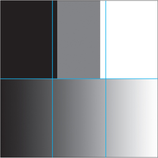
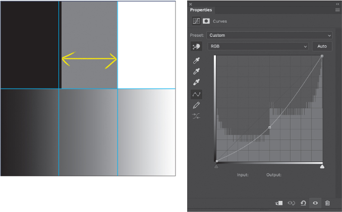
Here is a gradient that goes from black to white and that was treated to a Posterize adjustment to produce three gray bars. The lower half of the image is the original gradient for reference. The image also displays vertical guides that divide the image into three sections of equal widths. The reason the bars are not evenly aligned with the guides is that the default setting for the Smoothness slider in the Gradient Editor was cranked all the way up to 100% (this is meant to produce a more visually smooth transition, rather than a mathematically “correct” linear transition). Our first task is to even out the bars to align with the guides, ensuring an equal amount of gray between each vertical guide.
The Curves adjustment layer initially shows you the entire range of possible gray values available. The end points are aligned with absolute black and white, and the default straight line represents no change or translations to existing values. Put another way, every input gray value is left unchanged and exactly equals the output: If 50% gray exists in the image, the output will also be 50% gray.
As you manipulate the curve, inputs are remapped to new outputs. The horizontal axis represents input values, and the vertical shows output values. The histogram in the background shows you what luminosity information is coming into the Curves adjustment layer. Changing the curve does not affect the histogram’s display.
When you drag a point along the curve upward, you are telling Photoshop to take that input value and give it a new, higher, output value. The nature of Curves means that moving one point takes other input values with it, meaning if you change 50% gray to now be 60% gray (10% lighter), all the gray values will be made a little bit brighter without you having to move all of them yourself. This is what parametric means in this context: Things are kept relative to each other. Black and white are anchored, however, so the change is scaled.
In the special case of moving the black or white points, you can affect the total dynamic range of your image. Moving the black point to the right along the bottom of the curve, for example, remaps the black point. If the darkest pixel in your image is really 20% gray, you can remap it to 0% gray (full black) by moving the black anchor point to that 20% gray value. All the levels of gray get shifted slightly darker. Similarly, if the brightest point is not quite pure white, you can fix that as well.
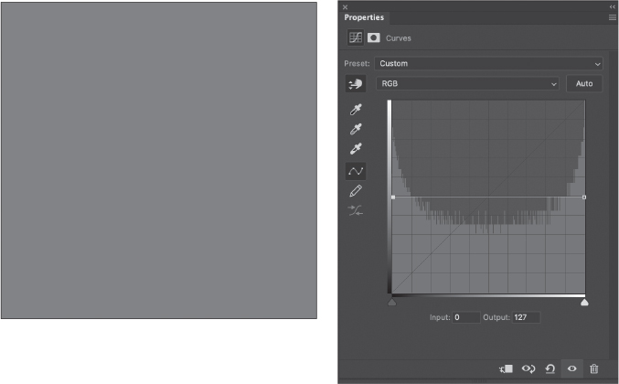
What happens if you move the black point at the left end of the curve vertically instead? Then the darkest point in your image gets mapped to a lighter value. If you have a solid black area in your image, you can remap it to any level of gray all the way to pure white. Note the histogram in this Curves panel shows a full range of values.
In fact, if you move the black and white endpoints to middle gray, your entire image becomes nothing more than a field of flat gray. All points are mapped to 50% gray, so there is no variation or detail left. In the Curves dialog box, gray values range from 0–255, so 50% gray is roughly 127.
So how do we use this information to repair our gradient? The Posterize function divides up the range of luminosity values into chunks of equal value and distributes them across the entire available range of luminosity values. The number of chunks is set by the value of the Levels slider in the Posterize adjustment layer, and each chunk is shown in our test gradient file as a bar. Each bar’s width represents how much of that range of gray values exist in the image, so there are fewer total areas in our test gradient that exist between 33% and 66% gray.

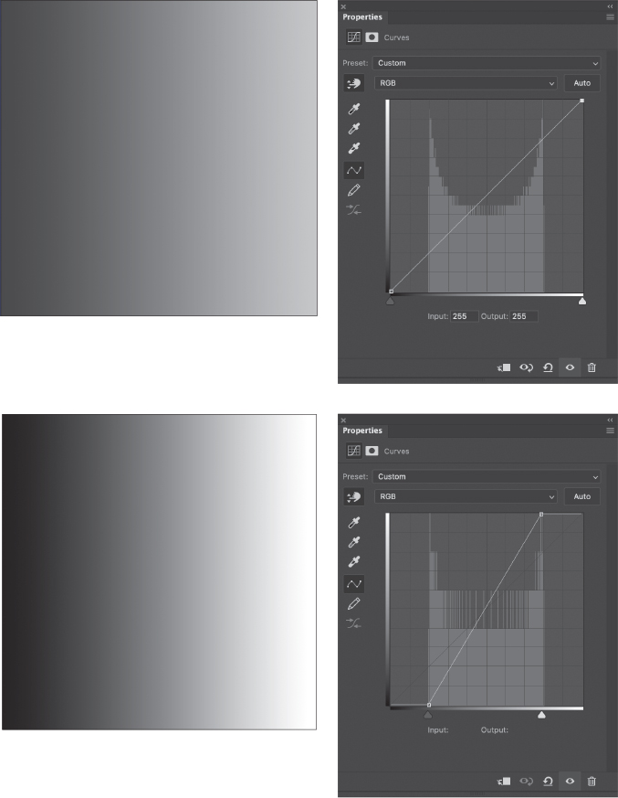
The challenge is to find a way to even out the bars, and there are two ways to do it. The first is to redefine the black and white points so that there are fewer deep shadows and bright highlights. To accomplish this, we can raise the black point and lower the white point, leaving the line flat between them. This effectively slices off the ends of dynamic range in the image and pushes everything towards middle gray, resulting in a more balanced histogram (but still not flat, which we’ll talk about shortly).
The black point has moved from 0 to 24, and the white point from 255 to 231. The bars are perfectly even, but take a look at the smooth gradient below: We’ve lost pure black and white, which may not be acceptable in many situations when you are working on an overall image, but it can be very useful when working on selections and masks.

Note
Later in the book, you’ll find out that 50% gray becomes invisible with certain blending modes, such as Overlay. Changing the blending mode of the Curves adjustment to Overlay then makes this exact set up a nifty way to adjust midtone contrast. Tuck that bit of knowledge away for your own experiments a little later on.
If we push the adjustments even further, it should become clear that the result is an overall reduction in contrast, which is what we saw with the horizontal line above.
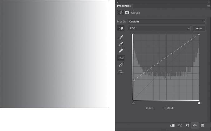
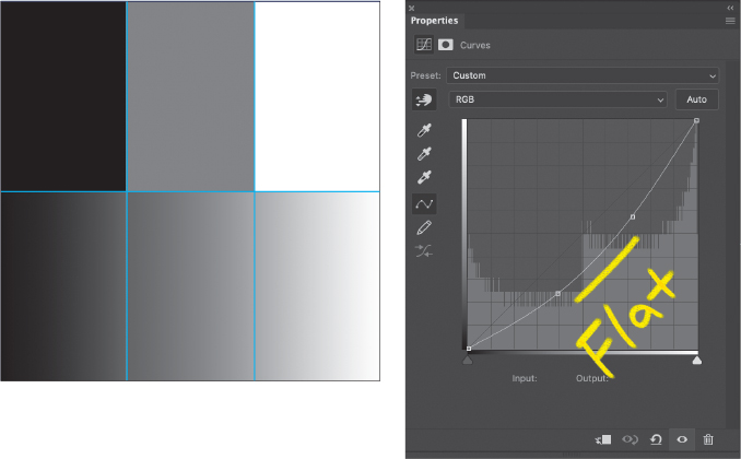
It seems natural to find a way to recover the middle values without affecting the black and white points. Rather than dragging these end points, we can leave them to their respective corners and instead focus on that middle area. Wherever you click the curve creates a control point. Control points are pinned and behave like pivot points. You can move the point all around, but when you add another control point near it, the line through that point rotates. We’re going to make use of that fact right now.
In the middle of the graph, click to add a control point. With that point still active, either move it around until the Input and Output values at the bottom of the panel each read 127 or simply enter the values in the fields below the curve to set the center point. This pins the exact middle so we preserve our true 50% gray.
Now we can move the remaining areas around without moving the middle gray, black, or white points. Starting in the lower left of the curve, drag the curve upward to shift the gray values and compress them slightly. In the upper-right area, drag down to compress that range of values. This motion approximates what we did previously to lower contrast towards a flat 50% gray field, but because we’ve pinned critical values, we don’t lose the full dynamic rage. We have simply reassigned the quantity of gray values a tiny bit in order to achieve more balance.
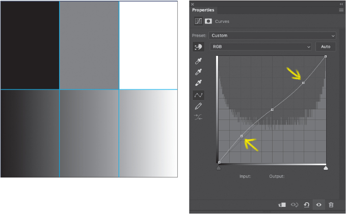
Notice that we didn’t have to move the curve much, and precision in this case isn’t as important as the general placement of points. This is a contrast reduction curve. We can make the opposite moves to create higher contrast.
We can also move that vertical line left or right and shift the balance wherever we like.
And just to take things to an extreme, we can create a nearly vertical curve.

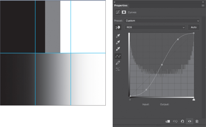
This example demonstrates that we have amazing control over the range of values available in an image. That includes some correction. Here’s another graph where the middle gray value has shifted to the right significantly, but we still have pure white and pure black to maintain; you can see the original distribution of gray values in the histogram. The goal here is once again to balance out the bars, and because we already know that moving points up makes things brighter, while moving them down makes things darker, it seems like a good idea to reduce the mids.
If we simply drag the midpoint down we get pretty close, but not an exact match. That implies we need to change the shape of the curve slightly.
The solution in this case is to use two points, one on either side of the midpoint. This more or less uniformly lowers the middle tones, but expands the shadows and compresses highlights just a touch to make room for more middle values.
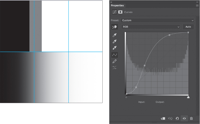
For fun, we can try out some other extreme curves settings and see their impact on the basic gradient. In this case, I’ve created part of a solarization curve that results in a gradient that appears to cycle on itself. I also increased the Posterization to show 5 bars.

Seeing in Colors
To this point, we’ve used Curves to explore how gray values can be manipulated and adjusted. This knowledge translates directly to photographs in later sections of the book, where the exact function of a given feature may not be immediately obvious.
The situation gets a little more complicated when dealing with colors, but not too terribly much. It turns out that Curves generally treats all three RGB color channels the same when moving the main Luminosity curve, but it may still cause some color shifting. This leads us back to the previous section where we looked at how Photoshop weights each color. It’s one thing to look at the weighting values, but it’s another to see a direct demonstration.
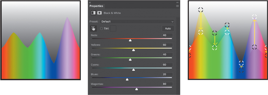
This graphic is simply a black-to-white vertical gradient layered over a horizontal spectrum gradient. The colors in each gradient were created with the Gradient Editor tool using “pure” color values for each stop (read up on Gradient Maps adjustment layers in the “Gradient Zone Control” section of the “Color & Value” chapter). That means each color is displayed on your screen exactly how Photoshop expects you to perceive it, including weighting. The black-to-white gradient is then set to Lighter Color blending mode, which compares the luminosity value between the two layers at every pixel.
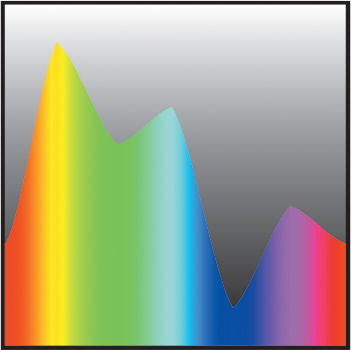

The result is a very literal display of the weighting factors in play. What you see is the exact gray value that each color represents when composited and given the percent luminosity values listed in the previous section. What do you notice about the peaks? Did you expect them to be magenta, cyan, and yellow? The reason these colors have more luminosity is because they represent the combination of two channels; magenta is the additive result of red and blue, for example.
Tip
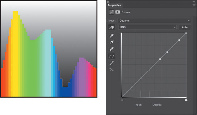
At this point, you can also see those fully saturated, luminous colors represented on the Curves Properties panel—at least where they are on the curve, anyway. Reset the Curves adjustment to a flat line, and then click the Targeted Adjustment tool (looks like a finger with little up and down arrows). Then, click the wide solid bars each in turn. That will place a point on the curve corresponding to the luminosity of that color. Each one is in its own spot, but they’re not evenly distributed.
We can use this setup to explore some other effects, as well. Adding a Curves adjustment to the spectrum layer and tweaking just the luminosity curve as we did above, the height of the RGB and CMY peaks does not change, but the slopes in between do. That tells us the default Curves luminosity adjustment is acting directly on the RGB channels more or less equally. The brightness of each channel is being affected.
Remember that the channels are just grayscale representations of the primary additive colors. It may be easier to see this if we add a Posterize adjustment to the spectrum, too. This also illustrates how Posterize works: It divides up the gray values into evenly spaced chunks. Because each color is made up of gray values, each channel is split up as well. A setting of 3 levels in the Posterize adjustment results in 9 total bars: three for each of the three color channels. In this example, I’m using 8 levels to show more detail. The wider bars correspond to the primary and secondary colors.
Using Curves in particular, I recommend this setup as a way to explore the channel-specific curves that are discussed in Part 2, under “Color Grading” in the “Color & Value” chapter. When you adjust Curves with this view, the smaller bars will appear to rise and sink, but this is the same behavior we saw above with the smoother graph. The effect you’re seeing is quantization, and if you were to imagine a line connecting the top center of each bar, you would recover the smooth appearance from the previous example. The bars are simply there to make visualization a little simpler.
Shades of Gray
Let’s throw a Black & White adjustment layer into the mix and remove the posterization for now.
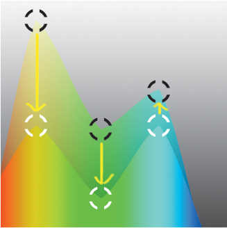
This is the default conversion of color to grayscale. Once again, we see peaks on cyan, magenta, and yellow, but they’re at very different luminosity levels. Take a look at where the sliders are positioned and toggle the adjustment layer’s visibility on and off to see the changes. Why do you think the Photoshop engineering team decided that should be the best conversion to start with?
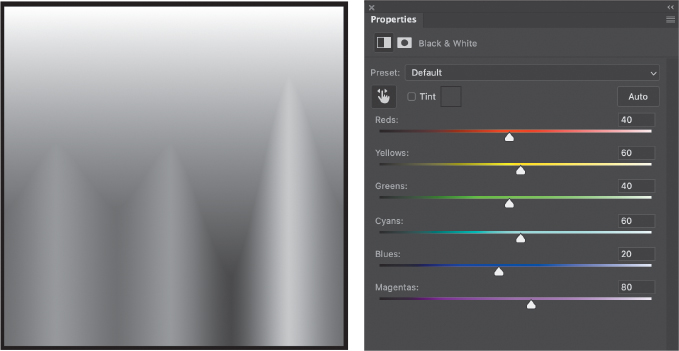
I can only tell you that I don’t know. It may have to do with a certain kind of film they wanted to simulate, or they tried it out on a few test images and called it good. In the end, it doesn’t really matter why. It looks fine, and it’s easy enough to change. I created a preset called Neutral that creates a direct conversion that preserves luminosity.
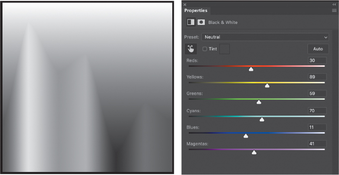
This lets me start from a literal conversion to grayscale, by which I mean a conversion that’s a direct implication of a color’s luminosity value rather than the somewhat “fudged” conversion that the engineers apply by default. This also has the added benefit of being a great starting point for using Black & White as a luminosity adjustment. Changing the Black & White layer’s blending mode to Luminosity lets you change the apparent brightness of the primary and complementary colors without shifting their hues. Here’s a comparison of the effect of Black & White with default and neutral conversions. The black targets are on peaks showing the original colors using the Neutral conversion, and the white targets are on peaks resulting from the default conversion. The arrows help demonstrate the direction of change.
Onward, Dear Reader!
By now, you should have already decided if building experiment files is of interest to you or not. If they are, be sure to check out the section in Part 3 “Creating the Workbench Files” to get tips on making your own. The benefit lies in giving your eyeballs and brain a break from your own images and to explore the range of editing features available in Photoshop. There is really no limit to the kinds of files you can generate, but you should focus on creating files that let you control only one variable at a time, whatever that variable is. It can also be rewarding to figure out new ways to examine a particular tool or feature, which is often instructive in and of itself. That chapter also has some philosophical ideas on how to approach building workbench files for new situations.
All of this is meant to give you some ideas about exploration, whether for yourself or to use in teaching others. I absolutely love tinkering in Photoshop just to find the edges of capability and the beautiful failures that often result.