Adjustment Layers
If images in Photoshop are just well organized data, then adjustment layers are the knobs, dials, and sliders you use to adjust that data. Adjustment layers take in image information, apply some math, and kick out the results on the other side. The controls on an adjustment layer let you change some parameters of that math to some extent, and can affect both individual pixels as well as how those pixels relate to each other.
There are 25 unique layer adjustments in Photoshop, 16 of which are also available as adjustment layers that you can add to your layer stack directly. Another three are fill layers, and the remaining six are “destructive” adjustments that you run like filters on a layer.

Adding an adjustment layer is simple, but of course with Photoshop there are multiple options. At the bottom of the Layers panel, notice the small circle icon that is half filled; this icon marks the “Create new fill or adjustment layer” button, and it does exactly what it describes. Click the button to open a text-based menu from which you may choose one of the 16 adjustment layers. When you add the layer, you may be presented with a dialog box that lets you choose settings, or the Properties panel will change if you have it open (Window > Properties).
For added fun, there is a dedicated panel under Window > Adjustments where you can see all of the adjustment layers as icons. You will also find the adjustment layers under the Layer > New Adjustment Layer menu. There is no difference in choosing from this menu or the Layers panel.
With all three options, you may hold Option (macOS)/Alt (Windows) while making your choice to bring up the New Layer dialog box before adding the layer. Here, you can set the layer name, indicate whether the new layer should be clipped to the layer immediately below it, and set the layer’s color, blending mode, and opacity. Choose this method when you are recording actions!
Layer adjustments (notice the ordering of the words? It matters!) are located under the Image > Adjustments menu (see?). When using this approach, you will apply the effects of the adjustment destructively to the selected layer or layers. You will also find the six additional adjustments in this menu. Several layer adjustments have shortcuts by default, including my favorites, Curves Command (macOS)/Ctrl (Windows)+M and Levels (Cmd/Ctrl+L).
You may wonder why there are so many different options when in reality they all deal with brightness and color in some way. The answer is this:
Each adjustment gives you a different way of manipulating image data.
Imagine the differences between a computer mouse, touch pad, and drawing tablet. Each of them lets you move a cursor around and click on elements in an interface. But each has a unique way of letting you accomplish those tasks, with more or less control. Where the mouse lets you move and click, a touch pad adds gesture controls to give more complex interactions. And a tablet can enable pressure and rotation through a stylus. It’s not just a question of control, however; it’s also about perception.
Consider Curves and Levels. Both let you reassign input values to new output values. Levels does this linearly across the value range, while Curves gives you more discrete control. Everything you can do with Levels can be replicated with Curves, but not the other way around. So why would you use Levels at all? Because the interface is more direct and obvious, for one thing. For some, it’s simply a matter of preference. I almost never use Levels outside of working on masks, for example, but there’s no real technical reason for the choice—it’s simply a habit at this point.
Other adjustments do give you quite a bit more control, though, and while some of them may look redundant, they all have a place in the Photoshop universe. I highly recommend giving each one a try with a few different images, especially anything you’ve not used before. While the distinctions between several of the adjustments may not seem that useful at first, the important thing is to build your experience with different ways to accomplish your goals in Photoshop.
Each of the following entries gives you some basics about the adjustment, a practical use, whether it can be used as a Smart Filter, and more. Where applicable, additional options and considerations are included, such as limits on bit depth or color mode, and tips on combining different tools. This section is not meant to be exhaustive and authoritative, but instead to be practical and useful for photographers.
Brightness/Contrast
Available both as an adjustment layer and under Image > Adjustments.
Can be used as a Smart Filter.
The Brightness slider expands the highlights in your photo when moved to the right, and expands the shadows when moved to the left. Contrast is similar to Levels in that it expands or contracts the total range of values. When moved to the left, tones in your image become more muted and tend towards neutral values; when moved to the right, those tones become more saturated and dynamic.
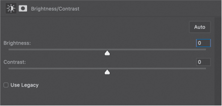
In standard mode (with Use Legacy deselected), the controls are proportional to the existing brightness and contrast in the image, similar to Levels and Curves. That is, the sliders are nonlinear and operate based on relative values available in the image. This is better for photographs and gives you more latitude in making fine adjustments, as well as helps avoid clipping highlights and shadows.
Legacy mode is linear and uses absolute values, which is more useful for working with masks (or preparing an image to create a mask). In Legacy mode, all pixel values are equally shifted and this can easily result in clipping.
The Auto function attempts to evaluate your image and apply settings to maximize dynamic range while preventing over-saturation and compression in the shadows and highlights. Brightness/Contrast has no presets or other controls aside from an Auto button, making it less useful in a commercial setting where repeatability is critical. While there is nothing wrong with this adjustment, I tend to prefer Curves or Levels simply because they are accessible with standard keyboard shortcuts and offer more flexibility with presets.
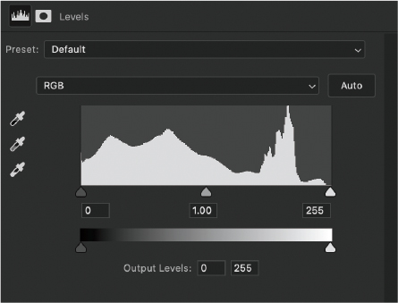
Levels
Available both as an adjustment layer and under Image > Adjustments.
Can be used as a Smart Filter.
Levels is one of the two critical adjustment tools for contrast, giving you access to manage luminosity range and value, and to some extent color balance. The Properties panel shows a histogram and two sets of sliders. The top controls manage Input, effectively allowing you to remap the black and white points in your image to the values set in the Output section. Typically, Output will stay at 0 and 255, meaning the Input sliders will map specifically to black and white. In some cases, you may wish to change this range either for stylistic reasons, or to adjust ink density for printing.
The midpoint slider manages the transition from black to white by moving the middle gray assignment value. The readout for this slider is given as a gamma value, ranging from 0.01 to 9.99, with 1.00 as the middle between the inputs. This slider is dynamic in that it will maintain its relative position between the end points as you move them.
For the mathematically inclined nerds, the gamma readout (customarily represented by the Greek letter γ) is an exponent, given in the following equation:
Vout = (Vin)γ
V is the luminosity, so this says the output luminosity is equal to the input luminosity raised to the power of the γ value. The reason the midpoint slider uses this kind of value display is to avoid confusion with the discrete end points which read actual luminosity values, while the γ reading is a relative value. Adding to the fun is that the γ value is nonlinear, so the rate of change in the slider value is faster to the right, and slower to the left. You don’t have to know how the number translates to luminosity, only that values less than 1 darken your image, and values greater than 1 make it brighter (a value of 1 leaves the image unchanged).
Levels comes with a handful of presets that are cleverly named things like Brighter, Darker, and Increase Contrast. If you are also clever, you’ll figure out what they do. You can save and load presets from the panel menu in the upper-right corner of the Properties panel.
On the same menu, there is an option to Show Clipping For Black/White Points. Setting this option enables the clipping display whenever you move an input slider. Instead of setting this option, though, I strongly recommend using the temporary modifier of holding the Option/Alt key while dragging. This way you get the best of both worlds.
On the left of the Properties panel are three eyedroppers for setting the shadow, midtone, and highlight values. Selecting one of these tools then clicking a point in the image tells Photoshop to use the point you chose as the value for that input slider. For example, to set the black point in your image, click the black eyedropper and then sample the darkest point in your image. Hold Option/Alt while clicking to preview the clipping results. The black and white point sliders will not show a change in the Layers panel, but the histogram may show signs of being expanded by displaying gaps between luminosity values. In order to move the clipping points out, you will need to resample or reset Levels using the Reset button at the bottom of the panel.
Note
When using the Auto Color Options dialog box, you must have previously selected the adjustment icon and not the layer mask! The layer mask is selected by default whenever you select an adjustment layer, but with the mask selected the Color Picker will sample from the mask, not the image. If you try to use the Color Picker and things turn all white (or are otherwise unexpected), cancel out of the dialog box and click the icon to highlight it, then start over holding Option/Alt while clicking Auto.
There is also an Auto button that will apply certain settings automatically. Holding Option/Alt while clicking the button opens the Auto Color Correction Options dialog box. This is the same box you’ll find with the Curves adjustment layer, and has several features. Keep the Levels histogram visible as you work with these options to see how it behaves.
Enhance Monochromatic Contrast: All color channels are composited for luminosity and an optimum setting is applied to all color channels equally. This option is intended to increase contrast without shifting color at all. This is the same as Image > Auto Contrast.
Enhance Per Channel Contrast: Each channel is considered independently, with the black and white points set based on that channel’s histogram. This option is likely to cause color shifting, so is typically best applied either after your image has been neutrally balanced or when you know there’s a slight overall color shift. You are likely to need additional color corrections with per channel options. This is the same as Image > Auto Tone.
Find Dark & Light Colors: The composite values for darkest and brightest colors are used for maximum color contrast. This is different than luminosity, which simply looks at the total histogram as opposed to evaluating the actual color luminosity. This option is the same as Image > Auto Color.
Enhance Brightness & Contrast: This AI-driven option uses content-aware evaluation of bright and dark areas. It’s a good choice for images that already have a good luminosity histogram but may need some color boosting. It is now the default option for Auto in both Levels and Curves.
Snap Neutral Midtones: Select this to allow Photoshop to set the midtone using a neutral color from your image rather than the default 50% gray. This option is available for the first three Auto methods and lets you select the value by clicking the Midtone swatch under Target Colors & Clipping.
Target Colors & Clipping: These three swatches are available when you select one of the first three algorithms. Clicking these opens up the Color Picker dialog box, which then allows you to choose a color from the image or the dialog box. Setting the shadow, midtone, and highlight values yourself gives you additional freedom to control the process, even while enabling the automation tools to do their job.
Clipping values are essentially the black and white point sliders, but within Levels, they actually expand the histogram without moving the control points when using the first three algorithms. This means you can’t go back and move the points outward unless you reset the adjustment layer.
For each of the first three Auto methods, the histogram is expanded in the Levels Properties panel. You can see gaps in discrete values if the adjustment is extreme enough, especially with 8-bit images.
Curves
Available both as an adjustment layer and under Image > Adjustments.
Can be used as a Smart Filter.
This is the main workhorse adjustment, found in virtually every professional workflow and probably the single most useful tool available in your Photoshop arsenal. Curves is able to accomplish most of what can be done with other adjustments; the limiting factor is your patience to discover the tool’s various tricks and techniques. I think it’s safe to say that most intermediate to advanced users drop Curves into a layer stack almost by reflex.
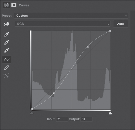
In essence, Curves behaves like Levels in that it allows you to map input values to output values, and the most general use for this is to adjust contrast and brightness. Levels, however, is a graphical set of adjustments with a single control for gamma (midpoint) tweaking, whereas Curves is a parametric view of the luminosity that allows for very detailed adjustments all along the range of available values.
The default view of Curves is a straight line with a slope of 1, overlaid on a histogram of the input luminosity (that is, the luminosity “visible” to the Curves adjustment from a composite of the underlying layers).
The value readouts in the Curves Properties panel are in luminosity values ranging from 0 to 255. It is possible to type values directly into these boxes when a control point is selected. If you have a hardware controller, such as the Monogram Creative Controller, Loupedeck, or PFixer MIDI controllers, then you can set a knob, dial, or slider to adjust these values while you work—just something to keep in mind if you are of a more production-oriented bent!
For a detailed discussion about practical applications and a demonstration of exactly how Curves behaves, visit “Seeing Images as Data” in the “Welcome” chapter in Part I.
Exposure
Available both as an adjustment layer and under Image > Adjustments.
Can be used as a Smart Filter.
Used to adjust the dynamic range and gamma of the image, Exposure is often ignored in favor of other tools. The three sliders comprise Exposure, Offset, and Gamma Correction. While similar functions may be available in other adjustments, the purpose here is mostly familiarity of controls. Exposure expands the image histogram (visible when the Histogram panel is open) when moved to the right and compresses it when moved to the left. It has a greater impact on highlights than shadows.
Offset tends to behave in the opposite way; it compresses the histogram when moved to the right and expands it moving to the left. Offset also tends to adjust the shadows more than highlights.
Gamma Correction, similar to its behavior in Levels, reassigns the midtone values and shifts the entire histogram. However, Gamma Correction is nonlinear, and it compresses the histogram in either direction if you move the slider too far.
Overall, Exposure is a great way to use more traditional approaches to histogram adjustments, though the capability is almost identical to Levels. The main reason to use Exposure is for alternative interface controls rather than any inherent advantage over image adjustments.

Vibrance
Available both as an adjustment layer and under Image > Adjustments.
Can be used as a Smart Filter.
Vibrance is similar to Hue/Saturation (which I’ll describe in a moment), but its sliders are relative and vary according to color ranges. Saturation in this adjustment layer behaves differently according to color value, and gives preference to the Green channel, then the Red, and finally the Blue. Vibrance gives equal weight to the Green and Blue channels, but less to Red. Unlike the Hue/Saturation controls, these sliders are far less likely to cause clipping or oversaturated colors because the values are scaled. Both sliders will remove saturation from all channels equally, but each slider does so at slightly different rates.
This adjustment layer is a great fine-tuning tool for preserving medium to light skin tones in environmental portraits, and because it is more restrained than Hue/Saturation, it’s much more forgiving of large changes.
Vibrance is one of a few adjustment layers that has no presets.
Hue/Saturation
Available both as an adjustment layer and under Image > Adjustments.
Can be used as a Smart Filter.
Hue/Saturation has three controls to adjust Hue, Saturation, and Lightness—the elements of the HSL color space. Although this adjustment uses the HSL model concept for display, it operates just fine on images in RGB, CMYK, and LAB color spaces. In many representations of color theory, Hue is displayed as a color wheel where the angle of rotation in degrees (0–360) is a specific hue, and distance from the center point is considered saturation.
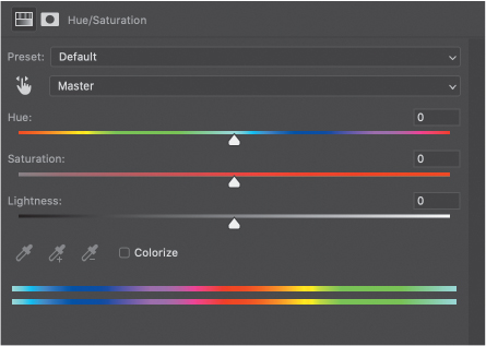
The Hue slider ranges from −180 to +180, and is centered on 0. These are not actual Hue values, but represent the shift from your starting color, so the slider is a relative change, not absolute assignment of hue.
Likewise, Saturation ranges from −100 to +100 and starts from 0 in the center, but it linearly increases or decreases the contrast of each channel identically when Master is chosen from the “color” menu (the nameless menu just above the Hue slider). Decreasing the slider effectively reduces colors to neutral gray, while increasing the slider results in full saturation. You can adjust each of the six major hues independently as well, which is covered below.
Lightness affects the total brightness of each channel, ranging from complete black to white.
At the bottom of the Properties panel is a pair of hue ramps. The top ramp is the baseline representing the full range of hues. The bottom ramp is the result of shifting the Hue slider, and represents a kind of map relating the top input hue to the bottom output hue.
The output range is a set of controls on the output ramp that relates to the options available in the color menu. When you choose a color from the menu, a default input range slider appears at the chosen color range as well as a numeric readout of the actual values. The values are tied to the range sliders; outer sliders are the ends of the falloff, while inner sliders are the “width” of the hue being adjusted. You can drag in the center of the range sliders to drag the entire set where you need it, shifting the chosen fundamental hue. If you move the range sufficiently, the color menu selection changes to reflect the new color (or the closest primary/secondary color).
Hue/Saturation also features a Targeted Adjustment tool (TAT). Enable the TAT then drag on the image to adjust the saturation of the selected color globally. Hold Cmd/Ctrl while clicking to adjust the hue of that color globally. If you find you use the TAT frequently, open the panel menu and choose Auto-Select Targeted Adjustment Tool. That way it’s ready to go whenever you add the Hue/Saturation adjustment layer.
A Colorize option removes saturation and applies an overall tone using whatever hue you choose. This is great for applying an overall tone to an image, whether or not it starts as black and white.
Common uses for Hue/Saturation are to apply global shifts to offset a color cast, to apply creative color shifts, and to fine-tune images for gamut correction when outputting for print. It can also be used for more discreet color balance operations, because it allows saturation adjustments at the same time. Color Balance is more global. And as seen in the “Selections & Masking” chapter, it can be used for making fine selections based on color.
Hue/Saturation offers a selection of presets, and you can save your own.
Color Balance
Available both as an adjustment layer and under Image > Adjustments.
Can be used as a Smart Filter.
Color Balance is used for making global corrections in each of three tonal ranges: shadows, midtones, and highlights (make a choice from the Tones menu of the Properties panel). The color sliders are broken out for each primary/secondary hue range, allowing for a mix between complementary colors, hence a “balance” between the two. Conceptually, the sliders let you replace one hue by substituting in its complement.
In the chapter “Color & Value,” you used a brute force method of removing color cast by generating an average complementary color that acts to negate an overall shift in all hues. Color Balance can accomplish the same task by addressing individual hues, so this is a more precise approach to correction, with more subtlety and control.

Color Balance has a Preserve Luminosity checkbox that is meant to preserve the mix of gray (that is, value) by compensating for perceptual loss of brightness with certain color changes. This should be left on by default, but you may encounter situations where it causes highlight blowouts due to over saturation, especially when shifting towards the secondary colors. If this happens, consider turning off Preserve Luminosity and using a Curves adjustment layer set to Luminosity blending mode instead of turning on Preserve Luminosity.
Alternatively, set the Color Balance blending mode to Saturation instead of Normal to adjust relative saturation levels without worrying about luminosity shifts. This is a neat trick to manage color contrast a little more directly than some other methods.
Black & White
Available both as an adjustment layer and under Image > Adjustments.
Can be used as a Smart Filter.
Allows you to mix the conversion of each primary and complementary color to gray. When you first apply it, the Black & White filter automatically returns a basic grayscale version of your image using a default setting. Photoshop accomplishes the conversion by extracting the tonal contribution from each color to gray, effectively desaturating the existing color. Sliders allow you to adjust the tone of each hue to affect the final gray value.
The Auto button maximizes the distribution of gray values, resulting in a typical high-contrast conversion where possible. This is a good option if you’re looking for a starting point for dynamic range. Auto does not have additional options like you find with Curves and Levels.
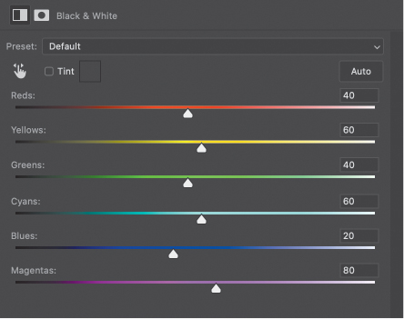
Black & White also features a Targeted Adjustment tool (TAT), allowing you to drag directly on the image to make specific changes. Remember, however, that this tool affects all regions in your image with the same fundamental hue, so be sure to watch the entire canvas while using TAT.
Tint allows for a monochrome result, applying any hue you like in a similar fashion to using a color overlay.
The presets available with Black & White are actually really good at simulating certain filters. One of my favorites is the Infrared preset, which gives beautiful results for landscape images. Pair this preset with a Curves adjustment for more control.
When set to Luminosity blending mode, Black & White is a wonderful tool for adjusting tone in specific ranges. In fact, I almost never use it for actual grayscale conversions, preferring to use Gradient Maps and my “B&W Control Freak” method from “Color & Value.” If you like the results you get from the Black & White layer conversion, but need a tiny bit more control, add a Color Balance layer below it to control the relative mix of incoming colors.
Photo Filter
Available both as an adjustment layer and under Image > Adjustments.
Can be used as a Smart Filter.
Applies a semi-transparent color overlay to images, good for both correction and effects, but easily replicated with Solid Color overlay, typically with more flexibility. The major use for Photo Filter is to apply common toning presets quickly, and it’s a great choice for replicating some traditional color filter effects. There are a number of presets, but you cannot save your own.
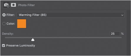
A Density slider behaves in a similar way to the Opacity slider, and you can use the Color Picker to dial in specific values. However, the best use of Photo Filter is to quickly apply the presets without any additional fuss or to preview several tonal variations as a visualization for your image before making a more detailed adjustment.
Other options for similar effects include the Solid Color fill mentioned, Color Lookup Tables, a Gradient Map, or a Gradient fill.
Channel Mixer
Available both as an adjustment layer and under Image > Adjustments.
Can be used as a Smart Filter.
Traditionally used for black-and-white conversions, Channel Mixer enables you to shift the contributions of a given channel to a different output color. Offering some nice presets, it operates by letting you control the mix of input channels directly, to the point of entirely swapping them around. It does not affect color directly, only the blending of channel information.
Think of the mixer as if you were blending grayscale channel information to create color plates. When your RGB image comes into Photoshop, each channel is discrete. Using the input sliders, you can combine the channel information for a given output color, so the sliders are relative input values. At the bottom right of the Properties panel is a summation value that tells you the total combined contribution from each slider. Keeping that value at 100 retains the exposure of your image overall, so it’s a good way to gauge whether you’ve changed the brightness of your photo.
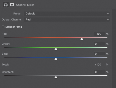
At the bottom of the Properties panel is a Constant slider that acts like a rough exposure slider. Use it to compensate for any changes you’ve made to the color sliders.
For creative color effects, just start playing with the sliders for each channel in the Output menu. There’s really no guide for this, though you can do some minor repair work for a noisy channel by replacing it with a little from the other two channels. This inevitably results in a color shift, however, so reserve that for dealing with deep shadows or white highlights.
A more moderate use is to create a hand-tinted look by toggling the Monochrome option. Select the checkbox, then deselect it and move the sliders. I honestly don’t know why it works this way, but that’s how it was designed. By selecting Monochrome, you are assigning the same slider values to each of the channels and directing everything to a single gray output channel. When you toggle it off, the sliders stay the same, allowing you to add color on each channel individually.
Where this becomes more useful is when you choose a particular preset before turning off Monochrome. Each of the presets sets the input sliders to a different combination of values, and turning off Monochrome leaves the sliders the same for every output channel. In this way you can choose the grayscale contrast level like you would with the Black & White adjustment layer, but then switch back and fold in hues any way you like.
Leaving Monochrome selected simply combines the output channels so they’re all the same, and the input sliders behave just like the Black & White adjustment sliders, but limited to RGB. In addition to choosing presets, you can save presets as well.
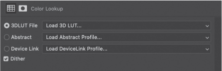
Color Lookup
Available both as an adjustment layer and under Image > Adjustments.
Can be used as a Smart Filter.
Color Lookup uses a set of tables to translate incoming colors from your image to new output colors. Most often, these are subtle replacements and help ensure a consistent set of hues and values across a range of images. So long as the starting images use the same range of colors and have similar exposure, the output will maintain a consistent look.
While there are several presets for Color Lookup, the real value is in creating your own tables. For details on this process, see “Color Grading” section in the “Color & Value” chapter.
This adjustment layer uses several standard color table formats, but some are more flexible than others. There are no adjustment controls, so like Photo Filter, you are limited to blending modes, masking, and layer opacity/fill.
Invert
Available both as an adjustment layer and under Image > Adjustments.
Can be used as a Smart Filter.
Literally inverts the colors and luminosity in your image, providing the same results as the Image > Adjustments > Invert command (Cmd/Ctrl+I). This adjustment is most frequently associated with visualization helpers, but there are some specialized uses for film negative scans and photo restoration techniques which are not covered in this book. There are no options or presets. You get what you get. On or off. Ah… simplicity!

Posterize
Available both as an adjustment layer and under Image > Adjustments.
Can be used as a Smart Filter.
Groups similar gray values in each channel into solid, averaged bands. The only control is how many bands the range is divided into, which is used for each channel. In other words, if you choose the default 4, that means each channel gets divided into 4 tonal ranges. For an RGB image, that gives 16 total levels.

Posterize is typically used for creating graphic illustration effects or for special effects within photographs. However, I use it primarily for simplifying gradients to show how other adjustments affect hue and value.

Threshold
Available both as an adjustment layer and under Image > Adjustments.
Can be used as a Smart Filter.
Creates a hard boundary between discrete luminosity values, filling everything below the selected value with black and everything above with white. The slider lets you choose the boundary value.
Again, the utility of this adjustment is kind of limited, but it turns out to be helpful for investigating how adjustment layers and blending works. I also use it to help create base effects that are used in other illustration techniques, such as this brushed linocut effect (seen in the “Stamped Portrait” section of the “Effects” chapter).

Selective Color
Available both as an adjustment layer and under Image > Adjustments.
Can be used as a Smart Filter.
Selective Color treats hues as a mix of printing dyes to give more subtle control over color balance. Each primary and complementary color is represented as a mix of cyan, magenta, yellow, and black. Sliders allow you to adjust the mix for each of the colors individually, as well as highlights, midtones, and shadows.
This adjustment is frequently used to balance images for printing output, and is used commonly with gamut visualization turned on. The “Color Matching” section in the “Color & Value” chapter demonstrates using Selective Color for matching colors in composites, and it can also be used as an input for the “B&W Control Freak” technique (again, see the “Color & Value” chapter), as well as a visualization aid.
At the bottom of the Property panel are two radio buttons: Relative and Absolute. Relative adjusts the mixes based on the existing color and applies changes more subtly as a percentage of color already in your image. Absolute applies larger changes without regard to the starting values, and so can easily oversaturate colors that are already strongly present.

Each slider presumes a starting contribution to whatever has been selected in the Colors menu, and then either adds to or subtracts from the starting mix. For example, choosing Greens from the menu and adjusting the Cyan slider is not likely to have much effect, but adjusting Magenta will, simply because of the nature of complementary colors. While each printed color is some mix of the Cyan, Magenta, and Yellow, the impact of each depends on how much each is used in a given color.
The Black slider adjusts tint (lighter) and shade (darker), just as if moving all of the sliders together will uniformly shift the selected color range brighter or darker.
The following fill layers have some interesting properties when used with the Presets panel. In the latest versions of Photoshop, you are able to drag presets to each of the fill layers directly from the Presets panel, and in some cases you can change the fill type. This can be a real time-saver for testing out presets or when working with library items and templates.
Gradient Map
Available both as an adjustment layer and under Image > Adjustments.
Can be used as a Smart Filter.
Remaps the colors and values in an image to whatever is designated on the Gradient Map. Think of this as a one-dimensional color lookup table. Gradient Maps are used widely for retouching color corrections and black-and-white conversions. I also use them as a selection tool. For an example using Gradient Maps, see the “Gradient Zone Control” section in the “Color & Value” chapter.
There are tons of presets available for Gradient Maps, and the ability to create your own, which is highly recommended. The gradient ramp represents the range of values available from black to white (recall that RGB color in Photoshop can be converted to a single gray color) and any color on the ramp is mapped to that same value in your image. If the value does not exist in your image, the gradient color does not get applied.
To configure your own gradient, click the ramp to open the Gradient Editor. You can add color stops to the bottom of the ramp and move them around to change the mapping. Each stop can have any color allowed in the working color space. The top of the ramp is for transparency, which is only used for gradients and gradient fills, but is ignored for Gradient Maps (bummer, right?).
Between the color stops are midpoint sliders. These control the transition between color stops and are great for adding little tweaks to gradients. These can help you create harder edges between colors, though if you want a nearly solid transition you should use two color stops almost on top of each other.
For each of the color and opacity stops, you can enter specific values for location in the bottom input boxes, or scrub on the word “Location” to adjust values like a slider.
Above the solid gradient ramp is a Smoothness slider. This affects the transition between colors, and appears largely based on perceptual models for luminosity. At 0%, the transitions are linear, which can be seen in a stepwise black-to-white ramp. The default of 100% results in a smoother perceptual blend, but has a slightly curved luminosity response.

Note that the second gradient is slightly compressed towards the middle. In Part I, there is a discussion on Levels and Curves that shows a smoothed curve and how to use those adjustments to flatten the gradient. In practical use, most people leave the Smoothing value set to 100% by default, but there may be instances where you want a sharper transition or the non-linear results.
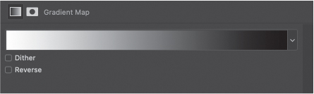
A neat feature not covered elsewhere in this book is noise gradients. From the Gradient Type menu, choose Noise and check out the gradient ramp. Instead of a set of transitions between colors you choose, Noise assigns a random gray value to each brightness value from 0–255 in each channel. Color sliders let you limit the mix of each channel, and you can choose from three different color models: RGB, HSB, LAB. Checkboxes let you Add Transparency and Restrict Colors to avoid over saturation.
The Roughness slider blends the values so the result doesn’t look like random lines as much as a highly variegated and complex gradient.
Just play with it. Click the Randomize button and mess with the sliders, save the ones you like because—hey!—it’s random!
Solid Fill
Available both as an adjustment layer and under Image > Adjustments.
Can be used as a Smart Filter.
Applies a Solid Color Fill layer. Solid Fill is typically used in graphic and illustration elements along with shapes and masks. However, it is used in photography with a variety of blending modes and opacity to apply color changes to image elements. It can also be used with visualization helper layers.
The advantage to Solid Fill over a simple raster filled layer is that you can much more easily change and refine the colors used. Consider using a Solid Fill layer any time you would normally just fill a regular layer with color.

Gradient Fill
Available both as an adjustment layer and under Image > Adjustments.
Can be used as a Smart Filter.

Applies a scalable gradient fill layer. The gradient can be dragged around when the Properties panel is open, which also allows for scaling, rotating, and choosing the gradient used. This is often a better choice than simply dragging out a gradient when an entire layer needs to be filled, because the scaling does not end at the canvas boundaries like a standard gradient would. Even better is that you can change the gradient without dragging out a new one—simply open the property panel and make your changes.
As mentioned above regarding the Gradient Map, you have a full range of presets available, including noise gradients. The only down side to using a Gradient Fill layer is that you cannot transform it like a rendered gradient. While you do have control over orientation and the gradient type, you cannot squish or stretch it like a regular layer item. If these features are required, you’ll have to first rasterize the layer or create a stamped copy, which then loses the editability of the gradient.
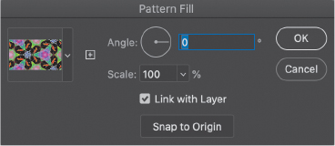
Pattern
Available both as an adjustment layer and under Image > Adjustments.
Can be used as a Smart Filter.
Applies a scalable, rotatable pattern fill layer. Just like with Gradient and Solid Color, this fill layer applies a scalable pattern without boundaries, and can be edited as much as you like.