
Color & Value

If you want to start a lengthy discussion, maybe even a few arguments, strike up a conversation about color with photographers. Second only to the fervor over equipment, color inspires nearly religious devotion to certain tools and methods.
Where the “Dodge & Burn” chapter focused on contrast, this group of techniques deals with brightness and color as individual elements, as well as the relationship between gray and color.
Color Grading
Because digital images are all about color, it makes sense that we want to master various ways to control color to different extents. You’ve already seen how to make some global and local tonal corrections with various dodge and burn methods, and later in this chapter you’ll learn various detailed color techniques. Applying an overall color scheme to an image is typically referred to as grading.

This does not mean you simply create a single, dominant cast to the entire image, but it does mean that certain tonal values become dominant. You see this all the time in major motion pictures, where base color themes are used to help set emotion and feeling of a scene. Consider action movies that use orange and teal colors or horror films that tend towards dark blues.
That being said, there are quite a number of ways to bring color palettes to your work so it makes sense to think about the options available and how they impact both your workflow and vision.
Solid Color Fill Layer
The simplest approach is indeed to simply place a color layer over your final image. Use this technique to create a smooth, narrow tonality, especially when you want to focus on the graphic elements of the image. Although you can do this by filling a blank layer with color and using a blending mode, I recommend using a Solid Color fill layer instead. There are two common blending modes to put into play here: Color and Hue. With a dark blue solid color (RGB: 16, 27, 46) filling a layer, select one of these two modes to replace the colors in your photo layer. The following example uses Color blending mode first, then Hue.
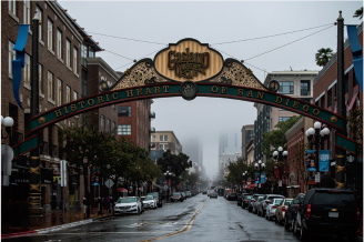

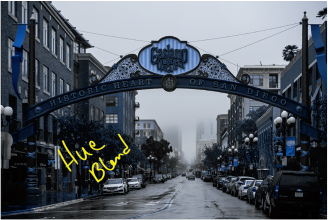
The main difference between the two modes is what they actually affect. Color blending mode takes the color of the blend layer and merges it with the luminosity of the base layer. That means even shades of gray get a color value. Color in this case means both hue and saturation together. We will make use of this fact in some later techniques.
Meanwhile, the Hue blending mode replaces the actual hue only, using the luminosity and saturation of the underlying layer. Because shades of gray have no saturation by definition, they do not change at all. This also has the effect of giving less dramatic results.
Between the two of these modes, you would use Color to apply color to a black-and-white image. Hue would be most useful for making more subtle corrections and enhancements to color images, such as you might do with makeup and skin retouching.
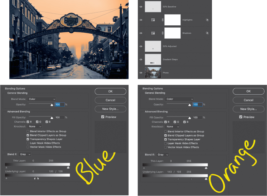
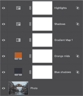
In addition to lowering opacity, you can enhance this basic technique in a number of ways. For a duotone effect, for instance, add two Solid Color fill layers with both set to Color mode. Use one color layer for shadows and one color layer for highlights or midtones. In each color layer, use the Blend If sliders to constrain that layer’s color to a particular range of values. In this example, darker values are given the same dark blue that was used in the Solid Color fill layer at the start of this section (blue shadows), and the middle values are given an orange (RGB: 187, 97, 24) tint (orange midtones).
Hue/Saturation Adjustments
For even more flexibility, let’s use a Hue/Saturation adjustment layer instead of a Solid Color fill layer. The Hue/Saturation adjustment behaves similar to a solid-color fill when Colorize is selected. There is the added bonus of having a Lightness slider that behaves a little like a levels adjustment. Advanced blending (the Blend If sliders) may be used to affect specific lightness ranges. For the Shadows adjustment in this example, I used HSL: 257, 30, −2, and for the highlights HSL: 109, 71, 5. The values are given in HSL rather than RGB due to the nature of the Hue/Saturation adjustment controls.

Want a more precise approach? Add a couple of gray steps and reference chips to your image temporarily (see below). This way you can see the color shifts against a standard, making it easier to see where your duotones (or tritones) overlap. The purpose of the gray step wedge is to help you balance your Blend If adjustments so that you can more easily see where the shadows and highlights actually overlap.
In the previous image, the layer named 50% Baseline holds a small 50% gray square that is above the adjustments, so it is not affected. The layer acts as a reference point so you can compare changes against a neutral tone. The same gray is used below on the 50% Adjusted layer. Seeing these two chips next to each other helps you gauge the changes you are making to your image.
The Gradient steps are also just a range of gray values that help make changes easier to see in shadow and highlight areas. Learn about building these elements in “Creating the Workbench Files” in Part III, “Project Examples.”

Gradient Maps
Now that you understand the foundations of altering colors in an image, the next level of complexity is to apply a palette of replacement colors. In this way, you can more directly map specific tones across the entire dynamic range in an image. Remember back in the “Gradient Map Luminosity Selection” section of the “Selections & Masking” chapter when we looked at using Gradient Map adjustment layers to convert from color to gray values for black-and-white visualization? We can do the same thing for colorizing and grading. Adobe added a lot of amazing new gradient presets with the 2020 release of Photoshop. These are typically divided up into general color groups.
Let’s apply a few Gradient Maps to my Gaslamp Quarter image just to see the effects. On a basic color image, the Gradient Map looks only at the composite luminosity value in order to map from tone to value to result color. That is, any given color you see on the screen is the result of the sum of brightness values in each channel, so Photoshop first generates a luminosity number for that color. Refer to “How Photoshop ‘Sees’ Your Image” in the “Welcome” chapter in Part I. Here are the Red_03 and Blue_30 presets applied to the starting image.
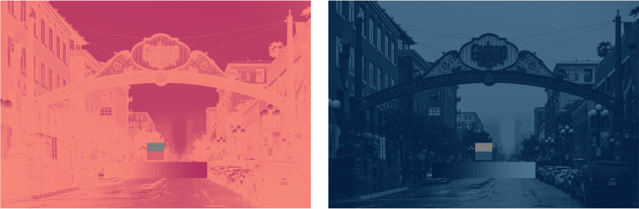
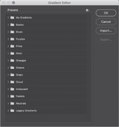
Remember that the color ramp in the Gradient Editor starts with blacks on the left and whites on the right, representing the input luminosity values. Color stops along the ramp translate from the luminosity level to the color on the ramp, so for a photographic result, the darker colors should be on the left, and lighter on the right. The Photographic Toning gradient presets are built this way. You can find them under the Legacy Gradients folder in the Gradient Editor. (If you do not see them among your presets, load them by choosing Window > Gradients to open the Gradients panel, and from the panel menu in the upper right corner choose Legacy Gradients.) Gradient Maps can completely replace hue, saturation, and luminosity.
Applying a slightly modified Sepia-Cyan Gradient Map preset (Legacy Gradients > Photographic Toning) gives a pretty nice result right away (cyan in the shadows, sepia in the high mids). Adding a couple of stops could give us some control over the outputs, of course. But for fine control, we need some tools governing the inputs.
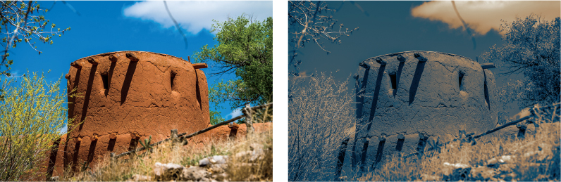
Let’s place a Black & White adjustment layer beneath the Gradient Map. I want the burnt orange adobe earth to be lighter and take on more of the sepia tone. The adobe is comprised of yellow and red, so we need to increase the luminosity of those colors. (Photoshop may lack a “burnt orange” slider, but the B&W adjustment does have red and yellow sliders.)
By increasing the luminosity of the input colors, those colors get shifted to the brighter portion of the gradient ramp. The output takes on whatever color is assigned at that point. In other words, you can carefully choose the output by moderating the input luminosity. By changing the luminosity input value, you affect the translation output along the gradient ramp. This is a key concept for the Black & White Control Freak technique at the end of this chapter.

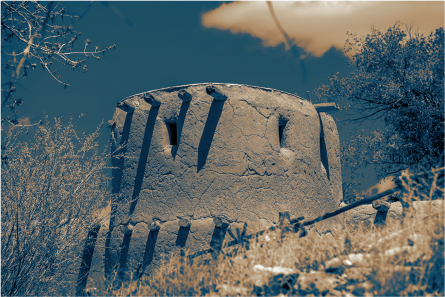
Gradient Maps also give you control over the transitions between color stops. If you find that the balance between shadow and highlight colors is not quite right but you want to preserve the specific color mapping, there is an additional feature you should know about. To adjust the gradient center point, drag the small diamond control that appears between two color stops; it lets you manage the balance or transition point between two adjacent stops.
This is really useful when your image has high-contrast regions, and the conversion seems to create an artificially hard edge.
So, Gradient Maps assign new colors and luminosity based on their composite input luminosity, while Hue/Saturation adjustment layers actually shift from a base color to a new color. Solid Color fill layers drive towards a specific tone. All of this takes some finesse and time to get exactly the right look. What if you need to do this same, complex conversion over and over to create a themed series? What if you just like the look and want to save it for future use? Enter color lookup tables!
Color Lookup Tables
Color lookup tables (CLUTs), which you apply by using a Color Lookup adjustment layer, operate differently than Gradient Maps, Solid Color fills, or Hue adjustments; they take literal color and brightness values and assign a new color and brightness. To do so, they use a lookup table of values, and you can save them as presets that will help ensure consistency across multiple images. Anything not explicitly in the lookup is interpolated. This is a subtle but important concept. It allows you to independently control two colors with the same brightness value, or move the same color in different brightness areas to new colors altogether. Gradient Maps allow you only to “translate” a specific composite luminosity value; so two different colors with the same luminosity would become the same result color.
An actual table is used; so including more entries in the table gives more fidelity by virtue of having more data points to affect, and thus more control.
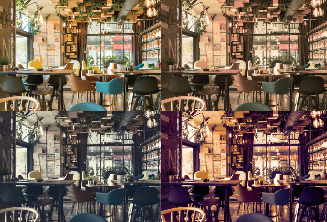
Applying CLUTs is pretty straightforward, and the Color Lookup adjustment layer in Photoshop includes a number of presets in various formats. Some represent classic film looks, and others are much more along the lines of special effects. After adding a Color Lookup adjustment layer, simply choose an option from the 3DLUT File menu. The table is applied as a pass-through replacement of colors and values, so has no direct controls. However, you can use blending modes, opacity, and advanced blending to moderate the effect. This cafe interior has been treated to three built-in lookup tables: Candlelight, Foggy Night, and Late Sunset.
Building your own CLUTs is a great way to get consistency and thematic focus in a project. It’s actually pretty easy to do, and can be—Dare I say it?—fun.
In order to get a good, complete lookup table, you should start with an image that is representative of a body of work or series. Any colors not included in the original image won’t be explicitly written to the table, so will have to be interpolated (in other words, a guess is made). If an entire collection of images that you wish to adjust has similar starting colors and values, then this really isn’t a problem. Exporting your color table is pretty straightforward, because you can work on one of the images to your satisfaction and create a CLUT that will look consistent across all of the images in your collection. But let’s talk about making your lookup table more useful for general cases.
I highly recommend that you plan your work up front. If you are developing a look for a series, start with a minimally processed image that reflects a reasonable starting point: something you expect to be similar to the majority of images you want to use with your CLUT. This image will be kind of a reference for other images, so that the rest of the series will give consistent results. Because color grading is usually the final pass for an image, earlier processing should be done in a way that is standard and repeatable for your workflow. Unlike a simple overlay, CLUTs will respond differently to color variations on the input side. That means if you apply the same lookup table to an image you have color balanced and also to one straight from your camera, the results will be different.
I also recommend that you create a flat copy of your reference image and build your color adjustments in a separate file.
In this separate file, use a copy of your flat reference image as the Background and add to it any adjustment layers you like for color control. When setting up an image to be used to create a new CLUT, you need to keep a few things in mind. First, only the background layer will be used to populate the inputs of the table. Second, masks are ignored. Third, opacity, including from Blend If and Fill adjustments, is respected in terms of effect on color and brightness, but not as opacity per se. In general, make the path from the original color to the result as direct as possible by avoiding any additional content layers. I recommend using only adjustment layers whenever possible, with a little sprinkling of blending modes if absolutely necessary. Although for some special cases you may want the color from one layer and the luminosity from another, you can by and large accomplish this through careful selection and control of adjustments.
Basically, Photoshop builds the color lookup table by sampling the values at specific pixel locations on the background layer, and comparing those with what that same location shows on the final canvas view, which is the sum of all layers together. Then Photoshop applies an operation similar to Curves to make the translation. I say “similar to Curves” because as mentioned above, there is still interpolation going on, and Curves represents a smooth transition to fill in the gaps. Even with every possible color represented, not all colors are explicitly sampled for inclusion.
If you need to hit specific output values, say for a commercial project, you will need more precision. That requires using a reference image of some kind, one that includes the full range of hue, saturation, and luminosity values potentially expected. The most typical image includes both spectra and important color swatches. The reason for the spectra is to get as many colors as possible into the conversion process. The key colors are there for the most critical values so you can precisely sample and control the output for each target value.
Instructions for creating the components of this image yourself are in Part III, “Project Examples,” in the section “Creating the Workbench Files.” Note that this image is in 16-bit mode to reduce banding and to increase precision in the CLUT. This is a basic chart that covers most RGB situations, and it is a good starting point to ensure your lookup table covers all the color and saturation bases.

For the most part, you’ll want a range of at least 16 shades of gray, and 16 to 32 important color swatches (which I’ll refer to as keys). Specific situations call for more specific charts, however. Skin tones, product colors, and branding elements are good examples of important key colors to include, as well as a range of saturation and brightness values surrounding the key colors. You can build these from known commercial charts or sample them from your own works. Spectra and gradients are helpful for visualization, but you should rely more heavily on the individual keys to make your adjustments. Apply the adjustments to your reference image and tweak as needed to get the desired final results for your key colors.
Okay, now that you have your stack of adjustment layers and fills, it’s time to create the actual CLUT preset. This is surprisingly easy!
Choose File > Export > Color Lookup Tables. The dialog box that appears gives you a few options to add metadata, such as a description (which is not used as the name of the preset), copyright information, and whether to use lowercase file extensions. The options that really matter, however, are the quality and format choices.
The Grid Points value tells you something about the size of the table used. This can go up to 256, but for the most part I find 64 to be sufficient, even for 16-bit images. Choosing High from the Grid Points menu automatically sets the value to 64. Higher numbers result in greater precision, but they yield diminishing returns for still-image work and are typically more useful for high bit-depth images and high-resolution video. Also, higher quality levels mean larger file sizes.
Format is a tricky consideration, but for general use in RGB color space, select the 3DL and/or the CUBE formats. The 3DL format tends to be more universally adopted, while CUBE is used more for video. If you work in LAB color mode, you can also export in ICC Abstract format, which can be applied to any other color space. For more information on the various formats, see the “Adjustment Layers” chapter in Part IV, “References.”
Color Replacement
Color replacement is a common task in product photography, but it can come up in lots of situations. The difficulty lies in making the effect look realistic, which requires good attention to detail, especially in preserving such aspects as surface finish, reflections, and realistic saturation levels.

First, we’ll start with the technique of simply painting over the object with either Color or Hue blending mode. To do this, use the Brush tool in Normal blending mode on a blank layer that is set to Color. Color mode uses both the hue and saturation of the blend layer (the one you’re painting on) and combines that with the luminosity of the base layer. Painting on a layer set to Hue mode preserves both the saturation and luminosity of the base layer. For either blending mode, you are looking for situations where the new color doesn’t require any real shift in luminosity or value.
Color blending mode will tend to give more pronounced results because it changes the saturation level of visible colors. Because Hue preserves the saturation of the base layer, it can result in a more natural-looking color change. Hue does not work with desaturated images, however, because the blending mode retains the saturation of the lower layer; if there’s no hue, there’s nothing to saturate.
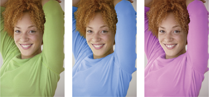
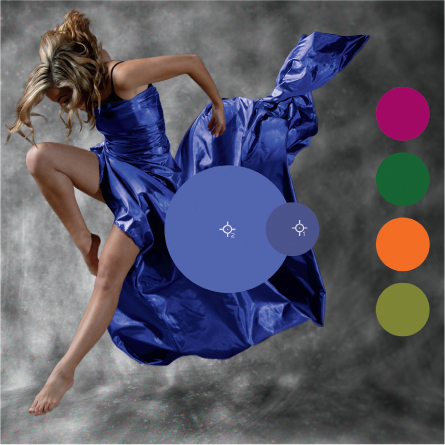
For this example, I selected this teen’s sweater using the Hue/Saturation method from the “Selections & Masking” chapter, and then used that selection to create a mask for a Solid Color fill layer. Both versions use Color blending mode.
This method is quicker and more flexible than painting on a new, blank layer in terms of changing colors, but painting is more flexible when you need multiple colors, additional blending, or more expression, such as variations in stroke directions, textures, et cetera.
Of course, some situations will require more work, especially when dramatic changes are required. Before we get there, let’s take a moment to consider an unusual (and admittedly extreme) result where Color blending mode appears to fail in spectacular fashion.
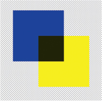
To demonstrate, I added a yellow square on its own layer over a blue one and set the yellow layer’s blending mode to Color.
Recall from “How Photoshop ‘Sees’ Your Images” that Photoshop uses a visual perception model in showing you RGB colors. In the previous example, RGB Blue has a luminosity value of about 28, while the RGB Yellow luminosity is closer to 220. So the yellow hue doesn’t show up well over such low luminosity. What we end up with is an undesirable dark yellow (RGB: 32, 32, 0). To recover the apparent brightness in yellow, we have to increase the luminosity of the underlying blue layer.
Try it out for yourself. In a new document with a transparent background, add a blank layer and create an RGB Blue (RGB: 0, 0, 255) square, then add another layer above and create an overlapping RGB Yellow (RGB: 255, 255, 0) square. Change the yellow layer’s blending mode to Color to get the results above.
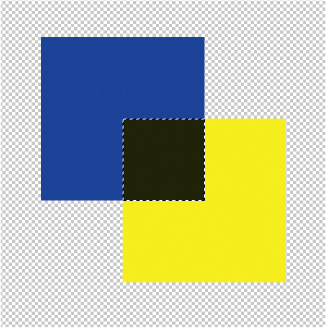
Starting from a blank layer gives you the opportunity to make an easy selection. Command-click (macOS)/Ctrl-click (Windows) the blue square’s layer thumbnail, then use a Boolean Intersection (Shift+Cmd-click/Alt+Shift+Ctrl-click) with the yellow layer’s thumbnail. This creates a selection of only where the two regions overlap.
With the selection still active, add a Hue/Saturation adjustment layer between the two color layers; the active selection becomes a mask for the layer.
Drag the Lightness slider to the right almost all the way (between +85 and +90) and watch the yellow come back to the selection area, as if there were no blending mode active at all.

This little experimental diversion illustrates the utility of the next technique, and should drive home the idea that sometimes you need to apply a little “preconditioning” to get the effect you want. As a general rule, I like to desaturate the target area whenever possible, which gives me a little more latitude in using blending modes and also immediately reveals such issues as the low luminosity value of the blue square above. Desaturating to start with sets the luminosity range you’re going to blend with.
Begin by creating a mask to limit the effect to only your intended color target area. I recommend a solid mask here rather than the more usual “proportional” mask that includes shading and so on (see the sidebar “Proportional Masks”). Replacing (or recoloring) the entire subject means we want both shadows and highlights to be affected. If we wanted to simply add some color splashes to represent gelled lights, or perhaps a faux duotone effect, then the proportional, shaded mask would be most appropriate. By using a solid mask, the replacement color will apply to all regions, and we can use some of our prior tricks and techniques to vary the effect for realism. Save your mask to an alpha channel for easy use later on.
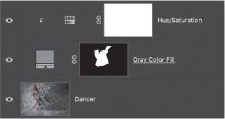
You have several options to desaturate your target area; the choice really comes down to preference. An easy method is to load your alpha channel as a selection, then create a Hue/Saturation adjustment layer and drag the Saturation slider all the way to −100. This approach allows you to vary the amount of desaturation, which can be used for graded effects where the replacement color is blended with the original color. The method I use most often is to apply the selected mask to a Solid Color fill layer, fill with 50% gray, and change the blending mode to Luminosity.
Once your desaturation layer is in place, add a Hue/Saturation adjustment layer and clip it to your desaturation layer (which I called Gray Color Fill). Clipping the Hue/Saturation adjustment allows it to affect only the output of the desaturation layer, which is already masked. This way, you’re taking advantage of work you’ve already done and minimized duplication of masks.
With the layers ready to go, simply check the Colorize box and start moving the Hue slider. It should become immediately apparent that you can achieve quite a wide range of colors this way, and increasing Saturation and Lightness opens up more possibilities. But there’s always room for improvement, right?
Tricky replacements or creating a wide variety of results requires more finesse. Knowing that Hue/Saturation is a good foundation, let’s build on that. Add a Color Balance layer clipped to the Hue/Saturation adjustment. Color Balance will give you fine control and allows for independent changes to shadows, mids, and highs. Think of it as a surgical color adjustment.
For the final touch in this particular method, place a Curves adjustment layer just below the Hue/Saturation layer (you may have to clip all the adjustment layers again). This controls the contrast going into the color replacement, and is important for maintaining realism with some of the potential color changes. The exact adjustment depends on both the starting material and the color applied. A general rule of thumb is that darker (in terms of luminosity, not hue) and heavily saturated colors tend to require contrast reduction, while lighter, less saturated colors need a little contrast boost. Because each fabric behaves a little differently, you will need to evaluate what looks good to your eye.
At this point, everything works as it should: The desaturation layer provides the foundation and bounds the effects with a mask. Additional adjustment layers refine the contrast and apply the color replacement effect. But in the interest of improving the process for repeatability and flexibility, you can instead group the adjustment layers and copy the mask to the group folder (Hold Opt/Alt and drag the mask from the desaturation layer to the group folder).


The reason for organizing into a group is two-fold: First, it lets you use one mask for everything in the group itself; second, it makes things much easier to duplicate for additional color changes. If you need to show several variations, just duplicate the group and create a new color. (Remember to name your groups appropriately!)
Tip
Placing everything into a group makes it easy to create a Library item from the stack. Duplicate the group and name it Color Replacement, then reset all the adjustments to their defaults and remove the layer mask. Next, open the Libraries panel and drag your group over. I have a custom library specifically for adjustment layer groups that I use frequently.
Specific Color Targets
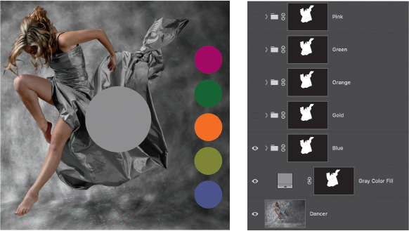
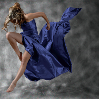
Let’s look at the stack in action to create a range of color variations on this dancer’s outfit.
I have chosen five different color samples (the Swatches layer) that will be used on the silver fabric. These are on a separate layer at the top of the stack so they can be sampled without any accidental interference from the adjustment layers. Before making any changes to the color replacement layers, I made duplicates of the Color Group and named each group for a color sample.
There are a few different ways to proceed, so I’m going to share the method that works for me with my slight colorblindness. Using this approach, I can almost entirely rely on numbers to work quickly and to make up for deficiencies in my eyesight. It will sound a little complicated at first, but stick with it!

To recap, the layer stack consists of my Color Group, a masked desaturation layer, and my color samples layer. The color samples in this case are meant to be targets for a 50% (neutral) gray sample, so that adjusting the Color Group causes the gray reference sample to become the same color as the sample.
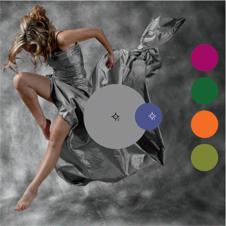
Add the 50% gray reference sample (as a large dot) to a layer by itself, above the desaturation layer but below the Color Group. Place it within the mask area so that the Color Group affects it. Drag the Swatches layer to the reference bar’s location so that the color sample you want to start with overlaps the reference bar a little. Alternatively, sample the color you want to use and paint a dot on a blank layer. This makes it easier to compare visually.
Once the layers are all in place, you need to do some workspace setup. Open the Info panel (Window > Info) and make sure you can see it easily while making adjustments. I like to place it near the Properties panel, which is where you’ll make changes to the Hue/Saturation layer. Open the Info panel menu (in the upper-right corner), and choose Panel Options. Ensure that Always Show Composite Color Values is selected. This will make the Color Sampler values persistent so you don’t have to memorize anything while making adjustments.

Back in the main document, select the Color Sampler tool. Click the color sample you want to match (it should be aligned with the gray reference bar) to place the first sample. Click again the gray bar to set the second sample. Notice the Info display now shows you the color from each sample as #1 and #2. They’re probably displaying RGB values at the moment, but the Hue/Saturation adjustment reads out in HSL. Next to each sample readout, open the menu (by the Eyedropper icon) to choose HSB Color. There is no HSL option, and Lightness is not the same as Brightness, but we can live with it. For the moment, look at the Info panel and note that the #2 sample reads 0 for Hue, 0 for Saturation, and 50% for Brightness.
Now you are finally ready to get your colors matched up! Select the Hue/Saturation adjustment layer, and check that the Colorize option is selected. Using the #1 sample readout from the Info panel, enter the Hue and Saturation values into the appropriate Hue/Saturation fields (leave Lightness alone for now). Check out the values for the #2 sample in the Info panel. They should have changed, including the Brightness value. However, they may not match the values of the #1 dropper, and the reference bar is not likely to exactly match the target color. Not yet, anyway.
That’s okay, because the goal is to get close enough to finish with other, more precise tools. From here, the trick is to adjust the sliders so that the Color Sample #2 display begins to match the #1 values. Start with the Lightness slider, watching the Info panel display instead of the values in its own dialog box. Compare the #2 Color Sample Brightness value with that of the #1 sample, and drag the Hue/Saturation Lightness slider in the direction of the needed change.
Dialing in the results requires a very technical approach referred to as “twiddling the knobs.” Except, replace “knobs” with “sliders” and you get the idea. Adjust the sliders in the Hue/Saturation property box while watching the values in the Info panel. It’s likely that you won’t be able to dial in the perfect values, because most adjustments to one slider result in some wobble in the other values.
When you feel you are as close as you can get, or you get tired of twiddling the knobs, open the Curves adjustment and make some visual changes if necessary. For this deep blue color, I wanted more shine, so I increased the contrast a tiny bit to bring up the highlights. Adjusting the Curve by keeping the line passing through the middle of the Curves graph helps keep the reference color from shifting, but it still may drift a little.

The final pieces are to use Color Balance for any leftover details, but also to manipulate the highlights and shadows independently. Some materials will look more natural if the highlights are slightly shifted or give a hint of reflection. Although this can move your target value, it can add more realism to the piece. In this example, I gave the Highlights a little extra yellow, which required more adjustments to other regions, including going back to the Hue/Saturation layer.

When using this approach, you’ll need to be patient and probably go through a few iterations on each control to get precisely the right match. After a few attempts, it gets a lot easier, but it’s not unusual to get a perfect match to the gray reference block and still need to make some changes for sake of aesthetics. The point here is that the amount of precision is entirely up to you; while you can get an exact conversion, it may not be pleasing to the eye.
Moving to the next target color, simply turn off the Color Group, move the Swatches layer so the chosen color is again next to the 50% gray reference block, and repeat the above process.
In the “Color Matching” section coming up, I will describe an alternate method. And after all of this, you may be wondering: Why not simply use a Solid Color fill layer for each of the sample colors? The short answer is that you should certainly try it out. It’s the fastest way to change colors on an object or in an image. Having multiple approaches gives you far more flexibility, though. There are plenty of situations where you will want options, such as sitting with a client who needs to see some variations. Trying to replace Solid Color fill layers takes only a couple of steps, but using the Hue slider you can see changes on the fly much more easily.
Remove Color Cast
A color cast generally is present when too much of a dominant color appears across an entire image. This can happen with poor color balance settings as a result of an odd light source or reflection, as well as due to aging of photographic print substrates. Fortunately, in the digital world we can take advantage of the additive nature of color and light to easily remove color cast.
The trick is to add more of the offending color’s inverse. That is, we want to neutralize the offending color by adding a little of the opposite color. It’s a great technique for correcting special environmental pictures, such as under water scenes, “mood lighting” in a restaurant, or aerial haze (that overall blue cast to landscape pictures as features get further away from the camera).
There are a handful of approaches you can take to solving this issue. The first one involves addressing an overall cast that affects an entire image (or major portions, such as you’ll see demonstrated shortly). It’s meant to be a global adjustment that can be applied quickly with reasonably good results, but it may not give you everything you need, so don’t stop if just the one technique isn’t sufficient.
The second approach involves a much more detailed view of specific areas, such as shadows, midtones, and highlights, but it relies on the same principle of adding the inverted color. It can be even more focused on specific problem areas, as might occur with reflections from solid surfaces.
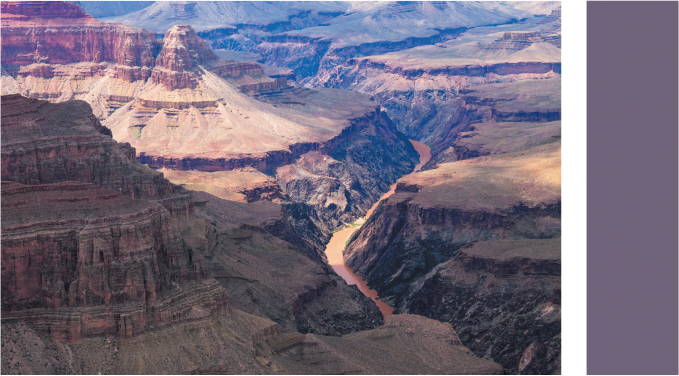
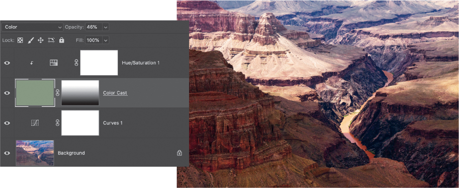
Start by duplicating the image layer and running an Average Blur filter on it (Filter > Blur > Average). You should get a solid color that represents the overall dominant cast in your image. Name this layer Color Cast. Invert the color itself by pressing Cmd/Ctrl+I with the layer selected. That is the complementary color that you’ll add to neutralize the cast.
On the Color Cast layer, set the blending mode to Color, and reduce the layer opacity. You’ll have to adjust for the relative change in brightness between the cast and correction colors. The exact opacity value will be different for every image. If the effect is still too strong, try changing to the Hue blending mode. For the canyon image, I used 50% opacity because there is such a strong cast. Quite often you’ll find that very low values are sufficient, typically around 10% to 20%. In this case, I want to remove only the cast associated with distance, so a simple gradient on the mask allows the correction to be applied only to the top half of the photo.

Sometimes the color correction is just not enough, though. This specific landscape example is still not quite punchy, so let’s add a couple of adjustment layers. Below the Color Cast layer, add a Curves adjustment layer and boost the contrast with a basic S curve. After that, add a Hue/Saturation layer above the Color Cast layer, and clip them. Remember that the Blur > Average command literally took the average value of every pixel in the image, which may not be a perfect representation of what you need to manage. Because the Color Cast layer is already at low opacity, the clipped Hue/Saturation layer can be moved quite dramatically with minimal effect; here, I’ve moved the Hue slider to −68, and the Saturation slider to +65.
Some extreme cases require a little more boost. In this nighttime shot, there is very little useful color information along with large areas of black, so using a simple, averaged color fill layer is insufficient; the image produced is dull and mostly monotone. To deal with images like this, use a duplicate of the Color Cast layer set to Color Burn blending mode. Add and adjust the Color Cast layer as well as possible first, then duplicate that layer and move it below the Color Cast layer and change to Color Burn mode. In some cases, it may not be necessary to lower the opacity of the latter at all. Typically, however, this will result in a much darker image so once you deal with the color, move on to other contrast and detail techniques.

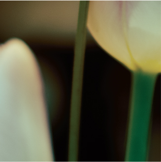
If you find that you only need the color cast correction applied to shadows or highlights, double click the Color Cast layer to open the Layer Style dialog box and in the Blend If section adjust the This Layer sliders to control blending in the highlights or shadows. Hold Option/Alt while dragging part of a slider to split it for a smoother transition. In this image of tulips, the two color correction layers (Color Cast and Color Burn) were grouped, and then the group was masked. I applied the mask selectively to the flowers and partially to the background as a creative choice to visually isolate the tulips.

You can apply localized (or more targeted) corrections by first selecting problem areas and copying the selection to a new layer, then running the Average Blur filter. This will create an area of solid color on the new layer; combining a few different selections on the same layer gives you a kind of palette of correction colors to work with. The selection matters so you get a good starting point to appropriately apply your color corrections.
Each time you make a copy and blur it, you’ll have to select the image layer again—otherwise you will be making your selections from the newly copied layer rather than from your photo.
To adjust color casts in shadows, try using the Magic Wand tool set to a fairly low Tolerance (below 16) and deselecting Contiguous in the Options bar (this allows the Magic Wand to select all similar values across the entire image). Also be sure to read “Gradient Map Luminosity Selection” in the “Selections & Masking” chapter for another quick way to isolate problem areas.
Once you have a reasonable selection of the areas that need correction, press Cmd/Ctrl+J to copy the selection to a new layer. Now run the rest of the basic steps above: Average Blur, invert, lower opacity. Note that this technique does not fill the entire layer, and you may find that you need to apply a little Gaussian blur to the edges of the filled region to avoid some odd or harsh transitions. Other kinds of color issues should be dealt with using painting methods. For portraits, for example, check out the “Frequency Separation” section in Part III, “Project Examples,” as well as the previous “Color Replacement” section.
It’s important to keep in mind that the goal of this particular correction is to obtain a somewhat neutral result that you can build on with later adjustments. It’s not meant to give you a final product, just to scrape off the majority of a large color problem in your photo. Once you have a good starting point, consider making a stamped copy of the result (see “The Claw” in the “Useful Information” chapter in Part I) to do any detail corrections such as healing or clone stamping. To prepare images for compositing, use the Color Matching technique (next), or apply a Color Grading method to get your pieces in a more uniform state.
Color Matching
Lifting a color scheme from a set of images is a great way to try out various looks in other images. It can be challenging to get good results without a lot of work, though. Fortunately, there is a quick method that lets you use virtually any starting image you like, whether a photo, a painting, or an illustration.

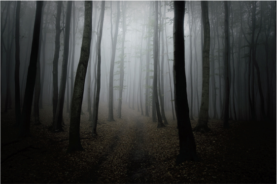
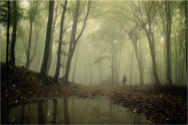
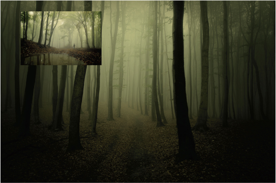
Let’s give this gray forest the green tint from this processed image:
The first thing to do is to place, paste, or drag the green version to the target document that you want to change. The source image can be low resolution, or you can resize it. You just need to be able to see the brightest and darkest regions.
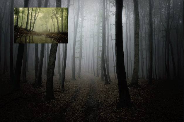
This trick works best with images that have similar dynamic and tonal range. In this case, the lighting is pretty consistent between the two, so it’s a good bet that the result will make the two different images appear to be shot and processed as part of the same series.
Add a Curves adjustment layer between the source and target images.
From here, you need to pay attention to one small detail: the adjustment layer thumbnail. By default, the mask of the adjustment layer is selected, which means the sampling step you are about to do will attempt to sample from the blank mask. Those results are not very impressive. Ensure the actual adjustment layer icon itself is selected, then hold down Opt/Alt and click the Auto button in the Properties panel. This opens the Auto Color Correction Options dialog box.
From the dialog box, select the Find Dark & Light Colors option. This enables the Color Picker section under Target Colors & Clipping. Move the dialog box so you can see the source image, then click the Shadows swatch. In the source image, click the darkest region you can find. It doesn’t have to be black, and in most cases will be more interesting if it isn’t. Finish out the Midtones and Highlights the same way (if Snap Neutral Midtones is not selected, do so at this time). Your goal is to select representative colors that you want in your photo, so use some discretion in making your choices. Close the dialog box when you’re done, and click No when Photoshop asks if you want to save the new target colors as defaults.
Depending on your selection prowess, you should have a reasonably good match between the two photos. I find I usually need a little tweak of the main RGB curve, or some other finishing touches, but this is a great time saver.
Note
If your eyedropper isn’t picking up colors from your source image, make certain the adjustment layer’s icon is selected and not the mask. Also be sure to place the source image above the curves layer so it doesn’t get adjusted along with the target.
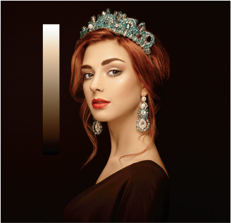
Applying this technique to portraits simply means stacking up a few things you already know how to do, including masking and blending. In this case, I want to use the palette from Luini and Solario’s Saint Mary Magdalene (shown here under Creative Commons Zero license from The Walters Art Museum). Rather than sampling from the entire image, I am going to constrain the effects to skin tones.
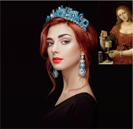
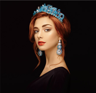
Because the effect will be limited to the model’s skin only, start with a quick selection that excludes the jewels, dress, and background but retains her hair. With the selection active, Photoshop will automatically create a mask when you add a Curves adjustment layer. Following the same technique as earlier and masking out the eyes gives an odd, unnatural result.
Blending modes to the rescue! Choose Color blending mode for the Curves layer, and things settle right down.

What if you want to keep the settings for other portraits? Because you are making selections from a specific source, it may be difficult to reproduce exactly the same values, so there are a handful of ways to deal with this.
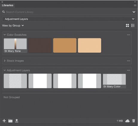
The first is simply to drag the Curves adjustment to your Libraries panel and save it directly. This is probably the quickest solution, and it will preserve any additional changes you’ve made to the Curves.
The next approach is to temporarily include some gray reference values in your image below the Curves layer. These can be color squares or a smooth gradient, so long as the reference values are on a layer by themselves. I tend to prefer a gradient because it can be difficult to gauge just exactly how a particular tone will translate to a solid color and a smooth gradient allows me to sample nearby tones easily. Once you have used the Auto Color Correction Options dialog box to make the color match adjustment, the grayscale gradient will take on the sampled colors. You can save the new color gradient layer to your Library by stamping a merged copy of your photo to a new layer, then selecting the gradient (Cmd/Ctrl-click the gradient layer thumbnail) and copying that selection to another new layer. Drag the new colored gradient to your library. This gives you a continuous tone sample. When you’ve saved the gradient, you can delete those temporary layers.
One method that is overlooked quite a bit is saving colors directly from the Color Picker box to a library. Load a sample as the Foreground color by selecting it with the Eyedropper tool, then with the Libraries panel open to your project library, click the Add Content button at the bottom and choose Foreground Color. Repeat for other colors you want to save. Once the samples are in your library, you can then use them to create color samples in other documents.
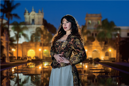
Using curves is a quick way to transfer a palette or theme from one work to another, but it doesn’t work as well for matching tones in composite work. For that, we need a little more control and some help with visualization. Here’s a composited image where the model is much cooler than the background.
Although we could jump in immediately with standard color correction techniques, it sometimes gets difficult to see subtle changes. Using a little blending mode and adjustment layer magic, we can highlight the differences and give our eyes a break. At the top of the layer stack, add a 50% gray layer set to Luminosity blending mode. This reveals the color without brightness changes. Then, add a Levels adjustment layer above the fill layer, and set the black and white points close to the middle to enhance contrast. Don’t move the midpoint. There will be a significant amount of artifacts visible because of the extreme adjustment. All you need to focus on is the actual color variations.
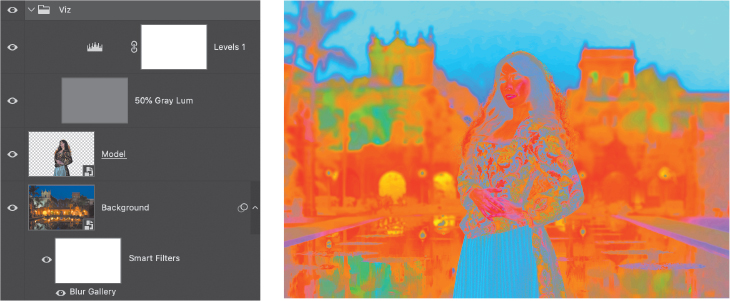
Group those two helper layers together, and name the group Viz. This way you can turn it on and off easily. For this image, use a Selective Color adjustment clipped to the model layer. This ensures any changes are restricted only to the model. Also choose the Absolute option rather than Relative.
Selective Color behaves like an ink mixing tool. For each of the colors represented in its menu, there are sliders that allow you to adjust the ratio of pigments that contribute using the Cyan, Magenta, Yellow, and Black sliders (the standard colors that you would find in a typical printer). Before you start fiddling with the sliders, take a look at the difference in colors between the model and background.
In particular, darks and shadows in the model photo are dramatically more cyan than the middle and foreground darks. There is also a hint of cyan and blue in the skin highlights. The sky is, of course, blue and cyan, but the majority of available light is coming from artificial sources and is very warm, mostly magenta and yellow in this view. I typically recommend starting with the Neutrals, but in this case the shadows are really affected by the color cast so start by choosing Blacks from the Colors menu.
For me, this is an iterative process, meaning I tend to go back and forth through the Neutral, Black, and White adjustments a few times. While we are not adjusting brightness here, it does help to compare areas of similar value when matching tone. Because her dress and hair have large dark areas, we’ll compare these to the shadow areas in the middle of the background. You should not be attempting precise tonal matching so much as aiming for “reasonably close.” Quite often this color matching step is just part of the path, so you’ll have time for dodging and burning or additional overall color work later on.
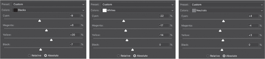
With the Blacks in the “close enough” region, go after the Whites next to knock down the highlights and remove a little of the cyan. Finally, the Neutrals need just a little reduction across the board. What you want is for the visualization to look like things are at least more balanced, not perfectly matched.

It is important to toggle the Viz layer while you are working to ensure you’re not pushing things too far or missing the key values. You can always reduce the opacity of the Selective Color layer, too. Another option is to use the Color Balance adjustment layer instead of Selective Color, which may be faster in some situations, although it gives you slightly less fine control. On the other hand, Color Balance is better at preserving brightness, and a little more intuitive because it shows you the complementary colors on the same slider—depending on how you think about color, this may make more sense to you.

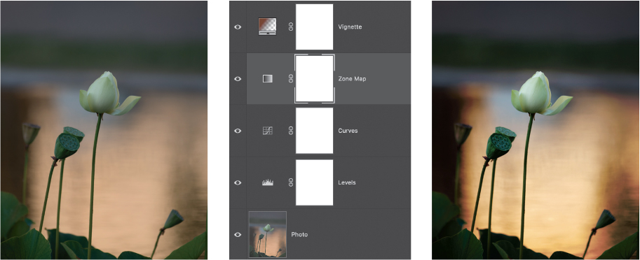
Gradient Zone Control
Way back in “Gradient Map Luminosity Selection,” you learned how to use Gradient Maps to carve out tonal ranges visually with ease. Using the same idea more broadly, you can also tweak those tonal ranges when using Luminosity blending mode, turning that basic technique into a zone control powerhouse. Let’s recap a bit.

Gradient Maps are kind of a cousin to color lookup tables (CLUTs), in that they selectively remap luminosity levels to specific colors, while CLUTs remap colors to colors. Knowing that each color you see on the Photoshop canvas is some combination of color channels and that each channel represents a specific color’s luminosity contribution, you can imagine how a given input brightness value gets transformed into a new value in a gradient.
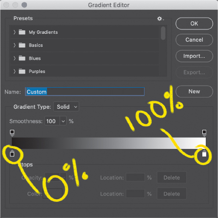
The bar (or ramp) in the Gradient Editor represents a visual map of output values based on composite luminosity (i.e., combining all three channels). Left is zero luminosity where no channels have any information (black), and the right is 100% luminosity where all channels are fully contributing (white). While you can’t see the input value, the Location text box lets you choose whole percentage values on the scale.
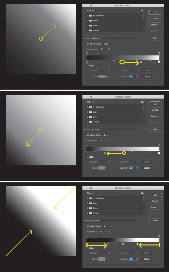
Each position along the gradient bar represents an absolute luminosity value, not the actual range of your image. Adding color stops tells Photoshop what you want that absolute luminosity value to translate to in terms of color and brightness. For example, placing a bright blue color stop at the 50% location will cause all selected areas of your image with 50% total luminosity to be converted to bright blue.

In this way, each color stop gets mapped to a discrete luminosity value. When mapped to the standard Black To White gradient preset, the result is a straight black-and-white conversion that is based on the composite luminosity. In images where there is no pure black or white, there is nothing for the linear gradient to convert at the extreme ends. In the simple case of a black-to-white gradient with one stop in the middle (set to 50% gray), a Gradient Map adjustment layer set to Luminosity blending mode then behaves like a levels adjustment: It drags the black and white points towards the middle, causing a kind of expansion of dynamic range.
Put in slightly different terms, moving a black slider to the right of its original position causes more shadows to become completely black, while moving a white slider to the left causes more highlights to become completely white.
In these three examples, I created a plain black-to-white gradient using the Gradient tool, and then applied the Gradient Map described above. Note the positions of the control points and how they remap the gray values in the plain gradient.
Unlike with a Levels adjustment, however, you can add more stops to the ramp. If you are careful about assigning gray values that match the percent Location values—that is, at the 25% Location stop you assign a 25% gray color—then you have fine control over translating specific ranges of luminosity input to specific output ranges.
This image demonstrates an approximation of Ansel Adams’ famous Zone system: Each stop represents the boundary of a gray value zone. The regions in between each stop can be compressed or expanded, changing the relationship of the zones to one another. In this way, you can get some seriously detailed control over the entire tonal range of an image. Incidentally, this method was shown to me by this book’s technical editor, Rocky Berlier. Kind of a genius trick, wouldn’t you say?

But the fun does not stop there! Setting the Gradient Map adjustment layer’s blending to Luminosity, you also gain tonal control over a color image. It’s like Levels on steroids hopped up on caffeine after a bowl of Super Frosted Sugar Bombs—but with a very, very steady hand.
The trick to setting this up is simply to start with the basic Black To White gradient (not the Foreground To Background preset!), then add stops along the bar. For each stop, assign the location value, then open the stop’s color panel and assign the B value in the HSB group (the values for H and S should be 0). The location percentage and the B value percentage should match this list:
0% 8% 17% 25% 33% 42% 50% 58% 67% 75% 83% 92% 100%
You’ll note that this makes 13 total stops, so you’ll have to add 11 stops between the end points. Because Photoshop doesn’t allow fractional values in this dialog, you have to make do with approximations. This particular set isn’t written in stone, but it does give you the most even distribution while hitting the 50% mark. It also ensures you have 12 individual zones of luminosity. You could easily just create 10% value stops and get most of the same control.
After you create this gradient, I highly recommend saving it as a preset in the Gradients menu. Give it a snappy name like Way Cool B&W Thing or Rocky’s Most Awesome Zone Gradient. Or maybe just Zone Control. Be boring. It’s okay. Now you can use it whenever you need to without recreating the entire sequence.
Applying this method is pretty straightforward, so let’s look at two examples. The first is a simple refinement for increased local contrast.
This wall is reasonably well exposed and balanced, so it just needs some minor range corrections. With a few tiny tweaks to the gradient color stops, I got some better definition in a few areas that were previously indistinct. The change is not dramatic, but having access to precise value ranges let me adjust overall contrast pretty easily. In this case, I used Luminosity blending mode with the Gradient Map to avoid applying any color. I simply wanted to adjust the balance of values in certain ranges.
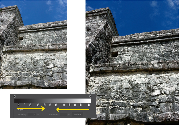
As you can see from the adjusted gradient map, not much has changed. I moved the black and white stops toward the middle slightly, separating the shadow detail just a little. Remember that moving a dark slider to the right of its original position causes a darkening, while dragging a light slider to the left adds luminosity. Having several stops allowed me to put boundaries on the adjustment with more local control than I could have gotten with Curves.
That being said, this technique really pairs well with other adjustments in a suite of corrections or enhancements. I tend to place this zone map at the end of other corrections.
This flower is quite a bit underexposed to keep detail in the petals, but that means the rest of the image is a little muddy. First, I added a Levels adjustment to compress the dynamic range, then I followed up with a slight overall contrast enhancement with Curves. Once that foundation was set, adding the Zone gradient map gave me fine control over the last bits of detail. I threw a vignette on top for good measure.
There are many ways to approach this zone system, but in the end my recommendation is to eyeball the results rather than going for precise numeric values for density and value. This gradient gives you control over the relationships between tonal values and ranges. The approach has many advantages, but first a warning: Getting too dramatic with the individual sliders often results in either very compressed tones or banding in what should be smooth areas of your image. Don’t forget that you are selectively compressing and expanding tonal ranges, not just changing discrete values.
In general, I like to use this gradient for making small contrast adjustments to separate details that are otherwise very close in tone, such as with clouds in a bright sky. It’s also a great way to shift tonality overall by nudging each of the sliders in the same direction.
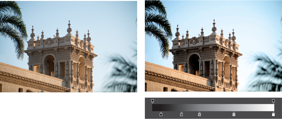
You’re not limited to the slider assignments listed above. Remember how all of this resembles levels on steroids? Using fewer stops allows you to make larger changes in different regions. This building from Balboa Park in San Diego just needed a little contrast boost in the mids, so I placed stops at the 25%, 50%, and 75% points (with corresponding gray values), and shifted the midtone stops to the left to make the overall image brighter.
In fact, it turns out that having a handful of presets is really useful. Although the examples above deal with the Luminosity blending mode, these same gradients can be used for effective and impactful black-and-white conversion. As you are about to see with the B&W Control Freak method and saw previously under Color Grading, Gradient Maps are effective at applying fine tonal variations to an image.
B&W Control Freak
This is one of my favorite black-and-white conversion techniques because it doesn’t rely on plug-ins or external software, and you can retain tons of control easily. It’s also pretty flexible in that you don’t have to use all of the elements. The trick is that this technique allows color tools to be used for grayscale conversion, putting you in charge of virtually every available element.
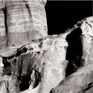
This northern New Mexico mesa is hiding some interesting detail in those narrow tonal ranges. A basic, direct conversion using a linear black-to-white gradient doesn’t do it justice, nor does the default conversion from adding a Black & White adjustment layer, shown here.

Fortunately, we know that Photoshop views color as a combination of channel luminosity values, so we can use that to control which colors get converted to which shade of gray. Early in the book, I explained that two different colors can map to the same gray value because they share the same luminosity, even while differing in hue and saturation. The secret sauce here is that we are going to manipulate hue and saturation as an input to the gray conversion.
The technique starts with a Black & White adjustment layer, where you set the major blocking or conversion from major colors to gray. Because the conversion process is entirely subject to your own creative vision, I’m going to talk more about the choices I made for this particular image, with almost no focus on actual values or settings. The point is to walk you through my thought process in creating the final piece, so you can use a similar approach in your work.
What struck me about this image is the variation in tone in an otherwise narrow color range. For processing, I wanted to try to draw out those variations along with the texture. That meant dropping the sky to black and really exploiting tiny differences in color. On the B&W adjustment layer, I dropped the Blue slider until the sky was almost completely gone, then nudged the Cyan slider down to finish it.
From there, it was just a matter of playing with the different sliders available to get the heavy lifting out of the way, what I called blocking above. I knew the sliders would not have the level of fidelity required to really separate things out, but they were useful for setting the major tonal regions and establishing the overall dynamic range.
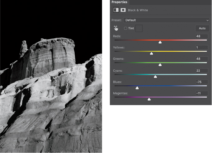
To adjust the exact hues going into the conversion, we need something with extremely fine color controls just below the Black & White adjustment layer. Selective Color provides this control by splitting out the primary and secondary colors into mixes of pigment: cyan, magenta, yellow, and black. When using Selective Color, I tend to start with the neutrals and work my way out to shadows and highlights.
The Yellow slider helped to enhance the contrast on the center spire’s horizontal layers, while Magenta brought up the shadows enough to reveal some nice detail.

Already this has become more dynamic with minimal slider moves. Tackling the whites next, the middle layer of sediment required a boost in Magenta with a little reduction in both Yellow and Cyan sliders. And finally, working on the blacks took even smaller adjustments. The shadow areas had a strong magenta cast to them, so for more refinement I chose Magenta from the menu and lowered the Yellow slider quite a bit. This brought more detail to the shadows without having to affect the other regions.
At this point, a conversion with the B&W Control Freak technique will be almost complete. But we have more options and room for improvement! Adding a Color Balance layer below the other two gives you a chance to make some global adjustments that affect how the different areas of color relate to each other. This treatment is very subtle, as it affects the balance between complementary colors: As you add to one, you are taking away from the other. Prior to this, we have been addressing individual colors, so this is a chance to manage the relationships with some precision.
Going on from here is mostly a matter of personal preference for detail, but this is the basic set of controls in place. Remember that the flow of information is upward through the layer stack, but we worked downward from the top. Think of each additional adjustment layer as refinement just like you would do if adding dodge and burn layers to the top of a portrait retouching file.

I finished off my mesa with a modified Sepia Gradient Map (in the Gradient Editor, Legacy Gradients > Photographic Toning > Sepia Midtones).
Speaking of adding to the top, we can certainly add some dodge and burn adjustments. In the “Dodge & Burn” chapter we looked at a few methods, but I’d like to add another version here: the Exposure adjustment layer. You can use any method you like, and to be honest I’m including this variation for the sake of proving the point that anything you can do in Photoshop can be done a number of different ways. Because I wanted only to add some shadows, I used only one Exposure layer with Exposure set to about −1.5 stops with a full black mask, and then manually painted a few shadows for contour.
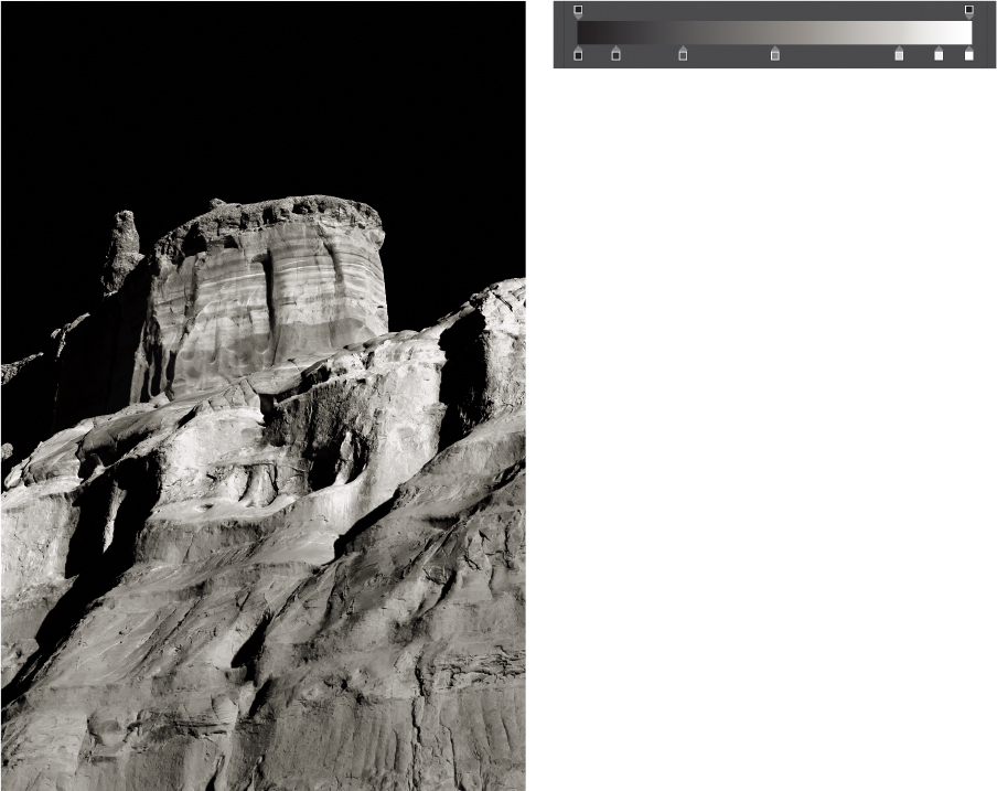
So the final layer stack includes five different adjustments, each of which is non-destructive and provides meaningful, responsive controls in slightly different ways. It starts with blocking out the major conversions from color to gray using a Black & White adjustment layer, then refines the contribution of colors to luminosity at the color component level with Selective Color. The relationship between colors is managed with a Color Balance layer. Finally, tonal adjustments are completed with a Gradient Map, and it’s all about the details with a dodge and burn layer that uses Exposure.
I have this stack with default settings as a group in my CC Library, so I can simply drag it out to a working document. There is no end to the possibility here. Even the gradient map gives you some ability to tweak a little more. I called this technique Control Freak for a reason!