
Effects

It’s time to take a little break from photo corrections and have some fun with textures and effects.
Playing around with effects is something I have done since my first forays into Photoshop, and I still enjoy the process. It really comes down to a directed kind of experimentation, and I find it also helps develop a sense of how filters behave. Although the filters in Photoshop are getting pretty long in the tooth and have some frustrating limitations, they still offer the creative artist a reasonable amount of flexibility.
In places, this chapter certainly wanders beyond the theme of blending modes and adjustment layers, but keep in mind that the purpose of this book is to enable deeper understanding of the tools. Seeing tools and techniques used in context helps solidify their place in larger workflows. Hopefully some of these example effects will spark your own creative explorations!

Orton Effect
The Orton effect has been around for quite some time in the digital imaging world, but traces back to the era of traditional darkroom techniques (and one Michael Orton), when implementing it required quite a bit of skill in manipulating film negatives. Fortunately, Photoshop allows us to achieve the effect fairly quickly and with lots of ability to control variations. The look itself provides a dreamy appearance, which is great for fantasy subjects and still lifes. It tends to work best with images that already have some fairly bright highlights and possibly even rays of light running through them. Dusty trails, cloudy landscapes, and shiny objects all look great with this effect, as do portraits (just be careful not to slide into the cheesiness of glamour portraits from the late ’80s).
Let’s start with an old-school version of the technique, which is what I learned nearly 20 years ago. Duplicate your photo layer and apply a large dose of Gaussian blur, perhaps 15–50 pixels depending on the actual pixel dimensions of your photo. You want to end up with regions of dark, midtones, and light in large enough patches, but not so much that the scene elements can no longer be identified. See the example for a rough guide to the initial results. This will result in a soft glow around your subject in later steps. When you’re happy with the blur, duplicate the blurred layer again. Name the top layer Blur 50% Desaturate Screen and the middle layer Blur 50% Multiply.

Turn off the Blur 50% Desaturate Screen layer for a moment, and set the Blur 50% Multiply layer’s blending mode to Multiply. This darkens everything up and creates a lot of muddy shadows, which we will take care of shortly. Back on the Blur 50% Desaturate Screen layer, make it visible and set its blending mode to Screen. Then desaturate the layer (press Shift+Command+U (macOS)/Shift+Ctrl+U (Windows) to desaturate). The initial result is kind of an indistinct mess, but remember that this is simply an intermediate step.
To get the final effect, dial down the opacity of each layer to about 50% to start, and if necessary use some Blend If magic from the “Useful Information” chapter in Part I to selectively blend shadows and highlights. The most typical result is a dreamy, soft glow around bright highlights and reflections.

The basic look is pretty easy to obtain, but can we improve on this? It turns out that if you are willing to give up the flexibility of having individual layers to tweak, you can get a different and possibly more pleasing result using just one duplicate layer and a dash of Apply Image.
Back in the original photo, make a duplicate as before, but this time choose Image > Apply Image and, in the Apply Image dialog box, set Blending to Linear Burn. Choose either Merged or Background for the source. We are using different blending modes for a different look—and to show that choice of blending mode is a little subjective. You should experiment with various looks!
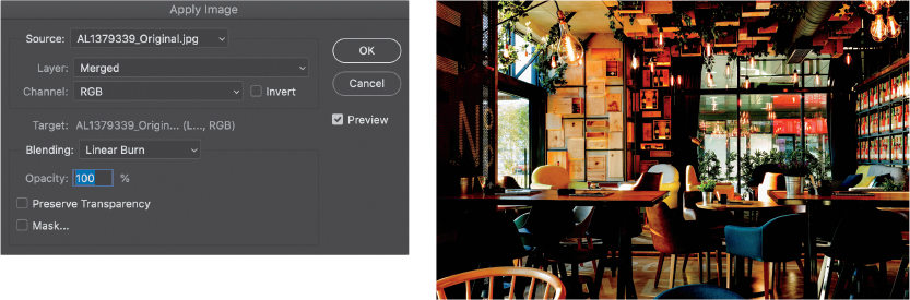
Now that we have baked in the darkening result of Linear Burn, add the large Gaussian blur and then change the layer blending mode to Screen. The result is not extreme like the first version, so there is less need for mitigating the look.

But let’s go a step further and recover some of the highlights. Add a layer mask to the blurred layer, and with the mask active, again choose Apply Image and Linear Burn. This time choose the Background layer, and check the Invert box. Doing so uses the image itself to create the mask so the details in the highlight regions are preserved, but the edges of the highlights still have a nice, soft glow.
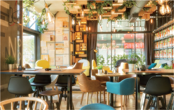
Take a moment and think about how this effect works. It starts with blending the original image with itself using Linear Burn; that burns down the overall tone, and then you blur the result. The blur acts to create the glow area, so the size of the blur matters to the end result’s impact. The final Screen blending acts to negate some of the Linear Burn result, but allows some of the blur to blend with highlight areas. In the end, the effect should be only slightly brighter than the original, owing to how Screen adds the highlight and light midtones together.
That suggests some interesting variations, such as changing the type of blur, adding adjustments along the way, and using different blending modes. Here’s an example using the same basic steps on a very different portrait image, but immediately after the Gaussian Blur, I used Levels (Cmd/Ctrl+L) to increase the contrast of the blur result. Instead of Screen, I used Soft Light, and I added a clipped Hue/Saturation layer to the result to reduce the saturation a little, between −25 and −50. Notice that the much darker areas show off the highlight and color tones.

You can also add textures by filtering immediately after the blur step. In this example, I ran the Clouds filter (Render > Clouds) after blurring, and then used the Fade command (Edit > Fade Clouds) with Soft Light chosen from the Mode menu in the Fade dialog box to blend the cloud diffusion back into the blurred result. The final step is simply setting the blending mode to Screen. Notice the hazy, textured glow around the white areas that almost look like mist. As my editor points out, this is an example of the “cheesy late-’80s” glow!

Naturally, you can try different blending mode combinations, as well. Rather than Linear Burn, try Multiply like in the original version. For something really funky, start with Hard Mix and a Distort filter, or a Path Blur filter. The point is that the effect gives rise to a technique that reaches beyond the original intent.
Rain and Atmosphere
I like to find ways to use Photoshop filters to organically generate various textures in a procedural manner. That simply means following a prescribed set of steps to build up a final effect, but taking advantage of randomness where possible. This turns out to be quite a lot of fun, and you can spend hours on end tweaking different settings and parameters to come up with various effects. More in context of this book, however, we can use the effort like an experiment to gain familiarity with digital tools and to exercise some problem-solving skills.
Generating rain, snow, and other atmospheric effects is a staple illustration trick. Rain in photographs consists of hazy streaks usually with no color and varying levels of brightness. Most tutorials start with adding noise to a black layer, adding some Motion Blur, then setting the layer blending mode to something like Screen, Soft Light, Linear Light, or Vivid Light.
Noise is pretty uniformly applied across the entire canvas, and consists of pixels that don’t scale to the size of features in the image. That means as your image gets higher in resolution, the “rain” drops get smaller. Plus, noise tends to end up looking like it’s distributed fairly uniformly. Let’s start experimenting by increasing the droplet size.
One approach is to use a Gaussian Blur to smear the noise together, and then find ways to make blobs of different sizes. This rarely seems to give satisfying results, though. Being a bit of a control freak, I like a more definite approach.

Enter the Crystallize filter (Filter > Pixelate > Crystallize). Crystallize comes with a single slider to control “cell” size, or size of the crystals. The filter generates little solid-color polygons by grouping together pixels within the cell-size radius, then averaging the RGB value and returning a single color. When started from a noise-filled layer, the quasi-random pixels create cells you can use as a basis for various precipitation effects. Plus, the cells have hard edges, which tends to look better when you later apply the Motion Blur filter.
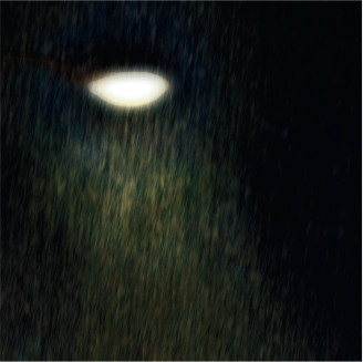
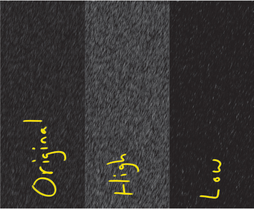
Here’s the result of filling a layer with solid black, adding about 20% Gaussian Monochromatic noise (Filter > Noise > Add Noise), and then using Crystallize set to 10 px setting (we’ll get to the recipe in just a moment, so don’t worry about following any steps just yet). The canvas size is about 2900 px wide by 3500 px tall.

Now that we have some control over the seeds for the raindrops, we can go ahead and apply the usual Motion Blur filter, using an angle of about −85 to produce rainfall that is not quite vertical, and a Distance value of 100 px.

There is a relationship between noise we generated and the results of the Crystallize filter. In particular, less noise results in darker crystals, as there are fewer white pixels contributing to each cell. Adding more noise to a black layer means adding more “not black” pixels (that is, there are more randomly generated pixels, so more of the original black layer content is obscured), and that results in brighter crystal cells with more chance of getting solid white.
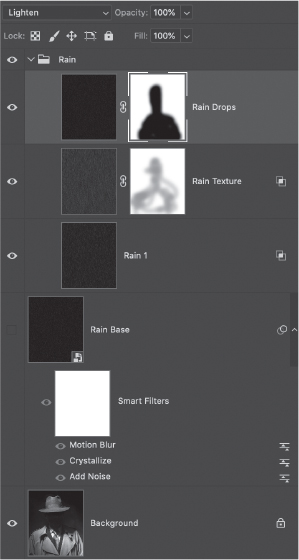
To achieve a good effect with depth, you need to generate several layers of rain. Rather than running through the filter process every time, start by filling a layer with solid black and then converting it to a Smart Object (Filter > Convert for Smart Filters). Now when you adjust the various filters, you can simply create a stamped copy of the variation.
On the Smart Object layer (name it Rain Base), add the following filters and settings in order:
Add Noise: Amount 20%, Gaussian, Monochromatic
Crystallize: Cell Size 10 px
Motion Blur: Angle −85°, Distance 100 px

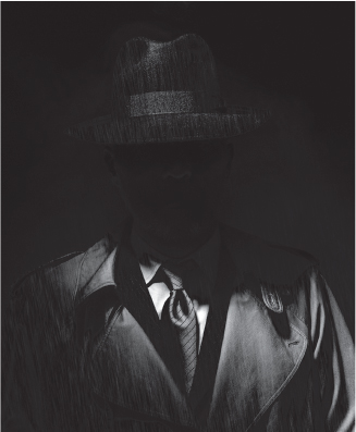
Use The Claw shortcut (Opt+Shift+Cmd+E/Alt+Shift+Ctrl+E) to create a stamped copy (like a snapshot) of the rendered rain on a black background. Turn off the Smart Object visibility, and set the copied layer to Screen (or other mode that suits your base image) blending mode. Name this Rain 1. The first round is just to get your bearings on how the effect looks with the subject, so feel free to explore various settings. My philosophical approach here is to start by creating a rain layer that looks good with the subject immediately, so it is typically a little more sparse.

At the moment, the rain itself looks good, but it isn’t really interacting with the subject. After exploring some of the other blending modes, I settled on Overlay, which in this case gave a really dramatic lighting result as well. This also took splitting the Black Underlying Layers in the Blend If area of the Layer Style dialog to bring back some of the shadow areas.
Note
A frequent concern with this effect is low contrast. Once it’s rendered, you can easily increase the contrast using a Levels adjustment applied directly to the layer. Press Cmd/Ctrl + L to bring up the Levels dialog box, and make necessary adjustments. This is purely subjective, but I suggest erring on the side of too bright because you can much more easily reduce the effect by lowering opacity or fill later on. Remember that applying an adjustment directly to a layer is destructive!
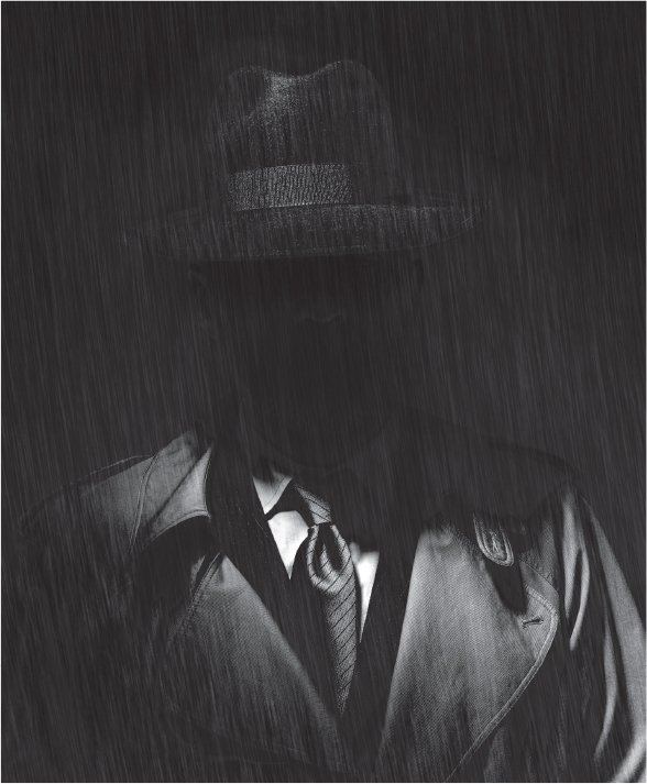
Now the hat and coat look wet from the rain. Turn off the Rain 1 layer, turn on the Rain Base Smart Object, and then adjust the filters to produce longer streaks. Add a little additional noise, slightly larger Crystallize setting, and longer motion blur (with a little extra tilt). Repeat the capture process to add your new rain, and call this layer Rain Texture.

The reason I’m not giving you specific settings here is because this effect is all about tweaking. If you don’t like the result, scrap the layer and synthesize something new. Think of the Rain Texture layer as the middle ground in your atmosphere, while the Rain 1 result is the foreground. Aim for something that will fill in the space and sell the idea that water is falling everywhere in the scene. For this middle texture, I used Linear Dodge (Add) blending mode with Fill set to 40%, and then applied a little masking in front of the subject’s face.
Here’s the current progress with both rain layers turned on.
In real life, rain that is further away will tend to cause less motion blur than rain that is close to the camera. It is common to see at least a few raindrops with less blur, so let’s add one more layer that sells this little detail. To get this effect, reduce the Motion Blur Distance setting to about half or less of the original blur, and cut the Noise Amount setting by half (to about 10%). Make a stamped copy, and call this one Rain Drops.
Set the Rain Drops layer to Lighten blending mode. If the rain is further away, it wouldn’t be in front of the subject, so apply a layer mask to prevent the effect from falling on the subject.

Group together the layers you generated from Rain Base, and name the group Rain.
Now, let’s explore some additional controls for this effect. It is easy to reduce the brightness of the rain by lowering layer opacity, but we can add another trick into the mix to adjust the apparent amount of rain, as well. Before making a stamped duplicate of the base effect, add a Levels adjustment layer above the Smart Object and clip it to the Smart Object. The adjustment layer gives you a way to change the contrast of the filtered Smart Object result, which in turn changes the apparent number of raindrops (or the “density” of rain). Start by adjusting the midpoint slider and observing the effect on the middle gray values. If additional contrast is needed, move the black or white point sliders towards the middle. Use this in addition to varying the amount of noise and the cell size in Crystallize.
Because you are using a Smart Object, you can preview the effect over the subject (and other rain layers) by setting the Smart Object blending mode to Screen. This trick gives you a chance to compare various settings before creating a snapshot layer. When you get a look you want to keep, set the Smart Object blending mode back to Normal before making your stamped copy. The Levels adjustment layer is clipped to the Smart Object, so it will no longer have an effect on the layer stack.
Creating multiple versions of atmospheric effects lets you create more depth in an image, so the Smart Object approach is really a great timesaver. For a rain scene with a large depth of field, you may want to create two or three different versions, changing up the motion blur direction and length, and maybe even the amount of noise or crystal size.
Here is a variation that tends more towards wet snow or sleet. There are four layers of precipitation here, with the far background becoming almost uniformly light gray, while big, wet chunks of snow are in the foreground.

As a final note for this technique, you can also use it to generate brushes for painting rain into a scene. This is really useful when you need to create splashes, for example, or want to only show a little rain here and there.
Stamped Portrait
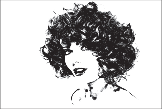
This effect came about as a result of trying to find a good use for the Threshold adjustment layer. It’s also an exercise in putting whatever tools you want to unusual uses. The secret to this technique is taking a minimalist approach to building up the starting image like a piece of graphic art rather than a photograph. Pay attention to composition and balance as you go, and how density of texture and line thickness impact the overall balance.

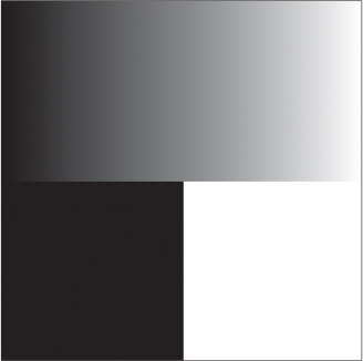
The Threshold adjustment layer evaluates the cumulative brightness of each channel and makes everything at that level or brighter into white, while everything else is solid black. Here’s what it looks like when Threshold is applied to a linear gradient. Moving the slider back and forth changes the cutoff (threshold) value. It’s easy to see why Adobe called it “threshold.” That’s pretty much all there is to this particular adjustment. For discussion on how Photoshop calculates the brightness, refer to the end of the section “How Photoshop ‘Sees’ Your Images” in Part I.
For the expressive portion of this effect, you’ll use various brushes to smear the pixels around a bit. This requires having some texture rather than solid areas, and the hard black/white transition of tiny pixels and edges is a great medium for blending. So you want to work towards texture as a kind of density. This helps preserve the illusion of depth, as well, and prevents having to deal with solid filled areas.
In order to get what we want out of Threshold, we need to feed it carefully by controlling what colors and values go into it. We are going to exploit our knowledge of how Photoshop converts color to luminosity values and place a few controls beneath the Threshold layer.
If you are using a photo that has lots of visual elements, first try to reduce visual clutter so you can more easily see how the Threshold technique works. You can do this by masking your photo layer, or by placing a white-filled layer above your photo and setting it to Screen blending, then paint with black on the white layer to reveal the subject.

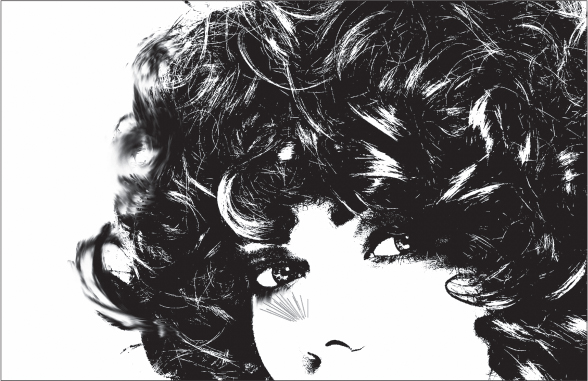
Place the Threshold adjustment layer above your photo and tweak the Threshold Level slider to get close to the result you want. If there is simply too much range to get a balance, focus on one element at a time (such as hair in this example) then add everything together before painting. This result is pretty good, but to refine it add a Black & White adjustment layer below the Threshold layer. Remember that this adjustment converts color to gray values, so you can modify the brightness of individual colors for Threshold.
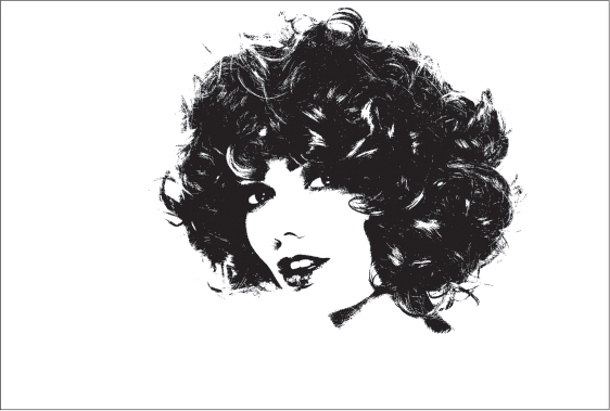
Let’s say I want even more control, and the color tools aren’t cutting it. We can add more adjustments below the Threshold and Black & White adjustment layers, in similar fashion to the Black & White Control Freak recipe from Part II. A more direct approach is to simply paint on an Overlay layer to control contrast exactly where we want it; add a layer below the Threshold layer and fill with 50% gray, then set to Overlay blending. This is one of the same approaches used for dodge and burn at the beginning of “Dodge & Burn” in Part II. Use a large, soft round brush set to about 10% flow and gently paint with black and white on the gray Overlay layer to choose the details you want preserved or obscured. I went for more texture in her hair and some detail in her eyes.

The only thing missing here is a hint of shoulder, but painting with Overlay in such a low-contrast area is kind of painful, so we need a cheat. With the Photo layer selected, choose Select > Subject. This loads up an outline selection that you can paint in on another layer with black.
Remember that you’re just setting yourself up to start a painting, so you can always add or subtract later on. Don’t worry too much about what you should or shouldn’t show at this stage. From here, you have a choice of using either the Smudge tool or Mixer Brush (or both—I won’t tell). When I first started using this technique, I preferred the Smudge tool for its simplicity. The more I worked with this effect, however, the more I began to prefer the options and flexibility of the Mixer Brush.
Once you have the starting point you want, create a merged flat copy at the top of the layer stack, then lock it so it doesn’t get changed. Name it Base, and then add a blank layer above that. This is where you’ll start painting.
Smudge Tool
Select the Smudge tool from the toolbar, and open the Brushes panel. Smudge works just like the Brush tool in that you can choose a brush tip and dynamic characteristics. I recommend choosing one of the bristle style brushes, especially the Flat Fan for faces because it has some wispy qualities that lend a more organic look to the process. To set up your brush, open the Brush Settings panel and select Brush Tip Shape from the list of options on the left side of the panel. The right side of the panel displays a number of brush tip presets; click the Flat Fan preset to select it.
In the options bar, set Strength to between 25% and 50% to start and ensure that Sample All Layers is selected. “Sample All Layers” is what will let you sample from what’s visible on the canvas and paint the smudged result to the blank layer, giving you a way to recover through erasing or masking. It also gives you a way to selectively turn on or adjust certain layers temporarily for more sampling control.
This technique is best used with a pressure sensitive stylus, such as a Wacom tablet.
On the blank layer, begin smudging. The amount of drag (how far digital paint is smudged) for each stroke depends on the Strength setting, so be sure to make judicious use of that control while working. This part is all about expression, so take some time to practice with various brushes and sizes. The Smudge tool is best suited for the first pass of blocking in areas you want to affect, but be warned that it can often result in blurry regions, so use it sparingly. Just get the digital ink roughly where you want it without obscuring details too much.
For more expression and a painter-like experience, add another blank layer and grab the Mixer Brush!
Mixer Brush Tool
I enjoy using the Flat Fan brush with a texture such as Raw Linen under the Artistic Brushes Canvas set. To try it, set up the Mixer Brush as follows:
Bristle brush: Wet 100%, Load 1%, Mix 100%, Flow 100%
Load the brush after each stroke: Not selected
Clean the brush after each stroke: Selected
Sample All Layers: Selected (if you are painting to a new layer)
Brush Smoothing: 10% (optional)

The Mixer Brush will take advantage of both the black and white pixels, so remember that you can also blend the white pixels into black areas to help with detail. As you work, consider adding new blank layers so you have a set of snapshots to work with. Sometimes you may need to experiment with a few different techniques to get what you want, and it can be helpful to have a range for comparison.
Using various brushes, you can tease out all kinds of strokes and effects. While I prefer the bristle brushes for smudging, try experimenting with regular brushes meant for hair or smoke. The Flat Round Mixer Brush is great for dense, solid details, while the Fan with something like a canvas texture can add a lot of character where there are few strokes to work with.
Remember, this effect is all about expressiveness, so tweak the technique as necessary. For example, you can always go back and add dabs of paint with a regular brush, then blend that in with the Smudge or Mixer Brush. I prefer a smooth look to most of the areas, with just a tiny bit of the original aliased grit or noise, so to get that in some areas, use the Sharpen tool to remove just a little of the edge softness here and there. Depending on what look you want, you could also take a look at the Rain recipe and add a little texture to your piece. The stark, inky look gives you a fantastic base for all kinds of additional elements.

This is just one of several ways to get this effect, but I enjoy this process of manual painting because it feels more involved and organic. Try taking it in crazy directions, or start with a different technique. This would pair nicely with the Dissolve Painting approach discussed next!
Dissolve Portrait
This effect was a lot of fun to develop as I had set myself a challenge to use the Dissolve blending mode, which most people tend to ignore. The Dissolve blending mode is quirky in that it uses a map of pixels on your canvas to determine opacity levels. Each time you start up Photoshop each pixel is assigned a specific value randomly. When you use the Dissolve blending mode and lower the opacity, Photoshop compares the opacity level to the value randomly assigned to each pixel. As the opacity level reaches that number, any pixel with that particular value becomes completely transparent.
But something different happens when using the Dissolve blending mode with brushes. In order for the blending mode to take effect, you need to use a brush that is not completely solid. Brushes that work best tend to have a soft edge and low flow. This allows the effect to be built up. However, unlike the layer-based blending mode, the tool-based blending mode is not assigned pixel values based on specific location on the canvas. Instead each pixel’s value is randomly generated as it is painted, which allows the effect to be built up in a manner similar to air-brushing.
This also means that brushing with the Dissolve blending mode can have a more random and scattered effect but it is still easily controlled. The newsprint or grainy airbrushed look relies on active selections from your image to keep things in order, as if you were painting by using a stencil (or if you have airbrushing experience, using frisket). There are many ways that you can select the different regions of your image, but I like to use automated approaches whenever possible. One great way to explore this effect is to simplify your portrait and use channels as selections. When you load the selections, they will automatically have shading built in.
This effect is best applied to images with minimal detail or where you can easily isolate key areas that you want to paint. Anything that you don’t want included in the final result can be masked out or deleted, or you can simply not paint those areas or features.

With your portrait layer loaded into Photoshop add a blank layer above the image layer. Now, select the Brush tool and load up a soft round brush that is relatively large. If you’re using a digitizing tablet such as a Wacom Intuos, be sure to set the pressure sensitivity for opacity but not size. In the options bar, set the brush blending mode to Dissolve and lower Opacity to around 30%.
Above the photo layer, add a layer filled with white (or a Solid Color fill layer set to white), then another blank layer above that. For the moment, turn off the white layer so you can see the background image.
Open the Channels panel, and select the Magic Wand tool from the Tools panel. In the options bar again, set Tolerance fairly low, such as 8 to 16, and deselect Contiguous. This will limit the total range that you select with the Magic Wand. Click one of the color channel thumbnails to make it visible, then click the canvas to load a narrow range of tones, such as middle values. I’ve chosen the Green channel and clicked just under the model’s hairline. Because the selection is based on density, you need to invert the selection (Select > Inverse) to paint into the areas you’ve chosen.

With the selection still active, click the Composite channel, and then return to the Layers panel to pick your starting color. For my example, I used black to start. Select a soft, round brush as described earlier and start painting gently on the top blank layer where the selection is active. You should begin to see some detail show up almost immediately. Because of the low Flow setting, you should be able to work back-and-forth as if you were coloring in the region. This is another way that you can keep control over the density of pixels painted on the canvas.
Remember that you do not have to fill in all of the selected areas. To include color in your images you have two major options: The first is to select your color and paint directly on the canvas; alternatively, add a new blank layer set to Color blending mode and paint over those regions with a regular brush. Remember that Color blending mode will not affect areas that are already solid black, so you may need to go back to your painted layer and use a very low flow and low opacity eraser to lighten those areas that you want to color.
Another thing to keep in mind is that because you are painting with actual pixels, the grain size is fixed. In order to get finer grains, start with a larger canvas (at least 3000 px × 3000 px). This will allow you to have much finer grains and much more variation in the apparent density, and you can always scale down as necessary.
If you want greater variation, instead of painting with pure black, paint with 50% gray. This will allow you to use dodge and burn layers, as well as apply one of the color grading methods outlined in other recipes.