The Monochrome Difference
Project Black Hole? Never heard of it.
One of the reasons purists often refer to black and white prints as “monochrome” is that it’s a much more precise term that also covers prints made in sepia and other tones. One of the advantages of working with monochromatic digital photographs is that the original image can come from many sources. Some digital cameras even have black and white or sepia modes for capturing images, but more often than not they actually capture these monochrome images in RGB mode. That’s right, it’s a color file without any color!
There is much more to black and white photography than simply an absence of color. Maybe we wouldn’t feel this way if the first photographs had been made in full color, but that didn’t happen, and like many photographers, I grew up admiring the works of W. Eugene Smith and other photojournalists who photographed people at work, play, or just being themselves. As a creative medium, traditionalists may call it “monochrome” and digital imagers may prefer “grayscale,” but it’s still black and white to me.
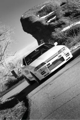
This Nissan Skyline was photographed in color while I was hanging out the window of my car (somebody else was driving) shooting with a Canon EOS 1D Mark II and a 28–105-mm lens. Exposure was 1/25 second at f/7.1 in Program mode. Because the car was white, the colorful surrounding took the spotlight away from the car. Converting the color file into monochrome puts the focus back on the car. © 2004 Joe Farace.
Black and white is a wonderful media for making portraits because the lack of color immediately simplifies the image, causing you to focus on the real subject of the photograph instead of their clothing or surroundings. Sometimes the nature of the portrait subject demands that the image be photographed in black and white. Arnold Newman’s portrait of composer Igor Stravinsky could never have been made in color and have the same impact it has as a monochrome image.
One reason that many publications print photographs in black and white is purely economical. It costs them less to produce their publication in black and white than to use color. This is especially true for small runs of brochures or newsletters produced by companies and non-profit organizations. There are also the trendy aspects associated with creating images in black and white. MTV, motion pictures, and fashion magazines periodically “rediscover” black and white as a way to reproduce images that are different from what’s currently being shown. Right now, many professional photographers are telling me that they’re seeing a higher than normal demand for black and white portraits than previously was the case. Individual and family portrait purchases like these are driven by these same trends.
In Camera
Many digital cameras have a black and white mode. Some, including those from Canon and Olympus, include the ability to add digital filters and toning modes along with their monochrome capabilities. Canon’s newest digital SLRs include a set of “Picture Styles,” including six presets that emulate different film characteristics (see “Picture Styles Extended”). Snapshot, for example, produces punchy, print-from-the-camera color; Portrait creates softer, more natural skin tones; and Landscape has vivid blues and greens along with increased sharpness. You can vary an image file’s contrast, color saturation, color tone, sharpness, and craft up to three additional user-defined styles. Then there’s Neutral, Faithful, and Monochrome. Monochrome can be further customized to emulate the color filters used with black and white films to darken skies for example; and you can add common tints like sepia and cyanotype.
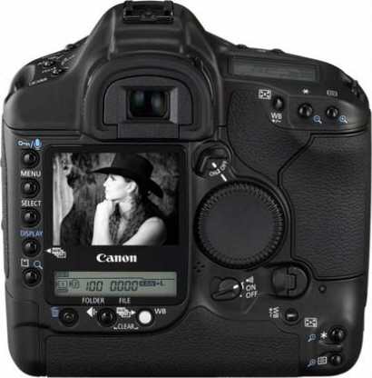
The Canon EOS 1D Mark II N includes a set of “Picture Styles” including six presets that emulate different film characteristics including monochrome. © 2006 Joe Farace.
|
Picture Styles Extended |
|
|
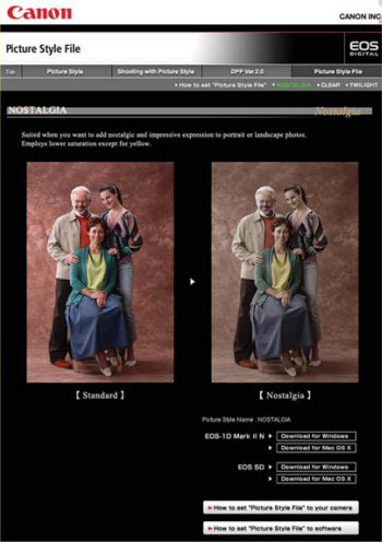
Picture Style replaces internal image processing previously controlled by setting “Parameters” and is also supported by Canon’s Digital Photo Professional software. The EOS 1D Mark II N, along with the EOS 5D and EOS 30D, have the ability to add Picture Styles and you can download new styles from Canon’s website (www.canon.co.jp/Imaging/picturestyle) Right now, three styles are available. Nostalgia |
produces desaturated colors, except yellow, and works great for portraits and landscapes. Clear is the digital equivalent of a UV or Haze filter, and is perfect for shooting images with a telephoto lens against a hazy sky. Twilight punches up the purples in a sunset image and produces saturated colors. |
The EOS 1D Mark II N also has the ability to add Picture Styles permitting even further in-camera creativity. Photo courtesy Canon USA.
Black and White with Color Filters
If you’re new to the world of traditional filters for black and white photography, here’s a quick primer: A yellow filter slightly darkens the sky, emphasizing clouds, and is primarily used for landscape photography; but when shooting in snow, it can produce brilliant, dynamic textures. An orange filter produces effects similar to the yellow filter, but skies are darker and clouds more defined. While useful for landscapes, it can also be used for higher contrast in architectural photography. An orange filter can be used in portraiture, especially under warm household light sources to produce smooth skin tones. The red filter produces dramatic landscapes. Skies turn almost black and contrast is maximized. In portraiture, freckles and blemishes can be eliminated with this filter. A green filter is useful for landscape photography as it lightens vegetation but doesn’t darken the sky as much as the red filter. Skin tones may also be more pleasing, but freckles and blemishes are more apparent.
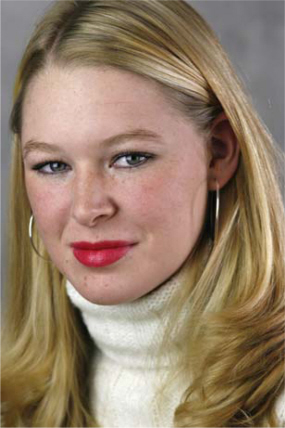
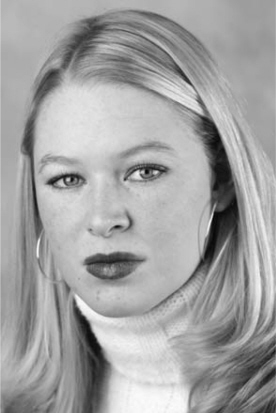
This color portrait of aspiring model Emily Blakely was made as a reference to show the effect of using digital filters in camera for direct monochrome capture with the EOS 1D Mark II N. For this shot, the camera was set in “Faithful” Picture Style. The lens used for this entire series of photographs was Canon’s EF 135mm f/2.8. Exposure was 1/100 second at f/6.3 in Shutter Priority mode at ISO 400. © 2005 Joe Farace.
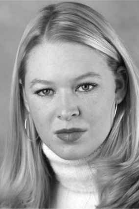
If you select “Monochrome” from the EOS 1D Mark II N’s Picture Styles menu, this is the result you achieve, but what happens when you add a digital filter? © 2005 Joe Farace.
The Green filter is usually my favorite filter for portraits because of the pleasing things it does for skin tones, but also maximizes Emily’s freckles, which is not a bad thing. There is no one-size-fits all approach to what filter works best. The text provides some guidelines, but experiment with the kind of pictures that you make to get the optimum results. © 2005 Joe Farace.
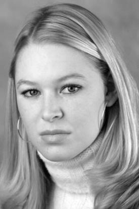
Emily’s freckles are minimized with the Red filter but it washes out her red lipstick. If you like this look, but want to punch up lip color in black and white with this filter, blue lipstick is the way to go. © 2005 Joe Farace.
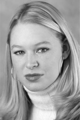
My first filter choice is Yellow, probably because that’s a general-purpose filter for outdoor photography, but it works well for this portrait of Emily because he’s a blond and makes her a little “blonder.” © 2005 Joe Farace.
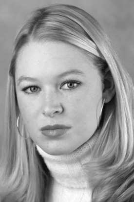
The Orange filter produces a softer look and smooth skin tones in portraiture, when photographed under warm household light sources. © 2005 Joe Farace.
While you could always use real color filters on your camera to achieve the same effects as cameras such as the EOS 1D Mark II N produce internally there are advantages to using digital filters: While most SLR’s in-camera metering systems automatically take “filter factors” (See “Filter Factor”) into consideration, you still have to look through and compose through a colored filter whose factor might range from three to five. Depending on how dark the filter is, it may not be that easy to see through. In addition, Canon’s digital solution is an easier one to live with because the exposure for no filter is identical to one with the dark red filter.
|
Filter Factors |
|
|
In the world of traditional photography, the light loss that caused by a filter’s absorption and color density is expressed as a filter factor. A 2X factor means the exposure has to be increased by one stop, 3X means one and |
one-half stops, etc. When using several filters at once, filter factors, aren’t added together but instead are multiplied, reducing depth of field or slowing shutter speeds. , |
In-Camera Color Effects
Monochrome images can be fun, but sometimes you might want to add some color—just not too much! That’s when Canon’s Mark II N’s (and other similar camera’s) digital toning modes come in handy. The camera lets you apply one of four different digital toning effects including Sepia, Blue, Purple, Green, and None. Digital filters and toning can even be applied together and since you get to see the results right away, you can decide if you like the effect and want to make any changes. There is no one-size-fits all approach to what toning effect works best. It depends on the subject itself, the original colors in the image (if you want to provide hints), and the mood you’re trying to achieve. When’s the last time you heard the words “mood” and “digital” in the same sentence? But that’s what the combination of monochrome filter and toning capabilities is all about. Not every photograph should be in color: sometimes a black and white or toned monochrome image tells a better story.
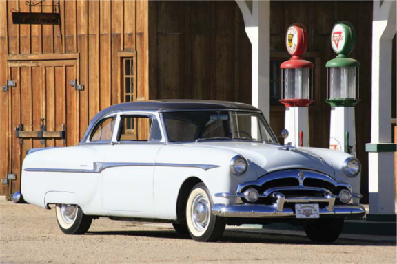
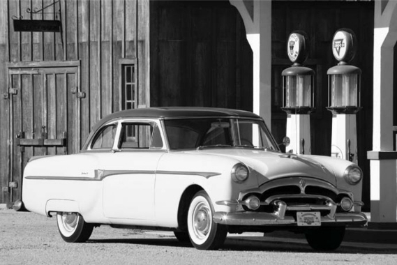
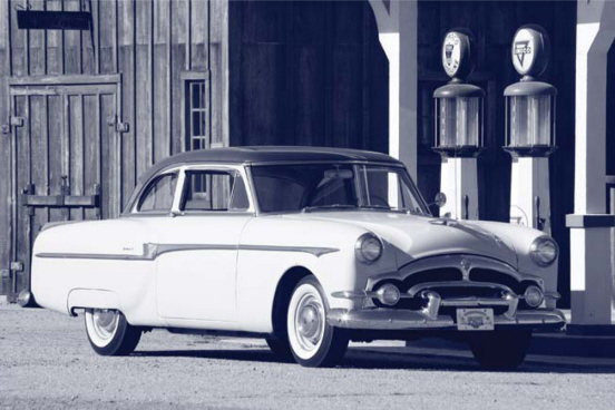
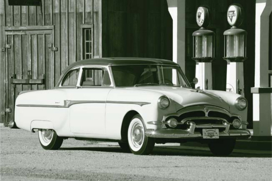
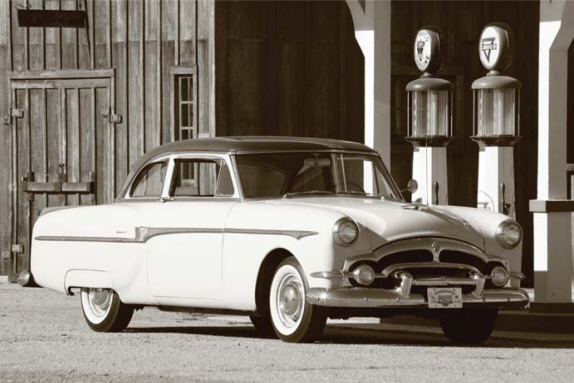
I photographed my 1953 Packard Clipper club sedan at the Adams County Historical Society’s outdoor museum using Canon’s EOS 1D Mark II N and a 70–300-mm IS zoom lens at 300mm. Exposure was 1/400 second at f/10 at ISO 200. © 2005 Joe Farace.
In Monochrome mode the image looks like it could have been a newspaper advertisement in the 1950s. © 2005 Joe Farace.
The Sepia toned example, like the use of digital color filters, does not change the exposure of the image and produces a wonderfully nostalgic effect. This exposure is identical to that of the fill color image and is, after all, still an RGB file. © 2005 Joe Farace.
Depending on the subject matter, the Blue toning effect would apply a wonderful cyanotype look to an old or pseudo old portrait. © 2005 Joe Farace.
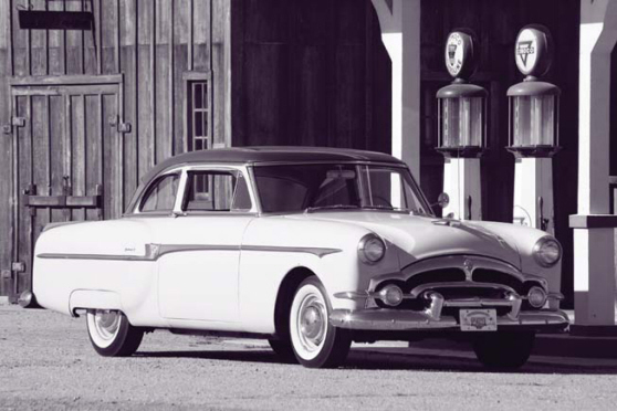
The biggest surprise I had was when looking at the Purple toned image; it was my favorite one in the series. The Purple tone produces a POP (Printing Out Paper) “proof” look of the 1940s that I found enjoyable to look at. © 2005 Joe Farace.
The Green tone effect may not be the best choice for this particular image but might be wonderful for some landscape photographs. As in any creative pursuit, make some tests, try different filters and toning combinations, and have some fun. © 2005 Joe Farace.
I Can do that in Photoshop!
You can always make these kinds of adjustments after the fact using Adobe Photoshop or your favorite digital imaging software, but I’d like to give you a few reasons why an in-camera approach may be better:
Aesthetics: Shooting directly in black and white impacts how you see while making the images and having the instant feedback made possible with digital cameras helps focus your vision. Sometimes too much color confuses the viewer—even you—and takes the focus away from the real subject of the photograph.
Workflow: There are many ways to use post-production software and Photoshop-compatible plug-ins to produce great-looking black and white images from color files, but not right now! If you want to make prints on-site using PictBridge-based printers or drop your memory cars off at your local digital minilab, capturing the file in black and white saves time.
Quality: The quality of Canon’s black and white conversion exceeds that of what’s built into Photoshop CS2, including using the Channel Mixer function. A Mark II N’s monochrome image looks like “real” black and white even though the file itself remains in RGB.
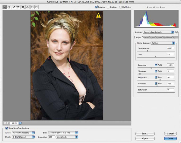
OK, I know what you’re thinking . . . what if you change your mind and wished you made that image in color? Some cameras, like the Mark II N, offers simultaneous color/monochrome capture, although it is sometimes disguised as RAW + JPEG (Joint Photographic Experts Group) capture. The Mark II has separate slots for CompactFlash and SD memory cards. The N model adds a unique twist by being able to capture a RAW image onto one memory card and JPEGs on the other. That means you can capture color RAW files on the CompactFlash card, while recording JPEG files in monochrome at the same time on the SD/MMC card!
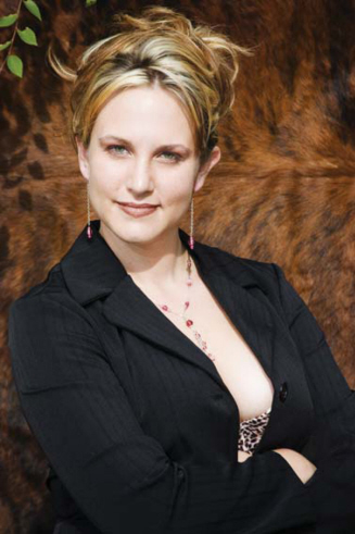
This RAW file of model Brenda was captured with a EOS 1D Mark II N with an EF 28–135-mm IS zoom lens at 135mm. Exposure was 1/200 second at f/5.6 and ISO 200. © 2005 Joe Farace.
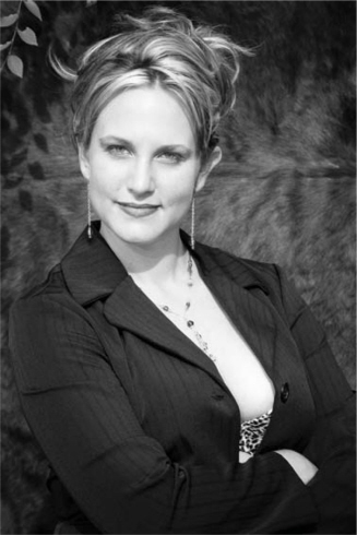
This monochrome JPEG portrait of Brenda was made at the same time as a color RAW file. Exposure was identical. The only thing that was different is that the Picture style was set at Monochrome and the Sepia option was used. Oh yeah, the EOS 1D Mark II N lets you capture toned photographs too. © 2005 Joe Farace.
One of my favorite techniques is capturing RAW color and JPEG monochrome files at the same time. Using its back-up mode, the EOS 1D Mark II N lets you simultaneously capture the different file types on different memory cards. © 2005 Joe Farace.
Other digital SLRs that offer simultaneous RAW + JPEG capture allow two files to be captured onto the same card. Whatever monochrome/filter setting you have will be applied to the JPEG file but the RAW remains unprocessed and in glorious color.
The Digital Difference
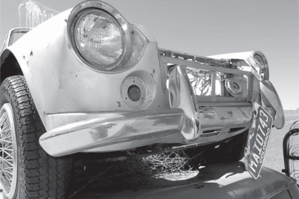
If your camera doesn’t have a monochrome mode you have no choice but to convert that image into black and white after the fact. Here are some entry-level methods to turn that living color image into something a little more dramatic. One of the simplest ways to create a black and white image from an all-color file is to use the Monochrome command found in many image-editing programs, usually under the Mode menu. (In Adobe Photoshop CS2 it can be found under Image > Mode > Grayscale.)
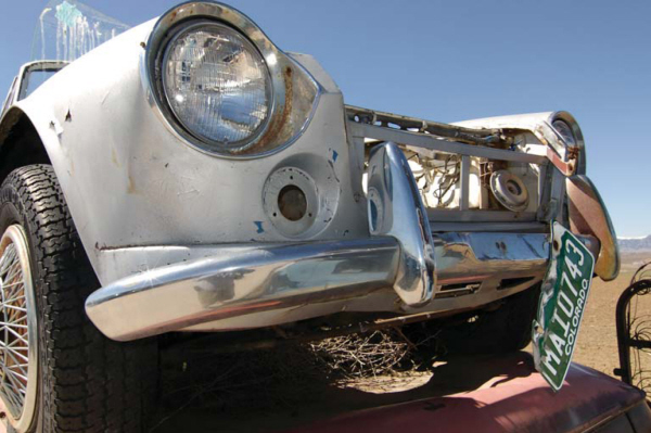
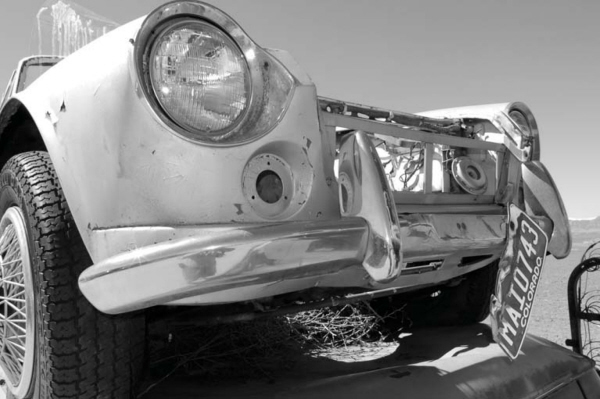
This image was captured as a color file using a Samsung GX-1S and 12–24-mm Pentax lens. Exposure was 1/180 second at f/11 in Program mode at ISO 200. The built-in flash was used to fill in shadows at the bottom (of what is left of a) Datsun 2000 roadster. © 2006 Joe Farace.
When you select > Image > Mode > Grayscale in Adobe Photoshop CS2, a small dialog box appears asking if it’s OK to discard the color information. Since you should be working with a copy of the file and the original is safely ensconced on a CD/DVD tucked away somewhere safe, it’s OK to click OK and remove the color, but that’s all you will do.
The resulting monochrome file will usually be flat looking and lacking the contrast of the original image file, so the simplest way to correct this is to use the Brightness/Contrast control to kick up the contrast a bit. The number shown is what I actually applied to the finished image but there are no magic numbers here. Gradually move the slider (increasing the contrast) and observe the effect before clicking OK.
The finished image was made with only two image tweaks: the first to remove all color and the second to increase contrast slightly. It may be all you need to do but if you want to try something else, keep reading.
Channel Mixer
Adobe Photoshop CS2’s Channel Mixer command produces grayscale images by letting you choose the percentage of contribution from each color channel. The Channel Mixer modifies a targeted output color channel, in this case grayscale, using a mix of the existing image’s color channels. When using the Channel Mixer, you add or subtracting data from a source channel to the output channel (Grayscale, when the Grayscale box is checked). It has more steps than the two in the previous example, but takes place in only one dialog box and gives you greater control. With practice you can whip through it.
Step 1: The original image was captured in color mode using a Pentax*ist DL camera and 10–17-mm Pentax fish-eye zoom lens. Exposure was 1/6 second at f/2.8 at ISO 400. The image was opened in Adobe Photoshop CS2. © 2006 Joe Farace.
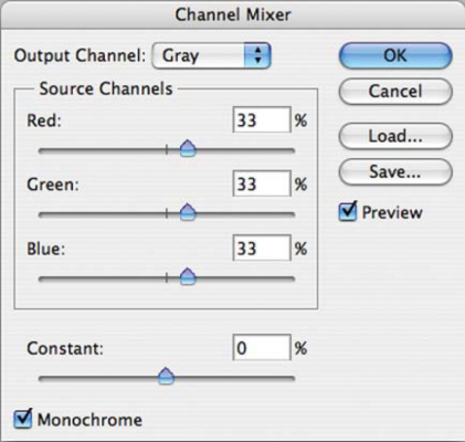
Step 2: The next step is opening the Channel Mixer dialog box (Image > Adjustments > Channel Mixer). Be sure to check the Monochrome option to set Gray as the output channel. This creates a color image that contains only gray values. Move the sliders to control the amount of detail and contrast in the image you plan to convert to grayscale, but first view how changes in each source channel affects the final monochrome image which is “live” as you work on it. Tip: When adjusting the percentages of the source channels, you often get the best results when the combined values of the source channels add up to 100%. If you go over 100%, you’ll overexpose an image and if you go under 100%, you will underexpose an image.
Step 3: Applying the Channel Mixer command is all most photographers may need to convert image files to monochrome, but if you want MORE POWER, it’s time to reach for a few power tools. © 2006 Joe Farace All Rights Reserved.
Monochrome Power Tools
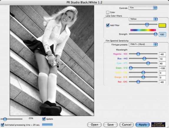
After RAW conversion, the next hottest bit of digital alchemy is black and white conversion of color images. Everybody has his or her favorite method, but Black & White Studio (www.powerretouche.com) may be the best ever monochrome conversion Photoshop-compatible plug-in. You can use the light sensitivity of films (Kodak Tri-X, T-MAX) to make the conversion or create your own sensitivity curves and save them for later use. Black & White Studio’s color filters are arranged on two “pages” for Windows and three in the Mac OS version.
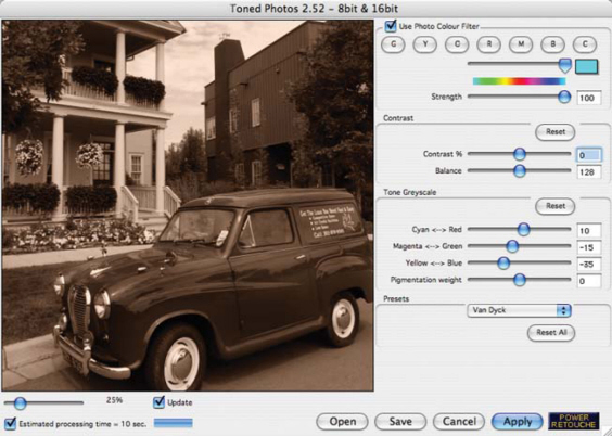
The Black Definition plug-in makes a wonderful complement to Black & White Studio and lets you adjust black as if it were a color channel. Before you finish, use Power Retouche’s Toned Photos plug-in to add Sepia, Van Dyck, Kallitype, Silver Gelatin, Palladium, Platinum, Cyanotype, Light Cyanotype, or Silver toning using built-in presets or create your own. All three plug-ins work with 8-, 16-, 48-, and 64-bit RGB, Grayscale, Duotone, or cyan, magenta, yellow, and black (CMYK) image files. Power Retouche offers a suite of 20 Mac OS and Windows power tools for $175. Ala Carte, Black & White Studio sells for $75. Black Definition costs $32, and Toned Photos is $54.
Black & White Studio is a Photoshop-compatible plug-in that features four groups of controls including Filters, Film, Print (multigrade, exposure, contrast), and Zones, but instead of those zones you get three selectable and adjustable zones.
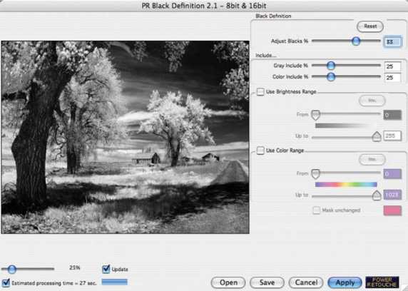
Power Retouche’s Black Definition Photoshop-compatible plug-in makes wonderful complement to its Black & White Studio and lets you adjust black as if it were a color channel in color, black and white, or even digital infrared images as demonstrated here. © 2005 Joe Farace.
The Toned Photos plug-in can add Sepia, Van Dyck, Kallitype, Silver Gelatin, Palladium, Platinum, Cyanotype, Light Cyanotype, or Silver toning with the built-in presets, or create your own. All Power Retouche’s plug-ins work with 8,- 16,- 48,- and 64-bit RGB, Grayscale, Duotone, or CMYK image files. © 2005 Joe Farace. All Rights Reserved.
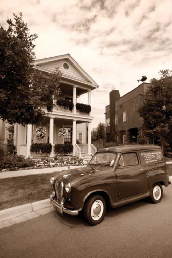
This image of an Austin delivery van was originally captured as a color file with a Canon EOS 20D and EF 10–22mm-EF-S lens at 13mm. Exposure at ISO 800 was 1/500 second at f/16. Image was converted into monochrome using Power Retouche’s Black & White Studio, then tinted in Toned Photos using the Van Dyck preset. © 2005 Joe Farace All Rights Reserved.
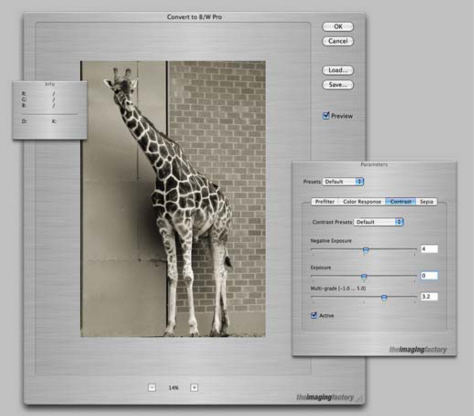
Convert to BW Pro 3.0 automatically compensates exposure for prefiltering and color responses. For the Contrast tab, Ilford provided their original curves data allowing the Multigrade slider to set contrast that matches their traditional darkroom papers.
Two different “Sepia” types are available: Tone is a graded transition that leaves whites pure, whereas Tint adds an overall color tint.
The Imaging Factory’s (www.theimagingfactory.com) Convert to BW Pro 3.0 has more user control than before and the ability to save favorite settings for later use. The floating control palette contains four tabs for adjusting all relevant parameters needed for conversion. The Prefilter tab lets you filter the original image to enhance or dampen certain color areas. The Color Response tab is like using different Black & White film types when shooting a film camera and acts as a color equalizer.
Bill Dusterwald is the genius who created Silver Oxide (www.silveroxide.com), a family of Photoshop-compatible plug-ins allowing digital images to emulate the tonalities of “real” analog film, such as the Kodak’s classic Tri-X, or my favorite Panatomic X. Now’s he’s begun a series of new monochrome filters designed to optimize based on subject matter. The first is the Landscape filter and addition to the typical filter options Silver Oxide offers in the dialog box, such as red, orange, and the ubiquitous none, he’s added a new purely digital filter called BANG (Blue Algorithm Neutral Gray) that acts like a polarizer filter.
Alien Skin Software’s Exposure (www.alienskin.com) brings the look and feel of film to digital photography. Exposure is two plug-ins: Black and White Film emulates a dozen different film stocks and Color Film not only recreate a film’s distinctive look as a more-or-less one-click operation, but manages saturation, color temperature, dynamic range, softness, sharpness, and grain at same time. These presets are just the starting point and can be tweaked to suit a particular photograph or applied to a batch using Photoshop Actions. Exposure can add grain to an image’s shadows, midtones, or highlights, and models the size, shape, and color of real-world grain. The plug-in presets include high-level contrast and highlight and shadow controls that can be applied with just a click. Additional features reproduce studio and darkroom effects such as cross-processing, splittoning, push processing, and glamour portrait softening. Exposure even includes presets for cross-processed Lomo-style image shots with your choice of four different manufacturer’s film! In addition to a before/after button, the preview window includes an optional, split-preview, and combines unlimited undo/redo pan and zoom using Photoshop-style keyboard shortcuts.
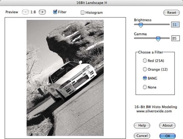
Usually Silver Oxide filters are modeled on the existing analog world, but creator Bill Dusterwald says that the BANG filter is “pure digital whiz bang.” All I can add is that it sure is.
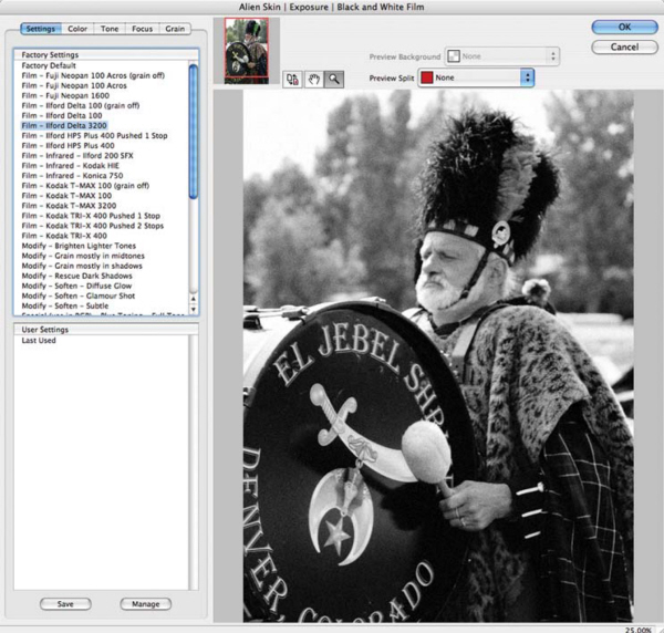
Alien Skin Software’s Exposure is really two plug-ins: Black and White Film emulates a dozen different film stocks and Color Film recreate a film’s distinctive managing saturation, color temperature, dynamic range, softness, sharpness, and drain at same time. Here the Black and White module was used to recreate the look of Agfa’s Delta 3200 film.
It was a Dark and Stormy Night . . .
Just because it’s a bright and sunny day doesn’t mean you want that same mood for the photographs you’re making. That’s the kind of thoughts that were running through what’s left of my mind when I was looking at this photograph of Mary and I standing in front of the Psycho movie house that was shot during a private tour of Universal Studio’s backlot. (Pssssst, that’s “Mother” staring at us out the window in the second floor window.) I decided to change the cheerful mood by using Adobe Photoshop CS2 (www.adobe.com) along with some powerful digital power tools to create a spookier image.
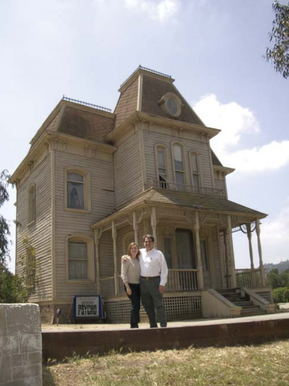
The original photograph of Mary and me was made by Ralph Nelson, a noted movie set photographer who’s also a heckuva nice guy. Be sure to visit Ralph’s website (www.ralphnelson.com) to view some astonishing work by this talented photographer. For the photograph, he borrowed my Pentax Optio S digital point-and-shoot camera. According to the exchangeable image file (EXIF) data, exposure was 1/800 second at f/4.3 in automatic mode.
Step 1: The first thing I do with any digital photograph is to tweak its color, density, and contrast. There are lots of ways to accomplish this, but I still usually start with PhotoTune’s 20/20 Color MD plug-in.
As before, 20/20 Color MD gives me a pair of images and I click the one I like. It doesn’t have to be the “perfect” one, just the best one of that pair. The plug-in uses all of your choices to come up with something much better and you can even do manual tweaks at the end of the process.
Step 2: When Hitchcock made Psycho it was a low budget effort that was shot in black and white using the same film crew he worked with on his television show, “Alfred Hitchcock Presents.” So, my next step was to convert the color image file into a monochrome photo.
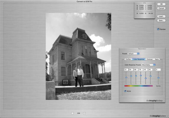
My tool of choice for monochrome conversion is The Imaging Factory’s Convert to B/W Pro Photoshop-compatible plug-in. The plug-in interface provides several options including emulating the tonality of “real” film, so I picked Kodak Tri-X as an obvious choice. Convert to B/W Pro also lets you apply color filters, add toning, and tweak contrast and brightness based on digital versions of traditional darkroom paper grades.
Step 3: To add a nighttime mood to the photograph, I reached for the Midnight filter that’s part of nik Color Efex 2.0.
|
TIP |
|
|
Don’t be timid when using a plug-in’s slider controls. Push them to the extremes and explore the possibilities rather than just inching them up until you see something |
you like. Maybe what fits the image best is an extreme or mild application of an effect, but you’ll never know until you try. |
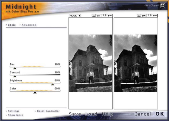
nik Color Efex 2.0 includes a set of Traditional and Stylizing filters, and the Midnight set offers several color tint variations you can use from depending on your image. For “Joe & Mary go Psycho” I used the standard Midnight filter, but manipulated all of its sliders to get the effect I wanted.
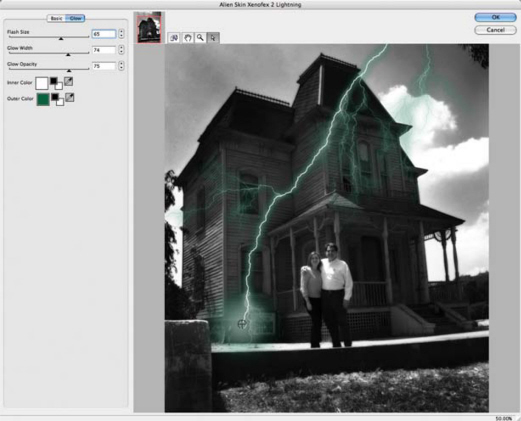
Step 4: To give the photograph a little “bam!” seasoning ala Emeril, I decided a lightning strike would be a nice touch. That’s when I selected the Xenofex package of Photoshop-compatible plug-ins from Alien Skin Software.
|
TIP |
|
|
Although the photograph is in black and white it’s still an RGB file. (Convert to B/W Pro doesn’t change the image |
file’s Mode to Grayscale.) So I decided to give the lighting a green exterior glow in homage to “The X Files.” |
Xenofex can do more than add Thor’s lighting bolt to your digital images; the package also includes Burnt Edges, Puffy Clouds, Cracks, and lots of other fun effects. Lightning has a large resizable preview screen and gives you controls for the shape and style of the lighting bolt as well as its inner and outer color.
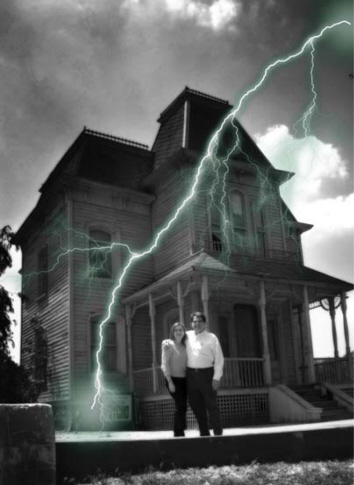
I did a little digital burning and dodging along with cropping to produce the final photograph that I call “Joe & Mary go Psycho.” I normally don’t like to crop my own photographs let alone another photographer’s, but cropping some of the grass in the foreground and that tree branch coming “out of nowhere” in the upper right-hand corner tightened up the image by removing extraneous visual data that doesn’t add to the overall impact.
Although I used the Mac OS version of Adobe Photoshop CS2 and all of the plug-ins shown in this example, all of this software is also available for Microsoft Windows. In addition, you can download demo versions of many of the products shown here, and I urge you to give them a try to create your own digital weather effects. Sometimes, it’s OK to fool Mother Nature, especially when using digital power tools such as the ones shown here.
The Duotone Command
When black and white photographs are printed on a press, they are sometimes produced using more than one color ink in order to add depth. When two colors of inks are used it’s called duotone, when three inks are used it’s a tritone, and when four are used it is a quadtone. As with all photographic techniques—including digital imaging—there is more than one way to accomplish working with monochromatic images. Located inconspicuously in Photoshop’s Image menu is the Duotone command, which can open many creative doors for the pixographer who is interested in printing monochrome images.
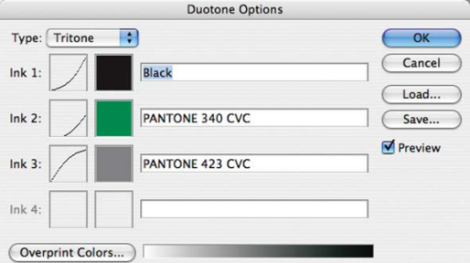
One gateway to adding Duotones, Tritones, or Quadtones to a grayscale photograph is the Duotone Options dialog box that appears after selection Mode/Duotone from Photoshop’s Image menu.
Duotones: In order to apply the Duotone command, the image must first be in Grayscale mode. When starting with a color image, be sure to convert it first. When you select Image Duotone, you’ll see a dialog box showing the two colors that are used. To use sets of color that are guaranteed to work together, click the dialog’s Load button to get ● to Adobe’s Duotone Presets folder. In Adobe Photoshop 5.5, a Duotone Presets folder, containing all kinds of color combinations, is found inside the Goodies folder, inside the Adobe Photoshop Only folder. In version 6.0, look in the Presets folder inside the Photoshop folder. This is true for both Macintosh and Windows versions of the program. In the latest version, there are three choices: Gray Black Duotones, Pantone Duotones, and Process Duotones. Open any folder and click on one of the choices. If you don’t like any of the results that you get, keep trying until you find one that you like. Using the Duotones command creates a file that has layers. This means you can save the finished file in Photoshop’s native format (.PSD) or use the Flatten Image command in the Layers menu to save it in other formats such as tagged image file format (TIFF).
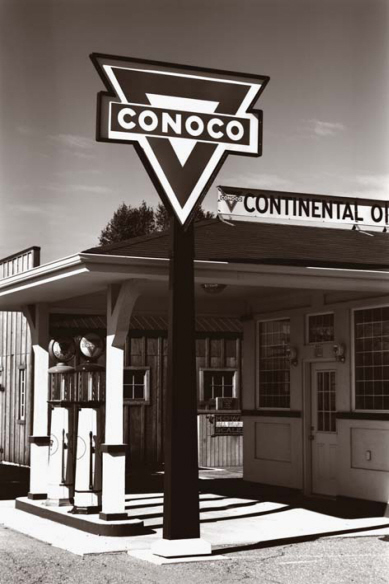
This photograph of a restored 1920s Conoco station was made on Kodak Tech Pan film and digitized on Photo CD. Since Grayscale Photo CD files are in RGB format, the image was converted to Grayscale format using Photoshop’s built-in conversion before applying the Duotones command and using one of the presets from the Gray/Black duotones folder. © 2001 Joe Farace.
Tritones: Making a tritone image is identical to making a duotone; the only difference is that now you have a three-color palette of colors to work with. For an image of a model dressed as Little Red Riding Hood, a red-based set of presets was loaded from the Process Tritones folder to compliment the image. If I wanted to show a snowy landscape, I might have selected a blue-oriented combination. While looking at the finished, printed image, you should notice it has more depth than a duotone. ●
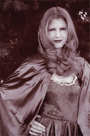
The original portrait of Kim as Little Red Riding Hood was made on Kodak Ektapress Plus color negative film, but was converted into grayscale using nik Color Efex Pro’s B/W Conversion plug-in. It was converted into a Tritone using the Duotone command selecting the BMY red 1 (black–magenta–yellow) preset from the Process Tritones folder. © 2001 Joe Farace.
Quadtones: If you’ve been following along, you should know how to make a quadtone image: You start by applying the Duotone command that converts your grayscale file into a duotone, then load in a collection of four complimentary colors to add depth and color to a monochrome image. ●
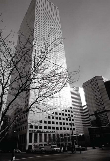
This photograph of a building in downtown Denver was originally made on Kodak 100VS slide film before being digitized and converted to grayscale with Silver Oxide’s Ilford Pan F filter. It was converted into a Quadtone using a preset that used black plus four shades of gray providing a “split-fountain” effect in which a cooler gray is used at the top of the building for the sky, while warmer tones are used on the street level. © 2001 Joe Farace.