Understanding Layers
Sirius Black was, and remains to this day . . . Harry Potter’s godfather.
When working with most image-editing programs, digital images can be composed of several parts. The base of an image file is its background, which you can think of as the paper used in a conventional wet darkroom. Layers are like additional emulsions on top the surface of that paper that allow you to create effects without interfering with what is on the other coatings.
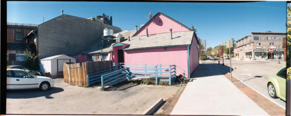
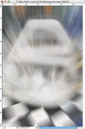
This little Harry Potter wannabe looks like a “straight” shot, but was created using multiple layers that appear to produce no visible effect, unless you compared it to the original. In this case, the layered manipulated image looks natural, which is just what I wanted to accomplish. Image was originally captured with a Canon EOS 1D Mark II and EF 75–300 zoom lens. Exposure was 1/100 second at F/5 with an ISO of 320. © 2005 Joe Farace.
One of the easiest ways to understand a digital enhancement program’s layers function is to imagine a photograph that has sheets of clear acetate stacked on top one another. Any kind of image—text, graphics, or even another photograph—can be placed on a layer. Where there is no image on a layer, you can see through it to the layers below the clear areas. You can change the composition of an image by changing the order and attributes of layers. At the bottom of the stack of layers is the background. The number of additional layers and effects you can add to an image is only limited by your computer’s memory.
The advantage of using a program’s layers function is that you can manipulate part of the completed image without affecting any of the other parts. This can be as simple as adjusting color or can include manipulation. Adobe Photoshop offers an additional type of layer called an adjustment layer that allows you to apply tonal and color corrections to all of the layers underneath it. This let you try different combinations of how layers react with one another and when you achieve the desired result on-screen, you can merge the adjusted layers.
The Layers Palette
A program’s Layers palette shows and lists all layers, groups, and layer effects for an image file. You can use the Layers palette to show and hide layers, create new layers, and work with groups of layers. You can also access commands and options in the Layers palette menu. It features a visible display of all of the layers in an image starting from the topmost to the background.
The Layers palette is used to create, hide, display, copy, merge, and delete layers from a document. In Photoshop, you can create new layers by using the New Layer button that is at the bottom of the Layers palette or simply by dragging and pasting a selection into your image. You can also copy layers between two open images. Layers can be added by using the New Layer button at the bottom of the palette or the New Layer command, which can be found by clicking on the black triangle in the upper-right-hand corner of the palette.
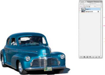
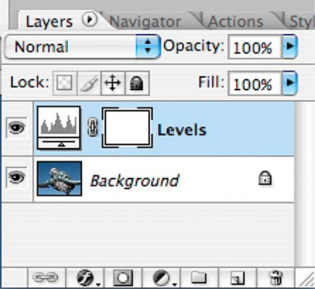
Here is the Layers palette shown for a two-layer photograph. This is the top layer and is called “Layer 1” but most image-editing programs will let you change the name, which can be helpful if you have more than two or three layers. © 2004 Joe Farace.
This is the background layer, which was shot in Louisville Colorado using a Horizon 202 panoramic (film) camera.
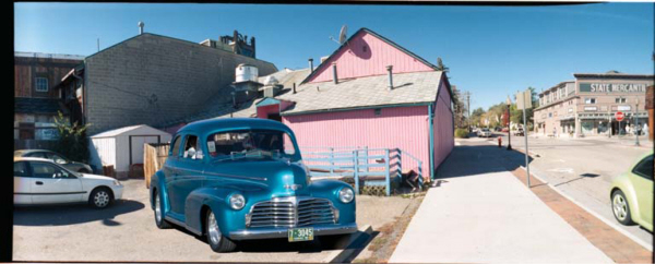
The car was shot in Colorado Springs using a Canon EOS digital SLR but was combined with the background layer to make it appear as if it were in Louisville. Note the shadows are going in the same direction. That’s a key component when combining images. © 2005 Joe Farace.
Adjustment Layers
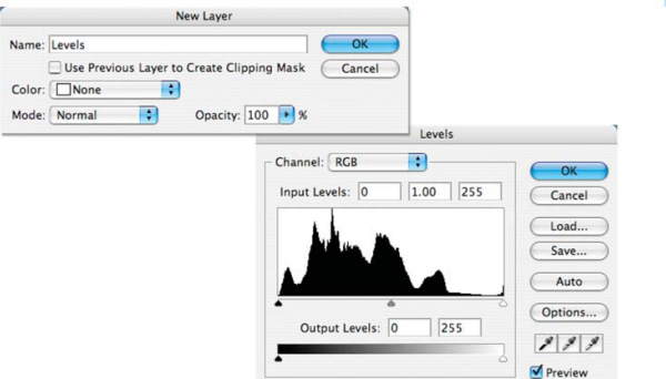
Photoshop’s Adjustment Layers lets users perform color adjustments without affecting the original image’s data. This allows you to experiment with different adjustments, such as hue and saturation, brightness and contrast, and overall color balance, and gives you the option to undo or refine any of these adjustments later. The following image commands can be applied with an adjustment layer: Levels, Curves, Color Balance, Brightness/Contrast, Hue/Saturation, Selective Color, Invert, Threshold, and Posterize.
Adjustment Layers can be powerful tools because they let you experiment with color or tonal adjustments to an image without permanently modifying that image. All of your changes or adjustments are made to the layer that acts as an overlay through which the underlying image appears. Creating an Adjustment Layer for Levels as an example, is as simple as going to Photoshop’s Layers menu and choosing New Adjustment Layer > Levels.
An adjustment layer does not make permanent changes to the underlying image pixels and can be modified any number of times without degrading image quality. Adjustment Layers can be hidden or discarded at any time, or moved up and down in the Layers palette. They can also be applied with the same opacity and blending mode controls for image layers.
The Input sliders are under the curve and there are three controls: Shadows (the black triangle), Midtones (the gray triangle), and Highlights (the white triangle). To add sparkle to the highlights—and increase overall contrast—move the Highlights slider to the left. When you do, the Midtone slider comes along for the ride. To darken shadows, move the Shadow slider control to the right. To tweak the overall photograph, use the Midtones slider.
The New Adjustment Layer is also found in Photoshop’s Layers pop-up menu, but when you select Levels, you get a dialog box that looks like the same dialog box that we have all come to know and love (if you haven’t, you will). It allows you to adjust the brightness and contrast of an image using Layers, and since only the layer is affected—the original image is untouched.
Simple Use of Layers
Layers can be used for many simple projects that dramatically improve an image’s overall look. In Chapter 8, I’ll show you how to create various soft-focus effects, and most of them can be done directly to an image file’s background, but you might want to try a layer for even greater image control. Start the process by making sure your image file is as good as it can be, then add a duplicate layer (Layer > Duplicate Layer). Apply a filter to the duplicate layer, not the background image below. Then lower that layer’s Opacity setting to let part of the bottom layer show through. For even more control you can erase part of the duplicate layer to let 100% of parts of the original file show through. Use the Eraser tool to erase the blur/soft focus (on the duplicate layer) around the subject’s eyes to allow the sharpness of the background layer to show through. This is an especially good trick for portraits because the sharpness of the subject’s eyes are critical to getting the viewer’s attention, so this technique gives the impression of sharpness while maintaining overall soft focus.
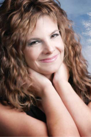
Mary is not a professional model but she has a sparkling personality that comes through when she’s photographed. This portrait was softened by creating a Duplicate layer (Layer > Duplicate layer) then applying B + W’s (www.schneideroptics.com) Soft Focus filter to that duplicate layer, then Fading it (Edit > Fade Soft Focus) to keep it from getting too soft. I used the Erase tool and erased the areas around her eyes allowing them to be sharp (on the background layer) while keeping the rest of the image in soft focus. © 2005 Joe Farace.
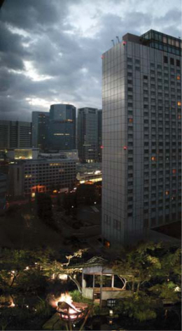
Two Faces of Japan
My approach to travel photography is interpretive rather than realistic. One of the techniques I like to use for these interpretations is to tell a story by combining two or more images into a single photograph.
While traveling in Japan I was struck by how newer, more modern elements of Japanese society coexisted with traditional ones, sometimes in close proximity. This thought was in the back of my mind when I made a photograph out of my hotel window, but the final concept for “Two Faces of Japan” didn’t occur to me until few days later when I made another photograph and saw how the two might blend together. The concept was to use Adobe Photoshop CS2 along with a few digital manipulation techniques to combine both image files into a single photograph.
As with most of my other digital imaging projects, I apply the “20-minute” rule. It’s my opinion that if you can’t make what you see on the monitor look like what you originally conceived it in your mind’s eye within 20 minutes, chances are you never will; but like any creative activity, you gotta go with the flow:
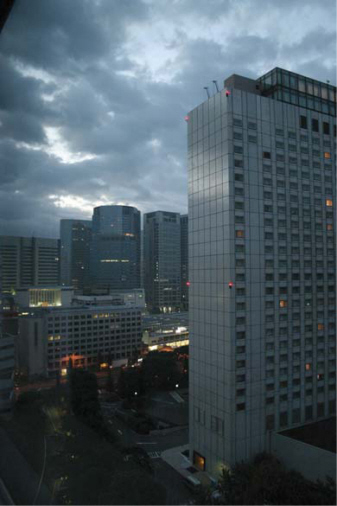
Step 1: This first picture was made from my hotel window either before I went to bed or after I got up; I was too jet-lagged to remember, and the camera’s Exchangeable Image File (EXIF) data is set for my home in Colorado. The lens was pressed flat against the window to minimize reflections inside the room, where I had already turned off all the lights. I made a total of three shots and liked this one best on the basis of sharpness, composition, and exposure. © 2004 Joe Farace.
The next night I had dinner with friends at a traditional restaurant on the outskirts of Tokyo. As we came out, the area behind the restaurant was dark but illuminated with torches. I used the same EOS Digital Rebel and 18—55m EF-S lens set at 18mm to make a series of exposures of the scene in front of me. Both of the images used in this montage were made in low light conditions at ISO 1600.
For the first image, I used a Canon EOS Digital Rebel with an 18–55-mm EF-S lens that was set at 18mm. A high ISO at 1600 gave me a shutter speed (1/30 second) that I could hand hold. This particular image was captured in Program mode and I made a few test shots ending up with an aperture of f/3.5 to get what I saw out the window.
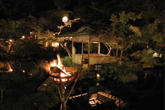
This second photograph was shot ISO at 1600 and produced a shutter speed (0.3 seconds) that I couldn’t really hand hold, but the camera was steadied on a wooden post. Aperture was f/3.5. I made several images and bracketed exposures; this was the best one, but the image is not critically sharp. © 2004 Joe Farace.
Step 2: The first thing I needed to do was bring both images into a similar tone. One was cool and the other was warm, so I decided that making the sunrise image warmer while cooling off the firelight would work best for my concept. One of the easiest methods for accomplishing this kind of color correction is using a Photoshop-compatible plug-in such as PhotoTune’s (www.phototune.com) 20/20 Color MD.
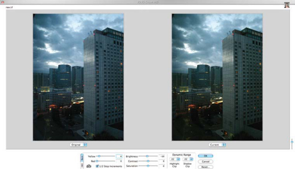
After launching 20/20 Color MD (Filter > PhotoTune > 20/20 Color MD) you’re presented with a series of pairs of images and asked to click the one you like best. After nine mouse clicks, you’re finished color correcting the file. © 2004 Joe Farace.
After I cooled off the color using 20/20 Color MD, I liked the traditional image’s density, but wished it were a littler sharper. Since I planned to use this image horizontally across the bottom of what would a vertical photograph, I knew having it reduced in size would give the impression of greater sharpness, but I wanted to make it look as sharp as possible.
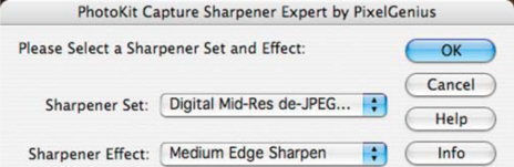
One of the best image sharpening solutions I’ve found is PhotoKit Sharpener, a set of Photoshop-compatible plug-ins that sharpen images based on the way the images are captured—film or digital. The plug-in’s deceptively simple menu lets you choose how the image was captured and select the kind of sharpening effect you want; PhotoKit Sharpener does the rest.
Step 3: Before I went any further I resized (Image > Image Size) my hotel room image to 300dpi producing a file that measured 6.827 × 10.24 inches images. If you were printing on an ink-jet printer and wanted a larger image size, you could make it 240dpi.
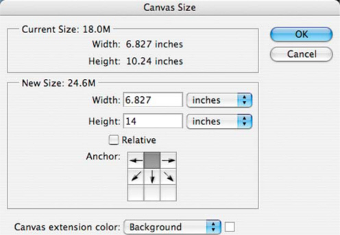
Because I wanted to add the horizontal image to the bottom of the photo—in the wooded area surrounding that particular hotel—I used the Canvas Size (Image > Canvas Size) command to provide additional white space at the bottom of the photograph where I could place the horizontal photograph.
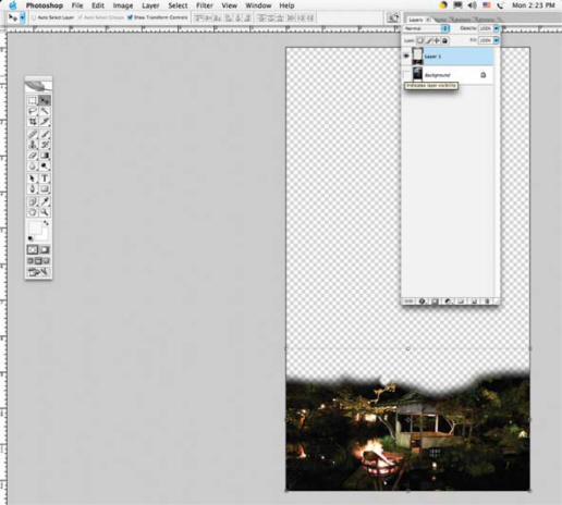
With both photographs open, I dragged the traditional image onto the skyline photograph in the space I just created. When I dragged the file it created a new layer and automatically resized that file to match the resolution of the original file. This gave me a two-layer photograph: the architectural “new” image on the bottom layer and the traditional “fire light” image on the top layer. Using the Move (it looks like a hand) tool with “Show Transform Controls” (in the Options bar) checked, I dragged the photo to resize it, filling up the width of the canvas.
Step 4: To make the two images blend, I used Photoshop’s Burn tool to darken the bottom of the hotel room image, then moved the second image layer up and down to see where it fit best. To make this process a little easier, I changed the second layer’s Opacity setting to 50%, so I could see through it to the bottom layer.
While I used Adobe Photoshop CS2 to create this montage, any image enhancement program that supports layers and Photoshop-compatible plug-ins should work. I also used the Mac OS version of the products mentioned, but all of this software is also available for Microsoft Windows. Trial versions of the plug-ins are available for download, so why not give one or more of them a try for your next digital montage?
When it looked like a close fit, I used the Erase tool to erase parts of the top layer to make the two layers blend together seamlessly. © 2004 Joe Farace.
Then I reset the layer opacity back to 100% and flattened the images (Layer > Flatten Image) to produce a single layered photograph. © 2004 Joe Farace.
I love import drag racing and have been know to take my Volkswagen GTI 337 down the drag strip just for the fun of it. Living in Colorado we don’t have much of a winter racing scene—except for the ice racers, of course—but that doesn’t mean that even cars parked indoors at a car show can’t look like they’re racing. Let me show you how to do it in just four steps:
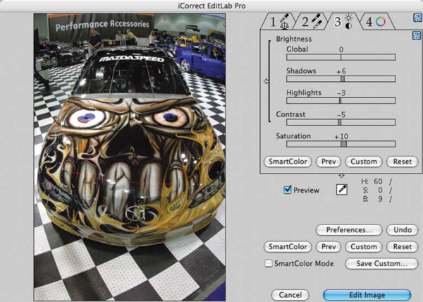
Step 1: This photograph of Mazda RX-7 drag racer was made at the International Auto Salon in Los Angeles using a Canon EOS D-60 digital SLR with 16mm Sigma lens attached. Even while making it, I recognized several things that needed to be done with this image to make it better, but the most important was eliminating the cluttered background.
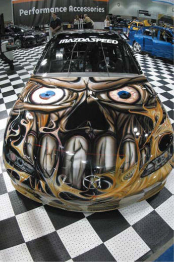
The exposure was 1/60 second at f/16 with an ISO setting of 800. Color balance was set on Auto and it did an acceptable job with the mixed lighting sources in the LA Convention Center.
Step 2: I think it’s a good idea to make an image look as good as possible before starting any manipulations and in this case it meant improving the overall color. I opened the image file in Adobe Photoshop CS and applied PictoColor’s (www.picto.com) iCorrect EditLab, one of the best power tools available for fine-tuning color.
PictoColor’s iCorrect EditLab correction and color management software is available either as a Photoshop-compatible plug-in or stand-alone application and using it is as simple as 1-2-3-4, which is how the tabs in its interface are set up. Just waltz through the tabs, gradually improving how the image in the preview window looks as you go.
Since I shot the RX-7 at a relatively slow shutter speed, I decided to sharpen the image just a bit too. One of the best solutions—maybe the best—for image sharpening that I’ve found is PhotoKit Sharpener set of Photoshop-compatible plug-ins that sharpen based on the way that the image was captured and works great whether the original was film or digital.
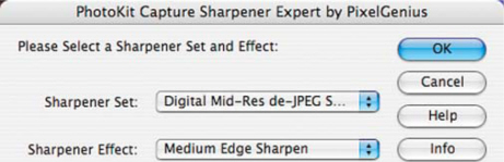
The interface for PhotoKit Sharpener is simple: you select the kind of sharpening effect you want and how the image was captured from two pop-up menus and PhotoKit Sharpener does the rest.
Step 3: Now that I had the image of the RX-7 looking good, the next step was creating a Duplicate Layer (Layer > Duplicate Layer) that I labeled “Zoom.”
All subsequent effects will be applied to the duplicate layer, leaving the original image (below) untouched.
Step 4: In the Layers window, click on the Zoom layer to select it. Then apply the Radial Blur filter (Filter > Blur > Radial Blur) while making sure the Zoom button in its dialog box is checked. Three qualities of blur are available and I choose “Best” because it gives more subtle shadings; but be aware that, depending on your computer’s power, “Draft” and “Good” blurs are rendered much faster.
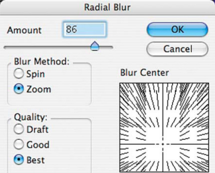
The amount of zoom is set in pixels and determines the length of the blurring. Use the preview windows to move the “Blur Center” point where the zoom will originate. I selected the area near the Mazda logo on the hood.
Step 5: Still working on the Zoom layer, use the Eraser tool to clear out areas allowing part of the car in the Background layer below to show through.
I began by using the Eraser at 100% opacity (selected for the Options bar) to outline the car, but then used lower opacity levels to erase portions of the inner car to make it look like it’s in motion while it’s really parked.

As a final tweak to the photograph, I created a Curves Adjustment Layer which allowed me to increase contrast in shadow and highlight areas and punch the image up a bit.
You can use this technique, along with other kinds of blurring techniques, such as Motion Blur (Filter > Blur > Motion Blur) for sports including track and field, horse racing, and even rodeo. The trick, if there is any, is determining how long the zoom or motion blur trail is and how much to erase and at what opacity. The best thing is that there is no right or wrong way to do this and there are no rules except to have fun!
While I used Adobe Photoshop CS to create this digital drag racer, any image enhancement program that supports layers and Photoshop-compatible plug-ins will work. I used the Mac OS version of the products mentioned, but all this software is also available for Microsoft Windows. Trial versions of the plug-ins are available for download, so why not give one or more of them a try for your next sports image?
Making Collages and Mosaics
The terms “collage” and “mosaic” are often confused. A collage is an artistic composition of materials and objects pasted over a surface, often with unifying lines and color. On the other hand, a mosaic is a picture or decorative design that’s made by setting small colored pieces, as of stones or tiles, into a surface. Here are some examples.
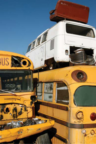
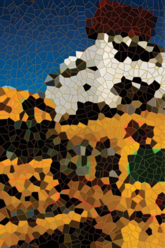
Salvage or junkyards are my favorite places to make photographs. This image was captured with a Canon EOS 1D Mark IIN with an exposure of 1/800 second at f/16 with an ISO of 800. © 2005 Joe Farace.
Using the junkyard photograph as a basic, Panos FX (www.panosfx.com) Mosaic Action was used, which is a one-click operation (information on what Photoshop Actions are and how they work will be found in Chapter 9). If this image proves anything, it’s that complex images are not the best subjects for creating Mosaics. Maybe a collage might work? © 2005 Joe Farace.
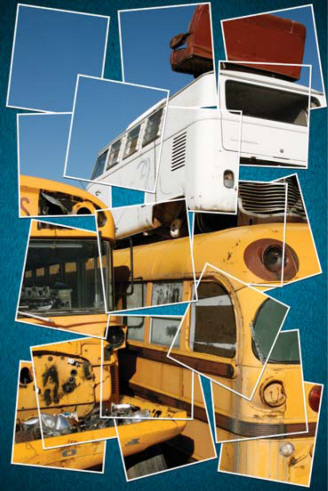
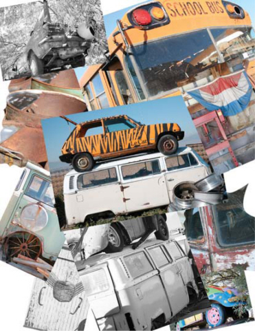
This is not exactly a collage; it is more specifically a photographic mosaic since all of the pieces work together to form a single image. This was created with another Panos FX Action called Synthesis. You see, there are a few ways to create a true collage using an image-editing program, but this is one of the easiest. © 2005 Joe Farace.
You can use general-purpose image-editing tools to produce a collage, but there are some special purpose tools including ArcSoft’s (www.arcsoft.com) Collage Creator. It’s a Microsoft Windows-based application that turns ordinary digital pictures and text into personalized works of art. The program includes everything one needs to turn regular digital photos and text into great-looking scrapbook pages suitable for printing, adding to a scrapbook, sharing with friends, or hanging on the wall. And because it’s all done with your computer, each masterpiece can be printed over and over again.
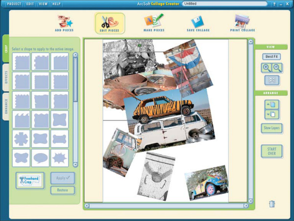
ArcSoft’s Collage Creator is a digital scrapbooking application that turns digital pictures and text into personalized art work. The program includes everything one needs to turn digital photos and text into great-looking scrapbook pages suitable for printing, sharing with friends or hanging on the wall.
Collage Creator lets you crop and assemble digital pictures any way you want and add creative photo edges and special effects with one click. You can also choose from over 300-clip graphics for all occasions.