CHAPTER 5
Creating the Web Site
WEB SITE GOALS
Before one can begin designing a web site, it is necessary to determine the purpose of the site and outline the goals for the web site. For a musician or singer, these goals should include the following:
- Creating and reinforcing brand awareness
- Advertising and promoting products (recordings and concert tickets)
- Generating direct sales (mail order and e-commerce)
- Creating a sense of community among an artist's fans
- Creating repeat traffic
The design will need to incorporate aspects that support and enhance these goals. It should be attractive and suit the artist's image. It must also be designed to appeal to the target market.
Branding
Branding is described as creating a distinct personality for the product (in this case, the artist, not the label) and telling the world about it. Artists who create a well-known brand can parlay that into endorsement deals, an acting career, or the position as a spokesperson for a worthy cause. Artists Madonna and Missy Elliott appeared in TV ads for The Gap, Queen Latifah has moved into films, and Bono of the rock group U2 has become the spokesperson for solving the problems of Third World debt and global trade. Therefore, artist branding should be an important part of any web site. Creating an easily identifiable logo and maintaining consistency in style and design can help support the brand. This extends to the style of the web site, which should convey the image that you want to project for the artist.
Promoting and Selling Products
The web site should create a demand for the artist's products. The primary products are recorded music and tickets to live shows. Secondary products include posters, bumper stickers, and other souvenirs. Enticing the web visitor to purchase the recordings, or even just creating a desire to purchase, should be an important aspect of the site. This goal can be achieved through offering music samples on the site and information about the music and the recordings. Links to online retailers will encourage the visitor to follow through on purchase intentions, creating the impulse buy. Tour schedules, concert photos, samples of live recordings, and links to sites that sell tickets can create a demand for concert tickets. Maps to the venues also encourage concert attendance. The web site is a great place for the merchandising of T-shirts and other mementos. Photos of these items are important (see the section on e-commerce).
Sense of Community
Artist web sites are a good place for like-minded people to connect with each other. These fans probably have much in common—especially their interest in the artist. A sense of community can be created through message boards, online chats with or without the artist, and by including photos of fans at concerts. These devoted fans can become opinion leaders (the virtual street team1) by influencing their friends to become fans of the artist and encouraging their friends to visit the web site. MySpace has provided an excellent opportunity for fans to engage in community social behavior centered on a common interest in an artist.
The web site should also provide materials for professional journalists looking for information on the artist, as well as contact information for both journalists and booking agents. Some sites provide print quality publicity photographs and in-depth biographical information suitable for reprint in mainstream publications.
Creating Repeat Visitation
It is important to provide elements on the web site that will keep visitors coming back as new developments occur in the artist's career. Certain attributes can be included in a web site that encourage repeat visits; these are outlined in Chapter 7 These features include blogs, updated tour itineraries, contests, news, new music samples, and message boards. One entrepreneur even offers a service that provides updated horoscopes that you can post to your web site to encourage repeat traffic (www.tomorrowsedge.net).
WEB SITE DESIGN
Web site design is defined as the creation and arrangements of web pages that make up the site. It's part art and part commerce. The first page is the home page, although some web sites will have a splash page with a welcome message or graphic image that sets the tone for the web site (see the section on splash pages). Aspects of the design include content, usability, appearance, and visibility (the ability of users to find your site on the Web). A good web site is one that is attractive, uncluttered, quick to load, and easy to navigate. The site must offer something of value to the consumer—information, products, and freebies. It also helps to make the web site fun, refresh content, and give people a reason to return. Effective web sites avoid large flash programs, flashing text, animation, and large graphic files. Half of Internet users do not yet have cable modems, and a web site that is slow to load is sure to fail.2
The home page identifies your company or brand and extols the benefits of the site and its products. The site description, news, and a logo or image should be featured on the home page. This page should be updated frequently to reflect changes and notify the visitor of new and interesting developments. The home page often posts announcements, although a “What's New” page can also contain news briefs and updates. The home page should also contain links and navigational tools for the rest of the site. A good web page should balance text with graphics or images and sport a layout that is inviting and interesting.
Basic Design Rules
Once you have established the goals and determined the audience for your web site, it is time to decide on layout and content for the web site in general and then for each page. This is called storyboarding; it is when “the organized content is used to develop a diagram or map” (www.amacord.com/services/storybrd. html). The storyboarding process consists of developing a sketch of the site's structure, a detailed structural outline (which is the URL of each page listed in an organized format), and a detailed sketch of each page.
It is important to first get a sense for the overall site, how many pages will be needed, and what materials to include on each page. Content should be categorized according to user needs and organized in a way that takes into consideration the audience characteristics, their information preferences, specifications of the majority of computers, and the audience's web experience.
It might be helpful to used blank index cards, one for each web page, and list the information that should be included on each page. Then for layout, use blank letter-sized sheets to create a diagram for each page. By determining the scope of the site first, the designer can then get an idea of the navigation needs and how to set up menus and style sheets (see the WYSIWYG section).
Consider these simple rules of web design:
1. Design web sites, not pages. Determine the overall look of the site and the scope of information before attempting to design any one particular page. This will help the designer determine how many pages are needed, what should be on each page, and the overall consistent look of the site.
2. Keep page size to a reasonable length. The general rule is to design the page so that it is no longer than twice the length of the computer screen, especially for the home page. Readers do not like to scroll down and tend to become lost or discouraged by long web pages. The exception to this may be blogging, which tends to be more linear than most other web elements. When long pages are used, be sure to have plenty of bookmarks that can direct the user quickly back to the top of the page. Never use horizontal scrolling
3. Use appropriate graphics. Don't load a lot of photos on one page—it will slow the loading time. Too many photos overload both the page and the eye. Make sure all photos are appropriate for that particular web page. If you want to include an album of photos, relegate it to a special photos page. Use thumbnails to present examples of photographs that can be enlarged at the click of a mouse. Web visitors are now accustomed to thumbnails but should be reminded that they can click for an enlarged version of the photo. Sometimes this is done with a “mouse-over” command, where a text message “click to enlarge” appears as the visitor runs the mouse over the thumbnail.
4. Clearly specify the purpose of the web site and why the user should visit regularly. The home page should have a clear, simple headline description of the site. If that is not suitable, then the masthead and dominant graphic or photo should clearly illustrate the site's purpose or products. Stick to the subject in the web site, keeping your goals in mind. If you want to include something that is not germane to the topic, consider linking to a separate web site. Keeping the site current and changing out content will encourage repeat traffic.
5. Keep it simple and easy to read. Nothing screams amateur more than a site that is cluttered and hard to read. Avoid backgrounds that conflict with the text and confuse the eye. Set up a color scheme that is appealing, consistent, and does not induce eye fatigue. Yellow or red text on a white or busy background never works.
6. Balance the design elements. Don't go too heavy on either text or graphics. Just like for a magazine layout, white space can be very appropriate when used properly. Basic principles of desktop publishing also apply to web design.
7. Content is king. Content should drive the design. Make your design appropriate for the theme and brand of the artist or product. Use content to give visitors a reason to explore the site and to return.
8. Make navigation easy. It is important to link pages in a consistent, wellplanned manner that is intuitive to users. Navigation bars are usually found across the top, under the masthead, or on the left side of the page. Web visitors are used to this design, which was originally created because web pages load from the top and left side, and navigation information was sure to appear on the page regardless of the end user's browser or computer screen. Keep your navigation bar in the same location on every page, with a clearly identified link back to the home page.
9. Keep your site up to date. Visitors will not return to a site that looks abandoned, with old news, outdated information, out-of-style design elements, and cobwebs. If you plan to update on a regular basis, state that intention on the site and then be sure to follow through! If you state you will provide a weekly podcast, then be sure to have a new one available at the same time each week.
10. Be consistent. Keep the basic look and theme the same throughout the site. Use the same color scheme, background, and fonts on each page. Do not use many different fonts. For a more consistent look, use the same masthead on every page—with slight variations if necessary to identify individual pages. Stick with standard layouts. The reason the three-column layout is so common is that it works (Kymin).
| Table 5.1 Red Flags of an Unprofessional Web Appearance | |
| Poor browser compatibility | |
| Animated bullets | |
| Too many graphic and line dividers | |
| Multiple banners and buttons | |
| Poor use of frames |
| Poor use of tables |
| Too much advertising |
| Large welcome banners |
| No meta tags |
| Under construction signs |
| Scrolling text in the status bar |
| Large scrolling text across the page |
| Poor use of mouse-over effects |
| Source: www.phoebemoon.com. |
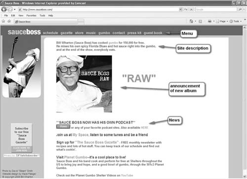
FIGURE 5.1
Example of an artist web site from www. sauceboss.com.
Splash Page
A splash page can be used to enhance the image of the web site. This is the first page a web surfer is directed to when accessing the site. Usually a splash page will have the logo and elaborate graphical layout, but not much information. The visitor is encouraged to enter the site by clicking on the page. Automatic splash pages direct the visitor to the home page after a few moments.
Do not overload the visitor with large flash programs that take a long time to load. An effective splash page has only a graphic image and the brand logo. Many web designers discourage the use of a splash page because it is just one more step or click required before the visitor gets to the true substance of the web site. However, Web Design Services India states that splash pages can be useful for entertainment web sites such as those for movies, video games, children, music, photographers, and travel sites.
If you must use a splash page, Client Help Desk (www.clienthelpdesk.com, 2004) advises one to “consider dropping a cookie into each site visitor's computer that automatically skips the splash screen on subsequent visits. Even people with the patience to deal with a splash screen once will be tested upon seeing it repeated each time they return to the site.” Always offer the visitor the option to “skip the intro” and move on quickly to the home page.3
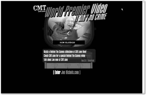
FIGURE 5.2
Splash page from Joe Nichols web site. (Courtesy of Joe Nichols and CountryWired.com.)
WYSIWYG or WYSINOT?
Many web design software programs feature a process called WYSIWYG, which means what you see (on the screen) is what you get. One of the first idiosyncrasies web designers encounter is the fact that a web site's look will vary from one computer to another. Not all web visitors use the same browser software and hardware, so what may look right on one computer may look completely different on another. Some of the variables that affect consistency are type of software browser, monitor size, monitor resolution, and the end user's font settings. Web designers must not make the mistake of assuming that a layout will look as good on other people's computer as it does on theirs. The standards for HTML agreed upon by the World Wide Web Consortium (W3C) are helping to create some consistency among various browsers, but not all users will have the latest browser version.
You can't expect your designs to look absolutely identical on every computer. Web design is just not like that. There are situations where they can break completely—elements shift to a different place on the page or disappear completely.
Joe Gillespie, www.wpdfd.com
The screen captures shown in Figures 5.3, 5.4, and 5.5 illustrate the variations in a web site's look based on browser and screen resolution. They all show the exact same web page.
The web page shown in Figure 5.3 was created on a liquid layout, where the size of the web page adjusts itself to fit the screen. On larger screens with higher resolution, the fixed elements (photos) remain the same size, whereas the liquid aspects (text arrangement) vary from computer to computer and are set up to conform to a certain percentage of the computer screen. The same web page shown on a screen with a higher resolution (Figure 5.4) has the menu bar on the right side at a distance from the main photograph. To minimize this problem, use fixed-width tables then set the elements inside specified-width boxes in the table. For years, the use of tables was popular until the introduction of cascading style sheets and universal standards for web pages.
On the high-resolution screen shot in Figure 5.4, note how the menu bar is far to the right of the photograph, rather than blended in, as was the case with the lower resolution Microsoft Internet Explorer screen shot. On the Netscape screen grab (Figure 5.5), the menu is beneath the photo rather than on the right side of the screen.
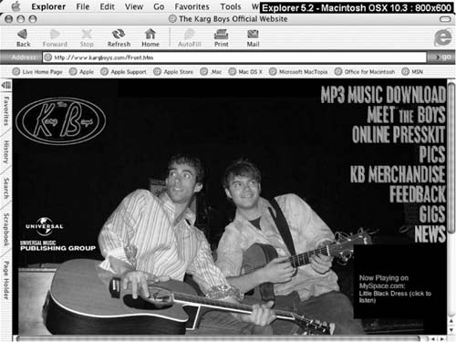
FIGURE 5.3 Example of web page in Explorer 5.2. (Courtesy of www.kargboys.com.)
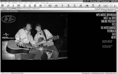
FIGURE 5.4 Example of web page on high-resolution screen. (Courtesy of www.kargboys.com.)
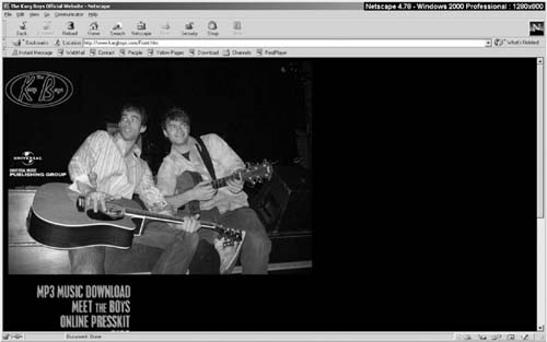
FIGURE 5.5 Example in Netscape 4.78 on a high-resolution screen. (Courtesy of www.kargboys.com.)
It is best to check out a new web design on different systems before launching the site. There are several online services (such as www.browsercam.com) that will provide screen shots of your web site loaded with different browsers, operating systems, and monitor resolutions.
Frames versus Tables versus Cascading Style Sheets
Beginning with Netscape 2.0, web designers started using frames. The Web Style Guide describes frames as “meta-documents that call and display multiple HTML documents in a single browser window.” Frames are commonly used to centralize navigation through the web site. A menu is displayed in one frame with content pages displayed in another. As a user moves through the web site, web page content changes but the navigation remains unchanged. If the navigation window has enough components, it will be displayed with a scroll bar. Many browsers cannot print frames appropriately and print each frame on a separate sheet of paper. Frames are no longer considered a recommended form of web design.
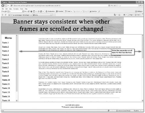
FIGURE 5.6 Example of frames page layout.
As web browsers evolved, frames then gave way to tables and nestled tables, which allowed for more content organization. Tables allow for greater control over page layout and create more visually interesting pages. Tables are used to define and separate elements in the document, such as navigation bars, masthead, side bars, text, and photos. The example in Figure 5.7 has four columns and five rows showing. Note how some of the cells have been merged to create a masthead or banner that spans more than one column or text that spans more than one row.
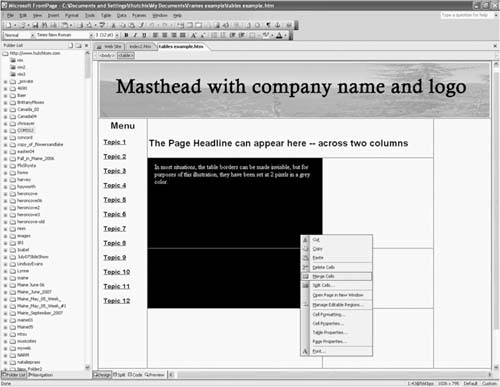
FIGURE 5.7 Example of tables layout.
In Figure 5.8, the borders of the cells have been made visible to demonstrate a tables document. By reducing the border width to zero, the cell borders become invisible while still constricting the cell content to the specified area. Cells can be created to float (expand to fill the screen) or set to a specific width and height. Cells can also have different backgrounds to set them apart from the others.
Recently, cascading style sheets have become popular. “Style sheets were developed as a means for creating a consistent approach to providing style information for web documents” (Wikipedia). Cascading style sheets (CSS) allow web developers to control the style and layout of multiple web pages at once, just by editing one master template (the CSS document). CSS is used to define colors, fonts, and layout, and is designed to separate document content (written in HTML) from document presentation (written in CSS). CSS has various levels, each building on the last by adding new features. Style sheets are saved in external .css files. The appearance and layout of multiple pages can be changed all at once by editing the style sheet.
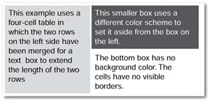
FIGURE 5.8 Example of tables with no cell borders.
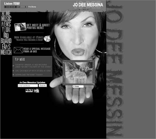
FIGURE 5.9 Example of web page using cascading style sheets. (Courtesy Jo Dee Messina and CountryWired.com.)
Graphics
Graphics are an important part of any web site. There are some general rules to follow when using graphics on a web page. The three most popular formats for using graphics on a web page are JPEG, GIF, and PNG. JPEG is short for Joint Photographic Experts Group. It is good for photographs and supports 16.7 million colors. The compression actually throws out data to create a smaller file. Sharp edges may appear blurred, so JPEG is not recommended for graphics that contain sharp lines or drastic color changes. It also does not support transparency, so if you want the background of your image to be transparent, JPEG is not the format to use. A progressive JPEG file presents a lowquality image at the first moment of download, and then over several passes it improves the quality.
The GIF (graphics interchange format) format is excellent for graphics that have large areas of the same color. The format supports a maximum of 256 colors and thus is not the best to use for photographs. Gradual changes in color may show up as progressive rings of color changes, as evident in Figure 5.11. The GIF format supports transparency, allowing the graphic designer to remove the background of the image. The newest format, PNG (Portable Network Graphics), has images that always look great and offer good compression ratios. PNG was designed to offer the best features of the GIF format, but with millions of colors. PGN also allows for transparency, but it is not supported by older browsers.
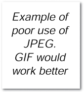
FIGURE 5.10 Example of a poor use of JPEG.

FIGURE 5.11 Example of a poor use of GIF.
EDITING GRAPHICS
Adobe Photoshop is the industry standard for image manipulation (editing graphics and photographs). Even the novice user is easily able to crop pictures, create layers, overlay text, rotate images, modify colors and contrast, convert formats, and brush out unwanted elements of the photograph. For the amateur photograph editor, there are some shareware and free programs available for basic photo editing.
In 2008, Adobe Systems launched a free online version of Photoshop called Photoshop Express. This web-based version works with any type of computer and operating system. Adobe also offers a boxed consumer version of Photoshop Express (Fehd, 2008).
The online site Picnik.com (www.picnik.com) offers users the opportunity to manipulate images online and includes widgets for photo editing your existing photos on other sites such as flickr, Facebook, Photobucket, Picasa, and Webshots. Picnik offers a free version or a premium version for a small annual fee.
FastStone offers a freeware version of its image viewer, which contains quite a few image editing and manipulation functions, such as those basic functions listed earlier, drop shadow, sepia tone, red-eye reduction, special effects, sharpen or blur, and resample compressed photos. The downloadable software is available at www.faststone.org. A commercial version is also available for a reasonable fee, and FastStone offers several other useful products.
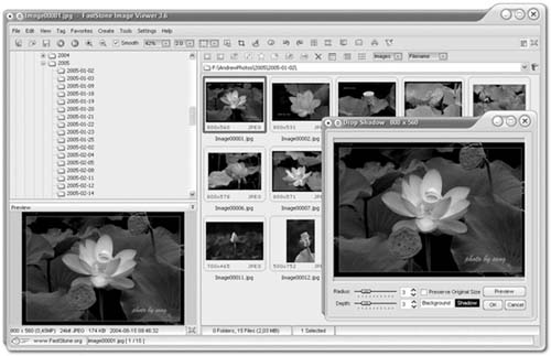
FIGURE 5.12 FastStone image editor. (Courtesy of FastStone, www.faststone.org.)
| Table 5.1 Photo Editing Software | |
| Software and URL | Description |
| Adobe Photoshop Express online www.adobe.com/products/ photoshopexpress/?promoid=CBTVM | The free version of Adobe Photoshop Express is available online, but not for download, and has hobbyist features but lacks the high-end professional features of the full program. |
| FastStone Image Viewer and Editor www.faststone.org | FastStone supports all major graphic formats including BMP, JPEG, JPEG 2000, GIF, PNG, PCX, TIFF, WMF, ICO, and TGA. It has a nice array of features such as image viewing, management, comparison, red-eye removal, e-mailing, resizing, cropping, color adjustments, and musical slide show. |
| GIMP for Windows www.gimp.org | GIMP is an image manipulation program, a freely distributed piece of software for photo retouching, image composition, and image authoring. It works on many operating systems. |
| Serif PhotoPlus www.freeserifsoftware.com/software/PhotoPlus/default.asp | PhotoPlus is a photo editing software that enables users to fix and enhance digital photos, create stunning bitmap graphics, and even produce web animations. |
| Paint.net www.getpaint.net | Paint.NET is free image and photo editing software for computers that run Windows. It features an intuitive and innovative user interface with support for layers, unlimited undo, special effects, and a wide variety of useful and powerful tools. |
| Pixia http://park18.wakwak.com/~pixia/download.htm | Pixia is free, Windows-based software that allows for free painting and retouching. It features custom brush tips, drawing tools, and image color adjustments. |
| ImageForge www.cursorarts.com/ ca_imffw.html | ImageForge provides a set of tools for painting and editing images, photos, or other graphics. Create and edit images; acquire pictures from a scanner, digital camera; apply special effect filters; and produce photo albums and simple slide shows. |
| Ultimate Paint www.ultimatepaint.com | Ultimate Paint is a full-featured 32-bit Windows graphics program for image creation, viewing, and manipulation. |
| XnView www.download.com/ XnView/3000-2192_4- 10067391.html?tag=lst-0-5 | XnView supports red eye correction, crops and transforms JPEG images losslessly, generates HTML pages and contact sheets, and provides batch conversion and batch renaming. |
| Saint Paint Studio www.download.com/Saint-Paint-Studio/3000-2192_4- 10066321.html?tag=fd_sptlt | The Saint Paint Studio paint package is designed to be the essential base tool for editing photos, web graphics, icons, images, and animations. |
| For more photo editor software, try www.WM4MB.com | www.photo-freeware.net |
In an article titled “Top 8 Free Photo Editors for Windows,” Sue Chastain mentioned the following free photo editors. Her list has been expanded to include a couple other programs that are either shareware or offer a free trial period.
CREATING THUMBNAILS
Thumbnails of photographs are popular on web pages. A thumbnail is a small version of a picture that opens a larger graphic file of that picture when the user clicks on it. Most web design programs will automatically create thumbnails with a simple command, but the concept is simple enough to create with a bit of HTML text. First, open the photograph in any photo editing program. Reduce the size of the photograph to the ideal thumbnail size (maybe 150 pixels wide by 200 pixels high). Be sure to resample the resized photograph (thumbnail) for best results. Save the new photograph under a different name so that it won't overwrite the original. A good rule of thumb is to use the same name but add “_small” to the name or “_thm” so you can distinguish it from the original. Then when creating the web page layout, include the smaller thumbnail-sized photo on the page. Create a hyperlink that will lead to and open the larger graphic file. The HTML may look something like that shown in the accompanying box.
HTML LANGUAGE FOR THUMBNAILS
<body>
<p><a href=http://www.kargboys.com/images/KBCover.jpg target=“_blank”>
<img src=“http://www.kargboys.com/images/KBCover_small.jpg” alt=“Karg Boys cover”
width=“150” height=“160”></a></p> </body>
The alt=“Karg Boys cover” denotes text that will be used to fill in if the image does not load into a user's browser. The target command will open the photograph in a new window. If you want it to open in the same browser window, the target command would be target=“_self”.
There are also several shareware programs that will create thumbnails quickly if you have many photos to process, including Easy Thumbnails. Easy Thumbnails is a popular free utility for creating accurate thumbnail images and scaled-down/ up copies from a wide range of popular picture formats (www.fookes.com/ezthumbs).
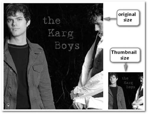
FIGURE 5.13 Example of photo and thumbnail.
WEB DESIGN SOFTWARE
Most software programs provide WYSIWYG editing, meaning you can manipulate components on the web page while seeing exactly what the finished product will look like (theoretically). This has made web designing much easier, especially for the novice web developer. In addition to WYSIWYG, most programs also provide a code-based view for HTML tweaking. For most popular web development programs, it is recommended that the novice user start with ready-made templates (see the section on templates), many of which are available for sale or for free by third-party developers.
The most commonly used programs to create web sites are Adobe's Dreamweaver and Microsoft's Front Page, although Front Page has been replaced by Office SharePoint Designer 2007 and Expression Web, which are partially based on FrontPage technologies.
ConsumerSearch.com states that “Dreamweaver is the best (albeit expensive) choice of web authoring tools for Windows and Mac users. Adobe Dreamweaver CS3 is the darling of the professional web design community for its powerhouse features, including strong support for Cascading Style Sheets (CSS) and all major scripting languages” (www.consumersearch.com/ www/software/web-design-software).
FrontPage from Microsoft has been another commonly used professional web development program, for both the novice and professional, and it allows for FTP uploading of web pages and files. Microsoft has phased out FrontPage but continues to support versions that are still in use in the marketplace.
Microsoft's newer web development software is Expression Web, which is the design tool that is part of the Microsoft Expression suite, along with Expression Graphic (for graphic design) and Expression Interactive (for application design). The newer suite of programs works more seamlessly with other standards such as XHTML (extensible hypertext mark-up language—a hybrid of XML and HTML) and CSS coding for style sheets. In fact, the program is designed to encourage the use of CSS standards. Bloggers and reviewers compare it more closely to Dreamweaver than to the earlier FrontPage program and say it was built from the ground up rather than being an upgrade of FrontPage.
CoffeeCup is an inexpensive, easy-to-use program for beginners, with detailed tutorials. The software is available with many add-on components to create extra features. The HTML editor allows for WYSIWYG editing in the “visual editor” mode or HTML editing in the “code editor” mode. In the visual editing mode, you can drag and drop images, text, and tables, and edit on the fly.
Web Studio 4.0 is the priciest of the midrange software. It is easy to use for the newbie and includes add-ons like a library of templates, photos, buttons, and special effects. Its features include a WYSIWYG design with drag-and-drop components, FTP uploading, and a built-in graphics generating tool, but it lacks an HTML code view for editing, and adding external HTML code can be a challenge.
Web Plus, according to ConsumerSearch, has features comparable to WebStudio. It offers a range of templates, smart objects, and automatic navigation bars and has a free version, Web Plus SE. The company offers templates, wizards, and tutorials to help newcomers create attractive web sites. Web Plus X2 is the commercial version.
Web Easy Professional 6.0, according to ConsumerSearch.com, “features WYSIWYG with drag-and-drop, FTP uploading, CSS support, real simple syndication (RSS) feed support, and multimedia support including Flash animation and scripting. There is a library of templates and thousands of clip-art images, as well as a built-in graphics generating tool. However, it lacks a spell checker and has no HTML editing capability—Web Easy Professional is strictly WYSIWYG.” Web Easy is highly rated by Top Ten Reviews.com. Web Easy Express 6.0 is a freeware version.
WYSIWYG Web Builder is a low-cost, easy-to-use, but limited design program. It features drag-and-drop components including flash and forms. Web Builder features online tutorials, and a fully functional 30-day trial version is available.
PC Magazine describes SJ Namo WebEditor 6 Suite as “an affordable entrylevel program that can grow along with a user's skill level and development needs.” The magazine gives it a high rating and touts its easy-to-use tools. David Nevue, in his book How to Promote Your Music Successfully on the Internet, stated that it is his personal favorite of the WYSIWYG editors and he personally uses it. There is a free trial version, and the full version sells for less than $100. The negatives listed by both PC Magazine and CNET review are that it lacks sufficient tutorials and the features are buried inside dialog boxes.
SiteSpinner is a software program mentioned in Nevue's book as recommended by one of his readers. Top Ten Reviews.com rates it as average, with nice text and image editors, all for less than $50. SiteSpinner offers tutorials, user guides, and online support, as well as a 15-day free trial period.
Nvu is an open-source free program with the basic tools needed to create a web site and an interface that is reminiscent of earlier FrontPage programs. It claims to support many of the same easy-to-use features that make Dreamweaver and FrontPage so popular. Nvu includes some more advanced bells and whistles like JavaScript coding and CSS support. It supports forms and has a file management system (FTP). It provides a WYSIWYG edit view, a code view, and preview mode, similar to FrontPage, and it is compatible with both Windows and Macintosh platforms.
WEB DEVELOPMENT SOFTWARE
The major software packages are available at many online and physical retail locations.
Microsoft Expression Web,
www.microsoft.com/expression/products/overview.aspx?key=web
Front Page, http://office.microsoft.com/en-us/frontpage/default.aspx
Adobe Dreamweaver,www.adobe.com/products/dreamweaver
CoffeeCup,www.coffeecup.com/software
Front Page, http://office.microsoft.com/en-us/frontpage/default.aspx
Adobe Dreamweaver, www.adobe.com/products/dreamweaver
CoffeeCup, www.coffeecup.com/software
Nvu, http://nvudev.com/index.php
Namo WebEditor, www.namo.com
WebStudio, www.webstudio.com
SiteSpinner, www.virtualmechanics.com
Web Easy, www.v-com.com/product/Web_Easy_Pro_Home.html
Web Builder, www.wysiwygwebbuilder.com
WebPlus, www.freeserifsoftware.com/software/WebPlus/default1.asp
TEMPLATES ANYONE?
Templates are predesigned web pages that feature basic elements (placeholders) such as text boxes, backgrounds, buttons, a header, and images. The idea is that you take the template and replace the generic elements with your own. For the novice web designer, using a ready-made template may be a good place to start. Even if you end up throwing out much of the original template and replacing it with your own features, it creates a baseline to work from. The downside of using a template is that your web site might not look unique if others also use the template with little modification. But generally, the template can serve as a guideline because designers with more experience created them. It also provides some of the basic elements such as buttons, backgrounds, dividers, and text boxes. In her article “Why and How to Use Templates Effectively,” Jacci Howard Bear suggested that templates can save time, provide consistency from page to page, and be a less expensive alternative to hiring a designer. She suggested the following steps to modify a template and make it your own:
1. Select the right template, one that closely suites the subject matter so that fewer modifications need to be made.
2. Change the graphics from the generic stock photos and graphics to your own.
3. Change fonts to your own, but keep them suited for the style and image of the site.
4. Change text formatting, perhaps adding bullet points or subheadings.
5. Change the template color scheme. The background, text colors, and other elements can be changed to reflect the image of the site.
6. Change the template layout. Although the original purpose of having a template is to provide a ready made web page design, alterations such as flipping to a mirror image or swapping out sections can help to personalize the template.
Lorem ipsum dolor, what? Many templates come with dummy or placeholder text of nonsense designed as filler until the web designer can replace it with actual text for the web site. In her article “Lorem ipsum dolor,” Jacci Howard Bear suggested working with the placeholder text to experiment with font types and colors and background colors to get an idea what the final product will look like and to give you an idea how much text to write for the web page. You can cut and paste the placeholder text over and over until it approximates the length of the replacement text. It comes in handy if you need to design a web page or a newsletter before the actual article copy is ready for insertion. Just don't forget to replace the dummy text before publication. You can generate your own dummy text at www.webdevtips.co.uk/webdevtips/codegen/ clickgo.shtml.
Lorem ipsum dolor sit amet, consectetuer adipiscing elit, sed diam nonummy nibh euismod tincidunt ut laoreet dolore magna aliquam erat volutpat. Ut wisi enim ad minim veniam, quis nostrud exerci tation ullamcorper suscipit lobortis nisl ut aliquip ex ea commodo consequat. Duis autem vel eum iriure dolor in hendrerit in vulputate velit esse molestie consequat, vel illum dolore eu feugiat nulla facilisis at vero eros et accumsan et iusto odio dignissim qui blandit praesent luptatum zzril delenit augue duis dolore te feugait nulla facilisi.
Many of the web site packages listed in this chapter contain some basic templates. For those with no prior web design experience, it is good practice to experiment with those templates before deciding on a look and layout for your web site. Of course, these packaged templates are the least unique because everyone using that software has access to them. Many third-party companies offer templates. Some are software specific and allow for a more seamless interaction with the program. Others are general HTML coded templates that are designed to work reasonably well with many web design software programs. Some templates are available for free, whereas others charge a fee for either one template or a series. A good place to start looking is TemplatesReview (www.templatesreview.com).
Template Monster is a site that is often cited in blogs and reviews (www.templatemonster. com). The service gets high marks from reviewers and users. You can use the search function to specify what types of templates you are looking for (music) and what feel you want to them. For less than $50, the search returns several possibilities. The site also offers a host of free sample templates and free clip art. 4Templates is another site that offers low-cost templates, starting at less than $22 (www.4templates.com). FreeWebsiteTemplates offers a wide selection of templates at no cost, including Flash templates (www.freewebsitetemplates.com).
ELEMENTS AND CONTENT FOR AN ARTIST WEB SITE
An artist's web site should contain elements that help achieve the goals set out at the beginning of this chapter: branding, promoting products, creating a sense of community and generating repeat traffic. As a part of the branding process, the overall look of the site should reflect the taste of the artist and the expectations of the target market.
An artist's web site should contain the following basic elements:
1. A description and biography of the artist. The home page should have some information or description, but a separate biography page should be created for in-depth information about the artist.
2. Photos. Promotional photos, concert photos, and other pictures of interest. This can include shots of the artist that capture everyday life, photos of the fans at concerts, and other photos that reflect the artist's hobbies or interests.
3. News of the artist. Press releases, news of upcoming tour dates, record releases, and milestones such as awards. This page should be updated often, and outdated materials should be moved to an archive section.
4. Information about recordings. Discography and liner notes from albums to increase interest in the recorded music of the artist. Comments from the artist on the recordings. Information on the recording process.
5. Song information. Lyrics and perhaps chord charts (again to increase interest in the recorded music).
6. Audio files. These may be located on the purchase page to encourage impulse purchases. They may be 30- to 45-second samples or streaming audio rather than downloadable files, to protect against piracy.
7. Membership or fan club signup page. Allows visitors to sign up for your newsletter or to access more exclusive areas of the site. This will help you build an e-mail list and allow for more control over content posted on message boards in restricted areas of the site.
8. Tour information. Tour dates, set lists, driving directions to venues, photographs/ video from live performances, touring equipment list.
9. E-store. Merchandise page for selling records, T-shirts, and other swag.4
10. Contests or giveaways. To increase repeat traffic and motivate fans to visit the site. These can be announced at concerts.
11. Links. To other favorite sites, including links to purchase products or concert tickets, venue information, the artist's personal favorites, e-zines (online magazines), the artist's MySpace page, and other music sites. Ensure that all your offsite links open in a new window so the visitor can easily return to your site.
12. Contact information. For booking agencies, club managers, and the media. This could also include print-quality images for the press.
13. Message board or chat rooms. This allows the fans to communicate with one another to create a sense of community. This can be an area restricted to members only.
14. Blogs. Recently blogs have become popular on the Internet. A blog is simply a journal, usually in chronological order, of an event or a person's experiences. Maintaining a blog of the touring experience is one way to keep fans coming back to the web site to read the most recent updates to the journal. It also gives fans a sense of intimacy with the artist. Video blogging (or vlogging) is also becoming popular.
15. Printable brochures or press kits. Electronic versions of any printed materials that the artist uses in press kits and to send out should be made available on the web site. (See Appendix 1.) On the link to retrieve these items, be sure to mention if they are in the PDF format—some older browsers and slower modems lock up when attempting to open a PDF file in a browser window. Sonicbids is an online site that offers users the ability to create professional-looking electronic press kits for artists (www.sonicbid.com).
By including these elements you will cover the goals of the web site, generate traffic and repeat visits, and provide an around-the-clock source of information and entertainment for fans. Coupled with an aggressive web promotion campaign, a well-designed web site can increase the visibility and popularity of an artist at any stage of the artist's development and career. Once you have determined what content should be included on a web site, decisions must be made regarding the design and layout—what colors, fonts, images, and so on should be used.
The best advice is to scour the Internet to find web sites and web components that are appealing and serve as examples and inspiration for building the perfect site. If a design expert is to be employed, these examples will illustrate to the designer what is expected of the new site. For the do-it-yourselfers, templates are available for most web design programs. Some are offered as part of the software package, some are offered as free downloads, and some are offered for sale (often for a small fee) through commercial software web sites. It may be worth spending a few dollars on a template with a professional and contemporary look. All templates can be modified or customized—the idea is to keep the elements that work and replace those that do not. A good web site can also be the product of evolution. Each time the site is updated, it is tweaked with minor improvements until it finally has the intended look of professionalism and success.
In conclusion, the web site is considered the home base from which promotions are launched. All marketing and promotional materials and campaigns can then direct fans to the web site for more of what they like about the artist. But the web site is just the beginning of the Internet presence for an artist. Chapter 7 addresses how to maximize the web site to increase traffic and sales. Chapters 10 through 12 outline how to promote the web site and the artist on the Internet.
Creating Content for the Web Site
An artist web site is one part press kit, one part electronic store front, and one part social networking site. One of the most challenging aspects of creating a new web site is building up the assets that will be used on the site. The earlier section on basic design rules discussed how to take the content and design a site using storyboarding. The previous section included a list of potential items that may be incorporated into the web site, but how are these assets developed? The publicist is the best person to create these assets. He or she knows how to craft stories and select photographs that depict the artist in the image that best suits the artist's career. Do not leave it to the webmaster to create and select these assets—this is not the webmaster's area of expertise.
If the artist has a press kit, that is a good place to start—using electronic versions of text files and graphics. These items should be developed in advance of designing the web site and should be developed for both online and offline use. An artist biography is usually written by a trained journalist or publicist, who interviews the artist, reads up on the artist's background, understands the market, and then creates a compelling story via the bio. A professional photographer should be hired to take publicity photos. Publicity shots are not the same as a publicity photo. A publicity shot is one taken backstage with other celebritiesor at events. The publicity photo is the official photographic representation of the artist. Publicity photos should be periodically updated to keep current with styles and image. But once a photo is released to the public, it is fair game for making a reappearance at any time in the artist's career, even for artists who have moved on and revamped their image.
The press release is another asset that should be incorporated into the web site. Press releases are a standard tool in public relations, one that works better than letters or phone calls (Spellman, 2000). The press release is used to publicize news and events and is a pared-down news story. Here are some examples of when a press release should be used:
1. To announce the release of an album
2. To announce a concert or tour
3. To publicize an event involving the artist or label
4. To announce the nomination or winning of an award or contest
5. To publicize other newsworthy items that would be appealing to the media
The press release should be written with the important information at the beginning. Today's busy journalists don't have time to dig through a press release to determine what it is about. They want to scan the document quickly to determine whether the information it contains is something that will appeal to their target audience.
The press release needs to have a slug line (headline) that is short, attention grabbing, and precise. The purpose or topic should be presented in the slug line. The release should be dated with contact information including phone and fax numbers, address, and e-mail. The body of text should be double spaced. The lead paragraph should answer the five W's and the H (who, what, where, when, why, and how). Begin with the most important information; no unnecessary information should be included in the lead paragraph (Knab, 2003). In the body, information should be written in the inverse pyramid form—in descending order of importance.
CONCLUSION
A web site should be created after determining the goals of the site, the image of the brand, and the expectations of the visitor. The elements for inclusion should be decided in advance, and the site should be planned before work begins on development. Assets or content for the site should be developed independently with consideration given for elements that will be used both on the web site and in other promotional materials. Publicists should work with web designers and marketers to ensure that the web site meets the goals. In addition to assets, web designers5 and developers need tools, including a web design program and an image editing program.
APPENDIX 1
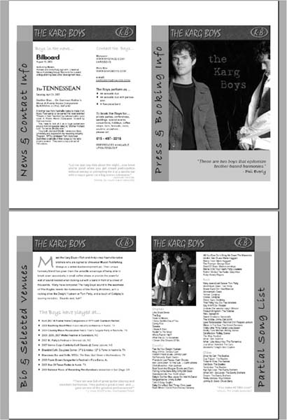
FIGURE 5.14 Printable press kit available from the artist's web site as PDF file. (Courtesy Karg Boys.)
GLOSSARY
Banner - A typically rectangular advertisement placed on a web site, either above, below, or on the sides of the web site's main content and linked to the advertiser's own web site.
Blog - Short for web log, a blog is a web page that serves as a publicly accessible personal journal for an individual. Typically updated daily, blogs often reflect the personality of the author.
Branding - Creating a distinct personality for a product (in this case the artist, not the label) and telling the world about it.
Cookie - A message that a web server gives to a web browser. The browser stores the message in a text file. The main purpose of cookies is to identify users and possibly prepare customized web pages for them.
CSS - Short for cascading style sheets, a new feature being added to HTML that gives both web site developers and users more control over how pages are displayed. With CSS, designers and users can create style sheets that define how different elements, such as headers and links, appear. These style sheets can then be applied to any web page.
FTP - File transfer protocol, the protocol for exchanging files over the Internet.
GIF - Pronounced giff orjiff, GIF stands for graphics interchange format. GIF is limited to 256 colors and is more effective for scanned images such as illustrations than it is for color photos.
Home page - The main page of a web site. Typically, the home page serves as an index or table of contents to other documents stored at the site.
JPEG - Short for Joint Photographic Experts Group, and pronounced JAY-peg. JPEG is a compression technique for color images, used for most photographs on the Web.
Liquid layout - Layouts that are based on percentages of the current browser window's size. They flex with the size of the window.
Navigation bar - A set of buttons or graphic images typically in a row or column used as a central point that links you to major topic sections on a web site.
PDF - Portable document format (PDF) is a file format that has captured all the elements of a printed document as an electronic image that you can view, navigate, print, or forward to someone else. PDF files are created using Adobe Acrobat, Acrobat Capture, or similar products (whatis.com)
PNG - Short for Portable Network Graphics, and pronounced ping, a new bitmapped graphics format similar to GIF.
Splash page - The page on a web site that the user sees first before being given the option to continue to the main content of the site. Splash pages are used to promote a company, service, or product or to inform the user of what kind of software or browser is necessary to view the rest of the site's pages.
Storyboarding - A storyboard is an expression of everything that will be contained in a program or web site—what menu screens will look like, what pictures (still and moving6) will be seen including when and for how long, and what audio and text will accompany the images, either synchronously or hyperlinked.
Thumbnail - A miniature display of a page or photo that can be enlarged when clicked. This enables a web page design that can hold many small images. The thumbnail is simply a smaller version of the picture connected by a hyperlink to the larger photo.
Virtual street team - A group of Internet marketers, generally selected from the target market, who actively promote the artist on the Web, generally from the perspective of the artist's avid fans.
Webmaster - A person or group of people responsible for the design, implementation, management, and maintenance of a web site.
WYSIWYG - Pronounced WIZ-zee-wig and short for “what you see is what you get.” A WYSIWYG application is one that enables you to see on the display screen exactly what will appear when the document is printed or published to the Web.
REFERENCES AND FURTHER READING
Bear, Jacci Howard. Lorem ipsum dolor, http://desktoppub.about.com/cs/pagelayout/a/lorem.htm.
Bear, Jacci Howard. Why and how to use templates effectively, http://desktoppub.about.com/cs/pagelayout/a/use_templates.htm.
Chastain, Sue. Top 8 free photo editors for Windows, http://graphicssoft.about.com/od/pixelbasedwin/tp/freephotoedw.htm.
CNET Web Editor Reviews. Namo WebEditor Suite 2006, http://reviews.cnet.com/ web-graphics/namo-webeditor-suite-2006/4505-3637_7-31752255.html.
ConsumerSearch.com. Web design software reviews, www.consumersearch.com/www/software/web-design-software.
Fehd, Amanda. (2008, March 27). Adobe launches free version of Photoshop. The Tennessean, business section, p. 1.
Gillespie, Joe. www.wpdfd.com.
Knab, Christopher. (November 2003). How to write a music-related press release, http://www.musicbizacademy.com/knab/articles/pressrelease.htm.
Kymin, Jennifer. Basics of web design, http://webdesign.About.com/od/webdesigntutorials/a/aa070504.htm.
Moon, Phoebe. www.phoebemoon.com.
Nevue, David. (2005). How to promote your music successfully on the Internet, www.promoteyourmusic.com.
PC Magazine Software Reviews. SJ Namo WebEditor 6 Suite, www.pcmag.com/article2/0,1759,1607976,00.asp.
Spellman P., (2000, March 24). Media power: Creating a music publicity plan that works: Part 1, www.harmony-central.com./Bands/Articles/Self-Promoting_Musician/chapter-14-1.html.
Top Ten Reviews. SiteSpinner, http://website-creation-software-review.toptenreviews. com/sitespinner-review.html.
Top Ten Reviews. Web Easy, http://website-creation-software-review.toptenreviews.com/web-easy-professional-review.html.
Web Design Services India. www.webdesignservicesindia.com.
Web Graphics. www.sph.sc.edu/comd/rorden/graphics.html.
Web Style Guide. http://webstyleguide.com/page/frames.html.
www.pcmag.com/encyclopedia_term.
www.amacord.com/services/storybrd.html.
www.theclienthelpdesk.com.
1 A street team in the music business is a local group of people, generally members of the target market, who use networking on behalf of the artist in order to reach their target market. A virtual street team serves this same purpose on the Internet and is not necessarily local.
2 Some web sites offer the visitor “high-speed” and “low-speed” versions or “Flash” and “Non-Flash.” The visitor can make the decision at the splash screen and proceed accordingly. Of course, this adds to the complexity and the cost of the web site.
3 Some music sites with splash screens also play music while the splash screen loads and after. While the use of music is discouraged on the splash screen or home page feature, you should also include a mute button in addition to the “skip intro” feature if you insist on including music with the splash screen (or any screen).
4 The e-store can be either integrated into the web site or feature a link to the artist's products on a third-party selling site.
5 There is a difference between web designers and web developers. A designer would not need a web design program, they work only with the graphic design and image editing tools, mostly Photoshop. The developer would be using the site design tools such as Dreamweaver, although most pro developers use other things. Occasionally these two people are one and the same, but in most pro web shops they're at two different desks.
6 Technically, these are called static and dynamic. In web page terms, “static” is a page with fixed text and standard images; “dynamic” is a page with variable information, moving or rotating pictures (or animation), and possibly some visitor interaction.