The risk of equity markets
Understanding the risk you take to get returns
It seems that every pre-bubble period is characterised by an abundance of changing paradigm stories or that ‘this time it’s different’, only for history to repeat itself and markets falling. What follows are the inevitable stories about people who saw it coming and those who predict further gloom.
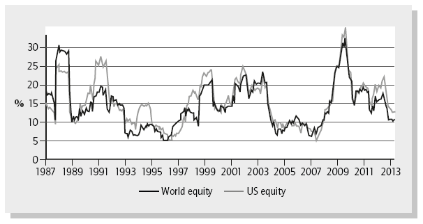
While nobody really knows what will happen to the stock markets, we can make some observations about the risks we take in investing in them. Figure 6.1 shows world and US equity market risk over the past 25 years, illustrated as the trailing 12-month standard deviation (SD) of the returns (explained below).
What you immediately notice is that the risk moves around a lot – it won’t surprise you that the markets moved around a lot during the 2008–09 financial crisis (notice the spike in 2009 where the standard deviation was over 40% for world equities), while market returns were far less volatile in 2007, right before the crisis. What you also notice is how closely tied the world and US risks appear. This is not a surprise as the US market is the largest component of the world market, but also because the world is far more interconnected than it used to be. But what we can also see from Figure 6.1 is that expecting a standard deviation of the equity markets of 20% on the basis of how it has been in the past is not a terrible guess.1
The standard deviation is important as it is meant to give you an idea of how much returns may vary. It assumes that returns are distributed around an expected average return of all the many potential outcomes, and the standard deviation tells you how different from the average return many outcomes will be. A higher standard deviation means that more outcomes are very different from the average outcome, while a low standard deviation suggests that most outcomes are clustered around the average outcome. While we don’t know what the future outcome will actually be (unless you have a crystal ball), the standard deviation helps us understand how great a variation there may be in actual future outcomes.
The standard deviation
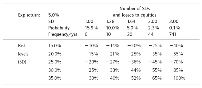
Table 6.1 gives you an idea of how frequently you may lose a lot of money, depending on the risk you think equities will have. The higher the standard deviation the more frequently you will lose a lot of money.2 A 20% annual standard deviation for equity returns may be a reasonable guess in future, but as you can see from Figure 6.1, the standard deviation does vary a lot over time. Table 6.1 shows how much you would lose at standard deviations of between 1 and 3 (so increasingly unlikely and big losses), if the standard deviation of the markets was 15–35% and you assumed that the markets on average return 5%.
So while it is obvious that greater risk generally means more fluctuating outcomes, the standard deviation helps us quantify it. Instead of putting a finger in the air and making vague statements like ‘losing 20% in a year is pretty unlikely’, the standard deviation can help us be more specific if we have a view on how risky the market is. And greater specificity helps us understand the potential frequency of different losses when investing in the market.
As an example, if you believe that the standard deviation of your returns is 20% and the expected return is 5%, then you know that there is roughly a 15.9% probability (or risk) (one standard deviation) that a £100 investment will turn into £85 one year later. (The mean expected return was £105, but with a standard deviation of 20% a one-standard deviation loss would be a £20 loss for a £85 result.) If we assumed a 25% standard deviation there would be a 15.9% probability that our £100 had become £80. You can also see that a 2 standard deviation outcome is something that only happens 2.3% of the time (so about every 44 years), but if the standard deviation we expect in future is 25% and we are unfortunate enough to have a 2 standard deviation loss in one year, we would lose 45% (5% expected return minus 2 × 25%).
So what does this mean for you?
Going back to Figure 6.1 you can get a decent picture of what risk you take by investing in the two markets. (Simplistically, I suggest using a 20% standard deviation.) You can then take this risk and use the standard deviation table (see Table 6.1) to estimate how frequently you may expect to incur various levels of losses in the equity portion of the portfolio. While using the standard deviation is not an exact science in this context (we don’t know nearly enough about future risk to say that there is precisely a 15.9% or 2.3% chance of the loss), at a basic level the standard deviation can help us understand the probability of various things happening to our equity portfolio, and thus help us plan our finances.
This may seem like finance mumbo jumbo, but you should try to understand it because it gives you an idea of how much money you can make or lose from investing in equity markets.
The standard deviation is useful, but hard to predict and has some flaws
The large fluctuations in the risk of the equity markets shown in Figure 6.1 suggest that we should generally be cautious about claiming too much precision in estimating the risk of an investment portfolio.
Consider the increase in the market risk during the 2008–09 financial crisis. If you had allocated assets to equities because you thought they had a risk profile similar to the historical one, you would find yourself at the height of the crisis with an equity portfolio far riskier than that. Equities are more volatile in times of crisis, but this is also typically where you have already lost a lot of money investing in them. If you shied away from equities at the peak of the crisis because they were now riskier than before, you would be selling equities and probably lock in a big loss, perhaps at the bottom of the market. In order to avoid this, you must make a conservative enough allocation to equities so that you can afford both the occasional losses but also the increased risk that inevitably comes with that decline.
While the standard deviation is a useful concept it is certainly not a perfect measure of risk. One of its drawbacks is that it does not properly account for skew or ‘fat tails’. What this means is that outcomes that are considered highly unlikely if you look only at the standard deviation, in reality happen a lot more. This is very important as otherwise we would massively underestimate how frequently we can expect to incur very large losses from our equity portfolio. At the time of writing, the standard deviation of the S&P 500 is around 15%; if we assume an expected return of 5% a year we can see from above that a 40% loss would be a 3 standard deviation event (a 45% move from the 5% expected outcome). We can also see that if we blindly used the standard deviation we would expect this to happen every 741 years, when we know that in reality it happens every couple of decades.
Understanding that highly unlikely events happen more than suggested by the standard deviation is important when we consider the risk of our portfolio. Large losses can and probably will happen, and almost certainly happen more than the simple standard deviation will have us think. How much more is hard to predict, but be ready for the possibility, and avoid just blindly using the standard deviation to understand your risk, even if some textbooks and finance practitioners seem to think that this method is the answer. It’s not.
If you are confused about all this, don’t despair. You are not alone, and until a couple of decades ago this stuff was rarely mentioned even in academia. Just remember that the standard deviation gives you a reasonable idea of how much money you can make or lose and is therefore useful for planning the portfolio, but also remember that unlikely bad events with large losses happen far more than the standard deviation suggests, and be ready for surprises.
You can lose a lot!
Most often when we talk about standard deviations we worry less about the small swings in values; we worry more about losing a lot of money quickly.
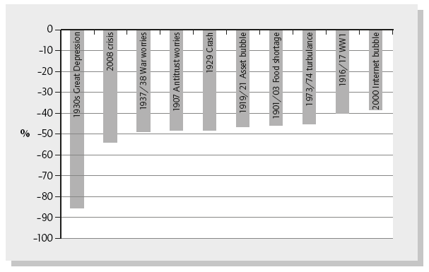
With an increase from around 40 at its inception in 1896 to trading at around 13,000 at the time of writing, the Dow is a manifestation of the equity market’s staggering success story and a neat illustration of the riches that are to be gained from investing in stock markets. That said, the progress of the Dow has not been without its losses, most notably around the Great Depression. Figure 6.2 shows the worst losses the Dow has incurred since its inception.
It is obvious that investing in the stock markets can lose you a lot of money.
Figure 6.2 is a great way to put things in perspective. A super-simple and non-mathematical way to use the chart would be to say, ‘If there is a crisis that is as bad as the 1930s depression, at least we know that then the stock market declined by over 80%.’ Or, ‘If the 2008 financial crisis was to be repeated we know that in that case the markets declined by 50%.’
While future events that lead to losses in the market may not look like past ones, this kind of simple comparison is a useful way to frame risk.
Recovering from the magnitude of losses like those in Figure 6.2 can take a long time, even if you were able to endure the painful losses and hold on to your equity position. Keep in mind that had you invested $100 in the Dow before the 1930 declines started you would have been left with only about $15 at the bottom, challenging even the most patient investor.
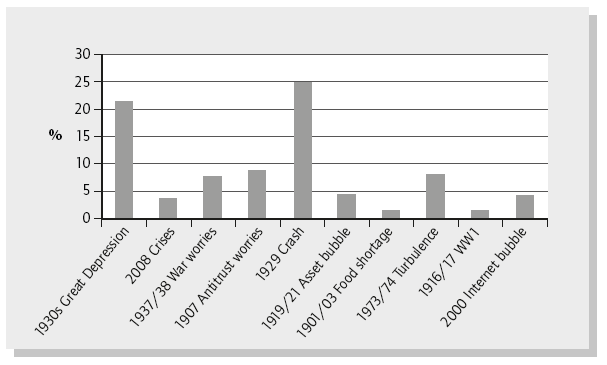
Figure 6.3 shows how long it took in years for the Dow to recover from the declines shown in Figure 6.2.
The point is that even once you have hit the bottom it may take a long time to be dug out of that hole, and in many cases longer than most investors’ time horizons.
Don’t assume that markets always bounce back
Of course the charts above are based entirely on the US stock market and specifically the Dow, a small subset of that market. People often use the US stock market for data analysis as it is not only the place with the most comprehensive data sets but it has, at least historically, dominated financial academic circles. Until only a couple of decades ago it was not as simple to get international data seamlessly and even if you did get the data it was not easy to analyse.
One of the problems with using US-based data is the large selection bias that is introduced. The twentieth century was the American century and the stock market reflected this success. But just because we use data from a very successful century in a very successful geographical area does not mean that things will be like that in future.
Imagine if you were an investor in the Russian stock markets or government bonds just before the 1917 revolution. You would have lost everything without hope or recourse. Likewise, there have been many instances of large-scale and irrevocable losses for investors. When studying the charts above there may be a dangerous tendency to believe that ‘it may take a while, but equity markets will always come back’. They may not.
The disadvantage with the view that markets will always bounce back is that some investors will want to ‘average in’ to falling markets, i.e. buy on weaknesses, dips, etc. After all, if markets always bounce back, the reasoning goes, you will eventually be fine. That thinking is akin to a gambler going to a casino, betting on red and keeping on doubling down whenever he loses. That strategy works really well until the one time when it really, really doesn’t work and you run out of money.
Some may view the rebound from the 2008 financial crisis as evidence that markets do always bounce back, and that historical instances of complete and ‘un-rebounded’ losses are exactly that: history. To those I would say, look at Japan.
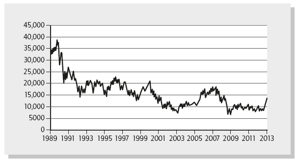
In Figure 6.4 the main Nikkei index is trading at an approximate 65% discount to its peak in the early to mid–1990s. When I was studying economics at university in the early 1990s, I remember how often we considered the Japanese miracle. We were told how special characteristics like lifetime employment and superior production techniques had led to Japan’s spectacular rise and the implication was clear: Japan would continue to prosper. But already as I headed to business school in 1996–98 there were few mentions of the Japanese economic miracle, other than the odd case on auto production techniques.
Even if the Nikkei does recovery fully it is entirely possible that this will be so far into the future as to be irrelevant for many current readers’ financial lives. From the vantage point of 1990 many would have predicted the chart shown in Figure 6.4 to apply to leading European or US markets, not Japan. So don’t exclude the possibility that this can happen in your local equity markets or even the wider world equity markets.
We don’t know what is to come, but it’s dangerous to extrapolate too much from historical data alone. We don’t know what we don’t know, and it is hard to incorporate this factor. Over the next year, decade or century we could be blessed with peace and prosperity, or some completely unpredictable calamity. Looking at how the US stock market reacted to the dire events in the twentieth century may give us an indication of how the world stock markets will react in future, but it’s also quite possible that future losses will look very different.
Diversification and the false sense of security
Although correlations between various national stock markets have generally increased over the past decades, the benefits from diversification are still clear. Local companies, in general, are more dependent on the global markets than they were decades ago, but there are still unique characteristics to national economies. The latter operate in different legal and political climates and while they may be dependent on local factors such as access to commodities, skilled labour, tourism, etc. they are also influenced by natural disasters (as in Japan) or political upheaval (as in the Middle East). Diversifying away from such exposures in one region or country makes a lot of sense.
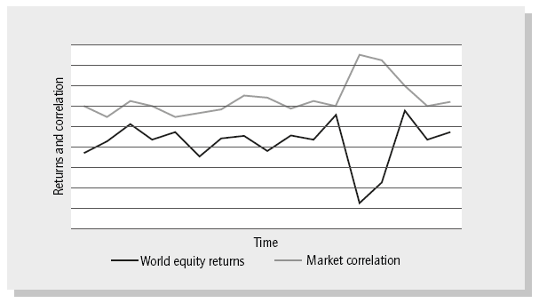
The main problem with higher correlation in down markets is that we are not always afforded the protection of diversification when we really need it. We are probably less concerned that the volatility of our monthly returns is slightly higher because correlations are higher than expected if this happens in a market where we are up 10% a year (see Figure 6.5). But if we are down 40% because of high correlations between our different investments then we care a lot. If we believe that the correlation between investments is more or less a constant number we would have understated our portfolio risk in bad markets and be more exposed to losses than we thought. Increased correlation was a factor that affected a lot of investors in the 2008 crash, when not only did various international stock markets correlate, but also several supposedly uncorrelated asset classes did so as well. (Certain government bonds were a notable exception, being the safety asset in the turbulence.)
A major selling point of the US sub-prime investment proposals was that there had never been a case where all housing markets in the US had declined at the same time. This diversification was supposed to provide great investment security and was a major driver of the high ratings and attractiveness. In simple terms, investors did not believe that the housing markets in Miami, Las Vegas and Dallas would all collapse at the same time and were therefore willing to provide more debt at a low cost. During the crash, correlations between the various housing markets shot up to the point at which they acted like one market instead of providing diversification against a location specific decline. The resulting eggs of embarrassment on the face of the financial community and huge monetary losses became all too obvious.
Some people look back at historical market declines that used to be more geographically contained and wish they had had the chance then to diversify internationally. Now they can diversify, but correlations are up. You can’t have it all. Over time, as cross-border capital flows to foreign equity markets increase and the world generally becomes more interconnected because of trade or information flows, correlations will probably increase even further. Higher correlation means that we would be fooling ourselves if we think diversification alone protected us against bad things and we accepted higher risk in our portfolio as a result.
Risk rethought
To some, standard deviations or skew might sound like an archaic finance-related term that will get us all in trouble. What I’m suggesting is not to use this as an exact science, but rather as a tool that gives a general idea of what the perceived risk of investing in equities will be in the future. The next step is to figure out how to use that in understanding the risk of our portfolio.
Other than basing things on a gut feel or what we glean from newspapers, we can get a more accurate sense of where things stand. A future market standard deviation of 20% is clearly not the same as one of 40%: the market is expecting far less risk. Similarly, you can’t just assume that future returns are distributed like the neat bell curve of the standard deviation – they are not. Understanding that there is skew helps to explain this; it makes more sense that really bad events can and probably will happen on occasion despite the standard deviation suggesting that it is as unlikely as being hit by a meteor.
This chapter has been less about giving answers than about informing the gut feel that investors probably already have about the equity markets. In the long run we can expect good returns from equities, but this is not without risks, and those risks can be unpredictable and severe. We’d better plan for that.
1 For those willing to engage in some complex maths there is a better way to predict the future volatility of stock markets. When looking at the price of an option on a stock market index the only variable that is not readily observable is the expected volatility (the other inputs are: the strike price of the option, the current price of the index, time to maturity and the interest rate). Using the Black-Scholes option pricing formula we can obtain the implied volatility. Looking at the implied volatility for options with various maturities we can see how volatile traders expect the market to be in future. In the past, the implied volatility of index options have been better predictors of future market volatility than using the historical volatility of the stock market. For the S&P 500 index you can look at the VIX index, which gives the implied volatility for that market for the coming month, but expect the implied volatility to be very different depending on the market, maturity and strike price you are looking at.
2 You can look up the probabilities associated with various standard deviations and get a fuller explanation of standard deviation in general, on Wikipedia. This also shows the recognisable ‘bell-shaped curve’ of the normal distribution.

