If you use Flash frequently, there may be symbols that you’ve found yourself using over and over—a button, for example. There’s no point in recreating the symbol and its accompanying ActionScript if you can reuse a symbol and script that you’ve already made.
Flash takes that principle a step further: It provides ready-made, prescripted symbols, called components, that you can use in any movie. You can find them in the Components panel (Window > Components).
The ActionScript inside these components is thorough and robust, so you can depend on them to work properly in every situation. In addition, because the ActionScript has been compiled (see #83), the scripts run much faster and make fewer demands on the computer than scripts you’d write yourself.
To make the best use of components, you have to be able to write scripts that will integrate them into your movie. Like the previous chapter, this chapter doesn’t attempt to teach the level of ActionScript you need to know, but it does provide a few examples that will allow you to use components in simple ways.
Because ActionScript 3.0 and 2.0 are mutually incompatible, Flash comes with two different sets of components. If you choose ActionScript 3.0 as the scripting language for a FLA file, the Components panel shows the ActionScript 3.0 components; otherwise, it shows the ActionScript 2.0 components. The ActionScript 3.0 components are uniformly faster, lighter, and easier to use than those for 2.0. For that reason, we’ll focus here on the ActionScript 3.0 components, although some of the techniques you see here will apply to earlier component versions as well.
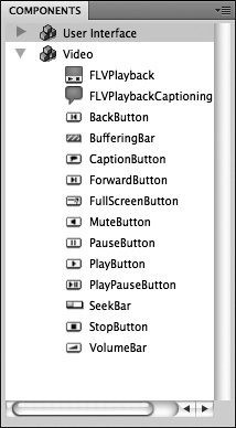
The ActionScript 3.0 components that come with Flash CS4 fall into two categories: user-interface (UI) components and video components. The UI components (Figure 96a) are familiar elements that allow users to interact with programs and Web sites: buttons, menus, sliders, check boxes, and so forth. The video components (Figure 96b) allow users to control video that’s playing back as part of a Flash movie.
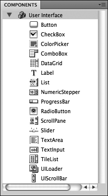
Figure 96b With the exception of the FLVPlayback component, which Flash deploys as part of the video-import process (see #69), the ActionScript 3.0 video components shown here require familiarity with ActionScript.
To add an instance of a component to your movie, drag it from the Components panel onto the stage. Two items are added to the library: the component itself and Component Assets, a folder of supporting files. To use additional instances of the same component, drag them from the library, not from the Components panel.
Note
If you use more than one type of component in a movie, only the first will add the Component Assets folder to the library. Additional components will share the same set of supporting files.
Adding a component instance to your movie presents the same problem as adding a button (see #27): The component functions properly in your movie—a check box is clickable, a slider is slideable, and so on—but it doesn’t accomplish anything. To make a component useful, you have to write ActionScript code that monitors each instance of the component and responds to changes in it. You’ll see an example of this kind of script in #100.
While using off-the-shelf components is convenient, the components’ default designs won’t always seem appropriate in your movie. Flash addresses this issue by providing several ways to modify the appearance of ActionScript 3.0 components:
• Use the Properties panel. As with standard movie clips, you can use the menus on the Properties panel to change the color effect (see #25) or blending mode (see #38) of a component instance.
• Use the Free Transform tool. Transforming a component instance doesn’t always yield the results you’d expect. Depending on the component, scaling an instance may change one dimension, both, or neither, and it doesn’t affect text size at all. Skewing or rotating an instance works fine on the graphic part of the component, but it makes all text—labels and data—disappear. You can avoid this problem by embedding a font (see #99).
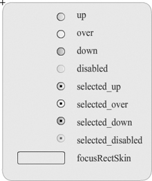
• Edit the component. Double-clicking an instance on the stage puts it into symbol-editing mode, but with a difference: All of the states of the component are shown (Figure 97a). Double-click one of the states to edit it as you would a standard symbol. (If you want a particular change to affect multiple states, you have to edit each one individually.) You can change the graphic portion of the component (Figure 97b), but you can’t change the appearance of the text—that can be done only through ActionScript.
Tip
To change an edited component back to its original appearance, drag another copy of the component from the Components panel to the library. When you see a dialog box telling you there’s a conflict, choose Replace Existing Items.
• Use ActionScript. Although you can’t use ActionScript to make radical changes in a component’s appearance, you can change attributes such as its size and visibility. You can also make changes in the font, size, and style of the component’s text. For an example of how ActionScript is used to set these parameters, see #98.
Although the line between them is fuzzy, you can think of the properties of a component instance (see #97) as referring to outward characteristics such as size and color, and parameters as referring to more functional aspects. Each component has a different set of parameters, but here are some of the more common ones for user-interface components:
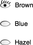
• Label and labelPlacement. A label is the text that’s associated with an instance. The standard placement of the label varies according to the component (Figure 98a).
• Value. When a user makes a choice from a menu or from among a group of radio buttons, the information that’s reported back to ActionScript is called the value. The value is often the same as the label, but it doesn’t have to be. For example, if a user chooses “Yes” in response to “Do you want a sales representative to call you?” the value (unseen by the user) might be “sucker.”
• Selected. This parameter, which can be set to “true” or “false,” determines whether an instance is already selected when it first appears on the stage—for example, whether a check box initially has a check in it.
• Enabled and visible. Selecting “false” for the enabled parameter causes an instance to appear dimmed on the stage; selecting “false” for the visible parameter causes the instance to disappear entirely.
There are two ways to set an instance’s parameters:
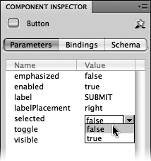
• Use the Component Inspector. You can open the Component Inspector panel by choosing Window > Component Inspector. When you select a component instance on the stage, the Component Inspector displays a table listing all of that instance’s parameters. A default value is filled in for each parameter, but you can make changes by typing new values into text fields or choosing them from menus (Figure 98b).
• Use ActionScript. The instance whose parameters you want to set must have an instance name (see #90). The ActionScript code for setting parameters takes this general form:
instanceName.parameter = value;
For this example, assume we have an instance of the check box component called checkbox1. To change the instance’s label and put a check mark inside, we could put the following code in a frame 1 script:
checkbox1.label="I use Flash";
checkbox1.selected=true;
Writing this script doesn’t change anything in the authoring environment; it takes effect only when you test or publish the movie (Figure 98c).
The simple syntax shown here is useful only for the parameters that are listed in the Component Inspector. Changing other characteristics of an instance requires more elaborate scripting, as you’ll see in #99.
Usually, the first thing you want to do with an instance of a component is change the appearance of its label. The label’s small size and unexciting font don’t go well with every movie.
Changing the label properties is tricky, because the label is actually a separate entity: In ActionScript terms, it’s an instance of the TextFormat class inside an instance of the component (see #87).
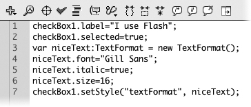
To demonstrate how this works, let’s continue with the example from Figure 98c. Assume we want the label for checkbox1 (the I Use Flash check box) to be in 16-point Gill Sans italic. We start by creating a new instance of the TextFormat class, which we’ll name niceText:
var niceText:TextFormat = new TextFormat();
We can then set the properties of that instance:
niceText.font="Gill Sans";
niceText.italic=true;
niceText.size=16;
Finally, we set the style for checkbox1. The specific style property we’re setting is textFormat, and the model we’re using is the instance we called niceText.
checkbox1.setStyle("textFormat", niceText);
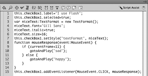
The finished script is shown in Figure 99a; the result of publishing the movie is shown in Figure 99b.
Figure 99a The finished script (including the two lines we wrote in #98) is displayed in the Actions panel.
You may choose to embed the font that’s used in a label. Embedding a font isn’t required, but it’s good insurance in case the user’s computer doesn’t have that font installed. It also keeps the label from disappearing if the component instance is rotated or skewed (see #97). The only drawback to embedding a font is that it increases the size of the SWF file.
To embed the Gill Sans font that’s used in the label for checkbox1:
1. Create a new font symbol by right-clicking (Windows) or Control-clicking (Mac) inside the library and choosing New Font from the contextual menu.
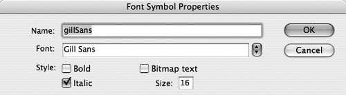
2. In the Font Symbol Properties dialog box, name the symbol gillSans (or whatever name you prefer) and choose its font, style, and size (Figure 99c). Click OK.
The font symbol appears in the library.
3. Right-click (Windows) or Control-click (Mac) the font symbol and choose Linkage from the contextual menu.
4. In the Linkage Properties dialog box, select Export for ActionScript. Flash fills in the Class and Base Class fields. The information in these fields allows ActionScript to recognize the font symbol.
5. Write down the name that Flash put into the Class field. Click OK.
If an alert box appears, click OK again.
6. In the Actions panel, add the following line to the top of your frame 1 script.:
var embeddedFont:Font=new gillSans();
This creates an instance of the font symbol and gives it the name embeddedFont (or whatever you’d like to call it). The word after new is the class name that you wrote down in the preceding step.
7. Go to the line in which you formerly specified a font for the niceText instance. Delete the font name and rewrite the line as follows:
niceText.font=embeddedFont.fontName;
(If you used a different instance name in Step 6, use it instead of embeddedFont.) The revised code tells niceText to use the embedded font rather than the one on the user’s computer.
8. Add one more line to the end of the script, giving the check box instance permission to use the embedded font:
checkbox1.setStyle("embedFonts", true);
9. To make sure Flash really is using the embedded font, use the Free Transform tool to rotate or skew the checkbox1 instance on the stage.
10. Test or publish the movie. If the label next to the check box appears rotated or skewed, Flash is using the embedded font (Figure 99d). If the text disappears, you’ve done something wrong—go through the steps again.

The component instances we’ve created in #97 through #99 look good, but they don’t do anything useful. To make an instance respond to user input, you have to know two things: First, what event do you want the instance to respond to—for example, a rollover, a mouse click, a key press? Second, what do you want to happen as a result of that event?
For this example, let’s combine the check box from #99 with the happy-sad face movie that we made in #90. What we want to happen is:
• When the check box is selected, the face becomes happy (Figure 100a).

• When the check box is deselected, the face becomes sad.
Let’s start by laying out the timeline. It looks similar to Figure 89b, but the first frame has been deleted. There are now two segments: “happy” from frames 1 to 10 and “sad” from frames 11 to 20 (Figure 100b).
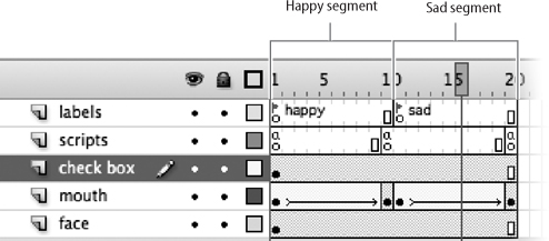
The instance of the check box component—which we’ll call just the check box for short—is placed where the Happy and Sad buttons used to be, and it remains visible throughout the movie. In frame 1 of the Scripts layer, we paste the script from Figure 99a. (For simplicity’s sake, we’re omitting the embedded font.)
If we test the movie at this point, the check box looks and works just as it did before. Independently, the face starts out neutral, becomes happy, and stops.
Now let’s tie the movement of the face to the events in the check box. When the movie begins, the check box is selected and the face becomes happy: That’s exactly what we want to happen. When the user clicks the check box to deselect it, we want the face to turn sad. To make that happen, we can add the following function to the frame 1 script:
function mouseResponse(event:MouseEvent) {
if (currentFrame<11) {
gotoAndPlay("sad");
} else {
gotoAndPlay("happy");
}
}
(The function here is named mouseResponse, but you can name it anything you like.) You may not understand every detail of the code, but it should be clear what’s happening: When the user clicks the mouse, if the playhead is anywhere in the happy segment, it moves to the beginning of the sad segment; if it’s anywhere in the sad segment, it moves to the beginning of the happy segment. (We cheated here and used a frame number instead of a frame label, but doing otherwise would have made the script too complicated.)
We want this function to be triggered in response to a mouse click in the check box. To accomplish this, we use an event listener (see #88):
this.checkbox1.addEventListener(MouseEvent.CLICK, mouse
Response);
This line of code adds an event listener to checkbox1 that waits for a click of the mouse. When it “hears” one, it activates the mouseResponse function.
The finished script (Figure 100c) produces the results that were shown in Figure 100a. It doesn’t do so in the most polished or foolproof way—for example, the script doesn’t know whether the check box is selected at any given time—but it should be simple and clear enough to get you started with writing your own ActionScript scripts.