In this chapter, we discuss how to design user interfaces for Android applications. Here we focus on the various layout widgets you can use to organize screen elements in different ways. These layout objects include LinearLayout, TableLayout, FrameLayout, and RelativeLayout. We also cover some of the more complex View objects we call container views. These are View objects that can contain other View objects and widgets. Finally, we talk about extending application functionality beyond the typical boundaries using AppWidgets.
Application user interfaces can be simple or complex, involving many different screens or only a few. Layouts and user interface widgets can be defined as application resources or created programmatically at runtime.
As discussed in previous chapters, Android provides a simple way to create layout files in XML as resources provided in the /res/layout project directory. This is the most common and convenient way to build Android user interfaces and is especially useful for defining static screen elements and widget properties that are known in advance, and to set default attributes that can be modified at runtime programmatically.
Caution
If you use Eclipse layout resource designer to design user interfaces for your Android development, it can be helpful to preview the layouts created. This is useful for catching obvious issues, but the preview can’t replicate the exact look and feel of the view the end user sees on the device or phone. For this, you must test your application on the emulator and most important on your target devices.
Almost any ViewGroup or View (or View subclass) attribute can be configured using the XML layout resource files. This method greatly simplifies the user interface design process, moving much of the static creation and layout of user interface widgets, and basic definition of widget attributes, to the XML, instead of littering the code. Developers reserve the ability to alter these layouts programmatically as necessary, but they can set all the defaults in the XML template.
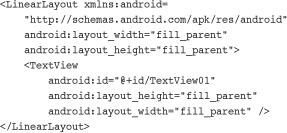
You’ll recognize the following as a simple layout file with a LinearLayout and a single TextView widget. This is the default layout file provided with any new Android project in Eclipse, referred to as /res/layout/main.xml:
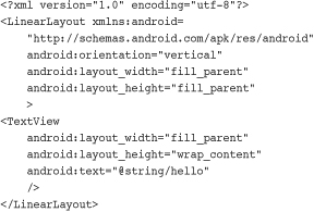
This block of XML shows a basic layout with a single TextView. The first line, which you might recognize from most XML files, is required. Because it’s common across all the files, we do not show it in any other examples.
Next, we have the LinearLayout element. LinearLayout is a ViewGroup that shows each child View either in a single column or in a single row. When applied to a full screen, it merely means that each child View will be drawn under the previous View if the orientation is set to vertical or to the right of the previous View if orientation is set to horizontal.
Finally, there is a single child View, in this case a TextView. A TextView is a widget, which is also a View. A TextView draws text on the screen. In this case, it draws the text defined in the “@string/hello” string resource.
Creating only an XML file, though, won’t actually draw anything on the screen. A particular layout is usually associated with a particular Activity. In your default Android project, there is only one Activity, which sets the main.xml layout by default. To associate the main.xml layout with the activity, use the method call setContentView() with the identifier of the main.xml layout. The ID of the layout matches the XML filename without the extension. In this case, the preceding example came from main.xml, so the identifier of this layout is simply main.
setContentView(R.layout.main);
You can also create user interface components at runtime programmatically, but for organization, this is best left for the odd case rather than the norm. The main reason is because the creating of layouts programmatically is onerous and difficult to maintain, whereas the XML resource method is visual and more organized.
The following example shows how to programmatically have an Activity instantiate a LinearLayout view and place two TextView objects within it. No resources whatsoever are used; actions are done at runtime instead.
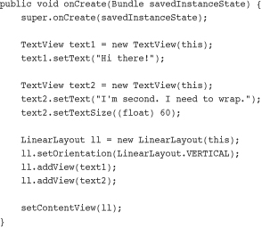
The onCreate() method is called when the Activity is created. The first thing this method does is some normal Activity housekeeping by calling the constructor for the base class.
Next, two TextView widgets are instantiated. The Text property of each TextView is set using the setText() method. All TextView attributes, such as TextSize, are set by making method calls on the TextView object. These actions perform the same function that you have in the past by setting the properties Text and TextSize using the Eclipse layout resource designer, except these properties are set at runtime instead of defined in the layout files compiled into your application package.
Tip
The XML property name is usually similar to the method calls for getting and setting that same widget property programmatically. For instance, android:visibility maps to the method setVisibility() and getVisibility(). In the preceding example TextView, the methods for getting and setting the TextSize property are getTextSize() and setTextSize().
To display the TextView objects appropriately, we need to encapsulate them within a container of some sort (a layout). In this case, we use a LinearLayout with the orientation set to VERTICAL so that the second TextView begins beneath the first, each aligned to the left of the screen. The two TextView widgets are added to the LinearLayout in the order we want them to display.
Finally, we call the setContentView() method, part of your Activity class, to draw the LinearLayout and its contents on the screen.
As you can see, the code can rapidly grow in size as more View widgets are added and more attributes for each View are needed. Here is that same layout, now in an XML layout file called /res/layout/main.xml:
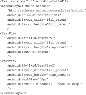
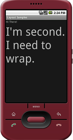
You might notice that this isn’t a literal translation of the code example from the previous section, although the output will be identical, as shown in Figure 7.1.
First, in the XML layout files, layout_width and layout_height are required attributes. Next, you see that each TextView object has a unique id property assigned so that it can be accessed programmatically at runtime. Finally, the textSize property needs to have its units defined. The XML attribute takes a dimension type (as described in Chapter 5, “Managing Application Resources”) instead of a float.
The end result differs only slightly from the programmatic method. However, it’s far easier to read and maintain. Only one line of code is needed now to display this layout view. Again, that’s
setContentView(R.layout.main);
We talked in the previous chapter about how the class View is the building block for user interfaces in Android. All user interface widgets, such as Button, Spinner and EditText, are derived from the View class.
Now we talk about a special kind of View called a ViewGroup. The classes derived from ViewGroup allow developers to display View objects (including all the user interface widgets you learned about in the previous chapter) on the screen in an organized fashion.
Like other View objects, including the widgets talked about in the previous chapter, ViewGroup objects control a rectangle of screen space. What makes ViewGroup different from your typical widget is that ViewGroup objects contain other View objects. A View that contains other View objects is called a parent view. The View objects the parent View contains are called child views, or children.
View child objects are added to a ViewGroup programmatically using the method addView(). In XML, child objects are added to a ViewGroup by defining the child View widget as a child node in the XML (within the parent XML element, as we’ve seen various times using the LinearLayout ViewGroup).
ViewGroup subclasses are broken down into two categories:
• Layout classes
• View container widgets
The Android SDK also provides the Hierarchy Viewer tool to help visualize the layouts you design, as discussed later in this chapter.
The direct subclasses of ViewGroup are the classes ending with the word “Layout,” for example, LinearLayout, RelativeLayout, and FrameLayout. Each of these layout classes are used to position groups of View objects (widgets) on the screen in different ways. For example, we’ve been using the LinearLayout to arrange various TextView and EditText widgets on the screen in a single vertical column. We could have used an AbsoluteLayout to specify the exact x/y coordinate locations of each widget on the screen instead, but this is not easily portable across many screen resolutions. Users do not generally interact with the Layout objects directly. Instead, they interact with the View objects they contain.
The second category of ViewGroup subclasses is the indirect subclasses. These special View objects act as View containers like Layout objects do, but they also provide some kind of functionality that allows users to interact with them like normal widgets. Unfortunately, these classes are not known by any handy names, instead they are named for the kind of functionality they provide.
Some classes that fall into this category include Gallery, GridView, ImageSwitcher, ScrollView, TabHost, and ListView. It can be helpful to consider these objects as different kinds of View browsers. A ListView displays each View as a list item, and the user can browse between the individual View objects using vertical scrolling capability. A Gallery is a horizontal scrolling list of View objects with a center “current” item; the user can browse the View objects in the Gallery by scrolling left and right. A TabHost is a more complex View container, where each Tab can contain a View, and the user chooses the tab by name to see the View contents.
In addition to the Eclipse layout resource designer provided with the Android plug-in, the Android Software Development Kit (SDK) provides a user interface tool called the Hierarchy Viewer. The Hierarchy Viewer can be found in the Android SDK subdirectory called /tools.
The Hierarchy Viewer is a visual tool that allows you to inspect your Android application’s View objects and their parent-child relationships. You can drill down on specific View objects and inspect individual View properties at runtime. You can even save screenshots of the current application state on the emulator or the device, although this feature is somewhat unreliable.
To launch the Hierarchy Viewer with your application in the emulator:
- Launch your Android application in the emulator.
- Navigate to the Android SDK
/toolsdirectory and launch the Hierarchy Viewer. - Choose your emulator instance from the Device listing.
- Select the application you want to view from the windows available. For example, to load an application from this book, choose one like
com.androidbook.parisview. - Click Load View Hierarchy button on the menu bar.
By default, the Hierarchy Viewer loads the Layout View of your application. This includes the parent-child view relationships shown as a Tree View. In addition, a property pane shows the various properties for each View node in the tree when they are selected. A wire-frame model of the View objects on the screen is shown and a red box highlights the currently selected view, which correlates to the same location on the screen.
Tip
You’ll have better luck navigating your application View objects with the Hierarchy Viewer tool if you set your View object id properties to friendly names you can remember instead of the auto-generated sequential id tags provided by default.
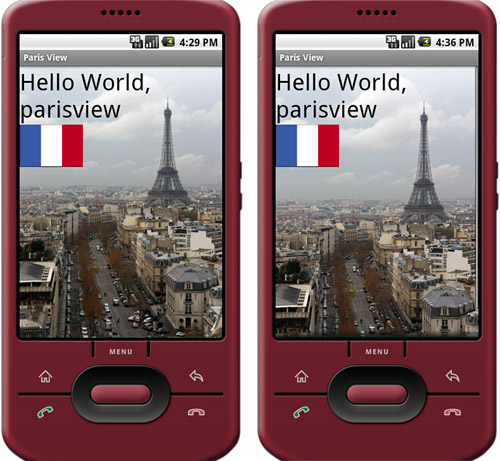
Figure 7.2 shows the Hierarchy Viewer loaded with the ParisView project from Chapter 5, which was a one-screen application with a single LinearLayout with a TextView and an ImageView child widget within it. The bulk of the application is shown in the right subtree, starting with LinearLayout with the identifier ParisViewLayout. The other subtree is the Application title bar. A simple double-click on each child node opens that View object individually in its own window.
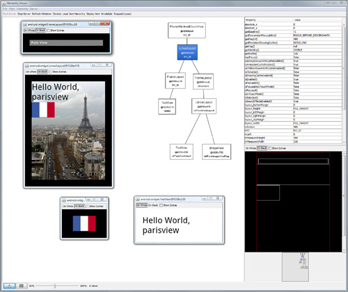
Each View can be separately displayed in its own window by selecting the appropriate View in the tree and choosing the Display View button on the menu bar. In Figure 7.2, you can also see that Display View is enabled on each of the child nodes: the ImageView with the flag, the TextView with the text, as well as the LinearLayout parent node (which includes its children), and lastly the application title bar.
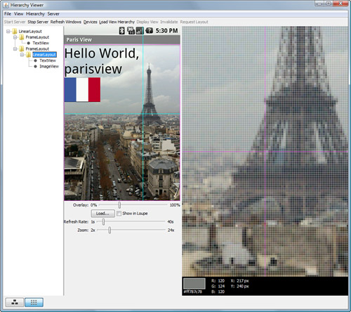
You can use the Pixel Perfect view to closely inspect your application using a loupe (Figure 7.3). You can also load PNG mockup files to overlay your user interface and adjust your application’s look. You can access the Pixel Perfect view by clicking the button with the Nine pixels on it at the bottom left of the Hierarchy Viewer. Click the button with the three boxes depicting the Layout view to return.
Caution
The Hierarchy Viewer is a useful tool, but it is also somewhat buggy (as you’ll find if you pay any attention to the command window when using it in Windows). To get the Pixel Perfect view to work, we had to click and drag my mouse back and forth across the Normal View (the middle black box) repeatedly until the loupe target crosshairs started working and the application screen loaded. Hopefully, this tool will be improved in future versions of Android. For now, we are of the opinion that a tool that works sometimes is better than a tool that doesn’t work at all.
The Hierarchy Viewer tool is invaluable for debugging drawing issues related to View widgets. If you wonder why something isn’t drawing or if a View is even available, try launching the Hierarchy Viewer and checking that problem View objects’ properties.
You can use the Hierarchy Viewer tool to interact and debug your application user interface. Specifically, developers can use the Invalidate and Request Layout buttons on the menu bar that correspond to View.Invalidate() and View.requestLayout() functions of the UI thread. These functions initiate View objects and draw or redraw them as necessary upon events.
Finally, you can also use the Hierarchy Viewer to deconstruct how other applications (especially sample applications) have handled their layout and displays. This can be helpful if you’d like to re-create a similar layout to another application, especially if it uses stock View types. However, you can also run across View types not provided in the SDK, and you need to implement those custom classes for yourself. For instance, choosing the Launcher window shows us that it uses views such as CellLayout—a view that isn’t exposed in the SDK.
We talked a lot about the LinearLayout layout, but there are several other types of layouts. Each layout has a different method and order in which it displays child View widgets on the screen. Layouts are derived from android.view.ViewGroup.
The types of layouts built-in to the Android SDK framework include
• AbsoluteLayout
• FrameLayout
• LinearLayout
• RelativeLayout
• TableLayout
All layouts, regardless of their type, have layout attributes. Layout attributes apply to any child View within that layout. Layout attributes can be set at runtime programmatically, but ideally they are set in the XML layout files using the following syntax:
android:layout_attribute_name="value"
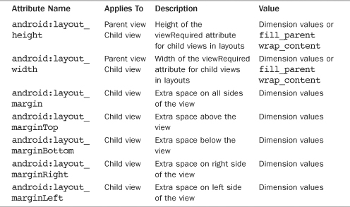
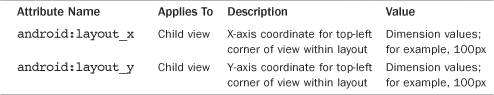
There are several layout attributes that all ViewGroup objects share. These include size attributes and margin attributes. You can find basic layout attributes in the ViewGroup.LayoutParams class. The margin attributes allow each child View within a layout to have padding on each side. Find these attributes in the ViewGroup.MarginLayoutParams classes. There are also a number of ViewGroup attributes for handling child View drawing bounds and animation settings.
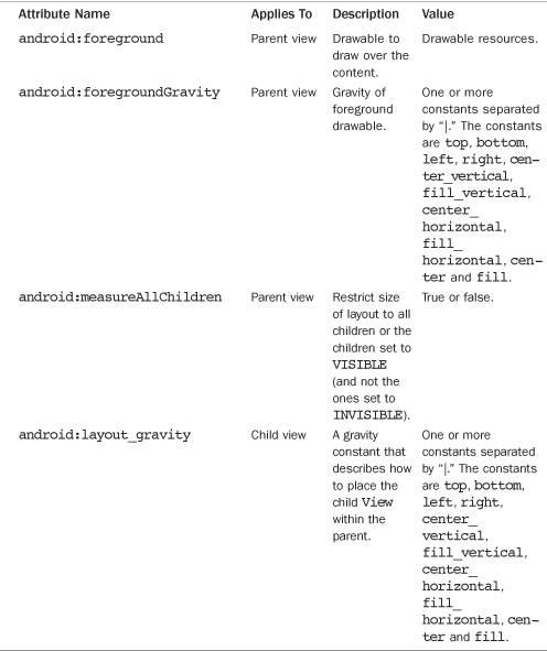
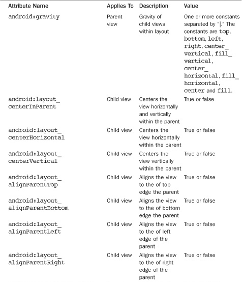
Some of the important attributes shared by all ViewGroup subtypes are shown in Table 7.1.
Here’s an XML layout resource example of a LinearLayout set to the size of the screen, containing one TextView that is set to its full height and the width of the LinearLayout (and therefore the screen).
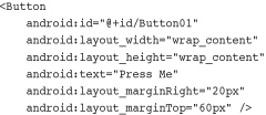
Here is an example of a Button object with some margins set via XML used in a layout resource file.
Remember that layout elements can cover any rectangular space on the screen; it doesn’t need to be the entire screen. Because layouts are View objects, layouts can be nested within each other. This allows for great flexibility when developers need to organize screen elements.
A layout such as an AbsoluteLayout might control only a small part of the screen, but that part of the screen will be defined in a pixel-perfect manner. It is also common to start with a FrameLayout or LinearLayout (as you’ve seen in many of the previous chapter examples) as the parent layout for the entire screen and then organize individual screen elements inside the parent layout using whichever layout type is most appropriate.
Now let’s talk about each of the common layout types individually and how they differ from one another.
Tip
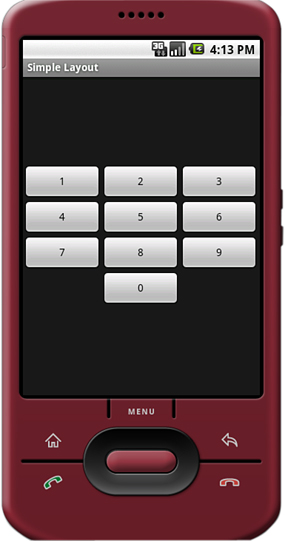
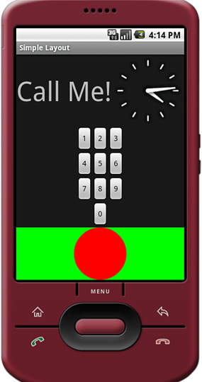
You can see an example of each layout in the Android project called SimpleLayout, which is available on the CD or at the book Web site.
An AbsoluteLayout view uses specific x/y coordinates of the child view for laying out each item to an exact location. This might be useful in cases where pixel-perfect layout is required. However, it’s less flexible in that a pixel-specific layout will not adapt well to other device configurations with different screen sizes. It can be helpful when you want to control a specific area of a screen at the pixel level and then include this layout within another larger, more flexible layout on the screen.
Caution
The AbsoluteLayout view class was deprecated in Android 1.5 R1. However, we have chosen to continue to include it in our list of layouts because developers might use this type of layout to port applications from other mobile platforms to Android or other specific purposes. For now, you might still use this class; however, it could disappear at some point in the future. Under most circumstances, other popular layout types such as FrameLayout and RelativeLayout will suffice in place of AbsoluteLayout, so we encourage you to seek other solutions whenever possible.
Figure 7.4 shows an example screenshot with widgets not aligned in any particular way; their coordinates were specifically given.
You can find the layout attributes available for AbsoluteLayout child View objects in android.widget.AbsoluteLayout.LayoutParams class. Some of the important attributes specific to AbsoluteLayout child View objects are shown in Table 7.2.
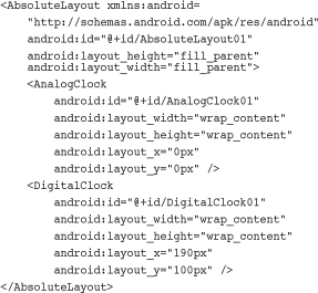
Here’s an example of an XML layout resource with an AbsoluteLayout and two child View objects, an AnalogClock and a DigitalClock:
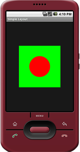
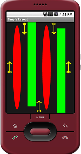
A FrameLayout view is designed to display a stack of child View items. Multiple views can be added to this layout, but each View is drawn from the top-left corner of the layout. This can be used to show multiple images within the same region, as shown in Figure 7.5, and the layout is sized to the largest child View in the stack.
You can find the layout attributes available for FrameLayout child View objects in android.widget.FrameLayout.LayoutParams. Some of the important attributes specific to FrameLayout views are shown in Table 7.3.
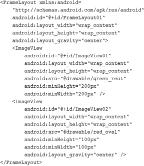
Here’s an example of an XML layout resource with a FrameLayout and two child View objects, both ImageView objects. The green rectangle is drawn first and the red oval is drawn on top of it. The green rectangle is larger, so it defines the bounds of the FrameLayout:
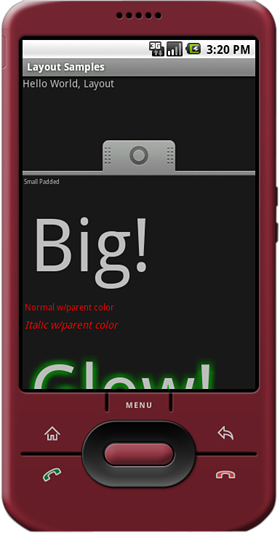
A LinearLayout view organizes its child View objects in a single row, shown in Figure 7.6, or column, depending on whether its orientation attribute is set to horizontal or vertical. This is a very handy layout method for creating forms.
You can find the layout attributes available for LinearLayout child View objects in android.widget.LinearLayout.LayoutParams. Some of the important attributes specific to LinearLayout views are shown in Table 7.4.

There are many examples of LinearLayout usage in Chapter 5.
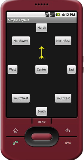
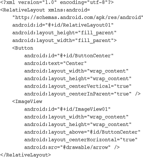
The RelativeLayout view allows you to specify where the child view widgets are in relation to each other. For instance, you can set a child View to be positioned “above” or “below” or “to the left of” or “to the right of” another View, referred to by its unique identifier. You can also align child View objects relative to one another or the parent layout edges. Combining RelativeLayout attributes can simplify creating interesting user interfaces without resorting to multiple layout groups to achieve a desired effect. Figure 7.7 shows how each of the button widgets is relative to each other.
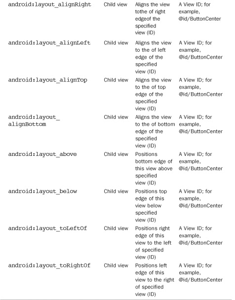
You can find the layout attributes available for RelativeLayout child View objects in android.widget.RelativeLayout.LayoutParams. Some of the important attributes specific to RelativeLayout views are shown in Table 7.5.
Here’s an example of an XML layout resource with a RelativeLayout and two child View objects, a Button object aligned relative to its parent, and an ImageView aligned and positioned relative to the Button (and the parent):
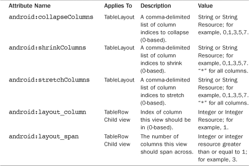
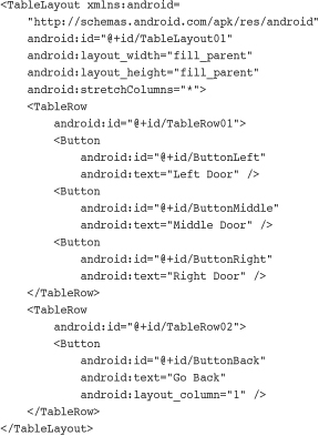
A TableLayout view organizes children into rows, as shown in Figure 7.8. Individual View objects are added within each row of the table using a TableRow layout View (which is basically a horizontally oriented LinearLayout) for each row of the table. Each column of the TableRow can contain one View (or layout with child View objects). View items added to a TableRow are placed in columns in the order they are added. You can specify the column number (zero-based) to skip columns as necessary (bottom row shown in Figure 7.8 demonstrates this); otherwise the View will be put in the next column to the right. Columns scale to the size of the largest View of that column. You can also include normal View objects instead of TableRow elements, if you want the View to take up an entire row.
You can find the layout attributes available for TableLayout child View objects in android.widget.TableLayout.LayoutParams. You can find all the layout attributes available for TableRow child View objects in android.widget.TableRow.LayoutParams. Some of the important attributes specific to TableLayout View objects are shown in Table 7.6.
Here’s an example of an XML layout resource with a TableLayout with two rows (two TableRow child objects). The TableLayout is set to stretch the columns to the size of the screen width. The first TableRow has three columns; each cell has a Button object. The second TableRow puts only one Button view into the second column explicitly:
Combining different layout methods on a single screen can create complex layouts. Remember that because a layout contains View objects and is, itself, a View, it can contain other layouts. Figure 7.9 demonstrates a combination of layout views used in conjunction to create a more complex and interesting screen.
Layouts are not the only View objects that can contain other View objects and widgets. Although layout views are useful for positioning other View objects on the screen, they aren’t interactive. Now let’s talk about the other kind of ViewGroup: the containers. These View objects often encapsulate other, simpler View types and allow the user some interactive ability to browse the child View objects in a standard fashion.
The types of ViewGroup containers built-in to the Android SDK framework include
• Lists, grids, and galleries with AdapterView
• Switchers with ViewFlipper, ImageSwitcher, TextSwitcher
• Tabs with TabHost and TabWidget
• Dialogs
• Scrolling with ScrollView and HorizontalScrollView
• Hiding and showing content with the SlidingDrawer
Some of the View container widgets are designed for displaying repetitive View objects in a particular way. Examples of this type of View container widget include ListView, GridView, and GalleryView.
• ListView: Contains a vertically scrolling, horizontally filled list of View objects, each of which typically contains a row of data; the user can choose an item to perform some action upon.
• GridView: Contains a grid of View objects, with a specific number of columns; this container is often used with image icons; the user can choose an item to perform some action upon.
• GalleryView: Contains a horizontally scrolling list of View objects, also often used with image icons; the user can select an item to perform some action upon.
These containers are all types of AdapterView widgets. An AdapterView widget contains a set of child View widgets to display data from some data source. An Adapter generates these child View widgets from a data source. As this is an important part of all these container widgets, we talk about the Adapter objects first.
In this section, you learn how to bind data to View objects using Adapter objects. In the Android SDK, an Adapter reads data from some data source and provides a View object based on some rules, depending on the type of Adapter used. This View is be used to populate the child View objects of a particular AdapterView.
The most common Adapter classes are the CursorAdapter and the ArrayAdapter. The CursorAdapter gathers data from a Cursor whereas the ArrayAdapter gathers data from an array. A CursorAdapter is a good choice to use when using data from a database. The ArrayAdapter is a good choice to use when there is only a single column of data or when the data comes from a resource array.
There are some common elements to know about Adapter objects. When creating an Adapter, you provide a layout identifier. This layout is the template for filling in each row of data. The template you create contains identifiers for particular widgets that the Adapter assigns data to. A simple layout can contain as little as a single TextView widget. When making an Adapter, refer to both the layout resource and the identifier of the TextView widget. The Android SDK provides some common layout resources for use in your application.
An ArrayAdapter binds each element of the array to a single View within the layout resource. Here is an example of creating an ArrayAdapter:
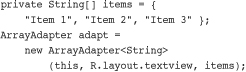
In this example, we have a String array called items. This is the array used by the ArrayAdapter as the source data. We also use a layout resource, which is the View that will be repeated for each item in the array. This is defined as follows:
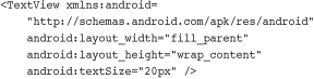
This layout resource contains only a single TextView. However, a more complex layout can be used with the constructors that also take the resource identifier of a TextView within the layout. Each child View within the AdapterView that uses this Adapter gets one TextView instance with one of the strings from the String array.
If you have an array resource defined, you can also directly set the entries attribute for an AdapterView to the resource identifier of the array to automatically provide the ArrayAdapter.
A CursorAdapter binds one or more columns of data to one or more View objects within the layout resource provided. This is best shown with an example. The following example demonstrates creating a CursorAdapter by querying the Contacts content provider. The CursorAdapter requires the use of a Cursor.
Note
For more information about the Android Cursor object, see Chapter 9, “Using Android Data and Storage APIs.”
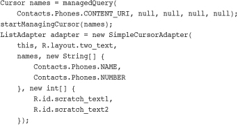
In this example, we present a couple of new concepts. First, you need to know that the Cursor must contain a field named _id. In this case, we know that the Contacts content provider does have this field. This field will be used later when you handle the user selecting a particular item.
We make a call to managedQuery() to get the Cursor. Then, we instantiate a SimpleCursorAdapter as a ListAdapter. Our layout, R.layout.two_text, has two TextView objects in it, which are used in the last parameter. SimpleCursorAdapter allows us to match up columns in the database with particular widgets in our layout. For each row returned from the query, we will get one instance of the layout within our AdapterView.
Now that you have an Adapter object, you can apply this to one of the AdapterView widgets. Any of them will work. Although the Gallery technically takes a SpinnerAdapter, the instantiation of SimpleCursorAdapter also returns a SpinnerAdapter. Here is an example of this with a ListView, continuing on from the previous sample code:
((ListView)findViewById(R.id.list)).setAdapter(adapter);
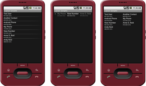
The call to the setAdapter() method of the AdapterView, a ListView in this case, should come after your call to setContentView(). This is all that is required to bind data to your AdapterView. Figure 7.10 shows the same data in a ListView, Gallery, and GridView.
AdapterView widgets are often used to present data to the user that they will be selecting from. All three of the discussed widgets, ListView, GridView, and Gallery, allow your application to monitor for click events in the same way. You need to call setOnItemClickListener() on your AdapterView and pass in an implementation of the AdapterView.OnItemClickListener class. Here is an example implementation of this class:
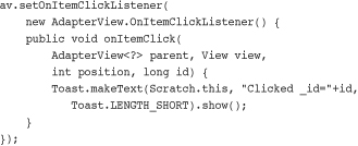
In the preceding example, av is our AdapterView. The implementation of the onItemClick() method is where all the interesting work happens. The parent parameter is the AdapterView where the item was clicked. This is useful if your screen has more than one AdapterView on it. The View parameter is the specific View within the item that was clicked. The position is the zero-based position within the list of items that the user selected. Finally, the id parameter is the value of the _id column for the particular item that was selected. This is useful for querying for further information about that particular row of data that the item represents.
Your application can also listen for long-click events on particular items. Additionally, selected items can be listened for. Although the parameters are the same, your application receives a call as the highlighted item changes. This can be in response to the user scrolling with the arrow keys and not selecting an item for action.
The ListView widget is commonly used for full-screen menus or lists of items to select from. As such, you might consider using ListActivity as the base class for such screens. Using the ListActivity can simplify these types of screens.
First, to handle item events, you now need to provide an implementation in your ListActivity. For instance, the equivalent of onListItemClickListener is to implement the onListItemClick() method within your ListActivity.
Second, to assign an Adapter, a call to the setListAdapter() method is needed. This is done after the call to the setContentView() method. However, this hints at some of the limitations of using ListActivity.
To use ListActivity, the layout that is set with the setContentView() method must contain a ListView with the identifier set to android:list; this cannot be changed. Second, you can also have a View with an identifier set to android:empty to have a View display when no data is returned from the Adapter. Finally, this works only with ListView widgets, so it has limited use. However, when it does work for your application, it can save on some coding.
The Android SDK has a flexible way to provide a tab interface to the user. A screen layout with tabs consists of a TabActivity and a TabHost. The TabHost consists of TabSpecs, a nested class of TabHost, which contains the tab information including the tab title and the contents of the tab. The contents of the tab can either be a predefined View, an Activity launched through an Intent object, or the View can be created with a factory provided by an implementation of TabContentFactory.
Tabs aren’t as complex as they might sound at first. Each tab is effectively a container for a View. That View can come from any View that is ready to be shown, such as an XML layout file. Alternatively, that View can come from launching an Activity. The following example demonstrates each of these methods using View objects and Activity objects created in the previous examples of this chapter:
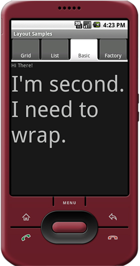
This example creates a tabbed layout view with four tabs on it, as shown in Figure 7.11. The first tab is from the recent GridView sample. The second tab is from the ListView sample before that. The third tab is the basic layout with two TextView objects, fully defined in an XML layout file as previously demonstrated. Finally, the fourth tab is created with a factory.
The first action is to get the TabHost instance. This is the object that allows us to add Intent objects and View identifiers for drawing the screen. A TabActivity provides a method to retrieve the current TabHost object.
The next action is only loosely related to tab views. The LayoutInflater is used to turn the XML definition of a View into the actual View objects. This would normally happen when calling setContentView(), but we’re not doing that. The use of the LayoutInflater is required for referencing the View objects by identifier, as is done for the third tab.
Finally, the code adds each of the four tabs to the TabHost in the order that they will be presented. This is accomplished by multiple calls to the addTab() method of TabHost. The first two calls are essentially the same. Each one creates a new Intent with the name of an Activity that launches within the tab. These are the same Activity classes used previously for full-screen display. If the Activity isn’t designed for full screen use, this should work seamlessly.
Next, on the third tab, a layout View is added using its identifier. In the preceding call to the LayoutInflater, the layout file also contains an identifier matching the one used here at the top level of a LinearLayout definition. This is the same one used previously to show a basic LinearLayout example. Again, there was no need to change anything in this view for it to display correctly in a tab.
Next, a tab referencing the content as the TabActivity class is added. This is possible because the class itself also implements TabHost.TabContentFactory, which requires implementing the createTabContent() method. The view will be created the first time the user selects the tab, so no other information is needed here. The tag that creates this tab must be kept track of, though, as that’s how the tabs are identified to the TabHost.
Finally, the method createTabContent() is implemented for use with the fourth tab. The first task here is to check the tag to see if it’s the one kept track of for the fourth tab. When that is confirmed, an instance of the TextView object is created and a text string assigned to it, which contains the current time. The size of the text is set to 24 pixels. The time stamp used in this string can be used to demonstrate when the view is created and that it’s not re-created by simple changing tabs.
The flexibility of tabs that Android provides is great for adding navigation to an application that has a bunch of views already defined. Few changes, if any, need to be made to existing View and Activity objects for them to work within the context of a TabHost.
Many other display widgets and objects are available in Android for laying out and designing screens. Some of these are listed here.
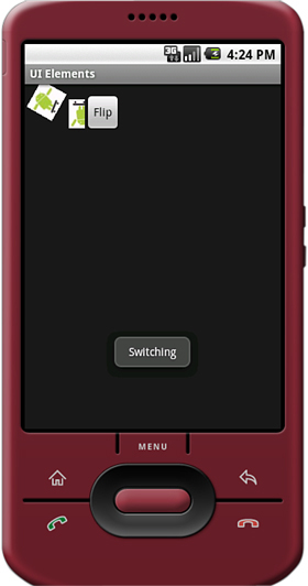
• Switchers: A ViewSwitcher widget contains only two child View objects and only one of those is shown at a time. It switches between the two, animating as it does so. Primarily, the ImageSwitcher, shown in Figure 7.12, and TextSwitcher objects are used. Each one provides a way to set a new child View, either a Drawable resource or a text string, and then animates from what is displayed to the new contents. Chapter 8, “Drawing and Working with Animation in Android,” discusses more about animation.
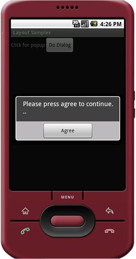
• Dialogs: A Dialog is not actually a View widget. Instead, it’s like the Activity, but as a pop-up window. A dialog contains a layout in the same way as a full screen and exposes many of the same events, along with some new ones. Other forms of Dialog objects simplify their creation for specific tasks. Figure 7.13 shows an AlertDialog, asking the user to continue.
• Scrolling: Although any View widget contains attributes for scrollbars, one of the easiest ways to provide vertical scrolling for a View is with the ScrollView widget. In Android 1.5 R1, a horizontal scrolling mechanism was introduced called HorizontalScrollView. Use either scrolling container as a wrapper, around another View to make scrollbars appear. Additionally, the layout might change, especially sizes of children objects, because the scrolling relaxes the size constraints. Notice, in Figure 7.14, how the background image shows less on the right, but with the scrollbars the user can move around the image.
Figure 7.14. The left screen has no scrollbar, while the right screen has a scrollbar, visually indicating that the user can move around the image.
• SlidingDrawer: Another View container introduced for developers in Android 1.5 R1 is the SlidingDrawer. This mechanism includes two parts: a handle and a container view. The user drags the handle open and the internal contents are shown; then the user can drag the handle shut and the content disappears. The SlidingDrawer can be used horizontally or vertically and is always used from within a layout representing the larger screen. This makes the SlidingDrawer especially useful for application configurations such as game controls. Users can pull the drawer out, pausing the game, change some features, and then close the SlidingDrawer to resume their game. Figure 7.15 shows how the typical SlidingDrawer looks when pulled open. An example is included in the code on disk.
Introduced officially in Android 1.5 R1, the AppWidget (or widget) provides a new level of application integration with the Android operating system previously not available to mobile developers. AppWidgets act like desktop plug-ins, which are tied back to some underlying Android application and are simply small View objects that have been exposed for use outside the typical boundaries of the application. AppWidgets are typically hosted in container objects such as the HOME screen, which serves as the Android device desktop.
So how might your application use AppWidgets? Well, in any number of ways:
• A travel application might include a simple AppWidget with the current flight security level.
• A picture gallery application might have a simple Picture of the Day AppWidget.
• A To-do application might include a simple AppWidget describing the number of high-priority outstanding items for the day, or the time of the user’s next appointment in the calendar.
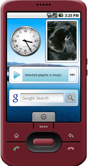
Figure 7.16 shows a variety of AppWidgets on the Android Home screen.
Applications that publish widgets are called AppWidget providers (much like applications can be content providers). A component that can contain AppWidgets is called an AppWidget host.
Many applications would benefit from becoming AppWidget providers. Although AppWidgets are small in screen size and functionality, they allow the user to benefit from some special functionality from your application without even launching it. They also serve to keep users using your application, by reminding them that they installed it.
Creating an AppWidget for your application involves the following steps:
- Declare a
BroadcastReceiverin your Android Manifest file, with anIntentfilter for theAppWidgetManager.ACTION_APPWIDGET_UPDATE Intentand a<meta-data>tag supplying the XML resource file that describes your AppWidgetView. - Create a specially formatted XML resource file for your AppWidget
Viewusing the<appwidget-provider>tag and attributes. - Implement the
AppWidgetProviderclass to handle widgetIntentbroadcasts, updates, and so on.
Tip
For a complete example of an AppWidget, see the ApiDemos sample application provided with the Android SDK.
Although somewhat less common, applications might also become AppWidget hosts. AppWidget hosts (android.appwidget.AppWidgetHost) are simply containers that can embed and display AppWidgets. The implementation details of how such containers display different AppWidgets is left up to the developer. However, all AppWidget hosts begin by interacting with the AppWidget service, which serves up the AppWidgets available on the system. For more information on becoming an AppWidget host, see the Android SDK documentation.
The Android SDK provides a number of powerful methods for designing usable and great-looking screens. This chapter introduced you to many of these. You first learned about many of the Android layout widgets that can control the placement of your widgets on the screen. In many cases, these allow you have a single screen design that works on most screen sizes and aspect ratios.
You then learned about other objects that contain views and how to group or place them on the screen in a particular way. These included such display paradigms as the tab, typically used in a similar way that physical folder tabs are used, in addition to a variety of different widgets for placing data on the screen in a readable and browsable way.
Finally, you also learned how to extend your application by creating simple AppWidgets, which can be hosted by Android system views such as the Home screen.
You now have all the tools you need to develop applications with usable and exciting user interfaces. As you continue your learning with Android, you might want to look through the SDK for other widgets that can be useful to you.