Often financial analysts are interested in investigating the nature of the relationship between different variables, such as the amount of debt that companies hold and their market capitalization or their risk and return. Correlation is an important way of numerically quantifying the relationship between two variables. A related concept, introduced in future chapters, is regression, which is essentially an extension of correlation to cases of three or more variables. As you will quickly find as you read through this chapter and those that follow, it is no exaggeration to say that correlation and regression are the most important unifying concepts of this book.
In this chapter, we will first describe the theory behind correlation, and then work through a few examples designed to think intuitively about the concept in different ways.
Let X and Y be two variables (e.g. market capitalization and debt, respectively) and let us also suppose that we have data on i = 1, ..., N different units (e.g. companies). The correlation between X and Y is denoted by the small letter, r, and its precise mathematical formula is given in Appendix 3.1. Of course, in practice, you will never actually have to use this formula directly. Any spreadsheet or statistics software package will do it for you. In Excel, you can use the Tools/Data Analysis or Function Wizard© to calculate them. It is usually clear from the context to which variables r refers. However, in some cases we will use subscripts to indicate that rXY is the correlation between variables X and Y, rXZ the correlation between variables X and Z, etc.
Once you have calculated the correlation between two variables you will obtain a number (e.g. r = 0.55). It is important that you know how to interpret this number. In this section, we will try to develop some intuition about correlation. First, however, let us briefly list some of the numerical properties of correlation.
r always lies between −1 and 1. That is, −1 ≤ r ≤ 1.
Positive values of r indicate a positive correlation between X and Y. Negative values indicate a negative correlation. r = 0 indicates that X and Y are uncorrelated.
Larger positive values of r indicate stronger positive correlation. r = 1 indicates perfect positive correlation. Larger negative values[13] of r indicate stronger negative correlation. r = −1 indicates perfect negative correlation.
The correlation between Y and X is the same as the correlation between X and Y.
The correlation between any variable and itself (e.g. the correlation between Y and Y) is 1.
Statisticians use the word "correlation" in much the same way as the layperson does. The following continuation of the executive compensation/profit example from Chapter 2 will serve to illustrate verbal ways of conceptualizing the concept of correlation.
The above example allows us to motivate briefly an issue of importance, namely, that of causality. Researchers are often interested in finding out whether one variable "causes" another. We will not provide a formal definition of causality here but instead will use the word in its everyday meaning. In this example, it is sensible to use the positive correlation between house price and lot size to reflect a causal relationship. That is, lot size is a variable that directly influences (or causes) house prices. However, house prices do not influence (or cause) lot size. In other words, the direction of causality flows from lot size to house prices, not the other way around. In our sales/market capitalization example a similar story can be told. Companies with high sales (indicating financial health) are valued more highly by the market. It is the high sales which cause the markets to value them highly, not the high market valuation which boosts sales.
Another way of thinking about these issues is to ask yourself what would happen if a homeowner were to purchase some adjacent land, and thereby increase the lot size of her house. This action would tend to increase the value of the house (i.e. an increase in lot size would cause the price of the house to increase). However, if you reflect on the opposite question: "will increasing the price of the house cause lot size to increase?" you will see that the opposite causality does not hold (i.e. house price increases do not cause lot size increases). For instance, if house prices in Windsor were suddenly to rise for some reason (e.g. due to a boom in the economy) this would not mean that houses in Windsor suddenly got bigger lots. Similarly, financial analysts, noting an increase in a firm's sales, may be tempted to purchase the stock (driving up its price and, hence, its market capitalization). But if the market capitalization of a firm increases, that will not cause its sales to increase.
The discussion in the previous paragraph could be repeated with "lot size" replaced by "number of bedrooms". That is, it is reasonable to assume that the positive correlation between Y = house prices and Z = number of bedrooms is due to Z's influencing (or causing) Y, rather than the opposite. Note, however, that it is difficult to interpret the positive (but weak) correlation between X = lot size and Y = number of bedrooms as reflecting causality. That is, there is a tendency for houses with many bedrooms to occupy large lots, but this tendency does not imply that the former causes the latter.
One of the most important things in empirical work is knowing how to interpret your results. The house example illustrates this difficulty well. It is not enough just to report a number for a correlation (e.g. rXY = 0.54). Interpretation is important too. Interpretation requires a good intuitive knowledge of what a correlation is in addition to a lot of common sense about the financial phenomenon under study. Given the importance of interpretation in empirical work, the following section will present several examples to show why variables are correlated and how common sense can guide us in interpreting them.
In our executive compensation/profits example, we discovered that executive compensation and profits are indeed correlated positively, indicating a positive relationship between the two. But what exact form does this relationship take? As discussed above, we often like to think in terms of causality or influence, and it may indeed be the case that correlation and causality are closely related. For instance, the finding that profits and compensation are correlated could mean that the former directly causes the latter. Similarly, the finding of a positive correlation between sales and market capitalization could be interpreted as meaning that more profit does directly influence market capitalization. However, as the following examples demonstrate, the interpretation that correlation implies causality is not always necessarily an accurate one.
In our house price example, however, it is likely that the positive correlations we observed reflect direct causality. For instance, having a larger lot is considered by most people to be a good thing in and of itself, so that increasing the lot size should directly increase the value of a house. There is no other intervening variable here, and hence we say that the causality is direct.[15]
The general message that should be taken from these examples is that correlations can be very suggestive, but cannot on their own establish causality. In the smoking/cancer example above, the finding of a positive correlation between smoking and lung cancer, in conjunction with medical evidence on the manner in which substances in cigarettes trigger changes in the human body, have convinced most people that smoking causes cancer. In the house price example, common sense tells us that the variable, number of bedrooms, directly influences house prices. In finance, the concept of correlation can be used in conjunction with common sense or a convincing financial theory to establish causality.
Intuition about the meaning of correlations can also be obtained from the XY-plots described in Chapter 2. Recall that in this chapter we discussed positive and negative relationships based on whether the XY-plots exhibited a general upward or down-ward slope.[17] If two variables are correlated, then an XY-plot of one against the other will also exhibit such patterns. For instance, the XY-plot of executive compensation density against profit exhibits an upward sloping pattern (see Figure 2.3). This plot implies that these two variables should be positively correlated, and we find that this is indeed the case from the correlation, r = 0.66. The important point here is that positive correlation is associated with upward sloping patterns in the XY-plot and negative correlation is associated with downward sloping patterns. All the intuition we developed about XY-plots in the previous chapter can now be used to develop intuition about correlation.
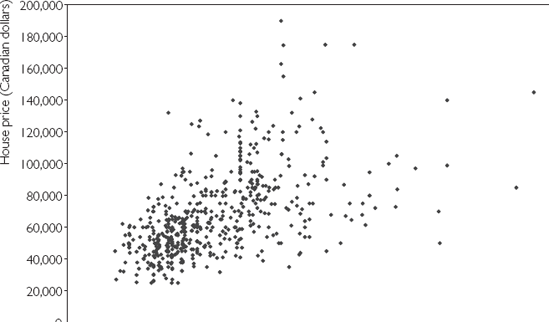
Figure 3.1 uses the Windsor house price data set (HPRICE.XLS) to produce an XY-plot of X = lot size against Y = house price. Recall that the correlation between these two variables was calculated as rXY = 0.54, which is a positive number. This positive (upward sloping) relationship between lot size and house price can clearly be seen in Figure 3.1. That is, houses with small lots (i.e. small X-axis values) also tend to have small prices (i.e. small Y-axis values). Conversely, houses with large lots tend to have high prices.
The previous discussion relates mainly to the sign of the correlation. However, XY-plots can also be used to develop intuition about how to interpret the magnitude of a correlation, as the following examples illustrate.
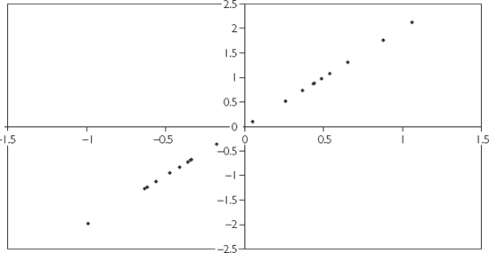
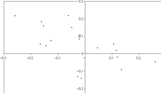
Figure 3.2 is an XY-plot of two perfectly correlated variables (i.e. r = 1). Note that they do not correspond to any actual financial data, but were simulated on the computer. All the points lie exactly on a straight line.
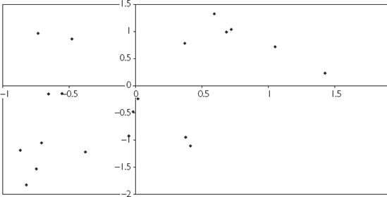
Figure 3.3 is an XY-plot of two variables which are positively correlated (r = 0.51), but not perfectly correlated. Note that the XY-plot still exhibits an upward sloping pattern, but that the points are much more widely scattered.
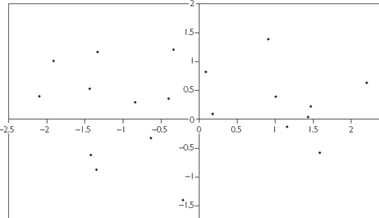
Figure 3.4 is an XY-plot of two completely uncorrelated variables (r = 0). Note that the points seem to be randomly scattered over the entire plot.
Plots for negative correlation exhibit downward sloping patterns, but otherwise the same sorts of patterns noted above hold for them. For instance, Figure 3.5 is an XY-plot of two variables that are negatively correlated (r = −0.58).
These figures illustrate one way of thinking about correlation: correlation indicates how well a straight line can be fit through an XY-plot. Variables that are strongly correlated fit on or close to a straight line. Variables that are weakly correlated are more scattered in an XY-plot.
Correlation is a property that relates two variables together. Frequently, however, researchers must work with several variables. For instance, market capitalization might depend on the firm's assets, income, debts and many other characteristics of the firm. As we shall see in subsequent chapters, regression is the most appropriate tool for use if the analysis contains more than two variables. Yet it is also not unusual for empirical researchers, when working with several variables, to calculate the correlation between each pair. This calculation is laborious when the number of variables is large. For instance, if we have three variables, X, Y and Z, then there are three possible correlations (i.e. rXY, rXZ and rYZ). However, if we add a fourth variable, W, the number increases to six (i.e. rXY, rXZ, rXW, rYZ, rYW and rZW). In general, for M different variables there will be M × (M – 1)/2 possible correlations. A convenient way of ordering all these correlations is to construct a matrix or table, as illustrated by the following example.
CORMAT.XLS contains data on three variables labeled X, Y and Z. X is in the first column, Y the second and Z the third. Using Excel, we can create the following correlation matrix (Table 3.1) for these variables.
Table 3.1. The correlation matrix for X, Y, and Z.
Column 1 | Column 2 | Column 3 | |
|---|---|---|---|
Column 1 | 1 | ||
Column 2 | 0.318237 | 1 | |
Column 3 | −0.13097 | 0.096996 | 1 |
The number 0.318237 is the correlation between the variable in the first column (X), and that in the second column (Y). Similarly, −0.13097 is the correlation between X and Z, and 0.096996, the correlation between Y and Z. Note that the 1s in the correlation matrix indicate that any variable is perfectly correlated with itself.
In the previous chapter, we discussed means and variances and distinguished between sample and population variants. So, for instance, the sample mean was denoted by
The same sample/population distinction holds with correlations. We will use the notation ρ to denote the population correlation (remember r is our notation for the sample correlation). To motivate why such a concept might be useful, consider a portfolio consisting of the shares of two companies. The expected return of the portfolio depends on the expected returns of the two individual stocks. What is the risk of this portfolio? In the preceding chapter we related the risk of an individual stock to its variance. But with a portfolio of stocks the correlation between their returns is also important. The financial analyst is, thus, interested in ρ when evaluating the riskiness of a portfolio.
To illustrate the previous point, suppose an investor is interested in investing over the summer months in the shares of two companies: an umbrella manufacturer and an ice cream maker. Sales of these two companies are susceptible to the weather. If it is a hot, sunny summer, then ice cream makers do well (and owners of their stock make large returns). But if the summer is rainy, sales are very poor for the ice cream makers (and owners of their stock make small or negative returns). Hence, it seems like shares in the ice cream company are very risky. Shares in the umbrella manufacturer are also very risky – but for exactly the opposite reasons. Sunny summers are bad for umbrella sales, whereas rainy summers ensure good sales.
However, the overall portfolio is much less risky than the individual stocks. Whenever one of the stocks does poorly, the other does well. In a rainy summer, the investor will earn a good return on the part of her portfolio in umbrella stocks but a bad return on the part in ice cream stocks. In a sunny summer, the opposite will occur. Hence, the investor's portfolio will be quite safe – earning an adequate return regardless of the weather.
In statistical language, the previous example shows how the correlation between the returns on the shares in the two companies is a crucial factor in assessing the riskiness of a portfolio. In our example, this correlation was negative (i.e. whenever one stock made a good return, the other made a bad return). In practice, of course, the correlations between the returns in shares of two different companies may be positive or negative.
The previous discussion is meant to motivate why correlation is an important concept for the financial analyst. To develop a formula for exactly what the population correlation is requires us to take a slight detour and introduce the concept of a covariance. Remember that, in Chapter 2, we introduced the formula for the variance. We considered a case where Y was an unknown variable (e.g. the return of a stock in a future month) and supposed there were K possible outcomes (e.g. return of 1%, return of 2%, etc.). The probability of each outcome occurring was denoted by Pi for i = 1, ..., K. The variance of Y is defined as:
Covariance is a closely related concept, except that two variables, Y and X are involved. The formula for covariance is:
The population correlation is the covariance normalized so as to have the same properties as the sample correlation (see the list "Properties of correlation" near the beginning of this chapter and replace r by ρ). It has the following formula:

Knowledge of this exact formula is rarely required in this textbook. However, it is crucial to have some intuition about correlation and how it depends on the variances and covariances of two variables.
As with means and variances, it is common for sample concepts to be used as estimates of population concepts. So, to return to our ice cream/umbrella example, the portfolio manager would be interested in knowing ρ: the population correlation between the stock returns in the two companies. The portfolio manager might collect data from the last 20 summers on stock returns for the two companies and use this data to calculate r: the sample correlation. The sample correlation could then be used as an estimate of ρ.
Correlation is a common way of measuring the relationship between two variables. It is a number that can be calculated using Excel or any spreadsheet or econometric software package.
Correlation can be interpreted in a common sense way as a numerical measure of a relationship or association between two variables.
Correlation can also be interpreted graphically by means of XY-plots. That is, the sign of the correlation relates to the slope of a best fitting line through an XY-plot. The magnitude of the correlation relates to how scattered the data points are around the best fitting line.
Correlations can arise for many reasons. However, correlation does not necessarily imply causality between two variables.
The population correlation, ρ, is a useful concept when talking about many issues in finance (e.g. portfolio management).
The correlation between X and Y is referred to by the small letter r and is calculated as:

where
[13] By "larger negative values" we mean more negative. For instance, −0.9 is a larger negative value than −0.2.
[14] If r were negative, the opposite of these statements would hold. For instance, high values of X would be associated with low values of Y, etc.
[15] An alternative explanation is that good neighborhoods tend to have houses with large lots. People are willing to pay extra to live in a good neighborhood. Thus, it is possible that houses with large lots tend also to have higher sales prices, not because people want large lots, but because they want to live in good neighborhoods. In other words, "lot size" may be acting as a proxy for the "good neighborhood" effect. We will discuss such issues in more detail in later chapters on regression. You should merely note here that the interpretation of correlations can be quite complicated and a given correlation pattern may be consistent with several alternative stories.
[16] It is a controversial issue among psychologists and educators as to whether intelligence tests really are meaningful measures of intelligence. For the purposes of answering this question, avoid this controversy and assume that they are indeed an accurate reflection of intelligence.
[17] We will formalize the meaning of "upward" or "downward" sloping patterns in the XY-plots when we come to regression. To aid in interpretation, think of drawing a straight line through the points in the XY-plot that best captures the pattern in the data (i.e. is the best fitting line). The upward or downward slope discussed here refers to the slope of this line.

