
In Chapter 7, I presented a subset of properties that combine to define a concept known as the CSS box model. In this chapter, I continue introducing new properties, this time focusing on two properties most often misunderstood by users new to CSS design: the float and clear properties. These properties are often misunderstood because of their unique effect on the elements in a document. In this chapter I discuss:
The
floatproperty and how it is used to change the flow of elements in a document — for instance, to place text beside an imageThe
clearproperty and how this property is used to cancel the effects of thefloatpropertyThe
vertical-alignproperty and how this property is used to control the vertical alignment of text to create subscript or superscript text or control vertical alignment in table cells
The next section begins the discussion of the float property.
A simple explanation of the float property is that it is used to put content side by side. In the coming sections, you look in depth at the float property, its idiosyncrasies, and how you can use it to lay out a web page. The following table outlines the float property and its possible values.
Property | Value |
|---|---|
float | left | right | none Initial value: none |
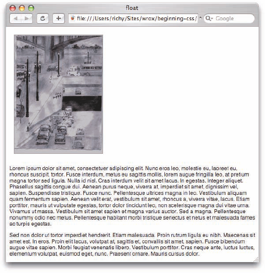
At this point, the float property appears fairly simple. It accepts keyword values of left, right, and none. The effects of the float property are intrinsically tied to the CSS box model. After the float property is applied to an element, regardless of the type of element, that element takes on the behavior of a block element, where its dimensions are defined by width, height, padding, borders, and margins. Before you see some examples of this, Figure 8-1 shows you how the float property affects a document's layout.
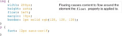
The CSS in Figure 8-1a is applied to the markup you see in Figure 8-1b.
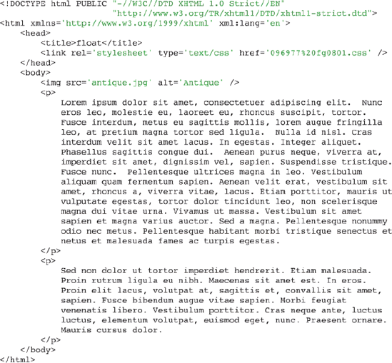
In Figure 8-1c, you can see that the image is floated to the left, meaning that the content in the paragraphs that follow the image floats up to the right of the image.
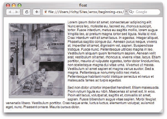
If you were to take away the float property from the example in Figure 8-1, you would get the output that you see in Figure 8-2.
In Figure 8-2, the effects of the float property become more obvious—primarily, the float property is used to place one element beside one or more other elements. In Figure 8-1, the element being floated was the <img/> element, and the elements it floated beside were two <p> elements.
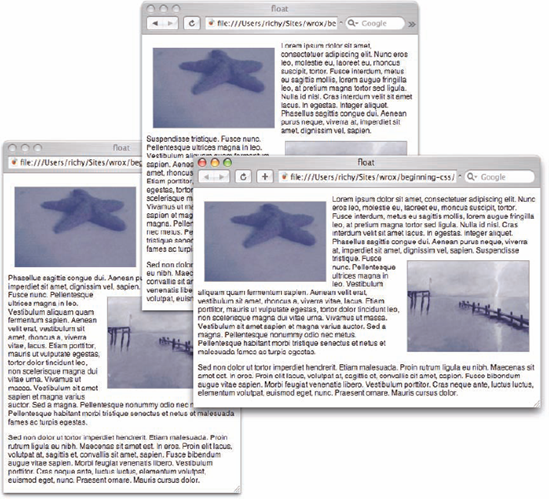
You can also include both left and right floats in a document; this is demonstrated in Figure 8-3.
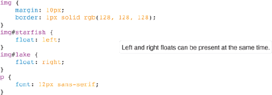
The CSS in Figure 8-3a is included in the markup in Figure 8-3b.
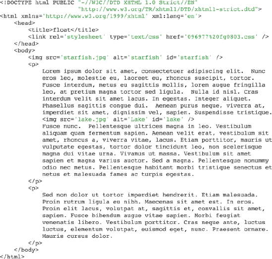
In Figure 8-3c, you can see what happens when there is both a left and right float; the right image floats to the right and allows the content that comes after it to wrap around it. Figure 8-3c shows three images so you can see what happens when the window is made smaller; the browser just reflows the content, and the second float is moved up or down as necessary to make room for the copy.
On the surface the concept of floating is pretty simple, and for most things that you set out to accomplish, this is about as complicated as it will get, but there is quite a complex set of rules under the surface of the float property. To understand what happens when an element is floated, you need to know about how the box model is affected, and what happens when certain types of elements are floated. These concepts are explored in the coming sections.
Because floated elements are repositioned to allow other content to flow around them, they exhibit unique behavior. This behavior is outlined here:
The margins of floated elements do not collapse, no matter what they are next to.
Only the contents of elements following a floated element are affected by the floated element. That is, the backgrounds, margins, borders, padding, and width (the box model and dimensions) of elements following a floated element are not affected.
A floated element is always treated like a block element.
Each rule is important in determining how floated elements are positioned and rendered. This section examines each rule in depth.
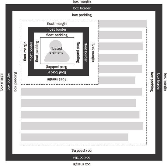
The margins of floated elements never collapse. Consider the diagram in Figure 8-4, which shows how the box model is incorporated when an element has been floated.
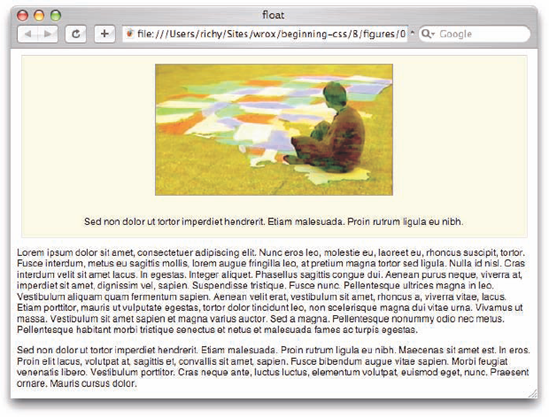
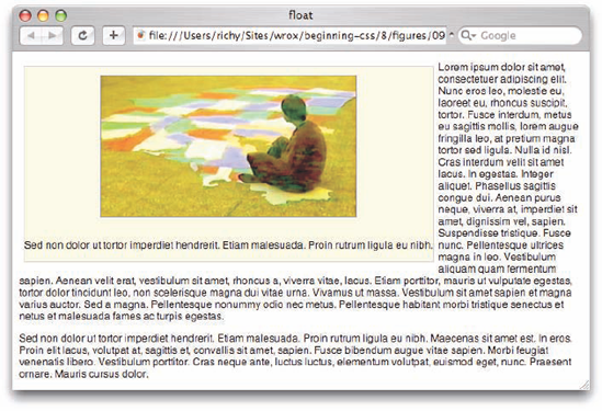
When an element is floated, it takes on the behavior of a block element, with one major difference: Its sizing becomes shrink-to-fit horizontally and vertically. That means that if you float a <div> element, its dimensions change such that it only expands enough to accommodate the content within it. In Chapter 7, you learned that the default dimensions of a <div> element are expand-to-fit horizontally, meaning the <div> takes up the whole line, but not so when a <div> element is floated. Figure 8-5 is an example of how a <div> element changes once floated.
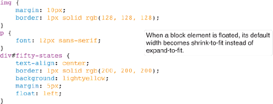
The CSS in Figure 8-5a is included in the markup in Figure 8-5b.
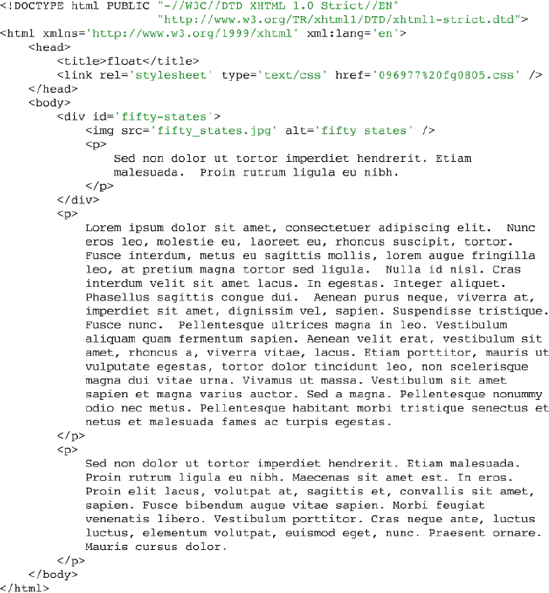
In Figure 8-5c, you see what happens before the <div> with id name fifty-states receives the float: left; declaration. You can see that the <div> is normal at this point; it expands to fill the whole line.
In Figure 8-5d, you see what happens after the <div> with id name fifty-states receives the float: left; declaration; its width has changed. Now the <div> element only expands enough horizontally to accommodate the content inside of it.
In Figure 8-5 you see what happens when a block element is floated, but what about an inline element, such as the <span> element, or the <a> element? This is demonstrated in Figure 8-6.
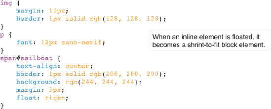
The CSS in Figure 8-6a is included in the XHTML markup that you see in Figure 8-6b.
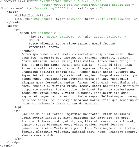
In Figure 8-6c, you see what happens prior to applying the float: right; declaration to the <span> element with the id name sailboat.
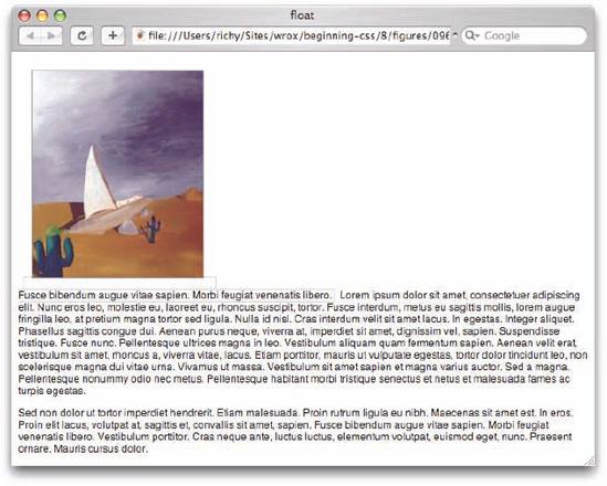
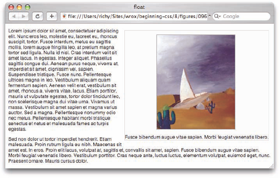
In Figure 8-6d, you see that after applying the float: right; declaration to the <span> element with id name sailboat. The <span> element becomes a block element with shrink-to-fit width and height. The width and height properties are not applicable to inline elements typically; in this situation, if you were to apply width or height to the <span> as a floated element, it would work, since it is now a block element.
Now that you've had an overview of the float property, the following Try It Out is a recap of what is possible with the float property.
Try It Out: Applying the float Property
Example 8-1. To review what's possible with the float property, follow these steps.
Enter the following markup in your text editor:
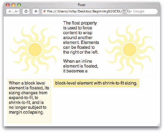
<!DOCTYPE html PUBLIC "-//W3C//DTD XHTML 1.0 Strict//EN"
                      "http://www.w3.org/TR/xhtmll/DTD/xhtmll-strict.dtd">
<html xmlns='http://www.w3.org/1999/xhtml' xml:lang='en'>
    <head>
        <title>float</title>
        <link rel='stylesheet' type='text/css' href='Example_8-1.css' />
    </head>
    <body>
        <img src='sun.png' alt='people' id='left' />
        <img src='sun.png' alt='people' id='right' />
        <p>
The float property is used to force content to wrap around another element. Elements can be floated to the right or the left. </p> <p class='block'> When a block level element is floated, its sizing changes from expand-to-fit, to shrink-to-fit, and is no longer subject to margin collapsing. </p> <p> When an inline element is floated, it becomes a <span id='inline'> block-level element with shrink-to-fit sizing. </span> </p> </body> </html>Save the preceding as
Example_8-1.html.Key in the following CSS in a new document in your text editor:
p.block {
    float: left;
    margin: 5px;
    background: lightyellow;
    border: 1px solid khaki;
    width: 150px;
    height: 150px;
    padding: 5px;
}
span#inline {
    float: left;
    background: khaki;
    border: 1px solid gold;
    padding: 5px;
    margin: 5px;
}
img {
    border: 1px solid rgb(244, 244, 244);
    margin: 5px;
}
img#left {
    float: left;
}
img#right {
    float: right;
}
Save the preceding style sheet as
Example_8-1.css.The preceding markup and style sheet result in the output that you see in Figure 8-7.
How It Works
In Example 8-1, you reviewed three major points about the float property: floated elements cause the copy, text, and other elements that follow them to float up beside the floated element. By applying either the float: right; or float: left; declarations, you can have content that wraps around the left or right of an element, as was the case with the sun.png images.
When you float an element, the rules that determine the floated element's size are changed from the default. Floated elements always use the shrink-to-fit sizing, even if the element was originally an inline or a block-level element.
In the next section I present a property that allows you to control floated elements, the clear property.
In this section, I discuss a property intrinsically related to the float property: the clear property. The clear property is used to control floating content. The following table outlines the clear property and its possible values.
Property | Value |
|---|---|
clear | none | left | right | both Initial value: none |
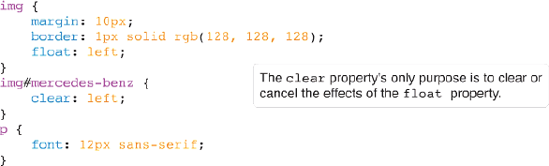
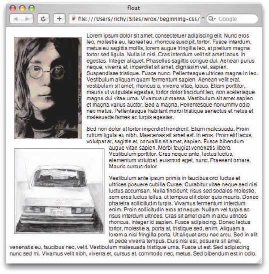
The simplest explanation for the clear property is that it is used to cancel the effects of one or more floated elements. An example of its use can be observed in Figure 8-8.
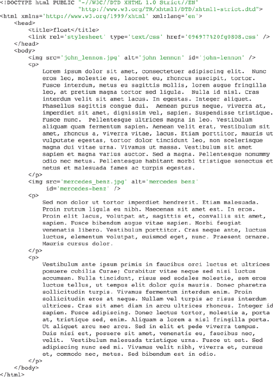
The CSS in Figure 8-8a is combined with the markup in Figure 8-8b.
In Figure 8-8c, you see what happens before the clear: left; declaration is applied to the <img /> element with the id name mercedes-benz. The mercedes-benz drawing has floated up beside the drawing of John Lennon. This is where the clear property can help; it can cancel the effects of a float on the element that it is applied to.
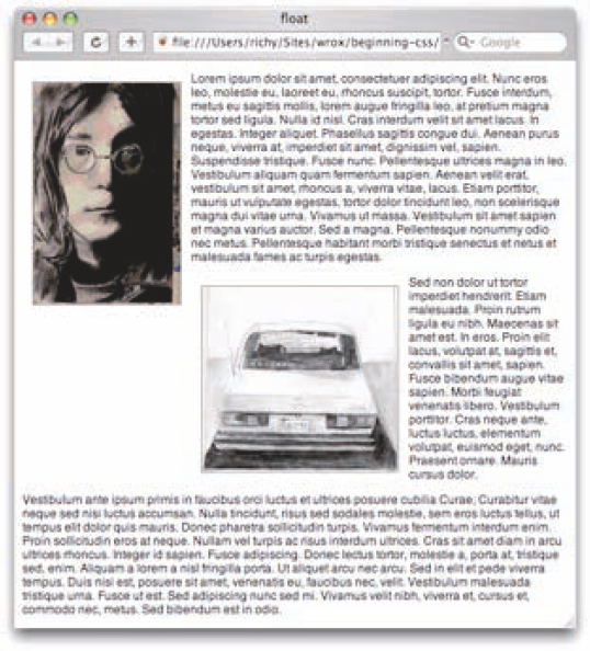
In Figure 8-8d, you see the results of the application of the clear: left; declaration on the <img /> element with the id name mercedes-benz. The effects of the float applied to the drawing of John Lennon has been canceled, and the image is dropped down below the drawing of John Lennon. However, because the float: left; declaration is also applied to the mercedes-benz image (since it is applied to all images via the img selector), the text still wraps around it.
So the clear property is used to control what happens when elements are floated. When you use the clear property, you can cancel a float on a particular element.
In the following Try It Out, you recap the clear property.
Try It Out: Applying the clear Property
Example 8-2. To review the clear property, follow these steps.
Enter the following markup in your text editor:
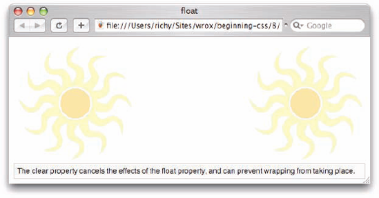
<!DOCTYPE html PUBLIC "-//W3C//DTD XHTML 1.0 Strict//EN"
                      "http://www.w3.org/TR/xhtmll/DTD/xhtmll-strict.dtd">
<html xmlns='http://www.w3.org/1999/xhtml' xml:lang='en'>
    <head>
        <title>clear</title>
        <link rel='stylesheet' type='text/css' href='Example_8-2.css' />
    </head>
    <body>
        <img src='sun.png' alt='people' id='left' />
        <img src='sun.png' alt='people' id='right' />
        <p>
            The clear property cancels the effects of the
float property, and can prevent wrapping from taking place. </p> </body> </html>Save the preceding document as
Example_8-2.html.Enter the following style sheet in a new document in your text editor:
img#left {
    float: left;
}
img#right {
    float: right;
}
p {
    clear: both;
    margin: 20px 0 0 0;
    font: 12px sans-serif;
    border: 1px solid rgb(200, 200, 200);
    background: rgb(244, 244, 244);
    padding: 5px;
}
Save the CSS that you just keyed in as
Example_8-2.css.The markup and CSS of Example 8-2 result in the rendered output that you see in Figure 8-9.
How It Works
In Example 8-2, you tried the clear property for yourself and observed how the clear property is used to cancel the effects of the float property on the element that it is applied to.
In the next section I look at some float bugs in IE 6.
The following section takes a look at float bugs that arise in IE 6 and a few of the techniques you can use to work around these bugs. The bugs that I discuss here are as follows:
Peek-a-boo bug: As the name implies, this bug involves the use of floats where certain content on a page disappears and occasionally reappears.
Guillotine bug: This is another bug that comes up in IE when using floats, where content is cut in half.
Three-pixel jog: This bug causes 3 pixels of space to mysteriously appear when using floats in IE.
Double-margin bug: This bug causes the left or right margins of a floated box to double when using floats in IE.
Even though the following bugs are a problem in IE 6, all of them have been fixed in IE 7.
The peek-a-boo bug can come up in several different contexts — in fact, in far too many to list here. It involves content that disappears and reappears seemingly at random (hence its aptly applied name). The example in Figure 8-10 demonstrates the peek-a-boo bug.
The CSS in Figure 8-10a is combined with the markup in Figure 8-10b.
Figure 8-10c shows that when this document is loaded into IE 6, none of the content beside the floated element is visible until you hover your mouse over a link. Hovering causes the lost content to reappear. If you hover your mouse cursor over the links that have reappeared, you find some of the content disappears again.
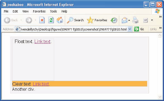
Three properties present in the style sheet trigger this bug:
Floating an element by applying a
float: left;declaration (float: right;also triggers the bug).Including a background on the containing element. In this example, this is the
background: rgb(234, 234, 234);declaration.Including a clear on an element following the float, where the margins of the clearing element come into contact with the floating element.
So, with an overview of what causes the peek-a-boo bug and what it is, what do you do to work around the bug? You have more than one option:
Apply a
position: relative;declaration to the containing element and floating element.Prevent the margins of the clearing element from coming into contact with the floating element.
Avoid applying a background to the containing element.
Apply the declaration
zoom: 1;to the containing element.Apply the declaration
display: inline-block;to the containing element.Apply a fixed width to the containing element.
The next section continues the discussion of Internet Explorer bugs with the guillotine bug.
The guillotine bug is another aptly named bug where only part of the content disappears. The guillotine bug is demonstrated in the documents in Figure 8-11.
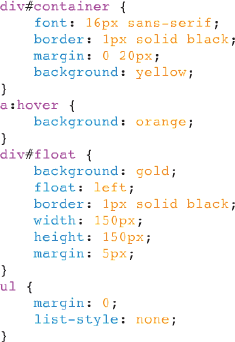
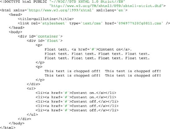
The CSS in Figure 8-11a is combined with the markup in Figure 8-11b.
After you load the preceding in Internet Explorer, when you hover your mouse cursor over the Content Off links, part of the content inside the floating element is chopped off! You can see this in the output in Figure 8-11c.
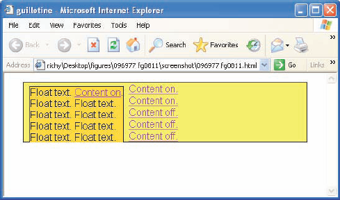
The guillotine bug occurs when the following conditions are present:
IE is in standards-compliant rendering mode.
An element is floated inside of a container element.
Links exist inside the container element in non-floated content that appears after the float.
A
:hoverpseudo-class is applied to<a>elements that change certain properties.
The guillotine bug is yet another bizarre IE rendering bug. The fix is not nearly as elegant as that for the peek-a-boo bug. To fix the guillotine bug, a clearing element must appear after the containing element. The best method to apply this clearing element without affecting the original design is to apply the following rule to the clearing element:
div#clearing {
    clear: both;
    visibility: hidden;
}
Then in the markup, add the clearing element:
<li><a href='#'>Content off.</ax/li>
            </ul>
        </div>
        <div id='clearing'></div>
    </body>
</html>
After you apply this rule and markup, the guillotine bug is corrected without any effects on the intended design. The visibility: hidden; declaration is similar to the display: none; declaration (see Chapter 13 and Chapter 14). The key difference is that an element with display: none; is not rendered and does not appear in a document, whereas an element with visibility: hidden; is rendered, does appear in the document, but is invisible. The easiest way to distinguish between the two is that the display property with a none keyword makes it seem an element doesn't exist at all. If you use the display: none; declaration, properties are not applied and the element takes up no space. If you use visibility: hidden; instead with this declaration, the element still exists; properties are applied, and the dimensions of the element are still honored, even though the element is invisible.
The nest section continues the discussion of IE 6 float bugs with the three-pixel jog.
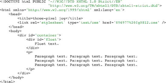
The next Internet Explorer rendering bug, which also involves floated elements, is called the three-pixel jog. As the name implies, this bug causes 3 pixels of space to appear between text inside an element that follows a floated element and the inner border of that element. This bug is demonstrated by the documents in Figure 8-12.
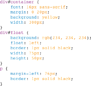
The CSS in Figure 8-12a is combined with the markup in Figure 8-12b.
Figure 8-12c shows the subtle effects of the three-pixel jog. If you look closely in the screenshot, you can see that the first three lines of the paragraph are 3 pixels farther to the right than the two lines that follow, which corresponds directly to the height of the floated element.
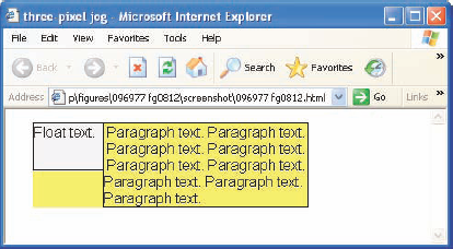
The three-pixel jog doesn't look like much of a big deal, but it can be — especially if a design must be the same, pixel for pixel, in all browsers. The three-pixel jog can be corrected by applying either a width or height (other than auto) to the element that follows the float. Because an explicit width or height is not always desirable, a few methods target IE 6 and less specifically. The first method uses conditional comments like those you saw in Chapter 7.
<!--[if lt IE 7]>
<style type='text/css'>
    P {
        height: 1px;
    }
</style>
<![endif]-->
This is a very clean, acceptable method to target IE 6 for Windows explicitly, and because IE 6 and earlier versions have incorrect support for the height property, the content isn't adversely affected by including this declaration. Other browsers won't be so forgiving, however, so this solution must be applied only to Internet Explorer to avoid complications. The next section continues discussion of Internet Explorer rendering bugs with the double-margin bug.
Here's yet another Internet Explorer rendering bug involving floated elements. The double-margin bug is demonstrated in the documents in Figure 8-13.
The CSS in Figure 8-13a is combined with the markup in Figure 8-13b.
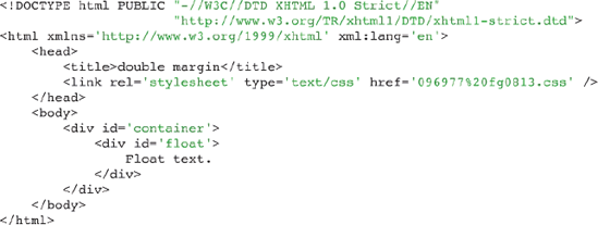
Figure 8-13c shows the double-margin bug in action.
Three ingredients are required to reproduce this bug:
A containing element
A floated element inside the containing element
A left margin specified on the floated element
When these ingredients are present, the left margin of the floated element doubles, so Figure 8-13c shows the floated element with 100 pixels of left margin instead of only 50, as is specified in the style sheet. The fix for this bug is very simple. All you need to do is apply a display: inline; declaration to the floated element. If you recall from earlier in this chapter, all floated elements are always block elements. Using the display: inline; declaration somehow tricks IE 6 into correct behavior. Be sure to test this fix with different browsers to ensure that unexpected side effects are not encountered. As is the case with the three-pixel jog, you can target IE 6 specifically by including this declaration within a rule inside of a style sheet that resides in conditional comments.
The vertical-align property is used primarily in two contexts. In one context, it is used to vertically align text appearing within the lines of a paragraph. One example of this creates subscript or superscript text. The vertical-align property may also be used to align the content appearing inside a table cell. The following table outlines the vertical-align property and its possible values.
Property | Value |
|---|---|
vertical-align | baseline | sub | super | top | text-top | middle | bottom | text-bottom | <percentage> | <length> Initial value: baseline |
The vertical-align property applies exclusively to inline elements, such as <img/> and <span>. It has different meaning when applied to table cells. I discuss its use in cells in an upcoming section. In the next section, however, I look at how to format subscript text with the vertical-align property.
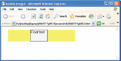
Within a paragraph, you may need several different types of styles that are only applied to snippets of the text, such as bold or italic fonts. Subscript text is an example of styles that often apply only to a selection of text, rather than to a whole paragraph. Subscript text is text that appears slightly smaller than the text surrounding it and slightly lower than the baseline of the surrounding text. The baseline is the invisible line created for each line of text against which the bottom of each letter is aligned. In other words, the baseline is the line that letters "sit" on. Superscript text, on the other hand, is text raised above the baseline and that appears slightly smaller than the surrounding text. Figure 8-14 is a demonstration of subscript and superscript text.

The CSS in Figure 8-14a is included in the markup document that you see in Figure 8-14b.
The rendered output of the source code appears in Figure 8-14c.

Figure 8-14 shows that the content of the <span> element of the first paragraph appears lower than that of the rest of the line, which is a result of applying the vertical-align: sub; declaration. The figure also shows that the <span> element of the second paragraph appears slightly higher, which is a result of the vertical-align: super; declaration.
The next section continues the discussion of the vertical-align property with top, middle, and bottom vertical alignment text.
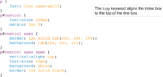
The top, middle, and bottom keywords are used to control vertical alignment of selections of text that are slightly smaller than the surrounding text. The top keyword is demonstrated in Figure 8-15.
Combine the style sheet in Figure 8-15a with the markup in Figure 8-15b.
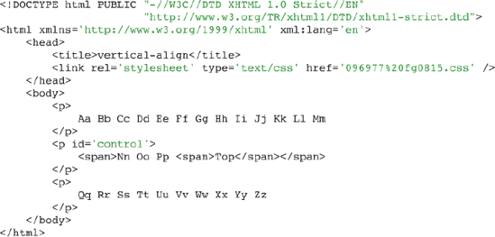
This source code results in the output depicted in Figure 8-15c.
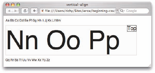
In Figure 8-15c, you see that the <span> element with the contents Top is aligned to the top of the line box. Figure 8-16 demonstrates the middle keyword.
In Figure 8-16, you can see that the middle keyword lines the inline box up relative to the center point of the lowercase letters on the line.
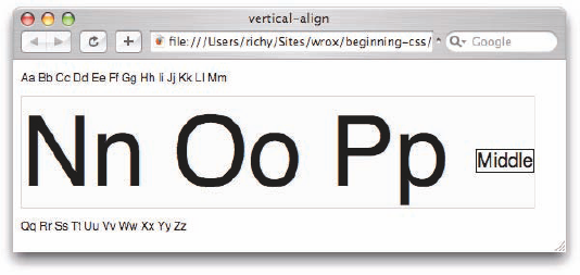
Figure 8-17 demonstrates the bottom keyword.
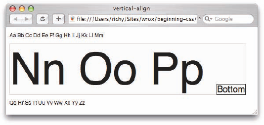
In Figure 8-17, you can see that the inline box is aligned with the bottom of the line box. In the next section, I discuss the text-top and text-bottom keywords.
Like the top, middle, and bottom values, the text-top and text-bottom keywords raise or lower a subset of text. The difference in the text-top keyword as opposed to the top keyword is that the text-top keyword causes alignment to happen with respect to the tallest character of the font of the surrounding text, for instance the lowercase letters t, l, f, or the uppercase letters. Likewise the text-bottom keyword aligns with respect to the lowest character, for instance the letters p, y, or g, which drop below the baseline. The text-top and text-bottom keyword values produce output similar to that produced by the top and bottom keywords. The most important difference between top and text-top is that top causes the border of the inline box to align with the top border of the line containing that inline box, whereas text-top aligns with respect to the tallest character in the font.
The next section discusses percentage and length values as applied to the vertical-align property.
If the selection of keywords I presented in the previous sections weren't enough for you, the vertical-align property also allows percentage and length values to be applied. Figure 8-18 demonstrates the vertical-align property with a value of 300%.

Percentage values with the vertical-align property are based on the line-height of the element the percentage value is applied to. If you remember back to Figure 8-15b, which shows the markup structure of this document, the <span> element that contains the text 300% has a line-height of 23 pixels. If you recall, I didn't give the <span> element an explicit line-height; I determined the line-height by including the line-height property and increasing or decreasing the value until I achieved the same results that you see in Figure 8-18. To calculate the pixel value of 300%, I take the line-height, 23, and multiply it by 3, to get 69, so the pixel value of 300% in Figure 8-18 is 69px. The default line height differs from browser to browser and between different font sizes, so your own results may vary.
Figure 8-19 demonstrates the vertical-align property with a length of 69 pixels, which should be identical to what you see in Figure 8-18, concerning the placement of the box.
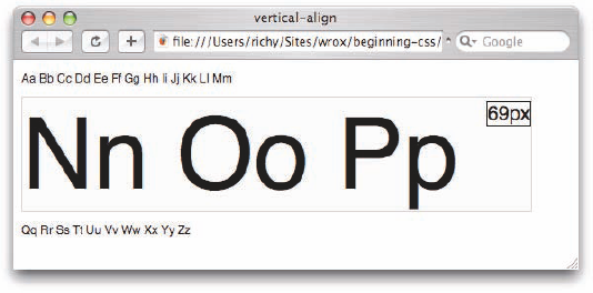
The vertical-align property has completely different meaning when it is applied to table cells. When applied to table cells, only the baseline, top, middle, and bottom keywords are applicable, and the vertical-align property is used to align the entire contents of the cell. This is demonstrated in Figure 8-20.
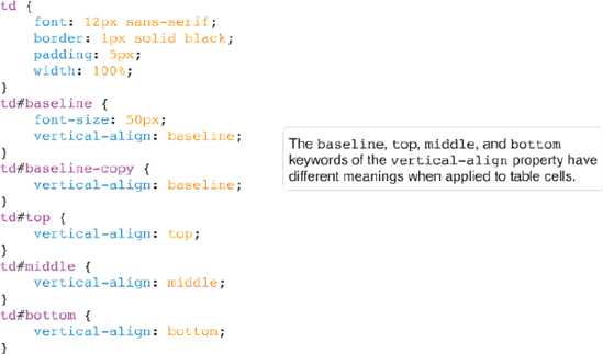
Apply the style sheet in Figure 8-20a to the markup in Figure 8-20b.
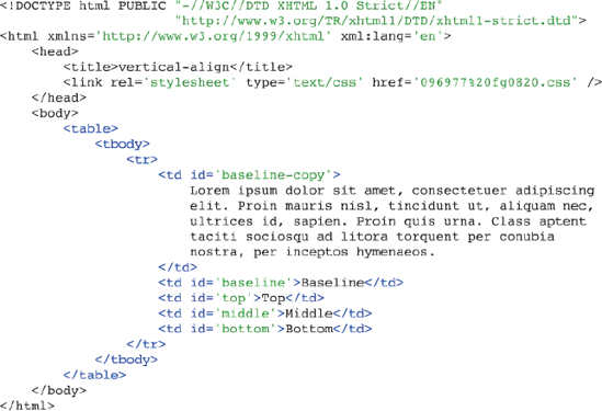
Figure 8-20c shows the output from this example.
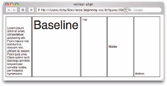
The preceding example is a demonstration of the four vertical-align properties that are applicable to table cells: baseline, top, middle, and bottom. The first two cells are aligned to the baseline. The baseline of a table cell is determined by the baseline of the table row. The baseline of the table row is determined by taking the baseline of the first line of each baseline-aligned table cell in that row. The one with the largest font, or other inline content, such as an image, determines the baseline of the row, which each table cell is aligned against.
In short, this complicated summary of baselining results in the line Lorem ipsum in the first table cell in Figure 8-16c having the same baseline as the word Baseline that appears in the second cell. In this case, the font size of Baseline determines where the baseline of the table row is.
The third cell is top-aligned, which means the content begins at the top of the cell and flows on downward from there. The fourth cell is middle-aligned, which means that the height of the content is measured to determine the middle point of the content, and then that midpoint is aligned with the midpoint of the cell. Finally, the fifth cell is bottom-aligned, which means that the bottom-most point of the content in the cell is aligned with the bottom of the cell.
Although you might expect the vertical-align property to apply to all elements — to block elements, for example, in the same way it is applied to table cells — this isn't the case. The vertical-align property is applicable only to inline elements and table cell elements, <td> and <th>.
The following Try It Out is a recap of the vertical-align property.
Try It Out: Applying the vertical-align Property
Example 8-3. To review the vertical-align property, follow these steps.
Enter the following XHTML in your text editor:
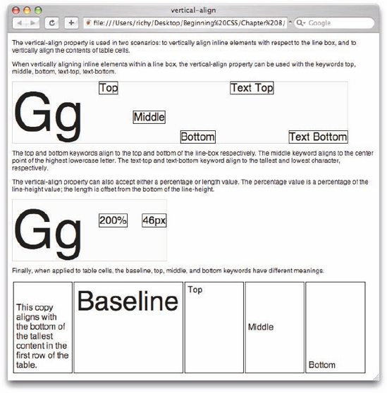
<!DOCTYPE html PUBLIC "-//W3C//DTD XHTML 1.0 Strict//EN"
                      "http://www.w3.org/TR/xhtmll/DTD/xhtmll-strict.dtd">
<html xmlns='http://www.w3.org/1999/xhtml' xml:lang='en'>
    <head>
        <title>vertical-align</title>
        <link rel='stylesheet' type='text/css' href='Example_8-3.css' />
    </head>
    <body>
        <p>
            The vertical-align property is used in two scenarios: to
            vertically align inline elements with respect to the line
            box, and to vertically align the contents of table cells.
        </p>
        <p>
            When vertically aligning inline elements within a line box,
            the vertical-align property can be used with the keywords
            top, middle, bottom, text-top, text-bottom.
        </p>
        <p>
            <span class='line'>
Gg <span id='top'>Top</span> <span id='middle'>Middle</span> <span id='bottom'>Bottom</span> <span id='text-top'>Text Top</span> <span id='text-bottom'>Text Bottom</span> </span> </p> <p> The top and bottom keywords align to the top and bottom of the line-box respectively. The middle keyword aligns to the center point of the highest lowercase letter. The text-top and text-bottom keyword align to the tallest and lowest character, respectively. </p> <p> The vertical-align property can also accept either a percentage or length value. The percentage value is a percentage of the line-height value; the length is offset from the bottom of the line-height. </p> <p> <span class='line'> Gg <span id='percentage'>200%</span> <span id='length'>46px</span> </span> </p> <p> Finally, when applied to table cells, the baseline, top, middle, and bottom keywords have different meanings. </p> <table> <tbody> <tr> <td id='baseline-copy'> This copy aligns with the bottom of the tallest content in the first row of the table. </td> <td id='baseline'>Baseline</td> <td id='td-top'>Top</td> <td id='td-middle'>Middle</td> <td id='td-bottom'>Bottom</td> </tr> </tbody> </table> </body> </html>Save the preceding XHTML document as
Example_8-3.html.Type the following style sheet in your text editor:
p  {
     font: 12px sans-serif;
}
span.line {
    border: lpx solid rgb(200, 200, 200);
    background: rgb(244, 244, 244);
    font-size: 100px;
}
span.line span {
    vertical-align: 300%;
    font-size: 20px;
    background: white;
    border: lpx solid black;
}
span#top {
    vertical-align: top;
}
span#middle {
    vertical-align: middle;
}
span#bottom {
    vertical-align: bottom;
}
span#text-top {
    vertical-align: text-top;
}
span#text-bottom {
    vertical-align: text-bottom;
}
span#percentage {
    vertical-align: 200%;
}
span#length {
   vertical-align: 46px;
}
td {
   padding: 5px;
   width: lOOpx;
   border: lpx solid black;
}
td#baseline-copy {
   vertical-align: baseline;
}
td#baseline {
   font-size: 50px;
   vertical-align: baseline;
}
td#td-top {
    vertical-align: top;
}
td#td-middle { vertical-align: middle; } td#td-bottom { vertical-align: bottom; }Save the preceding style sheet as
Example_8-3. css.The preceding source code results in the output that you see in Figure 8-21.
How It Works
In Example 8-3, you reviewed the more complicated portions of the vertical-align property. You set up text cases for each of the keywords, save the sub and super keywords, which are used to apply subscript and superscript text styling, respectively.
First were the top, middle, bottom, text-top, and text-bottom keywords. You see that with this example that there really is no discernable difference between the text-top and text-bottom keywords; most browsers simply map these to the top and bottom keywords. You set up a line to test each keyword where the font is 100 pixels, and each line has a border and background so that you can easily see the dimensions of the line box. The top and text-top, and the bottom and text-bottom keywords align to the top and bottom of the line box, respectively. The middle keyword aligns to the center point of the lowercase letter.
In the next test case you set up a line for testing the vertical-align property with a percentage and a length value. The percentage value is based on the height of the line; in this case the line height is 23 pixels, you verify this by the next example, which gives the vertical-align property a length value of 46 pixels, which is offset from the bottom of the line box, just like the percentage.
In the last test, you set up a table for the four values of the vertical-align property that have special value when applied to a table. The first line of the first cell is aligned to the bottom of the word "Baseline" that appears in the second cell. When table cells are aligned to the baseline, each cell is aligned to the bottom of the largest content that appears in the first row of the table. In the last three cells, the contents of each cell are aligned to the top, middle, and bottom.
This chapter focused on three key areas of CSS design. In this chapter you learned the following:
The
floatproperty is a seemingly complex property that has a unique place in CSS design. Thefloatproperty is used for layout—for instance, to include content in the flow of paragraph text in such a way that text wraps around the floated element.The
clearproperty is used to control the effects of thefloatproperty in situations where you don't want all the content following a floated element to float beside it.The
vertical-alignproperty is used to vertically align inline elements such as the<span>element or the<img/>element relative to the line containing those inline elements; this property can be used, for instance, to create subscript or superscript text.The
vertical-alignproperty may also be applied to table cells to control vertical alignment of the content within table cells. If thevertical-alignproperty is applied to table cells, only a subset of properties are applicable. These include thebaseline, top, middle, andbottomproperties. The behavior of these properties is completely different when applied to table cells as opposed to normal inline content.
Chapter 9 discusses how to control the styling of list elements with CSS.
When an element is floated, what rule governs its dimensions?
What happens when an inline element, such as a
<span>element, is floated?What are the three keywords of the
floatproperty?If an element is floated to the right, and you don't want the following element to wrap around it, what declaration would you apply to that element?
What declarations would you use to create subscript and superscript text?
When vertically aligning an inline element to the
middle, how is the element positioned on the line?What is the difference between the
text-topandtopkeywords of thevertical-alignproperty?If you are aligning table cells to the baseline, what determines the baseline?