

APPENDICES
B. Compound Interest and the Number e
1. Malthus: Population Outstrips Food Supply
5. Present Value of Lottery Winnings
7. Investing for Future: Tuition Payments
9. Verhulst: The Logistic Model
A FITTING FORMULAS TO DATA
In this section we see how the formulas that are used in a mathematical model can be developed. Some of the formulas we use are exact. However, many formulas we use are approximations, often constructed from data.
Fitting a Linear Function to Data
A company wants to understand the relationship between the amount spent on advertising, a, and total sales, S. The data they collect might look like that found in Table A.1.
The data in Table A.1 are linear, so a formula fits it exactly. The slope of the line is 20, and we can determine that the vertical intercept is 40, so the line is
![]()
Now suppose that the company collected the data in Table A.2. This time the data are not linear. In general, it is difficult to find a formula to fit data exactly. We must be satisfied with a formula that is a good approximation to the data.
Figure A.1 shows the data in Table A.2. Since the relationship is nearly, though not exactly, linear, it is well approximated by a line. Figure A.2 shows the line S = 40 + 20a and the data.
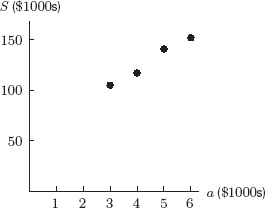
Figure A.1: The sales data from Table A.2

Figure A.2: The line S = 40 + 20a and the data from Table A.2
The Regression Line
Is there a line that fits the data better than the one in Figure A.2? If so, how do we find it? The process of fitting a line to a set of data is called linear regression and the line of best fit is called the regression line. (Later in the section, we discuss what “best fit” means.) Many calculators and computer programs calculate the regression line from the data points. Alternatively, the regression line can be estimated by plotting the points on paper and fitting a line “by eye.” In Chapter 8, we derive the formulas for the regression line. For the data in Table A.2, the regression line is
![]()
This line is graphed with the data in Figure A.3.

Figure A.3: The regression line S = 54.5 + 16.5a and the data from Table A.2
Using the Regression Line to Make Predictions
We can use the formula for sales as a function of advertising to make predictions. For example, to predict total sales if $3500 is spent on advertising, substitute a = 3.5 into the regression line:
![]()
The regression line predicts sales of $112,250. To see that this is reasonable, compare it to the entries in Table A.2. When a = 3, we have S = 105, and when a = 4, we have S = 117. Predicted sales of S = 112.25 when a = 3.5 makes sense because it falls between 105 and 117. See Figure A.4. Of course, if we spent $3500 on advertising, sales would probably not be exactly $112,250. The regression equation allows us to make predictions, but does not provide exact results.

Figure A.4: Predicting sales when spending $3,500 on advertising
| Example 1 | Predict total sales given advertising expenditures of $4800 and $10,000. |
| Solution | When $4800 is spent on advertising, a = 4.8, so
Sales are predicted to be $133,700. When $10,000 is spent on advertising, a = 10, so
Sales are predicted to be $219,500. |
Consider the two predictions made in Example 1 at a = 4.8 and a = 10. We have more confidence in the accuracy of the prediction when a = 4.8, because we are interpolating within an interval we already know something about. The prediction for a = 10 is less reliable, because we are extrapolating outside the interval defined by the data values in Table A.2. In general, interpolation is safer than extrapolation.
Interpreting the Slope of the Regression Line
The slope of a linear function is the change in the dependent variable divided by the change in the independent variable. For the sales and advertising regression line, the slope is 16.5. This tells us that S increases by about 16.5 whenever a increases by 1. If advertising expenses increase by $1000, sales increase by about $16,500. In general, the slope tells us the expected change in the dependent variable for a unit change in the independent variable.
How Regression Works: What “Best Fit” Means
Figure A.5 illustrates how a line is fitted to a set of data. We assume that the value of y is in some way related to the value of x, although other factors could influence y as well. Thus, we assume that we can pick the value of x exactly but that the value of y may be only partially determined by this x-value.
A calculator or computer finds the line that minimizes the sum of the squares of the vertical distances between the data points and the line. See Figure A.5. The regression line is also called a least-squares line, or the line of best fit.

Figure A.5: Data and the corresponding least-squares regression line
Correlation
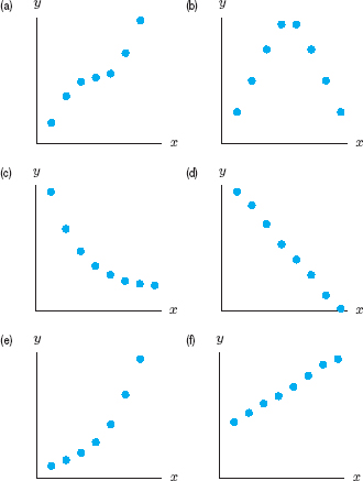
When a computer or calculator calculates a regression line, it also gives a correlation coefficient, r. This number lies between −1 and +1 and measures how well the regression line fits the data. If r = 1, the data lie exactly on a line of positive slope. If r = −1, the data lie exactly on a line of negative slope. If r is close to 0, the data may be completely scattered, or there may be a nonlinear relationship between the variables. (See Figure A.6.)

Figure A.6: Various data sets and correlation coefficients
| Example 2 | The correlation coefficient for the sales data in Table A.2 is r ≈ 0.99. The fact that r is positive tells us that the regression line has positive slope. The fact that r is close to 1 tells us that the regression line fits the data well. |
The Difference Between Relation, Correlation, and Causation
It is important to understand that a high correlation (either positive or negative) between two quantities does not imply causation. For example, there is a high correlation between children's reading level and shoe size.1 However, large feet do not cause a child to read better (or vice versa). Larger feet and improved reading ability are both a consequence of growing older.
Notice also that a correlation of 0 does not imply that there is no relationship between x and y. For example, in Figure A.6(d) there is a relationship between x and y-values, while Figure A.6(c) exhibits no apparent relationship. Both data sets have a correlation coefficient of r ≈ 0. Thus, a correlation of r = 0 usually implies there is no linear relationship between x and y, but this does not mean there is no relationship at all.
Regression When the Relationship Is Not Linear
Table A.3 shows the population of the US (in millions) from 1790 to 1860. These points are plotted in Figure A.7. Do the data look linear? Not really. It appears to make more sense to fit an exponential function than a linear function to this data. Finding the exponential function of best fit is called exponential regression. One algorithm used by a calculator or computer gives the exponential function that fits the data as
![]()
where P is the US population in millions and t is years since 1790. Other algorithms may give different answers. See Figure A.8.
Since the base of this exponential function is 1.03, the US population was increasing at the rate of about 3% per year between 1790 and 1860. Is it reasonable to expect the population to continue to increase at this rate? It turns out that this exponential model does not fit the population of the US well beyond 1860. In Section 4.7, we see another function that is used to model the US population.

Figure A.7: US Population 1790–1860

Figure A.8: US population and an exponential regression function
Calculators and computers can do linear regression, exponential regression, logarithmic regression, quadratic regression, and more. To fit a formula to a set of data, the first step is to graph the data and identify the appropriate family of functions.
| Example 3 | The average fuel efficiency (miles per gallon of gasoline) of US automobiles declined until the 1960s and then started to rise as manufacturers made cars more fuel efficient.2 See Table A.4.
(a) Plot the data. What family of functions should be used to model the data: linear, exponential, logarithmic, power function, or a polynomial? If a polynomial, state the degree and whether the leading coefficient is positive or negative. (b) Use quadratic regression to fit a quadratic polynomial to the data; graph it with the data. |
| Solution | (a) The data are shown in Figure A.9, with time t in years since 1940. Miles per gallon decreases and then increases, so a good function to model the data is a quadratic (degree 2) polynomial. Since the parabola opens up, the leading coefficient is positive.
(b) If f(t) is average miles per gallon, one algorithm for quadratic regression tells us that the quadratic polynomial that fits the data is
In Figure A.10, we see that this quadratic does fit the data reasonably well.
Figure A.9: Data showing fuel efficiency of US automobiles over time
Figure A.10: Data and best quadratic polynomial, found using regression |


Problems for Appendix A
1. Table A.5 gives the gross world product, G, which measures global output of goods and services.3 If t is in years since 1950, the regression line for these data is
![]()
(a) Plot the data and the regression line on the same axes. Does the line fit the data well?
(b) Interpret the slope of the line in terms of gross world product.
(c) Use the regression line to estimate gross world product in 2005 and in 2020. Comment on your confidence in the two predictions.
2. Table A.6 shows worldwide cigarette production as a function of t, the number of years since 1950.4
(a) Find the regression line for this data.
(b) Use the regression line to estimate world cigarette production in the year 2010.
(c) Interpret the slope of the line in terms of cigarette production.
(d) Plot the data and the regression line on the same axes. Does the line fit the data well?
3. Table A.7 shows the US Gross National Product (GNP).5
(a) Plot GNP against years since 1970. Does a line fit the data well?
(b) Find the regression line and graph it with the data.
(c) Use the regression line to estimate the GNP in 1985 and in 2020. Which estimate do you have more confidence in? Why?
4. The acidity of a solution is measured by its pH, with lower pH values indicating more acidity. A study of acid rain was undertaken in Colorado between 1975 and 1978, in which the acidity of rain was measured for 150 consecutive weeks.6 The data followed a generally linear pattern. If P is the pH and t is the number of weeks into the study, the regression line was determined to be
![]()
(a) Is the pH level increasing or decreasing over the period of the study? What does this tell you about the level of acidity in the rain?
(b) According to the line, what was the pH at the beginning of the study? At the end of the study (t = 150)?
(c) What is the slope of the regression line? Explain what this slope is telling you about the pH.
5. In a 1977 study7 of 21 of the best American female runners, researchers measured the average stride rate, S, at different speeds, v. The data are given in Table A.8.
(a) Find the regression line for these data, using stride rate as the dependent variable.
(b) Plot the regression line and the data on the same axes. Does the line fit the data well?
(c) Use the regression line to predict the stride rate when the speed is 18 ft/sec and when the speed is 10 ft/sec. Which prediction do you have more confidence in? Why?
Table A.8 Stride rate, S, in steps/sec, and speed, v, in ft/sec
![]()
6. Table A.9 shows the atmospheric concentration of carbon dioxide, CO2 (in parts per million, ppm), at the Mauna Loa Observatory in Hawaii.8
(a) Find the average rate of change of the concentration of carbon dioxide between 1980 and 2000. Give units and interpret your answer in terms of carbon dioxide.
(b) Plot the data, and find the regression line for carbon dioxide concentration against years since 1980. Use the regression line to predict the concentration of carbon dioxide in the atmosphere in the year 2020.
7. In Problem 6, carbon dioxide concentration was modeled as a linear function of time. However, if we include data for carbon dioxide concentration from as far back as 1900, the data appear to be more exponential than linear. (They looked linear in Problem 6 because we were only looking at a small piece of the graph.) If C is the CO2 concentration in ppm and t is in years since 1900, an exponential regression function to fit the data is
![]()
(a) What is the annual percent growth rate during this period? Interpret this rate in terms of CO2 concentration.
(b) What CO2 concentration is given by the model for 1900? For 1980? Compare the 1980 estimate to the actual value in Table A.9.
8. (a) Fit an exponential function to the population data in Table A.10. Plot the data and the exponential function on the same axes.
(b) At approximately what percentage rate was the population growing between 1960 and 2000?
(c) If the population continues to grow at the same percentage rate, what population is projected for 2020?
Table A.10 US population 1960–2000
![]()
9. Table A.11 shows the public debt, D, of the US9 in billions of dollars, t years after 1998.
(a) Plot the public debt against the number of years since 1998.
(b) Does the data look more linear or more exponential?
(c) Fit an exponential function to the data and graph it with the data.
(d) What annual percentage growth rate does the exponential model show?
(e) Do you expect this model to give accurate predictions beyond 2004? Explain.
![]()
10. A company collects the data in Table A.12. Find the regression line and interpret its slope. Sketch the data and the line. What is the correlation coefficient? Why is the value you get reasonable?
Table A.12 Cost to produce various quantities of a product
![]()
11. Match the r values with scatter plots in Figure A.11.
![]()

12. Table A.13 shows the number of cars, N, in millions in the US10 t years after 1940.
(a) Plot the data, with number of passenger cars as the dependent variable.
(b) Does a linear or exponential model appear to fit the data better?
(c) Use a linear model first: Find the regression line for these data. Graph it with the data. Use the regression line to predict the number of passenger cars in the year 2010 (t = 70).
(d) Interpret the slope of the regression line found in part (c) in terms of passenger cars.
(e) Now use an exponential model: Find the exponential regression function for these data. Graph it with the data. Use the exponential function to predict the number of passenger cars in the year 2010 (t = 70). Compare your prediction with the prediction obtained from the linear model.
(f) What annual percent growth rate in number of US passenger cars does your exponential model show?
Table A.13 Number of passenger cars, in millions
![]()
13. Table A.14 gives the population of the world in billions.
(a) Plot these data. Does a linear or exponential model seem to fit the data best?
(b) Find an exponential regression function.
(c) What annual percent growth rate does the exponential function show?
(d) Predict the population of the world in the year 2020 and in the year 2050. Comment on the relative confidence you have in these two estimates.
Table A.14 World population in billions
![]()
14. In 1969, all field goal attempts in the National Football League and American Football League were analyzed. See Table A.15. (The data has been summarized: all attempts between 10 and 19 yards from the goal post are listed as 14.5 yards out, etc.)
(a) Graph the data, with success rate as the dependent variable. Discuss whether a linear or an exponential model fits best.
(b) Find the linear regression function; graph it with the data. Interpret the slope of the regression line in terms of football.
(c) Find the exponential regression function; graph it with the data. What success rate does this function predict from a distance of 50 yards?
(d) Using the graphs in parts (b) and (c), decide which model seems to fit the data best.
Table A.15 Successful fraction of field goal attempts
![]()
15. Table A.16 shows the number of Japanese cars imported into the US.11
(a) Plot the number of Japanese cars imported against the number of years since 1964.
(b) Does the data look more linear or more exponential?
(c) Fit an exponential function to the data and graph it with the data.
(d) What annual percentage growth rate does the exponential model show?
(e) Do you expect this model to give accurate predictions beyond 1971? Explain.
Table A.16 Imported Japanese cars, 1964–1971
![]()
16. Figure A.12 shows oil production in the Middle East.12 If you were to model this function with a polynomial, what degree would you choose? Would the leading coefficient be positive or negative?

17. After the oil crisis in 1973, the average fuel efficiency, E, of cars increased until the early 1990s, when it started to decrease again.
(a) Plot the data13 in Table A.17, using t in years since 1975. If you were to fit a quadratic polynomial to the data, what would be the sign of the leading coefficient?
(b) Fit a quadratic polynomial and plot it with the data.
![]()
18. Table A.18 gives the area of rain forest destroyed for agriculture and development.14
(a) Plot these data.
(b) Are the data increasing or decreasing? Concave up or concave down? In each case, interpret your answer in terms of rain forest.
(c) Use a calculator or computer to fit a logarithmic function to this data. Plot this function on the axes in part (a).
(d) Use the curve you found in part (c) to predict the area of rain forest destroyed in 2010.
In Problems 19–21, tables of data are given.15
(a) Use a plot of the data to decide whether a linear, exponential, logarithmic, or quadratic function fits the data best.
(b) Use regression to find a formula for the function you chose in part (a). If the function is linear or exponential, interpret the rate of change or percent rate of change.
(c) Use your function to predict the value of the function in the year 2015.
(d) Plot your function on the same axes as the data, and comment on the fit.
19. World solar power, S, in megawatts; t in years since 1990

20. Nuclear warheads, N, in thousands; t in years since 1960
![]()
21. Carbon dioxide, C, in ppm; t in years since 1970
![]()
22. For each graph in Figure A.13, decide whether the best fit for the data appears to be a linear function, an exponential function, or a polynomial.
1From Statistics, 2nd ed., by David Freedman, Robert Pisani, Roger Purves, Ani Adhikari, p. 142 (New York: W.W.Norton, 1991).
2C. Schaufele and N. Zumoff, Earth Algebra, Preliminary Version, p. 91 (New York: Harper Collins, 1993).
3The Worldwatch Institute, Vital Signs 2001, p. 57 (New York: W.W. Norton, 2001).
4The Worldwatch Institute, Vital Signs 2001, p. 77 (New York: W.W. Norton, 2001).
5The World Almanac and Book of Facts 2005, p. 111 (New York).
6William M. Lewis and Michael C. Grant, “Acid Precipitation in the Western United States,” Science 207 (1980), pp. 176–177.
7R.C. Nelson, C.M. Brooks, and N.L. Pike, “Biomechanical Comparison of Male and Female Distance Runners.” The Marathon: Physiological, Medical, Epidemiological, and Psychological Studies, ed. P. Milvy, pp. 793–807 (New York: New York Academy of Sciences, 1977).
8www.cmdl.noaa.gov/ccgg/iadv, accessed on February 20, 2005.
9The World Almanac and Book of Facts 2005, p. 119 (New York).
10The World Almanac and Book of Facts 2005, p. 237 (New York).
11The World Almanac 1995.
12Lester R. Brown, et al., Vital Signs, p. 49 (New York: W.W. Norton and Co., 1994).
13The World Almanac and Book of Facts (New York, 2005).
14C. Schaufele and N. Zumoff, Earth Algebra, Preliminary Version, p. 131 (New York: Harper Collins, 1993).
15The Worldwatch Institute, Vital Signs 2007–2008 (New York: W.W. Norton & Company, 2007).