
CHAPTER SIX
NAVIGATION
The two-dimensional world of the computer’s display prohibits exploration of an e-learning application in the ways we naturally like to explore things. We can’t evaluate an e-learning application by touching the screen, for example. When we touch the monitor, we feel only the monitor and nothing of the application. We can’t lift the application to see how heavy it is or measure it to determine its size.
We can’t run a finger over an e-learning application to feel its texture. We can’t tell if it’s smooth and refined, or rough and ill fitting. Taste and smell don’t help. There are no telltale noises to suggest a well-engineered design or a cheap chassis. We’re often stuck with only our sight to evaluate them.
Unfortunately, we can’t see anything of an application other than what the designers and programmers chose to reveal. And although navigation is only one component of an e-learning application, it is the component that controls the learner’s ability to size up an application. It is the component that determines the learner’s ability to explore, and the ability to control the application for personal needs.
Victim or Master?
Learners are sometimes so controlled by e-learning applications that they feel victimized. They have few options, if any, beyond how to answer questions. Learners can perform the next step put in front of them or quit—and that’s it.
Good navigation does just the reverse. It provides learners as many controls as is reasonably possible, then does everything else possible to help learners feel that they have almost limitless control—or at least all the control they could realistically want, and certainly everything they need.
Navigation Services
Where navigation stops and individual interactions start is sometimes a gray area. Navigation gets learners to the interactions and resource materials needed, but it also overlays all these components to allow learners sometimes to interrupt one activity with another and then return. An important learning activity can be deciding when to take control and use a navigation service versus continuing a current activity.
The list of learning services presented in the navigation overview in Chapter 3 is expanded here to identify the many things that navigation is. Navigation provides:
- Abilities to preview and personally assess:
- Abilities to:
- Overall, abilities to:
- Once learning has begun, abilities to determine:
- Sometimes many performance details, such as:
In many ways, navigation ties together the structural components at many different levels, much like the trunk of a tree with all its limbs. Interactions are the essential leaves on the tree, fitting on the branches and giving the whole structure a reason to exist.
Reusable Navigation
Because navigation can provide many valuable learning and interface functions, designing and developing good navigation structures can be difficult and costly. Fortunately, navigation is an area in which reusability can save e-learning design and development costs. Although custom-designed and -built navigation can build more strongly on unique aspects of the content, successful structures can often be used for a variety of applications. Once the user interface is refined and the underlying programming is perfected, navigational structures should need minimal testing. Larger portions of the budget can then be applied to building interactions that are specifically devised for the instructional content.
Developers commonly choose a solution between custom development and reapplication of existing navigation structures. After a number of e-learning applications have been developed, teams often find they can reuse many of the navigational structures with only moderate amounts of revision. The revisions allow better integration with the subject matter and the overall instructional context chosen for the application. To achieve appreciable savings from reapplication, it is important to carefully organize and structure navigation systems so that modification and reapplication is possible.
Navigation Imperatives
There is much to navigation design, as you can deduce from the list of possible services given earlier. There are many successful approaches, but for each one there are many unfortunate paths. In order to provide practical guidance here, I have focused on essential navigation design concepts and those most frequently misapplied or overlooked in e-learning. The result is a list of simple imperatives—simple in concept if not implementation.
They aren’t imperatives in the sense that failure to follow or implement them means certain failure. They are imperatives in the sense that e-learning is usually much, much more effective and able to provide the needed return on the investment when the imperatives are implemented. Whether you are buying, building, or contracting for the development of an e-learning solution, the imperatives should usually be included in the specifications.
Imperative 1: Let Learners See the Boundaries of Their Universe
Children have their school day structured for them and make few decisions about time investments. In contrast, as adults in a much too hurried world, most of us are constantly verifying for ourselves that we are using our time wisely. Our time is valuable—we don’t want to throw it away unless we choose to do so, and we guard against letting others waste it.
Even if we actually have only a few options, we don’t like being treated as schoolchildren. We don’t like someone else saying, “This is good for you. Do it now.” We like to know how long something is likely to take, to have the option of doing things now or later, and to decide in what order we will do things.
As adults, we like to know the purpose of our activities. We like to get some perspective, consider options, and then decide whether to make the commitment or to search for other options.
Sure, adult learners can be forced into the schoolchild’s role. Some adults snap right into it, having become quite accustomed to it and probably successful at it in their youth. But even those willing victims are likely to have a better experience if they have the means to survey the opportunity before the event launches in earnest. How long will it take? What does it cover? How hard will it be?
Is It Bigger than a Breadbox?
In a content-focused trance, many designers launch right into instruction following a listing of learning objectives. If they follow my suggestions, they will often take some effort to sell the value of the pending learning experience before attempting to deliver it. But what they might not do is give learners any sense of how big this thing is, what shape it is, what kind of crust and filling it has.
You can size up a book fairly easily. You can assess some of its characteristics even as it sits on a shelf. Pick it up and you can quickly check to see how many pages it has, about how much is on a page, how it’s divided up, how big the divisions are, what the illustrations are like, how useful the index and glossaries appear to be, and so on. In just a few minutes standing in a bookstore, you can set some fairly reasonable expectations of what reading a book will be like. Of course, the book designer is doing everything possible to give you a positive impression quickly. But you have the option to jump directly to the meat of the offering if you want to.
I Can’t Tell
Not so with e-learning. Unless the means are provided to browse, play around, test features, and get to it at randomly selected points, many basic parameters of the product remain hidden. Learners need your help. For example, with a book, you can quickly check to see if each chapter really is of about the same length, but with e-learning the amount of material to be presented, the number of interactions to be used, and the amount of time to be spent depend on each learner’s performance. There isn’t (or at least shouldn’t be) a simple page count that can reflect all this.
Some applications provide time estimates for learners. The estimates might be inaccurate, because the actual time needed depends on the learner’s readiness and abilities. But learners can understand this and appreciate the estimates even if they are somewhat inaccurate. Combined with a good browsing facility, time estimates can soothe many of the discomforts of e-learning and make adults feel more like adults.
Imperative 2: Let Learners See How the Contents Are Organized
Navigation, by definition, builds on content organization. This creates an opportunity to let learners review the organization of the content, which can help learners not only get their bearings but also learn something about the content itself. If the content is organized from easy to hard, learners will gain a sense of what is easy and what is more difficult; if content is ordered according to a process, the structure will impart knowledge of the sequence; if content is ordered chronologically, learners can get a sense of precedent and consequent events; and so on.
There is often a necessary compromise between the efficiency of navigation and the information that navigational controls supply. A simple click to go to the next sequential topic doesn’t even require presentation of a list of topics, but this streamlined navigation would be an unfortunate extreme of simplicity over informativeness. On the other hand, requiring learners to open layer upon layer of hierarchical menus in order to access the next topic would err at the opposite extreme.
Excellent designs are both efficient, allowing quick and easy access to content, and informative, allowing users to see the content organization clearly. And they do more: They also present multiple points of view to the organization. They might, for example, provide the following views:
- Sequence of topics in the order of recommended study
- Structured listing of topics by discipline, such as accounting, management, and communications
- List of topics by instructional activities provided, such as simulations, drill and practice, and problem solving
- List of topics by media, such as videos, animations, and narrated text
All these views and many other possible ones add potential value to the e-learning application. Of course, the design should also provide the convenience and functionality of taking learners to any displayed topic they want to investigate further.
Imperative 3: Let Learners See Where They Are
Once you’ve launched yourself into an e-learning experience as a learner, it can be difficult to know where you are. Again, the intangible nature of e-learning creates an uneasiness, so the design needs to compensate by providing a sense of orientation and position (Figure 6.1).
FIGURE 6.1 A fanciful yet effective progress indicator.

There are many creative ways to help learners see where they are. This is a good place to have fun with the design, but even a simple thermometer or a dot moving from one end of a line to another as a report of progress will become a meaningful display of information to be keenly observed. It’s not unusual for the learner’s vocabulary to reflect how important progress measures are: “My dot is halfway there!” “I’m in the last building!” “Only one more stone to complete my pyramid!” They even compare progress notes with each other: “How far did you get? Did you make it to the green level yet?”
Of course, we’d rather they were boasting about how much they have learned, but it’s not often easy to put that in a short sentence.
Imperative 4: Let Learners Go Forward
“I don’t want to back up to go forward,” said Carl Philabaum, in one of his many profoundly insightful moments. Carl, one of my fellow cofounders of Authorware, Inc., often brought brilliant clarity to our discussions about user interface. Once you saw his vision, you couldn’t possibly go any other way. As usual, he was right on this point about going forward.
Why would you want to back up to go forward? Learners don’t want to be forced to back up through a series of submenus, for example, in order to get to the next topic. Designers might justify such an annoying requirement by suggesting that it helps learners keep the structure in mind. But if learners want to see the structure, let them. If they want to go forward to the next logical item in their path, let them do that, too.
There’s no reason you can’t remind learners of the overall structure without forcing them to retreat first. You can do it with a graphical map, for example, showing learners where they have arrived with their command to go forward. If learners don’t want to be where they’ve come so easily, they can just click another point on the map. With a single click they’ve gone forward again. Easy.
Thanks, Carl.
Imperative 5: Let Learners Back Up
It can be a programming challenge, especially if the learning experience is a complex simulation, but being able to back up is almost always essential to providing an optimal learning experience. We often think we understand something, only to find out a bit later that we really don’t. Being able to back up at that moment of realization is very important, especially for adult learners who don’t want to be constrained and may be taking responsibility for their own learning.
Not being able to back up raises anxiety, creates a helpless, lack-of-control feeling, precludes a potentially beneficial experience, and suggests to learners that:
We’re in charge here, not you. If you had been paying attention, you wouldn’t need to back up. If we had thought people couldn’t understand this in one pass, then, of course, we would have let you back up. Because we must take responsibility for your learning, and you didn’t get what you needed, here’s what’s going to happen to you next. . . .
A bit dramatic, perhaps. But not providing a means for backing up is a regrettable constraint in many e-learning applications. It can severely limit their potential.
In simple page-turning applications, it is not difficult to back up. But with highly interactive e-learning, backing up can become complex—so complex, in fact, that development teams sometimes abandon efforts to build powerful learning experiences because they cannot devise a backup function. If the design requirement to allow learners to back up is established early in the design of each application, the team will find it isn’t as difficult to build as it might seem, assuming the use of a powerful authoring tool. Programming the function is a bit harder, but making provisions for backing up isn’t an unreasonable effort as long as it is anticipated at the start. It’s almost impossible to retrofit a backup capability into a completed or nearly complete e-learning application, however, so it is essential to be clear about this early in the design process.
Imperative 6: Let Learners Correct Themselves
The experience of privately discovering you have made a mistake, fixing it, and finding satisfaction in your work describes the perfect learning experience. The outcome includes knowing what happens when you make the error and knowing what happens when you do the right thing. Instead of being told what to do, you find the path and appreciate it in all its nuances more than you ever could by simply following step-by-step instructions. The fidelity of your learning is at maximum. Why, then, don’t we design learning experiences that enable and nourish such events?
Perhaps it’s because some extra work is involved. It takes work to provide intrinsic feedback through which learners see the consequences of their choices directly, instead of hearing from you, “No, that’s not correct. Try again.” It takes work to allow learners to manipulate objects, make decisions, and collect information before they make those decisions. It takes cleverness to construct challenges that reveal important truths or fully present opposing points of view.
The learner-interface control for backing up may be only a very simple BACK button. However, helping learners know where they are, what their previous decisions or actions were, and the state of a simulated process or product will also be essential interface components. These can range from simple to very complex.
Yes, it takes some effort to reap the value effective e-learning can provide. And it takes more creativity than does the simple presentation of information. But once you’ve done the right things, the costs stop and the benefits will continue to accrue for each learner and the organization. If you don’t, the costs just continue to accrue without the benefits.
Give learners the means to correct themselves. It’s powerful.
The Imperatives
There are always exceptions, but justifiable exceptions to the listed imperatives are rare. They pay off handsomely in the creation of successful learning events. Unless there are incontestable objections, insist that your learning applications follow the imperatives. Write them into the specifications whether you are buying, building, or contracting for e-learning solutions.
Additional Learner-Interface Ideas
Table 6.1 shows some additional learner-interface features you should consider. These aren’t imperatives, but you can expect them to pay back handsomely.
TABLE 6.1 Handy Learner-Interface Features
| Feature | Advantages |
| Bookmarking | Learners can mark and return to any marked point. |
| Personal index | An elaboration of bookmarking. Learners can essentially create a titled list of selected contents or interactions. They can use default titles provided by the application or use titles they find more meaningful. Each title is linked to a point of interaction, allowing learners to return to that point on demand. |
| Highlighting | Just as with a book and highlighting pen, learners can drag the cursor over items to mark them with a distinctive color. |
| Margin notes | Learners can type in the margins of screen displays. In some implementations, these notes are automatically assembled inan online notebook. Learners can then click any note to return to the screen and see the note in its original context. |
| Posted notes | Learner-created notes can be stuck anywhere on screen displays. |
I have seen all these capabilities implemented at one time or another in various e-learning applications. They are much appreciated by learners, who often appreciate the ability to print notes and selected content elements for later reference. Once you have developed the software for these features, they can be dropped into applications at an acceptable expense. They resonate well with adult learners, many of whom remain skeptical that all this computer stuff is really an improvement over more traditional methods of instruction. They recognize the learner’s desire for freedom and control and empower those who truly want to take responsibility for managing their own learning.
Examples
It always helps to see examples, so before we take up any other topic in navigation, let’s take a look at a couple of very different approaches to navigation.
WorldTutor
Originally designed for American Airlines for training across a variety of topics, including such diverse performance domains as ticketing and security procedures, this structure has proven valuable for many different content domains. It has been repeatedly reapplied without redevelopment.
The navigation structure provides a uniform framing device that presents all content consistently (Figure 6.2). (Because this discussion focuses only on navigation, the content areas in the illustrations are blank for clarity.)
FIGURE 6.2 A basic WorldTutorscreen layout with template information.
WorldTutor. Courtesy of Allen Interactions Inc.
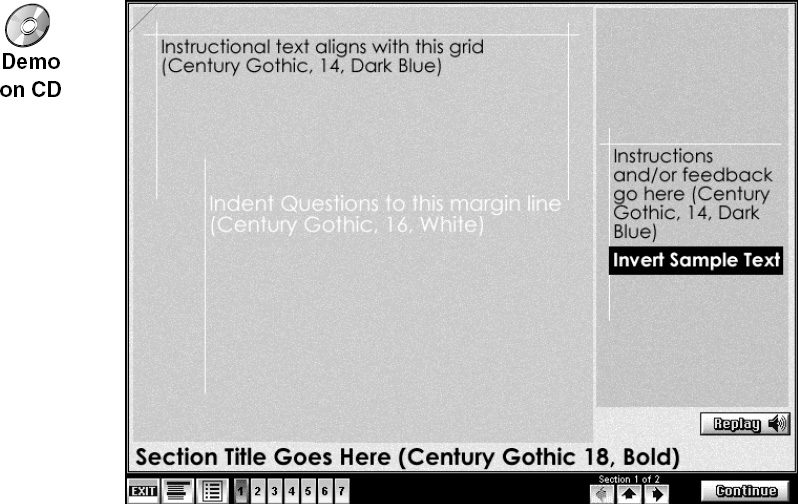
The navigation controls are concentrated in a narrow band along the bottom of the screen, maximizing the screen real estate reserved for instructional and content purposes.
Let’s look at this system in more detail in terms of the six imperatives.
Imperative 1: Let Learners See the Boundaries of Their Universe
The navigation system accommodates several levels of organization. A course is divided into topics. Each topic is organized into sections. Each section might be made up of one or more pages or challenges. This structure is displayed at all times, no matter where learners are in the course (Figure 6.3).
FIGURE 6.3 The numbered rectangles represent topics with the current topic highlighted. The current section and the total number of sections in the current topic are displayed above the arrow buttons.
WorldTutor. Courtesy of Allen Interactions Inc.
The navigation bar (Figure 6.3) shows the course structure in a very compact space. A numbered rectangle or topic icon represents each topic in the course. These icons are arranged in order from left to right. For each course, only the appropriate number of icons is displayed—there are no placeholder blank images. In addition to clearly showing the number of topics, it is also effective as a more general indicator of scope. For a learner who will be completing even just a few sections in this navigation framework, a fleeting glance provides an immediate sense of whether it is a long or short course.
Imperative 2: Let Learners See How the Contents Are Organized
The topic icons give a visual indicator of the skeleton of the course, but do not convey anything about the content except to indicate the recommended order of study. More details about topics and sections are available in two ways. First, the learner can move the mouse over any topic icon to view the name of the topic (Figure 6.4).
FIGURE 6.4 Rolling over a topic icon displays its name.
WorldTutor. Courtesy of Allen Interactions Inc.

For even more detail, the learner can select the TOPICS & OBJECTIVES button (second button from the left) to view topics and sections in a list (Figure 6.5).

Learners can view the topics and sections list without losing their place in the course. Detailed learning objectives for the course are also available from the topics and sections list.
Imperative 3: Let Learners See Where They Are
The topic icons change status as the learner moves through the course. The current topic is highlighted, and completed topics are marked with a colored bar. Learners also have the ability to earmark pages for later review by clicking in the upper left corner of the screen. Earmarked pages are indicated at the upper left as well as on the topic icons (Figure 6.6).
FIGURE 6.6 Topic icons showing progress. Topic 5 is the current topic. Topics 1, 2, and 4 have been completed. Topics 2 and 4 are earmarked for review.
WorldTutor. Courtesy of Allen Interactions Inc.

Imperative 4: Let Learners Go Forward
This navigation allows users to go forward in several ways. At the most basic level, the CONTINUE button takes the learner through the entire course in the suggested order (Figure 6.7). The continue function is disabled only during a challenge, when the learner must successfully complete an activity before being allowed to proceed.
FIGURE 6.7 The CONTINUE button provides default forward navigation through pages and partial pages. The arrow keys facilitate moving among sections.
WorldTutor. Courtesy of Allen Interactions Inc.

The arrow buttons allow learners to move forward (and backward) on a section basis rather than just one page at a time. The notation above the arrow buttons provides useful orienting information regarding the number of sections in the current topic and where the learner currently is working.
In the context of the larger course, the learner can also skip forward to any topic simply by clicking the icon for that topic, if the author allows it.
Imperative 5: Let Learners Back Up
Conveniently, the learner can move backward in nearly all the same ways as foreward. Clicking the left arrow button takes the learner to previous sections (Figure 6.7). Clicking the up arrow button restarts the section. Clicking the icon for a topic that has been studied previously takes the learner back to that topic.
Imperative 6: Let Learners Correct Themselves
This navigation model is somewhat neutral in regard to making mistakes. However, it does allow corrections in that learners are generally one or two clicks away from any part of the content, so an unintended stray click can be corrected quickly and easily. The REPLAY button is available in case the learner missed or did not attend to the audio narration.
In addition to these imperatives, the WorldTutor structure also provides some other handy features. The options button reveals a set of buttons for other enhanced features (Figure 6.8).
The buttons include a glossary of definitions for specialized vocabulary; a help function to describe lesson features; a word finder that enables learners to search the course for keywords; a volume control; a flash-card system that allows learners to tag specific concept displays and review them as a drill later; and a comments section where the learners can write notes for themselves, their instructor, or the system administrator. For the most part, each of these special options operates within the same space occupied by the navigation controls, so it doesn’t restrict the learner’s view of the actual lesson content.
What’s the Secret?
Chapter 5 looked at two instructional pieces from What’s the Secret? as examples of applying the Seven Magic Keys. Now let’s take a look at how these hang together in a navigation system. This navigational structure differs in many ways from that of WorldTutor but provides many of the imperatives. Because the application is intended to encourage exploration, it uses creative visuals and is somewhat less oriented toward indicating specific progress than are many other navigation systems.
The main menu is a great example of combining playful and enticing visuals with effective navigation (Figure 6.9).
FIGURE 6.9 Main menu of What’s the Secret?
What’s the Secret?, Vol. 1. Courtesy of KCTA-TV, St. Paul, MN.
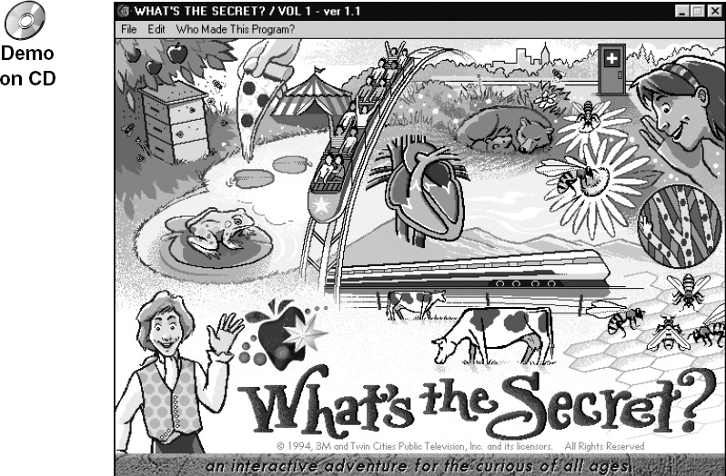
This doesn’t look like a menu, but in the spirit of exploration, all graphic objects are actually hot menu choices. This is indicated by a cursor change when the learner moves the mouse pointer over each object (Figure 6.10).
FIGURE 6.10 The cursor changes when it’s moved over an active menu item.
What’s the Secret?, Vol. 1. Courtesy of KCTA-TV, St. Paul, MN.

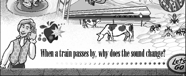
Each menu selection ultimately launches an extended exploration context, so it is helpful in this case to let the user confirm the menu choice. The first click shows the section title, and engaging narration asks leading questions that characterize what will be covered in that section (Figure 6.11). If the preview seems satisfactory, the learner chooses the LET’S GO button to enter the section.
FIGURE 6.11 The menu provides a preview before launching each section.
What’s the Secret?, Vol. 1. Courtesy of KCTA-TV, St. Paul, MN.
Each section is focused on a central experiment or investigation with related supporting resources (Figure 6.12). Again, since we’re focusing on navigation issues, we’ll ignore the instructional interactions and just look at how the users can move around.
FIGURE 6.12 An experiment page featuring typical screen navigation controls.
What’s the Secret?, Vol. 1. Courtesy of KCTA-TV, St. Paul, MN.

The navigation controls are clustered at the bottom of each screen. The image in the lower left is a thumbnail of the menu screen, and indeed will return to the menu when clicked. The other navigation buttons are divided into two groups: some placed in the white gap and others grounded to the solid surface to the right. This difference in position tells the learner what to expect. The elements in the gap represent excursions to a related topic. Taking one of these excursions takes the learner away from the current activity and moves to a related topic in a new context (Figure 6.13).
FIGURE 6.13 A typical excursion page.
What’s the Secret?, Vol. 1. Courtesy of KCTA-TV, St. Paul, MN.

On the excursion page, all navigation disappears except for an option to go back to the experiment page. The GO BACK button is exactly parallel to the button that brought this section up and follows the same rule: The button is in the gap, so by choosing it, learners expect to go to a new screen.
In contrast, the “grounded” navigation buttons bring up additional resources on top of the current experiment screens (Figure 6.14). These resources typically represent additional experiments, puzzling questions pertaining directly to the experiment, or additional video resources. The original experiment remains in the background.
FIGURE 6.14 Some resources, such as this video controller, float on top of the main display and disappear when finished.
What’s the Secret?, Vol. 1. Courtesy of KCTA-TV, St. Paul, MN.

One final clever and powerful twist in the navigation is represented by the backpack on the navigation bar that is really a submenu for some important learning aids (Figure 6.15).
FIGURE 6.15 This backpack is a submenu to additional resources.
What’s the Secret?, Vol. 1. Courtesy of KCTA-TV, St. Paul, MN.

The backpack notepad is always available to record interesting facts or observations during the lessons. While this is very handy, the backpack has another more interesting function: While exploring an experiment, the learner can earn reward patches if some serious attention has been spent in the activity. The learner collects these patches by dragging them to the backpack. The payoff is that these patches provide access to fun games and exercises. So even though there is no mechanism to force learners through the whole program systematically, these patches accomplish the same thing in a much more motivating way. Very few learners are content until they know they have gathered all the patches—and the only way to do that is to be systematic and thorough in exploring the sections of the program.
What’s the Secret? represents a very different structure from what is typical in corporate e-learning applications. Yet it still provides the things a navigation system must have, in a fresh, unorthodox context. We need to strive for this vitality of design for all audiences, instead of immediately thinking that this kind of creative solution is inappropriate or out of our grasp.
Hypertext
Hypertext was hailed as a revolutionary user-interface construct for learning. Any word or sequence of words could be tagged and linked to another content element or location. Clicking tagged words would summon the linked information. The linked information might be laid over current screen contents so that learners could easily dismiss it and resume the previous activities, or the information could be linked so that learners could jump to the new location, entirely replacing their current screens.
With hypertext capabilities, content could be linked together in a vast network, so that learners could explore in multiple ways. Learners might, for example, browse at a high level, avoiding examples or extended discussions. At any point, they might decide to explore a selected topic in depth. Avoiding related notions, they could dig deeply into the foundations of a single concept until the content was exhausted or another interest took over. A great deal of power and freedom could be seen in such an environment. In many ways, this is what the World Wide Web is today—a very large multistructured hypertext network.
Because of the high cost of building such networks, rich with many links and great volumes of information for learner exploration, few are built. Although the World Wide Web itself is evolving into such a network it is insufficiently and inappropriately structured for most training and even educational needs, even with all the resources it offers.
Designers must ensure that learners are acquiring basic skills and undertaking reasonable challenges. Otherwise, learners are likely to flounder. Learners need some form of guidance and mentorship to effectively allocate their time. Although it can be a very valuable resource, simple access to information doesn’t create an effective learning environment—just as a presentation of information does not equal teaching.
Hyperlinked resources are arguably richer in the breadth of the learning content they can provide and are more responsive to momentary learner interests than structured e-learning, but they’re less efficient in leading learners to defined proficiencies. In the preparation of e-learning, designers find it important to focus much of their effort on chunking information into segments learners can handle. Designers work hard to provide needed overviews, reviews, examples, exercises, and elaborations at the right points, and they provide transitions to help learners structure the knowledge they are attempting to internalize. Unstructured linked resources just don’t provide learners the support they need. It’s just not that easy.
Lost in Hyperspace
With no guide, learners can easily become lost in hyperspace and spend a good deal of time navigating without learning much. While experts may find the lack of restrictions refreshing and supportive of their objectives in traversing the knowledge domain, learners can easily lose sight of meaningful goals—if, indeed, they were able to formulate them at the start. After spending a good deal of time, learners often come away feeling they gained little or only incomplete knowledge.
Hyperdisappointment
As with so many gizmos that purport to instantly transform learning into an entertaining, effortless, and self-gratifying adventure, hypertext has failed to introduce significant advances. The Internet, of course, has become a wonderful resource for learning research and exploration, but the work necessary to build focused, productive learning environments remains a complex undertaking. It’s not readily simplified by any single invention, whether it’s a new user-interface capability or even the availability of low-cost personal computers.
Hypertext is, of course, valuable, but it is more a branching or navigation mechanism than an instructional concept. It can be a very handy and effective alternative to more visually restrictive buttons.
To Underline or Not to Underline
Hypertext is broadly used today simply as a way of branching—as an alternative to buttons linked to various displays. While conventional underlining marks clickable links quite effectively, many find underlined text to be visually unappealing. Unfortunately, conventions can have great utility, and supplanting them has its perils. Many interface designs today make rather unforgivable errors both when using conventional underlining and when attempting to create intuitively understandable alternatives:
- Using underlined hypertext links and underlining headings and other text that are not hyperactive
- Not underlining hypertext, and in the process making headings and other text that are not hyperactive look the same as hypertext
- Using color to demark links embedded within text—a problem of separating a series of links (three blue words in a row could be one, two, or three links)
Helpful Hypertext
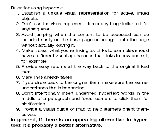
Hypertext can be a useful tool. It isn’t the instructional technology revolution early proponents thought it might be. It doesn’t make design and implementation of effective instructional applications much easier, if any easier, and it is easy to misuse. But hypertext can make applications easier (or harder) to use, depending on how it’s applied. Check Figure 6.16 for some rules on using hypertext in learning applications.
FIGURE 6.16 Rules for using hypertext.
Navigational Metaphors
Metaphors are often used to impart instant familiarity to navigational structures. A building, for example, has analogies to the usual components of an interactive course of instruction: the building as a whole (the course of instruction), the reception area (a place to register or log on), the building directory (list of main topics), floors of the building (levels of skill and challenge advancing to the top), rooms (modules or subtopics), labs (places for experimentation), gym (place for practice), and so on.
Any structure with multiple parts can be used as an organizational and therefore navigational metaphor, such as a book, a car, a city, a train, or a camp. Consider also a road map, a treasure map, or a pyramid with all its hallways and vestibules.
Metaphors can be quite powerful, providing terminology, a familiar structure, and even visual representation. For a complex structure or for a very large application, they can provide some welcome orientation.
Some Concerns
Although metaphors for navigation—or for any interactive controls for that matter—can be powerful, they’re sometimes used to mask a lack of good instructional interactivity. It’s very disappointing to begin an e-learning application with an extravagant rendering of a metaphor, only to find that once you’ve selected your topic of instruction, the metaphor has no further utility. Even worse is to find that the interactions are shallow and lacking in imagination because too much effort was spent devising the navigational window dressing.
To make it even worse yet, metaphors are sometimes forced into every nook and cranny of interactions, where they provide no benefit, become wearisome, and may actually distract or confuse learners.
Compounding all these problems, metaphors sometimes feel childish and demeaning. There’s a fine line between gamelike metaphors—those that can provide energy and a helpful lightheartedness to otherwise taxing learning events—and silly metaphorical contexts that add no value and may impede learning. From my perspective, it’s usually best to find interest and energy in the content and skills being taught.
Simplicity is Best
In general, the simplest way to represent the structure and content of a course of instruction may be the best. Selecting a segment of content to study shouldn’t involve learning the controls of a starship to fly through an alien sector to the next solar system. As fun as that might be, it seems more beneficial to put such talents and resources to work building meaningful learning experiences.
Consider giving navigational metaphors the boot!
Summary
Navigation capabilities provide the backbone and many of the instructional services learners need for a successful learning experience. This chapter describes a number of very important but too seldom found navigational features. Because they are so valuable, they are dubbed imperatives to suggest that there should be immutable objections before any project decides to omit them.
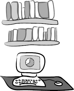
Hypertext was once thought to be the solution to many impediments to the development of rich technologically delivered learning experiences. However, today we are finding it more valuable in noninstructional Web sites than in e-learning. While hypertext structures are indeed easy to implement and use, they are generally insufficient instructional mechanisms. More like a library than a learning event, hypertext can help learners probe for information, but much more is needed to construct most training applications.
Finally, a few comments are offered on navigational metaphors. While metaphors can help learners understand application structures more quickly, they can easily become overworked, too cute, too attention getting, and too annoying. If structures need a metaphor to be readily understood, they may be overly complex. However, metaphors are too often used to explain structures that are easily understood without them. My recommendation is that metaphors be kept to a minimum and navigational structures be kept simple so that maximum attention can be given to what really counts: the development of effective learning experiences.