16
InfoQ support with JMP
Ian Cox
JMP Division, SAS Institute, Cary, NC, USA
16.1 Introduction
JMP is a desktop product from SAS that is designed to allow researchers, engineers, and scientists to get the most value from data generated by measurements. Like all software, it is enabling in the sense that it has the potential to allow users to do things that would otherwise be difficult or impossible for them to do through another way. The InfoQ framework allows consideration and discussion of what “value” actually means in specific situations, a more rational appraisal of possible alternative approaches or, in the worst case, a clearer indication of the limitations of an approach demanded by practical considerations.
Clearly the skills, aptitudes, and knowledge of the user are a vital consideration in the design and development of software that aspires to enable, and, as with everything, there is variation in these three aspects. To tame this complexity, modern software development is usually couched in terms of a repertoire of use cases (Cockburn, 2001), often refined by an agile approach for delivery (Shore and Warden, 2007). Such use cases can generally be grouped into two types, which we will label as planned and unplanned. A planned use case is characterized by the fact that the pathway from data to information and action is known (or stipulated) in advance, whereas for an unplanned use case, this is not so. For a given application area, unplanned use cases tend to come before planned ones, and the latter often emerge from what is learned through the former. The considerations of InfoQ can and should be applied to both types. Note also that, generally, planned use cases often imply or demand some level of automation to make them practically feasible and often have to support multiple users (with their attendant variation). Associated with this is the idea of encapsulating the best practice so as to democratize the use of data to do something useful and valuable.
Every software product has strengths and weaknesses. Vendors or open‐source communities attempt to serve markets and users to the best of their ability, and many users present a proliferation of use cases that they might be interested in. Users are inventive and demanding, so, from the point of view of the vendor at least, this tension is best managed by some overarching principles that guide product concept and development. Additionally, software products have to continue development from where they currently are, and older products may be at risk from a choice of technology, architecture, or platform that originally made sense but now puts constraints on what is possible.
In the case of JMP, we aim to support the process of statistical discovery, shown in Figure 16.1. Many of our users work in companies and environments in which innovation is a prerequisite for survival, and innovation demands learning something new about the way the relevant system of value production functions or can be made to function through appropriate redesign. New insights are serendipitous, and JMP aims to reduce the barriers to encountering such insights by offering a synergistic blend of visualization and statistical modeling in one environment. In other words, one of the guiding principles of JMP is to offer the best support possible for unplanned use cases that are in scope and can be reasonably delivered by desktop software.
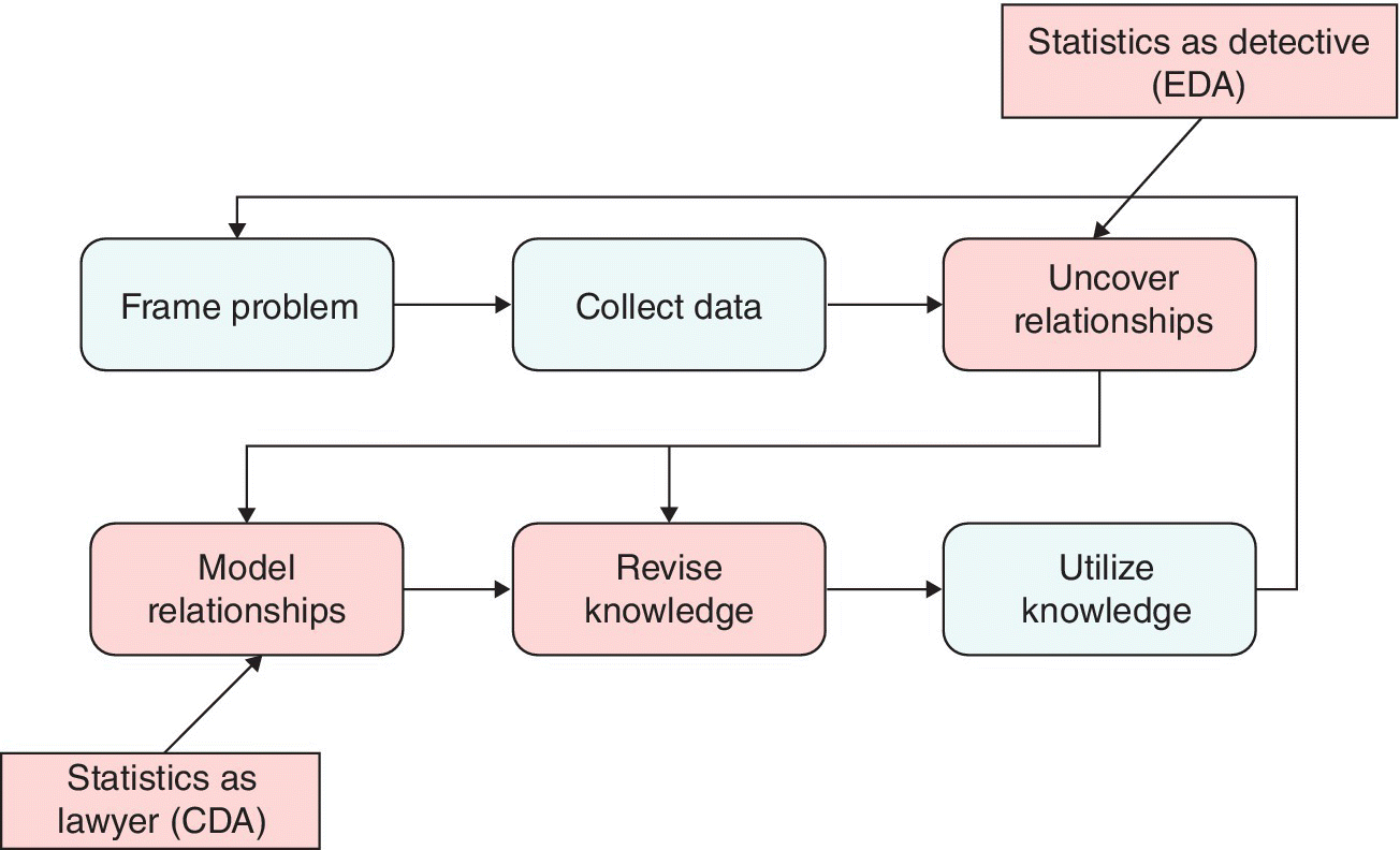
Figure 16.1 Statistical discovery.
JMP was first brought to market in 1989 and at the time of writing is at version 12 on Windows and OS X. It uses an in‐memory architecture, so that the local RAM determines how much data you can work with. The user interface of JMP was inspired by some key ideas which were new at the time but which continue to serve users well today:
- Hot spots for optional analyses
- Hypertext for organizing, folding, and unfolding
- Boxes and glue for layout
- Smart scrolling to keep titles sticky
- Color coding for preattentive cognition
- Dynamic linking
Like every well‐established software product, raw functionality has grown over the years.
Although support for unplanned use cases has been a particular focus, another guiding principle of JMP is that, when functionality is added, it is always made scriptable, that is, accessible via the JMP Scripting Language (JSL). This allows JMP to fully support the automated, planned use cases mentioned earlier. JSL is an interpreted, full‐fledged scripting language that supports a variety of programming styles. JMP also provides an integrated development environment and the associated tools for building and distributing statistical discovery applications for workgroups with common requirements. Interactive use of JMP generates JSL behind the scenes, and this code can be easily reused to reduce the burden of application development. JSL also allows JMP to interoperate with other software (such as SAS, R, and MATLAB) when this is needed or beneficial for moving from data to information and action.
Use cases are always indicative rather than exhaustive or comprehensive. This chapter contains two examples to illustrate how JMP supports InfoQ. Each example starts with a tabular synopsis of the scenario to orient the reader. As mentioned earlier, in so far as InfoQ is a way of thinking that guides our approach to exploiting data and preventing its abuse, it should be clear that the practice of statistical discovery could benefit considerably from this discipline. Moreover, in so far as InfoQ can be systematized, one can also envisage that its repeatable application can be facilitated through software. To illustrate the application‐building capabilities of JMP, we briefly show a prototype of this after the two examples. Finally, we close with some commentary on how various JMP capabilities align with the four InfoQ components (Chapter 2) and the eight InfoQ dimensions (Chapter 3).
We encourage the reader to download a trial copy of JMP from www.jmp.com/trial to see the materials in this chapter in a “live” setting. Download the InfoQ.jmpaddin file from the book’s website, and if JMP is installed, double‐click on this file to create an “InfoQ” menu under the “Add‐Ins” main menu. All the materials here are available as submenus from the “InfoQ” menu, and tooltips explain the intended purpose of each. For a comprehensive treatment of modern industrial statistics with JMP see Kenett and Zacks (2014).
16.2 Example 1: Controlling a film deposition process
Manufacturing working semiconductor devices is nontrivial. Many steps are involved and one of the key aspects is that although it is the final individual chips that count, in the early stages these have to be fabricated on wafers. When each wafer is cut up, it forms many chips (ideally all identical). For operational reasons wafers are often arranged into groups (lots or batches) and can be processed at a particular manufacturing step as a run consisting of either part of a lot or of several lots. This example is the latter situation: low‐pressure chemical vapour deposition (LPCVD) is conducted in a furnace tube, which holds four lots (each of 24 wafers). The engineering objective is to grow a new layer of silicon nitride on the surface of each wafer that has properties such that the final device works as designed. The furnace tube is heated, and gases flow from one end of the tube to the other, passing over and between the wafers. The process is executed according to a recipe that controls things like the rate of heating, temperature, and gas flows and pressures. After each run of the furnace tube, measurements of responses are made on four nonproduct wafers, each one adjacent to a lot in the tube. The measurements made on each monitor wafer are assumed to be representative of the properties of the adjacent lot. A summary of the example and the data analysis methods it uses is presented in Table 16.1.
Table 16.1 Synopsis of Example 1.
| Application area | Quality engineering, reliability, and six sigma |
| Industry niche | Semiconductor fabrication |
| System under study | Low‐pressure chemical vapour decomposition (LPCVD) diffusion step growing silicon nitride on semiconductor wafers |
| Practical goal (operations manager) | From the operations manager to the diffusion engineer: “Implement statistical process control (SPC) at the LPCVD step so my technicians only chase real problems” |
| Analytical goal (diffusion engineer) | Using available process data, construct, deploy, and maintain appropriate control charts to balance risks appropriately |
| Major steps | Assess data quality and take remedial actions |
| Visualize and estimate patterns of variation | |
| Construct appropriate charts and calculate limits | |
| Implement control methodology | |
| Analytical tools | Multivariate missing maps |
| Linked histograms and bar charts | |
| Spatial maps | |
| Mixed models | |
| Control charts |
To meet customer demand, build schedules require that four distinct furnace tubes or entities are available. The cycle time for the LPCVD step is several hours, and manufacturing operations require that each of the four entities can also be used for several other steps. Ideally, as lots arrive from various prior steps in the process, entities are available to process them in such a way that the end‐to‐end cycle time of each is as short as possible.
Although the LPCVD step is generally well understood, things can and do go wrong, at which point technicians intervene to try to fix the problem, ideally finding the root cause and removing it. The operations manager has issued an apparently simple directive to the diffusion engineer—“Implement statistical process control (SPC) at the LPCVD step so my technicians only chase real problems.” From the InfoQ point of view, this is the practical goal, at least from the frame of reference of the operations manager. Although not stated directly, we can assume that the operations manager wants a decision rule that directs whether or not technicians need to intervene each time a furnace has been run. Other practical goals are certainly possible, so this highlights an important issue, namely, that the successful application of InfoQ requires good communication, particularly in the case of goal definition (see Chapter 2).
Note that, as mentioned in Chapter 3, SPC and the related concept of rational subgrouping is a special case of the data resolution dimension of InfoQ. However, note also that, as originally conceived, the idea of rational subgrouping was designed to handle situations in which differences in the product stream can be usefully modeled with just a single source of variation. In such a case the focus of the analysis lies in understanding how this variation shows itself within and between the chosen subgroups. However the batch‐oriented LPCVD process here is clearly more complex and, depending on the measurement scheme that is used, may result in data that is correspondingly less simple. Depending on exactly how it is handled, this increased data complexity may or may not increase the InfoQ analysis quality and how this contributes to the InfoQ goal quality.
For reasons of expediency, we assume that the diffusion engineer is presented with a single JMP table containing data already extracted from the manufacturing execution system. Of course, accessing data and getting it “in” to any analytical environment is a big and important topic and one that is crucial to InfoQ. Considerations of data structure, resolution, and temporal relevance start with this step, and, in extreme cases, it may be that the analytical environment is overwhelmed to the point that no analysis can proceed. Systems that work well with textbook data may or may not perform so well in the real world. In some cases, knowledge of how to coax the best from any given environment may make marginal cases feasible, but often such knowledge is in short supply.
In so far as we sidestep this key issue, we only give a partial picture of JMP capabilities aligned with the requirements of InfoQ. However, most of the analyses in JMP, whether graphical or numerical or a combination thereof, consume a single table, so this is a sensible starting point.
Like most statistical software, in JMP tables, rows (columns) represent the units that were measured (values of a measurement made on those units). JMP allows each column to be one of the following four data types:
- Numeric
- Character
- Row state
- Expression
Values within a column have to be of the same type. Data types 1 and 2 are obvious enough; 3 is reflective of the fact that rows can be designated with colors, markers, and so on, whereas 4 allows a table cell to contain any JSL expression. A special case of an expression is an image, which can be very useful in providing additional context and meaning, not easily quantifiable, to a given row. Any column with data type 1 or 2 is also assigned a modeling type (continuous, ordinal or nominal) that affects the details of how JMP handles this column (both graphically and numerically). As well as containing data, a JMP table can also contain metadata, relating either to specific columns or the entire table. Such metadata is persisted when the JMP table is saved to the operating system and, for instance, can consist of JSL scripts that direct JMP as to how the data in the table should be treated.
A partial view of the diffusion engineer’s table is shown in Figure 16.2. Note that the table under the “InfoQ” menu also contains some saved scripts to allow you to easily follow the steps described here. These scripts are in the tables panel of the JMP table, below the little red triangle (LRT) hot spot at the top left of the figure. To run one of these scripts, click on the LRT and select Run Script.
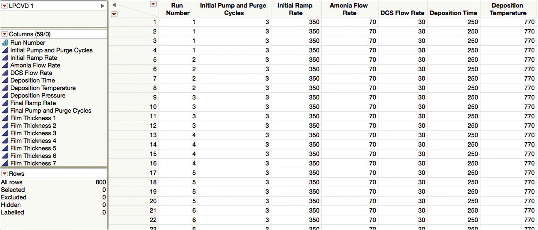
Figure 16.2 The LPCVD data (partial view).
The first challenge the diffusion engineer faces is to make an assessment of data quality. By inspection of the data grid and the columns and rows panels, you can see that the data appears to have come from 200 furnace runs and that for each run, nine process conditions were logged (“Initial Pump and Purge Cycles” to “Final Pump and Purge Cycles”). In addition, a film thickness was measured 49 times for each unit or wafer. Note that the recorded data is ambiguous, in the sense that knowledge of exactly how the measurements were made and the subsequent values stored and extracted is required to fully understand its meaning. For example, each run number seems to be associated with four rows, and although it is tempting to assume that each row relates to one of the monitor wafers and that the wafer that occupied a particular position in the tube always has the same row‐wise placement, this is nevertheless an assumption that should be checked. The script “Add Wafer ID” adds a new column to the table assuming this is indeed true. Furthermore, although the 49 measurements of film thickness could be repeated measurements made at a particular spot on the monitor wafer (e.g., the center), it is much more likely that they are measurements made at different points over the wafer to try to understand within‐wafer variation in thickness. We pursue this point later.
Given that we have identified two groups of columns (one for inputs and one for outputs), it is useful to explicitly form these groups since it will simplify subsequent JMP dialogs. The script “Group Columns” does this.
The structure of the data can be further verified by using “Analyze > Distribution” (or the third saved script)—the equal heights of the bars in the Run Number bar chart is a visual confirmation that each run is indeed associated with four rows.
The script “Add Spec Limits” adds the upper, lower, and target values to each of the Film Thickness columns (this can be done interactively via the “Column Information” dialog and the “Cols > Standardize Attributes” menu). This is an example of adding metadata as a column property and, although not of primary interest in the consideration of process control, would be used automatically by JMP if we attempt to assess capability.
One of the key considerations of data quality is the extent of missingness in the data. The script “Missing Response Values” produces a multivariate view of missingness in a summary table (see Figure 16.3).
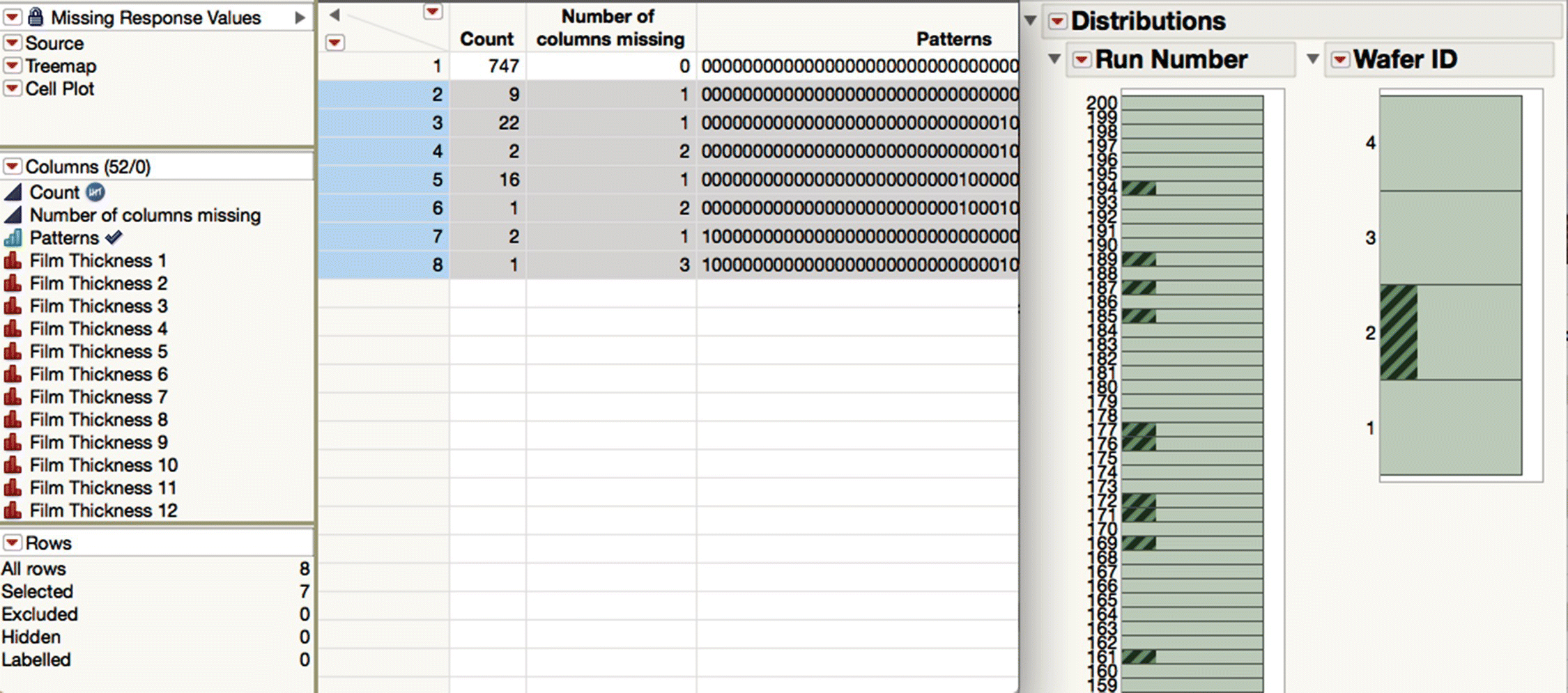
Figure 16.3 Pattern of missing thickness data.
Every row in this summary table is linked to a row in the LPCVD 1 table that has at least one missing thickness measurement. We see immediately that only 747 of the 800 rows are complete and also the counts and structure of the rows that are incomplete. Highlighting rows two to eight of the summary table and exploiting the fact that this is linked to the detail‐level data, which in turn is linked to the distributions made earlier, we arrive at an interesting insight, namely, that missing values of thickness are always associated with Wafer 2. Scrolling the bar chart vertically also reveals which runs have missing values within them.
Although seen here in a simple setting, this interactive linking of graphical displays with data, possibly also within data hierarchies, is a very powerful capability for uncovering relationships and modeling relationships (see Figure 16.1).
The question of how to best handle missing data is subtle. Clearly the “Wafer 2” issue needs to be followed up. Given, though, that the analytical objective is to construct some kind of SPC chart, we lose little in deleting every run that has one or more missing thickness values to form a final table that is complete and balanced. Note here that, generally, there is an interaction between the missingness of the data and the implementation of the desired analysis method. For example, because JMP implements restricted estimation maximum likelihood (REML, 2015) in the case of linear regression models, it does not require you to decimate your data so that it is balanced. Additionally, when data is more scarce, it may be that some form of data imputation will help. JMP provides a variety of methods (JMP Missing Values, 2015) and, in the case of predictive modeling, can automatically use auxiliary indicator variables related to the missingness of predictors to improve prediction accuracy (JMP Missing Values, 2015). For some further discussion, see Cox et al. (2016).
To select all rows for each run that has a missing value, select the Run Number column in the LPCVD 1 table, and use Rows > Row Selection > Select Matching Cells. Then select Rows > Delete Rows. Alternatively use the script “Delete Incomplete Runs.” This produces a table with data for 147 lots and 4 × 147 = 588 rows.
Looking at the columns in the process conditions group, it is easy to demonstrate using similar approaches that there are no missing values and each column has only one value, corresponding to the set point used in production. These columns contain no useful information for the analysis goal, and they can be safely deleted using the Cols > Delete Columns menu or the “Delete Process Conditions” script.
We now return to the question of how the film thickness measurements are made on a monitor wafer. As mentioned earlier, it is probable that they represent values from specific wafer locations or sites, and the diffusion engineer confirms this with the engineer responsible for the metrology tool. The engineer also gets a map of where the sites are. Given that we want to look at the measurements en masse, it makes sense to stack the data so that they all appear in a single column. In the stacked data, each row corresponds to a site on a wafer in a run. If it later turns out that we want to focus on measurements from a single site, we can use JMP’s Local Data Filter to show just the sites we are interested in. You can use Tables > Stack or the script “Stack Measurements” to rearrange the data into a new table, LPCVD 2. Note that the values inside the Site column were inherited from the column names in LCCVD 1. For what follows, it is more convenient to truncate them, and this can be done using Cols > Utilities > Recode or via the “Recode Site” script. To see the scripts mentioned in the following text, use the LPCVD 2 table accessible via the add‐in.
Note that LPCVD 2 contains no obvious spatial information, yet because JMP can use ESRI shapefiles and name files (Shapelife, 2015), it is still possible to map such data from a table like this. Running the saved script “Make Map Files” will set things up correctly. Normally such files would be provided and managed by an administrator and provided “unseen” to a group of users who need no knowledge of them. In this case, though, the requisite files are placed on the Desktop so that you can more easily locate and delete them. Using this mechanism maintains the interactivity of JMP, since you can click on a shape or shapes to select the associated rows.
Figure 16.4 shows a Graph Builder report (use Graphs > Graph Builder or the script “Map 1”). Note that the Site column in LPCVD 2 is assigned to the Map Shapes role to automatically generate the map. Note also the clear spatial variation of thickness between the measured locations.
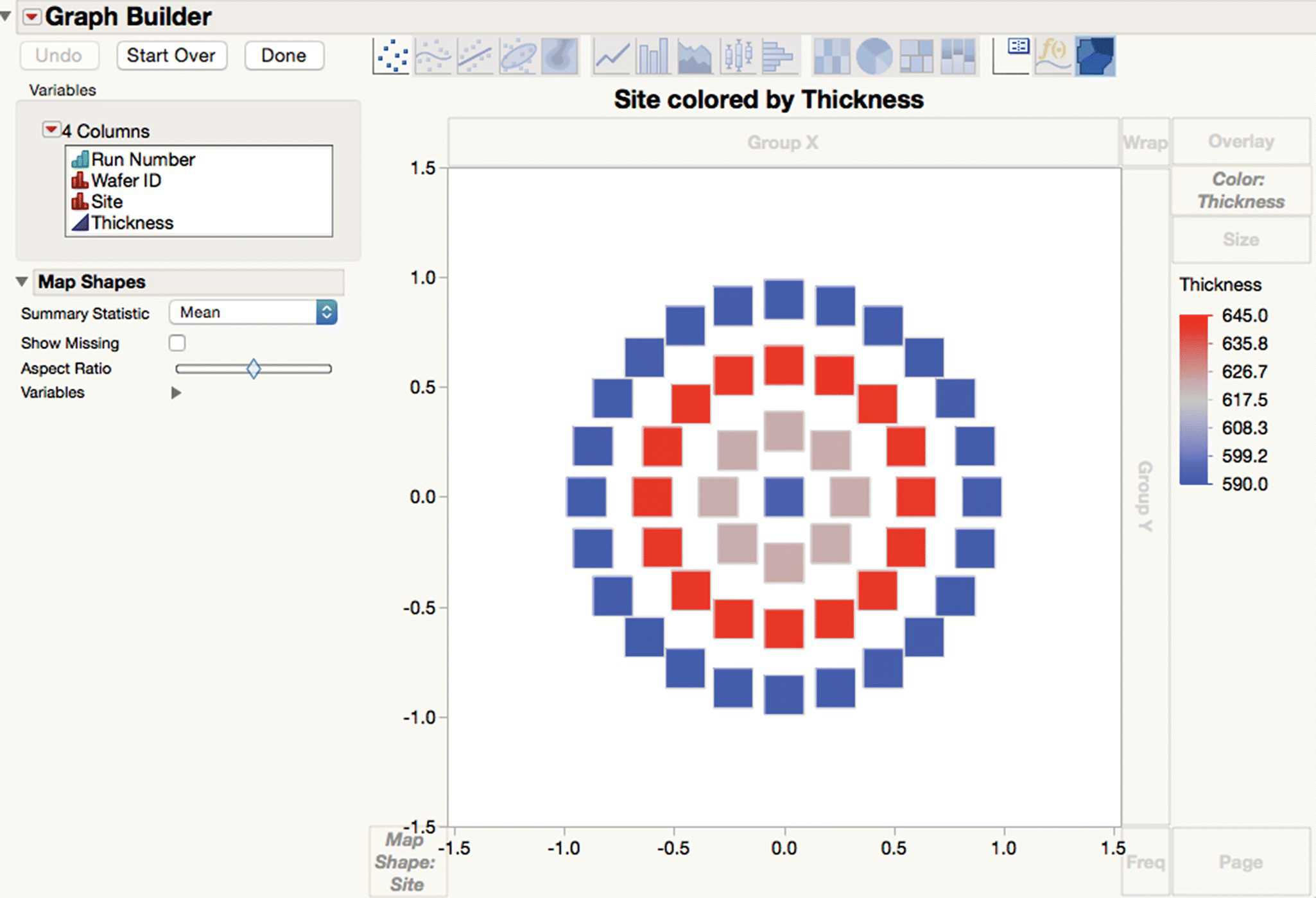
Figure 16.4 Map of all the thickness values.
Graph Builder allows you to build many graphical reports simply by dragging and dropping a column to one of the many different drop zones and by selecting the appropriate graph type from the palette. You can create trellis plots with nested x and/or y grouping variables and customize the properties of many of the graphical elements.
The script “Map 2” shows overall thicknesses for each wafer, while “Map 3” is similar, but uses the Local Data Filter to show results for each run. The Animation option under the LRT allows you to loop through each run and see the corresponding values in succession. The script “Graph Builder” does something similar, but looking at the thickness variation along the furnace tube rather than within the wafer. The script “Variability Chart” gives a conventional, if perhaps more unwieldy, view of the same thing.
The overall message from the graphical displays used is that there are several sources of variation in film thickness and that the source of variation between sites and between wafers has both a fixed and a random part. It should be clear that the more commonly used SPC charts will probably not have the desired statistical properties (because they are based on a model that is too simple), so they are unlikely to be of much practical use.
You can generate an XBar‐R chart of film thickness using Analyze > Quality and Process > Control Chart Builder or via the “Control Chart Builder 1” script (Figure 16.5). Using Run Number in the x role means that each run will be considered a rational subgroup, and JMP will automatically aggregate the data in LPCVD 2 without the need for further data management steps. More than 10 of the runs are flagged as being out of control.
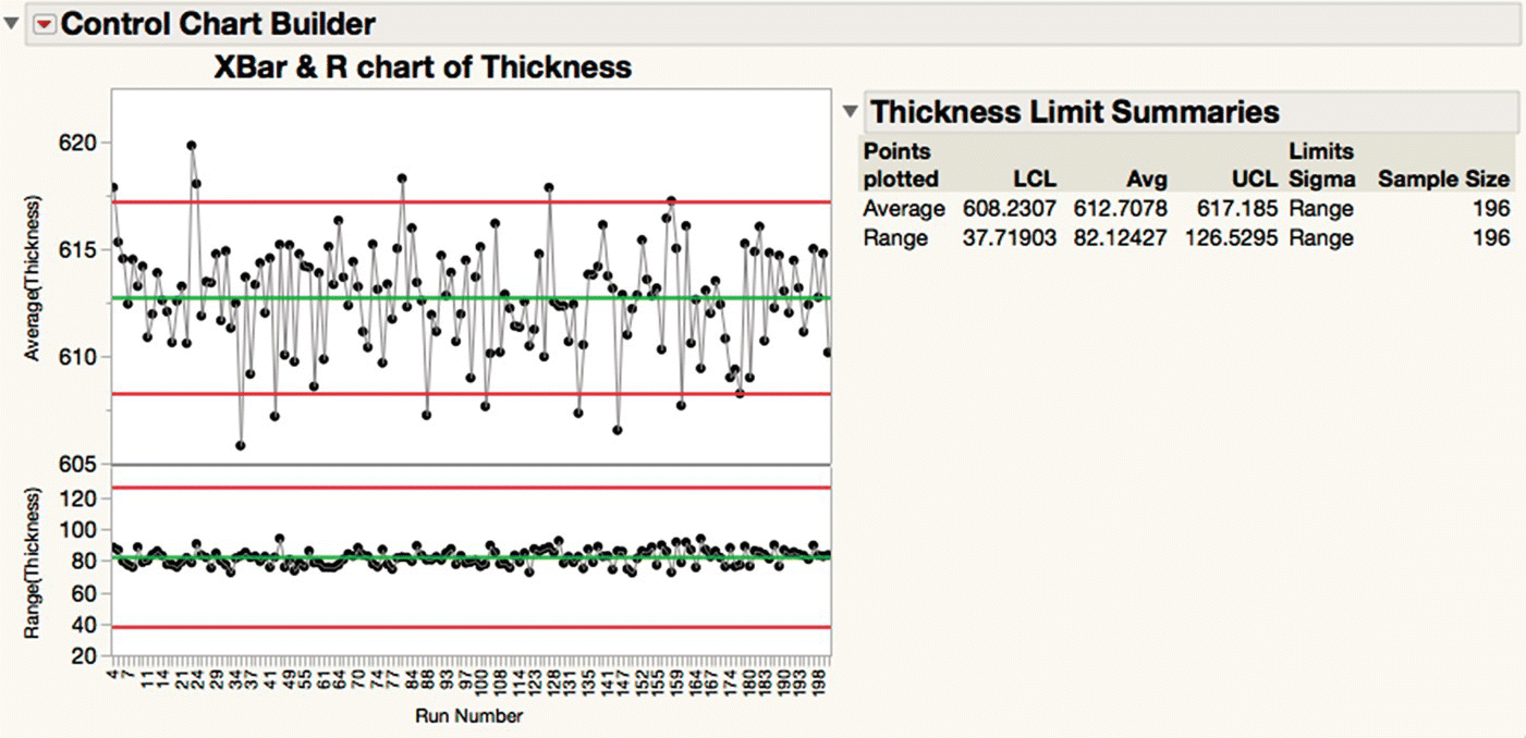
Figure 16.5 XBar‐R chart of film thickness.
You can obtain a more appropriate chart by right‐clicking and asking to Add Dispersion Chart (or running the script “Control Chart Builder 2”) to give Figure 16.6. Such “three‐way” charts are commonly used when attempting to introduce SPC for batch processes (Threeway chart, 2015), but may still not fit every case. Note that the limits of the topmost chart are now wider than in Figure 16.5, to the point that none of the runs are considered to be out of control.
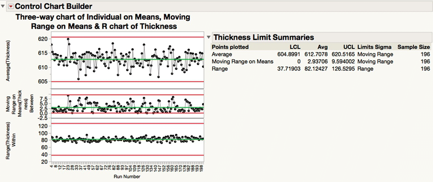
Figure 16.6 Three‐way chart of film thickness.
The topic of SPC for complex processes is a broad and interesting one. For example, CUSUM charts of variance components have been used to signal a change in the process (Wetherill and Brown, 1991, Yaschin, 1994, and Kenett and Zacks, 2014). The saved script “Fit Model” estimates the variance components associated with the within‐wafer, between‐wafer (within a run), and between‐run random effects but taking into account the systematic variation within and between wafers. By combining inbuilt functionality with JSL, control limits for such control schemes can easily be calculated with JMP. Note, however, that JMP is not the best vehicle for implementing such schemes in real time, in which case consideration must be given to how limits are passed to, or updated within, an online system.
Finally, note that an adequate SPC model is only part of a control methodology. The XBar‐R chart and its variants are general‐purpose tools. Specific knowledge of how the system has failed in the past can often be exploited to prompt more timely interventions, for example, by using Cuscore charts on specific metrics (Ramirez, 1998). Finally, we need to recognize that the practical goal (in this case, set by the operations manager) is what drives the analysis goal. Although it may be tempting to wring every last drop of information from the data by using more sophisticated analyses, this may not be necessary. Indeed, simpler approaches requiring fewer measurements may have a hidden value simply because they do require fewer measurements. Even though the sampling scheme described here makes sense when the objective is to gather information on lots as they move through the process (in support of yield improvement or problem‐solving initiatives), they may not be well aligned with the stated practical goal. Indeed, it might be reasonable to expect that we could exploit the correlations in the data to reduce the number of measurements taken but not compromise the final decision rule that dictates when operators intervene.
We conclude this example with Table 16.2, an InfoQ assessment. As well as the score for each dimension, there is a comments column with some notes as to why the score was chosen. The final InfoQ is calculated as 72%.
Table 16.2 InfoQ assessment for Example 1.
| InfoQ dimension | Score | Comments |
| Data resolution | Very high | Contingent on the measurement process for film thickness being adequate. Possible redundant data in relation to the practical goal |
| Data structure | High | Some plausible assumptions were required, for instance, that the Run Number represented the processing sequence through the furnace tube. Although the data was decimated (at the Run Number level) due to missing values within runs, the remaining data was sufficient |
| Data integration | Very high | Film thickness data is readily available from the manufacturing execution system. Map data (in the form of ESRI shapefiles and name files) enrich the film thickness data without requiring specialist knowledge on the part of the diffusion engineer |
| Temporal relevance | Very high | Film thickness data and map data are readily extracted, and the requisite chart construction can be automated in JMP, including the deployment of associated limits to an online system. Once the required analysis pathway is defined, data volumes are such that its runtime is very small compared to the time taken for a furnace run |
| Chronology of data and goal | Very high | Contingent on updating the associated limits in the online system with an appropriate frequency. SPC charts can be considered as graphical statistical models, and statistical models always degrade over time |
| Generalizability | Acceptable | Only data from one of the four furnace tubes was used. With 200 runs, it is almost certain that the furnace tube was used for other steps and/or subject to maintenance during this time, and these may or may not have had an effect on the subsequent runs |
| Operationalization | Low | Action operationalization is unclear since the analysis here is incomplete. Deciding to use the topmost chart in Figure 16.6 as the decision rule to prompt operator intervention would increase this rating. Statistical considerations aside, one important test for a control methodology is “with what frequency are special causes actually found after interventions?” This information is only available retrospectively after the control scheme is implemented |
| Communication | High | Even though manufacturing communities tend to be close‐knit, statistical approaches can sometimes be viewed with distrust |
16.3 Example 2: Predicting water quality in the Savannah River Basin
The second example is taken from the book Discovering Partial Least Squares with JMP (Cox and Gaudard, 2013), which contains a more extensive treatment of this case. The data was originally provided by Nash and Chaloud (2011).
The practical goal is to make assessments of water quality in remote regions without the need for expensive field trips to take water samples. The term water quality refers to the biological, chemical, and physical conditions of a body of water and is a measure of its ability to support beneficial uses. A summary of example 2 is presented in Table 16.3.
Table 16.3 Synopsis of Example 2.
| Application area | Statistics, predictive modeling and data mining |
| Industry niche | Ecology |
| System under study | Water quality in the Savannah River Basin |
| Practical goal | Make assessments of water quality in remote regions without the need for expensive field trips to take water samples |
| Analytical goal | Build a model that makes good predictions of aquatic biota properties from remote sensing data from satellites |
| Major steps | Assess data quality and take remedial actions |
| Visualize and estimate patterns of variation Partition data for predictive modeling | |
| Build predictive model using partial least squares | |
| Refine predictive model | |
| Profile the model and assess prediction accuracy | |
| Analytical tools | Multivariate missing maps |
| Linked histograms and bar charts | |
| Spatial maps | |
| Scatter plot matrix and correlation | |
| Partial least squares | |
| Prediction profiler | |
| Actual versus predicted plots |
Of particular interest to landscape ecologists is the relationship between landscape conditions (predictors, or Xs) and indicators of water quality (responses, or Ys). In their attempts to develop statistically valid predictive models that relate the two (the analytic goal), they often find themselves with a small number of observations and a large number of highly correlated Xs. An additional challenge is the low level of signal relative to noise in the relationship between Xs and Ys. In the application of standard multiple or multivariate regression, these conditions usually compromise the modeling process in one way or another, often requiring the selection and use of a subset of the potential predictors. To meet the analytic goal, we will use partial least squares (PLS) (or projection on latent structures) as the analytic technique, since it may be expected to require fewer modeling compromises and predict well.
The data is in a JMP table WaterQuality2 and shown partially in Figure 16.7. As with the first example, we do not consider how this table was built. As before, we use saved scripts to help you walk along the chosen analysis path, though in the interests of brevity we do not highlight every step.
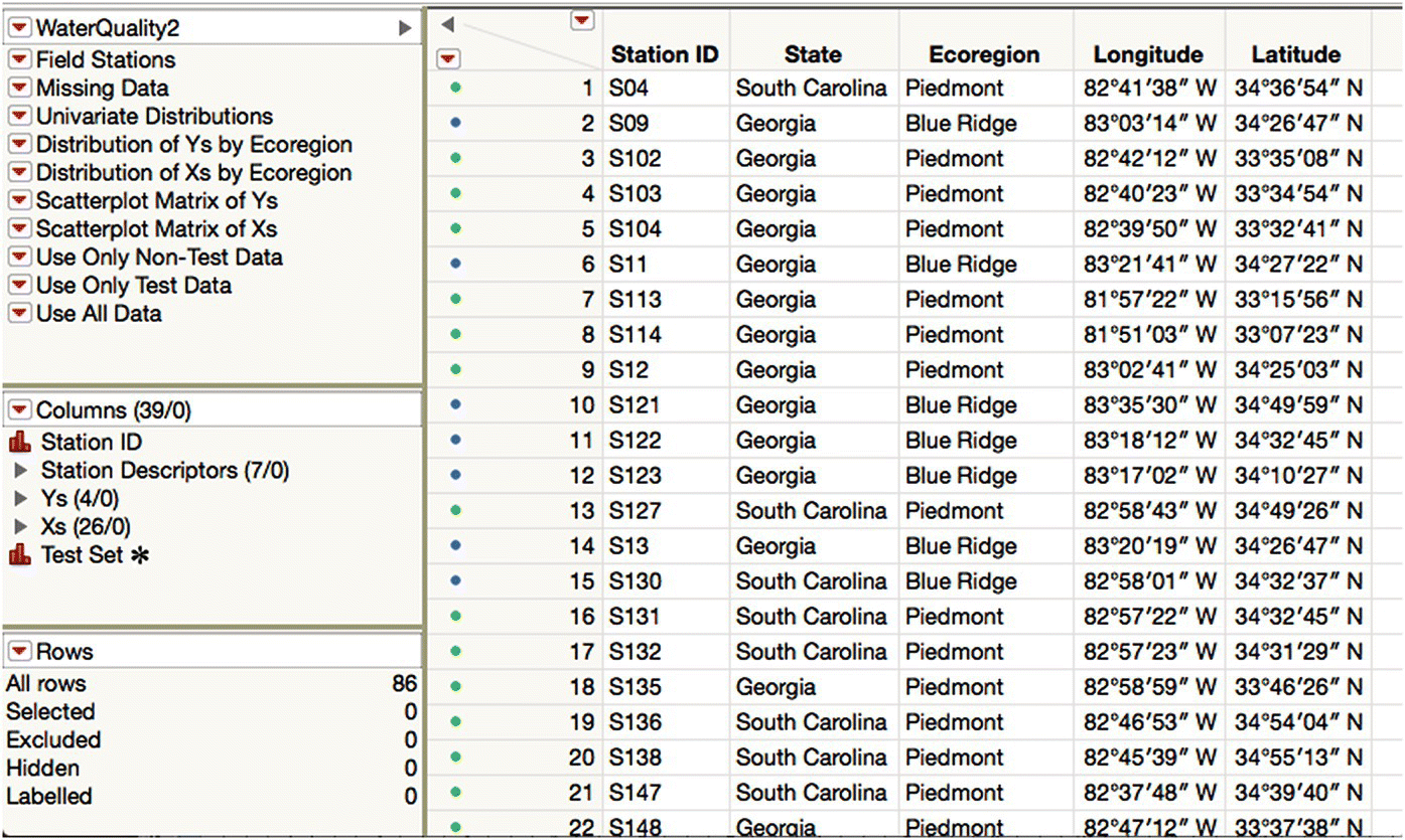
Figure 16.7 The water quality data.
Each row (unit) describes a water sample taken at a particular field station in the Savannah River Basin. There are 86 samples. The field station is described by the columns in the station descriptors group (seven of them), and there are four Ys and 26 Xs in the respective column groups. The last column, Test Set, will be described later. The row states were obtained by marking and coloring rows by Ecoregion (Rows > Color or Mark by Column).
The location of the field stations can be seen by running the script with the same name (Figure 16.8). Note that if the requisite columns are given the appropriate format, you can ask JMP to show background maps that provide additional context to the point cloud that is plotted. Maps can be stored locally or obtained on demand from a designated map server over the Internet.
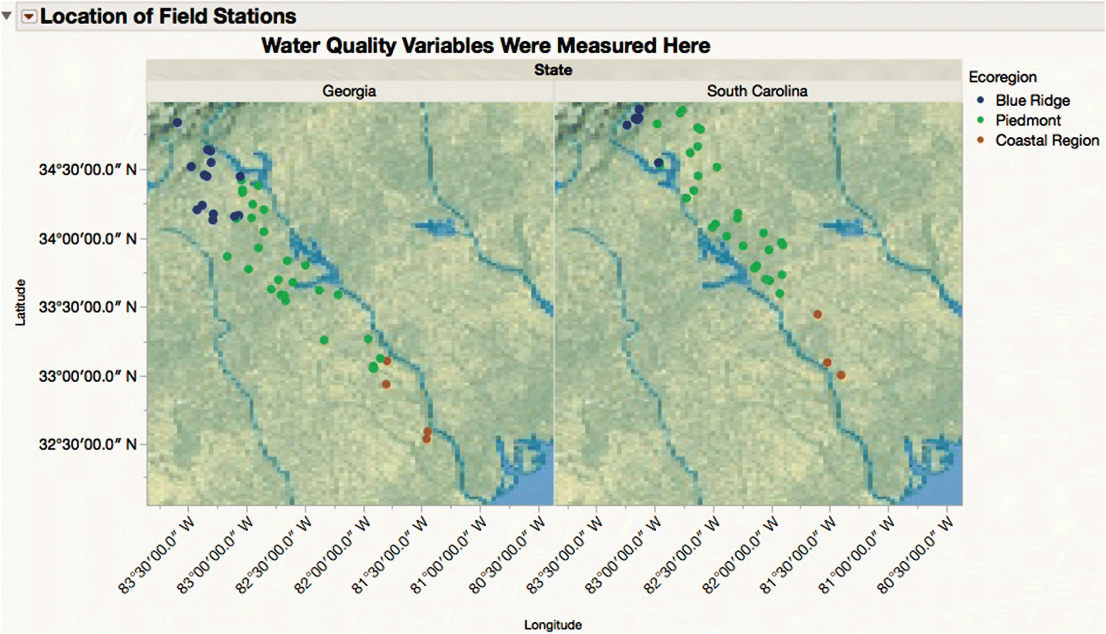
Figure 16.8 Field stations in the Savannah River Basin.
The Ys are described in Table 16.4. Note that AGPT has been transformed logarithmically.
Table 16.4 Ys for the PLS model.
| Column name | Full name | Description |
| AGPT | Algal growth potential test | An indicator of the level of nutrients that are biologically available to support algal growth. Higher levels of nutrients are indicated by higher values |
| HAB | Macroinvertebrate habitat | A weighted composite score derived from visual observations of stream habitat characteristics. Higher scores indicate better habitat conditions for macroinvertebrate populations |
| RICH | Macroinvertebrate species richness | A count of the number of taxa observed in a sample collected from a 100 meters stream segment. Higher numbers indicate greater diversity. For this study, counts exceeding 26 indicated nonimpaired conditions, while counts below 11 indicated severely impaired conditions |
| EPT | Ephemeroptera/Plecoptera/Trichoptera index | An index derived by assessing the density of three orders of macroinvertebrate that are known to be sensitive to environmental conditions. The orders are Ephemeroptera (mayflies), Plecoptera (stoneflies), and Trichoptera (caddisflies). For this study, values exceeding 10% indicate nonimpaired conditions, while values of 1% or below indicate severely impaired conditions |
We refer to Cox and Gaudard (2013) for a description of the Xs—they are values derived from satellite images in the neighborhood of the field station from where the sample was taken. For example, column f is the percentage of forest cover, and column x is the mean slope of the terrain.
Running the “Missing Data” script reveals that five rows have missing values only for HAB, while one row has missing values for both RICH and EPT. Note that it is typical to have missing values when data are collected in the field. There are no missing values in the Xs. Dropping six of the 86 available rows is not desirable if it can be avoided, and the PLS platform in JMP Pro provides both mean and iterative expectation‐maximization (EM) imputation. Using JMP Pro will allow us to make best use of the data, and using JMP will simply drop any incomplete cases.
Exploratory data analysis (EDA) (or “Uncovering Relationships” in Figure 16.1) can be conducted in the normal way. Given the heuristic nature of EDA, defining a rigid process can be self‐defeating. The user interface of JMP, coupled with its interactivity, linking, and filtering capabilities, encourages you to take a free‐form approach. Nonetheless, we would recommend you to look at the suggestions in Cox et al. (2016). In this case, the correlation between Xs and Ys is of specific interest. Running the script “Scatterplot Matrix of Ys” shows the bivariate correlations of the Ys (Figure 16.9). Note that there is some suggestion of difference by ecoregion.
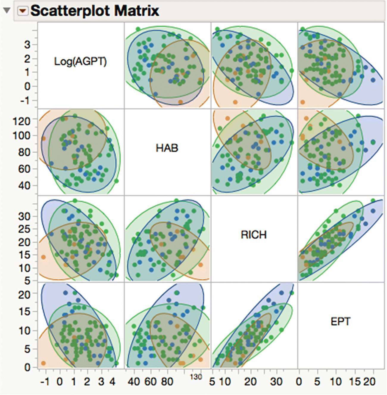
Figure 16.9 Bivariate correlation of Ys.
More extensive EDA confirms the fact that ecoregion has an important impact on the patterns of variation in the data. This suggests that we should consider two modeling approaches:
- Produce a model for the Savannah River Basin as a whole, but include ecoregion as an additional X.
- Produce three models, one for each ecoregion.
Approach (2) necessarily restricts the number of observations available for building and testing each model to the number of samples taken in that ecoregion. But, even so, it might provide better predictions than (1) for similar ecoregion located elsewhere. Approach (1) gives us more data to work with and might produce an omnibus model that has more practical utility, assuming it can predict well. In the interests of brevity, we only consider (1) here.
One of the hallmarks of predictive modeling is that we split the available data into groups for different phases of the model building process. As the name implies, our fundamental objective is to make statements about data not yet acquired, so it is advisable to hold back some of the data to try to assess the likely prediction accuracy. The data that we do not hold back is usually split further in some way, in an attempt to assure that we model signal rather than noise.
The last column in WaterQuality2.jmp is called Test Set. It contains the values “0” (labeled as “No”) and “1” (labeled as “Yes”). This column was constructed by selecting a stratified random sample of the full table, taking a proportion of 0.3 of the rows for each level of ecoregion. You can review the outcome of this random selection by selecting Analyze > Distribution to look at the distributions of test set and ecoregion. Clicking on the Yes bar shows that there is an appropriate number of rows highlighted for each level of ecoregion.
Although we could use hide and exclude attributes in the row state, it can sometimes be less confusing to make a subset table to work with. Tables > Subset will respect any row selection currently in force, and you can make such a selection from a distribution (Analyze > Distribution) or tabulation (Analyze > Tabulate) of Test Set. The table WaterQuality2_Train contains the required rows, plus various saved scripts.
Running the “Fit Model Launch” script gives Figure 16.10. PLS, along with many other regression‐based modeling methods, are available as different personalities in the Fit Model platform (Analyze > Fit Model).
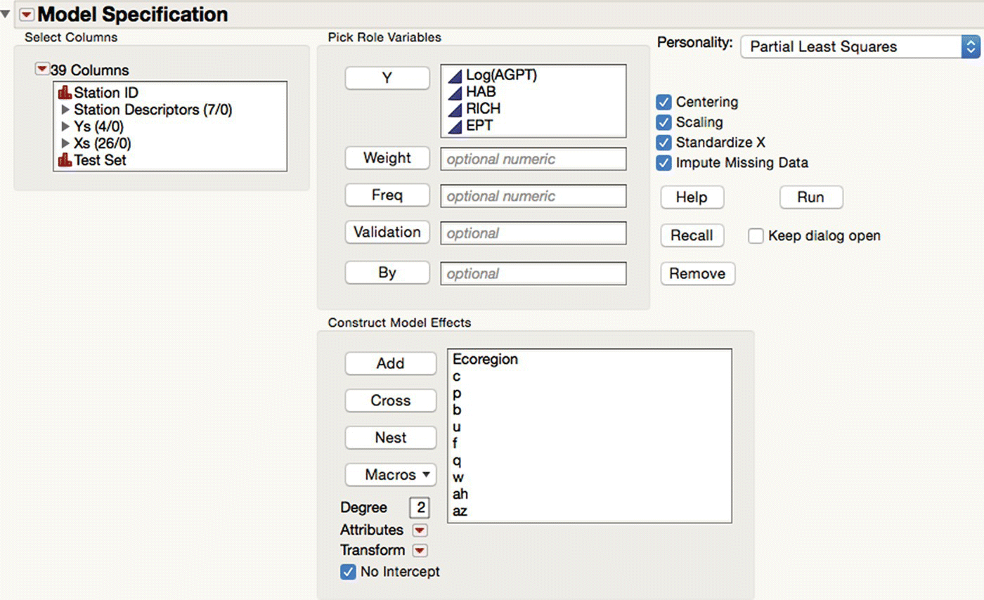
Figure 16.10 The PLS personality of fit model.
Having assigned columns to the necessary roles, you can fit and compare a variety of models (see Figure 16.11). The Model Launch outline node allows you to specify the Validation Method the first time it appears. This is the specific mechanism used to avoid overfitting, and the default is k‐fold cross‐validation with sevenfolds. The output from each model fit is contained under the respective outline node (all closed in Figure 16.11). Additional options for each fit are found under the LRT of each outline node.
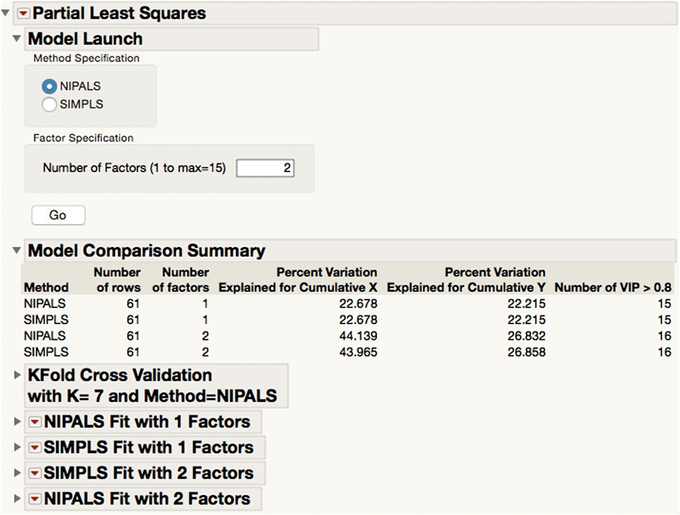
Figure 16.11 Fitting and comparing multiple PLS models.
One of the key decisions in PLS modeling is how many latent factors to included in the model. JMP will define a best model according to certain criteria, but you can override this if you want to. Each model term plays a dual role, both in dimensionality reduction and in explaining the variation in the Ys. So, aside from the usual diagnostics relating to residuals (which should have no structure if the model is well specified), the VIP versus Coefficients plot shown in Figure 16.12 is very useful (run the script “VIP Plots”). This plot has a point for each term in the model (linked to the associated column in the table). Although a contentious issue, this plot also allows you to easily generate pruned models by omitting some of the terms you included originally.
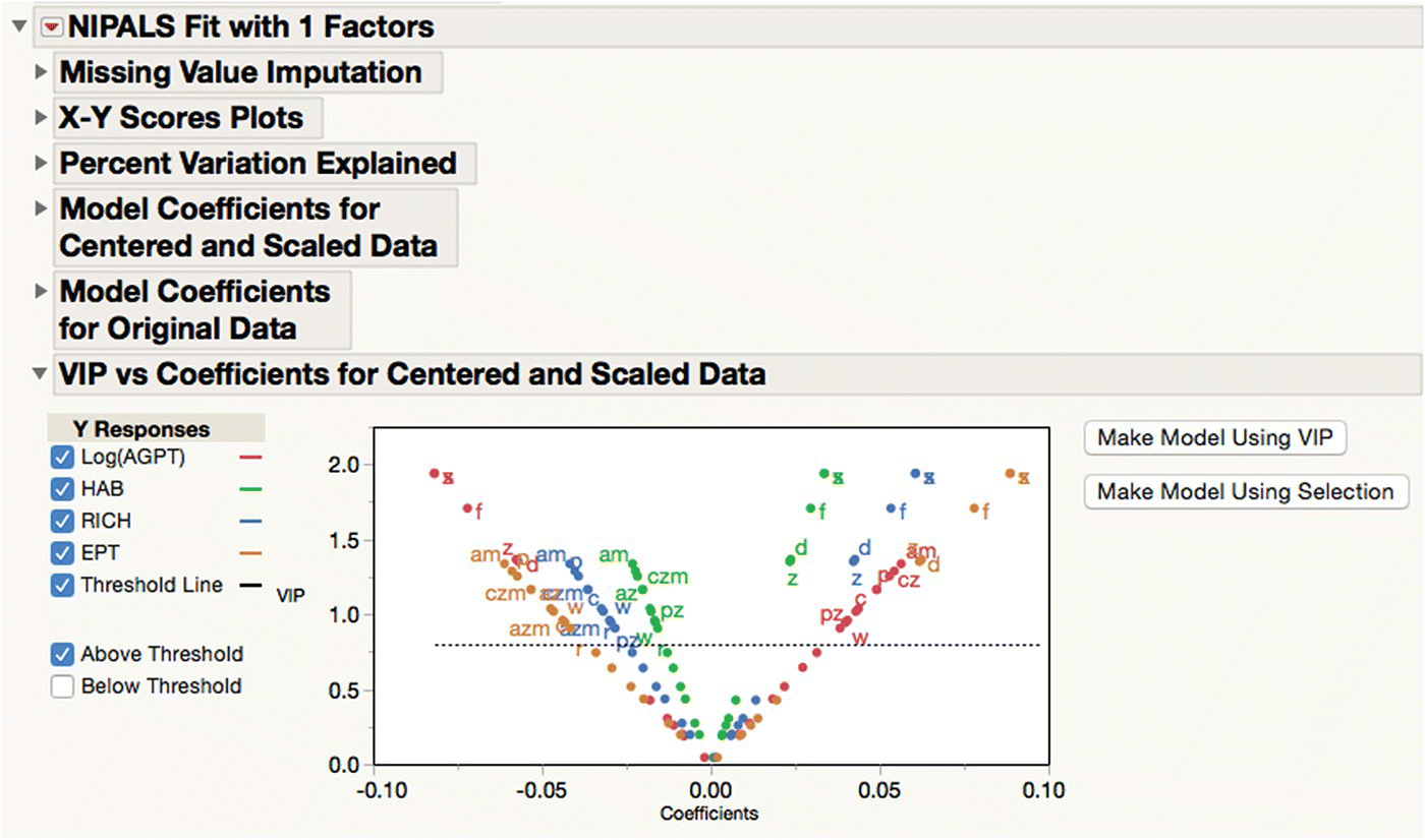
Figure 16.12 The dual role of terms in a PLS model.
Once you are happy with a specific model, you can save the predictions to the table from the LRT associated with that model (Save Columns > Save Prediction Formula). This generates new columns in the table, one for each Y. It can be convenient to group these columns with an appropriate name. You can inspect the formula in a column by clicking on the “+” sign next to a column name in the columns panel. Because they are formulas, you can append new rows to the table and (so long as each X column has a nonmissing value) obtain predictions for the Ys. Running the script “Add Predictions for PLS Pruned Model” mimics the effect of performing a pruned two factor PLS fit (with NIPALS and sevenfold cross‐validation) involving only interesting terms.
Figure 16.13 shows the Prediction Profiler for this fitted model with Y scales adjusted (select Profiler from the LRT of the fit). This profiler is one of several in JMP but has the advantage that it can profile Ys within the space of the Xs no matter what the dimensionality of the problem and no matter what modeling approach was used. The profiler is interactive, so you can dynamically adjust the settings of the Xs using the vertical red line and see the traces update instantly. This provides a visual way to identify and communicate which effects and interactions are important. Defining desirability functions (Derringer and Suich, 1980) allows you to find X settings that simultaneously optimize the Ys, and using the integrated simulator allows this optimization to take into account preset variation in the Xs.
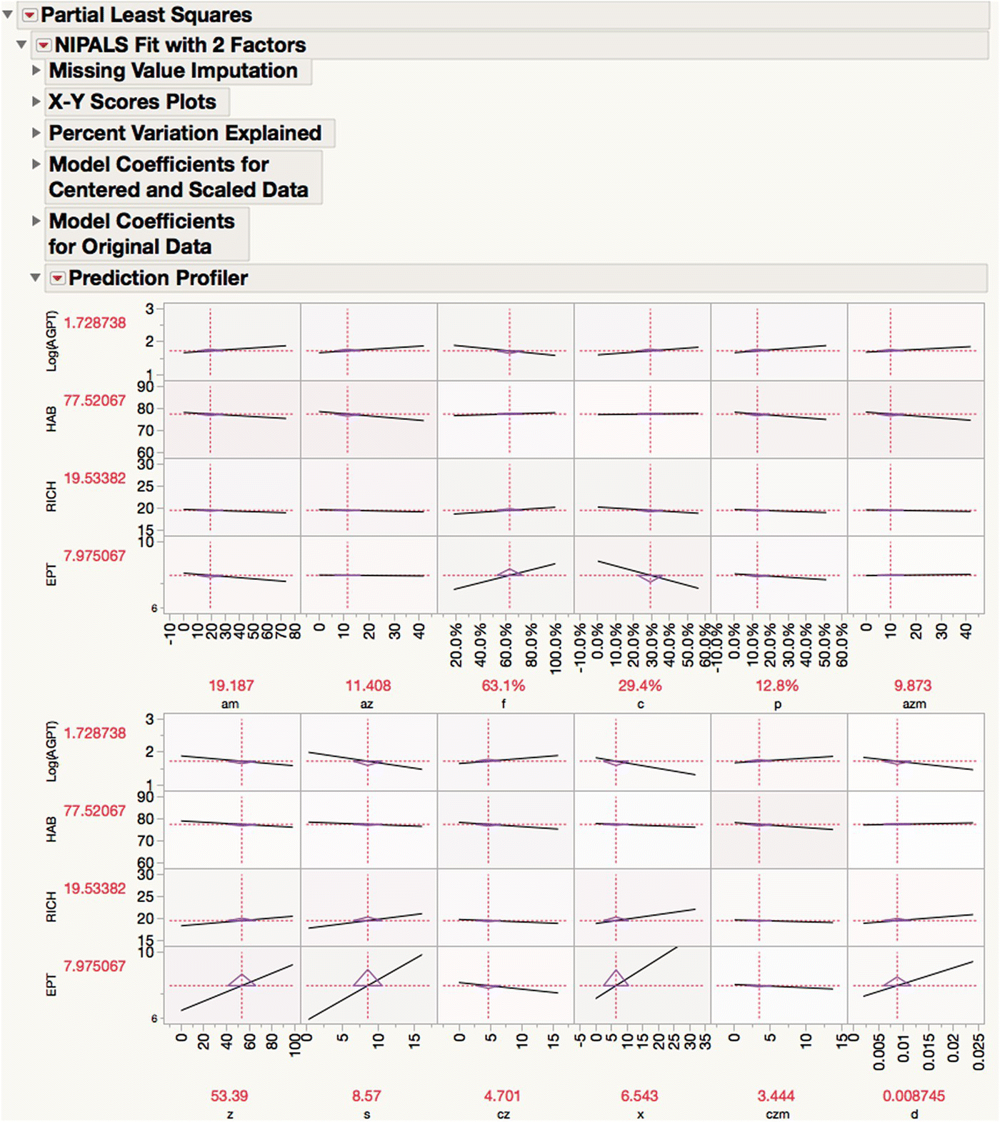
Figure 16.13 Interactively profiling four Ys in the space of 12 Xs.
Opening the table WaterQuality2_Test (containing the test data we set aside earlier) and running the script “Add Test Data” in the table WaterQuality2_Train make a new table, WaterQuality3, with all of the rows recombined (you can alternatively use Tables > Concatenate). Running the script “Actual by Predicted” in this new table shows these plots for all the data, and running the script “Use only Test Data” (which just manipulates the row states appropriately) updates the display to give Figure 16.14, showing the performance of the chosen model on the unseen test data.
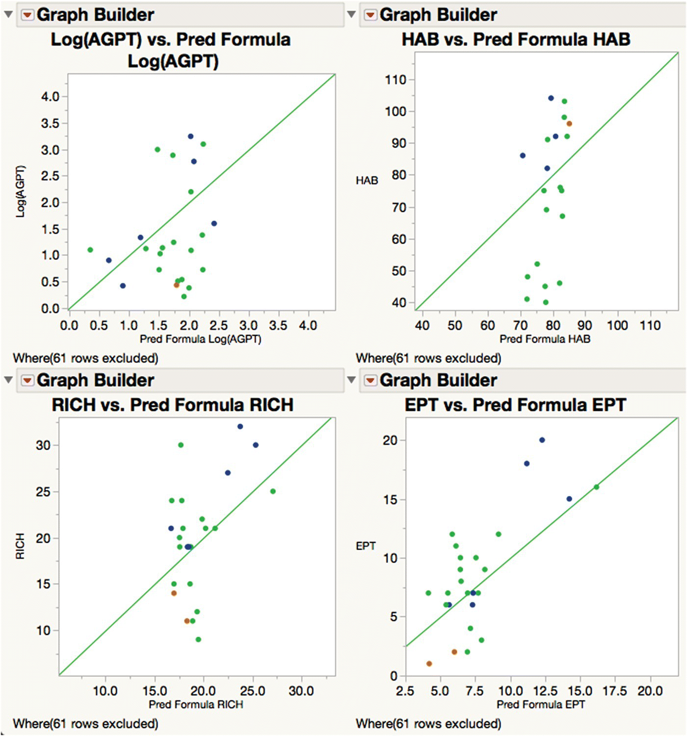
Figure 16.14 Prediction accuracy of the final PLS model for test data.
We conclude this example with Table 16.5, an InfoQ assessment. As well as the score for each dimension, there is a comments column with some notes as to why the score was chosen. The final InfoQ is calculated as 58%.
Table 16.5 InfoQ assessment for Example 2.
| InfoQ dimension | Score | Comments |
| Data resolution | Acceptable | Contingent on the sampling and measurement process for the Ys being adequate. Contingent on an appropriate operationalization of the “neighborhood” of a field station |
| Data structure | High | Using appropriate imputation helps overcome limitations of data collected in the field, so long as the missingness is “reasonable” (as in this case) |
| Data integration | Very high | Contingent on upstream feature extraction to generate values for the Xs being easy to automate |
| Temporal relevance | High | The requisite model construction can be automated in JMP, including the deployment of the resulting score code to another system should this be required. Some oversight would be advised, but this would not be a bottleneck. Once the required analysis pathway is defined, data volumes are such that the execution time is very small |
| Chronology of data and goal | Low | The timing of new satellite images is not under direct control. Gathering new Y values is time consuming. So updating the model to reflect changes in land use over time may not be easy |
| Generalizability | Low | As noted, constraints on the size of the data and the pattern of variation therein interact with the efficacy of the modeling approach and at what level of granularity this is performed. This determines the quality of the analytic goal and hence the utility of the practical goal. Using PLS1 (in which the Ys are analyzed separately, rather than together as here) may improve prediction accuracy but is unlikely to remove the effect of ecoregion |
| Operationalization | Very high | Once the modeling is completed to your satisfaction, the outcome is encapsulated in score code which can be deployed without any understanding of how it was generated |
| Communication | High | PLS is a relatively sophisticated technique, possibly hard to explain should this be needed. The Profiler and related tools in JMP may help |
16.4 A JMP application to score the InfoQ dimensions
As noted already, part of the power of InfoQ is to force active consideration of crucial issues that too often are taken for granted. Although generating a single InfoQ score is attractive, it may sometimes be easier to generate a range of scores reflecting uncertainty in the assessment of the dimensions. Selecting Add‐Ins > InfoQ > InfoQ brings up a simple application that facilitates this. You can adjust the range of scores for each dimension and see the resulting score update dynamically. The five‐point scoring algorithm set out in Chapter 3 is implemented, but the use of the slider boxes would make a continuous scale possible if needed.
When initialized, the InfoQ score is undefined and the sliders span the whole range of each dimension. Figure 16.15 shows an assessment of Example 2. The InfoQ score lies in the range 0–69%.
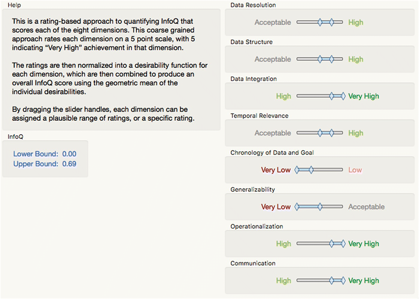
Figure 16.15 InfoQ assessment of Example 2 with uncertainty.
16.5 JMP capabilities and InfoQ
Definitively mapping JMP capabilities to InfoQ is difficult, because the InfoQ agenda seeks to illuminate and encourage the productive use of all data and because JMP is very functional and becoming more so. Generally, we would expect enabling software to have most affinity with two of the InfoQ components (data quality and analysis quality), impacting the other two components only indirectly and in an emergent way.
Following through the two examples in this chapter should suggest the kind of user experience that JMP provides, and as implied in the Introduction, how functionality is made accessible is very influential in determining its effective use. To this extent, lists of capabilities, features, and functions of software can be misleading, or at best unhelpful, particularly when one is confronted with real‐world data.
We therefore restrict ourselves to a few general comments as follows:
- In Chapter 1, InfoQ is defined in terms of its four components g, X, f, and U as InfoQ (f, X, g, U) = U {f(X|g)}, where f is the “analysis quality” and U is the “quality of the utility measure.” JMP provides the flexibility to define custom loss functions (Desirability, 2015) which, used appropriately, can be used to increase f and U and hence improve InfoQ for given g and X.
- The distinction between planned and unplanned use cases is important, and JMP was designed from the outset to support the latter through interactivity, the combined use of graphical and tabular output and a free‐form approach to analysis where, as far as possible, the software “gets out of the way” leaving you free to tease out the nuances of the data at hand and model its essential features.
- The link between data, models, and graphical displays thereof is powerful in both “Uncovering Relationships” and “Modeling Relationships,” and JMP attempts to provide a comprehensive and unified environment to exploit this.
- JSL provides the basis to customize or extend core capabilities and support specific users and groups of users in a way they find helpful. In relative terms, the barriers to doing this are small.
- JSL also provides the means to automate planned use cases from “end to end,” interoperating with other software as needed. Such workflows are easily deployed to others and can encapsulate best practice and help codify the knowledge that results.
- Although not shown here, JMP has a particular strength in the field of statistically designed experiments (DOE for short). As digital marketing really takes hold, DOE is likely to find increasing application outside its agricultural and manufacturing roots and in areas where InfoQ has much relevance.
Finally, we remark again that JMP is a desktop product. Its memory‐based architecture and multithreaded code base make very good use of such hardware, but there are many problems that will remain outside its grasp. In such “big data” scenarios, it can still serve as a useful prototyping environment.
16.6 Summary
Increasing data availability and computing power, coupled with the continuing necessity to improve and innovate, make it an interesting time for anyone inclined to take a rational view of how systems of value production operate or can be made to operate. InfoQ provides a much needed language and framework within which vital issues can be surfaced and discussed. Seasoned practitioners have always appreciated that the useful application of statistical thinking is largely contextual and that, while it can be mastered by an individual, it is often difficult to codify this knowledge and expertise in such a way it can be transferred to others. The relatively recent intertwining of statistics with other disciplines such as machine learning and data science only compounds this issue, which, ironically, is further exacerbated by the ready availability of software like JMP. Nonetheless, it is clear that we definitely need software for working with data. In so far as JMP has always aimed to support researchers, scientists, and engineers with statistical discovery, it is reasonable to expect that JMP can also help such users pursue the InfoQ agenda as it takes root.
References
- Cockburn, A. (2001) Writing Effective Use Cases. Addison‐Wesley, Boston.
- Cox, I. and Gaudard, M. (2013) Discovering Partial Least Squares with JMP. SAS Institute Press, Cary, NC.
- Cox, I., Gaudard, M. and Stephens, M. (2016) Visual Six Sigma: Making Data Analysis Lean, 2nd edition. John Wiley & Sons, Inc., Hoboken, NJ.
- Derringer, G. and Suich, R. (1980) Simultaneous optimization of several response variables. Journal of Quality Technology, 12(4), pp. 214–219.
- Desirability. http://www.jmp.com/support/help/Additional_Examples_2.shtml#289104 (accessed December 7, 2015).
- JMP Missing Values. http://www.jmp.com/support/help/Explore_Missing_Values_Utility.shtml (accessed December 7, 2015).
- Kenett, R.S. and Zacks, S. (2014) Modern Industrial Statistics: With Applications in R, MINITAB and JMP, 2nd edition. John Wiley & Sons, Ltd, Chichester, UK.
- Nash, M.S. and Chaloud, D.J. (2011) Partial Least Squares Analysis of Landscape and Surface Water Biota Associations in the Savannah River Basin, International Scholarly Research Network, ISRN Ecology, Vol. 2011, Article ID 571749, 11 pages.
- Ramirez, J.G. (1998) Monitoring clean room air using cuscore charts. Quality and Reliability Engineering International, 14(4), pp. 281–289.
- REML. https://en.wikipedia.org/wiki/Restricted_maximum_likelihood (accessed December 7, 2015).
- Shapelife. https://en.wikipedia.org/wiki/Shapefile (accessed December 7, 2015).
- Shore, J. and Warden, D. (2007) The Art of Agile Development. O’Reilly Media, Sebastopol, CA.
- Threeway Chart. http://blogs.sas.com/content/jmp/2012/04/18/whats‐a‐three‐way‐chart‐and‐why‐would‐i‐need‐one/ (accessed December 7, 2015).
- Wetherill, G.B. and Brown, D.W. (1991) Statistical Process Control: Theory and Practice, 3rd edition. Chapman and Hall, London.
- Yaschin, E. (1994) Monitoring variance components. Technometrics, 36(4), pp. 379–393.
