Chapter 36
Handling Multiple Screen
Sizes
For the first year or so since Android 1.0 was released, all production Android devices had the same screen resolution (HVGA, 320 by 480) and size (around 3.5 inches, or 9 centimeters). Starting in the fall of 2009, though, devices have been arriving with widely disparate screen sizes and resolutions, from tiny QVGA (240 by 320) screens to much larger WVGA (480 by 800) screens.
Of course, users will be expecting your application to be functional on all of these screens, and perhaps take advantage of larger screen sizes to add greater value. To that end, Android 1.6 added new capabilities to help better support these different screen sizes and resolutions.
The Android documentation has extensive coverage of the mechanics of handling multiple screen sizes (http://d.android.com/guide/practices/screens_support.html). You are encouraged to read that information along with this chapter, to get the best understanding of how to cope with, and perhaps take advantage of, multiple screen sizes.
After a number of sections discussing the screen size options and theory, the chapter wraps with an in-depth look at making a fairly simple application that handles multiple screen sizes well.
Taking the Default
Let's suppose that you start off by totally ignoring the issue of screen sizes and resolutions. What happens?
If your application is compiled for Android 1.5 or lower, Android will assume your application was designed to look good on the classic screen size and resolution. If your application is installed on a device with a larger screen, Android automatically will run your application in compatibility mode, scaling everything based on the actual screen size.
For example, suppose you have a 24-pixel square PNG file, and Android installs and runs your application on a device with the standard physical size but a WVGA resolution (a so-called high-density screen). Android might scale your PNG file to be 36 pixels, so it will take up the same visible space on the screen. On the plus side, Android handles this automatically. On the minus side, bitmap-scaling algorithms tend to make the images a bit fuzzy.
Additionally, Android will block your application from running on a device with a smaller screen. Hence, QVGA devices, like the HTC Tattoo, will be unable to get your application, even if it is available on the Android Market.
If your application is compiled for Android 1.6 or higher, Android assumes that you are properly handling all screen sizes, and therefore will not run your application in compatibility mode. You will see how to tailor this in a later section.
Whole in One
The simplest approach to handling multiple screen sizes in Android is to design your UIs so that they automatically scale for the screen size, without any size-specific code or resources. In other words, “it just works.”
This implies, though, that everything you use in your UI can be gracefully scaled by Android and that everything will fit, even on a QVGA screen.
The following sections contain some tips for achieving this all in one solution.
Think About Rules, Rather Than Positions
Some developers, perhaps those coming from the drag-and-drop school of UI development, think first and foremost about the positions of widgets. They think that they want particular widgets to be certain fixed sizes at certain fixed locations. They get frustrated with Android layout managers (containers) and may gravitate to the deprecated AbsoluteLayout as a way to design UIs in a familiar way.
That approach rarely works well—even on desktops—as can be seen by applications that do a poor job of window resizing. Similarly, it will not work on mobile devices, particularly Android, with their wide range of screen sizes and resolutions.
Instead of thinking about positions, think about rules. You need to teach Android the business rules about where widgets should be sized and placed, and then Android will interpret those rules based on what the device's screen actually supports in terms of resolution.
The simplest rules are the fill_parent and wrap_content values for android:layout_width and android:layout_height. Those do not specify specific sizes, but rather adapt to the space available.
The richest environment for easily specifying rules is to use RelativeLayout (discussed in Chapter 6). While complicated on the surface, RelativeLayout does an excellent job of letting you control your layout while still adapting it to other screen sizes. For example, you can do the following:
- Explicitly anchor widgets to the bottom or right side of the screen, rather than hoping they will wind up there courtesy of some other layout.
- Control the distances between widgets that are connected (e.g., a label for a field that should be to the left of the field) without needing to rely on padding or margins.
The greatest control for specifying rules is to create your own layout class. For example, suppose you are creating a series of applications that implement card games. You may want to have a layout class that knows about playing cards—how they overlap, which are face up versus face down, how big to be to handle varying number of cards, and so on. While you could achieve the desired look with, say, a RelativeLayout, you may be better served implementing a PlayingCardLayout or something that is more explicitly tailored for your application. Unfortunately, creating custom layout classes is underdocumented at this point in time.
Consider Physical Dimensions
Android offers a wide range of available units of measure for dimensions. The most popular has been the pixel (px), because it is easy to wrap your head around the concept. After all, each Android device will have a screen with a certain number of pixels in each direction.
However, pixels start to become troublesome as screen density changes. As the number of pixels in a given screen size increases, the pixels effectively shrink. A 32-pixel icon on a traditional Android device might be finger-friendly, but on a high-density device (say, WVGA in a mobile phone form factor), 32 pixels may be a bit small for use with a finger.
If you have something intrinsically scalable (e.g., a Button) where you had been specifying a size in pixels, you might consider switching to using millimeters (mm) or inches (in) as the unit of measure—10 millimeters are 10 millimeters, regardless of the screen resolution or the screen size. This way, you can ensure that your widget is sized to be finger-friendly, regardless of the number of pixels that might take.
Avoid Real Pixels
In some circumstances, using millimeters for dimensions will not make sense. Then you may wish to consider using other units of measure while still avoiding real pixels.
Android offers dimensions measured in density-independent pixels (dip). These map 1:1 to pixels for a 160-dpi screen (e.g., a classic HVGA Android device) and scale from there. For example, on a 240-dpi device (e.g., a phone-sized WVGA device), the ratio is 2:3, so 50dip = 50px at 160 dpi = 75px at 240 dpi. The advantage to the user of going with dip is that the actual size of the dimension stays the same, so visibly there is no difference between 50dip at 160 dpi and 50dip at 240 dpi.
Android also offers dimensions measured in scaled pixels (sp). Scaled pixels, in theory, are scaled based on the user's choice of font size (FONT_SCALE value in System.Settings).
Choose Scalable Drawables
Classic bitmaps—PNG, JPG, and GIF—are not intrinsically scalable. If you are not running in compatibility mode, Android will not even try to scale them for you based on screen resolution and size. Whatever size of bitmap you supply is the size it will be, even if that makes the image too large or too small on some screens.
One way to address this is to try to avoid static bitmaps, using nine-patch bitmaps and XML-defined drawables (e.g., GradientDrawable) as alternatives. A nine-patch bitmap is a PNG file specially encoded to have rules indicating how that image can be stretched to take up more space. XML-defined drawables use a quasi-SVG XML language to define shapes, their strokes and fills, and so on.
Tailor-Made, Just for You (and You, and You, and...)
There will be times when you want to have different looks or behaviors based on screen size or density. Android has ways for you to switch out resources or code blocks based on the environment in which your application runs. When properly used in combination with the techniques discussed in the previous section, achieving screen size- and density-independence is eminently possible, at least for devices running Android 1.6 and newer.
Add <supports-screens>
The first step to proactively supporting screen sizes is to add the <supports-screens> element to your AndroidManifest.xml file. This specifies which screen sizes you explicitly support and which you do not. Those that you do not explicitly support will be handled by the automatic compatibility mode described previously.
Here is a manifest containing a <supports-screens> element:
<?xml version="1.0" encoding="utf-8"?>

<manifest xmlns:android="http://schemas.android.com/apk/res/android"

  package="com.commonsware.android.eu4you"

  android:versionCode="1"

  android:versionName="1.0">

  <supports-screens

    android:largeScreens="true"

    android:normalScreens="true"

    android:smallScreens="true"

    android:anyDensity="true"

  />
  <application android:label="@string/app_name"

    android:icon="@drawable/cw">

    <activity android:name=".EU4You"

              android:label="@string/app_name">

      <intent-filter>

        <action android:name="android.intent.action.MAIN" />

        <category android:name="android.intent.category.LAUNCHER" />

      </intent-filter>

    </activity>

  </application>

</manifest>
Each of the attributes android:smallScreens, android:normalScreens, and android:largeScreens takes a Boolean value indicating if your application explicitly supports those screens (true) or requires compatibility mode assistance (false).
The android:anyDensity attribute indicates whether you are taking density into account in your calculations (true) or not (false). If false, Android will behave as though all of your dimensions (e.g., 4px) were for a normal-density (160-dpi) screen. If your application is running on a screen with lower or higher density, Android will scale your dimensions accordingly. If you indicate that android:anyDensity = “true”, you are telling Android not to do that, putting the onus on you to use density-independent units, such as dip, mm, or in.
Resources and Resource Sets
The primary way to toggle different things based on screen size or density is to create resource sets. By creating resource sets that are specific to different device characteristics, you teach Android how to render each, with Android switching among those sets automatically.
Default Scaling
By default, Android will scale all drawable resources. Those that are intrinsically scalable will scale nicely. Ordinary bitmaps will be scaled using a normal scaling algorithm, which may or may not give you great results. It also may slow things down a bit. If you wish to avoid this, you will need to set up separate resource sets containing your nonscalable bitmaps.
Density-Based Sets
If you wish to have different layouts, dimensions, or the like based on different screen densities, you can use the -ldpi, -mdpi, and -hdpi resource set labels. For example, res/values-hdpi/dimens.xml would contain dimensions used in high-density devices.
Size-Based Sets
Similarly, if you wish to have different resource sets based on screen size, Android offers -small, -normal, and -large resource set labels. Creating res/layout-large-land/ would indicate layouts to use on large screens (e.g., WVGA) in landscape orientation.
Version-Based Sets
There may be times when earlier versions of Android get confused by newer resource set labels. To help with that, you can include a version label to your resource set, of the form -vN, where N is an API level. Hence, res/drawable-large-v4/ indicates these drawables should be used on large screens at API level 4 (Android 1.6) and newer.
Android has had the ability to filter on version from early on, and so this technique will work going back to Android 1.5 (and perhaps earlier).
So, if you find that Android 1.5 emulators or devices are grabbing the wrong resource sets, consider adding -v4 to their resource set names to filter them out.
Finding Your Size
If you need to take different actions in your Java code based on screen size or density, you have a few options.
If there is something distinctive in your resource sets, you can sniff on that and branch accordingly in your code. For example, as will be seen in the code sample later in this chapter, you can have extra widgets in some layouts (e.g., res/layout-large/main.xml); simply seeing if an extra widget exists will tell you if you are running a large screen.
You can also find out your screen size class via a Configuration object, typically obtained by an Activity via getResources().getConfiguration(). A Configuration object has a public field named screenLayout that is a bitmask indicating the type of screen on which the application is running. You can test to see if your screen is small, normal, or large, or if it is long (where long indicates a 16:9 or similar aspect ratio, compared to 4:3). For example, here we test to see if we are running on a large screen:
if (getResources().getConfiguration().screenLayout
& Configuration.SCREENLAYOUT_SIZE_LARGE)
==Configuration.SCREENLAYOUT_SIZE_LARGE) {
// yes, we are large
}
else {
// no, we are not
}
There does not appear to be an easy way to find out your screen density in a similar fashion. If you absolutely need to know that, a hack would be to create res/values-ldpi/, res/values-mdpi/, and res/values-hdpi/ directories in your project, and add a strings.xml file to each. Put a string resource in strings.xml that has a common name across all three resource sets and has a distinctive value (e.g., name it density, with values of ldpi, mdpi, and hdpi, respectively). Then test the value of the string resource at runtime. This is inelegant but should work.
Ain't Nothing Like the Real Thing
The Android emulators will help you test your application on different screen sizes. However, that will get you only so far, because mobile device LCDs have different characteristics than your desktop or notebook, such as the following:
- Mobile device LCDs may have a much higher density than that of your development machine.
- A mouse allows for much more precise touchscreen input than does an actual fingertip.
Where possible, you are going to need to either use the emulator in new and exciting ways or try to get your hands on actual devices with alternative screen resolutions.
Density Differs
The Motorola DROID has a 240-dpi, 3.7-inch, 480-by-854 pixel screen (an FWVGA display). To emulate a DROID screen, based on pixel count, takes up one third of a 19-inch, 1280-by-1024 LCD monitor, because the LCD monitor's density is much lower than that of the DROID—around 96 dpi. So, when you fire up your Android emulator for an FWVGA display like that of the DROID, you will get a massive emulator window.
This is still perfectly fine for determining the overall look of your application in an FWVGA environment. Regardless of density, widgets will still align the same, sizes will have the same relationships (e.g., widget A might be twice as tall as widget B, and that will be true regardless of density), and so on.
However, these issues may come up:
- Things that might appear to be a suitable size when viewed on a 19-inch LCD may be entirely too small on a mobile device screen of the same resolution.
- Things that you can easily click with a mouse in the emulator may be much too small to pick out on a physically smaller and denser screen when used with a finger.
Adjusting the Density
By default, the emulator will keep the pixel count accurate at the expense of density, which is why you get the really big emulator window. You do have an option of keeping the density accurate at the expense of pixel count.
The easiest way to do this is to use the Android AVD Manager, introduced in Android 1.6. The Android 2.0 edition of this tool has a Launch Options dialog that pops up when you go to start an emulator instance via the Start button, as shown in Figure 36–1.
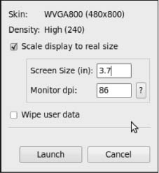
Figure 36–1. The Launch Options dialog
By default, the “Scale display to real size” check box is unchecked, and Android will open the emulator window normally. You can check that check box, and then provide two bits of scaling information:
- The screen size of the device you wish to emulate, in inches (e.g., 3.7 for the Motorola DROID)
- The dots-per-inch resolution of your monitor (click the ? button to bring up a calculator to help you determine that value)
This will give you an emulator window that more accurately depicts what your UI will look like on a physical device, at least in terms of sizes. However, since the emulator is using far fewer pixels than will a device, fonts may be difficult to read, images may be blocky, and so forth.
Accessing Actual Devices
Of course, the best possible way to see what your application looks like on different devices is to actually test it on different devices. You do not necessarily need to get every Android device ever made, but you may want to have access to ones with distinctive hardware that impacts your application, and screen size impacts just about everyone. Here are some suggestions:
- Virtually test devices using services like DeviceAnywhere (http://www.deviceanywhere.com/). This is an improvement over the emulator, but it is not free and certainly cannot test everything (e.g., changes in location).
- Purchase devices, perhaps through back channels like eBay. Unlocked GSM phones can readily share a SIM when you need to test telephony operations or go SIM-less otherwise.
- If you live in or near a city, you may be able to set up some form of a user group, and use that group for testing applications on your collective set of hardware.
- Take the user-testing route, releasing your application as a free beta or something, and then letting user feedback guide adjustments. You may wish to distribute this outside the Android Market, lest beta test feedback harm your application's market rating.
Ruthlessly Exploiting the Situation
So far, we have focused on how you can ensure your layouts look decent on other screen sizes. And, for smaller screens than the norm (e.g., QVGA), that is perhaps all you can achieve.
Once we get into larger screens, though, another possibility emerges: using different layouts designed to take advantage of the extra screen space. This is particularly useful when the physical screen size is larger (e.g., a 5-inch LCD like on the Archos 5 Android tablet), rather than simply having more pixels in the same physical space.
The following sections describe some ways you might take advantage of additional space.
Replace Menus with Buttons
An option menu selection requires two physical actions: press the Menu button, and then tap on the appropriate menu choice. A context menu selection requires two physical actions as well: long-tap on the widget, and then tap on the menu choice. Context menus have the additional problem of being effectively invisible; for example, users may not realize that your ListView has a context menu.
You might consider augmenting your UI to provide direct on-screen ways of accomplishing things that might otherwise be hidden away on a menu. Not only does this reduce the number of steps a user needs to take to do things, but it also makes those options more obvious.
For example, suppose you are creating a media player application, and you want to offer manual playlist management. You have an activity that displays the songs in a playlist in a ListView. On an option menu, you have an Add choice, to add a new song from the ones on the device to the playlist. On a context menu on the ListView, you have a Remove choice, plus Move Up and Move Down choices to reorder the songs in the list. On a large screen, you might consider adding four ImageButton widgets to your UI for these four options, with the three from the context menu enabled only when a row is selected by the D-pad or trackball. On regular or small screens, you would stick with just using the menus.
Replace Tabs with a Simple Activity
You may have introduced a TabHost into your UI to allow you to display more widgets in the available screen space. As long as the widget space you save by moving them to a separate tab is more than the space taken up by the tabs themselves, you win. However, having multiple tabs means more user steps to navigate your UI, particularly if the user needs to flip back and forth between tabs frequently.
If you have only two tabs, consider changing your UI to offer a large-screen layout that removes the tabs and puts all the widgets on one screen. This places everything in front of the user, without needing to switch tabs all the time.
If you have three or more tabs, you probably will lack screen space to put all those tabs' contents on one activity. However, you might consider going half and half: have popular widgets be on the activity all of the time, leaving your TabHost to handle the rest on (roughly) half of the screen.
Consolidate Multiple Activities
The most powerful technique is to use a larger screen to get rid of activity transitions outright. For example, if you have a ListActivity where clicking an item brings up that item's details in a separate activity, consider supporting a large-screen layout where the details are on the same activity as the ListView (e.g., ListView on the left, details on the right, in a landscape layout). This eliminates the user having to constantly press the Back button to leave one set of details before viewing another.
You will see this technique applied in the sample code presented in the following section.
Example: EU4You
To examine how to use some of the techniques discussed so far, let's look at the ScreenSizes/EU4You sample application. This application has one activity (EU4You) that contains a ListView with the roster of European Union (EU) members and their respective flags (http://www.wpclipart.com/flags/Countries/index.html). Clicking one of the countries brings up the mobile Wikipedia page for that country.
In the source code to this book, you will find four versions of this application. We start with an application that is ignorant of screen size and slowly add in more screen-related features.
The First Cut
First, here is our AndroidManifest.xml file, which looks distinctly like one shown earlier in this chapter:
<?xml version="1.0" encoding="utf-8"?>

<manifest xmlns:android="http://schemas.android.com/apk/res/android"

  package="com.commonsware.android.eu4you"
  android:versionCode="1"

  android:versionName="1.0">

  <supports-screens

    android:largeScreens="true"

    android:normalScreens="true"

    android:smallScreens="true"

    android:anyDensity="true"

  />

  <application android:label="@string/app_name"

    android:icon="@drawable/cw">

    <activity android:name=".EU4You"

              android:label="@string/app_name">

      <intent-filter>

        <action android:name="android.intent.action.MAIN" />

        <category android:name="android.intent.category.LAUNCHER" />

      </intent-filter>

    </activity>

  </application>

</manifest>
Notice we have the <supports-screens> element, saying that we do indeed support all screen sizes. This blocks most of the automatic scaling that Android would do if we said we did not support certain screen sizes.
Our main layout is size-independent, as it is just a full-screen ListView:
<?xml version="1.0" encoding="utf-8"?>

<ListView xmlns:android="http://schemas.android.com/apk/res/android"

  android:id="@android:id/list"

  android:layout_width="fill_parent"

  android:layout_height="fill_parent"

/>
Our row, though, will eventually need some tweaking:
<?xml version="1.0" encoding="utf-8"?>

<LinearLayout xmlns:android="http://schemas.android.com/apk/res/android"

  android:layout_width="fill_parent"

  android:layout_height="wrap_content"

  android:padding="2dip"

  android:minHeight="?android:attr/listPreferredItemHeight"

>

  <ImageView android:id="@+id/flag"

    android:layout_width="wrap_content"

    android:layout_height="wrap_content"

    android:layout_gravity="center_vertical|left"

    android:paddingRight="4px"

  />

  <TextView android:id="@+id/name"

    android:layout_width="wrap_content"

    android:layout_height="wrap_content"

    android:layout_gravity="center_vertical|right"

    android:textSize="20px"

  />

</LinearLayout>
For example, right now, our font size is set to 20px, which will not vary by screen size or density.
Our EU4You activity is a bit verbose, mostly because there are a lot of EU members, and we need to have the smarts to display the flag and the text in the row:
package com.commonsware.android.eu4you;


import android.app.ListActivity;

import android.content.Intent;

import android.net.Uri;

import android.os.Bundle;

import android.view.View;

import android.view.ViewGroup;

import android.widget.ArrayAdapter;

import android.widget.ImageView;

import android.widget.ListView;

import android.widget.TextView;

import java.util.ArrayList;


public class EU4You extends ListActivity {

  static private ArrayList<Country> EU=new ArrayList<Country>();


  static {

EU.add(new Country(R.string.austria, R.drawable.austria,
R.string.austria_url));
EU.add(new Country(R.string.belgium, R.drawable.belgium,
R.string.belgium_url));
EU.add(new Country(R.string.bulgaria, R.drawable.bulgaria,
R.string.bulgaria_url));
EU.add(new Country(R.string.cyprus, R.drawable.cyprus,
R.string.cyprus_url));
EU.add(new Country(R.string.czech_republic,
R.drawable.czech_republic,
R.string.czech_republic_url));
EU.add(new Country(R.string.denmark, R.drawable.denmark,
R.string.denmark_url));
EU.add(new Country(R.string.estonia, R.drawable.estonia,
R.string.estonia_url));
EU.add(new Country(R.string.finland, R.drawable.finland,
R.string.finland_url));
EU.add(new Country(R.string.france, R.drawable.france,
R.string.france_url));
EU.add(new Country(R.string.germany, R.drawable.germany,
R.string.germany_url));
EU.add(new Country(R.string.greece, R.drawable.greece,
R.string.greece_url));
EU.add(new Country(R.string.hungary, R.drawable.hungary,
R.string.hungary_url));
EU.add(new Country(R.string.ireland, R.drawable.ireland,
R.string.ireland_url));
EU.add(new Country(R.string.italy, R.drawable.italy,
R.string.italy_url));
EU.add(new Country(R.string.latvia, R.drawable.latvia,
R.string.latvia_url));
EU.add(new Country(R.string.lithuania, R.drawable.lithuania,
R.string.lithuania_url));
EU.add(new Country(R.string.luxembourg, R.drawable.luxembourg,
R.string.luxembourg_url));
EU.add(new Country(R.string.malta, R.drawable.malta,
R.string.malta_url));
EU.add(new Country(R.string.netherlands, R.drawable.netherlands,
R.string.netherlands_url));
EU.add(new Country(R.string.poland, R.drawable.poland,
R.string.poland_url));
EU.add(new Country(R.string.portugal, R.drawable.portugal,
R.string.portugal_url));
EU.add(new Country(R.string.romania, R.drawable.romania,
R.string.romania_url));
EU.add(new Country(R.string.slovakia, R.drawable.slovakia,
R.string.slovakia_url));
EU.add(new Country(R.string.slovenia, R.drawable.slovenia,
R.string.slovenia_url));
EU.add(new Country(R.string.spain, R.drawable.spain,
R.string.spain_url));
EU.add(new Country(R.string.sweden, R.drawable.sweden,
R.string.sweden_url));
EU.add(new Country(R.string.united_kingdom,
R.drawable.united_kingdom,
R.string.united_kingdom_url));
}
@Override
public void onCreate(Bundle savedInstanceState) {
super.onCreate(savedInstanceState);
setContentView(R.layout.main);
setListAdapter(new CountryAdapter());
}
@Override
protected void onListItemClick(ListView l, View v,
int position, long id) {
startActivity(new Intent(Intent.ACTION_VIEW,
Uri.parse(getString(EU.get(position).url))));
}
static class Country {
int name;
int flag;
int url;
Country(int name, int flag, int url) {
this.name=name;
this.flag=flag;
this.url=url;
}
}
class CountryAdapter extends ArrayAdapter<Country> {
CountryAdapter() {
      super(EU4You.this, R.layout.row, R.id.name, EU);

    }


    @Override

public View getView(int position, View convertView,
ViewGroup parent) {
CountryWrapper wrapper=null;
if (convertView==null) {
convertView=getLayoutInflater().inflate(R.layout.row, null);
wrapper=new CountryWrapper(convertView);
convertView.setTag(wrapper);
}
else {
wrapper=(CountryWrapper)convertView.getTag();
}
wrapper.populateFrom(getItem(position));
return(convertView);
}
}
class CountryWrapper {
private TextView name=null;
private ImageView flag=null;
private View row=null;
CountryWrapper(View row) {
this.row=row;
}
TextView getName() {
if (name==null) {
name=(TextView)row.findViewById(R.id.name);
}
return(name);
}
ImageView getFlag() {
if (flag==null) {
flag=(ImageView)row.findViewById(R.id.flag);
}
return(flag);
}
void populateFrom(Country nation) {
getName().setText(nation.name);
getFlag().setImageResource(nation.flag);
}
}
}
Figures 36–2, 36–3, and 36–4 show what the activity looks like in an ordinary HVGA emulator, a WVGA emulator, and a QVGA screen.
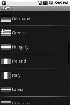
Figure 36–2. EU4You, original version, HVGA
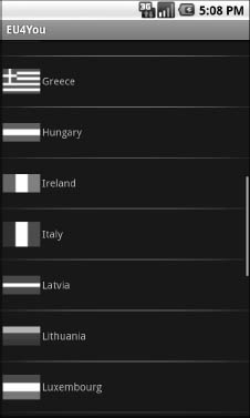
Figure 36–3. EU4You, original version, WVGA (800x480 pixels)
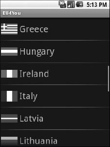
Figure 36–44. EU4You, original version, QVGA
Fixing the Fonts
The first problem that should be fixed is the font size. As you can see, with a fixed 20-pixel size, the font ranges from big to tiny, depending on screen size and density. For a WVGA screen, the font may be rather difficult to read.
We could put the dimension as a resource (res/values/dimens.xml) and have different versions of that resource based on screen size or density. However, it is simpler to just specify a density-independent size, such as 5mm, as seen in the ScreenSizes/EU4You_2 project:
<?xml version="1.0" encoding="utf-8"?>

<LinearLayout xmlns:android="http://schemas.android.com/apk/res/android"

  android:layout_width="fill_parent"

  android:layout_height="wrap_content"

  android:padding="2dip"

  android:minHeight="?android:attr/listPreferredItemHeight"

>

  <ImageView android:id="@+id/flag"

    android:layout_width="wrap_content"

    android:layout_height="wrap_content"

    android:layout_gravity="center_vertical|left"

    android:paddingRight="4px"

  />

  <TextView android:id="@+id/name"

    android:layout_width="wrap_content"

    android:layout_height="wrap_content"

    android:layout_gravity="center_vertical|right"

    android:textSize="5mm"

  />

</LinearLayout>
Figures 36–5, 36–6, and 36–7 shows the results on HVGA, WVGA, and QVGA screens.
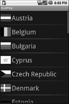
Figure 36–5. EU4You, 5mm font version, HVGA
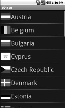
Figure 36–6. EU4You, 5mm font version, WVGA (800x480 pixels)
Figure 36–7. EU4You, 5mm font version, QVGA
Now our font is a consistent size and large enough to match the flags.
Fixing the Icons
So, what about those icons? They should be varying in size as well, since they are the same for all three emulators.
However, Android automatically scales bitmap resources, even with <supports-screens> and its attributes set to true. On the plus side, this means you may not need to do anything with these bitmaps. However, you are relying on a device to do the scaling, which definitely costs CPU time (and, hence, battery life). Also, the scaling algorithms that the device uses may not be optimal, compared to what you can do with graphics tools on your development machine.
The ScreenSizes/EU4You_3 project creates res/drawable-ldpi and res/drawable-hdpi, putting in smaller and larger renditions of the flags, respectively. This project also renames res/drawable to res/drawable-mdpi. Android will use the flags for the appropriate screen density, depending on what the device or emulator needs.
Using the Space
While the activity looks fine on WVGA in portrait mode, it really wastes a lot of space in landscape mode, as shown in Figure 36–8.
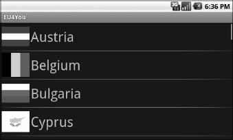
Figure 36–8. EU4You, landscape WVGA (800x480 pixels)
We can put that to better use by having the Wikipedia content appear directly on the main activity when in large-screen landscape mode, instead of needing to spawn a separate browser activity.
To do this, we first must clone the main.xml layout into a res/layout-large-land rendition that incorporates a WebView widget, as seen in ScreenSizes/EU4You_4:
<?xml version="1.0" encoding="utf-8"?>

<LinearLayout xmlns:android="http://schemas.android.com/apk/res/android"

  android:layout_width="fill_parent"

  android:layout_height="fill_parent"

>

  <ListView

    android:id="@android:id/list"

    android:layout_width="fill_parent"

    android:layout_height="fill_parent"

    android:layout_weight="1"

  />

  <WebView

    android:id="@+id/browser"

    android:layout_width="fill_parent"

    android:layout_height="fill_parent"

    android:layout_weight="1"

  />

</LinearLayout>
Then we need to adjust our activity to look for that WebView and use it when found; otherwise, it will default to launching a browser activity:
@Override

public void onCreate(Bundle savedInstanceState) {
super.onCreate(savedInstanceState);
setContentView(R.layout.main);
browser=(WebView)findViewById(R.id.browser);
setListAdapter(new CountryAdapter());
}
@Override
protected void onListItemClick(ListView l, View v,
int position, long id) {
String url=getString(EU.get(position).url);
if (browser==null) {
startActivity(new Intent(Intent.ACTION_VIEW,
Uri.parse(url)));
}
else {
browser.loadUrl(url);
}
}
This gives us a more space-efficient edition of the activity, as shown in Figure 36–9.
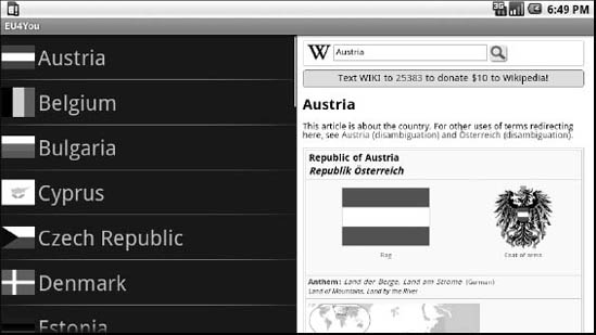
Figure 36–9. EU4You, landscape WVGA (800x480 pixels), set for normal density, and showing the embedded WebView
When the user clicks a link in the Wikipedia page, a full browser opens, for easier surfing.
Note that to test this version of the activity, and see this behavior, requires a bit of extra emulator work. By default, Android sets up WVGA devices as being high-density, meaning WVGA is not large in terms of resource sets, but rather normal. You will need to create a different emulator AVD that is set for normal (medium) density, which will result in a large screen size.
What If It's Not a Browser?
Of course, EU4You does cheat a bit. The second activity is a browser (or WebView in the embedded form), not some activity of your own creation. Things get slightly more complicated if the second activity is some activity of yours, with many widgets in a layout, and you want to use it both as an activity (for smaller screens) and have it embedded in your main activity UI (for larger screens).
Here is one pattern to deal with this scenario:
- Initially develop and test the second activity as an activity.
- Have all of the second activity's life-cycle methods delegate their logic to an inner class. Move all data members of the activity that are needed by only the inner class to that inner class, and ensure that still works.
- Pull the inner class out into a separate public class, and ensure that still works.
- For your first (or main) activity, create a separate layout for large screens and use the
<include>directive to blend in the contents of your second activity's layout into the proper spot in the large-screen first activity's layout. - In the first activity, if it finds the second activity's layout has been inflated as part of its own (e.g., by checking for the existence of some widget via
findViewById()), create an instance of the public class you created in step 3 and have it deal with all of those widgets. Adjust your code to reference that class directly, rather than start the second activity as shown in the previous section.
In short, use a public class and reusable layout to keep your code and resources in one place, yet use them from both a stand-alone activity and as part of a large-screen version of the main activity.
What Are a Few Bugs Among Friends?
The Motorola DROID, which shipped with Android 2.0, had two bugs of relevance for screen sizes:
- It had incorrect values for the screen density, both horizontal and vertical. This means it incorrectly scaled dimensions based on physical sizes:
pt,mm, andin. - It had Android 2.0 as API level 6 instead of level 5, so version-specific resource directories need to use the
-v6suffix instead of-v5
Both of these bugs are fixed in Android 2.0.1 and later, and no other devices should ship with Android 2.0 or be affected by these bugs.