
C H A P T E R 32
User Experience
Learning how Drupal works takes a lot of time—and that's just core. As modules get added, the complexity grows. As a Drupal developer, you don't want this complexity to get in the way of users and site administrators getting the full benefit of your work. This creates some challenges in terms of design. How does this module fit together with all the other modules? How do we design Drupal administration to fit endless possibilities?
This is when the practice of design—and most importantly, interaction design, which focuses on the behavior of the user—comes in. For example, the single biggest change in Drupal 7's design was the introduction of the admin theme named Seven.
Not having a default admin theme caused confusion from the very first second people started using Drupal 6 because it doesn't map to how they think a CMS would work. It confused people that the administrative interface was visually within their site, instead of there being a separate admin interface.
Modularity
The ability to plug in functionality without hacking the application is at the core of Drupal. However, once you start to use the modules in combination with each other, workflow issues begin to occur. Can you imagine needing to use several plug-ins within Firefox or the iPhone to achieve one goal?
Human API
We like to think that humans are reasonable, rational beings that take conscious action based on careful thinking. The truth is that many, if not most, of our decisions are made unconsciously, driven by emotion and automatic triggers coming from parts of the brain we don't have conscious access to.
This subconscious part of the brain is a pretty darn fast and smart processor of inputs—as it should be—because our five senses capture about 11 million pieces of information every second. Only 40 of those are processed consciously. Good thing we have the unconscious to handle all the others or we'd be overloaded in seconds.
Memory
Have you ever walked into a room and can't remember what you were going to do there? You've just run into the restrictions of your short term memory and also experienced your ability to get distracted easily. In the interface world, we have to account for this, as users are easily disrupted from their task flow by many events throughout the day, such as a colleague walking in or e-mail popping up.
Short term memory, which goes from a couple seconds to about 30 seconds, has limited storage. George A. Miller, a psychology professor, wrote in a famous paper “The Magical Number Seven, Plus or Minus Two” (1956) that a person can remember about 7 (±2) items. As research progressed on this topic, it was discovered that humans are likely to remember even less (about 4 (±1) items), and that we tend to remember information in chunks, such as telephone numbers. This is why in game shows it is easier for participants to remember a larger group of similar or related names than a small number of unrelated ones.
As we design interfaces, we need to take into account how users are easily disrupted in the task flow and that they struggle to remember larger bits of information from one screen to the next, especially if it contains unfamiliar information. Repeating important collections of information in logical chunks across screens will help users work through the task at hand.
Long Term Memory
Do you remember studying for an upcoming school test? You may have tried all the tricks from spaced repetition (gradually increasing the interval between repetitions of learned material) to the advice of your mom that you need sleep to process and properly organize those memories. When users approach interfaces, a lot of long-term memory kicks in by recognizing familiar elements—how these work, what the next step would be, etc.
Semantic memory is about the memory of concepts and meanings. It's not the story of when you first learned how to use the checkbox form element, but rather a specific piece of knowledge on how it works and how it is distinctive from other form elements.
Procedural memory is our memory of the steps involved in the execution of tasks. This allows us to tie our shoe and allows seasoned Drupalistas to setup a module without much thinking. It's often when we break with these learned processes that user confusion occurs.
By creating a deeper understanding of the users' long-term memory (the concepts, previous experience, and existing processes), we can provide a better interface. We can match their expectations of how things work and possibly even exceed their expectations by guiding them towards more possibilities.
How Drupal modules work is part ofan eco-system from the Web to content management systems to Drupal specifically. All these systems introduce concepts and processes that are leveraged by the user when using your module. By adhering to standards, you are more likely to avoid obvious mismatches with concepts and processes. However, as Drupal modules get more and more complex, it's likely you will have to do additional research to understand how users perceive the concepts involved in your module and which existing knowledge can be applied to make it easier.
Mental Model
Before users get to Drupal, they already have a mental model of how it might work, not just from previous experience with content management systems but from computer experience in general. When thinking about mental models, we differentiate between the way the system works (system model) and the way users think about achieving their goals with the system (interaction model).
The interface of a system tries to close the gap between these two models and is called the representational model—the way we as developers or designers choose to display functionality. A poor understanding of the interaction model that a user has before actually using the functionality often leads developers and designers to model the interface after the system model instead. This usually results in hard-to-use interfaces. For example, Drupal 7 has the Fields UI; its interface is modeled after the system requiring the user to shift his focus from the interaction model of creating forms and boxes of content to making a database column.
Taking a step back and thinking about how the user thinks about achieving their goals with your module (before they ever see it) is key to creating a usable interface. It's also a step that is often forgotten in the process of building an interface.
Figure 32–1 shows a simplified version of the user's interaction model against that of the system model. What do I want a list of? Where do I want to show it? How do I want to present it, using which format for each item?
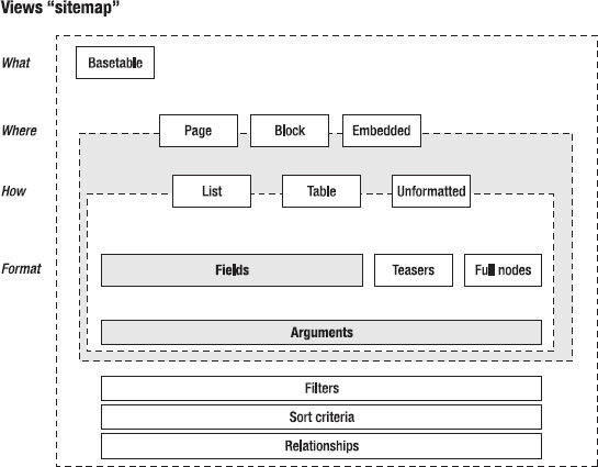
Figure 32–1. A concept model of the Views module
Perception
Understanding why humans see certain things as foreground and others as background is fundamental to designing a good interface. As our surroundings give stimuli to our sense organs, we start talking about perception—the interpretation of these stimuli.
“Perception is not determined simply by stimulus patterns; rather it is a dynamic searching for the best interpretation of the available data.”
—Richard L. Gregory
Top-down perception explains the perception processing as something that is built constructively from our knowledge, expectations, and thoughts. Bottom-up perception processing is described as primarily driven by physical elements.
A famous video from one of the usability tests on Drupal 6 showed a participant struggling to find the “Create content” link that was placed in the left menu and always visible. Still, it took the user over 5 minutes to find it on the screen, after going through various places in the administration screen. It was a clear example of how expectations and prior knowledge drove where the user looked and that Drupal failed to prominently display the most important link in a Content Management System.
When designing, we have to remember how to work with what is perceived outside of the center of the gaze—what is referred to as the peripheral vision. As people move through a page, they identify many objects in their peripheral vision. Designing with this principle in mind means visually grouping related elements and demoting the visual importance of less critical functionality.
Perception is one of the oldest fields in psychology and has a lot of theories and applicable understanding to designing your modules interface. We will cover only two: that of Gestalt (the form and harmony between elements on your page) and some general color usage tips. When we think of form and color, the following qualities drive the meaning:
- Form
- Line orientation
- Line length
- Line width
- Size
- Spatial grouping
- Color
- Hue
- Chromaticity
- Saturation
- Luminance
A lot of what goes into understanding perception is about designing for grouping information more logically to manage the complexity of your interface. For modules like Views and Rules, these challenges are immense and have a deep impact on the usefulness, efficiency, effectiveness, learn ability, and overall satisfaction of the module.
Gestalt Psychology
When looking at the interface, we do not consider the different stimuli of different pieces on the page as individual elements, but rather we see it as a larger whole. Gestalt psychology focuses on understanding how humans perceive certain elements as foreground and others as background, how we differentiate between forms, and how we find similarity between forms.
Research by Kurt Koffka, Wolfgang Köhler, and Max Werheimer from 1920-1940 introduced this idea of considering the perception of object or environment as a whole form where one would have foreground parts and background parts. Gestalt perception is introduced as the law of prägnanz, where the following laws are part of and applicable to the Drupal context:
We will briefly cover each law and its application in Drupal. These laws often help in exploring and evaluating your module forms.
Law of Similarity
We group together items that have similar characteristics, such as color, shape, orientation, size, space, etc. When we see the elements shown in Figure 32–2, such as a row of circles in a field of blocks, we perceive this as a row or line rather than separate circles.
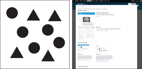
Figure 32–2. Bigger screenshots for active themes, smaller thumbnails for inactive ones
This pattern is often applied in Drupal to differentiate items among many others, as shown in the right of Figure 32–2 where size is used to group similar items. It's a pattern also used for grandeur in architecture—and in the retail store by repeating similar parts to look grand.
Law of Proximity
As shown in Figure 32–3, a common pattern is to put visual elements close to each other. Psychologically, when we see two people standing close to each other, we assume they know each other. This pattern is used all over the Internet. A notable example is Flickr, which uses this pattern for almost everything on the page and only occasionally uses lines for closure. Drupal also uses it, as shown in Figure 32–3.
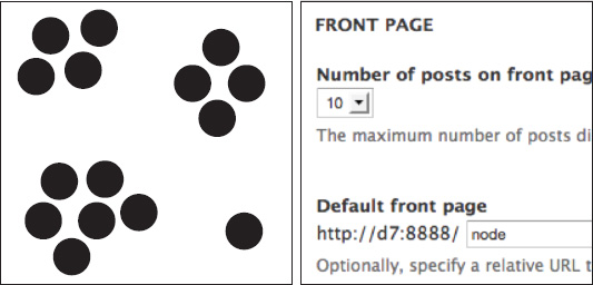
Figure 32–3. White space is used to define the relationships between form labels and form elements.
We apply this principle all over Drupal to layout all kinds of listing pages but also on the detailed level, using white space to define relationships between the elements of a form. The key to applying this principle is to look at the page as a whole and group page elements in a way that helps guide the eye.
This very basic law is often misapplied by using either too much or too little white space. A trick for applying this pattern correctly is taking a step back. By blurring the page a bit, can you still see the groups on your page? If not, you might have to make the groups more explicit or reduce the number of groups.
Color
Beyond making things look beautiful, color is used to give structure, attention, and meaning to elements on the page. The “Perception” section covered a few cases where color could be used to enhance the composition of elements on the page and help convey meaning. Describing color itself is both technical and confusing as we put different meanings to words like “dimmed” or “bright,” especially in a black-and-white book like this. In technical terms, color is described by its hue, chromaticity, saturation, and luminance.
- Hue is when we try to identify the primary color. Red, green, blue, and yellow are referred to as the unique hues.
- Chromaticity is the purity of a color—the absence of other colors. For example, a shiny dark blue would have a high chroma where as purple would have a medium chroma.
- Saturation is how a color changes as it gets darker or lighter; more importantly, it's about the intensity of a given color—how one color can appear pale while another looks strong.
- Luminance is a measure for the brightness of a color.
Drupal's administrative interface (Seven) uses color sparingly. This is primarily a branding and usability decision. We tried to add as little visual distractions to the actual form interactions on the page as possible. Another consideration is accessibility, because a good part of our society has a form of color vision deficiency. Seven makes use of the neutral colors described in Table 32–1.
| Seven's Colors | Usage |
| #a6a7a2 (light gray) | Tabs, selected table column header |
| #e1e2dc (light gray) | Table header backgrounds |
| #0074bd (blue) | All links |
| #008800 (green) | Success messages, enabled modules |
| #b14400 (orange) | Warnings |
| #8c2e0b (dark red) | Errors |
| #b4d7f0 (light blue) | Demonstrate blocks back background |
As shown in Table 32–1, there is a whole range of colors you can use out of the box, and the large majority of modules will be fine leveraging any one of these. For modules that need to step beyond these supplied colors, there are several principles that apply.
Color Harmony
In Drupal we use light gray because it doesn't draw attention, unlike shades of blue, red, and green. When you choose color, there are many different types of color combinations to be made from analogous color (combinations of colors that are close to each other on the color wheel) to complementary colors (combinations of colors that are on opposing ends of the color wheel) to different types of hues and chromaticity of colors.
It's important to understand what type of meaning and attention you want to draw to the element you are coloring. Nonetheless, try to limit the usage of new colors because it's likely that colors will conflict, harmony will collapse, and the eye will be left wondering what the colors are trying to communicate.
Color theory is an extensive field and we have only skimmed the basics here. For more information, we suggest these books: The Art of Color: The Subjective Experience and Objective Rationale of Color by Johannes Itten (John Wiley & Sons, 1997) and Color: A Natural History of the Palette) by Victoria Finlay (Random House Trade Paperbacks, 2003). But most importantly it's a field of experimentation—finding harmony and meaning through carefully chosen colors.
Practice
“In theory, theory and practice are the same. In practice, they're not.”
—Yogi Berra
So with all this theory, how do you bring the principles into practice? It's all about having a process that considers design as an activity during the creation of your module, rather than something done at the last moment.
This is an important aspect of building a good UI: the willingness to take the necessary steps by doing sketches, wireframes, and mockups, and then running them by a few users. The process described in this section is applicable to most digital projects, but we specifically target it on Drupal.
We believe strongly that the role that design takes in the current module design process has to change if we want to make a more compelling Drupal where the user experience of its contributed modules fits in seamlessly in with Drupal core and each other.
The Process
Most Drupal modules serve a very specific need which is often only a part of the larger goals in building the website. The act of designing focuses on two major parts: understanding what people want to accomplish with your module, and how they can do this the best through your UI.
The design process is about a very simple idea: in order to get to good design, you need to explore possibilities and iterate on these with feedback from users. It's important to realize that your module is often part of a larger workflow; therefore, not breaking with existing interaction patterns and not breaking that flow is key.
We will describe the following process:
- Concept: Define what you are making.
- Design: Sketch your module's screens and relations.
- Build: Build your user interface, checking against core interaction patterns.
- Optimize: Test with users and optimize on findings.
- Release: Prepare your project files for sharing on
drupal.org.
This process can be applied fully or partially, depending on what stage in the cycle you are; nonetheless, each step will be revisited from time to time as you are making iterations. As we walk through the process, it will become clear which activities you can use to step out of the role of programmer and into that of the designer; it should also create an understanding why design based on just the implementation model tends to not account for user needs.
The design activity is about seeing the larger picture for where and how your part fits in. How is your module used with other modules? To what task flow are you adding a feature? At what point in this flow might people want to use it? How do you do it in a way that blends in and enhances the user experience?
In the practice section, you will apply this process to the administrative interface of the Rules module. The interface for this module had grown organically over the years but for Drupal 7 got a bigger overhaul to better fit the needs of the people using it in their sites. As is the case with many others of the more technical modules, its domain can be incredibly complex. Thus, the user interface has to account for large amounts of data and configuration to actually become useful and enable users to get their things done—not an easy task.
The Challenges
Designing a good UX is hard. Once you've got your version 1.0 out of the door, your module enters a new phase: it will actually get used by others. It may take some time, but eventually issues will pop up in your issue queue. Gasp! Bugs are found. Or worse: feature requests!
Designing a piece of a modular, extensible, and flexible framework like Drupal is a tough job. Let's look at some of the main challenges you may encounter when designing your application within the Drupal ecosystem.
Keep the Focus on the Essentials (Say No!)
As your module progresses, it's likely that new features will be added. Over time, the original simplicity and focus of the module might get lost. This is a threat to any software project, but especially in modules where there is little feedback on the actual use of functionality—its common module functionality is really only used by the module maintainer himself.
As we have experienced in Drupal core, the issue queue is not the best place for receiving feedback on your UI. The people in this queue are often far more experienced Drupal users (expert users, in fact) and take the time to actually write up an issue. These users often do not reflect common user needs or problems with the UI, so just keep this in the back of your mind as you approach these issues.
For example, if we went solely by the feedback we received in the issues queue, Drupal 7's biggest problem would have been the permission page and the second biggest problem the module page. However, from testing, we saw that most of the problems were in finding how to create content and where to actually find functionality. Therefore, Drupal 7 added an add content link in the administration section, reorganized this section, and introduced contextual links for editing and configuring; while the modules and permissions pages await Drupal 8 for their overhaul.
Be bold and say no to a feature request if it diverges from your original vision for your module. Some modules do this by providing additional modules for specific feature requests or by providing the option in the code but not the UI. Keeping the focus means you are able to deliver the core value of the module easily and your interface will stay clean of distracting settings.
How to Make Informed Design Decisions
It's rare that an issue starts with “While observing and talking to a user…” because it's not exciting information to share. Fundamentally, however, this is what informs your decision best: how it affects users. How do you know who your target audience is and what intermediate users want to achieve? How do you build a solid understanding of your users so you can make informed design decisions?
The quickest and best way to do this is by talking to them and observing them as they use your module. This might seem like a big step, but often you can find people in your close surroundings who can give you this kind of feedback.
Throughout the Drupal 7 design process, we often spoke with users in the issue queue, visitors of local camps and technology conferences, and those who update their local scouting web site. From all these stories, we were able to make more informed design decisions on how it affects the user, the code, and the work they do together.
Design with Limited Resources
It's common in software development environments for the amount of developers to far outnumber that of designers; in open source projects, this is even more drastic. However, for your design to work, you often need feedback from designers to make sure that visual affordances such as alignment, color usage, and the relationships between elements on the page are in balance.
Concept: What Exactly Are You Building?
This is primarily about taking a step back and looking at the larger picture. To help you set the scope of the project and map the different audiences that will be using it, the two primary questions are:
- What are you building?
- Who will use it (excluding yourself)?
Both questions can be defined quickly and expanded on when needed. Actually, documenting both answers sets a good stage for discussing further development and helps communication towards the community. So what goes into answering the question: “What are you building?”
This answer is not primarily expressed in the functions and features of the tool but on a somewhat more abstract level concerning the user goals this module wants to support. The opportunity here is to tie the technological abilities of your module to real user needs.
The question of “Who will use it” is primarily about understanding who your users are in a way that goes beyond putting them into beginner, intermediate, and advanced groups. Research the different needs people have and consider how your module will be used in the larger workflow.
Let's take a look at these two questions for the example project, the Rules module (drupal.org/project/rules). The Rules module lets site administrators define conditionally executed actions that can be triggered by events that occur in the site or application. You could create a rule to send the site manager an e-mail when new people register on the site. E-commerce sites have many uses for rules, too: calculating shipping costs or applying promo-codes for lower prices, for example.
Let's try to answer these two questions that help define the concept for this tool.
Rules: What Are You Building?
Rules wants to provide users with a complete set of tools for defining the business logic in a Drupal application. The intended scope is large: Rules aims to be the primary, extensible platform for defining and handling events on your site.
The concept model in Figure 32–4 explains the general problem that Rules wants to tackle.
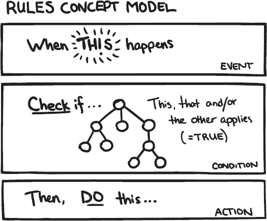
Figure 32–4. The concept model of Rules
Rules: Who Will Use It?
The main audience for the Rules module can be grouped into three roles or people: developers, site builders, and business developers.
They all share the main reason to use for Rules: to define the business logic of the site or application. Developers use the Rules API to customize system workflows. Site builders use the Rules interface to define how different interactions on the site make other things happen. Business-minded people have order processing and marketing campaigns to implement and improve.
Design
Now, how do you translate these ideas about your project and its audience to actual screens for your software? You explore multiple ideas with sketches, refine the best options in wireframes, and create a mockup of the one selected solution.
Don't fear the bad ideas. Explore freely.
Getting Ideas: Sketching
“The best way towards a good idea is to have many ideas” is how the saying goes. Getting towards a good design is very much about exploring multiple ideas first.
It's an almost universal problem in software design that very little time and energy are spent on exploring multiple possible solutions. Often it is simply the first, and therefore un-optimized, design that is chosen.
On the abstract level, the practice of design consists of switching back and forth between two opposing mental states: divergent thinking and convergent thinking, as shown in Figure 32–5. With divergent thinking, you look for multiple ideas and opportunities. Convergent thinking is about evaluating those ideas and making choices on which to throw away and which to elaborate on.
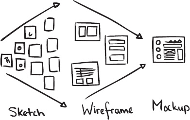
Figure 32–5. Showing the design deliverables in the process from divergent thinking to convergent thinking
Sketching can be done in any kind of medium: pen and paper, wireframe software, graphic software, and even code. When exploring designs, you can grab a pencil and make a quick drawing of how things could look. It's all about the activity of putting technical boundaries aside for a bit and just brainstorm about how it might work in a perfect world. Explore, explore, and explore some more. Get those (crappy) ideas out of your system, make a quick note of them, and move on to the next idea.
In the book Sketching User Experiences: Getting the Design Right and the Right Design by Bill Buxton (Morgan Kaufmann, 2007), sketches are defined by the following attributes:
- Quick: It doesn't take much time to make one.
- Timely: It can be provided when needed.
- Inexpensive: Costs should not restrict possibilities to explore.
- Disposable: The investment is in the concept, not in the execution.
- Plentiful: Sketches work best in series or collections.
- Clear vocabulary: There's a specific style to them that identifies them as sketches.
- Distinct gesture: It's not tight and precise, but open and fluid.
- Minimal detail: It includes only what is needed to communicate the concept.
- Appropriate degree of refinement: The level of precision matches level of refinement of the actual project itself.
- Suggest and explore rather than confirm: Don't dictate solutions, but suggest ways towards answers.
- Ambiguity: Leave room for multiple interpretations.
You might have noticed that nowhere in this list does it say that you have to be able to draw well. It's not about that. Nor is it about having to use pen and paper. Sketches can be done in code as well. Just focus on generating multiple ideas. Work only as long as needed to get the gist of the idea across. Take a screenshot or document it in another way, and move on to the next idea. We're using pen and paper in our examples here because that's what we're comfortable with. Pick the tool that you are comfortable with and that lets you work quickly.
The feedback loop starts here. Show it to others with the intention of getting more ideas first, not necessarily for separating the good from the bad ones. If you get suggestions for other ideas, sketch those out quickly.
If you choose to narrow down your selection yourself, make sure you review your ideas with relatively fresh eyes. Put some time between sketching and selecting. Look at them upside down and from a distance.
Sketching the Rules User Interface
Let's look at an example from the Rules module. If you explore the Rules interface, you'll see many of the basic core UI ingredients like tabs, tables, and fieldsets at work. But what stands out even more is that there are a few deliberate deviations from core patterns. There are a couple of pages that present multiple tables on one page. There's the Rules listing page that groups active and inactive rules each in their own table. And there's the Rules edit page, where there are no less than three tables shown below each other. Let's retroactively explore some ideas for both of these cases and find out why those design decisions were taken.
The Rules Listing Page
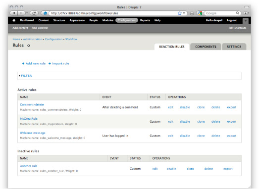
Figure 32–6. A screenshot of the Rules listing page. Note how active and inactive rules are each presented in their own table
As you can see in Figure 32–6, all rules in the system are grouped into two tables: one table with all active rules and another table with inactive rules underneath it. Is this the best way to separate the two? Let's see if we can come up with some ideas for doing this differently, shown in Figures 32–7a through 32–7g.
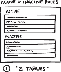
Figure 32–7a. The current situation: a table for active rules and another for inactive ones
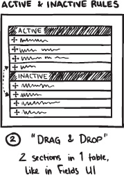
Figure 32–7b. One table with an inactive part at the bottom. You make rules active or inactive by dragging-and-dropping them to the desired section of the table. This is a variation on a pattern used in the Fields UI where this interaction is used to show or hide individual fields on an entity.
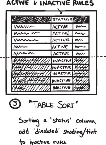
Figure 32–7c. What if all rules were in a single table that can be filtered to show only active or inactive rules?
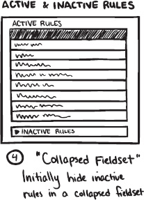
Figure 32–7d. What if all inactive rules are put into a collapsible fieldset below the active ones?
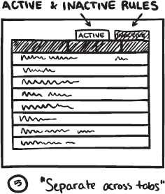
Figure 32–7e. Would spreading them out across separate tabs be a workable solution?
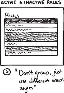
Figure 32–7f. Do you even have to group rules bases on active or inactive? Can the inactive ones just be styled differently (greyed out)?
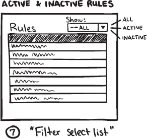
Figure 32–7g. What if all rules were in a single table that can be filtered to show only active or inactive rules?
As you can see, a few ideas can easily be discarded (32–7e and 32–7f), but the filter (32–7g) and fieldset ideas (32–7d) seem promising. The filter could work because there's already a fieldset with filter options present. Further explorations would investigate if that could be designed to accommodate this active/inactive filter.
The other option with all inactive rules (in a table) inside a collapsible fieldset seems nice, too, because it makes them less prominent in the interface. You can safely assume that when people are on this page, they come much more often to work on an active rule. Having the inactive rules take up less screen space would support that. The two groupings are clearly different from each other, which makes it easier to tell them apart.
Get feedback on page concept from real people. Ask them how it aligns with their mental model, show sketches, ask what they see.
For really complex problems, you might need ten or more idea-sketches to get the feeling that you have sufficiently explored the problem space. For less complex scenarios, three sketches can easily be enough. But even then, you'll have material to choose from, which still puts you ahead because now you can make an informed decision on which route you are going to take and explore further.
How? you ask.
Wireframes
Wireframes can serve many purposes: prioritizing content, initial design briefings, validating requirements, evaluating copy writing in context, or as paper prototypes that can be usability tested. This versatility brings the risk of trying to communicate too much to multiple audiences. When making a wireframe, know its purpose and stick to it. Keeping that focus will make it most effective.
Wireframes can be made with many tools: pen and paper, dedicated diagramming software, drawing software, and even office productivity tools have some basic capability for drawing labelled boxes onto the screen. As with sketches, the medium isn't important. A digitally created wireframe might be easier to share online since you'll need to scan or photograph pen-and-paper drawings first.
Say you want to wireframe a Drupal admin screen. From your sketches you have picked two or three ideas that seemed to point towards a solution. You narrowed down your options. Now it's time to look at those ideas and explore each in more detail.
It's entirely possible that by now it is already perfectly clear what you need to do because your project scope is small.
- Wireframing is about collecting and arranging the bits and pieces needed, where the bits are form elements and the pieces are interaction patterns (more on these later).
- Use the Seven theme. It imposes interesting restrictions like a one-column layout and provides a beautiful baseline that can be extended. The visual language is one of restraint. That leaves a lot of room to experiment. And you definitely should. There are many complex interfaces in contrib for which core does not have a ready answer. But to make the Drupal admin UI shine is to make it disappear. You should also honour that restraint and be picky about what is added to the visual language.
Get Feedback on Your Wireframes
As pointed out earlier, it's important to know the purpose of your wireframe and stick to it. This is especially important when asking other people for feedback who don't have the background information (meaning your process up till now). Present the wireframe in a way that best serves its purpose. Whatever the tool you use, make sure to include the following elements for an effective visualisation:
- Title and a description. Yes, that's obvious but also easily forgotten. Without knowing what they're looking at, it will be hard for people to give meaningful feedback. It's best to add the title to the graphic itself. Doing it this way ensures that the wireframe is not dependant on surrounding text for this basic clarification.
- Main page areas. For a web page, outline the header, footer, content area, and sidebar(s). For a Drupal admin screen, put in a box for the toolbar and shortcuts. Add one underneath for the breadcrumbs, page title, and tabs. It's unlikely that your module changes things in these areas but put them in to provide context.
- Highlight and annotate the specifics that are part of your design. Put a number close to the part you want to highlight. Repeat that number in a column next to the wireframe and write a short description of what's going on in that particular spot.
Once again, it's time to get some input from others on your designs.
Reality Check
Stress-test your design with the four basic screen states: normal, empty, flooded, and error. All of these screen states will eventually happen and you should design each of them.
Normal
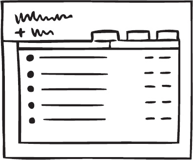
Figure 32–8. Normal state
Figure 32–8 shows a manageable list of content, a handful of tags, menus with a moderate amount of links. This is probably the state your wireframe already depicts. Everything is about average—no extreme cases.
Empty
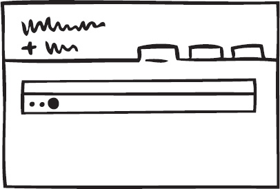
Figure 32–9. Empty state
If your module generates listings of objects, you'll want to use a table for that list. But what if no items are available yet? On the one hand, this case is very much an exception. On the other hand, most listings start out empty. So while this state (Figure 32–9) doesn't happen often, you can be sure it does happen at the very important first-time use scenario. Drupal 7 introduces a standard empty pattern for tables that you'll want to implement as well.
Flooded
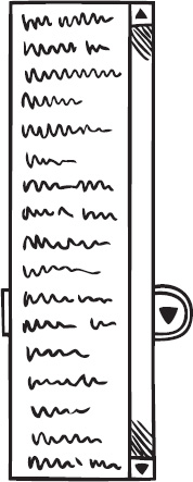
Figure 32–10. Flooded selectlist state
“I have so many active modules that the Site Configuration drop-down menu extends beyond the height of my screen.”What happens when you have 68,000 content items? Or 1429 taxonomy terms, 5 million comments, or a content type with 63 fields? If this is a likely scenario for your module (such as in Figure 32–10), what kind of tools will the user interface expose to help people manage that amount of data? Search, sorts, filters?
Error
Figure 32–11. Error state
Figure 32–11 is the screen you don't want to show. And of course the best error message is no error message at all. Still, you will want to handle this situation constructively. Drupal provides basic patterns for how and where system status messages are shown. What wording will you use for your error message and how do you guide people towards fixing the problem?
This review will help you find parts of the UI that you might not have thought about yet. Rework your wireframe where needed. Sketch multiple options if necessary; take care to not simply bolt on some fixes.
Mockups for Detailed Design
While wireframing or reviewing your design, you might have run into a few specific parts of the interface that are particularly tricky. Maybe you noticed people had a hard time finding a particular bit of info or functionality when you were testing.
Then it's time to take the fidelity of your designs one last level further and create some mockups. You've sketched ideas to come up with general ideas. Then you made wireframes to work through individual screens. When you find that a particular element in a screen needs even more detailed design exploration, that's when you want to create mockups. Mockups look exactly like the interface. You can make them with Photoshop or other image editing software. If you already have functional code, then tweaking the design with the Firebug plug-in or directly in the module code itself is perfectly fine as well and probably even more efficient.
Create mockups to sweat the details and get the design exactly right. It's possible that using default patterns and styling gets the interface working at about 80 percent. It's very much worth it to dive deeper and get that last 20 percent in order.
Build: Build an Alpha and Verify with Users
You've defined the scope and intended audience for your project. You have explored different options for the layout of your screens and chosen a direction. It's time to start actually building your project.
Make it your goal to get a working prototype as quickly as possible, meaning to focus on building only the main functionality you want to achieve. If your project consists of multiple screens, then get the main flow through those screens/states up and running. Work on the big picture; filling in the details comes later.
Why such a strong focus on a working prototype? Because a working proof of concept can be tested by others. All the nice little extras you might want to add are useless if people cannot achieve the main goal your project wants to support. Verify it with *other people*. Simply because you already know too much about how things (should) work, you are *not* the best person to verify if the functionality matches user goals. Because you know, it has become impossible for you to imagine how things are perceived when you *don't* know. It's called the Curse of Knowledge and it's a barrier towards simplicity. You might feel that you are dumbing things down and over-simplifying. Seeing other people use your application will, in most cases, correct that and tell you that you need to clarify.
So, get the essentials up and running and observe other people using it. There is more about getting the best results from simple usability testing a bit later in this chapter.
But let's say you are at a stage where most things seem to be working as planned. People successfully use the interface to get things done. Then it is time to do a check you *can* do yourself, and that is verifying if your interface elements follow core conventions, which can be found at drupal.org/ui-standards.
It's important to realize that when you are building a module, your UI will be seen in context of core and multiple other contributed modules. That's why the consistency mantra is so important: you will almost never know the exact context in which your UI will show up. The best strategy then is to not try to be different but to do your very best to blend in.
Optimize: Observations and New Versions
Once your module is built and designed, you should have a good idea what the user wants and whether your module achieves this. The final stage is to optimize your module for reality. As your module goes into alpha, it's likely you will get feedback from users.
This alpha stage is also the best moment to do a more thorough usability test. The primary goal of any usability test is to inform design decisions.
- Does the module serve its purpose? Is it useful?
- Does it help people achieve their larger goals?
- Is it effective, efficient, and perhaps even a pleasure to use?
This chapter will go into some of the basics of running a qualitative usability test, which is quick to run and applicable to module development. We follow a fairly basic process for running a usability test:
- Development of test plan.
- Recruitment of participants.
- Set up of module, recording, and logging.
- Running the usability test.
- Analysis of results.
- Reporting of issues.
- Develop a test plan.
The test plan is your blueprint for the usability test, making sure that you prepare your test sufficiently and can run each individual session consistently. But it also serves as the tool to convince others that you didn't just run it by users but performed a well thought-out plan.
Test Plan Outline
- Why are you testing?
- What kind of user are you testing?
- How are you testing?
- Method
- Scenario
- Task
- Environment
- Analysis method
- Reporting method
This is a very basic test plan, which leaves out a lot of detail work you would otherwise do for a large site. The idea here is that you can repeat this test plan more often, and others can help by performing it on participants around. So let's use this test plan outline to set up a usability test of Rules.
Why Are You Testing the Rules Module?
You are testing to find out whether users can set up a rule using the Rules 2 interface. Specifically, you want to know:
- How closely does the module workflow match the user's expectations?
- Are the basic Event, Condition, and Action relationships clear?
- How confident are users that their rule will be triggered?
You are also testing to provide material to the community that will help people make better design decisions for the user interface of this module in the future.
What Kind of User Are You Testing?
In the concept phase, you identified three audiences for this module. Now you have to make the evaluation of which users and how many you should test in this phase.
- Developer: The developer can provide valuable insights to whether the flow they see in the interface matches their expectations, especially since they are looking at this from an implementation model.
- Site builder: Can the site builder set up a rule and is he confident enough that this rule will be executed successfully? What are the triggers that help the user understand the required steps in the interface?
- Business developer (sales, content strategist, shop owner): Is the rules interface leading enough to understand which steps they need to take? How does it match their mental model?
Both Site builder and Developer audiences should be easy to recruit from the people around you, but the last group will be considerably harder, given that they are also a small portion of your target audience. For the test, refer to the spread shown in Table 32–2.
| Participant Type | Number of Participants |
| Developer | 2 |
| Site builder | 2 |
| Business developer | 1 |
| Total Number of Participants | 5 |
Let's avoid recruiting participants who are familiar with the Rules 2 UI or Rules 2 implementation.
These participants will be recruited through the Drupal.org forums, IRC, and from the people around you.
How Are You Testing?
This usability test will be an explorative one, where each user is asked to create two rules using the Rules 2 UI. The test will be recorded and shared with the community.
Method
You will do five individual sessions that will last for about 20 minutes each. During this session, the participant will be asked to perform two tasks. Ideally, the scenario and tasks for each session will be adapted to the context of the participant.
The test moderator will introduce the tasks and ask questions whenever appropriate as well as take notes and assure the video is running.
Scenario
You are building a web shop for a small store that sells shoes online, and you are using Rules to send notifications to shop management when you are running over 20 orders of a specific shoe (to check the store's stock) and to have a scheduled discount on shoes during the summer sale.
Tasks
- Send a promotion e-mail to a user when that user hasn't visited the web site for more than three months.
- Offer a 20 percent discount on all shoes from June 1 till August 31.
Environment
You need to have a web shop with at least a Carlos shoe. This web shop system needs to leverage Rules; this can be set up using an e-commerce system like Drupal Commerce or Ubercart, or Drupal core using a price field on a shoe content type.
Since you will be recording each session, you will require a video recording tool. If you are testing remotely, you need a screen sharing tool as well (remoteusability.com/tools/ for remote testing tools).
Choosing an Analysis Method
For this test, let's use a qualitative usability test that is explorative on the actual UI. This method was chosen because of Rules 2 release cycle and ability to change significant parts.
Having an idea of how you will perform analysis helps you determine exactly what data you want to collect. A typical way of analyzing results is writing down each problem you find during the test from going through your notes and video to answer the research questions formulated in the “Why are you testing?” section.
Reporting test results is all about sharing your information so that others can act upon it, too. It can not only help make your module more usable, but also those modules in the same domain and even Drupal core; for example, your findings can help Drupal core optimize its actions module because in some parts they are similar.
Recruitment of Participants
In the test plan you identified which participants you wish to recruit; now you need to actually find these participants. In order to verify whether they meet the requirements you set, you have to do a quick interview or questionnaire.
Where Do You Find Participants?
Finding participants requires a bit of creativity. Since this is open source, it's likely you are on a shoestring budget for everything so using a recruitment form or offering compensation is probably a bit too much to ask. Here are some places we have looked for finding participants.
- Forums and IRC: If you are trying to recruit developers, it is relatively easy to find them on IRC and in the Forums. For recruiting participants from the Forums, it's important to inform them that you want them to be “fresh” to avoid that they will try out the module before you do a test with them.
- Module Page Signup: If you want to recruit people who are about to use your module, or already are using your module, include a link to sign up for testing on your module's page. This is an effective way to recruit participants. The signup form could include a few questions and ask for some indicators when they are available. Make it as easy as possible to select the right participants for you and the participants themselves.
- Drupalcamps, User Groups and Contribution Sprints: There are many local events that give you the possibility to do quick 15-20 minute usability tests. We have tested at Drupalcamps before; with some coordination with the organizers, it's usually possible to do tests before the camp starts, during lunch breaks, or possibly during sessions. It all depends on the willingness of the participant to miss other sessions. A request for test participants can be done up front, on the website/blogpost about the event, or during the event (for example, in the opening presentation).
- Colleagues, friends, and family: You might be working at a web development company, have friends that build web sites, or have a really excited cousin that is into building web sites. It's likely that they meet the requirements you set for the usability test, so recruiting them should be possible. A risk here is that the relationship you have to the person influences the test (not feeling free to criticize) so keep this in mind.
Schedule Participants
Scheduling participants is relatively easy. We often schedule sessions in the evening or during lunch. Keep them in close contact and confirm once or possibly even twice before the session to assure it's in their agenda. Always try to schedule participants, even when people come from IRC. This way you can assure they have dedicated a block of time for just your test, rather than something adhoc where they can be disturbed by work or other stuff.
Inform Them of Privacy Considerations
It is important to inform the participant on what test involvement means in terms of information that will be released. If you are recording and sharing this with the community, you have to get permission from the participant. Be clear on how the data of the test will be used, including any material, and that this will be anonymized.
If you share any information with the community, make sure that there are no names on recordings or in notes. An easy way to make sure this happens is to use participant numbers rather than names during the test and analysis.
For sharing video, you also have to make sure it's clear that videos can be shared—without showing their face or anything—purely for sharing insights.
Setup of Module, Recording, and Logging
Running a smooth usability test means taking away any worries about the technical environment and recording. The following are a few tips for the setup process:
- Have backup installs ready.
- Run a dry test (test it yourself).
- Evaluate whether the timing set for tasks is realistic.
- Is all the information you give correct?
- Test the microphone and video quality.
- Disable core update notifications.
Running the Usability Test
Now, onto actually running a usability test! Much of this is common sense. It's primarily the techniques you use to get the most out of your participants in terms of insights that are important. For a traditional test we use the following setup:
- Introduction (Purpose, setup, duration)
- Expectations (What the user should do, such as speak loudly)
- Comfort (You are not being tested, ask any questions, you can skip stuff if needed)
- Introduce scenario
- Introduce task
- “Thinking aloud” technique
- Post-test questions
- Closing (evaluation)
It's very difficult to understand what people are thinking and which small considerations they make each second as they browse through the interface. You are testing because you want to rise above your own assumptions. Interpreting silence from participants brings you back to assuming. Use the “thinking aloud” technique, in which you ask the participant to say what they think as they use the interface. It is extremely effective in learning about all of the small problems they run into and how decisions affect their ability to use the interface; it gives valuable hints towards their mental model. It also keeps participants in the flow of talking about what they are doing. The participant has to be open to this technique; to some it will feel unnatural or they will forget to do it because they are moving through the interface fast. It's okay to ask the participant during the session to keep thinking aloud.
Questioning the Participant
The participant will do a lot of things where you want to more deeply understand the thinking behind them. Feel free to ask the participants how they feel about it, what is expected, or their thoughts about what happened.
By asking questions, as if you where the student trying to learn from the participant, the participant should feel more at ease.
Don't Turn the Participant Into the Designer
You are looking for problems. Don't ask for solutions. It's okay if the participant suggests solutions. Dig a bit deeper if they do, but don't suggest improvements yourself (“Do you think it would work better if that button would be below instead of to the right of the object?”) or ask which color might communicate a message better.
These suggestions can often cloud your judgment in later processes when you are looking for recommendations.
Wait an Extra 20 Seconds Before Offering Assistance
It's quite often that the participant will run into problems that are either hard to solve or are still undoable in the prototype. It's human nature to want to be friendly and help. But it's best to wait a bit. It's through the struggle of a participant you get a deeper understanding.
So whenever the participant feels lost and truly can't complete the task, give it a bit more time and see if you can ask questions regarding the mental model and how, for example, the error messages give information.
We Are Testing the Software, Not You
This is a sentence that makes the participant more at ease. During a test you want to make sure the participant doesn't shy from giving a critique and even being very negative when necessary.
Analysis of Results
Now that you have collected all this data, you can start doing analysis. For qualitative tests, this is a fairly chaotic process of looking through your notes and writing down the trends you see on each task and the larger trends you see in the interface.
It's key in analysis to create direct connections between the trends you see and the material. This helps you verify your understanding and makes it easier to describe the trend in reporting.
A common method for analysis is building an affinity diagram (KJ Analysis), which is often done by doing the following:
- Writing down individual issues on a Post-it.
- Counting how often it was found.
- Grouping similar issues.
- Removing duplicate issues.
- Grouping issues on trends.
While doing this, it's often easy to spot the trends. Some issues might occur often or one issue is leading in a lot of other issues.
During this rather chaotic process it's important to keep in mind that you are mapping the problems; you are not yet finding solutions. As a developer, it's easy to jump into the activity of coming up with solution, but that's not the activity here—and it will cloud your ability to do a thorough analysis.
Reporting of Issues
How do you want to report your findings with the community? It's not always easy to communicate usability test results. We have applied the following method in previous tests:
- Single report page (important findings, list of problems)
- Project issues (describing a specific problem)
- Video
The most important part here is that you are always reporting the problem, not the possible solution. This is to create greater separation between the two mental activities and to avoid communicating the solution as something that will definitely be usable.
The single report page is an overall view of what was learned, but it's also a centralized place from which you can go to the individual issues and the videos. There are many ways to communicate specific problems; for example, in a Drupal 6 core test, we described the problem shown in Table 32–3.
Table 32–3. Drupal 6 Core Test Problem
| Object | Observation | Importance |
| Administrative overlay | Users were confused that the administrative interface was overlaying the web site. Their mental model of CMS software is an administrative interface and a separate interface to view the site. | Major |
Using a simple table, we could communicate about 30 identified problems, which were turned into issues.
Essentially, reporting is all about isolating problems into workable chunks that you and contributors on your module can work on. Since a usability test is likely to expose a large number of issues, the activity of reporting helps you finalize which major issues you want to work on, what strategy you want to adopt, and how you hope to potentially attract other developers to work on the low-hanging fruit.
Feedback from Issue Queues
When your module is in beta or even alpha, it's likely others are already trying it out and giving feedback through the issue queue. This feedback is vital for improving your module and often allows for a more direct conversation than through other methods such as testing. Additionally, this feedback will be continuous in any phase your module is in.
However, it's always important to remember these reports come from the very small percentile that has the skills and desire to actually let you know about it by posting an issue in the first place. Although this is an important audience, it's likely that this audience is more advanced and doesn't necessary reflect the issues the majority of your users face.
Understanding when certain feedback is describing an obscure edge case or when it's actually dealing with a common case is helpful. There is danger in jumping in to changing the UI; quite often these edge cases introduce edge case interface elements, which can potentially make it confusing for the common case.
Release: Project Page and Documentation
When you have released your module, there is one step that remains: creating a useful project page and documentation for your audiences. With the many modules out there now, finding the right module is a difficult task—even more so for those who don't understand all the points involved in evaluating a module. Usability starts by helping your potential users find and evaluate your module.
What Does Your Module Do?
The primary question people ask is “What does your module do?” Let's look at how Rules describes itself.
- The Rules modules allows site administrators to define conditionally executed actions based on occurring events (known as reactive or ECA rules). It's a replacement with more features for the trigger module in core and the successor of the Drupal 5 Workflow-ng module.
- Example use cases
- Build flexible content publishing workflows changes
- Send customized mails to notify your users about important updates
- Create custom redirections, system messages, breadcrumbs, and many more
It's a fairly compact description that entails what it does (touching upon some specifics known to experienced Drupal users) and gives examples. It's most likely the examples are most interesting aspect as they give people an idea what they can do with the module.
Having a clear description at the top of your project description explaining what your module does is obvious but an often missed step.
Another example is Pathauto.
The Pathauto module automatically generates path aliases for various kinds of content (nodes, categories, users) without requiring the user to manually specify the path alias. This allows you to get aliases like /category/my-node-title.html instead of /node/123. The aliases are based upon a “pattern” system which the administrator can control.
Again, compact and clearly showing what you can do using an example. So what can you do to improve page sections like these? Let's take the last example of Pathauto. A user scanning over this whole page might miss the most important information: the example that clearly shows what it does. Rewriting this piece could look like the following:
The Pathauto module automatically generates path aliases for various kinds of content (nodes, categories, users) without requiring the user to manually specify the path alias.
Example:
Turn
www.example.com/node/123 into www.example.com/category/my-page-title.htmlThe aliases are based upon a “pattern– system which the administrator can control.
Ideally your project page is as short as possible, sending people to additional handbooks when you want to explain specific errors or frequently asked questions.
A common structure for project pages is the following:
For a more in depth description on how to make a usable project page, please see an article by Lisa Rex at growingventuresolutions.com/blog/module-owners-how-make-your-module-description-useful.
Copywriting
The quickest and most effective way towards a more usable interface is through good copywriting. In most cases, the text is the interface. In Drupal 6, we saw the impact of badly written descriptions; they were often superfluous and not targeted at the task at hand. It was a serious issue that could be found in a majority of Drupal interfaces, so in Drupal 7 almost all descriptions and labels got a major overhaul, optimizing them for the task at hand and knowledge of the user.
An example of this was found during a usability test of Drupal 6. A smart and web-savvy participant was tasked with categorizing some of her content. She actually quickly found the taxonomy page but then wasn't sure if she was in the right place. She started reading the very long help text at the top of the page. This text confused her so much, she left the page.
At least three things stand out here.
- The help text somehow didn't provide enough clues for the participant to inform her she was at the right place.
- Even a multi-paragraph help text gets ignored at first.
- The more help text, the further the actionable part of the page is pushed into peripheral vision.
The reason that many descriptions in Drupal are wrong is because they are trying to provide too much information—from the concept, the place where it will be used, to the interactions on the page. With all that information, often the most important part—the concept—gets lost. For example, look at the Taxonomy page description in Drupal 6.
“The taxonomy module allows you to categorize your content using both tags and administrator defined terms. It is a flexible tool for classifying content with many advanced features. To begin, create a ‘Vocabulary’ to hold one set of terms or tags. You can create one free-tagging vocabulary for everything, or separate controlled vocabularies to define the various properties of your content, for example ‘Countries’ or ‘Colors’.
Use the list below to configure and review the vocabularies defined on your site, or to list and manage the terms (tags) they contain. A vocabulary may (optionally) be tied to specific content types as shown in the Type column and, if so, will be displayed when creating or editing posts of that type. Multiple vocabularies tied to the same content type will be displayed in the order shown below. To change the order of a vocabulary, grab a drag-and-drop handle under the Name column and drag it to a new location in the list. (Grab a handle by clicking and holding the mouse while hovering over a handle icon.) Remember that your changes will not be saved until you click the Save button at the bottom of the page.”
The top paragraph explains the concept and the second paragraph explains what this page is about, what vocabularies can be tied to it, and how to use the interactions on this page. As we went through the process of changing this description, we established the following principles:
- We need to explain the concept of terms and vocabularies; this concept is often unknown to the user who thinks in terms of categorizing content.
- We should avoid explaining how to use the interactions on this page and what effect it will have in other places; this should be obvious from the interactions themselves.
- We should bring forward familiar concepts in terms of categorizing content.
With all that in mind, we rewrote the description to the following:
“Taxonomy is for categorizing content. Terms are grouped into vocabularies. For example, a vocabulary called “Fruit” would contain the terms “Apple” and “Banana.”
As you can see, this is far more to the point. It starts by validating that Taxonomy is indeed about categorizing your content and goes on with one example that clearly explains how a vocabulary is used to contain terms.
The next step is validation with users. Does the new description cause confusion or does it help users? We did a number of usability tests of which this page was a step. The large majority of users that did read this text understood what taxonomy is about and how vocabulary and terms are related.
Causes of Unhelpful Copy
Taking a step back, what causes all this unhelpful copy in Drupal and its contributed modules?
- Not focused on the task at hand: Users are relentlessly task-focused. In order to achieve their goal, they know the page is only a step; thus reading descriptions will only be done if really necessary.
- The wrong attitude towards the user: We rarely see the kind of writing that sounds relaxed and confident in the user. Instead a lot of text is trying to lecture and assumes the user doesn't care. You can see this in the amount of places where we say “please note,” “warning,” etc. Lecturing users is never a good thing.
- Developer documentation bubbling up into the UI: Often descriptions are trying to explain technical concepts from the usage of the word “node” in the interface to explaining the effects of certain performance options.
- Explaining a broken UI: We often see descriptions that are trying to make up for a hard-to-use interface. When you find yourself having to write a description explaining parts of the page, you're creating an interaction that doesn't work.
- Not understanding where your users are: Your interface is rarely the first one they see in Drupal, so consider where they are coming from and where they want to go. This will set boundaries to what you need to explain.
- No clarity in choice of words: The copy in your interface should be as clean as possible. It should be active and stripped of any unnecessary words or long words that could be short. Using “now” over “currently” and other quick wins will help bring clarity to your writing.
Users often blame themselves when they missed the meaning of a description; they go back read it again or just go on and ignore it. As an interface developer, you are stepping into the shoes of a writer, composing sentences with great clarity and meaning. Revise your writing until it's totally clear what you are trying to say.
Just like good design, good writing is no accident. It often comes from a thorough process of rewriting.
Principles
The principles outlined below are the ones we use for Drupal 7 core. Obviously, more principles apply to writing like good spelling, grammar, and tone of voice.
- Use active voice: Active voice is about the subject doing an action; passive voice is about having done it. For example, the user creates content (active), the content was created by the user (passive). This principle applies to most text in Drupal where we try to direct towards a certain action.
- Focus on the task at hand: The description or label should only be about the task at hand, not about any preceding or follow-up tasks.
- Clarity over precision: It's in the programmer's nature to be as precise as possible; in copywriting, this usually means long, dense, and very complex sentences. Always consider clarity over precision. It's likely your precision will not be understood by the user and your most important point is overlooked. It is often better to refer to documentation when you are getting to the point where you need to explain how it affects different use cases.
You will encounter this problem more often in modules that are more technical, such as Drupal 7's field interface, which is basically an interface for setting up database tables; the copywriting is precise enough for those who are familiar with database concepts to use it effectively. However, this means anyone who is not completely familiar with database concepts will not get the information they need in an easy-to-digest manner.
- Cut 50 percent; cut another 50 percent: As you're writing, especially when you're incorporating other people's feedback, it's easy to grow your text into a long paragraph. A trick applied by many writers is constantly cutting big parts of the text; this forces you to let go of those carefully crafted sentences when they don't convey the meaning. It's about constantly reevaluating whether each word in your text has a function. You'll be surprised how much you can improve your interface only by going through and cutting text. The earlier mentioned Taxonomy page has seen many revisions; during the Drupal 7 lifecycle, it changed several times from a lot to too little (not conveying the meaning) to just right. It's likely you will have to rewrite a sentence three, four, maybe even ten times before you get it right; getting it right will save many module users many hours of time.
- Only add descriptions when needed: This might sound obvious, but in Drupal 6 we had a really tough time removing all the places where the description was either repeating the label above or adding little to no additional meaning.
Whenever you can add two or three extra words in the label to make the description superfluous, it's best to do so. We definitely recommend that module maintainers avoid having any descriptions in their forms; it's a good practice because it means your labels are descriptive enough.
- Be consistent with core terminology: There are many existing text patterns applied all over Drupal 7 from the way we label our menu items, buttons, and links to proper usage of plural and singular. When writing interface text, compare your work with similar interfaces in Drupal core. This helps you maintain consistency in both terminology and tone-of-voice.
In Drupal core we also have a number of words we avoid using, which are displayed in Table 32–4.
Table 32–4. Words We Avoid Using in Drupal Core
| Don't use | Use | Why |
| Drupal | Site | This complicates distributions. |
| Please | - | It sounds pushy; it's often possible to leave this word out. |
| We | The user, the admin, name the person | “We” is often not descriptive as to which user it applies, so specifically name whom this is affecting. |
| Node | Content, piece of content | “Node” is an unknown concept to users. |
| Post | Piece of content | “Post” can be used as verb; “post” can be confused with other concepts. |
| Input format | Text format | The word “text” is a better trigger to the user's mental model. |
| Plug-in, Extension | Module | These words can have other meanings. |
We hope you feel prepared to design for the user experience and help make Drupal great!
 Tip Visit
 dgd7.org/ux for links to resources mentioned in this chapter (and more) and to track continuing developments in Drupal UX.