
In the last chapter we discussed creating a responsive, flexible layout and worked through several patterns. But none of them had the one element that you find on virtually every website: the navigation menu. Even though responsive navigation uses some of the tricks of responsive layout, it has its own problems and patterns, so I wanted to discuss it separately. One big difference between the patterns here and those in the last chapter is that JavaScript can start playing a major part, though this will bring in its own challenges. Note that all samples assume the basic CSS reset that was used at the beginning of Chapter 2. The samples were all tested on our standard device testing set as listed in the introduction.
All of the following patterns have one thing in common: on mobile, we are trying to hide/move/minimize the navigation to get the user to the content as soon as possible, yet still have the navigation within easy reach. On desktop monitors, it is usually trivial to accommodate both navigation and content in a single glance. On mobile devices, this is often much more difficult.
Making the Horizontal Menu Vertical
In the first chapter on the basics of responsive web design we used one easy pattern, which simply involved taking the horizontal navigation and turning it vertical again, which you can see in Figure 4-1. This was achieved with some simple CSS for removing the floats and applying a little formatting.
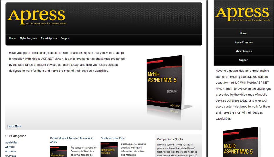
Figure 4-1. Making a horizontal menu vertical for smaller screens
Because that was described in Chapter 1, we won’t go into much detail about that now. But here is a review. You may recall that our menu was implemented as an unordered list like this:
<ul class="nav">
  <li class="nav-item"><a href="/">Home</a></li>
  <li class="nav-item"><a href="/">Alpha Program</a></li>
  <li class="nav-item"><a href="/">About Apress</a></li>
  <li class="nav-item"><a href="/">Support</a></li>
</ul>
The CSS for making the unordered list lay out horizontally was as follows.
.nav {
  overflow: hidden;
}

.nav li {
  float: left;
  margin-left: 17px;
}
After reading Chapter 2, this CSS should make sense. The list items are all floated, which causes them to stack horizontally instead of vertically. They are also given a left margin for a little spacing as well. The list itself has overflow: hidden applied to keep its height from collapsing because all its child elements are floated.
But this menu has a problem on smaller screens because the floated elements will start wrapping to the next line. To accommodate this, we change the menu to a vertical list on smaller screens.
@media screen and (max-width: 425px) {
  .nav li {
    float: none;
    margin: 0;
    padding: 12px 0;
    text-align: center;
  }
}
This CSS change is wrapped in a media query so it only applies to screens that are 425 pixels or smaller. In this media query we remove the floats and margins as well as add some vertical padding to space the elements out.
You’ll find that this is the simplest approach for handling single-level navigation menus. This approach has one significant negative to it, however, which is that it forces the user to scroll to see the content that was presumably the focus all along. The longer the menu, the longer the user would have to scroll. The following patterns handle this problem better.
This pattern solves the navigation-first problem by moving the menu to the bottom, with a link at the top that takes you to the menu so you don’t have to scroll all the way down past the content to get to it. You can see an example of this in Figure 4-2. Fortunately, this pattern is also very easy to implement, and you will learn two separate ways of implementing it. Both implementations work well, but the first is a bit easier to understand, so we’ll start there.
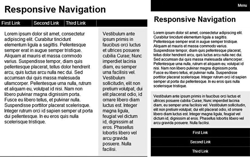
Figure 4-2. Showing the menu up top on wide screens, below on smaller screens
The core idea of the pattern is that on larger screens the menu is shown near the top; but on smaller screens the menu is shown at the bottom. So that the user doesn’t have to scroll all the way down the screen to get to the menu, a link to the menu is shown at the top.
We start with our basic markup with the most important bits highlighted.
<div id="content">
  <a id="menuLink" href="#menu">Menu</a>
  <header>
    <h1>Responsive Navigation</h1>
  </header>
  <nav id="navTop">
    <ul>
      <li><a href="#">First Link</a></li>
      <li><a href="#">Second Link</a></li>
      <li><a href="#">Third Link</a></li>
    </ul>
  </nav>
  <div id="primary">
    <p>Lorem ipsum dolor sit amet...</p>
  </div>
  <div id="sidebar">
    <p>Vestibulum ante ipsum primis...</p>
  </div>
  <nav id="navBottom">
    <a name="menu"></a>
    <ul>
      <li><a href="#">First Link</a></li>
      <li><a href="#">Second Link</a></li>
      <li><a href="#">Third Link</a></li>
    </ul>
  </nav>
</div>
The CSS for creating the basic layout is as follows:
#content {
  max-width: 960px;
  margin: 0 auto;
  outline: solid 1px #000;
  overflow: auto;
}

header {
  border-bottom: solid 1px#EEE ;
  padding: 15px;
}

nav {
  background-color: #000;
  clear: both;
  overflow: auto; /* keeps the ul from collapsing (see Chapter 2) */
  padding-left: 15px;
}

li {
  border-right: solid 1px #777;
  float: left;
  list-style-type: none;
  padding: 3px 5px;
  width: 100px;
}

li a {
  color: #FFF;
  text-decoration: none;
}

#primary {
  float: left;
  padding: 3%;
  width: 60.66666%;
}

#sidebar {
  background-color: #EEE;
  float: left;
  padding: 3%;
  width: 27.33333%
}

#menuLink {
  background-color: #000;
  color: #FFF;
  min-height: 35px;
  padding: 15px 15px 0 0;
  text-align: right;
  text-decoration: none;
}

#navBottom, #menuLink {
  display: none; /* Both the menu link and the nav in the bottom are hidden by default. */
}
To handle the navigation layout for smaller devices, the following media query is used, which will be applied when the screen is 500 pixels or smaller.
@media screen and (max-width: 500px) {
  nav {
    padding: 0;
  }

  #navTop { /* This hides the topmost menu. */
    display: none;
  }

  #menuLink { /* This will show the link at the top, which will skip the user to the bottom menu. */
    display: block;
  }

  #navBottom { /* By default the bottom menu is hidden. This shows it. */
    display: block;
  }

  /* All the rest of the CSS changes are concerned with switching to a single-column layout. */
  li {
    border-bottom: solid 1px #555;
    float: none;
    padding: 10px 0;
    text-align: center;
    width: auto;
  }

  li a {
    display: block;
    height: 100%;
  }

  #primary, #sidebar {
    float: none;
    width: 94%;
  }
}
So with simple markup and relatively straightforward CSS, the effect we want is achieved. But before we discuss the strengths and weaknesses of this approach, let us see another way to implement a similar pattern. This approach creates one visual difference, reversing the position of the header text and the menu in the widescreen design. It looks like Figure 4-3.
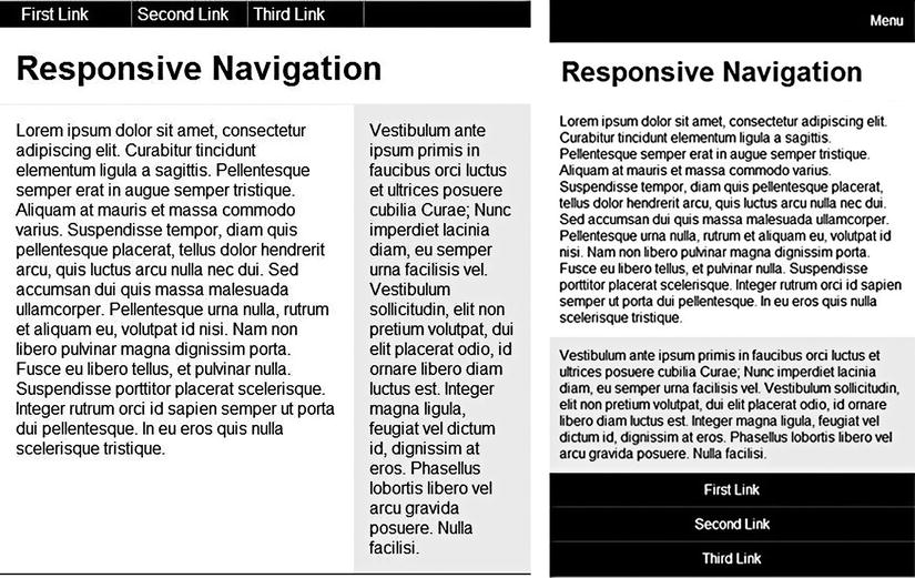
Figure 4-3. Our second implementation of putting the menu at the bottom of smaller screens
Why the difference? This implementation removes the duplicated menu, putting it only at the bottom. To achieve this effect, here are the CSS changes you need to make:
nav { /* take the nav from its default position and stick it at the top of the screen. */
  position: absolute;
  top: 0;
}

header { /* since the nav is now at the top, bump the header down to make room for it */
  margin-top: 30px;
}

@media screen and (max-width: 500px) {
  header { /* the extra margin in the header is no longer needed to accommodate the navigation. */
    margin-top: 0;
  }

  nav { /* reset to default behavior, which pops the menu back to where it belongs in the layout. */
    position: static;
    top: auto;
  }
}
Even though the nav is located at the bottom of the page, you use CSS to move it to the very top for all wide screens. Using absolute positioning, it’s easy to put it at the very top of the page. You could also position it below the header by setting a fixed height on the header, but this is easiest. But when the screen is 500 pixels or smaller, the media query kicks in and puts the nav back to where it belongs by default, putting the navigation back at the bottom.
Both work fine, though the first suffers from duplicate HTML and the second is just a bit more complicated. Both will also work on devices without media query support because the default styling puts the navigation at the top, which is a good default.
Turning the Menu into a Select
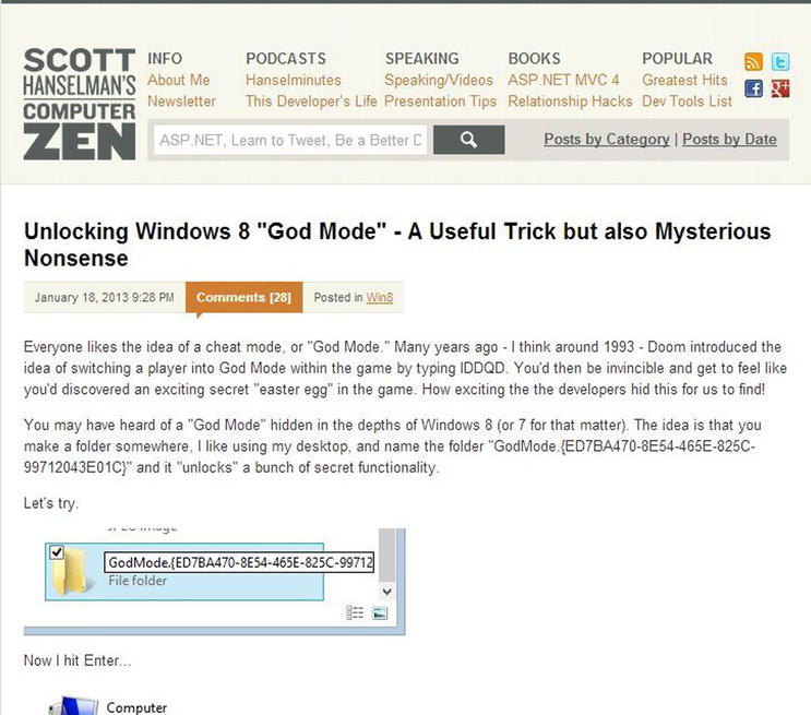
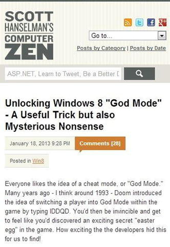
Another way to deal with a potentially large navigation menu is to get rid of it entirely and turn it into an HTML select element (aka, a drop-down list). One popular .NET developer blog (http://www.hanselman.com) used this approach in the previous design of his blog, as seen in Figure 4-4.
This approach is easy to implement and works with few caveats. The markup is very similar to the above. Note the addition of the select.
<nav id="navTop">
  <ul>
    <li><a href="#">First Link</a></li>
    <li><a href="#">Second Link</a></li>
    <li><a href="#">Third Link</a></li>
  </ul>
  <select id="selectNav"></select>
</nav>
Note that there is nothing in the select. We will use a little JavaScript to fill that. The following CSS can be added to the above to give us all the styling implementation that we need:
#selectNav { /* By default, hide the select. */
  display: none;
}

/* When the screen gets too small, hide the main nav and show the select */
@media screen and (max-width: 500px) {
  #navTop ul {
    display: none;
  }

  #selectNav {
    display: block;
    width: 100%;
  }
}
So how do we fill that select? We will use a short script with some jQuery to make this easier, though you could obviously do something similar without it.
$(document).ready(function () {

  var nav = $('#selectNav'),
  //We need to create an option in the select for every anchor tag in the
  //  nav, so we use the jQuery each function.
  $('nav li a').each(function() {

    var anchor = $(this);

    //This creates a DOM object and adds the specified attributed to
    //  the element.
    var option = $('<option />', {
      value: anchor.attr('href'),
      text: anchor.text()
    });

    nav.append(option);
  });

  nav.change(function () {
    window.location = $(this).find("option:selected").val();
  });
});
When the page is loaded, the select menu is created from the links in the navigation. If the screen is over 500 pixels in width, the select is hidden and the main navigation is visible. If the screen size is 500 pixels or smaller, the main navigation is hidden and the select is shown. When an option from the select is selected, the select’s change event is fired and the window location changes, loading the new page. You can see this approach in Figure 4-5.
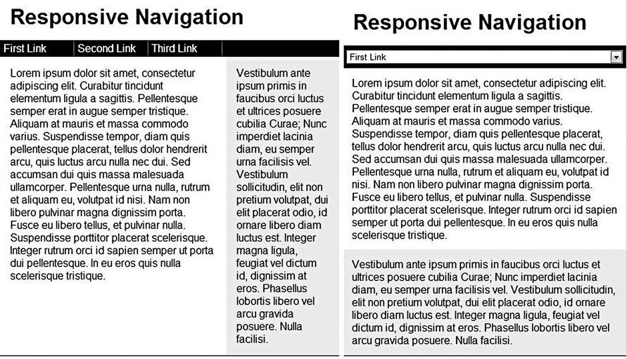
Figure 4-5. Our implementation of turning the navigation menu into an HTML select
This approach is great in that it can handle menus of any size and make them all tiny. Even multi-level menus can be handled by using the optgroup tag in the select, though the JavaScript would get a bit more complicated. This is exactly how multiple levels of navigation hierarchy are handled on Scott Hanselman’s blog above. His primary navigation gets switched out for a select at 720 pixels.
The obvious strength in this approach is that it minimizes the navigation effectively. Devices will also have a native selection control when the user chooses the select, which is nice. The negative is that it requires JavaScript. If the browser has media query support but JavaScript is turned off, small devices will get no navigation menu unless you put the work in to handle that situation.
Creating Accordion-Style Navigation at the Top
Another useful pattern involves keeping the menu at the top but hiding it. This is the approach that http://www.microsoft.com took in its responsive design, seen in Figure 4-6. At around 550 pixels their menu switches from horizontal to hidden with a menu icon to press to reveal the menu. The menu is also animated as it opens and closes, a nice touch.
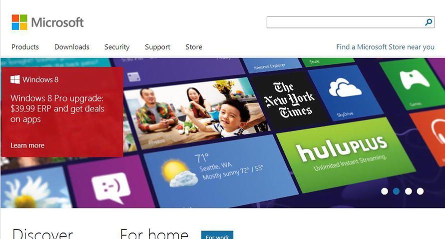
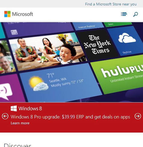
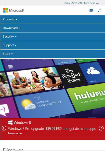
Figure 4-6. The first image shows the Microsoft home page as viewed in a desktop browser, the second two in a smaller browser. Note that the menu in the smaller browser screenshot is collapsed in the image on the left and expanded in the image on the right
Let’s discuss how we would implement a similar menu. Like the last pattern, I am going to use JavaScript to make this work, but I will use it as little as possible (and less than the microsoft.com site uses). As for our implementation, the larger screen size will look like the screen you are by now familiar with though the smaller screen will look like Figure 4-7:
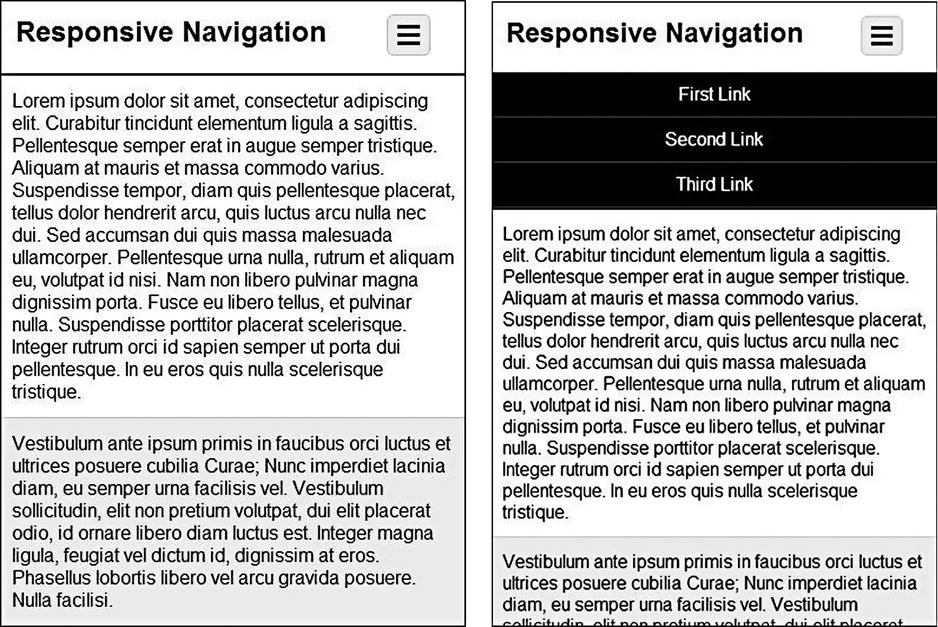
Figure 4-7. An accordion-style menu
<div id="content">
  <header>
    <h1>Responsive Navigation</h1>
    <div id="menuLink">
      <span class="menuBarGroup">
        <span class="menuBar"></span>
        <span class="menuBar"></span>
        <span class="menuBar"></span>
      </span>
    </div>
  </header>
  <nav>
    <ul>
      <li><a href="#">First Link</a></li>
      <li><a href="#">Second Link</a></li>
      <li><a href="#">Third Link</a></li>
    </ul>
  </nav>
  <div id="primary">
    <p>Lorem ipsum dolor sit amet, consectetur adipiscing elit...</p>
  </div>
  <div id="secondary">
    <p>Vestibulum ante ipsum primis in faucibus orci luctus et...</p>
  </div>
</div>
This markup is a bit different than the markup above, most notably in the menuLink element. We will use this markup to create our menu icon. Our only JavaScript is this.
<script type="text/ecmascript">
  $(document).ready(function () {
    $('#menuLink').click(function () {
      $('nav').toggleClass('open'),
    });
  });
</script>
This adds a class to the nav element that we can use in our CSS. As for CSS, an image could have been used for the menu link, but a simple button can easily be created with just markup. This menuBarGroup is hidden by default, but when the screen is small enough, I show it.
@media screen and (max-width: 500px) {
  h1 {
    float: left;
    font-size: 1.5em;
    margin-bottom: 15px;
    max-width: 80%;
  }

  #menuLink {
    display: block;
    float: right;
    width: 40px;
  }

  .menuBarGroup {
    background-color: #eee;
    border: solid 1px #ccc;
    border-radius: 5px;
    display: block;
    overflow: auto;
    padding: 8px 8px 4px 8px;
    width: 19px;
  }

  .menuBar {
    background-color: #000;
    display: block;
    height: 3px;
    margin-bottom: 4px;
    width: 19px;
  }
}
To fit the menu link beside the heading, I float both the menuLink and h1 elements beside each other. This gives us a simple menu icon.
As for the menu itself, the styling looks like the following. (The lines in bold are those that create the transition effect.)
@media screen and (max-width: 500px) {

  nav {
    height: 0;
    overflow: hidden;
    -webkit-transition: all .5s ease;
    -moz-transition: all .5s ease;
    -o-transition: all .5s ease;
    transition: all .5s ease;
  }

  nav.open {
    height: auto;
    min-height:40px;
    max-height:400px;
  }
}
The styling for the list items is like that in the first example in the chapter. The only difference is how we are styling the containing nav element. When the screen is 500 pixels or less, by default, the nav element is given a height of 0, effectively hiding the menu items. When expanded, the height is changed to auto, which will size the nav by the actual height of all its child elements.
To create the animation of expanding/shrinking navigation, I used CSS3 transitions. To get this to work, the first obvious addition will be the rules for transitioning. All properties are transitioned (only height differs in this case, but in my experimentation using all here worked better due to buggy height transitioning, discussed a bit more below), the transition lasts for half a second and an “ease” timing function is used to determine how the intermediate steps in the animation are calculated. Appropriate browser-specific prefixes are used to target older devices/browsers that may not implement the final, non-prefixed standard notation. One is not included for Internet Explorer because you either have transition (IE 10) or you don’t (< IE 10), so a prefix would bring no benefit. Browsers that do not support transitions will simply snap the menu open and closed as the open class is added/removed from the nav element, giving you good backward compatibility. For more information on CSS transitions, see Chapter 9, “Native APIs, HTML5 and CSS3 on Mobile Today”.
The remaining CSS in bold above is required, but its function is probably not obvious to most. First, an overflow of hidden is set on the nav element because otherwise a scrollbar appears in the element as the animation progresses. After all, the content will not fit in the containing element at first because there isn’t enough room, so a desktop browser will by default add a scrollbar. Hiding the overflow solves this problem.
Second, you cannot animate height from 0 to auto. You can either animate to a set height (which means you need to pay close attention to the actual height of the navigation and when it changes, update the CSS) or you can set a min- and max-height value, in which case the transition will work. But even this is tricky. When the open class is added to the nav, the animation will move forward. When the class is removed, it will move backward. In the backward animation, it will start at the min-height and animate from there. This is only very noticeable when the min-height is significantly smaller than the actual size of the element. So it is best to set the min-height close to the actual height and the max-height close to the actual height, which is only slightly less work than actually figuring out the exact pixel height of the nav element. It is your choice how you want to handle the animation as both work. Alternatively, you could handle the animation entirely with JavaScript.
Creating Off-Canvas Flyout Navigation
Our last pattern hides the navigation off-screen. Facebook and Google popularized this pattern on their mobile sites, though their implementations are not responsive. Figure 4-8 shows what Facebook’s looks like:
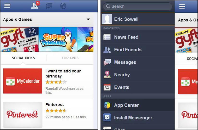
Figure 4-8. Facebook’s off-canvas navigation
Our implementation will be responsive (of course). Since we are using old but well-supported CSS tricks for layout, this implementation works for all our targeted devices. The basic idea behind this pattern is that the menu is hidden, but it slides into place whenever the user clicks on the navigation button. When the menu slides into place, the content slides off the right-hand side of the screen. If the navigation button is clicked a second time, the menu slides back off and the content resumes its normal position. Sound easy? Figure 4-9 shows what our final result will look like.
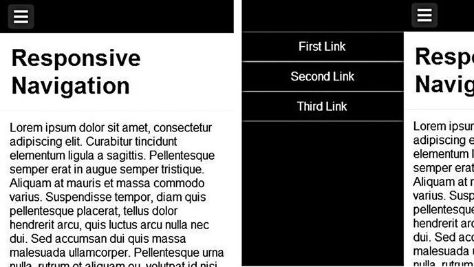
Figure 4-9. Implementing off-canvas navigation
Our HTML has to be a little different than the markup we had before, so here it is:
<div class="pageWrapper">
  <div class="contentWrapper">
    <div id="menuLink">
      <span class="menuBarGroup">
        <span class="menuBar"></span>
        <span class="menuBar"></span>
        <span class="menuBar"></span>
      </span>
    </div>
    <header>
      <h1>Responsive Navigation</h1>
    </header>
    <nav>
      <ul>
        <li><a href="#">First Link</a></li>
        <li><a href="#">Second Link</a></li>
        <li><a href="#">Third Link</a></li>
        <li><a href="#">Fourth Link</a></li>
      </ul>
    </nav>
    <div class="content">
      <div class="primary">
        <p>Lorem ipsum dolor sit amet, consectetur adipiscing elit...</p>
      </div>
      <div class="secondary">
        <p>Vestibulum ante ipsum primis in faucibus orci luctus et...</p>
      </div>
    </div>
  </div>
</div>
The important addition is highlighted. I’ll explain why we need this extra containing div shortly. Note that the nav is nested within contentWrapper. As for the JavaScript, it’s just like as in the previous sample.
<script type="text/ecmascript">
  $(document).ready(function () {
    $('#menuLink').click(function () {
      $('body').toggleClass('open'),
    });
  });
</script>
The CSS for general formatting is similar to that above, so we will only concern ourselves with the new styling.
@media screen and (max-width: 400px) {

  nav {
    background-color: #000;
    height: 100%;
    position: absolute;
    top: 0;
    left: -70%;
    width: 70%;
  }

  nav ul {
    margin-top: 45px;
  }

  nav li {
    border-right: none;
    border-bottom: solid 1px #777;
    border-top: solid 1px #777;
    float: none;
    padding: 10px 0;
    text-align: center;
    width: 100%;
  }

  .contentWrapper {
    -webkit-transition: all .5s ease;
    transition: all .5s ease;
    position: relative;
  }
}
First let’s discuss the styling relevant before the user clicks the button. The nav element is positioned absolutely, left 70 percent of the width of the screen. Since the nav element is also 70 percent in width, this hides it just off the screen. The styling for the ul and li is important to how things look but not important for the core layout, so we can skip discussing that. To open up the navigation, a class is added to the body, at which point the following is relevant.
@media screen and (max-width: 400px) {

  .open .contentWrapper {
    left: 70%;
  }

  .pageWrapper {
    overflow-x: hidden;
  }
}
At this point the contentWrapper element slides over from the left 70 percent. The nav element, which is already positioned 70 percent left of the contentWrapper, now slides into view. If you’ve been keeping track of the math, at this point the nav plus contentWrapper is actually 140 percent the width of the device. Unless we do something the page will now have scrollbars if it’s on a desktop browser. If on a mobile browser, the page can now be wiggled (technical terminology) left and right. To solve this problem we have the pageWrapper element whose overflow-x value is set to hidden, which allows the contentWrapper to slide to the right without affecting actual page width. Note that -x must be specified, since we want the user to be able to scroll down the screen.
This responsive navigation technique can also benefit from some CSS transitions, so this was added to the contentWrapper. The simple transition declaration will animate the move from left: 0 to left: 70 percent for devices that support transitions. For those that do not, the element will snap into place and the transition statements are ignored.
Summary
We have now covered five different flexible and responsive navigation solutions. There are more patterns to follow, and new ones are being pioneered all the time. You can see that the techniques involved are not much different than what we used to create flexible layouts, which is a good thing. Now it is time to deal with content. If the layout and navigation are flexible, the content has to be flexible as well.