
The Basics of Responsive Web Design
In April of 2000, John Allsopp wrote an article entitled “A Dao of Web Design” on the website A List Apart [http://alistapart.com/article/dao]. The article essentially poses the following question: Do you try to control the naturally fluid medium of the web and the variety of ways people access it? Or do you treat this natural fluidity as a strength rather than as a weakness? John’s answer is simple: “Make pages which are adaptable.” In many ways this is a more difficult approach to building sites for the Web. There are advantages to starting with a fixed-layout size for a page, otherwise the approach would not be so popular. But the big problem with this fixed and non-adaptive approach is that the site ends up working really well for one type of device and not particularly well for any other. Have a website designed to work on a 1024x768 display? If that layout is fixed at that width, you have created a good experience only for the desktop user. This is not adapting. This is not designing for flexibility, but it has been the norm since few were trying to target anything other than the lowest-common-denominator desktop experience.
Fast forward a decade to May of 2010, to an article written by Ethan Marcotte entitled “Responsive Web Design.” Marcotte accepted Allsopp’s approach and outlined the main ideas behind what is now called “responsive web design.” The basic idea is that you use fluid layouts, flexible images, and media queries to design a page in such a way that it responds to its viewer and how they are viewing the site: in short, you want to “design for the ebb and flow of things” [http://alistapart.com/article/responsive-web-design]. You don’t have separate designs for mobile phones, desktops, and tablets, or yet another for large-screen displays like TVs. You design in such a way that it is flexible enough for all; and you do it with techniques that already have wide browser support.
Since May of 2010, responsive web design has taken much of the web development community by storm. This adoption has been especially high for doing mobile web development. The principles of responsive web design give you a great tool for designing sites that work across a wide range of modern phones and tablets. Here are some examples:
- We have two sizes for iPhone now as of the release of the iPhone 5 (same width but different height).
- There are a variety of phone sizes with Android.
- We have one phone size with Windows Phone 7 but a couple of sizes for Windows Phone 8.
- There are many different sizes of Android tablets.
- The Kindle Fire is now in several different sizes and resolutions.
- The iPad now comes in two sizes (same CSS pixel resolution but different physical sizes and pixel densities).
- Windows 8 has no specific constraints on display, so there will be a lot of variety; and the browser in tablet mode has both a full-screen and a small-screen “snapped mode” for viewing web pages.
- Devices for both Ubuntu and Firefox OS have been announced, though it remains to be seen what range of devices they will support.
Go ahead and get fixed-size sites working on all those devices and try to keep your sanity. Or, instead, take an approach that embraces the fluidity of it all and uses this fluidity as a strength instead of a weakness. Even though responsive web design is not a mobile technique specifically, it works great for mobile technology anyway.
The techniques found in responsive web design are also future-friendly, since adoption of the technical bits is standardized and/or universally supported in recent browsers. For older browsers different techniques will have to be used, which is part of the focus of Chapter 6. But most people who want to create mobile websites focus on modern mobile browsers, in particular both Android and iPhone, since they are the undisputed dominant phones in the smartphone market today. So we will start there. This same approach will also work well on some other devices, like the Windows Phone 7.5 and 8, Blackberry 10, Firefox OS, and other mobile browsers like Opera and Firefox mobile.
This first chapter will give you an overview of responsive web design. In chapters 3 through 5 we will dive deep into the main ideas and look at a lot of examples. Even though the web design community is constantly coming out with new techniques and new standards are being implemented that would make being responsive easier (note the picture element draft, http://www.w3.org/TR/2013/WD-html-picture-element-20130226/), responsive web design is a very practical technique that can be used now. Working through examples will make the principles more clear as we see them used and will allow us to discuss ideas techniques can be used on a wide range of projects today.
Is This for Developers?
So who is this book for, web designers or developers? Given the start of the chapter, you would be excused in thinking that this was a chapter for designers; however, this is not the case. I am a developer, not a web designer, and I can assure you this material is for developers. The topic of web design is much greater than responsive web design. The technique is for making sites work across a wide range of displays and is not meant to encompass all that is web design. I will not be talking about many design ideas like color theory because I’m not qualified to do so, nor is it even necessary. We will be talking about typography, but only to the extent that it’s necessary to talk about flexible sizing. We will not be talking about composition, proportion, and visual hierarchies. In other words, this book is not here to turn you into a designer. You are a developer, and it is okay if you stay that way.
But if you are a web developer, the web is your medium and your canvas; so it is valuable for you to understand how it works and what it is capable of. HTML and CSS do not belong to the designer. They are there for both web developers and web designers. In many cases, developing a more thorough knowledge of your medium is not a luxury but a necessity. At my place of employment, our designers are not web developers. We get Photoshop documents to work from. If the design has to work across multiple devices, the developers have to make that happen, not the designers. Many of you will be in the same position.
So you could say that this is a discussion of the mechanics of web design. If you are a web developer, you should know how to implement a three-column design in CSS without using tables, even if you don’t have the design knowledge to navigate through all the design choices involved. Making those decisions might be someone else’s job, and that’s okay.
This chapter introduces you to the main ideas of responsive web design and how you can use that to make your design (or someone else’s) work across a variety of screen sizes. We have a sample site that we’ll use to work through some of the issues in making the design work across desktop devices and scaled down to fit nicely on common mobile devices. If you find all this discussion of floats, margins, paddings, borders, and such difficult (as many web developers do), Chapter 2 is for you. So feel free to skip ahead, but come back if you get confused.
As a bonus, understanding how responsive web design works might just make you a designer’s best friend. I often wonder how many eyes glaze over when web designers start talking to developers about responsive web design. Don’t be that kind of developer. Embrace your medium, and give your web designer a virtual hug.
Getting Started
Responsive web design centers around three primary ideas: flexible layouts, flexible content, and media queries. The big idea is that you can use the same HTML and CSS for both desktop and mobile browsers. In developer terms, this is like the DRY (Don’t Repeat Yourself) principle in code. Mobile websites are often completely different sites than their desktop counterparts, which means everything is generally created twice. Responsive web design helps you stay DRY, making it easier to share the code, even if the “code” in this case is primarily HTML and CSS. Flexible layouts make it easier to organize the page for different sizes of device. Following flexible content practices allows the content of your site to work on multiple devices. Media queries allow you to target particular sizes and apply changes.
To see how this would work, let’s jump into our sample site. As of the writing of this chapter, Apress does not have a responsive site, so we will create a responsive version of their home page. As with the other samples in this book, the source code for the sample site can be downloaded from the Apress website.
This chapter will focus on making this one page an introduction to responsive web design. The next four chapters will explain the ideas more fully and provide many more samples.
Losing that Fixed Fixation
So let’s start with the home page of the site, which looks like Figure 1-1, on the left, in a desktop browser. It features a header with a horizontal menu, a large content block at the top, four columns below, and a footer. When viewed on an iPhone, the header image and text stays the same, but the menu is morphed into a centered, vertical list since it’s too wide to fit on a phone. The content in the large content block below the header shifts so that it can all fit on the screen. The four-column area adapts to the device size and collapses down to a single column. The footer itself has content broken into four columns, so we collapse the content down to a single column just as we did above.
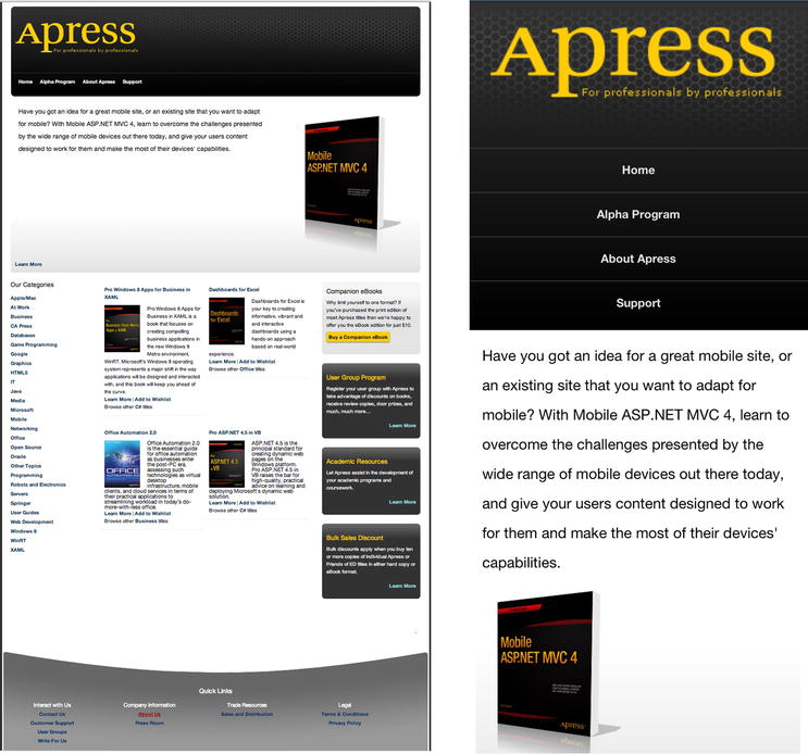
Figure 1-1. Sample site. On the left is a screenshot from Chrome on the desktop at full screen. On the right are several screenshots from an iPhone 5 combined to show how it would look on a mobile device
You can contrast this by looking at the current Apress site on a smartphone. There is no adaptation. Rather, the page is shrunk down so that it all fits in the screen, and you have to pinch and zoom to find what you need. It is functional, but a better approach would be to do what we are doing in our example site: adapt to the user’s device and give them something easy to read and use.
The markup for the page is fairly simple, but there is a lot of it, so we’ll take it a section at a time.
<!DOCTYPE html>
<html>
<head>
  <title>A Responsive Apress</title>
  <!—this tag is very important and will be explained at the end of the chapter -->
  <meta name="viewport" content="width=device-width" />
</head>
<body>
  <div class="page">
    <div class="header">
      <h1>apress</h1>
      <h2>For professionals by professionals</h2>

      <ul class="nav">
        <li class="nav-item"><a href="/">Home</a></li>
        <li class="nav-item"><a href="/">Alpha Program</a></li>
        <li class="nav-item"><a href="/">About Apress</a></li>
        <li class="nav-item"><a href="/">Support</a></li>
      </ul>
    </div>

    <!-- the page content goes here -->

  </div>
</body>
</html>
First of all, like the live Apress site, we want to set a maximum width on the main section of the site. We will start by thinking inflexibly (we’ll change this below) and set the width of our content wrapper to 960 pixels and center it all horizontally. Here is our CSS for that:
.page {
  margin: 0 auto;
  width: 960px;
}
Why 960 pixels? The smallest common resolution for desktop monitors these days is still 1024x768. The number 960 is good because it’s less than the maximum of 1024 pixels in width and allows for the browser border and scrollbar, when visible. It’s also easily divisible, making calculations for column widths easy, since 960 is divided evenly by 2, 3, 4, 6, 8, 10, 12, and 16 (layout will be discussed further in Chapter 3). So 960 pixels is a great starting place for a fixed-width site.
Now on to the header. The only part of this section that most people would find tricky is the menu. The old-school way to lay this out would be to use an HTML table. Though this would “work” for a desktop browser, this approach is very inflexible. If you want to change the layout according to the screen size, you’ve now trapped yourself. By using a table, you make the layout a bit easier but only for one screen size. The savvier web developer would use a list and CSS floats to make the list lay out horizontally (with all non-layout-related styling removed).
/*
  I also use a CSS reset (not listed here). If you aren’t familiar with those, I recommend checking out
  http://meyerweb.com/eric/tools/css/reset/or check out Chapter 2.
*/

.nav {
  overflow: hidden;
}

.nav li {
  float: left;
  margin-left: 17px;
}
The overflow value on the “nav” section keeps the size of the element from collapsing to zero, and the float applied to the list items causes them to stack to the right of the one above, with a little margin to keep them from bunching up together. For those who aren’t familiar with either of these techniques, both will be discussed at length in Chapter 2.
Following the header is the main content area, which is made up of four sections. The first is the featured book, which has only a paragraph description, an image, and a link. The image is floated to the right (something we will change later), but this section poses nothing complex.
<div class="featured-book">
  <p class="description">Have you got an idea for a great mobile site, or an existing site...</p>
  <img src="/content/responsivebasics/my-book-cover.png" />
  <p class="learn-more"><a href="http://www.apress.com/9781430250562">Learn More</a></p>
</div>
The next section is the list of links that constitutes “Our Categories” on the left side of the page. The layout of the list is not changed, but the whole section plays a part in the four-column layout that organizes this part of the page.
<div class="our-categories">
  <h2>Our Categories</h2>
  <ol>
    <li><a href="http://www.apress.com/apple-mac">Apple/Mac</a></li>
    <li><a href="http://www.apress.com/at-work">At Work</a></li>
    <li><a href="http://www.apress.com/business">Business</a></li>
    <!-- more links -->
  </ol>
</div>
The next section, which has two of the four columns, has markup like the following:
<div class="products">
  <ul>

    <li class="product-item">
      <p class="product-name"><a href="http://www.apress.com/9781430243984">Pro Windows 8 Apps ...</a></p>
        <!-- other info -->
        <p>Browse other <a href="http://www.apress.com/microsoft/c">C#</a> titles</p>
      </div>
    </li>

    <li class="product-item">
      <p class="product-name"><a href="http://www.apress.com/9781430249443" title="Dashboards...</a></p>
        <!-- other info -->
        <p>Browse other <a href="http://www.apress.com/office/office">Office</a> titles</p>
      </div>
    </li>
    <!-- two more items -->

  </ul>
</div>
These items will be arranged into two of our four columns, the two columns in the middle. Finally we have our rightmost column of content, which contains secondary, somewhat miscellaneous bits of information.
<div class="secondary">
  <div class="secondary-item">
    <h2>Companion eBooks</h2>
    <p>Why limit yourself to one format? If you’ve purchased the print edition of most Apress titles....</p>
    <p class="more"><a href="http://www.apress.com/companion/customer/view/">Buy a Companion eBook</a></p>

  </div>

  <!-- more items -->
</div>
So how would we arrange these into four columns? We would take our total allowable width (960 pixels, which we set above), divide that width into sizes appropriate for our three sections, and float them. In other words, it could look a lot like this:
.our-categories {
  float: left;
  padding: 0 25px;
  width: 150px;
  /* total width with padding, 200px */
}

.products {
  float: left;
  padding: 0 20px;
  width: 480px;
  /* total width with padding, 520px */
}

.secondary {
  float: left;
  width: 240px;
  /* total width, 240px */
}
Each section is floated left and the total width of the sections is 960 pixels, so the three sections line up side by side. For those not comfortable with CSS layouts using floats, Chapter 2 will explain how all of this works in detail. With the CSS above, we would see Figure 1-2.
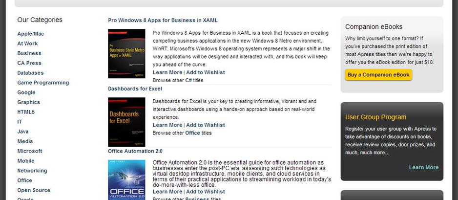
Figure 1-2. Three-column layout
Next we need to arrange the product items in the middle section so that they form two columns. To implement this, we follow a similar procedure and set the width of the items and float them. The CSS below does this nicely.
.product-item {
  float: left;
  margin: 10px 10px;
  width: 220px;
}
After we implement these CSS changes, we get what we want: the four-column layout in Figure 1-3.
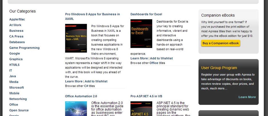
Figure 1-3. Four-column layout
Our last section is the footer, which is a four-column nested list of links. We will use the same techniques as above and float these lists.
<div class="footer">
<h2>Quick Links</h2>
<ul>
<li>Interact with Us
<ul>
<li><a href="#">Contact Us</a></li>
<li><a href="#">Customer Support</a></li>
<li><a href="#">User Groups</a></li>
<li><a href="#">Write For Us</a></li>
</ul>
</li>
<li>Company Information
<ul>
<li><a href="#">About Us</a></li>
<li><a href="#">Press Room</a></li>
</ul>
</li>
<li>Trade Resources
<ul>
<li><a href="#">Sales and Distribution</a></li>
</ul>
</li>
<li>Legal
<ul>
<li><a href="#">Terms & Conditions</a></li>
<li><a href="#">Privacy Policy</a></li>
</ul>
</li>
</ul>
</div>
As you can see from the markup, each “column” is a list item, a direct descendent of the uppermost unordered list element, so we will target these elements. The footer’s width is not the expected 960 pixels in width but 956 pixels in width so that the background image can be sized to be just inside the total width of the content. But not to worry, since 956 is divisible by four.
.footer > ul > li {
  float: left;
  line-height: 20px;
  width: 239px;
}
This gives us what we see in Figure 1-4, our footer.
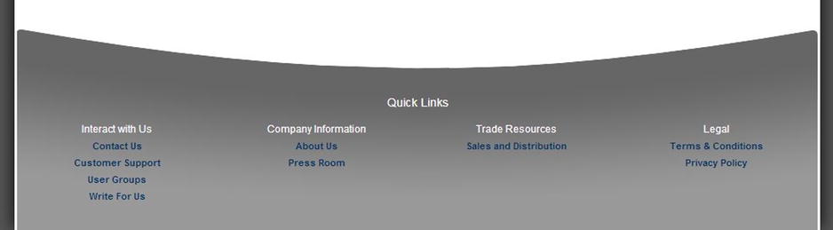
Figure 1-4. The footer, laid out as four columns
The problem is that a fixed layout like you see above, whether it uses HTML tables for layout or not, works poorly on small devices. We need a better way to handle both desktop browsers and smaller mobile device browsers: the solution is to stop thinking in terms of fixed sizes. Fixed sizes are nice because they give you a consistent palette for your layout and design. This makes it easier to create a site design for a particular size browser but makes it harder to design for every other size. So instead of fearing the variability, learn to embrace it. Think of the browser’s flexibility to render at different sizes and take advantage of that. This is what responsive design is about.
A Flexible Layout
So let’s apply responsive principles to make this page more flexible. Instead of a fixed width for the container and the various content sections, we will set a maximum width for the container and percentages for the columns.
.page {
  margin: 0 auto;
  max-width: 960px;
}

.our-categories {
  float: left;
  padding: 0 2%;
  width: 16%;
}

.products {
  float: left;
  padding: 0 2%;
  width: 46%;
}

.product-item {
  float: left;
  padding: 2%;
  width: 46%;
}

.secondary {
  float: left;
  width: 25%;
}

.footer > ul > li {
  float: left;
  width: 23%;
}
Now if you were to view the site in your browser and change the size lower than 960px, you would see the page flexibly scale down to fit the new size and back up again if the browser window is made wider. This is handy. Text on the web is inherently flexible unless we purposefully constrain it, like we were doing before. Now we let the text change and flow with the size of their containing DOM elements.
Flexible Content
Though text is flexible on the web by default, images are a bit more problematic. On this page there is one image we need to deal with so that it works well on both larger desktop monitors and smaller phone screens: the one in the header. In this particular case the image is too big for phones around 320 pixels in width, which includes many phones, most notably the iPhone. Viewing our site right now gives us this unsightly view in Figure 1-5.
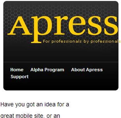
Figure 1-5. Inflexible image. Ouch!
With our new more flexible layout, we can see some problems with these if we change the browser window size.
Clearly, this will not do. The word “apress” is too close to the border of the background, and the yellow subheading juts out in a rather unfortunate manner. We also need to do something about the menu and the following text but that will come below. Fortunately, the fix for the image can be easily applied.
.header img {
   max-width: 95%;
}
And after reloading the browser, we are greeted with a much more pleasant sight!
So what is going on here? This image is contained within a div whose width is constrained by the size of the browser window. As the browser window size changes, the containing div changes and the image scales up or down to fit. In this case I use a maximum width of 95 percent, so it should fill all the space that it can; but if it’s too big to fit, it will scale down and leave a little buffer between it and its containing div. You could supply lower percentage values, and it would also work fine.
Flexible content is one of the most difficult things when implementing responsive web design. There will be much more to say about flexible images and other types of content in Chapter 5.
We have discussed two of the three elements of responsive web design, a flexible layout and flexible content. The last element, media queries, takes our flexibility to a whole new level. Our page is more flexible than it used to be, but we still have some issues. The most significant of these is the menu. The CSS for the menu is as follows:
.nav {
  border-top: solid 1px #333;
  overflow: hidden;
}

.nav li {
  float: left;
  margin-left: 17px;
}
In normal lists, items would stack vertically. The float: left bit changes that behavior and causes the list items to “float” up to the left, effectively making a vertical list go horizontal. This works great until the DOM element holding the list gets resized smaller than the width of all the list items combined. This will cause the last item to wrap, appearing on the next line. If the browser is sized smaller, another list item will wrap and so on. You can see this unsightly affect in Figure 1-6 above.
Figure 1-6. An image as flexible as its container
When an element in the site (whether it’s content or some structural/navigational piece like this menu) does not work well at given size, CSS media queries are a very useful tool. Media queries allow you to query the device context so you know what’s going on and can respond appropriately. By far the most common media query I use is the query for width, though you can query other properties like height, orientation, aspect ratio, and resolution. For this site, I’ll use a media query to see if the device has reached a certain breaking point; if it has, I’ll change the layout. In this case, my menu breaks around 425 pixels in width, so I’ll add a media query to change the menu from a horizontally stacking menu to a vertically stacking menu. The most important changes are in bold.
@media screen and (max-width: 425px) {

  .nav li {
    border-top: solid 1px #333;
    float: none;
    margin: 0;
    padding: 12px 0;
    text-align: center;
  }
}
The “media query” part of this is in the first line of that CSS. This query checks two things: first, it makes sure the media type is screen (as opposed to print, projection, braille, et al.), and then it checks that the screen is 425 pixels in width or lower. If either one of these is false (either you are printing something, for example, or the browser window is 426+ pixels wide), the CSS nested in the media query is ignored. But if both are true, the CSS nested in the media query is applied. The great thing about media queries is that the styling follows the normal rules of CSS and is additive when placed after the other styling rules. The previous CSS is still applied to the elements, so you only need to put in style rules that you want to add. For example, the padding for the .nav item is still the same as it was when it was set earlier in the style sheet. This can be assumed in the media query. These style rules can also override previous styles, as is the case for the float value for .nav .li. To change the list back to its normal, vertical-stacking behavior, the previous float needs to be turned off, and you do that by setting float: none.
 Note Media in CSS refers to how the document is to be presented. As web developers, we most commonly assume that the media we are targeting is the screen, but other media types include braile (for tactile feedback devices), projection (for viewing on a projector), and speech (used for speech synthesizers). To target all media types, “all” can be used. Since responsive web design is primarily a visual technique, we will be focusing on the screen.
Another place on this page that media queries can be used effectively is with the multi-column section at the bottom of the page. Though we have made our layout and our content flexible and everything can be scaled down, at a certain point the scaling becomes too great and readability is compromised (and doesn’t look good, either). In this case, removing the columns and going for a single-column approach for the bottom pieces makes sense around the 600-pixel mark, so I added this media query to override the previous CSS and add some styling to make things better in this resolution.
CSS media query to turn the three-column layout into a single-column layout
@media screen and (max-width: 600px) {
  .featured-book .description {
    float: none;
    width: 96%;
  }

  .featured-book img {
    float: none;
  }

  .our-categories li {
    width: 50%;
  }

  .products {
    float: none;
    width: 96%;
  }

  .product-item {
    float: none;
    width: 90%;
  }

  .secondary {
    width: 100%;
  }

  .secondary-item {
    border-radius: 0;
    width: 92%;
  }

  .footer > ul > li {
    float: none;
    width: 100%;
  }
}
Media queries give you a lot of power because any CSS can be put in a media query. And because any CSS can be put in a media query, you can use media queries to make slight changes to a design or radically change the entire look and feel of a site (though this is usually not a good idea). But you can. Media queries give you tremendous capabilities for tailoring a site’s design or layout to a particular screen size.
The Viewport Meta Tag
The last basic thing you need for doing responsive design for mobile is to add a viewport meta tag. The term “viewport” refers to the size of the screen that is viewing the page. In very basic terms, the viewport meta tag tells the device how to render the site with respect to the screen size of the device. As was said above, responsive design isn’t just an approach for developing for mobile, but it is useful for handling a wide range of screens. But for mobile, you almost always want a viewport meta tag. Here are several samples.
<meta name="viewport" content="width=device-width" />
<meta name="viewport" content="width=device-width, initial-scale=1" />
<meta name="viewport" content="width=device-width, initial-scale=1, minimum-scale=1, maximum-scale=1" />
<meta name="viewport" content="width=device-width, initial-scale=1, user-scalable=no" />
Though the term “viewport” and how it is relevant for defining web standards predates the iPhone, Apple introduced this meta tag to control the viewport on the iPhone. The other mobile browsers have followed, and it seems to have universal support in modern mobile browsers. After enough browsers adopted the tag, it was standardized by the W3C and should be considered standard practice in your mobile development work. Let’s take our sample site above and how it fares in actual mobile browsers both with and without the viewport tag, as well as with various options set.
This first screenshot is of the site if it has no viewport tag, whether we are using a fixed-width design (like an explicit width: 960px as we had before) or a responsive design. Why it works this way is an interesting question. Let’s start by defining the term “viewport.” The viewport for a page is the area visible to the user in the browser. If you take a wide, fixed-width site and view it in a mobile browser, your viewport will be just a small window into the total page when zoomed in like the second view in Figure 1-7. If zoomed out, it may look like the first view in Figure 1-7. Because the site has a fixed width, the content size cannot be changed; only your zoom level can change. So the viewport, or the viewable area, can differ from the total area the page can take up.
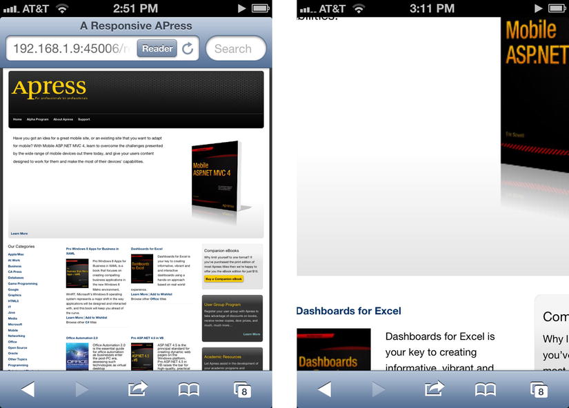
Figure 1-7. Our mobile site without a viewport meta tag, default view, and zoomed in
The strange thing is that a responsive design that can be resized will not be resized if there is no viewport meta tag. Why? When Apple launched the iPhone with its browser, they couldn’t assume that lots of websites would scale down. Actually, you would assume the opposite. So instead of automatically scaling the viewport down to 320 pixels in width, they instead defaulted to showing things at a width of 980 pixels. As mentioned above, that’s right around the popular desktop resolution that web designers generally target. This is why a responsive website without a viewport meta tag is treated as if the width is 980 pixels, even though the site can support the smaller size.
So if the mobile browsers assume a width slightly under 1,000 pixels (it varies somewhat), how do you tell the browser to not behave that way? You use the viewport meta tag. Take the following meta tag for example:
<meta name="viewport" content="width=device-width" />
The setting tells the viewport that the width of the browser should be the width of the device, not the default width of the browser. If you are using an iPhone, the device width is 320 pixels, so any of the media queries that get applied at sizes down to 320 pixels will be applied. In the examples above there are three max-width media queries for 425, 600, and 800 pixels respectively in our sample site above. All three would be applied because the iPhone’s size in portrait orientation is smaller than both. In Figure 1-8 we see our site with the media query applied. As you can see, it is what we want. This is why I said above that the viewport meta tag is something you almost always want to set when developing for mobile. Without it our responsive CSS above would have been for naught.
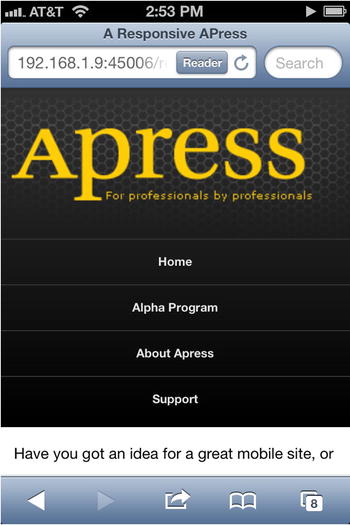
Figure 1-8. Our responsive site with our viewport meta tag
Let’s try another one of our sample viewport tags.
<meta name="viewport" content="width=device-width, initial-scale=2" />
Notice the value of two in the initial scale setting. This viewport yields the result we see in Figure 1-9.
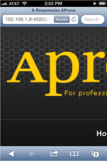
Figure 1-9. Our site with a viewport meta tag with a zoom value of two applied
In this case the site is set to be of the proper width (the device width) but the initial view is zoomed by a factor of two. Though this is not something most will want to do, it’s an option for those who need it.
The last options I want to talk about are these two variations of the viewport meta tag.
<meta name="viewport" content="width=device-width, initial-scale=1, minimum-scale=1, maximum-scale=1" />
<meta name="viewport" content="width=device-width, initial-scale=1, user-scalable=no" />
These two viewport tags are functionally equivalent. From a visual standpoint, either one will give you the same view of the site in Figure 1-8. The difference is that these settings disallow zooming. As a general rule this should be discouraged because it creates potential usability problems (those with poor eyesight cannot zoom in to view the text if it’s too small), but there may be cases where it makes sense. One positive side effect is that some browsers will remove the 300ms delay on the browser click event with this viewport setting. For more information on why mobile browsers act that way, see Chapter 10 on programming for touch. But just in case you need to disable zoom, this is an option you can set in the viewport meta tag.
Though viewport meta tags and media queries have great support on iPhone and Android devices, this does not mean they always work the same. Question: what should happen when you switch a phone to landscape mode? The answer is different between iOS and Android. Let’s assume we have the following media queries:
@media screen and (max-width: 400px) {
  /* css for our first media query */
}

@media screen and (max-width: 500px) {
  /* css for our second media query*/
}
Assuming your Android device is the same screen size as the iPhone 4S (320 pixels wide, 480 pixels tall), only one of our media queries above gets triggered in landscape mode, the second media query. It has a max-width check of 500 pixels, and since the screen is less than 500 pixels in width, this media query kicks in. But the media query set at 400 pixels max-width does not kick in because the width is now 480 pixels. This is also the behavior on Windows Phone and Firefox OS.
For iOS, if the page has either of the first two viewport meta tags and you view the page in landscape, both media queries will be applied. If an iPhone 4S is used, the width should be 480 pixels, and one of the media queries should be applied. If an iPhone 5 is used, the width should be 568 pixels, and neither of the media queries should be applied because the viewport is wider than our largest max-width media query. But in both cases, both media queries are applied and the page is zoomed to show exactly the same width of page as when in portrait orientation. It’s almost as if the device is acting like it is 320 pixels wide. And that is exactly what is going on. If you put the following script in the page with a media query tag that only specifies width (like the first one we discussed above), you see that the inner width of the browser is actually 320 pixels wide.
How to get the inner width of the window with JavaScript
<script type="text/javascript">
  window.addEventListener('resize', function () {
    console.log('inner width', window.innerWidth);
  });
</script>
So that’s why both media queries are applied. But if you set the minimum and maximum scaling to one in a viewport meta tag, iOS begins to behave like Android. In other words, add this:
<meta name="viewport" content="width=device-width, initial-scale=1, minimum-scale=1, maximum-scale=1" />
So if it is important for your site to make iOS behave like Android, you will need to turn off scaling. Note that setting “user-scalable=no” does not have the same effect as setting the scale values.
Retina Screens
You might be wondering about the iPhone retina screens. With the iPhone 4, Apple doubled the resolution of the iPhone. Previously, it was 320x480 in resolution. Retina screens are 640x960 on the iPhone 4 and iPhone 4S, and 640x1136 on the iPhone 5. Do we need to have separate media queries for these widths? Fortunately, no (in most cases).
For these retina screens, you actually need to think in terms of device pixels versus CSS pixels. Device pixels refer to how many are actually on the screen. Retina screens in portrait orientation are 640 device pixels wide. However, as far as CSS is concerned, the screen is 320 pixels in width. This is fantastic, because media queries for width will work the same on screens of different pixel densities. And if they hadn’t implemented the retina screens in this way, all sites that were previously targeting 320 pixels in width would suddenly be half the size on the new phones. So making retina screens behave in this manner was important.
Though this is generally a desirable behavior, there are scenarios where you do want to pay attention to different pixel densities. Ever since the iPhone 4 was released, the retina screen has been both praised for its awesomeness and caused angst because most images for the web were not prepared for the 326 ppi displays of the new devices. This is why many images still look fuzzy on them. Even though this is a problem easily solved, it is not easily solved well. There are ways of querying the pixel ratio of the device though there are inconsistencies in the browsers. This will be discussed in Chapter 5 in more detail. That is the first scenario.
The second scenario relates to text size. Let’s compare the third generation iPad (9.7 inch display, 2048x1536 resolution, 264 ppi) and the iPad mini (7.9 inch display, 1024x768 resolution, 163 ppi). In the case of the larger iPad, even though it has a resolution of 2048x1536, it is 1024x768 in CSS pixels, so the two devices will respond to all the exact same width-based media queries. This also means that text for both will be sized the same as far as CSS is concerned but will actually be smaller on the iPad mini because the screen is smaller. Unfortunately, this means small text will be even smaller, so you might have readability problems on the iPad mini.
Both of these scenarios can be handled. In Chapter 5 you will learn more about making your content work across different screen resolutions and pixel densities.
Summary
Responsive web design is a great technique for giving you flexibility in the browser. This approach is built on three key ideas: flexible layouts, flexible content, and CSS media queries. The great thing about it is that it gives you a relatively easy way to handle different display sizes: from the browser on an iPhone up to the browser in a widescreen HD TV.
But the approach is not without its weaknesses. For example, responsive non-textual content can be problematic, and there are differing ideas on the best way to solve this. Displaying tabular data on smaller devices can also be difficult. These problems and others will be discussed in chapters 3, 4, and 5. Responsive design also does not help you with older phones, so you will need some sort of adaptive rendering approach, which will be discussed in Chapter 6. But for modern browsers, desktop and mobile, it’s a fantastic tool for creating sites.
One thing that many developers will find difficult with responsive design is that it’s absolutely necessary to drop those old table-based layout patterns that the web development world used to follow. They are simply not flexible enough. But many do not understand float-based positioning and often abandon that approach after frustration sets in. Fortunately, learning how to do layout using floats is pretty easy once you have a few ideas. And this is the topic we now turn to.