
This book has thus far been about the skills you need to do mobile well without libraries (most of the time). This was intentionally done because we will always be better developers if we understand our medium well, even if we eventually decide to use libraries to make developing in that medium easier. But we’ve covered the basics, and it’s time to start talking about some tools you can use.
The first part of the book was dedicated to responsive web design, so it only makes sense to start with the same subject here. Here are a number of useful libraries to help our websites be more responsive.
Bootstrap [http://getbootstrap.com/] is a flexible, responsive framework for quickly building responsive websites. A few of the templates in Visual Studio 2012 were responsive but didn’t use any particular responsive library. In Visual Studio 2013 Microsoft switched the default MVC template to use Bootstrap 3.0. You get this by first creating a new project as you see in Figure 12-1.

Figure 12-1. The new web project dialog in Visual Studio 2013
Once “ASP.NET Web Application” is chosen, a new dialog appears, shown in Figure 12-2, that lets you specify how the project is set up.

Figure 12-2. If this option is chosen, a new ASP.NET MVC project using Bootstrap will be created
This project comes with bootstrap pre-installed and integrated into the template. Bootstrap makes it easy to define a grid, create menus that collapse when the browser is narrow to preserve space, gives you standard sets of styles you can use, allows you to hide/show sections of a page depending on screen size and more. Here in Figure 12-3 is what the default template with Bootstrap looks like.
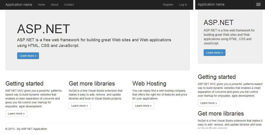
Figure 12-3. The default ASP.NET MVC template with Bootstrap 3.0, large and small screen
Layout is done using a CSS-based 12-column grid system. The framework comes with four sizes (phone, tablet, monitor, and large monitor) and allows you to easily customize your layout grid to change at any of these sizes. Here is an example of a row of a grid layout that divides the page into three equal sections.
<div class="row">
  <divclass="col-lg-4">
    <h2>Heading</h2>
    <p>First column... </p>
  </div>
  <divclass="col-lg-4">
    <h2>Heading</h2>
    <p>Second column...</p>
  </div>
  <divclass="col-lg-4">
    <h2>Heading</h2>
    <p>Third column...</p>
  </div>
</div>
Bootstrap is easy to use and very popular. For those who want to get started quickly with a responsive framework, this is a good choice.
Another popular responsive framework is Zurb Foundation [http://foundation.zurb.com/]. It’s very similar to Bootstrap in many ways, and if you are shopping for a responsive framework, take a look at this one as well before deciding. Here is an example of some HTML with styling to create a two-column row over a four-column image grid.
<div class="row main-content">
  <div class="large-6 columns">
    <h2>Heading</h2>
    <p>Column 1</p>
  </div>
  <div class="large-6 columns">
    <h2>Heading</h2>
    <p>Column 2</p>
  </div>
</div>

<ul class="small-block-grid-2 large-block-grid-4">
  <li><img src="/content/images/dice_200.jpg" /></li>
  <li><img src="/content/images/ready_200.jpg" /></li>
  <li><img src="/content/images/greek_200.jpg" /></li>
  <li><img src="/content/images/bacon_200.jpg" /></li>
</ul>
Let’s leave the realm of larger responsive frameworks and start solving individual problems. Have you ever needed headline text to expand as the browser width expands? If so, FitText [http://fittextjs.com/] will come in handy. With FitText you only need to do this to get an element to a size relative to the size of the viewport:
$(document).ready(function () {
  $('h1').fitText();
});
As for what this would look like, take a look at Figure 12-4. Note that the screenshot on the right shows a wider viewport and the header grows correspondingly.
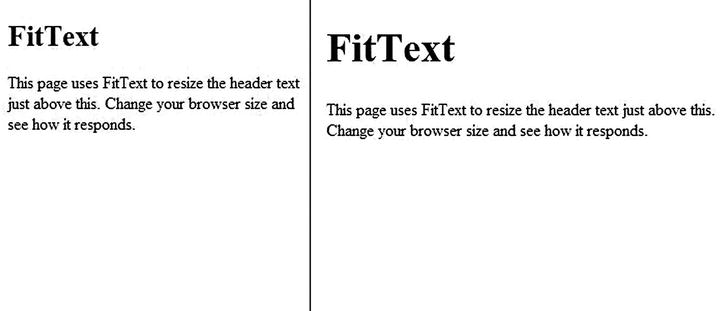
Figure 12-4. FitText applied to the header of this page
This can be quite a bit easier than using multiple media queries to tweak headers for various viewport sizes in your responsive implementation. But note that this is not even going to be needed in most cases since text is already flexible (as discussed in Chapter 5, “Flexible Content”). This is more for visual effect and aesthetics: but if that’s something you are looking for, this library could be useful for you.
FitText is for headline text but if you need something that is meant to work with body text, FlowType [http://simplefocus.com/flowtype/] is a good option. FlowType allows you to set minimum and maximum sizes and between those widths it will keep line-length pretty consistent. Once you include the library, this is how you would setup an element to use FlowType.
$(document).ready(function () {
  $('.main-content').flowtype({
    minimum: 500,
    maximum: 800
  });
});
Like with FitText, this can be an easier way to flexibly manage text sizes in your responsive sites. You can see an example of this in action in Figure 12-5.
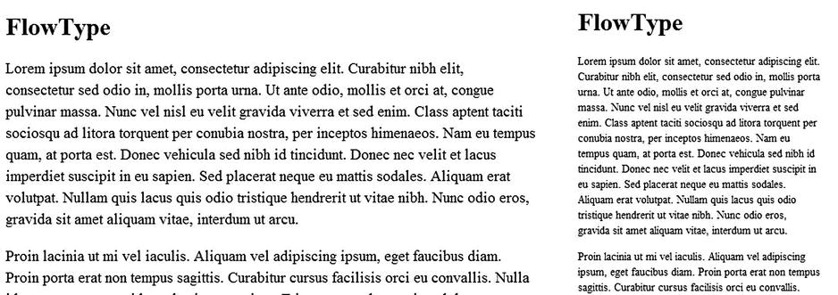
Figure 12-5. An example of using FlowType to increase text size as the screen size increases
CSS media queries are very handy, but sometimes you need to have media query support in your JavaScript, like when you need to have different client-side functionality given the screen size. There is a function named matchMedia on newer browsers that you can use to execute media queries in JavaScript, and this is very handy: but if I need to do this, I would rather use enquire.js [http://wicky.nillia.ms/enquire.js/] because I prefer the API over the raw matchMedia JavaScript API. I especially like its callback mechanism, which allows you to provide callbacks whenever a media query matches or becomes unmatched. The API looks like this:
window.addEventListener('load', load);

function load() {

  enquire.register("screen and (max-width:500px)", {

    match: function () {
      $.ajax({
        url: '/thirdpartylibraries/smallerlibraries/enquirecontent',
        success: function (content) {
          console.log('got this', content);
          $('#put-content-here').html(content);
        }
      });
    },

    unmatch: function () {
      $('#put-content-here').html(''),
    },

  });
}
In this sample the match function executes whenever the screen drops below 500 pixels in width and the unmatch function executes when it is 500 pixels in width or greater. Here I’m adding some content from the server when the page size drops below a certain value. That content could be an ad or a new widget. Or maybe you could enable/disable some functionality. Whatever your needs, if you need to execute some JavaScript when a page changes size, have a look at this.
What do you do if you need media query support in a browser that doesn’t support it (like IE 6-8)? You can complain about it on Twitter, or you can polyfill it with Respond [https://github.com/scottjehl/Respond] by Scott Jehl. Respond adds the functionality for min/max-width media queries to these older browsers (and more). The only requirement is that you add the respond JavaScript file.
PictureFill
Another very useful library is PictureFill [https://github.com/scottjehl/picturefill], also created by Scott Jehl. This library is a polyfill for the proposed picture element [http://www.w3.org/TR/2013/WD-html-picture-element-20130226/]. Using background images in responsive web design works pretty well without a polyfill. What responsive techniques don’t normally help with as elegantly are inline image tags. The picture element is designed to solve this problem, and you can use PictureFill to mimic it even though browsers don’t support it yet. For more information and an example, see Chapter 5.
The following libraries are useful for your mobile touch development. We had two chapters on touch development, so we know that creating good touch applications can be difficult. Hopefully these will help.
Swipeview [http://cubiq.org/swipeview] is a very fast and fluid swipe control. We use it for our mobile website at Match.com for our photo gallery as well as a few other features. Figure 12-6 shows a picture of what it looks like though that doesn’t do it justice. I would recommend trying it out on the live site.

Figure 12-6. Swipeview used for a photo gallery. Also, bacon
The only negative about Swipeview is that it doesn’t work on Windows Phone 8. If this is not a device you plan to support, I would strongly recommend using it.
When I’m not writing my own gnarly touch code and if I want gestures, I usually turn to hammer.js [http://eightmedia.github.io/hammer.js/]. Not only does it work well and works with both the touch event and the pointer event models, it also has a really awesome theme. And setting up gestures is a snap. Assuming you have a div on the page with an id of “touch-me”, this is all you need to set up some simple gestures.
$(document).ready(function () {
  $('#touch-me').hammer().on('tap', function () {
    $('#touch-me').text('tapped'),
  });

  $('#touch-me').hammer().on('swipeleft', function () {
    $('#touch-me').text('swiped left'),
  });

  $('#touch-me').hammer().on('swiperight', function () {
    $('#touch-me').text('swiped right'),
  });
});
This version uses jQuery, but they supply a version that is plain JavaScript.
In our touch chapters you probably noticed the differences between the Webkit/Gecko touch event model and Internet Explorer’s pointer events. In Chapter 11 I showed one example of how to normalize the event models. But what if we could just give other browsers pointer events? That is the purpose of Hand.js [http://handjs.codeplex.com/], a pointer event polyfill. If you include the hand.js library into a page, you can start using unprefixed pointer events like this:
window.addEventListener('load', load);

function load() {

  var tapMe = document.getElementById('tap-me'),

  tapMe.addEventListener('pointerdown', function () {
    tapMe.innerHTML = 'You have tapped using the pointerdown event.';
  });
}
This provides a nice alternative to handling the different events in your own code when it makes sense to do so, which is probably most of the time.
Device/Feature-Detection Libraries
The following two libraries are very useful for device and feature detection.
WURFL (Wireless Universal Resource File) is a project headed up by Scientia Mobile [http://www.scientiamobile.com/] and is a library and database combination for server-side device detection. It is as useful for older devices like feature phones as it is for our new smartphones. The most useful feature is that it does User Agent parsing and detection, though they gather bits of information about the devices. The drawbacks are that it always has to be updated, it costs money to keep it updated, and that it doesn’t tell you necessarily what the device can do. WURFL was described and put to use in Chapter 7, so see that chapter for more information.
Modernizr [http://modernizr.com/] is a library for doing client-side feature detection. While WURFL focuses on what the device is, Modernizr focuses on what the device can do by doing client-side sleuthing. In this respect Modernizr is much more future-friendly, in that the same feature-detections should continue to work as browsers advance while WURFL can go out of date. Modernizr was used in Chapter 7, so see that chapter for more information.
The other sections in this chapter examined special-purpose libraries and tools. The last libraries and tools we cover tend to be much more invasive to how you create your website, giving you guidance and delivering a wide variety of tools to help you along. These tools are also generally well tested on a wide range of devices, which is very valuable because cross-device debugging can be a large time and money investment.
jQuery Mobile [http://jquerymobile.com/] is not the mobile version of jQuery (as many probably assume when they first hear the name of the project) but as I described above, a framework for creating mobile web applications across a wide variety of devices. This is a description of the library description:
A unified, HTML5-based user interface systemfor all popular mobile device platforms, built on the rock-solid jQuery and jQuery UI foundation. Its lightweight code is built with progressive enhancement, and has a flexible, easily themeable design.
The sample app I created (which is a part of the downloadable source code) starts with a list page as can be seen in Figure 12-7.
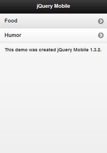
Figure 12-7. A simple list page using jQuery Mobile
Here is the markup that created everything above.
<div data-role="page" class="ui-page ui-body-c ui-page-panel ui-page-active"
  tabindex="0" style="min-height: 728px;">

  <div class="ui-panel-content-wrap ui-body-c ui-panel-animate ui-panel-content-wrap-closed">
    <div data-role="header" class="jqm-header ui-header ui-bar-a" role="banner">
      <h1 class="ui-title" role="heading" aria-level="1">jQuery Mobile</h1>
    </div>

    <div data-role="content" class="ui-content" role="main">
      <ul data-role="listview">
        <li><a href="/link/to/food">Food</a></li>
        <li><a href="/link/to/humor">Humor</a></li>
      </ul>
    </div>
      <p style="font-size: .9em; font-weight: bold; margin-top: 30px;">This demo was created jQuery Mobile 1.3.2.</p>
  </div>
</div>
The only thing in this markup that I had to create custom styling for is the note about the demo at the bottom. All the rest uses built-in jQuery Mobile CSS and JavaScript and is adapted from an actual jQuery Mobile demo. There are two things in particular that I want to point out. First, data-role=“x” attributes are used throughout the markup to tell the framework the role a particular block of markup is playing in the page. Second, many of the classes end in things like –a, -b and -c, which are markers to indicate which built-in theme you want to use. If I change the header to use the ui-bar-c class and the panel content wrap to ui-body-a, I get a very different theme as can be seen in Figure 12-8.
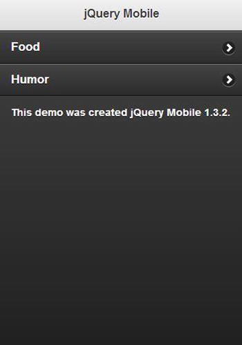
Figure 12-8. An example of what you can do with jQuery Mobile theming
On the next page I used an accordion for showing the food choices, which you can see in Figure 12-9.
The markup for the accordion (no need to repeat the other outer markup as it is essentially the same) with a little Razor markup to build my page is as follows:

Figure 12-9. An example of the jQuery mobile accordion control
<div data-role="collapsible-set" data-theme="c" data-content-theme="d">
  @foreach (var image in Model.Images)
  {
    <div data-role="collapsible">
      <h3>@image.Name</h3>
      <p>@image.Description</p>
      <img src="@image.Url" style="max-width: 200px;" />
    </div>
  }
</div>
I found jQuery Mobile easy to get started with. The project also has a very active community, and it is easy to find help online. Much of the popularity is undoubtedly due to its association with jQuery. Another factor that has probably increased its popularity among ASP.NET developers is that it’s used in the Mobile project template (as can be seen in Figure 12-10) for ASP.NET MVC 4.
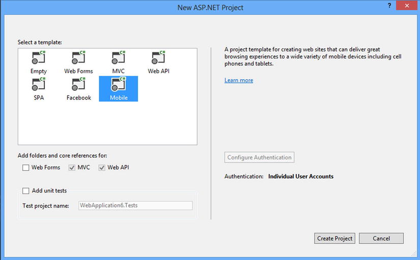
Figure 12-10. The new project dialog for ASP.NET MVC in Visual Studio 2013
Sencha Touch is another popular framework for building mobile web applications. As for the purpose of the framework, here is Sencha’s own description from their website [http://www.sencha.com/products/touch].
HTML5 Mobile App Development
With over 50 built-in components, themes for every popular mobile platform, and a built-in MVC system, Sencha Touch provides everything you need to create universal mobile web apps.
It took me longer to get up and running and to get the core ideas of Sencha Touch than with either of the other two frameworks we are discussing in this section. It’s also radically different in its approach. First of all, it has a command-line component to it, and this component requires Java and Ruby to be installed, which .NET developers may not have installed yet (though there is no harm in this). Second, the approach is entirely JavaScript-based, which will be quite different from the experience of most ASP.NET developers. As the Single Page Application model becomes more popular, this becomes less of a problem, but it’s also not like any SPA that I have used, so it will still likely be foreign to most. You will see a sample shortly.
The most natural thing to do for my Sencha Touch demo was to have the whole demo on one page, though this isn’t necessary. The app had three virtual pages, a welcome page, a blog page, and a gallery. Most of this was taken from or adapted somewhat from samples found on the Sencha Touch site, so it should at least be representative enough for you to get a basic feel for using it. Let’s start with the welcome page, seen in Figure 12-11.
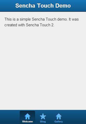
Figure 12-11. The welcome page of the Sencha app
The tab panel is set up by doing this:
Ext.create('Ext.tab.Panel', {
  fullscreen: true,
  tabBarPosition: 'bottom',

  //There are three things in this array, so there are three elements in the tab bar.
  items: [
    {
      //First tab
    },
    {
      //Second tab
    },
    {
      //Third tab
    },

  ]
});
This is simple enough. What about the content of the first tab?
{
  title: 'Welcome',
  iconCls: 'home',

  styleHtmlContent: true,
  scrollable: true,

  items: {
    docked: 'top',
    xtype: 'titlebar',
    title: 'Sencha Touch Demo'
  },

  html: [
      "This is a simple Sencha Touch demo. It was created with Sencha Touch 2."
  ].join("")
}
Hopefully you can see what I mean when I say that this is a JavaScript-based solution.
One element of their demos was the following blog list. Of course I changed the RSS feed to that of my blog!
{
  xtype: 'nestedlist',
  title: 'Blog',
  iconCls: 'star',
  displayField: 'title',

  store: {
    type: 'tree',

    fields: [
        'title', 'link', 'author', 'contentSnippet', 'content',
        { name: 'leaf', defaultValue: true }
    ],

    root: {
      leaf: false
    },

    proxy: {
      type: 'jsonp',
      url: 'https://ajax.googleapis.com/ajax/services/feed/load?v=1.0&q=http://feeds.feedburner.com/ericsowell',
      reader: {
        type: 'json',
        rootProperty: 'responseData.feed.entries'
      }
    }
  }
}
As far as code goes, that’s a fairly concise bit of code for fetching a blog’s feed and displaying the results in a mobile-friendly manner. The result is what you see in Figure 12-12.
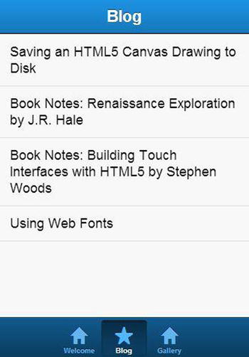
Figure 12-12. A fairly simple list of blog posts using Sencha Touch
So far so good. Creating a carousel is fairly easy to do as well.
{
  title: 'Gallery',
  iconCls: 'home',

  styleHtmlContent: false,
  scrollable: false,

  layout: {
    type: 'hbox',
    pack: 'center'
  },

  defaults: {
    height: 200,
    width: 200
  },

  items: [
    Ext.create('Ext.Carousel', {
      fullscreen: false,

      defaults: {
        styleHtmlContent: false,
        height: 200,
        width: 200
      },

      items: [ //Each image in the carousel is its own object.
          {
            html: '<img src="/content/bacon_200.jpg" />',
          },
          {
            html: '<img src="/content/css_200.jpg" />',
          },
          {
            html: '<img src="/content/dice_200.jpg" />',
          }

        ]
      })
    ]
  }
The result from this is what you see in Figure 12-13.
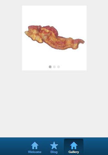
Figure 12-13. The carousel of Sencha Touch. It works great and is even better with bacon!
Sencha Touch provides an interesting approach to developing mobile web applications. Even though the development style is quite different than what most ASP.NET MVC developers would be used to, if you are looking for a framework to use, I would check it out anyway.
Kendo UI by Telerik [http://www.kendoui.com/] provides another alternative for building mobile web applications. Kendo UI’s mobile component takes an approach similar to jQuery Mobile, as you will see. For this sample I started with a simple list page, which can be seen in Figure 12-14.
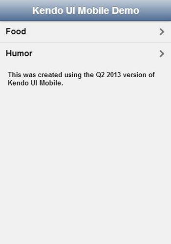
Figure 12-14. A list page created with Kendo UI Mobile
The code for this is as follows.
<div data-role="view" data-title="Kendo UI Mobile Demo" id="index">
  <header data-role="header">
    <div data-role="navbar">
      <span data-role="view-title">The Title</span>
    </div>
  </header>

  <ul data-role="listview">
    <li><a data-role="listview-link" class="km-listview-link" href="/link/to/food">Food</a></li>
    <li><a data-role="listview-link" class="km-listview-link" href="/link/to/humor">Humor</a></li>
  </ul>

  <p class="kw-text">This was created using the Q2 2013 version of Kendo UI Mobile.</p>
</div>
Like jQuery Mobile, Kendo UI uses data-role attributes to specify function, which the JavaScript and CSS of the framework use to build the page. The next page, which has an image gallery, (see Figure 12-15) is understandably more complex than the previous page.
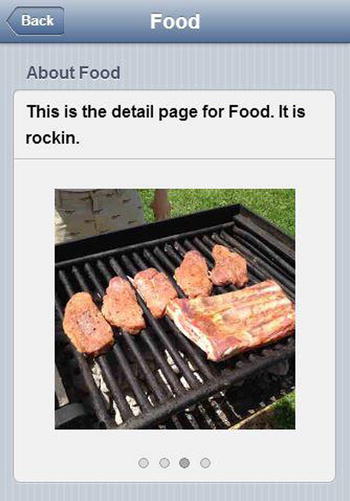
Figure 12-15. An image gallery built with Kendo UI
<div data-role="view" data-title="@Model.Title" id="detail">

  <header data-role="header">
    <div data-role="navbar">
      <a class="nav-button km-button km-back"
        data-align="left"
        data-role="backbutton" href="" data-transition="slide:right" style="">
        <span class="km-text">Back</span>
      </a>
      <span data-role="view-title">@Model.Title</span>
    </div>
  </header>

  <ul data-role="listview" data-style="inset" data-type="group" class="km-listview km-listgroupinset">
    <li class="km-group-container">
      <div class="">
        <div class="km-group-title">About @Model.Title</div>
      </div>
      <ul>
        <li>This is the detail page for @Model.Title. It is rockin.</li>
        <li>

          <div id="scrollview-container">
            <div data-role="scrollview">

              @foreach (var image in Model.Images)
              {
                <img src="@image" class="photo" />
              }

            </div>
          </div>

        </li>
      </ul>
    </li>
  </ul>

</div>
Despite the added complexity, the Kendo UI gallery was very straightforward to implement. Alternatively, Kendo UI Mobile comes with some server-side components for generating the markup. Telerik distributes these through the Visual Studio Extensions gallery. Once installed, these components include project templates for getting it all set up.
Telerik has been investing heavily in the .NET community for some time. Those who already use Telerik products and need a mobile application framework like this would be well served. Those who have not now have a reason to try their products.
Summary
Mobile web development can be very difficult. Sometimes it’s best to use third-party libraries to make development easier. There are of course many more out there, but these are all libraries that I have tried out myself. I tend to prefer the approach of using smaller libraries to solve my individual development needs; but some will prefer the larger frameworks, so pick the approach that works best for you.