Introducing Silverlight Screen Design
Users of your application will spend most of their time interacting with it through screens. So no matter how well you’ve designed other aspects of your application, screen design is the single factor that determines how users perceive your application.
In this chapter, you’ll learn how to
- Create screens, lay out controls, and configure screen navigation
- Present data using built-in controls
- Modify the appearance of screen items
This chapter shows you how to create a search screen in the HelpDesk application that allows users to find records about engineers. Once a user finds a record, you’ll learn how to enable the selected record to be opened in a new screen. This parent/child navigation is a common scenario that you’ll likely want to implement in most of your applications.
This chapter intentionally contains no code and highlights how much you can achieve without having to write a single line of .NET code.
Choosing a Screen Template
When you create a new screen, the initial dialog prompts you to choose a template. LightSwitch uses templates to create screens with an initial layout and purpose. In general, you would use these screens as a starting point for further customization.
The standard templates that ship with LightSwitch are shown in the Add New Screen dialog. (See Figure 3-1.) The descriptions in this dialog explain the purpose of each template.
Figure 3-1. Creating a new screen
The Details Screen and New Data Screen templates are designed to work with a single record. The remaining templates create screens that show multiple records.
The Screen Data area includes a drop-down menu that shows a list of tables, queries, and other options you use to define the data source for your screen. If the data source that you choose includes related records, you can choose to include the related data on your screen.
If you want to create a screen that isn’t bound to any data, choose the New Data Screen template and leave the Screen Data drop-down empty.
Showing a Single Record
The Details Screen template creates a screen that shows a single record. If the record that you’re showing is a parent of child records, you can choose to include the child records on your details screen. Details screens are launched from other screens and can’t be opened directly. For example, a user can open a details screen by clicking on the results of a search screen.
When you create a details screen, you can choose to mark it as the default screen for the underlying table. This means that your application uses this screen whenever it needs to display a record of that particular type.
The absence of a details screen for any given table doesn’t prevent LightSwitch from displaying data. If a default screen doesn’t exist, LightSwitch displays the data using an autogenerated screen. However, you can’t customize the autogenerated screens in any way. Therefore, the advantage of creating a custom details screen is that you can modify the appearance of your screen.
After creating your Engineer details screen, the LightSwitch screen designer allows you to modify the layout and carry out further customization.
Unlike the WYSIWYG designers that you may have used in other development applications (such as Microsoft Access or Windows Forms), the screen designer shows the UI elements as a series of tree nodes. Technically, this is called the Screen Content Tree. (See Figure 3-2.)
Figure 3-2. Example of a Screen Content Tree
A couple of important nodes that you should note are the Root node and Screen Commands node. The Root Node allows you to set screen attributes such as your screen title. The items within the Screen Command Bar node are shown in the Ribbon Bar section of your application (when you apply the Standard shell). By default, LightSwitch shows Save and Refresh buttons on every screen that you create. If you want to rename or delete these items, you can do it by editing or deleting the items that are shown in the Screen Command Bar node.
The remaining nodes contain a mixture of layout controls and data controls, and you’ll find out exactly how to use these controls later in this chapter.
Introducing the Screen Designer Toolbar
You’ll find the Screen Designer command bar at the top of the screen designer. It has six buttons, which are shown in Figure 3-3.
Figure 3-3. Screen Designer command bar
The Edit Query button opens the query editor and allows you to edit the underlying query.
You can use the Add Data Item button to add additional properties, queries, and commands to your screen.
You can modify the items that are shown in the Screen Content Tree by using the Add Layout Item and Delete buttons. The options that you’ll find in the Add Layout Item button are a subset of the options that appear within the Add button for a node in the Screen Content Tree.
The Reset button provides a really useful feature. If you add extra fields to your table, the Reset button resets the controls within a container back to their default state. It automatically creates controls for the new fields that you’ve added and saves you from having to create them manually.
Setting Screen Properties
The properties for the first node in the tree (the Root node) allow you to configure various attributes that apply to your screen. (See Figure 3-4.)
Figure 3-4. Root-node properties
Most notably, it lets you set the display name for your screen. LightSwitch shows this piece of text in the screen’s tab title and uses it to identify your screen in your application’s navigation pane.
The Allow Multiple Instance check box controls the ability of users to open multiple instances of your screen. If this is unchecked and the user attempts to open more than one instance, LightSwitch displays the screen that’s already open.
Grouping and Laying Out Your Screen
You can organize the appearance of your screen by using group controls. There are five layout types that you can choose: Rows Layout, Columns Layout, Tabs Layout, Group Box Layout, and Table Layout.
These group controls allow you to position the data controls (for example, text boxes, labels, and check boxes) on your screen. You can nest these controls inside one another, and you can create as many levels of nesting as you want.
For any given node, you can change the group control that’s used by using the drop-down menu that appears next to the node.
Figure 3-5 shows the screen designer and how the formatting looks at run time.
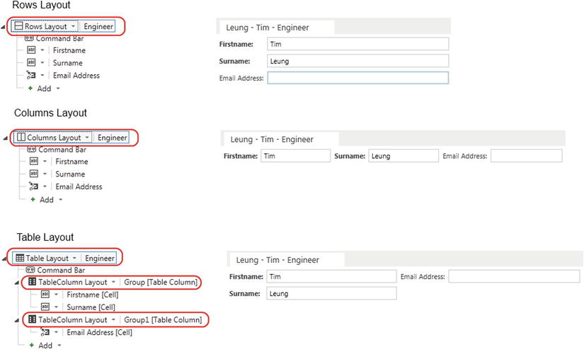
Figure 3-5. Rows, Columns, and Table layout controls
The Rows Layout container lays out controls one below another. The Columns Layout container places the controls side by side. The Table Layout container allows you to arrange your controls in a tabular fashion by placing them inside child TableColumn Layout groups.
Figure 3-6 shows the Tabs Layout and Group Box Layout controls. LightSwitch renders each group beneath the Tabs Layout control as a separate tab. It sets the tab title using the value you specified in the Display Name property setting for the group.
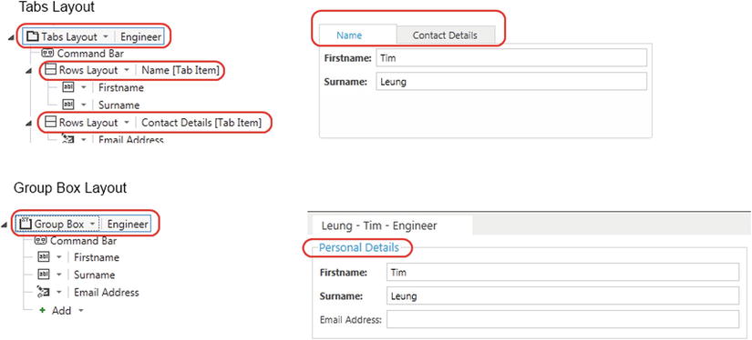
Figure 3-6. Tabs and Group Box layout controls
The Group Box Layout control is new to LightSwitch 2012 and places a border around the child controls. The Display Name property of the Group Box Layout control sets the title that appears on the control.
Displaying Static Text and Images
You can add static text and images to your screen by clicking on the Add button that appears beneath a group control, and choosing the Add Image, or Add Text options. (See Figure 3-7.) This feature is new in LightSwitch 2012 and is perfect for adding screen titles, headers, and company logos.
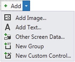
Figure 3-7. Adding static text and images
 Caution Adding large images can bloat the size of your Silverlight application, slowing down the initial load time.
Choosing Data Controls
Data controls are the UI elements that allow users to view or edit your data. There are many controls that you can use, but if you can’t find a built-in control that suits your needs, you can create your own custom control instead (as explained in Chapter 11).
Table 3-1 shows the controls that you can use to edit data. In many cases, you’ll use the Text Box control. This is the default control that’s selected for editing string data. You can use a control only if it’s supported by the underlying data type. For example, you can’t assign the Check Box control to a string data property. Figure 3-8 shows the appearance of the Image Editor, Date Picker, Email Address Editor, Money Editor, and Phone Number Editor controls at run time.
Table 3-1. Editable Data Controls
| Name | Description | Supported Data Types |
|---|---|---|
| Text Box | You can edit the data by typing into this control. | All LightSwitch data types |
| Check Box | Allows you to edit Boolean values. | Boolean |
| Date Picker | A control that you can use to type or select a date from a calendar view. | Date |
| Date Time Picker | Allows you to edit a date and time value using a calendar view and a time drop-down list. | Date, Date Time |
| Email Address Editor | Allows you to edit an email address. Includes validation to ensure that only valid email addresses can be entered. | |
| Image Editor | Displays an image and allows you to upload an image by using a file-browser dialog. | Image |
| Phone Number Editor | Allows you to enter a phone number using predefined formats. | Phone Number |
| Money Editor | Allows you to edit a monetary value. | Money |
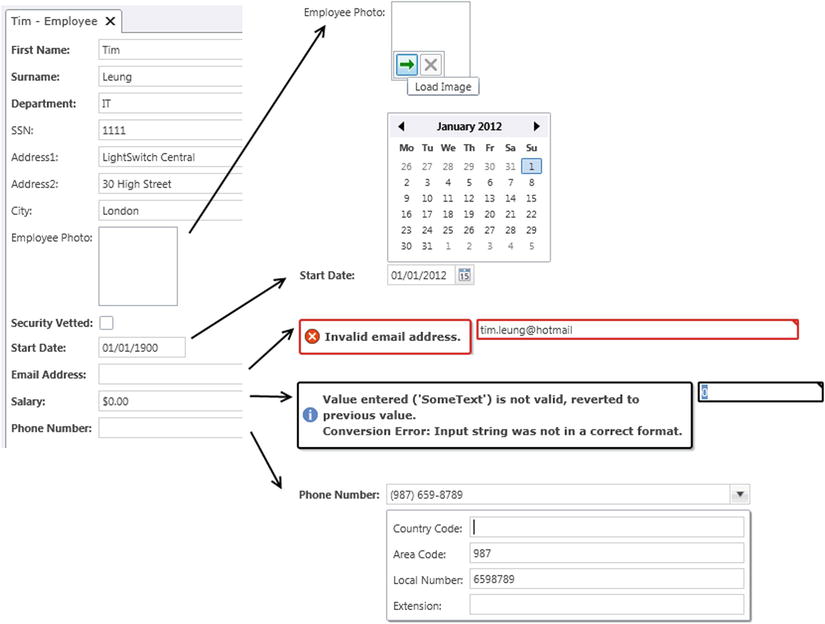
Figure 3-8. Editable data controls at run time
The Image Editor control allows users to upload an image. When the user clicks on the control, it shows a Load Image button that opens a file-browser dialog.
The Date Picker control displays a pop-up calendar that allows users to select a date.
The Email Address Editor and Money Editor controls enable data entry and validate the data that the user enters.
When users click the Phone Number Editor control, it reveals a drop-down panel that contains separate data-entry controls for each part of a phone number. The formats that you want to allow are defined in the table designer. Figure 2-8 in Chapter 2 shows the dialog that you use to specify the valid formats.
Displaying Multiline Text Using the Text Box Control
By default, the Text Box control renders text using a single-line text box. If you want to allow multiline text and enable the user to enter line breaks, set the Lines property of your Text Box control to a value greater than 1. (See Figure 3-9.)
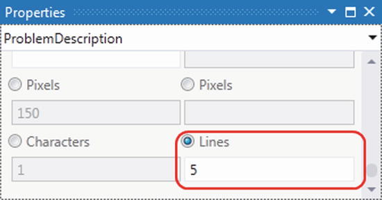
Figure 3-9. Enabling multiline text to be entered
Displaying Data Using Data Item Containers
LightSwitch provides three data item containers which allow you to lay out data in a preformatted fashion. They contain placeholders that are bound to data items on your screen.
The data item containers that you can use are the Address Editor, Modal Window, and Picture And Text controls. Figure 3-10 compares the appearance of these controls both at design time and run time.
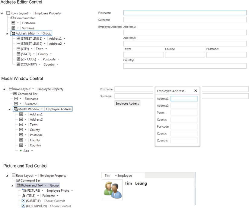
Figure 3-10. Data item containers at design and run time
The Address Editor control contains placeholders that you can assign to the address fields that you’ve defined in your table. LightSwitch shows the display name for your control in the Address Editor control’s label at run time.
The Modal Window control displays a button on the screen. When the user clicks on this button, LightSwitch opens a modal window popup that contains the controls that you’ve added beneath the Modal Window control.
The Picture And Text and Text And Picture controls allow you to display an image and various pieces of associated text.
EXERCISE 3.1 – CREATING A DETAILS SCREEN
Open your project from Exercise 2.1, and create New Data and Details screens for your Engineer entity. Notice the controls that LightSwitch uses, and try changing some of your data items so that they use different controls. Use the Add Text option to add a title to your Details screen. Run your application, and use your New Data screen to create a new record. After you save a record, notice how LightSwitch automatically opens the new record in your Details screen.
You can customize a details screen so that it shows related records. In the Details screen that you created in Exercise 3.1, take a look at the screen query that appears in the Screen Members list (the left hand part of the screen designer). You’ll find a link that’s titled ‘Add Issues - click this to add the related Issues collection’ (See Figure 3-11.)
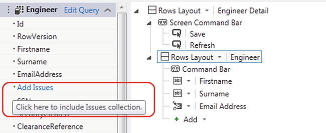
Figure 3-11. Adding related items
When you click this link, LightSwitch adds the Issues collection and you’ll see it appear in the Screen Member list. You can then add a data grid of issues by dragging the Issues collection onto your details screen. (See Figure 3-12.)
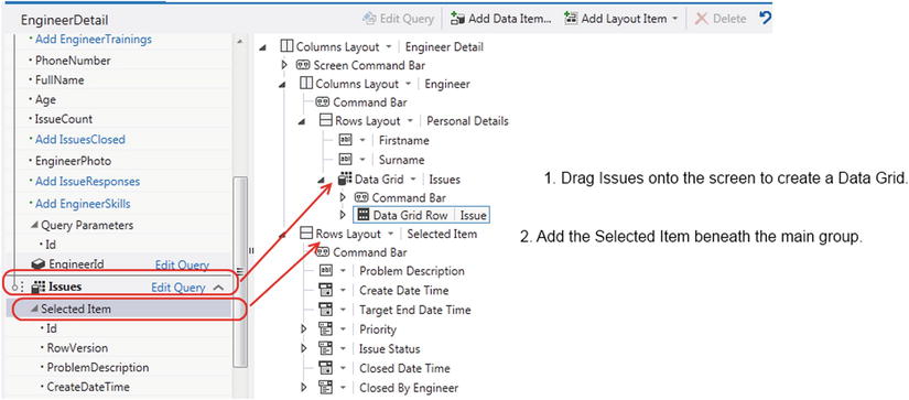
Figure 3-12. Design-time view of your details screen
Beneath the top level Rows Layout for Engineer Detail, click on the Add button and select the Issues  Selected Item option. Note that the option to add the selected issue item only appears outside of the main Engineer Detail group.
By adding the selected item, users can select an issue from the data grid and view the selected issue detail in a separate part of the screen. As soon as a user selects an issue, the data controls that are bound to the selected item will automatically refresh. Figure 3-13 shows the runtime view of this screen. Notice that this example sets the parent layout to a Columns Layout, so that LightSwitch shows the selected issue in the right hand part of the screen.
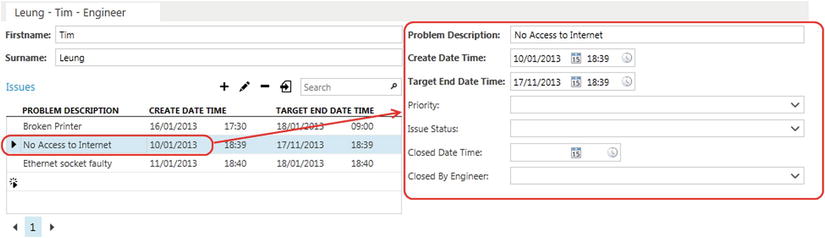
Figure 3-13. Runtime view of screen
This example demonstrates how LightSwitch keeps track of the currently selected data item whenever you work with collections of data. It also shows how you can bind the selected item to data controls on your screen. At design time, LightSwitch exposes the selected item as an entity property. This allows you to use the properties of the selected item or to bind them to additional data controls.
Showing Collections of Records
LightSwitch includes two controls that allow you to display collections of records: the Data Grid and Data List controls (you’ve already seen the Data Grid control in the earlier example). The main difference between the two controls is that the Data List control is designed to show read-only data.
The Data Grid control displays editable data in a grid. It allows users to sort data by clicking on the column header. You can add or remove the columns that are shown on your data grid by adding or deleting the child nodes that are shown beneath the Data Grid node.
At run time, a user can sort the rows in a Data List control by using a drop-down box that appears in the header. By default, a Data List control uses a Summary control to display each entry in the list. But if you want to display additional properties, you can change the Summary control to a Rows Layout control and use that to add your additional fields.
These two controls are shown in Figure 3-14.
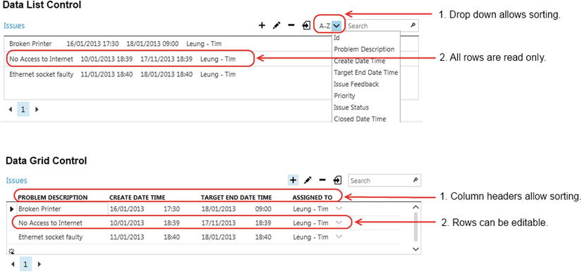
Figure 3-14. Data Grid and Data List controls
Note If you’re using an attached SQL Server data source, the data controls don’t allow users to sort columns that are based on the text data type. Use the varchar or nvarchar data types if you want users to be able to sort their data using the column headers.
Configuring Data Grid Settings
Data Grid and Data List settings are configured in two places: via the screen query and the properties of the Data Grid or Data List control.
It’s useful to remember where these settings are configured. Otherwise, you could spend a considerable amount of time hunting around in the properties sheet of a Data Grid control trying to find a setting that actually belongs to the query.
The screen query represents a data source and is an object of type VisualCollection<T>. Figure 3-15 shows the properties that you can set.
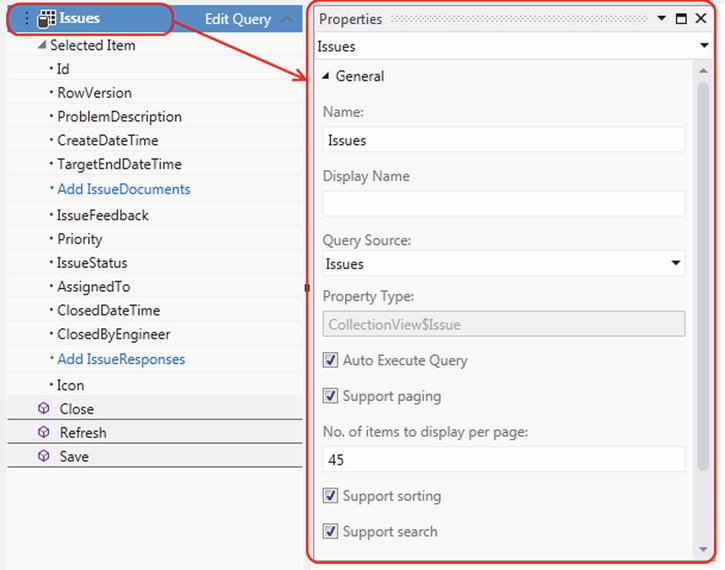
Figure 3-15. Data grid paging, sorting, and searching options
The Auto Execute Query property indicates whether or not LightSwitch executes your query when the screen first opens. To demonstrate this property, Figure 3-16 shows a data-entry screen that allows engineers to make time sheet entries. It’s designed as a data-entry screen that displays only the entries that an engineer makes during a session. When the screen initially loads, it isn’t necessary to populate the data grid with any previous time-sheet entries. You can achieve this behavior by setting the Auto Execute Query property of the time-sheet query to false. Appendix E shows the schema of the TimeTracking table that allows you to recreate this example.
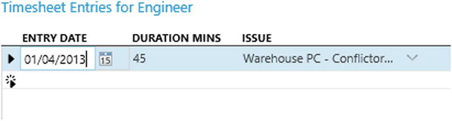
Figure 3-16. Hiding existing records by deselecting the Auto Execute Query check box
The paging, sorting, and search check boxes control whether or not LightSwitch shows these options on the data grid.
The properties of the data grid (shown in Figure 3-17) allow you to hide or show the Export To Excel button, which appears in the data grid toolbar (for desktop applications only).
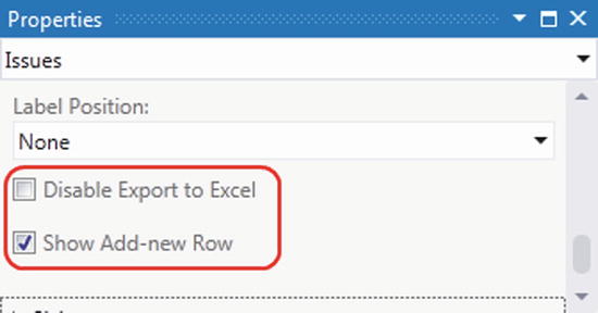
Figure 3-17. Data grid properties
You can also uncheck the Show Add-new Row check box to hide the empty row placeholder that appears at the bottom of the data grid. However, unchecking this option doesn’t disable the option to add new records altogether. Users can still add records by clicking the Add button that appears in the command bar section of the data grid. (See Figure 3-18.)
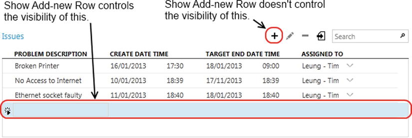
Figure 3-18. Show Add-new Row property
Setting Data Grid Header Buttons
If you want to remove the Add button that appears in the command bar or modify the items that the Data Grid control shows in this section, you can do so by editing the nodes that appear beneath the Command Bar node.
If you want to add a button to the command bar section, use the Add button that appears beneath the Command Bar node, as shown in Figure 3-19.
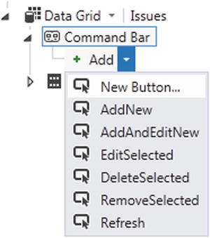
Figure 3-19. Editing the Data Grid command bar buttons
In this figure, you see the command types that you can add. The New Button option is particularly useful because it allows you to write your own code to perform a custom task.
Note When a user clicks on a data grid’s Add or Edit button, LightSwitch displays the selected record using an autogenerated window. By default, these autogenerated windows aren’t customizable, but Chapter 7 shows you how to work around this limitation.
EXERCISE 3.2 – SHOWING RELATED DETAILS
Take the Engineer Details screen that you created in Exercise 3.1 and add the Issues collection, as described in this section. Use a DataGrid control to render the Issues collection. Run your application, and use the controls in the DataGrid header to add, edit, and delete issue records. Notice how your DataGrid autogenerates a screen that allows you to work with issue records—it isn’t necessary for you to manually add a details screen for the Issue entity. Now change the DataGrid control to a List control, re-run your application, and examine the differences between these two controls.
LightSwitch provides a couple of controls that allows users to view or select related entities. These are the Auto Complete Box and Modal Window Picker controls.
Using the Auto Complete Box Control
The Auto Complete Box is a control that’s similar to a drop-down box, in that it allows users to select from a list of drop-down values. However, it also allows users to type into the control and filters the items by the text that’s entered.
When a user types into this control, LightSwitch searches against all records in the underlying table. You can restrict the records that LightSwitch searches by writing your own query and assigning it to the Auto Complete Box’s Choices property. (See Figure 3-20.) The Filter Mode property controls the way that the matching works.
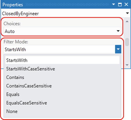
Figure 3-20. Setting the Auto Complete Box Choices and Filter Mode values
The Auto Complete Box shows a summary for each row that’s shown through a Summary control. But if you want to show additional properties, change the Summary control to a Columns Layout control and add the additional properties that you want to show. (See Figure 3-21.)
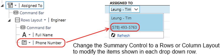
Figure 3-21. Setting the items shown in an Auto Complete Box
Using the Modal Window Picker Control
The Modal Window Picker control renders a button on the screen. When the user clicks on this button, LightSwitch opens a pop-up window that allows the user to search and select a record. (See Figure 3-22.)
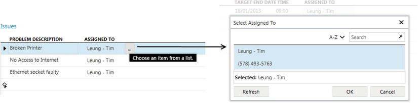
Figure 3-22. Modal Window Picker control
As with the Auto Complete Box, you can control the fields that the control shows in the picker by editing the child items of the Modal Window Picker control.
For each control that you add to a screen, you can adjust its size and position by using the options that you’ll find in the Sizing section of the Properties sheet. Figure 3-23 shows the properties that you can set.
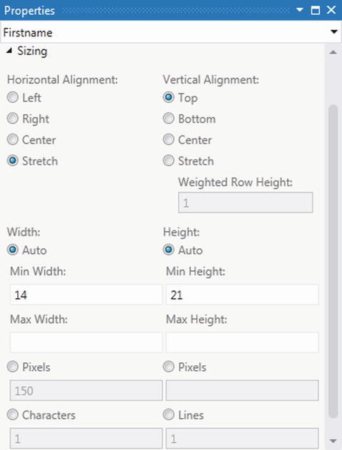
Figure 3-23. Sizing options
Depending on the control you choose, additional sizing options may also be available. For example, you’ll find an Is Resizable option in some of the layout controls. This allows your user to resize the contents using a splitter control.
Most of these sizing options are self-explanatory. The Width and Height settings default to Auto. This means that LightSwitch chooses an optimal width and height based on the space available. If you want to specify a definite size, the units that you can use are pixels or characters and lines.
Depending on the control you choose, additional appearance options may also be available. If you choose the Date Time Picker control, for example, you can configure whether or not to show the time component.
Positioning Control Labels
For each data control that you add to your screen, LightSwitch automatically displays a label. If you add a Surname text box to your screen, for example, LightSwitch displays a Surname label next to the text box. The text that it uses for the label comes from the Display Name property that you set in the table designer.
Figure 3-24 shows the label position drop-down. Once again, most of these options are self-explanatory. An interesting pair of options you’ll find are None and Collapsed.
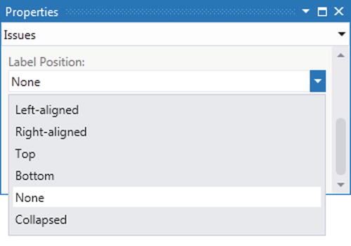
Figure 3-24. Label Position drop-down
If you want to hide a label, you can set the Label Position to None. However, the label will still take up space on the screen, even though it’s not shown. If you choose the Collapsed option, the label doesn’t take up any space. This is illustrated in Figure 3-25.
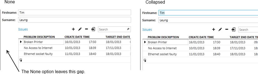
Figure 3-25. The difference between the Collapsed and None options
Styling Labels and Static Text Controls
In general, you can’t change the fonts that individual LightSwitch controls use. This is because the font settings are designed to be configured using the theme you’ve defined for your application. The benefit of a theme is that it allows you to easily maintain a consistent look and feel throughout all the screens in your application.
A nice feature about the Label control is that you can set the font style to one of six predefined styles. Figure 3-26 shows the available font styles, and illustrates how they look at run time.
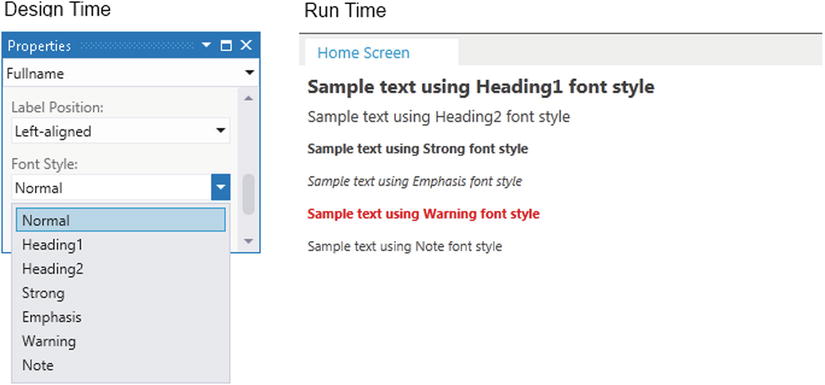
Figure 3-26. The available font label styles
Making Controls Read-Only
If you want to make parts of your screen read-only, the easiest way to do this is to replace your text boxes with labels.
Group controls include a Use Read-Only Controls check box. If you set this to true, LightSwitch replaces all child data controls with labels or their read-only equivalents.
The other read-only controls that LightSwitch provides are described in Table 3-2. This table also shows their supported data types.
Table 3-2. Read-Only Controls
| Name | Description | Supported Data Types |
|---|---|---|
| Label | This displays a read-only copy of the data value. | All LightSwitch data types |
| Date Viewer | Displays a date value. | Date |
| Date Time Viewer | Displays a date/time value. | Date, Date Time |
| Email Address Viewer | Displays an email address. | |
| Image Viewer | Displays an image. | Image |
| Phone Number Viewer | Displays a phone number. | Phone Number |
| Money Viewer | Displays a monetary value. | Money |
In Table 3-2, notice how there isn’t a read-only check box. If you want to make a check box read-only, you’ll need to write some code. You’ll see how to do this in Chapter 7.
Creating a Search Screen
The Search Screen template allows you to create screens that allow users to carry out searches.
Figure 3-27 demonstrates a screen that’s been created with the Search template. The key feature of this screen is that it includes a Search text box.
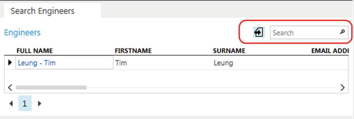
Figure 3-27. Example Search screen
The search operation matches all records that contain the value that the user enters into the text box. It searches all string fields in the underlying table where the Is Searchable check box is selected. Figure 2-1 in Chapter 2 shows where you can set this property.
Behind the scenes, LightSwitch uses the Search operator, which is exposed via the IDataServiceQueryable query property of your data source.
The search screen doesn’t allow you to change the type of search LightSwitch performs. If you want to return all records that begin with (rather than contain) the text-box value that’s entered, you’ll need to create a custom search screen.
LightSwitch only searches against string properties. It won’t search against numeric or navigation properties, even if you’ve chosen to show string data from a navigation property on your search screen’s data grid. To perform a more advanced search, you’ll need to create a search screen that uses a custom query.
EXERCISE 3.3 – CREATING A SEARCH SCREEN
Use the Search Screen template to create a search screen for your Engineer table. Run your application, and use the Search box to search for engineer records. Notice how LightSwitch matches the text that you enter in the Search text box against all properties where you selected the Is Searchable check box in the table designer. Return to the screen designer, select the Data Grid Row check box for your Engineers data grid, and use the Properties sheet to deselect the Use Read-only Controls check box. Select the Command Bar for your Engineers data grid, and click the Add button to add the AddAndEditNew, EditSelected, and DeleteSelected items. Run your application, and notice how your search screen now allows you to fully add and edit records.
In this section, you’ll find out how to allow users to launch child screens from the engineer search screen that you created in Exercise 3-3. The child screen will show the issues that have been assigned to the selected engineer.
First, create a screen that shows the issues that have been assigned to an engineer. This is the screen that you’ll launch from your search screen.
To do this, create a new details screen called EngineerIssues. Choose Engineer from the Screen Data drop-down, and check the Engineer Issues checkbox in the Additional Data to Include section. Delete the engineer details so that only the Issues data grid remains. (See Figure 3-28.)
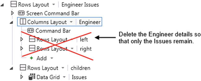
Figure 3-28. EngineerIssues screen
Now open the engineer search screen that you created in Exercise 3.3. In the Data Grid Row for the Engineer data grid, find the IssueCount label. Check the Show As Link check box, and choose EngineerIssues from the Target Screen drop-down list. (See Figure 3-29.)
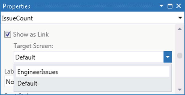
Figure 3-29. The Target Screen options on the Properties sheet
This means that LightSwitch will render each Issue Count cell in the grid as a link. When the user clicks on this link, LightSwitch opens the record using the EngineerIssues screen.
Figure 3-30 shows how the screen looks at run time. Notice that the Full Name link still opens the engineer details screen. Therefore, it’s possible to launch multiple instances of different screen types from a single data grid.
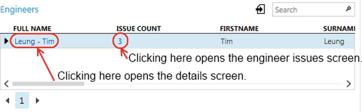
Figure 3-30. The search screen at run time
Setting Application Properties
The General Properties tab of your project (shown in Figure 3-31) allows you to control application-level settings.
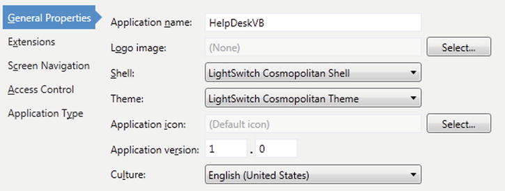
Figure 3-31. General Properties tab
This tab enables you to change the shell and theme of your application. As you learned in Chapter 1, changing the shell and theme alters the look and feel of your application.
You can also set your application name on the General Properties tab. LightSwitch shows the text that you enter here in the title bar of your application. In a desktop application, LightSwitch shows the server name in the title bar after your application name. This is a security feature that Silverlight imposes, and it isn’t possible to hide the server name.
The Icon settings allow you to assign icons to your application. The icons that LightSwitch displays depend on the application type and shell you choose. For example, if you’ve chosen the Cosmopolitan shell, your logo image will appear in the banner of your application. In a desktop application that uses the Standard shell, the application icon appears in the title bar of your application and the logo image appears in the desktop shortcut that starts your application.
Changing the Language and Culture Settings
To change the primary language of your application, use the culture drop-down box in the General Properties tab of your project and select one of the 42 available cultures. If Microsoft decides to add support for the English (British) culture in a future release, it would make one particular author very happy.
Figure 3-32 shows a running application with the culture setting set to Spanish. As shown in this illustration, LightSwitch automatically localizes the built-in messages and menu items that the user sees. LightSwitch also provides support for right-to-left languages such as Arabic and Chinese.
Figure 3-32. Localized application
Until very recently, LightSwitch applications supported only a single language and culture. But if you install Visual Studio 2012 Update 2 and upgrade your project (see Chapter 8 for details), you can make your application fully multilingual. If you’ve ever localized an ASP.NET, you’ll recognize that localizing a LightSwitch application works in a very similar way.
It involves adding localized resource files into both your Client and Server projects. So if the primary language of your application is English and you want your application to also support Spanish, switch to File View and use Visual Studio’s Add New Item option to create two resource files in the root folder of your Client and Server projects. You should name the files in your Client project Client.resx and Client.es-ES.resx, and name files in your Server project Service.resx and Service.es-ES.resx. es-ES is the culture code for the Spanish (Spain) locale, and Appendix A shows a full reference list of culture codes. If you want your application to support additional languages, you’ll need to add additional resource files and name them with your desired language code.
The resource files allow you to create name/value pairs of string values. Let’s suppose that you want to localize the Surname property’s label on an Engineer screen. To do this, you’d add an entry to your Client.resx file with a name/value pair of SurnameDisplayName and Surname. SurnameDisplayName is a user-defined key that allows you to identify the word “Surname.” Next, you’d add the name/value pair SurnameDisplayName and Apellido to your Client.es-ES.resx file. (Apellido is the Spanish word for surname.) You’d then open your Engineer screen, and change the Surname property’s Display Name value from Surname to $(SurnameDisplayName). The $() notation prompts LightSwitch to retrieve the localized version of the value from the resource file at run time. If a user runs a Spanish version of Windows, or sets their computer to Spanish by installing and enabling the Spanish Windows language pack, your application will automatically show the Spanish version of the Surname label.
To complete the localization task, you’ll need to repeat the same process for the remaining text values in your application and localize any text that you’ve assigned to entity and property descriptions through the table designer. To localize table settings, you’d create the name/value pairs in your Server resource file. To find out more about localizing an application, take a look at the help file by visiting the following Microsoft web page:
http://msdn.microsoft.com/en-us/library/vstudio/xx130603(v=vs.110).aspx
This page also shows you how to retrieve resource values in .NET code, and how to localize HTML Client applications.
Configuring Screen Navigation
The Screen Navigation menu allows users to open the screens that you’ve created in your application. The menu appears along the left hand side of your application, but it can appear elsewhere depending on the shell that you select.
The Screen Navigation tab allows you to manage the items that LightSwitch shows in your navigation menu. In particular, you can create groups to help better organize your screens.
Figure 3-33 shows the Screen Navigation tab in the designer, alongside the screen navigation menu in running applications with both the Cosmopolitan and Standard shells applied.
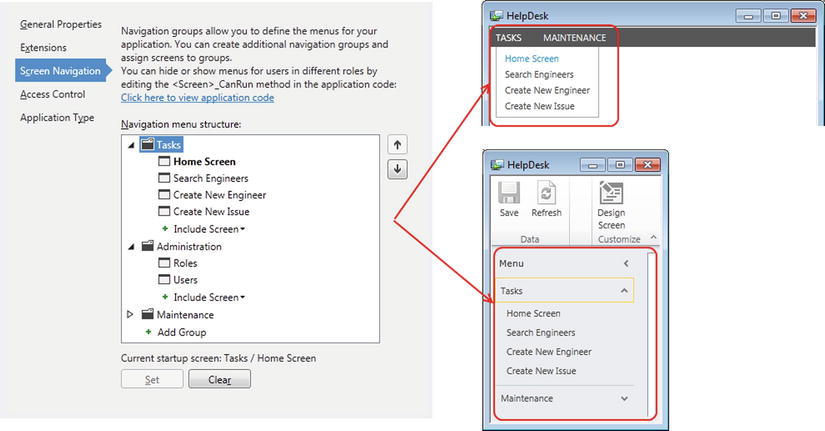
Figure 3-33. Screen navigation at design time and run time
LightSwitch automatically adds any new screen that you create to the navigation menu. This, however, excludes any screens that are based on the Details Screen template.
You can add multiple menu items that refer to the same screen. If you want to prevent all users from opening a specific screen, right-click the screen and select the Delete option.
The Include Screen drop-down menu allows you to add two built-in screens called Users and Roles. These screens allow you to manage the security of your application. By default, LightSwitch adds these screens into the Administration group.
At debug time, LightSwitch doesn’t show the Administration group. This group appears only in deployed applications and is shown only to application administrators.
LightSwitch recognizes the permissions of the logged-on user when it builds the navigation menu at run time. If a user doesn’t have sufficient permission to access a screen, LightSwitch doesn’t show it in the navigation menu. (Chapter 17 shows you how to set screen-level permissions.) This makes your life really easy because you don’t need to do any extra work to configure menu-item permissions.
Finally, you can set the initial screen that’s shown to your user by specifying the startup screen. But if you don’t want any screens to be shown at startup, you can click the Clear button to unset your startup screen.
Designing Screens at Run Time
It’s difficult to visualize how your screen might look at run time when you’re designing it through a series of tree nodes.
To simplify this task, LightSwitch provides a runtime designer that allows you to design screens at debug time. This is particularly useful for setting the sizing and appearance of controls, because it allows you to see immediately the changes that you’re making.
To use the runtime designer, start up your application (by pressing F5) and click on the Design Screen link or button (depending on the shell that you’ve chosen). This opens the runtime designer, as shown in Figure 3-34.
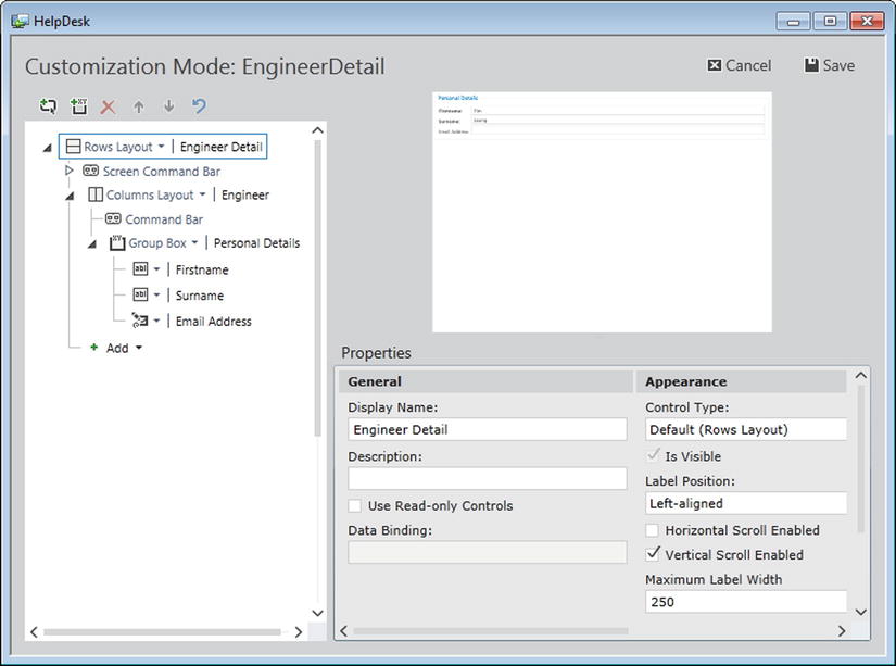
Figure 3-34. Runtime screen designer
The runtime designer allows you to add and delete controls, and to change the appearance properties of the controls on your screen. You can even add and delete group controls.
Although the runtime designer provides a great way to visually design your screens, it has some slight limitations. You can’t add new data items such as local screen properties, queries, or methods. Also, you can’t move items out of their layout containers or modify the underlying Visual Basic or C# code on your screen.
One last caveat—when you deploy your application, don’t forget to change your build configuration from Debug to Release. If you forget, the link to the runtime designer will appear in your deployed application.
Tip If you spend most of your time in Visual Studio, it’s easy to overlook the runtime screen designer. The top tip for this chapter is to remember to use the runtime designer. It definitely makes screen design much easier.
Summary
This chapter has showed you how to create and design screens for the Silverlight client. To create a screen, you’d use one of the five built-in template types: Details, New Data, Search, Editable Grid, and List/Details.
Templates allow you to build screens with a prebuilt layout and function. The template names intuitively describe the purpose of each template, but a template type that warrants further explanation is the Details screen template. Details screens are designed to show a single record and can optionally display related data. Details screens must be opened from other screens and cannot be opened directly. A common use-case scenario is to create a search screen that allows users to open the selected record in a details screen.
LightSwitch includes a screen designer that allows you to build a screen by adding content items to a tree view. Each content item might represent a group or a data item. LightSwitch allows you to change the control that it uses to render a content item. In the case of a group, the Rows and Columns layout controls are two common controls that you can use. These controls allow you to display the group’s child items in a horizontal or vertical stack.
The controls that allow you to display data include text box, label, check box, and a whole range of other controls. If you want to allow users to select a record, you can use either an Auto Complete Box or Modal Window Picker control. To display lists of related child records, you can use either the Data Grid or Data List control. The difference between these two controls is that the Data List control is designed to show data in read-only mode.
When you add a label to your screen, you can set the label to “show as a link” and specify a target screen. This allows users to click on the label and to open a related record in a new details screen.
All controls have appearance properties that allow you to set attributes such as the height and width. It’s quite difficult to visualize your screen when you’re developing it through a series of tree nodes. To simplify this task, LightSwitch provides a runtime designer that allows you to design screens in a WYSIWYG fashion.
Finally, the General Properties window allows you to set your application title and icon. It also allows you to configure your application’s navigation menu and to specify the primary language of your application.