
Up until now, this book has focused on building user interfaces with LightSwitch’s Silverlight client. By installing an update to Visual Studio, you can build applications that use an HTML interface. The biggest benefit is that it allows you to build applications that work well on mobile devices. In particular, the “HTML client” produces screens that are optimized for touch-screen devices.
In this chapter, you’ll learn how to
- Add an HTML client, create screens, and build a navigation structure
- Show and edit data by using custom HTML controls
- Customize your application by adding CSS (Cascading Style Sheet) and JavaScript code
This chapter shows you how to build an HTML interface to the HelpDesk application. You’ll find out how to build screens that allow engineers to add, view, and edit issues. You’ll also find out how to allow users to upload and download files, replace the default Date/Time Picker control with a custom control, and apply different fonts and colors to your application by using themes.
The ability to build HTML clients is a big step in the evolution of LightSwitch, allowing you to reach a far wider range of devices. In comparison, a Silverlight browser application requires the user to install the Silverlight runtime. This isn’t always possible, particularly on mobile devices or locked-down corporate environments. A disadvantage of the HTML client is that it isn’t suitable for all scenarios. If you’re targeting your application at PC users and require rich features, such as output to Excel and COM automation, Silverlight is still the best choice.
One of the features of LightSwitch is that it builds applications that are based on industry standards and best practices. In Chapter 1, you learned how LightSwitch uses an n-tier architecture and is based on the MVVM pattern. The HTML client is also based on a “layered” architecture and uses libraries that are well known and popular with web developers.
As Figure 8-1 shows, LightSwitch HTML client applications are based heavily on jQuery. It uses the controls in the jQuery Mobile library, and it uses the datajs library to access your server through OData. It uses a small, cross-browser-compatible subset of the WinJS library. This is a JavaScript library that’s primarily designed to help build browser applications that target Windows 8. Developing an HTML client application is very similar to developing a Silverlight application—the underlying concepts (such as screens, entities, content items, and controls) are identical. However, there are a few fundamental differences that you need to understand.
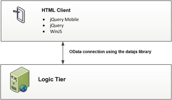
Figure 8-1. HTML client architecture
Whereas the Silverlight client allows users to open multiple screens and carry out multiple tasks at the same time, HTML clients are designed to carry out just a single task at any one time. In previous chapters, you learned how each screen includes a data workspace, and how each screen carries out data operations independently of other screens. This concept doesn’t apply to the HTML client. The HTML client includes just one data workspace for your entire application.
Just like the Silverlight client, an HTML client application consists of screens. Each screen that you create centers on a unit of work and is generally based on an entity or a collection of data. Each screen can contain one or more tabs. Tabs allow you to split a screen into separate sections. At runtime, a user can switch between tabs by using links that appear at the top of your screen.
Compared to the Silverlight client, the HTML client makes it easier to share UI elements across multiple screens through dialogs. To create a dialog, you’d create a screen as normal, but configure it so that LightSwitch shows it as a dialog. When a user opens a dialog, LightSwitch displays the screen content in a floating panel and darkens the underlying screen area.
Another piece of UI that’s new to the HTML client is the popup. A popup is a floating piece of UI that’s perfect for showing messages or confirmations. Whereas a dialog takes up almost all of the available screen area, popups are generally smaller in size. When LightSwitch shows a popup, it doesn’t darken the underlying screen, as in the case of a dialog. To dismiss a popup, a user would click on an area of the screen outside of the popup. Popups are screen-specific, so there’s no way to share popups between screens.
Setting Up Visual Studio for HTML Development
To develop HTML client applications, you first need to install an update called “Visual Studio 2012 Update 2.” You can download and install this from the following URL:
http://www.microsoft.com/en-us/download/details.aspx?id=38188
Once you install this update, you can begin to develop HTML client applications.
Adding an HTML Client
There are two ways for you to create an application that includes an HTML client. You can either create a brand new “LightSwitch HTML Application” by using Visual Studio’s File  New Project option, or you can add an HTML client to an existing Silverlight LightSwitch project.
To do the latter, right-click your LightSwitch project and choose the “Add Client” option. This opens the Add Client dialog, as shown in Figure 8-2.
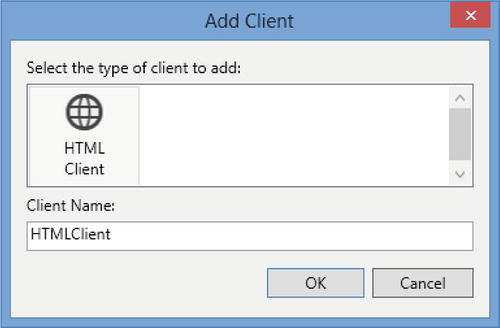
Figure 8-2. Adding an HTML client
Once you add an HTML client, Visual Studio upgrades your project. This process creates a new project file with an ls3proj extension and upgrades your application’s model schema from v2 to v3.
Once the upgrade process finishes, your new HTML client project becomes your startup project. This means that when you debug your application by pressing F5, Visual Studio runs your HTML client project. If you want to debug and run your Silverlight client, right-click your Client project in Solution Explorer and select the “Set as StartUp Client” option.
If the “Add Client” dialog fails to add an HTML client, try upgrading your project independently, and then try adding an “HTML client” again. You can perform an independent upgrade by right-clicking your project in Solution Explorer and choosing the “Upgrade Project” option.
 Caution Make sure to back up your application. Upgrading a project rewrites the contents of your LSML file. You can lose data if you’ve customized your LSML file, for example, by creating global values (Chapter 6). Once you upgrade a project, you won’t be able to share your work with other developers who haven’t installed Visual Studio 2012 Update 2.
Adding Screens to Your Application
Once you add an HTML client, you can start to add screens to your application. To do this, right-click your HTMLClient in Solution Explorer and choose the “Add Screen” option. This opens the “Add New Screen” dialog, as shown in Figure 8-3.
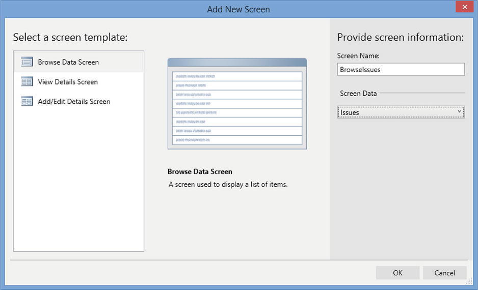
Figure 8-3. Adding a new screen
This dialog looks very similar to the Add New Screen dialog that you’re familiar with, but notice how it contains fewer screen templates. The screen templates that appear are self-explanatory. The Browse Data Screen template creates a screen that shows a collection of entities through a List control.
The List control allows you to specify the action that occurs when a user selects an item in the control. It allows you to open the selected entity in a View Details Screen or Add/Edit Details Screen.
The View Details Screen template builds a screen that’s designed to show a read-only view of data, whereas the Add/Edit Details Screen template creates a screen that allows users to edit data.
Following on from Chapter 7, you won’t have any difficulty in understanding how to design and customize HTML screens. This is because LightSwitch provides a screen designer that looks almost identical to the one that you’ve used before. Many of the concepts are the same—you still design screens using the hierarchical Screen Content Tree, Screen Members still appear in the left panel, and you can still add queries and local properties by clicking on the Add Data Item button.
Despite these similarities, the HTML designer introduces some different layouts and controls. This section describes the differences that you’ll find in further detail.
Understanding the Top-Level Screen Layout
Let’s begin by creating a Browse Data Screen that displays data from the Issue table. Open the “Add New Screen” dialog, select the “Browse Data Screen” template, and name your screen BrowseIssues. Once you do this, the template generates the screen layout that’s shown in Figure 8-4. Beneath the root node, you’ll find two folders: Tabs and Popups.
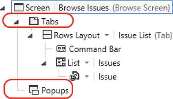
Figure 8-4. HTML screen layout, highlighting tabs and popups
Each data item that you add beneath the Tabs folder appears in a separate tab. The user can switch tabs simply by clicking the tab heading that appears at the top of the screen.
You can create popups by adding controls beneath the Popups folder. To show the contents of a popup, you can either write code or configure buttons or controls to open the popup.
Using Data List Controls
The Silverlight controls that you’ve seen in previous chapters include the DataGrid and DataList controls. You won’t find these controls in the HTML client—instead, LightSwitch provides two controls that are called List and Tile List.
The difference between these two controls is that List renders data items from top to bottom, whereas Tile List renders data items from left to right and then top to bottom (Figure 8-5).
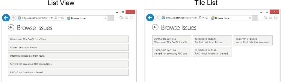
Figure 8-5. List View vs. Tile List
Using Data Controls
Just like the Silverlight client, data controls allow you to display individual data items. The controls that you’ll find are intuitive, but following are several controls that you’ll be unfamiliar with:
- Text: This control displays read-only text. It’s the HTML client’s equivalent of the Silverlight client’s Label control.
- Paragraph: This is similar to the Text control. It allows you to display read-only text, but unlike the Text control, it allows you to set the height of the control.
- Text Area: There are two controls users can use to enter text: Text Box and Text Area. The difference between the two is that Text Boxes allow users to enter only a single line of text, whereas Text Areas allow users to enter multiple lines, including line breaks.
- Flip Switch: The Flip Switch control allows users to edit Boolean values. LightSwitch renders this control as a button that displays either Yes/No or On/Off options. You can define which set of options the control shows by setting the Options dropdown in the properties sheet.
- Date/Time Picker: The Date/Time Picker control allows users to enter and view dates and times. You can configure the Date/Time Picker through the properties sheet for your data item. The Date/Time Picker allows users to enter the date parts by choosing from a list of values. A useful setting is the minute increment setting, which defaults to 5 (Figure 8-6). This means that the minute picker shows the values 0, 5, 10, 15, 20, 25, 30 (and so on) rather than the values 0 through 60.
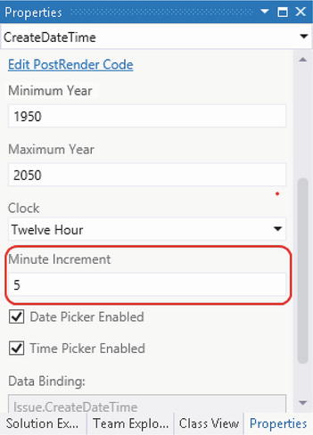
Figure 8-6. DateTime Picker control properties
The Silverlight client includes data-picker controls such as the AutoCompleteBox and Modal Window Picker controls. The HTML client comes with just a single data-selection control—the “Details Modal Picker.” Just as with the AutoCompleteBox control, you can restrict the items that are shown in this control by setting the Choices property to a user-defined query.
To illustrate this control, Figure 8-7 shows a Details Modal Picker control that a user would use to allocate an engineer to an issue.
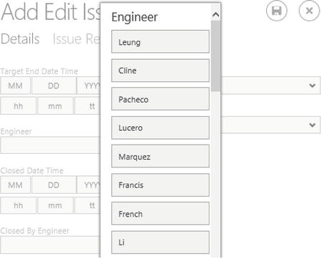
Figure 8-7. Details Modal Picker
You can modify the content that the control shows in each row by replacing the Details Modal Picker’s Summary Control with a Rows Layout and adding data items beneath your Rows Layout. The principle of how this works is identical to the way that you would do it for the AutoCompleteBox. You can refer to the section “Using the Auto Complete Box Control” in Chapter 3 for further details.
Unlike the AutoCompleteBox or Modal Window Picker controls, the Details Modal Picker control doesn’t allow users to search for records. For example, the AutoCompleteBox control filters the choices based on what the user types into the control. If your database contains hundreds of engineer records, your users could spend ages scrolling through the list until they find the correct engineer. You can improve this behavior by building a custom search dialog, and you’ll find out how to do this later in this chapter.
Setting Screen Properties
The properties sheet for the root node of your screen allows you to set your screen’s display name and control the visibility of tab titles (Figure 8-8).
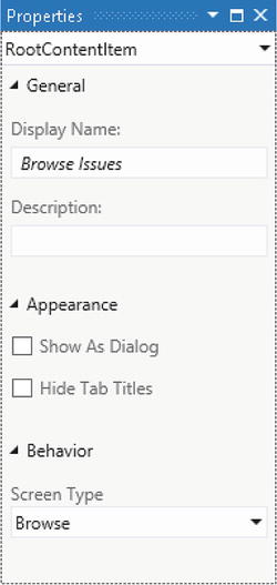
Figure 8-8. Setting screen properties
LightSwitch shows the Display Name that you specify as a title that appears at the top of your screen. If you choose the option to hide the tab titles, LightSwitch shows only the contents of the first tab. If you want to display a different tab, you’ll need to write code or configure a button or control to show the tab.
The properties sheet allows you to define the Screen Type, and there are two options that you can choose: Browse and Edit. The main purpose of this setting is to control the navigation buttons that appear on your screen. If you set the Screen Type to Browse, LightSwitch shows only an OK button. If you set the Screen Type to Edit, LightSwitch also shows a Cancel button. This button allows the user to discard the changes that they’ve made on a screen. The exception to this is that LightSwitch shows a Save button, rather than an OK button, on the first Edit screen that the user encounters in an application.
Creating a Navigation Structure
Any serious application includes more than one screen, so you’ll need to provide a way for users to navigate your application. In this section, you’ll find out how to create a startup screen, how to allow users to open screens, and how to show popups and dialogs.
Creating a Startup Screen
When a user starts the HelpDesk application, the initial view that the user sees consists of a screen that contains a series of buttons. These buttons allow the user to open screens to carry out different tasks.
To create this screen, open the “Add Screen Dialog” and add a new screen to your application. Choose the Browse Data Screen template, set the Screen Data dropdown to None, and name your screen Startup. Once you do this, right-click the Startup screen in Solution Explorer and choose the “Set as Home Screen” option. This option sets the initial screen that LightSwitch displays when a user starts your application.
Return to the screen designer and, beneath the Tabs folder, add some Rows Layouts. Use the properties sheet to set the display name of the first Row Layout to “Issues.” Beneath this group, add another Rows Layout. Use the Add button to add two buttons. When the Add Button dialog appears, choose the radio option to “Write my own method,” and name your methods ViewIssues and CreateNewIssue.
Now select the root node of your screen and use the properties sheet to change the display name of your screen to “Main Menu.” You can now run your application, and Figure 8-9 shows what your screen looks like at design time and runtime.
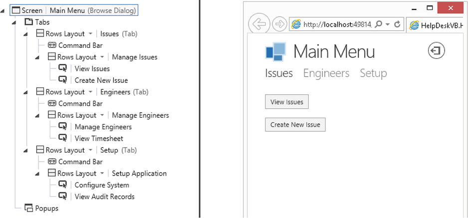
Figure 8-9. Startup screen –Design time vs. runtime
Notice that the screen includes a logout button. LightSwitch automatically adds this button to the screen that you’ve defined as your startup screen.
Navigating to Different Screens
The next step is to configure the “click action” of the buttons on your startup screen. Let’s start with the first button, “View Issues.” You’ll now configure this button so that it opens your BrowseIssues screen.
In your StartUp screen, select the “View Issues” button and open the properties sheet. There, you’ll find an Actions group that contains a “Tap” link. Click on this link to open the “Edit Tap Action” dialog that’s shown in Figure 8-10.
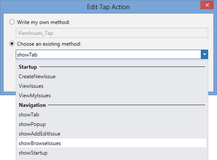
Figure 8-10. Edit Tap Action dialog
This dialog provides two ways for you to control what happens when a user clicks on a button. You can either write your own JavaScript method or choose one of LightSwitch’s prebuilt navigation methods.
The “Choose an existing method” dropdown contains two main groups. The first group allows you to choose one of the local methods that you’ve defined on your screen. The second group contains show methods for each screen that you’ve created in your application. To open your “browse issues” screen, you can simply select the showBrowseIssues choice that you’ll find in the Navigation group.
Adding New Records
Unlike the Silverlight client, there isn’t a screen template that allows you to create screens for the sole purpose of adding records. Instead, you’ll need to create a screen that uses the Add/Edit Screen Details template. So to add a screen that allows users to add records, create a screen that’s based on the Issue table and name it AddEditIssue. In the “Add New Screen” dialog, use the check box to include the “Issue Response” data—you’ll use this data collection in the next section.
Once you do this, you can configure the CreateNewIssue button on your setup screen to open your AddEditIssue screen by using the “Edit Tap Action” dialog (Figure 8-11). When this dialog opens, select the “Choose an existing method” radio button and choose the showAddEditIssue option from the “Navigation Group.” LightSwitch detects that you’ve selected an Add/Edit screen and shows a text box that allows you to enter the entity that you want to work with. Enter “(New Issue)” into this text box to configure your button to open your Add/Edit screen in Add mode.
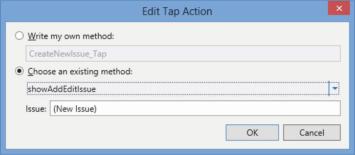
Figure 8-11. Adding new records
When you now run your application and click on your “Create New Issue” button, LightSwitch will open your Issue Detail screen in Add mode.
EXERCISE 8.1 – CREATING HTML SCREENS
Add an HTML client to your application, and create some HTML screens for your application. Create a Browse Screen for your Issue table. Experiment with the List and Tile List controls, and examine the differences between the two controls. Use the screen content tree to change the items that appear beneath these two controls. Create an Add/Edit Details screen for your Issue table, and configure your Browse screen so that it opens the selected issue in the Add/Edit Details screen. Now run your application and notice the navigation controls that LightSwitch displays at the top of your screen (for example, logout, save, discard, ok). Use the properties sheet to change the “Screen Type” for your Browse and Add/Edit Details screens, and notice the effect that it has on the navigation controls.
Dialogs are modal screens that “open up” and float above an existing screen. When LightSwitch shows a dialog, it darkens the existing screen, which is still visible beneath. Dialogs are perfect for adding UI elements that you can reuse on multiple screens. To create a dialog, simply create a screen and check the “Show as Dialog” check box in the properties sheet, as shown in Figure 8-8.
Dialogs are a great way to allow users to add and edit child records. This section shows you how to create a dialog that allows users to add and edit the child issue response records that relate to an issue record.
To create this example, add a new screen that uses the “Add/Edit Details Screen” template, and base it on the IssueResponse table. Name your screen AddEditIssueResponse. Once you create your screen, select the root node of your screen use the properties sheet to check the “Show As Dialog” check box.
Creating Child Records in a Dialog
To open your dialog, open your AddEditIssue screen in the screen designer. If you included the Issue Response data when you created your screen, the IssueResponses collection will appear in the screen member list. If not, don’t worry. Simply select the “Add IssueResponses” link from the screen member list.
By default, LightSwitch adds your IssueResponses collection to a separate tab and renders the data using a List control. Find your List control, and add a new button beneath it by clicking on the Add dropdown and choosing “New Button.”
When the “Add Button” dialog opens, select the “Choose an existing method” radio option and use the dropdown box to select the IssueResponse.addAndEditNew option (Figure 8-12). When you do this, LightSwitch populates the “Navigate To” dropdown with a list of screens that are capable of showing Issue Response records. Choose the “Add Edit Issue Response” dialog that you created earlier.
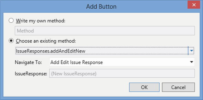
Figure 8-12. Adding new records
Editing Child Records in a Dialog
To allow users to open child records in a dialog, you can configure the “Tap Action” of your List control to open the selected record in a new dialog. To accomplish this, open your AddEditIssue screen, and select the list control for your issue responses collection. Click on the “Item Tap” link in the properties sheet and when the “Edit ItemTap Action” dialog opens, select the “Choose an existing method” radio option. Use the dropdown box to select the IssueResponse.editSelected option, and use the “Navigate To” dropdown to select your “Add Edit Issue Response” dialog (Figure 8-13).
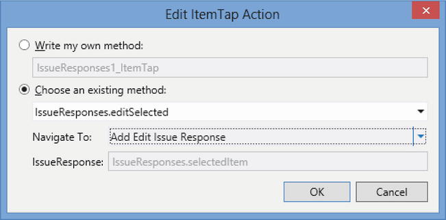
Figure 8-13. Editing child records
When you now run your application and view the Issue Response list for an issue, you can tap on a row to open the selected record in a dialog. Figure 8-14 shows how the dialog looks at runtime. This screenshot also illustrates the appearance of the default Date, Date/Time Picker, and Flip Switch controls. Notice how the Response Text field allows the user to enter multiline text. You can configure this by using a Text Area control that specifies a height in pixels.
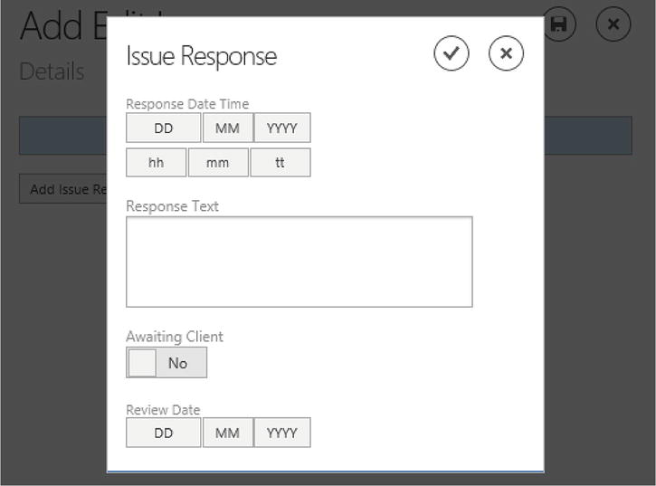
Figure 8-14. Adding a new child record through a dialog
Popups are similar to dialogs. They allow you to show UI controls in a modal panel that appears above an existing screen. The main difference between a popup and dialog is that popups are defined at a screen level and you can’t share them across multiple screens. Unlike its treatment of dialogs, LightSwitch doesn’t gray out the underlying screen when it shows a popup, nor does it show OK and Discard or Save buttons. To close a popup, a user would click on a screen area outside of the popup. Another characteristic is that LightSwitch doesn’t center-align popups in the same way as dialogs.
To demonstrate how popups work, here’s how to attach a popup to your issue screen that shows additional details about the engineer who has been assigned to the issue. To create this example, carry out the following steps:
- Open your AddEditIssue screen in the screen designer, and create a new popup by clicking on the “Add Popup” button that appears beneath the popups folder. Open the properties sheet, and set the name of your popup to AssignedEngineerPopup.
- Drag the Issue entity’s AssignedTo property onto your popup. By default, LightSwitch renders the AssignedTo property as a “Details Modal Picker” control. Use the dropdown to change the control type to a Rows Layout.
- Open the properties sheet for your Rows Layout, and check the “Use Read-only Controls” check box that you’ll find in the General section. You can tidy up your popup view by deleting the engineer property controls that you don’t want to show.
- In the main part of your screen, add a new button. When the “Add Button” dialog appears, select the “Choose an existing method” radio button and use the dropdown to select the showPopup option. Use the dropdown to select the “Assigned Engineer Popup” choice. Set the display property of your button to “Show Assigned Engineer Details.” Figure 8-15 shows how your screen should now look.
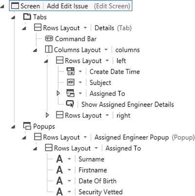
Figure 8-15. Designing a Popup
You can now run your screen, and Figure 8-16 shows how it looks. When a user edits an issue and sets an “Assigned To” engineer, the “Show Assigned Engineer Details” button allows the user to view the selected engineer in a popup.
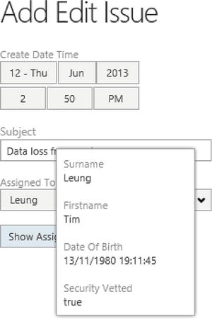
Figure 8-16. Viewing a Popup
This example demonstrates how popups are ideal for showing additional pieces of information on a screen. In Figure 8-16, also notice how the popup docks itself to the location of the button rather than aligning the content in the center of the screen (as in the case of a dialog).
Using Compact Margins
One of the property sheet options that you’ll have noticed in group controls such as “Rows Layout” is the “Use Compact Margins” check box. According to the help, the purpose of this check box is to “display all child items with Compact Margins.” This may not mean very much to you, so the best way to describe this feature is through the screenshot that’s shown in Figure 8-17.
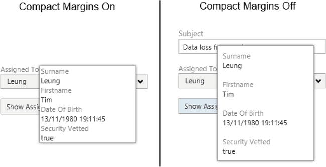
Figure 8-17. Using Compact Margins
Figure 8-17 shows the Add/Edit Issue screen with the “Compact Margins” setting enabled and disabled on the popup. With Compact Margins enabled, LightSwitch renders the child items much closer together. This “Compact” appearance looks much neater on pieces of UI that are designed to show summary data, such as the engineer popup.
Creating a Search Screen
Although LightSwitch doesn’t include a search screen template, you can easily create a search screen by creating a Browse Data Screen that’s based on a query. In fact, the process is identical to the “Creating an Advanced Search Screen” example that you saw in Chapter 7. You won’t find it difficult to create a search screen, so this chapter focuses on showing you how to add search capabilities to your application by demonstrating how to allow users to filter the choices in the List control.
Earlier in this chapter, you saw how difficult it is for users to assign an engineer to an issue by using the “Modal Window Picker” control. This is particularly the case if the control contains hundreds of engineers’ records (Figure 8-7). This section shows you how to create a dialog that users can use to find engineers by name. You can then call this dialog from your AddEditIssue screen to make it easier for users to assign an engineer to an issue.
To begin, you’ll need to create a query that returns engineer records where the surname or first name matches the value of a parameter called Name. Create the query that’s shown in Figure 8-18, and name your query EngineersByName.
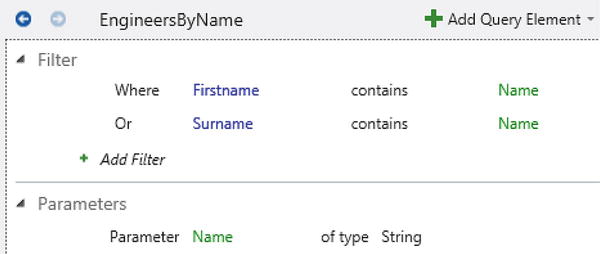
Figure 8-18. Query that filters Engineers by Name
Once you’ve added your query, carry out the following steps to create your dialog:
- Create a new “Add/Edit Details Screen” that’s based on the Issue table, and name your screen EngineerPicker.
- In the properties sheet for the root node of your EngineerPicker screen, set the display property to “Find Engineer” and make sure that you select the “Show As Dialog” check box. (This is the default option.)
- Delete all of the Issue property controls on the screen, except for the AssignedTo property.
- Click on the “Add Data Item” button, and add a local string property called EngineerName. Make sure to uncheck the “Is Required” check box.
- Drag the EngineerName property from the screen member list onto your screen, above the AssignedTo “Details Modal Picker.”
- Click on the “Add Data Item” button, and add your EngineersByName query.
- Set the “Parameter Binding” for the EngineersByName query’s Name parameter to the EngineerName property. (If you need some help on binding parameters, refer to the “Creating an Advanced Search Screen” section in Chapter 7.)
- Open the properties sheet for your AssignedTo “Details Modal Picker.” Change the Choices setting from Auto to EngineersByName.
- Change the control that appears beneath your “Details Modal Picker” from a Summary Control to a Columns Layout. Delete the properties beneath the Columns Layout so that only the Firstname and Surname properties remain. This completes the design of your “Engineer Picker” dialog, and Figure 8-19 shows how your screen now looks.
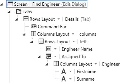
Figure 8-19. Designing the EngineerPicker Dialog
Note You might wonder why you’ve replaced the Summary Control with a Columns Layout that includes the engineer’s first name and surname. Why not keep the Summary Control, and use it to show the full-name computed property that you defined in Chapter 2? The reason is because the HTML client doesn’t support computed properties. Computed properties are defined with .NET code, and therefore, the JavaScript HTML client can’t derive the result of a computed property value on the client.Now that you’ve created your Engineer Picker dialog, you’ll need to carry out the following step in your Issue screen to allow users to open your Engineer Picker dialog:
- Open your AddEditIssue screen, and add a new button beneath the AssignedTo property. When the “Add Button” dialog appears, select the showEngineerPicker option and select Issue in the Issue text box (Figure 8-20). In this context, Issue refers to the local Issue property on your screen. Set the display name of your button to “Find Engineer.”
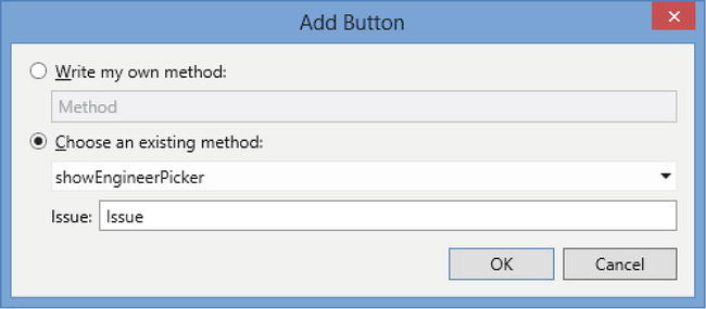
Figure 8-20. Opening a Dialog
You’re now ready to run your application, and Figure 8-21 shows what your screen looks like at runtime.
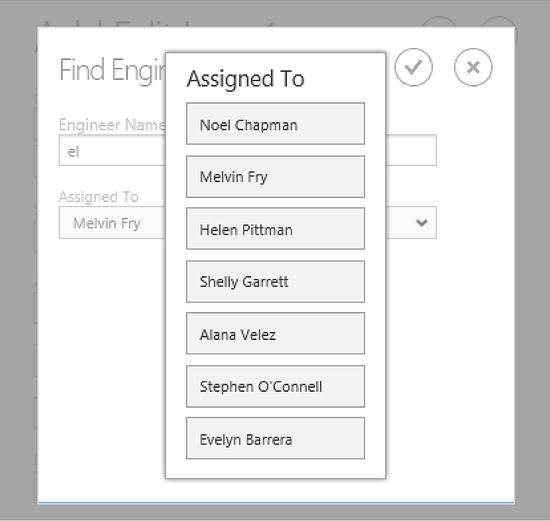
Figure 8-21. Engineer Picker screen at runtime
When the user opens an issue and clicks on the “Find Engineer” button, LightSwitch opens the “Find Engineer” dialog that allows the user to enter a name. This allows the user to enter an engineer name, and Figure 8-21 illustrates a case where the user enters “el” into the engineer name search box. When the user clicks on the “Assigned To” control that’s below the engineer name search box, LightSwitch shows a list of engineer records where the surname or first name contains the text that’s been entered by the user (in this case, “el”). This filtered list makes it much easier to find an engineer, compared to forcing the user to find an engineer by scrolling through a list of hundreds of records.
This example also illustrates a case where a dialog works better than a popup or a tab. In this scenario, a dialog provides a center-aligned piece of UI that looks neater than a popup. When the user clicks on the “Assigned To” Details Modal Picker in the “Find Engineer” dialog, LightSwitch opens the list of available choices in a center-aligned panel that appears above everything else on the screen. By using a center-aligned dialog, you can be certain that the “Details Modal Picker” appears directly above the dialog, therefore drawing the user’s attention to the “Assigned To - Details Modal Picker.”
Another advantage is that dialogs include a cancel button. So if a user makes a mistake in the “Find Engineer” dialog and selects the wrong engineer, they can easily undo their change by clicking on the cancel button.
Extending Your Application with JavaScript
The HTML client allows you to customize your applications by writing JavaScript. This allows you to add custom logic (for example, client-side validation), customize the UI that’s shown to the user, bind data to custom controls, and interact with data.
If you’ve used earlier versions of Visual Studio, you’ll be pleasantly surprised at how well Microsoft has improved its support for JavaScript. The IDE provides full IntelliSense when you’re writing JavaScript. It auto-completes and provides tooltip descriptions for most of the JavaScript objects that you’ll encounter. This includes IntelliSense support for local screen properties and custom entities, as shown in Figure 8-22.
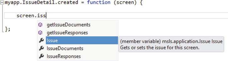
Figure 8-22. IntelliSense provides support for custom entities
Another improvement is that breakpoints now work as you’d expect them to work. In contrast to previous versions of Visual Studio, you don’t need to mess about with enabling debugging in Internet Explorer or attach your Visual Studio debugger to your browser process. You can simply place breakpoints in your JavaScript code, press F5, and go!
Using the LightSwitch JavaScript API
Besides enhancements to the IDE and better debug support, LightSwitch also provides a JavaScript API that allows you to access data and carry out application tasks. The objects that you’ll find in the JavaScript API work in very much the same way as the objects that exist in the .NET API.
The two objects that you’ll most often use are the myapp and screen objects. The myapp object represents your LightSwitch application, and it allows you to open screens, access the data workspace, and save or cancel changes. myapp is actually an alias that you use to access the msls.application object, and msls refers to the LightSwitch API’s top-level object.
Figure 8-23 shows some of the IntelliSense choices that apply to the myapp object. Notice the Show methods that allow you to open screens. This figure also highlights a method that you won’t find in the Silverlight API, called navigateHome. This method moves the user back to the screen that you’ve defined as the home screen. Table 8-1 highlights some of the methods that you’ll find through the myapp object.
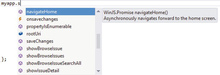
Figure 8-23. Some of the methods that belong to the myapp object
Table 8-1. Application (myapp) Object Methods
| Method | Description |
|---|---|
| activeDataWorkspace | Gets the active data workspace |
| applyChanges | Asynchronously merges any changes in the nested change set back into the parent change set (or saves top-level changes), and keeps the user on the current screen |
| cancelChanges | Asynchronously cancels any changes, and navigates the user back to the previous screen |
| commitChanges | Asynchronously merges any changes in the nested change set back into the parent change set (or saves top-level changes), and navigates the user back to the previous screen |
| navigateBack | Prompts the user to apply or cancel any changes. If the user applies the change, this method navigates the user back to the previous screen. Otherwise, the user will remain on the current screen |
| navigateHome | Navigates the user to the startup screen |
| show<Screen> | Navigates the user to the specified screen |
Attaching JavaScript Code
There are several “entry points” that allow you to write JavaScript code. First, you can create custom buttons and attach JavaScript code that executes when a user clicks on the button. Second, if you can’t find a built-in control that suits your needs, you can author your own custom controls. JavaScript is the language that allows you to generate these controls. You can also create listeners that run custom code when, for example, the value of a control changes.
Finally, you can attach JavaScript to handle screen or content item events. As with the Silverlight client, you can use the Write Code button to create methods that handle these events. To illustrate this, select a Rows Layout and click on the “Write Code” button. This reveals the methods that are shown in Figure 8-24.
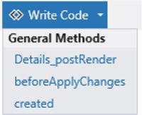
Figure 8-24. Screen methods that allow you to add custom JavaScript code
Compared to the “Write Code” button in the Silverlight client designer, there are far fewer methods. The JavaScript methods that you can use include
- created: The code that you write in this method executes when the HTML client creates your screen. It’s the ideal place to set default screen values.
- beforeApplyChanges: This code runs just before the HTML client applies screen changes, and it is useful for adding validation code.
- <control>_postRender: For each control on your screen, the HTML client calls its postRender method after it generates the HTML for your control.
The created and beforeApplyChanges events are screen-wide events, whereas the postRender event is specific to each content item. The postRender event doesn’t apply to custom controls, but you’ll learn more about this later in this chapter.
Setting Default Screen Values
To show you how to apply JavaScript to your application, let’s begin with a simple demonstration. This example customizes the Add/Edit Issue screen by defaulting the create date of the issue to today, when the user creates a new record.
To create this example, open your AddEditIssue screen in the designer, click on the “Add Code” button, and choose the created method. Visual Studio opens the code window and adds a method stub for the created method. Modify your code as shown in Listing 8-1.
Listing 8-1. Setting Default Values
File:HelpDeskVBHTMLClientUserCodeAddEditIssue.js

/// <reference path="../GeneratedArtifacts/viewModel.js" />

myapp.AddEditIssue.created = function (screen) {
    if (screen.Issue.Id == undefined) {
        screen.Issue.CreateDateTime = new Date();
    }
};
The created method includes a screen parameter  that allows you to access the screen object. The screen object allows you to access the local properties on your screen. This code detects whether the user is adding a new record by testing if the Issue.Id property is undefined
  . If so, the code sets the CreateDateTime property to today’s date by assigning to it a new instance of a JavaScript date object
  .
.
Caution Your code file includes a reference to a file called viewModel.js. Make sure not to delete this line. If you do, IntelliSense’s auto completion will no longer work in the code editor.
Setting the Screen Title
The screen object allows you to access your screen title through the displayName property. LightSwitch displays the screen title at the top of your screen and, by default, it shows the name of your screen.
This example shows you how to modify your AddEditIssue screen so that if a user opens an existing Issue, the screen title shows the Issue Subject text. Otherwise, it’ll show the heading “New Issue” instead.
Open your screen in the designer, click on the “Add Code” button, choose the created method, and add the code that’s shown in Listing 8-2.
Listing 8-2. Setting the Screen Title
File:HelpDeskVBHTMLClientUserCodeAddEditIssue.js

myapp.AddEditIssue.created = function (screen) {
    if (screen.Issue.Id == undefined) {
        screen.details.displayName = "New Issue";
    } else{
        screen.details.displayName = screen.Issue.Subject;
    }
};
Once again, the code tests whether the value of the Issue.Id property is undefined . Depending on the result, it then sets the screen title by assigning a value to the screen.details.displayName property .
The screen object exposes other useful properties and methods, and some of these are shown in Table 8-2.
Table 8-2. screen Object Methods and Properties
| Method/Property | Description |
|---|---|
| closePopup | Closes the popup that’s currently open |
| findContentItem | Finds a content item |
| showPopup | Allows you to specify a popup name, and opens the popup that you supply |
| showTab | Allows you to specify a tab name, and shows the tab that you supply |
| <localProperty> | You can access the local properties that you’ve defined by name via the screen object |
| <localMethod> | You can call the local methods that you’ve defined on your screen |
Hiding Controls
In Chapter 7, you learned how to retrieve a reference to a content item (LightSwitch’s representation of the View Model for your data item). The HTML client also allows you to access content item objects, and you can use these to access properties such as validation details and the underlying value of your data item.
The HelpDesk application allows users to store the date and time and the engineer who closes an issue. When a user enters a new issue, there’s no point in wasting valuable screen space by showing the fields that relate to issue closure. In this example, you’ll find out how to hide these controls when the user enters a new issue, but keep them visible when a user edits an issue.
To create this example, open the AddEditIssue screen in the designer, create a new group called ClosureDetails, and move the ClosedByEngineer and ClosedDateTime controls into this group. Click on the “Add Code” button, choose the created method, and add the code that’s shown in Listing 8-3.
Listing 8-3. Hiding Controls
File:HelpDeskVBHTMLClientUserCodeAddEditIssue.js

myapp.AddEditIssue.created = function (screen) {
    if (screen.Issue.Id == undefined) {
        screen.findContentItem("ClosureDetails").isVisible = false;
    }
};
This code obtains a reference to a content item object for the ClosureDetails group by calling the screen’s findConentItem method. If the screen is in add mode, the code hides the ClosureDetails group by setting the content item’s isVisible property to false.
Accessing Data in Code
You can access data quite intuitively in code, and you’ve already seen how to access your Issue data in the “Setting Default Screen Values” section. Because you can easily work out the correct syntax through IntelliSense, this section won’t go into too much detail. Instead, the following list shows you a brief summary of the syntax that you can use to carry out common data tasks:
-
Access the current data workspace
myapp.activeDataWorkspace -
Access the Intrinsic data source
myapp.activeDataWorkspace.ApplicationData -
Access the Engineer table
myapp.activeDataWorkspace.ApplicationData.Engineers -
Create a new Engineer record
var newEng =
myapp.activeDataWorkspace.ApplicationData.Engineers.addNew(); -
Delete the Engineer record that you’ve created
newEng.deleteEntity(); -
Save changes
myapp.activeDataWorkspace.saveChanges(); -
Create a new data workspace
var myWorkspace = new myapp.DataWorkspace;
Chapter 15 shows you a full example of how to create records in code. This includes a listing that shows you how to create a new data workspace and how to add new records by using the JavaScript API.
If you create a button and bring up the “Tap Action” dialog, you’ll notice that it doesn’t include an option that allows you to delete records. Although the graphical dialog doesn’t include a “delete” option, it’s possible to delete records by writing custom JavaScript code. To demonstrate how to accomplish this, the following example shows you how to create a button with which users can delete Issue Response records. This button opens a popup that prompts the user for a confirmation prior to the actual deletion. To create this example, carry out the following steps:
- Open your AddEditIssueResponse screen. Click on the “Add Data Item,” and add a string property called PopupTitle. Make sure to uncheck the “Is Required” check box.
- Click on the “Add Data Item,” and add another string property called PopupText. Make sure to uncheck the “Is Required” check box.
- Click on the “Write Code” button, select the created method, and enter the code that’s shown in Part 1 of Listing 8-4.
Listing 8-4. Deleting Records
File:HelpDeskVBHTMLClientUserCodeAddEditIssueResponse.js

// Part 1 - Popup Display Code
myapp.AddEditIssueResponse.created = function (screen) {
    screen.PopupTitle = "Confirm Delete";
    screen.PopupText = "Are you sure you want to delete this record?";
};

// Part 2 - Popup Button Code
myapp.AddEditIssueResponse.CancelPopup_execute = function (screen) {
    screen.closePopup();
};

myapp.AddEditIssueResponse.DoDelete_execute = function (screen) {
    screen.IssueResponse.deleteEntity();
    myapp.applyChanges();
    myapp.navigateBack();
}; - Return to the screen designer. Create a new popup, and name it ConfirmDelete. Drag your PopupTitle property from the screen member list onto your popup, and change the control type from a TextBox to a Text control. In the properties sheet, set the Label Position to None, and set the Font Style to Large.
- Drag your PopupText property from the screen member list onto your popup, and change the control type from a TextBox to a Text control. In the properties sheet, set the Label Position to None and set the Font Style to Normal.
- Add a new Group beneath your PopupText control, and change the control type to a Columns Layout. Add a new button to your Columns Layout, and when the “Add Button” dialog opens, select the “Write my own method” radio button and name your method DoDelete. Set the Display Name of your button to “OK.”
- Add another button to your Columns Layout. When the “Add Button” dialog opens, select the “Write my own method” radio button and name your method CancelPopup. Set the Display Name of your button to “Cancel.”
- Add a button to the Command Bar section of the first tab on your screen. When the “Add Button” dialog opens, select the “Choose an existing method” radio button, select the showPopup option, and select the “Confirm Delete” popup from the popup dropdown. Use the dropdown in the Appearance section of the properties sheet to set the icon to “Trash.” Set the Display Name of your button to “Delete Record.”
- Right-click the CancelPopup and DoDelete methods in the screen member list, click on the “Edit Execute Code” link, and enter the code that’s shown in Part 2 of Listing 8-4. Figure 8-25 shows how your screen should now look.
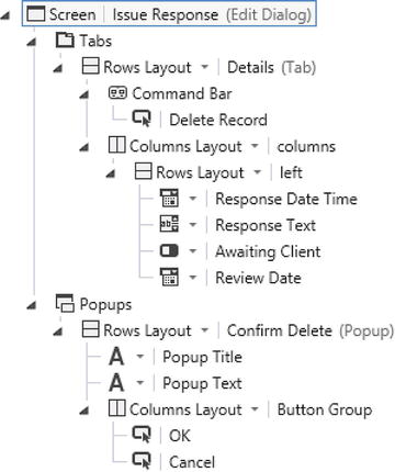
Figure 8-25. Creating a Delete option
You can now run your application and open your Issue Response screen by selecting an Issue Response record from your AddEditIssue screen. Figure 8-26 shows how your Issue Response dialog looks. If you click on the “Delete Record” button, LightSwitch opens the ConfirmDelete popup. The text that’s shown in this popup is set by the code that you created in Listing 8-4 . If the user clicks on the Cancel button, the code closes the popup by calling the screen’s closePopup method . The closePopup method closes the popup and keeps the user on the Issue Response screen. If the user clicks OK, the code deletes the Issue Response record by calling the property’s deleteEntity method . It then applies the change and navigates the user back to the calling screen (in this case, the AddEditIssue screen) by calling the navigateBack method .
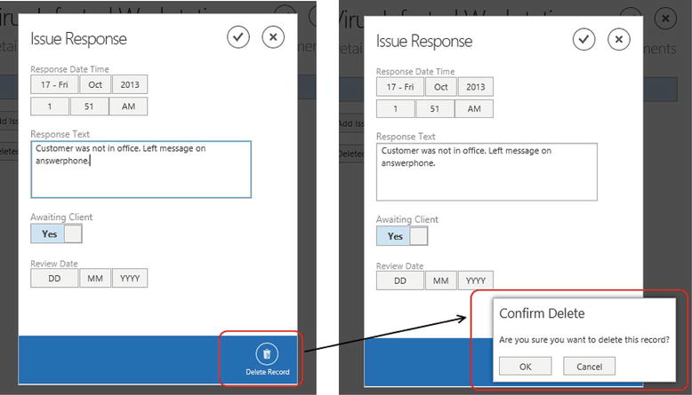
Figure 8-26. Delete button and confirmation at runtime
Setting a Custom Command Icon
When you add a button to the Command Bar section of a tab, you can set the icon LightSwitch uses to represent your button. In the previous example, you set the icon for the ShowConfirmDelete button to “Trash.” The icon dropdown contains a list of 32 icons that you can use, and these are shown in Figure 8-27.
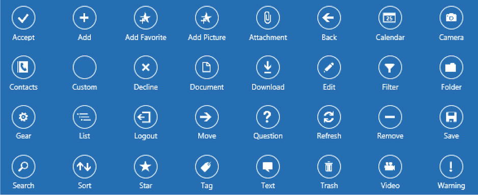
Figure 8-27. Command Bar icon choices
If you can’t find an icon that suits your needs, you can configure your button to use a custom icon, and you can achieve this by writing code in your button’s postRender method. You’ll see an example of how to use this method later in the chapter.
Accessing Screen Data Collections
When you’re writing custom JavaScript code, it’s not unusual for you to want to access the data in screen collections. To demonstrate how this works, here’s how to create a method in your Add/Edit Issue screen that sets the “Awaiting Client” property on all related Issue Response records to false. The main purpose of this example is to show you how to access and loop through related child records.
To create this example, open your AddEditIssue screen and add a new button. When the “Add Button” dialog opens, select the “Write my own method” radio button and name your method ClearAwaitingClient. Right-click your method in the screen member list, click on the “Edit Execute Code” link, and enter the code that’s shown in Listing 8-5.
Listing 8-5. Working with Screen Collections
File:HelpDeskVBHTMLClientUserCodeAddEditIssue.js

myapp.AddEditIssue.ClearAwaitingClient_execute = function (screen) {

    for (var i = 0; i < screen.IssueResponses.count; i++) {
        var issResp = screen.IssueResponses.data[i];
        issResp.AwaitingClient = false;
    }
};
This completes the code, and you’re now ready to build and run your screen. The first thing to highlight is the syntax that allows you to access your IssueResponses collection. You might imagine that screen.Issue.IssueResponses gives you access to the child collection, but in actual fact, screen.IssueResponses is the syntax that you should use. The for loop allows you to loop through the items in the collection that have loaded. The screen.IssueResponses.data member returns an array that allows you to access the individual IssueResponse records. The final part of the code sets the AwaitingClient property for each Issue Response record to false .
Screen collection objects expose useful properties and methods that you can call, and Table 8-3 highlights some of the more useful methods.
Table 8-3. Screen Collection Methods
| Method/Property | Description |
|---|---|
| addNew | Call this method to add a new item to the collection |
| canLoadMore | Returns true if the collection believes it can load more pages of data |
| count | Gets the number of items that are currently in the collection |
| data | Allows you to access the items in the collection |
| deleteSelected | Call this method to delete the currently selected item |
| isLoaded | Returns true if the collection has loaded one or more pages |
| load | Call this method to load the first page of data into the collection |
| loadError | Returns the last load error (if an error has occurred) |
| loadMore | Call this method to asynchronously load another page of data into the collection |
| selectedItem | Returns the currently selected item in the collection |
| state | Returns the state of the collection (the possible values are idle, loading, loadingMore) |
You’ll notice that Table 8-3 includes various “load” methods that you can call. This is because just as in the Silverlight client, data collections support pagination. If you select a data collection and open the properties sheet, you can enable or disable paging, and you can also specify the number of records that LightSwitch loads per page (Figure 8-28). In Listing 8-5, it’s worth noting that the code loops through only the records that have loaded and you can call the canLoadMore and loadMore methods if you want to work through all of the related records.
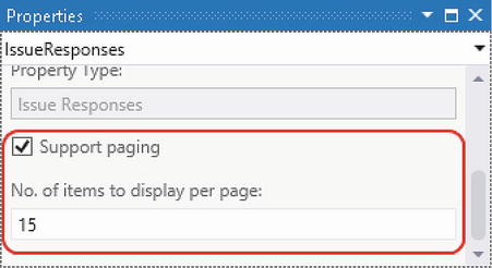
Figure 8-28. Pagination settings
Validating Data
You’ll be pleased to know that it’s very simple to perform basic validation. Chapter 5 showed you how to define predefined validation rules by using the table designer. As you’d expect, the HTML client enforces these predefined rules. It performs data type, data length, and mandatory field validation on the client. As soon as a user enters invalid data, LightSwitch highlights the offending field in red and prevents the user from applying the change. Figure 8-29 shows the screen error that appears when a user closes out of a screen and leaves a mandatory field empty.
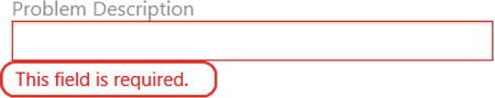
Figure 8-29. Example of required field validation
Chapter 5 also showed you how to apply more advanced validation rules by writing .NET code. A problem is that the HTML client uses the JavaScript language, and not .NET. This means that LightSwitch won’t apply your .NET rules on the client. It’ll apply custom rules only through the server-side save pipeline when the user clicks on the save button.
This behavior can be frustrating for the user. Let’s consider the validation rule that you saw in Chapter 5 (Listing 5-2). This rule specifies that an issue’s close date cannot be earlier than the create date.
Let’s imagine that a user opens the browse issues screen, finds an issue, and closes it with an invalid close date. The user then returns to the browse issues screen, finds another issue and closes it. This time, the user chooses a valid date. The difficulty is that the user won’t discover the problem with the first record until they click on the Save button. Worst of all, LightSwitch only tells the user that ‘Closed Date cannot be earlier than Create Date’, but doesn’t say which record the error relates to.
So to improve this behavior, it’s important to provide more instant user feedback. In this example, you’ll re-create this validation rule in JavaScript so that the HTML client shows a warning as soon as the user enters an invalid date.
To create this example, open your AddEditIssue screen, click on the “Add Code” button, choose the created method, and add the code that’s shown in Listing 8-6.
Listing 8-6. Validating Data
File:HelpDeskVBHTMLClientUserCodeAddEditIssue.js

myapp.AddEditIssue.created = function (screen) {

   //1 add a change listener to the ClosedDateTime property
   screen.Issue.addChangeListener("ClosedDateTime",
      function (e) {

         //2 this code runs each time ClosedDateTime changes
         var issue = screen.Issue;

         var contentItem = screen.findContentItem("ClosedDateTime");

         if (issue.CreateDateTime != undefined &&
         issue.ClosedDateTime < issue.CreateDateTime) {

            contentItem.validationResults = [
               new msls.ValidationResult(
                  screen.Issue.details.properties.ClosedDateTime,
                  "Closed date can't be earlier than create date")];
         }
   });
};
This code uses a method in the HTML client’s API called addChangeListener . This method calls JavaScript’s addEventListener method and allows you to specify code that runs every time a property value changes.
The code inside the function runs each time the CloseDateTime property changes. This code includes logic that obtains a reference to the screen’s issue property and the content item that represents the ClosedDateTime property . The next piece of code checks whether the closed date is earlier than the create date. If so, it attaches a validation result to the ClosedDateTime content item . LightSwitch will immediately show this warning to the user, as shown in Figure 8-30.
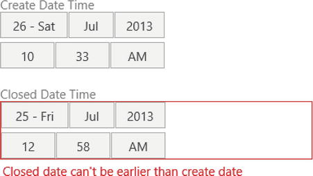
Figure 8-30. Conditional validation warning
One of the beauties of HTML client applications is that you can customize almost all parts of your screen. The only exception is the heading section. To demonstrate this feature, this section shows you how to add custom images, text, and hyperlinks to a screen, as illustrated in Figure 8-31.
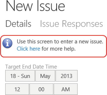
Figure 8-31. Adding custom HTML content
To create this example, open your AddEditIssue screen in the designer and select the Rows Layout that corresponds to the first tab on your screen. By default, LightSwitch names this control Details. Click on the “Add Code” button, and choose the Details_postRender method. Now add the code that’s shown in Listing 8-7.
Listing 8-7. Adding Custom HTML to a Screen
File:HelpDeskVBHTMLClientUserCodeAddEditIssue.js

myapp.AddEditIssue.Details_postRender =
    function (element, contentItem) {

        var helpText = $("<div style='padding-bottom:20px;'>" +
            "<img src='Content/Images/Info.png' style='float:left;padding-right:10px;'/>" +
        "Use this screen to enter a new issue.<br/>" +
        "<a href='http://intranet/help.htm' target='_blank'>Click here</a>" +
        " for more help.</div>");

    helpText.prependTo($(element));

    };
The postRender method includes a parameter called element . This represents the HTML markup that has been built by the HTML client. In this example, element contains the HTML markup that represents the Details group.
This code builds the new content that you want to add in a variable called helpText . This content includes a DIV (an HTML Division element) that contains an image tag, help text, and a hyperlink. This HTML represents the content that’s shown in Figure 8-31. For the image to display correctly, you’ll need to create an image called Info.png and add it to your HTML client’s ContentImages folder. You can add resources such as images by switching your project to File View and using the “Add” option in Solution Explorer. The final part of the code adds this HTML to the beginning of your Details Group by calling jQuery’s prependTo method.
As you can see, the helpText contains a fair amount of presentational data in the style attributes. To improve this code, you could apply your own CSS classes and include the style definitions in a CSS file.
Tip jQuery’s prependTo and appendTo methods are very useful for adding HTML content to your screens. You can read more about these methods at http://api.jquery.com/prepend/ and http://api.jquery.com/append/.
Using Custom Controls
As with the Silverlight Client, you’re not limited to using the built-in controls that LightSwitch supplies. If there isn’t a built-in control that looks or behaves exactly as you want, you can overcome this limitation by building your own custom control.
This section consists of two main parts. In the first part, you’ll learn how to use custom controls to show data in a read-only format. In the second part, you’ll learn how to create a fully interactive custom control that data-binds to your underlying data source. Technically, this two-way data binding requires you to carry out two distinct tasks. First, you need to run code that responds to changes in the value of your underlying data item. This allows you to write code that updates the display of your custom control. Second, you need to write code that reacts to user interaction and updates the value of your underlying data item.
Let’s take a closer look at how you’d set up a custom control. To define a custom control, use the screen designer’s dropdown to set the control type for a data item to “Custom Control” (Figure 8-32). The next step is to write JavaScript in your custom control’s render method that defines the HTML for your control. The render method includes a parameter called ContentItem that allows you to access the data that your custom control binds to.
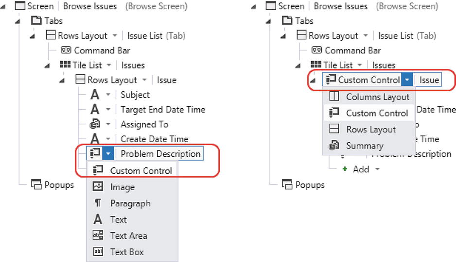
Figure 8-32. Defining Custom Controls for properties and entities
The “level” at which you create a custom control is very important because it determines the data that you can access in code. If, for example, you set the control type of the ProblemDescription property to a custom control, the ContentItem parameter gives you access to the ProblemDescription property only. If you want to create a custom control that shows both the Problem Description and the Target End Date, you wouldn’t be able to accomplish this by using a custom control that binds to the ProblemDescription property. To access more than one property from an entity, you’d need to create a custom control that binds to the entity. So, in this example, you’d change the parent Rows Layout to Custom Control. This means that your custom control’s ContentItem parameter gives you access to the Issue property, which in turn allows you to access both the Problem Description and Target End Date values.
Showing Data with Custom Controls
In the first custom control example, you’ll find out how to customize the appearance of your browse issues screen. Figure 8-33 shows the default appearance of this screen.
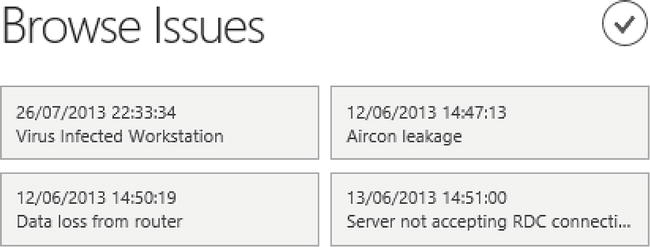
Figure 8-33. Default appearance of the Browse Issues screen
There a few things that you can improve in this screen. Each tile shows the create date of the issue, but the formatting isn’t very easy to read. This example shows you how to remove the time component and how to display the month name in words.
The second improvement that you’ll make will allow users to more easily identify issues that have exceeded the target end date. You’ll do this by displaying a warning icon in the top left part of the tile.
Note In Figure 8-33, notice how the Date/Time Picker control displays the dates in UK format (that is, day/month/year). The control uses the browser’s language setting to apply the most suitable date format. If a user sets their browser to English (US), the screen would automatically format the dates in US format (month/day/year).
Formatting Dates
To make it easier to format dates, you’ll use a utility called momentjs. Although you can use native JavaScript to format dates, a custom date library makes your life much simpler. It saves you (for example) from having to write your own custom method to convert the month number 2 to the month name “March.” If you’re unfamiliar with JavaScript, there’s no mistake in the previous sentence. JavaScript months are zero based, but even more confusingly, day numbers are one based.
Although this example uses momentjs, you can choose to use other JavaScript date libraries instead. Another good library is datejs (http://www.datejs.com/), and a quick search on the Internet will reveal many more.
To begin, download momentjs from the following web site: http://momentjs.com/ . You’ll find two versions that you can download: a minified version, and a full version. The minified version doesn’t contain comments or extra white space. The benefit of this version is that, because of its smaller size, browsers can download and parse the file more quickly.
Once you’ve downloaded momentjs, you’ll need to carry out the following tasks:
- The datejs library consists of a JavaScript file called moment.min.js. Switch your project to File View, and add this file to your HTMLClient project’s scripts folder (HTMLClientScripts).
- While still in File View, open the default.htm file that you’ll find in the root of your HTMLClient project. The body section of the default.htm file contains links to script files. In the section of the file where the script links appear (just before the end of the body section), add a link to the moment.min.js file. Your link will look like this:
<script src="Scripts/moment.min.js"></script>
- Now switch back to Logical View, and open your BrowseIssues screen in the screen designer. Because you want to create a custom control that includes the CreateDateTime, TargetEndDateTime, and Subject fields, you’ll need to change the Rows Layout beneath the Tile List to a custom control and make sure that no child items exist beneath your custom control (Figure 8-34).
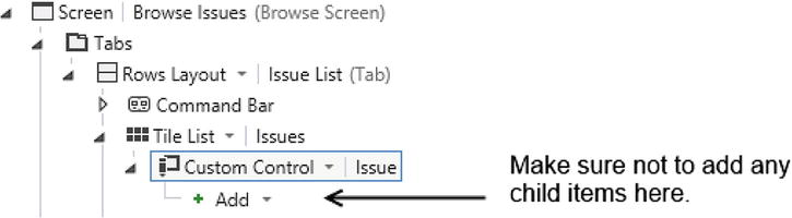
Figure 8-34. Setting a Custom Control
Select your custom control in the designer, and click on the “Edit Render Code” link in the properties sheet. When the code editor opens, enter the code that’s shown in Listing 8-8.
Listing 8-8. Formatting Dates with Custom Controls
File:HelpDeskVBHTMLClientUserCodeBrosweIssues.js

myapp.BrowseIssue.IssuesTemplate_render =
    function (element, contentItem) {
    //RowTemplate
    var overdueAlert = "";
    var today = new Date();
    if (contentItem.value.TargetEndDateTime < today) {
        overdueAlert =
            "<img src='Content/Images/Warning.png' " +
            "style='float:left;padding-right:10px;'/>";
    }

    var customText = $("<div>" + overdueAlert + "<p><strong>" +
       moment(contentItem.value.CreateDateTime).format('ddd MMM DD YYYY') +
       "</strong></p></br>" +
       contentItem.value.Subject + "</div>");
    customText.appendTo($(element));
};
The render method for any custom control includes two parameters: contentItem and element. The contentItem object represents the view model that the custom control binds to—in this example, the Issue property. The element object represents the placeholder that you’ll add your custom HTML to.
The code builds the custom control’s HTML into a variable called customText. The first part of the code tests whether the issue’s TargetEndDateTime is greater than today. The code determines today’s date by declaring a variable and setting it to an instance of a new JavaScript Date object . Because the ContentItem object’s value is an Issue object, contentItem.value.TargetEndDateTime allows you to access the target end date value . If the target end date is greater than today, the code creates an HTML image tag that shows a warning icon . You’ll need to create a warning image called warning.png and add it to your HTML client’s ContentImages folder.
The next part of the code builds the HTML that’s shown in the control . It begins by including the warning image, if it has been set. It then uses momentjs’s format method to format the date as a string that looks like this: “Fri Mar 16 2012.” You can find out more about the format strings that you can use on momentjs’s web site. The final piece of code sets your custom control’s HTML markup by assigning the contents of your customText variable to the element parameter.
You’re now ready to run your application, and Figure 8-35 shows how your screen looks at runtime. As you can see, the appearance is now much improved. The style of the Issue date is set to bold, and the formatting makes it easier to read. The tiles also show icons next to the issues that are overdue.
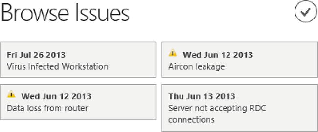
Figure 8-35. Final screen
Accessing Navigation Properties
In the example that you’ve just seen, you accessed the properties that belong to the Issue object (CreateDateTime, TargetEndDateTime, and Subject). You can also access the Issue object’s navigation properties in code, but to do this, you need to make sure that LightSwitch loads your navigation property values. If not, your code will fail when it tries to retrieve data that isn’t available.
You can configure the related data that the HTML client loads by clicking the “Edit Query” link that appears next to your query in the screen members list. When the query designer opens, click on the “Manage Included Data” link that appears in the properties sheet.
Figure 8-36 shows the Manage Included Data dialog. If, for example, you want to include the user’s department in your custom control, you’ll need to use this dialog to include the department data.
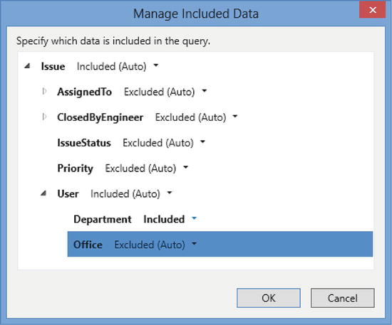
Figure 8-36. Managing included data
Running Code When Data Changes
The previous example showed you how to display data by using a custom control. If you want to do anything more sophisticated, you’ll need to know how to update data in addition to showing it. You can accomplish this by calling a method that the contentItem object exposes called dataBind. This is a powerful method that allows you to bind JavaScript functions to data items.
To introduce how the dataBind method works, this section shows you how to run code when the value of a data item changes. The following example shows you how to modify your Add/Edit Issue screen so that when a user enters a new issue, it’ll trigger custom code that sets the target end date of the issue to 3 days after its create date. The advantage of the data-binding technique is that the HTML client automatically updates the target end date as soon as the user changes the create date. And it’ll do this every time that the user subsequently changes the create date.
To create this example, open your AddEditIssue screen and select the Rows Layout that contains the controls that relate to your Issue property. By default, this group is called Details. Click on the “Add Code” button, and choose the Details_postRender method. Now add the code that’s shown in Listing 8-9.
Listing 8-9. Running Code When Data Changes
File:HelpDeskVBHTMLClientUserCodeAddEditIssue.js

myapp.AddEditIssue.Details_postRender = function (element, contentItem) {

    // 1 databind the createDateTime
    contentItem.dataBind("screen.Issue.CreateDateTime", function () {
        setTargetEndDate(contentItem);
    });

    function setTargetEndDate(contentItem) {

        // 2 only set the target date for new issues
        if (contentItem.screen.Issue.Id == undefined
             && contentItem.screen.Issue.CreateDateTime != undefined) {

            // get the create date
            var createDate = contentItem.screen.Issue.CreateDateTime;
            var futureDate = new Date(createDate.getFullYear(),
                                createDate.getMonth(), createDate.getDate());

            // add 3 days onto the create date
            futureDate.setDate(futureDate.getDate() + 3);
            contentItem.screen.Issue.TargetEndDateTime = futureDate;
        }
    };
};
The first part of this code uses the dataBind method to bind the CreateDateTime property to a method called setTargetEndDate . The screen object allows you to access the issue’s CreateDateTime property, so the valid binding path that you would use is screen.Issue.CreateDateTime. This data binding means that LightSwitch will call the setTargetEndDate method each time the CreateDateTime property changes.
The setTargetEndDate method tests whether the user is creating a new record, and it also checks that the user has set a create date . If so, it creates a variable called futureDate and uses JavaScript’s setDate method to set the value to three days after the create date . Finally, the code sets the TargetEndDateTime to the future date .
Replacing Default Controls with Custom Controls
Now you know how to use the dataBind method, you can begin to create even more sophisticated custom controls. This example shows you how to replace LightSwitch’s Date/Time Picker with a third-party date-picker control that data-binds to your data item in both directions.
The third-party control that you’ll use is provided by a company called Mobiscroll. However, you could use any other HTML control instead—the principles would remain the same.
In this example, you’ll bind the Issue’s CreateDateTime to an HTML input box and attach the Mobiscroll “Date & Time Scroller” control to this input box. Figure 8-37 shows what your screen looks like when you complete this example.
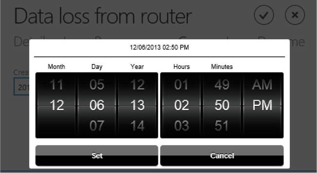
Figure 8-37. Mobiscroll Control
To create this example, carry out the following tasks:
- Download the Mobiscroll control from the following web site: http://download.mobiscroll.com/datetime. At the time of writing, this control is free; however, the suite contains several other controls that you must pay for.
- The Mobiscroll package includes two files: a CSS file and a JavaScript file. Switch to File View, and add these files to a new folder in the following location in your HTMLClient project: HTMLClientContentmobiscroll.
- While you’re still in File View, open the default.htm file that you’ll find in the root of your HTMLClient project. The head section of this file contains links to CSS files. Before the end of the head section, add a link to the Mobiscroll CSS file. Your link will look like this:
<link rel="stylesheet" href="Content/mobiscroll/mobiscroll.datetime-2.4.1.min.css" />
- The body section of your default.htm file contains links to script files. Before the end of the body section, add a link to the Mobiscroll JavaScript file. Your link will look like this:
<script src="Content/mobiscroll/mobiscroll.datetime-2.4.1.min.js">
</script>
This completes all of the tasks that are needed in your default.htm file. If Mobiscroll releases a newer version of its controls, or if you’ve saved the CSS and JS files in a different location, you can adapt the file names that are specified in steps 3 and 4. Now switch your project to Logical View and carry the following steps:
- Open your AddEditIssue screen in the screen designer.
- Change your CreateDateTime control from a Date/Time Picker to a custom control.
- Select your CreateDateTime control, click on the “Edit Render Code” link in the properties sheet, and add the code that’s shown in Listing 8-10.
Listing 8-10. Adding the Mobiscroll Control
File:HelpDeskVBHTMLClientUserCodeAddEditIssue.js

myapp.AddEditIssue.CreateDateTime_render =
function (element, contentItem) {
    var CreateDateTime =
        $('<input id="CreateDateTime" type="datetime"/>'),
    CreateDateTime.appendTo($(element));

    // 2 Initialize the mobiscroll control
    $(function () {
        var now = new Date();
        $('#CreateDateTime').mobiscroll().datetime({
            minDate: new Date(now.getFullYear() - 10,
            now.getMonth(), now.getDate()),
            dateFormat: 'yy-MM-dd HH:mm',
            theme: 'default',
            lang: ' ',
            display: 'modal',
            animate: ' ',
            mode: 'scroller'
        });
    });

    // 3 Listen for changes made in the view model
    contentItem.dataBind("value", function (newValue) {
        // Update the HTML Input and Scroller Control
        CreateDateTime.val(moment(newValue).format('YYYY-MM-DD HH:mm'));
        $("#CreateDateTime").scroller('setDate', newValue , true);
    });

    // Listen for changes made via the custom control
    CreateDateTime.change(function () {
        // update the content item value
        var newDate = moment(CreateDateTime.val(), "YYYY-MM-DD HH:mm");

        if (contentItem.value != newDate.toDate()) {
            contentItem.value = newDate.toDate());
        }
    });
};
After you’ve added this code, you can run your application. The code at the start of the render method creates a variable called CreateDateTime, and sets its value to the HTML markup that represents an HTML input control. It then renders it on screen by appending CreateDateTime to the render method’s element parameter . This piece of code is necessary because the Mobiscroll control technically works by attaching itself to an HTML input.
The next part of the listing contains code that’s specific to the Mobiscroll control . It initializes the Mobiscroll control by setting default attributes. This includes the minimum date that the user can select (it sets this to ten years before today’s date), theme settings, and language settings. For more information, the Mobiscroll documentation shows you all of the attributes that you can use.
The code in the next section calls the content item’s databind method . This allows your control to react when the underlying value changes and to update the value of the HTML input control by calling a Mobiscroll method called scroller . This method sets the value of the Mobiscroll control to the new value.
The next section adds code that executes when the value of the HTML input changes. When this happens, it sets the underlying value of the content item to the new value  . This section of code uses the momentjs library to test that the date has changed before updating the underlying content item value.
Chapter 6 showed you several examples of how to query your data in code. In an HTML application, LightSwitch’s JavaScript API allows you to carry out queries against your data. However, you’ll find some important differences compared to the code that you’ve seen in previous chapters. The most obvious difference is that .NET objects such as EntityCollection<T>, IDataServiceQueryable, and LINQ don’t exist in JavaScript. So to work with queries in JavaScript, you’ll need to apply a different technique to access your data.
In this section, you’ll find out how to modify the Browse Issues Screen so that it includes a summary of the issues that are due today and tomorrow. Figure 8-38 shows how your screen will look when you complete this example.
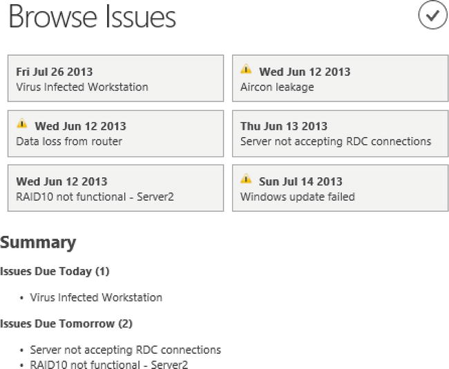
Figure 8-38. Summary of Issues
First, you’ll need to create a query called IssuesDueSoon that returns Issues that are due between today and the following two days. The “Filtering by Date Elements” section in Chapter 6 shows you the type of code that you’d need to write to create such a query. If you simply want to run this example and aren’t too concerned about the query returning correct data, you can create a query called IssuesDueSoon and not apply any filters.
Once you’ve created your query, open your BrowseIssues screen and add a new Rows Layout beneath your Tile View. Change it to a custom control, and name it IssueSummary (Figure 8-39).
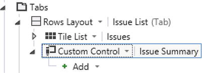
Figure 8-39. Adding a Summary Custom Control
Select IssueSummary, click the “Edit Render Code” link in the properties sheet, and add the code that’s shown in Listing 8-11.
Listing 8-11. Query Code
File:HelpDeskVBHTMLClientUserCodeBrowseIssues.js

myapp.BrowseIssues.IssueSummary_render = function (element, contentItem) {

    // 1 execute the IssuesDueSoon query
    myapp.activeDataWorkspace.ApplicationData.IssuesDueSoon().execute().then(

        // 2 this code runs when the query completes
        function (promiseObjResult) {

        var issuesToday = "";
        var issuesTomorrow = "";

        var issueCountToday = 0;
        var issueCountTomorrow = 0;

        var today = new Date();
        var tomorrow =
          new Date(today.getYear(), today.getMonth(), today.getDate() + 1);

        // 3 this code consumes the query result
        promiseObjResult.results.forEach(function (issue) {

            if (issue.TargetEndDateTime.getDate() == today.getDate()) {
                issuesToday = issuesToday + "<li>" + issue.Subject + "</li>";
                issueCountToday = issueCountToday + 1;
            }

            if (issue.TargetEndDateTime.getDate() == tomorrow.getDate()) {
                issuesTomorrow = issuesTomorrow + "<li>" + issue.Subject + "</li>";
                issueCountTomorrow = issueCountTomorrow + 1;
            }

        });

        // 4 this code creates the final HTML output
        var heading = $("<h2>Summary</h2>" +
            "<div><strong>Issues Due Today (" + issueCountToday.toString() +
            ")</strong><ul>" + issuesToday + "</ul></div>" +
            "<div><strong>Issues Due Tomorrow (" + issueCountTomorrow.toString() +
            ")</strong><ul>" + issuesTomorrow + "</ul></div>");

        heading.appendTo($(element));

    },

   function (error) {

      // 5 an unexpected error has occurred
      var heading = $("<h2>Summary</h2>" +
         "<div>Unexpected error - Summary data couldn't be retrieved because:" +
             error + "</div>");
      heading.appendTo($(element));
    }

   );
};
This completes the example, and you can now run your application. The code at the start of the render method calls the IssuesDueSoon query by calling the method myapp.activeDataWorkspace.ApplicationData.IssuesDueSoon().execute() .
As you type the word execute into the code editor window, Visual Studio’s IntelliSense informs you that the execute method is designed to “asynchronously execute your query.” You’ll notice that many of the other methods in the JavaScript API also work asynchronously—the data service’s saveChanges method is one example. The advantage of asynchronous methods is that they allow you to carry out long-running processes without locking up your UI. LightSwitch provides asynchronous support by implementing the WinJS promise pattern (http://msdn.microsoft.com/en-us/library/windows/apps/br211867.aspx). A Promise object acts as a proxy for a result that’s initially unknown. A query object’s execute method is an example of an object that returns a promise.
Promise objects expose a method called then. You use this method to define the code that runs when the asynchronous work completes. In this example, the code executes a function that includes a parameter called promiseObjResult that represents the result of the query . The first part of this code initializes some variables that help to build the HTML that’s shown to the user. The next part of the code consumes the query result and loops through each issue record by using this syntax: promiseObjResult.results.forEach . The code inside the forEach loop builds a list of issues that are due today and tomorrow, and it produces a count of issues for each day. The final piece of code builds the custom HTML output that’s added to the screen.
The second function that you supply to the then method defines the code that runs if an error occurs . The code in this function displays the error message that’s returned by the request.
As you’ll remember from Chapter 7, the HelpDesk application includes a feature that allows users to upload multiple documents for each issue. In this section, you’ll find out how to allow users to upload and download documents through your Add/Edit Issues screen.
Uploading Files
The HTML client doesn’t include a file upload control, so you’ll need to create a custom file-upload mechanism. An efficient way to provide this capability uses the File API capabilities that you’ll find in HTML5 browsers. The HTML5 standard allows web browsers to interact with local files. This is a really powerful feature because it enables you to work with files on the client, before you send them to the server. For example, you could validate data or create thumbnails of images on the client. Figure 8-40 illustrates the process that you’ll carry out in the form of a diagram.
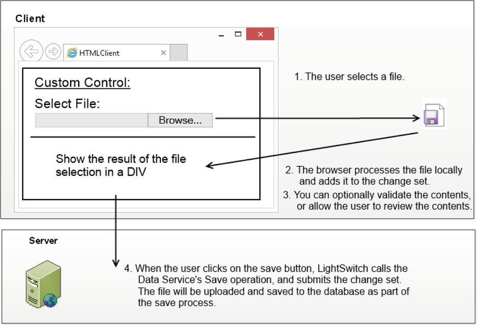
Figure 8-40. HTML5 file upload process
This process relies on a custom control that you’ll create. This custom control consists of two elements: a file browse button (that is, an HTML Input of type file), and a DIV that shows the results.
When the user selects a file, the control uses the local file-processing feature of the HTML5 browser to read the file. It retrieves the contents as a base 64–encoded string, adds the data to the local change set, and shows the results in the DIV. When the user clicks on the save button, the HTML client calls the Data Service’s Save operation. The file that the user adds will be included in the change set that the client sends to the server.
Despite the File API’s ease of use, a big problem is that many users still don’t use HTML5-compliant browsers. Therefore, you’ll need a fallback method to make sure that users with older browsers can still upload files. Figure 8-41 shows how the non-HTML5 file-upload process works.
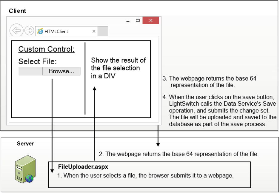
Figure 8-41. Non-HTML5 file-upload process
If the custom control detects that the user isn’t using an HTML5 browser, it generates a control that contains three elements: a file browse button, a hidden iframe, and a DIV to display the progress details. (An iframe is an HTML control that you can use to display a web page inside another web page.)
Once the user selects a file, the control submits the file to an ASP.NET web page through the hidden iframe. The iframe allows the browser to submit the file to the server, without interrupting the user’s ability to interact with the other parts of the screen. The ASPX page mimics the job that the HTML5 File API would carry out—it produces a base 64–encoded representation of the file and returns the result to the client. When the ASPX page finishes loading, the contents of the hidden iframe will contain the base-64 representation of the file. The custom control detects when the iframe finishes loading and displays the result in a DIV, in the same way as the HTML5 custom control.
Creating a Custom File-Upload Control
To create this example, the first step is to write the JavaScript methods that generate the custom control. To do this, switch your project to File View, go to your HTMLClient project, and add a new folder beneath the Content folder called FileUploader.
Now create a new file called file-uploader.js, and add the content that’s shown in Listing 8-12.
Listing 8-12. File Uploader JavaScript
File:HelpDeskVBHTMLClientContentFileUploaderfile-uploader.js

function createfileUploader(element, contentItem) {

    var $element = $(element);

    //1 Create either an HTML5 or Non HTML5 control
    if (window.FileReader) {
        createHTML5Control();
    } else {
        createNonHTML5Control();
    }

    //2 This code creates the HTML5 control
    function createHTML5Control() {
        var $file_browse_button = $(
            '<input name="file" type="file" style="margin-bottom: 10px;" />'),
        $element.append($file_browse_button);

        var $review = $('<div></div>'),
        $element.append($review);

        $file_browse_button.bind('change', function handleFileSelect(evt) {
            var files = evt.target.files;
            if (files.length == 1) {
                var reader = new FileReader();
                reader.onload = function (e) {
                    reviewAndSetContentItem(
                        e.target.result, $review, contentItem);
                };
                reader.readAsDataURL(files[0]);
            } else {
                //  if no file was chosen, set the content to null
                reviewAndSetContentItem(null, $review, contentItem);
            }
        });
    }

    //3 This code creates the non HTML5 control
    function createNonHTML5Control() {
        // Create a file submission form
        var $file_upload_form = $('<form method="post" ' +
                'action="../Web/FileUploader/FileUploader.aspx" ' +
                'enctype="multipart/form-data" target="uploadTargetIFrame" />'),
        var $file_browse_button = $(
            '<input name="file" type="file" style="margin-bottom: 10px;" />'),
        $file_upload_form.append($file_browse_button);
        $element.append($file_upload_form);

        // The file contents will be posted to this hidden iframe
        var $uploadTargetIFrame = $('<iframe name="uploadTargetIFrame" ' +
                'style="width: 0px; height: 0px; border: 0px solid #fff;"/>'),
        $element.append($uploadTargetIFrame);

        // This div shows the upload status and upload confirmation
        var $review = $('<div></div>'),
        $element.append($review);

        // Submit the file automatically when the user chooses a file
        $file_browse_button.change(function () {
            $file_upload_form.submit();
        });

        // On form submission, show a "processing" message:
        $file_upload_form.submit(function () {
            $review.append($('<div>Processing file...</div>'));
        });

        // Once the result frame is loaded (e.g., result came back),
        $uploadTargetIFrame.load(function () {
            var serverResponse = null;
            try {
                serverResponse =
                    $uploadTargetIFrame.contents().find("body").html();
            } catch (e) {
                // request must have failed, keep server response empty.
            }
            reviewAndSetContentItem(serverResponse, $review, contentItem);
        });
    }

    //4 This code shows the upload confirmation
    function reviewAndSetContentItem(fullBinaryString, $review, contentItem) {
        $review.empty();

        if ((fullBinaryString == null) || (fullBinaryString.length == 0)) {
            contentItem.value = null;
        } else {
            $review.append($('<div>File uploaded</div>'));

            //remove the preamble that the FileReader adds
            contentItem.value =
                fullBinaryString.substring(fullBinaryString.indexOf(",") + 1);
        }
    }
}
The createfileUploader method is the method that you would call from the render method of a custom control that’s bound to a binary property (for example, the IssueFile property from the IssueDocument table).
This code detects if the user is using an HTML5-compliant browser by calling the Window.FileReader method . If so, the code creates the HTML5 custom control that’s shown in Figure 8-40 by calling the createHTML5Control method . Otherwise, it creates the non-HTML5 custom control that’s shown in Figure 8-41 by calling the createNonHTML5Control method . When the custom control processes the file during runtime, it calls the reviewAndSetContentItem method . This method sets the value of the content item and generates a confirmation message in a DIV.
To use this file in your application, you’ll need to add a link to file-uploader.js file in your default.htm file. Open your default.htm file, and add a link to this script just before the end of the body tag. If you completed the Mobiscroll example, you can add the link just beneath the link to the Mobiscroll JavaScript file. The link that you’ll need to add will look like this:
<script src="Content/FileUploader/file-uploader.js"></script>
Supporting Non-HTML5 Browsers
To support non-HTML5 browsers, you’ll need to create an ASP.NET page that accepts a file and returns the base-64 representation. To create this page, switch your project to File View and go to your Server project. Create a new folder beneath your Web folder, and name it FileUploader. Right-click your FileUploader folder, and select the Add New Item option. Create a new Web Form, name it FileUploader.aspx, and modify the contents as shown in Listing 8-13.
Listing 8-13. Creating a Page That Returns the base-64 Representation of a File
VB:
File:HelpDeskVBServerWebFileUploaderFileUploader.aspx

<%@ Page Language="VB"%>

<script  runat="server">
   Sub Page_Load()
      If Request.Files.Count = 1 Then
         Dim file = Request.Files(0)
         If file.ContentLength > 0 Then
            Dim inputStream = file.InputStream
            Dim base64Block As Byte() =
               New Byte(inputStream.Length - 1) {}
            inputStream.Read(base64Block, 0, base64Block.Length)

            '1 Add the preamble of "data:{mime-type};base64,".
            Response.Write("data:" & file.ContentType & ";base64," &
                           Convert.ToBase64String(base64Block))
         End If
      End If
    End Sub
</script>

C#:
File:HelpDeskCSServerWebFileUploaderFileUploader.aspx

<%@ Page Language="C#" %>

<script runat="server">
   void Page_Load(object sender, System.EventArgs e)
   {
       if (Request.Files.Count == 1)
       {
           var file = Request.Files[0];
           if (file.ContentLength > 0)
           {
               var inputStream = file.InputStream;
               byte[] base64Block = base64Block =
                  new byte[inputStream.Length];

               inputStream.Read(base64Block, 0, base64Block.Length);

               //1 Add the preamble of "data:{mime-type};base64,".
               Response.Write("data:" + file.ContentType +  ";base64," +
                               Convert.ToBase64String(base64Block));
           }
       }
   }
</script>
The output from this web page creates the same response that the HTML5 FileReader produces by adding the preamble of "data:{mime-type};base64," to the start of the response .
Attaching a File Upload Control to Your Screen
To complete this example, you’ll need to create a dialog that allows users to add and edit IssueDocument records. Your dialog will contain the custom file upload control that allows the user to select a file. You’ll then add a List Control to your Add/Edit Issue screen that shows the documents that belong to an Issue and a button that allows users to add new IssueDocument records.
To create the dialog that allows users to add and edit Issue Document details, carry out the following steps:
- Create a new “Add/Edit Details Screen” that’s based on the IssueDocument table, and name your screen AddEditIssueDocument.
- In the properties sheet for the root node of your AddEditIssueDocument screen, set the “Display Name” property to “Issue Document” and make sure that you check the “Show As Dialog” check box. (This is the default option.)
- By default, LightSwitch renders the IssueFile property using the Image control. Change the control type to a custom control. Click the “Edit Render Code” link in the properties sheet, and add the code that’s shown in Listing 8-14.
Listing 8-14. File Uploader JavaScript Code
File:HelpDeskVBHTMLClientUserCodeAddEditIssueDocument.js

myapp.AddEditIssueDocument.IssueFile_render =
    function (element, contentItem) {
    createfileUploader(element, contentItem);
};
The next step is to modify your Add Edit Issue screen to allow users to edit Issue Documents or to upload a new Issue Document. Here are the steps that you’ll need to carry out:
- Open your AddEditIssue screen. If your screen doesn’t contain the IssueDocuments collection, click on the “Add IssueDocuments” link in the screen member list.
- Create a new tab, and name it IssueDocumentsTab. Set the Display Name of your tab to ‘Issue Documents’. Drag the IssueDocuments collection from the screen member list onto this tab. This creates a List control for your IssueDocuments collection.
- Select your IssueDocuments List control, open the properties sheet, and click the “Item Tap” link in the Actions section. When the “Edit ItemTap Action” dialog appears, select the “Choose an existing method” radio button, and use the dropdown box to select IssueDocuments.editSelected. Select “Issue Document” in the “Navigate To” dropdown (Figure 8-42).
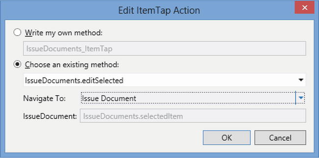
Figure 8-42. Opening the Add Edit Issue Document Dialog
- Add a new button beneath your list control. When the “Add Button” dialog appears, select the “Choose an existing method” and use the dropdown to select IssueDocuments.addAndEditNew. Use the “Navigate to” dropdown to select your AddEditIssueDocument screen.
This completes the example, and you’re now ready to run your application. Figure 8-43 shows what your screen looks like at runtime. The “Add Issue Document” button opens the “Issue Document” dialog that allows the user to upload a document. Once the user adds a document and clicks on the dialog’s OK button, the newly added file will appear in the list control.
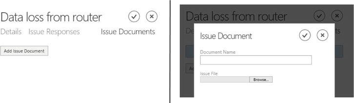
Figure 8-43. Document Uploader control at runtime
Downloading Files
The ability to upload files is just one half of this example. Users need some way to retrieve the files that have been uploaded, and you’ll now find out how to implement this feature.
One way to do this is to write JavaScript that uses the LightSwitch’s JavaScript API to retrieve the file content and write the data into a new file on the user’s machine. Downloadify is a utility that can help you accomplish this (https://github.com/dcneiner/Downloadify). It’s a free JavaScript library that allows you to create client-side files by using Adobe Flash.
However, a much easier way to retrieve files from your database is to take advantage of a new feature that the “Visual Studio 2012 Update 2” provides: the Server Application Context API. This is a powerful new feature that allows clients to communicate directly with the LightSwitch logic layer, without having to go through the save or query pipelines. Figure 8-44 shows how the download feature will work.
Figure 8-44. Downloading files via the Server Application Context API
The Server Application Context API allows you to access your data workspace from custom .NET applications. This, for example, allows you to create ASP.NET or MVC applications that can access your LightSwitch data. You can use the Server Application Context API to add custom functions to your application’s Server project. This example creates a generic ASP.NET HTTP handler that uses the Server Application Context API. A generic handler provides an HTTP endpoint that serves HTTP responses without a UI.
To create a handler that returns the file contents, switch your project to File View. Navigate to your Server project, right-click on the Web folder, and add a new Generic Handler (Figure 8-45). Name your handler DownloadIssueDocument.ashx.
Figure 8-45. Adding a new Generic Handler
Now modify the contents of this file, as shown in Listing 8-15.
Listing 8-15. File Downloader Code
VB:
File:HelpDeskVBServerWebDownloadIssueDocument.ashx.vb

Imports System.Web
Imports System.Web.Services

Public Class DownloadIssueDocument
   Implements System.Web.IHttpHandler

   Sub ProcessRequest(
      ByVal context As HttpContext) Implements IHttpHandler.ProcessRequest

       If context.Request.Params("id") IsNot Nothing Then
            context.Response.ContentType = "application/octet-stream"

           Using serverContext =
              LightSwitchApplication.ServerApplicationContext.CreateContext()

                Dim doc =serverContext.DataWorkspace.ApplicationData.
                    IssueDocuments_SingleOrDefault(
                       context.Request.Params("id"))

               context.Response.AddHeader(
                   "Content-Disposition",
                   "attachment;filename=" & doc.DocumentName)
               context.Response.BinaryWrite(doc.IssueFile)

           End Using

       End If

   End Sub

   ReadOnly Property IsReusable() As Boolean Implements IHttpHandler.IsReusable
       Get
           Return False
       End Get
   End Property

End Class

C#:
File:HelpDeskCSServerWebDownloadIssueDocument.ashx.cs

using System;
using System.Collections.Generic;
using System.Linq;
using System.Web;

namespace LightSwitchApplication.Web
{
   public class DownloadIssueDocument : IHttpHandler
   {
      public void ProcessRequest(HttpContext context)
      {

         if (context.Request.Params["id"] != null)
         {
            context.Response.ContentType = "application/octet-stream";
            using (var serverContext =
               LightSwitchApplication.ServerApplicationContext.CreateContext())
               {
                  var doc = serverContext.DataWorkspace.ApplicationData.
                     IssueDocuments_SingleOrDefault (
                        int.Parse (context.Request.Params["id"]));
                  context.Response.AddHeader(
                     "Content-Disposition",
                     "attachment;filename=" + doc.DocumentName);
                  context.Response.BinaryWrite(doc.IssueFile);
               }
           }
        }

        public bool IsReusable
        {
           get
           {
              return false;
           }
        }
    }
}
The DownloadIssueDocument.ashx handler allows users to download issue documents by URL. For example, the URL http://WebServer/Web/DocumentIssueDocument.ashx?id=8 would return the document that’s stored in the IssueFile property of an IssueDocument record with an id of 8.
To complete this example, you’ll need to add a hyperlink to your AddEditIssueDocument dialog. In the screen designer, select the parent Rows Layout that contains the controls for your IssueDocument property—in this example, the default name of the group is left. In the properties sheet, click on the “Edit PostRender Code” link and add the code that’s shown in Listing 8-16.
Listing 8-16. Button Code That Calls DownloadIssueDocument.ashx
File:HelpDeskVBHTMLClientUserCodeAddEditIssueDocument.js

myapp.AddEditIssueDocument.left_postRender =

function (element, contentItem) {
   if (contentItem.value.Id != undefined) {

      var downloadURL = '../Web/DownloadIssueDocument.ashx?id=' +
         contentItem.value.Id.toString();

      var downloadLink = $('<div><a target="_blank" ' +
          'href="' + downloadURL + '" style="margin-top: 10px;" >' +
          'Download Document File</a></div>'),
      downloadLink.appendTo($(element));
   }
};
This code builds a hyperlink and appends it to the end of your Document dialog. The first part of this code creates the URL that points to the DownloadIssueDocument.ashx address and appends the Id value of the selected document record to the URL . The code sets the target attribute to _blank . This prompts the browser to open the hyperlink in a new window. If you didn’t add this attribute, the hyperlink would navigate the user away from your LightSwitch application. The final piece of code appends the hyperlink to the end of the Rows Layout.
This code works on the basis that you deploy your HTML application to the following URL: http://yourServer/HTMLClient. The default address of your handler will be this: http://yourServer/Web/DownloadIssueDocument.ashx. The code in creates a hyperlink with a relative URL that uses the syntax .. to refer to the parent folder. If the download link doesn’t work when you deploy your application, you should check that you’ve deployed your DownloadIssueDocument.ashx file to the expected location. Figure 8-46 shows how your issue document dialog now looks at runtime.
Figure 8-46. Download link that appears
You might wonder why you’ve added this code to the postRender method rather than create a custom control that’s based on the IssueDocument Id. One of the reasons is because the HTML client applies the read-only and disabled properties of your content item when it renders custom controls (Figure 8-47). When the HTML client applies the disabled and read-only renderings to a custom control that includes a hyperlink, it makes the hyperlink nonclickable. You can’t set the Id property of an entity to not be read only, so the simplest workaround is to append the custom HTML in the postRender method rather than use a custom control. Therefore, if you create a custom control and it doesn’t work as you would expect it to work, it’s worth checking these rendering options.
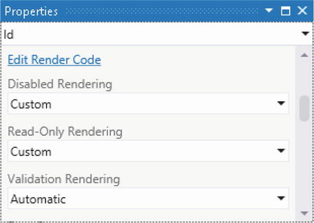
Figure 8-47. Custom Control Rendering options
Customizing the Appearance of Your Application
There are several ways that you can modify the icons, colors, and fonts that your application uses. This section shows you how to modify the appearance of your application by using themes.
Applying Themes
The HTML client uses jQuery mobile controls and, because of this, you can apply jQuery mobile themes to your application. The advantage of using a theme is that it allows you to package the appearance of your application in a single file. You can easily use the same theme in multiple applications, and even share your themes with other developers. A quick search for “jQuery mobile themes” on the Internet will reveal lots of themes that you can download and use.
By default, the HTML client applies a theme that uses a white background. However, it also includes a theme that consists of a black background with white text. When you’re developing mobile applications, it’s good practice to use the “dark theme” with a black background because it decreases the drain on the battery. This is because it minimizes the screen area that the device needs to light up.
LightSwitch stores its themes in the Content folder of your HTMLClient project. This folder also contains additional CSS files that define the appearance of your application. These files are shown in Figure 8-48.
Figure 8-48. CSS Themes
The CSS files that contain the dark and light themes are called dark-theme.css and light-theme.css, respectively. To set up your application so that it uses the dark theme, open your default.htm file. You’ll find this in the root folder of your HTMLClient project.
Near the top of this file, you’ll find two style-sheet links that point to the light-theme.css and msls-light.css files. To use the dark theme, modify these links so that they point to the dark-theme.css and msls-dark.css files instead.
When you now run your application, LightSwitch applies a black background rather than a white background. If your application still shows a white background, it’s likely that your browser has cached your default.htm file. You can fix this by problem by clearing your browser cache.
Creating Your Own Themes
The jQuery web site provides a tool called Theme Roller (Figure 8-49) that makes it very easy for you to create custom themes. To use Theme Roller, open your web browser and navigate to http://jquerymobile.com/themeroller/.
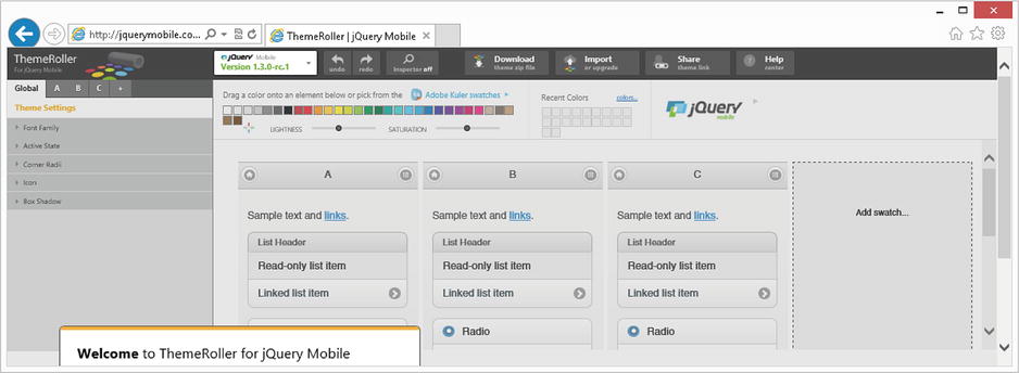
Figure 8-49. Using ThemeRoller
You can simplify the process of creating a theme by taking the light theme as a starting point for further customization. On the Theme Roller web site, click on the Import button that appears toward the top of the page. This opens a dialog that allows you enter a theme. Open your light-theme.css file, and copy and paste the contents into this dialog.
Once you’ve imported your theme, you can use the graphical designer to customize your theme. When you finish making your modifications, you can download your theme by clicking on the download button that appears at the top of the page. The download button creates a zip file that contains the CSS file for your theme. Extract the CSS file into your HTML client project’s Content folder, and modify your default.htm file so that it points to your new theme file.
Changing the Application Icon and Title
The HTML client shows an icon that contains a mixture of blue squares while your application loads. Once your application loads, it shows a similar icon in the top left part of your home screen and sets the browser tab or window title to “<ProjectName>.HTMLClient” (Figure 8-50).
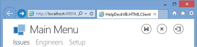
Figure 8-50. Changing the Title and Icon settings
The title tag in your default.htm file defines your page title. You can change this from “<ProjectName>.HTMLClient” to something more meaningful by modifying the value of the title tag. Near the top of the default.htm file, you’ll find a div tag that contains the value “<ProjectName>.HTMLClient.” This is the text that LightSwitch shows in the lower part of the screen when your application loads. Once again, you can modify this to a value that better describes your application.
The HTML client stores the home page and splash-screen images in the folder HTMLClientContentImages. The home page image is called user-logo.png, and the splash screen image is user-splash-screen.png. To use different images, you can replace these two files with new images.
Securing Your Application
As is the case with most web applications, it’s important to apply security and access control. The first line of defense is to enable authentication, and Chapter 16 describes this process in more detail. LightSwitch supports two types of authentication: Windows authentication, and Forms authentication.
When you enable Forms authentication, LightSwitch uses the ASP.NET membership provider to manage your usernames and passwords. By default, the membership provider stores your user credentials in a table in your Intrinsic database. By applying Forms authentication, you can restrict your application so that only users with a username and password can login. With Forms authentication enabled, the user would see the login page that’s shown in Figure 8-51 before your application loads.
Figure 8-51. Login Screen
The name of this login page is LogIn.aspx, and you’ll find this file in the root folder of your server project. If you want to modify the appearance of this page (by adding a company logo, for example), you can simply open the LogIn.aspx file and make your amendments in Visual Studio.
Securing Methods
Each screen method that you create allows you to add JavaScript to a CanExecute method. Figure 8-52 shows the “Edit CanExecute Code” link that appears in the properties sheet for a method. You can prevent users from calling this method by setting the return value of the CanExecute method to false.
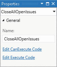
Figure 8-52. Securing a method by using the CanExecute Code
In Chapter 17, you’ll discover that LightSwitch includes a security model that allows you to define permissions. The advantage of this system is that it allows you to apply access control at a granular level.
Unfortunately, LightSwitch’s JavaScript API doesn’t include the methods that allow you to determine whether the logged-in user has been granted a certain permission. This means, for example, that you can’t easily restrict access to screens for editing and deleting engineers to only those users that you define as “managers.”
If you need to apply access control based on group membership, a possible (but not ideal) workaround is to create separate applications for each group of users. Another option is to build your own authorization mechanism that ties into your CanExecute methods. If you choose to do this, it’s important to remember that JavaScript is a text-based, uncompiled language that runs on the client. Because of this, users can easily view the source of your application and work out ways to compromise any custom security code that you’ve written.
Looking at the wider picture, the best place to implement security code is on the server. In Chapter 17, you’ll learn how to prevent users from accessing or updating data by implementing access-control checks through the server and query pipelines. To help you apply server-side access control, LightSwitch allows you to obtain the logged-in user through server-side code, after you’ve enabled authentication in your application.
Summary
The HTML client allows you to create applications that work well on mobile and touch-screen devices. It uses industry-standard libraries that include jQuery, jQuery Mobile, datajs, and WinJS. To create an application that uses the HTML client, you need to install an update called “Visual Studio 2012 Update 2.”
Unlike the Silverlight client (which uses a multidocument interface), HTML client applications are designed to perform one task at a time. If a user opens a child screen from an existing screen, LightSwitch bases the target screen on a nested change set. When the user returns to the calling screen, LightSwitch allows them to discard or accept their changes. If the user accepts the changes, LightSwitch merges the changes in the nested change set back into the main change set. A user can commit their changes to the database by clicking on a Save button. LightSwitch shows the Save button on the first Edit screen that the user encounters in your application.
LightSwitch allows you to design HTML screens by using a screen designer that’s visually similar to the Silverlight designer that you’re familiar with. There are three screen templates that you can use: the Browse Data, View Details, and Add/Edit Details Screen templates.
Browse Data Screens allow users to view and select records by using a List control. You can configure the tap action of the List control to open the record through a View Details or Add/Edit Details screen. View Detail screens are designed to show read-only data, whereas Add/Edit Detail screens are designed to enable users to edit data.
You can separate the contents of each screen into different tabs. Each screen includes a tab control that users can use to switch between tabs. You can prevent users from switching between tabs by hiding the tab header and controlling the visibility of tabs through buttons or code. Each screen also allows you to define popups. These are UI panels that appear on top of the current screen. Popups are perfect for showing details such as messages or confirmations. They appear next to the control that opens the popup, and a user can dismiss a popup by clicking on an area of the screen outside of the popup.
The properties sheet allows you to define a screen as a dialog. Dialogs open differently from normal screens. A normal screen fills up all of the available screen space, whereas a dialog opens on top of an existing screen. When a dialog opens, the background of the existing screen is still visible, but grayed out. Dialogs include OK and Cancel buttons. If your user clicks on the Cancel button, LightSwitch discards the changes the user has made and returns the user to the calling screen.
Just like the Silverlight client, the HTML client provides a set of controls that allow users to view and edit data. These controls include Text, Paragraph, Text Area, and the Date/Time Picker controls. The Modal Window Picker control allows users to select an entity. If there isn’t a default control that does what you want, you can build your own custom HTML control.
To set up a custom control, you’d select a data item in the screen designer and change the control type to “custom control.” Afterward, you can define your custom control’s HTML by writing JavaScript in the control’s render method. The render method includes a parameter called contentItem that you can use to access the data that your custom control binds to. In order for contentItem to give you access to the data that you need, it’s important to define your custom control against the correct data item. If, for example, you set the control type of the firstname property to a custom control, contentItem will give you access to only the firstname data value. If you want a custom control that can access other property values, you should define a custom control for the entity rather than an individual property in an entity.
The contentItem object provides a method called databind that you can use to bind a custom control to your view model. databind allows you to specify a method that executes each time your property value changes. This allows you to implement the two-way data binding that enables custom controls to work.
There are several “entry points” that you can use to write custom JavaScript. You can call custom JavaScript methods from buttons or from the “tap” event of controls such as the List control. You can also define custom JavaScript that runs when the HTML client creates your screen, when the HTML client renders a screen control, or when a user initiates a save operation.
LightSwitch provides a JavaScript API that you can use to perform data and application tasks. The myapp object allows you to open screens, access the current data workspace, and cancel or apply changes. You can work with data by accessing local screen properties and collections, and by using the objects that the data workspace exposes.
LightSwitch executes many of its JavaScript API methods asynchronously. For example, it executes long-running data operations asynchronously, such as the data service’s saveChanges method or a query’s execute method. These asynchronous methods return a promise object. Promise objects expose a method called then that allows you to execute code when the asynchronous work completes.
You’ve learned how to create a custom control that users can use to upload files. You’ve also found out how to allow users to download files by using LightSwitch’s Server Context API. This is a powerful feature that enables your client to communicate directly with LightSwitch’s logic layer, without having to go through the save or query pipelines.
You can easily customize your application’s fonts and colors by applying jQuery themes. LightSwitch supplies two built-in themes: a dark theme, and a light theme. You can change the theme that your application uses by editing your default.htm file. If you want to further customize your application’s theme, you can use a tool that you’ll find on the jQuery web site called ThemeRoller. If you switch your project to File View, you’ll find all the CSS files and images that make up your application. You can modify the appearance of your application by editing the CSS or image files as you wish.