
Creating Data and Presentation Extensions
Now that you understand the principles of how to build an extension project, this chapter focuses on how to build other LightSwitch extension types. In this chapter, you’ll learn how to
- Create business type and data source extensions
- Create screen template extensions
- Create shell and theme extensions
In this chapter, you’ll learn how to build a business type that stores time durations and incorporates the Duration Editor control that you created in Chapter 12. You’ll learn how to skin your application with a custom look and feel by creating shell and theme extensions. If you find yourself carrying out repetitive tasks in the screen designer, you can automate your process by creating a custom screen template extension. You’ll learn how to create a template that creates screens for both adding and editing data. Finally, you’ll learn how to create a data source extension that allows you to connect to the Windows event log.
Creating a Business Type Extension
Business types are special types that are built on top of the basic LightSwitch data types. The business types that come with LightSwitch include phone number, money, and web address. The advantage of creating a business type is that it allows you to build a data type that incorporates validation and custom data entry controls, and it allows you to package it in such a way that you can reuse it in multiple projects and share it with other developers.
To show you how to build a business type, you’ll learn how to create a business type that stores time durations. This example reuses the Duration Editor control and includes some additional validation. If a developer creates a table and adds a field that uses the “duration type,” the validation allows the developer to specify the maximum duration that users can enter into the field, expressed in days. Here’s an overview of the steps that you’ll carry out to create this example:
- Create a new business type, and set the underlying data type.
- Create and/or associate custom controls with your business type.
- Create an attribute that stores the maximum duration.
- Write the validation logic in the Common project.
To begin, right-click your LSPKG project, select “New Item,” and create a new business type called DurationType. When you do this, the business type template does two things. First, it creates an LSML file that allows you to define your business type and second, it creates a new custom control for your business type.
Your duration type uses the integer data type as its underlying storage type. This is defined in your business type’s lsml file, which you’ll find in your Common project. To define the underlying storage type, open the DurationType.lsml file in the Common project, and modify the UnderlyingType setting, as shown in Listing 13-1  .
.
Listing 13-1. Creating a Business Type
VB:
File:ApressExtensionVBApressExtensionVB.CommonMetadataTypesDurationType.lsml.vb

  <SemanticType Name="DurationType"
    UnderlyingType=":Int32">
    <SemanticType.Attributes>
      <DisplayName Value="Duration Type" />
    </SemanticType.Attributes>
  </SemanticType>
…………….

  <DefaultViewMapping
    ContentItemKind="Value"
    DataType="DurationType"
    View="DurationTypeControl"/>
The UnderlyingType values that you can specify include :Int32, :String, and :Double. Appendix B shows a full list of acceptable values that you can use. The DisplayName property  specifies the name that identifies your business type in the table designer. Toward the bottom of your LSML file, you’ll find a DefaultViewMapping
  element. This allows you to specify the default control that a business type uses to render your data. By default, the template sets this to the custom control that it automatically creates. So, in this case, it sets it to DurationTypeControl.
Although there’s still much more functionality that you can add, you’ve now completed the minimum steps that are needed for a functional business type. If you want to, you can compile and install your extension.
Associating Custom Controls with Business Types
By now, you’ll know that LightSwitch associates business types with custom controls. For instance, if you’re in the screen designer and add a property that’s based on the “phone number” business type, LightSwitch gives you the choice of using the “Phone Number Editor,” “Phone Number Viewer,” TextBox, or Label controls.
Strictly speaking, you don’t configure a business type to work with specific set of controls. The relationship actually works in the other direction—you define custom controls to work with business types by adding data to the custom control’s metadata.
When you create a business type, the template generates an associated control that you’ll find in your Client project’s Controls folder (for example, ApressExtensionVB.ClientPresentationControlsDurationTypeControl.xaml). This automatically provides you with a custom control that accompanies your business type.
Because you’ve already created a duration control, you can save yourself some time by associating it with your business type. The association between custom controls and business types is defined in your custom control’s LSML file. To associate the Duration Editor control (discussed in Chapter 12) with your duration business type, open the LSML file for your control. You’ll find this file in the Metadata  Controls folder of your Common project. Find the Control.SupportedDataTypes node, add a SupportedDataType element, and set its DataType attribute to DurationType (as shown in Listing 13-2). DurationType refers to the name of your business type, as defined in the LSML file of your business type.
Listing 13-2. Specifying Control Data Types
File:ApressExtensionVBApressExtensionVB.CommonMetadataControlsDurationEditor.lsml

<Control.SupportedDataTypes>
   <SupportedDataType DataType="DurationType"/>
   <SupportedDataType DataType=":Int32"/>
</Control.SupportedDataTypes>
The code in Listing 13-2 specifies that the Duration Editor control supports integer and duration data types. You can add additional SupportedDataType entries here if you want your Duration Editor Control to support extra data types.
The big advantage of business type validation is that LightSwitch applies your validation logic, irrespective of the control that you use on your screen. Business type validation runs on both the client and server and therefore, any validation code that you write must be added to your Common project. In this section, you’ll create a validation rule that allows developers to specify the maximum duration in days that users can enter.
You can allow developers to control the behavior of your business type by creating attributes that LightSwitch shows in the table designer. Custom attributes are defined in a business type’s LSML file, and you’ll now create an attribute that allows developers to specify the maximum duration that an instance of your business type can store. Open the LSML file for your business type, and add the parts that are shown in Listing 13-3.
Listing 13-3. Extending the Metadata to Support a Maximum Duration
File: ApressExtensionVBApressExtensionVB.CommonMetadataTypesDurationType.lsml
<?xml version="1.0" encoding="utf-8" ?>
<ModelFragment
xmlns="http://schemas.microsoft.com/LightSwitch/2010/xaml/model"
xmlns:x="http://schemas.microsoft.com/winfx/2006/xaml">
<!--1 - Add the AttributeClass Element-->
<AttributeClass Name="MaxIntegerValidationId">
<AttributeClass.Attributes>
<Validator />
<SupportedType Type="DurationType?" />
</AttributeClass.Attributes>
<AttributeProperty Name="MaxDays" MetaType="Int32">
<AttributeProperty.Attributes>
<Category Value="Validation" />
<DisplayName Value="Maximum Days" />
<UIEditor Id="CiderStringEditor"/>
</AttributeProperty.Attributes>
</AttributeProperty>
</AttributeClass>
<SemanticType Name="DurationType"
UnderlyingType=":Int32">
<SemanticType.Attributes>
<DisplayName Value="DurationType" />
<!--2 - Add the Attribute Element-->
<Attribute Class="@MaxIntegerValidationId">
<Property Name="MaxDays" Value="0"/>
</Attribute>
</SemanticType.Attributes>
</SemanticType>
<DefaultViewMapping
ContentItemKind="Value"
DataType="DurationType"
View="DurationTypeControl"/>
</ModelFragment>
The code in Listing 13-3 defines two things. It associates validation logic with your business type, and it defines an attribute that allows developers to specify the maximum duration that an instance of your business type can store. Let’s now look at this code in more detail.
Associating Validation Logic with a Business Type
To associate your business type with validation logic, there are two tasks that you need to carry out in your LSML file. The first is to define an AttributeClass, and the second is to apply the class to your business type.
The code in Listing 13-3 defines an AttributeClass that includes the Validator attribute . It includes an attribute that defines the data type that the validation applies to , and the value that you specify here should match the name of your business type. After you define your AttributeClass, you need to define an Attribute for your business type  .
.
When you’re writing this code, there are two important naming rules that you must adhere to:
- Your AttributeClass name must match your Attribute’s Class value .
- Your Attribute’s Class value must be preceded with @ symbol.
If you don’t abide by these naming conventions, your validation simply won’t work. You’ll notice that the name of the class is MaxIntegerValidationId, and by the end of this section, you’ll notice that you don’t write any .NET code that creates an instance of the MaxIntegerValidationId class. Technically, MaxIntegerValidationId is a class that exists in the model’s conceptual space rather than in the .NET code space. In practice, it’s easier to think of MaxIntegerValidationId as a string identifier, and for this reason, this example names the class with an Id suffix to allow you to more easily follow its usage in the proceeding code files.
Defining Property Sheet Attributes
The code in Listing 13-3 defines an attribute that controls the maximum duration that an instance of your business type can store. To define an attribute, you need to add an AttributeProperty  to your AttributeClass. Once you do this, you can define additional attributes
  that control the way that your attribute appears in the table designer. These attributes include
- DisplayName: Defines the label text that appears next to your property.
- Category: Specifies the group that your property appears in.
- UIEditor: Defines the editor that allows users to modify your property value. Chapter 12 contains a list of valid UIEditor choices.
Once you’ve defined your AttributeProperty, you’ll also need to define a Property that’s associated with your business type’s Attribute. This Property specifies the default value that your business type applies if the developer hasn’t set a value through the properties sheet.
Figure 13-1 illustrates how this property appears in the table designer at runtime.
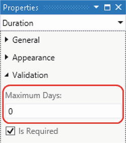
Figure 13-1. Maximum Days attribute, as shown in the properties sheet
Applying Validation Logic
Now that you’ve set up your LSML file to support custom validation, let’s take a closer look at how business type validation works. In the LSML for your business type, you used the identifier MaxIntegerValidationId. This identifier ties your business type with a validation factory. When LightSwitch needs to validate the value of a business type, it uses this identifier to determine the factory class that it should use. The factory class then returns an instance of a validation class that contains the validation logic for your business type. In our example, we’ve named our validation class MaxIntegerValidation. This class implements the IAttachedPropertyValidation interface and a method called Validate. This is the method that LightSwitch calls to validate the value of your business type. Figure 13-2 illustrates this process.
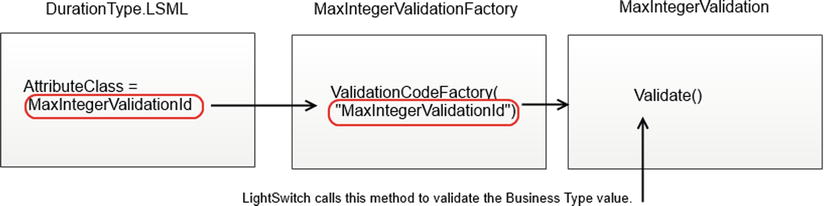
Figure 13-2. Applying validation logic
To apply this validation to your business type, let’s create the factory and validation classes. Create a new class file in your Common project, and name it MaxIntegerValidationFactory. Now add the code that’s shown in Listing 13-4.
Listing 13-4. Creating the Validation Factory Code
VB:
File: ApressExtensionVB.CommonMaxIntegerValidationFactory.vb

Imports System.ComponentModel.Composition
Imports Microsoft.LightSwitch.Runtime.Rules
Imports Microsoft.LightSwitch.Model

<Export(GetType(IValidationCodeFactory))>
<ValidationCodeFactory("ApressExtensionVB:@MaxIntegerValidationId")>
Public Class MaxIntegerValidationFactory
    Implements IValidationCodeFactory

    Public Function Create(
       modelItem As Microsoft.LightSwitch.Model.IStructuralItem,
       attributes As System.Collections.Generic.IEnumerable(
          Of Microsoft.LightSwitch.Model.IAttribute)) As
       Microsoft.LightSwitch.Runtime.Rules.IAttachedValidation Implements
       Microsoft.LightSwitch.Runtime.Rules.IValidationCodeFactory.Create

        ' Ensure that the data type is a positive integer semantic
        ' type (or nullable positive integer)
        If Not IsValid(modelItem) Then
            Throw New InvalidOperationException("Unsupported data type.")
        End If
        Return New MaxIntegerValidation(attributes)
    End Function

    Public Function IsValid(modelItem As
       Microsoft.LightSwitch.Model.IStructuralItem) As Boolean Implements
       Microsoft.LightSwitch.Runtime.Rules.IValidationCodeFactory.IsValid

        Dim nullableType As INullableType = TryCast(modelItem, INullableType)

        ' Get underlying type if it is a INullableType.
        modelItem =
           If(nullableType IsNot Nothing, nullableType.UnderlyingType, modelItem)

        ' Ensure the type matches the business type, or the underlying type
        While TypeOf modelItem Is ISemanticType
            If String.Equals(DirectCast(modelItem, ISemanticType).Id,
               "ApressExtensionVB:DurationType",
                  StringComparison.Ordinal) Then
                   Return True
            End If
            modelItem = DirectCast(modelItem, ISemanticType).UnderlyingType
        End While
        ' Don't apply the validation if the conditions aren't met
        Return False

    End Function
End Class

C#:
File: ApressExtensionCS.CommonMaxIntegerValidationFactory.cs

using System;
using System.Collections.Generic;
using System.ComponentModel.Composition;
using System.Linq;
using Microsoft.LightSwitch;
using Microsoft.LightSwitch.Model;
using Microsoft.LightSwitch.Runtime.Rules;

namespace ApressExtensionCS
{
    [Export(typeof(IValidationCodeFactory))]
    [ValidationCodeFactory("ApressExtensionCS:@MaxIntegerValidationId")]
    public class MaxIntegerValidationFactory : IValidationCodeFactory
    {
        public IAttachedValidation Create(IStructuralItem modelItem,
           IEnumerable<IAttribute> attributes)
        {
            // Ensure that the data type is a positive integer semantic
            // type (or nullable positive integer)
            if (!IsValid(modelItem))
            {
                throw new InvalidOperationException("Unsupported data type.");
            }
            return new MaxIntegerValidation (attributes);
        }

        public bool IsValid(IStructuralItem modelItem)
        {
            INullableType nullableType = modelItem as INullableType;

            // Get underlying type if it is an INullableType.
            modelItem =
               null != nullableType ? nullableType.UnderlyingType : modelItem;

            // Ensure the type matches the business type,
            // or the underlying type
            while (modelItem is ISemanticType)
            {
                if (String.Equals(((ISemanticType)modelItem).Id,
                   "ApressExtensionCS:DurationType",
                    StringComparison.Ordinal))
                {
                    return true;
                }
                modelItem = ((ISemanticType)modelItem).UnderlyingType;
            }

            //Don't apply the validation if the conditions aren't met
            return false;
        }
    }
}
The first part of this code contains the identifier (AttributeClass) that links your validation factory to your LSML file . The syntax that you use is particularly important. You need to prefix the identifier with the namespace of your project, followed by the : symbol and the @ symbol.
The remaining code in the validation factory performs validation to ensure that the data type of the model item matches your business type, and returns a new instance of your MaxIntegerValidation validation class if the test succeeds. In the code that carries out this test, it’s important to specify your business type identifier in the correct format. It should contain the namespace of your project, followed by the : symbol, followed by the business type name.
At this point, you’ll see compiler errors because the MaxIntegerValidation class doesn’t exist. So the next step is to create a new class in your Common project, name it MaxIntegerValidation, and add the code that’s shown in Listing 13-5.
Listing 13-5. Creating the Validation Class
VB:
File: ApressExtensionVBApressExtensionVB.CommonMaxIntegerValidation.vb

Imports System
Imports System.Collections.Generic
Imports System.ComponentModel.Composition
Imports System.Linq
Imports Microsoft.LightSwitch
Imports Microsoft.LightSwitch.Model
Imports Microsoft.LightSwitch.Runtime.Rules

Public Class MaxIntegerValidation
    Implements IAttachedPropertyValidation

    Public Sub New(attributes As IEnumerable(Of IAttribute))
        Me.attributes = attributes
    End Sub

    Private attributes As IEnumerable(Of IAttribute)

    Public Sub Validate(value As Object,
       results As IPropertyValidationResultsBuilder) Implements
         Microsoft.LightSwitch.Runtime.Rules.IAttachedPropertyValidation.Validate
        If value IsNot Nothing Then

            ' Ensure the value type is integer.
            If GetType(Integer) IsNot value.GetType() Then
                Throw New InvalidOperationException("Unsupported data type.")
            End If

            Dim intValue As Integer = DirectCast(value, Integer)

            Dim validationAttribute As IAttribute =
               Me.attributes.FirstOrDefault()
            If validationAttribute IsNot Nothing AndAlso
                validationAttribute.Class IsNot Nothing AndAlso
                validationAttribute.Class.Id =
                   "ApressExtensionVB:@MaxIntegerValidationId" Then

                Dim intMaxDays =
                   DirectCast(validationAttribute("MaxDays"), Integer)

                'There are 1440 minutes in a day
                If intMaxDays > 0 AndAlso intValue > (intMaxDays * 1440) Then
                    results.AddPropertyResult(
                       "Max value must be less than " &
                        intMaxDays.ToString & " days", ValidationSeverity.Error)
                End If
            End If
        End If
    End Sub
End Class

C#:
File: ApressExtensionCSApressExtensionCS.CommonMaxIntegerValidation.cs

using System;
using System.Collections.Generic;
using System.ComponentModel.Composition;
using System.Linq;
using Microsoft.LightSwitch;
using Microsoft.LightSwitch.Model;
using Microsoft.LightSwitch.Runtime.Rules;

public class MaxIntegerValidation : IAttachedPropertyValidation
{
    public MaxIntegerValidation (IEnumerable<IAttribute> attributes)
    {
        _attributes = attributes;
    }

    private IEnumerable<IAttribute> _attributes;

    public void Validate(object value,
        IPropertyValidationResultsBuilder results)
    {
        if (null != value)
        {
            // Ensure the value type is integer.
            if (typeof(Int32) != value.GetType())
            {
                throw new InvalidOperationException("Unsupported data type.");
            }

            IAttribute validationAttribute = _attributes.FirstOrDefault();
            if (validationAttribute != null &&
                validationAttribute.Class != null &&
                validationAttribute.Class.Id ==
                   "ApressExtensionCS:@MaxIntegerValidationId")
            {

                int intValue = (int)value;
                int intMaxDays = (int)validationAttribute["MaxDays"];

                //There are 1440 minutes in a day
                if (intMaxDays > 0 && intValue > (intMaxDays * 1440))
                {
                    results.AddPropertyResult(
                       "Max value must be less than " + intMaxDays.ToString() +
                       " days", ValidationSeverity.Error);
                }
            }
        }
    }
}
The code in Listing 13-5 defines a class that implements the Validate method . LightSwitch calls this method each time it needs to validate the value of your business type. This method allows you to retrieve the data value from the value parameter, apply your validation rules, and return any errors through the results parameter. The validation code retrieves the MaxDays attribute by querying the collection of attributes that are supplied to the validation class by the factory. The code retrieves the first attribute and checks that it relates to your duration type. In the test that the code carries out, notice the syntax of the class Id . It should contain the namespace of your project, followed by the : symbol, followed by the @ symbol, followed by the validation identifier that you specified in your LSML file.
Creating Custom Property Editor Windows
By default, the “Maximum Day” attribute that you added to your business type shows up as a TextBox in the table designer’s property sheet. In this section, you’ll learn how to create a popup window that allows developers to edit custom attribute values. The phone number business type provides a great example of a business type that works just like this. As you’ll recall from Chapter 2 (Figure 2-8), this business type allows developers to define phone number formats through a popup “Phone Number Formats” dialog. The advantage of a popup window is that it gives you more space and allows you to create a richer editor control that can contain extra validation or other neat custom features. In this section, you’ll find out how to create an editor window that allows developers to edit the MaxDay attribute. The custom editor window will allow developers to set the value by using a slider control.
Chapter 12 showed you how to customize the screen designer’s properties sheet, and this example works in a similar fashion. When you’re in the table designer and Visual Studio builds the property sheet for an instance of your business type, it uses the LSML metadata to work out what custom attributes there are and what editor control it should use.
The LSML file allows you to specify a UIEditor for each custom attribute that you’ve added. The value that you specify provides an identifier that allows you to associate an attribute with a factory class. When Visual Studio builds the property sheet, it uses this identifier to find a matching factory class. It then uses the factory class to return an editor class that implements the IPropertyValueEditor interface. The editor class implements a method called GetEditorTemplate that returns the XAML that plugs into Visual Studio’s property sheet. To create a custom popup property editor, you’d return a piece of XAML that contains a hyperlink control that opens your custom property editor in a new window. Figure 13-3 illustrates this process.
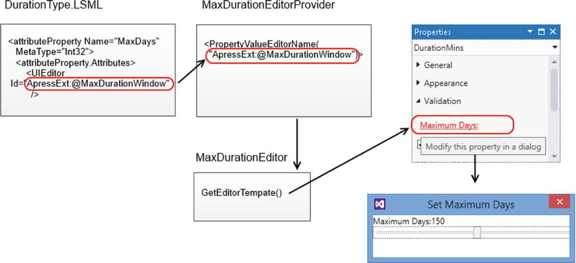
Figure 13-3. Creating a popup custom editor window
You’ll remember from Chapter 12 that Visual Studio is built with WPF, so creating a pop up window that integrates with the IDE will involve writing a custom WPF user control. Just like the other examples in this book that extend the Visual Studio IDE, you’ll carry out this work in your Design project.
To create the custom editor window, right-click your Design project, click Add New Item, and select “User Control (WPF).” As a prerequisite, you’ll need to make sure that your LSPKG and Design projects are set to .NET 4.5. (You may have done this already in Chapter 12.) In your Design project, you’ll need to add a reference to the Microsoft.LightSwitch.Design.Designer.dll file. You’ll find this file in Visual Studio’s private assembly folder. On a 64-bit computer, the default location of this folder is: C:Program Files (x86)Microsoft Visual Studio 11.0Common7IDEPrivateAssemblies.
Once your control opens in Visual Studio, modify the XAML for your user control as shown in Listing 13-6.
Listing 13-6. Creating a Custom Property Editor
File: ApressExtensionVBApressExtensionVB.DesignMaxIntegerEditorDialog.xaml

<Window x:Class="MaxIntegerEditorDialog"
        xmlns="http://schemas.microsoft.com/winfx/2006/xaml/presentation"
        xmlns:x="http://schemas.microsoft.com/winfx/2006/xaml"
        WindowStartupLocation="CenterOwner"
        ShowInTaskbar="False" ResizeMode="NoResize"
        Title="Set Maximum Days" Height="100" Width="300">
    <StackPanel>

        <StackPanel Orientation="Horizontal" >
            <TextBlock  Text="Maximum Days:" />
            <TextBlock Text="{Binding Value,
                RelativeSource={RelativeSource FindAncestor,
                AncestorType={x:Type Window}}, Mode=TwoWay}" />
        </StackPanel>

        <Slider Value="{Binding Value,
                RelativeSource={RelativeSource FindAncestor,
                AncestorType={x:Type Window}}, Mode=TwoWay}"
                Minimum="0" Maximum="300" Width="300" />
    </StackPanel>
</Window>
This code defines the XAML for the window that opens from the properties sheet, and Figure 13-4 shows how it looks at runtime. The XAML contains a TextBlock that shows the selected Maximum Days value . The Slider control allows the developer to edit the value, and because of the data-binding code that you’ve added, the TextBlock value updates itself when the developer changes the value through the slider control.
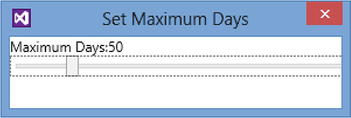
Figure 13-4. The popup window that allows users to set maximum days
 Caution If you copy and paste the XAML in a WPF user control, your code might fail to compile due to a missing InitializeComponent method. See here for more details: http://stackoverflow.com/questions/954861/why-can-visual-studio-not-find-my-wpf-initializecomponent-method
Once you’ve added your WPF user control, add the code that’s shown in Listing 13-7.
Listing 13-7. Creating a Custom Property Editor
VB:
File: ApressExtensionVBApressExtensionVB.DesignMaxIntegerEditorDialog.xaml.vb

Imports System.Windows

Public Class MaxIntegerEditorDialog
    Inherits Window

    Public Property Value As Nullable(Of Integer)
        Get
            Return MyBase.GetValue(MaxIntegerEditorDialog.ValueProperty)
        End Get
        Set(value As Nullable(Of Integer))
            MyBase.SetValue(MaxIntegerEditorDialog.ValueProperty, value)
        End Set
    End Property

    Public Shared ReadOnly ValueProperty As DependencyProperty =
        DependencyProperty.Register(
            "Value",
            GetType(Nullable(Of Integer)),
            GetType(MaxIntegerEditorDialog),
            New UIPropertyMetadata(0))

    Public Sub New()
        InitializeComponent()
    End Sub

End Class

C#:
File: ApressExtensionCSApressExtensionCS.DesignMaxIntegerEditorDialog.xaml.cs

using System.Windows;

public partial class MaxIntegerEditorDialog : Window
{
    public MaxIntegerEditorDialog()
    {
        InitializeComponent();
    }
    public int? Value
    {
        get { return (int?)GetValue(ValueProperty); }
        set { SetValue(ValueProperty, value); }
    }
    public static readonly DependencyProperty ValueProperty =
        DependencyProperty.Register("Value", typeof(int?),
        typeof(MaxIntegerEditorDialog), new UIPropertyMetadata(0));
}
The code in Listing 13-7 sets up your control so that it inherits from the Window class . By default, your WPF control would inherit from the UserControl class. This code contains a dependency property called ValueProperty, which is of data type integer . This property allows the window to share the selected value with the code in the properties sheet that opens the window.
Caution When you create dependency properties, make sure to pass the correct value to the UIPropertyMetadata constructor. For example, if you define a decimal dependency property and you want to set the default value to 0, use the syntax UIPropertyMetadata (0d). If you set default values that don’t match the data type of your dependency property, you’ll receive an obscure error at runtime that can be difficult to decipher.
You’ve now created the window that allows the developer to edit the MaxDays attribute, so the next step is to define the UI that contains the hyperlink that opens this window. Create a new “User Control (WPF)” called EditorTemplates.xaml in your Design project, and add the code that’s shown in Listing 13-8.
Listing 13-8. Adding the UI That Opens the Custom Window
File: ApressExtensionVBApressExtensionVB.DesignEditorTemplates.xaml

<ResourceDictionary
    xmlns="http://schemas.microsoft.com/winfx/2006/xaml/presentation"
    xmlns:x="http://schemas.microsoft.com/winfx/2006/xaml"
    xmlns:self="clr-namespace:ApressExtensionVB">
    <DataTemplate x:Key="MaxIntegerEditorTemplate">
        <Label>
            <Hyperlink
                Command="{Binding EditorContext}"
                ToolTip="{Binding Entry.Description}">
                <Run
                    Text="{Binding Entry.DisplayName, Mode=OneWay}"
                    FontFamily="{DynamicResource DesignTimeFontFamily}"
                    FontSize="{DynamicResource DesignTimeFontSize}"
                    />
            </Hyperlink>
        </Label>
    </DataTemplate>
</ResourceDictionary>
The code in Listing 13-8 defines a resource dictionary that contains a single data template called MaxIntegerEditorTemplate . Using a resource dictionary gives you the ability to add additional templates at a later point in time. You should make sure to configure the xmlns:self value so that it points to the namespace of your extension project. When you add a WPF User Control, the template creates a .NET code file that corresponds with your XAML file. Because this code isn’t necessary, you can simply delete this file.
The next step is to create your editor class. Create a new class called MaxIntegerEditor in your Design project, and add the code that’s shown in Listing 13-9.
Listing 13-9. Creating a Custom Property Editor
VB:
File: ApressExtensionVBApressExtensionVB.DesignMaxIntegerEditor.vb

Imports System
Imports System.ComponentModel.Composition
Imports System.Runtime.InteropServices
Imports System.Windows
Imports System.Windows.Input
Imports System.Windows.Interop
Imports Microsoft.LightSwitch.Designers.PropertyPages
Imports Microsoft.LightSwitch.Designers.PropertyPages.UI

Public Class MaxIntegerEditor
    Implements IPropertyValueEditor

    Public Sub New(entry As IPropertyEntry)
        Me.command = New EditCommand(entry)
    End Sub

    Private command As ICommand

    Public ReadOnly Property Context As Object
      Implements IPropertyValueEditor.Context
        Get
            Return Me.command
        End Get
    End Property

    Public Function GetEditorTemplate(entry As IPropertyEntry) As DataTemplate
       Implements IPropertyValueEditor.GetEditorTemplate
        Dim dict As ResourceDictionary = New ResourceDictionary()
        dict.Source =
           New Uri("ApressExtensionVB.Design;component/EditorTemplates.xaml",
              UriKind.Relative)
        Return dict("MaxIntegerEditorTemplate")
    End Function

    Private Class EditCommand
        Implements ICommand

        Public Sub New(entry As IPropertyEntry)
            Me.entry = entry
        End Sub

        Private entry As IPropertyEntry

        Public Function CanExecute(parameter As Object) As Boolean
           Implements ICommand.CanExecute
               Return True
        End Function

        Public Event CanExecuteChanged(sender As Object,
           e As System.EventArgs) Implements ICommand.CanExecuteChanged

        Public Sub Execute(parameter As Object) Implements ICommand.Execute

            Dim dialog As MaxIntegerEditorDialog = New MaxIntegerEditorDialog()
            dialog.Value = Me.entry.PropertyValue.Value
            ' Set the parent window of your dialog box to the IDE window;
            ' this ensures the win32 window stack works correctly.
            Dim wih As WindowInteropHelper = New WindowInteropHelper(dialog)
            wih.Owner = GetActiveWindow()
            dialog.ShowDialog()
            Me.entry.PropertyValue.Value = dialog.Value

        End Sub

        'GetActiveWindow is a Win32 method; import the method to get the
        ' IDE window
        Declare Function GetActiveWindow Lib "User32" () As IntPtr

    End Class

End Class

<Export(GetType(IPropertyValueEditorProvider))>
<PropertyValueEditorName(
    "ApressExtension:@MaxDurationWindow")>
<PropertyValueEditorType("System.String")>
Friend Class MaxIntegerEditorProvider
    Implements IPropertyValueEditorProvider

    Public Function GetEditor(entry As IPropertyEntry) As IPropertyValueEditor
       Implements IPropertyValueEditorProvider.GetEditor
          Return New MaxIntegerEditor(entry)
    End Function

End Class

C#:
File: ApressExtensionCSApressExtensionCS.DesignMaxIntegerEditor.cs

using System;
using System.ComponentModel.Composition;
using System.Runtime.InteropServices;
using System.Windows;
using System.Windows.Input;
using System.Windows.Interop;
using Microsoft.LightSwitch.Designers.PropertyPages;
using Microsoft.LightSwitch.Designers.PropertyPages.UI;

namespace ApressExtensionCS
{
    internal class MaxIntegerEditor : IPropertyValueEditor
    {
        public MaxIntegerEditor(IPropertyEntry entry)
        {
            _editCommand = new EditCommand(entry);
        }
        private ICommand _editCommand;

        public object Context
        {
            get { return _editCommand; }
        }

        public DataTemplate GetEditorTemplate(IPropertyEntry entry)
        {
            ResourceDictionary dict = new ResourceDictionary() {
            Source = new
            Uri("ApressExtensionCS.Design;component/EditorTemplates.xaml",
            UriKind.Relative)};
            return (DataTemplate)dict["MaxIntegerEditorTemplate"];
        }

        private class EditCommand : ICommand
        {
            public EditCommand(IPropertyEntry entry)
            {
                _entry = entry;
            }

            private IPropertyEntry _entry;

            #region ICommand Members

            bool ICommand.CanExecute(object parameter)
            {
                return true;
            }

            public event EventHandler CanExecuteChanged { add { } remove { } }

            void ICommand.Execute(object parameter)
            {
                MaxIntegerEditorDialog dialog = new MaxIntegerEditorDialog() {
                    Value = (int?)_entry.PropertyValue.Value };

               //Set the parent window of your dialog box to the IDE window;
               //this ensures the win32 window stack works correctly.
                WindowInteropHelper wih = new WindowInteropHelper(dialog);
                wih.Owner = GetActiveWindow();
                dialog.ShowDialog();
                _entry.PropertyValue.Value = dialog.Value;
            }

            #endregion
           //GetActiveWindow is a Win32 method; import the method to get the
           //IDE window

            [DllImport("user32")]
            public static extern IntPtr GetActiveWindow();
        }
    }

    [Export(typeof(IPropertyValueEditorProvider))]
    [PropertyValueEditorName(
        "ApressExtension:@MaxDurationWindow")]
    [PropertyValueEditorType("System.String")]
    internal class MaxIntegerEditorProvider : IPropertyValueEditorProvider
    {
        public IPropertyValueEditor GetEditor(IPropertyEntry entry)
        {
            return new MaxIntegerEditor(entry);
        }
    }
}
Listing 13-9 defines the factory class that specifies the PropertyValueEditorName attribute . The value of this attribute identifies your custom editor control, and this is the value that you specify in your business type’s LSML file to link an attribute to a custom editor.
When the LightSwitch table designer needs to display a custom editor, it uses the factory class to create an instance of a MaxIntegerEditor object . The table designer calls the GetEditorTemplate method to retrieve the UI control to display on the property sheet. This UI control binds to an ICommand object, and the UI control can access this object through the EditorContext property (see Listing 13-8). This UI control shows a hyperlink on the properties sheet, and when the developer clicks the on the link, it calls the code in the Execute method , which opens the dialog. This allows the developer to set the “Max Days” attribute, and once the developer enters the value, the code sets the underlying property value using the value that was supplied through the dialog.
The next step is to link your custom editor class to your custom attribute. To do this, open the LSML file for your business type, find the section that defines the UIEditor, and modify it as shown in Listing 13-10.
Listing 13-10. Creating a Custom Property Editor
File: ApressExtensionVBApressExtensionVB.CommonMetadataTypesDurationType.lsml

<AttributeProperty Name="MaxDays" MetaType="Int32">
   <!--Attribute Properties 3-->
   <AttributeProperty.Attributes>
      <Category Value="Validation" />
      <DisplayName Value="Maximum Days" />
      <UIEditor Id="ApressExtension:@MaxDurationWindow"/>
   </AttributeProperty.Attributes>
</AttributeProperty>
Listing 13-10 shows the snippet of XML that links the custom editor to the MaxDays attribute. The important amendment here is to make sure that the UIEditor value matches the PropertyValueEditorName value that you set in Listing 13-9.
Using Your Business Type
The duration business type is now complete, and you’re now ready to build and use it. To demonstrate how to use the business type that you’ve created, open the TimeTracking table and select the DurationMins property. You’ll now find that you can change the data type from Integer to Duration, and when you open the properties sheet, you’ll find a “Maximum Days” link that allows you to open the dialog that contains the slider control (Figure 13-5).
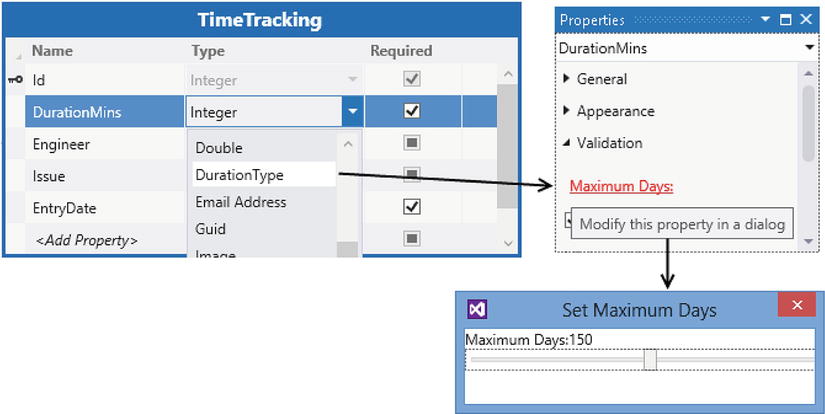
Figure 13-5. The new slider control that appears in the properties sheet
Figure 13-6 shows a screen at runtime. The Maximum Days setting for the DurationMins property is set to two days, and the screenshot shows the error message that appears when you try to enter a duration that’s greater than two days. Notice how the control type for DurationMins is set to a TextBox rather than the default Duration Editor control. This emphasizes that LightSwitch applies your business type validation, irrespective of the control type that you choose.
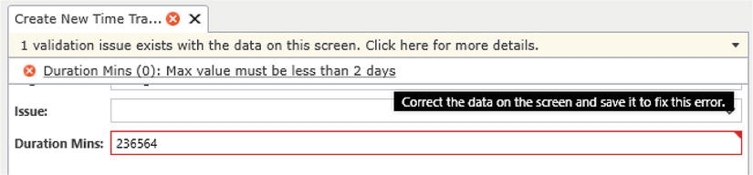
Figure 13-6. Business type validation at runtime
Creating a Custom Shell Extension
By creating a LightSwitch shell, you can radically change the appearance of your application. A custom shell allows you to change the position of where the command menu, navigation items, and screens appear.
When you add a new shell, the template creates a blank canvas that allows you to add as little or as much as you like. So if for some reason you don’t want to include a navigation menu, that’s no problem—you can simply choose not to implement that functionality. Some developers have created bare shells and used custom controls to achieve an appearance that looks nothing like a LightSwitch application. Custom shells, therefore, allow you to carry out extreme modification to your application’s UI.
A custom shell is a Silverlight concept, so the work that you’ll carry out takes place in your Client project. A LightSwitch shell consists of a XAML file that defines the layout and UI elements of your shell. Data binding then allows you to connect your UI elements with your LightSwitch application through special “View Models” that LightSwitch provides.
In this section, you’ll find out how to create a custom shell. To demonstrate how to modify the behavior of your shell, you’ll learn how to create a navigation system that uses drop-down boxes. The overview of how to create a custom shell involves the following:
- Create a new shell, and set the name and description.
- Write the XAML that defines your shell’s UI, and data-binds to LightSwitch’s View Models.
- Write the underlying .NET code that supports your shell.
Just as you would with all extension types, you would create a new shell by right-clicking your LSPKG project, choosing the Add New option, and selecting “Shell” in the “Add New Item” dialog. To carry out the example that’s shown in this section, create a new shell called ApressShell. Once you do this, the template creates the following two files:
-
ClientPresentationShellsApressShell.xaml:
This file contains the markup that defines the presentation and UI elements for your shell. -
ClientPresentationShellsComponentsApressShell.vb:
This .NET code file contains the implementation code that allows your shell to work with MEF (Managed Extensibility Framework), and includes properties that identify your shell.
A large part of the shell development process involves rewriting parts of LightSwitch that you probably take for granted. A new shell provides you with a UI that’s completely blank, and in this section, you’ll find out how to re-create the tab controls that allow users to switch screens. This functionality relies on a couple of DLLs that you need to add to your Client project. These DLLs, and their default location on a 64-bit computer are shown here:
-
System.Windows.Controls.dll:
C:Program Files (x86)Microsoft SDKsSilverlightv5.0Libraries -
Microsoft.LightSwitch.ExportProvider.dll:
C:Program Files (x86)Microsoft Visual Studio 11.0Common7IDEPrivateAssemblies.
Defining the Look of Your Shell
The key part about shell design is to work out how you want your shell to look. In this example, you’ll create a shell that stacks the UI elements from top to bottom. Figure 13-7 shows the proposed layout of this shell.
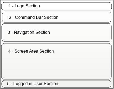
Figure 13-7. The proposed layout for your Shell
The code in Listing 13-11 contains the XAML that achieves the look that’s shown in Figure 13-7. Take a look at this code but don’t add it to your ApressShell.xaml file yet. It won’t compile because it depends on some components that you haven’t yet defined.
Listing 13-11. Shell UI Code
File: ApressExtensionVBApressExtensionVB.ClientPresentationShellsApressShell.xaml
<UserControl
x:Class="ApressExtensionVB.Presentation.Shells.ApressShell"
xmlns="http://schemas.microsoft.com/winfx/2006/xaml/presentation"
xmlns:x="http://schemas.microsoft.com/winfx/2006/xaml"
xmlns:controls="clr-namespace:System.Windows.Controls;
assembly=System.Windows.Controls"
xmlns:ShellHelpers=
"clr-namespace:Microsoft.LightSwitch.Runtime.Shell.Helpers;
assembly=Microsoft.LightSwitch.Client"
xmlns:local="clr-namespace:ApressExtensionVB.Presentation.Shells">
<UserControl.Resources>
<local:WorkspaceDirtyConverter x:Key="WorkspaceDirtyConverter" />
<local:ScreenHasErrorsConverter x:Key="ScreenHasErrorsConverter" />
<local:ScreenResultsConverter x:Key="ScreenResultsConverter" />
<local:CurrentUserConverter x:Key="CurrentUserConverter" />
<!-- 0 Template that is used for the header of each tab item -->
<DataTemplate x:Key="TabItemHeaderTemplate">
<Border>
<StackPanel Orientation="Horizontal">
<TextBlock Text="{Binding DisplayName}" />
<!-- This TextBlock shows ! when the screen is dirty -->
<TextBlock Text="!"
Visibility="{Binding ValidationResults.HasErrors,
Converter={StaticResource ScreenHasErrorsConverter}}"
Margin="5, 0, 5, 0" Foreground="Red" FontWeight="Bold">
<ToolTipService.ToolTip>
<!-- This tooltip shows validation results -->
<ToolTip Content=
"{Binding ValidationResults,
Converter={StaticResource ScreenResultsConverter}}"/>
</ToolTipService.ToolTip>
</TextBlock>
<Button Height="16" Width="16"
Padding="0" Margin="5, 0, 0, 0"
Click="OnClickTabItemClose">X</Button>
</StackPanel>
</Border>
</DataTemplate>
</UserControl.Resources>
<StackPanel>
<!-- 1 Logo Section -->
<Image Source="{Binding Logo}"
ShellHelpers:ComponentViewModelService.ViewModelName=
"Default.LogoViewModel"/>
<!-- 2 Command Bar Section -->
<ListBox x:Name="CommandPanel"
ShellHelpers:ComponentViewModelService.ViewModelName=
"Default.CommandsViewModel"
ItemsSource="{Binding ShellCommands}"
Background="{StaticResource RibbonBackgroundBrush}">
<ListBox.ItemsPanel>
<ItemsPanelTemplate>
<StackPanel Orientation="Horizontal" />
</ItemsPanelTemplate>
</ListBox.ItemsPanel>
<ListBox.ItemTemplate>
<DataTemplate>
<StackPanel Orientation="Horizontal">
<Button Click="GeneralCommandHandler"
IsEnabled="{Binding IsEnabled}"
Style="{x:Null}"Margin="1">
<Grid>
<Grid.RowDefinitions>
<RowDefinition Height="32" />
<RowDefinition MinHeight="24"
Height="*" />
</Grid.RowDefinitions>
<Image Source="{Binding Image}"
Grid.Row="0" Margin="0"
Width="32" Height="32"
Stretch="UniformToFill"
VerticalAlignment="Top"
HorizontalAlignment="Center" />
<TextBlock Grid.Row="1"
Text="{Binding DisplayName}"
TextAlignment="Center"
TextWrapping="Wrap"
MaxWidth="64" />
</Grid>
</Button>
</StackPanel>
</DataTemplate>
</ListBox.ItemTemplate>
</ListBox>
<!-- 3 Navigation Section -->
<StackPanel>
<ComboBox ShellHelpers:ComponentViewModelService.ViewModelName=
"Default.NavigationViewModel"
ItemsSource="{Binding NavigationItems}"
Name="navigationGroup"
SelectionChanged="navigationGroup_SelectionChanged" >
<ComboBox.ItemTemplate>
<DataTemplate>
<TextBlock Text="{Binding DisplayName}" />
</DataTemplate>
</ComboBox.ItemTemplate>
</ComboBox>
<ComboBox ShellHelpers:ComponentViewModelService.ViewModelName=
"Default.NavigationViewModel"
Name="navigationItems"
SelectionChanged="navigationItems_SelectionChanged" >
<ComboBox.ItemTemplate>
<DataTemplate>
<TextBlock Text="{Binding DisplayName}" />
</DataTemplate>
</ComboBox.ItemTemplate>
</ComboBox>
</StackPanel>
<!-- 4 Screen Area Section -->
<controls:TabControl x:Name="ScreenArea"
SelectionChanged="OnTabItemSelectionChanged">
</controls:TabControl>
<!-- 5 Logged in User Section -->
<TextBlock ShellHelpers:ComponentViewModelService.ViewModelName=
"Default.CurrentUserViewModel"
Name="LoggedInUser"
Text="{Binding CurrentUserDisplayName,
Converter={StaticResource CurrentUserConverter}}" />
</StackPanel>
</UserControl>
The comments in Listing 13-11 allow you to match the code blocks with the screen sections that are shown in Figure 13-7. The first part of this code defines several supporting resources. This includes the value converters to support the shell’s functionality and a template that defines the tab headings that appear above each screen. The tab heading includes the screen name and elements that indicate whether the screen is dirty or contains validation errors.
The next part of the XAML defines the parent StackPanel that arranges the contents of your shell in a top-to-bottom manner. The first control inside the StackPanel displays the application logo , and the next control is a ListBox control that binds to the screen commands in your application. The standard commands that LightSwitch shows on each screen include “Save” and “Refresh.” The next section contains a pair of ComboBox controls that you’ll customize to allow users to navigate your application. The final part of the XAML contains the tab control that contains the screen area and a TextBlock that displays the currently logged-in user. In the sections of this chapter that follow, we’ll refer back to this XAML and describe the code that’s shown in further detail.
When you add this XAML to your project later, make sure to set the two namespace references that are indicated in  to the name of your project.
LightSwitch exposes shell-related data through six view models, which are shown in Table 13-1.
Table 13-1. Shell View Models
| Name | View Model ID | Description |
|---|---|---|
| Navigation | NavigationViewModel | Provides access to navigation groups and screens. |
| Commands | CommandsViewModel | Provides access to the commands that are normally shown in the command section. |
| Active Screens | ActiveScreensViewModel | Provides access to the active screens in your application (that is, the screens that your user has opened). |
| Current User | CurrentUserViewModel | Provides information about the current logged-on user. |
| Logo | LogoViewModel | Provides access to the image that’s specified in the application’s logo property. |
| Screen Validation | ValidationViewModel | Provides access to the validation information. |
LightSwitch provides a Component View Model Service that allows you to bind UI elements to view models by simply adding one line of code against the control that you want to data-bind. The Component View Model Service uses MEF to find and instantiate a view model and to set it as the data context for the specified control. The advantage is that it makes it really simple for you to consume the data from the view models. To demonstrate how this works, let’s take a closer look at the XAML that shows the screen commands (Listing 13-12).
Listing 13-12. Command Bar Section
File:ApressExtensionVBApressExtensionVB.ClientPresentationShellsApressShell.xaml

<!-- 2 Command Bar Section -->
<ListBox x:Name="CommandPanel"
   ShellHelpers:ComponentViewModelService.ViewModelName=
      "Default.CommandsViewModel"
    ItemsSource="{Binding ShellCommands}"
    Background="{StaticResource RibbonBackgroundBrush}">

    <ListBox.ItemsPanel>
        <ItemsPanelTemplate>
            <StackPanel Orientation="Horizontal" />
        </ItemsPanelTemplate>
    </ListBox.ItemsPanel>

    <ListBox.ItemTemplate>
        <DataTemplate>
            <StackPanel>
                <Button Click="GeneralCommandHandler"
                        IsEnabled="{Binding IsEnabled}">
                   <Image Source="{Binding Image}"/>
                   <TextBlock Text="{Binding DisplayName}"/>
                </Button>
            </StackPanel>
        </DataTemplate>
    </ListBox.ItemTemplate>
</ListBox>
Listing 13-12 is a simplified version of the code from Listing 13-11 that highlights the parts that are specific to data binding. The first section of this code defines a ListBox control. If you’re not very familiar with Silverlight, it’s useful to understand that the ListBox control isn’t only just designed to display simple lists of text data. It allows you to bind to a data source and to render each data item using rich data controls that can include images and other Silverlight controls. The initial part of ListBox control defines the “parent” container for your list items. This code renders the child items horizontally by defining an ItemsPanelTemplate element that contains a StackPanel with its Orientation set to Horizontal .
The definition of the ListBox control uses the Component View Model Service to bind it to the Commands View Model. It does this by applying the following line of code:
ShellHelpers:ComponentViewModelService.ViewModelName="Default.CommandsViewModel"
The Component View Model Service requires you to supply a view model name. The name that you provide should begin with Default, followed by the view model ID that’s shown in Table 13-1. The code that’s shown in sets the data context of your ListBox to the Commands View Model. The Commands View Model exposes the individual commands through a collection called ShellCommands, and the next line of code data-binds the ItemsSource of the ListBox control to this collection .
The DataTemplate section presents each data item in your ListBox as a button. Each button is bound to an IShellCommand object, and you can use the properties of this object to control the enabled status , Image , and display name of each command item.
When a user clicks on one of these buttons, LightSwitch won’t automatically execute the command. You’ll need to write custom code that executes the command, and you’ll find out how to do this shortly.
Displaying Your Application’s Logo
The top section of your shell displays the logo that’s defined in the properties of the LightSwitch application. You can show the application logo by using the Component View Model Service to bind an image control to the Logo View Model.
Listing 13-13 illustrates the code that you would use, and it provides another example of how to use the Component View Model Service.
Listing 13-13. Displaying a Logo
File: ApressExtensionVBApressExtensionVB.ClientPresentationShellsApressShell.xaml

<Image
    ShellHelpers:ComponentViewModelService.ViewModelName="Default.LogoViewModel"
    Source="{Binding Logo}"/>
Adding Code That Supports our Custom Shell
Up till now, I’ve shown you plenty of XAML that defines the appearance of your Shell. Although the big advantage of custom shells is that they allow you to carry out extreme UI customization, the side effect is that you need to implement a lot of the functionality that you would take for granted in LightSwitch. This includes writing the code that executes command items, manages screens, and enables navigation. To support the XAML that you’ve created so far, you’ll now add the following code to your shell:
- ApressShell.xaml.vb or ApressShell.xaml.cs: This defines the .NET code behind your XAML file and contains the logic that enables your custom shell to open and close screens and respond to user-initiated actions.
- ScreenWrapper class: LightSwitch’s screen object doesn’t contain any properties that allow you to determine if a screen is dirty or contains validation errors. This object extends LightSwitch’s IScreenObject and provides these extra functions.
- Value Converters: The shell that you’ve created includes UI elements that indicate whether the screen is dirty or contains validation errors. These value converters help to convert the property results from your screen object into types that your UI controls can consume.
Let’s begin by creating your ScreenWrapper class. Add a new class in your Client project’s Presentation Shells folder and call it ScreenWrapper. Now add the code that’s shown in Listing 13-14.
Listing 13-14. ScreenWrapper Object
VB:
File: ApressExtensionVBApressExtensionVB.ClientPresentationShellsScreenWrapper.vb

Imports System
Imports System.Collections.Generic
Imports System.ComponentModel
Imports System.Linq
Imports System.Windows

Imports Microsoft.LightSwitch
Imports Microsoft.LightSwitch.Client
Imports Microsoft.LightSwitch.Details
Imports Microsoft.LightSwitch.Details.Client
Imports Microsoft.LightSwitch.Utilities

Namespace Presentation.Shells

    Public Class ScreenWrapper
        Implements IScreenObject
        Implements INotifyPropertyChanged

        Private screenObject As IScreenObject
        Private dirty As Boolean
        Private dataServicePropertyChangedListeners As List(
           Of IWeakEventListener)

        Public Event PropertyChanged(sender As Object,
           e As PropertyChangedEventArgs) Implements
              INotifyPropertyChanged.PropertyChanged

        ' 1.  REGISTER FOR CHANGE NOTIFICATIONS
        Friend Sub New(screenObject As IScreenObject)
            Me.screenObject = screenObject
            Me.dataServicePropertyChangedListeners =
               New List(Of IWeakEventListener)

            ' Register for property changed events on the details object.
            AddHandler CType(screenObject.Details,
              INotifyPropertyChanged).PropertyChanged,
              AddressOf Me.OnDetailsPropertyChanged

            ' Register for changed events on each of the data services.
            Dim dataServices As IEnumerable(Of IDataService) =
              screenObject.Details.DataWorkspace.Details.Properties.All().OfType(
                   Of IDataWorkspaceDataServiceProperty)().Select(
                      Function(p) p.Value)

            For Each dataService As IDataService In dataServices
                Me.dataServicePropertyChangedListeners.Add(
                  CType(dataService.Details, INotifyPropertyChanged).CreateWeakPropertyChangedListener(
                    Me, AddressOf Me.OnDataServicePropertyChanged))
            Next
        End Sub

        Private Sub OnDetailsPropertyChanged(sender As Object,
           e As PropertyChangedEventArgs)
            If String.Equals(e.PropertyName,
              "ValidationResults", StringComparison.OrdinalIgnoreCase) Then
                RaiseEvent PropertyChanged(
                   Me, New PropertyChangedEventArgs("ValidationResults"))
            End If
        End Sub

        Private Sub OnDataServicePropertyChanged(sender As Object,
          e As PropertyChangedEventArgs)
            Dim dataService As IDataService =
              CType(sender, IDataServiceDetails).DataService
            Me.IsDirty = dataService.Details.HasChanges
        End Sub

        ' 2.  EXPOSE AN ISDIRTY PROPERTY
        Public Property IsDirty As Boolean
            Get
                Return Me.dirty
            End Get
            Set(value As Boolean)
                Me.dirty = value
                RaiseEvent PropertyChanged(
                      Me, New PropertyChangedEventArgs("IsDirty"))
            End Set
        End Property

        ' 3.  EXPOSE A VALIDATION RESULTS PROPERTY
        Public ReadOnly Property ValidationResults As ValidationResults
            Get
                Return Me.screenObject.Details.ValidationResults
            End Get
        End Property

        ' 4.  EXPOSE UNDERLYING SCREEN PROPERTIES
        Public ReadOnly Property CanSave As Boolean
          Implements IScreenObject.CanSave
            Get
                Return Me.screenObject.CanSave
            End Get
        End Property

        Public Sub Close(promptUserToSave As Boolean)
          Implements IScreenObject.Close
            Me.screenObject.Close(promptUserToSave)
        End Sub

        Friend ReadOnly Property RealScreenObject As IScreenObject
            Get
                Return Me.screenObject
            End Get
        End Property

        Public Property Description As String
         Implements IScreenObject.Description
            Get
                Return Me.screenObject.Description
            End Get
            Set(value As String)
                Me.screenObject.Description = value
            End Set
        End Property

        Public ReadOnly Property Details As IScreenDetails
          Implements IScreenObject.Details
            Get
                Return Me.screenObject.Details
            End Get
        End Property

        Public Property DisplayName As String
           Implements IScreenObject.DisplayName
            Get
                Return Me.screenObject.DisplayName
            End Get
            Set(value As String)
                Me.screenObject.DisplayName = value
            End Set
        End Property

        Public ReadOnly Property Name As String Implements IScreenObject.Name
            Get
                Return Me.screenObject.Name
            End Get
        End Property

        Public Sub Refresh() Implements IScreenObject.Refresh
            Me.screenObject.Refresh()
        End Sub

        Public Sub Save() Implements IScreenObject.Save
            Me.screenObject.Save()
        End Sub

        Public ReadOnly Property Details1 As IBusinessDetails
           Implements IBusinessObject.Details
            Get
                Return CType(Me.screenObject, IBusinessObject).Details
            End Get
        End Property

        Public ReadOnly Property Details2 As IDetails
            Implements IObjectWithDetails.Details
            Get
                Return CType(Me.screenObject, IObjectWithDetails).Details
            End Get
        End Property

        Public ReadOnly Property Details3 As IStructuralDetails
             Implements IStructuralObject.Details
            Get
                Return CType(Me.screenObject, IStructuralObject).Details
            End Get
        End Property
    End Class

End Namespace

C#:
File: ApressExtensionCSApressExtensionCS.ClientPresentationShellsScreenWrapper.cs

using System;
using System.Collections.Generic;
using System.ComponentModel;
using System.Linq;
using System.Windows;

namespace ApressExtensionCS.Presentation.Shells
{
    using Microsoft.LightSwitch;
    using Microsoft.LightSwitch.Client;
    using Microsoft.LightSwitch.Details;
    using Microsoft.LightSwitch.Details.Client;
    using Microsoft.LightSwitch.Utilities;

    public class ScreenWrapper : IScreenObject, INotifyPropertyChanged
    {
        private IScreenObject screenObject;
        private bool dirty;
        private List<IWeakEventListener> dataServicePropertyChangedListeners;

        public event PropertyChangedEventHandler PropertyChanged;

        // 1.  REGISTER FOR CHANGE NOTIFICATIONS
        internal ScreenWrapper(IScreenObject screenObject)
        {
            this.screenObject = screenObject;
            this.dataServicePropertyChangedListeners =
               new List<IWeakEventListener>();

            // Register for property changed events on the details object.
            ((INotifyPropertyChanged)screenObject.Details).PropertyChanged +=
                this.OnDetailsPropertyChanged;

            // Register for changed events on each of the data services.
            IEnumerable<IDataService> dataServices =
              screenObject.Details.DataWorkspace.Details.Properties.All().OfType<
               IDataWorkspaceDataServiceProperty>().Select(p => p.Value);

            foreach (IDataService dataService in dataServices)
                this.dataServicePropertyChangedListeners.Add(
                  ((INotifyPropertyChanged)dataService.Details).CreateWeakPropertyChangedListener(
                     this, this.OnDataServicePropertyChanged));
        }

        private void OnDetailsPropertyChanged(
           object sender, PropertyChangedEventArgs e)
        {
            if (String.Equals(
               e.PropertyName, "ValidationResults", StringComparison.OrdinalIgnoreCase))
            {
                if (null != this.PropertyChanged)
                    PropertyChanged(
                       this, new PropertyChangedEventArgs("ValidationResults"));
            }
        }

        private void OnDataServicePropertyChanged(
           object sender, PropertyChangedEventArgs e)
        {
            IDataService dataService = ((IDataServiceDetails)sender).DataService;
            this.IsDirty = dataService.Details.HasChanges;
        }

        // 2.  EXPOSE AN ISDIRTY PROPERTY
        public bool IsDirty
        {
            get{return this.dirty; }
            set
            {
                this.dirty = value;
                if (null != this.PropertyChanged)
                    PropertyChanged(
                      this, new PropertyChangedEventArgs("IsDirty"));
            }
        }

        // 3.  EXPOSE A VALIDATION RESULTS PROPERTY
        public ValidationResults ValidationResults
        {
            get {return this.screenObject.Details.ValidationResults;}
        }

        // 4.  EXPOSE UNDERLYING SCREEN PROPERTIES
        public IScreenDetails Details
        {
            get {return this.screenObject.Details; }
        }
        internal IScreenObject RealScreenObject
        {
            get {return this.screenObject; }
        }

        public string Name
        {
            get {return this.screenObject.Name; }
        }

        public string DisplayName
        {
            get {return this.screenObject.DisplayName; }
            set {this.screenObject.DisplayName = value; }
        }

        public string Description
        {
            get {return this.screenObject.Description; }
            set {this.screenObject.Description = value; }
        }

        public bool CanSave
        {
            get {return this.screenObject.CanSave; }
        }

        public void Save()
        {
            this.screenObject.Save();
        }

        public void Refresh()
        {
            this.screenObject.Refresh();
        }

        public void Close(bool promptUserToSave)
        {
            this.screenObject.Close(promptUserToSave);
        }

        IBusinessDetails IBusinessObject.Details
        {
            get {return ((IBusinessObject)this.screenObject).Details; }
        }

        IStructuralDetails IStructuralObject.Details
        {
            get {return ((IStructuralObject)this.screenObject).Details; }
        }

        IDetails IObjectWithDetails.Details
        {
            get{return ((IObjectWithDetails)this.screenObject).Details;}
        }
    }
}
When you create a custom shell, it’s important to be able to access screens in code, and the ScreenWrapper object allows you to do this. It provides a thin wrapper around the IScreenObject object and exposes properties you use to determine if a screen is dirty or contains validation errors. The code in Listing 13-14 includes the following features:
- 1 - Change Notification: This class implements the INotifiedPropertyChanged interface and the PropertyChanged event. This allows the ScreenWrapper object to raise a notification if the underlying data becomes dirty or invalid. Ultimately, this allows you to build a UI that shows an indication as soon as a user makes a change or enters invalid data.
- 2 - Exposes an IsDirty Property: This class allows you to determine whether the user has made any data changes by providing an IsDirty property. This returns true if the screen contains changes.
- 3 - Exposes a ValidationResults Property: This class exposes a public property called ValidationResults that allows you to access any underlying validation errors.
- 4 - Implements Underlying Screen Properties: The class implements the underlying properties of IScreenObject and allows you to access the screen’s name, display name, and description in code. It also exposes methods such as Save and Refresh, which allow you to call these methods in code.
Once you’ve added the ScreenWrapper class, the next step is to create the helper class that contains the value converters. To do this, add a new class in your Client project’s Presentation Shells folder and call it ShellHelper. Now modify your code, as shown in Listing 13-15.
Listing 13-15. ShellHelper (Value Converter) Code
VB:
File: ApressExtensionVBApressExtensionVB.ClientPresentationShellsShellHelper.vb

Imports System.Windows.Data
Imports System.Globalization
Imports Microsoft.LightSwitch
Imports System.Text

Namespace Presentation.Shells

Public Class WorkspaceDirtyConverter
    Implements IValueConverter

    Public Function Convert(value As Object, targetType As Type,
       parameter As Object, culture As CultureInfo) As Object
          Implements IValueConverter.Convert
             Return If(CType(value, Boolean),
               Visibility.Visible, Visibility.Collapsed)
    End Function

    Public Function ConvertBack(value As Object, targetType As Type,
       parameter As Object, culture As CultureInfo) As Object
           Implements IValueConverter.ConvertBack
               Throw New NotSupportedException()
    End Function

End Class

Public Class ScreenHasErrorsConverter
    Implements IValueConverter

    Public Function Convert(value As Object, targetType As Type,
       parameter As Object, culture As CultureInfo) As Object
          Implements IValueConverter.Convert
              Return If(CType(value, Boolean),
                 Visibility.Visible, Visibility.Collapsed)
    End Function

    Public Function ConvertBack(value As Object, targetType As Type,
       parameter As Object, culture As CultureInfo) As Object
          Implements IValueConverter.ConvertBack
              Throw New NotSupportedException()
    End Function

End Class

Public Class ScreenResultsConverter
    Implements IValueConverter

    Public Function Convert(value As Object, targetType As Type,
       parameter As Object, culture As CultureInfo) As Object
          Implements IValueConverter.Convert

        Dim results As ValidationResults = value
        Dim sb As StringBuilder = New StringBuilder()
        For Each result As ValidationResult In results.Errors
            sb.Append(String.Format("Errors: {0}", result.Message))
        Next
        Return sb.ToString()
    End Function

    Public Function ConvertBack(value As Object, targetType As Type,
       parameter As Object, culture As CultureInfo) As Object
          Implements IValueConverter.ConvertBack
              Throw New NotSupportedException()
    End Function

End Class

Public Class CurrentUserConverter
    Implements IValueConverter

    Public Function Convert(value As Object, targetType As Type,
       parameter As Object, culture As CultureInfo) As Object
          Implements IValueConverter.Convert
        Dim currentUser As String = value

        If currentUser Is Nothing OrElse currentUser.Length = 0 Then
            Return "Authentication is not enabled."
        End If

        Return currentUser
    End Function

    Public Function ConvertBack(value As Object, targetType As Type,
       parameter As Object, culture As CultureInfo) As Object
          Implements IValueConverter.ConvertBack
           Throw New NotSupportedException()
    End Function

End Class

End Namespace

C#:
File: ApressExtensionCSApressExtensionCS.ClientPresentationShellsShellHelper.cs

using Microsoft.LightSwitch;
using System;
using System.Globalization;
using System.Text;
using System.Windows;
using System.Windows.Data;

namespace ApressExtensionCS.Presentation.Shells
{
public class WorkspaceDirtyConverter : IValueConverter
{
    public object Convert(object value, Type targetType,
       object parameter, CultureInfo culture)
    {
        return (bool)value ? Visibility.Visible : Visibility.Collapsed;
    }

    public object ConvertBack(object value, Type targetType,
        object parameter, CultureInfo culture)
    { throw new NotSupportedException();}
}

public class ScreenHasErrorsConverter : IValueConverter
{
    public object Convert(object value, Type targetType,
       object parameter, CultureInfo culture)
    {
        return (bool)value ? Visibility.Visible : Visibility.Collapsed;
    }

    public object ConvertBack(object value, Type targetType,
       object parameter, CultureInfo culture)
    { throw new NotSupportedException();}
}

public class ScreenResultsConverter : IValueConverter
{
    public object Convert(object value, Type targetType,
       object parameter, CultureInfo culture)
    {
        ValidationResults results = (ValidationResults)value;
        StringBuilder sb = new StringBuilder();

        foreach (ValidationResult result in results.Errors)
            sb.AppendLine(String.Format("Error: {0}", result.Message));

        return sb.ToString();
    }

    public object ConvertBack(object value, Type targetType,
       object parameter, CultureInfo culture)
    { throw new NotSupportedException();}
}

public class CurrentUserConverter : IValueConverter
{
    public object Convert(object value, Type targetType,
       object parameter, CultureInfo culture)
    {
        string currentUser = (string)value;

        if ((null == currentUser) || (0 == currentUser.Length))
            return "Authentication is not enabled.";

        return currentUser;
    }

    public object ConvertBack(object value, Type targetType,
       object parameter, CultureInfo culture)
    { throw new NotSupportedException();}
}

}
This code defines the following four value converters, and you’ll notice references to these converters in the XAML code that’s shown in Listing 13-11 The following list describes how these value converters apply to the XAML:
- WorkspaceDirtyConverter: The template for the screen tab title includes a text block that shows the value “*” —this symbol indicates to the user that the screen is dirty. The Visibility property of this text block is data-bound to the ScreenWrapper object’s IsDirty property. The WorkspaceDirtyConverter converts the Boolean IsDirty property to the visibility values of either Visible or Collapsed. Setting the visibility of a Silverlight control to Collapsed hides the control completely. The other visibility value that you can you set is Hidden. The difference between Hidden and Collapsed is that Hidden hides the control, but displays white space in its place instead.
- ScreenHasErrorsConverter: The screen tab title includes a text block that shows the value “!” —this symbol indicates to the user that the screen contains validation errors. The Visibility property of this text block is data-bound to the ScreenWrapper object’s ValidationResults.HasErrors property. The ScreenHasErrorsConverter converts the Boolean result to a visibility value of either Visible or Collapsed.
- ScreenResultsConverter: The tooltip property of the screen tab is bound to the ScreenWrapper’s ValidationResults property. This allows the user to hover their mouse over a screen tab and to see a summary of any validation errors. ValidationResults returns a collection of errors, and the purpose of ScreenResultsConverter is to concatenate the individual error messages into a single string.
- CurrentUserConverter: The TextBlock in the bottom part of the shell displays the name of the currently logged-on user. The data context of this control is the CurrentUserViewModel, and the TextBlock binds to the CurrentUserDisplayName property. If authentication isn’t enabled in the LightSwitch application, CurrentUserConverter returns a string that indicates this condition, which is friendlier than showing nothing at all.
Now compile your project so that the value converter code becomes available. You can now add the XAML for your shell, which was shown in Listing 13-11, and you can also add the .NET “code behind” that’s shown in Listing 13-16.
Listing 13-16. XAML Code-Behind Logic
VB:
File: ApressExtensionVBApressExtensionVB.ClientPresentationShellsApressShell.xaml.vb

Imports Microsoft.VisualStudio.ExtensibilityHosting
Imports Microsoft.LightSwitch.Sdk.Proxy
Imports Microsoft.LightSwitch.Runtime.Shell
Imports Microsoft.LightSwitch.BaseServices.Notifications
Imports Microsoft.LightSwitch.Client
Imports Microsoft.LightSwitch.Runtime.Shell.View
Imports Microsoft.LightSwitch.Runtime.Shell.ViewModels.Commands
Imports Microsoft.LightSwitch.Runtime.Shell.ViewModels.Navigation
Imports Microsoft.LightSwitch.Threading

Namespace Presentation.Shells

Partial Public Class ApressShell
    Inherits UserControl

    Private weakHelperObjects As List(Of Object) =
       New List(Of Object)()

    'Declare the Proxy Object
    Private serviceProxyCache As IServiceProxy
    Private ReadOnly Property ServiceProxy As IServiceProxy
        Get
            If Me.serviceProxyCache Is Nothing Then
                Me.serviceProxyCache =
                    VsExportProviderService.GetExportedValue(Of IServiceProxy)()
            End If
            Return Me.serviceProxyCache
        End Get
    End Property

    ' SECTION 1 - Screen Handling Code
    Public Sub New()
        InitializeComponent()
        ' Subscribe to ScreenOpened,ScreenClosed, ScreenReloaded notifications
        Me.ServiceProxy.NotificationService.Subscribe(
            GetType(ScreenOpenedNotification), AddressOf Me.OnScreenOpened)
        Me.ServiceProxy.NotificationService.Subscribe(
            GetType(ScreenClosedNotification), AddressOf Me.OnScreenClosed)
        Me.ServiceProxy.NotificationService.Subscribe(
            GetType(ScreenReloadedNotification), AddressOf Me.OnScreenRefreshed)
    End Sub

    Public Sub OnScreenOpened(n As Notification)
        Dim screenOpenedNotification As ScreenOpenedNotification = n

        Dim screenObject As IScreenObject =
            screenOpenedNotification.Screen

        Dim view As IScreenView =
            Me.ServiceProxy.ScreenViewService.GetScreenView(
                screenObject)

        ' Create a tab item from the template
        Dim ti As TabItem = New TabItem()
        Dim template As DataTemplate = Me.Resources("TabItemHeaderTemplate")
        Dim element As UIElement = template.LoadContent()

        'Wrap the underlying screen object in a ScreenWrapper object
        ti.DataContext = New ScreenWrapper(screenObject)
        ti.Header = element
        ti.HeaderTemplate = template
        ti.Content = view.RootUI

        ' Add the tab item to the tab control.
        Me.ScreenArea.Items.Add(ti)
        Me.ScreenArea.SelectedItem = ti

        ' Set the currently active screen in the active screens view model.
        Me.ServiceProxy.ActiveScreensViewModel.Current = screenObject

    End Sub

    Public Sub OnScreenClosed(n As Notification)
        Dim screenClosedNotification As ScreenClosedNotification = n
        Dim screenObject As IScreenObject =
            screenClosedNotification.Screen

        For Each ti As TabItem In Me.ScreenArea.Items
            ' Get the real IScreenObject from the instance of the ScreenWrapper.
            Dim realScreenObject As IScreenObject =
                CType(ti.DataContext, ScreenWrapper).RealScreenObject
            ' Remove the screen from the tab control
            If realScreenObject Is screenObject Then
                Me.ScreenArea.Items.Remove(ti)
                Exit For
            End If
        Next

        ' Switch the current tab and current screen
        Dim count As Integer = Me.ScreenArea.Items.Count
        If count > 0 Then
            Dim ti As TabItem = Me.ScreenArea.Items(count - 1)
            Me.ScreenArea.SelectedItem = ti
            Me.ServiceProxy.ActiveScreensViewModel.Current =
                CType(ti.DataContext, ScreenWrapper).RealScreenObject
        End If
    End Sub

    Public Sub OnScreenRefreshed(n As Notification)

        Dim srn As ScreenReloadedNotification = n
        For Each ti As TabItem In Me.ScreenArea.Items
            Dim realScreenObject As IScreenObject =
                CType(ti.DataContext, ScreenWrapper).RealScreenObject
            If realScreenObject Is srn.OriginalScreen Then
                Dim view As IScreenView =
                    Me.ServiceProxy.ScreenViewService.GetScreenView(
                        srn.NewScreen)

                ti.Content = view.RootUI
                ti.DataContext = New ScreenWrapper(srn.NewScreen)
                Exit For
            End If
        Next
    End Sub

    Private Sub OnTabItemSelectionChanged(sender As Object,
        e As SelectionChangedEventArgs)
        If e.AddedItems.Count > 0 Then
            Dim selectedItem As TabItem = e.AddedItems(0)

            If selectedItem IsNot Nothing Then
                Dim screenObject As IScreenObject =
                    CType(selectedItem.DataContext,
                       ScreenWrapper).RealScreenObject

                Me.ServiceProxy.ActiveScreensViewModel.Current =
                    screenObject
            End If
        End If
    End Sub

    Private Sub OnClickTabItemClose(sender As Object, e As RoutedEventArgs)
        Dim screenObject As IScreenObject =
            TryCast(CType(sender, Button).DataContext, IScreenObject)

        If screenObject IsNot Nothing Then
            screenObject.Details.Dispatcher.EnsureInvoke(
                Sub()
                   screenObject.Close(True)
                End Sub)
        End If
    End Sub

    ' SECTION 2 - Command Button Handling Code
    Private Sub GeneralCommandHandler(sender As Object, e As RoutedEventArgs)
        Dim command As IShellCommand = CType(sender, Button).DataContext
        command.ExecutableObject.ExecuteAsync()
    End Sub

    ' SECTION 3 - Screen Navigation Code
    Private Sub navigationGroup_SelectionChanged(sender As Object,
       e As SelectionChangedEventArgs) Handles navigationGroup.SelectionChanged
        navigationItems.ItemsSource =
            (navigationGroup.SelectedItem).Children
    End Sub

    Private Sub navigationItems_SelectionChanged(sender As Object,
       e As SelectionChangedEventArgs) Handles navigationItems.SelectionChanged
        Dim screen As INavigationScreen =
            TryCast((navigationItems.SelectedItem), INavigationScreen)
        If screen IsNot Nothing Then
            screen.ExecutableObject.ExecuteAsync()
        End If
    End Sub

End Class

End Namespace

C#:
File: ApressExtensionCSApressExtensionCS.ClientPresentationShellsApressShell.xaml.cs

using Microsoft.VisualStudio.ExtensibilityHosting;
using Microsoft.LightSwitch.Sdk.Proxy;
using Microsoft.LightSwitch.Runtime.Shell;
using Microsoft.LightSwitch.Runtime.Shell.View;
using Microsoft.LightSwitch.Runtime.Shell.ViewModels.Commands;
using Microsoft.LightSwitch.Runtime.Shell.ViewModels.Navigation;
using Microsoft.LightSwitch.BaseServices.Notifications;
using Microsoft.LightSwitch.Client;
using Microsoft.LightSwitch.Threading;
using System.Windows.Controls;
using System.Collections.Generic;
using System.Windows;
using System;

namespace ApressExtensionCS.Presentation.Shells
{
public partial class ApressShell : UserControl
{

    private IServiceProxy serviceProxy;
    private List<object> weakHelperObjects = new List<object>();

    // Declare the Proxy Object
    private IServiceProxy ServiceProxy
    {
        get
        {
            if (null == this.serviceProxy)
                this.serviceProxy =
              VsExportProviderService.GetExportedValue<IServiceProxy>();
            return this.serviceProxy;
        }
    }

    // SECTION 1 - Screen Handling Code
    public ApressShell()
    {
        InitializeComponent();
        // Subscribe to ScreenOpened,ScreenClosed, ScreenReloaded notifications
        this.ServiceProxy.NotificationService.Subscribe(
           typeof(ScreenOpenedNotification), this.OnScreenOpened);
        this.ServiceProxy.NotificationService.Subscribe(
           typeof(ScreenClosedNotification), this.OnScreenClosed);
        this.ServiceProxy.NotificationService.Subscribe(
           typeof(ScreenReloadedNotification), this.OnScreenRefreshed);
    }

    public void OnScreenOpened(Notification n)
    {
        ScreenOpenedNotification screenOpenedNotification =
           (ScreenOpenedNotification)n;
        IScreenObject screenObject = screenOpenedNotification.Screen;
        IScreenView view =
            this.ServiceProxy.ScreenViewService.GetScreenView(screenObject);

        // Create a tab item from the template
        TabItem ti = new TabItem();
        DataTemplate template =
           (DataTemplate)this.Resources["TabItemHeaderTemplate"];
        UIElement element = (UIElement)template.LoadContent();

        // Wrap the underlying screen object in a ScreenWrapper object
        ti.DataContext = new ScreenWrapper(screenObject);
        ti.Header = element;
        ti.HeaderTemplate = template;
        ti.Content = view.RootUI;

        // Add the tab item to the tab control.
        this.ScreenArea.Items.Add(ti);
        this.ScreenArea.SelectedItem = ti;

        // Set the currently active screen in the active screens view model.
        this.ServiceProxy.ActiveScreensViewModel.Current = screenObject;
    }

    public void OnScreenClosed(Notification n)
    {
        ScreenClosedNotification screenClosedNotification =
           (ScreenClosedNotification)n;
        IScreenObject screenObject = screenClosedNotification.Screen;

        foreach (TabItem ti in this.ScreenArea.Items)
        {
            // Get the real IScreenObject from the instance of the ScreenWrapper
            IScreenObject realScreenObject =
                ((ScreenWrapper)ti.DataContext).RealScreenObject;
            // Remove the screen from the tab control
            if (realScreenObject == screenObject)
            {
                this.ScreenArea.Items.Remove(ti);
                break;
            }
        }

        // Switch the current tab and current screen
        int count = this.ScreenArea.Items.Count;
        if (count > 0)
        {
            TabItem ti = (TabItem)this.ScreenArea.Items[count - 1];

            this.ScreenArea.SelectedItem = ti;
            this.ServiceProxy.ActiveScreensViewModel.Current =
               ((ScreenWrapper)(ti.DataContext)).RealScreenObject;
        }
    }

    public void OnScreenRefreshed(Notification n)
    {
        ScreenReloadedNotification srn = (ScreenReloadedNotification)n;
        foreach (TabItem ti in this.ScreenArea.Items)
        {
            IScreenObject realScreenObject =
               ((ScreenWrapper)ti.DataContext).RealScreenObject;

            if (realScreenObject == srn.OriginalScreen)
            {
                IScreenView view =
                    this.ServiceProxy.ScreenViewService.GetScreenView(
                       srn.NewScreen);
                ti.Content = view.RootUI;
                ti.DataContext = new ScreenWrapper(srn.NewScreen);
                break;
            }
        }
    }

    private void OnTabItemSelectionChanged(object sender,
        SelectionChangedEventArgs e)
    {
        if (e.AddedItems.Count > 0)
        {
            TabItem selectedItem = (TabItem)e.AddedItems[0];
            if (null != selectedItem)
            {
                IScreenObject screenObject =
                    ((ScreenWrapper)selectedItem.DataContext).RealScreenObject;
                this.ServiceProxy.ActiveScreensViewModel.Current = screenObject;
            }
        }
    }

    private void OnClickTabItemClose(object sender, RoutedEventArgs e)
    {
        IScreenObject screenObject =
           ((Button)sender).DataContext as IScreenObject;
        if (null != screenObject)
        {
            screenObject.Details.Dispatcher.EnsureInvoke(() =>
            {
                screenObject.Close(true);
            });
        }
    }

    //SECTION 2 - Command Button Handling Code
    private void GeneralCommandHandler(object sender, RoutedEventArgs e)
    {
        IShellCommand command = (IShellCommand)((Button)sender).DataContext;
        command.ExecutableObject.ExecuteAsync();
    }

    // SECTION 3 - Screen Navigation Code
    private void navigationGroup_SelectionChanged(object sender,
        SelectionChangedEventArgs e)
    {
        navigationItems.ItemsSource =
                    ((INavigationGroup)(navigationGroup.SelectedItem)).Children;
    }

    private void navigationItems_SelectionChanged(object sender,
        SelectionChangedEventArgs e)
    {
        INavigationScreen screen =
            (INavigationScreen) navigationItems.SelectedItem ;
        if (screen != null){
            screen.ExecutableObject.ExecuteAsync();
        }
    }

    }
}
Although Listing 13-16 contains a lot of code, you can split the logic into three distinct sections:
- Section 1 – Screen Handling Code
- Section 2 – Command Button Handling Code
- Section 3 – Screen Navigation Code
In the sections that follow, I’ll explain this code in more detail.
Managing Screens
The LightSwitch API provides an object called INavigationScreen. This object represents a screen navigation item and provides a method that you can call to open the screen that it represents. The Navigation View Model gives you access to a collection of INavigationScreen objects and, in general, you would bind this collection to a control that allows the user to select a screen. INavigationScreen provides an executable object that you can call to open a screen. But when you call this method, LightSwitch doesn’t show the screen to the user. The runtime simply “marks” the screen as open, and you’ll need to carry out the work that shows the screen UI to the user.
To work with screens, you’ll need to use an object that implements the IServiceProxy interface. This allows you to set up notifications that alert you whenever the runtime opens a screen, and you can use these notifications to add the code that shows the screen UI to the user. In Listing 13-16, the shell’s constructor uses the IServiceProxy to subscribe to the ScreenOpened, ScreenClosed, and ScreenRefreshed notifications. The code that you’ll find in “Section 1 – Screen Handling Code” defines the following methods:
- OnScreenOpened: Your shell calls this method when the runtime opens a screen. It creates a tab item and sets the contents of the tab to the UI of the newly opened screen. Screen objects expose their UI contents via a property called RootUI. The code creates a ScreenWrapper object from the underlying IScreenObject object and sets the data context of the tab item to the ScreenWrapper object.
- OnScreenClosed: This method executes when the runtime closes a screen, and removes it from the application’s collection of active screens. This custom method removes the tab item that displayed this screen, sets the selected tab to the last tab in the tab control, and sets the current screen to the screen that’s contained in that tab.
- OnScreenRefreshed: When a user refreshes a screen, the runtime actually creates a new IScreenObject and discards the old one. This code replaces the data context of the tab item that contains the screen with a ScreenWrapper object that represents the new IScreenObject instance.
- OnTabItemSelectionChanged: This method handles the SelectionChanged event of the tab control. The XAML for the tab control (Listing 13-11) defines OnTabItemSelectionChanged as the method that handles the SelectionChanged event. When a user switches tabs, this code uses the proxy to set the active screen. It’s important that you do this because it causes the commands view model to update itself to reflect the commands of the new screen.
Executing Commands
The custom shell includes a command bar section that renders your screen commands using buttons. Typically, every screen includes save and refresh commands, in addition to any other commands that the developer might add through the screen designer.
Technically, the shell implements the command bar section through a list control that data binds to the Commands View Model (Listing 13-11). The list control’s data template defines a button control that represents each command data item.
The data context of each button control is an object that implements the IShellCommand interface. The IShellCommand object exposes a member called ExecutableObject. This object represents the logic that’s associated with the command item.
So to make the buttons on your command bar work, you need to handle the Click event of the button, retrieve the IShellCommand object that’s bound to the button, and call the IShellCommand object’s ExecutableObject’s ExecuteAsync method. This code is shown in the GeneralCommandHandler method, in Listing 13-16 (Section 2—Command Button Handling Code).
Performing Navigation
Your custom shell includes a pair of ComboBoxes that allow your users to navigate your application. The first ComboBox displays a list of navigation groups. When the user selects a navigation group, the second ComboBox populates itself with a list of screens that belong to the selected navigation group.
The first navigation group ComboBox binds to the Navigation View Models NavigationItems collection. When a user selects a navigation group by using the first ComboBox, the shell runs the code in the navigationGroup_SelectionChanged method and sets the data source of the second ComboBox to the Children collection of the NavigationGroup. This binds the second ComboBox to a collection of INavigationScreen objects.
When the user selects an item from the second ComboBox, the shell executes the navigationItems_SelectionChanged method. The code in this method retrieves the INavigationScreen object that’s bound to the selected item in the ComboBox. Just like the IShellCommand object, the INavigationScreen object exposes an ExecutableObject. The code then calls the ExecutableObject.ExecuteAsync method. This causes the runtime to open the screen, and triggers the code that’s defined in your OnScreenOpened method. The code in the OnScreenOpened method creates a new screen tab, and carries out the remaining actions that are needed to show the screen UI to the user. Figure 13-8 illustrates this process.
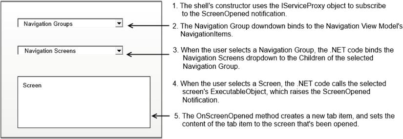
Figure 13-8. Custom navigation process
Persisting User Settings
The IServiceProxy object includes a user settings service that allows you to persist user settings, such as the position of screen elements. For example, if you create a shell with a splitter control that allows users to apportion the visible screen area between the navigation and screen areas, you can save the screen sizing details when the user closes your application and restore the settings when your user next opens your application.
To demonstrate the user settings service, we’ll add a feature to the shell that allows the user to hide the “logged-in user” section if authentication isn’t enabled in the application. When the user closes an application that doesn’t have authentication enabled, you’ll display a confirmation dialog that allows the user to permanently hide the “logged-in user” section. Listing 13-17 shows the code that adds this feature.
Listing 13-17. Saving User Preferences
VB:
File: ApressExtensionVBApressExtensionVB.ClientPresentationShellsApressShell.xaml.vb

Public Sub New()
   InitializeComponent()

   ' Append this code to the end of the constructor...
   AddHandler Me.ServiceProxy.UserSettingsService.Closing,
      AddressOf Me.OnSettingsServiceClosing

   Dim hideLoggedInUser As Boolean =
      Me.ServiceProxy.UserSettingsService.GetSetting(Of Boolean)(
           "HideLoggedInUser")

   If hideLoggedInUser Then
      LoggedInUser.Visibility = Windows.Visibility.Collapsed
   Else
       LoggedInUser.Visibility = Windows.Visibility.Visible
   End If

 End Sub

Public Sub OnSettingsServiceClosing(
        sender As Object, e As EventArgs)

   If LoggedInUser.Text = "Authentication is not enabled." Then
      If MessageBox.Show(
         LoggedInUser.Text,
         "Do you want to permanently hide the logged in user section?",
         MessageBoxButton.OKCancel) = MessageBoxResult.OK Then

            Me.ServiceProxy.UserSettingsService.SetSetting(
               "HideLoggedInUser", True)
      Else
            Me.ServiceProxy.UserSettingsService.SetSetting(
                "HideLoggedInUser", False)
      End If
  End If

End Sub

C#:
File: ApressExtensionCSApressExtensionCS.ClientPresentationShellsApressShell.xaml.cs

public ApressShell()
{
    InitializeComponent();
    // Append this code to the end of the constructor...

    this.ServiceProxy.UserSettingsService.Closing +=
        this.OnSettingsServiceClosing;

    bool hideLoggedInUser =
      this.ServiceProxy.UserSettingsService.GetSetting<bool>(
        "HideLoggedInUser");

    if (hideLoggedInUser)
    {
        this.LoggedInUser.Visibility = Visibility.Collapsed;
    }
    else
    {
        this.LoggedInUser.Visibility = Visibility.Visible;
    }
}


public void OnSettingsServiceClosing(object sender, EventArgs e)
{
    if(this.LoggedInUser.Text == "Authentication is not enabled." ){

        if(MessageBox.Show(
            LoggedInUser.Text,
            "Do you want to permanently hide the logged in user section?",
            MessageBoxButton.OKCancel) == MessageBoxResult.OK ){

                this.ServiceProxy.UserSettingsService.SetSetting(
                    "HideLoggedInUser", true);
        }
        else
        {
                this.ServiceProxy.UserSettingsService.SetSetting(
                    "HideLoggedInUser", false);
        }
    }
}
The code in the constructor adds an event handler for the user settings service’s Closing event . LightSwitch raises this event when the user closes your application. The user settings service exposes two methods: GetSetting and SaveSetting. The SaveSetting method allows you to persist a setting by supplying a name/value pair as shown in . When your application loads, the code in the constructor hides the LoggedInUser TextBlock if the value of the HideLoggedInUser setting is true .
Setting the Name and Description
The name and description for your shell are defined in the LSML file for your shell. Developers can view these details through the properties window of their LightSwitch solution. To set these details, modify the DisplayName and Description attributes as shown in Listing 13-18.
Listing 13-18. Setting the Name and Description
File: ApressExtensionVBApressExtensionVB.CommonMetadataShellsApressShell.lsml

<?xml version="1.0" encoding="utf-8" ?>
<ModelFragment
  xmlns="http://schemas.microsoft.com/LightSwitch/2010/xaml/model"
  xmlns:x="http://schemas.microsoft.com/winfx/2006/xaml">

  <Shell Name="ApressShell">
    <Shell.Attributes>
      <DisplayName Value="ApressShell"/>
      <Description Value="ApressShell description"/>
    </Shell.Attributes>
  </Shell>

</ModelFragment>
Using Your Custom Shell
Your custom shell is now complete, and you can build and share it with other developers. Once a developer installs your extension, LightSwitch adds your custom shell to the list of available shells that it shows in the properties window of each application. A developer can apply your shell by selecting it from the list. Figure 13-9 shows the final appearance of your screen.
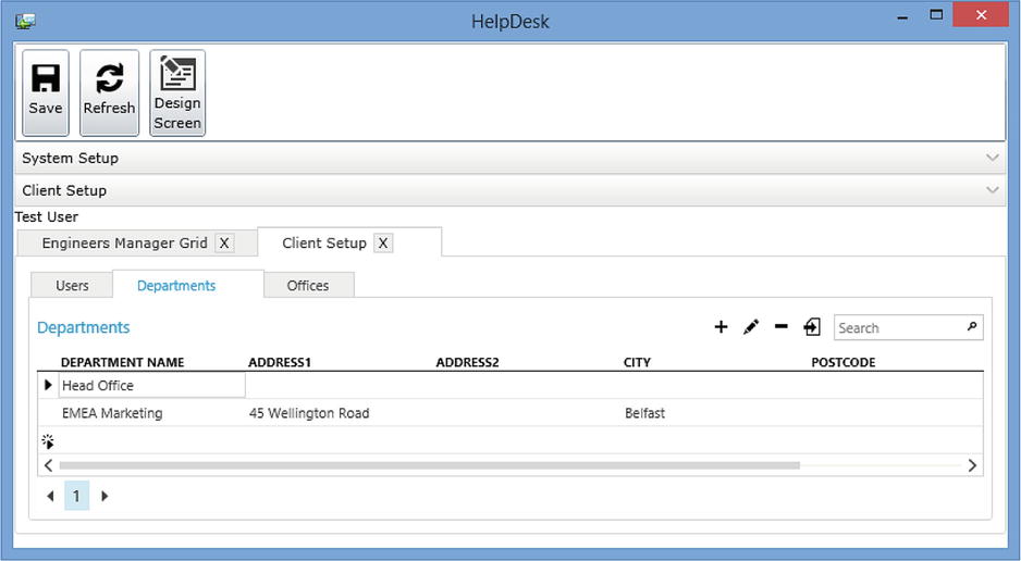
Figure 13-9. Illustration of the final Shell
Creating a Custom Theme Extension
Custom themes are the ideal companion to a custom shell. You can use themes to customize your application’s font, color, and control styles. You’ll be pleased to know that it’s much simpler to create a theme, compared to some of the extension types that you’ve already created. The process involves
- Creating a new theme, and setting the name and description.
- Modifying the style information that’s defined in the theme’s XAML file.
To begin, right-click your LSPKG project, select “New Item,” and create a new theme called ApressTheme. As soon as you do this, the template creates a XAML file in your Client project and opens this file in Visual Studio’s XML text editor.
The template prepopulates this file with default fonts and colors. It groups the style definitions into well-commented sections. At this point, you could build and deploy your theme. But before you do this, let’s modify the fonts and colors that your theme applies.
Applying a Different Font
The default theme that’s created by the template uses the Segoe UI font, and you’ll find references to this font throughout your theme file. Figure 13-10 shows a screenshot of the theme file in Visual Studio’s editor. Notice how the file defines font styles, and notice how it sets the FontFamily value to “Segoe UI, Arial.” This setting defines Segoe UI as the preferred font and Arial as the fallback font. This means that LightSwitch will apply the Arial font, only if the Segoe UI font isn’t available on the end-user PC.
Figure 13-10. The contents of your Theme file in Visual Studio
To change the font, simply replace the references to “Segoe UI” with the name of the font that you want to use. For example, you could replace “Segoe UI” with “Times New Roman,” Tahoma, or Verdana. To perform a global change, you can use Visual Studio’s Find and Replace option. You can find a full list of font name values that you can use by visiting the following page on MSDN: http://msdn.microsoft.com/en-us/library/cc189010(v=vs.95).aspx
Changing the colors in a style is just as easy. For an example, refer back to the command bar control that you added in the custom shell section. Listing 13-19 shows the code that defines the ListBox control that contains the command buttons. You’ll notice that this code applies the static resource RibbonBackgroundBrush to the ListBox control’s Background property . RibbonBackgroundBrush defines a key that links a shell with a theme.
Listing 13-19. CommandPanel Section of Shell
File: ApressExtensionVBApressExtensionVB.ClientPresentationShellsApressShell.xaml

<ListBox x:Name="CommandPanel"
   ShellHelpers:ComponentViewModelService.ViewModelName=
      "Default.CommandsViewModel"
    ItemsSource="{Binding ShellCommands}"
    Background="{StaticResource RibbonBackgroundBrush}">
If you now use the find feature in Visual Studio to search for the string RibbonBackgroundBrush in your theme file, you’ll find an entry that relates to this style. To apply a different background style, you can modify this entry as appropriate. To demonstrate this, we’ll modify the background style to apply a diagonal gradient background style that goes from white to black. To do this, modify the RibbonBackgroundBrush style in your theme as shown in Listing 13-20.
Listing 13-20. Setting the Theme Colors
File: ApressExtensionVBApressExtensionVB.ClientMetadataThemesApressTheme.xaml

<!-- RibbonBackground - The background of the ribbon menu -->
<LinearGradientBrush x:Key="RibbonBackgroundBrush"
                     StartPoint="0,0" EndPoint="1,1">
    <GradientStop Color="White" Offset="0" />
    <GradientStop Color="#FFC7C7C7" Offset="0.769" />
    <GradientStop Color="#FF898989" Offset="0.918" />
    <GradientStop Color="#FF595959" Offset="1" />
</LinearGradientBrush>
Listing 13-20 defines the color codes that allow you to replicate this example. But rather than manually hand-code the styles in your theme, you can select a style entry and use the graphical designer that you’ll find in the properties sheet to define your colors and gradient styles (Figure 13-11).
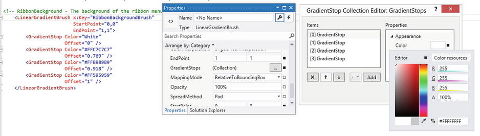
Figure 13-11. The contents of your Theme file in Visual Studio
To complete your theme, the final step is to specify a name and description. The LSML file for your theme allows you to define these settings. You’ll find this file in your Common project, in the following location:
...CommonMetadataThemesApressTheme.lsml
Once you build and install your theme extension, you can apply it to your LightSwitch application through the properties windows for your application. Figure 13-12 shows the Command Bar section of an application with the ApressTheme applied, and highlights the white-to-black gradient style that runs from the top left to bottom right.
Figure 13-12. Applying a gradient background to the command bar
Creating a Screen Template Extension
If you frequently create screens that contain common patterns, features, and code snippets, you can save yourself time by creating a custom screen template. In this section, you’ll extend the example that you saw in Chapter 7 and learn how to create a template that creates a combined add and edit screen. As you found out in Chapter 7, creating a combined add and edit screen requires you to carry out several detailed steps. The advantage of using a screen template is that you can automate this process and save yourself from having to carry out the same repetitive tasks every time you want to create this type of screen. The process for creating a screen template is as follows:
- Add a screen template item, and specify the template attributes.
- Write code that generates the templated screen controls.
- Write code that generates the templated .NET code.
To create this example, right-click your LSPKG project, select “New Item,” and create a new screen template called AddEditScreenTemplate. After you do this, Visual Studio opens the code file for your template in the code editor.
Setting Template Properties
The first part of the code file enables you to set the properties of your template. You can set the name, description, and display name of the screens that your template generates by modifying your code as shown in Listing 13-21.
Listing 13-21. Creating a Screen Template Extension
VB:
File: ApressExtensionVBApressExtensionVB.DesignScreenTemplatesAddEditScreenTemplate.vb

Public ReadOnly Property Description As String Implements
   IScreenTemplateMetadata.Description
    Get
        Return "This template creates a combined Add/Edit screen."
    End Get
End Property

Public ReadOnly Property DisplayName As String Implements
   IScreenTemplateMetadata.DisplayName
    Get
        Return "Add/Edit Screen Template"
    End Get
End Property

Public ReadOnly Property ScreenNameFormat As String Implements
   IScreenTemplateMetadata.ScreenNameFormat
    Get
        Return "{0}AddEditScreen"
    End Get
End Property

Public ReadOnly Property RootDataSource As RootDataSourceType Implements
   IScreenTemplateMetadata.RootDataSource
    Get
        Return RootDataSourceType.ScalarEntity
    End Get
End Property

Public ReadOnly Property SupportsChildCollections As Boolean
  Implements IScreenTemplateMetadata.SupportsChildCollections
   Get
      Return True
      End Get
End Property

C#:
File: ApressExtensionCSApressExtensionCS.DesignScreenTemplatesAddEditScreenTemplate.cs

public string Description
{
    get { return "This template creates a combined Add/Edit screen"; }
}

public string DisplayName
{
    get { return "Add/Edit Screen Template"; }
}

public string ScreenNameFormat
{
    get { return "{0}AddEditScreen"; }
}

public RootDataSourceType RootDataSource
{
    get { return RootDataSourceType.ScalarEntity; }
}

public bool SupportsChildCollections
{
    get { return true; }
}
You’ll find several more properties that you can set. These include the images that are associated with your template, the root data source, and whether or not your template supports child data items. The SupportsChildCollection property controls the visibility of the “Additional Data to Include” check boxes, and LightSwitch exposes many other of these properties through the “Add New Screen” dialog, as shown in Figure 13-13.
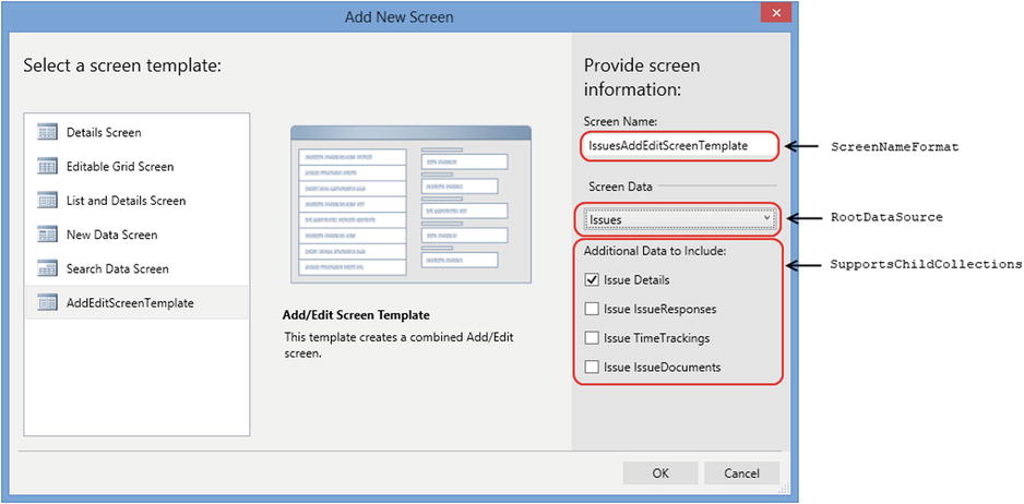
Figure 13-13. Add New Screen dialog
Defining the Data Source Type
By now, you’ll be familiar with the “Add New Screen” dialog and understand how the “Screen Data” drop-down shows different data, depending on the template that you choose. When you build a screen template, you can define the data that appears in the “Screen Data” drop-down by setting the RootDataSource property. Table 13-2 shows the four values that you can set for this property.
Table 13-2. Query Types
| RootDataSource value | Description |
|---|---|
| Collection | Allows the developer to select collections or multiple result queries. |
| ScalarEntity | Allows the developer to select a single entity type or queries that return one item. |
| NewEntity | Used for screens that are intended to create new entities. |
| None | Used for screens in which no data needs to be selected. |
In your example template, set the RootDataSource property to ScalarEntity to configure the “Screen Data” drop-down to show singleton queries when a developer selects your screen template.
The most important part of designing a template is to work out the screen components that you want to add to your template. The best way to do this is to create a normal screen and use that to work out your requirements. Figure 13-14 shows the add/edit screen from Chapter 7, and highlights the steps that you would carry out in the screen designer to create this screen.
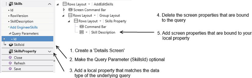
Figure 13-14. Screen requirements
Once you’ve established the items that you want to add to your template, you’ll need to translate these tasks into code. The screen template produces screens by calling a method called Generate, and Listing 13-22 shows the code that you’d add to this method to create the screen that’s shown in Figure 13-14.
Listing 13-22. Creating a Screen Template Extension
VB:
File: ApressExtensionVBApressExtensionVB.DesignScreenTemplatesAddEditScreenTemplate.vb

Public Sub Generate(host As IScreenTemplateHost) Implements
   IScreenTemplate.Generate

    Dim screenBase =
        DirectCast(host.PrimaryDataSourceProperty, ScreenPropertyBase)

    Dim groupLayout1 As ContentItem =
        host.AddContentItem(host.ScreenLayoutContentItem,
          "GroupLayout1", ContentItemKind.Group)

    Dim entityTypeFullName As String =
       CType(host.PrimaryDataSourceProperty, ScreenProperty).PropertyType
    Dim entityTypeName As String =
       CType(host.PrimaryDataSourceProperty,
          ScreenProperty).PropertyType.Split(":").LastOrDefault()
    Dim screenProperty1 As ScreenProperty =
       host.AddScreenProperty(entityTypeFullName, entityTypeName + "Property")

    'make the default id parameter not required
    Dim idParameter =
       host.PrimaryDataSourceParameterProperties().FirstOrDefault()
    CType(idParameter, ScreenProperty).PropertyType =
       "Microsoft.LightSwitch:Int32?"

    'This creates an AutoCompleteBox for the item
    Dim screenPropertyContentItem =
       host.AddContentItem(groupLayout1, "LocalProperty", screenProperty1)
    Try
        host.SetContentItemView(screenPropertyContentItem,
           "Microsoft.LightSwitch:RowsLayout")
    Catch ex As Exception
        Try
            host.SetContentItemView(screenPropertyContentItem,
              "Microsoft.LightSwitch.RichClient:RowsLayout")
        Catch ex2 As Exception
            Throw ex2
        End Try
    End Try
    host.ExpandContentItem(screenPropertyContentItem)

    'Code Generation
    Dim codeTemplate As String = ""
    If _codeTemplates.TryGetValue(
       host.ScreenCodeBehindLanguage, codeTemplate) Then

        host.AddScreenCodeBehind(String.Format(codeTemplate,
           Environment.NewLine,
           host.ScreenNamespace,
           host.ScreenName,
           screenBase.Name,
           idParameter.Name,
           screenProperty1.Name,
           entityTypeName))
    End If

End Sub

C#:
File:ApressExtensionCSApressExtensionCS.DesignScreenTemplatesAddEditScreenTemplate.cs

public void Generate(IScreenTemplateHost host)
{
    var screenBase = (ScreenPropertyBase)host.PrimaryDataSourceProperty;

    ContentItem groupLayout1 =
       host.AddContentItem(host.ScreenLayoutContentItem,
          "GroupLayout1", ContentItemKind.Group);

    string entityTypeFullName =
      ((ScreenProperty)host.PrimaryDataSourceProperty).PropertyType;

    var entityTypeName =
      ((ScreenProperty)host.PrimaryDataSourceProperty).PropertyType.Split(
         ":".ToArray()).LastOrDefault();

    ScreenProperty screenProperty1 =
      (ScreenProperty)host.AddScreenProperty(entityTypeFullName,
         entityTypeName + "Property");

    //make the default id parameter not required
    var idParameter = host.PrimaryDataSourceParameterProperties.FirstOrDefault();
    ((ScreenProperty)idParameter).PropertyType =
        "Microsoft.LightSwitch:Int32?";

    //This creates an AutoCompleteBox for the item
    var screenPropertyContentItem = host.AddContentItem(
       groupLayout1, " LocalProperty", screenProperty1);
    try
    {
        host.SetContentItemView(
            screenPropertyContentItem, "Microsoft.LightSwitch:RowsLayout");
    }
    catch (Exception ex)
    {
        try
        {
            host.SetContentItemView(screenPropertyContentItem,
                @"Microsoft.LightSwitch.RichClient:RowsLayout");
        }
        catch (Exception ex2)
        {
            throw ex2;
        }
    }

    host.ExpandContentItem(screenPropertyContentItem);

    string codeTemplate = "";
    if (codeTemplates.TryGetValue(
        host.ScreenCodeBehindLanguage , out codeTemplate ))
    {
        host.AddScreenCodeBehind(String.Format(codeTemplate,
           Environment.NewLine,
           host.ScreenNamespace,
           host.ScreenName,
           screenBase.Name,
           idParameter.Name,
           screenProperty1.Name,
           entityTypeName));
    }
}
The following list highlights the actions that you'd carry out in the screen designer if you created the screen manually, and identifies the code in Listing 13-22 that carries out the corresponding task.
-
Creating a Details Screen and Query. The add/edit screen is based on a query that returns a single record by Id value. The good news is that you don’t need to write any specific code to create the screen’s underlying query. The screen template automatically creates a query when you set the RootDataSource to ScalarEntity. You can use the syntax host.PrimaryDataSourceProperty to access the query that LightSwitch generates. If you set the RootDataSource to NewEntity instead, the PrimaryDataSourceProperty object would be a property that matches the data type the developer chooses in the “Add New Screen” dialog. And if you set the RootDataSource to Collection, the PrimaryDataSource would be a collection of entities (that is, a Visual Collection).
-
Adding Group Layouts: Let’s imagine that you select a node in the screen designer's tree view and click on the “Add” drop-down button. The code equivalent that performs this action is the AddContentItem method. This method requires you to supply the content item type that you want to add and the name that you want to give your new data item. The code in Listing 13-22 adds a new group layout by specifying the content item kind of ContentItemKind.Group .
-
Adding a Local Property that matches the underlying query’s data type: In the screen designer, you’d add a new local property by opening the “Add Data Item” dialog and choosing the radio option to add a local property. In code, you’d carry out this action by calling the AddScreenProperty method . As with the “Add Data Item” dialog, you need to supply a name and data type to create a new local property. The code uses the PrimaryDataSourceProperty object to determine the data type of the underlying screen object and names the property after the entity type name, but with the word “Property” appended to the end. Another useful method is the AddScreenMethod method. This is the code equivalent of creating a screen method through the “Add Data Item” button.
-
Making the Query Parameter Optional: To allow your screen to work in “New Data” entry mode, the Id parameter on your screen must be set to optional. You might expect to find a Boolean property that allows you to set the optional status of a parameter to false, but interestingly, no such property exists. So to make a parameter optional, you need to carry out a step that might seem unusual. To make a parameter optional, you’d change the underlying data type from an integer to a nullable integer, as shown in .
- Deleting the Screen properties that are bound to the query: If you create an add/edit screen manually through the screen designer, you’d need to delete the data items that are bound to the underlying query. You don’t need to carry out this action when you create a screen template in code. The screen that the screen generator creates includes only the root element and doesn’t include any extra content that you need to delete.
-
Add the screen properties that are bound to your local entity property: If you create an add/edit screen manually through the screen designer, the final step is to drag your local property onto your screen and to add data items that are bound to your local property’s data items. The AddContentItem method allows you to add the local property onto your screen in code. If you carried out this task in the screen designer, LightSwitch would render your local property as an autocomplete box. In code, the AddContentItem method does the same—it’ll add the local screen property as an autocomplete box. To change the autocomplete box to a Rows Layout in code, you’d call the SetContentItemView method. This method accepts a reference to the content item and a ViewID that identifies a RowsLayout.
The SetContentItemView method is a versatile method, and Appendix C shows a full list of ViewIDs that you can use. Unfortunately, the ViewIDs are different in projects that have been upgraded to support the HTML client. If a developer attempts to run your screen template on a project with the HTML client installed, the screen template will fail with an exception. The Try Catch block attempts to correct this error condition if it occurs.
Another useful method that you can call is ExpandContentItem. This method expands a content item by adding child items that represent each property in the entity. This method mimics the use of the reset button in the LightSwitch screen designer.
It’s highly likely that any screen that you want to generate from a template requires some sort of custom code, and the add/edit screen is no exception. This screen requires code in its loaded method to create a new instance of your local screen property and to set the value of the local screen property to the results of the underlying screen query.
The final part of Listing 13-22 creates the screen’s .NET code by calling the AddScreenCodeBehind method. A developer can call your screen template from either a VB or C# application. The host.ScreenCodeBehindLanguage property returns the language of the target application, and you can use this information to build your screen's source code in the correct language. The code retrieves a language specific template from a Dictionary called _codeTemplates. It then uses .NET’s String.Format method to substitute the required values into the template (Listing 13-23). The aim of this code is to create the code that was shown in Chapter 7 (Listing 7-14).
Listing 13-23. Creating Screen Template Code
VB:
File:ApressExtensionVBApressExtensionVB.DesignScreenTemplatesAddEditScreenTemplate.vb

Private Shared _codeTemplates As Dictionary(Of CodeLanguage, String) =
   New Dictionary(Of CodeLanguage, String)() From
{
    {CodeLanguage.CSharp, _
        "" _
        + "{0}namespace {1}" _
        + "{0}{{" _
        + "{0}    public partial class {2}" _
        + "{0}    {{" _
        + "{0}" _
        + "{0}        partial void {5}_Loaded(bool succeeded)" _
        + "{0}        {{" _
        + "{0}            if (!this.{4}.HasValue){" _
        + "{0}               this.{5} = new {6}();" _
        + "{0}            }else{" _
        + "{0}               this.{5}  = this.{3};" _
        + "{0}            }" _
        + "{0}            this.SetDisplayNameFromEntity(this.{5});" _
        + "{0}        }}" _
        + "{0}" _
        + "{0}    }}" _
        + "{0}}}"
    }, _
    {CodeLanguage.VB, _
        "" _
        + "{0}Namespace {1}" _
        + "{0}" _
        + "{0}    Public Class {2}" _
        + "{0}" _
        + "{0}        Private Sub {5}_Loaded(succeeded As Boolean)" _
        + "{0}            If Not Me.{4}.HasValue Then" _
        + "{0}               Me.{5} = New {6}()" _
        + "{0}            Else" _
        + "{0}               Me.{5} = Me.{3}" _
        + "{0}            End If" _
        + "{0}            Me.SetDisplayNameFromEntity(Me.{5})" _
        + "{0}        End Sub" _
        + "{0}" _
        + "{0}    End Class" _
        + "{0}" _
        + "{0}End Namespace" _
    }
}

C#:
File:ApressExtensionCSApressExtensionCS.DesignScreenTemplatesAddEditScreenTemplate.cs

private static Dictionary<CodeLanguage, String> codeTemplates =
   new Dictionary<CodeLanguage, String>()
    {
        {CodeLanguage.CSharp,
            ""
            + "{0}namespace {1}"
            + "{0}{{"
            + "{0}    public partial class {2}"
            + "{0}    {{"
            + "{0}"
            + "{0}        partial void {5}Loaded(bool succeeded)"
            + "{0}        {{"
            + "{0}            if (!this.{4}.HasValue){"
            + "{0}               this.{5} = new {6}();"
            + "{0}            }else{"
            + "{0}               this.{5} = this.{3};"
            + "{0}            }"
            + "{0}            this.SetDisplayNameFromEntity(this.{5});"
            + "{0}        }}"
            + "{0}"
            + "{0}    }}"
            + "{0}}}"
        },
        {CodeLanguage.VB,
            ""
            + "{0}Namespace {1}"
            + "{0}"
            + "{0}    Public Class {2}"
            + "{0}"
            + "{0}        Private Sub {5}Loaded(succeeded As Boolean)"
            + "{0}            If Not Me.{4}.HasValue Then"
            + "{0}               Me.{5} = New {6}()"
            + "{0}            Else"
            + "{0}               Me.{5} = Me.{3}"
            + "{0}            End If"
            + "{0}            Me.SetDisplayNameFromEntity(Me.{5})"
            + "{0}        End Sub"
            + "{0}"
            + "{0}    End Class"
            + "{0}"
            + "{0}End Namespace"
        }
    };
Another way to generate code is to use .NET’s Code Document Object Model (CodeDOM). CodeDOM is specially designed for this purpose, and you can read more about it on the following Microsoft web page: http://msdn.microsoft.com/en-us/library/650ax5cx.aspx. However, this example uses string substitution because it’s simple to understand and saves you the small task of having to learn a new API.
Creating More Complex Screen Templates
Your add/edit screen template is now complete, and you can now build and deploy your extension. The template generation host allows you to do much more than this chapter shows—for example, you can add query parameters, related collections, and entity properties to your screen. You can use Visual Studio’s IntelliSense to work out the purpose of the host generation methods, so designing more complex screens shouldn’t be difficult.
If you need to create screen templates that are more complex, the best advice is to create your screen as normal in your LightSwitch application. If you then examine the LSML file that LightSwitch produces in the Common folder, you’ll be able to work out how to construct the same output in a screen template. This technique is particularly useful in helping you work out the correct ViewIDs to use (especially when you’re using custom controls) and building the ChainExpressions that you need to access the selected item in a collection.
Creating a Data Source Extension
In the final part of this chapter, I’ll show you how to create a data source extension. Data source extensions allow developers to consume data sources that are not natively supported. Although there are several other ways to connect to external data, which include RIA Services and OData, the advantage of a data source extension is that it allows you to more easily package and share the code that consumes a data source. In this section, you’ll learn how to create a data source extension that connects to the Windows event log on the server. The purpose of this example is twofold. First, it demonstrates how to connect to a slightly unusual data source, and the second reason is slightly more practical. It allows you to display your server’s event log from within your application so that, once you deploy your application, developers or support staff can view the errors that have been generated by your application, without needing access rights to log on to the server. Here’s an overview of the steps that are needed to create the Windows event log data source extension:
- Create a new data source extension, and name it WindowsEventLog. To do this, right-click your LSPKG project, select “New Item,” and choose the “Data Source” option.
- Add entity classes to represent event sources and event log entries.
- Add the RIA Services code that retrieves the event log data.
Creating an Entity Class
Just as in the RIA services code from Chapter 9, you need to define entity classes to enable LightSwitch to consume your data. So to carry out this example, you’ll need to create a pair of entity classes: a class that represents an event log entry, and a class that represents an event log source. An event log source represents a group of event log entries. (The Application, System, and Security logs in the Windows Event Log are examples of sources.) To add these classes, create a new class file in your Server project, name it EventLogEntityClasses, and add the code that’s shown in Listing 13-24.
Listing 13-24. Entity Class for Event Log
VB:
File:ApressExtensionVBApressExtensionVB.ServerEventLogEntityClasses.vb

Imports System.Collections.Generic
Imports System.Linq
Imports System.Text
Imports System.ComponentModel
Imports System.ComponentModel.DataAnnotations

Public Class LogEntry

    <Key()> _
     <[ReadOnly](True)> _
     <Display(Name:="Log Entry ID")> _
     <ScaffoldColumn(False)> _
    Public Property LogEntryID As Integer

    <Required()> _
    <Display(Name:="Message")> _
    Public Property Message() As String

    <Display(Name:="Source Name")> _
    Public Property SourceName As String

    <Association("EventLog_EventEntry",
       "SourceName", "SourceName", IsForeignKey:=True)> _
    <Display(Name:="Source")> _
    Public Property EventSource As LogSource

    <Display(Name:="Event DateTime")> _
    Public Property EventDateTime() As DateTime

End Class

Public Class LogSource

    <Key()> _
     <[ReadOnly](True)> _
     <Display(Name:="Source Name")> _
     <ScaffoldColumn(False)> _
     <Required()> _
    Public Property SourceName As String

    <Association("EventLog_EventEntry", "SourceName", "SourceName")> _
    <Display(Name:="EventLogEntries")> _
    Public Property EventEntries As ICollection(Of LogEntry)

End Class

C#:
File:ApressExtensionCSApressExtensionCS.ServerEventLogEntityClasses.cs

using System;
using System.Collections.Generic;
using System.ComponentModel.DataAnnotations;

namespace ApressExtensionCS
{
    public class LogEntry
    {
        [Key(), Editable(false), ScaffoldColumn(false),
           Display(Name = "Log Entry ID")]
        public int LogEntryID { get; set; }

        [Required(), Display(Name = "Message")]
        public string Message { get; set; }

        [Display(Name = "Source Name")]
        public string SourceName { get; set; }

        [Association("EventLog_EventEntry", "SourceName", "SourceName",
             IsForeignKey = true)]
        public LogSource EventSource { get; set; }

        [Required(), Display(Name = "Event DateTime")]
        public DateTime EventDateTime { get; set; }
    }

    public class LogSource
    {
        [Key(), Editable(false), ScaffoldColumn(false),
           Required() ,  Display(Name = "Source Name")]
        public string SourceName { get; set; }

        [Association("EventLog_EventEntry", "SourceName", "SourceName"),
            Display (Name="EventLogEntries")]
        public ICollection<LogEntry> EventEntries { get; set; }
    }

}
In the code that’s shown in Listing 13-24, notice how the primary-key property is decorated with the key attribute, and how it’s also decorated with the Editable attribute with the value set to false. LightSwitch uses these attributes to prevent users from editing the ID property and to render it on screens by using read-only controls.
The Required attribute allows you to define mandatory properties. You can also use the StringLength attribute to specify the maximum length of a property. Both these attributes allow LightSwitch to apply its built-in validation, and prevent users from saving data that violates the rules that you’ve specified.
A highlight of this code is that it defines a relationship between the LogSource and LogEntry entities. A single LogSource record can be associated with many LogEntry entries, and the Association attribute allows you to define this relationship between the two entities.
Creating the Data Service Class
The next step is to write the code in your domain service class. Just like the RIA service example, this class contains the logic that adds, updates, retrieves, and deletes the data from your underlying data source. The data source template creates a domain service class called WindowsEventLog. So now add the code that’s shown in Listing 13-25.
Listing 13-25. Domain Service Code for Accessing Data
VB:
File:ApressExtensionVBApressExtensionVB.ServerDataSourcesWindowsEventLog.vb

Imports System
Imports System.Collections.Generic
Imports System.ComponentModel
Imports System.ComponentModel.DataAnnotations
Imports System.Linq
Imports System.ServiceModel.DomainServices.Server

Imports System.Configuration
Imports System.Web.Configuration
Imports System.Diagnostics.EventLog

Namespace DataSources

    <Description("Enter your server path.")> _
    Public Class WindowsEventLog
        Inherits DomainService

        Private _serverName As String

        Public Overrides Sub Initialize(context As DomainServiceContext)
            MyBase.Initialize(context)
        End Sub

        Public Overrides Function Submit(changeSet As ChangeSet) As Boolean
            Dim baseResult As [Boolean] = MyBase.Submit(changeSet)
            Return True
        End Function

#Region "Queries"

        Protected Overrides Function Count(Of T)(query As IQueryable(Of T))
          As Integer
             Return query.Count()
        End Function

        <Query(IsDefault:=True)> _
        Public Function GetEventEntries() As IQueryable(Of LogEntry)

            Dim idCount As Integer = 0
            Dim eventLogs As New List(Of LogEntry)()
            Dim logSource As LogSource

            For Each eventSource In EventLog.GetEventLogs(".")

                logSource = New LogSource
                logSource.SourceName = eventSource.Log

                Try
                    For Each eventEntry As System.Diagnostics.EventLogEntry
                       In eventSource.Entries
                        Dim newEntry As New LogEntry
                        newEntry.LogEntryID = idCount

                        newEntry.EventDateTime = eventEntry.TimeWritten
                        newEntry.Message = eventEntry.Message
                        newEntry.Message = eventEntry.Source
                        newEntry.SourceName = eventSource.Log
                        newEntry.EventSource = logSource
                        eventLogs.Add(newEntry)

                        idCount += 1
                        If idCount > 200 Then
                            Exit For
                        End If

                    Next

                Catch ex As System.Security.SecurityException
                    'User doesn't have access to view the log
                    'Move onto the next log
                End Try
            Next

            Return eventLogs.AsQueryable
        End Function

        <Query(IsDefault:=True)> _
        Public Function GetEventLogTypes() As IQueryable(Of LogSource)

            Dim eventLogs As New List(Of LogSource)()
            For Each elEventEntry In System.Diagnostics.EventLog.GetEventLogs

                Dim event1 As New LogSource
                event1.SourceName = elEventEntry.Log
                eventLogs.Add(event1)
            Next

            Return eventLogs.AsQueryable
        End Function

        Public Sub InsertLogEntry(entry As LogEntry)
            Try
                Using applicationLog As New
                  System.Diagnostics.EventLog("Application", ".")
                     applicationLog.Source = "Application"
                     applicationLog.WriteEntry(
                        entry.Message, EventLogEntryType.Warning)
                End Using

            Catch ex As Exception
                Throw New Exception("Error writing Event Log Entry" & ex.Message)
            End Try
        End Sub

        Public Sub UpdateLogEntry(entry As LogEntry)
        End Sub

        Public Sub DeleteLogEntry(entry As LogEntry)
        End Sub

#End Region

    End Class

End Namespace

C#:
File:ApressExtensionCSApressExtensionCS.ServerDataSourcesWindowsEventLog.cs

using System;
using System.Collections.Generic;
using System.ComponentModel.DataAnnotations;
using System.Linq;
using System.ServiceModel.DomainServices.Server;
using System.Diagnostics;

namespace ApressExtensionCS.DataSources
{
    public class WindowsEventLog : DomainService
    {

        private string _serverName;
        public override void Initialize(DomainServiceContext context)
        {
            base.Initialize(context);
        }

        public override bool Submit(ChangeSet changeSet)
        {
            Boolean baseResult = base.Submit(changeSet);
            return true;
        }

        protected override int Count<T>(IQueryable<T> query)
        {
            return query.Count();
        }

        [Query(IsDefault = true)]
        public IQueryable<LogEntry> GetEventEntries()
        {

            int idCount = 0;
            List<LogEntry> eventLogs = new List<LogEntry>();
            LogSource logSource = default(LogSource);

            foreach (var eventSource in EventLog.GetEventLogs("."))
            {
                logSource = new LogSource();
                logSource.SourceName = eventSource.Log;

                try
                {
                    foreach (System.Diagnostics.EventLogEntry eventEntry
                       in eventSource.Entries)
                    {
                        LogEntry newEntry = new LogEntry();
                        newEntry.LogEntryID = idCount;
                        newEntry.EventDateTime = eventEntry.TimeWritten;
                        newEntry.Message = eventEntry.Message;
                        newEntry.Message = eventEntry.Source;
                        newEntry.SourceName = eventSource.Log;
                        newEntry.EventSource = logSource;
                        eventLogs.Add(newEntry);

                        idCount += 1;
                        if (idCount > 200)
                        {
                            break;
                        }
                    }

                }
                catch (System.Security.SecurityException ex)
                {
                    //User doesn't have access to view the log
                    //Move onto the next log
                }
            }

            return eventLogs.AsQueryable();
        }

        [Query(IsDefault = true)]
        public IQueryable<LogSource> GetEventLogTypes()
        {

            List<LogSource> eventLogs = new List<LogSource>();

            foreach (var elEventEntry in
               System.Diagnostics.EventLog.GetEventLogs())
            {
                LogSource event1 = new LogSource();
                event1.SourceName = elEventEntry.Log;
                eventLogs.Add(event1);
            }

            return eventLogs.AsQueryable();
        }

        public void InsertLogEntry(LogEntry entry)
        {
            try
            {
                using (System.Diagnostics.EventLog applicationLog =
                   new System.Diagnostics.EventLog("Application", "."))
                {
                    applicationLog.Source = "Application";
                    applicationLog.WriteEntry(
                      entry.Message, EventLogEntryType.Warning);
                }
            }
            catch (Exception ex)
            {
                throw new Exception(
                  "Error writing Event Log Entry" + ex.Message);
            }
        }

        public void UpdateLogEntry(LogEntry entry)
        {}

        public void DeleteLogEntry(LogEntry entry)
        {}
    }
}
This code relies on the methods in the System.Diagnostics namespace to retrieve the event log messages. It decorates the GetEventEntries method with the Query(IsDefault=true) attribute . This indicates that LightSwitch should use it as the default method for returning a collection. This code includes logic that limits that number of entries to return to 200, and it also includes an error trap that allows the code to skip over event sources that it can’t access because of insufficient permissions. In practice, you can modify this code so that it better handles these conditions.
Because the Windows Event Log doesn’t allow you to update or delete individual entries, notice that the code doesn’t implement the UpdateLogEntry and DeleteLogEntry methods.
Using the Data Source Extension
You’ve now completed all of the code that’s needed to build and use your data source extension. Once you’ve installed your extension, you can use it by going to Solution Explorer in your LightSwitch project, selecting the right-click “Add Data Source” option, and choosing “WCF RIA Service.” In the next dialog that appears, you’ll find an entry for the Windows Event Log service in the “Available WCF RIA Service classes” list box, as shown in Figure 13-15.
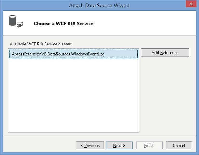
Figure 13-15. Using the Data Source Extension
Select the Windows Event Log service, and carry out the remaining steps in the “Attach Data Source Wizard.” Once you’ve completed the Wizard, you’ll be able to consume the Windows Event Log in your application, just as you would for any other data source.
Summary
In this chapter, you learned how to create business type, shell, theme, and data source extensions. Business types allow you to define rich data types that contain validation and are associated with custom controls that allow users to work with your data. They’re based on primitive, basic LightSwitch types, and an advantage of using them is that LightSwitch applies business type validation, irrespective of the screen control you use. LightSwitch stores business type definitions in an LSML file. This file allows you to specify the underlying data type, any custom validation that you want to apply, and the attributes that you want to expose through the table designer. To associate your business type with custom validation, you’d specify the name of a validation factory class in your business type’s LSML file. When LightSwitch needs to validate the value of a business type, the factory class returns an instance of a custom validation class that contains your validation logic. The validation code that you write belongs in your Common project, because this allows LightSwitch to carry out validation on both the server and the client.
You can define custom attributes to allow developers to control the behavior of your business type. An example of this is the list of valid phone number formats that you’ll find in LightSwitch’s Phone Number business type. LightSwitch allows you to edit this list by opening a pop-up window from the table designer’s property sheet. This chapter shows you how to create an editor control that behaves in the same way. This technique relies on a WPF control that defines your pop-up editor control. To link this control with an attribute, you specify an attribute in your business type’s LSML file and define a “UI Editor” setting that links the attribute with a factory class. The factory class returns an instance of an editor class that produces the UI that Visual Studio displays in the property sheet. This UI may contain controls that allow the developer to edit your attribute, but in this case, it simply returns a hyperlink that opens the pop-up window. Once the developer edits the value, the editor class updates the underlying attribute by using an IPropertyEntry object that was supplied by the factory class.
Custom shells allow you to modify the structure and overall layout of an application. A shell consists of a XAML file that defines the layout of your UI, and also contains controls that manage commands, navigation, and screen interaction. “View Models” allow your UI to consume the application data that LightSwitch exposes. The six view models allow you to access navigation items, commands, active screens, and validation details. LightSwitch includes a “Component View Model Service” that provides you with easy access to the view models through your XAML code. You can simply add a line of code in your Silverlight control that references the service and pass in a View Model Id. This sets the data context of your control to the view model, and you can data-bind the properties of your control to the properties that the view model exposes. A custom shell requires you to write the .NET code that executes commands, manages screens, and performs navigation. This chapter has shown you how to create a ScreenWrapper object that determines if a screen contains data changes or validation errors. You’ve also found out how to build custom navigation by using a ComboBox control that allows users to open screens. This ComboBox data-binds to a collection of INavigationScreen objects by using the navigation view model. When a user selects a screen, it triggers code that prompts the LightSwitch runtime to open the selected screen. Although the runtime opens the screen, it doesn’t display any content to the user—this is something that you need to manage yourself. To do this, you’d use a ServiceProxy object that notifies you whenever the runtime opens a screen. In the example that you’ve seen, the code that handles the notification shows the screen by adding the content to a tab control.
Custom themes allow you to customize the font, color, and styles that a shell applies. The styles in a theme are defined in a XAML file. When you add a new theme, the template creates a working theme that contains well-commented sections that describe each style setting. For example, if you want to change the command bar style, you can use the comments to find the command bar section and amend the entries within that section to modify the colors, font names, and font styles.
If you find yourself carrying out the same repetitive tasks in the screen designer, you can automate your process by creating a custom screen template extension. Screen templates are defined in .NET files in your Design project. The template file includes .NET properties that allow you to specify attributes such as the name, description, and importantly, the root data source type. The root data source type allows you to define the data that fills the “Screen Data” drop-down in the “Add New Screen” dialog. Screen templates create screens by calling a method called Generate. This method allows you to build screens in code by calling the methods that are provided by a screen generator host. This host object includes methods that you can call to carry out the same tasks that you’d perform in the screen designer. For example, you can use the host to create local screen properties, add content items, and change the control that renders a data item. The host generator also includes a method that allows you to add .NET code to your screen. When you create a screen template, you’ll need to create code templates that define both the VB and C# versions of your code.
Finally, data source extensions allow you to write an extension that connects to a data source. This process uses a domain service class, so the code that you need looks very similar to the RIA service code from Chapter 9. This chapter has shown you how to create a data source extension that connects to the Windows Event Log. To create a data source extension, you need to add entity classes that describes the data that your extension returns. You can also create Associations that enable you to define relations between the entity classes that you’ve defined. The code in your domain service class includes methods to retrieve, add, update, and delete the data from your data source. Just as if you were writing an RIA service, you need to define a default method that returns a collection of data. You’d do this by decorating a “get” method with the Query(IsDefault=true) attribute.