
![]()
Extending the Excel Data Model Using PowerPivot
This chapter further develops the data tables that you imported in the previous chapter. You will discover how to take the data tables that you loaded and convert them into a coherent data set in the Excel Data Model using PowerPivot. This data set will enable you to deliver information, insight, and analysis from the data the tables contain.
Once you have loaded the source data into Power View tables there are essentially three steps to follow to mold the tables into a cohesive whole.
- Establish relationships between the tables so that PowerPivot understands how the data in one table is linked to the data contained in another table. Chaining one table to another will let you use the data to deliver accurate and cogent results.
- Prepare a date table that enables PowerPivot to see how data evolves over time. In the world of data warehousing, such a table is called a date dimension and it is fundamental if there is a date or time element in your analysis.
- Augment the tables with any calculated metrics that you need in the final outputs. These can range from simple arithmetic to complex calculations.
Admittedly, not every data set in PowerPivot will need all these techniques to be applied. In some cases you will only need to cherry-pick techniques from the range of available options to finalize a data set. In any case, it probably helps to know what PowerPivot can do, and when to use which of the techniques outlined in this chapter. So it is up to you to decide what is fundamental and what is useful—and to have a suite of solutions available to deal with any potential issue that you may encounter in your data analysis.
If you want to continue enhancing the data as it appeared at the end of the previous chapter, download the PowerPivotCodeData.xlsx file from the Apress web site. This file will let you follow the examples as they appear in this chapter.
Designing a PowerPivot Data Repository
Congratulations! You are well on the way to developing a high-performance data repository for self-service business intelligence (BI). You have imported data from one or even from several sources into the Excel Data Model. You have taken a good look at your data using PowerPivot and you can carry out essential operations to rename tables and columns, as well as to filter the data. The next step to ensure that your data set is ready for initial use as a self-service BI data repository is to create and manage relationships between tables. This is a fundamental part of designing a coherent and useable data set in PowerPivot.
Before leaping into the technicalities of table relationships, we first need to answer a couple of simple questions:
- What are relationships between tables?
- Why do we need them?
Table relationships are links between tables of data that allow columns in one table to be used meaningfully in another table. If you have loaded the SQL Server data from the example database into PowerPivot (or opened the PowerPivot example PowerPivotCoreData.xlsx file), then you can see that there is a table of sales data that contains a ColourID column, but not the actual color itself. As a complement to this, there is a reference table of colors. It follows that, if we want to say what color a car was when it was sold, we need to be able to link the tables so that the SalesData table can look up the actual color of the car that was sold. This requires some commonality between the two tables and, fortunately, both contain a column named ColourID. So if we are able to join the two tables using this field, then we can see which color is represented by the color ID for each car sold, which figures in the sales data.
Clearly this example is extremely simple. However, it is not unduly contrived, and it represents the way many relational databases store data. So there is every chance that you will see potential links, or relationships, like this in the real-world data that you will import in practice from corporate databases. In any case, if you want to use data from multiple sources in your data analysis, you will have to find a way to link the tables using a common field, like the ColourID field that I just mentioned. The reality may be messier (the fields may not have the same name in the two tables, for instance), but the principle will always apply.
![]() Tip If you have the necessary permissions as well as the SQL knowledge, then you can, of course, join tables directly in the source database using a query. This way you can create fewer “flattened” tables in Power Pivot from the start.
Tip If you have the necessary permissions as well as the SQL knowledge, then you can, of course, join tables directly in the source database using a query. This way you can create fewer “flattened” tables in Power Pivot from the start.
Up until now, we have worked exclusively in data view; that is, we have looked at tables and the detail of the data. When moving to the design phase of your data preparation in PowerPivot, it is often easier to switch to diagram view, as this allows you to step back from the detail and look at the data set as a whole. To do this:
- Click on the Design View button in the Home ribbon. PowerPivot will display the tables in diagram view, as shown in Figure 10-1.
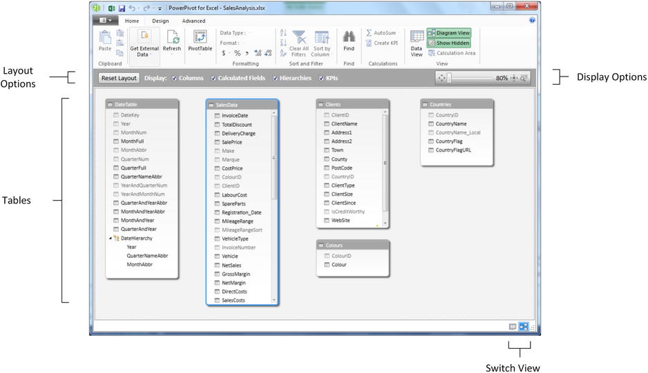
Figure 10-1. Diagram view
![]() Tip You can also use the Diagram View icon at the bottom right of the PowerPivot window to switch to diagram view if you prefer.
Tip You can also use the Diagram View icon at the bottom right of the PowerPivot window to switch to diagram view if you prefer.
As you can see from Figure 10-1, you are now looking at most or all of your tables, and although you can see the table and column names, you cannot see the data. This is exactly what we need, because now it is time to think in terms of overall structures rather than the nitty gritty. You can use this view to move and resize the tables. Moving a table is as easy as dragging the table’s title bar. Resizing a table means placing the pointer over a table edge or corner and dragging the mouse.
Although repositioning tables can be considered pure aesthetics, I find that doing so is really useful. A well laid out data set design will help you understand the relationships between the tables and the inherent structure of the data.
The whole point of diagram view is to let you get a good look at the entire data set and, if necessary, modify the layout in order to see the relationships between tables more clearly.
To this end, a few layout options are worth getting to know. They are shown in Figure 10-2.
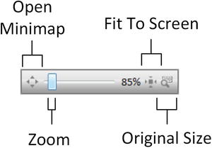
Figure 10-2. Diagram view display options
These options are explained in Table 10-1.
Table 10-1. Diagram View Display Options Explained
|
Display Option |
Description |
|---|---|
|
Zoom |
Allows you to zoom into, or out of, the table display. |
|
Minimap |
Shows a high-level overview of the table layout. You can then select the area to view by dragging the mouse over the minimap. |
|
Fit To Screen |
Sets the zoom level so that all tables are visible. |
|
Original Size |
Displays the tables at their original size. |
|
Reset Layout |
PowerPivot displays the tables as they were before any manual adjustment of the layout. |
If you have many, many fields in a table, then you may occasionally need to take a closer look at a single table. Fortunately the creators of PowerPivot have thought of this. So, to zoom in on a specific table:
- Click on the table that you wish to examine more closely.
- Click the Maximize button at the top right of the table. The table will expand to give you a clearer view of the fields in the table.
To reset the table to its previous size, click the same icon—now called the Restore button—at the top right of the table.
Creating relationships is easy once you know which fields are common between tables. Since we already agreed that we need to join the Colours table to the SalesData table, let’s see how to do this.
- Drag the ColourID field from the SalesData table over the ColourID field in the Colours table.
A thin arrow will join the two tables as shown in Figure 10-3.
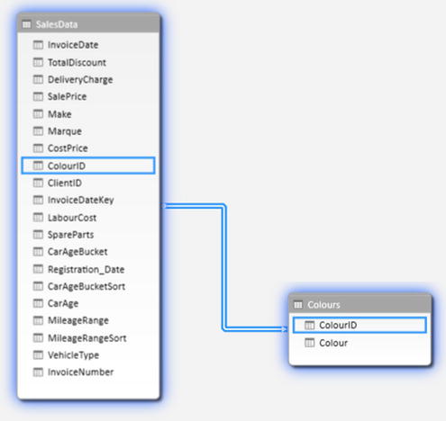
Figure 10-3. A table relationship
Creating Relationships Manually
You do not have to drag and drop field names to create relationships. If you prefer, you can specify the tables and fields that will be used to create a relationship between tables. What is more, you do not have to be in diagram view to do this. So, just to make a point and to show you how flexible PowerPivot can be, in this example, you will join the Countries and Clients tables on their common CountryID field:
- Select the Countries table.
- Click the Create Relationship button in the Design ribbon. The Create Relationship dialog will appear.
- On the upper row, where the Countries table is already selected (because you started from the Countries table), select the CountryID field.
- On the lower row, select the Clients table as the Related Lookup Table. The CountryID field should appear automatically as the field to join on (in the Related Lookup Column field). If PowerPivot has guessed the field, it will display a tiny “i” icon on a round background. If it does not, or if it has guessed incorrectly, you can always select the correct field from the Related Lookup Column popup. The Create Relationship dialog should look like Figure 10-4.
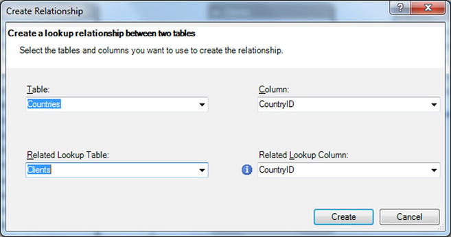
Figure 10-4. The Create Relationship dialog
- Click Create. The relationship will be created.
![]() Note You can create relationships using the manual method in either the data view or the diagram view. Creating relationships manually can be easier when you have hundreds of fields or if you want PowerPivot to guess which fields to use.
Note You can create relationships using the manual method in either the data view or the diagram view. Creating relationships manually can be easier when you have hundreds of fields or if you want PowerPivot to guess which fields to use.
Creating Relationships Automatically
If you are importing several tables from a relational database, then you can have PowerPivot to create the relationships during the import process. This approach has a couple of advantages:
- You avoid a lot of manual work.
- You reduce the risk of error (that is, creating relationships between tables on the wrong fields, or even creating relationships between tables that are not related).
This technique is unbelievably easy. You carry out an import from a relational database source (say, using SQL Server). When faced with the list of available tables in the source database (as described in Chapter 9), you
- Select the major source table.
- Click the Select Related Tables button. Any tables that are linked to the table you have selected will be selected.
- Continue the import process as described previously.
Once you have completed the import, switch to diagram view. You will see that the tables you just imported already have the relationships generated in PowerPivot.
![]() Note If you choose to select related tables, be aware that doing so only selects tables linked to the table(s) that you have already selected. As a result, you may have to carry out this operation several times, choosing a different starting table every time, to force all the existing relationships to be imported correctly.
Note If you choose to select related tables, be aware that doing so only selects tables linked to the table(s) that you have already selected. As a result, you may have to carry out this operation several times, choosing a different starting table every time, to force all the existing relationships to be imported correctly.
In addition to creating relationships, you will inevitably want to remove them at some point. This is both visual and intuitive.
- Click on the Design View button in the Home ribbon. PowerPivot will display the tables in diagram view.
- Select the relationship that you want to delete. The arrow joining the two tables will become a double link, and the two tables will be highlighted.
- Right-click and choose Delete (or press the Delete key). The Confirmation dialog will appear.
- Click Delete From Model.
The relationship will be deleted and the tables will remain in the data model.
If you wish to change the field in a table that serves as the basis for a relationship, then you have another option. You can use the Manage Relationships dialog. This approach may also be useful if you want to create or delete several relationships at once. If you want to use this
- In the Design tab, click Manage Relationships. The Manage Relationships dialog appears, as shown in Figure 10-5.
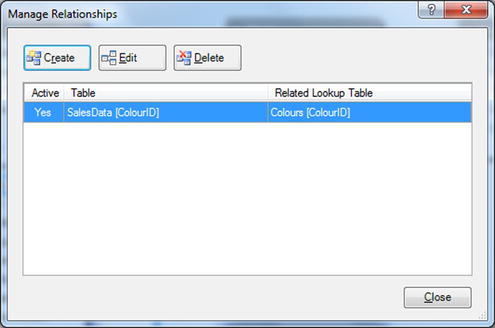
Figure 10-5. The Manage Relationships dialog
- Click the relationship you wish to modify.
- Click Edit. The Edit Relationship dialog appears (it is virtually identical to the Create Relationship dialog shown in Figure 10-4).
- Continue modifying the relationship as described previously.
As you can see from this dialog, you also have the option of creating or deleting relationships. Since the processes here are identical to those I have already described, I will not repeat them. If you want to practice using the Edit Relationship dialog, you can use it to complete the data model by adding the following final relationships:
- The SalesData to Clients table on the ClientID field in each table.
- The DateTable table to the SalesData table on the DateKey and InvoiceDate fields, respectively.
The data model will then look like the one given in Chapter 1, Figure 1-13.
![]() Note If you delete a set of related tables and subsequently reimport them without importing the relationships, then PowerPivot will not remember the relationships that existed previously. Consequently, you will have to re-create any relationships manually. The same is true if you delete and reimport any table that you linked to an existing table in PowerPivot—once a relationship has been removed through the process of deleting a table, you will have to re-create it.
Note If you delete a set of related tables and subsequently reimport them without importing the relationships, then PowerPivot will not remember the relationships that existed previously. Consequently, you will have to re-create any relationships manually. The same is true if you delete and reimport any table that you linked to an existing table in PowerPivot—once a relationship has been removed through the process of deleting a table, you will have to re-create it.
The techniques used to create and manage relationships are not, in themselves, very difficult to apply. It is nonetheless absolutely fundamental to establish the correct relationships between the tables in the data set. Put simply, if you try and use data from unconnected tables in a single Power View visualization or Excel pivot table, you will not just get an alert warning you that relationships need to be created, you will also get visibly inaccurate results. Basically, all your analysis will be false. So it is well worth it to spend a few minutes upfront designing a clean, accurate, and logically coherent data set.
Most business intelligence—indeed, much data analysis—is time-based. Most data sets have date fields in them, and you use these when looking at data over time, but such data is rarely enough to allow you to add what PowerPivot calls time intelligence to a data set.
If you are going to analyze your data using a time dimension (as data warehousing people call it), you will need to add one special thing to your data set: a table that contains a complete and contiguous list of all the dates that you will be using to look at how your data pans out over time.
Since this last sentence was a little dense, let me be clear and state that you must add a table to the PowerPivot data set that
- Contains a record for each day in the date/time series—that is, one that extends from the beginning of the year of the first date to the end of the year of the last date for any date field in the table whose data you want to analyze over time.
- Does not contain any gaps in the series of dates. This is vital. Not a single day must be absent from the list of dates.
- Has a date key field that is a date data type.
If you want, you can think of this as a large list of dates that encompasses all the dates for sales, or whatever you are analyzing. This date table can then contain other columns that in turn contain information about each date record. These other columns could, for instance, contain the following:
- Which Year the date is
- Which Quarter the date is
- What the Weekday is
- What the Month is
These four examples are only an extremely superficial subset of all the columns that you will probably need in a data table. A good data table will contain every date-based element that you are likely to need in every visualization that you will create using the data model. So you need to foresee every combination of year, day, month, quarter, and possibly week that you are likely to want in every table and chart you will create.
You can then use these complementary columns in visualizations to display the year, quarter, or month (etcetera) and to display them exactly as you have prepared them in the date table. So what you are doing is avoiding the need to format and subset dates in a visualization by preparing the elements that you will use in Power View. Then, once you have such a table, you can link it to the date field in your core data, which will be the basis for time analysis.
So where are you going to get such a table? Well, if you already have such a table in your source data (and corporate data warehouses nearly always contain date tables), then you no longer have a problem. However, if this is not the case, there is nothing to worry about. In PowerPivot there is an easy solution for creating a date table. You simply create the table in an Excel worksheet, and then import it using the techniques I described in the previous chapter.
However, when preparing a date table, the last thing you want to do is enter the month, the quarter, and the day of the week for several hundred rows manually. Table 10-2 contains some selected Excel formulas that will help you create a fairly standard date table easily. Each date element will be a separate column in an Excel table. This table is not meant to be exhaustive, but you can always use this as a starting point and develop it further to correspond more exactly to your requirements. Remember to start with the earliest date that you will be using for all time-based analysis in the table that contains your metrics; then drag the row down in Excel to create as many rows as there are days in the date range that ends at the end of the year corresponding to the last date in your metrics. After you have done this, add the formulas that return the data elements to the first row of the table and copy this row down until you reach the bottom of the date column.
Table 10-2. Preparing a Date Table
|
Column |
Formula |
Description |
|---|---|---|
|
DateKey |
The unique date. | |
|
Year |
=YEAR(E2) |
The year element. |
|
MonthNum |
=MONTH(E2) |
The month of the year, as a number. This can be useful for sorting dates. |
|
MonthFull |
=TEXT(E2,"mmmm") |
The full name of the month. |
|
MonthAbbr |
=TEXT(E2,"mmm") |
The abbreviated name of the month. |
|
QuarterNum |
=ROUNDUP(MONTH(E2)/3,0) |
The quarter of the year, as a number. This can be useful for sorting dates. |
|
QuarterFull |
="Quarter " & ROUNDUP(MONTH(E2)/3,0) |
The full name of the quarter. |
|
QuarterAbbr |
="Qtr " & ROUNDUP(MONTH(E2)/3,0) |
The abbreviated name of the quarter. |
|
YearAndQuarterNum |
=YEAR(E2) & ROUNDUP(MONTH(E2)/3,0) |
The year and the quarter in digits. This can be useful for sorting dates. |
|
MonthAndYearAbbr |
=TEXT(E2,"mmm") & " " & YEAR(E2) |
The abbreviated month of the year and the year. |
|
QuarterAndYearAbbr |
=TEXT(E2,"mmm") & "-" & RIGHT(YEAR(E2),2) |
The quarter of the year in short form and the year. |
|
MonthAndYear |
=TEXT(E2,"mmmm") |
The abbreviated month and the year in two digits. |
|
MonthName |
=TEXT(E2,"mmmm") |
The full name of the month. |
|
MonthNameAbbr |
=TEXT(E2,"mmm") |
The short name of the month. |
|
QuarterAndYear |
="Quarter " & ROUNDUP(MONTH(E2)/3,0) & " " & YEAR(E2) |
The quarter and the year fully laid out. |
Once you have created a date table, it could look something like Figure 10-6.
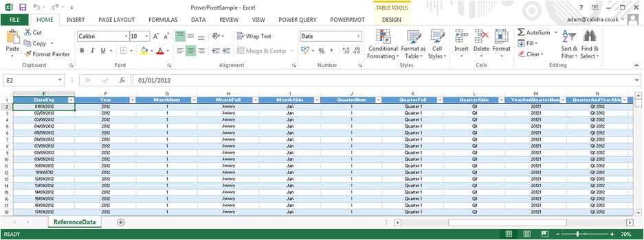
Figure 10-6. A date table in Excel
A small date table is in the sample files that you can find on the Apress web site. Once the table is finished, you can then import it into PowerPivot. I will not repeat here how to import a table from Excel; please refer to the previous chapter. Anyhow, once you have imported the date table into Excel, you still have a couple of things to do and then your date dimension will be ready to add time intelligence to your PowerPivot data set.
Marking a Table as a Date Table
PowerPivot now needs to know that the table you have imported is, in fact, a date table that it can use to add time intelligence. This is easier to do than to talk about:
- Click on the DateTable tab (in data view) or the table itself (in display view).
- In the Design tab, click the Mark As Date Table button.
- Switch to the data view.
- Click on the tab for the DateTable.
- Select the column that contains the contiguous list of dates. In the example used in this book, it is the DateKey column.
- To make sure everything has gone well, click on the lower part of the Mark As Date Table button (the small downward-facing triangle) and select Date Table Settings from the popup menu. The Mark As Date Table dialog will appear.
- The selected (date key) column should appear in the Date popup. If this is not the case, select it from the popup.
- Click OK.
Now PowerPivot knows that this table is slightly special, and that it contains only a list of dates that can be used to add time intelligence to your analyses. The final thing to do is define a relationship between the DateKey column in the date table and a date field in the table that contains the data you want to analyze over time. In the sample data that we are using, this will be the InvoiceDate field in the SalesDate table. This way the data set knows that you may be looking at sales by invoice date, but that the DateTable will provide the list of days, months, quarters, and years used to display metrics over time.
Calculations
If you are really lucky, then the data that you have imported contains everything that you need to create all the visualizations you can dream up in Power View. Reality, however, is frequently more brutal than that, and it necessitates adding further metrics to one or more tables. These calculated metrics will extend the data available for visualization. This is fundamental when you are using tools such as Power View that do not allow you to add calculated elements to the output, but insist that all metrics—whether they are source data or calculated metrics—exist in the data set. This is less of a constraint and more of a nod toward good design practice, because it forces you to develop calculations once and to place them in a single central repository. It also reduces the risk of error, because users cannot develop their own possibly erroneous metrics and calculations and so distort the truth behind the data.
Calculated columns are one of the two ways in which you can extend a data set with derived metrics that you can then use in tools like Power View. There are multiple reasons why you may need further columns. Some reasons, among many, many others, are:
- Concatenating data from two existing columns into one new column
- Performing basic calculations for every row in the table, such as adding or subtracting the data in two or more columns
- Extracting date elements such as the month or year from a date column and adding them as a new column
- Extracting part of the data in a column into another column
- Replacing part of the data in a column with data from another column
- Creating the column needed to apply a visually coherent sort order to an existing column
- Showing a value from a column in a linked table inside the source table
Indeed, the list could go on…
Before you start wondering exactly what you are getting yourself into, I want to add a few words of reassurance about the ways in which a data model can be extended.
- First, extending a table with added columns is designed to be extremely similar to what you would do in Excel. Consequently you are building on your existing knowledge.
- Second, the functions that you will be using are, wherever possible, similar to existing Excel functions. This does not mean that you have to be an Excel Power User to add a column but that knowledge gained using Excel will help with PowerPivot and vice-versa.
- Finally, most of the basic table extension techniques follow similar patterns and are not complex in themselves.
To show you what can be done, I will presume that, when working with Power View, you have met a need for a single column of data that contains both the make and model of every car sold. Because the data we imported contains this information as separate columns, we need to add a new column that takes the data from the columns Make and Marque, and joins them together (or concatenates them, if you prefer) in a new column. Here is how it can be done:
- In the PowerPivot window, make sure that you are in data view.
- Click on the SalesData tab to select the SalesData table.
- Scroll to the right of the data in the table and click anywhere in the blank column that appears after the final column of data. This column is currently entitled Add Column.
- Enter the = (the equals sign). The equals sign will appear in the formula bar above the table of data.
- Scroll left and click anywhere inside the Make column. The formula bar now reads =[Make].
- In the formula bar add: &" "&. The formula bar now reads =[Make] & " " &.
- Click anywhere inside the Marque column. The formula bar now reads =[Make] & " " & [Marque].
- Press Enter. The cursor jumps back to your starting point in the new column at the right of the table. The column is filled automatically with the result of the formula and shows the make and model of each car sold.
- Right-click on the column header for the new column and select Rename.
- Enter the word Vehicle and press Enter.
The table will now look something like Figure 10-7.
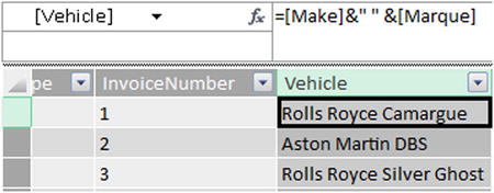
Figure 10-7. An initial calculated column
I imagine that if you have been using Excel for any length of time, then you might have a strong sense of déjà vu after seeing this. After all, what you just did is virtually what you would have done in Excel. All you have to remember is that
- Any additional columns are added to the right of the existing columns. You can always move them elsewhere in the table once they have been created.
- All functions begin with the equals sign.
- Any function can be developed and edited in the formula bar at the top of the table.
- Reference is always made to columns, not to cells (as you would in Excel). Indeed, you can click anywhere inside a column to obtain a reference to a column, as you did in step 5 in the preceding exercise, or you can type the column name (in square brackets).
- Column names are always enclosed in square brackets.
- You can nest calculations in parentheses to force inner calculations before outer calculations—again, just as you would in Excel.
To extend the basic principle, and also to show a couple of variations on a theme, let’s now add a calculation to the SalesData table. More precisely, I will assume that our Power View visualizations will frequently need to display the figure for net sales, which I will define as being the sales figure minus any sales-related costs. To obtain this, by applying a variation on a technique that we used before,
- Click in the blank column at the right of the SalesData table.
- Click inside the formula bar.
- Enter the equals sign.
- Enter a left square bracket([). The list of the fields available in the SalesData table will appear in the formula bar, as shown in Figure 10-8.
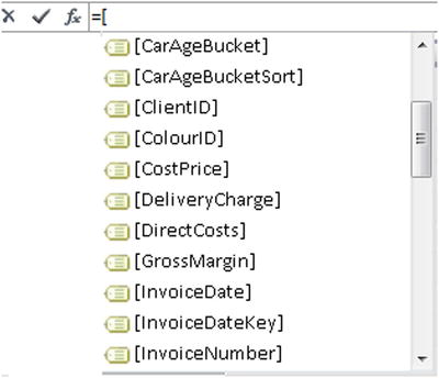
Figure 10-8. Selecting available columns from a table
- Type the first few characters of the column that you want to reference—SalePrice, in this example. The more characters you type, the fewer columns will be displayed in the list.
- Click on the column name. It will appear in the formula bar.
- Enter the plus sign (+) or any other mathematical operator you want to use.
- Continue repeating steps 5 and 6 until you have built the formula you require. In this example, it is
=[SalePrice] - ([TotalDiscount] + [DeliveryCharge]) - Click the check box in the formula bar (or press Enter) and the new column will be created. You can now rename and reposition the column.
Using arithmetic in calculated columns in PowerPivot is almost the same as using calculating cells in Excel. Consequently I will not re-explain things you most likely already know. Just use the same arithmetical operators as you would use in Excel and, after a little practice, you should be able to produce calculated columns with ease. If you want to practice a little, begin by adding the columns described in Table 10-3. Adding these columns will prepare the PowerPivot data model, which is used as the basis for all the Power View examples in the previous chapters. These columns are also necessary for some of the formulas that we will use later in this chapter.
Table 10-3. Calculated Columns in the Sample File
|
Calculated Field |
Formula |
Description |
|---|---|---|
|
NetSales |
=[SalePrice]-([TotalDiscount] + [DeliveryCharge]) |
Sales minus sales-related costs |
|
GrossMargin |
=[NetSales]-[CostPrice] |
Sales minus the cost of purchase |
|
NetMargin |
=[GrossMargin]-([LabourCost]+[SpareParts]) |
Sales minus all direct costs |
|
DirectCosts |
=[LabourCost]+[SpareParts] |
The definition of direct costs |
|
SalesCosts |
=[TotalDiscount]+[DeliveryCharge] |
Any sales-related costs |
|
Vehicle |
=[Make]&" " &[Marque] |
The composite column of the make and model/marque |
![]() Note Calculated columns can refer to existing calculated columns. The only trick is to build the columns in a logical order so that you always proceed step by step and do not find yourself needing a column that you have not created yet. Another really helpful aspect of calculated columns is that if you rename a column, PowerPivot will update all formulas that used the previous column name.
Note Calculated columns can refer to existing calculated columns. The only trick is to build the columns in a logical order so that you always proceed step by step and do not find yourself needing a column that you have not created yet. Another really helpful aspect of calculated columns is that if you rename a column, PowerPivot will update all formulas that used the previous column name.
Using Formulas in Calculated Columns
Over a few pages you have seen just how easy it is to extend a data model with some essential metrics that you can then use in Power View, or indeed any other end user tool that can take PowerPivot data as its source of information. Yet we have only performed simple arithmetic to achieve our ends. PowerPivot can, of course, do much more than just carry out simple sums. Indeed, it comes with an incredibly powerful data manipulation language called DAX (short for Data Analysis eXpressions).
I am afraid that explaining all the possibilities of DAX would take an entire book, so all I want to do for the rest of this chapter is explain how you can use some core DAX functions in a handful of useful calculations. To begin with—and as an admittedly extremely simple example—I will presume that we need to calculate the age of every car sold relative to the current date. As the source data contains the registration date for each vehicle, this will not be difficult. So, what you have to do is
- With the SalesData table selected, activate the Design ribbon and click inside any column (not necessarily the empty column at the right of the table).
- Click Insert Function. The Insert Function dialog will display.
- From the Select A Category popup at the top of the dialog choose Date And Time.
- In the Select A Function list click on NOW. The dialog will look like Figure 10-9.
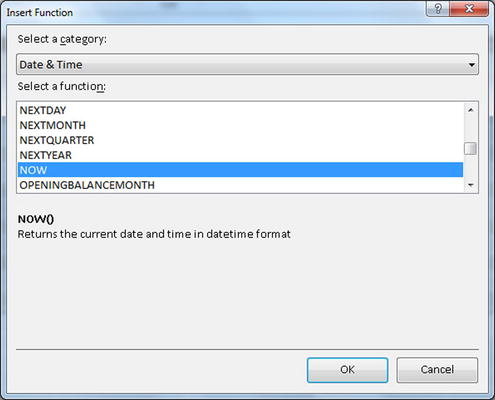
Figure 10-9. The Insert Function dialog
- Click OK. The function is added to the new column and appears in the formula bar. The cursor also jumps directly to the new column at the right of the existing data.
- Extend the formula so it reads as follows. Remember that you can either enter the Registration_Date field or select it, as described earlier.
=(NOW()-[Registration_Date])/365 - Press Enter or click the check box in the formula bar. The formula will be added to the entire new column, and you can rename it (I will call it CarAge), move it, and format it as you wish.
Let me be clear, this is not the only way to calculate a time difference using DAX. It is probably not even the best one. It is, however, a simple yet comprehensible introduction to a DAX function which, once again, reminds you just how close a cousin DAX is to the Excel function language. It also shows you an easy way to see exactly what DAX functions are available and what they do, as each function displays a brief explanation when you click on it in the Insert Function dialog.
There is another way to insert functions if you prefer. If you are building a DAX formula in the formula bar, you can call up DAX formulas in the following ways:
- Click on the Fx icon in the formula bar (again, as you would in Excel). This brings up the Insert Function dialog.
- Start typing in the first few characters of the formula—assuming you know that it exists and how it is spelled. This will display a short list of all DAX functions that begin with the characters that you have typed. This is shown in Figure 10-10.
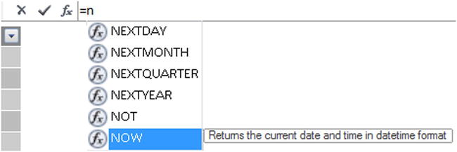
Figure 10-10. Inserting DAX functions in the formula bar
![]() Note If you want to abandon a formula while you are creating it, all you have to do is to click the cross icon in the formula bar or press Escape.
Note If you want to abandon a formula while you are creating it, all you have to do is to click the cross icon in the formula bar or press Escape.
To give you another example of a slightly more complex DAX function, but one that is very necessary, consider the following requirement. Our data now has the car age, but we want to group the cars by age buckets. So we will use a nested IF function to do this. Then, to allow us to sort the column in a more coherent way, we will create a Sort By column for the new CarAgeBucket column that we created. I realize that I have not yet explained what a Sort By column is; its use will be explained in the next chapter.
As these columns use the same techniques that you have seen in the last few pages, I will not take you through them step by step but will show you the final, working code as it appears in the sample file. You can then re-create it if you want to as practice. For the sake of clarity, you need to know that the two formulas that follow are based on the following logical DAX functions:
- IF—requires three parameters (just as Excel does): a test, a true result, and a false result.
- AND—allows you to evaluate a number of comma-separated elements, all of which must be true as part of the test in the IF function. Just as in Excel you also have an OR function and a NOT function available.
The code for the CarAgeBucket column is as follows:
=IF(
    [CarAge] <=5,"Under 5",
    IF(AND([CarAge]>=6,[CarAge]<=10),"6-10",
       IF(AND([CarAge]>=11,[CarAge]<=15),"10-15",
          IF(AND([CarAge]>=16,[CarAge]<=20),"16-20",
             IF(AND([CarAge]>=21,[CarAge]<=25),"21-25",
                IF(AND([CarAge]>=26,[CarAge]<=30),"26-30",
                   ">30"
                  )
               )
            )
          )
       )
    )
The code for the CarAgeBucketSort column is
=IF([CarAge]<=5, "1",
    IF(AND([CarAge]>=6, [CarAge]<=10),"2",
       IF(AND([CarAge]>=11, [CarAge]<=15), "3",
          IF(AND([CarAge]>=16, [CarAge]<=20), "4" ,
             IF(AND([CarAge]>=21 , [CarAge]<=25), "5",
                IF(AND([CarAge]>=26, [CarAge]<=30),"6","7"
                  )
               )
            )
         )
      )
   )
These formulas could have come straight from an Excel spreadsheet. Indeed, some 80 of the DAX functions are nearly identical to their Excel cousins. So experience and imagination combined have shown me that you have many ways to extend the data you imported by adding calculated columns. Even better, all calculated columns are updated when you refresh the data from the source. The only major caveat is that you have to be careful if you are tweaking the data connection not to delete any source columns on which a calculated column depends, or you will get errors in the PowerPivot table.
Just in case you were wondering, you do not have to write formulas over multiple lines as I did here. Indeed, the two formulas used earlier could be written as follows:
=IF([CarAge] <=5,"Under 5",IF(AND([CarAge]>=6,[CarAge]<=10),"6-10",IF(AND([CarAge]>=11,[CarAge]<=15),"11-15",IF(AND([CarAge]>=16,[CarAge]<=20),"16-20",IF(AND([CarAge]>=21,[CarAge]<=25),"21-25",IF(AND([CarAge]>=26,[CarAge]<=30),"26-30","Over 30"))))))
And
=IF([CarAge] <=5,"1",IF(AND([CarAge]>=6,[CarAge]<=10),"2",IF(AND([CarAge]>=11,[CarAge]<=15),"3",IF(AND([CarAge]>=16,[CarAge]<=20),"4",IF(AND([CarAge]>=21,[CarAge]<=25),"5",IF(AND([CarAge]>=26,[CarAge]<=30),"6","7"))))))
I chose to write the formulas over multiple lines hoping that by doing so, I’d make the nested logic clearer. You can write your formulas in any way that suits you and that does not cause PowerPivot a problem.
Most likely, you will frequently want to look up data in another table and have it appear in the table that you are currently enhancing. If you are an Excel user, then you are probably trembling at the thought that there might be a VLOOKUP function in PowerPivot, too. Well, I have good news! The function is no longer as complicated or as lengthy to use to get the lookup in PowerPivot as it can be in Excel. To prove this, imagine that you are using the Clients table and you want to add a calculated column to display the client country that is currently in the Countries table. As the two tables are linked by a table relationship, all you have to do is
- Scroll to the right of the Clients table and click in the blank column.
- In the formula bar, add the following code:
=RELATED(Countries[CountryName]) - Confirm by pressing Enter. The country name for each client will appear in the new column.
- Rename the column ClientGeography.
All that this function does is say, “Use the relationship to the Countries table, and bring back the CountryName field.” You do not need to specify how the tables are joined (in this case, on the CountryID fields) as that is defined by the relationship between the tables.
Making Good Use of the Formula Bar
If you only ever enter formulas as simple as those that we just created, then not only will you be extremely lucky, but you can content yourself with a single line in the formula bar. I doubt, however, that this is likely to be the case, as hopefully you will want to do great things with PowerPivot. It follows that you may soon be tired of creating long and complex DAX formulas in a limited space. So here is how to expand the formula bar—pretty much as you would in Excel.
- Click the Expand icon at the right of the formula bar (the downward-facing chevron).
The formula bar will increase in height to allow you to type and see several lines of text. To reduce the height of the formula bar and reset it to a single line, just click the Reduce icon at the right of the formula bar (which has now become an upward-facing chevron). You’ll see this icon in Figure 10-11 momentarily.
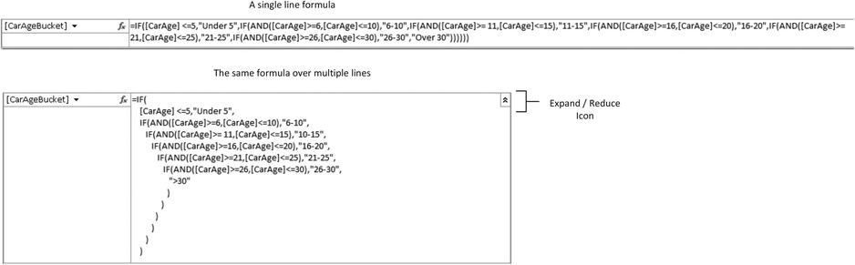
Figure 10-11. Multi-line formulas
If you wish to set the height of the formula bar, all you have to do is drag the top border of the table up or down. The cursor becomes a narrow bar with a small, thin, vertical arrow while you do this—just as if you were adjusting the height of a row in Excel. Interestingly, once you have set the height of the formula bar manually, this is the size that the Expand icon will set it to from this point on in this workbook.
All formulas that you create in PowerPivot will, by default, be on a single line. This can become an extremely wearing way of working, so it is worth knowing that you can tweak long formulas to force them to display over more than one line. All you have to do is force a line return inside the formula bar by pressing Shift-Enter where you want to force a new line. My experience is that PowerPivot will not let you create line breaks everywhere in a formula. Nonetheless, with a bit of trial and error, a more complicated formula, such as the CarAgeBucket column that you created previously, can look like it is in Figure 10-11.
Adding calculated columns can provide much of the extra data that you want to output in tools like Power View. It is unlikely, however, that this approach can deliver all the analyses that you need. Specifically, calculated columns can only work on a row-by-row basis; they cannot contain formulas that have to apply to all or part of the records in a table. For instance, counting the number of cars sold for a year, a quarter, or a month has nothing to do with the data in a single row in the SalesData table. It does, however concern the table as a whole.
Generally, then, you will almost always need to add a second type of formula to your tables when you have to look at subsets of the data. These formulas are called, simply, calculated fields. These calculations (or measures or metrics—call them what you will) also use DAX. They are, though, applied differently and can produce some extremely powerful results to help you analyze your data.
As with so many aspects of PowerPivot and self-service business intelligence in general, calculated fields are probably best introduced through a few examples. It will, unfortunately, be impossible to do anything other than scratch the surface of calculated fields in a few pages as they are arguably the most powerful element in PowerPivot—one that deserves an entire book to itself. Nonetheless, I hope that this short introduction will whet your appetite, and that you will then continue to learn all about DAX and its more advanced application from the many excellent resources currently available.
A First Calculated Field: Number of Cars Sold
Suppose that you want to be able to display the number of cars sold in Power View. Not only that, but you want this figure to adjust when it is filtered or sliced by another criterion such as country or color. Put simply, you want this metric to be infinitely sensitive to how it is displayed, yet always give the right answer.
So how are we going to achieve this? Here is how:
- Select the Table to which you wish to add a calculated field. I am choosing SalesData here.
- Click in a blank cell in the calculation area under the data in the table.
- Add the following formula to the formula bar:
NumberOfCarsSold:=COUNTROWS(SalesData) - Confirm the creation of the formula by pressing Enter or by clicking the check mark icon in the formula bar.
The cell in the calculation area where you placed the calculated field should read NumberOfCarsSold:=154. That is, the formula has counted the sales records for the entire table. The name of the formula is NumberOfCarsSold. So, unlike calculated columns, you do not rename calculated fields; you include the name in the formula by entering the name followed by a colon. In this example, the field name did not contain spaces. Had this not been the case, it would have made no difference.
Not difficult, I am sure you will agree. Yet the best is yet to come. Suppose that you now use this field in a Power View table, which is also filtered to show the results for 2013 only, and has tiles. The result is shown in Figure 10-12.
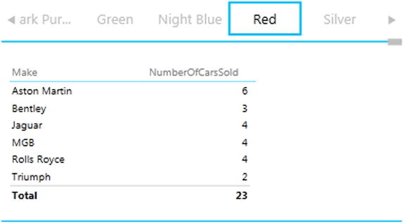
Figure 10-12. Using a calculated field in Power View
The key thing to take away is that a correctly applied calculated field can be used in Power View or an Excel pivot table or chart and will always show the correct result of any and all filters and selections that you have applied. Also, in pivot tables, the figures will display the correct figure for each intersection of rows and columns. All in all, it is well worth ensuring that you have all the calculated fields that you need for your analytical output in place and that they are working correctly in PowerPivot, because you can then rely on these calculations in the data set in so many different visualizations.
![]() Tip Do not leave a space between the colon and the equals sign when creating DAX formulas. If you do, PowerPivot will interpret them as text and will not return any result—in addition to leaving you scratching your head for awhile as you wonder why your formula doesn’t work.
Tip Do not leave a space between the colon and the equals sign when creating DAX formulas. If you do, PowerPivot will interpret them as text and will not return any result—in addition to leaving you scratching your head for awhile as you wonder why your formula doesn’t work.
Basic Aggregations in Calculated Fields
Calculated fields are DAX formulas, so in learning to use calculated fields you will have to become familiar with some more DAX than is generally required for calculated columns. My intention here is definitely not to take you through all that DAX can offer. However, I would like to show you a few basic formulas that can be practically useful in many cases, and as a result give you some initial DAX recipes that should prove of practical use.
As a second example, let’s calculate all sales revenue. Although you can just type in a simple DAX formula, I prefer to show you how you can extend the knowledge that you gained when creating calculated columns and apply many of the same techniques to creating calculated fields.
- Select the SalesData table and click in a blank cell in the calculation area under the data in the table.
- Enter the calculated field name (TotalSales) followed by a colon (:) and an equals sign (=).
- Click the function icon in the formula bar. The Insert Function Dialog will appear.
- Select Math & Trig as the category and SUM as the function.
- Click OK.
- Start typing the table name (SalesData). After a couple of characters the table and all the fields that it contains will be listed, as shown in Figure 10-13.
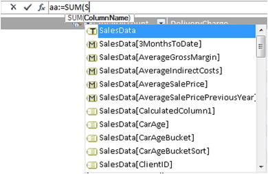
Figure 10-13. Creating a calculated field
- Scroll down and select the SalesData[SalePrice]field.
- Add a right parenthesis and press Enter (or click the check mark icon in the formula bar). The formula should read: TotalSales:=SUM(SalesData[SalePrice]).
The calculated field will be inserted into the calculation area. This particular function will give you the total of the SalePrice column. However, when you use it in Power View or a pivot table based on the PowerPivot data set, it will be filtered and applied (or sliced and diced if you prefer) to take into account how the data is subset.
One important thing to note when creating calculated fields is that you should almost always use the table name as well as the field name. Also, if a table name contains spaces, then the table name needs to be in single quotes. In all cases the field name has to be enclosed in square brackets.
To practice a little, try creating the average sale price using the following formula:
AverageSalePrice:=AVERAGE(SalesData[SalePrice])
This is still fairly close to an Excel formula, even if it is not identical. Anyway, now that you get the picture, you can use the following formulas (among others) to aggregate your data:
- SUM
- AVERAGE
- COUNT
- MAX
- MIN
- COUNTROWS
For a little practice, then, you could try adding the following calculated fields that are used in the chapters on Power View:
RatioCostToSales:=Sum(SalesData[CostPrice])/SUM(SalesData[SalePrice])
and
RatioNetMargin:=SUM(SalesData[NetMargin])/SUM(SalesData[SalePrice])
and finally
RatioGrossMarginToCosts:=SUM(SalesData[GrossMargin])/SUM(SalesData[CostPrice])
You may well find that some calculations are displayed (in the calculation area at least) to many decimal places. If you find this distracting, then you can format calculated fields in the same way that you format PowerPivot columns. Any formats that you apply will be used in Power View by default whenever you use this calculated field.
A final point is that when you insert a table or a field from the popup list that you can see in Figure 10-13, you will see three types of icon to the left of the table or field: the icon with a T denotes a PowerPivot table; the M icon indicates a calculated field; and the icon without a letter tells you that you are looking at a data field.
Now that you have seen how to create basic calculated fields, it is time to move on to some more advanced concepts. More precisely, I want to outline a couple of ways to evaluate data on a row-by-row basis, yet return the result as a function of any filters and slicers. This cannot be done in many cases by using a calculated column and then returning the aggregate of the column data. Think, for instance, of calculating a ratio for each row and then adding up or averaging the results to get the average ratio; it will be arithmetically false.
PowerPivot, fortunately, has some simple yet powerful solutions to this kind of conundrum. One principal tool is the use of the “X” functions—AVERAGEX, COUNTX, SUMX, MAXX, and MINX among others. These functions allow you to specify
- The table in which the calculations will apply
- The row-by-row calculation that is to be applied
As an example, consider the requirement for the average gross margin per sale. Not only do we need this potentially at the finest level of granularity—the individual record—but we may need it sliced and diced by any number of criteria. So here is the formula that you could use in Power View reports:
AverageGrossMargin:=AVERAGEX(SalesData,[SalePrice]-[CostPrice])
Unlike the AVERAGE function, AVERAGEX takes two inputs (or parameters as they are technically known):
- The table to which the formula will be applied
- The formula to use, which is just as you would apply it to a calculated column
What this formula has done is deduct the CostPrice from the SalePrice for every row in the table, and then return the average dependent on the filters and selections currently applied. This way, you will always get the mathematically accurate result in your visualizations. This is shown in the KPI visualization (Figure 2-30) in Chapter 2.
To make the point (and because they are potentially useful examples for data sets that you might develop), here are a couple more aggregated functions for you to try:
AverageIndirectCosts:=AVERAGEX(SalesData, [TotalDiscount] + [DeliveryCharge])
and
SalePriceAfterIndirectCostsRatio:=(SUM(SalesData[SalePrice]) - (SUM(SalesData[TotalDiscount]) + SUM(SalesData[DeliveryCharge]))) / SUM(SalesData[SalePrice])
The first of these two calculations is largely self-explanatory as it is an extension of the first formula that you saw earlier. The second, however, requires a couple of additional explanations:
- The first point is that it is essential to wrap any field references in an aggregate function, such as SUM, AVERAGE, or COUNT, for an aggregated result to work. This is because the calculation (depending on the filters used) is not applied to only one record, but potentially several records, so data must be aggregated. Hence the use of the SUM function in this example. Should you forget this and not use an aggregate function on numeric fields, PowerPivot will indicate an error, as shown in Figure 10-14. It will also provide a popup message if you hover the pointer over the yellow error symbol. However, I challenge most people to make any sense of the error message.
![]()
Figure 10-14. PowerPivot calculated field error message
- The second point is that you can, and indeed, must, nest calculations inside parentheses to force PowerPivot to calculate elements in the correct order. This functions exactly as it does in Excel, so I will not labor the point here.
Describing code may explain some things, but for me, nothing quite explains like a tangible result does. So here, in Figure 10-15, is a Power View table of the three formulas that we developed in this section. The subtle indication that all has been calculated correctly is in the totals, which appeared accurately when the table was created.
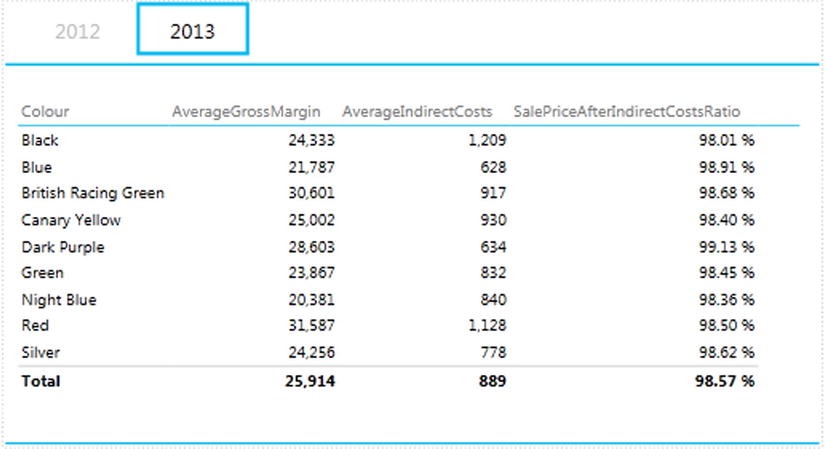
Figure 10-15. Some more advanced aggregations using calculated fields
The penultimate set of functions that I want to explain concern time, or rather, the dates used in analyzing data. PowerPivot calls this time intelligence (even though most of the time it refers to is the use of date ranges) and it can be a fundamental aspect of data presentation in business intelligence. After all, what enterprise does not need to know how this year’s figures compare to last year’s and what kind of progress is being made?
Time intelligence will always require a valid date table, which is one of the reasons why we spent a certain amount of time devoted to this earlier in the chapter. Then the date table has to be joined to the table containing the data that you want to compare over time on a date field. The good news is that once you have a valid date table, and have acquainted yourself with a handful of data and time functions in DAX, you can deliver some extremely impressive results. These kinds of calculations can cover
- YearToDate, QuarterToDate, and MonthToDate calculations
- Comparisons with previous years, quarters, or months
- Rolling aggregations over a period of time, such as the sum for the last three months
- Comparison with a parallel period in time, such as the same month in the previous year
As an introduction to time intelligence in PowerPivot, and also to give you a taste of some of the DAX functions that you are likely to use when analyzing data over time, let’s look at some of these calculations.
YearToDate, QuarterToDate, and MonthToDate Calculations
Once you have a date table in place and it is connected to the requisite date field in the table that contains the data you want to aggregate, you can start to deliver some interesting output. Suppose that you want the Quarter to Date and the Year to Date aggregations for car sales. The following two DAX formulas will provide them:
SalesQTD:=TOTALQTD(Sum(SalesData[SalePrice]), DateTable[DateKey])

SalesYTD:=TOTALYTD(Sum(SalesData[SalePrice]), DateTable[DateKey])
The formulas used are TOTALQTD (for the Quarter to Date aggregation) and TOTALYTD for the Year to Date aggregation. Both functions take two parameters:
- The aggregate function to use (SUM here—although it could be AVERAGE or COUNT or any other aggregate function, depending on the actual metric that you want to deliver) and the table and column that is aggregated.
- The key field of the date table. Since the SalesData table is linked to the date table in the data model using the InvoiceDate field, DAX can do the rest.
Interestingly, when you enter the formula correctly, the calculation area cell displays SalesQTD:(blank). This is not any cause for alarm, it is just the way in which some results appear in PowerPivot. Nonetheless, to reassure ourselves, let’s see what using these formulas looks like in Power View (Figure 10-16).
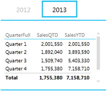
Figure 10-16. Quarter to Date and Year to Date functions
Comparisons with Previous Years, Quarters, or Months
You may have cases when all you want to do is produce the figures for a previous time period so that you can compare the current figures with those for, say, the previous year. There might be several ways of doing this, but here is one fairly simple approach that returns the total car sales for the previous year and the average car sales price for the previous year.
SalesPreviousYear:=CALCULATE(SUM(SalesData [SalePrice]), DATEADD(DateTable[DateKey], -1, YEAR))

AverageSalePricePreviousYear:=CALCULATE(
                                        AVERAGE(SalesData [SalePrice]),
                                        DATEADD(DateTable[DateKey], -1, YEAR)
                                       )
![]() Note I have formatted the code of any complex formulas for greater readability on the page, and hopefully to make the logic of the functions more comprehensible. You might not be able to use the code formatted like this in PowerPivot without simplifying the presentation.
Note I have formatted the code of any complex formulas for greater readability on the page, and hopefully to make the logic of the functions more comprehensible. You might not be able to use the code formatted like this in PowerPivot without simplifying the presentation.
How It Works
Now let me explain. Here we are using a function in DAX called CALCULATE. This function does what its name implies; it calculates an aggregation. However, what is interesting is the way in which its two parameters work:
- The first parameter defines the function to use (SUM and AVERAGE here), and the table and column that is aggregated; it could have been potentially a much more complex formula.
- The second parameter is a filter to force DAX, in this specific case, to return the data from one year ago. The DATEADD function simply says, “add minus one year to the date column” to get data from a year previously, only it says it as DateColumn / minus 1 / Year.
So what the formula does is to sum or average the data in a column, but only for the previous year, compared to the date field for each row (the InvoiceDate in the sample data, as this is the date field that is linked to the date table in the sample data model). Note that you do not use the InvoiceDate field in these formulas. This is because it is the field that is linked to the DateKey field of the date table. So PowerPivot knows which field to use in the SalesData table as the basis for time comparisons. To labor the point, once again it was essential to create a coherent and complete data model in order to make time intelligence work perfectly.
![]() Tip The DATEADD function lets you replace YEAR with MONTH or DAY if you need to compare with data from days or months previously.
Tip The DATEADD function lets you replace YEAR with MONTH or DAY if you need to compare with data from days or months previously.
Rolling Aggregations over a Period of Time
We are now getting into the arena of more complex DAX formulas. So, since returning the rolling sum (or average) of a specified period to date necessitates several DAX functions and some in-depth nesting of these functions, I will take this as an example of a more complicated DAX formula. I will begin by outlining some of the functions that are used to deliver a result that is reliable and efficient:
- ISBLANK—This function tests if a calculation returns nothing and allows you to specify what to do if this happens. This is a bit like an IF function that only tests for blank data.
- BLANK()—Returns a blank (or Null). This is useful for overriding unwanted results and replacing them with a blank.
- DATESBETWEEN—Lets you select a range of dates. The three parameters are the date key field from the date table, then the starting date, then the ending date.
- FIRSTDATE—Allows you to get the first date from a range. Since we are using this momentarily to go back a defined number of months, it will get the first day of the month.
- LASTDATE—Allows you to get the last date from a range. Since we are using this momentarily to go back a defined number of months, it will get the last day of the month.
You can now create two calculated fields (3MonthsToDate and Previous3Months) using some fairly sophisticated logic to ensure that only blank cells are returned if there is no previous year’s data using the following formulas:
3MonthsToDate:=IF(
                  ISBLANK(SUM(SalesData[SalePrice])),
                          BLANK(),
                          CALCULATE(
                                    SUM(SalesData[SalePrice]),
                                    DATESINPERIOD(
                                                  DateTable[DateKey],
                                                  LASTDATE(DateTable[DateKey]),-3,MONTH
                                                 )
                                    )
                  )

Previous3Months:=IF(
                    ISBLANK(
                            CALCULATE(
                                      SUM(SalesData[SalePrice]),
                                      DATEADD(DateTable[DateKey],-1,MONTH)
                                     )
                           ),
                           BLANK(),
                           CALCULATE(
                                     SUM(SalesData[SalePrice]),
                                     DATESBETWEEN(
                                                DateTable[DateKey],
                                                FIRSTDATE(DATEADD(DateTable[DateKey],-4,MONTH)),
                                                LASTDATE(DATEADD(DateTable[DateKey],-1,MONTH))
                                     )
                           )
                     )
How It Works
The formula 3MonthsToDate essentially evaluates the code that is in boldface. This says, “Add up the sales for a time period ranging from three months ago to now,” using the InvoiceDate field as the date to evaluate. The IF function detects if there are sales for the current date, and if there are none (ISBLANK), then the calculation is not attempted, and a BLANK is returned.
The formula Previous3Months is pretty similar, except that the time period uses the DATESBETWEEN function to set a range of dates—from the first day of the month four months ago to the last date in the preceding month.
Comparison with a Parallel Period in Time
The following two calculated fields (YearOnYearDelta and YearOnYearDeltaPercent) return the increase or decrease in sales compared to a previous year and also that change expressed as a percentage. These calculated fields extend the logic of the last few formulas using functions that you have already met. The code is as follows:
YearOnYearDelta:=IF(
                    ISBLANK(
                            SUM(SalesData [SalePrice])
                           ),
                    BLANK(),
                    IF(
                       ISBLANK(
                               CALCULATE(
                                         SUM(SalesData [SalePrice]),
                                         DATEADD(DateTable[DateKey], -1, YEAR)
                                        )
                              ),
                       BLANK(),
                       SUM(SalesData[SalePrice])
                       - CALCULATE(
                                   SUM(SalesData [SalePrice]),
                                   DATEADD(DateTable[DateKey], -1, YEAR)
                                  )
                       )
                     )

YearOnYearDeltaPercent:=IF(
                           ISBLANK(
                                   SUM(SalesData [SalePrice])
                                   ),
                           BLANK(),
                           IF(
                              ISBLANK(
                                      CALCULATE(
                                                SUM(SalesData [SalePrice]),
                                                DATEADD(DateTable[DateKey], -1, YEAR)
                                               )
                                     ),
                                      BLANK(),
                                      (
                                        SUM(SalesData[SalePrice])
                                        - CALCULATE(
                                                    SUM(SalesData [SalePrice]),
                                                    DATEADD(DateTable[DateKey], -1, YEAR)
                                                   )
                                      )
                                      /CALCULATE(
                                                 SUM(SalesData [SalePrice]),
                                                 DATEADD(DateTable[DateKey], -1, YEAR)
                                                )
                                      )
                               )
How It Works
These two formulas are a lot easier than they look, believe me.
The formula for YearOnYearDelta is really only
SUM(SalesData[SalePrice])
- CALCULATE(SUM(SalesData [SalePrice]), DATEADD(DateTable[DateKey], -1, YEAR))
All the code says is “Subtract last year’s sales from this year’s sales.” Everything else is wrapper code to prevent a calculation if either this year’s or last year’s data is zero.
Equally, for the formula YearOnYearDeltaPercent, the core code is this:
SUM(SalesData[SalePrice]) - CALCULATE(SUM(SalesData [SalePrice]),DATEADD(DateTable[DateKey], -1, YEAR)) / CALCULATE(SUM(SalesData [SalePrice]),DATEADD(DateTable[DateKey], -1, YEAR))
In other words, “Subtract last year’s sales from this year’s sales and divide by last year’s sales.” Everything else in the complete formula that is given in full earlier exists to prevent divide-by-zero errors or unwanted results for the first year where there is no previous year’s data!
We have seen several DAX functions in this short section and have put together some fairly complex formulas. So I think that it is a good idea to see how they look when you apply them. In this case, I will use an Excel pivot table to show the results, as you can see in Figure 10-17. I am presuming that as an Excel user, you probably already know quite a lot about pivot tables, but if you need a one-minute introduction into how to create pivot tables from PowerPivot, skip to the end of this chapter where this is explained.
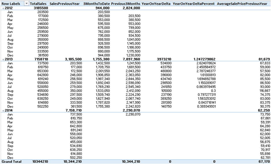
Figure 10-17. Pivot table output for time intelligence functions
Other Possibilities
As a final nod to the myriad possibilities that DAX offers, here is how to rank sales by the age of cars in the CarAgeBucket field:
SalesRankByAge:=RANKX(ALL(SalesData[CarAgeBucket]),SalesData[TotalSales],,,Dense)
How It Works
As its name implies, RANK will rank the first field using the order returned by the descending output of the second field.
Finally, if you have created all the calculated fields that are described in this chapter, the calculation area could look something like Figure 10-18.
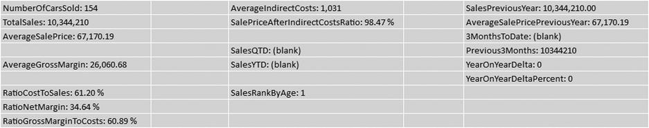
Figure 10-18. Calculated fields in the calculation area
A Few Comments and Notes on Using Calculated Fields
Calculated fields are an immense subject. The breadth and depth of the calculations that can be delivered using DAX are little short of astounding. Consequently, it is impossible in an introductory chapter to do anything other than give you a taste of what can be done and hopefully provide a few useful starter functions for you to adapt to your own requirements.
As you move on with DAX, a few things might help you on your way. The first concerns the use of calculated columns. Sometimes they are such an easy solution that it is a shame not to create them. However, they are stored in the table and do take up space. This means more space on disk and more space in memory. This is particularly true for a table containing tens of millions of rows. Calculated fields, on the other hand, are only calculated at run time, and so they take up virtually no space. So, if you are considering creating many calculated columns, perhaps some of them could become calculated fields instead.
Another trick worth knowing is that you can, of course, delete calculated fields by simply using the Delete key (or by right-clicking and choosing Delete). You will need to confirm this choice. However, you can also cut and paste calculated fields, one at a time, in the calculation area. This is a useful technique when you want to rearrange the fields into a more visibly coherent order.
Finally, and particularly if you are creating dozens of calculated fields, remember that you can increase the visible size of the calculation area. Simply drag the line separating the calculation area from the table data up or down.
I imagine that you have not had to worry about recalculation of PowerPivot workbooks if you have been using relatively small data sets like the sample data for this book. If, however, you are using vast amounts of data (and, after all, this is what PowerPivot was designed for), then recalculation could become a subject that you need to master.
By default PowerPivot will recalculate all calculated columns and calculated fields when there is a change in the data set. These are the main operations that can trigger a recalculation:
- Data from an external data source (of any kind) have been updated.
- Data from an external data source have been filtered.
- You have changed the name of a table or column.
- You have added, modified, or deleted relationships between tables.
- You have altered any formula for a calculated column or a calculated field.
- You have added new calculated columns or calculated fields.
In the case of a large data set, recalculation can take some time. If this slows you down, you can inhibit automatic recalculation and then recalculate the data set when it suits you. To do this
- In the Design ribbon, click the Calculation Options button. You will see the popup shown in Figure 10-19.
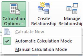
Figure 10-19. Calculation options
- Select Manual Calculation Mode.
Now all you have to do is remember to force a manual recalculation when you have finished a set of changes to the formulas, for instance. This is done by selecting the Calculate Now option from the Calculation Options menu. These options are explained in Table 10-4.
Table 10-4. Calculation Options.
|
Calculation Option |
Description |
|---|---|
|
Calculate Now |
Recalculates every calculation in the PowerPivot data set if the calculation mode has been set to manual calculation |
|
Automatic Calculation Mode |
Sets the calculation mode to manual calculation |
|
Manual Calculation Mode |
Sets the calculation mode to automatic calculation |
![]() Note It is vital that you recalculate your PowerPivot formulas before saving a worksheet or deploying it using Power BI (of which you will learn more later in Chapter 14).
Note It is vital that you recalculate your PowerPivot formulas before saving a worksheet or deploying it using Power BI (of which you will learn more later in Chapter 14).
Creating Pivot Tables from PowerPivot
As I wrote in Chapter 1, I am presuming that you are already familiar with Excel to some extent and that it is quite possible that you are a relatively advanced user. I realize, nonetheless, that you might not have used all that Excel has to offer. So just in case, here is an extremely rapid introduction to creating pivot tables from PowerPivot data.
The art and science of creating and modifying pivot tables in Excel could easily be, indeed is, the subject of many good books. I have no intention of reiterating vast swathes of things that you probably already know. Suffice it to say that when you create a pivot table or chart using a PowerPivot data set, you are using the existing Excel PivotTable tools. I hope that by merely indicating a starting point, I will enable you to continue to use this irreplaceable analytical tool.
Creating a Pivot Table
Assuming that your data set has all the requisite calculations in place, the time has come to create a simple pivot table. This can be a great way to test any calculations that you have developed and to see if they produce the results that you expect.
- In the PowerPivot window (and you can be in either design view or data view), activate the Home ribbon.
- Click the Pivot Table button. The Create Pivot Table dialog appears.
- Select New Worksheet to create the pivot table in a new, independent worksheet. A new worksheet will be created and activated; that is, you will leave the PowerPivot window. This worksheet will contain an empty pivot table and will display the Field List containing the available fields from the PowerPivot data set, as shown in Figure 10-20.
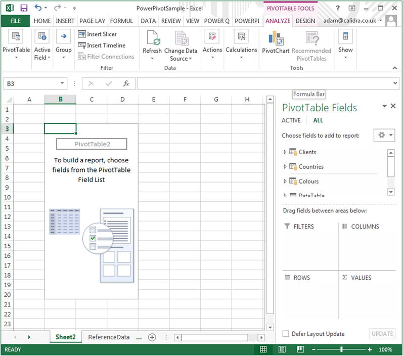
Figure 10-20. An empty pivot table using the PowerPivot data set
- Expand the Countries table and drag the CountryName_EN field to the ROWS area.
- Expand the Colours table and drag the Colours_EN field to the COLUMNS area.
- Expand the SalesData table and drag the NumberOfCarsSold field to the VALUES area. The pivot table will look like Figure 10-21.
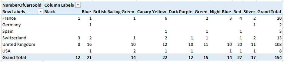
Figure 10-21. A simple pivot table
This is, admittedly, the simplest pivot table I have ever made. However it serves to make the point that PowerPivot data sets can be the basis for pivot tables as well as Power View visualizations. Also, and at some risk of laboring the point, pivot tables are essential for testing your DAX formulas.
Although we have not needed it so far, now is quite a good time to outline the buttons contained in the PowerPivot ribbon. These buttons are shown in Figure 10-22 and are then described in Table 10-5.
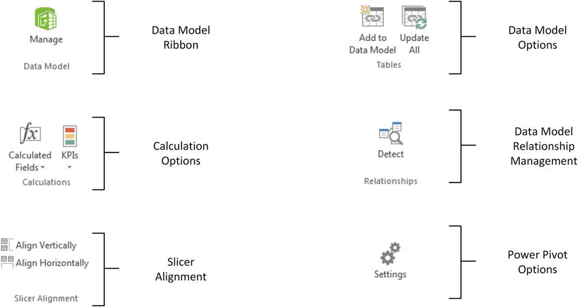
Figure 10-22. Buttons in the PowerPivot ribbon
Table 10-5. The PowerPivot Ribbon Buttons
|
Button |
Description |
|---|---|
|
Manage |
Switches to the PowerPivot window and the data model |
|
Calculated Fields |
Allows you to create calculated fields in the data model |
|
KPIs |
Lets you create and modify Key Performance Indicators (KPIs) |
|
Align Vertically |
Aligns slicers to the pivot table vertically |
|
Align |
Aligns slicers to the pivot table horizontally |
|
Add To Data Model |
Adds the Excel table to the PowerPivot data model |
|
Update All |
Updates all the PowerPivot tables that are linked to Excel tables of data |
|
Detect |
Detects relationships from the data used in a pivot table |
|
Settings |
Lets you choose the language used by PowerPivot |
If you need to add calculated fields to the data model while working in a pivot table, you can do this without switching to the PowerPivot window. Simply click on the Calculated Fields button and define the field. Similarly, you can create KPIs (which you will see in the next chapter) by clicking the KPI button.
So far when I explained how to subset and order data or when I showed you how to create calculated columns I suggested that it was in order to get a look at the information that you were using. This is certainly true, but it is only one of the reasons for spending time working on your data. Another valid reason is that you want to use the power and speed of PowerPivot to prepare a data set that you will copy into another application, such as Excel, for further customization.
This operation is as easy as it is fast, and the only limitations are
- The memory of the PC on which you are working
- The capacity of the destination application
So, if we presume that you want to copy a subset of data from PowerPivot into Excel, and you have checked the row counter to ensure that you have not gone over the million row Excel limit, all you have to do is
- Order the columns; filter and sort the data to obtain exactly the subset you want.
- Click on the top-left corner of the grid for the PowerPivot table. The data subset will be selected.
- Click Copy in the Home ribbon.
- Switch to Excel, and select the destination worksheet.
- Click Paste.
The data is now standard Excel data, ready to be used as you see fit.
Conclusion
In this chapter you have taken the raw data that you successfully imported into PowerPivot and developed it into a coherent and reliable data set. You did this by linking tables to create a cogent whole from the separate tables. Then you saw how to prepare the data set for time intelligence by adding a date table. Finally, you saw how to start adding formulas to the data set to prepare all the metrics that your Power View reports could need.
The data is now almost ready for output. All it needs is a few tweaks to prepare it for Power View (and, to a lesser extent, for Excel pivot tables). This will be the subject of the next chapter.