
C H A P T E R 5
Using the JavaFX UI Controls
Miracles are a retelling in small letters of the very same story which is written across the whole world in letters too large for some of us to see.
—C. S. Lewis
In Chapter 2 you learned how to create user interfaces (UIs) in JavaFX by creating a stage, putting a scene on the stage, and putting nodes in the scene. You also learned how to handle mouse and keyboard events, as well as how to animate nodes in the scene.
In this chapter we pick up the UI discussion from Chapter 2 by showing you how to use the UI controls available in JavaFX. The knowledge you've gained about property binding in Chapter 3 and layouts in Chapter 4 will serve you well in this chapter, as it builds upon those concepts.
Trying Out the JavaFX UI Controls
JavaFX has a rich set of UI controls for creating your applications. These range from relatively simple controls such as TextField to more complex controls such as WebView. To get you up to speed quickly on these controls, we've created an example application named StarterApp. This application has an example of most of the UI controls available in JavaFX, and it also serves as a starting point from which you can modify to create an application.
Before walking through the behavior of the program, go ahead and open the project and execute it by following the instructions for building and executing the AudioConfig project in Chapter 1. The project file is located in the Chapter05 directory subordinate to which you extracted the book's code download bundle.
EXAMINING THE BEHAVIOR OF THE STARTERAPP PROGRAM
When the program starts, its appearance should be similar to the screenshot in Figure 5-1.
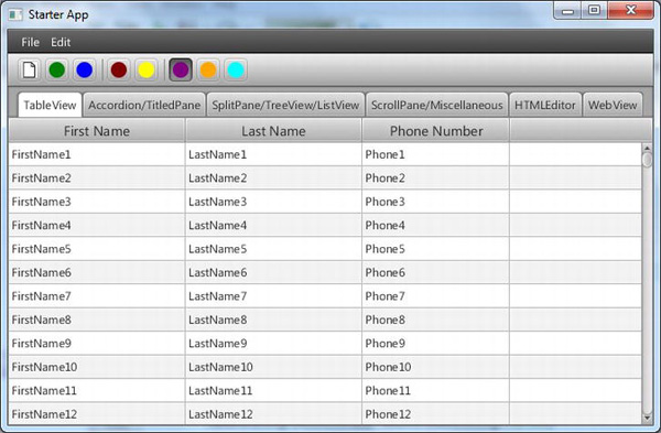
Figure 5-1. The StarterApp program when first invoked
To fully examine its behavior, perform the following steps.
- Click the File menu, noticing that the dropdown menu contains a menu item named New, with an image and the Ctrl+N shortcut key combination as shown in Figure 5-2.
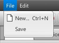
Figure 5-2. The File menu of the StarterApp program
- Select the New menu item by clicking it or pressing the shortcut key combination, noticing that the following message appears in the Java console: “ACTION occurred on MenuItem New”.
- Examine the toolbar under the menu bar, shown in Figure 5-3, clicking the leftmost button that has the same image that is on the New menu item. Notice that the following message appears in the Java console: “New toolbar button clicked”.

Figure 5-3. The toolbar of the StarterApp program
- Hover the mouse cursor over the leftmost button in the toolbar, noticing that a tooltip appears with the message: “New Document... Ctrl+N”.
- Click the fourth and fifth buttons on the toolbar, located between the vertical separator bars. Note that the buttons have two states, independent of each other.
- Click the three rightmost buttons on the toolbar, located to the right of the last vertical separator bar. Note that the buttons have two states, but that only one button at a time is in the selected (depressed) state.
- Drag the thumb on the vertical scroll bar on the right side of the
TableView, noting that there are 10,000 rows in the table containing FirstName, LastName, and Phone data in each row. Click on one of the rows, noting that a message like “Person: FirstNameX LastNameX chosen in TableView” prints to the Java console. - Drag the TableView column headers horizontally to rearrange them. Drag the right and left sides of the column headers to resize them.
- Click the tab labeled Accordion/TitledPane, noting that the tab contains an Accordion control with three expandable titled panes as shown in Figure 5-4. Click each
TitledPane, noting that they expand and collapse.
Figure 5-4. The Accordion/TitledPane tab of the StarterApp program
- Click the tab labeled SplitPane/TreeView/ListView, noting that the tab contains a split pane with a tree control on the left and an empty list view on the right as shown in Figure 5-5.

Figure 5-5. The SplitPane/TreeView/ListView tab of the StarterApp program
- Expand the nodes in the
TreeViewon the left, clicking on various leaf nodes. Note that theListViewon the right is populated with 10,000 rows containing the same name as the node clicked. - Drag the divider of the
SplitPaneto the right, resulting in the application having the appearance shown in Figure 5-6. Drag the divider of theSplitPaneto the left, noting that it is prevented from hiding theTreeView.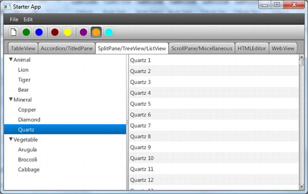
Figure 5-6. After expanding the nodes on the TreeView and selecting one of the leaf nodes
- Click the tab labeled ScrollPane/Miscellaneous, noting that the tab contains a variety of UI controls in a scrollable pane, as shown in Figure 5-7.
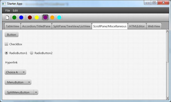
Figure 5-7. The ScrollPane/Miscellaneous tab of the StarterApp program
- Click the
Button(labeled “Button”), noting that the following message is output to the Java console: “ACTION occurred on Button”. - Click the
CheckBox, noting that the following message is output to the Java console: “ACTION occurred on CheckBox, and selectedProperty is: true”. - Select each radio button, noting that a message such as “RadioButton2 selected” is output to the Java console when a given
RadioButtonis selected. - Click the
Hyperlinkcontrol, noting that the following message is output to the Java console: “ACTION occurred on Hyperlink”. - Select various items (e.g., “Choice B”) in the
ChoiceBox, noting that a message such as “Choice B chosen in ChoiceBox” is output to the Java console when a given item is selected. - Select the “MenuItem A” option in the
MenuButton(labeled “MenuButton”), noting that the message “ACTION occurred on Menu Item A” is output to the Java console. - Click on the area of the
SplitMenuButton(labeled “SplitMenuButton”), noting that the following message is output to the Java console: “ACTION occurred on SplitMenuButton”. - Click the down arrow on the right side of the
SplitMenuButtonand select the “MenuItem A” option, noting that the message “ACTION occurred on Menu Item A” is output to the Java console. - Scroll down as necessary in the
ScrollPaneto see the controls shown in Figure 5-8.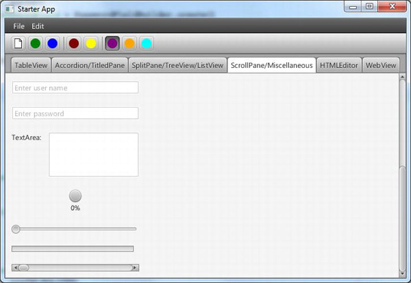
Figure 5-8. The ScrollPane/Miscellaneous tab scrolled to the bottom
- Enter some text into the
TextFieldthat has the prompt text “Enter user name”, noting that each time the text is modified the contents of the TextField are output to the Java console. - Enter some text into the
PasswordFieldthat has the prompt text “Enter password”, noting that a mask character is displayed instead of the characters that you typed. Click on anything other than thePasswordField, causing it to lose focus, noting that the contents of thePasswordFieldare output to the Java console. - Enter some text into the
TextArea(labeled “TextArea”). Click on anything other than theTextArea, causing it to lose focus, noting that the contents of theTextAreaare output to the Java console. - Slide the thumb of the horizontal
Sliderto the right, noticing that theProgressIndicatorabove it displays from 0% through 99%, and then Done. Slide it all the way to the left, noticing thatProgressIndicatorchanges in appearance to its spinning indeterminate state. - Slide the thumb of the horizontal
ScrollBarto the right, noticing that theProgressBarabove it represents the same value. Slide it all the way to the left, noticing thatProgressBarchanges in appearance to its indeterminate state. - Click the secondary (usually the right) button on your mouse somewhere in the blank area of the
ScrollPane, noting that aContextMenuappears as shown in Figure 5-9.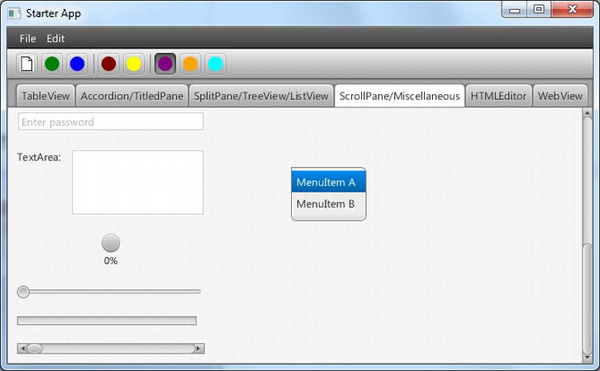
Figure 5-9. The ContextMenu appearing after the secondary mouse button is clicked
- Click the “MenuItem A” menu item in the ContextMenu, noting that the following message appears in the Java console: “ACTION occurred on Menu Item A”.
- Click the tab labeled HTMLEditor, noting that the tab contains a rich text editor and a button labeled View HTML, as shown in Figure 5-10.
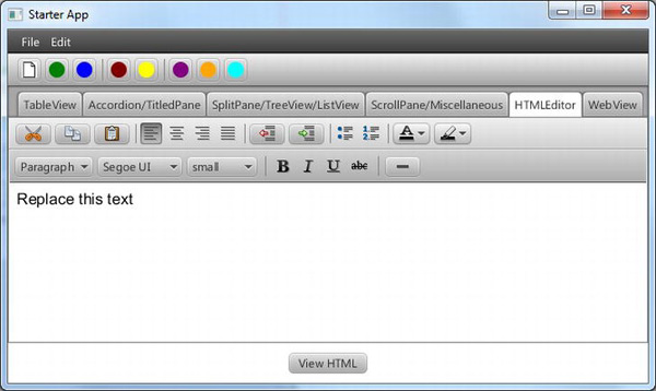
- Type some text into the editing area, using various tools in the editor's toolbars to style the text. When finished, click the View HTML button to see the HTML in the underlying data model displayed in a Popup, as shown in Figure 5-11.
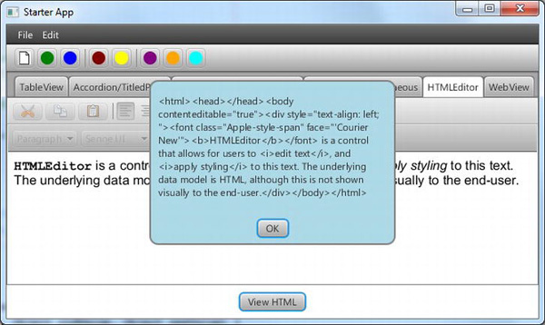
Figure 5-11. After editing text in the HTMLEditor and clicking View HTML
- Click the OK button to dismiss the popup. Then click the tab labeled WebView, noting that the tab contains a web browser displaying a randomly selected web page (if your computer is connected to the Internet), as shown in Figure 5-12.

Figure 5-12. The WebView tab of the StarterApp program
- Click on one of the other tabs in the application, and then on the WebVIew tab, noting that the Java console displays a randomly selected URL that the WebView is attempting to load.
Congratulations on sticking with this 33-step exercise! Performing this exercise has prepared you to relate to the code behind it, which we now walk through together.
Leveraging the JavaFX UI Controls
Similar to the Audio Configuration program in Chapter 1, our StarterApp program contains a model class. This class is named StarterAppModel, and is shown in Listing 5-1.
Listing 5-1. The Source Code for StarterAppModel.java
package projavafx.starterapp.model;


import javafx.beans.property.DoubleProperty;

import javafx.beans.property.SimpleDoubleProperty;

import javafx.collections.FXCollections;

import javafx.collections.ObservableList;


public class StarterAppModel {

  public ObservableList getTeamMembers() {

    ObservableList teamMembers = FXCollections.observableArrayList();

    for (int i = 1; i <= 10000; i++) {

      teamMembers.add(new Person("FirstName" + i,

                                 "LastName" + i,

                                 "Phone" + i));

    }

    return teamMembers;

  }


  public String getRandomWebSite() {

    String[] webSites = {

      "http://javafx.com",

      "http://fxexperience.com",

      "http://steveonjava.com",

      "http://javafxpert.com",

      "http://pleasingsoftware.blogspot.com",

      "http://www.weiqigao.com/blog",

      "http://google.com"

    };

    int randomIdx = (int)(Math.random() * webSites.length);

    return webSites[randomIdx];

  }


  public ObservableList listViewItems = FXCollections.observableArrayList();


  public ObservableList choiceBoxItems = FXCollections.observableArrayList(

    "Choice A",

    "Choice B",

    "Choice C",

    "Choice D"

  );


  public double maxRpm = 8000.0;

  public DoubleProperty rpm = new SimpleDoubleProperty(0);


  public double maxKph = 300.0;

  public DoubleProperty kph = new SimpleDoubleProperty(0);

}
We refer to snippets from this listing as they apply to relevant UI controls that we walk through in the main Java file of the StarterApp program. This file is named StarterAppMain.java and is shown in its entirety one chunk at a time during our imminent discussion of the JavaFX UI controls.
Setting the Stage for the StarterApp Program
Listing 5-2 shows the first portion of the StarterAppMain.java file, in which the Stage and Scene are received and created. In addition, the root of the Scene is assigned a BorderPane, which provides the UI structure in which the MenuBar, ToolBar, and TabPane will reside.
Listing 5-2. The First Portion of StarterAppMain.java
package projavafx.starterapp.ui;


import javafx.application.Application;

import javafx.beans.value.ChangeListener;

import javafx.beans.value.ObservableValue;

import javafx.event.ActionEvent;

import javafx.event.Event;

import javafx.event.EventHandler;

import javafx.geometry.Insets;

import javafx.geometry.Orientation;

import javafx.geometry.Pos;

import javafx.scene.Node;

import javafx.scene.Scene;

import javafx.scene.SceneBuilder;

import javafx.scene.control.*;

import javafx.scene.control.cell.PropertyValueFactory;

import javafx.scene.image.Image;

import javafx.scene.image.ImageView;

import javafx.scene.input.KeyCombination;

import javafx.scene.input.MouseButton;

import javafx.scene.input.MouseEvent;

import javafx.scene.layout.*;

import javafx.scene.paint.Color;

import javafx.scene.shape.CircleBuilder;

import javafx.scene.shape.RectangleBuilder;

import javafx.scene.web.HTMLEditor;

import javafx.scene.web.HTMLEditorBuilder;

import javafx.scene.web.WebView;

import javafx.scene.web.WebViewBuilder;

import javafx.stage.Popup;

import javafx.stage.PopupBuilder;

import javafx.stage.Stage;

import projavafx.starterapp.model.StarterAppModel;


public class StarterAppMain extends Application {


  // A reference to the model

  StarterAppModel model = new StarterAppModel();


  Stage stage;

  CheckBox checkBox;

  ContextMenu contextMenu;

  Label htmlLabel;

  Popup alertPopup;

  Tab webViewTab;


  public static void main(String[] args) {

    Application.launch(args);

  }


  @Override

  public void start(final Stage primaryStage) {

    stage = primaryStage;

    Scene scene = SceneBuilder.create()

      .width(800)

      .height(600)

      .stylesheets(StarterAppMain.class.getResource("starterApp.css")

                                 .toExternalForm())

      .root(

        BorderPaneBuilder.create()

          .top(

            VBoxBuilder.create()

              .children(

                createMenus(),

                createToolBar()

              )

              .build()

          )

          .center(createTabs())

          .build()

      )

      .build();


    stage.setScene(scene);

    stage.setTitle("Starter App");

    stage.show();

  }
Of particular note in Listing 5-2:
- The top area of the
BorderPanewill contain theMenuBarandToolBarshown in Figure 5-1, created by thecreateMenus()andcreateToolBar()methods that we walk through soon. - The center area of the
BorderPanewill contain theTabPaneshown in Figure 5-1, created by thecreateTabs()method that we walk through soon as well. - A style sheet named
starterApp.cssis loaded, which we refer to later when discussing relevant functionality.
Creating a Menu and Defining Menu Items
To create the menu structure, our StarterApp program defines a method that we've arbitrarily named createMenus(), shown in Listing 5-3. This method leverages the MenuBarBuilder, MenuBuilder, and MenuItemBuilder classes, and returns a MenuBar instance that contains the desired menu structure.
Listing 5-3. The createMenus() Method Located in StarterAppMain.java
  MenuBar createMenus() {

    MenuBar menuBar = MenuBarBuilder.create()

      .menus(

        MenuBuilder.create()

          .text("File")

          .items(

            MenuItemBuilder.create()

              .text("New...")

              .graphic((new ImageView(

                new Image(getClass().getResourceAsStream("images/paper.png"))))

              )

              .accelerator(KeyCombination.keyCombination("Ctrl+N"))

              .onAction(new EventHandler<ActionEvent>() {

                  @Override public void handle(ActionEvent e) {

                    System.out.println(e.getEventType() +

                                       " occurred on MenuItem New");

                  }

                })

              .build(),

            MenuItemBuilder.create()

              .text("Save")

              .build()

          )

          .build(),

        MenuBuilder.create()

          .text("Edit")

          .items(

            MenuItemBuilder.create()

              .text("Cut")

              .build(),

            MenuItemBuilder.create()

              .text("Copy")

              .build(),

            MenuItemBuilder.create()

              .text("Paste")

              .build()

          )


          .build()

      )

      .build();


    return menuBar;

  }
As previously shown in Figure 5-2, in addition to a title, menu items often have a graphic and an accelerator key combination. In the snippet below from Listing 5-3, the menu item named New is defined with a title, graphic, and an accelerator key, as well as an action to be performed when the menu item is selected:
            MenuItemBuilder.create()

              .text("New...")

              .graphic((new ImageView(

                new Image(getClass().getResourceAsStream("images/paper.png"))))

              )

              .accelerator(KeyCombination.keyCombination("Ctrl+N"))

              .onAction(new EventHandler<ActionEvent>() {

                  @Override public void handle(ActionEvent e) {

                    System.out.println(e.getEventType() +

                                       " occurred on MenuItem New");

                  }

                })

              .build(),
The recommended size for a menu item graphic is 16 × 16 pixels, which is the size of the graphic used in the New menu item of the StarterApp program. To load the graphic from the file system, the argument supplied to the graphic() method in the snippet above causes the same class loader that loaded the StarterAppMain class to load the paper.png file. This paper.png file is loaded from the images directory subordinate to the location of the StartAppMain.class file.
To define the Ctrl+N accelerator key combination, the static keyCombination() method of the KeyCombination class is used to create a KeyCombination instance. This instance is passed into the accelerator() method of the MenuItemBuilder.
The onAction() event handler in the snippet above defines an anonymous inner class whose handle() method is invoked when the user selects the New menu item. The resulting message printed to the Java console is the one to which Step 2 of the exercise above refers.
Creating a Toolbar
To create the toolbar, our StarterApp program defines a method that we've arbitrarily named createToolBar(), shown in Listing 5-4. This method leverages the ButtonBuilder, Separator, ToggleButtonBuilder, and ToggleGroup
classes, and returns a ToolBar instance that contains the desired toolbar buttons.
Listing 5-4. The createToolBar() Method Located in StarterAppMain.java
  ToolBar createToolBar() {

    final ToggleGroup alignToggleGroup = new ToggleGroup();

    ToolBar toolBar = ToolBarBuilder.create()

      .items(

        ButtonBuilder.create()

          .id("newButton")

          .graphic(new ImageView(

            new Image(getClass().getResourceAsStream("images/paper.png")))

          )

          .tooltip(new Tooltip("New Document... Ctrl+N"))

          .onAction(new EventHandler<ActionEvent>() {

              @Override public void handle(ActionEvent e) {

                System.out.println("New toolbar button clicked");

              }

            })

          .build(),

        ButtonBuilder.create()

          .id("editButton")

          .graphic(

            CircleBuilder.create()

              .fill(Color.GREEN)

              .radius(8)

              .build()

          )

          .build(),

        ButtonBuilder.create()

          .id("deleteButton")

          .graphic(

            CircleBuilder.create()

              .fill(Color.BLUE)

              .radius(8)

              .build()

          )

          .build(),

        new Separator(Orientation.VERTICAL),

        ToggleButtonBuilder.create()

          .id("boldButton")

          .graphic(

            CircleBuilder.create()

              .fill(Color.MAROON)

              .radius(8)

              .build()

          )

          .onAction(new EventHandler<ActionEvent>() {

              @Override public void handle(ActionEvent e) {

                ToggleButton tb = ((ToggleButton)e.getTarget());

                System.out.print(e.getEventType() + " occurred on ToggleButton "

                                 + tb.getId());


                System.out.print(", and selectedProperty is: ");

                System.out.println(tb.selectedProperty().getValue());

              }

            })

          .build(),

        ToggleButtonBuilder.create()

          .id("italicButton")

          .graphic(

            CircleBuilder.create()

              .fill(Color.YELLOW)

              .radius(8)

              .build()

          )

          .onAction(new EventHandler<ActionEvent>() {

              @Override public void handle(ActionEvent e) {

                ToggleButton tb = ((ToggleButton)e.getTarget());

                System.out.print(e.getEventType() + " occurred on ToggleButton "

                                 + tb.getId());

                System.out.print(", and selectedProperty is: ");

                System.out.println(tb.selectedProperty().getValue());

              }

            })

          .build(),

        new Separator(Orientation.VERTICAL),

        ToggleButtonBuilder.create()

          .id("leftAlignButton")

          .toggleGroup(alignToggleGroup)

          .graphic(

            CircleBuilder.create()

              .fill(Color.PURPLE)

              .radius(8)

              .build()

          )

          .build(),

        ToggleButtonBuilder.create()

          .id("centerAlignButton")

          .toggleGroup(alignToggleGroup)

          .graphic(

            CircleBuilder.create()

              .fill(Color.ORANGE)

              .radius(8)

              .build()

          )

          .build(),

        ToggleButtonBuilder.create()

          .id("rightAlignButton")

          .toggleGroup(alignToggleGroup)

          .graphic(


            CircleBuilder.create()

              .fill(Color.CYAN)

              .radius(8)

              .build()

          )

          .build()

      )

      .build();


    alignToggleGroup.selectToggle(alignToggleGroup.getToggles().get(0));

    alignToggleGroup.selectedToggleProperty().addListener(new ChangeListener() {

      public void changed(ObservableValue ov, Object oldValue, Object newValue) {

        ToggleButton tb = ((ToggleButton)alignToggleGroup.getSelectedToggle());

        if (tb != null) {

            System.out.println(tb.getId() + " selected");

        }

      }

    });


    return toolBar;

  }
Defining Graphical Buttons
As shown in Figure 5-1, toolbar buttons often have a graphic rather than a title. They also often have a tooltip that pops up when the mouse cursor hovers over the button, as demonstrated in Step 4 of the exercise. In the snippet below from Listing 5-4, the toolbar button that causes a New Document to be created is defined with a graphic and tooltip, as well as an action to be performed when the toolbar button is selected:
        ButtonBuilder.create()

          .id("newButton")

          .graphic(new ImageView(

            new Image(getClass().getResourceAsStream("images/paper.png")))

          )

          .tooltip(new Tooltip("New Document... Ctrl+N"))

          .onAction(new EventHandler<ActionEvent>() {

              @Override public void handle(ActionEvent e) {

                System.out.println("New toolbar button clicked");

              }

            })

          .build(),
Note that the id() method of the ButtonBuilder is used in the snippet above. This causes the padding in the button to be set to four pixels on all four sides as a result of the following rule in the starterApp.css style sheet.
#newButton {

    -fx-padding: 4 4 4 4;

}
The toolbar button defined in the previous code snippet is a JavaFX Button, but there are often use cases in which a JavaFX ToggleButton is a more appropriate choice. The following section discusses such cases, and how to implement toggle buttons in a toolbar.
Defining Toggle Buttons
In Steps 5 and 6 of the preceding exercise, you interacted with buttons that have two states: selected and not selected. The buttons in Step 5 are toggle buttons, as are the buttons in Step 6. The buttons in Step 5 operate independently of each other, but only one of the buttons in Step 6 can be in the selected (depressed) state at any given time. The following snippet from Listing 5-4 contains the code behind one of the buttons in Step 5.
        ToggleButtonBuilder.create()

          .id("boldButton")

          .graphic(

            CircleBuilder.create()

              .fill(Color.MAROON)

              .radius(8)

              .build()

          )

          .onAction(new EventHandler<ActionEvent>() {

              @Override public void handle(ActionEvent e) {

                ToggleButton tb = ((ToggleButton)e.getTarget());

                System.out.print(e.getEventType() + " occurred on ToggleButton "

                                 + tb.getId());

                System.out.print(", and selectedProperty is: ");

                System.out.println(tb.selectedProperty().getValue());

              }

            })

          .build(),
This use case is the classic Bold button in many document editing applications, where the Bold button is either selected or not selected. The ToggleButton shown in the snippet above contains this dual-state functionality, so it is a natural fit for this use case.
The onAction() event handler in the snippet above demonstrates how you can ascertain the state of the ToggleButton as a result of being clicked. As shown in the snippet, use the getTarget() method of the ActionEvent to obtain a reference to the ToggleButton; then use its selectedProperty() method to get a reference to its selected property. Finally, use the getValue() method to get the value (either true or false) of the selected property.
Using Toggle Groups
As pointed out in the previous section, only one of the buttons in Step 6 of the preceding exercise can be in the selected (depressed) state at any given time. The following snippet from Listing 5-4 contains the code behind one of the buttons in Step 6.
    final ToggleGroup alignToggleGroup = new ToggleGroup();

        ...

        ToggleButtonBuilder.create()

          .id("leftAlignButton")

          .toggleGroup(alignToggleGroup)

          .graphic(

            CircleBuilder.create()

              .fill(Color.PURPLE)

              .radius(8)

              .build()

          )

          .build(),

        ...

    alignToggleGroup.selectToggle(alignToggleGroup.getToggles().get(0));

    alignToggleGroup.selectedToggleProperty().addListener(new ChangeListener() {

      public void changed(ObservableValue ov, Object oldValue, Object newValue) {

        ToggleButton tb = ((ToggleButton)alignToggleGroup.getSelectedToggle());

        if (tb != null) {

            System.out.println(tb.getId() + " selected");

        }

      }

    });
This use case is the classic Left-Alignment button in many document editing applications, where only one of the Alignment buttons may be selected at any given time. The ToggleGroup instance is passed into the toggleGroup() method of the ToggleButtonBuilder shown in the snippet above to provide this mutually exclusive behavior.
In addition to providing mutual exclusivity, the ToggleGroup instance is used in the snippet above for two purposes:
- To initially select the first
ToggleButtonin the group, by using theselectToggle()method of theToggleGroupinstance. - To detect when the currently selected
ToggleButtonchanges. This is accomplished by adding aChangeListenerto theselectedToggleproperty of theToggleGroup, and then using itsgetSelectedToggle()method to ascertain whichToggleButtonis currently selected. Note that this is generally preferred over putting anonActionevent handler in each of the toggle buttons that are participating in a toggle group.
Inserting a Separator into a Toolbar
It is sometimes useful to visually separate toolbar buttons by using the vertical separators shown in Figure 5-3. To accomplish this, use the Separator class as shown in the snippet below from Listing 5-4:
new Separator(Orientation.VERTICAL),
Although we didn't make use of separators in the menus of this StarterApp program, Separator objects may be used in menus as well. Of course, separators used in menus typically have a HORIZONTAL Orientation.
Creating a TabPane and Defining Tabs
One of the principles of UI design is called “progressive disclosure,” which states that a UI should reveal its functionality progressively rather than inundating the user with all of its functionality at once. The TabPane is a good example of this principle in use, as each tab discloses its functionality while hiding the functionality contained in the other tabs.
To create the TabPane instance, our StarterApp program defines a method that we've arbitrarily named createTabs(), shown in Listing 5-5. This method leverages the TabPaneBuilder and TabBuilder classes, and returns a TabPane instance that contains the desired Tab objects.
Listing 5-5. The createTabs() Method Located in StarterAppMain.java
  TabPane createTabs() {

    final WebView webView;

    TabPane tabPane = TabPaneBuilder.create()

      .tabs(

        TabBuilder.create()

          .text("TableView")

          .content(createTableDemoNode())

          .closable(false)

          .build(),

        TabBuilder.create()

          .text("Accordion/TitledPane")

          .content(createAccordionTitledDemoNode())

          .closable(false)

          .build(),

        TabBuilder.create()

          .text("SplitPane/TreeView/ListView")

          .content(createSplitTreeListDemoNode())

          .closable(false)

          .build(),

        TabBuilder.create()

          .text("ScrollPane/Miscellaneous")

          .content(createScrollMiscDemoNode())

          .closable(false)

          .build(),

        TabBuilder.create()

          .text("HTMLEditor")

          .content(createHtmlEditorDemoNode())

          .closable(false)

          .build(),

        webViewTab = TabBuilder.create()

          .text("WebView")

          .content(

            webView = WebViewBuilder.create()

              .build()

          )

          .closable(false)

          .onSelectionChanged(new EventHandler<Event>() {

            public void handle(Event evt) {

              String randomWebSite = model.getRandomWebSite();

              if (webViewTab.isSelected()) {

                webView.getEngine().load(randomWebSite);

                System.out.println("WebView tab is selected, loading: "

                                   + randomWebSite);

              }

            }

          })

          .build()

      )

      .build();


    return tabPane;

  }
To define a tab in its simplest form, you need only supply its text (which appears on the tab), and content (which appears when that tab is selected). The snippet shown below from Listing 5-5 demonstrates some other features of the TabPane used in the StarterApp program:
        webViewTab = TabBuilder.create()

          .text("WebView")

          .content(

            webView = WebViewBuilder.create()

              .build()

          )

          .closable(false)

          .onSelectionChanged(new EventHandler<Event>() {

            public void handle(Event evt) {

              String randomWebSite = model.getRandomWebSite();

              if (webViewTab.isSelected()) {

                webView.getEngine().load(randomWebSite);

                System.out.println("WebView tab is selected, loading: "

                                   + randomWebSite);

              }

            }

          })

          .build()

      )

      .build();
In addition to supplying text and content, we're also specifying that the tab shouldn't be closable, and that some processing should occur when the user chooses the tab. The latter is implemented using the onSelectionChanged() method shown above, which enables you to implement lifecycle functionality when a tab is exposed or hidden (i.e., selected or not selected). In the snippet above, we're causing the WebView (which is covered later) to load a randomly selected site when the tab is selected.
Now that you understand how the menus, toolbar, and tabs were created in the StarterApp program, let's examine the UI controls on each tab. We start with the leftmost tab, labeled TableView, and work our way to the right.
Creating a TableView
As you experienced in Steps 7 and 8 of the exercise, the TableView shown in Figure 5-1 contains 10,000 rows of data, and allows its columns to be rearranged and resized. The code that defines and populates the TableView in the StarterApp program is shown in Listing 5-6.
Listing 5-6. The createTableDemoNode() Method Located in StarterAppMain.java
  Node createTableDemoNode() {

    TableView table = TableViewBuilder.create()

      .columns(

        TableColumnBuilder.create()

          .text("First Name")

          .cellValueFactory(new PropertyValueFactory("firstName"))

          .prefWidth(180)

          .build(),

        TableColumnBuilder.create()

          .text("Last Name")

          .cellValueFactory(new PropertyValueFactory("lastName"))

          .prefWidth(180)

          .build(),

        TableColumnBuilder.create()

          .text("Phone Number")

          .cellValueFactory(new PropertyValueFactory("phone"))

          .prefWidth(150)

          .build()

      )

      .items(model.getTeamMembers())

      .build();


    table.getSelectionModel().selectedItemProperty()

                                .addListener(new ChangeListener() {

      @Override

      public void changed(ObservableValue observable, Object oldValue,

                          Object newValue) {

        Person selectedPerson = (Person)newValue;

        System.out.println(selectedPerson + " chosen in TableView");

      }

    });

    return table;

  }
In addition to the code in Listing 5-6, the following code snippet from Listing 5-1 contains a method from our StarterAppModel class that creates the Person instances that will be displayed in the TableView:
  public ObservableList getTeamMembers() {

    ObservableList teamMembers = FXCollections.observableArrayList();

    for (int i = 1; i <= 10000; i++) {

      teamMembers.add(new Person("FirstName" + i,

                                 "LastName" + i,

                                 "Phone" + i));

    }

    return teamMembers;

  }
Assigning Items to a Table
The items() method in the TableViewBuilder class from Listing 5-6 causes the ObservableList containing Person instances (returned from the getTeamMembers() method) to be associated with the TableView. If the contents of the underlying ObservableList change, the TableView is automatically updated to reflect the changes.
Defining TableView Columns
To define the columns in our TableView we use the methods of the TableColumnBuilder class shown in the snippet below from Listing 5-6:
        TableColumnBuilder.create()

          .text("First Name")

          .cellValueFactory(new PropertyValueFactory("firstName"))

          .prefWidth(180)

          .build(),
The text() method specifies the text that should appear in the column header, and the prefWidth() method specifies the column's preferred width in pixels.
The argument passed into the cellValueFactory() method specifies a property that will be used to populate this column. In this case, the property is the firstNameProperty defined in the Person model class of our StarterApp program, shown in Listing 5-7.
Listing 5-7. The Source Code for Person.java
package projavafx.starterapp.model;


import javafx.beans.property.SimpleStringProperty;

import javafx.beans.property.StringProperty;


public final class Person {

  private StringProperty firstName;

  public void setFirstName(String value) { firstNameProperty().set(value); }

  public String getFirstName() { return firstNameProperty().get(); }

  public StringProperty firstNameProperty() {


    if (firstName == null) firstName = new SimpleStringProperty(this, "firstName");

    return firstName;

  }


  private StringProperty lastName;

  public void setLastName(String value) { lastNameProperty().set(value); }

  public String getLastName() { return lastNameProperty().get(); }

  public StringProperty lastNameProperty() {

    if (lastName == null) lastName = new SimpleStringProperty(this, "lastName");

    return lastName;

  }


  private StringProperty phone;

  public void setPhone(String value) { phoneProperty().set(value); }

  public String getPhone() { return phoneProperty().get(); }

  public StringProperty phoneProperty() {

    if (phone == null) phone = new SimpleStringProperty(this, "phone");

    return phone;

  }


  public Person(String firstName, String lastName, String phone) {

    setFirstName(firstName);

    setLastName(lastName);

    setPhone(phone);

  }


  public String toString() {

    return "Person: " + firstName.getValue() + " " + lastName.getValue();

  }

}
Detecting When a Row Is Selected
To detect when the user selects a row in the TableView, the StarterApp program adds a ChangeListener to the selectedItem property of the table view's selection model. The code for accomplishing this is shown in the snippet below from Listing 5-6:
    table.getSelectionModel().selectedItemProperty()

                                .addListener(new ChangeListener() {

      @Override

      public void changed(ObservableValue observable, Object oldValue,

                          Object newValue) {

        Person selectedPerson = (Person)newValue;

        System.out.println(selectedPerson + " chosen in TableView");

      }

    });
When the user selects a row the changed method of the anonymous inner class is invoked, which prints data from the underlying Person instance represented by that row. This is the behavior you observed in Step 7 of the previous exercise.
Now that we've explored some of the capabilities of the TableView, let's move on to the next tab, labeled “Accordion/TitledPane.”
Creating an Accordion and Defining a TitledPane
As you experienced in Step 9 of the exercise, the Accordion shown in Figure 5-4 contains some TitledPane instances, each of which contains nodes and may be expanded/collapsed. The code that defines and populates the Accordion in the StarterApp program is shown in Listing 5-8.
Listing 5-8. The createAccordionTitledDemoNode() Method Located in StarterAppMain.java
  Node createAccordionTitledDemoNode() {

    TitledPane firstPane;

    Accordion accordion = AccordionBuilder.create()

      .panes(

        firstPane = TitledPaneBuilder.create()

          .text("TitledPane A")

          .content(new TextArea("TitledPane A content"))

          .build(),

        TitledPaneBuilder.create()

          .text("TitledPane B")

          .content(new TextArea("TitledPane B content"))

          .build(),

        TitledPaneBuilder.create()

          .text("TitledPane C")

          .content(new TextArea("TitledPane C content"))

          .build()

      )

      .build();


    accordion.setExpandedPane(firstPane);

    return accordion;

  }
As shown in the snippet below from Listing 5-8, a TitledPane is typically given the text for its title, and a Node subclass (in this case a TextArea) for its content:
        firstPane = TitledPaneBuilder.create()

          .text("TitledPane A")

          .content(new TextArea("TitledPane A content"))

          .build(),

        ...

    accordion.setExpandedPane(firstPane);
In addition, we want the first TitledPane in our example initially to be expanded, so the setExpandedPane() method of the Accordion is used to accomplish this.
Now that you know how to create Accordion and TitledPane controls, we move on to the next tab, labeled “SplitPane/TreeView/ListView”.
Creating a TreeView
As you experienced in Steps 10 and 11 of the exercise, the TreeView shown in Figure 5-5 contains a hierarchical structure of tree items, each of which may be expanded/collapsed. The code that defines and populates the TreeView in the StarterApp program is shown in Listing 5-9.
Listing 5-9. The createSplitTreeListDemoNode() Method Located in StarterAppMain.java
  Node createSplitTreeListDemoNode() {

    TreeView treeView = TreeViewBuilder.create()

      .minWidth(150)

      .showRoot(false)

      .editable(false)

      .root(

        TreeItemBuilder.create()

          .value("Root")

          .children(

            TreeItemBuilder.create()

              .value("Animal")

              .children(

                TreeItemBuilder.create()

                  .value("Lion")

                  .build(),

                TreeItemBuilder.create()

                  .value("Tiger")

                  .build(),

                TreeItemBuilder.create()

                  .value("Bear")

                  .build()

              )

              .build(),

            TreeItemBuilder.create()

              .value("Mineral")

              .children(

                TreeItemBuilder.create()

                  .value("Copper")

                  .build(),

                TreeItemBuilder.create()

                  .value("Diamond")

                  .build(),

                TreeItemBuilder.create()

                  .value("Quartz")

                  .build()

              )

              .build(),

            TreeItemBuilder.create()

              .value("Vegetable")

              .children(

                TreeItemBuilder.create()

                  .value("Arugula")

                  .build(),

                TreeItemBuilder.create()

                  .value("Broccoli")

                  .build(),

                TreeItemBuilder.create()

                  .value("Cabbage")

                  .build()

              )

              .build()

           )

          .build()

       )

      .build();


    ListView listView = ListViewBuilder.create()

      .items(model.listViewItems)

      .build();


    SplitPane splitPane = SplitPaneBuilder.create()

      .items(

        treeView,

        listView

      )

      .build();


    treeView.getSelectionModel().setSelectionMode(SelectionMode.SINGLE);

    treeView.getSelectionModel().selectedItemProperty()

                                .addListener(new ChangeListener() {

      @Override

      public void changed(ObservableValue observable, Object oldValue,

                          Object newValue) {

        TreeItem treeItem = (TreeItem)newValue;

        if (newValue != null && treeItem.isLeaf()) {

          model.listViewItems.clear();

          for (int i = 1; i <= 10000; i++) {

            model.listViewItems.add(treeItem.getValue() + " " + i);

          }

        }

      }

    });


    return splitPane;

  }
As shown in the snippet below from Listing 5-9, a TreeView may be supplied with values for several properties, including whether the root TreeItem should show and whether the TreeView is editable. In the StarterApp program we're also setting the minWidth so that the user can't hide the TreeView by dragging the SplitPane divider (as you noticed in Step 12 of the previous exercise).
    TreeView treeView = TreeViewBuilder.create()

      .minWidth(150)

      .showRoot(false)

      .editable(false)

      .root(

        TreeItemBuilder.create()

          ...
Defining a TreeItem
Taking a look at the snippet below from Listing 5-9, you see that each TreeItem is given the value that it represents, and 0 or more children TreeItem objects:
        TreeItemBuilder.create()

          .value("Root")

          .children(

            TreeItemBuilder.create()

              .value("Animal")

              .children(

                TreeItemBuilder.create()

                  .value("Lion")

                  .build(),

                TreeItemBuilder.create()

                  .value("Tiger")

                  .build(),
In addition, you can set properties such as
graphic,which displays aNodein theTreeItemexpanded,which controls whether theTreeItemis expanded or collapsed
Now that you know how to create a TreeView and its TreeItem instances, let's examine how to detect when a TreeItem has been selected.
Detecting When a TreeItem Is Selected
To detect when the user selects a TreeItem in the TreeView, the StarterApp program adds a ChangeListener to the selectedItem property of the tree view's selection model. The code for accomplishing this is shown in this snippet from Listing 5-9:
    treeView.getSelectionModel().setSelectionMode(SelectionMode.SINGLE);

    treeView.getSelectionModel().selectedItemProperty()

                                .addListener(new ChangeListener() {

      @Override

      public void changed(ObservableValue observable, Object oldValue,

                          Object newValue) {

        TreeItem treeItem = (TreeItem)newValue;


        if (newValue != null && treeItem.isLeaf()) {

          model.listViewItems.clear();

          for (int i = 1; i <= 10000; i++) {

            model.listViewItems.add(treeItem.getValue() + " " + i);

          }

        }

      }

    });
A TreeView may allow the user to select a single row, or multiple rows, based upon its selection mode. In the first line of the snippet above, we're setting the selection mode of the TableView to SINGLE.
In Step 11 of the exercise, when you clicked on a leaf TreeItem in the TreeView, the ListView on the right side of Figure 5-6 was populated. The code in the snippet above accomplishes this by first checking to see if the selected TreeItem is a leaf, and then populating the model that backs the ListView.
Creating a ListView and Assigning Items to a ListView
The following code snippet, from Listing 5-9, defines and populates the ListView in the StarterApp program:
    ListView listView = ListViewBuilder.create()

      .items(model.listViewItems)

      .build();
In addition to the code in the preceding snippet, the following code snippet from Listing 5-1 contains an instance variable from our StarterAppModel class that contains the objects that will be displayed in the ListView:
public ObservableList listViewItems = FXCollections.observableArrayList();
Recall that this is the same instance variable that is populated when clicking a leaf TreeItem in the previous section.
The items() method in the ListViewBuilder class causes the ObservableList named listViewItems in the model to be associated with the TableView. As demonstrated in Step 11 of the previous exercise, if contents of the underlying ObservableList change the ListView is automatically updated to reflect the changes.
Creating a SplitPane
As you experienced in Step 12 of the previous exercise, the SplitPane shown in Figure 5-6 contains a TreeView and a ListView, and its divider can be dragged by the user. The following code snippet, from Listing 5-9, defines and populates the SplitPane in the StarterApp program:
    SplitPane splitPane = SplitPaneBuilder.create()

      .items(

        treeView,

        listView

      )

      .build();
In this case there are two nodes in the SplitPane which means that there will be just one divider. Note that a SplitPane may have more than two nodes and therefore more than one divider.
In addition to the functionality shown in the previous snippet, a SplitPane may also have its orientation set to VERTICAL, and its dividerPositions set to given percentages of the pane.
Now that you know how to create TreeView, ListView, and SplitPane controls, we move on to the next tab, labeled “ScrollPane/Miscellaneous”.
Defining a ScrollPane
As you experienced in Step 22 of the previous exercise, the ScrollPane shown in Figure 5-8 contains several UI controls, and has a vertical scrollbar so that all of the controls may be accessed.
The code from the StarterApp program that defines the ScrollPane and populates it with UI controls is shown in Listing 5-10.
Listing 5-10. The createScrollMiscDemoNode() Method Located in StarterAppMain.java
  Node createScrollMiscDemoNode() {

    final ToggleGroup radioToggleGroup = new ToggleGroup();

    ChoiceBox choiceBox;

    final TextField textField;

    final PasswordField passwordField;

    final TextArea textArea;

    Slider slider;

    ProgressIndicator progressIndicator;

    ProgressBar progressBar;

    ScrollBar scrollBar;

    VBox variousControls = VBoxBuilder.create()

      .padding(new Insets(10, 10, 10, 10))

      .spacing(20)

      .children(

        ButtonBuilder.create()

          .text("Button")

          .onAction(new EventHandler<ActionEvent>() {

              @Override public void handle(ActionEvent e) {

                System.out.println(e.getEventType() + " occurred on Button");

              }

            })

          .build(),

        checkBox = CheckBoxBuilder.create()

          .text("CheckBox")

          .onAction(new EventHandler<ActionEvent>() {

              @Override public void handle(ActionEvent e) {

                System.out.print(e.getEventType() + " occurred on CheckBox");

                System.out.print(", and selectedProperty is: ");

                System.out.println(checkBox.selectedProperty().getValue());

              }

            })

          .build(),


        HBoxBuilder.create()

          .spacing(10)

          .children(

            RadioButtonBuilder.create()

              .text("RadioButton1")

              .toggleGroup(radioToggleGroup)

              .build(),

            RadioButtonBuilder.create()

              .text("RadioButton2")

              .toggleGroup(radioToggleGroup)

              .build()

          )

          .build(),

        HyperlinkBuilder.create()

          .text("Hyperlink")

          .onAction(new EventHandler<ActionEvent>() {

              @Override public void handle(ActionEvent e) {

                System.out.println(e.getEventType() + " occurred on Hyperlink");

              }

            })

          .build(),

        choiceBox = ChoiceBoxBuilder.create()

          .items(model.choiceBoxItems)

          .build(),

        MenuButtonBuilder.create()

          .text("MenuButton")

          .items(

            MenuItemBuilder.create()

              .text("MenuItem A")

              .onAction(new EventHandler<ActionEvent>() {

                  @Override public void handle(ActionEvent e) {

                    System.out.println(e.getEventType() +

                                       " occurred on Menu Item A");

                  }

                })

              .build(),

            MenuItemBuilder.create()

              .text("MenuItem B")

              .build()

           )

          .build(),

        SplitMenuButtonBuilder.create()

          .text("SplitMenuButton")

          .onAction(new EventHandler<ActionEvent>() {

            @Override public void handle(ActionEvent e) {

              System.out.println(e.getEventType() +

                                 " occurred on SplitMenuButton");

            }

          })


          .items(

            MenuItemBuilder.create()

              .text("MenuItem A")

              .onAction(new EventHandler<ActionEvent>() {

                  @Override public void handle(ActionEvent e) {

                    System.out.println(e.getEventType() +

                                       " occurred on Menu Item A");

                  }

                })

              .build(),

            MenuItemBuilder.create()

              .text("MenuItem B")

              .build()

           )

          .build(),

        textField = TextFieldBuilder.create()

          .promptText("Enter user name")

          .prefColumnCount(16)

          .build(),

        passwordField = PasswordFieldBuilder.create()

          .promptText("Enter password")

          .prefColumnCount(16)

          .build(),

        HBoxBuilder.create()

          .spacing(10)

          .children(

            new Label("TextArea:"),

            textArea = TextAreaBuilder.create()

              .prefColumnCount(12)

              .prefRowCount(4)

              .build()

          )

          .build(),

        progressIndicator = ProgressIndicatorBuilder.create()

          .prefWidth(200)

          .build(),

        slider = SliderBuilder.create()

          .prefWidth(200)

          .min(-1)

          .max(model.maxRpm)

          .build(),

        progressBar = ProgressBarBuilder.create()

          .prefWidth(200)

          .build(),

        scrollBar = ScrollBarBuilder.create()

          .prefWidth(200)

          .min(-1)

          .max(model.maxKph)

          .build()

      )

      .build();


    radioToggleGroup.selectToggle(radioToggleGroup.getToggles().get(0));

    radioToggleGroup.selectedToggleProperty().addListener(new ChangeListener() {

      public void changed(ObservableValue ov, Object oldValue, Object newValue) {

        RadioButton rb = ((RadioButton)radioToggleGroup.getSelectedToggle());

        if (rb != null) {

          System.out.println(rb.getText() + " selected");

        }

      }

    });


    textField.textProperty().addListener(new ChangeListener() {

      public void changed(ObservableValue ov, Object oldValue, Object newValue) {

        System.out.println("TextField text is: " + textField.getText());

      }

    });


    passwordField.focusedProperty().addListener(new ChangeListener() {

      public void changed(ObservableValue ov, Object oldValue, Object newValue) {

        if (!passwordField.isFocused()) {

          System.out.println("PasswordField text is: "

                               + passwordField.getText());

        }

      }

    });


    textArea.focusedProperty().addListener(new ChangeListener() {

      public void changed(ObservableValue ov, Object oldValue, Object newValue) {

        if (!textArea.isFocused()) {

          System.out.println("TextArea text is: " + textArea.getText());

        }

      }

    });


    slider.valueProperty().bindBidirectional(model.rpm);

    progressIndicator.progressProperty().bind(model.rpm.divide(model.maxRpm));


    scrollBar.valueProperty().bindBidirectional(model.kph);

    progressBar.progressProperty().bind(model.kph.divide(model.maxKph));


    choiceBox.getSelectionModel().selectFirst();

    choiceBox.getSelectionModel().selectedItemProperty()

                                .addListener(new ChangeListener() {

      @Override

      public void changed(ObservableValue observable, Object oldValue,

                          Object newValue) {

        System.out.println(newValue + " chosen in ChoiceBox");

      }

    });


    ScrollPane scrollPane = ScrollPaneBuilder.create()

      .content(variousControls)

      .hbarPolicy(ScrollPane.ScrollBarPolicy.NEVER)

      .vbarPolicy(ScrollPane.ScrollBarPolicy.AS_NEEDED)

      .onMousePressed(new EventHandler<MouseEvent>() {

        public void handle(MouseEvent me) {

          if (me.getButton() == MouseButton.SECONDARY) {

            contextMenu.show(stage, me.getScreenX(), me.getScreenY());

          }

        }

      })

      .build();


    contextMenu = ContextMenuBuilder.create()

      .items(

        MenuItemBuilder.create()

          .text("MenuItem A")

          .onAction(new EventHandler<ActionEvent>() {

              @Override public void handle(ActionEvent e) {

                System.out.println(e.getEventType() +

                                   " occurred on Menu Item A");

              }

            })

          .build(),

        MenuItemBuilder.create()

          .text("MenuItem B")

          .build()

       )

      .build();


    return scrollPane;

  }
As shown in the following snippet from Listing 5-10, the content of a ScrollPane is a Node subclass, in this case a VBox that contains several nodes. When the contents are larger than the viewable area of the ScrollPane, horizontal and/or vertical scroll bars appear according to the specified hbarPolicy and vbarPolicy.
    ScrollPane scrollPane = ScrollPaneBuilder.create()

      .content(variousControls)

      .hbarPolicy(ScrollPane.ScrollBarPolicy.NEVER)

      .vbarPolicy(ScrollPane.ScrollBarPolicy.AS_NEEDED)

      .onMousePressed(new EventHandler<MouseEvent>() {

        ...

      })

      .build();
Other useful ScrollPane properties include:
pannable, which enables the user to pan the contents of theScrollPaneby dragging it with the mousefitToWidth/fitToHeight, which causes thecontentnode (if resizable) to be stretched to fit the width/height of theScrollPane
Note that we're using an onMousePressed() event handler in the previous snippet. We walk through that functionality after discussing some of the UI controls that are contained within our ScrollPane, beginning with the CheckBox.
Using a CheckBox
As you experienced in Step 15 of the exercise, the ScrollPane shown in Figure 5-7 contains a CheckBox. When the CheckBox is clicked a message is printed to the Java console indicating the state of its selected property. The following code snippet, from Listing 5-10, implements this functionality in the StarterApp program:
        checkBox = CheckBoxBuilder.create()

          .text("CheckBox")

          .onAction(new EventHandler<ActionEvent>() {

              @Override public void handle(ActionEvent e) {

                System.out.print(e.getEventType() + " occurred on CheckBox");

                System.out.print(", and selectedProperty is: ");

                System.out.println(checkBox.selectedProperty().getValue());

              }

            })

          .build(),
A CheckBox may also represent a third indeterminate state by setting its allowIndeterminate property to true. This third state is typically represented in the CheckBox with a dash, and is useful for indicating that the state represented by the CheckBox is unknown.
Defining a RadioButton
In Step 16 of the previous exercise, you selected each of the RadioButton controls shown in Figure 5-7. As a result, a message was printed to the Java console indicating which RadioButton was selected. The following code snippet, from Listing 5-10, implements this functionality in the StarterApp program:
    final ToggleGroup radioToggleGroup = new ToggleGroup();

    ...

            RadioButtonBuilder.create()

              .text("RadioButton1")

              .toggleGroup(radioToggleGroup)

              .build(),

            RadioButtonBuilder.create()

              .text("RadioButton2")

              .toggleGroup(radioToggleGroup)

              .build()

    ...


    radioToggleGroup.selectToggle(radioToggleGroup.getToggles().get(0));

    radioToggleGroup.selectedToggleProperty().addListener(new ChangeListener() {

      public void changed(ObservableValue ov, Object oldValue, Object newValue) {

        RadioButton rb = ((RadioButton)radioToggleGroup.getSelectedToggle());

        if (rb != null) {

          System.out.println(rb.getText() + " selected");

        }

      }

    });
Because the RadioButton class extends the ToggleButton class, the code in the snippet above is very similar to the code in the Using Toggle Groups section earlier in this chapter. Please review that section if you'd like an explanation of the code in the snippet above.
Creating a Hyperlink
The Hyperlink control is a button that has the appearance of a link seen in a browser. It can have a graphic and/or text, and it responds to mouse rollovers and clicks. In Step 17 of the previous exercise, you clicked the Hyperlink control shown in Figure 5-7. As a result, a message was printed to the Java console indicating that it was clicked. The following code snippet from Listing 5-10 implements this functionality in the StarterApp program:
        HyperlinkBuilder.create()

          .text("Hyperlink")

          .onAction(new EventHandler<ActionEvent>() {

              @Override public void handle(ActionEvent e) {

                System.out.println(e.getEventType() + " occurred on Hyperlink");

              }

            })

          .build(),
Defining a ChoiceBox
When clicked, a ChoiceBox control presents a popup containing a list of items from which to choose. In Step 18 of the previous exercise, you clicked the ChoiceBox control shown in Figure 5-7. As a result, a message was printed to the Java console indicating which item you chose. The following code snippet from Listing 5-10 implements this functionality in the StarterApp program:
    ChoiceBox choiceBox;

    ...

        choiceBox = ChoiceBoxBuilder.create()

          .items(model.choiceBoxItems)

          .build(),

    ...

    choiceBox.getSelectionModel().selectFirst();

    choiceBox.getSelectionModel().selectedItemProperty()

                                .addListener(new ChangeListener() {

      @Override


      public void changed(ObservableValue observable, Object oldValue,

                          Object newValue) {

        System.out.println(newValue + " chosen in ChoiceBox");

      }

    });
To initially select the first item in the ChoiceBox, the preceding snippet invokes the selectFirst() method of the choice box's selectionModel. To detect when the user chooses an item in the ChoiceBox, we add the ChangeListener shown in the snippet to the selectedItem property of the choice box's selection model.
In addition to the code in the snippet above, the following snippet from Listing 5-1 contains an instance variable from our StarterAppModel class that contains the objects that will be displayed in the ChoiceBox:
  public ObservableList choiceBoxItems = FXCollections.observableArrayList(

    "Choice A",

    "Choice B",

    "Choice C",

    "Choice D"

  );
Now we move on to a control named MenuButton whose appearance is similar to the ChoiceBox, but whose behavior is similar to a Menu.
Using a MenuButton
When clicked, a MenuButton control pops up a context menu that contains MenuItem instances from which to choose. In Step 19 of the previous exercise, you clicked the MenuButton control shown in Figure 5-7. As a result, a message was printed to the Java console indicating which MenuItem you chose. The following code snippet, from Listing 5-10, implements this functionality in the StarterApp program:
        MenuButtonBuilder.create()

          .text("MenuButton")

          .items(

            MenuItemBuilder.create()

              .text("MenuItem A")

              .onAction(new EventHandler<ActionEvent>() {

                  @Override public void handle(ActionEvent e) {

                    System.out.println(e.getEventType() +

                                       " occurred on Menu Item A");

                  }

                })

              .build(),

            MenuItemBuilder.create()

              .text("MenuItem B")

              .build()

           )

          .build(),
Because of the similarity between the MenuButton and Menu classes, the concepts in the previous snippet are covered in the Creating a Menu section earlier in the chapter. One of the distinguishing features of MenuButton is the popupSide property, which enables you to choose on which side of the MenuButton the ContextMenu should pop up.
Another way to pop up a ContextMenu which doesn't require using a MenuButton, is our next topic of discussion.
Creating a ContextMenu
In Step 28 of the previous exercise, you clicked the secondary mouse button in a blank area of the ScrollPane shown in Figure 5-9, and a ContextMenu popped up from which you chose a MenuItem. The following snippet from Listing 5-10 realizes this behavior:
  ContextMenu contextMenu;

  ...

    ScrollPane scrollPane = ScrollPaneBuilder.create()

      ...

      .onMousePressed(new EventHandler<MouseEvent>() {

        public void handle(MouseEvent me) {

          if (me.getButton() == MouseButton.SECONDARY) {

            contextMenu.show(stage, me.getScreenX(), me.getScreenY());

          }

        }

      })

      .build();


    contextMenu = ContextMenuBuilder.create()

      .items(

        MenuItemBuilder.create()

          .text("MenuItem A")

          .onAction(new EventHandler<ActionEvent>() {

              @Override public void handle(ActionEvent e) {

                System.out.println(e.getEventType() +

                                   " occurred on Menu Item A");

              }

            })

          .build(),

        MenuItemBuilder.create()

          .text("MenuItem B")

          .build()

       )

      .build();
When the user presses the secondary mouse button, the handle() method of the anonymous inner class is invoked. Calling the show() method in the manner used in the snippet causes the ContextMenu to be displayed on the screen at the location in which the mouse was pressed. A ContextMenu must have an owner, either a Node or a Stage, in order for it to be displayed, which is why the Stage object was passed into the show() method.
Creating a SplitMenuButton
Very similar to the MenuButton, the SplitMenuButton pops up a ContextMenu when the down arrow is clicked. In addition, when the main part of the SplitMenuButton is clicked, the behavior is that of a Button. Both of these behaviors are demonstrated in Steps 20 and 21 of the previous exercise when interacting with the SplitMenuButton shown in Figure 5-7. The following snippet from Listing 5-10 realizes these behaviors:
        SplitMenuButtonBuilder.create()

          .text("SplitMenuButton")

          .onAction(new EventHandler<ActionEvent>() {

            @Override public void handle(ActionEvent e) {

              System.out.println(e.getEventType() +

                                 " occurred on SplitMenuButton");

            }

          })

          .items(

            MenuItemBuilder.create()

              .text("MenuItem A")

              .onAction(new EventHandler<ActionEvent>() {

                  @Override public void handle(ActionEvent e) {

                    System.out.println(e.getEventType() +

                                       " occurred on Menu Item A");

                  }

                })

              .build(),

            MenuItemBuilder.create()

              .text("MenuItem B")

              .build()

           )

          .build(),
Let's move away from the button-like UI controls and turn our attention to some UI controls that accept text input, starting with the TextField.
Defining a TextField
In Step 23 of the exercise, as you entered text into the TextField shown in Figure 5-8, the contents of the TextField were printed to the Java console each time the contents changed (e.g., as characters were typed into the TextField). The following snippet from Listing 5-10 creates the TextField and implements these behaviors:
    final TextField textField;

    ...

        textField = TextFieldBuilder.create()

          .promptText("Enter user name")

          .prefColumnCount(16)

          .build(),

    ...


    textField.textProperty().addListener(new ChangeListener() {

      public void changed(ObservableValue ov, Object oldValue, Object newValue) {

        System.out.println("TextField text is: " + textField.getText());

      }

    });
To detect when the text property of the TextField has changed, the code in the snippet above adds a ChangeListener to the text property. The new value of the text property is then printed to the Java console in the body of the changed() method.
Using a PasswordField
The PasswordField extends the TextField class, and its purpose is to mask the characters that are typed into it. In Step 24 of the exercise, when you entered text into the PasswordField shown in Figure 5-8 and subsequently caused the PasswordField to lose focus, the contents of the PasswordField were printed to the Java console. The following snippet from Listing 5-10 creates the PasswordField and implements these behaviors:
    final PasswordField passwordField;

    ...

        passwordField = PasswordFieldBuilder.create()

          .promptText("Enter password")

          .prefColumnCount(16)

          .build(),

    ...

    passwordField.focusedProperty().addListener(new ChangeListener() {

      public void changed(ObservableValue ov, Object oldValue, Object newValue) {

        if (!passwordField.isFocused()) {

          System.out.println("PasswordField text is: "

                               + passwordField.getText());

        }

      }

    });
To detect when the PasswordField has lost focus, the code in the snippet above adds a ChangeListener to the focused property. The value of the text property is then printed to the Java console in the body of the changed() method if the PasswordField is indeed not focused.
Creating a TextArea
The TextArea control is similar to the TextField control, but allows for multiple lines of text. In Step 25 of the exercise, when you entered text into the TextArea shown in Figure 5-8 and subsequently caused the TextArea to lose focus, the contents of the TextArea were printed to the Java console. The following snippet from Listing 5-10 creates the TextArea and implements these behaviors:
    final TextArea textArea;

    ...

            textArea = TextAreaBuilder.create()

              .prefColumnCount(12)

              .prefRowCount(4)

              .build()

    ...

    textArea.focusedProperty().addListener(new ChangeListener() {

      public void changed(ObservableValue ov, Object oldValue, Object newValue) {

        if (!textArea.isFocused()) {

          System.out.println("TextArea text is: " + textArea.getText());

        }

      }

    });
Some useful TextArea properties not demonstrated in the snippet above are:
wrapText, which controls whether the text will wrap in the TextAreascrollLeft/scrollTop, which are the number of pixels by which the content is horizontally/vertically scrolled
Let's move away from the UI controls that accept text input, and toward ones that graphically represent numeric values in various ranges.
Creating a Slider
The Slider control represents a numeric value with its thumb, and enables the user to choose a numeric value by dragging its thumb. In Step 26 of the exercise you interacted with the Slider, shown in Figure 5-8, to control the value of the ProgressIndicator directly above it. The following snippet from Listing 5-10 contains the code that realizes the Slider-related portions of this behavior:
    Slider slider;

    ...

        slider = SliderBuilder.create()

          .prefWidth(200)

          .min(-1)

          .max(model.maxRpm)

          .build(),

    ...

    slider.valueProperty().bindBidirectional(model.rpm);
The range of the Slider is set through its min and max properties, which in this case are –1 and the value of the maxRpm instance variable located in the StarterAppModel class. Also, the value property of the Slider is bidirectionally bound to the rpm property in the model, which is used for keeping the ProgressIndicator updated as you experienced in Step 26. The following code snippet from Listing 5-1 contains the relevant instance variables from our StarterAppModel class:
  public double maxRpm = 8000.0;

  public DoubleProperty rpm = new SimpleDoubleProperty(0);
Defining a ProgressIndicator
The ProgressIndicator control displays the progress of an operation, either expressed as percent complete or indeterminate. The following snippet contains the code that creates the ProgressIndicator and keeps its progress property updated from the relevant instance variables in the model.
    ProgressIndicator progressIndicator;

    ...

        progressIndicator = ProgressIndicatorBuilder.create()

          .prefWidth(200)

          .build(),

    ...

    progressIndicator.progressProperty().bind(model.rpm.divide(model.maxRpm));
As a result of the bind shown in the snippet above, when the rpm variable in the StarterAppModel class is negative, the progress property of the ProgressIndicator becomes negative. This causes the ProgressIndicator to assume the indeterminate appearance that you experienced in Step 26 of the exercise. Note that we're using the Fluent API covered in Chapter 3 in the bind expression.
Defining a ScrollBar
The ScrollBar control, like the Slider control discussed earlier, represents a numeric value with its thumb, and enables the user to choose a numeric value by dragging its thumb. The ScrollBar control is typically used in conjunction with other nodes to define a new UI component, the ScrollPane and ListView serving as two examples of this. In Step 27 you interacted with the ScrollBar, shown in Figure 5-8, to control the value of the ProgressBar directly above it. The following snippet from Listing 5-10 contains the code that realizes the ScrollBar-related portions of this behavior:
    ScrollBar scrollBar;

    ...

        scrollBar = ScrollBarBuilder.create()

          .prefWidth(200)

          .min(-1)

          .max(model.maxKph)

          .build()

    ...

    scrollBar.valueProperty().bindBidirectional(model.kph);
As with the Slider, the range of the ScrollBar is set through its min and max properties, which in this case are –1 and the value of the maxKph instance variable located in the StarterAppModel class. Also, the value property of the ScrollBar is bidirectionally bound to the kph property in the model, which is used for keeping the ProgressBar updated as you experienced in Step 27. The following code snippet from Listing 5-1 contains the relevant instance variables from our StarterAppModel class:
  public double maxKph = 300.0;

  public DoubleProperty kph = new SimpleDoubleProperty(0);
Using a ProgressBar
The ProgressBar control is a specialization of the ProgressIndicator that displays the progress of an operation as a bar. The following snippet contains the code that creates the ProgressBar and keeps its progress property updated from the relevant instance variables in the model.
    ProgressBar progressBar;

    ...

        progressBar = ProgressBarBuilder.create()

          .prefWidth(200)

          .build(),

    ...

    progressBar.progressProperty().bind(model.kph.divide(model.maxKph));
As a result of the bind shown in the snippet above, when the kph variable in the StarterAppModel class is negative, the progress property of the ProgressBar becomes negative. This causes the ProgressBar to assume the indeterminate appearance that you experienced in Step 27.
Now we move away from the UI controls that graphically represent numeric values in various ranges, toward the controls that deal with HTML and other web-related content.
Creating an HTMLEditor
The HTMLEditor control enables users to edit rich text, with its underlying data represented in HTML. As you experienced in Step 30 of the exercise, the HTMLEditor shown in Figure 5-10 contains several tools for editing text, as well as the editing area itself.
To create the HTMLEditor instance, our StarterApp program defines a method that we've arbitrarily named createHtmlEditorDemoNode(), shown in Listing 5-11. This method leverages the BorderPaneBuilder, HTMLEditorBuilder, and ButtonBuilder classes, returning a BorderPane instance that contains the HTMLEditor and a button labeled View HTML.
Listing 5-11. The createHtmlEditorDemoNode() Method Located in StarterAppMain.java
  Node createHtmlEditorDemoNode() {

   final BorderPane htmlEditorDemo;

   final HTMLEditor htmlEditor;

   Button viewHtmlButton;


    htmlEditorDemo = BorderPaneBuilder.create()

      .center(

        htmlEditor = HTMLEditorBuilder.create()

          .htmlText("<p>Replace this text</p>")

          .build()

      )

      .bottom(

        viewHtmlButton = ButtonBuilder.create()

          .text("View HTML")

          .onAction(new EventHandler<ActionEvent>() {

            @Override public void handle(ActionEvent e) {

              Popup alertPopup = createAlertPopup(htmlEditor.getHtmlText());

              alertPopup.show(stage,

                (stage.getWidth() - alertPopup.getWidth()) / 2 + stage.getX(),

                (stage.getHeight() - alertPopup.getHeight()) / 2 + stage.getY());

            }

          })


          .build()

      )

      .build();


    BorderPane.setAlignment(viewHtmlButton, Pos.CENTER);

    BorderPane.setMargin(viewHtmlButton, new Insets(10, 0, 10, 0));

    return htmlEditorDemo;

  }
Creating a Popup
As you experienced in Step 31 in the exercise, when the Button is clicked the Popup shown in Figure 5-11 is created and displayed. This Popup displays the HTML that represents the text in the editing area. The snippet above contains the code that calls the show() method of the Popup. The Popup, however, is created by another method in StarterAppMain.java, arbitrarily named createAlertPopup() and shown in Listing 5-12.
Listing 5-12. The createAlertPopup () Method Located in StarterAppMain.java
  Popup createAlertPopup(String text) {

    Button okButton;

    alertPopup = PopupBuilder.create()

      .content(

        StackPaneBuilder.create()

          .children(

            RectangleBuilder.create()

              .width(300)

              .height(200)

              .arcWidth(20)

              .arcHeight(20)

              .fill(Color.LIGHTBLUE)

              .stroke(Color.GRAY)

              .strokeWidth(2)

              .build(),

              BorderPaneBuilder.create()

                .center(

                  htmlLabel = LabelBuilder.create()

                    .text(text)

                    .wrapText(true)

                    .maxWidth(280)

                    .maxHeight(140)

                    .build()

                )

                .bottom(

                  okButton = ButtonBuilder.create()

                    .text("OK")


                    .onAction(new EventHandler<ActionEvent>() {

                      @Override public void handle(ActionEvent e) {

                        alertPopup.hide();

                      }

                    })

                    .build()

                )

                .build()

          )

          .build()

      )

      .build();


    BorderPane.setAlignment(okButton, Pos.CENTER);

    BorderPane.setMargin(okButton, new Insets(10, 0, 10, 0));

    return alertPopup;

  }
Some relevant notes about the createAlertPopup() method code:
- A
Stringargument containing the HTML to be displayed is passed into the method. - The
PopupBuilderclass is leveraged to create thePopup. - The
onActionhandler in the OK button causes thePopuptohidefrom view, as you experienced in Step 32 of the exercise.
Let's move on to the final, and arguably the most powerful, UI control in the StarterApp program.
Using a WebView
The WebView control is a web browser that you can embed in JavaFX applications. As you experienced in Steps 32 and 33 of the exercise, the WebView control shown in Figure 5-12 automatically displays a randomly selected web page when the tab labeled PasswordField is selected.
To create the WebView instance, our StarterApp program uses the WebViewBuilder class as shown in the following snippet from Listing 5-5, where the TabPane and its tabs are created.
        webViewTab = TabBuilder.create()

          .text("WebView")

          .content(

            webView = WebViewBuilder.create()

              .build()

          )

          .closable(false)

          .onSelectionChanged(new EventHandler<Event>() {

            public void handle(Event evt) {

              String randomWebSite = model.getRandomWebSite();


              if (webViewTab.isSelected()) {

                webView.getEngine().load(randomWebSite);

                System.out.println("WebView tab is selected, loading: "

                                   + randomWebSite);

              }

            }

          })

          .build()
The code in the onSelectionChanged() method above calls a method in the StarterAppModel class to get the URL of a randomly selected website. The getEngine() method of the WebView is then invoked to get the WebEngine instance associated with the WebView. The load() method of the WebEngine is invoked, passing a String that contains the randomly selected URL, which causes the WebView to display the web page retrieved from that URL. The following snippet contains the relevant code from the StarterAppModel class:
  public String getRandomWebSite() {

    String[] webSites = {

      "http://javafx.com",

      "http://fxexperience.com",

      "http://steveonjava.com",

      "http://javafxpert.com",

      "http://pleasingsoftware.blogspot.com",

      "http://www.weiqigao.com/blog",

      "http://google.com"

    };

    int randomIdx = (int)(Math.random() * webSites.length);

    return webSites[randomIdx];

  }
The WebView control and its WebEngine counterpart have additional capabilities documented in the javafx.scene.web package of the API that are worth investigating.
Summary
Congratulations, you gained a lot of experience with the UI controls in JavaFX:
- You tried out most of the JavaFX UI controls in the context of the StarterApp program, which also serves as starting point from which you can modify and create an application.
- You explored code examples and explanations for these JavaFX UI controls.
Resources
For some additional information using JavaFX UI controls, consult the following resource.
- Using JavaFX UI Controls, developed by Alla Redko, a technical writer for Oracle:
http://download.oracle.com/javafx/2.0/ui_controls/jfxpub-ui_controls.htm