

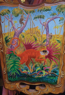
The iPhone camera is a funny device. Often, in order to get a good image, you have to turn every which way until you get the light right, something you don’t usually do with other cameras. When you take a photo with an iPhone, it’s best to move around yourself or move your subject/object around so you can place it in the best possible light and background.
Before you start using the iPhone apps, which will be discussed in the later chapters of this book, you should experiment with the camera to get the best possible photos you can. Apps will work better when your photos are ship-shape. Don’t be afraid to do anything with your iPhone camera to get a picture, short of throwing it around or submerging it in water. You can get compelling photos under the weirdest of circumstances if you’re on the lookout for them.
So far we’ve touched on lighting for iPhone photos. There are some really cool lighting options you can use in various apps that are discussed later in this book.
For unprocessed shots, there’s a lot you can do to get proper lighting for sharp shots, shots without haze, and shots without blown highlights. In traditional photography, photographs that contain noise, blown highlights, blur throughout the frame, and hazy casts aren’t considered good. Here I present them as alternatives because with phone camera photography, these photographic conditions can sometimes be seen as compelling effects.
There are umpteen ways in which iPhone tends to use light. Although it might seem that getting a good shot (I’m not saying sharp here, because some photographic conditions like those mentioned a moment ago can make for a compelling shot) is like a roll of the dice, there are ways to manipulate the light to get that WOW photo you might be shooting for.
If you want a near-perfect outside shot with an iPhone, you should have the sun behind you on a clear, pollution-free day to get an image as sharp as the one shown in Figure 3.1. In this photo, it was important to have the entire frame sharp because of the ship in the background. It’s the focal point of the image. The curves in the foreground are sharp, too. Their purpose is to bring your eyes through the frame to the ship.

There are also different ways to use light when you are out of the direct sunlight. Many websites and books tell you to photograph subjects/objects/settings in the shade, but that’s not all there is to it. Even when you’re in the shade, any light coming toward your lens from the front or sides will likely give you special effects that you might or might not want—white streaks, haze, and glare.
Tropical light, such as what you see coming from the left edge of the image in Figure 3.2, is intense. It can seep in through the slightest of openings, turning your entire frame hazy. Unless you want a hazy image (it can be an interesting effect), frame your shot so that no light seeps in and hits the lens of your camera.

The best way to shoot in the shade is with the light coming from behind you onto your subject. In the shade, you’ll have ample light without wiping out part of your subject with shadows cast over the face from hair and the nose. Figure 3.3 shows optimal lighting for an iPhone photo. The light comes from behind the lens (at the photographer’s back), casting beautifully onto the subject, who stands in the shade. Also, note the reflection in the sunglasses and the unique background.

Whether your subject is a person or an object, you’ll want to get as close as you can for a number of reasons. The first is that the iPhone 3GS has a lens that can take photos up close. (Some sample photos of the iPhone’s macro capabilities are shown in Chapter 5, “Photographing Places and Things.”) The second reason is because you can’t zoom in on objects, so in order to get it big enough, you have to get close. The third reason is to get the details that parts of objects offer.
Figure 3.4 shows a close-up of the back of a chair that has a painting on it. The iPhone camera picked up the paint’s pigment extraordinarily well.
In Figure 3.5, there are some apples shot from close up. This still life is one of many types you can take of fruit. The iPhone camera picked up the color and the smooth, waxy texture of the apples well. Because this photo was taken with the iPhone 3GS camera, which has tap focus, you have part of the image sharp and part soft. The shot was taken by angling the camera to get the best light that was being reflected off of the apples.

Using an iPhone, you can close in on almost anything with just so-so light. Don’t be afraid to experiment when you see a design on something you like or you find a still life. You’ll quite possibly get a better image of the design than the one you are shooting.
Colors in iPhone photos come out beautifully under good lighting conditions.
You can take the most offbeat subjects, hold up your iPhone to them, and come up with what looks like a masterpiece of photography. Figure 3.6 shows the inside of a tool shed. Several elements in the photo help to make it compelling.
Tools are laid out randomly yet neatly in two rows, with a surprising abstract orange design connecting the rows.
The hard edges of the tools come out as a kind of paradoxical play between texture and color—bright, fun colors among some serious tools.
Other shades of orange included in the frame—in the scissors and the glue—match the abstract design in the middle.
The placement of those alternative shades of orange one-third from the left side of the frame looks compelling because it follows the Rule of Thirds, which we’ll discuss more later in the chapter.
Topping it all off is the text that says “Paper Only,” which gives a small narrative that this person’s tools are well taken care of.
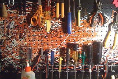
Even though the image in Figure 3.6 wasn’t taken in the best of lighting (lighting in a garage is mediocre at best), it still came out fairly sharp. Not bad for a camera phone.
You can find bright colors balanced in signage and still lifes. Getting good photographs of signage with an iPhone is difficult. Usually signs are so high up that the 37mm (35mm equivalent) iPhone lens fails to get close enough so that the sign takes up a good part of the frame, enabling all of the lettering to show up sharp in the frame.
If you look at Figure 3.7, there’s a Coca-Cola sign in the background. When I took the image, I walked as far as I could toward it, to the closest point at which I could see the image free of obstructions. The iPhone could only catch the sign as a small portion of a frame that’s filled with the buildings around it.

If I had a zoom lens, I could have caught the sign up close so you could see the layers of paper from which it was made. (I did, in fact, catch the sign using my Canon 5D with a 70-300mm Tamron zoom lens.)
Now that you know that signs aren’t great subjects for the iPhone (unless they are at ground level), we can move on to still lifes, which can be caught in all of their glory.
Still lifes can be found all around you if you look hard enough and have a sharp eye for design. That eye can be developed when you know what you are looking for.
A good still life should include objects with a variety of geometrical shapes and matching colors.
Geometrical shapes don’t have to match each other in a still life. Just about any pattern goes. If you have repeating geometrical shapes, all the better. They increase the aesthetic value of a design in a still life.
Colors are a bit more complex to match than geometrical shapes are. There are certain color arrangements that work well together because of color theory factors. (Color theory is the science of color design.)
Note
The colors in a rainbow that match each other (when looked upon in a wheel, these are colors that are opposite each other) include blue and orange, green and red, and yellow and violet. These are called complementary colors.
Designers know these colors well; they match them all the time in webpages, signage, interiors of houses, and so on.
Figure 3.8 shows a picture where the colors match. The prominent geometrical shapes in the image stand out because of their color. The blue-green of the table is a perfect match for the red-orange of the floorboard.

The similar tones of blues also match somewhat. The rest of the colors, except the brown, are nearly neutral—colors that will match anything. Although the browns of the chairs don’t match exactly, they provide good contrast with the rest of the colors in the frame.
It all makes for a great still life.
There are certain places in the world where you can photograph buildings with bright colors. Many of them are in Latin America and the Caribbean, where painting buildings with bright colors is a common practice. Figure 3.9 shows part of a welcome arch in Grand Turk. The iPhone camera lens picks up colors brilliantly when the sun is shining directly on a surface, as shown in the image. Note the dark-blue sky, the yellow-orange building, and the green door. In contrast to the bright colors are the fronds of the palm tree, which sit in the shade, with the darker tones caused by them being in the shade.

If you look closely at the image, the orange is blown out, meaning it’s so bright that it becomes the same shade throughout much of the wall when the shade should vary somewhat. Also, with blown-out colors, any texture you had in a surface will disappear.
When an iPhone image is taken in good light, salvaging the color so both the tonality and the texture of the surface come back is a possibility when you use a hue/saturation app, such as the Photoshop Mobile app, or almost any image processing software (such as that found in Photoshop or iPhoto). Figure 3.10 shows the image in Figure 3.9 with the saturation lowered (—20 in Photoshop). You can now see the tonality of color in the wall as well as the texture.

With any other digital camera, I would not have included the palm tree fronds in the frame, as I would have zoomed in to catch the orange wall against the deep-blue sky. In this shot I had no choice but to include the palm tree fronds because of the 37mm constant focal length of the camera—a camera with no zoom lens. After I framed the image in a way I ordinarily wouldn’t, I found that the iPhone camera showed me that added elements to a shot like this (in this case, the palm fronds) can make for a better picture than I would have thought possible.
If you place items in an image one-third from the top or bottom or one-third from the left or right of the edge of the frame, you’re following the Rule of Thirds. The rule has been passed down from generation to generation. It was created to keep the focus off the center of the frame by not placing important compositional elements there.
No one knows exactly where the rule came from, but they do know it originated from similar rules that the ancient Greeks used.
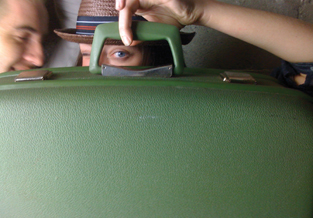
In Figures 3.11 and 3.12, you see the Rule of Thirds used in two different ways. In Figure 3.11, you can see that the image was framed so that the primary object lies one-third from the left edge of the frame. In Figure 3.12, you can see that the line that makes the top of the suitcase is located one-third from the top edge of the frame.
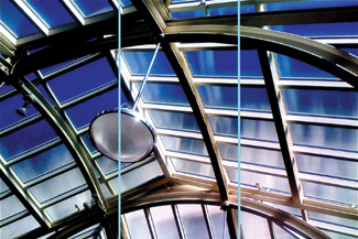
Sometimes the Rule of Thirds is used to find an exact placement of a part of a shot. If you look at Figure 3.13, you’ll find that the center of the wheel was placed so that it aligns not only one-third of the way from the left edge of the frame, but also one-third of the way up from the bottom of the frame, almost at the intersection point of the two lines shown in the figure.
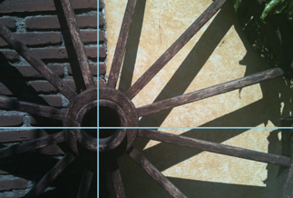
Figure 3.13. Sometimes the Rule of Thirds works by placing the center of an object where lines intersect.
Since eyes are the most important feature in a portrait, the Rule of Thirds is often used to place them. Figure 3.14 shows a portrait where the eyes are placed one-third from the top of the frame. For more about portraits, see Chapter 4, “Portraits.”

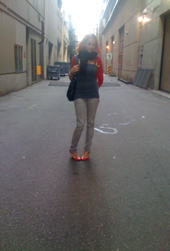
In photography, many believe that rules are made to be broken. If you spot a shot where the subject looks great in the center of the frame, by all means frame it that way. Figure 3.15 shows a woman who is placed in the area of the image with the most light. The light in the middle gives the woman a kind of angelic look.
This one you have to bend down for. When people are walking by or when people are dancing, stoop as low as you can go with your iPhone camera and shoot with your camera pointing slightly upward. You’ll find that among your shots, you’ll get interesting movement blur (especially in low light) and angles of the people moving about.
Don’t worry if you don’t get the entire bodies of the people you’re shooting. Body parts are perfectly acceptable as subjects to be framed. In Figure 3.16, an image of a woman walking in front of a dance floor, there are dancers in the background that help set the atmosphere for the picture.

The 20th-century photographer, Lisette Model, perfected this technique in many of her photographs. For more about this technique and myriad others taken from 20th-century photographers, see the book 101 Quick and Easy Ideas Taken from the Master Photographers of the Twentieth Century (Course Technology PTR, 2009).