
Chapter 5
Spatial Analysis
Renato Assunção
Universidade Federal de Minas Gerais
Belo Horizonte, Brazil
Marcelo Azevedo Costa
Universidade Federal de Minas Gerais
Belo Horizonte, Brazil
Marcos Oliveira Prates
Universidade Federal de Minas Gerais
Belo Horizonte, Brazil
Luís Gustavo Silva e Silva
Universidade Federal de Minas Gerais
Belo Horizonte, Brazil
5.1 Introduction
Statistical data often has associated a temporal and spatial coordinate reference system. Spatial statistics is the set of techniques to collect, visualize, and analyze statistical data taking into account their spatial coordinates. Therefore, spatial statistics is a natural tool when the interest lies on the geographical analysis of actuarial risk. To describe the spatial statistics methods, we need to consider first the spatial data nature. Spatial data can be classified into four types according to the stochastic nature of the random component in the statistical data: point pattern, random surface, spatial interaction and areal data.
5.1.1 Point Pattern Data
A point pattern dataset gives the locations of n random events occurring in a continuous study region R. The random locations of earthquake epicenters, burglarized households, or the coordinates of car accidents in an urban center are examples of point patterns. The random aspect of the data is its location xi in the map. The interest is focused on describing and learning the mechanism that generates the spatial spread of the random events in the map. Many times, there will be additional information, called marks, associated with the events. In the previous examples, the marks could be the time of occurrence and the magnitude of each event.
Typical inference questions in this type of data are the following: Is the random spread of the events associated with some aspect of the region such as the presence of a river or an industrial center? Are the marks associated with the random location such as when the earthquake magnitude in a certain area tend to be larger than elsewhere? Do nearby cases tend to be also close in time?
5.1.2 Random Surface Data
The random aspect of this type of data is a potentially observable surface Z(x) defined for every location x in a continuous study region R. Examples for the surface height Z(x) include the temperature at position x or the soil pH as a measure of the soil acidity viewed as a surface unfolded on R. Although potentially observable at every x, in practice the random surface is measured or observed only at a finite set of collection stations In contrast with point pattern datasets, these stations are considered fixed and known previously to any measurement. The joint probability distribution of the random variables is induced by the distribution of the random surface Z(x) for . It is usual to observe the surface with some measurement error called the nugget effect.
Some of the typical inference problems in this type of spatial data are to predict the surface height in positions that are not monitored, to estimate the entire surface by interpolating between the monitoring stations and to select a position to receive a new monitoring station.
5.1.3 Spatial Interaction Data
In this type of data, we also have fixed, non-random stations or positions . The data, however, is not associated with the individual locations but rather to ordered pairs of locations. The random data that require a statistical model are of the form . Usually, we can see these locations as one origin station xi flowing some random quantity to a destination station . Typical examples include the airline traffic between airports in a region or the commuting patterns between neighborhoods in the morning.
In this type of spatial data, some of the typical inference questions are to describe quantitatively how the flow is affected by the individual characteristics of stations i and j (such as their size, type, and location), and where a new station should be assigned to minimize the total flow cost.
5.1.4 Areal Data
This is the most common type of spatial data in insurance problems. Suppose a continuous study region R is partitioned into disjoint areas R = R1 U ... U Rn. In each area , we measure the random variable Y ending up with a random vector Y = (Y1,... ,Yn) whose joint distribution will reflect the spatial location of the areas.
The vector Y can be visualized in a thematic map, where each area is colored according to . Figure 5.1 shows a thematic map of lung cancer mortality among white males between 2006 and 2010, based on data from the Centers for Disease Control (CDC). The region is the continental United States partitioned into its counties. This thematic map was created using Rand following the design recommendations made by the CDC. These design rules were elaborated to maximize the atlas' effectiveness in conveying accurate mortality patterns to users and were obtained after extensive experimentation (see Pickle et al. (1999)).

Map of lung cancer mortality among white males between 2006 and 2010 in the continental United States, by counties.
To create the thematic map, we first read the shapefile file uscancer with the function readShapeSpatial of the maptools package. Further details of the readShapeSpatial function are provided later in this chapter.
> library(maptools)
> source("AtlasMap.R")
> us.shp <- readShapeSpatial("uscancer")
The function AtlasMap creates the thematic map. The required arguments of the function are shp, the object of class SpatialPolygonsDataFrame, and var.plot, the variable name that is visualized on the map.
> AtlasMap(shp = us.shp, var.plot = "ageadj", mult=100000, size="full")
The remaining parameters are optional: the mult value is used as the multiplication factor of the rate; rate.reg is the reference rate. If not specified, the default value is the average of the var.plot variable; r is the rounding parameter; colpal is the palette of colors used for coloring the map; ncls is the number of color breaks of the var.plot variable; brks is the range of the data that defines the colors for each value of the var.plot variable. Default values are the quantiles 0.1, 0.2, 0.4, 0.6, 0.8 and 0.9. For more details, see ?classInt::classIntervals; codesize is the size of the graphic window to be displayed.
The map shows that high rates are found in areas located in the Mississippi and Ohio River valleys. This spatial pattern reflects the high per-capita consumption of cigarettes in these areas.
The main spatial aspect of this type of data is that represents an aggregation of values dispersed in the i-th area. That is, is not associated to any specific location x within , but rather to the entire area .
Some of the main inference questions in this type of data are: to verify if the spatial pattern of the data is associated with attributes measured in the areas, to obtain a smooth version of the thematic map eliminating the random variation that can be assigned to random noise, and to detect sub-regions of higher values with respect to the rest of the map. We will study several other relevant questions after we specify models for this type of data.
5.1.5 Focus of This Chapter
The main difference between these spatial data types is the nature of their randomness. Therefore, it is natural that different statistical methods and models are adopted in each one of them. Indeed, they are so different as to prevent coverage of all of them due to lack of space in this chapter. Hence, we decided to focus on the type that is most common in actuarial studies, the areal data. We describe briefly the R capabilities for the other three types of data and point to relevant literature for the interested reader.
Presently, there are many R packages dedicated to spatial analysis. In the Task View in Analysis of Spatial Data (see http://cran.r-project.org/web/views/Spatial.html), there is a classification of these packages according to their main objectives: class definition, manipulation, reading, writing, and analysis of spatial data. As of May 2013, 108 packages that are involved with spatial analysis were listed. Because we cannot cover them all in this chapter, we focus on the most important and basic of them (the package sp) and present some of the packages that are associated with areal data, mixing the authors' preferences, experience and their sense of the packages' usefulness for actuarial work.
5.2 Spatial Analysis and GIS
Spatial statistical data can arise in many different formats and one needs a flexible medium for visualizing and interacting with them. This medium is a Geographic Information System (GIS), a computer system integrating hardware, software, and data for storing, managing, analyzing and displaying geographically referenced information. Simply put, it is a combination of maps and a traditional database. Interacting with a GIS, a user can answer spatial questions by turning raw data into information. What most commercial GIS software calls a spatial analysis is a simple query in the spatial database. Typically, there is little sophisticated statistical analysis capability in the available GIS as compared with usual statistical software such as R.
In its core, every GIS establishes an architecture to combine the non-spatial attributes and the spatial information of geographical objets in a single database. Conceptually, the geographic world can be modeled according to two different and complementary approaches: using fields or geo-objects. In the geo-objects model, the aspect of reality under study is seen as a collection of distinct entities forming a collection of points, lines, or polygons corresponding to different objects in the real world. The computer implementation of these geo-objects uses vector data: one or more coordinate pairs rendering the visual aspect of points, lines or polygons. In the field model, the reality is seen as a continuous surface and the typical data model implementation is a grid image (or raster image).
The most simple geo-object is the point, a discrete location that is stored as a vector (s1, s2) giving its spatial coordinates. The geographical locations of crimes, traffic accidents, buildings, post offices, or gas stations can be represented by points. The choice of this data type depends on the map scale and the intended analysis. For example, the 1,000 largest American cities can be represented as points on a U.S. map if the aim is simply to visualize their geographical dispersion in the territory.
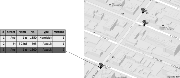
In addition to the spatial coordinates, attributes characterizing each point are stored in a table. In Figure 5.2, each crime in an urban area may be represented by a point with associated characteristics such as the type of crime, the closest address and the number of victims involved. There is 1-to-1 association between the rows of the attribute table and the set of points, with the linking provided by a unique id.
A line geo-object is an ordered sequence (s11, s21),..., (s1n, s2n) of points together with the associated table attribute of this line. Connecting the points in the given order produces the visual appearance of a line. Typical entities represented by lines are roads, pipelines, rivers, bus routes and so on. As with point geo-objects, an attribute table associates statistical features to each line geo-object. Figure 5.3 shows a line representing the Amazon

River in South America with the associated attributes of length, drainage area and average discharge.
The geo-object polygon is the most important in this chapter and, as the geo-object line, it is represented by an ordered sequence of points. The difference with a line is that the first and the last points of the ordered sequence forming the polygon are the same. Hence, a polygon is simply a closed line. Figure 5.4 shows the municipalities of Rio de Janeiro, in Brazil. Each one is a polygon geo-object. Besides the geographical coordinates, each polygon geo-object has associated attributes stored in tables, such as population and average income.

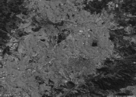
The raster or image GIS data model is used to represent continuous fields. Satellite images or non-geographic images, such as photographic pictures, are examples of raster data. Regular grid cells are used as units to store raster data. It can be implemented as a rectangular matrix array with each cell corresponding to a geographical small area. Each cell has associated alphanumeric attributes. Figure 5.5 shows the region around Pampulha Lake in Belo Horizonte, a Brazilian city located in the Southeast.
In a typical GIS, the operations to manipulate the data can be classified into three groups. The first one refers to the traditional data summaries and calculations involving only the attributes values. The second one consists of operations involving only the geoobjects such as the count of geo-points within a polygon, the calculation of an area or perimeter of a polygon, or the creation of a new larger polygon as a result of merging two smaller ones. The third group of operations combines the attribute values and the geoobjects and could be represented, for example, by a function that returns the set of polygons that are within a certain distance from a given polygon and with yearly income per capita greater than a certain value.
Commercial GIS are powerful environments where these operations are efficiently carried out. A large-scale project, involving extensive creation and manipulation of geo-objects, may require GIS software. Given its advanced analytical capability, R is an important option to those interested in spatial analysis. A complete book-length coverage of the spatial resources in R is available in Bivand et al. (2013). R is not a GIS but has a large number of features that allow it to be used as a spatial data analysis environment, mainly through contributed packages. These packages are mostly concerned with the input and output of spatial data and with spatial data analysis. There are some packages to interface between R and some GIS, such as GRASS, pgrass6, StatConnector (to link with ArcGIS), geoR and ArcRstats. However, the integration between R and GIS is not as developed as one might expect. Most spatial data analysis we carry out in this chapter is developed completely within R after inputting geo-objects prepared by GIS software. Although the analysis can be run in R, it is common to have the final results and presentation maps made using GIS software as it may have more visual tools for the specific task at hand. However, we stick with R, showing all our results using only its graphical capabilities.
5.3 Spatial Objects in R
One important development for the spatial analysis in R was the release of package sp; see Pebesma and Bivand (2005). They established a coherent set of classes and methods for the major spatial data types (points, lines, polygons and grids) following the same basic principles of GIS data models and following the principles of object-oriented programming. sp is a required package by most other R packages working with spatial data. Additionally, some spatial visualization and selection features are implemented for the classes defined by this package.
In sp, the basic building block is the Spatial class. Every object of this class has only two components, called slots in S4 terminology: a bounding box and a cartographic projection. The first one is named bbox and it gives the numeric limits of a given coordinate system within which lies the geographic object represented internally by an R object of Spatial class. The bounding box is a 2 x 2 matrix object with column names c('min','max'). The first row gives the bounds for the spatial objects coordinates in the East-West direction while the second row gives the bounds for the North-South direction.
The cartographic projection is specified by the second slot, named proj4string. It gives the reference system that needs to be used to make sense of the limits specified in the bounding box. The cartographic projections represent different mathematical attempts to represent the Earth's surface in a plane. It is impossible to avoid area, distance or angle distortions in this process. For instance, a point A could be equally distant from B and C on the Earth's surface but, in the two-dimensional map, it could be closer to B than to C.
Cartographic projection is an essential item when dealing with spatial data. Its relevance is even greater nowadays with GIS, whose main strength is its ability to aggregate disparate sources of information and data by overlaying different maps, delimitation of regions by different criteria, etc. Spatial information comes from different agencies and sources such as from the Census Bureau, from satellite images, police data, roads maps, etc. Different sources use different cartographic projections. We need to connect these different projections so the different spatial data can be overlaid properly.
The slot proj4string must contain an object of class CRS, which stands for coordinate reference system. Each CRS object has a single slot called projargs, and it is simply a character vector with values such as "+proj=longlat", meaning that the longitude-latitude (longlat, from now on) coordinate system is to be considered. In fact, strictly speaking, the longlat coordinate system is not a cartographic projection (because it is spherical coordinate system, see Chapter 2 in Banerjee et al. (2004)).
To create a Spatial class object named sobj, one can type
> library(sp)
> bb <- matrix(c(-10,-10,10,10),ncol = 2,dimnames=list(NULL,c("min","max")))
> crs <- CRS(projargs = "+proj=longlat")
> sobj <- Spatial(bbox = bb, proj4string = crs)
We can represent the Earth locations more accurately if we approximate the globe by an ellipsoid model rather than a sphere. This can also be provided in the slot projargs as, for example, in the command CRS("+proj=longlat +ellps=WGS84") .
Two generic methods work on Spatial class objects, the bbox and CRS, which return the respective slots values:
> bbox(sobj)
min max
[1,] -10 10
[2,] -10 10
> proj4string(sobj)
[1] "+proj=longlat"
5.3.1 SpatialPoints Subclass
There is little spatial content in an object such as sobj defined above. In fact, the geographical data are stored in Spatial subclasses objects rather than as Spatial objects directly. The subclass SpatialPoints extends the Spatial class and it can store the spatial coordinates of geographic points in an additional slot called coords. Usual plotting functions, such as plot and points, can be used with SpatialPoints objects.
The command to create an object of class SpatialPoints holding n points in a region is
> SpatialPoints(coords, proj4string=CRS(as.character(NA)), bbox = NULL)
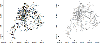
where coords is a n x 2 numeric matrix or dataframe. The cartographic projection default is missing and the bounding box matrix is built automatically from the data, if the default NULL value is used. As an example, we will read and plot the locations of traffic collisions that occurred in February 2011, in Belo Horizonte, a Brazilian city.
> mat <- read.table("accidents.txt",header=TRUE)
> crs <- CRS("+proj=longlat +ellps=WGS84")
> events <- SpatialPoints(mat, proj4string = crs)
> plot(events)
> plot(events, axes=T, asp=2, pch=19, cex=0.8, col="dark grey")
> summary(events)
Object of class SpatialPoints
Coordinates:
min max
lat -20.02569 -19.78362
long -44.05925 -43.88172
Is projected: FALSE
proj4string : [+proj=longlat +ellps=WGS84]
Number of points: 1314
The left-hand side plot in Figure 5.6 shows the output of the simple plot command. Note that no axes are drawn when plotting SpatialPoints objects. If longlat or an NA coordinate reference system is used, one unit in the x direction equals one unit in the y direction. This default aspect ratio can be changed by the plot asp parameter, a positive value establishing how many units in the y direction is equal in length to one unit in the x direction. Axes can be added using axes=T in the plot command. For unprojected data (longlat or NA), the axis label marks will give units in decimal degrees as, for example, 80°W. The default symbol for the points is a cross but this can be changed using the parameter pch in the plot command (and using cex for the symbol size). An example of changing these default options is shown on the right-hand side of Figure 5.6, obtained with the plot command with additional parameters (pch=19 produces filled circles; see the help page of the points command).

Use of SpatialPoints to visualize traffic accidents that occurred in February 2011, in Belo Horizonte, a Brazilian city.
The output of the summary command shows that the object does not have a cartographic projection (because longlat is not strictly a projection). A bounding box has been calculated automatically when the spatial object was created.
The bbox method returns the bounding box of the object (e.g., bbox(events)), and it is useful to set plotting axes and regions. A matrix with the points coordinates is the return value of coordinates(events), and proj4string(events) returns the cartographic projection adopted.
5.3.2 SpatialPointsDataFrame Subclass
In most spatial analysis, the points have nongeographic attributes. For example, besides its geographical locations, traffic accident locations can be classified according to hour of day, date, number of cars involved, either there were victims or not, among other additional information relevant for the statistical analysis. We now show how to add these attributes to a SpatialPoints object, creating a SpatialPointsDataFrame subclass object. The command to create such an object is as follows:
> SpatialPointsDataFrame(coords, data, coords.nrs = numeric(0),
+ proj4string = CRS(as.character(NA)), match.ID = TRUE, bbox = NULL)
where the arguments coords, proj4string, and bbox are the same as in the SpatialPoints command. The argument data is a dataframe with the same number of rows as coords and it holds the attributes of the points. When the row order of the points in the matrix data match the row order of the dataframe data, the user can set match.ID = FALSE, and the coordinates and data are bound together as in the cbind command. However, many times, attributes and geographical coordinates come from different sources and their row order do not match. In this case, assuming that coords and data have unique row names and there is an 1-to-1 correspondence between them, the argument match.ID = TRUE can be used. The dataframe rows are re-ordered to suit the coordinate points matrix. If any differences are found in the row names of the two objects, no SpatialPointsDataFrame object is created and an error message is issued. The argument coords.nrs is optional and is explained after a simple example.
We add hour, day, month, type, and severity of the accidents to their locations stored in the matrix mat. These attributes form the five columns of the dataframe x, and they are in the same row order as the events in mat. Hence, the SpatialPointsDataFrame object events2 is created and plotted in this way:
> x <- read.table("accidents_data.txt",header=TRUE)
> events2 <- SpatialPointsDataFrame(mat, x, proj4string = crs, match.ID = FALSE)
> summary(events2)
Object of class SpatialPointsDataFrame Coordinates:
min max
lat -20.02569 -19.78362
long -44.05925 -43.88172
Is projected: FALSE
proj4string : [+proj=longlat +ellps=WGS84]
Number of points: 1314 Data attributes:
day hour weekDay severity type
Min. : 1.00 18:00 : 29 fri:218 Fatal : 8 collision :1040
1st Qu.: 7.00 17:00 : 24 mon:196 Nonfatal:1306 running over: 274
Median :14.00 15:30 : 23 sat:218
Mean :14.31 19:00 : 21 sun:152
3rd Qu.:21.00 09:00 : 20 thr:155
Max. :28.00 14:00 : 20 tue:191
(Other):1177 wed:184
> eventS3 <- events2[order(events2$type),]
> plot(eventS3, axes=TRUE, pch = 19, cex = as.numeric(eventS3$weekDay)/5,
+ col=c(rep("black",sum(eventS3$type == "collision")),
+ rep("grey",sum(eventS3$type == "running over"))))
> plot(eventS3, axes=TRUE, pch = c(rep(1,sum(eventS3$type == "collision")),
+ rep(19,sum(eventS3$type == "running over"))), cex = as.numeric(eventS3$weekDay)/5, + col=c(rep("black",sum(eventS3$type == "collision")),
+ rep("grey",sum(eventS3$type == "running over"))))
The left-hand side plot of Figure 5.7 shows the result of the plot command. The circles are drawn with radii proportional to the week days (by means of the cex parameter) and with colors according to the type (by means of the col parameter, or if the dots are full, or not, by means of parameter pch).
The SpatialPointsDataFrame class behaves as a dataframe, both with respect to standard methods such as extraction operators and names, and to modeling functions such as formula. For example, events2$day extracts the column day from events2. The command events2[13:25,] returns the points (coordinates and attributes) corresponding to rows 13 to 25 and the command
> events2[events2$severity == "Fatal",c("weekDay","hour","type")]
coordinates weekDay hour type
455 (-19.9281, -43.9828) sat 00:30 collision
458 (-19.8356, -43.9397) sat 01:20 collision
486 (-19.8122, -43.9586) sat 15:01 running over
556 (-19.9602, -43.9992) sun 01:00 running over
564 (-19.8618, -43.9323) sun 04:00 collision
862 (-19.8904, -43.9283) sat 15:30 running over
923 (-19.9934, -44.0258) sun 22:50 collision
950 (-19.9209, -43.971) mon 17:00 collision
returns the weekDay, hour, and type values of the accidents that had fatal victims in February of 2011. Typing names(events2) returns the character vector c("day","hour","weekDay","severity","type").
Another way to create a SpatialPointsDataFrame object is to add the attributes in a dataframe to an existing SpatialPoints object. For example, given the previously created events spatial object, the attributes in x can be added by issuing the command:
> events2.alt <- SpatialPointsDataFrame(events, x)
> all.equal(events2, events2.alt)
[1] TRUE
Still another way to create a SpatialPointsDataFrame object is to add the geographical coordinates to an existing dataframe. For example, the dataframe x can be transformed into a SpatialPointsDataFrame class object by adding as coordinates the numeric matrix mat.
> events2.alt2 <- x
> coordinates(events2.alt2) <- mat
> proj4string(events2.alt2) <- crs
> all.equal(events2, events2.alt2)
[1] TRUE
One last way to create a SpatialPointsDataFrame object is to assign two columns in a given dataframe as the points' coordinates. In this case, the coordinate columns are dropped from the attributes list. For example,
> aux0 <- cbind(x, mat)
creates a dataframe with seven columns. With
> coordinates(aux0) <- ~lat+long
aux0 is now a SpatialPointsDataFrame object, and has only five attributes columns. More information can be obtained using
> summary(aux0)
or
> proj4string(aux0) <- crs
to assign cartographic projection to aux0, or
> str(aux0)
to view the structure of aux0. The last command output will show that the coords.nrs slot, empty in all previous examples, has now the numeric vector c(6,7) giving the columns numbers of the original dataframe that were taken as the coordinates.
Spatial objects in the form of lines can model streets, rivers, and other linear features of the world. They are handled by the SpatialLines subclass in the sp package. Because most actuarial applications do not use these type of objects, we will not cover it in this chapter. Our main interest is the manipulation of polygons for areal data, a subject we turn to now.
5.3.3 SpatialPolygons Subclass
Basic R graphics has the function polygon to draw and shade one or more polygons. This is different from the subclasses Polygon and Polygons of the sp package. The definition of these sp subclasses is more complicated than those for point objects subclasses because, among other reasons, one spatial entity may be associated with more than one polygon. For example, a map of the fifty U.S. states needs more than fifty polygons. While most states are represented by a single polygon, Hawaii is composed of several islands, each one represented by a separate polygon. Furthermore, while attributes in a dataframe will be associated with a single polygon for most states, Hawaii attributes must be associated with all its constituent polygons. To deal with all the possible aspects of these geo-objects, the polygon subclasses are more complex than the others.
The basic class is Polygon, and an object of this class is created with the command Polygon(coords, hole=as.logical(NA)) where coords is an n x 2 coordinate matrix, with no NA values, and with the last row equal to the first one. Successively connecting with line segments, the i-th and i + 1-th rows of coords creates a closed line defining a polygon. The argument hole is explained later.
Given the possible need for representing a single geographical entity by more than one polygon (such as in the case of an administrative region with islands), sp also defines the Polygons class. Finally, to make a single bundle of all regions, we connect several Polygons objects in a SpatialPolygons object.
5.3.3.1 First Elementary Example
We will illustrate how to create a map with three administrative regions. The first region is composed of two polygons, one of them representing an island. The other two regions are composed of single polygons. Initially, let us define the four matrices containing the ordered vertices of each polygon and visualize them with the basic and nonspatial function polygon:
> pi <- rbind(c(2,0), c(6,0), c(6,4), c(2,4), c(2,0)) # region 1, mainland
> p1i <- rbind(c(0,0), c(1,1), c(1,4), c(0,2), c(0,0)) # region 1, island
> p2 <- rbind(p1[2,], c(10,3), c(10,7), c(8,7), p1[3:2,]) # region 2
> p3 <- rbind(p1[4:3,], p2[4,], c(4,10), c(0,10), p1[4,]) # region 3
> plot(rbind(p1, p2, p3)); polygon(p1); polygon(p1i); polygon(p2); polygon(p3)
Note that some of the vertices are common to two or three areas due to their adjacency. To identify more precisely the areas, we can shade them:
> plot(rbind(p1, p2, p3))
> polygon(p1,density=20,angle=30)
> polygon(p1i,density=20,angle=30,col="grey")
> polygon(p2,density=10,angle=-30)
> polygon(p3,density=15,angle=-60,col="grey")
The class Polygon from sp is completely different from the function polygon from R, and they should not be confused. We will not make further use of the latter in this chapter. In fact, we use polygon simply to call attention to its difference to the Polygon class. Let us convert our objects to Polygon class objects.
> require(sp)
> pl1 <- Polygon(p1); pl1i <- Polygon(p1i); pl2 <- Polygon(p2); pl3 <- Polygon(p3)
> str(pl1)
Formal class 'Polygon' [package "sp"] with 5 slots
..@ labpt : num [1:2] 4 2
..@ area : num 16
..@ hole : logi TRUE
..@ ringDir: int -1
..@ coords : num [1:5, 1:2] 2 6 6 2 2 0 0 4 4 0
> names(attributes(pl1))
[1] "labpt" "area" "hole" "ringDir" "coords" "class"
A Polygon object has five slots, some of them automatically created when instantiating the object:
- labpt is a two-dimensional vector with the polygon centroid coordinates, the arithmetic average of the vertices coordinates.
- area is the polygon area.
- hole is a logical value indicating whether the polygon is a hole (see Section 5.3.3.2).
- ringDir: more about this in Section 5.3.3.2.
- coords are the vertices coordinates.
Hence, it holds much more geographical information than a simple matrix with x — y coordinates. We can access the attributes of a Polygon using and the slot name. For example,
> pl1@labpt
[1] 4 2
> pl1@area
[1] 16
There is no plot method for the Polygon class and therefore one cannot yet visualize the polygons stored in these objects.
We want to create one object in which the Polygon class pl1 and pl1i objects are joined to compose a single administrative region. The way to do this is to create a Polygons class object (note the s at the end). It receives a list of Polygon objects and conforms them to a unique geographic unit. Its basic use is Polygons(srl, ID), where srl is a list of Polygon
objects and ID is a character vector of length one with a label identifier for the geographical entity created. For example,
> t1 <- Polygons(list(pl1,pl1i), "town1")
> t2 <- Polygons(list(pl2), "town2")
> t3 <- Polygons(list(pl3), "town3")
creates three objects of class Polygons in which t1 is composed of two separate polygons and the other two are composed of single polygons. It seems redundant to define a Polygons object composed of a single Polygon object but we need some consistency when joining Polygons to create maps. The next step will clarify why we need this.
Finally, to create a geo-object holding the entire map of the region composed of these three towns, we use a SpatialPolygons class object, created with SpatialPolygons(Srl, pO, crs), where Srl is a list with objects of class Polygons (note the plural, not Polygon class objects), p0 is an optional parameter giving the plotting order of the polygons (if missing, they are plotted in reverse order of polygons area), and crs, also optional, is a string of class CRS with the cartographic projection:
> map3 <- SpatialPolygons(list(t1, t2, t3))
> plot(map3)
> plot(map3,col=grey(c(.7,.9,.5)))
> cents <- coordinates(map3)
> points(cents, pch=20)
> text(cents[,1], cents[,2]+0.5, c("town1","town2","town3"))
The left-hand side of Figure 5.10 shows the output of the first plot command, while the right-hand side shows that of the second.


5.3.3.2 Second Example
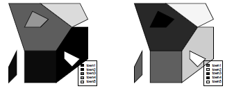
Let us modify the previous example to show more details of the SpatialPolygons class. Town t1 will be the same. Within Town t2 there is a lake of considerable area that cannot be ignored. This lake is considered a hole within Town t2 polygon and it is represented by another polygon contained in the outer boundary of Town t2. A third situation is that Town t3 also contains another smaller polygon that is also a hole. However, in this case, the hole represents Town4 t4, a fourth administrative region in our map. This is, for example, the situation of the Vatican, which is entirely contained within the boundaries of Rome. We finally add a fifth area to the set, ending with five towns in our schematic map.
For completeness, we will repeat some commands and create the matrices with the vertices coordinates, and define the Polygon objects:
> p1 <- rbind(c(2,0), c(6,0), c(6,4), c(2,4), c(2,0)) # region 1, mainland
> p1i <- rbind(c(0,0), c(1,1), c(1,4), c(0,2), c(0,0)) # region 1, island
> p2 <- rbind(p1[2,], c(10,3), c(10,7), c(8,7), p1[3:2,]) # region 2
> p2l <- rbind(c(8,2), c(9,3), c(7,4), c(7,3), c(8,2)) # region 2, lake
> p3 <- rbind(p1[4:3,], p2[4,], c(4,10), c(0,10), p1[4,]) # region 3
> p4 <- rbind(c(4,7), c(5,8), c(3,9), c(2,7), c(4,7)) # region 4, inside region 3
> p5 <- rbind(p3[4:3,], c(10,8), c(9,10), p3[4,]) # region 5
> pls5 <- list()
> pls5[[1]] <- Polygons(list(Polygon(p1, hole=FALSE),
+ Polygon(p1i, hole=FALSE)), "town1")
> pls5[[2]] <- Polygons(list(Polygon(p2, hole=FALSE),
+ Polygon(p2l, hole=TRUE)), "town2")
> pls5[[3]] <- Polygons(list(Polygon(p3, hole=FALSE),
+ Polygon(p4, hole=TRUE)), "town3")
> pls5[[4]] <- Polygons(list(Polygon(p4, hole=FALSE)), "town4")
> pls5[[5]] <- Polygons(list(Polygon(p5, hole=FALSE)), "town5")
> map5 <- SpatialPolygons(pls5)
> plot(map5)
> plot(map5, col=gray(c(.1,.3,.5,.7,.9)))
> legend("bottomright", c("town1", "town2", "town3", "town4", "town5"),
+ fill=gray(c(.1,.3,.5,.7,.9)))
> plot(map5, col=c("red", "green", "blue", "black", "yellow"))
> legend("bottomright", c("town1", "town2", "town3", "town4", "town5"),
+ fill=c("red", "green", "blue", "black", "yellow"))
Note that this time we avoid the intermediate creation of the Polygon and the Polygons objects by nesting the Polygon and Polygons commands when assigning the pls5 elements. The hole logical argument is optional and it establishes if the polygon is a hole. Note that p4 enters as a hole=TRUE in t3 (because it represents a hole within the limits of t3) but as a hole=FALSE in t4 (as p4 describes the limits of t4). The second plot command uses a sequential gray level for each town, the first town receiving the darkest tone. The third plot makes it more clear how towns and holes are considered when coloring.
If the hole argument is not given, the status of the polygon as a hole or an island will be taken from the ring direction, with clockwise meaning island, and counter-clockwise meaning hole.
5.3.4 SpatialPolygonsDataFrame Subclass
In addition to the polygons representing the geographical entities, we typically have attributes to be attached to them. In our schematic map with five administrative regions, we could be interested in analyzing their insured population size, income per capita, and incidence rate of a certain claim. Adding attributes to a SpatialPolygons object, we create a SpatialPolygonsDataFrame subclass object with the command
> SpatialPolygonsDataFrame(Sr, data, match.ID = TRUE)
The argument Sr is a SpatialPolygons class object, and data is a dataframe with number of rows equal to length(Sr). The third argument can be a logical flag indicating whether the row names should be used to match the Polygons ID slot values (match.ID = TRUE), re-ordering the dataframe rows if necessary. If match.ID = FALSE, the dataframe is merged with the Polygons assuming that they are in the same order. Compare the output of the first two commands SpatialPolygonsDataFrame below:
> x <- data.frame(x1 = c("F", "F", "T", "T", "T"), x2=1:5,
+ row.names = c("town4", "town5", "town1", "town2", "town3"))
> map5x <- SpatialPolygonsDataFrame(map5, x, match.ID = TRUE)
> map5x@data
> map5x <- SpatialPolygonsDataFrame(map5, x, match.ID = F)
> map5x@data
A third option is to pass a string to match.ID indicating the column name in the dataframe to match the Polygons IDs:
> x <- data.frame(x1 = c("F", "F", "T", "T", "T"), x2=1:5,
+ x3 = c("town4", "town5", "town1", "town2", "town3"))
> map5x <- SpatialPolygonsDataFrame(map5, x, match.ID = "x3")
5.4 Maps in R
The previous examples are schematic and purely illustrative of the type of spatial objects sp deals with. Most actual spatial analyses require maps built by official agencies or companies, maps of high quality, time consuming to produce, and for multiple purposes. These maps typically are acquired or downloaded and are composed of hundreds of areas and richly equipped with many attributes data. In this section we show how to read this type of map in R and how to add your own data to build a SpatialPolygonsDataFrame object.
A first option is to use maps that come with the package maps. It makes available the world map, with the boundaries of the countries, as well as the United States map divided into states or counties. To visualize the world map, resulting in Figure 5.11, we can type
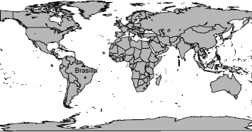
> require(maps)
> map("world", col = grey(0.8), fill=TRUE)
> map.cities(country = "Brazil", capitals = 1, cex=0.7)
The default projection is a rectangular one (with the aspect ratio chosen so that longitude and latitude scales are equivalent at the center of the picture), but it is possible to use another one using mapproj package. For instance, in Figure 5.12, several projections are considered for Canada.
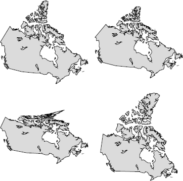
> library(mapproj)
> mapCworld", "canada", proj="conic", param=45, fill=TRUE, col=grey(.9))
> map("world", "canada", proj="bonne", param=45, fill=TRUE, col=grey(.9))
> map("world", "canada", proj="albers", par=c(30,40), fill=TRUE, col=grey(.9))
> map("world", "canada", proj="lagrange", fill=TRUE, col=grey(.9))
However, most of the maps that users need in their analysis will be provided by third parties and in particular proprietary formats. The package maptools implements functions to read and write maps in the shapefile format, the most popular GIS format and specified by Environmental Systems Research Institute - ESRI. This package converts spatial classes defined by the package sp to classes defined in other R packages such as PBSmapping, spatstat, maps, RArcInfo, and others.
In the next section, we will show how to read a database with attribute data and to merge them with a spatial object created from an ESRI shapefile. The exploratory analysis of the spatial database formed is carried out in the remaining sections.
5.5 Reading Maps and Data in R
We read a spatial database provided by IBGE, the Brazilian governmental agency in charge of geographical issues and official statistics (ibge.gov.br, accessed in February, 2013). This database has a shapefile format with a set of at least three files: one containing the geographical coordinates of the polygons, lines or dots (extension .shp); another with attribute data (extension .dbf); and a third file with the index that allows the connection between the .shp and .dbf files (extension .shx). An additional file that can be part of the shapefile format is a file indicating the cartographic projection of the polygons, lines or points, with extension .prj.
We use the maptools functionalities to read the shapefile data organized by municipality as a SpatialPolygonsDataFrame, leaving for the next section a more detailed discussion of the object read in by R:
> library(maptools)
> shape.mun <- readShapeSpatial("55mu2500gsd")
We illustrate the R spatial analysis capabilities using one large actuarial database provided by SUSEP, the agency responsible for the regulation and supervision of the Brazilian insurance, private pension, annuity, and reinsurance markets. SUSEP releases biannually a car insurance database composed of the aggregation of all insurance companies' information. Due to confidentiality concerns, there is no individual-level information, the data being aggregated into zip code areas.
The variables available are the number of vehicles-year exposed, the average premium, the average number of claims, and amount of damages, classified according to category, model and year of vehicle, region, working place ZIP code, and main driver age and sex. This database is known as AUTOSEG (an acronym for Statistical System for Automobiles) and can be accessed online (www2.susep.gov.br/menuestatistica/Autoseg, accessed February 2013). We used the 2011 AUTOSEG database in our analysis, available for download as an Access file, with 2GB. The package RODBC offers access to databases (including Microsoft Access and SQL Server) through an ODBC interface. We used its ODBConnectAccess function to fetch some data. First, a connection to the database file is achieved using
> library(RODBC)
> con <- odbcConnectAccess2007CbaseAuto.mdb")
We are particularly interested in comparing premiums, claims, and reported damages for two specific groups: popular vehicles and luxury vehicles. The basic difference between the groups is the power of the engine and the materials and finishing quality. Popular cars have a power of 1,000 cc (cylinders), whereas luxury cars usually have a power of 2,000 cc or greater. In Brazil, popular cars also share a more simple internal structure and therefore their price is affordable to most car consumers. Selected popular vehicles in Brazil are Celta 1.0 (Chevrolet), Corsa 1.0 (Chevrolet), Prisma 1.0 (Chevrolet), Uno 1.0 (Fiat), Palio 1.0 (Fiat), Gol 1. (Volkswagen), Fox 1.0 (Volkswagen), Fiesta 1.0 (Ford), and Ka 1.0 (Ford). Similarly, selected luxury vehicles are Vectra (Chevrolet), Omega (Chevrolet), Linea (Fiat), Bravo (Fiat), Passat (Volkswagen), Polo (Volkswagen), Fusion (Ford), Focus (Ford), Corolla (Toyota), Civic (Honda), and Audi.
We can create a dataframe structure with detailed information of region, city code, yearly exposure, premium, and frequency of claims for the following categories: robbery or theft (RB), partial collision and total loss (COL), fire (FI), or others (OT). The transfer of the data stored in the Access database to R can be made using the function sqlFetch() from RODBC. We used the required parameters channel and sqtable with arguments con and susep:
> base <- sqlFetch(channel=con, sqtable="susep")
> odbcClose(con)
The final dataframe is available in this book' database package, and the different columns store information for popular and luxury groups. The frequency of claims for each category are found in columns CL_RB_LUX, CL_COL_LUX, CL_FI_LUX, CL_OT_LUX, CL_RB_POP, CL_COL_POP, CL_FI_POP, and CL_OT_POP. The name of the municipality is found in column NAME_MUN, and the numeric municipality code is found in column COD_MUN. The information on exposition and average premium for the popular and luxury groups is given in EXPO_POP and EXPO_LUX, respectively.
Originally, both SUSEP and IBGE databases did not present a unique identification column that provides a forward merge of the two databases. The joint information is the name and the state of each municipality. Due to discrepancies between the databases, some of the municipalities presented different names. An extensive code was written in order to properly adjust the names of the municipalities and merge the two different databases. We did not include this code in our example but we briefly describe how to merge the database generated from SUSEP and the database generated from IBGE. We make available the final database, which also includes the municipality population (POP_RES) based on the 2010 Census, and the 2000 municipality Human Development Index (HDI code HDIM_00). The Human Development Index (HDI) is a summary measure of long-term progress in three basic dimensions of human development: income, education, and health. The HDI provides a counterpoint to another widely used indicator, the Gross Domestic Product (GDP) per capita, which only considers economic dimensions. Both POP_RES and HDIM_00 columns were generated from the IBGE site (ibge.gov.br, accessed February 2013).
A new dataframe is created by merging the spatial dataframe and the SUSEP data frame:
> base.shp <- merge(shape.mun@data, base, by="COD_MUN", all.x = TRUE)
The shape.mun object is of class SpatialPolygonsDataFrame, which stores polygons information and dataframe. To guarantee that the spatial polygon information available in shape.mun matches the order of municipalities in the new dataframe (base.shp), both databases are first sorted in ascending order of the municipality codes:
> base.shp <- base.shp[order(base.shp$COD_MUN),]
> shape.mun <- shape.mun[order(shape.mun$COD_MUN),]
In sequence, the dataframe of the shape.mun object is updated with the new dataframe
> shape.mun@data <- base.shp
We restrict the size of the final database using only the municipalities from four Brazilian states. We use the state variable, ST, to select the following states: Sao Paulo (SP), Santa Catarina (SC), Parana (PR), and Rio Grande do Sul (RS). These states are located in the southern region of Brazil and contain almost 70 million inhabitants (around 36% of the Brazilian population) and constitute one of the richest regions of the country (approximately 60% of the Brazilian gross product). It allows us to show how to select subregions in a map to carry out a spatial statistical analysis:
> sul_sp <- shape.mun[shape.mun$ST 7in7 c("SP", "SC", "PR", "RS"),]
> length(sul_sp@polygons)
[1] 1833
> dim(sul_sp@data)
[I] 1833 17
> names(sul_sp@data)
[1] "COD_MUN" "ST" "NAME_MUN" "EXPO_POP" "PREMIO_POP"
[6] "CL_RB_POP" "CL_COL_POP" "CL_FI_POP" "CL_OT_POP" "EXPO_LUX"
[11] "PREMIO_LUX" "CL_RB_LUX" "CL_COL_LUX" "CL_FI_LUX" "CL_OT_LUX"
[16] "HDIM_00" "POP_RES"
Therefore, our final SpatialPolygonsDataFrame has 1,833 administrative regions and 17 attributes associated to each of them. The names of the variables are displayed above and have been discussed previously in the text.
Out of the 1, 833 available municipalities, approximately 20%, or 397 municipalities, have missing data. From the municipalities without missing values we adjusted a simple linear regression using the logarithm of the population as explanatory variable and the exposition as response. With the fitted regression, the logarithms of the municipalities with missing information were used to predict the exposition of these municipalities. Finally, the imputed value is the maximum between the exponential of the predicted value and zero because the exposition is a nonnegative variable. The claims in the municipalities with missing data are kept as NA and will be estimated in the model fitting. Some municipalities in the state of Rio Grande do Sul are recent and do not have any HDI information based on the most recent Brazilian Census. For these municipalities, the HDI information was set as the mean value of it neighbors.
The final dataset, with both spatial and insurance information, is saved as a shapefile for future use and is available as a separate file named sul+sp_shape.shp:
> writePolyShape(sul_sp, "sul+sp_shape")
5.6 Exploratory Spatial Data Analysis
Initially, load the package maptools and read the data from the shapefile sul+sp_shape as a SpatialPolygonsDataFrame:
> library(maptools)
> shape <- readShapeSpatial("sul+sp_shape")[,-1]
The shape object of class SpatialPolygonsDataFrame stores different information such as dataframe and polygons coordinates. The different structures are known as slots and their names can be accessed with
> slotNames(shape)
[1] "data" "polygons" "plotOrder" "bbox" "proj4string"
Further information about the shape object, such as the number of polygons and access to the coordinates of the polygons, is provided with
> class(shape)
[1] "SpatialPolygonsDataFrame" attr(class(shape),"package")
[1] "sp"
> dim(shape)
[1] 1833 17
> str(shape@data)
> shape@polygons
> slotNames(shape@polygons[[1]])
> [1] "Polygons" "plotOrder" "labpt" "ID" "area"
> names(shape)
[1] "COD_MUN" "ST" "NAME_MUN" "EXPO_POP" "PREMIO_POP"
[6] "CL_RB_POP" "CL_COL_POP" "CL_FI_POP" "CL_OT_POP" "EXPO_LUX"
[11] "PREMIO_LUX" "CL_RB_LUX" "CL_COL_LUX" "CL_FI_LUX" "CL_OT_LUX"
[16] "HDIM_00" "POP_RES"
5.6.1 Mapping a Variable
One advantage of working with sp class objects is that they can be passed directly as arguments to the function plot(), such as in plot(shape). If plot() receives a SpatialPolygonsDataFrame class object, it returns a polygon map. Another useful way to visualize area data is to color each polygon according to an attribute. This is available through the function spplot() from the sp package. Taking the HDIM_00 variable from the shape object as a theme, we create a five-dimensional vector cols with five gray shade values (more on colors soon) and draw a colored map with the following commands:
> cols <- rev(gray(seq(0.1, 0.9, length =5)))
> cols
[1] "#E6E6E6" "#B3B3B3" "#808080" "#4D4D4D" "#1A1A1A"
> spplot(shape, "HDIM_00", col.regions = cols, cuts = length(cols) - 1)
The function spplot() automatically breaks the range of HDIM_00 into equal length intervals. We need to provide the additional parameter cuts to force the number of colors to be equal to the number of cuts in the legend. Some municipalities are white painted due to their missing values in the HDIM_00 variable. These are municipalities created after the 2000 Census and hence they had no HDIM_00 value associated. We can input values to these municipalities using the average HDIM_00 among their neighboring areas. We discuss how to perform this imputation in Section 5.7.3.
The automatic determination of the color classes by spplot() is an advantage when we want a quick spatial visualization of a certain variable. However, many times, the user will need customized breaks. This takes much longer than the simple use of spplot(). Suppose, for example, we wish gray shades associated with the intervals determined by the quantiles of HDIM_00. We need first to find the break points (in brks) and create a factor with levels indicating the class interval each area belongs to. As a more stringent need, this factor must be added to the shape object (as the variable col_var). This factor is now the variable to be mapped using the same gray shades as before:
> brks <- quantile(shape$HDIM_00, prob = c(0, .2, .4, .6, .8, 1), na.rm = TRUE)
> shape$col_var <- cut(shape$HDIM_00, brks)
> spplot(shape, "col_var", col.regions = cols, main = "Levels are intervals")
> levels(shape$col_var) <- c("Very Low", "Low", "Middle", "High", "Very High")
> spplot(shape, "col_var", col.regions = cols, main = "User defined levels")
Because we are mapping a factor (col_var) rather than the continuous variable HDIM_00, we are not required to use the parameter cut any more. The map is colored according to the values of the factor col_var and the legend uses its levels. The user can change these levels to obtain legends that could be more suitable. For example,
> levels(shape$col_var) <- c("Very Low", "Low", "Middle", "High", "Very High")
> spplot(shape, "col_var", col.regions = cols, main = "Levels are user defined")
5.6.2 Selecting Colors
Colors in R are represented by a vector of characters such as “#RRGGBB” where each of the pairs “RR” , “GG” , and “BB” consist of hexadecimal “digits” with a value ranging from “00” to “FF” . Basic colors can also be obtained by typing their name between quotation marks, as for example, typing “black” or “red” . The color names recognized by R can be obtained with the command colors().
Typically, we prefer maps with a single color with different shades or two different colors as extreme values with gradual shading trends for the intermediate values. Some functions in R create shades between two colors as, for example, heat.colors(n) that creates an n-dimensional vector with the codes from intense red to white. Other color palettes are provided by R, such as terrain.colors(), topo.colors(), and cm.colors. The code below is a simple way to visualize some of the possibilities of color palettes in R:
> par(mfrow=c(2,2))
> pie(rep(1,10), col=heat.colors(10), main = "heat.colors()")
> pie(rep(1,10), col=topo.colors(10), main = "topo.colors()")
> pie(rep(1,10), col=terrain.colors(10), main = "terrain.colors()")
> pie(rep(1,10), col=cm.colors(10), main = "cm.colors()")
More options on colors are available using the package RColorBrewer, especially developed to generate pleasant color palettes to be used in thematic maps. For details, type brewer.pal.info to obtain a data.frame with the name of the palettes, their maximum number of colors, and category. To visualize all palettes in a single graphical window use the function display.brewer.all() . For more details, type help(package="RColorBrewer").
We can customize the maps in R by using the many options on colors. The next set of commands illustrates how we can create the categories and colors to be used with spplot().
> library(RColorBrewer)
> cols <- brewer.pal(5, "Reds")
> spplot(shape, "col_var", col.regions = cols,
+ main = "HDI by municipalities in South Brazil")
Instead of spplot(), we can use the usual function plot() with additional parameters to control colors and the legend position. We start defining the number of colors and categories as equal to five. To select the colors, we use the function brewer.pal() of package RColorBrewer. The first argument of the function is the number of colors, and the second is "Greens", the name of the color palette.
> plotvar <- shape$HDIM_00
> ncls <- 5
> colpal <- brewer.pal(ncls,"Greens")
The next step is to define the interval categories to break down the range of the HDIM_00 variable. From the package classInt, we use the function classIntervals requiring the parameter style, that specifies which method is used to create the class intervals. For example, style="quantile" indicates that the intervals are built using quantiles of the variable of interest, and style="equal" builds equal-amplitude intervals. Other options can be found by calling the help on classIntervals. Another parameter that must be specified is the number of classes to be created.
> library(classInt)
> classes <- classIntervals(plotvar, ncls, style = "equal")
> cols2 <- findColours(classes, colpal)
Rather than providing only the list of different colors of the categories as in spplot, the function plot needs to specify the color of each region in the map. In the last command above, we used the function findColours, specifying two arguments, the first one being a classIntervals class object, and the second is the color palette. The output returns the color of each polygon and two other attributes of help to draw a legend. More details can be found by typing help(package="classInt").
In executing the above commands, a warning is issued because the variable HDIM_M has NAs. To highlight these polygons with missing values, we assign them the color red:
> cols2[is.na(shape$HDIM_00)] <- "red"
After defining classes and colors, the next step is to use the function plot() to generate the map. The first argument is shape, the SpatialPolygonsDataFrame class object, and the second one is the object col2, with the colors of each polygon. Finally, we build the legend through the function legend() passing the coordinates X and Y for the legend location in the graphical window, the character vector with the labels of each category in legend, and the parameter fill with the color of each category:
> plot(shape, col = cols2)
> legend(-47.85126, -29.96805, legend=c(names(attr(cols2, "table")), "NA"),
+ fill=c(attr(cols2, "palette"), "red"))
The results of these commands are shown in Figures 5.6.2 and 5.6.2.
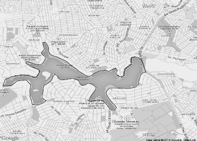
5.6.3 Using the RgoogleMaps Package
We can use the RgoogleMaps package (Loecher et al. (2013)) to download into Ra static map from Google Maps′ (maps.google.com). This map is used as a canvas or background image where we overlay polygons, lines, and points as shown in Figure 5.15 where the thematic map of the variable HDIM_00 is overlaid on a satellite image fetched from Google Maps.


Visualizing shape maps with RgoogleMaps package. Variable HDIM_00 overlaid on satellite map from Google Maps.
The PBSmapping package was created by fisheries researchers to provide R with features similar to those available in a Geographic Information System (GIS). It is the standard package used by RgoogleMaps to plot a set of polygons in an image from Google Maps. The first step, using PBSmapping, is to convert shape, an object of class sp, into a PolySet dataframe.
> shape <- readShapeSpatial("sul+sp_shape")
> library(PBSmapping)
> map.susep <- SpatialPolygons2PolySet(shape)
> class(map.susep)
[1] "PolySet" "data.frame"
> head(map.susep)
The PolySet dataframe is a standard R dataframe with five numerical columns: PID is the area ID, SID is a secondary id number when the area is composed of more than one polygon (such as when it has islands), POS is the index of the point forming the polygon contour, and finally the vertex coordinates X and Y.
The second step is to get the satellite image from Google Maps that contains the shape file with the South Brazilian states. For this, we need to specify a rectangle (or bounding box) enclosing the polygons we want to overlay on the Google Maps image. This bounding box can be obtained with the bbox() function from the sp package. RgoogleMaps requires this bounding box in lat-long coordinates. Because our shape spatial object has been specified with this coordinate system, it is the return value of bbox(). Next, we use the GetMap.bbox() function from the RgoogleMaps package for inputting the bounding box lat-long and some additional parameters. The resulting MyMap object is a list holding the image and can be inspected with str(MyMap). The Google Maps image can be visualized with R using the PlotOnStaticMap() command, the main RgoogleMaps plot function:
> bb <- bbox(shape) # getting the map bounding box
> bb
min max
x -57.64322 -44.16052
xy -33.75158 -19.77919
> library(RgoogleMaps)
> MyMap <- GetMap.bbox(bb[1,], bb[2,], # fetching the Google Maps image
+ maptype = "satellite",
+ destfile = "myMap.png",
+ GRAYSCALE = FALSE)
> str(MyMap) # inspecting the MyMap object
> PlotOnStaticMap(MyMap) # plotting the image
The type of image can be controlled with the maptype parameter whose values include "roadmap", a map with the main roads shown as lines, and "terrain", an image showing the main relief aspects of the region (see ?GetMap() for further details). The destfile parameter identifies the name of the local png file holding the map image. The most important feature of RgoogleMaps is the overlay of the thematic maps on this image with the PlotOnStaticMap() command. Along with the map image MyMap returned from GetMap.bbox() and the spatial object map.susep with the polygons, we also need to pass a vector with the colors of each area in the map. Using the vector cols2 created for the Figure 5.6.2 map, we can overlay the polygons:
> PlotPolysOnStaticMap(MyMap, map.susep, col = cols2, lwd = 0.15,
+ border = NA, add = FALSE)
The other parameters are optional: lwd controls the line width; border=NA omits the polygon borders, while border=NULL is the default and plots the borders in black; and as usual, add starts a new plot or adds to an existing plot. To add a legend to the figure, we use the classInt package and legend. The leglabs() function makes the legend labels, whereas cex, ncol, bg, and bty parameters are related to character expansion (size) of the legend, number of columns, background color, and the type of box to be drawn around the legend (see ?legend() for further details).
> legend("topleft", fill=attr(cols2, "palette"),
+ legend=leglabs(round(classes$brks, digits=2)),
+ cex=1.0, ncol=1, bg="white", bty="o")
Finally, to save the map as a png file, or other formats, use savePlot:
> savePlot(filename="map.png", type="png")
It is worth mentioning that plotGoogleMaps Kilibarda (2013) and ggmap Kahle & Wickham (2013) packages also generate visualizations using Google Maps (see r-project.org). The R code of the previous examples using RgoogleMaps can be found in plotmaps_RgoogleMaps.R.
In data analysis of point processes, it is natural that the locations of the events are available as written addresses. For example, the number and the street name where an automobile accident occurred. However, to perform a spatial analysis of data points, we need the set of geographical coordinates that represent the exact locations of these events. We can obtain the coordinates from these addresses using the function geocode() in package dismo. The dismo package was originally written to implement models for species distributions and the function geocode() provides an interface to Google Maps API.
The geocode) function gets the geographical coordinates of a given written address through the Google Maps geocoding service. This service allows a maximum number of 2,500 queries per day. To use function geocode(), a vector with the addresses must be informed. Next, we create a sequence of addresses and apply the geocode() function to generate the coordinates.
> require(dismo)
> adress <- paste("Avenida Otacilio Negrao de Lima, ",
+ seq(1, 30000, by = 200),
+ " , Belo Horizonte - Minas Gerais",
+ sep = "")
> geo.pt <- geocode(adress)
> geo.pt <- rbind(geo.pt, geo.pt[1,])
The output of the geocode() function is a dataframe object with the following columns: the originalPlace column with the written address; the interpretedPlace column with the detected address by Google Maps API; the longitude column lon; the latitude column lat; the minimum longitude of the bounding box monmin; the maximum longitude of the bounding box lonmax; the minimum latitude of the bounding box, latmin; the maximum latitude of the bounding box, latmax; and the distance between the point and the farthest corner of the bounding box, uncertainty,
To visualize the points on the map, we use functions GetMap() and PlotOnStaticMap() from RgoogleMaps package to read a map from Google Maps, and use it as the background image.
We use an optional argument, FUN=lines, from the PlotOnStaticMap function to connect the dots by lines, as shown in Figure 5.16:
> require(RgoogleMaps)
> center <- c(mean(geo.pt$lat), mean(geo.pt$lon))
> mymap <- GetMap(center=center, zoom=14, GRAYSCALE = TRUE)
> map <- PlotOnStaticMap(mymap, lat = geo.pt$latitude, lon = geo.pt$longitude,
+ lwd = 2.5, lty = 2, col="black", FUN = lines)
5.6.4 Generating KML Files
The RgoogleMaps package imports maps from Google Maps and use them as a canvas to overlay R spatial objects. This is a static view of the spatial information, with little user interaction. Another option is to visualize the spatial information generated by R in a dynamic environment such as Google Earth™. This allows for a rich interaction between the user and the Web interface, providing for use of zooming features and pop-up textual or graphical information to be added to the map. It is possible to visualize R-generated spatial information in Google Earth if we store this information in a KML file. KML (Keyhole Markup Language) is a file format developed by Google and based on the XML language. It is used to display geographic data in Google Earth, Google Maps, and Google Maps for mobile. Other applications displaying KML files include NASA WorldWind, Esri® ArcGIS Explorer, Adobe PhotoShop®, AutoCAD®, and Yahoo! Pipes®. We present in this section some functions developed by us that link Google Earth and R. These functions are currently available in the package spGoogle, which can be uploaded at CRAN.
To illustrate the creation of a KML file from R, we use the variable HDIM_00. Two new columns are added to the shapefile database. One column, named color, stores the color scheme for each polygon and the other column, named description, stores a string for each polygon that is displayed inside a pop-up balloon when the user clicks on the map.
shape$color <- cols2
shape$description <- paste("HDI:", shape$HDIM_00)
The following function creates, for each polygon in the shapefile, a corresponding KML code and merges them into a single KML file. The shp, color, namepoly, description, and file.name parameters are the shape file object, the name of the color column in the shape file object, the name of the column with the name associated to each polygon, the name of the description column, and the name of the file where the KML code should be stored, respectively.
> KML.create <- function(shp, color, namepoly, description, file.name){
+ out <- sapply(slot(shp, "polygons"),
+ function(x) {
+ kmlPolygon(x,
+ name = as(shp, "data.frame")[slot(x, "ID"), namepoly],
+ col = as(shp, "data.frame")[slot(x, "ID"), color],
+ lwd = 1,
+ border = "#C0C0C0",
+ description = as(shp, "data.frame")[slot(x, "ID"), description]
+)
+}
+)
+ kmlFile <- file(file.name,"w")
+ cat(kmlPolygon(kmlname="KML", kmldescription="KML")$header, file=kmlFile, + sep="
")
+ cat(unlist(out["style",]), file=kmlFile, sep="
")
+ cat(unlist(out["content",]), file=kmlFile, sep="
")
+ cat(kmlPolygon()$footer, file=kmlFile, sep="
")
+ close(kmlFile)
+}
The call of the KML.create() function is as follows
KML.create(shape, color="color", namepoly="NAME_MUN",
+ description="description", file.name="maps.kml")
5.6.4.1 Adding a Legend to a KML File
Creating a legend in a KML file is quite complex. One option is to draw colored polygons on the map, as if the boxes of the colors were regular polygons. Then add the text with legend information to the right of the boxes. By doing so, extra code lines are created in the KML file in order to account the legend boxes and texts. As a result, if the user zooms in on the map, then the legend is also expanded and vice versa. An alternative is to create a separate image, or a file, and, by using KML language, provide the link between the image and a specific location on the screen in the KML code. Thus, the size of the image of the legend is not changed if the user zooms in on or zooms out from the map. We created two functions named generates_figure_legend() and generates_layer_legend() that handle the image creation and the associated KML code. They can be used with
> source("kml_legend.R")
The following code creates the legend image and the KML code:
> library(Cairo)
> brks <- classes$brks
> dest.fig.attrs <- generates_figure_legend(brks, colpal, 2, num.faixas = ncls)
> dest.fig <- dest.fig.attrs[1]
> fig.width <- dest.fig.attrs[2]
> fig.height <- dest.fig.attrs[3]
> legendkml <- generates_layer_legend(brks, colpal, dest.fig, fig.width,
+ fig.height, 2)
Responsible for creating the legend image in a png file, the function generates_figure_ legend() uses the function CairoPNG from package Cairo. Cairo is a graphics device for R that provides high-quality output in various formats which includes png. The legendkml object has the KML code holding the information on the image filename, its location, and size.
> legendkml
[1] "<ScreenOverlay>"
[2] "<name>Legenda</name>"
[3] "<color>ffffffff</color>"
[4] "<visibility>1</visibility>"
[5] "<Icon>"
[6] "<href>legenda1584edf9b4.png</href>"
[7] "</Icon>"
[8] "<overlayXY x="0" y="0" xunits="fraction" yunits="fraction"/>"
[9] "<screenXY x="148" y="18" xunits="insetPixels" yunits=
"pixels"/>"
[10] "<size x="-1" y="-1" xunits="pixels" yunits="pixels"/>"
[11] "</ScreenOverlay>"
This information is aggregated into the KML.create() function. Note that the function has a new parameter legendkml that must be specified with the object that we just created (also named legendkml in this example).
> KML.create <- function(shp, color, namepoly, description, file.name, legendkml){
+ out <- sapply(slot(shp, "polygons"),
+ function(x) {
+ kmlPolygon(x,
+ name = as(shp, "data.frame")[slot(x, "ID"), namepoly],
+ col = as(shp, "data.frame")[slot(x, "ID"), color],
+ lwd = 1,
+ border = "#C0C0C0",
+ description = as(shp, "data.frame")[slot(x, "ID"), description]
+)
+}
+)
+ kmlFile <- file(file.name,"w")
+ cat(kmlPolygon(kmlname="KML", kmldescription="KML")$header, file=kmlFile,
+ sep="
")
+ cat(legendkml, file=kmlFile,sep="
")
+ cat(unlist(out["style",]), file=kmlFile, sep="
")
+ cat(unlist(out["content",]), file=kmlFile, sep="
")
+ cat(kmlPolygon()$footer, file=kmlFile, sep="
")
+ close(kmlFile)
+}
Using the updated function KML.create, we created a new file KML that exhibits the legend in Google Earth, as shown in Figure 5.18.
> KML.create(shape, color="color", namepoly="NAME_MUN",
+ description="description", file.name="maps_lege.kml", legendkml=legendkml)
It is important to note that the KML code provides only the reference to the image. That is, the image is not stored in the KML code. An alternative is to encapsulate both KML and the image into a single file with a KMZ extension. A KMZ file is simply a standard zip file with both the KML code and the image. This file encapsulates all geographical information and image files and therefore it makes easy the transfer of information between users. Furthermore, KMZ files can also be visualized in Web browsers using maps.google, as long as the KMZ file is available online with public access.
> KMZ.create <- function(kml.name, legenda.name){
+ kmz.name <- gsub(".kml", ".kmz", kml.name)
+ zip(kmz.name, files = c(kml.name, legenda.name))
+}
> KMZ.create(kml.name = "maps_lege.kml", legenda.name = dest.fig)
updating: maps_lege.kml (deflated 64%)
adding: legenda158c4af43a70.png (deflated 2%)
The R code to create KMZ files can be found in plotmaps_kml.R.
5.7 Testing for Spatial Correlation
One of the first tasks before embarking on a stochastic model for the spatial variation of a variable y is to test if there is evidence of a mechanism inducing spatial correlation between the areas. After all, by chance alone, we are almost certain to observe spatial clusters of high values or low values. These randomly formed clusters are likely to appear in any map, even if the values of y in each area are generated irrespective of their spatial location.
Spatial correlation tests depend on the definition of a neighborhood matrix. The spdep package provides basic functions for building and manipulating these neighborhood matrices as well as spatial inference tools in the form of correlation tests and spatial regression models.
5.7.1 Neighborhood Matrix
Given a map partitioned into n areas, we represent their degree of spatial association or proximity by an n X n matrix W. The element Wij represents the weight, the connectivity degree, or the spatial proximity intensity between areas i and j. The diagonal elements are null: for all . The other elements can be selected rather arbitrarily but should be made considering specific aspects of the problem under analysis. However, in most applications, the matrix W is chosen in a relatively simple way. Some of the most common choices for the matrix W take and they are the following:
- if areas i and j share boundaries, and otherwise. This binary and symmetric matrix is called the adjacency matrix.
- if the distance between the centroids of areas i and j is less than a certain threshold d*, and 0 otherwise.
- if the centroid of area j is one of the k nearest neighboring centroids of area i. Otherwise, . Note that we can have in this case.
- where .
- The influence of i intro j could depend on the relative size of i among j's neighbors. One way to capture this idea is to consider the common boundary length lij between areas i and j. Let be the perimeter of area i. Then, wij = Iij/Ii. Typically, we will have .
In some statistical models, it is useful to standardize the rows of W so they are nonnegative and sum to 1. Hence, with the above choices for W, we can redefine the neighborhood matrix as W* where with . From now on, we will use only the notation W for the neighborhood matrix, making it clear from the context which matrix is under consideration.
Typically, W is sparse, with few non-zero elements in each row. Rather than storing a large n × n matrix with most elements equal to zero, it is more efficient to store a list with the few elements or neighboring areas that are non-zero, together with the indices of their areas. The package spdep defined the class nb to handle the sparse neighborhood matrix based on boundary adjacency as a neighborhood list. If a SpatialPolygonsDataFrame object has n Polygons, the neighborhood list will also have n elements. The i-th element is a vector with the integer indices of the adjacent regions of the i-th Polygons. To show how to create this list version of the adjacency matrix, we will use a subregion of our illustrative southern Brazil map, the Parana state municipalities. The spdep function poly2nb() creates the neighborhood list:
> library(maptools)
> library(spdep)
> shape <- readShapeSpatial("sul+sp_shape")
> pos <- which(shape@data$ST == "PR") # indices of selected rows
> prshape <- shape[pos,] # new SpatialPolygonsDataFrame Parana regions
> plot(prshape) # plotting the map
> text(coordinates(prshape), label=prshape@data$NAME_MUN, cex=0.5) # adding areas names
> pr.nb <- poly2nb(prshape) # Adjacency ngb list from SpatialPolygonsDataFrame
> is.list(pr.nb) # output is TRUE
> pr.nb[[1]] # neighbors of "ABATIA", the first data.frame region
[1] 30 86 181 306 321 336
> summary(pr.nb)
Neighbour list object:
Number of regions: 399
Number of nonzero links: 2226
Percentage nonzero weights: 1.398232
Average number of links: 5.578947
Link number distribution:
2 3 4 5 6 7 8 9 10 11 12
7 40 72 86 83 56 27 16 9 2 1
7 least connected regions:
32 50 176 257 277 333 361 with 2 links
1 most connected region:
69 with 12 links
The neighbors in the pr.nb list are identified by their order in relation to the list itself. Note how sparse the 399 × 399 adjacency neighborhood matrix is: only 1.4% of its elements are non-zero.
The plot command works with the neighborhood list and produces a graph where each centroid is connected by edges to its adjacent regions:
> plot(prshape)
> plot(pr.nb, coordinates(prshape), add=TRUE, col="blue")
The poly2nb function creates edges between regions that represent binary indicators of who is a neighbor of whom. It does not specify weights for these non-zero neighboring pairs. This is possible through the function nb2listw, whose most simple usage is
> pr.listw <- nb2listw(pr.nb, style="W") # weighted ngb list
> length(pr.listw); names(pr.listw);
> pr.listw$weights[[1]] # weights of the 1st region neighbors
[1] 0.1666667 0.1666667 0.1666667 0.1666667 0.1666667 0.1666667
> pr.listw$weights[[2]] # weights of the 2nd region neighbors
[1] 0.3333333 0.3333333 0.3333333
The neighborhood list pr.nb of class nb is transformed into a weighted neighborhood list. The output pr.listw is a list composed of three elements: "style", "neighbours", and "weights". The first one is simply a character indicating the style used to build the weighted list ("W" in this example). The second one is the list of neighbors, similar to pr.nb. The third element is the list pr.listw$weights whose element pr.listw$weights[[i]] is the vector with the non-zero weights assigned to the neighbors of region i. The argument to style determine the type of weights with "W" meaning that , where is the element (i, j) of the adjacency matrix.
Another option is to provide a list of weights directly. For example, for a map composed by seven polygons, the first municipality of Parana plus its six adjacent neighbors, we could assign user-specified weights to neighbors in the following way. We start creating an indicator for region 1 and its six adjacent regions:
> pos <- c(1, pr.nb[[1]])
Then, we create a new SpatialPolygonsDataFrame with these seven regions:
> map4 <- prshape[pos,]
and we create the adjacency neighborhood list:
> plot(map4)
> map4.nb <- poly2nb(map4)
We can count the number of neighbors in each area:
> sapply(map4.nb, length)
[1] 6 4 4 3 3 3 3
and finally assign weights:
> x <- rep(1/3,3) # auxiliary vector
> lweights <- list((1:6)/21, runif(4), 1/(1:4), x, x, x, x)
> map4.listw <- nb2listw(map4.nb, glist=lweights, style="W")
> map4.listw$weights
5.7.2 Other Neighborhood Options
Another way to build a neighborhood structure is to use the spdep function knearneigh which obtain the k nearest neighboring points of each point. We can use the centroids of the n regions or any other adequate point summary of the polygons. The return value of knearneigh is a list of class knn whose first element is n × k matrix holding the indices of the k nearest neighbors. This knn class object can be passed to knn2nb to generate the neighborhood list of class and then plotted on the map (see Figure :
> coords <- coordinates(prshape)
> pr.knn <- knearneigh(coords, k=3, longlat = TRUE)
> pr.nbknn <- knn2nb(pr.knn) # ngb list
> plot(prshape, border="grey") # map of the Parana regions
> plot(pr.nbknn, coords, add=TRUE)
for plotting edges between neighbors
> title("K nearest neighbours, k = 3")
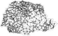
5.7.3 Moran's I Index
To evaluate the degree of spatial association of a variable in a map, we use Moran's I index defined by
This index is called Moran's I index in honor of P.A.P. Moran, an Australian statistician who studied their behavior (see Moran, 1950). Its intuition is clear. We calculate the standardized deviate of yi with respect to the global variation of y in the map. Next, we calculate the correlation between pairs of areas weighting by the elements of the matrix W.
As in the case of the usual correlation, if , there would not be evidence for spatial correlation. On the contrary, if I is much greater than zero, there is evidence of positive autocorrelation. That is, neighboring regions tend to deviate similarly from the mean y. Finally, I << 0 indicates negative correlation, a situation rarely seen in practice. The statistical problem is to determine a critical value c0 for I such that when |I| > c0, we will admit that there is evidence for spatial autocorrelation.
Although it is possible to obtain the exact distribution of I under special situations, we prefer to evaluate the statistical significance of I using Monte Carlo methods. Assuming that Y1,... ,Yn are i.i.d. random variables, the test based on Moran's index can be described as an algorithm:
- Calculate Moran's I index with the observed data obtaining I(1).
- For k varying from 1 up to a large N integer (say, N = 999), repeat independently the two next steps:
- — Generate a pseudo-map by randomly permuting the values yi among the areas.
- — Calculate the Moran's index I for the pseudo-map obtaining I(k+1).
- Under H0, all permutations are equally likely and the p-value is given by
Reject the null hypothesis at level α if p-value < α.
The Moran index and the Monte Carlo test are easily obtained using the spdep package with the command moran.mc. For example, to run the test with N = 999 simulations and the variable HDIM_00 from prshape with the neighborhood structure pr.listw, we type
> imoran <- moran.mc(prshape$HDIM_00, pr.listw, nsim=999)
> par(mar=c(4,4,2,2))
> hist(imoran$res, xlab='Index', main='', col=gray(.5), border=gray(.7))
> arrows(imoran$stat,-2,imoran$stat,10,lwd=2,col=2,leng=.1,code=1)
> segments(imoran$stat, 3, 0.4, 120, lty=2)
> text(.4, 150, paste("Moran's I =", format(imoran$stat,dig=4)))
> text(.4, 130, paste("p-value =", format(imoran$p.val, dig=4)))
5.8 Spatial Car Accident Insurance Analysis
For the analysis of areal spatial site data, the Simultaneous Autoregressive (SAR), see Whittle (1954), and the Conditional Autoregressive (CAR), see Besag (1974), models are commonly applied. Both models account for spatial dependence by applying a spatial covariance structure. In this case, estimates for the parameters of the models are found by maximum likelihood or Bayesian methods. The package spdep provides both SAR and CAR maximum likelihood estimates through the spautolm() function. Other packages, like spbayes, perform Bayesian spatial estimates. Although maximum likelihood estimates (MLE) are possible for spatial random effects, it is extremely challenging because it requires numerical integration over all multivariate random effects. For this reason, for hierarchical spatial models, spatial data analysis is commonly performed in a Bayesian framework, as will be seen in our case.
Let ϕ be a CAR random vector. The CAR model is defined from the conditional distribution of each observation i given the neighboring sites (sites that share borders with site i) as
where i ~ j denotes all neighboring sites of i, ni is the number of neighbors of site . is the observed responses for all sites but site is the variance parameter, and ρ represents the strength of the spatial dependence. The precision of the conditional distribution (5.2) is directly proportional to the number of neighbors of site i, that is, the greater the number of neighbors of a particular site, the more local information is available for estimating the parameters of site i. If ρ is fixed as 1, then the CAR model is known as the Instrisic CAR (ICAR) model. The ICAR model is not a proper probability distribution. However, it can be used as a prior distribution in Bayesian hierarchical models because it usually leads to proper posterior distributions.
We revisit the data introduced in Section 5.5 to perform the analysis of the number of claims of popular and luxury vehicles by municipalities in the four selected Brazilian states. For each municipality i, i = 1,..., 1833, let Yi be the number of car claims. The hierarchical model is defined as
where Ei is the expected number. of car claims in each municipality is the fixed effect, ϕi is the spatial random effect parameter that captures the spatial variability, and ei is the standard random noise.
We use the Human Development Index (HDI) and the logarithm of the population size (POP) of each municipality as possible explanatory variables. Thus,
In order to fit the model, the first step is to load the data into R and prepare the data structure for the analysis. First we define a function to calculate the neighbor mean given the map and the variable of interest:
> NbMean <- function(shp, vari){
+ library(spdep)
+ shpnb <- poly2nb(shp)
+ shpnb.mat <- nb2mat(shpnb, style="B",zero.policy=TRUE) #adjacency matrix
+ selNA <- which(is.na(shp@data[, vari]))
+ NAnb <- shpnb.mat[selNA,]
+ shp@data[selNA, vari] <- apply(NAnb, 1, FUN = function(x)
+ mean(shp@data[which(x == 1), vari], na.rm = TRUE))
+ return(shp)
+}
Now we can load the libraries
> library(maptools)
> library(INLA)
Then, we can read the shapefile:
> shape <- readShapeSpatial("sul+sp_shape")
and calculate the number of accidents for popular and luxury cars
> shape@data$SIN_LUX <- rowSums(shape@data[,20:23], na.rm=FALSE)
> shape@data$SIN_POP <- rowSums(shape@data[,14:17], na.rm=FALSE)
> shape@data$POP <- log(shape@data$POP_RES)
Some lines of codes are necessary to deal with the missing values for the exposition of the popular category:
> pos <- which(!is.na(shape@data$EXPO_POP)) #non missing positions
> pos.ms <- which(is.na(shape@data$EXPO_POP)) #missing positions
> expo <- log(shape@data$EXPO_POP[pos]+1)
> pop <- shape@data$POP[pos]
> reg <- lm(expo ~ pop)
> pred <- as.vector(predict(reg,data.frame(pop=shape@data$POP[pos.ms])))
> shape@data$EXPO_POP[pos.ms] <- sapply((exp(pred) - 1),
+ function(x) max(x,0))
A few more lines are used to input the exposition values for the luxury car:
> pos <- which(!is.na(shape@data$EXPO_LUX)) #non missing positions
> pos.ms <- which(is.na(shape@data$EXPO_LUX)) #missing positions
> expo <- log(shape@data$EXPO_LUX[pos] + 1)
> pop <- shape@data$POP[pos]
> reg <- lm(expo ~ pop)
> pred <- as.vector(predict(reg,data.frame(pop=shape@data$POP[pos.ms])))
> shape@data$EXPO_LUX[pos.ms] <- sapply((exp(pred) - 1),function(x) max(x,0))
To input the HDI missing values, we use the information of the neighboring areas:
> shape <- NbMean(shape,"HDIM_00")
We set the expected number of accidents based on the number of cars of each type:
> shape@data$E_POP <- shape@data$EXPO_POP *
+ sum(shape@data$SIN_POP,na.rm=TRUE)/sum(shape@data$EXPO_POP)
> shape@data$E_LUX <- shape@data$EXPO_LUX *
+ sum(shape@data$SIN_LUX,na.rm=TRUE)/sum(shape@data$EXPO_LUX)
We prepare the spatial structure for inla():
> shape@data$struct <- rep(1:dim(shape@data)[1])
> shape@data$unstruct <- rep(1:dim(shape@data)[1])
Finally, we need to create the neighborhood structure for INLA
> nb2INLA("ngbINLA.graph",poly2nb(shape))
where SIN_LUX and SIN_POP represents the number of accidents for the luxury and popular categories, respectively. The expected number of accidents E_LUX and E_POP were calculated as the number of cars exposed in municipality i times the overall accident risk (total number of accidents of the category divided by the total number of cars exposed).
R provides a variety of alternatives to adjust the spatial model. One option is to use the spbayes package. Another is to call OpenBUGS (Lunn et al. 2009) software from within R using one of the possible packages: rbugs (Yan & Prates 2012), R2OpenBugs (Sturtz et al. 2005), or BRugs (Thomas et al. 2006). The OpenBUGS is free software that performs Bayesian analysis in hierarchical models. However, both spbayes and OpenBUGS rely on Markov Chain Monte Carlo (MCMC) methods that can be computationally costly. For this reason, we use the R-INLA package (www.r-inla.org). The Integrated Nested Laplace Approximation (INLA) (Rue et al. 2009) is adequate for the analysis of Gaussian hierarchical models. INLA relies on directly approximating the posterior distributions of interest using numerical algorithms and, by doing so, it does not need to perform MCMC. Thus, it is extremely faster than the standard MCMC method. The R-INLA package is not directly available on CRAN and must be installed by the following command:
> source("http://www.math.ntnu.no/inla/givemeINLA.R")
The R-INLA function, inla(), is similar to lm() or glm() R functions. Briefly, to call inla() function, the user might provide a formula, the distribution of the response variable and a R dataframe, with the data:
> inla(formula, family = "gaussian", data = data.frame(),...)
More options are provided by the inla() function and are explored along the analysis.
To proceed with the analysis using inla, it is necessary to define the formulas that represent (11.4), with a formula for popular analysis:
> f.pop <- SIN_POP ~ HDIM_00 + POP + f(unstruct,model="iid")
+ + f(struct,model="besag",graph="ngbINLA.graph")
and a formula for luxury analysis:
> f.lux <- SIN_LUX ~ HDIM_00 + POP + f(unstruct,model="iid")
+ + f(struct,model="besag",graph="ngbINLA.graph")
The random effects in the R-INLA package are specified using the f() function. The generic syntax for f() function is
> f(name, model, ...)
where name is the name of the random effect variable, inside the dataframe, and model is the probability distribution of the random effects. R-INLA has several choices for random effect models, including, for example, iid for independent and identically distributed effects; besagproper for the CAR model; besag for the ICAR model; besag2 for weighted ICAR model; bym which is a combination of ICAR and iid models; and many others. If the besag model is being used, then it is necessary to provide the neighboring structure of the map, for example, the ngbINLA.graph data. This variable contains the spatial structure of the municipalities and can be created using the function nb2INLA() from spdep package. The struct and unstruct elements in the shape@data dataframe represents the ϕ and e random effects, respectively.
To call the inla() function, use either; for popular analysis,
> m.pop <- inla(f.pop, family="poisson", data=shape@data, E=E_POP,
+ control.compute=list(dic=TRUE,cpo=TRUE),
+ control.predictor= list(compute=TRUE,link=1))
or, for luxury analysis,
> m.lux <- inla(f.lux, family="poisson", data=shape@data, E=E_LUX,
+ control.compute=list(dic=TRUE,cpo=TRUE),
+ control.predictor= list(compute=TRUE,link=1))
where family is set as Poisson because the response variable represents count data and the offset is the expected number of claims (see Chapter 13 for more details on the Poisson regression to count car accidents). R-INLA also provides model fit statistics such as DIC, see Spiegelhalter et al. (2002), and CPO, see Geisser & Eddy (1979) or Dey et al. (1997), using the command control.compute. Prediction estimates are provided by the command control.prediction. Further details of functionalities and options provided by the R-INLA package are found online. Results are stored in variables m.pop and m.lux for the popular and luxury analysis, respectively.
The summary() function summarizes the fitted model and shows estimated values and credible intervals:
> summary(m.pop)
Call:
c("inla(formula = f.pop, family = "poisson", data = shape@data,","E = E_POP, control.compute = list(dic = TRUE, cpo = TRUE), ", "control.predictor = list(compute = TRUE, link = 1))")
Time used:
Pre-processing Running inla Post-processing Total
0.6833 10.2896 0.2356 11.2085
Fixed effects:
mean sd 0.025quant 0.5quant 0.975quant kld
(Intercept) -1.3909 0.4089 -2.1959 -1.3899 -0.5918 0
HDIM_00 -0.1796 0.5990 -1.3528 -0.1803 0.9977 0
POP 0.1109 0.0150 0.0816 0.1108 0.1404 0
Random effects:
Name Model
struct Besags ICAR model
unstruct IID model
Model hyperparameters:
mean sd 0.025quant 0.5quant 0.975quant
Precision for struct 6.297 1.567 3.679 6.152 9.786
Precision for unstruct 28.220 8.367 15.825 26.848 48.352
Expected number of effective parameters(std dev): 368.41(18.30)
Number of equivalent replicates : 3.898
Deviance Information Criterion: 5669.35
Effective number of parameters: 366.75
Marginal Likelihood: -4372.68
CPO and PIT are computed
Posterior marginals for linear predictor and fitted values computed
for popular cars, while for luxury cars,
> summary(m.lux)
Call:
c("inla(formula = f.lux, family = "poisson", data = shape@data,","E = E_LUX,
 control.compute = list(dic = TRUE, cpo = TRUE), ", "control.predictor =
list(compute = TRUE, link = 1))")
Time used:
Pre-processing Running inla Post-processing Total
1.4731 9.5868 0.4716 11.5315
Fixed effects:
mean sd 0.025quant 0.5quant 0.975quant kld
(Intercept) -1.0623 0.7300 -2.5038 -1.0590 0.3606 0
HDIM_00 0.1323 1.0576 -1.9333 0.1289 2.2181 0
POP 0.0506 0.0260 -0.0003 0.0506 0.1018 0
Random effects:
Name Model
struct Besags ICAR model
unstruct IID model
Model hyperparameters:
mean sd 0.025quant 0.5quant 0.975
quant Precision for struct 4.827 1.743 2.214 4.567 8.970
Precision for unstruct 11.648 3.735 6.129 11.041 20.631
Expected number of effective parameters(std dev): 224.10(18.40)
Number of equivalent replicates : 6.408
Deviance Information Criterion: 3309.70 Effective number of parameters: 221.48
Marginal Likelihood: -3115.58
CPO and PIT are computed
Posterior marginals for linear predictor and fitted values computed
Results show that the population variable has a positive effect on the number of claims. For popular cars, an increase of 1, 000 people in the municipality causes an increase in accident risk of 115%; while for the luxury cars, the increase risk factor is 42%. Thus, larger cities tend to increase the number of accidents as compared to the expected value. The HDI index has no significant effect for either popular cars or luxury cars. Thus, the HDI index has no direct connection with the number of claims in each municipality. Results also show that the spatial effects in both models have a smaller precision value, which suggests that most variability is captured in the spatial trend.
R-INLA also provides the predicted number of accidents, as required by the control.prediction command. Next, we update the shapefile with the estimated posterior mean information. First, we save in the shape variable the posterior mean of the popular vehicles' number of accidents fitted values:
> shape@data$POP_SPAT <- m.pop$summary.random$struct$mean
> shape@data$POP_PRED <- m.pop$summary.fitted.values$mean * shape@data$E_POP
> shape@data$POP_RR <- m.pop$summary.linear.predictor$mean
And then we save in the shape variable the posterior mean of the luxury vehicles' number of accidents fitted values:
> shape@data$LUX_SPAT <- m.lux$summary.random$struct$mean
> shape@data$LUX_PRED <- m.lux$summary.fitted.values$mean * shape@data$E_LUX
> shape@data$LUX_RR <- m.lux$summary.linear.predictor$mean
Thus, the spplot() function can be used to plot the posterior mean of the spatial random effects, i (e.g., m.pop$summary.random$struct$mean). Figure 5.20 shows an increasing spatial trend from the south to north.
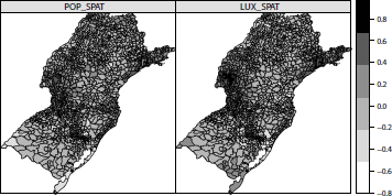
> spplot(shape,c("POP_SPAT","LUX_SPAT"), layout = c(2,1),
+ main = "Spatial Dependence", cuts=5, col.regions=grey.colors(50,1,0))
where layout is the parameter responsible for the number of graphical displays, main is the parameter of the figure title, cuts is the number of categories in the scale, and col.regions is the color scheme.
It is also possible to update the shapefile with the estimated prediction of the number of accidents for each category. Figure 5.21 shows that the model prediction is quite accurate for the number of accidents in each scenario.
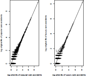
> par(mfrow=c(1,2))
> plot(log(shape@data$POP_PRED+1),log(shape@data$SIN_POP+1),
+ xlab="log pred #s of popular cars accidents",
+ ylab="log original #s of popular cars accidents",
+ main="log-predicted x log-accidents")
> abline(a=0,b=1)
> plot(log(shape@data$LUX_PRED+1),log(shape@data$SIN_LUX+1),
+ xlab="log pred #s of luxury cars accidents",
+ ylab="log original #s of luxury cars accidents",
+ main="log-predicted x log-accidents")
> abline(a=0,b=1)
Another interesting result is the logarithm of the accident risk rate, returned by the model. The relative accident risk is defined as
To plot the logarithm of the estimated posterior mean relative risk, use
> spplot(shape,c("POP_RR","LUX_RR"), layout = c(2,1),
+ main="Log relative risk by category", col.regions=grey.colors(50,1,0))
Figure 5.22 shows that the relative risk is higher for some specific areas. The higher risk municipality is the municipality of Cascavel, which has that have one of the most violent transits in Brazil with high rates of car robbery and accidents.

Log relative risk of the number of accidents for the popular and luxury vehicles per county.
5.9 Spatial Car Accident Insurance Shared Analysis
Previous results relied on separate analysis for each car category. Figure 5.20 shows that there is evidence of a common spatial trend in both categories. In this section we present an advanced spatial analysis, in which both categories are analyzed simultaneously. In this case, the statistical model assumes a joint spatial effect that is shared between the two car categories. Following the idea proposed by Knorr-Held & Best (2001), we propose the following model:
where, is the joint spatial component and
The other elements of the equation are similar to the ones presented in Section 11.4. Notice that there is one joint spatial random effect parameter, ψ, in model (5.4), and a second spatial effect parameter, ϕ , that captures spatial singularities of each category. All spatial effects are modeled using an ICAR structure. Due to the fact that the numbers of claims of popular and luxury cars are not on the same scale, there are many more claims for popular cars, it is necessary to include a parameter related to the variability in each category. Therefore, although both models share one spatial structure, the scale structure is different. Thus, the parameter S is responsible for re-scaling the variability between the car categories.
To perform the analysis using R-INLA, it is necessary to define properly the model, and the joint and individual random effects. Next, we define the model in which shared is the joint spatial component and shared.copy is the joint component of one car category:
> k <- 2
> n <- dim(shape@data)[1]
> Y <- matrix(NA, n, k)
> Y[1:n, 1] <- shape@data$SIN_POP
> Y[1:n, 2] <- shape@data$SIN_LUX
Create the shared list to store the data:
> share.dat <- list(Y=matrix(NA, nrow=n*2, ncol=2))
> share.dat$Y[1:n, 1] <- Y[,1]
> share.dat$Y[n+(1:n), 2] <- Y[,2]
Set the expected values:
> share.dat$E <- c(shape@data$E_POP,shape@data$E_LUX)
Now some code is necessary to prepare random effects:
> share.dat$shared <- c(1:n, rep(NA,n))
> share.dat$shared.copy <- c(rep(NA,n), 1:n)
> share.dat$spat.pop <- c(1:n, rep(NA,n))
> share.dat$spat.lux <- c(rep(NA,n), 1:n)
> share.dat$random.pop <- c(1:n, rep(NA,n))
> share.dat$random.lux <- c(rep(NA,n), 1:n)
Finally, include intercept and attributes information in the shared model:
> share.dat$alpha_POP <- rep(1:0, each=n)
> share.dat$alpha_LUX <- rep(0:1, each=n)
> share.dat$POP_POP <- c(shape@data$POP,rep(0,n))
> share.dat$POP_LUX <- c(rep(0,n),shape@data$POP)
> share.dat$HDI_POP <- c(shape@data$HDIM_00 ,rep(0,n))
> share.dat$HDI_LUX <- c(rep(0,n),shape@data$HDIM_00)
The share.dat variable contains all the required elements of the model. The formula of the model (5.4) is now written as
> f.shared <- Y ~ 0 + alpha_POP + POP_POP + HDI_POP +
+ alpha_LUX + POP_LUX + HDI_LUX +
+ f(shared, model="besag", graph="ngbINLA.graph") +
+ f(shared.copy, copy="shared", hyper=list(theta=list(fixed=FALSE,
+ param=c(1,1), range=c(0,Inf)))) +
+ f(spat.pop, model="besag", graph="ngbINLA.graph",
+ hyper=list(theta=list(initial=log(6.30),
+ param=c(0.5,0.0005)))) +
+ f(random.pop, model="iid", hyper=list(theta=list(initial=log(28.22),
+ param=c(0.5,0.0005)))) +
+ f(spat.lux, model="besag", graph="ngbINLA.graph",
+ hyper=list(theta=list(initial=log(4.83),
+ param=c(0.5,0.0005)))) +
+ f(random.lux, model="iid", hyper=list(theta=list(initial=log(11.65),
+ param=c(0.5,0.0005))))
where the f() function defines the random effects and the copy parameter provides the inla() function the information that there is one joint component that is shared by both categories. Initial values were set based on previous analysis, presented in Section 5.8. Then we can proceed calling the inla() function and run the analysis. This model takes a longer time to run due to its complex structure. The following command is used to run the model:
> m.shared <- inla(f.shared, family=rep("poisson", 2), data=share.dat, E=E,
+ control.inla=list(h=0.005),
+ control.compute=list(dic=TRUE, cpo=TRUE),
+ control.predictor= list(compute=TRUE,link=c(rep(1,n),rep(2,n))))
Next, we generate a summary of the results:
> summary(m.shared)
Call:
c("inla(formula = f.shared, family = rep("poisson", 2), data = share.dat,",
 "E = E, control.predictor = list(compute = TRUE, link = c(rep(1, ", " n),
rep(2, n))), control.inla = list(h = 0.005))")
Time used:
Pre-processing Running inla Post-processings Total
1170.4027 1167.6059 1.9053 0.8915
Fixed effects:
mean sd 0.025quant 0.5quant 0.975quant kld
alpha_POP -1.3064 0.3957 -2.0855 -1.3053 -0.5326 0
POP_POP 0.1057 0.0142 0.0780 0.1057 0.1338 0
HDI_POP -0.2142 0.5831 -1.3577 -0.2145 0.9311 0
alpha_LUX -1.2520 0.6334 -2.5008 -1.2498 -0.0156 0
POP_LUX 0.0637 0.0215 0.0217 0.0637 0.1059 0
HDI_LUX 0.2014 0.9212 -1.6006 0.1994 2.0147 0
Random effects:
Name Model
shared Besags ICAR model
spat.pop Besags ICAR model
random.pop IID model
spat.lux Besags ICAR model
random.lux IID model
shared.copy Copy
Model hyperparameters:
mean sd 0.025quant 0.5quant 0.975quant
Precision for shared 3.4007 0.5303 2.5158 3.3393 4.6404
Precision for spat.pop 103.1491 41.9399 40.4108 96.5179 205.4203
Precision for random.pop 97.3670 34.6254 43.2435 93.0040 179.4224
Precision for spat.lux 27.9985 13.9083 9.1927 25.3512 62.7788
Precision for random.lux 786.1263 986.4267 13.8756 441.9154 3452.4998
Beta for shared.copy 1.3596 0.0182 1.3248 1.3589 1.3981
Expected number of effective parameters(std dev): 476.52(27.80)
Number of equivalent replicates : 6.027
Marginal Likelihood: -26114.53
CPO and PIT are computed
Posterior marginals for linear predictor and fitted values computed
Results show that the population variable has a positive effect on the number of car claims for both categories in the same scale presented in Section 5.8. Similarly, the HDI variable has no significant effect on either category. These results are similar to previous results presented in Section 5.8, and possibly share the same interpretation. The precision estimate of the joint spatial effects is much higher than the precision estimate of the individual spatial effects. Therefore, it can be said that the joint spatial effects have captured the spatial variability of the data. Moreover, the precision estimate of the random effects for both popular and luxury cars is large, which indicates that there is no other important source of variability in the dataset.
One of the main interests in our proposed analysis is to observe the joint spatial pattern and to understand the effect of the individual spatial pattern of each category. Previous results show that the joint spatial effect is very strong; therefore, it can be concluded that both vehicle types share the same spatial structure with a slight variation difference of δ ≈ 1.36. To plot the shared spatial dependence first, obtain the spatial shared components from inla output:
> shape@data$SHARED_SPAT <- m.shared$summary.random$shared$mean
And now we can use spplot() to plot it:
> spplot(shape,"SHARED_SPAT", main = "Shared Spatial Dependence", cuts=5,
+ col.regions=grey.colors(50,1,0))
Figure 5.23 shows that Cascavel municipality and its surroundings is the region with higher risk. This results agrees with the analysis obtained in Figure 5.22 in the separate analysis.
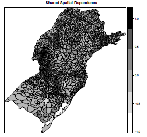
Nevertheless, we can fit separately the spatial models for each car category and the joint spatial model, and compare them in terms of prediction. Although the joint model is more complex and provides prediction for both categories, Table 5.1 shows that the joint model does not improve prediction. The separate models for each category present a smaller estimated mean absolute prediction, and therefore the separate analysis is more effective.
Mean estimated prediction error,
Model |
Category |
|
popular |
luxury |
|
Shared |
1.38 |
0.75 |
Popular |
1.25 |
- |
Luxury |
- |
0.62 |
The relative risk estimates of the joint model is very close to the estimates presented in Figure 5.22, and therefore were not presented. Finally, we can conclude that, for the analysis of the number of car claims, the joint analysis and the analysis with separate models achieved very similar results. The joint spatial model has the advantage of being a more complete model, and it presents the separate models as a special case. However, the model fit of the joint spatial model requires more expertise in terms of R computing language, and demands more computing time. Moreover, although there were no significant differences between the joint and the separate models using our dataset, results may be completely different for different datasets.
5.10 Conclusion
R provides a variety of packages to access, visualize, and fit spatial models. Most of these packages rely on the sp and maptools packages. These two packages can be considered as the standard packages in which geographical data bases can be read and manipulated. Recently, new R packages have been created providing new visualization tools and new models for spatial and spatial temporal analysis. In particular, the following packages: RgoogleMaps, plotKML, googleVis, among others, have integrated Rwith open resources from maps.google. As a result, the user can interact with the map in a friendly way, either by zooming in, zooming out, using the Google Street View™ application, or overlaying the map with Google online geographical databases such as roads and locations of hospitals. The R environment provides statistical maps but it does not provide interactive maps such as those provided by Google. Thus, we predict that new spatial packages will appear, further connecting R to external visualization resources. For example, we are currently investigating the SVG package as a potential language for building Web interactive maps.
Different from visualization tools, there have been an increasing number of new models for statistical analysis of spatial data. Packages such as rbugs and INLA provide a model building environment to run very sophisticated Bayesian spatial analysis using MCMC and Integrated Laplacian Approximations. We could only touch on the possibilities for spatial analysis in this chapter. We emphasized in the chapter the description of the sp package, which is the building block for all the others. We also showed some of the R capabilities for spatial analysis in actuarial science, focusing on Bayesian methods. Hopefully, the readers will find this useful as a first step in the widely varied and beautiful world of spatial analysis in R.