For years, iOS developers used the UITableView component to create a huge variety of interfaces. With its ability to let you define multiple cell types, create them on the fly as needed, and handily scroll them vertically, UITableView became a key component of thousands of apps. While Apple has increased the capability of table views with every major new iOS release, it’s still not the ultimate solution for all large sets of data. If you want to present data in multiple columns, for example, you need to combine all the columns for each row of data into a single cell. There’s also no way to make a UITableView scroll its content horizontally. In general, much of the power of UITableView came with a particular trade-off: developers have no control of the overall layout of a table view. You define the look of each individual cell, but the cells are just going to be stacked on top of each other in one big scrolling list.
In iOS 6, Apple introduced a new class called UICollectionViewaddressing these shortcomings. Similar to a table view, UICollectionView allows you to display a bunch of “cells” of data and handles functionality such as queuing up unused cells to use later. But unlike a table view, UICollectionView doesn’t lay these cells out in a vertical stack for you. In fact, UICollectionView doesn’t lay them out at all. Instead, UICollectionView uses a helper class to do layout.
Creating the DialogViewer Project
Let’s start by talking about UICollectionView. To show some of its capabilities, we’re going to use it to lay out some paragraphs of text. Each word will be placed in a cell of its own, and all the cells for each paragraph will be clustered together in a section. Each section will also have its own header. This may not seem too exciting, considering that UIKit already contains other perfectly good ways of laying out text. However, this process will be instructive anyway, since you’ll get a feel for just how flexible this thing is. You certainly wouldn’t get very far doing something like Figure 10-1 with a table view.
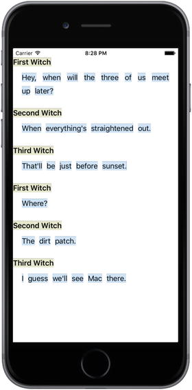
Figure 10-1. Each word is a separate cell, with the exception of the headers, which are, well, headers. All of this is laid out using a single UICollectionView, and no explicit geometry calculations of our own
In order to make this work, we’ll define a couple of custom cell classes, we’ll use UICollectionViewFlowLayout (the one and only layout helper class included in UIKit at this time), and, as usual, we’ll use our view controller class to make it all come together.
Use Xcode to create a new Single View Application, as you’ve done many times by now. Name your project DialogViewer and use the standard settings we’ve used throughout the book (set Language to Swift and choose Universal for Devices.). Open ViewController.swift and change its super class to UICollectionView:
class ViewController: UICollectionViewController { Open Main.storyboard. We need to set up the view controller to match what we just specified in ViewController.swift. Select the one and only View Controller in the Document Outline and delete it, leaving an empty storyboard. Now use the Object Library to locate a Collection View Controller and drag it into the editing area. If you examine the Document Outline, you’ll see that the collection view controller comes with a nested collection view. Its relation to the collection view is very much like the relationship between UITableViewController and its nested UITableView. Select the icon for the collection view controller and use the Identity Inspector to change its class to ViewController, which we just made into a subclass of UICollectionViewController. In the Attributes Inspector, ensure that the Is Initial View Controller check box is checked. Next, select the collection view in the Document Outline and use the Attributes Inspector to change its background color to white. Finally, you’ll see that the collection view has a child called Collection View Cell. This is a prototype cell that you can use to design the layout for your actual cells in Interface Builder, just like we have been doing with table view cells. We’re not going to do that in this chapter, so select that cell and delete it.
Defining Custom Cells
Now let’s define some cell classes. As you saw in Figure 10-1, we’re displaying two basic kinds of cells: a “normal” one containing a word and another that is used as a sort of header. Any cell you’re going to create for use in a UICollectionView needs to be a subclass of the system-supplied UICollectionViewCell class, which provides basic functionality similar to UITableViewCell. This functionality includes a backgroundView, a contentView, and so on. Because our two types of cell will have some shared functionality, we’ll actually make one a subclass of the other and use the subclass to override some of the functionality of the base class.
Start by creating a new Cocoa Touch class in Xcode. Name the new class ContentCelland make it a subclass of UICollectionViewCell. Select the new class’s source file and add declarations for three properties and a stub for a class method, as shown in Listing 10-1.
Listing 10-1. Our ContentCell Class Definition
class ContentCell: UICollectionViewCell {var label: UILabel!var text: String!var maxWidth: CGFloat!class func sizeForContentString(s: String,forMaxWidth maxWidth: CGFloat) -> CGSize {return CGSize.zero}}
The label property will point at a UILabel. We’ll use the text property to tell the cell what to display, the maxWidth property to control the cell’s maximum width. We’ll use the sizeForContentString(_:forMaxWidth:) method—which we’ll implement shortly—to ask how big the cell needs to be to display a given string. This will come in handy when creating and configuring instances of our cell classes.
Now add overrides of the UIView init(frame:) and init(coder:) methods, as shown in Listing 10-2.
Listing 10-2. Init Override Routines for Our Cell ContentCell Class
override init(frame: CGRect) {super.init(frame: frame)label = UILabel(frame: self.contentView.bounds)label.isOpaque = falselabel.backgroundColor =UIColor(red: 0.8, green: 0.9, blue: 1.0, alpha: 1.0)label.textColor = UIColor.black()label.textAlignment = .centerlabel.font = self.dynamicType.defaultFont()contentView.addSubview(label)}required init?(coder aDecoder: NSCoder) {super.init(coder: aDecoder)}
The code in Listing 10-2 is pretty simple. It creates a label, sets its display properties, and adds the label to the cell’s contentView. The only mysterious thing here is that it uses the defaultFont() method to get a font, which is used to set the label’s font. The idea is that this class should define which font will be used for displaying content, while also allowing any subclasses to declare their own display font by overriding the defaultFont() method. We haven’t created the defaultFont() method yet, so let’s do so:
class func defaultFont() -> UIFont {return UIFont.preferredFontForTextStyle(UIFontTextStyleBody)}
Pretty straightforward. This uses the preferredFontForTextStyle() method of the UIFont class to get the user’s preferred font for body text. The user can use the Settings app to change the size of this font. By using this method instead of hard-coding a font size, we make our apps a bit more user-friendly. Notice how this method is called:
label.font = self.dynamicType.defaultFont()The defaultFont() method is a type method of the ContentCell class. To call it, you would normally use the name of the class, like this:
ContentCell.defaultFont()In this case, that won’t work—if this call is made from a subclass of ContentCell (such as the HeaderCell class that we will create shortly), we want to actually call the subclass’ override of defaultFont(). To do that, we need a reference to the subclass’s type object. That’s what the expression self.dynamicType gives us. If this expression is executed from an instance of the ContentCell class, it resolves to the type object of ContentCell and we’ll call the defaultFont()method of that class; but in the HeaderCell subclass, it resolves to the type object for HeaderCell and we’ll call HeaderCell’s defaultFont() method instead, which is exactly what we want. To finish off this class, let’s implement the method that we added a stub for earlier, the one that computes an appropriate size for the cell, as shown in Listing 10-3.
Listing 10-3. Compute an Approximate Cell Size
class func sizeForContentString(s: String,forMaxWidth maxWidth: CGFloat) -> CGSize {let maxSize = CGSize(width: maxWidth, height: 1000.0)let opts = NSStringDrawingOptions.usesLineFragmentOriginlet style = NSMutableParagraphStyle()style.lineBreakMode = NSLineBreakMode.byCharWrappinglet attributes = [ NSFontAttributeName: defaultFont(),NSParagraphStyleAttributeName: style]let string = s as NSStringlet rect = string.boundingRect(with: maxSize, options: opts,attributes: attributes, context: nil)return rect.size}
The method in Listing 10-3 does a lot of things, so it’s worth walking through it. First, we declare a maximum size so that no word will be allowed to be wider than the value of the maxWidth argument, which will be set from the width of the UICollectionView. We also create a paragraph style that allows for character wrapping, so in case our string is too big to fit in our given maximum width, it will wrap around to a subsequent line. We also create an attributes dictionary that contains the default font we defined for this class and the paragraph style we just created. Finally, we use some NSString functionality provided in UIKit that lets us calculate sizes for a string. We pass in an absolute maximum size and the other options and attributes that we set up, and we get back a size.
All that’s left for this class is some special handling of the text property. Instead of letting this use an implicit instance variable as we normally do, we’re going to define methods that get and set the value based on the UILabel we created earlier, basically using the UILabel as storage for the displayed value. By doing so, we can also use the setter to recalculate the cell’s geometry when the text changes. Replace the definition of the text property in ContentCell.swift with the code in Listing 10-4.
Listing 10-4. The Text Property Definition in the ContentCell.swift File
var label: UILabel!var text: String! {get {return label.text}set(newText) {label.text = newTextvar newLabelFrame = label.framevar newContentFrame = contentView.framelet textSize = self.dynamicType.sizeForContentString(s: newText,forMaxWidth: maxWidth)newLabelFrame.size = textSizenewContentFrame.size = textSizelabel.frame = newLabelFramecontentView.frame = newContentFrame}}
The getter is nothing special; but the setter is doing some extra work. Basically, it’s modifying the frame for both the label and the content view, based on the size needed for displaying the current string.
That’s all we need for our base cell class. Now let’s make a cell class to use for a header. Use Xcode to make another new Cocoa Touch class, naming this one HeaderCell and making it a subclass of ContentCell. Let’s open HeaderCell.swift and make some changes. All we’re going to do in this class is override some methods from the ContentCell class to change the cell’s appearance, making it look different from the normal content cell, as shown in Listing 10-5.
Listing 10-5. The HeaderCell Class
class HeaderCell: ContentCell {override init(frame: CGRect) {super.init(frame: frame)label.backgroundColor = UIColor(red: 0.9, green: 0.9,blue: 0.8, alpha: 1.0)label.textColor = UIColor.black()}required init?(coder aDecoder: NSCoder) {super.init(coder: aDecoder)}override class func defaultFont() -> UIFont {return UIFont.preferredFont(forTextStyle: UIFontTextStyleHeadline)}}
That’s all we should have to do to give the header cell a distinct look, with its own colors and font .
Configuring the View Controller
Select ViewController.swift and start by declaring an array to contain the content we want to display, as shown in Listing 10-6.
Listing 10-6. Our Content to Be Displayed— Place This in the ViewController.swift File
private var sections = [["header": "First Witch","content" : "Hey, when will the three of us meet up later?"],["header" : "Second Witch","content" : "When everything's straightened out."],["header" : "Third Witch","content" : "That'll be just before sunset."],["header" : "First Witch","content" : "Where?"],["header" : "Second Witch","content" : "The dirt patch."],["header" : "Third Witch","content" : "I guess we'll see Mac there."]]
The sections array contains a list of dictionaries, each of which has two keys: header and content. We’ll use the values associated with those keys to define our display content.
Much like UITableView, UICollectionView lets us register the class of a reusable cell based on an identifier. Doing this lets us call a dequeuing method later on, when we’re going to provide a cell. If no cell is available, the collection view will create one for us—just like UITableView. Add this line to the end of the viewDidLoad() method to make this happen:
self.collectionView?.register(ContentCell.self, forCellWithReuseIdentifier: "CONTENT")Since this application has no navigation bar, the content of the main view will be visible beneath the status bar. To prevent that, add the following lines to the end of viewDidLoad():
var contentInset = collectionView!.contentInsetcontentInset.top = 20collectionView!.contentInset = contentInset
That’s enough configuration in viewDidLoad() for now. Before we get to the code that populates the collection view, we need to write one little helper method. All of our content is contained in lengthy strings, but we’re going to need to deal with them one word at a time to be able to put each word into a cell. So let’s create an internal method of our own to split those strings apart. This method takes a section number, pulls the relevant content string from our section data, and splits it into words :
func wordsInSection(section: Int) -> [String] {let content = sections[section]["content"]let spaces = NSCharacterSet.whitespacesAndNewlineslet words = content?.components(separatedBy: spaces)return words!}
Providing Content Cells
Now it’s time to create the group of methods that will actually populate the collection view. These next three methods are all defined by the UICollectionViewDataSource protocol, which is adopted by the UICollectionViewController class. The UICollectionViewController assigns itself as the data source of its nested UICollectionView, so these methods will be called automatically by the UICollectionView when it needs to know about its content.
First, we need a method to let the collection view know how many sections to display:
override func numberOfSections(in collectionView: UICollectionView) -> Int {return sections.count}
Next, we have a method to tell the collection how many items each section should contain. This uses the wordsInSection() method we defined earlier:
override func collectionView(_ collectionView: UICollectionView, numberOfItemsInSection section: Int) -> Int {let words = wordsInSection(section: section)return words.count}
Listing 10-7 shows the method that actually returns a single cell, configured to contain a single word. This method also uses our wordsInSection() method. As you can see, it uses a dequeuing method on UICollectionView, similar to the one in UITableView. Since we’ve registered a cell class for the identifier we’re using here, we know that the dequeuing method always returns an instance:
Listing 10-7. Setting up the Collection View Cell
override func collectionView(_ collectionView: UICollectionView, cellForItemAt indexPath: IndexPath) -> UICollectionViewCell {let words = wordsInSection(section: indexPath.section)let cell = collectionView.dequeueReusableCell(withReuseIdentifier: "CONTENT", for: indexPath) as! ContentCellcell.maxWidth = collectionView.bounds.size.widthcell.text = words[indexPath.row]return cell}
Judging by the way that UITableView works, you might think that at this point we’d have something that works, in at least a minimal way. Build and run the app. You’ll see that we’re not really at a useful point yet, as shown in Figure 10-2.
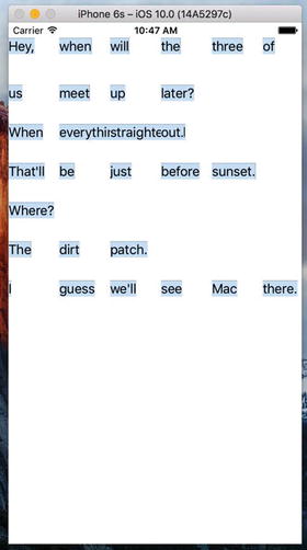
Figure 10-2. Not quite what we’re looking for…yet
We can see some of the words, but there’s no “low” going on here. Each cell is the same size, and everything is all jammed together. The reason for this is that we have some collection view delegate responsibilities we have to take care of to make things work.
Creating the Layout Flow
Until now, we’ve been dealing with the UICollectionView, but this class has a sidekick that takes care of the actual layout. UICollectionViewFlowLayout, which is the default layout helper for UICollectionView, includes delegate methods of its own that it will use to try to pull out more information from us. We’re going to implement one of these right now. The layout object calls this method for each cell to find out how large it should be. Here we’re once again using our wordsInSection() method to get access to the word in question, and then using a method we defined in the ContentCell class to see how large it needs to be.
When the UICollectionViewController is initialized, it makes itself the delegate of its UICollectionView. The collection view’s UICollectionViewFlowLayout will treat the view controller as its own delegate if it declares that it conforms to the UICollectionViewDelegateFlowLayout protocol. The first thing we need to do is change the declaration of our view controller in ViewController.swift so that it declares conformance to that protocol:
class ViewController: UICollectionViewController,UICollectionViewDelegateFlowLayout {
All of the methods of the UICollectionViewDelegateFlowLayout protocol are optional and we only need to implement one of them. Add the method in Listing 10-8 to ViewController.swift.
Listing 10-8. Resizing the Cells Using the UICollectionViewDelegateFlowLayout Protocol
func collectionView(collectionView: UICollectionView,layout collectionViewLayout: UICollectionViewLayout,sizeForItemAtIndexPath indexPath: NSIndexPath) -> CGSize {let words = wordsInSection(indexPath.section)let size = ContentCell.sizeForContentString(words[indexPath.row],forMaxWidth: collectionView.bounds.size.width)return size}
Now build and run the app again. You’ll see that we’ve taken a step forward, as shown in Figure 10-3.
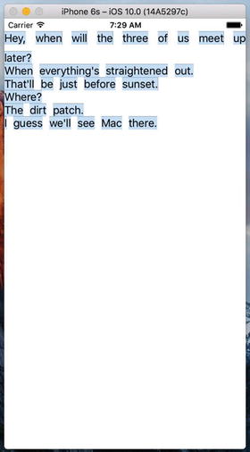
Figure 10-3. Our paragraph flow begins taking shape
You can see that the cells are now flowing and wrapping around so that the text is readable, and that the beginning of each section drops down a bit. But each section is jammed really tightly against the ones before and after it. They’re also pressing all the way out to the sides, which doesn’t look too nice. Let’s fix that by adding a bit more configuration. Add these lines to the end of the viewDidLoad() method:
let layout = collectionView!.collectionViewLayoutlet flow = layout as! UICollectionViewFlowLayoutflow.sectionInset = UIEdgeInsetsMake(10, 20, 30, 20)
Here we’re grabbing the layout object from our collection view. We assign this first to a temporary variable, which will be inferred to be of type UICollectionViewLayout. We do this primarily to highlight a point: UICollectionView only knows about this generic layout class, but it’s really using an instance of UICollectionFlowLayout, which is a subclass of UICollectionViewLayout. Knowing the true type of the layout object, we can use a typecast to assign it to another variable of the correct type, enabling us to access properties that only that subclass has. In this case, we use the sectionInset property to tell the UICollectionViewLayout to leave some empty space around each item in the collection view. In our case, that means that there will now be a little space around every word, as you’ll see if you run the example again (see Figure 10-4).
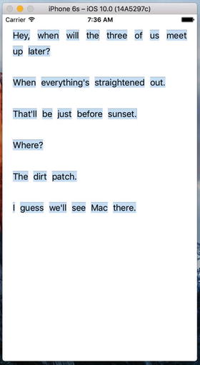
Figure 10-4. Things are much less cramped
Implementing the Header Views
The only thing missing now is the display of our header objects, so it’s time to fix that. You will recall that UITableView has a system of header and footer views, and it asks for those specifically for each section. UICollectionView has made this concept a bit more generic, allowing for more flexibility in the layout. The way this works is that, along with the system of accessing normal cells from the delegate, there is a parallel system for accessing additional views that can be used as headers, footers, or anything else. Add this bit of code to the end of viewDidLoad() to let the collection view know about our header cell class:
self.collectionView?.register(HeaderCell.self,forSupplementaryViewOfKind: UICollectionElementKindSectionHeader,withReuseIdentifier: "HEADER")
As you can see, in this case we’re not only specifying a cell class and an identifier, but we’re also specifying a “kind.” The idea is that different layouts may define different kinds of supplementary views and may ask the delegate to supply views for them. UICollectionFlowLayout is going to ask for one section header for each section in the collection view, which we’ll supply, as shown in Listing 10-9.
Listing 10-9. Getting Our Header Cell View
override func collectionView(_ collectionView: UICollectionView, viewForSupplementaryElementOfKind kind: String, at indexPath: IndexPath) -> UICollectionReusableView {if (kind == UICollectionElementKindSectionHeader) {let cell =collectionView.dequeueReusableSupplementaryView(ofKind: kind, withReuseIdentifier: "HEADER",for: indexPath) as! HeaderCellcell.maxWidth = collectionView.bounds.size.widthcell.text = sections[indexPath.section]["header"]return cell}abort()}
Note the abort() call at the end of this method. This function causes the application to terminate immediately. It’s not the sort of thing you should use frequently in production code. Here, we only expect to be called to create header cells and there is nothing we can do if we are asked to create a different kind of cell—we can’t even return nil, because the method’s return type does not permit it. If we are called to create a different kind of header, it’s a programming error on our part or a bug in UIKit.
Build and run. You’ll see… wait! Where are those headers? As it turns out, UICollectionFlowLayout won’t give the headers any space in the layout unless we tell it exactly how large they should be. So go back to viewDidLoad() and add the following line at the end:
flow.headerReferenceSize = CGSize(width: 100, height: 25) Build and run once more. You’ll see the headers in place, as Figure 10-1 showed earlier and Figure 10-5 shows again.
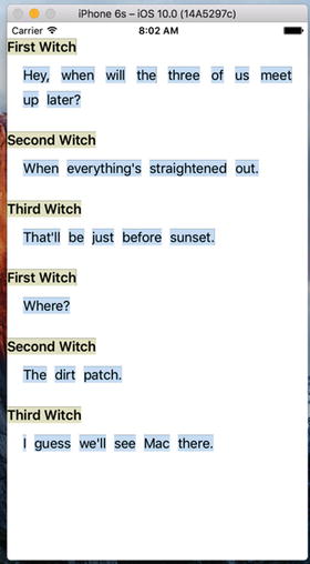
Figure 10-5. The completed DialogViewer app
Summary
In this chapter, we’ve really just touched on UICollectionView and what can be accomplished with the default UICollectionFlowLayout class. You can get even fancier with it by defining your own layout classes, but that is a topic for another book.
Stack Views are something else you should look into when considering applications using Collection Views. They may offer an alternative approach that could save you time. As this book is tending to get larger and larger with the new Swift, Xcode and iOS features, I’m leaving Stack Views as an exercise for the reader.