
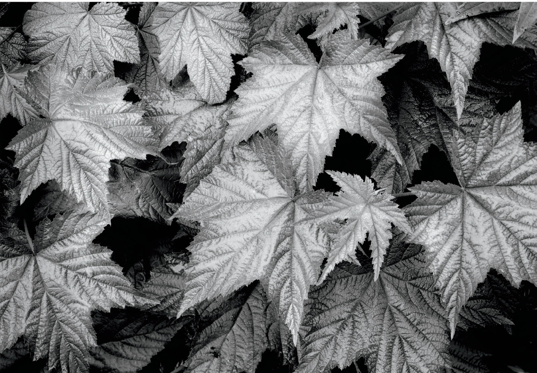
Figure 2-1: Leaves, Big 4 Mountain Trail, Washington
Trailside leaves produce a rhythmic mix of metallic forms, interspersed with deep black holes (the spaces between the leaves) that have interesting shapes themselves, serving as negative space to the positive space of the leaves. There is no center of interest. Rather, there is a pattern, keeping the eye moving within the image.
CHAPTER 2
What Is Composition?
![]()
BEFORE MOVING ON, it would be worthwhile to study your photographs slowly while considering the questions posed in the first chapter, in order to better evaluate your own work. I feel that such an evaluation is extremely valuable and should be done periodically. Assuming that you have already done so, questions arise as to the most effective methods of conveying your thoughts photographically. The most effective technique, it turns out, varies from scene to scene and from artist to artist. No overall rule can be made. Indeed, art is devoid of rules.
One statement can be made concerning any artistic effort: it must possess good composition. Whether the subject is a fine portrait, a panoramic landscape, a slum alley, a studio tabletop arrangement, or anything else, only with good composition will it achieve meaning and importance. (In fact, this can be extended to all other art forms, including visual and nonvisual forms. After all, even music requires good composition!)
But, you may ask, what is good composition? What, in fact, is composition? The term is constantly used, seldom defined or discussed, rarely understood, yet never questioned. Try to define composition, and you will see how difficult it is.
My dictionary defines it as “an arrangement of the parts of a work of art so as to form a unified, harmonious whole.” This is an excellent beginning. “A unified, harmonious whole.” That is the key phrase. If photography is your means of self-expression, then composition must be the vehicle with which you express yourself clearly, concisely, and smoothly. Composition is the means of bringing viewers into your photograph and holding their attention long enough to read your commentary and define their own feelings.
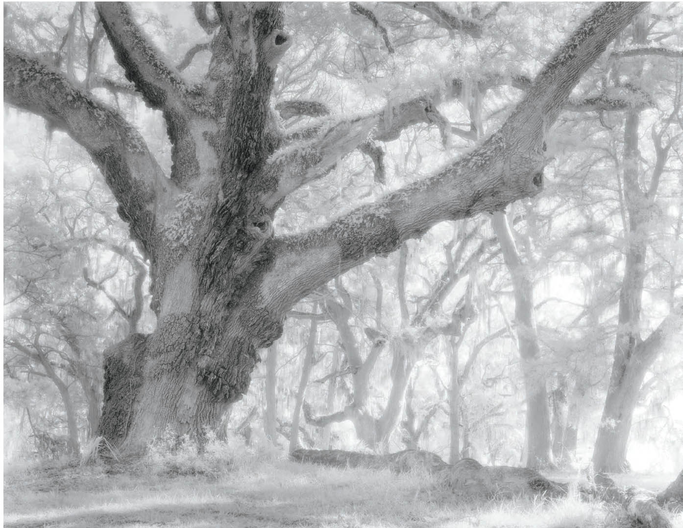
Figure 2-2: Oak Tree, Sapelo Island
The immense oak tree is clearly the center of interest. Background trees form a rhythmic counterpoint.
We will delve into the dictionary definition more deeply, but first we need a short physiological description of the human visual process in order to apply the definition to photography.
How the Human Eye Sees
The eye does not see whole vistas at once. It views the world in small chunks, then puts the pieces together to form the complete picture. The angle of sharp vision is extremely small, only about three radial degrees. To see for yourself what this means, try the following: Hold your arm straight out with your hand bent upward and your fingers spread (as if your palm were held against a wall in front of you). You are looking at the back of your hand at arm’s length. Now, look at your thumbnail. As you do so, you will see that your little finger is out of focus! You will have to move your eyes in order to see your little finger sharply. Yet it is not very far from your thumb, even with your fingers spread. In fact, all of your other fingers are out of focus as well, indicating the limits of sharp vision.
With the eye able to see only small bits sharply at any moment, it must move about speedily to view the entire scene. It does not do so in an organized fashion like a TV scanner. Instead, it darts about randomly, up and down, side to side, picking out bits and pieces here and there, and sending these tidbits back to the brain at a furious pace. The brain processes this random data and puts it all together, like a mosaic or a jigsaw puzzle. While studying the scene the eye stops momentarily at prominent objects and sees them with real clarity, filling in the rest in a rather fuzzy manner. Thus, the eye does not perceive the whole scene with uniform sharpness or interest.
The term “random” is used loosely here, for when the eye stops momentarily at objects of greater interest, that is not purely random. However, I will use the term “random” to indicate that the eye’s movements are not preprogrammed like a TV or image scanner, but that the eye responds uniquely to each scene, never searching through two different scenes in precisely the same way.
We all see this way. Researchers have proven it and confirmed it more than once. It is a physiological fact. You can’t fight it!
With this in mind, let’s return to the discussion of composition and define it as follows: Good composition is the artist’s way of directing the viewer’s vision in a planned, derandomized fashion.
When a photograph is well composed, viewers first see the elements that the artist wants them to see most prominently and remember longest. Next, they notice the elements of secondary importance, and finally the elements of subordinate interest. With good composition, the artist leads viewers through the photograph in a controlled manner. Sometimes it may be bringing out interesting relationships that catch the viewer’s eye, perhaps a relationship that exists only from one point of view. There is nothing haphazard about a well-composed photograph (just as there is nothing haphazard about a well-composed musical score, a well-constructed novel, play, or movie or any other well-composed work of art). Composition is the artist’s way of bringing order into a nonordered world. In essence, this is what the dictionary definition calls for.
This definition helps explain why a magnificent scene often fails to translate into a fine photograph. The scene may be quite complex. The eye accepts this, darting about and selecting the most important bits of information, then filling in the rest. But a photograph or any other work of visual art must organize that information. If it fails to do so, the viewer’s eye roams about aimlessly, unable to find the artist’s statement because there is none. The scene has not been composed, but merely selected. The photograph is not a work of art, but merely a recording of the scene with one critical defect: it lacks the presence of the real scene.
There is a very real difference between “seeing” and “photographic seeing.” An individual may recognize and appreciate an interesting scene, but may not be able to organize it into an effective photograph. Only those individuals who can bring out an unusual, easily overlooked, worthwhile set of relationships from within a scene can be said to “see photographically.” Understanding composition and applying it separates the artists from the snapshooters. A single, interesting object of exceptional visual power may sometimes be enough to produce a wonderful image, but rarely. Usually it is the relationships of lines, forms, colors, etc. that create the exceptional compositions and the most insightful photographs. The savvy photographer looks at all parts of the intended image to uncover hidden relationships that produces the extraordinary image; she rarely confines her seeing to a single object of interest.
There are two aspects of good composition that are of prime importance. The concept of a unified thought is one; simplicity is the other. The two are strongly interrelated.
![]() With good composition the artist leads the viewer through the photograph in a controlled manner.
With good composition the artist leads the viewer through the photograph in a controlled manner.
Unified Thought
The term “unified thought” comes from the dictionary definition of composition referred to earlier as “a unified, harmonious whole.” It means that all the elements of the photograph work together. In other words, a central concept underlies the photograph (figure 2-1). This concept often translates to the somewhat narrower concept of a center of interest. Let’s differentiate between a center of interest and a unified thought through the use of two examples.
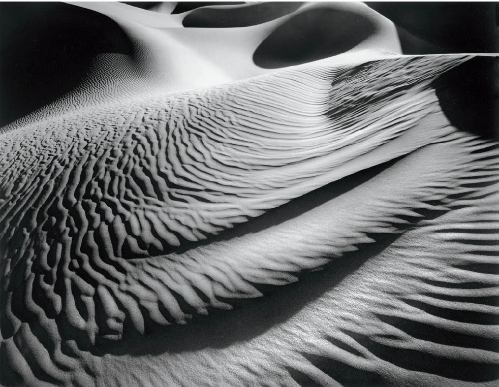
Figure 2-3: Wings and Bubbles, Death Valley Dunes
There is no center of interest in this pattern of sand, with echoes of the same forms repeating themselves from the bottom of the image upward, and an array of nearly circular shadows in the background above them. It is the pattern that creates a unifying thought for this image, though the eye does not go to any singular point within the image as a center of interest.
The first photograph shows a huge oak tree with an array of more distant trees beyond (figure 2-2). An effective photograph of an old giant like this could have been made by isolating it against the sky rather than against a background of other trees. Even against a background of trees, it is so dominant as to clearly draw your attention, with the background trees obviously subordinate. Such isolation or obvious dominance focuses the viewer’s attention on the tree. It is clear that the tree is the subject under consideration and the thing to be studied. It is the center of interest.
Suppose, however, the subject is sand. How do you photograph something as potentially dull as sand, and how do you create a mood? One answer is to find an interesting pattern of sand, such as on the beach as a high tide is receding or on sand dunes, particularly after wind has molded them into compelling forms (figure 2-3). You wouldn’t find this in a children’s sand box or on a heavily trodden, popular sandy beach on a warm summer day.
If you concentrate on a unifying thought, your photographs will be cohesive. It is the visual equivalent of speaking on a topic without rambling aimlessly toward peripheral issues. Just beware of allowing the definition of a “unified thought” to become too broad. It’s easy to say, “The countryside is the unifying thought” as justification for shooting everything in sight!
Simplicity
For the beginner, simplicity is a necessity. The simpler the composition, the more likely he or she is to maintain control and direct the viewer’s attention to the important elements (figure 2-4). It is equally true for the intermediate or advanced photographer, though with increased experience and sophistication he is able to simplify and control progressively more complex situations. This is true of painters and sculptors as well as photographers—and of all other visual artists. It is even true of composers, with the modification that the concept applies to listeners rather than viewers.
The importance of simplicity cannot be stressed too strongly. Over the years, I have observed that most unsuccessful photographs fail because they are too complicated rather than too simple (assuming they are technically competent, of course). The photographer is unable to elucidate his thoughts clearly and concisely, and the resulting photograph illustrates his uncertainty and lack of direction. In some cases, this may produce exactly the desired effect, but in most cases it will not.
Look at your own prints and ask yourself what your goal was in each one. Can you distill the answer down to a clear comment? Try it. Put the book down and analyze several of your photographs as if they were someone else’s work. Try to be objective. A rambling answer to the key question usually indicates a photograph filled with ambiguity. Is it clear, concise, and basically simple, or is it complicated, unclear, confused, or just unimportant? Then again, are you actively trying to express ambivalence or ambiguity, or trying to create complexity or confusion? If so, you may need to alter your approach significantly to best achieve your goals. Be aware of your intent, and state it simply and clearly, even if your intended statement is, “I am confused!” That may seem contradictory at first reading, but it is not.
At the start of this chapter, I suggested looking through your prints slowly while considering the thoughts in chapter 1. I am doing the same thing again here. While this may seem redundant, I urge you to try it. If you have committed yourself to take the time to read this book, make your commitment worthwhile by relating what you read to your own photography. This process will also help you tune in to a better understanding of yourself, your goals, and your methods.
Expressing Your Own Point of View
Implicit in this questioning of your own images and their specific goals is the deeper question of whether or not your own point of view is visible. Without a point of view, there will always be ambiguity in the image that cannot be overcome by simplicity and unity alone. School graduation portraits are perfect examples. There is no commentary or point of view by the photographer. Each student marches in, puts on the appropriate robe, poses properly, and marches out. The photographer does not know the student, has no time to become acquainted with the student, and has no interest in the student, anyway. The result, predictably, is of no great moment. It’s a face. It’s simple and unified, but it is artistically lacking.

Figure 2-4: Pentstemon, Little Death Hollow
In one of the many side canyons of Utah’s Escalante River, a group of pentstemon flowers in soft sunlight stand out against the background of an overhanging canyon wall. The pentstemon are the obvious center of interest, for there is nothing in the image that competes with them for attention. An even simpler composition could have featured just one single plant, but the repetition of slightly arched flower stalks makes for greater interest, while still maintaining a very simple composition.
On a more sophisticated level, an attempt at enlightening portraiture will fail unless there is some rapport between the photographer and the subject (and if not rapport, at least some meaningful contact or strong prior feelings). The photographer should know the subject, have some interest in and some opinions about the subject, and try to convey those elements of the subject’s personality that strike him most strongly (figure 2-5). In some cases, the photographer must rely heavily on initial impressions, for it is not often possible to spend sufficient time with a subject to know them thoroughly.
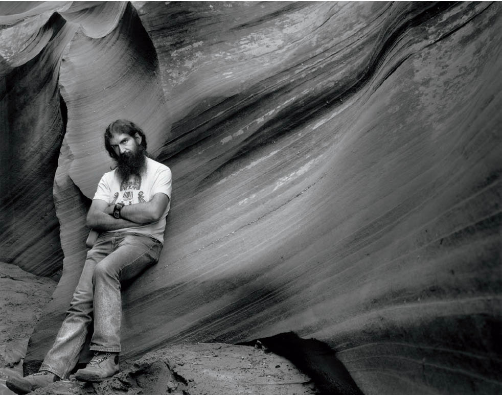
Figure 2-5: Stu Levy in Waterholes Canyon
Stu is a good friend, a wonderful physician, a penetrating thinker, and a fine photographer. During a workshop we co-instructed, I asked to do his portrait. I wanted to show him in an environmental setting that suits him as much as his medical office.
Lack of sufficient time is a typical problem bedeviling all fields of photography. After all, how often have you been on a vacation, wanting to make one more photograph, but your friends, family or relatives were trying to rush you along? That’s a problem, but some photographers have thrived under the time constraints. Henri Cartier-Bresson did not spend weeks on a particular street prior to photographing an event there. Yousuf Karsh was unable to spend days with Winston Churchill before making his famous portrait. Ansel Adams tells of working with exceptional haste when photographing Moonrise, Hernandez, New Mexico. A quick impression is often all that a photographer can gain of his subject, and thus his perceptions and definitions must be quick and precise.
Surprisingly, this is true even if the subject is supposedly nonmoving, such as a landscape, because the lighting and other conditions always change—sometimes with astonishing quickness! A landscape is an ever-changing situation, and the photographer can rarely analyze the scene leisurely; but he or she must analyze it nonetheless. If you can quickly define your own reaction, determine how you want to convey that reaction, and go about composing the photograph with simplicity and unity of thought, you have a good chance of communicating your thoughts successfully.
Edward Weston defined good composition as “the strongest way of seeing.” Some people dislike that definition because it doesn’t offer a handle on how to compose. Yet it is a remarkable definition. It specifically avoids rules of composition and purposely relates composition to seeing. It talks about “strength of seeing,” or in other words, the art of creating a strong visual statement. I believe that Weston would fully agree that simplicity and unity go a long way toward imparting strength to a photograph.
Simplicity vs. Complexity
Other thoughts run quite contrary to those just discussed, and it would be worthwhile to air them, if only briefly. A good deal of contemporary thought claims that today’s world is complex, dissonant, fragmented, and brutal. Since art mirrors society, it would be remiss and even absurd to renounce these elements in favor of outdated concepts of simplicity and harmony. Just as ambiguity may be better expressed by contrary principles, so too should these aspects of life.
Such thoughts point to a radically different approach, and surely a valid one. It is not my approach, but it may be yours. It depends largely on your point of view, and to a lesser degree on your subject matter. Personally, I feel that a visual representation of even the most complex, confusing, and inharmonious subject should possess inherent simplicity and unity to achieve maximum effect—just as an incisive statement has greater impact than a long, rambling speech. To depict discord and complexity by means of still more discord and complexity strikes me as useless, for it merely declares the world a mess without shedding any light on it.
Furthermore, those elements which are certainly an unfortunate part of today’s world are not new at all. They have always been there. When was civilization not plagued by hatred, cruelty, war, contradictions, insurmountable problems, and unexpected disasters? Art can illuminate this perplexing and imperfect world by isolating portions of it in an understandable way. Simplicity and unity appeal to me as the most easily understood approach and the one possessing the greatest impact. Yet I must add that this approach is valid for me in most cases, but not all.
I feel that some amount of dissonance, complexity, or ambiguity can be meaningful or tolerable, but that in undiluted doses they serve no enlightening purpose. Then again, is art supposed to be enlightening? Perhaps. Perhaps not. I feel it should be, but your conclusion is a matter of personal choice. The question itself brings us to the most basic of all questions concerning art: “What is art?” An attempt to answer that question can be as elusive as grabbing a cloud. Despite the near impossibility of articulating a sensible answer, we can rely on the fact that every person has his or her own opinions, his or her strong likes and dislikes, and his or her own limits. It always boils down to the often-expressed phrase, “I don’t know what’s good, but I know what I like!” I feel that art should provide satisfying visual distillations of real or imagined worlds. For me, unity and simplicity are satisfying, whereas confusion and dissonance are relatively dissatisfying.
Another thought concerns the concept of simplicity alone and challenges its esteemed position rather effectively. This concept maintains that complexity is not only important, but also essential to any great work of art. By way of illustration, Beethoven’s Ninth Symphony is regarded as a greater work than “Twinkle, Twinkle Little Star” primarily because of its greater complexity, despite the fact that the latter is a rather “perfect” and pleasant tune. I endorse this thought completely.
That may seem to contradict some of the thoughts in the previous pages of this chapter, but the apparent contradiction can be easily explained. The Ninth Symphony is indeed highly complex, but Beethoven’s consummate mastery of music kept it under control at all times. A lesser composer could not have achieved such control. Beethoven harnessed the complexity and the dynamics. In a similar fashion, a photographer with a mastery of the medium can control greater complexity than a beginner. By striving for simplicity, the beginner can produce worthwhile photographs at the outset and then work toward gaining control over ever more complex compositions as his understanding of the medium—and his confidence in himself—grows. In doing so, he will probably create ever more meaningful images. I feel that complexity is essential to great art, but that it must be controlled.
A final thought that I want to consider is the concept of almost uncontrolled complexity as a core of artistic expression. Consider the paintings of Jackson Pollock, who is highly regarded among art critics. His paintings cannot be considered simple, though they can be viewed as unified in that the eye repeatedly finds the same elements as it travels through them. Scientific analysis of his paintings indicates that there may be an underlying fractal character to them—meaning that as you view smaller and smaller sections of the painting, you continue to find similar structures. This is fascinating from both a scientific and artistic aspect. Yet I must admit, Pollock’s paintings say nothing to me. I find them messy, formless, and utterly lacking in interest. I disagree with most of the critics, but that’s my right. You have to make up your own mind on such issues.
I have several photographs that are not easily seen or comprehended at first. One that I title “Camouflage” is almost like a Jackson Pollock painting, intended to have the objects of interest hidden from view (figure 2-6). Another, “The Beggar Woman” (figure 2-7), features a center of interest that is so small (the woman sitting and begging at the cathedral doorway) that the viewer hardly notices her at first. But once noticed, she immediately becomes the center of interest.
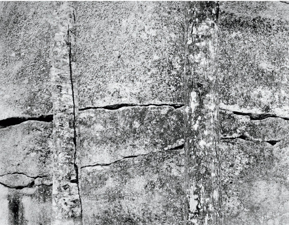
Figure 2-6: Camouflage
This is, perhaps, the closest thing I’ve produced to a Jackson Pollack painting. Can you decipher what it is? Did you see it immediately, or did it take some time?
I have brought up these points so you can think about them, incorporate them when appropriate to your way of seeing and thinking, and discard them when inappropriate. This process should become part of your own philosophical approach to photography. Photography is not simply the act of picking up a camera, pointing it at something, and pressing the shutter. It is a process of thoughtful consideration of your own point of view overlaid upon the scene. It requires creative thinking, which is not easy. The ideas expressed here are simply a means of stimulating further thought and creativity on your part.
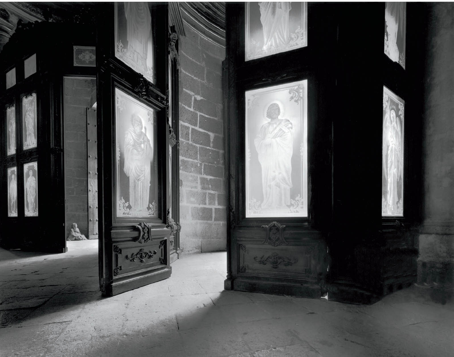
Figure 2-7: The Beggar Woman
From inside the Cathedral in Oaxaca, Mexico, I saw the beggar sitting on the stone entryway beyond the frosted etched glass panels. While heart-wrenching, there was a compositional unity created by the strong lines of the light pouring into the cathedral. Yet the beggar is the center of interest, but you don’t see her initially. She’s too small to be seen immediately. Once discovered, the image takes on a different character.