Chapter 1. Introducing Power BI
David is the manager of budgeting at Contoso, a company that sells electronic products worldwide through several retail shops and a website. Around the globe, country/region managers are responsible for producing figures for next year’s budget for their respective countries/regions, which David then aggregates to produce the big picture to show to his boss.
Our scenario begins in October 2015, when David commences working on the budget for 2016. As always, David has a Microsoft Excel workbook containing the relevant information to produce the budget. Based on the results of the workbook, he would typically create a Microsoft PowerPoint presentation to share the results during internal meetings. This year, however, David wants to take advantage of the new Power BI service provided by Microsoft.
This entire book is a journey that we’ll take along with David as he discovers how Power BI can help to build a rather sophisticated reporting solution; in this case, based on a budgeting system. But because this book is about Power BI, not budgeting, we will not focus on the complexity of building a budget. Instead, we will keep the budgeting considerations fairly basic, focusing on the complexity of teamwork, data modeling, and reporting.
We provided all the workbooks and databases that we used to build the demonstrations in the companion content for this book. If you are interested in learning the basics of Power BI, you can replicate David’s activities on your computer so that you can augment your learning experience by following the examples. Be aware, though, that the results you obtain by running the demonstrations might be slightly different, and the appearance of webpages and the user interface might not be identical, either. Power BI is evolving very quickly, and we tried our best to show examples that will last some time. Nevertheless, differences might occur; thus, you should concentrate on learning the features of Power BI, not the demonstrations. So, even if the numbers end up being different, what’s important is to absorb how to do something, not just replicate what you read in the book.
Moreover, we strongly encourage you to test Power BI using your own data. You can perform the same operations on your personal information that we describe in the book, thus reaping the combined benefits of learning the Power BI tools while simultaneously gaining insights into your data.
Getting started with Power BI
Any journey begins with the first step, so let’s take that step together.
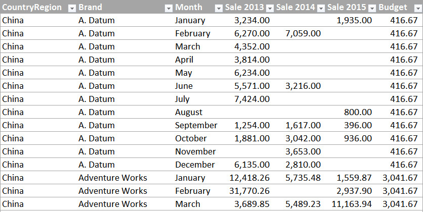
David obtained from IT an Excel report that contains the sales for the past three years, divided by country/region, brand, and month. Sales in Contoso are strongly brand-oriented, and some brands are prone to seasonal effects that David wants to take into account. For this reason, he uses data grouped by month. Figure 1-1 shows a small portion of the resulting data, which he stores in an Excel file. If you would like to become more familiar with David’s data, you can open 2015 Sales.xlsx from the book’s companion content.

Every year, David makes some considerations on these numbers and then he shares his findings with the country/region managers, who then send back to him workbooks with their numbers for the next year. Figure 1-1 shows some data from China, but there are several other countries/regions, as well. During the process of computing those numbers, there are many meetings and discussions in which the managers bring their experience and knowledge to bear on the process, adding their own versions of the original workbooks, each displaying various charts and calculations, which must all be explained to others. This is a daunting task, to be certain, and one that David would like to streamline.
Fortunately, David heard about an interesting tool called Power BI that Microsoft created in 2015 that might be helpful toward creating a collaborative environment in which any stakeholder of the budgeting process can share his findings with others, working together on the goal. But, at this point, the name and maybe a marketing video is all that David knows about Power BI.
Driven by curiosity, he navigates to www.powerbi.com and starts down his learning path. Figure 1-2 depicts the welcome page of the Power BI website.

To begin, David clicks the Get Started Free button. He is then offered a choice as to which experience he would prefer to use: he can choose either Power BI Desktop For Windows or just Power BI, as shown in Figure 1-3.

Actually, there is very little difference between the two. In fact, Power BI Desktop and Power BI are two sides of the same coin: Power BI Desktop is a Windows application running on your PC, whereas Power BI is a cloud service that you use through the web browser. In both cases, you will be able to perform the same operations, albeit with some subtle differences. Moreover, the two tools complement each other, and you are likely to use both to build your dashboards.
After reading the descriptions, David correctly concludes that Power BI Desktop is designed for more advanced tasks. Given that he’s just beginning to learn about it, he opts for plain, vanilla Power BI.
When David clicks the Sign Up button, the screen shown in Figure 1-4 appears. Power BI is a web service to which you can upload data and build insightful dashboards and charts. As with any web service, you need to sign in, but Power BI does not require much in the way of credentials: to get started, all you need is a valid email address, which David provides.

After clicking Sign Up, Power BI informs David that he already has a subscription to Microsoft Office 365; those credentials are sufficient to gain access to Power BI.
Note
If you do not have an Office 365 account, Power BI will send you an email with a link to complete the registration process. (Be aware that you cannot use a personal email service such as Hotmail, Yahoo, or Gmail.) This is to ensure that you actually own the email address. Following the link directs you to the registration page, where you provide some basic details such as first name, last name, and so on. In both cases, no credit card or any other form of payment is required, because most of the features of Power BI are totally free.
On the same No Need To Sign Up page, David could click OK, Got It to sign in without any additional steps. Rather than do that, he goes back to the sign-in page, but instead of clicking Sign Up, he signs in to the portal by using the Sign In button (see Figure 1-2) and then provides his Office 365 credentials. The system takes a few seconds to prepare his account, after which David gets his first glimpse at the Power BI portal, as shown in Figure 1-5.

Uploading data to Power BI
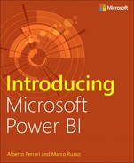
David has an Excel workbook that he wants to upload to Power BI to see what it has to offer. Because the data is stored in a local file on his laptop, he clicks the Get button on the Files tile (see Figure 1-5). This displays the screen in Figure 1-6, where he can then choose from among several upload options.
We will explore these options at greater length in the chapters that follow. For now, David chooses Local File, navigates to a file on his laptop named 2015 Sales.xlsx, and then clicks Open to upload the workbook to Power BI. After a few seconds, the Power BI dashboard displays the screen depicted in Figure 1-7.

Before going any further, we want to take a few moments to explain how the Power BI portal is organized. On the left side of the screen, in the pane labeled My Workspace, there are several items. Let’s take a look at them:
• Dashboards This lists all of the dashboards you have created. After loading a single workbook, Power BI creates a dashboard for you, using the same name as that of the original workbook.
• Reports Here, you will see the reports based on your data. In Figure 1-7, there is no default report, but we’ll follow along as David creates one very soon.
• Datasets This lists all of the data sources that you connected to Power BI. In our narrative thus far, the only workbook David loaded is 2015 Sales.
The Power BI experience is all about gaining insights from data. You begin with a dataset (2015 Sales, in this example), you then build reports on the data, and, finally, you organize visualizations of the reports into dashboards. You will learn how to perform all of these operations in detail in this book. For the moment, we want only for you to become acquainted with the basic operations.
Referring back to Figure 1-7, the central pane is positioned on the 2015 Sales dashboard and, because David has loaded the file but has not yet performed any analysis on the data it contains, the dashboard is essentially empty, showing only the Ask A Question box and the 2015 Sales.xlsx tile, which indicates that the dashboard is indeed connected to his Excel workbook.
Introducing natural-language queries
With Power BI, you have the ability to carry out analysis of your data by asking it questions, in plain English—no special code or syntax is required. This feature is called natural-language queries, and with it, you can ask Power BI to perform tasks in much the same way you would ask one of your colleagues. Let’s take a look at an example of how David uses natural-language queries in Power BI.
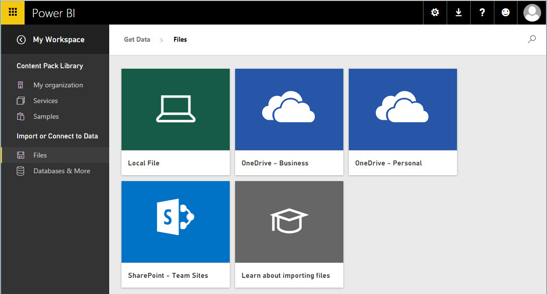
In the central pane, in the question box, David types a simple query: “Show sales 2015 by brand.” Power BI understands the query and presents a bar chart (see Figure 1-8) in which the brands are displayed alphabetically and the length of the bars is proportional to the corresponding sales for each brand in 2015.
Not only did Power BI understand David’s query, but, after performing an analysis of his dataset, it also suggests other meaningful queries in a list that appeared when he began to type the query. For David’s data, that analysis revealed that he might also be interested in viewing sales in 2015 by country/region or by month, so Power BI suggests those as alternate queries.
Also in Figure 1-8, notice the highlighted pushpin icon to the right of the question box. You can click this to “pin” the currently displayed visualization to the dashboard; this way, you can easily see it when you connect to Power BI. When you click the pushpin button, Power BI opens the Pin To Dashboard dialog box shown in Figure 1-9.

Figure 1-9: Using the Pin To Dashboard dialog box, you can choose to pin a visualization to an existing or a new dashboard.
To save the newly created bar chart to the dashboard, click Pin. Figure 1-10 shows how Power BI presents the dashboard with the pinned bar chart. (You need to go back to the dashboard to see it.)

Using natural-language queries is quite impressive, but it is only one of the many ways in which Power BI can analyze your data.
Introducing Quick Insights
Another feature that is worth learning as soon as you begin using Power BI is Quick Insights. With this feature, Power BI can search a dataset for interesting patterns and provide you with a list of charts that help you to better understand your data.
To activate Quick Insights, click the ellipsis to the right of the dataset (see Figure 1-11) on which you want to perform the analysis: in David’s case, that’s “2015 Sales”. This opens the dataset menu; here you choose Quick Insights. When David clicks Quick Insights, the button changes to View Insights.

The first time you run Quick Insights on a dataset, Power BI schedules an analysis of that dataset. This might last for some seconds or minutes, depending on the size of the data. When the search for insights is complete, Power BI notifies you. Of course, whenever you update your dataset, this search operation will need to be repeated. However, as long as the dataset remains unchanged, the insights will be immediately available.
But, what are these insights?
The basic idea is that Power BI can use artificial intelligence to analyze your data, searching for some useful or interesting patterns. It uses very sophisticated algorithms whose speed depends on the size and complexity of the dataset. Obviously, on a small dataset such as the one David uploaded, finding insights takes no more than a few seconds. As soon as the search is complete, you can access it. On the Insights Are Ready dialog box, David clicks View Insights. Figure 1-12 presents the first two insights that Power BI found on David’s file. Many others are within the list, so many, in fact, that they would not fit on the page in this book. David scrolls down to view them all.

The first insight shows that the United States accounts for most of the sales of the A. Datum brand, compared with China and Germany. The second insight reveals a substantial seasonal-effect increase in sales for the month of March for Adventure Works and Contoso. If you run Quick Insights on the data, you will likely get different insights, which Power BI chooses to display at the top.
Of course, insights are gathered by Power BI without it having any knowledge of your business or the economic scenario as a whole, so there might be many different reasons that explain the data and findings. Power BI cannot replace your brain when it comes to interpreting the numbers, but it can prove extremely useful because it can easily find some points of interests in your data by using the brute force of algorithms.
The best way you can use Quick Insights is to browse through them, looking for the confirmation of what you already know about your data and, at the same time, for fresh ideas. It might be the case that some of the insights are not really meaningful, but, with the sheer number of insights that Power BI finds for you, it’s likely that there are some real hidden gems that might improve your knowledge of your numbers.
More info
You can find a more complete description of the algorithms used by Power BI and the types of insights that it can reveal by going to https://powerbi.microsoft.com/en-US/documentation/powerbi-service-auto-insights-types/. Of course, with newer versions of the analytics engine, the numbers and the quality of insights might change and improve.
You can click any insight to enlarge it. If you hover over one, the same pushpin button as that of the natural-language query appears so that you can pin the insight to the dashboard if you want. David clicks the Category Outliers Insight from Figure 1-12 to enlarge it, clicks the Pin icon, and then in the Pin To Dashboard dialog box, he leaves Existing Dashboard selected and clicks Pin to pin it to his dashboard.
Pinning one of the insights to the dashboard makes it more interesting. Moreover, by doing that, you will learn that you can move and resize visualizations pinned to a dashboard by using a convenient grid, making them more aesthetically appealing. David returns to look at his expanded 2015 Sales.xlsx dashboard, and he moves the new Sale 2013 By Brand visualization below the others. Figure 1-13 demonstrates David’s dashboard, which now contains two visualizations.

Figure 1-13: A dashboard can contain multiple visualizations organized in a grid, individually moved and resized.
Introduction to reports
So far, David has used only automated report building, using a natural-language query as well as the Quick Insights feature. As you might imagine, he only scratched the surface of Power BI’s reporting capabilities. In fact, he can build reports manually, unleashing the full potential of Power BI visualizations.
To create a new report, in the Datasets section of the navigation pane, click a dataset. David clicks 2015 Sales. Power BI opens an empty report based on that dataset, as illustrated in Figure 1-14.

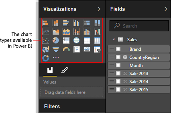
The user interface of a report is very powerful because it combines many different features in a single window. On the far left is the standard Power BI navigation pane. The central pane is the canvas on which you can build a report by adding visualizations. Here, you can also configure the properties of each visualization. On the right are two panes: Visualizations and Fields. The Visualizations pane offers the entire set of available visualizations at the top; the bottom section presents filtering options. The Fields pane contains the list of all the fields of your dataset. In David’s case, you can see how the Fields pane lists the columns of the Excel table he uploaded to Power BI.
Figure 1-15 shows an enlarged view of the Fields pane. If you focus your attention on the individual columns there, you can see that some of them have a small icon beside their names. This icon identifies the main usage of the field. For example, the fields Sale 2013, Sale 2014, and Sale 2015 each have a summarization icon (a Greek sigma), indicating that the total for each column will be displayed if used in a report. The CountryRegion field shows a small globe, indicating that this field contains geographical data, and it will be used to draw data on maps.

Figure 1-15: Many columns in the Fields list display a small icon. The icon indicates the default aggregation it uses.
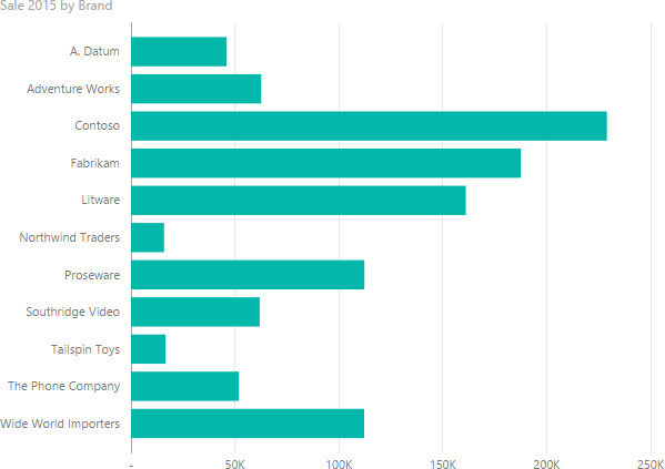
To create a report, select the fields that you want to appear in the report. For example, referring back to Figure 1-14, in the Fields pane, David clicks Brand and then Sale 2015. Because Brand has no summarization icon, it is used to slice data, whereas Sale 2015, which displays a sigma, will present the sum for that column, generating the report shown in Figure 1-16.
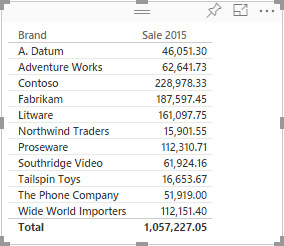
What David just created is the default visualization; that is, it’s a grid with the brands and the sum of Sale 2015 on the rows, showing raw numbers. Numbers are very interesting, but they do not give a clear idea of the relationship among them. In fact, at first glance it’s not evident which brand is the most important one, which ones are the smallest, and what the relative importance of the numbers is. Charts, on the other hand, can give viewers a much quicker understanding of the data.
You can modify the visualization of a tile by choosing one of the many available types of charts in the Visualizations pane. For example, you can use a column chart by first selecting the visualization and then clicking the column chart icon, which is among the many highlighted in Figure 1-17.
Note
If you click a visualization type but do not have a specific tile selected, Power BI inserts a new, empty visualization. If this happens to you, do not worry: just select the empty chart and delete it by pressing the Delete key. Then, select the tile that you want to change and try again.
As Figure 1-18 so clearly demonstrates, the same numbers—Sale 2015 by Brand—shown in a column chart are much easier to understand.
Note
Before proceeding further, feel free to experiment by using different visualizations for the same data. As you will discover, each visualization offers a different insight from the same numbers. With Power BI you can use different visualizations to find the best way to tell a story about your data, using the same numbers.
So far, you’ve learned how to create an individual chart. But one chart alone is not yet a full report. If you click an empty area of the central canvas and repeat the aforementioned procedure, but, adding the CountryRegion and Sale 2015 fields, you will generate a new tile, this time displaying a map with sales in the three countries/regions contained in the demonstration dataset, as shown in Figure 1-19.

Figure 1-19: A map of the world showing sales in different countries/regions, highlighted as bubbles.
Now, maps are powerful charting tools, but, as Figure 1-19 demonstrates, by having only three values they look dispersive. There are too many details in the map, whereas the goal is to show only the relative size of three areas. In this case, a column chart does this job well. You can transform the map into a column chart and then move the two visualizations so that they look like those shown in Figure 1-20.

As you have seen, a report is a collection of visualizations organized in such a way as to communicate insights about the data. In Figure 1-20, a reader has an immediate feeling that sales in China, Germany, and the United States are nearly the same. Also it is clearly evident that there are only a few brands that make up most of the sales (Contoso, Fabrikam, and Litware), whereas others (Northwind Traders and Tailspin Toys) produce only a relatively tiny amount of sales.
Introducing Visual Interactions
This feature is very similar to what David could have achieved by using Excel and a couple of pivot tables on top of the table containing sales, yet there are some important differences between a report created in Excel and the same report done by using Power BI. We will look at those as you proceed through the book, but, for the moment, let’s look at the interactive nature of Power BI reports.
In the top chart from Figure 1-20, click the column for Germany. As soon as you click an element within the chart, the entire report is filtered showing the contribution of Germany to sales of different brands, by means of coloring with two shades the Sale 2015 By Brand visualization, as depicted in Figure 1-21.

Figure 1-21: Clicking on one column in the column chart filters the bar chart, highlighting the contribution against the total.
By doing this simple operation, David notes that sales of Northwind Traders in Germany are tiny when compared with China and the United States. Clearly, that brand is not popular in Germany, and David is curious to see whether it is sold in equal volumes in China and United States or whether one of those countries/regions has much more sales than the other one.
To perform this analysis, he clicks the bar for Northwind Traders. By doing so, the filter will move from the country/region to the brand and, as it happened before, the country/region chart will highlight the contribution of Northwind Traders to the total sales, as shown in Figure 1-22.
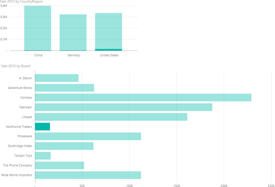
Figure 1-22: Filtering one brand shows the contribution of the brand against the total of sales by country/region.
The chart with sales by country/region already shows that a majority of sales are in United States, but because David is analyzing a very small brand, the chart is not clear in terms of relative importance of sales in different countries/regions.
Before we move on, we now need to be a bit more accurate in describing what we are seeing. Any chart produces graphical visualizations of the underlying numbers. Any of those visualizations can behave as a filter, and such a filter is activated by simply clicking the chart. So far, you have seen that a filter—when applied to other charts—highlights the relative contribution of the filtered item against the grand total by using two colors. This behavior is known as visual interaction, and it is extremely interesting. Yet, there are scenarios, like the one David is experimenting with, for which it would be better to compare the differences between countries/regions more than the overall contribution of a brand against the other brands.
You can configure visual interactions in a highly precise way. Namely, you can configure how the filtering on a chart behaves with respect to all of the other ones. The scenario we are looking at—with only two charts—is perfect for experimenting because it is very simple. To configure visual interactions, on the top menu bar of the report, click the Visual Interactions button, which you can see highlighted on the right in Figure 1-23.
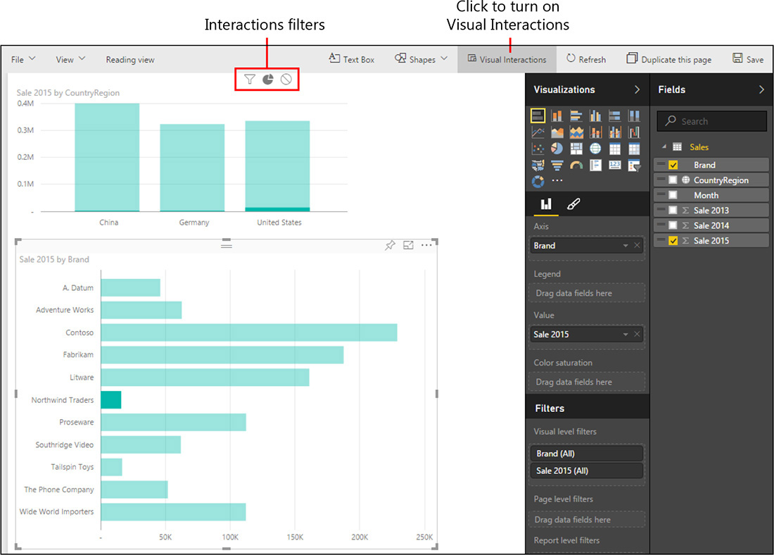
Figure 1-23: When you turn on visual interactions, you can configure how a chart interacts with other charts.
When you turn on visual interactions, each chart shows a different set of icons. The one you select (in this example, Sale 2015 By Brand) shows the standard selection icon, whereas all of the others (Sale 2015 By CountryRegion) show the three different kinds of interactions you can choose:
• The first is the filtering interaction (the funnel icon). When you click this, filtering the selected chart will place the very same filter on the destination chart. In such a case, you will not see the contribution of the selection to the total. Instead, you will see only the selection in the chart, excluding the values (and corresponding areas) related to unselected items.
• The second interaction is a pie chart (the pie icon); that is, the relative contribution. This is the default filtering behavior, where the filtering on one chart shows, on the destination chart, the relative contribution of the selection against the total.
• The third is the no filtering interaction. When this is the selected behavior, filtering the selected chart has no effect on the target chart.
Note
Visual interactions are much easier to use than to explain in a book that, by nature, contains static figures. If you are still not clear on the behavior of filtering, try it yourself; you will understand it in a much easier way.
For example, you can select the filtering interaction from the sales by brand to the sales by country/region. By doing so, when you select Northwind Traders, the resulting report will show a different result, as shown in Figure 1-24.

Figure 1-24: By using the filtering behavior, the relative size of the bars in the Sale 2015 By CountryRegion chart is more meaningful.
Now, when you browse the report, you can quickly click a brand and see which country/region sold more than the others. Because of automatic determination of the scale, the insights are much clearer.
Note
You can configure the filtering behavior for any two pairs of visualizations. To perform this, you first select the source (that is, the tile from which you want to filter) and then choose the proper action on the destination visualization. Needless to say, you need to pay attention because mixing different filtering behaviors on the same page can result in some complexity and confusion when using the report.
Decorating the report
In the previous sections, David performed some analysis on the data, and now he thinks that his first report, although simple, contains some findings that are worth sharing. He can obviously make a screenshot and attach it to an email with some description, but Power BI offers some tools that make it possible for him to annotate a report with remarks.
David can add text to the report and decorate it with shapes. For example, he can add a colored arrow to Northwind Traders and a text box with some remarks about what he found. When David does this, the report is easier to read, as demonstrated in Figure 1-25.

Figure 1-25: Decorating the report makes it easier for the reader to immediately understand the insights.
To add the text, above the central pane, David clicks Text Box. When the text box appears, he types and formats his text. To add the arrow, again above the central pane, David clicks Shapes and then Arrow. He then moves the arrow into position and resizes it.
When you add the text box or the arrow, you need to set some properties for these objects. In fact, the appearance of each object (either a decoration or a full chart) in a Power BI report is controlled by a set of properties that you can access by clicking the object in the central pane. The properties that you can set appear in the Visualizations pane, as shown in Figure 1-26.

For example, to rotate the arrow, David selects it and then, in the Format Shape pane on the right, he clicks Rotation and drags the slider. Similarly, he also changes the fill color.
Finally, keep in mind that visual filters on reports (that is, filters that you set by clicking a chart item) are not saved as part of the report. Thus, when you look at the report again, the arrow is useful to tell you where to apply the filter to see the data. Later in this chapter, you will learn how to place a permanent filter on a report.
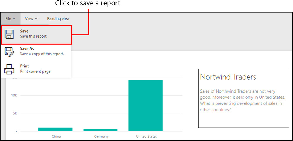
Saving the report
At this point, David can save his report so that he can continue working on it later. To save a report, go to File, click Save (see Figure 1-27), and then provide a name for the report. Here, David saves his report with the name Northwind Traders.
After you save the report, it appears in the My Workspace pane, in the Reports section. You can now access it any time you sign in to Power BI.
When you select a saved report, it opens and remains in read-only mode until you explicitly activate it for editing by clicking the Edit Report button highlighted in Figure 1-28.

This behavior is useful to avoid unintentional editing of the report. A saved report can be easily viewed, and it always reflects the latest data. If you need further filtering or you want to perform a different analysis on the same report, you need to turn on edit mode.
Pinning a report
When you open a report in read-only mode, the menu bar at the top of the screen offers you several actions: you can choose to save a copy of the report under another name, edit or print it, and apply different visualizations. All of these operations are seamless and need no further explanation.
But, one of the menu bar items is worth a few moments of our attention: Pin Live Page (see Figure 1-29).

Figure 1-29: Visualizations aren’t the only things that you can you can pin to the dashboard: You can pin reports, too.
What is the difference between pinning a visualization and pinning a full report? When you pin a visualization, Power BI saves it as it is, but the visualization is disconnected from any others in the same dashboard. Thus, any visualization in a dashboard does not include the visual interactions of other visualizations. This is usually good, because a dashboard is not intended for interaction. If you need interaction or further analysis, you can always click a visualization from the dashboard to open the source report.
Nevertheless, sometimes you want to keep visual interactions between some components of your dashboard. If this is your goal, you need to build the report and pin it in its entirety as a live page. Visualizations belonging to the same live page will maintain the behavior of visual interactions, albeit they will be limited to the visuals in the report. In other words, visualizations belonging to the same report can interact among themselves, whereas filtering them has no effects on other visualizations in the same dashboard. For example, after David adds his Northwind Traders report to his dashboard, the two charts are mutually interactive, but they don’t affect the other visualizations in the dashboard, and those other visualizations don’t affect the two brought over in the report.
Refreshing the budget workbook
So far, David has learned the basics of Power BI and ended up with some useful findings that he will want to share with the country/region managers. Nevertheless, before continuing, David is worried about how he will refresh his data when new figures become available. In fact, you might remember that he began building the budget in October. Thus, new data will be arriving over time for sales, and the country/region managers will provide new forecasts that David will need to add to his workbook. How will he upload new data to the service to refresh the existing data?
If fact, there are many ways by which you can refresh data in Power BI.
David receives figures from the country/region managers in a very simple form: They each send him a workbook with forecasts based on the brand, with no monthly details. Figure 1-30 shows what the forecasts look like for China.

Because the forecasts are at the year level, but David set them up at the month level, he opts for a simple solution: divide the yearly sales by 12 and copy the result to his own workbook in a new column called Budget.
The workbook with the new Budget column now looks like Figure 1-31. Looking at the numbers, it is clear that David should have used a different allocation, because the numbers do not reflect the seasonal nature of sales and, more important, they are not correct. We will fix this and use a better technique later in the book. Right now let’s focus on Power BI. Remember, this is not a book about budgeting techniques.
Now, David faces this scenario: the workbook on his laptop has different numbers and a different structure (the Budget column is new), whereas the workbook he uploaded into Power BI still retains the old values and model.
The simplest way that comes to mind to refresh the workbook is to upload it again to the Power BI service. David follows the same upload procedure he used the first time, but when it is about to complete the upload, Power BI issues the warning shown in Figure 1-32.

Figure 1-32: If you upload the same workbook twice, Power BI issues a warning about possible data loss.
The error message is not totally clear. It states that David is going to lose changes to reports online, but he did not make any changes. He created several reports, without modifying them. But, David is nothing if not a brave and cavalier sort, so he clicks Replace It to see what happens.
Note
Even if it might be obvious, it is worth remembering that Power BI is an online service. When it comes to datasets, you cannot use the standard technique of “making a copy of the workbook before replacing it” that you probably use on your PC.
After uploading the file, the old workbook is replaced with the new one and all the reports and the dashboard look identical. David did not lose anything. In reality, the warning pertains to Power View reports that might have been automatically created within the Excel data model, a feature that you did not learn yet. So, David breathes a sigh of relief and pushes onward.
Note
Be aware that there might be a delay of several minutes from when you upload a new version of a dataset until the new columns and tables appear in Power BI. The exact timing depends on whether there is a recent release of Power BI and is subject to change in the future. If, for any reason, you do not see updated information after a new upload, just wait a few minutes and try it again; Power BI is being refreshed and nothing is going wrong.
Now, the Power BI model contains the new Budget column, which David can use to build more interesting reports. It is worth noting that a report can contain multiple pages. Thus, he can add different visualizations to the 2015 Sales report. For example, he created the report page depicted in Figure 1-33.

Observe that the two visualizations at the bottom use a different visual interaction method. The chart on the left shows the contribution of a brand to the overall sales and budget, whereas the one on the right is more useful to perform a comparison of budget and sales in different countries/regions. Both are useful and provide different insights. The technique of adding multiple copies of the same visualization with different visual interactions is common, and we encourage you to learn to use it.
You might have noticed that to make it more evident, David uses different titles for the two visualizations (and different font sizes, too). You can manage these visualization details by using the brush icon highlighted in Figure 1-34, which shows the many options to configure a visual. In the example, we used a custom title and changed the font size.

You will learn many more details about visualization formatting as the book progresses. However, for an introductory chapter, this is enough. It’s time now to draw some conclusions.
Filtering a report
You already learned about the visual interactions feature, which makes filtering a report a breeze. Visual interactions are useful, but they come with some limitations:
• The filter is not saved as part of the report. Whenever you open a report, you can begin to play with visual filters but there is no way to store the filter in the saved report.
• The filter is always visible. Sometimes you want a filter for the entire report, but you do not want any visual indication of the filter being applied. In other words, you want something like a hidden filter working in the background on the full page or report.
Power BI offers you a different way of filtering data. They are the standard filters (as opposed to visual filters), and they can be applied to three different layers:
• Visual-level filters Visual-level filters work on only an individual visualization, reducing the amount of data that the visualization can see. Moreover, visual-level filters can filter both data and calculations.
• Page-level filters Page-level filters work at the report-page level. Different pages in the same report can have different page-level filters.
• Report-level filters A report-level filter works on the entire report, filtering all pages and visualizations included in the report.
You can set all of the filters in the Filters section in the Visualizations pane. Figure 1-35 illustrates that for David’s report, there are three kinds of filters.

Figure 1-35: You can configure filters in the same place, in the Filters section of the Visualizations pane.
You can drag columns from the Fields in any filter and, when there, you can click them to apply a filter, by simply selecting some values from the list.
For example, Figure 1-36 shows the result if you add a page-level filter to the report, selecting only China and Germany.

Figure 1-36: The same report as the report presented in Figure 1-33, this time filtered using only China and Germany.
Filters at the report and page level behave the same way. Filters on a visualization, on the other hand, have an additional feature: they can filter both data (as was the case for the country/region) or the metric associated with the chart.
For example, you can filter the upper-right chart to include only values for which the budget is greater than 50,000. Figure 1-37 presents the result.

Notice in Figure 1-37 that the number of brands is much less than that of Figure 1-36. This is because the latter report shows only brands that have a Sale 2015 measure greater than 50,000.
All of these filters are saved as part of the report, and they are not shown in any visual way. For this reason, if you prepare a report that, for example, filters only 2015, it is always useful to add a description of the filter as part of the report title—“Sales in 2015” instead of “Sales.”
Conclusions
After this first tour in Power BI, it’s now time to take a breath and describe what we’ve learned so far.
• Power BI is a cloud service that provides tools to perform analysis of data and gain insights from your numbers.
• To build a dashboard, you need a dataset, a report, and, finally, the dashboard. The dataset is the source of data, reports are useful to create visualizations that might be connected through visual interactions, and a dashboard is a collection of visualizations and/or reports.
• You can create visualizations by using natural-language queries, Quick Insights, or full reports.
• You can decorate a report by using text boxes, shapes, and pictures.
• Visualizations in a dashboard are not connected through visual interactions, which work only among visualizations in a report. If needed, you can pin a report as a live page in a dashboard to maintain the interaction capability.
• You can load data in Power BI from many different sources. So far, David has used only an Excel workbook, but there are many other sources that he will learn to use before becoming a Power BI expert (and that you will learn about later in this book).
• You can refresh the content of your workbook by uploading a new version of it. But, as Chapter 2 describes, there are better ways to refresh data.
• You can apply filters by using visual filters, which produce highly interactive reports, or you can use static filters, which you can apply at the visual level, page level, and report level. Static filters are saved as part of the report, whereas visual filters are not.