Chapter 24
Using 3D Maps
You can build a pivot table and display the results on an animated map using the 3D Map feature. This functionality debuted as the Power Map add-in for Excel 2013. The functionality was renamed 3D Map and built in to Excel starting with Excel 2016.
Examples of 3D Maps
The first three figures represent corn acreage by state for the year 2014. Figure 24.1 shows a shaded area map. Iowa and Illinois are the leading producers of corn.
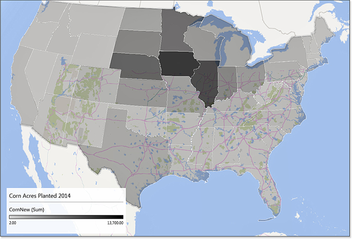
Figure 24.2 shows a column chart. The height of each column correlates to acres of corn planted. Note that this visualization looks best when you tip the map to look at it closer to ground level.
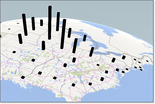
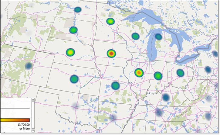
Figure 24.3 shows a heat map. The points with the highest value are shown in a red/yellow/green/blue circle, whereas smaller points might appear in just blue.
Adding Color Information for Categories
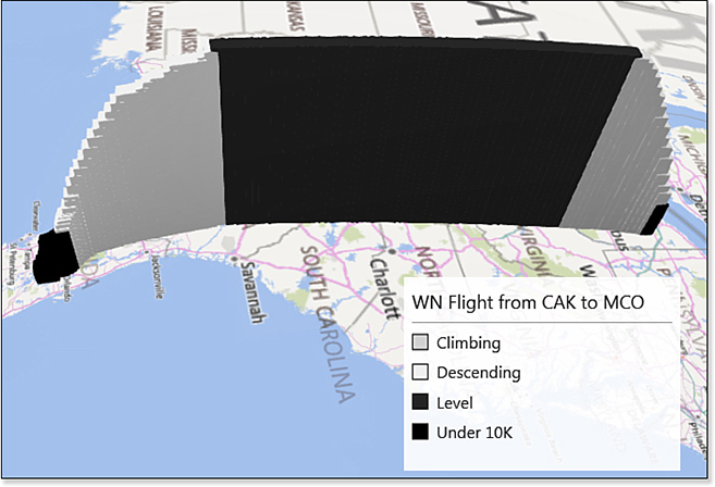
The next figures are based on data from FlightStats.com. Figure 24.4 shows the position and altitude of a Southwest Airlines flight from Akron, Ohio, to Orlando, Florida. By using a Category field, the columns are a different color based on whether the flight is below 10,000 feet, climbing, level, or descending.
Zooming In
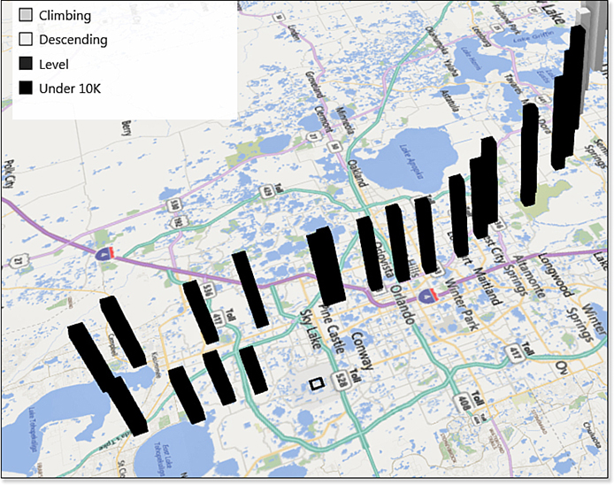
FlightStats provides new data every minute. Although the flight in Figure 24.4 looks like a solid line, when you zoom in, as in Figure 24.5, you can see the gaps between the columns. While landing, this flight flew west of downtown Orlando, flew four minutes south of the airport, turned, and landed four minutes later.
When you pan to the beginning of the flight as in Figure 24.6, you see the first four minutes of the flight as viewed southwest of Akron, Ohio. By changing the theme to use a satellite photograph of the ground, you can see that the plane took off to the northeast from runway 5 and began turning south three minutes into the flight.

Animating Over Time
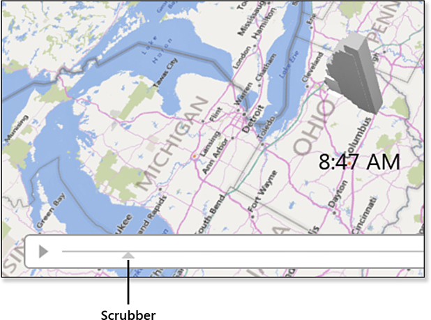
If your data set includes a date or time field, you can animate the data over time. A time scrubber appears at the bottom of the map. Click the Play button to the left of the scrubber to play the entire sequence or grab the scrubber and drag to any particular day or time.
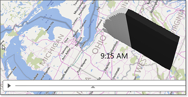
In Figure 24.7, the flight has reached Columbus, Ohio, by 8:47 a.m. In Figure 24.8, the flight crosses through the northeast corner of Tennessee by 9:15 a.m.
Going Ultra-Local
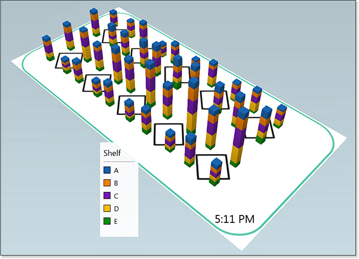
The previous example showed a 1,000-mile journey that spanned more than two hours. This example shows a 2-mile story that spans 50 years. Figure 24.9 shows Merritt Island, Florida, in November 1967. Engineers who work at Kennedy Space Center on the Apollo program had started building houses on the canals of Merritt Island. Each tiny square is a house.
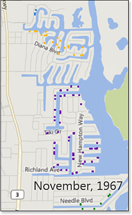
Figure 24.10 shows the same area at the end of the Apollo program in 1972. More houses have been built.
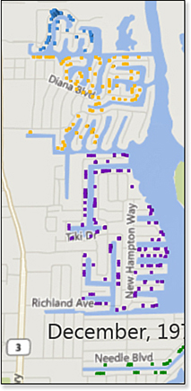
Figure 24.11 shows the area as the first Shuttle mission took off in 1981.
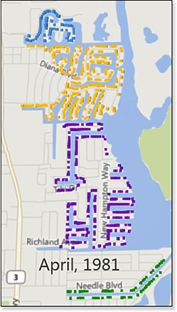
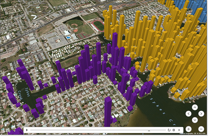
Figure 24.12 shows the detail of two neighborhoods. The height of the column is the last sale amount. When you animate this data over time, you can see the run-up of sale prices in 2009 leading up to the housing bubble.
Getting Your Data into 3D Map
The mapping engine is always using data from the PowerPivot data model. You don’t have to load your data to the data model. Just choose one cell in the data set and select Insert, 3D Map. Excel loads the data to the data model for you.
However, if your data is in multiple tables, and if you have the full version of PowerPivot, you can load your tables to PowerPivot and define relationships between the tables.
3D Map requires one or more geographic fields, such as City, County, Country, State or Province, Street, Postal or ZIP Code, or Full Address. If you have data that already has latitude and longitude, the program can use that. If you are using a custom map, the X, Y coordinates will work. If you are using custom shapes, Power Map can accept .kml or .shp files.
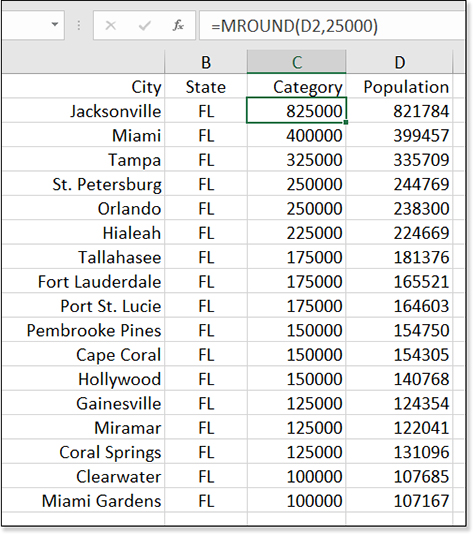
Figure 24.13 shows a simple data set. Columns A and B provide enough geography with City and State. Column C is a Category column to provide different colors on the map. It rounds the population from column D to the nearest 25,000. Column D contains the population. This data will be plotted at the city level. For some cities, it would be possible to get by with only column A. However, without the FL qualifier in column B, it is likely that Melbourne would appear in Australia instead of Florida. When in doubt, add extra geography fields, even if every value in column B is FL.
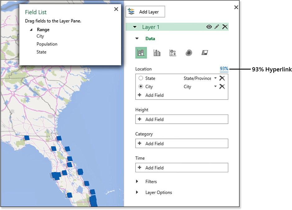
With one cell in your data selected, choose Insert, 3D Map. It takes several seconds for the data to be loaded to the PowerPivot data model. You are then presented with the 3D Maps window. A Field List is hovering above the map. The Location box on the right shows the fields that Excel detected as being geography. Pay particular attention that this is correct. A field that contains values such as “123 Main Street” should be classified as Street and not Address. The Address data type is reserved for values that contain a complete address, such as “30 Rockefeller Plaza, New York, NY 10112.”
In Figure 24.14, the Location box has a 93% hyperlink on the right side. You can see many blue columns already appearing in Florida. The hyperlink indicates that geocoding is finished and 93% successful, but there were some places that Bing was unsure of.
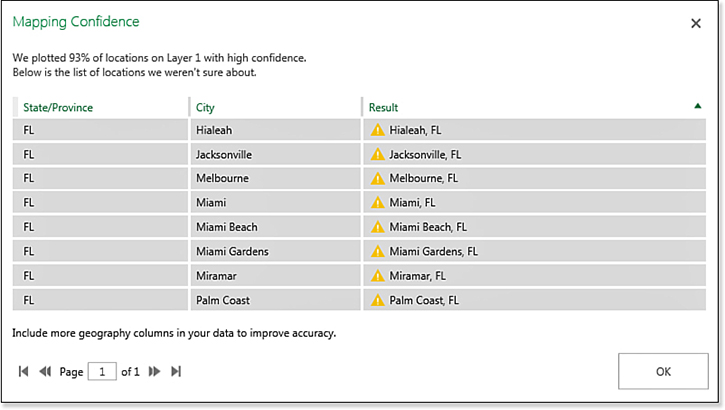
Click the 93% hyperlink for a report of the places with low mapping confidence. As shown in Figure 24.15, everything is actually correct. If something was not correct, you would have to go back to the original data in Excel, add more geography, and then refresh the data in 3D Map.
Troubleshooting
When 3D Map cannot find a location, there is no way to specifically point to it on a map.
I’ve seen data sets where Excel thinks Paris is in Kentucky and Melbourne is in Florida. In these cases, adding a new column named “Country” with the appropriate country can help.
Also, when assigning your fields to a geography category, understand the difference between “Street” and “Address.” If your data has a column with values such as “123 Main Street,” this should be classified as a street. If you have values such as “123 Main Street, New York, NY,” this should be classified as an address.
If you refer to “123 Main Street” as an address, there will be many points misplaced.
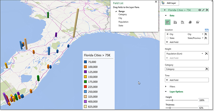
After the records are assigned to the correct geography, you can move fields from the Field List to the drop zones. In Figure 24.16, the population is the height. The columns are different colors thanks to a new field added to the category area. Note that to add a new field, you would return to Excel and insert a new column in the middle of the data. Add a formula, such as =MROUND(D2,25000). Return to 3D Map and click Refresh.
3D Map Techniques
Here are some useful techniques when using 3D Map.
Tipping, Rotating, and Zooming the Map
There are clickable navigation icons on the map. But master these mouse techniques for faster navigation:
Hold down Alt. Left-click and drag the mouse left or right to rotate the map. In most of the Florida examples in this chapter, the map looks best when you are viewing it from the Atlantic Ocean. I made that happen by dragging the mouse left while holding down Alt.
Hold down Alt. Left-click and drag the mouse up or down to tip the map. Dragging down gives you a view looking straight down on the map. Dragging up gives you a view from ground level.
Hold down Ctrl. Scroll the wheel on your mouse to zoom in or out. Note that you often have to click the map once before the wheel mouse will start to work.
Adding a Photo to a Point
Right-click any column and choose Add Annotation. In the Description field, choose Image and browse to the location of the image. Choose a size and a placement. The image appears next to the column with an arrow (see Figure 24.17).
Combining Layers
Figure 24.17 shows a map made from two different tables. This is easy if you have the Power Pivot tab displayed in your ribbon. Follow these steps:
Format both data sets in Excel as a table.
On the PowerPivot tab, choose Create Linked Table from both tables.
On the Insert tab, choose 3D Map.
Both tables appear in the field list. Drag County and State from the first table to the Location box. Choose a shaded area map. Add Population as the Value for the map.
Click Add Layer. You get a new Location box. Drag City and State from the second table. Build a column chart from this layer.
If you are using Excel 2016 and do not have the Power Pivot tab in the ribbon, there are two alternate ways to get the tables into the data model:
One simple method is to create a pivot table from each data set. In the Insert PivotTable dialog box, choose the box for Add This Data To The Data Model. It does not matter what you put in the pivot table; simply creating the pivot table is enough.
The other method is to use Power Query. From each table, choose Data, From A Table/Range. When the Power Query window opens, you will see Close & Load icon on the left side. Open the drop-down menu below that icon and choose Close & Load To. In the Close & Load dialog box, choose Only Create A Connection and choose Add This Data To The Data Model.
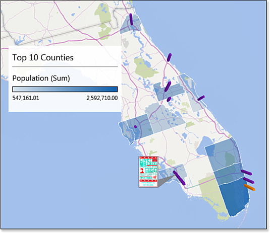
The result: Figure 24.17 shows a map in which the top 10 Florida counties are highlighted. The columns indicate places where I have done my live Power Excel seminar. Any county that is shaded without a column indicates a market I have been overlooking.
Changing Column Size or Color
The thickness of a column is more than one city block. If you want to show multiple houses on a street, you won’t be able to tell one point from the others. In the right panel, choose Layer Options. Change the Thickness slider to 10% or less.
To change the colors used on the map, go to Layer Options. Use the 60 colors in the color drop-down menu or define your own color.
Resizing the Various Panes
Almost every legend or information pane takes up too much room. If you are working on a small laptop, your inclination will be to close all panes because they are covering up the map. If you have a large monitor, you can resize each pane. Click on the pane, and then use one of the two resize handles. To move a pane, click and drag the pane to a new location.
When you have a Time panel on the map, right-click and choose Edit. You can control the Time Format.
Adding a Satellite Photograph
Use the Themes drop-down menu in the ribbon. The second theme offers a satellite image. Outside of the first two themes, I rarely find anything that looks acceptable.
Showing the Whole Earth
What if you have data points in America and Australia? There is no way to see both halves of the globe at the same time. Use the Flat Map option in the ribbon. When you zoom out, you can see the entire world map.
Understanding the Time Choices
When you add a field to the Time drop zone, a small clock icon appears above the right side of the field. This icon offers three choices, as shown in Figure 24.18:
Data Shows for an Instant—The point appears when the scrubber reaches the date associated with that record. As the scrubber moves to the next day, the point disappears.
Data Accumulates Over Time—Suppose you are showing ticket sales over time. After a ticket has been purchased, it should stay on the map. Choose Data Accumulates Over Time.
Data Stays Until It Is Replaced—One map that I frequently use shows the last sale price for various houses in a neighborhood. A house might sell once every 7 years. In this case, you want the last sales price to remain until the house is sold at a different price.
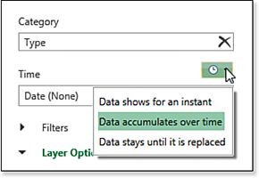
Figure 24.18 Three choices are available near the Time field.
Note that there is no good way to change a category as time progresses. You might want to show Chicago as red from 2013 to 2015 and then as green from 2019 to 2020. There currently is no good way to do this in 3D Map.
Controlling Map Labels
You have only one option with map labels—either show them or do not. After you turn them on, they seem to have a mind of their own. If you zoom way out, you see large labels for each continent and map labels for some countries (see Figure 24.19).
As you zoom in, more countries are labeled, and some city labels appear.
Zoom in to a city, as in Figure 24.20. Some streets are labeled and others are not. What if an important street is one that is not named? You have no explicit control over which items are labeled and which are not. Your only hope is to zoom out, recenter the map slightly, and then zoom back in. Keep doing this until luck falls on your side and the particular street is labeled.
Building a Tour and Creating a Video
A tour is composed of multiple scenes. You can use the New Scene drop-down menu to duplicate the current scene as a new scene.
Your first scene might start out with a view of the entire country. Your next scene might zoom in on one portion of the country. Then a scene might add an annotation to one point. The next scene might fly to another part of the country. Each scene has a duration and an Effects duration. The various effects are designed to add visual interest.
Caution
You rarely want a Time field in more than one scene. If your first scene shows the data growing over time, and then the next scene zooms in on one portion of the map, you must remove the Time field in the second scene or you will watch the data repopulate in each scene.
After building several scenes, use the Play Tour icon to test the timing of the scenes. When you have a tour that looks good, use the Create Video icon to build a video of the tour. Note that this step can take up to an hour, so it makes sense to test the tour before building a video.
Using an Alternate Map
You can use 3D Map to show data on something other than a globe. For example, a retail store might have transaction data showing sales by time and item. If you can map the item number to a location in the store map, you can plot sales by location.
Preparing the Store Image
First, find (or create) a map of the store. Figure out the height and width of the image in pixels. When you look at your store map, the lower-left corner has a coordinate of X=0, Y=0. As you move from left to right across the image, the X values increase. As you move from bottom to top, the Y values increase.
The process of locating each item in the store can be tedious. If you have Photoshop, open the image in Photoshop and press F8 to display a panel showing the X,Y coordinates of the mouse. Make sure to change the measurement units from inches to pixels. You can hover your mouse over a location on the store map. The X value reported by Photoshop is correct. The Y value is the distance from the top edge of the image, so you have to subtract the reported Y value from the height of the image. Or, if it is easier, key the reported Y values into Excel and then use a formula to change.
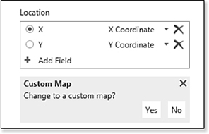
Specifying a Custom Map
After launching 3D Map, move your X and Y field to the Location box. Choose X Coordinate and Y Coordinate as the field type. You see a question asking whether you want to change to a custom map (see Figure 24.21). Choose Yes.
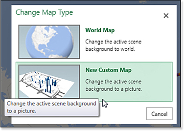
In the Change Map Type dialog box, choose New Custom Map, as shown in Figure 24.22.
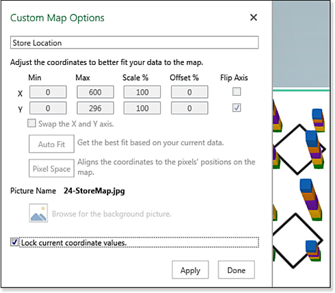
Although I appreciate the team who built 3D Map, the Custom Map Options dialog box always requires a lot of tweaking. Unless you managed to sell something at the X=0, Y=0 position in your store map, the default settings will always be wrong. Use the following steps to change the settings:
For the X Max, specify the width of the image in pixels.
For the Y Max, specify the height of the image in pixels.
Click the Picture icon and browse to the image of your store map.
Change from Auto Fit to Pixel Space.
Figure 24.23 shows the settings.
Your data is plotted on the store map. You can use the Alt and Ctrl navigation keys to rotate, tip, and zoom in on the map (see Figure 24.24).