
Chapter 25
Using Sparklines
Edward Tufte wrote about small, intense, simple datawords in his 2006 book, Beautiful Evidence. Tufte called them sparklines and produced several examples where you could fit dozens of points of data in the space of a word. Tufte’s concepts made it into Excel 2010.
Fitting a Chart into the Size of a Cell with Sparklines
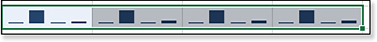
Excel’s implementation of sparklines offers line charts, column charts, and a Win/Loss chart. Figure 25.1 shows an example of each:
Win/Loss—The 1951 Pennant Race (in rows 7 and 8) shows two examples of a Win/Loss chart. Each event (in this case, a baseball game) is represented by either an upward-facing marker (to indicate a win) or a downward-facing marker (to indicate a loss). This type of chart shows winning streaks. The final three games were the playoffs between the Dodgers and the Giants, with the Giants winning two games to one.
Line—The sparkline in row 12 shows 120 monthly points of the Dow Jones Industrial Index, indicating the closing price for each month in one decade.
Column—Rows 16 through 21 compare monthly high temperatures for various cities using sparkcolumns. The minimum and maximum values for each city are marked in a contrasting color. Curitiba, in the southern hemisphere, has its warmest month in February.

Figure 25.1 Excel 2019 offers three types of sparklines.
Sparklines can exist as a single cell (the Dow Jones example) or as a group of sparklines (the temperature example). When sparklines are created as a group, you can specify that all the sparklines should have the same scale or that they should be independent. There are times where each is appropriate.
The Sparkline feature offers the capability to mark the high point, the low point, the first point, the last point, or all negative points.
There is no built-in way to label sparklines. However, sparklines are drawn on a special drawing layer that was added to Excel 2007 to accommodate the data visualizations discussed in Chapter 22, “Using Data Visualizations and Conditional Formatting.” This layer is transparent, so with some clever formatting, you can add some label information in the cell behind the sparkline.
Understanding How Excel Maps Data to Sparklines
Contrary to most examples that you see in the Microsoft demos, sparklines do not have to be created adjacent to the original data set.
Suppose that you have the 4-row-by-12-column data set shown in Figure 25.2. This data shows four series of economic data. It can be used to create four sparklines.

You can create the sparklines in a four-row-by-one-column range, as shown in D3:D6 of Figure 25.3, or in a one-row-by-four-column range, as shown in A1:D1 of the same figure. When you specify a sparkline, you specify the source data and the target range. Given a 4×12 cell source data and a 1×4 or 4×1 target range, Excel figures out that it should create four sparklines.

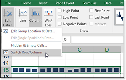
What if your original data set is perfectly square? This occurs when you have four rows by four columns, as shown in Figure 25.4.

You then have the chance that Excel will choose to create the sparklines along the wrong axis (see Figure 25.5).
While those sparklines are selected, go to the Sparkline Tools Design tab of the ribbon, open the Edit Data drop-down menu, and select Switch Row/Column (see Figure 25.6). The sparkline is reversed.
Troubleshooting
Sparklines are scaled independently. Because there are no labels along the left axis, it is hard to see the magnitude of each line.
This is by design and allows you to see unemployment in percentages compared to GDP in trillions. There are cases where each sparkline is showing items that can be compared to each other.
In these cases, use the Axis settings in the Sparkline Tools. Change the Minimum Value and the Maximum Value to the Same For All Sparklines.
Creating a Group of Sparklines
The worksheet in Figure 25.7 includes more than a decade of leading economic indicators. Use the following steps to add sparklines to the table.

Insert a blank column between columns A and B. This provides room for the sparklines to appear next to the labels in column A.
Select the data in C4:N8. Note that you should not include any headings in this selection.
On the Insert tab, select Column from the Sparkline group. Excel displays the Create Sparklines dialog box. This dialog box is the same for all three types of sparklines. You have to specify the location of the data and the location where you want the sparklines. Because your data is 4 rows by 12 columns, the Location Range must be a four-cell vector. You can either specify one row by four columns or four rows by one column.
Tip
In step 1, you might find that you don’t need to print the table of numbers; just the labels and sparklines will suffice.
Select B5:B8 as the location range, as shown in Figure 25.8.

Figure 25.8 Preselect the data range and then specify the location range. Click OK to create the default sparklines.
As shown in Figure 25.9, the sparklines have no markers. They are scaled independently of each other. The unemployment max of 9.6 reaches nearly to the top of cell B5, indicating the maximum for Unemployment is probably about 10. By contrast, the maximum for GDP in B6 is closer to 17,500.

The Show group of the Sparkline toolbar enables you to mark certain points on the line. In Figure 25.10, the high point is marked with a dot. This one change adds a lot of information to the sparklines. New Construction peaked in 2005. Unemployment peaked in 2010, and GDP and Consumer Credit both hit a new high in 2014.

Built-In Choices for Customizing Sparklines
The Sparkline Tools Design tab offers five groups of choices for customizing sparklines: Edit Data, Type, Show, Style, and Group. Each is discussed in this section.
The Edit Data drop-down menu enables you to redefine the data range for the source data and the location. If you have to add new data to existing sparklines, you can do so here. Generally, you would edit the location for the whole group, but the drop-down menu enables you to edit data for a single sparkline.
The Type group enables you to switch between Line, Column, and Win/Loss charts.
The Show group offers the second-most useful settings in the tab. The six check boxes here control which points should display markers in the sparkline:
High Point
Low Point
First Point
Last Point
Negative Points
All Points
Here, you can choose to highlight the high point, the low point, the first point, or the last point. Note that if there is a tie for high or low point, both points in the tie are marked. You can also choose to highlight all points and/or the negative points.
For sparklines, any item you choose in the Show group is drawn as a marker on the line. You can control the color for each of the six options using the Marker Color drop-down menu, discussed next.
For sparkcolumns, the markers are always shown for All Points, so the All Points check box is grayed out. Choosing any of the five other check boxes in the Show group causes those particular columns to be drawn in a different color.
For Win/Loss, you’ll generally choose Markers and Negative. This is how the losses show in a contrasting color from the wins.
In Figure 25.11, examples of the various options are shown:
In cell B3, the high, low, first, and last points are shown.
In cell B5, all markers are shown in the same color.
When you choose Markers and Negative, all points appear, but you can change the negative points to another color, as shown in cell B7.
In cells B11 and B13, the chosen markers are shown in a contrasting color.
Cells B9 and B15 are examples where the horizontal axis is shown. This helps to differentiate positive from negative. Note that the axis always appears at a zero location.

Figure 25.11 Use the Show group to highlight certain points.
The Style gallery seems to be a huge waste of real estate. In the Office theme, it offers 36 ugly alternatives for sparkline color. This group also offers the Sparkline Color drop-down menu, which is the standard Excel 2016 color chooser. The color chosen here controls the line in a sparkline. You use the Marker Color drop-down menu to control the color of the high, low, first, last, and negative points, as well as the default color for regular markers.
You use the Group group to ungroup a group of sparklines. Any changes that you make on the Design tab apply to all the sparklines in the group. This is usually a desired outcome. However, if you needed to mark the high point in one line and the low point in another line, you would ungroup the sparklines.
Note
For sparklines, the sparkline color controls the color of the line. For sparkcolumns or the Win/Loss chart, the sparkline color controls the color of the columns.
You can also group sparklines or clear sparklines using icons in the Group group. The Axis drop-down menu appears in this group and contains the most important settings for sparklines. You learn how to use the Axis drop-down menu in the next example.
Controlling Axis Values for Sparklines
Figure 25.12 presents a group of sparkcolumns showing the average high temperatures for several cities. These cities are a mix of tropical and frigid locales.

The default behavior is that each sparkline in the group gets its own scale. This worked for the varying economic indicators in Figure 25.7. However, it does not work here.
When the vertical axis scale is set to Automatic, you can never really know the high and low of the scale in use. If you study the data and the sparkline for Trinidad, it appears as if Excel has chosen a min point of 84.8 and a max point of 89. Without any scale, you might think that Trinidad in January is as cold as Chicago in January.
Figure 25.13 shows the options available in the Axis drop-down menu on the right end of the Sparkline Tools Design tab. The important settings here are the options for the minimum value and maximum value.

If you change the minimum and maximum values to the setting Same for All Sparklines, then all six sparklines in this group have the same min and max scale. The sparklines in Figure 25.14 initially look better. Juneau is never as warm as Tucson, but you still do not know the min and max values.

Take a close look at Chicago. It appears that the January high temperature is about zero, but the data table shows that the average high temperature in January is 29. You can estimate that these columns run from a minimum of 28 to a maximum of 101, based on looking through the data.
My suggestion is to always visit the Axis drop-down menu and set custom min and max values. For example, in the temperature example, you would set a minimum of 0 and a maximum of 100.
Setting Up Win/Loss Sparklines
The data for a Win/Loss sparkline is simple: Put a 1 (or any positive number) for a win and put a –1 (or any negative number) for a loss. Put a zero to have no marker.
In Figure 25.15, you can see the data for a pair of Win/Loss sparklines. The 2 in cell F3 does not cause the marker to appear any taller than any of the 1s in the other cells. However, it does cause that marker to be shown as the max point.

The data for the Win/Loss sparkcolumn chart does not have to be composed of 1s and –1s. Any positive and negative numbers will work.
In Figure 25.16, the data shows the closing price for the Dow for a period of a few months. Column D calculates the daily change. The Win/Loss chart in rows 4 and 5 does not show the magnitude of the change but instead focuses on how many days in a row had market gains versus market losses.

The following are some notes about the chart in Figure 25.16:
Cells B4:E5 are merged to show a larger sparkline.
If you stretch out a sparkcolumn or a Win/Loss chart wide enough, gaps eventually show up between the columns. This helps to quantify the number of events in a streak.
One up marker in B and one down marker in C are a darker color. These represent the largest negative change and largest positive change.
Start two series, white and black.
Add a White+Black helper series. This sparkline will be as tall as the white and black series combined.
Create three column sparklines from the three series.

Click each sparkline and use the Ungroup command on the Sparkline Tools Design tab of the ribbon. From this point on, you only need to work with the White sparkline and the Helper sparkline. You can ignore the Black sparkline.
For each sparkline, go to Sparkline Tools, Axis. Set the Minimum Axis to zero for both sparklines. Set the Maximum Axis to the same number for both sparklines.
Copy the cell containing the Helper sparkline.
Go to a new location and click Home, select the Paste drop-down menu, and choose Linked Picture.
Copy the cell containing the White sparkline.
Paste a Linked Picture in the same vicinity of the White sparkline using the same steps. Drag the White sparkline over the Helper sparkline and nudge carefully until they line up.

Showing Detail by Enlarging the Sparkline and Adding Labels
The examples of sparklines created by Tufte in Beautiful Evidence almost always label the final point. Some examples include min and max values or a gray box to indicate the normal range of values.
Professor Tufte’s definition of sparklines includes the word small. If you are going to be showing sparklines on a computer screen, there is no reason they have to stay small.
When you increase the height and width of a cell, the sparkline automatically grows to fill the cell. If you merge cells, the sparkline fills the complete range of merged cells.
In Figure 25.17, the height of row 2 is set to 56.25. This height allows for five rows of 8-point Calibri text to appear in the cell. To determine the optimum height for your font, type 1 and press Alt+Enter, type 2 and press Alt+Enter, type 3 and press Alt+Enter, type 4 and press Alt+Enter, and then type 5 in a cell. Then select Home, Format, AutoFit Row Height.

The sparkline in cell B2 is set to have a custom minimum and a custom maximum that match the minimum and maximum of the data set.
The label in cell A2 is right-justified 8-point Calibri font. The formula in A2 is =B9&REPT(CHAR(10),4)&B8. This formula concatenates the maximum value, four line feeds, and the minimum value. Ensure the Wrap Text icon is selected on the Home tab.
The labels in B3 are 10-point Calibri. Type J F M A M J J A S O N D in cell B3 and adjust the column width to fit the text. (Note: Be sure to place spaces between each of the letters.)
Formulas in B10 and B13 calculate the range from min to max as well as the quintile where the final value falls. The formula in C2 uses =REPT(CHAR(10),B13-1)&B11 to put the final label at about the right height to match the final point.
In Figure 25.18, the city labels are values typed in the same cell as the sparkcolumns. The max scale is set to 120 to make sure there is room for the city name to appear. The Month abbreviations below the charts are J F M A M J J A S O N D in 6.5-point Courier New font.

If you set a row height equal to 110, you can fit 10 lines of text in the cell using Alt+Enter. Even with a height of 55, you can fit five lines of text. This enables the label for the final point to get near to the final point.
In Figure 25.19, a semitransparent gray box indicates the acceptable limits for a measurement. In this case, anything outside of 95% to 105% is sent for review. These gray boxes are shapes from the Insert tab.

Tip
After trying both 6-point and 7-point font and not having the labels line up with the bars, I ended up using 6.5-point font and adjusting the column widths until the columns lined up with the labels.
Use the following tips when setting up the box:
Temporarily change the first two points in the first cell to be at the min and max for the box.
Increase the zoom to 400%.
Draw a rectangle in the cell.
Use the Drawing Tools Format tab to set the outline to None.
Under Shape Fill, select More Fill Colors. Choose a shade of gray. Because shapes are drawn on top of the sparkline layer, drag the transparency slider up to about 70% transparent.
Use the resize handles to make sure the top and bottom of the box go through the first and second points of the line.
After getting the box sized appropriately, reset the first two data points back to their original values.
Copy the cell that contains the first box. Paste onto the other sparkline cells. Because the sparklines are not copied, only the box is pasted.
Tip
It is possible to copy sparklines. You have to copy both the sparkline and the data source in a single copy. If your copy range includes both elements, the sparkline is pasted.
Other Sparkline Options
You can choose how to deal with gaps in the data. Select Sparkline Tools Design, Edit Data, Hidden and Empty Cells to display the Hidden and Empty Cell Settings dialog box, shown in Figure 25.20.
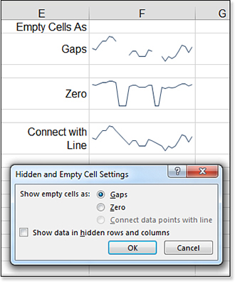
By default, any missing data in the source range is plotted as a gap, as shown in the top chart in Figure 25.20. Alternatively, you can choose to plot the missing values as zero (center chart) or have Excel connect the data points with a straight line (bottom chart). Also, by default, any data in hidden rows or columns is removed from the sparkline. To keep the hidden data in the chart, select the Show Data in Hidden Rows and Columns check box in Figure 25.20.