
The Browser Framework
This chapter describes the overall framework for web applications—including the browser itself and its components. Included are the interior structure of web pages, a little about web browser architecture, and the structure of the content area—the piece in the middle of the window holding your content.
It also describes some common pitfalls of web design that might affect how you use a browser window to deliver your applications. But first, an overview.
Browser Window: A Conceptual Model
Think about the web browser as a standard two-story office building—four outside walls, some doors and windows, floors, ceilings. Then think about the inside. Inside, you might have dozens of offices with doors, or you might have a cubicle farm, or an open warehouse space, or stacks of books on shelves. The inside of the structure, in other words, can be anything.
You can look at web design in the same way (see Figure 2-1): The browser provides the structure with its overall frame, the Back and Forward buttons, the URL address bar, and the menus, but you fill in the content area—the navigation frames, the data-entry frames, the command buttons, the fields, and so on.
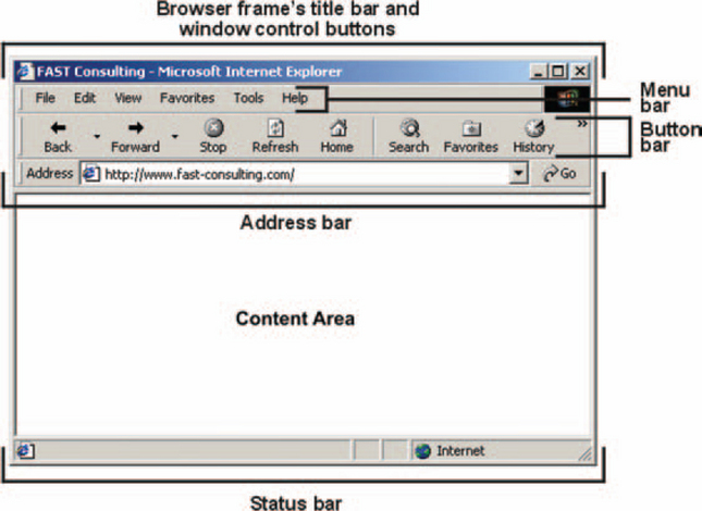
The content area does not come with frames, buttons, fields, and so forth. These structures appear because someone decided they must go there. But it’s not all wide open space. There are now de facto standards for some aspects of web page architecture—for example, if there is a vertical navigation frame, it usually appears on the left, not the right, side of the page.
Parts of a Browser Window
All browsers (Internet Explorer, Netscape, Mozilla, Lynx, Opera, and Safari)1 have built-in menus, toolbars, address areas, status bars, popup menus, and content areas.
For informational and e-commerce applications, it is probably a good idea to keep as many of the standard browser behaviors as possible since people expect to be able to go back and forward, to email specific pages, and to save graphics and text files to their hard drives.
For business applications, think carefully about controlling access to the standard functions. For example:
• For data-input applications, designers may need to restrict or capture back and forward actions to prevent loss of users’ input.
• Applications that require logins may also require logouts and force users to exit via the application’s own Close option.
• Managers of internal business infranets may want to restrict read access or copy access when making sensitive or proprietary files available online. Sites selling art, photography, music, or video may also want to prevent printing and downloads from their sites. High-volume sites have strong security systems; smaller sites can sometimes make do with off-the-shelf solutions like the one described in “Technical Note: Preventing Downloads.”
However, don’t constrict the browser’s functionality beyond what is absolutely necessary. People have come to count on the tools available in browsers and become frustrated and angry when they aren’t available.
Parts of the Content Area
Over time, people have come to expect certain types of controls or information on the windows they see (see Figure 2-2):
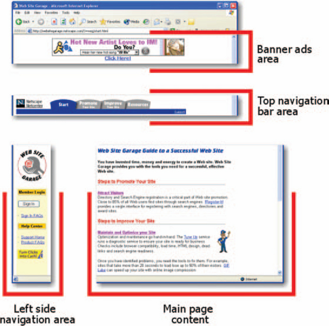
FIGURE 2-2 Parts of the content area.2
• The logo “home” control, described later in “Make Home Easy to Find”
• Left navigation panel, described later in “Put Local Navigation on the Left”
• Top navigation panel, described later in “Put Site-Wide Navigation on the Top”
• Bottom navigation panel, described later in “Repeat Links on the Bottom”
• Advertising banners, described later in “Try Putting Advertising Banners in More Than One Spot”
A Note About Navigation
In desktop applications, GUI standards require that nearly all actions be restricted to the dropdown menus at the top of the window. This rule is helpful since everyone knows from experience where to find options; in fact, people even know where to find individual options like “Print” and “Cut” on the dropdown menus.
However, the dropdown menus also hide functionality. Because you can’t see what’s on the menu until you click it and you can’t keep more than one menu open at a time to compare the lists, you can’t get a clear view of what’s available (unless the documentation contains a menu map, in which all the menus are opened up and arrayed across the page).
On web sites, you have an opportunity to make things better. The web paradigm is to show as much as possible right on the screen—yes, there are dropdown menus, but they often coexist happily with navigation panels, buttons, and underlined links.
Chapter 3, Data Input: Froms, addresses the appropriate use of buttons, links, and other controls in detail. However, keep in mind that a broad, shallow navigation structure with many visible links is generally more usable than a narrow, deep structure with just a few. In other words, it’s easier to scan large lists of possibilities (provided they’re organized in some way) than to pick one option that leads to another set of options and to another set and so on until you either find what you’re looking for or abandon the search.
Make Home Easy to Find
Logos are important for identifying your organization, but they also have another purpose on web sites: They’re used as shortcuts to the home page. In other words, if users click on the logo, they go to the home page.
Although applications aren’t seen as having home pages, they do have entry points. Providing users an easy way to start over may be appreciated.
It’s simple to turn a logo into a home shortcut: Just add a graphic link to it. Remove the purple selection box, if desired, using your web design tools or by adding border = 0 inside the image source information:
<a href = “homepage.htm”><img src=“logo.gif” border=“0”></a>
Note that organizations often design extranets (sites for customers) with the customer’s own branding. Employees using the extranet may never realize that the site isn’t internal and, in fact, that it may be managed at a location halfway across the world. In these cases, “home” should be the customer’s home page, not the external company’s home page.
Put Local Navigation on the Left
Most public web sites and many intranet and extranet sites run a navigation area down the left side of the page. Eye-scanning studies indicate that users commonly start looking at a page by scanning the left-hand list and then jumping to the list, if any, at the top of the screen. They also focus on text, not on graphics or photographs (Lewenstein et al. 1999).
There are no hard rules for what appears in this area, but if there are both top and left navigation areas, the left one seems to collect all of the “local” links—things related to the current section of the site or application. It may also contain logins, searches and, occasionally, advertising.
The navigation area may be in a frame, which lets users scroll the navigation area separately from the main area, or in a table column, which scrolls at the same time as the main area.
Designing Navigation Lists the Easy (but Thorough) Way
Coding navigation lists isn’t difficult. The difficulty comes in deciding what each name should be, what the options should be on each navigation list, and what names to use for each of the options. Here is a recommended method for defining the navigation lists. (Note that you can use the same method to organize the site as a whole.)
1. Collect a diverse team to brainstorm the menus: This is probably key, for two reasons. First, for collecting ideas, two or more heads are better than one. Second, if the group contains different enough people (sales representative, usability expert, designer, developer, customer, etc.), any misunderstandings of terms and activities will be tested and addressed.
2. Start brainstorming: Pass out index cards or sticky notes (the advantage of index cards and sticky notes will become apparent in step3). Ask each person to spend a few minutes (say five, but give them ten minutes) writing down everything he or she thinks should be on the lists. Important: Each card or sticky note should contain only one activity. The writers can use more than one word, however, to describe each action.
3. Collect the results: Go around the room and ask each person to read aloud one of his or her cards. Continue going around the room until nearly everyone has run out of cards. If a few people still have some cards, you don’t need to keep going around the room—just have these team members read their last few cards aloud. The facilitator or a volunteer collects the index cards or sticky notes and posts them on a flat surface—the wall, a table. Note that people can continue to add cards at any point (they will run out of ideas eventually).
4. Organize the results: Ask everyone to stand up and take turns arranging the notes or index cards into groups. They may also prioritize the items as well. If they spot a duplicate, they can put the duplicates on top of one another. If one person thinks a card should go in one group and another disagrees, the facilitator can make a second card to put in the second group and/or post the problematic option somewhere for further discussion.
5. Label the groups: The facilitator reads off the items in each group and asks the team to come up with a term that describes the group. These terms, once agreed upon, become the top-level labels (as well as the names for the main sections of the application). The facilitator also resolves any disagreements about which groups the actions belong to.
6. Test the results: Once you have satisfactory lists of items, type them up and try them out on unsuspecting colleagues and strangers. Make sure that each item makes sense to people who weren’t at the design meeting. However, if one person says he or she doesn’t understand an item, check whether he or she is a member of the target audience. Expert users expect and understand technical terms and may find a “dumbed-down” term puzzling, whereas novice or casual users don’t understand jargon and need standard-language terminology.
How to Organize Long Lists to Make Items Easier to Find
Aside from distributing items among left, top, and bottom navigation panels and menus, you can make life easier for users if you organize the items into groups (Kalbach 2002, p. 4). Here are two suggestions.
• Use different visual cues—change the typeface, size, and color for different groups of items. Just make sure that more important items are larger, bolder, and more colorful than less important ones.
• Chunk lists into groups, even arbitrarily. A line’s space between every eight or ten items will make it easy to scan even very long lists.
Put Site-Wide Navigation on the Top
The top navigation area, if there is one, generally contains links to the major sections of the site and to the home page. The links may be graphical, textual, or both. There can be one or more rows. If there is a second button row, the buttons here are used for local activities. (A possible rule of thumb is that the closer the buttons are to the content area, the more local they are.)
For example, Marriott uses the second row (“1 Availability, 2 Rates,” etc.) to show users where they are in the process of making a reservation (see the highlighting on “Availability” in Figure 2-3).
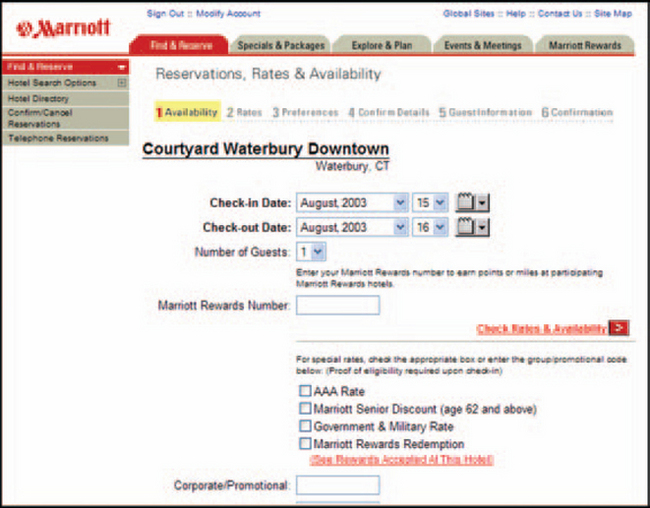
FIGURE 2-3 Top navigation areas.3
Help Users Keep Track of Where They Are with Bread Crumbs
Another top-area navigation option is “bread crumbs.” A bread-crumb area keeps track of the levels of pages users have clicked and lets them jump back to any desired level. Unlike the “You are here” method shown in Figure 2-3, in which the web author highlights one of a fixed set of tabs or frames, bread crumbs are dynamic. They change based on the user’s actions, as shown in Figure 2-4. For more information and sample code, see the box entitled “Technical Note: How to Create Bread Crumbs.”
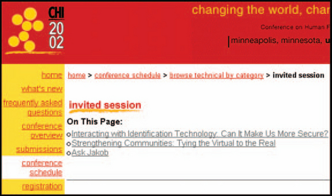
FIGURE 2-4 Location bread crumbs. See “home > conference schedule > browse,” etc.4
Repeat Links on the Bottom
The bottom is generally a repeat of the top, plus housekeeping links such as “Contact Us” and “Copyright Information.”
The reason to repeat the links is simply that people don’t want (or expect) to have to return to the top of the page to move to another part of the site, especially if the page is long.
Try Putting Advertising Banners in More Than One Spot
If your application is more information or sales oriented than application oriented, you’re probably going to have advertising banners somewhere on the site. Just make sure you eliminate them from application tasks and from sales fill-ins—if you want to make a sale, don’t distract your customers with ads for something else!
Although the most common location for ads is the top of the page, consider putting them at the bottom instead (or in both locations). In a UIE Tips article, Jared Spool, principal of User Interface Engineering, talks about taking advantage of the “seducible moment”—the moment at which a reader is mostly likely to want what you’re offering (2002). An ad at the bottom of the description of a medical condition appears exactly at the point when the readers have finished reading your information and are now ready to buy the book, tool, or service they came to the site to research.
Overall Design Issues
When setting up the web application framework, make sure that you consider the following issues.
• Different types of users require different kinds of designs, as described later in “Consider User Roles.”
• Windows should be sized correctly so that important information isn’t lost off the edges of the browser frame. See “Size Windows Correctly,” later.
• Make sure that pages can be printed without cutting off information, as described later in “Make Pages Printable.”
• Use the right palette of colors, as described later in “Use the Right Colors.”
• Make sure that the application can be localized easily. See “Make Sure the Application Can Be Localized;’ later.
• Make sure that you meet accessibility requirements. See the later subsection “Make Sure Pages Are Accessible.”
Consider User Roles
In general, there are three user roles: casual, expert, and power user. Casual users are people who come to your site or application occasionally. Expert users are people who utilize your system daily, probably as part of their jobs. Power users are “computer heads”—system administrators, installation and deployment people, programmers, and so on. (Keep in mind that these are only roles—people will switch among them, depending on the situation. For example, an expert C++ developer can be a novice with a DHTML editor.)
Different graphic styles are appropriate to each role. Bright colors, big buttons, and many decorative elements (including repeats of your logo) are appropriate for casual users. Since they don’t come to your application that often, the more attractive the site is and the more visual pointers you give them, the better.
Expert users generally prefer subtle colors, fewer logos, and less decoration. Buttons and icons can be smaller. These users are looking at the application all day long, and bright colors and flashy graphics get old very quickly.
Power users generally don’t care about the graphic elements. If anything, use elements that let them know they’re in the right frame and the right application (via a logo tucked into a corner, say), and let it go at that.
Size Windows Correctly
If you don’t control the hardware requirements, as you may not if your application is directed to all possible consumers, you should plan your designs around an 800 × 600 pixel or a 1024 × 768 pixel window. In 2003, W3Schools reports that 49 percent of users worldwide have resolutions of 1024 × 768 pixels and 42 percent have resolutions of 800 × 600 pixels (2003, p. 1).
However, keep in mind that different user populations have very different hardware and software setups. Students, for example, may be sharing computers—either one or two in a primary-school classroom for drills or banks of computers in the computer lab for learning analysis and programming skills. Teachers may have to use old, donated computers to do their paperwork.
Nurses and medical technicians may share one or two computers at the nursing station, and because the older, character-based systems are familiar and fast (or perceived to be by the experienced users), there may be no push to upgrade the computers. Security issues, which are a serious concern for medical businesses, also tend to make medical offices Internet unfriendly.
Office computers may have severe restrictions on Internet access, and the Internet may be available on only one or two computers per office. In many places around the world and in the United States, the general public may be accessing the Internet from public libraries, Internet cafes, church basements, and community centers; in these cases, the hardware may not be up to date (Jensen 2002).
If you do control the hardware requirements—you’re designing an intranet and your company has strictly enforced standards for office computers, for example—then feel free to design for them. Just keep in mind that things change—for example, internal FAQs become available to outside customers or people start telecommuting using nonstandard home computers. Consider giving yourself a margin of error and design to the corporate minimum or to public access requirements.
How to Keep Inside the Borders
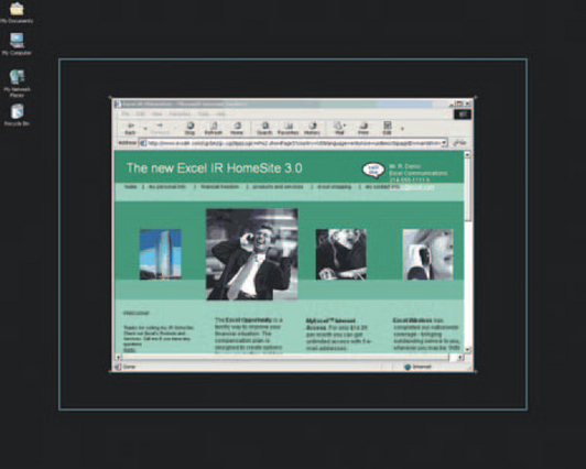
Restricting yourself to small monitors is hard to do if—like most software professionals—you work on a larger, higher-resolution monitor. However, remind yourself by putting markers on your video monitor that show the perimeters of an 800 × 600 window and a 1024 × 768 window.
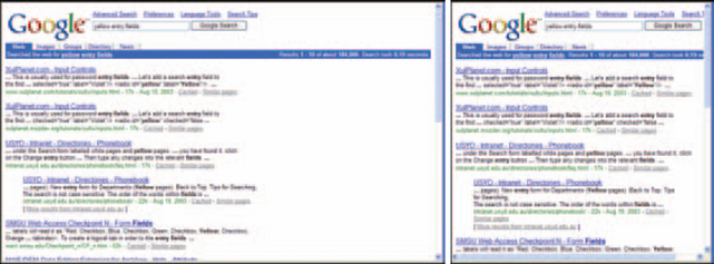
In Figure 2-5, the small white crosses demarcate the area covered by a browser on an 800 × 600 pixel window. The box demarcates the area covered by a 1024 × 768 window.
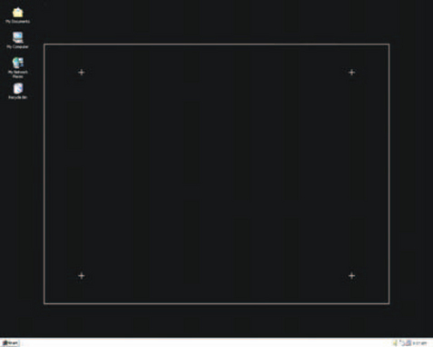
When you design a page, resize the browser window to the two templates and check whether all the live information is still visible. See Figures 2-6 and 2-7.
How to Design Resizable Windows
In addition to restricting the size of the whole window, lay out the content area so that it’s visible no matter what the resolution or the window size. You have three good choices (Kalbach 2001, p. 5):
• Oriented to the left (or to the right for right-to-left languages like Hebrew, Arabic, and some of the Indian languages)
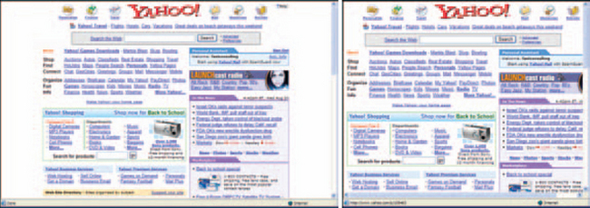
In a centered design, the important content is in the middle. Blank space, graphics, and online help and tips can be placed on either side, and if whatever is on the edges gets cut off, it doesn’t really matter. See Figure 2-8 for an example from Yahoo.
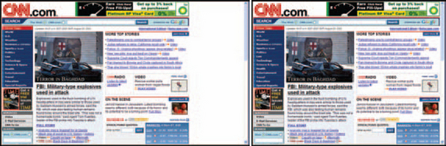
In a left-oriented design, the important information and controls are put at the left, and the right side can be blank or contain online help and tips. See Figure 2-9 for an example from the CNN web site.
In a fluid design, the text rewraps to fit when the window is too small (within reason—you can’t make a window an inch wide and expect anything to wrap correctly). See Figure 2-10.
Make Pages Printable
People do print web pages, especially when money is involved, so it’s important to get the printing right. In Figure 2-11, note that the tested page fails the 800 × 600 pixel test—the fourth column is cut off on the right. It fails the print test, too—the text is cut off on the printout as well.
Another printing problem occurs when the type or other live information is reversed—in other words, the text is white on black (or another dark color). Browsers, by default, print the text, not the backgrounds. If the text is white or another light color, nothing shows up on the printout.
Although both Netscape and Internet Explorer let users set an option to print reversed text in black and print background colors and images,
many people don’t know about them. You shouldn’t count on them to find it.
Many developers still use tables to organize material on the page (see the box “Technical Note: If You Must Use Tables” for more information). However, cascading style sheets (CSSs) prevent both resizing and printing problems and make text accessible for screen readers. See “Technical Note: Use CSS to Format Pages Correctly” for more information.
Use the Right Colors
“Web-safe colors” are the set of colors that the three primary browsers, Mosaic, Netscape, and Internet Explorer, use in their browsers, minus 40 colors that are slightly different between Macs and PCs. By eliminating the 40 variable colors, the web-safe palette is optimized for cross-platform use.
If you don’t stick with the web-safe palette, nothing blows up. However, some colors will be dithered—in other words, since the browser doesn’t have that color in its set, it tries to match the color by putting pixels of two or more colors next to one another. (This is how paper-based four-color printing works—there are only four colors of ink, but by putting dots of various colors next to one another, your eye is fooled into seeing millions of colors.)
For high-resolution screens, dithering may not be much of a problem. But on lower-resolution screens, the pixels start to pop out and cause eyestrain.
Lynda Weinman has a famous site on which she published the complete set of web-safe colors. Note, though, that she no longer believes that restricting one’s palette to 216 colors is justified (except, possibly, for PDA and web-phone applications).
In 1996, when she first published the palette, she says, most computer users had 8-bit color cards and could not display more than 256 undithered colors. That is no longer the case, which is good news: “A designer would have never picked these colors [for a palette]. Mostly, the palette contains far [fewer] light and dark colors than I wish it did, and is heavy on highly saturated colors and low on muted, tinted or toned colors” (1999–2003, p. 1).
Make Sure the Application Can Be Localized
Internationalization means to set up software so that all text can be translated easily into multiple languages. Localization means to actually translate the interface and to allow data entry in the local language.
Consider internationalizing and localizing your applications whenever the following are true.
• There is more than one official language in an area. For example, in Canada, most software must be available in both official languages, French and English.
• There is more than one unofficial language at home. For example, in Miami, Florida, Spanish is an unofficial but widely used second language and businesses lose customers if they communicate only in English.
• Your company wants to sell to international markets. Many software companies (Microsoft, for example) make more of their profits overseas than at home.
There are two aspects to localization: cultural and technical. The cultural aspects include locale-specific colors, images, calendars, number formats, sort orders, and national languages.
The technical aspects revolve around encoding, storing, and displaying data and controls in such a way that people can see, add to, and change the data using their native languages.
This section addresses only the most pressing requirements for web application internationalization. However, there is a wealth of information about both the cultural and the technical aspects. If you are considering internationalizing your applications, see the books and web sites listed in Resources.
Which Encoding Scheme Should You Use?
Textual data can be represented in either of two ways: with specific character sets for a particular region or language (for example, “Western Europe,” or “CJK,” for Chinese, Japanese, and Korean); or with Unicode, which contains codes for characters in almost every human language.
Specific character sets have these advantages over Unicode:
• Your current software probably uses them already.
• The software can have typefaces that are esthetically pleasing and optimized for each particular language. With Unicode, on the other hand, the software has to rely on whatever typeface is available. For example, of all the faces supplied with Microsoft’s Internet Explorer, only Arial Unicode MS and Lucida Sans Unicode contain the entire Unicode range of characters.5
• Language-specific character sets are small (255 characters), unlike the Unicode character set. Version 4.0 of Unicode contains approximately 99,000 distinct characters.
Even if users or customers are in different countries working in various languages, you can still accommodate them by providing multiple versions of the application translated into their languages and employing their character sets.
However, if users need to be able to enter or see more than one language at a time—for example, if they need to enter names and addresses in, say, German and Korean—then the software must use Unicode. Only Unicode lets people input and display text in multiple languages at the same time.
Another advantage of Unicode is that each character has only a single code point, or ID. If you use specific character sets (also called “charsets”) instead of Unicode, “[t]he code point 230 might be the Greek lowercase zeta (ζ), the Cyrillic lowercase zhe (χ), or the Western European diphthong æ. All three characters have the same code point (230), but the code point is from three different code pages (1253, 1251, and 1252, respectively). Users exchanging documents between these languages are likely to see incorrect characters” (Microsoft 1999, p. 2).
How to Indicate the Encoding Scheme
Any time that data are passed from one program to another, the first program’s character set should be indicated explicitly; otherwise, the browser may use the default, whether or not the default is correct. The charset can be defined as part of the protocol or API or provided explicitly in the HTML header (Vine 2002, p. 1).
For example, you can use the CHARSET attribute in the META tag to show the browser (and any interested humans) what scheme was used to encode the data. This statement indicates that the text was encoded in Russian (charset 1251):
This statement indicates that it was encoded using Unicode, 8-bit:
However, keep in mind that if the browser is too old to recognize Unicode, it probably won’t display non-ASCII characters correctly. The ASCII characters are the first 128 characters in the Unicode set.
For lists of character-code sets, see the section on code pages and character sets in Resources.
How to Store Localized Data
To store and handle localized data correctly:
• Make sure that fields and message frames are big enough. If you’re starting from English, keep in mind that English is fairly compact compared to other languages. See Table 2-1 for expansion rates. Also, keep in mind that Chinese, Japanese, and Korean scripts expand vertically—ideographs tend to be taller than alphabetic scripts.
TABLE 2-1
Rules of thumb for translation expansion.
| Type of Text | English Length (with Spaces and Punctuation) | Additional Space Needed |
| Button labels, field labels, menu options | 1–20 characters | 80–200 percent |
| Messages, onscreen instructions | 20–50 characters | 40–80 percent |
| Online help, documentation, content-management records | 50–70 or more characters | 30–40 percent |
• Learn how to index and sort records correctly for the locale; for example, in Czech, the word hiša is sorted after Czech and  uēt but before chaque. In Danish or Norwegian, however, the order is chaque, uēt, Czech, hiša. Sorting in ideographic scripts like Chinese and Japanese is not done alphabetically—there is no alphabet. For more on sorting in various scripts, see Developing International Software (Kano 1995, 271–285).
• If the users employ Unicode for input, make sure you pick a Unicode-enabled database package—see Table 2-2.
TABLE 2-2
| Browsers | Version |
| Internet Explorer | 4.01 or later |
| Lynx | 2.8 or later |
| Mozilla | 1.02 or later |
| Netscape Navigator | 4.03 or later |
| Opera | 6.0 or later |
| Safari | 1.0 or later |
| Databases | Version |
| MySQL (open source) | 4.1 |
| Oracle | 8.i |
| SAP | 7.3.00 |
| Sybase | 6.0.x (Adaptive Server Anywhere) |
How to Display Internationalized Data
Displaying internationalized information has two aspects—localizing the interface (the field names, buttons, links, etc.) and displaying the information in the correct language. Here are some general suggestions for displaying information correctly.
Take advantage of the internationalization tools available from development platforms and packages. Sun, Microsoft, Apple, and others have developed APIs specifically addressing many of the most difficult internationalization problems—for example, showing bidirectional scripts correctly, concatenating messages correctly for languages with different word orders, and sorting records correctly for the current locale.
Check for and pick up the locale from the operating system and, if there is a difference, from the browser preferences (users may be running in one locale but set their browsers to a different locale). Avoid asking users to set a locale in your software. However, you might need to make an exception when the domain is highly technical and the technical terms (not the language) differ because of geography or history. For example, in South Africa, telecommunication terms are similar to but not exactly the same as British telecommunication terms, which are very different from U.S. and Canadian terms. If you were to design an internationalized telecom package, even if it were marketed only in English-speaking countries, you’d have to provide different labels and help tips for the United Kingdom, South Africa, Australia, Canada, and the United States (or, better yet, a method that lets customers add and change the terms themselves).
Make sure that the right charset is set. A web page can easily be saved with the wrong character set if the designer forgets to reset the defaults and/or to check what was the development package put into the META tag. A mismatch between the user’s locale and the page’s charset can mean garbage on the screen.
Clearly document methods for accessing and downloading typefaces for the local language, both for the system administrators who will do the job in large corporations and for individuals who will do it on their home or small-business computers (Wood 2003). If the data were saved using the Unicode character set, also explain how to install a universal font.
If you’re using Java or other programming languages, put all text messages, labels, and localized terminology in resource files (also called resource bundles). Never embed text in software controls. HTML files can be translated easily and don’t need to employ resource files. However, make sure that commands don’t get translated by mistake—the application won’t work if they do!
Localize pictures. Remember that localized images should take the same filename in each localization directory. Otherwise, the picture will be “broken” in one or more of the displays. For example, an image referred to as new.gif on all of the internationalized pages should have the same name in the images/en_US directory and in the images/pt_BR (Brazilian Portuguese) directory, even if the images are completely different (Trachtenberg 2002, p. 6).
Watch Out for Mismatches
Most software does not live in a vacuum. An in-house software system will depend on other software systems within a company. If the other systems aren’t Unicode-enabled, the character sets will have to be translated at the interfaces between your system and the other systems.
In-house and commercial software often incorporates packages from third-party vendors. If these other packages aren’t Unicode-enabled, then they may restrict how thoroughly your software can be localized. Note: If you’re looking for third-party packages, internationalization should be added to your list of criteria. If your package isn’t ready for internationalization yet, this criterion can be lower priority, but don’t ignore it.
The browsers used for data input and display may be Unicode-enabled, but that won’t matter if the database isn’t. See Table 2-2 for Unicode-enabled database packages.
All current versions of the browsers are Unicode-enabled, but earlier versions may not be (see Table 2-2). If your company or client controls the hardware and software, you can require that users upgrade their browsers; if not, you may have to find other solutions—a menu of localized versions, for example, from which the users pick the version that is in their language.
Make Sure Pages Are Accessible
For the software industry, accessibility means to make an application usable by people with disabilities. In the United States, Section 508 of the Workforce Investment Act of 1998 requires that electronic and information technology built for or sold to federal agencies must be accessible to people with disabilities.
The government itself hires numerous people with disabilities, and many others use government sites to apply for benefits or grants, pay taxes, check on real-estate liens and transfers, and so on. Because almost every kind of software is sold to government offices and agencies, quite a few software companies have decided to make their products “508 compliant.”
This section addresses only a few broad aspects of accessibility. However, many excellent books and web sites are available on the topic. If you’re considering making your applications accessible, see the books and web sites listed in Resources.
Use Universal Design Principles
Making applications more accessible is common sense. As the authors at the Trace Research & Development Center at the University of Wisconsin put it (Trace R&D Center):
People who could benefit from more universal designs include many both with and without disabilities. In some cases, people may experience difficulty in using products purely as a result of the environment or an unusual circumstance. Beneficiaries of universal design include:
Aging is an important factor. The “Baby Boom” generation, an enormouscohort born in the 1950s, is getting older. Interfaces that accommodateworsening eyesight and arthritic wrist joints might start to become fashionable,or at least unremarkable, simply because there are so many of us asking for them.
Don’t Confuse 8 out of 100 Men
An often-overlooked area is color blindness. Eight percent of males are redgreen color-blind, which means that, in every room containing 25 men, two will probably be unable to separate red and green elements from one another.
The term color-blind is a little misleading. Many men who are color-blind can actually see reds and greens when they are separated. However, when the two colors are next to each other, they tend to melt together and become indistinguishable.
What this means in practical terms is that your designs should not use red and green (a) alone, as the only method for indicating meaning; and (b) next to each other (and to browns and blacks) in interfaces.
Make Styles Easy to Change
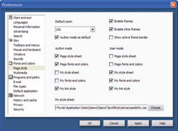
Many users take advantage of operating-system accessibility tools like highcontrast displays (white-on-black text) and browser accessibility options. Both Internet Explorer and Opera let users override typefaces, font sizes, and colors and substitute a preferred style sheet for the web page’s style sheet, as shown in Figure 2-12.
Making an interface accessible doesn’t mean that you can’t design your interfaces with the corporate colors and fonts. Rather, you simply have to make sure that you allow for changes; don’t hardcode anything. For example, to avoid overriding type-size preferences, use relative font sizes (for example, “200%”) instead of absolute ones (“12 pt”) (Nielsen 1997, pp. 2–3).
Use Text Wisely
“ALT text” is an alternate description of a picture or other graphic element. The text is added to images using the ALT attribute of IMG (image) tags. For example, this tag creates the text you see in Figure 2-13:

<img src=“images/banner.gif” alt=“FAST Consulting banner graphic. Click here to return to the home page”>
ALT is important for two reasons.
1. On slow-loading modems, ALT text appears immediately and lets users click on the item, if it contains a link, before it is completely visible on the screen.
2. ALT text is the only way for people using screen readers to know what is in a graphic.
Another useful IMG attribute is LONGDESC, which lets you add the URL of a file that contains a longer description of the image. For example:
Don’t forget TITLE, in which you can put a readily understood name for the entire page. It appears in the title bar of the browser. For example:
If your application is internationalized, remember to get all of these text elements translated as well. For help localizing ALT tags, see Trachtenberg’s “Internationalization and Localization with PHP” (2002, p. 6).
A bread-crumb trail is a method for keeping track of where you are in a site so that you can retrace your route (the name comes from the bread-crumb trail that Hansel and Gretel left behind in the Grimm’s fairy tale). Each spot on the trail, except the last, is a link.
Keith Instone from IBM analyzed bread-crumb trails and discovered that there are three types (2003, p. 1):
• Location bread crumb, which tells the users “You are here” in the site’s hierarchy. This type reports the user’s position rather than tracking it and is therefore essentially static. See Figure 2-4, the CHI2002 conference site, for an example of a location bread crumb.
• Path bread crumb, which shows the users each page they’ve touched. This type is dynamic and especially useful for data-driven applications. Two users on the same page may have gotten there two different ways, and the bread crumbs will show that. See Figure 2-14.
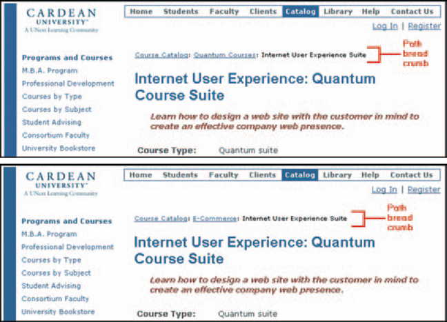
FIGURE 2-14 Path bread crumbs. Notice the different routes to the same page.6
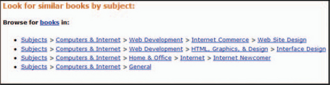
• Attribute bread crumb, which looks like a bread crumb but doesn’t track the users’ trek through the site. Rather, it acts like an extended keyword. Attribute bread crumbs are most often used on search sites and e-commerce sites. More than one path can appear on the same page, and since they are set up by an indexing process rather than via the user’s movement through the site, they may not change between visits. A typical example appears in Figure 2-15.
6From “Cardean Quantum Courses: Internet User Experience,” © 2002 by UNext.com LLC, http://www.cardean.edu/cgi-bin/cardean1/view/catalog_quantum_course_description.jsp.
Here’s the script for a “path” bread crumb trail. Put it inside the <head></head> tags:
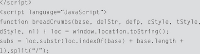
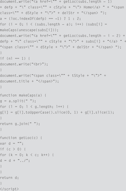
Then, wherever you want the actual bread crumb to appear, you put this line (minus the bracketed comments):
Here’s an explanation of some of the terms in this code.
• site root directory: This is the base, or root, directory of your site. For instance, if your site is named “http://www.fast-consulting.com/”, your base is “www.fast-consulting.com”. If your site is a subdirectory off of a main directory (like http://www.fast-consulting.com/~subdir/) your base would be www.fast-consulting.com/~subdir. This will be replaced with “Home” in the bread-crumb list.
• text or image delimiter: The delimiter is the separation between the crumbs on the trail. For instance, in this trail, Home | Scripts | Extensions | Breadcrumbs, the delimiter is “|” (the “pipe” character). You can also use an image as a delimiter by substituting the location of a graphic file (for example, “<img src=‘button.gif’>”) for the text delimiter (the pipe in this case).
• default page: The default page is the page that loads whenever you click on a crumb. This has to be universal and has to be in every directory that will have a bread-crumb trail going through it. This is why we always use index.htm or default.htm as our home page identity.
• crumb, title, and text delimiter style: You can use a cascading style sheet (CSS) to apply a fixed style to the crumb trail. If you’re using a graphic as a delimiter, the style statement won’t have any effect on it. If you already have a style sheet linked to your pages, you can just add these styles to the sheet and they’ll link automatically.
Use CSS to Format Pages Correctly
Cascading style sheets (or CSSs; see Figure 2-16) are text files referenced by HTML, DHTML, XML, and other W3C standard files that describe how documents are to be presented on screens, in print, on portable devices, and via text readers.

FIGURE 2-16 One HTML file, four style sheets.8
CSSs were originally created to let designers separate the description of the layout from the content and thereby make it easy to take advantage of the strengths (and avoid the weaknesses) of a given browser or technology.
By providing different CSSs for various situations, the web page is reformatted automatically to suit the browser or printer. However, it turns out that CSSs are useful for other reasons as well.
First of all, a CSS speeds up development and maintenance. On sites with many pages, for example, it is much faster to change a CSS than to change all of the individual pages and to find and fix markup errors. It can make the files smaller as well: In an interview about Wired News’s switch to CSS, designer Douglas Bowman says, “The sheer amount of redundant <font> tags inside every cell was probably enough to double the file size” (Meyer 2002, pp. 1–3).
Style sheets are unusually helpful for prototyping. Designers doing iterative designs can change the look and flow of an entire web application very quickly by tweaking the CSS (Spool 2003, pp. 1–3).
Style sheets can also be used to support accessibility. The CSS specifications contain properties that support voice synthesizers, Braille, and teletypewriters (W3C 1999, p. 7), and they make it easy for users to change text sizes. In Figure 2-17, for example, when the user clicks one of the A’s on the right, a different style sheet is loaded and the typefaces throughout the site get larger or smaller.
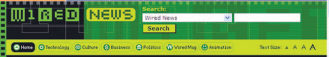
FIGURE 2-17 Changing text sizes with style sheets.9
Last but not least, style sheets let web applications, including ones built with Java,7 change the look of items based on rules. For example, in Figure 2-18, all customers with quantities over 300 (“Fergusson and “Smith”) are highlighted; rows that have not been updated are highlighted; and quantities are colored (teal, black, and a dark turquoise) according to their values-100s, 200s, or 300s (Kaplan 2003, pp. 5–6).
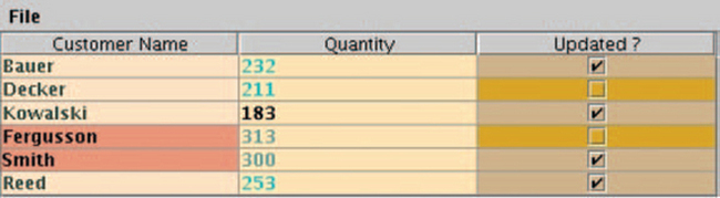
FIGURE 2-18 Rows change color based on contents.10
One note: Older browsers (i.e., versions prior to Internet Explorer or Netscape 4) may not support CSS. If you know that the users have kept their equipment and software up-to-date, then use style sheets. If your application is designed for the general public, however, you might want to stick with standard HTML tags and tables (see the earlier box “Technical Note: If You Must Use Tables”).
Obviously, this section of the chapter hits only a few high points. See Resources for more on cascading style sheets.
8From “Zen Garden: The Beauty in CSS Design,” © 2003 by Dave Shea (and others), http://csszengarden.com (accessed 27 August 2003).
9From Wired News, © 2003 by Lycos, Inc., http://www.wired.com/news (accessed 27 August 2003).
7ILOG, Inc., offers an implementation of CSS for Java. See www.ilog.com/products/jviews/demos/ for sample applets.
10From “Styling Java User Interfaces,” © 2003 by Fawcette Technical Publications, http://www.fawcette.com/javapro/2003_05/online/pkaplan_05_29_03/default.asp (accessed 27 August 2003).
1For an overview and links to the various browser home pages, see “Basic Questions about the Web,” http://www.boutell.com/newfaq/basic.html (accessed 20 August 2003).
2From “Web Site Garage,” © 1999 by Netscape; no longer available (accessed 28 November 2001).
3From “Check Rates & Availability,” © Marriott International, http://www.marriott.com/reservations/Availability.asp (accessed 15 August 2003).
4From “CHI 2002: Invited session,” © 2002 by Association for Computing Machinery, http://www.sigchi.org/ch2002/browse-invited.html (accessed 26 September 2002).
5Or not. When you look at the lists on the “Insert Symbols” dialog box in Microsoft Word, you can see that some character sets are missing from the Arial and Lucida Sans Unicode typefaces.