
Data Input: Forms
The data-input section of a web application lets users enter, save, delete, and modify data in databases. The databases are generally managed at corporate locations on servers; input, however, can be done from anywhere, including handheld computers.
Although there are two ways to put data into databases—manual input and data feeds—this chapter concentrates on manual input. Data feeds have minimal user interfaces that contain only three commands: start the job; interrupt the job; and check error and completion messages.
Note that data-input systems do not use, save, or open files (except for an occasional settings file), so they don’t include File Save, File Open, File Print, or other such options. Instead, the applications save, open, and change records. The data-output section, however, will save files—in this case, reports, labels, graphs, and so on. Data output is discussed in later chapters.
Conceptual Model: Lists versus Objects
Data-input systems have two views for data: lists (also called tables) and objects (also called records or input forms).1 There are lists of objects and there are individual objects.
You can easily flip between the two views—when you open a row on the list, the row becomes an object in its own input form (see Figure 3-1). When you close the form, you return to the list of objects.

This concept may sound either obscure or elementary, depending on where you stand on the designer/developer continuum, but it can be a powerful organizing principle when designing windows for database applications.
For example, from a workflow point of view, you can tell users, “You always start with the list of customer-service callbacks [or whatever the list contains]. You pick one and open it, resolve it, and close it. Then you’re back at the list again.” In other words, the list window is “home” for both the user and for all the objects in the database.
The list and object duet in Figure 3-1 is one of the simplest ways to show database objects: The inbox is the list, and the email is the object. General guidelines for input forms appear below; guidelines for lists appear in Chapter 4.
Data-Input Forms: The Basics
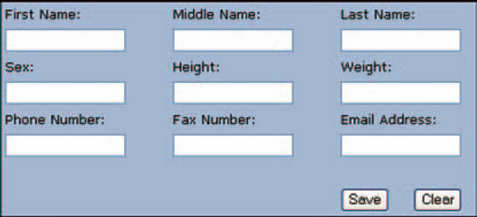
Input forms like the one in Figure 3-2 let users enter information and act on (saving, deleting, etc.) their entries.

FIGURE 3-2 Simple data-input form.2
• Users enter information using a set of fields (also called text boxes) and controls such as checkboxes, radio buttons, and dropdown boxes for selecting items from lists.
• Users act on the information using buttons. Commands (“Save;” for example) are generally handled using buttons, not menu options. This is unlike desktop systems, where all main window options are done using menus, and only dialog boxes (or, occasionally, specific areas of a window with their own very restricted subset of actions) have command buttons.
Both of these types of activities are described in the next few sections.
Use Fields to Collect Free-Form Information
Fields, or text-entry areas, are boxes into which users can type information—names, addresses, phone numbers, etc. They are not the only control with which you can collect data, but they are the most common and most easily programmed (until you start doing the validation rules, that is).
Know the Various Field Types
Fields can be protected or unprotected, required or not required or conditionally required. Standard, required, and protected fields overlap: For example, protected fields can change from protected to entry, depending on which business or data-integrity rules are in effect (the conditions).
Standard Field, Defined
In interface terms, a field is an area on the screen that lets users enter and edit text. Depending on the type of application, fields allow users to enter, edit, and save database and system information or to enter values for analyses.
General Design Guidelines
For input forms on public web sites where users may not know how to type, use text-entry areas only for information that can’t be chosen from a list. For example, you can’t expect to select your last name from a list, but you can select your state and the expiration month and year for a credit card.
However, if your input form is used by experienced data-entry personnel or other people who work on their computers all day long, use text-entry fields or text-adapted controls as often as possible (more on this later). People who spend much of their days typing hate switching back and forth between the mouse and the keyboard. Also, data-entry personnel are sometimes paid by their input speed, and you want to avoid slowing them down for any reason.
Entry fields should look like they accept data. Create this effect by:
• Providing a frame or box for the entry area.
• If possible, using a beveled border that makes the field look inset. (HTML-only frames may not be able to show a beveled border.)
• Using a different, lighter color for the entry area so that it contrasts with the background.
• Except for passwords, always displaying the user’s entries as he or she types them. Other guidelines:
• If possible, indicate focus—in other words, assign a field to accept focus when the user opens the window and then continue to show which field the cursor is in. (Different development platforms may or may not handle initial focus well.)
• When a field appears, it should either be empty or contain an initial default value. If the field contains a value, the value should become selected (and therefore editable or replaceable) as soon as the cursor enters the field.
• Provide a label. However, because the data are more important than the labels, make sure that the labels are smaller, lighter, or less visible than the data.
• Group related fields. Do not group unrelated fields. People automatically assume that fields that are together belong together and that fields that are separate do not belong together.
Make Entry Areas the Right Size
Field size can mean three things: The maximum size of the field in the underlying database, which usually has nothing to do with what users see on the screen; the number of characters accepted in the field (in HTML, the “maxlength” attribute), usually called the field length; and the size of the entry area on the screen (in HTML, the “size” attribute). For example, this HTML code creates the entry area shown in Figure 3-3.

To pick the appropriate field length and screen size for a field, first try to find a set of standards, either from an internal source or from a standards organization. For example, e-commerce system designers can use the Electronic Commerce Modeling Language (ECML) specification for field lengths (see Table 3-1 for some examples). Other international standards are listed in Resources.
TABLE 3-1
Sample of ECML standard ship-to fields.
| Field | Name | Minimum Length |
| ship-to title | Ecom_ShipTo_Postal_Name_Prefix | 4 |
| ship-to first name | Ecom_ShipTo_Postal_Name_First | 15 |
| ship-to middle name | Ecom_ShipTo_Postal_Name_Middle | 15 |
| ship-to last name | Ecom_ShipTo_Postal_Name_Last | 15 |
| ship-to name suffix | Ecom_ShipTo_Postal_Name_Suffix | 4 |
| ship-to company name | Ecom_ShipTo_Postal_Company | 20 |
| ship-to street line1 | Ecom_ShipTo_Postal_Street_Line1 | 20 |
| ship-to street line2 | Ecom_ShipTo_Postal_Street_Line2 | 20 |
| ship-to street line3 | Ecom_ShipTo_Postal_Street_Line3 | 20 |
| ship-to city | Ecom_ShipTo_Postal_City | 22 |
| ship-to state/province | Ecom_ShipTo_Postal_StateProv | 2 |
| ship-to zip/postal code | Ecom_ShipTo_Postal_PostalCode | 14 |
| ship-to country | Ecom_ShipTo_Postal_CountryCode | 2 |
| ship-to phone | Ecom_ShipTo_Telecom_Phone_Number | 10 |
| ship-to email | Ecom_ShipTo_Online_Email | 40 |
For fields not covered by standards, you can find the right sizes by collecting sample data and then averaging the lengths.
Generally, the maximum field length and the maximum entry-area size should be the same. However, if your screens are very crowded and if the maximum size of an address field is, say, 45 but the average address is 25 characters, you might want to make the entry area 25 characters long but retain the actual maximum field length at 45. This means that, if the user types an address of 30 characters, the area scrolls horizontally while she types, and the last five characters are hidden once she leaves the field.
When the widths of a number of fields are similar, make them all the same width rather than defining customized widths for each one. However, keep in mind that the size of the entry area signifies the data length to users. Don’t be tempted to make entry areas too short or too long only for esthetic reasons.
If you are going to internationalize your interface, make sure you repeat the average-field-length tests for entries in the target languages. These entries can be 10–200 percent longer than their English counterparts.
Don’t Make Users Format Text
Don’t force users to enter leading zeros or to change the text’s case themselves. Also don’t force users to right-justify or left-justify entries: Let the software do it.
• If the entry is alphabetical, left-justify it.
• If it’s numeric, right-justify it.
• If it’s decimal, justify the entry around the decimal point.
However, note that different writing systems have different justification rules. For example, Hebrew and Arabic writing systems are bidirectional—text is entered and displayed from right to left, but numbers (and any Roman-alphabet words) are entered and displayed from left to right.
Provide Keyboard as Well as Mouse Navigation
Try to make it easy for users to move through the form via the keyboard. The minimum requirement is to set up a good tab sequence so that the Tab key moves the user from field to field in a logical order. The HTML attribute is called “tabindex= n,” where n is the order of the control in the tab sequence.
Development systems generally use the control-creation order as the default tab order—in other words, the first field you create is first in the tab order, the second field you create is second, and so on. The order breaks down when the developer changes fields, moving or replacing them. If a screen has suffered many changes, check that the tab order is still in order—from top to bottom, left to right (in left-reading languages).
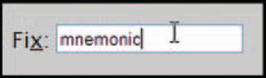
Mnemonics that let users jump to particular fields using Alt and a letter or number can also be useful (but do some usability testing before investing a lot of development time—if no one will ever use them, there’s no point in doing all that handwork). The HTML attribute is called “accesskey” (“alt” being used for “alternate text”). For example, this code generates the mnemonic in Figure 3-4.
Retain Cut, Copy, and Paste
Data-entry applications should, at a minimum, allow cut, copy, and paste using the browser’s standard toolbar buttons, menu options, and accelerators (Ctrl+X for cut, Ctrl+C for copy, and Ctrl+V for paste).
Also, let users select data via the keyboard (not just the mouse). Shift plus the left and right arrows selects text in Internet Explorer, Opera, and Mozilla.
Label Fields Correctly
There are two basic styles of input forms: single-screen, heavy-duty data-input forms, discussed next, and long, scrolling e-commerce forms, discussed in “How to Label e-Commerce Forms.”
How to Label Data-Input Forms
If you are creating a data-input form, you need to put as many fields in the same frame as possible, to help the people doing input keep track of where they are. Fields should be organized in columns and groups, not in one long scrollable list down the screen. If there are too many fields to fit on one screen, then provide multiple screens and a method, such as tabs or pop-up windows, to move between them.
Also consider whether the application will be used internationally, especially if you’re starting with English, which is a fairly compact language. An English phrase or sentence translated into German or Russian, say, will become 10–100 percent longer.
If you expect to internationalize your application, put the field labels above the fields, not at the left (or at the right in right - to-left - reading languages) (Figure 3-5). This allows the field labels to expand or contract as needed and lets you put many fields in the same area.
How to Label e-Commerce Forms
If your form is used to collect customer or client information—names addresses, and so on—you can follow the de facto standard for many sales-oriented forms: a long column of fields with labels on the left (or on the right for right-to-left languages).
The labels are sometimes right-justified to keep them close to the fields, as shown in Figure 3-6. However, most forms left-align the labels (see Figure 3-7 for an example). How do you decide between the two styles?

FIGURE 3-6 Right-justified labels.3
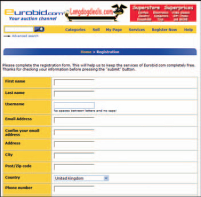
FIGURE 3-7 English version of the form.4
In general, experts recommend left-aligned labels when users might be expected to scan a form—left alignment makes it easier to find one label in a set of labels and reduces the visual complexity of the form (it is harder to find the beginning of a word along a jagged left edge). They sometimes recommend right alignment when users are tabbing from field to field and/or the labels are of very different lengths—keeping the labels near the fields reinforces the visual association between label and entry area.
Also, use a colon to end the label—in the absence of other cues (such as the “Label for” attribute described in “Make Sure Labels are Correctly Tied to Their Fields”), screen-reading software uses colons to recognize labels.
Accommodate Less Experienced Users
If your audience is not computer savvy, a long, scrolling form might not be the best approach, since these users may not notice the scroll bars and may try to exit from the window prematurely.
Here are two alternative approaches:
• Use a set of windows, optimized for 800 ×600-pixel screens, with “Next” and “Previous” buttons.
• Use a scrolling form but avoid “false bottoms”—a break at the bottom edge of the screen that makes it look like the page has ended.
In either case, carefully test the form with the target audience before deciding and state explicitly when a new window will open or when the user should click the “Next window” button (Chadwick-Dias 2002, p. 1).
Use Different Labeling Strategies for International Forms
If the form will be internationalized, you have two options: Put the labels, left-aligned, above the fields, as described above, or create a table with resizable columns.
In the second strategy, the labels go in the first column and the fields in the second. Then whatever language you use, the columns will resize to accommodate the text. For example, compare Figure 3-7, the English version, to Figure 3-8, the Spanish version: same form, different language, no problem.

Make Sure Labels Are Correctly Tied to Their Fields
Screen readers like Jaws can associate a label with its field, no matter where the label might appear, provided you explicitly associate the two. In HTML, for
example, you can use the <label for=“id”> attribute. For example, this code creates the label and field shown in Figure 3-9:5

Note that, although you can put the label anywhere if you associate it correctly, people using screen magnification software (and the rest of us, as a matter of fact) need the label to be near its field.
How to Group Fields
For ease of use and speed in finding a field, nothing—not even label alignment—beats grouping fields, according to the research done by Tom Tullis (2003b, personal email):
I measured the speed and accuracy with which users could find various target items on the screens. They were encouraged to be highly accurate, so error rates were very low and the main analyses were done on the time data ….
For the search time data, the best predictors were the two measures related to the grouping of characters on the screen. As either the number of visual groups increased or the average size of those groups increased, the search time increased. Overall density and local density were also significant predictors, but less so than the grouping measures. Interestingly, the layout complexity measure (i.e., alignment) was not a significant predictor of search time.
He adds that although left alignment didn’t help with search speed, “the single best predictor [of high ease of use ratings] was the layout complexity measure. As elements on the screen got less left-aligned with each other, subjective ratings got worse.”
Grouping fields is simple: Instead of laying fields out on the screen willy-nilly, you group the items that go together and separate them from unrelated items. You don’t have to use boxes or rules; empty space between the groups is often enough.
For example, in Figure 3-10, the date information is set in a horizontal area along the top, information about the organization writing the mortgage is at the left, and information about the type of mortgage is on the right.

FIGURE 3-10 Grouped fields.6
Complexity Is Not Necessarily Bad
Another aspect to grouping fields is the “decision complexity advantage,” which, although designers don’t often address it explicitly, can be important to user satisfaction. Research indicates that it is often more efficient to show users a small set of complex decisions rather than a large set of simple decisions. In other words, making one six-step decision is faster than making six one-step decisions.
So, for example, a financial trader is likely to be happier with many small frames on one screen than one big frame containing only one type of information at a time. Pharmaceutical researchers will prefer a window with many inputs and outputs rather than a window that forces them to make one choice at a time. Experienced data-input personnel will be more satisfied with a window crammed with fields (as long as it’s organized well) than one that makes them move from screen to screen.
Offer Automated Entry Fields
A web application can have two types of automated field entry: Auto-complete and auto-fill.
Auto-complete “remembers” users’ input and provides a list of earlier entries that match the first few letters typed in (see Figure 3-11).

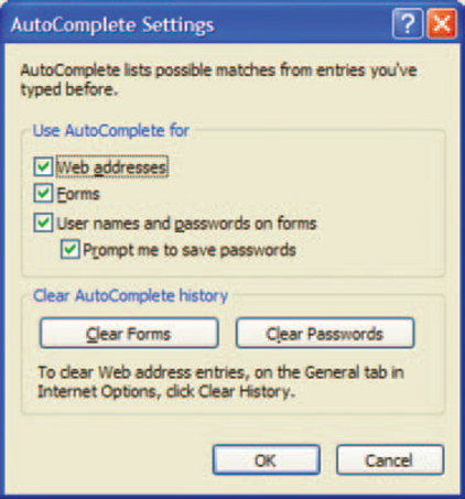
Users can turn auto-complete on and off with their browser’s Preferences dialog box (see Figure 3-12). Developers can set an auto-complete property for individual data-entry fields. For information about creating auto-complete fields in HTML forms, see the section on auto-complete in Resources.
Auto-fill may look the same as auto-complete at first glance, but it employs an HTML standard to create its effects. Using a set of standard field names called the “Electronic Commerce Modeling Language” (ECML), it copies personal data from a user’s “electronic wallet” into forms. Banks, online merchants, gambling sites, and Google, among others, offer auto-fill options. Table 3-1 shows the first section of the specification (Eastlake and Goldstein 2001, p. 5).
Google’s auto-fill is handled through its add-on toolbar. Figure 3-13 shows the dialog box that collects the user’s information. Figure 3-14 shows a Staples form that accepts the preset entries when the user clicks “AutoFill” on the Google toolbar (the button is on the far right). The auto-fill fields are marked in yellow.


FIGURE 3-14 A Staples.com form with auto-fill fields highlighted in yellow.7
Although the ECML standard and electronic wallets are designed primarily for consumer e-commerce applications, some of the fields might be useful in business-to-business, extranet, and electronic data transfer (EDT) transactions. For information about auto-fill, see the section on auto-fill in Resources.
How to Show Protected Fields
Sometimes fields become protected—unavailable or disabled temporarily because of business or data-integrity rules. When fields are temporarily inactive, follow these guidelines.
• If users cannot change the contents of a field temporarily, turn the contents lighter (gray or a pastel version of the dominant color on the window), but do not change the background color of the entry area or the color of the label.
• If the entire field is inactive, gray out the label and background of the entry area.
For example, in Figure 3-15, fields that are can only be changed on other windows (“State where property is located,” “Application Type,” and so on) are shown as protected.

FIGURE 3-15 Temporarily protected fields at the top of the input form.8
Display-only, permanently protected fields, on the other hand, use the window’s background color for their data areas and shouldn’t have borders. Users may not even realize that these are fields, unless they notice that the text changes when a record changes.
Required Field, Defined
Required fields are fields that must be filled in before the form will be accepted, validated, and saved. They are used in the following situations.
• In database applications, to make sure that records contain complete or necessary information.
• In interactive analyses, to make sure that the entries are complete and valid.
• On e-commerce sites, in forms that collect information necessary to ship a product or open a claim, for example.
Use Required Fields Sparingly
On e-commerce sites, required fields have gotten a bad name. The problem is that, on too many sites, users are asked for too much information.
For example, if you just wanted to try an online software demonstration, why should you have to fill in your entire name, mailing address, email address, phone and fax numbers, pet’s name, mother’s maiden name, and so on, before you can download the demo? It would make more sense to send in some of that information at the end of the demo, when you’ve decided you can’t live without the software.
And whether or not all fields are actually required, many people believe that they are, so they will bail out of the form, angry about the violation of their privacy.
Required fields can be problematic in database and analysis applications as well. If the people inputting data don’t have, or can’t find, the right data to put in a field, they sometimes put in anything that the field will accept, whether or not it makes sense: “You have a pet Komodo dragon? Hmm. It won’t take ‘Komodo dragon.’ I’ll just put in ‘ferret’ for now.”
To solve these problems, conduct usability tests with the target users to make sure that they can easily get all the information they need to fill in the required fields or, if they cannot, that they can save an unfinished window. Although much of the constraint information (logical or because of business rules) should be in your task analysis, subtle difficulties may appear when you put the windows in front of actual users.
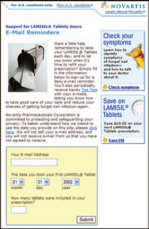
On commercial sites, consider picking up the minimum amount of information you need and let users add more as they get deeper into your site and have a better idea of what you are offering them. Novartis Pharmaceuticals, for example, picks up the minimum amount of information they need at each point. The Lamisil site, for example, gives away plenty of good information for free without registration. If you want a $10 coupon toward the cost of a prescription, then you have to fill in your name and address (Figure 3-16), but the trade-off is clearly reasonable.

FIGURE 3-16 Collect only the minimum.9
Once you start taking the drug, the site offers email reminders for refills (Figure 3-17) and helps you track your progress online. Each option asks for only the minimum required information.
How to Indicate a Required Field
In desktop applications, there are many ways to indicate that a field is required: changing the background color of the required fields, making the labels bold, or putting a symbol (asterisk, arrow) in front of the field.
Different indicators have taken hold on the Internet. Many public and e-commerce sites put a statement at the top of an input form that says something like “Fields marked with asterisks are required.” Then each required field has an asterisk in front of the label or the field. See Figure 3-18, for example.
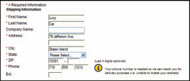
FIGURE 3-18 Required fields on a web site.10
On web applications, however, you can be more subtle. Users who access the system daily don’t need to be reminded of the rules on every page. If the
web application is just another version of a desktop application and this application already has a well-known standard for indicating required fields (bold labels, blue backgrounds, etc.), then feel free to use it. In Figure 3-19, for example, required fields are indicated with bold text.
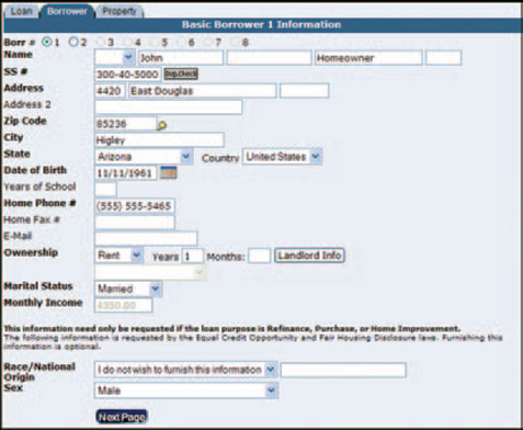
FIGURE 3-19 Required fields are bolded in a web application (not recommended).11
Offer Defaults Whenever Possible
Use a default whenever there is a likely one.
• In fields, show the default entry in the field.
• In a set of checkboxes or radio buttons, set the most likely choice (however, see the section called “I Want Nothing!” for situations in which a default is impossible).
As Jeff Johnson says in Web Bloopers, if you’re Stanford University and you’re asking students for their state, it’s going to be “California,” not “Alabama,” which was used as the default on the Stanford web site only because it was the first state alphabetically (2003, p. 136).
How can you decide on a good default? Johnson offers an excellent source of information: your site’s logs. What do people enter or choose most often?
He also suggests offering a default based on what you already know about the user. If users must log on to the site, you may be able to tell where they are (2003, p. 138). For example, a multinational company’s web application can fill in a Canadian user’s province automatically based on his or her address in the corporate database. Or if a group of insurance agents is based in the Appenzell canton of Switzerland, odds are that the customer addresses they enter will also be in Appenzell.
How Not to Indicate a Required Field
Don’t use color alone to indicate a required field. Sometimes designers put the “required” label in a different color. For the 8 percent of men who are red-green color-blind, the change in color may be invisible. Also, since colors have less contrast than black and white, colored text is not as visible as black unless you bold it or use a larger type size.
Don’t use just boldface to indicate a required field. Screen-reading software can’t read the change in color or style—there’s nothing to read—so the change won’t be recognized. Instead, usability experts suggest, either use a graphic with ALT text saying “Required” or put “Required” in the label (you can make “Required” the same color as the background so that it will be invisible to people not using screen readers).
How to Provide Feedback for Required Fields
In spite of all your cues, say that the user has skipped a required field. In public web forms, the de facto standard is to wait until the user clicks the Submit, Continue, or other button and then show an error message. Here’s where things get tricky:
1. Do you show an error message on a separate error page and ask people to go back to the earlier window?
1. Do you return to the form, show the error message, and list the missing fields?
2. Do you return to the form, show the error message, and highlight the missing fields to make it easy for the user to find the errors?
On a public web form, option 1 isn’t enough because you’re asking the users to do something they have come to believe that the program should do automatically—put them back on the offending page. In fact, this approach has become very rare.
Thad Allen (2001, personal email)), a web application designer, recommends option 2 for public forms:
Allowing the user to submit the form and then returning it with the missing or incorrect fields highlighted seems to be the standard in most cases, but it’s
also a waste of web traffic and highly annoying for the user in some situations, especially when the missed field was an oversight versus a misunderstanding.
I would recommend that, whenever possible, you send simple validations, like required fields, to the user along with the form. Display a dialog box listing the miscues when the user hits the Submit button until he or she gets them all correct. It’s a lot cleaner and a lot less time consuming.
Another suggestion comes from web design expert Chris Kania (2002, personal email): Validation when leaving a field “is very irritating. You may not fill out a form in the ‘approved’ order, and [having to cancel a series of] JavaScript popups before you are finished with the whole form is really annoying.”
Option 3 is widely used, but it doesn’t always work well, especially if the form is long and the user can’t see all of the highlighted fields at once. Also, highlighting with red text, which is common, doesn’t work well for the 8 percent of males who are red-green color-blind.
However, options 2 and 3 both accommodate the standard required-field behavior seen by usability professionals: The users fill in the fields and then click Save, fix the errors, and repeat as needed until all the fields pass the validation tests.
Check whether the fields you’ve marked as required really are necessary. For example, it rarely matters, at least in the United States, what salutation (Mr., Ms., Dr., etc.) people prefer, but some sites require it (see Figure 3-20 for an example of a silly required field).
Check what you’re putting online. Many paper forms pick up new fields over time as business rules or legislation changes, and old fields are rarely removed. If no one really looks at the form before putting it online, all sorts of unnecessary (and out-of-order) fields can end up in the online version.
Put all of the required fields together. Tom Tullis and Ana Pons found that users entered data most quickly when all of the required fields were separated into their own section. Users also preferred this style. The next two most popular and speedy methods were to use bold for the label and to put checkmarks next to the required fields. The worst method was no indicator, followed closely by putting a “Required” message in the status bar (1997, 4).

FIGURE 3-20 12
Prevent Input Errors with Dropdown Lists
A dropdown list lets users pick items from a list rather than type them. They are helpful when you need to limit choices to the items on the list but are not helpful when users need to add new items or select more than one item at a time. Use dropdown lists for structured, fixed information, like codes, states or provinces, and country names.
Note that developers can populate the lists from tables in a database; the items don’t have to be hard-coded. In fact, a common managerial job is to update code lists using a special data-entry window.
When to Use Dropdown Lists
Having dropdown lists is one way to maintain data consistency—if users can only pick items off a list, you don’t run the risk of saving invalid entries in your databases.
However, dropdowns can get in the way of expert users and power users. As Micky Liu says (2002, personal email), “When I am filling out a form, I prefer NO dropdown lists. If I am typing every field, it is annoying to have to take my hands off the keyboard to use the mouse to make a selection for the STATE, which would have been accomplished far faster just by typing.” He adds, “The lists that I believe are implemented well are those that make intelligent guesses about your response and place those guesses at the top of the dropdown list rather than have you scroll through potentially hundreds of choices.”
For example, if you know that a user has signed on from somewhere in the United States, “United States” should be entered automatically. Similarly, if the user has signed on from France, then “France” should be entered automatically.
Currently, in most web applications the best you can do is to type the first letter of the entry you want and then arrow down or keep pressing the same first letter until you reach the item you want. For example, if you’re trying to select “New York” from a list of states, you can press “N” six times (Nebraska, Nevada, New Hampshire, New Jersey, New Mexico, New York).
If your users are touch-typists or people who do heavy-duty data entry, a better method would be to let them type the entire entry. The users could then move through fields quickly by typing and tabbing rather than typing and arrow-keying or mousing.
However, some developers have published code for type-ahead dropdown lists, as shown in Figures 3-21 and 3-22 (this is a JavaScript version). See Resources for sources.

FIGURE 3-21 If you type “g,” the first “g” name is filled in…. 13

Note: Don’t confuse this “auto-complete” with the browser-level auto-complete, which is described in “Offer Automated Entry Fields.”
Also, don’t confuse dropdown menus (Figure 3-23) with dropdown lists (Figure 3-24). They are two different types of controls and are programmed differently. Menus, and navigation in general, are discussed in Chapter 2, “The Browser Framework.”

FIGURE 3-23 Dropdown menu.14

FIGURE 3-24 Dropdown list.15
Check Your Lists for Typos and Other Errors
Dropdown lists are either hard-coded or called from database tables as needed. The quality of those lists depends on the attention that the developers, testers, designers, and technical communicators paid to them before releasing the application to the public.
Someone needs to check whether items are misspelled, out of numeric or alphabetical order, missing, repeated, and so on, before the application is put online.
Put Lists in Order
According to Kent Norman (1991, pp. 133–134), there are eight ways to organize information, as shown in Table 3-2. Random order will not be appropriate for web applications, but the rest may be useful for dropdown lists and for default sort orders for list views (described in Chapter 4).
TABLE 3-2
| Organization Type | Explanation | Examples |
| Random | Not recommended, although random order (or what appears to be random to an uninitiated observer) is sometimes unavoidable. | Icons on a desktop |
| Alphabetic | Use when the items can be meaningfully alphabetized and scanned. Also use when no other type of organization springs to mind. | A list of typefaces: Arial Helvetica, Times Roman |
| Numeric | Use for items that are associated with numbers. | Baud rates, type sizes, numbers of copies |
| Chronological | Use for items that are most effectively organized by date or time. You can sort by age or in standard cognitive order. | Age: Email messages from newest to oldest, articles in a news service from oldest to newest Cognitive order: January through December |
| Sequential processing | List items according to their likely order in a process or according to a cognitive ordering of items. | Process order: Open Picture, Modify Picture, Save Picture, Close Picture Cognitive order: From large to small: Galaxy, Cluster, Star, Planet, Moon |
| Semantic similarity | Order items in terms of some semantic dimension, such as impact, reversibility, or potency. Items that are most similar are next to each other on the list. | Emphasis styles ordered by impact: Normal, Underlined, Italic, Bold |
| Frequency of use | Okay for “last n used” or “last n saved” lists. Can be problematic for other situations, since frequencies change when users become more expert, and in data-entry tasks, when demographics change. If frequency order is the only suitable order, then log usage to find actual frequencies. Or let users change the default themselves. | The four most recently opened items |
| Standard or custom | Standardization reduces the number of decisions during development and helps users cross program boundaries more easily. | Location as latitude north, then longitude west—for example, 32°25’28” N × 84°55’56” W. Spectrum colors in the order red, orange, yellow, green, blue, indigo, l |
When to Use Regular Lists Rather Than Dropdown Lists
Sometimes the number of items just gets too big for a dropdown list. Or the list may be manageable but you need to select multiple items, not just one.
This is the point at which you want to switch to boxed lists—for example, like the one in Figure 3-25. Note that the items have checkboxes: These indicate to users (a) that they can select multiple items and (b) which ones they’ve already selected.

When a list gets very long (with hundreds or thousands of items), use a two-list system, as shown in Figure 3-26. The advantage of a two-list selection box is that users can see exactly what they’ve selected, no matter where they found the items on the first list.

Prevent Input Errors with Checkboxes
Checkboxes are buttons used to turn attributes or states on and off. Users can set any number of checkboxes, including none.
Checkboxes are square and can have either text or iconic (picture) labels. The “on” setting is usually indicated by a checkmark (“tick” in British English) or an X inside the box.
Checkbox Groups: Doing the Numbers
How many checkboxes are too many? Here are three rules of thumb.
If the settings are related: Unless you have a lot of spare room on the screen, switch to a multiple-selection list when you get to about seven checkboxes.
If the settings are visual (colors on a palette for example): Use as many checkboxes as you need, but group them into categories or some natural order (the spectrum, for example). See Table 3-2 for categorizations.
If you have a long list of toggle checkboxes: Try to break them into groups of five or so buttons per group.
Be Careful How You Toggle
Every checkbox is a toggle—the setting is either on or off. When you have a group of checkboxes, you have a group of independent and mutually inclusive toggles.
When you have a single-button toggle, on the other hand, you are taking advantage of the fact that a checkbox’s two states or settings are mutually exclusive—either yes or no, on or off—in a Boolean sort of way. For example:
Problems occur, however, when either the two states are not opposites or the check-button label contains negatives.
Use Opposites Only
Make sure that the two states are opposites. For example, what is the opposite of “full duplex”?
To the uninitiated, probably “empty duplex” (or a single-floor apartment, depending on the context). For modem connections, however, the right answer is “half duplex.”
One solution is to change the label depending on the setting, but that becomes confusing for two reasons:
2. Until the user clicks the button a few times, he or she may not realize that clicking sets the other state, not the state shown on the label:
It’s confusing to describe and worse to specify and program. Here are some better ideas.
Only when the setting’s two states are opposites or can be easily inferred, use a single checkbox—for example, ‘’Allow fast save” or “Sounds enabled” both work well.
When the two states are not opposites or are not easily inferred, use two radio buttons. For example, say that you have two types of color fill—spot and flood. Spot and flood are not natural opposites. To be clear, you’d use two radio buttons:
Don’t Use Negatives (You‘ll Create a Double Negative by Mistake)
Never use negatives in the labels. The rule is, if the box is checked (true), then the answer to the question (actual or implied) is yes. Otherwise, the answer is no.
Therefore, to avoid double negatives when the boxes are empty, always label the buttons with positive statements. For example, “Disable sound card” (negative) means, if unchecked, “Don’t disable sound card,” which really means, “Do enable sound card” (positive). Eliminate the negative dis- and use “Enable sound card.”
Prevent Input Errors with Radio Buttons
Radio buttons are used to turn mutually exclusive settings on and off—users can set only one radio button at a time. Radio buttons are usually round, unlike checkboxes, which are square. They are also used to let people toggle between two states when the states aren’t opposites or aren’t easily inferred from one another.
Don’t use radio buttons for more than six or seven settings at a time. Use a single-selection list or a dropdown list instead. Otherwise, the buttons start taking up too much room on the window.
“/ Want Nothing!”
Here’s a problem that has both users and designers pulling out their hair and gnashing their teeth: Once you select a radio button from a set that starts out with none selected, how can you get back to “none selected” again? (The same problem can occur with dropdown lists, which are the same as a set of radio buttons, just formatted differently.)
Developers and designers don’t usually preselect a radio button if there is no default. (What, for instance, would be the default for gender?) So when users open a page or frame for the first time, some radio buttons will be unset. Once the users select a button, however, they’re stuck with a choice—“neither” is no longer an option.
There are at least two solutions to this problem. One is to get an exhaustive set of criteria from the end-users. Figure 3-27, a mocked-up screen from a veterinary office application, is an example of a bad set of radio buttons. What if the patient is a squirrel? An iguana? What if the owner simply came in for information? Clearly, this set of options was not specified correctly. (In situations like these, the front-desk people will choose any button just to get through the screen.)

FIGURE 3-27 Radio buttons with none selected and then one selected, even though none of the three are correct.
The second is simply to add another button or list item called “None,” “Not Relevant,” “Not Applicable,” or “Other” (Figure 3-28).

Make Your Checkboxes and Radio Buttons More Accessible
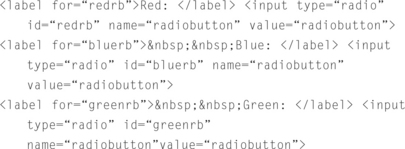
Whenever you can, and especially if your users cannot click very accurately, let users set the button by clicking the label (or tabbing to the label) as well as by clicking the checkbox or radio button itself. Even in HTML, this is easy to do by using the “label for” attribute. For example, this code creates the buttons shown in Figure 3-29:

This code creates the buttons shown in Figure 3-30:
You can also add keyboard mnemonics. See “Provide Keyboard as well as Mouse Navigation” earlier in this chapter for more information.
When to Use Tabs Instead of Pages
What you can do all at once on a single paper form, you generally have to do in sections on a software form.
If your input form has more than one screen’s worth of data, you can divide it up into pages, tabs, or both (as in Figure 3-31). So how do you decide between a paged interface and a tabbed interface?

In general, both help organize related groups of fields and the steps of a task. However, a set of pages is more constraining, intellectually if not actually, than a set of tabs. In Figure 3-32, for example, users can’t go to the “2 Rates” tab without filling in “1 Availability,” nor can they go backward. This design is task oriented, and the process is strictly step-by-step.

With pages, you get a sense of closure when you finish with one and go onto the next. In fact, in desktop systems, page changes are often used as “save” points—when a user clicks “Next,” the program does a checkpoint save of the input up to that point. Web applications can do the same thing. Just make sure that the browser’s Close and Back options are either captured or disabled—otherwise users may wipe out their input by going backward or closing the browser prematurely.
With tabs, on the other hand, there is less of a sense of closure—you can usually flip between tabs without saving anything, for example, and users don’t feel like they’ve “gone anywhere” when they’ve changed tabs.
Guidelines for Tabs
The three guidelines for tabbed interfaces are: use a single row of tabs; fix them in place; and display them always. (Also see “Be Careful Where You Put the Buttons on Tabs and Frames.” For page guidelines, see “Interactions on the Page and Application Levels.”)
Amazon uses tabs correctly (Figure 3-33): It sticks to one row and doesn’t use tabs for everything. Rather, the major categories appear in the single row at the top; the secondary categories are hidden in the dropdown list under Search.

Following the second guideline—don’t move them—is automatic if you follow the first guideline. When you select a tab, it comes to the front of the pile and changes color or focus so that you know which tab you selected. If you stick with one row of tabs, the only “movement” is in the content area, as one set of fields is replaced by another. If you use two or more rows of tabs,
however, the entire row of tabs has to come forward, replacing the original front row. This is remarkably confusing.
Finally, don’t let tabs appear and disappear dynamically. If they do, users will regard your application as unstable, at a minimum, and possibly insane. If someone on your development team suggests it as a strategy, be sure to test for usability with your target audience and make the development team watch the tests.
When to Use Popups
Popup windows have taken over for dialog boxes in web applications. Popups hold settings or secondary information and can be used to gather information for a particular object or record. Whereas the web application’s main content area contains the users’ actual tasks (a what-if analysis, for example), popups let users change the details (the currency type used during the what-if analysis).
Popups have these equally important functions.
1. Collecting secondary information and settings for an object or record—landlord information for a mortgage application (Figures 3-34 and 3-35), a percentage setting for a bond analysis, and so on.


FIGURE 3-35 A message popup.16
Popups have a technical advantage as well—response time may be faster since, once the popup is saved and closed, the server doesn’t have to send an entire page back to the client.
Another advantage of popups is that they ensure that the little pieces of data are validated before they go into the main record. If you’re not sure of a date, for example, you can click the calendar button and pick a date from the calendar. You don’t have to guess or pull out your paper calendar and look up the date.
They are not, however, good for holding top-level business information. Popups are, by nature, hidden. They can be used to modify primary tasks or add to primary information, but they cannot be the user’s main view of the application or the data.
Use Popups to Offer Information
Text popups are used to ask questions, confirm actions, and warn of problems (like message boxes in desktop applications—see Figure 3-35) and also to display background information, such as warranties and license agreements (Figure 3-36).

FIGURE 3-36 Use a popup to show background information.17
For informational popups like the one in Figure 3-36 to be really useful, they have to be printable. Remember to include a “Print” button—many users won’t know about the shortcut menu with the Print option that you get by right-clicking the mouse.
Follow These Popup Guidelines
Here are some guidelines for all types of popups.
• Wait for users to ask for the popup; don’t pop them up automatically.
• Make sure that the popup box is between a quarter and a third of the window size. Too small and the user won’t see them; too large and they’ll cover too much of the screen.
• Don’t reuse the same popup unless you can make sure that it comes to the front of the screen each time (see the box entitled “Stay on Top”).
Here are some additional guidelines for data-collection popups.
• Use popups to collect secondary information whenever you don’t want to interrupt the user’s flow through the transaction. (Switching to another screen, for example, would clearly interrupt the flow.)
• Provide OK or Save and Cancel buttons (don‘t rely on people knowing they can cancel the box using the X button at the top right corner).
For informational popups, also remember to provide a Print button as well as a Close (not Cancel) button.
Three Traditional Popup Buttons
OK, Cancel, and Apply have come to have particular meanings in desktop-application dialog boxes. The three buttons can be used the same way in web popup boxes, tabs, and frames acting as dialog-box equivalents. See Table 3-3.

Use Standard Button Order
Show the buttons in this order: OK (or OK equivalent), Cancel or Clear (or equivalent), all other buttons, and Help if you offer help for the form. This is the traditional button order according to the Microsoft and Java standards, and as such, will feel familiar to most users.
How to Do Dates, Addresses, and Other Standard Input
Dates, names, mailing addresses, money and number formats, and credit card numbers are all standardized. However, the standards (except possibly for credit card numbers) differ from country to country.
This section lists some suggestions for creating internationally aware controls. However, if your application may be sold or used in multiple coun-tries, check the internationalization section in Resources for more detailed information.
Dates: Use Calendar Popups and a Day-Month-Year Format
Usability researchers have evaluated methods for entering dates on public web forms, and the results indicate that people prefer to choose dates from an interactive calendar and, secondarily, from dropdowns (Caldwell 2000, pp. 1–4; Bainbridge 2002, pp. 24–25).
Also, although most travel sites don’t seem to do this, the best date format is DD Month YYYY—for example, 01 May 2004. Date formats differ between countries: The United States shows dates in MM-DD-YY order, while most of Europe uses DD-MM-YY. May 1,2004, for example, could be written as 05–01-04 or 01–05-04, depending on the user or the location (an American traveler on a German web site might easily put the date in wrong). Spelling out the month makes the date unambiguous. See Figure 3-37 for a site that follows the recommendations.
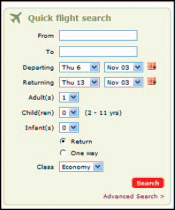
FIGURE 3-37 Good format: day of the week and day first, month second, and an interactive calendar.18
These research results may be transferable to web applications as well, even though people doing large amounts of data entry might prefer typing dates. However, people like the popup calendar because:
• They can see the day of the week as well as the date, which helps them check that they’ve chosen the right date.
However, remember that Netscape and Mozilla don’t handle certain controls the same way (or at all). Test calendar popups on various browsers. If they don’t work, rewrite your home page to check for browser type and version. You can then present a popup-free version of the page (use the second runner-up, dropdowns, for example) on the browsers that don’t accept popups.
What Are the Standard Elements of Names and Addresses?
If your web application is used by people in multiple cultures (which may or may not cross political boundaries), you will have to address the issue of names. For example, in many Asian cultures, the last, family, or surname is given first and the first, given, or forename is given second. In Spanish cultures, many people have multiple middle names and/or surnames, and deciding which pieces to put in which fields can be difficult.
Addresses are also different from country to country. For example, U.S. ZIP codes are all numbers; Canadian and U.K. postal codes are mixtures of letter and numbers. Street addresses in Japanese cities tend to be more like a set of directions than the Western style of house number and street name.
However, there is hope: The Organization for the Advancement of Structured Information Standards (OASIS) offers “Customer Information
Quality Standards,” including names (“xNL”) and addresses (“xAL”). See Resources for details.
Numbers Are Handled Differently in Different Cultures
Numbers—currency formats, names, separators, even rounding conventions—differ between cultures and countries and also between disciplines (biology, engineering, and physics, for example). Here are some examples—not an exhaustive list, by any means—of differences you can expect to find in number handling.
Currency
Currency has these characteristics:
1. The symbol used to indicate the currency—for example, ¥ for Japanese yen
2. Where the symbol appears in the number
3. The formats of the monetary fields themselves
Note: ISO 4217, Codes for the Representation of Currency and Funds, is a list of unambiguous, uppercase, three-letter codes for all national currencies. Although many countries call their currency “dollars,” the ISO codes differentiate among them well. For example, the code for the U.S. dollar is USD, the code for the Canadian dollar is CAD, and code for the New Zealand dollar is NZD. For lists of international currencies (in a currency commodities application, for example), these codes may be easier and less ambiguous than the national symbols.
Although localized operating systems accommodate different currencies, you must remember to leave enough space in your fields. Some currencies involve numbers up to four digits longer than what you’d need to express the same amount in U.S. dollars. For example, the equivalent of $100 U.S. is approximately 117,670 South Korean won.
The international financial markets have their own peculiar formats for prices. Prices are often quoted in eighths, sixteenths, and thirty-seconds, which may be displayed as fractions (981/8) or decimal numbers or with hyphens and pluses to indicate various combinations of eighths, sixteenths, and thirty-seconds (98–15+).
Negative Numbers
You can find a leading hyphen -10, a trailing hyphen 10-, parentheses (10), or square brackets [10] used to indicate negative numbers. Whatever the format, remember that the numbers have to align correctly unlike the following example:
If the country uses brackets to indicate negative numbers, remember that the field lengths and text-entry sizes have to accommodate the two brackets, plus up to four more characters for the currency symbol and two or more characters for separators.
Names for Large Numbers
In the United States, this amount―1,000,000,000―is a billion. In the United Kingdom (and Europe generally), this same amount is called a thousand million or a milliard. A British billion is the same as the U.S. trillion―1,000,000,000,000. This difference is beginning to be erased in financial applications. (The international community is settling on the U.S. format.) However, if there is any possibility of error, make sure you know what terminology your users employ.
Separators for decimals and thousands: Table 3-4 lists some common variations in decimal and thousands separators.

Rounding Conventions
Rounding conventions vary not only from one country to another but from one industry to another and sometimes within industries according to convention.
In Switzerland, for example: If the last 2 digits are less than 26, change to 0.
If the last 2 digits are greater than 75, add 1 to the previous digit, and drop the last digits.
If the last 2 digits are greater than 25 but less than 76, replace the digits with 5 (Xencraft 2003, pp. 3–4).
Another example: In the U.S. bond market, prices of primary-market treasuries (primary means sold by the federal government to brokers) are rounded to three decimal places, but secondary-market treasury prices (from brokers to portfolio managers and other buyers) are rounded to six decimal places. Corporate, government agency, and municipal securities are truncated at three decimal places.
Credit Card Numbers Are the Same, Except When They’re Different
Here are some of the issues you need to address when designing credit card number fields.
• People will type credit card numbers with and without spaces and hyphens. Make sure that your software accepts whatever format the users use; transform it as needed behind the scenes.
• Visa and MasterCard use 16 digits. American Express uses 15 digits. However, other kinds of cards—debit cards, credit cards issued by businesses (in the United States, Staples, Home Depot, Sears, and Lord & Taylor come to mind)—use a variety of formats. You might also have to consider local-business account numbers that can be used for online purchases and credit references.
• The first four digits of a credit card usually represent the card type—Visa, MasterCard, American Express, and so on.
• Somewhere in the number is a check digit—on Visa cards, digit 13 or 16 is a check digit, on MasterCards, digit 16 is the check digit, and on American Express cards, it is digit 15 (HowStuftWorks, Inc. undated, p. 2). The check digit is mathematically compared to the expiration date; if they don’t match, the card number was entered wrong or is bogus.
Guidelines for Buttons
In desktop applications, menus held all the big, screen-wide commands (“Save,” “Print,” “Cut”). Dialog boxes and, occasionally, sections of windows used buttons—buttons were always “local.”
In web applications, on the other hand, there are no menus. What might look like menus are generally navigation choices, not actions. Instead, almost all actions are managed using buttons.
However, although the mechanisms have changed, the actions and requirements haven’t. Following are some high-level guidelines for buttons.
Use Buttons to Do Things, Use Links to Jump to Other Web Pages
One of the ways a web application is different from a desktop application is that you may be tempted to use links for everything.
Do not give in to temptation. Use underlined links when you want to show information (“Go To” or “Read This”) and buttons when you want to do something (“Save” or “Search”).
The reason is based on the idea of affordance—the behavior users expect from an item. For example, the affordance of a doorknob is turning; the affordance of a handle or plate on a door is pushing. The affordance of the door itself is that it opens and closes.
Similarly, the affordance of a button is that it can be pressed; and when it is pressed, it does something. The affordance of a link, on the other hand, is that it goes to another web page.
Although you can use a link to open or close a popup or switch to a different input page, these types of actions don’t match the affordance for links. Similarly, using a button to jump to a new informational page doesn’t match the affordance for button.
Yes, it’s all in the user’s head. But why be confusing if you don’t have to be?
Note: There are exceptions to this rule when you’re working with list views. See Chapter 4 for more information.
How to Size Buttons
In general, use the same size for every button in a related group of buttons. For example, if the button labels are “OK,” “Cancel,” and “Find Flights …,” make all three buttons as wide as “Find Flights ….”
If there are many buttons and their sizes vary dramatically—for example, “OK,” “Set,” “Fly,” “Cancel,” “Find Flights …,” and “Register Flights…”—create two sizes. This gives you approximately the right size for all buttons without creating too many sizes.
Set Buttons Off from Fields
Keep all the buttons in their own restricted area of the frame. In other words, don’t run data-entry controls and command buttons together. Compare Figure 3-38 to Figure 3-39. In Figure 3-38, you run a risk of “hiding” the commands from the user.


Also, developers creating reusable frames may want to keep a clear zone for these buttons. If this is the case, design the frame with two zones: the field zone, which may vary from window to window, and the button zone, which won’t. When the window is actually coded, the developers can just drop the appropriate fields into the field zone and the command buttons will appear automatically.
Repeat Command Buttons at Top and Bottom
If you create an input form that may be larger than the window (in other words, that will have scroll bars on some people’s windows), consider putting the same command buttons on the top and the bottom of the form.
The researchers at User Interface Engineering discovered an interesting problem—button gravity (Spool 1999, pp, 79–81):
When working on a site that had multiple buttons on a page, users filled in one field, then scrolled to the bottom of the page and clicked the bottommost button. It didn’t matter that there was often a button right next to the field; users plummeted to the bottom of the page ….
This behavior perplexed us until we thought about standard graphical user interfaces. Traditional interfaces rarely have buttons that operate on a single field.
Usually there are OK and Cancel buttons in the bottom right that apply to the entire dialog box or form. When you think about it in that light, the users’ actions make perfect sense!
Also, some people, if they happen to be at the top or bottom of the form when they decide they’re done, may miss the buttons if you’ve put them in only one location. For an example, see Figure 3-40.

Be Careful Where You Put the Buttons on Tabs and Frames
Keep in mind, when you’re designing tabs and frames, that you need to be very clear about what the buttons are saving, canceling, or applying—only what’s on the tab or frame, or the entire input form? (In a popup, it’s clear that you’re saving what’s in that box.)
If the user is saving only the tab input, for example, then put the buttons inside the tabbed area—visually group the tab fields with the buttons.
For example, in the Internet Options dialog box (Figure 3-41), the buttons “Use Current,” “Use Default,” “Use Blank;” which are related to a section of the tab, are inside the tab frame. The buttons “OK,” “Cancel,” and “Apply” are outside the tab frame and clearly relate to the dialog box as a whole.

Also label the buttons correctly: If a button changes something on the tab, not on the entire form, say something like, ‘’Apply tabname Settings” or “Reset tabname Colors.”
Capture Multiple Button Presses
Here is a common situation: Users fill out a form and press Submit or Order. The connection is slow and they don’t see anything happen, so they press the button again. And again. Finally, they see a message, “Your application has been accepted” or “Your order has been placed,” and they walk away, satisfied that they have finished the transaction correctly. Unfortunately, what they have done is create multiple forms, one for each press of the button.
Some sites put messages near the Submit or Order button telling users not to press the button more than once (see Figure 3-42, for example).

You can warn people to click only once, but a better method is to catch and throwaway the extra button presses.
In JavaScript, you can fix the problem as follows. Put this code into the head section:

You then include this code in the HTML for the Submit button:

When the form is first loaded, its state is blank by default. When a user clicks Submit, it calls the function “subrnitCurrentl-Form( ).” If the form’s state is still blank, the system gathers the form’s information, performs the “action” specified, and sets the form’s state to “True.” Otherwise, if the form’s state is already “True,” the system takes no action.
In Java, this code will capture extra presses:

You Don’t Really Need “Reset,” Do You?
Some sites provide a “Reset” button at the bottom of their forms. Reset buttons generally wipe out all of the user’s input and return the form to blanks or defaults.
Most usability experts, as well as nearly everyone who has pressed one by mistake, think they’re a bad idea as well as unnecessary.
• If users want to stop and leave the page, they can press Cancel or they close the window.
• If users want to change an entry, they can move back to the field and write over it.
In neither case do they need a Reset button. Reset buttons do get pressed, however, either by mistake, because of a slip of the mouse, or out of curiosity, to find out what they do (which usually turns out to be a mistake as well).
The only time that a Reset button might be useful is in a public library, say, when you don’t want the next person in line to see your search.
If you want to give people the opportunity to return a complicated form or set of preferences to its initial values, a reset operation is fine. Just call it “Return to Initial Values” so that users know exactly what is going to happen, and place it far away from all the other buttons on the page.
Include a “Find” Button
In natural language, find and search are synonyms. In software, however, they are beginning to be seen as two different operations. Find means “look only on this page” and Search means “look in the underlying table, database, or file system or on the entire web.” In other words, Find is local and Search is global.
Don’t remove the browser’s own Find operation (Figure 3-43) unless you replace it with something better—and the replacement must still do local, not global, searches. Always use Ctrl+F as the keyboard shortcut.

You can add a special Find operation if you define local differently, as Adobe Acrobat does. “Find” in Acrobat looks through the entire document, not just the current page (Figure 3-44). (Acrobat has a separate Search operation as well, which lets users search through specially indexed collections of PDF documents.)

When Losing Input Is Dangerous, Strip Out the Browser Controls
A problem with using an unmodified browser window for web applications (versus web sites) is that users might click Back or close the window and lose all their input up to that point. Or worse, from a data-integrity point of view, they might leave a record partially updated and the underlying database in an uncertain state.
If this is possibility, take away as many of the navigation buttons, shortcut menu options, and keystroke shortcuts (the Backspace key for Back, for example) as you can. Show only the web application’s content area and provide your own navigation as needed (Figure 3-45).

If users must log in and log off, capture the toolbar’s Close button as well. For example, Citibank’s online banking system interrupts if you try to close the browser without first closing the application (Figure 3-46).

FIGURE 3-46 Caught trying to sneak away.19
Also, if your application moves from informational to transactional, as most e-commerce sites do, remember to strip out all distractions on the transactional pages—for example, ads, links to nice but unnecessary information, even the standard navigation tabs and dropdowns. Inexperienced users will click these other links, especially when they become confused or frustrated, and never find their way back to the original transaction.
However, don’t over-constrain. If users open a best-practices document, for example, leave that page’s browser controls alone. And let users abandon a sales form by closing the browser—don’t trap them in your site. However, if they press “Submit Order” but then click Close just before they receive an acknowledgment of the order, you’ll have to define a corporate policy. For example, you might decide to stop users at that point with a question such as “Did you want to cancel your order?”
Considering Offering Different Levels of Save
The main operation in an input form is saving input. You might want to offer two levels of Save, depending on how complicated or time consuming the task is and the degree of damage that bad data might cause. For example:
A homeowner filling an online credit application might find out she needs to collect old bills or creditor information and would prefer to go offline while she pulls the information together. If you don’t give her a way to save her unfinished application, she will have to start over from the beginning—or go to your competitor’s site that does let her stop and restart easily.
In some offices (medical offices, insurance companies, catalog companies, etc.), operators will sometimes be under pressure to fill as many records as quickly as possible. If there is no way to save unfinished records and return to them later, operators may be tempted to enter inaccurate data just to get through the workload.
In these types of situations, offer two saves. The first saves the unfinished record locally or in a scratchpad section of the server (keyed and protected by user ID). Do very little error checking, since the record is almost guaranteed to be incorrect or incomplete. The second save checks the record for errors and, if it’s okay, commits it to the official database.
Depending on the context, the first Save operation could be called “Temporary Save” or “Add to Shopping Cart” and the second could be called “Commit to Database” or “Buy Now.”
When to Validate Input
Whenever an application has to send information to a server, it takes time and bandwidth. For this reason, most system administrators prefer that applications minimize interactions with the server databases, do most of the error checking on the client (the user’s computer), and send only groups of clean records to the server. Here they may undergo a final round of validation in which the new or changed records are compared to records already in the database.
System administrators do not get all of their wishes, but savvy designers try to accommodate them whenever possible. Designers can make web applications more system-friendly as well as user-friendly by using more dropdown lists, running validation applets in the background on the client computers, and using more popup tools, such as calendars, calculators, and postal-code lookups.
Mosaic Pages: Syndication and Links
Desktop applications are often amalgamations of various software packages. For example, a sales-tracking package might be assembled from a commercial reportwriter, a popular database management system, and a mapping module.
Web applications can be mosaics as well, but with the difference that some of the parts of the mosaic may be links. Some links are invisible; others are obvious. The problem is how to present them correctly to users. Following are some guidelines for handling the various types of connections.
What If Part of Your Application Is Someone Else’s Application?
Sometimes an application uses parts of another application, possibly one that is owned by another company (called syndication). For example, your company offers subscriptions to a magazine but another company does the fulfillment. Or your company offers investment plans but another company manages the plans and collects the information from your employees.
So how do you show the “outside” application? Should you make the other application look the same as the internal application? Or should you provide a link and say, “Click here for that other application. You will leave our application when you do so”?
The answer is “It depends.” If the other application has a strong identity of its own, then you might want to be obvious about your use of the other company, even going so far as to open a new browser window (see Figures 3-47 and 3-48).

FIGURE 3-47 PayPal is included on the eBay Page but isn’t quite part of it.20

FIGURE 3-48 PayPal opens into its own window.21
If, on the other hand, you think, for example, that employees might be uncomfortable giving their 401K information to an outside company, you would probably want the connection to look as seamless as possible. In this case, you’d open the new application in the same window using your own corporate visual style, with the other company’s logo appearing discreetly in a corner somewhere.
For more information, see the section on syndication in Resources.
When to Warn That a Jump Is Imminent
Linking to an outside informational site from within your site (Figure 3-49) is different from linking to another application. If the context is clear, then you only have to decide whether you should open the new link in another browser window or stay with the current window.
FIGURE 3-49 Jump is clear in context.22
If the context may be unclear, however, or if there are legal considerations (for example, the source site contains FDA-approved pharmaceutical information and the target site contains disease information that may or may not be accurate), consider warning users that they’ll leave your site when they click the link.
In either case, do usability tests with your target audience before deciding how to handle the jump—warning or no warning; new window, same window. Note: Reusing the same window is usually best (C. Snyder 2001, p. 4).
Consider Using Flash to Simplify the Interaction
Macromedia Flash videos have been maligned as the worst kind of Internet irritants—to summarize, people don’t want to download extra software just to watch some marketing fluff.
However, there is one area in which Flash might come in useful. What if, instead of having to spread an interaction across multiple pages, you could do it all in one? This is the premise of an iHotelier.com demo, shown in Figures 3-50 through 3-53.


How to Be Helpful
In general, onscreen help and reminders are the best way to assist web-application users. People rarely use separate help windows in desktop applications, and they are even less likely to use online help on the web. If your usability tests showthat people have questions about a particular user-interface item, put its help text on the screen.
For example, observe the helpful note next to the ZIP field in Figure 3-54 (“Last 4 digits optional”) and the information about why Staples needs your phone number. In general, onscreen help and reminders are the best way to assist users.

FIGURE 3-54 Good on-screen help.23
The informative note, indicated with the circled “i,” is a good way to address the trust factor. Instead of leaving users to stew about why they’re filling in all this irrelevant information, Staples explains why they need it.
People rarely use separate help windows in desktop applications, and they are even less likely to use online help on the web. If your usability tests show that people have questions about a particular user-interface item, put its help text on the screen. If no one cares, don’t bother providing help.
Note that some information should be on separate windows—for example, corporate best-practices manuals, tutorials, troubleshooting systems, FAQs, knowledge management systems, and other documents and databases that require close study—but not “What’s this?” help.
1In a later chapter, there is another definition of form: a printout, such as a form letter or label, which is output from one record. In this chapter, form refers to an input area or frame.
2From “Change Your Account” © 2003 by Staples, Inc., https://www.staples.com/Account/Registration/registrationl.asp (accessed 23 October 2003).
3From “Registration;” © 2003 by Blue Dolphin Group, Inc., http://www.bluedolphin.com/ (accessed 27 October 2003).
4Figures 3-7 and 3-8 screens from “Registration;” © 2003 by Eurobid.com, Inc., http://www.euro-bid.com/ (accessed 28 October 2003).
5The HTML code is read as follows: Start new paragraph; set the label for text input field “cpt.” The label is “CPT.” Line break. Start an input text field; its name is “cpt,” The default or beginning value is “99203.” The maximum field length is 10 characters, but the entry area is six characters
6From “Eclipse System, Loan Registration;” © 2003 by Palisades Technology Partners (accessed 28 October 2003).
7From “Change Your Account,” © 2003 by Staples, Inc., https://www.staples.com/Account/Registrationlregistrationl.asp (accessed 23 October 2003).
8from “Eclipse System, Basic Info,” © 2003 by Palisades Technology Partners (accessed 28 October 2003).
9Screens from “Lamisil,” © 2003 by Novartis Pharmaceuticals, http://www.lamisil.com/ (accessed 28 October 2003).
10from “Change Your Account,” © 2003 by Staples, Inc., https://www.staples.com/Account/Registrationlregistrationl.asp (accessed 23 October 2003).
11From “Eclipse System, Basic Borrower Information,” © 2003 by Palisades Technology Partners (accessed 28 October 2003).
12from “Friskies,” © 2003 by Nestlé (accessed 6 June 2002).
13from ‘’AutoComplete,” © 2003 by Matt Kruse, http://www.mattkruse.com/javascript/autocomplete/ (accessed 29 October 2003).
14From “John Walsted Icons,” © 2003 by John Walsted, http://www.waistedicons.com/ (accessed 29 October 2003).
15from “Change Your Account,” © 2003 by Staples, Inc., https://www.staples.com/Account/Registration/registrationl.asp (accessed 23 October 2003).
16From “Eclipse System, Loan Registration,” © 2003 by Palisades Technology Partners (accessed 28 October 2003).
17from “Sears Appliances > Refrigeration > Side-by-Side Refrigerators,” © 2003 by Sears, Inc., http://www.sears.com/ (accessed 31 October 2003).
18from “Opodo,” © 2003 by Opodo, http://opodo.co.uk/otpbvpl/Homepage/Page/Homepage.jsp? Locale=uk (accessed 30 October 2003).
19From “CitiBusiness Online,” © Citibank N.A., http://www.citibank.com/us/citibusiness/ (accessed 31 October 2003).
20From “Pay for Items You’ve Won,” © 2003 by eBay, Inc., http://payments.ebay.com/ (accessed 1 November 2003).
21From “Members Log In,” © 2003 by PayPal, https://www.paypal.com/ (accessed 1 November 2003).
22From “FDU Library News, Books and Ideas Discussion.” © 2003 by Fairleigh Dickinson University, http://alpha.fdu.edu/library/accountability.html; and “Linked,” © 2002 Albert-Laszlo Barabasi, http://www.nd.edu/~networks/linked/ (1 November 2003).
23From “Change Your Account,” © 2003 by Staples, Inc., https://www.staples.com/Account/Registration/registrationl.asp (accessed 23 October 2003).