
Graph Types Based on Use
This chapter is designed to help you select the right graph type and format for your data. The types of graphs are organized by usage.
Simple Comparisons
The graph types in this section let readers compare small numbers of datasets easily.
Bar Chart
Also called column charts, bar charts (Figure 11-1) are good for comparing or ranking a small number of values (no more than 10 or 12). They are also useful when the data sets are so similar that they would overlap if shown as lines. By using a bar chart, you can visually separate the data sets.
The spacing between bars or sets of bars should be one-half the size of the bars. (If all bars touch, the graph will look like a histogram rather than a bar chart.)
Horizontal Bar Chart
Horizontal bar charts (Figure 11-2) are good for long category labels—you can put the labels right in the bars if you want.

FIGURE 11-2 Sample horizontal bar chart.1
Clustered Bar Chart
Clustered bar charts (Figure 11-3) are good for comparing two to four data sets.

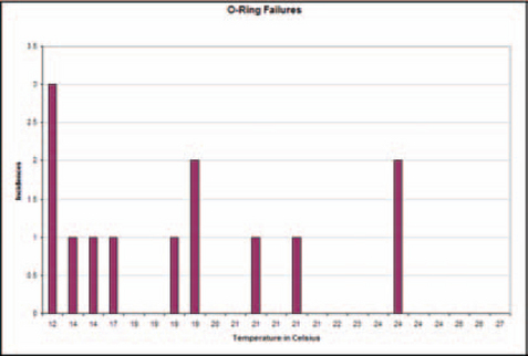
Zero-Line Bar Chart
Also called deviation bar charts, zero-line bar charts (Figure 11-4) are good when values fall above and below zero or some other fixed point.
Pictorial Bar Chart
Pictorial bar charts are good for making a graph more interesting and for making information more easily understood across language and educational differences. However, as shown in Figure 11-5, the pictographs used to create the bars sometimes have to be broken to match the data; this could be seen as a disadvantage.

Pareto Diagrams Are Not Bar Charts
Do not confuse Pareto diagrams with bar charts. Pareto diagrams (Figure 11-6) highlight the major types, causes, and sources of defects, usually in manufacturing situations, so that the primary contributors can be identified and addressed first. Although they use bars and look like bar charts, Pareto diagrams always have the same format: The highest bars are to the left, and a curve shows the sum of the values of each bar in percentages. The last point on the curve represents 100 percent of the defects.
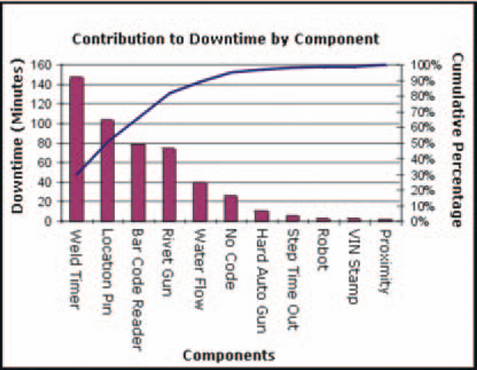
FIGURE 11-6 Sample Pareto diagram.2
For more information on Pareto diagrams, see Harris (1999, p. 267, “Pareto Diagram/Graph”).
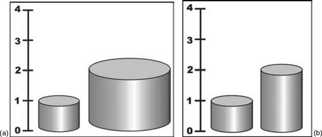
Potential Pitfalls for Three-Dimensional and Pictorial Bar Charts
In pictorial graphs, watch out for changes in apparent volume. In a bar chart made of cylinders whose edges represent the value of a variable, doubling the values (height and width) increases the perceived size of the cylinder by four times. In Figure 11-7a, for instance, cylinder 2 looks at least four times larger than cylinder 1, instead of just twice as large (Horton 1991, p. 78). The correct way to show the difference is to stretch only one axis, not both or all three (Figure 11-7b).
If you double the height of a pictograph (the picture used in a pictorial graph), its width doubles as well. In Figure 11-8, the proportions are misleading because the second milk carton looks four times larger, not just twice as large (Huff 1982, pp. 68–69). The example in Figure 11-9, on the other hand, does not exaggerate the change, and the example in Figure 11-10 follows the rule for columns—stretch only one dimension.


Changes Over Time
The graphs in this section let readers compare datasets over time.
Line Graph
Also called time-series graphs, line graphs (Figure 11-11) are good for comparing one set of values to another. They are also good for displaying trends.
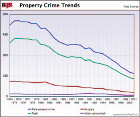
FIGURE 11-11 Sample line graph.3
Angles and points indicate that the lines are composed of actual data points. Smooth curves indicate interpolated data (points discovered mathematically by filling in between actual data points). Broken-line or grayed curves indicate extrapolated data (guesses based on actual data).
High/Low/Close
High/low/close graphs (Figure 11-12), a variation of line graphs, are used to show at a glance high, low, opening, and closing prices for a stock or other financial instrument. (They are also called bar chart within the financial industry, even though they are not bar charts in the traditional sense.) The bar is read as follows:
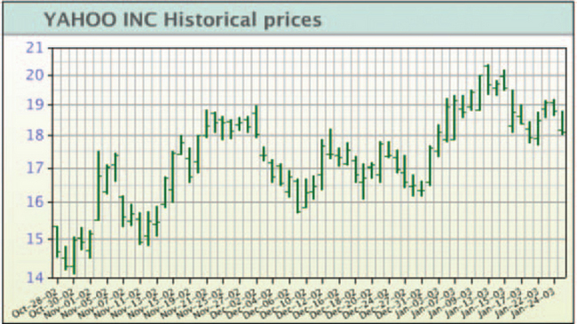
FIGURE 11-12 Sample high/low/close graph.4

Candle Chart
Also called candlestick charts, candle charts (Figure 11-13), another line graph variation, show opening, closing, highest, and lowest prices.

FIGURE 11-13 Sample candle chart.5
The candle symbol is read as follows:

Candles are shown as filled when the closing price is lower than the opening price and unfilled when the closing price is higher. The positions of the opening and closing prices are flipped as well.
Statistical Analysis
This section shows the best-known graphs used for statistics: histograms, frequency polygons, and scatterplots. However, there are many more types of statistical graphs. Check Resources for more information.
Histogram
Also called step charts, histograms (Figure 11-14) are good for comparing counts. They show the frequency with which specific values (data elements) or values within ranges (class intervals) occur in a set of data.
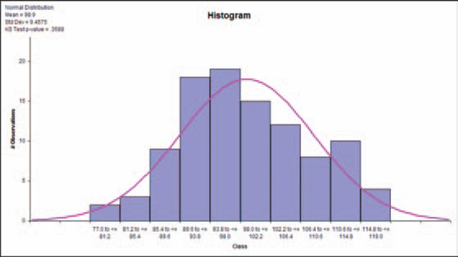
FIGURE 11-14 Sample histogram.6
Software should let users adjust the intervals (also called bins, class intervals, classes, group intervals, or cells).
Rules for Formatting Histograms
The rule, according to some style guides, is that histogram bars must always touch and the bars (or sets of bars) on bar charts must never touch. However, these two rules are sometimes violated.
For example, certain high-volume financial bar charts don’t separate the bars (see Figure 11-15). Putting spaces between the bars would just add visual noise, so the bar chart rule—that the bars should be separated—is ignored, correctly.

Microsoft Excel separates histogram bars by default, which is incorrect (see Figure 11-16). It is important to keep histogram bars together because the shape of the overall image is distinctive and can be meaningful to expert users. For example, a peak in the center indicates a normal distribution in the set of samples; two peaks may mean that the values came from two different populations or sets of samples.

Also, unlike the bars in bar charts, which are scaled in only one direction (height), the bars in histograms are scaled in two directions (width and height—by area, in other words). The heights of the bars represent the count only if the widths of all of the bars are equal. If for some reason you cannot make the intervals equal, you must adjust the height of each bar so that its overall area is correct.
In Figure 11-17, for example, you can see that the intervals 0–2, 2–4, 10–12, and 12–14 are different from those between 4 and 10. They indicate that whoever collected the data used double the amount of time (probably—the labels are ambiguous) to collect blood-sugar numbers for intervals 0–4 and 10–14.
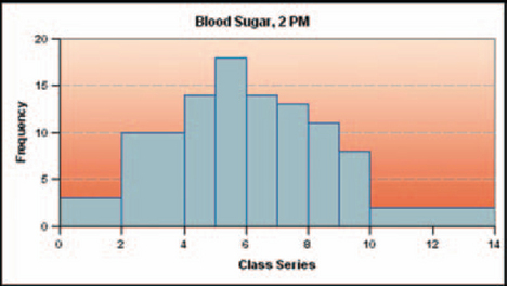
FIGURE 11-17 Histogram with uneven bins.7
If the time slots had been equal, the graph would look more like Figure 11-18 (if, for example, in Figure 11-17, 0–2 is 6 counts, in Figure 11-18, 0–1 could be 2 counts and 1–2 could be 4, for a total of 6 counts).

Although Figure 11-17 is done correctly, all but the most sophisticated readers will have trouble interpreting the graph (Scientific Illustration Committee 1988, 106).
For an interactive explanation of how changes in bin size affect the look of a histogram, see West (1996). For an excellent discussion of histograms and frequency polygons, see Harris (1999, pp. 187–194).
Frequency Polygon
Frequency polygons, also called bell curves (mistakenly—bell curves are smoothed normal distributions) are, like histograms, good for showing counts—how many times something happened or how many times a number appeared. They show frequency distributions (the count for each interval during which data were collected) as smoothed curves. See Figure 11-19.

Smoothed frequency polygons are sometimes used to analyze the nature of the data itself. The best-known curve is the bell curve, or normal distribution. For others, see Harris (1999, p. 189).
Although histograms and frequency polygons are essentially interchangeable (transformable), frequency polygons let readers compare multiple data series more easily. For example, if the polygons in Figure 11-20 were histograms instead, it would probably be impossible to layer the histograms without having them overlap and occlude one another.
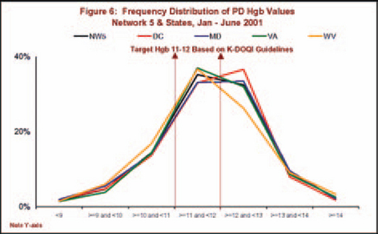
FIGURE 11-20 Multiple frequency polygons.8
Pyramid Histogram
Also called population pyramid (see in population patterns, Figure 11-21) because it is most commonly used to compare populations, a pyramid histogram is a two-part graph designed to let readers easily visualize changes or differences in population patterns. Usually, age is plotted along the vertical axis and the numbers of males and females of each age are plotted along the horizontal axis. For more on population pyramids, see Harris (1999, p. 301).

FIGURE 11-21 Sample pyramid histogram.9
Stem-and-Leaf Graphs
Stem-and-leaf graphs are similar to histograms in function but not visual style. Like histograms, they show the distribution of data elements in a set. Unlike histograms, they also show the actual numbers. In a web application, it might be more useful to transform histograms and frequency polygons into stem-and-leaf graphs rather than into plain tables.
There are two types of stem-and-leaf graphs. One is textual and is intermediate between tables and graphs. Figure 11-22 is an example of a textual stem-and-leaf graph. In a textual stem-and-leaf graph, the numbers of interest are shown in the “stem” and the data are shown as “leaves.” So in Figure 11-22, for example, the numbers in the center are math scores; the leaves on the left side are the girls’ scores and the leaves on the right side are the boys’ scores, by country.

FIGURE 11-22 Textual stem-and-Ieaf graph.10
The second type of stem-and-leaf graph is number oriented (Figure 11-23). In the numerical stem-and-leaf plot, a data value (for example, “606”) is split into two components: the stem, “6;’ representing 600, and the leaf, “06.”

The stems are written down once, while the leaves are stacked up alongside the stem to which they are attached. The leaves are often put in numerical order, although this is not necessary.
Scatterplot
Also called scattergram or XY scatter, a scatterplot is good for spotting clusters or out-of-range points (Figure 11-24). Each data point is the intersection of two variables plotted against the two axes.
Bubble Chart
Bubble charts, a variation of the scatterplot, are good for showing three dimensions—two axes plus one other—on a two-dimensional plot (Figure 11-25). The bubbles can represent either quantities (“leaks, in numbers of gallons”) or qualities (“sales regions”). Readers will need a key to the meaning of the bubble sizes, either text superimposed on the bubbles (Figure 11-26) or a legend (Figure 11-27).
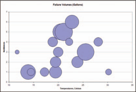
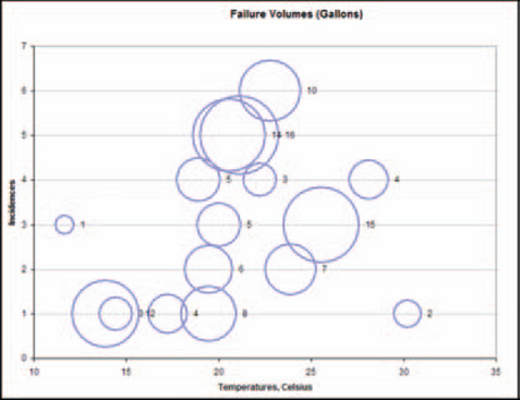

FIGURE 11-27 Qualitative bubbles—size and color represent region names.11
Although bubble graphs sometimes use bubbles of different sizes to represent qualities (names), this is probably not a great idea. Readers will assume, based on lifelong experiences with bubbles, balloons, and other resizable objects, that a change in bubble size represents a change in volume and not a change in region as in Figure 11-27. (Note that all the red “Northern Region” bubbles are the same size, the green “Southern Region” bubbles are the same size, and so on.) Instead, use clearer types of representations—see “How to Use and Choose Symbols on Line and Scatterplot Graphs” in Chapter 10 for ideas.
Opaque bubbles may cover and hide one another. If you find this might be likely, use unfilled bubbles (Figure 11-26) or make sure that the program displays large bubbles first and small ones last so that the small ones overlay the large ones (Figure 11-27).
Proportion
Proportional graphs show differences in size, number, or value without requiring a scale. They can be transformed easily from one into the other, and sometimes it may be helpful to do so. For example, inexperienced readers may have trouble parsing area graphs but readily understand the same information in a pie chart.
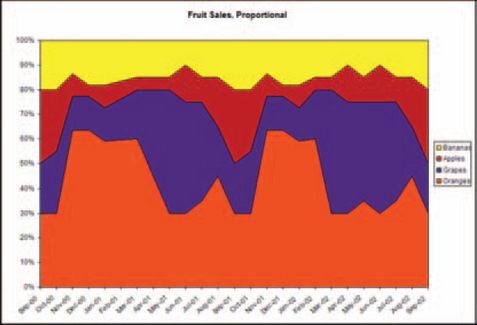
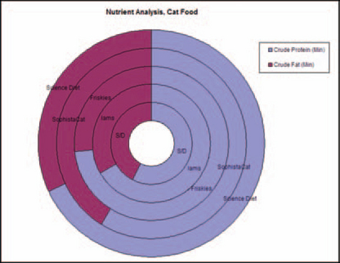
Area Charts
Also called surface, component part, belt, or mountain charts, area charts are good for showing cumulative totals over time. Each data set is added to the data set below it, so the top edge of the top set is the sum of the data at any point on the timeline. Totals can be percentages (Figure 11-28) or numbers (Figure 11-29).

FIGURE 11-28 Sample proportional area chart (adds up to 100 percent).12

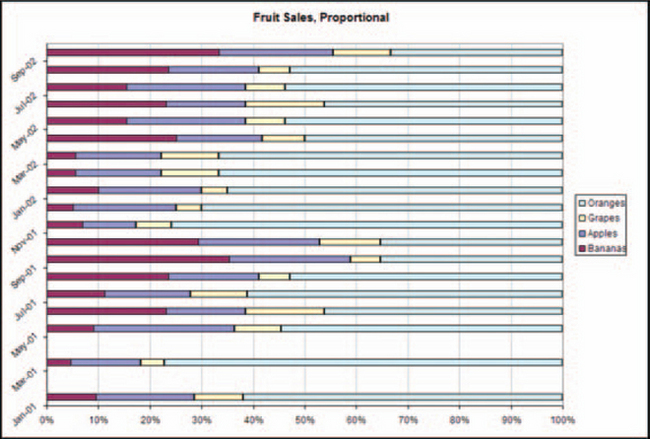
Area Charts Are Cumulative
As shown in Figure 11-30, the amounts in an area chart are added up from the bottom of the chart.
To format area charts correctly put the smoothest area on the bottom. If you don’t, the datasets in the upper parts of the graph will seem more variable than they actually are. In Figure 11-31, for example, the spiky orange dataset pushes grapes, bananas, and apples into spikes as well. In Figure 11-32, on the other hand, putting the flat banana dataset on the bottom keeps the sharp angles under control. It’s clearer that apples and grapes are not as variable as oranges.


Do not confuse area charts with line graphs. Although Excel and other graphing programs let users change the areas between the lines in line graphs into filled areas, the filled areas have no meaning. In area charts, the filled areas are actually volumes.
If area charts rarely appear in the domain for which you’re designing graphs, either avoid them or let users transform them into pie charts or segmented bar graphs. Most people understand pie charts and segmented bar graphs more quickly.
Pie Chart
Also called circle, cake, or sector charts, pie charts are good for showing snapshots of proportional relationships, one snapshot per period of time or data series (Figure 11-33). One pie is one whole (100 percent).
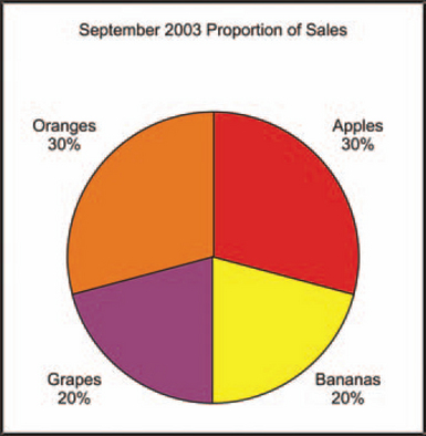
It is not possible to compare two or more data series without showing multiple pie charts. However, most people find it hard to compare wedge-shaped areas from one pie chart to the next. If you need to compare data series, use a different type of graph—area charts, segmented bars, and donut charts (shown later) let readers compare multiple series.
Rules for Formatting Pie Charts
Put segments in order: Start from 12 o’clock with either the largest segment or the first segment, if there is an order (for example, ages of donors: 18–25, 25–35, 35–45, and so on).
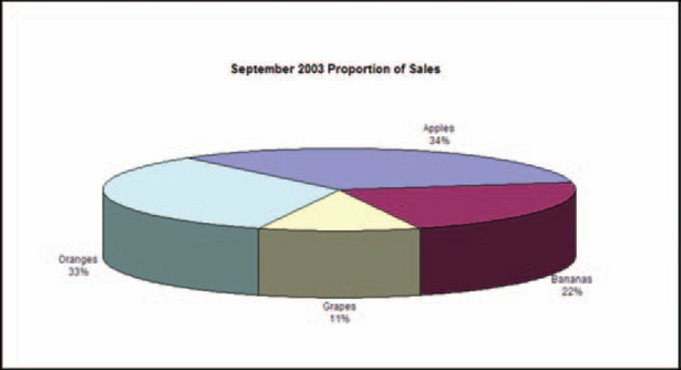
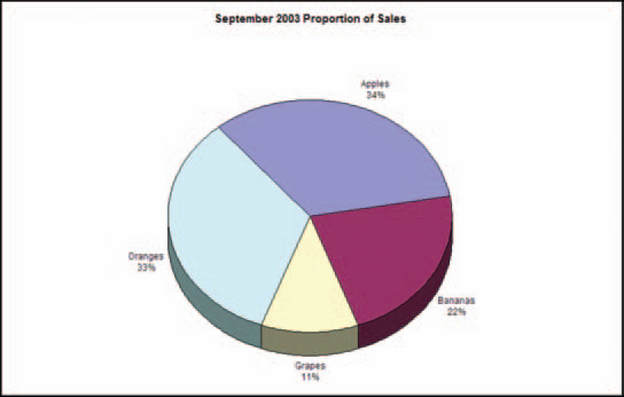
Unless distortion really doesn’t matter, avoid tilting three-dimensional pies. Small wedges at the front of a tilted chart will look much larger than they are. Compare Figure 11-34, in which the grape wedge looks bigger than it should because of the 10 percent tilt and its position at the front of the pie, and Figure 11-35, in which the grape wedge is shown in its proper context.
Donut Chart Variation
A donut chart is done as either a set of circles representing multiple data series (not possible on standard pie charts) or a pie chart with the middle blanked out (see Figure 11-36).
Segmented Bar Chart
Also called stacked bar charts, sliding multicomponent bar charts, or subdivided bar charts, segmented bar charts (Figure 11-37) are good for showing proportional relationships (like pie charts and area charts) over time (like bar charts). They can be transformed easily into area charts. Use segmented bar charts to compare parts of a whole___for example, how interest and principal equal total savings. Do not include parts and the whole in the same bar. For example, don’t stack interest, principal, and total savings on one bar. The bar will be twice the height that it should be.

FIGURE 11-37 Sample segmented bar chart.13
Horizontal Segmented Bar Chart
A horizontal segmented bar chart is the same as a stacked or vertical segmented bar chart but turned on its side. Like area charts, segmented bar charts can be set up to show either percentages, in which each bar adds up to 100 percent (Figure 11-38), or quantities (Figure 11-39).

Paired Horizontal or Vertical Bar Chart
A paired horizontal or vertical bar chart (also called deviation bar chart) is used to compare two or more related sets of data. They show the opposition of two primary characteristics (in Figure 11-40, anomalous hot versus cold weather) around a centerline (sometimes zero).
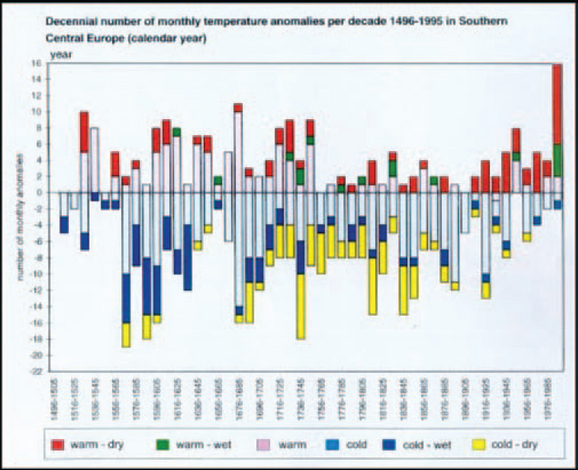
FIGURE 11-40 Paired vertical bar chart.14
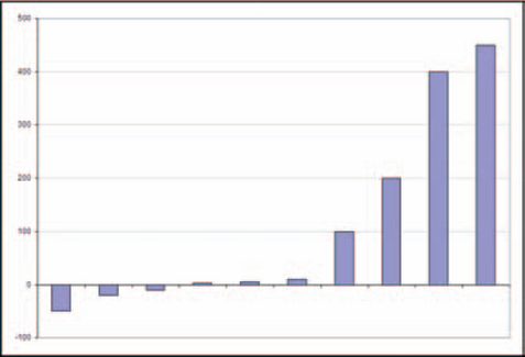
Zero-Line Bar Chart
A zero-line bar chart (Figure 11-41) shows both negative and positive numbers by moving the zero point toward the middle of the scale.
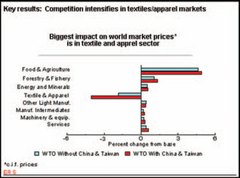
FIGURE 11-41 Zero-line bar chart.15
1From “PopChart Examples,” © 2003 by CORDA Technologies Inc., http://www.corda.com/examples/go/sports/jp_baseball.cfm (accessed 28 January 2003).
2Adapted from “Case Study Report: Failure Reporting, Evaluation and Display (FRED) Report” Dave Whetton, © 2003 by ReliaSoft Corporation, http://www.reliasoft.com/newsletter/3q2002/fred.htm (accessed 2 June 2003).
3From “Pop Chart—Bureau of Justice Statistics,” © 2002 by CORDA Technologies Inc., http://www.corda.com/examples/go/bjs/property.cfm (accessed 29 January 2003).
4From “Stock Quote (Historical),” © 2002 by CORDA Technologies Inc., http://www.corda.com/examples/go/stock/ (accessed 29 January 2003).
5From “Stock Quote (Historical),’ © 2002 by CORDA Technologies Inc., http://www.corda.com/examples/go/stock/ (accessed 29 January 2003).
6From “Histogram” showing a superimposed frequency polygon (normal distribution), © 2002 by Digital Computations, Inc., http://www.sigmazone.com/histogram.htm (accessed 4 February 2003).
7From “Histograms,” © 2003 by Visual Mining, Inc., http://www.visualmining.com/aws/histograms.html (accessed 30 January 2003).
8From “Quality Improvement, Clinical Performance Measures,” © 2003 by Mid Atlantic Renal Coalition, http://www.esrdnet5.org/Quality/CPM/PD/HgbDistGraph.html (accessed 4 February 2003).
9From “Business & Charting: Other Examples; Population Pyramid,” © 2003 by SmartDraw.com, http://www.smartdraw.com/resources/examples/business/images/population_pyramid_full.gif (accessed 4 February 2003).
10Data from TIMSS 1999 International Mathematics Report, In V.S. Mullis et al., International Study Center, Boston College, Lynch School of Education, http://timss.bc.edu/timss1999i/pdf/T99i_Math_l.pdf (accessed 7 February 2003).
11From “Bubble Charts,” © 2003 by Visual Mining, Inc., http://visualmining.com/examples/styles/bubble.html (accessed 4 February 2003).
12Figures 11-28 and 11-29 from “Examples;’ © 2003 by Visual Mining, Inc., http://visualmining.com/examples/nc4styles/imgexamples/linestackedarea.html (accessed 5 February 2003).
13From “Examples,” © 2003 by Visual Mining, Inc., http://visualmining.com/examples/nc4styles/imgexamples/barbasicstack.html (accessed 5 February 2003).
14From “Wetternachhersage. 500 Jahre Klimavariationen und Naturkatastrophen (1496–1995),’ © 1998 by Christian Pfister, http://www.cx.unibe.ch/hist/fru/img-temp.htm (accessed 7 February 2003).
15From “The impact of China and Taiwan joining the WTO,’ Economic Research Service, U.S. Department of Agriculture, 12/22/2000, http://www.ers.usda.gov/briefing/WTO/Wang.htm (accessed 7 February 2003).