
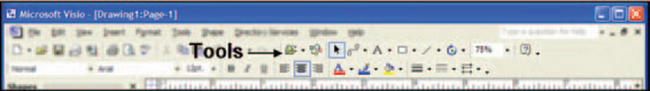
Designing Diagrams
A diagram is a visual method for showing relationships among such things as network elements, employees, and tasks (see Figure 12-1, for example).

FIGURE 12-1 Flowchart for an application.1
This chapter concentrates on designing:
For information about particular types of diagrams, see Chapter 13.
When to Use Diagrams
Executives and managers use diagrams and charts to communicate difficult concepts. Engineers, technicians, and programmers use them to study problems.
The importance of diagrams is in how they let users show, talk about, and manipulate relationships. Unlike graphs, the position, size, length, width, fill, or any other characteristic of a line or shape in a diagram has no meaning in itself. The lines and shapes are important only in connection to each other and, ultimately, to the item or idea in the real world with which they are associated.
Designing Diagram Software
The word diagram covers a variety of structures: cause-and-effect charts (see Figure 12-2), flowcharts, Gantt charts, entity relationship diagrams, organization charts, network diagrams, and so on. However, whatever their purpose and format, they all have some common characteristics. This section describes the characteristics of and requirements for diagramming software, as follows.

FIGURE 12-2 A fishbone (or Ishikawa) diagram, often used for process analysis.2
• Users should be able to see more information on the screen than they would on paper because they can zoom in and out, drill down to detailed information, and pan.
• Users should be able to transform diagrams from one style to another (within reason—it might make sense to transform a flowchart into a Gantt chart, but you probably wouldn’t try to change it into a network diagram).
• Software-based diagrams should offer overviews, filtering, selection, coordinated views of related diagrams and tables, and other methods for analysis that would be difficult to manage on paper.
• Diagrams should also be “live”—in other words, if they are tied to real-time data feeds, they should show state changes, errors, paths, and other information in real time. In fact, since you can buy drawing-only packages (for example, Visio, SmartDraw, and Microsoft Project), there’s no point in creating new diagramming software unless you intend to attach data to the diagrams (or unless creating drawing programs is your business).
Parts of a Diagram Window
The diagram window contains the diagrams plus tools for manipulating the users’ views of the diagram—for example, zoom and pan tools and an overview window or pane.
Figure 12-3, for instance, shows an overview window overlaying a workflow window (the overview can also be embedded in the main browser window). The overview shows a miniature of the entire diagram; the rectangle inside this window indicates which part of the whole diagram is currently visible on the main window.
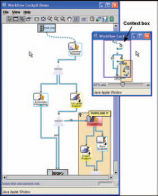
FIGURE 12-3 Workflow diagram with a separate overview window.3
From the overview, users can move around on the main diagram by moving the overview’s context box (the rectangle matching what you see in the workflow window) and zoom in and out by moving the slider. They can also pan and zoom on the main diagram using the toolbar buttons.
Note that the content of the diagram window will change depending on whether it is used to create diagrams (see “Creating Diagrams” for details) or to show diagrams (see “Showing Diagrams”).
Parts of Diagrams
This section describes the various parts of diagrams and some design pitfalls.
All diagrams have three elements: shapes, lines, and labels.
Shapes Represent Two Types of Meaning
Shapes represent two levels of information. The shape itself will have meaning and the shape’s label will say what particular information this element contains. For example, in a flowchart like the one in Figure 12-4, a diamond always means “decision point” and its label will state the nature of the decision: “Upgrade?”
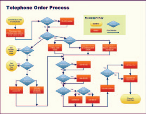
FIGURE 12-4 Flowchart for ordering telephone service.4
Certain business areas have very specific, traditional shapes—for example, see the electrical shapes in Figure 12-5. The standard shapes in technology fields are available from national and international organizations like ANSI (American National Standards Institute), JIS (Japanese Industrial Standards), and ISO (International Organization for Standardization).
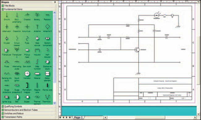
FIGURE 12-5 Sample shapes for electrical drawings.5
Note that in telecommunications and networking fields, there is only partial agreement on how to display network equipment. This is a problem because there are hundreds of pieces of equipment and services that users may want to show in a diagram.
A few cryptic “standard” line drawings appear in the 1996 American National Standards document Operations, Administration, Maintenance, and Provisioning (OAM & P)—G Interface Specification for Use with the Telecommunications Management Network. Also, development software packages often include picture libraries and methods for adding pictures to the libraries. In Figure 12-6, for example, you can see library-based shapes for terminals, routers, and other pieces of equipment. However, since manufacturers create new equipment and service providers create new services all the time, it’s hard to keep up.
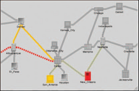
FIGURE 12-6 Standard shapes from a development package.6
A common strategy is to start with the development software’s library and any icons that expert users have been including in their own diagrams and PowerPoint presentations and then to create new shapes based on graphics from the equipment manufacturers. One shape is consistent, however: the cloud (see Figure 12-7).

FIGURE 12-7 Clouds indicating an Internet provider (IP) network and a public switched telephone network (PSTN).7
A cloud means either the public switched network (the standard phone network, in other words) or a part of the network in which the switching is done automatically and locally using “intelligent” switches. With intelligent routing, it’s difficult to predict the route of a call or to track it except at the moment when the switch decides where to send it. Since no one knows which lines inside the network are carrying a call, the convention has been to show networks as amorphous masses—i.e. clouds.
Lines Show Relationships and May Also Carry Information
The lines (also called edges) show relationships between the shapes and may contain multiple levels of information as well: First, a line connecting two shapes indicates that the two shapes are related. Second, the weight or style of the line may indicate a particular type of relationship. Third, arrows or other symbols at the ends of the lines may indicate directionality (see Figure 12-4, for example), chronological time, a category of information, or any combination of these (see Figure 12-8—the line lengths show time and the line styles and endpoints show departments; the broken line shows a dependency). Finally, labels describe the purpose of the particular line (see Figure 12-9, for example).
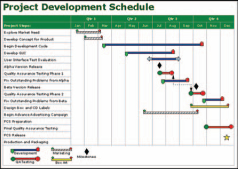
FIGURE 12-8 High-level Gantt chart for a software project.8
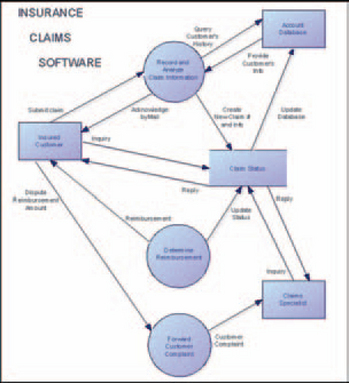
FIGURE 12-9 A Yourdon–Coad data-flow diagram showing object and flow labels.9
Lines do not indicate physical distance in diagrams. In network diagrams, they may indicate a physical connection, but even then, the connections between network elements are often more virtual than physical. If you need to show real distances, attach the diagrams to maps.
Note that lines in diagram software should be, and usually are, attached to shapes. This means that if a user moves a shape around, the end of the line moves with it. However, there are situations in which lines are legitimately detached—the graphic is not finished or validated yet, the physical endpoint is unknown, the endpoint is actually a dead end, and so on. Be careful to check your user research and use cases for ambiguous endpoints. Ambiguity is difficult to accommodate in a program; you don’t want to have to figure out how to do it at the end of the design process.
Labels Add to the Meanings of Shapes and Lines
Although pictures are said to be worth a thousand words, sometimes pictures really can’t stand on their own. If all pictures were self-explanatory, hieroglyphics wouldn’t have evolved into alphabets.
Label in this context can be defined as any text that states or adds to the meaning of a shape or line. For example, in Figure 12-9, circles represent processes and the labels inside the circles are the process names. The lines represent flows, and their labels name their activities (i.e., the type of information flowing from one process to another). Each label is firmly attached to its line or shape, so if the user moves the element, the label moves with it.
However, depending on the type of diagram, labels don’t always have to be attached to the shape or line—they can be in a tree or list to the left of the drawing, as in Figures 12-8 and 12-10.
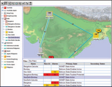
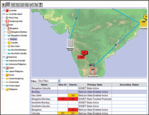
FIGURE 12-10 New Delhi-Bombay is selected in the tree and centered vertically on the screen.10
In fact, on a complicated diagram, you might want to have a list from which users select items. Once selected, the shapes or lines are highlighted in the picture. See Figures 12-10 and 12-11—if the user selects a location in the tree, the location is centered on the screen and the description of the location’s network element is highlighted in the list below the map.
Note: If you’re designing diagram-creation software, make sure that you do not hard-code label typefaces, sizes, or colors. Hard-coding these characteristics prevents accessibility options from working.
Where Labels Come From
When diagrams are generated from databases, so are the labels. They may be:
• Names—stock tickers, file names, equipment names, and so on.
• Based on rules. For example, “If shape A is a decision node, then line B’s label is ‘Yes’ and line C’s label is ‘No.’”
• Based on industry-standard messages. For example, the telecommunications industry has a defined list of “probable cause” names, covering everything from ‘’Adapter error” and “Excessive vibration” to “Version mismatch” (ISO/IEC 1992, p. 15).
These labels can be reused as text messages on graphics-poor interfaces such as PDAs and web-enabled phones.
How to Position Labels
When your diagrams are generated from a database or updated from an online feed, you will have to define rules for the label positions—for instance, “Labels always appear to the right of and/or below the shape or line.”
You will also have to decide what to do if labels start to overlap. Some possibilities include defining a rule that moves the label a set number of pixels further down and to the right, or a rule that separates the lines and shapes more, which will automatically separate the labels.
Some software development packages provide algorithms for automatically placing labels so that they don’t overlap the shapes or other labels—see the difference between Figures 12-12 and 12-13, for example.
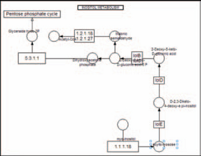
FIGURE 12-12 Messy labels.11

If the labels in the domain are so long that they almost always overlap, even when layout algorithms try to keep them separate, provide a method for truncating them on the screen but providing the full label in a tooltip. Keep in mind that deciding how to truncate the labels may not be easy—sometimes the important bit of information is at the end of the label, sometimes at the beginning, and sometimes it’s a combination.
Provide Methods for Displaying Labels Only When Asked To
Instead of showing labels all the time, consider hiding them until users ask for them. Here are some suggestions.
Tooltips Only: A particularly elegant solution to the overlapping labels problem is not to show them at all until the user asks for them. In the University of Maryland’s excentric labeling system, as shown in Figures 12-14 and 12-15, labels appear only when the pointer hovers over an element. The labels don’t overlap, and each one is attached to its element with a line so that there’s no confusion about which label goes with which element.

FIGURE 12-15 Labels appear when the pointer is held over the elements.12
Toggling Labels: The software can provide a switch that turns all labels on and off. With this method, users can hide the labels when they need to concentrate on the overall picture, then turn them on when they need details. If you let users turn off the labels, make sure that you provide tooltips so that, if they need to, they can see the label of an individual element by hovering over it.
Expanding Labels When Asked: Even if labels are on by default, consider whether you need to provide text bubbles or expanded tooltips for individual elements. This option is especially helpful when users need to see more information than just the name—for example, trouble symptoms, geographical locations, or a long directory or path name.
Help When Zooming In: When a diagram has been zoomed out, labels may become too small to read. Consider providing the labels in tooltips. See Figure 12-16 for an example of a tooltip for a too-small label.

FIGURE 12-16 Tooltip method for showing reduced labels.13
Include Other Types of Information if Needed
You may need to include timelines, rulers, and other types of information on the borders of the diagram. Make sure that any units of measurement or special symbols are labeled. For example, in Figure 12-17, the meanings of the different types of fill color and pattern appear in the legend at the bottom of the chart.

FIGURE 12-17 Gantt chart with legend.14
Let Users Annotate Diagrams
Annotations are another form of labeling. The difference between labels and annotations is that labels are fixed while annotations can be added at any time.
Users might want annotation as a troubleshooting aid—for example, on a live network diagram, one technician might want to point out a trouble spot to other technicians working in the same area. They might also use annotations to comment on work in progress. On a flowchart, for example, someone might write, “The call-the-customer process is missing here.”
Annotations can be personal (viewed only by the user who created them), restricted (viewable by users with the right permissions), or public (viewable by anyone who can access the diagram).
The software can let users either type right on the diagram or open a special annotation panel into which they type their text and then save it by clicking OK or Save. Whichever method is used, the annotation should both stick to the spot where it was created and not cover over elements (the background should be transparent, in other words). There should also be methods for hiding annotations and deleting them when they’re no longer needed.
Creating Diagrams
Creating diagrams has levels of effort, depending on how standardized or well understood the diagram is. If the purpose and contents of a particular type of diagram are well known, users will be able to generate it rather than draw it: They pick the database name, for example, and a range of dates and then click a button to have the diagram appear. Your job as designer is simply to collect requirements and sample diagrams and then to decide on line styles, standard shapes, etc., so that the generated diagram looks right. Users don’t have to do any of the drawing tasks.
If, however, the diagram is being used for analyses—for example, to design a new timeline, data-flow, network, or other process—the interface will require at least three things: a drawing area, a palette containing the shapes and lines, and a set of tools and commands like redraw, text edit, clean-up, and save.
In either case, though, providing samples and tutorials is a good idea. Many users will start with a sample and revise it to fit their own needs. Wizards may be a good idea when the users are unfamiliar with the design process—the wizard will demonstrate what has to be done first, what has to be done second, and so on.
Warning: Open-ended direct manipulation (drag-and-drop) is the crux of all drawing programs. However, direct manipulation is difficult to do on web browsers, even with Flash’s new interactive features (which mostly let you manipulate existing objects, not create new ones). The processing cycles are likely to be nightmarish as well. Consider putting all of the drawing code on the local machine and using the Internet connection only to email drafts and publish the finished diagrams.
Provide a Drawing Area
The drawing area is basically a big open space on the screen that is sensitive to mouse and arrow-key movements (Figure 12-18). The background should bea neutral color. Off-white—for example, RGB 230, 230, 230—is good because it’s not as glaring as pure white.

A grid pattern can be useful; if it exists, users should be able to toggle it on and off. Also, make sure it’s in the background; it shouldn’t pop up in front of the diagram.
Whether or not the grid is visible, there should be a “snap to grid” feature (which should also be toggle-able) with an adjustable cell size.
Provide a Palette
Palettes hold the diagram’s standard shapes and, sometimes, lines. Users select the palette shape they want to add to the drawing and then either click on the drawing area or drag the shape to the point at which they want the shape to appear (Figure 12-19).

The palette design should let users reuse the same shape multiple times without having to select it each time. Some known methods for keeping a shape selected are requiring a double-click, selecting a “reuse” mode from a popup menu, or just keeping it selected by default.
Palette elements can have some intelligence”—for example, on a flowchart, if the user drops a decision diamond on the diagram and then selects a line tool, the program might add lines and process rectangles automatically as soon as the pointer touches the drawing area. Or say that the user creates a half dozen process rectangles and then picks up a line tool and draws a line across the entire set. The program might automatically “correct” the single long line into multiple lines that connect each process rectangle to the next.
The program can also reject lines or shapes that don’t make sense in the context. However, keep in mind that too much constraint can be a problem. Don’t force experienced users to draw a diagram in a fixed sequence if they’d prefer to drop in pieces as they think of them and connect them later. Consider providing a “sketch” mode in which all error checking is turned off until the user wants to check and save the sketch, or leave all error checking off by default and then provide a “validate” operation.
Let Users Choose the Right Type of Line
Lines can be characterized by:
Line weight, pattern, and color can work together to represent meaning. For example, a thick line on a network diagram might indicate a high-capacity T3 line, whereas a thin line might indicate analog phone service to an individual building. Pattern might represent a particular customer. Color might indicate a state change, with red meaning an alarm state and green meaning “all clear.” Keep in mind, however, that color cannot be used as the only signal—8 percent of males are red-green colorblind and not all of them know it. Also, make sure that colors are not hard-coded; if they are, accessibility options like high-contrast displays won’t work.
Endpoints can be arrows, circles, symbols, or nothing—the line just ends. Arrows usually imply directionality; circles and symbols have specific meanings in some types of diagrams.
When designing diagram software, you will have to decide which of the four characteristics to use and in which combinations. Check with your expert users for requirements and preferred styles in the business, research, or other domain.
Let Users Choose the Right Layout
The layout defines how lines are connected to the shapes—with right angles, straight lines, curves, and so on.
Line connection rules (as embodied in layout algorithms) can be used to minimize chaos, primarily by preventing overlapping lines. See Figure 12-20 for a before-and-after example.
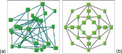
FIGURE 12-20 (a) Chaotic diagram is (b) simplified by applying a circular layout algorithm.15
Consider Using 3D to Manage Intersections
Intersecting lines can be a problem because, in some situations, an intersection may seem meaningful but, in reality, be meaningless. You might be able to use volume to resolve intersections. If the drawing looks three-dimensional, as shown in Figures 12-21 and 12-22, it will seem that the lines don’t actually cross each other (Bertin 1983, p. 271).


FIGURE 12-22 Network diagram using 3D.16
Also, a 3D look can be esthetically appealing in sales and marketing presentations. However, if the diagram or graph contains important data, avoid the 3D look—it will add noise and clutter without any new information.
Compact Layouts Take Up Less Room, But …
Some layouts are more compact than others. If you have large, complicated diagrams, using direct connections between shapes takes up less room than using right-angled connections. See Figure 12-23—the right-angled version takes about a third more space than Figure 12-24, which uses direct connections. Note, however, that the directly connected version is harder to read.


Flowcharts in particular are not compact. Flowcharts are not very efficient for procedures that consist primarily of steps and that have few decisions; the lines between the steps take up room without adding any information (see Figure 12-25). The amount of space available for text is very limited—steps will not fit in the shapes unless the steps are very short (although you can design shapes that open up when clicked to show as much text as you need).

FIGURE 12-25 Complex procedural flowchart17
Also, it is hard to show hierarchical information (substeps within steps, steps within sections, and sections within procedures) in flowcharts. Researchers have found flowcharts to be very effective for decision making and diagnostics. But for procedures, the recommended alternative is text (Wieringa and Farkas 1991, p. 53).
Use the Right Format
Certain types of diagrams require certain types of formats. Flowcharts require flowchart formats and don’t make sense otherwise. Gantt charts use Gantt chart formats, but they can be reformatted more or less accurately using other time and activity formats: PERT, critical-path method (see Figure 12-26), milestone, and so on.

FIGURE 12-26 Critical-path method diagram.18
Network diagrams can be shown as trees, as starbursts, in circular layouts (especially for ring or star network topologies), and as horizontal or vertical (one-dimensional) schematics. See Figure 12-27 for two examples.
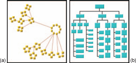
FIGURE 12-27 (a) Circular and (b) tree layouts.19
When you’re deciding which format style should be the default (or only) style and which should be secondary, check with local experts. Some seemingly useful styles may be completely alien to that particular business domain.
When to Provide Symbol Sets
Diagrams may have symbols in addition to shapes. Symbols are graphics used to show states or changes. For example, milestone charts use upside-down triangles to indicate milestones. The telecommunications industry has a semiofficial set of symbols and colors for alarms that are put into libraries by companies specializing in telecommunications and network software.
“None of the Above” Symbols
In addition to the standard symbols, keep in mind that your software may need some “None of the above” symbols. The design team may have to create styles and behaviors for “Unknown,” “Added manually until we know what this thing is;’ and aggregated elements (described next).
Use Aggregates to Combine Elements Visually
An aggregated element is a set of many elements that have been squashed, so to speak, into a single visual representation. In Figure 12-28, for example, the network in the Philippines is shown as an aggregate—a yellow shape—rather than as a set of individual network elements.

Aggregates are used (1) when there are too many elements to see in a small space at a particular resolution, (2) when some elements are inside other elements and usually don’t need to be visible, or (3) when there are just too many elements, period. Since users may have to see and act on the subelements, you will need to design ways to open them manually or automatically based on rules. Check your requirements and use cases.
Provide Tools and Commands
Tools in a diagramming program include a text editing option, a method for redrawing and cleaning up a diagram, and sometimes line and line style (right angle, straight, curve, and so on). Lines and line styles are sometimes put on the palette instead, especially if there are many types of lines or if each has a special meaning or constraint (Figure 12-29).
Users will also need to change the view of the diagram by zooming, panning, using an overview, and so on. These tools are described in “Showing Diagrams,” later in this chapter.
The main commands on a diagramming window are redraw and save options.
Let Users Redisplay Diagrams Whenever They Need To
Remember that diagrams tend to get messy and unbalanced while users are setting them up. Provide some sort of cleanup option that will straighten out the layout, shorten or expand lines as needed, and eliminate overlapping elements (in complicated diagrams, you may have to settle for getting rid of most rather than all crossing lines).
Rules for Saving Diagrams
Saving diagrams in a web-based or even a networked environment can be complicated. First, diagrams can be individually owned or shared—users may be creating diagrams for their own reference or for other people. When there are private, shared, and public diagrams, your software design has to include security and access methods.
Second, diagrams can be saved either as real diagrams or as templates. (Templates are samples or half-finished diagrams that users can use as models. Templates make it easy to create series of diagrams that all look the same.) If users need to share templates, then you have to include methods for naming, saving, and retrieving them. Note: Whether or not you provide template functions, consider including templates or samples in the software you deliver. Providing worked solutions to diagramming problems is an easy way for most people to learn how to do the job themselves.
The alternative to templates is to take an existing diagram, save it under a new name, and revise the copy—if this is enough, just make sure you include a Save As function.
Allow Users to Save Unfinished and Unvalidated Diagrams
Make sure you do not constrain people too much while they are creating diagrams. Don’t pop up errors or refuse to save an unfinished diagram because, for example, lines and shapes are not attached correctly, a rule has an AND in the wrong spot, or a timeline doesn’t have a milestone. This will infuriate expert users and lead them to abandon, not correct, the diagrams.
Drawing anything requires a lot of thinking, changes of tack, false starts, and discussion with other users. So let users save unfinished, unvalidated diagrams (maybe locally or in a special “scratch” area). Let them decide when to validate the diagram and save it as a finished document.
Showing Diagrams
All but the simplest diagrams tend to be larger than the visible screen. For this reason, you will have to find ways of showing parts of diagrams without losing context. The primary methods for doing so are filtering, panning, zooming, and overviews.
Provide Filtering Options
For diagrams with lots of data (for example, a data-flow diagram for all of the company’s actuarial tables), users may need to isolate one or two datasets from the dozens or hundreds that could appear on the window.
To filter a diagram, you may be able to adapt whatever filtering interface you already have in your system. Chapter 6, Data Retrieval: Filter and Browsing, covers filtering.
When there are many elements or when the diagram is used to analyze problems, it may make sense to provide a query-on-query option. In other words, rather than asking users to run new queries each time they have new questions, let them refine the search starting from the current set of data.
Provide Panninn
Panning is essentially a two-way scroll. Common pan methods are pan mode and panning arrows.
Pan Mode
If you click the pan mode button and then put the pointer on the diagram and move the mouse, the image moves left or right, up or down, under the pointer (Figure 12-30).

Panning Arrows
Arrows on the edges of a diagram let users move the picture in various directions (see Figure 12-31 for a map example).

Note that there are two methods for presenting a pan. Some systems send a call to the web server, which analyzes the request and then sends back a completely new image. Other systems just change the view on the diagram held in memory on the local machine. To decide on the right approach for your system, work with your system administrators as well as your users. See “Should the Diagram Be Live or Recorded?” below for more information.
Another panning method is to move the context box around in an overview thumbnail. See “Overviews Provide Context” for details.
Provide Zooming
Zooming is a method for expanding or contracting the view under the pointer or at the center of the diagram. Although zooming would seem to be straight-forward, there are a few variations.
The most common zoom interface design is a set of zoom-in and zoom-out buttons, usually set on the border of the diagram. When the user clicks the zoom-in button, the picture expands so that the user sees more detail and less of the entire diagram. (Note that some systems zoom automatically, while others require that the user click the button and then the picture.) Zooming out does the opposite—the view becomes wider and the user sees less detail but more of the diagram. See Figure 12-32.

FIGURE 12-32 Zooming in, (a) before and (b) after.20
Then there is zoom mode (also called zoom box or infinite zoom). If the diagram has a zoom mode, the user can click the zoom mode button and then drag a square around an area on the window. When the user lets go, the picture expands within the selected area (Figure 12-33).

FIGURE 12-33 Zoom mode (a) before and (b) after. Notice the zoom box in (a).21Notice the zoom
Note that if you provide a zoom mode, you may also have to provide a method for returning the picture to its original size. Most zoom modes only box in zoom in, not out. It is possible to have a zoom in and out (interactive zoom), however, as shown in Figures 12-34, and 12–36. When the user clicks the zoom tool and then moves the pointer over the picture, dragging the pointer upward zooms the diagram in. Dragging the pointer downward zooms the diagram out.

FIGURE 12-34 Starting diagram with interactive zoom tool selected.22
Other zoom options are a zoom dialog box and a zoom dropdown dropdown list. If you provide a zoom dialog box, the user can zoom to any size by typing in a per-centage (200%, 50%) or a multiple (1:1 (1:1 is full size, 2:1 is double the original size, 1:2 is half the original size). If you provide a zoom dropdown list, the user can select from a fixed set of typical increments (10%,50%, 100%,200%, and so on).
Problems with Zooming
Zoom mode and zoom dialog boxes add another level of complexity to the code and to users’understanding so consider avoiding them unless you know that
• The diagrams will become very complex and detailed.
• The users will need to zoom in and out on the diagrams regularly.
Also, unless you can do most of the processing in the browser or somehow optimize turnaround time, zooming may not be a good use of network resources. In addition, slow connections may make zooming too time-consuming for many users.
The zoom-in and zoom-out buttons (and the dropdown list, which is simply a text version of the same functionality) are less troublesome because they use a fixed set of magnifications (10 percent, 50 percent, 100 percent, 200 percent, and so on). On the web-server side, therefore, each diagram can be magnified or reduced ahead of time to a handful of images and response time can be shortened. Just be sure to test the set of zoom sizes with users.
Zooming as a Way to Open Aggregates
Zooming in is not the same as opening an aggregate, unless your display rules are set up that way. In other words, say that you have a diagram with hidden elements; the elements are hidden because there are just too many of them to show on the full-size diagram. When you zoom in, should you expect to see these aggregates open up and display their contents, or should they just get larger like everything else around them?
What happens depends on the rules that are set up for the diagram. You can design the software so that zooming in shows more detail (like zooming in on a CAD drawing or a map) or so that it actually opens the aggregated element into its constituent parts. Or it might do nothing. The choice should depend on your user requirements—how often or how quickly do the users need to see inside an element? Do they need to see a text description at this point or do they expect a picture?
Overviews Provide Context
There are many visual design guidelines but the basic principle might be summarized as the Visual Information Seeking Mantra:
Overview first, zoom and filter, then details-on-demand
Overview first, zoom and filter, then details-on-demand
Overview first, zoom and filter, then details-on-demand
Overview first, zoom and filter, then details-on-demand
Overview first, zoom and filter, then details-on-demand
Overview first, zoom and filter, then details-on-demand
Overview first, zoom and filter, then details-on-demand
Overview first, zoom and filter, then details-on-demand
Each line represents one project in which I found myself rediscovering this principle and therefore wrote it down it as a reminder. It proved to be only a starting point in trying to characterize the multiple information-visualization innovations occurring at university, government, and industry research labs ( Shneiderman 1996, p. 2).
Giving users overviews of complex diagrams, graphs, and maps helps them orient themselves in the picture, especially when they’ve zoomed in to details and can no longer see the whole picture.
The most common methods for providing an overview are:
• Providing a floating thumbnail containing a miniature of the whole picture.
• Showing a miniature of the whole diagram in a navigation frame.
Using Thumbnails for Overviews
Figures 12-37 and 12-38 show examples of overview thumbnails. In Figure 12-37, the thumbnail is the small square in the middle of the picture; in Figure 12-38, the thumbnail floats over the main diagram. In either case, the black outline in the thumbnail shows what proportion of the entire diagram is visible in the main container.

FIGURE 12-37 Zoomed-in diagram with overview box (center, below the ILOG logo).23

FIGURE 12-38 Diagram with floating overview thumbnail.24
The black box can also be used for panning. By putting the mouse pointer on the box, you can move around in the main diagram by dragging the box around with the mouse.
Using Navigation Frames for Overviews
Another way to provide context is to use the left-hand navigation frame for a visual thumbnail (see Figure 12-39, for example) or for a tree or textual hierarchy (see (see Figure 12-40).


FIGURE 12-40 Tree navigation.25
Other Methods for Providing Overviews
Other methods for fulfilling Shneiderman’s mantra, “overview first, zoom and filter, then details-on-demand,” progressive disclosure and fish-eye lenses.
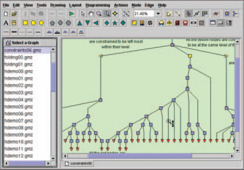
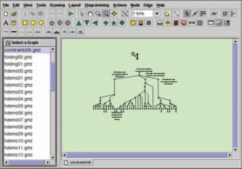
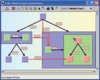
Progressive Disclosure: Progressive disclosure means hiding details until the user asks for or is ready to see them. The system starts by displaying an entire picture on the screen, except that this picture includes elements that contain other elements (in Figure 12-41, for example, the yellow file folders contain graphs).
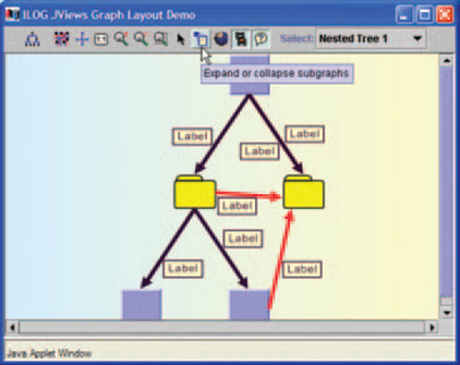
FIGURE 12-41 The starting diaqrarn.26
When a user wants to see what’s inside an aggregated element, he or she opens it using whatever rules and methods are available. For example, to open the subgraphs in Figure 12-41, the user clicks the “Expand or collapse subgraphs” button and then clicks the file folders (Figure 12-42).
Other forms of progressive disclosure include providing summaries and keywords that users can open (Buyukkokten et al. 2002, pp. 87–88) and providing miniatures of pictures that users can expand.
Fish-Eye Lenses: A fish-eye lens (also called hyperbolic browser) magnifies whatever is under the pointer. As the user moves the pointer or clicks on an item, the area under the pointer expands, the items farthest from the pointer become smaller, and the tree adjusts to fill the available space (see Figures 12-43 to 12-45 for an organization chart using a fish-eye lens).
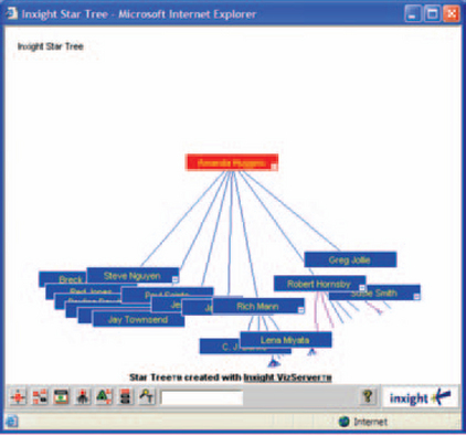
FIGURE 12-43 Organization chart displayed using a fish-eye lens.27


The two advantages of this method are that, first, users can get an overall view of the structure and, second, all of the elements are visible, no matter where you focus the lens. The lens doesn’t obscure the rest of the information—the elements that are out of focus get smaller but don’t disappear. Although fish-eye lenses require manual dexterity and are unfamiliar to many users, the lenses may be good in small spaces, like PDA and web phone screens (Bederson et al. 2002).
Make Diagrams Come Alive
In our opinion, the promise of the web is fulfilled when diagrams show changes in real time (or close to it) and those changes are available on computers all over the company—or the world.
Here are some examples of live diagrams.
• A workflow diagram that shows changing levels of activity in a call center (Figure 12-46).

FIGURE 12-46 Live workflow system.28
• A flowchart that shows how a telecommunications network is to be put together. As installers plug pieces of equipment together and the pieces start to come online (many of them automatically), the pieces’ colors change from dull to bright.
• A telecommunications diagram that shows trouble spots (Figure 12-47). As problems occur and are resolved, the elements change color and messages are added and removed, almost in real time.

To make diagrams live, your team needs to decide:
• What colors, patterns, and symbols the software will use to indicate different states (errors, alarms, active versus inactive, and so on).
• Whether the software waits for the user to click a “Refresh” button (pull) or shows changes automatically (push).
All three of these decisions require research, team analysis and negotiation, and a long phase of iterative development as the programmers and quality assurance testers discover what their software tools and networks can and cannot support. The solutions are specific to your situation, hardware, and users’ needs.
What follows, therefore, are the issues to consider while you design the software. The choices you make depend on your situation.
Use the Right Colors, Patterns, and Symbols
A live diagram shows state changes: Something on the screen changes when something in the real world changes. For example, when a stock drops by 20 basis points, its line on a live graph might slope down and turn red. Or say that an Internet service provider has software that tracks the health of the high-capacity phone lines they lease. When a problem occurs, the failing line or piece of equipment might turn orange or yellow on the screen.
The three most common methods for showing state changes are color, pattern, and symbols. So that the shape or line changes correctly to match thechange in state, you also need a rule editor (see “Provide a Rule Editor” for more information).
Color: The use of color is both culturally bound and business- or industry-specific. For example, in the United States, red means danger or stop, whereas in China (and wherever Chinese people live in large numbers), it means good fortune and life. However, in the international businesses of air traffic control and shipping, red means danger no matter what the captain’s nationality.
So if there is a first rule in using color, it is to choose the colors mandated by the business domain if you’re creating a business application and to choose culturally defined colors if you’re defining a game or an application to be used by the general public. For this rule and more, see Table 12-1.
TABLE 12-1
| 1. | Be sensitive to the conventions of the domain: Adopt industry-standard colors in business applications and culturally appropriate colors in games and applications used by the general public. |
| 2. | Don’t assign arbitrary, unconventional, or multiple meanings to the same color or pattern. Rather, use color and pattern to indicate similarities and differences-humans will assume that things that look similar are similar, and things that look different are different. |
| So, for example, if you use red to indicate “severe alert,” don’t use it on the same graphic to mean “high temperature” (the same color should not have two meanings). | |
| 3. | Never use color as the only signal. Color-blind individuals may miss important information, and low-light situations may make colors difficult to see for nearly everyone. Use pattern, symbols, and/or significantly different grayscales in addition to color (see the box “Technical Note: How to Create a Grayscale Chart”). |
| 4. | Don’t use hue (red, yellow, etc.) to rank information. Although the order of colors seen through a prism is always the same (red, orange, yellow, green, blue, indigo, violet), people don’t rank red, say, higher than blue (Cleveland 1994, p. 232). You can, however, use saturation-from pale blue to deep blue, for example-and brightness (or grayscale)-from dull yellow to bright yellow-to show order. |
| 5. | Although hue can’t be used to rank information, it can serve to code categories-for example, on maps, metamorphic rocks can be shown as blue, sedimentary rocks as red, igneous rocks as brown, and so on. On graphs, you could use red for cats, blue for dogs, yellow for ferrets, etc. Ware recommends using these 12 colors for coding: |
| 1: red; 2: green; 3: yellow; 4: blue; 5: black; 6: white; 7: pink; 8: cyan; 9: gray; 10: orange; 11: brown; 12: purple | |
| His reasons are that they are reasonably distinct in terms of hue and grayscale and that they are the most common color names, except for cyan, across cultures (different cultures recognize different numbers of colors). Ware suggests using colors from the first set of six before choosing any from the second set of six (Ware 2000, pp. 135–136). However, note that this grouping ignores the problem of red-green color confusions. Again, make sure that color is not the primary signal. | |
| 6. | Use blues for backgrounds, reds for foregrounds, and yellow, green, and black and white for elements carrying meaning (like text). Because of the physiology of our eyes and the physics of light waves, blue recedes in our visual fields and red pops out; the human eye can focus on neither red nor blue, Yellow green, black, and white, however, come into focus at the retina, making them suitable for reading (Fowler and Stanwick 1994, pp. 322–323). |
Pattern and Shape: Color isn’t the only way to make similar states look similar and dissimilar states appear different. Changes in pattern, shape, texture, and so on will also make states (and elements) look distinct. See Table 12-2 for details.
TABLE 12-2
Dimensions for indicating similarities and differences


29Blinking, depending on the intensity and frequency, can also cause migraines and even epileptic seizures.
Symbols: If the business or industry for which you’re designing the software has a standard set of symbols (or other conventional ways to show state changes), use them. Otherwise, make the symbols distinctive via the variables in Table 12-2.
Should You Pull or Push?
Live diagrams, graphs, and maps can be updated two ways: When the user asks for an update and automatically.
If the diagram is updated only when the user asks for it, the data are being pulled. Pulling data is desirable when connections are slow, the interface (a PDA or a web-enabled phone, for example) is relatively difficult to use, or the information is not critical.
If the diagram is updated automatically, either according to a timer (for example, every 60 seconds) or whenever something changes, the data are being pushed. Pushing data is desirable when the information is mission critical (in other words, the users’ job is to watch for problems); the connections are fast, possibly internal to the company; and the interface is relatively easy to use.
What if the characteristics are mixed? For example, the diagram might be mission critical but the viewer is a PDA or web phone with a tiny screen. In this case, you’d probably want to abandon the diagram and show only the text messages (these may be the same as the labels, as described in “Where Labels Come From”).
Should the Diagram Be Live or Recorded?
There are basically two ways to show state changes to users.
1. The picture on the browser is refreshed whenever a change occurs. (A variation is that only the parts of the picture that need to be changed are changed; other elements are not changed or refreshed.)
2. A state changes and the server receives and processes it and then generates a new picture, which is sent to the browser. In other words, the diagram is constructed on the server and only a picture is sent to the browser.
Picking the right method depends more on technical than design issues. For an analysis, see the box “Technical Note: Watch Out for the Programming and Networking Aspects of Graphical Displays.
Provide a Rule Editor
When a state changes, you want (a) to show the change and (b) to match the type of visual change to the type of state change. For this, you need rules. Even if an item will just be on or off, you still have to have a rule that says something like “If ON, turn shape YELLOW” and “If OFF, turn shape GRAY.”
Rule-editing software can range from strictly internal to completely open (see Table 12-3). Nota bene: Although developers and managers will argue that
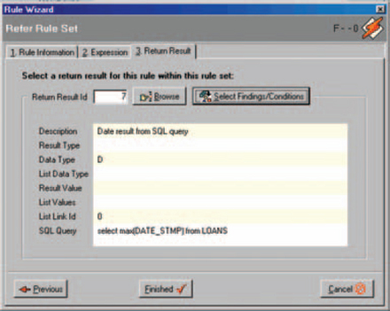
Internal/Support: The windows in Figures 12-48 to 12-51 are from a three- rule editor of intermediate difficulty. To use it effectively, the individual would have to be a subject matter expert (SME) and have some training with the tool.

FIGURE 12-48 First tab, defining a new mortgage application rule.30


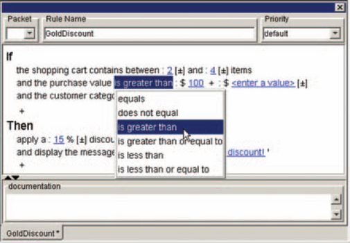
External/Public: Some development packages provide rule editors that can be used by people without programming backgrounds—for example, Figures 12-52 and 12-53. A developer can use the same window, but a different tab, to look at the underlying code.

FIGURE 12-52 A rule editor with an easy-to-understand display.31
Graphics can be big. They can easily become larger than one standard sheet of paper (A4, or 8.5×11 inches) or any single sheet of any size of paper. Unless your customers have plotters with big rolls of paper, you will have to offer some method for printing on multiple sheets.34
Shrinking the diagram (“fit to page”) is the minimum requirement for printing graphics. Fit-to-page is fine for graphics that are a third to a half larger than the selected type of paper. If the graphic is much larger than that, however, labels and fine detail become unreadable.
Tile: Break Up Large Pictures and PrintThem in Pieces
Professional graphics programs usually offer tiling, in which the picture is broken into parts, each the size of a piece of paper. Once the users print the parts, they can then reconstitute the graphic by gluing or taping the edges together.
If you want to put tiling in your software design, make sure that users can (a) preview how the graphic will be broken up before they print it; (b) switch between portrait and landscape orientations and different kinds of paper; and (c) move the break lines vertically and horizontally so that they can avoid cutting up shapes or other important features. Otherwise, they could end up with badly broken graphics like the one in Figure 12-54.

Geographic atlases often provide a sort of virtual tiling—each map has pointers to the adjoining area’s map on the edges of the page (Figure 12-55).

FIGURE 12-55 Pointers to adjoining maps.35
Any large graphic could be divided the same way, with pointers to the adjacent parts printed in the margins. The sheets could also be bound into an atlas.
However you decide to do the tiling, remember to print information about the graphic in the margins. At a minimum, you need to include the name of the graphic and information that lets users know how to put the graphic back together. For example, you could number the graphic with row and column coordinates—row 1, column 1; row 2, column 2; and so on, as shown in Figure 12-56.

You might also include the print date, the file name and location, the creator’s name, and whatever other information the task analysis suggests.
Layering in this context means breaking a large graphic into layers or levels of self-contained subgraphics, starting from a master sheet, map, or diagram (Figure 12-57). (This can be done online, with drill-downs, as well as on paper.)

FIGURE 12-57 Levels of diaqrarns.36
The top-level graphic, sometimes called the master or context diagram or map, shows the entire graphic with very little detail.
However, each major component on the master is given a number (1.0, 2.0, etc.), and then each component gets its own sheet. The subsheets themselves can have subsheets, which are numbered accordingly–1.1, 1.1.1, and so on through the lavers.
Helpful Hint: Is Your Diagram Not Printing?
Don’t be tempted to use a diagram as a background on a web page. Most browsers are set by default not to print backgrounds. If users try to print the diagram, they’ll get a blank page.
34Or displaying them on multiple screens. For a description of an OpenGL mural-sized graphics display, see ‘’A Distributed Graphics System for Large Tiled Displays” (Humphreys and Hanrahan 1999).
35Adapted from “Formats and Examples, Hagstrom Map,” © 2001 Langenscheidt Publishing Group, http://www.hagstrommap.com (accessed 7 May 2003).
36From “9, Dataflow Diagrams,” Just Enough Structured Analysis, May 21,2001, © 2001 by Edward Yourdon, http://www.yourdon.com/books/msa2e/CH09/CH09.html (accessed 7 May 2003).
How to Create a Grayscale Chart
If you want to see how gray a color is, create a grayscale chart.
1. Pick a program with a color or palette editor. Open the editor, and either find or create a set of nine grays and one black separated by 10 percent differences in darkness. Use white for the background. The values for each gray are:

2. Draw a set of gray boxes on a white background, one color of gray per box, ranging from 10 percent to 100 percent (black).
3. Draw diamonds of all the colors you want to test.
4. Drag each color sample over the chart, squinting as you drag it. When the color and a gray box seem to match, you’ve found its grayscale value.
5. Save the colors that are either 20 or 30 percent apart (separated by two or three boxes) and discard the rest.
Note: Some colors, because of their brightness, maintain high contrast no matter where you put them on the grayscale. However, check the size. Small areas of yellow disappear against white. Red, if used for small dots or thin lines, shrinks away to nothing against a dark background. At the other end of the spectrum, avoid thin blue lines and text. Because of the structure of the eye and blue’s wavelength, it is hard to focus on small blue objects.
1Microsoft Visio sample.
2“Business & Charting—Org Charts and Trees Cause-and-Effect (Fishbone) 2;’ © 1994–2003 SmartDraw.com, http://www.smartdraw.com/resources/examples/business/images/fishbone/diagram/full.gif (accessed 27 February 2003).
3“Workflow monitoring: an executive cockpit,” © 1987–2003 ILOG, Inc., http://www.ilog.com/ products/jviews/demos/wf-monitor/index.cfm (accessed 27 February 2003).
4Business & Charting—Flowcharts Telephone Order Process;’ © 1994–2003 SmartDraw.com, http://www.smartdraw.com/resources/examples/business/images/order_process_full.gif (accessed 27 February 2003).
5Microsoft Visio sample.
6From “Thin client network monitoring;’ © 2003 by ILOG, Inc., http://www.ilogJr:8001/Products/JTGO/ (accessed 14 March 2003).
7From “Vyyo VoIP Architecture;’ © 2000 by Vyyo, http://www.vyyo.com/products/35ghz.html (accessed 3 October 2003).
8“Business & Charting—Gantt Charts & Time Lines, Project Gantt Chart,” © 1994–2003 SmartDraw.com, http://www.smartdraw.com/resources/examples/business/images/project/gantt/chart/full.gif (accessed 27 February 2003).
9“Software Design—Data Flow Diagrams (DFD), Claims Processing—Yourdon and Coad Diagram,” © 1994–2003 SmartDraw.com, http://www.smartdraw.com/resources/examples/software/images/yourdon_coad_dfdl_full.jpg (accessed 27 February 2003).
10From “Telecommunications with JTGO, Web-enabled user interface;’ © 2003 by ILOG, Inc., http://demo.ilog.com:8082/jtgo-webc/index.jsp (accessed 13 March 2003).
11From Windows charting demo © 2003 by Tom Sawyer Software, http://www.tomsawyer.com/ (accessed 4 October 2003).
12Try it yourself at http://www.cs.umd.edu/hcil/excentric/dist/bin/test7.html, “Excentric Labeling for Information Visualization,” (accessed 12 March 2003).
13From downloadable demo by Tom Sawyer Software, © 2003, http://www.tomsawyer.com/ download-soft.html; see also http://www.tomsawyer.com/lav/lav.htm (accessed 9 May 2003).
14From “Business & Charting—Gantt Charts & Time Lines;’ © 2003 by SmartDraw, Inc., http://wwwsmartdraw.com/resources/examples/business/images/gantt_load_full.gif (accessed 11 March 2003).
15From “Graph Layout Package;’ © 1987–2003 ILOG, Inc., http://www.ilog.com/products/jviews/graphlayout/ (accessed 4 March 2003).
16From “netViz 3D Gallery,” © 2003 by netViz Corporation, http://www.netviz.com/products/ gallery.htm (accessed 25 March 2003).
17From “Procedural Flowchart—The Regents as Tenant,” © 2003 by University of California, San Diego, http://adminrecords.ucsd.edu/ppm/docs/440-3A.HTML (accessed 4 October 2003).
18From “Screenshots,” © 2002 Intellisys Inc., http://www.webintellisys.com/screenshots/ criticalpath.jpg (accessed 5 March 2003).
19From “Graph Layout Package,” © 1987–2003 ILOG, Inc., http://www.ilog.com/products/jviews/graphlayout/ (accessed 5 March 2003).
20From “Workflow Monitoring: An Executive Cockpit,” © 2003 by ILOG, Inc., http://www.ilog.com/products/jviews/demos/wf-monitor/index.cfm (accessed 17 March 2003).
21“Workflow monitoring: an executive cockpit;’ 0 1987–2003 ILOG, Inc., http://www.ilog.com/ products/jviews/demos/wf-monitor/index.cfm (accessed 27 February 2003).
22From downloadable demo by Tom Sawyer Software, © 2003, http://www.tomsawyer.com/download-soft.html.
23“Thin Client Executive Cockpit,” © 2003 ILOG, Inc., http://demo.ilog.com:8888/wfthc/ index.html (accessed 19 March 2003).
24“Workflow monitoring: an executive cockpit © 1987–2003 ILOG, Inc., http://www.ilog.com/ products/jviews/demos/wf-monitor/index.cfm (accessed 27 February 2003).
25See “PhotoMesa Image Browser” for a downloadable demo from the Human-Computer Interaction Lab, University of Maryland, at http://www.cs.umd.edu/hcillphotomesa/ (accessed 19 March 2003).
26Prom “More smart diagramming;’ © 2003 by ILOG, Inc., http://www.ilog.com/products/jviews/demos/nestedlayout/index.cfm (accessed 20 March 2003).
27From “Inxight VizServer, Demos and More;’ © 2002 Inxight Software, Inc., http://www.inxight.com/ products/vizserver/demos.php (accessed 21 March 2003).
28From “A Thin Client Executive Cockpit,” © 2003 by ILOG, Inc., http://demo.ilog.com:8888/ wfthc/index.html (accessed 25 March 2003).
30Screen ED 2003 by Palisades Technology Partners, Inc., Englewood Cliffs, NJ.
31From “ILOG Business Rules © 2003 by ILOG, Inc., http://www.ilog.com/products/rules/kit/index.cfm (accessed 3 April 2003).