
Diagram Types
This chapter contains examples of the types of diagrams often seen in software applications, both desktop and web.
This list lisn’t exhaustive, however. For more information about diagrams, see the books listed in Resources.
Cause-and-Effect Diagrams
Also known as Ishikawa, fishbone, or characteristic diagrams, cause-and-effect diagrams are good for documenting the factors that contribute to or lead to a certain effect (Figure 13-1). They are often used when looking for solutions to problems and can be helpful during online brainstorming sessions with geographically dispersed team members.


Engineering and Scientific Diagrams
Each engineering and scientific discipline has its own symbols and requirements for drawings. Therefore, rather than trying to cover all of the many types of diagrams and illustrations used in science and engineering, this section concentrates on some of the most common types and explains why certain types are more suitable for certain purposes than for others.
Cross Section
Cross sections are good for showing internal structures that you would normally never see, as well as how different parts relate to each other in an assembled unit.
Cross-sectional views show the object as if it had been cut straight through. For example, Figure 13-2 is a cross-sectional view of mammal skin showing sweat glands, ducts, receptors, skin layers, and other pieces of which skin is made.
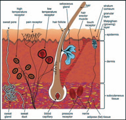
Do not confuse cross-sectional views with cutaway views. A cross section is cut straight through the subject in a line from one point to another. A cutaway view has some of the parts removed or cut open to show the inside parts.
Cutaway View
The cutaway view is good for showing how parts are connected to the whole. For example, Figure 13-3 shows the relationship of a car’s engine, transmission, and axles. Because these parts do not line up, a cross-sectional view would miss several connections.

FIGURE 13-3 Cutaway view of the relationships between parts of a car.1
By cutting out only the material that hides the important details, the rela- tionship between the structure and the details becomes clear.
Elevation View
Also known as the front or side view, the elevation view is good for showing the height or length of an object. Elevation views are often used in documents to identify a product or object (Figure 13-4) or to show the front, sides, and back of buildings in architectural drawings (Figure 13-5). An elevation can be a drawing or a photograph. Drawings are commonly used in technical documents to control clutter and noise. Architects use elevation views to show how their buildings will fit into their surroundings and also to show what surface materials will look like.
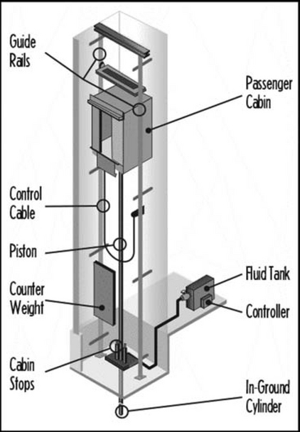

FIGURE 13-5 An architect’s elevation view of a proposed building.2
Exploded View
Good for showing the orderly relationship of parts to each other, exploded views, such as the one in Figure 13-6, are almost always line drawings, although there are occasional photographic exploded views.

FIGURE 13-6 Exploded view of a plutonium Q32 explosive space modulator.3
When using photos in exploded views, make sure the photo is well lit, that the objects in the photo are easily recognizable, and that there are no distracting shadows or unnecessary details cluttering the picture. You may also have to add callouts to the picture to identify the parts.
The problem with photographic exploded views is that the parts cannot always be aligned exactly as they would fit in real life. For example, in Figure 13-7 the parts are not lined up in the positions they would normally occupy. They are lying flat next to the housing, and it is not clear exactly how they fit together.
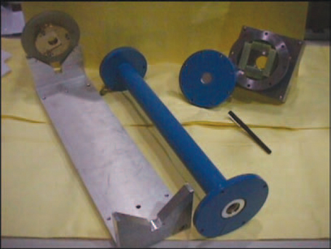
FIGURE 13-7 Photographic exploded views almost never show true alignment.5
To line components up as they would actually fit in an assembly, the parts would have to float. The photograph would then have to be retouched to remove the wires or platforms used to show the parts in the correct alignment.
However, animation could solve this problem—for example, if the user clicked the exploded view, the components could assemble themselves in the right order. Or you could provide drill-downs into individual parts and show tooltips with part numbers. Or you could let users print out a single part with its specifications via clicking it and then clicking “Print with Details,”4
Line Drawing
The line drawing, also known as the cartoon, is good for illustrating complex material without extraneous detail. Even the best photographs are often toocluttered to be as helpful as a good line drawing. For example, medical publications often use high-quality renderings to help doctors and students identify organs, muscles, and other tissue without the mess of the real thing (see Figure 13-8).

Cutaway, cross-sectional, plan, elevation, and exploded views are usually line drawings.
Consider providing methods to animate and rotate drawings and to add tooltips (text) and rollovers (other pictures) containing details.
Photographs
Photographs are not usually thought of as diagrams, but they are sometimes used in the same ways—to provide information—and therefore follow some of the same rules.
Photographs are good for showing objects realistically. For example, one photograph can take the place of many paragraphs when describing a process or the differences between items. Figure 13-9 is a photograph of a flexible drill bit that electricians use to drill through floors and between walls to fish wires from one floor to another. It sounds confusing (flexible drill bit?) and would require several paragraphs to explain. But the photograph shows immediately how it works.

FIGURE 13-9 Flexible drill bit.6
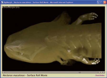
Photographs and other images created from real objects can also be animated to good effect. For example, at the University of Texas, Austin, Digital Morphology site, photographs, scans, and X-rays of many species are available as animations (see Figures 13-10, 13-11, and 13–12).

FIGURE 13-10 One frame of a QuickTime animation of a common mud puppy.7
Surgeons use three-dimensional models from MRIs, angiograms, CT scans, and other radiographs before surgery to plan and practice a procedure and during surgery to guide their scalpels. The computerized information can also be used to generate transparent plastic models (Davis 2003).
However, although photographs are considered to be the most realistic type of graphic, they often suffer from background clutter. For example, at first glance Figure 13-13 appears to be a photograph of a church. But if you look at Figure 13-14 and its callout, you see what appears to be a 200- foot-tall professor waving her arms over the church. Once you know she’s there, it’s pretty obvious. But the background clutter makes it hard to pick her out initially.


FIGURE 13-14 Now you see what’s up.8
Besides adding callouts, you can clarify photographs by turning them into photo-realistic drawings. For example, the photograph in Figure 13-15 is badly lit and cluttered. The drawing in Figure 13-16, on the other hand, is much clearer.

Plan View
The plan view, also known as the top view or map, is good for showing relationships between objects on a flat or horizontal plane. The view is looking down on an object from directly above.

Plan views are often used for architect’s renderings, floor plans, and landscaping layouts (see Figure 13-17). Plan views are also used to show layouts, distances, directions, and sizes (see Figure 13-18).

There is no perspective in plan views—views into the distance stay the same from one end of the plan to the other. This is an artificial view: If you were actually standing on top of a ladder or building looking down on an object, the object would seem distorted because of your visual acuity. In other words, the center of the object would be in clear focus, but the edges would become distorted by distance. In a plan view, however, everything is in focus.
Schematic
The schematic is good for simplifying complex objects like the wiring in a piece of equipment or complex processes like the brewing of beer.
Wiring diagrams such as the one in Figure 13-199could be used for interactive what-if analyses. For example, engineers designing circuitry for a new instrument might sketch the circuit and then let the program automatically test it for shorts and redundancies, based on built-in rules.

FIGURE 13-19 What’s wrong with this circuit?10
Schematics lend themselves to animations—in Figure 13-20, for example, grain and water could make their ways through the various tanks and ultimately to market. If the system sends alarms to a computerized monitor, a “live” version could even be used to show trouble spots.

Flowcharts
Also known as the flow diagram or work flow, the flowchart (Figure 13-21) is good for showing interrelated information (events, steps in a process, flows of money or data, etc.), either sequentially or chronologically.
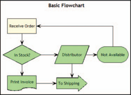
Flowcharts are often used for troubleshooting. They can also be used to define and see the effects of workflows. For example, analysts can set up an automated workflow, tie the diagram to a data feed, and watch elements light up as they come online.
Primary Symbols

The lozenge (start, stop), rectangle (activity), diamond (decision), and torn paper (document) are the four most common flowchart symbols. For a more complete list, see Harris (1999, p. 156) or the International Standards Organization11and American National Standards Institute12standards.
Network Diagrams
Also known as the hierarchical tree or topology diagram, the network diagram is good for showing how pieces of equipment are related to each other (see Figure 13-22). It is also good for showing the effect of overloads, failures, or design errors on a network, either live or in simulation.

FIGURE 13-22 Network diagrarn.13
Primary Symbols
Network symbols are not standardized, although there are standard practices. Depending on the purpose of the diagram, lines are used to represent either relationships (for example, “This station contains this item” or “This router supports this service”) or actual connections (for example, “This T1 line runs to this point of presence”).
Shapes can be either abstract—for example, boxes and circles (see Figure 13-23)—or concrete—for example, line drawings of actual equipment (see Figure 13-24).

FIGURE 13-23 Abstract symbols.14

FIGURE 13-24 Concrete symbols.15
Organization Charts
The organization (or org) chart (Figure 13-25) is good for showing how people, departments, organizations, operations, functions, and so on are organized. (But see also “Don’t Restrict Yourself to Hierarchies: The Anti-org Chart.”)

Organization charts are important to sales people, marketers, and consultants when they are prospecting for business and need to understand how a company is organized. As they do their analyses, they gather and, if necessary, create their own organization charts.
Organization charts are also useful for newly hired managers who need to find out who to go to for help and information, as well as during merger and acquisition planning.
Primary Symbols

The top levels of the organization or other hierarchy are usually indicated by position (at the top) and heavier lines around the shapes.
Temporary people or departments are often indicated by dashed lines.
Formal or permanent relationships are usually indicated by solid lines. Temporary or indirect relationships are indicated by dashed lines.
For more symbols, see “Organization Chart, Construction Options” in Harris (1999, p. 264).
Create Live Organization Charts
Organization charts can be much better “alive” than “dead.” For example, making boxes clickable lets users easily get more information about the department or organization (see Figure 13-26).

FIGURE 13-26 Clickable boxes take users to more information.16
Another example: When the user holds the pointer over an employee, you can provide popups containing data such as years with the company, years in the current position, major projects, interests, photos, and so on.
If you’re asked to design a directory, consider including an organization chart as well as the standard text listings and search options. The org chart could be updated automatically from human resources databases and might let users move up and down through the various levels.
For example, an employee who knows the right department but not the right contact could start with a department-level org chart and then drill down until she found the desired contact name. Or she might know a name but need to find the department head; in this case, you could show her the name in the context of a department org chart and provide a way to jump to higher levels of the hierarchy.
Don’t Restrict Yourself to Hierarchies: The Anti-org Chart
For many people, the standard corporate organization chart is barely meaningful. Perhaps their workplace has a flattened hierarchy. Perhaps they are independent consultants. Perhaps they work in an industry where employment is fluid—an individual can be looking for work one month and looking for employees the next. Or perhaps they work in a field where professional contacts outside the company are just as important as the ones inside.
In short, people may need to organize their relationships, but not hierarchically. As Bonnie Nardi et al. say (2002, pp. 89–90):
Our research on communication patterns in the workplace points to models of personal social networks. We have found that people invest considerable effort in maintaining links with networks of colleagues, acquaintances, and friends, and that these networks are a significant organizing principle for work and information ….
Organizations experience a constant flux of downsizing, merging, splitting, partnering, reorganizing, and outsourcing. An increased focus on business relationships between companies leads to new kinds of alliances among them and with their suppliers and customers. Relationships outside the organization, including those with government agencies and the press, are increasingly critical to many businesses. Within organizations, constant reorganization means frequent changes in workers’ responsibilities, colleagues, and reporting relationships. One consequence is that many organizations operate in an increasingly distributed manner, with workers, contractors, consultants, and important contacts located not only in different parts of their home countries but around the world as well.
Nardi and her many colleagues have developed a program called ContactMap that presents users with a visual model of their personal social networks, showing which members are literally central or peripheral to their work and personal lives and letting them reorganize the clusters as responsibilities and relationships change. In Figure 13-27, you can see at least seven clusters of people. One person, Steve Whittaker, is selected; his personal information appears at the left.

FIGURE 13-27 ContactMap, an organization chart without hierarchies.17
Other Hierarchical Charts
Family trees and dendograms are two other types of hierarchical charts that are semantically very unlike organization charts.
The family tree or genealogy chart (see Figure 13-28) shows ancestral relationships in a family or other group (for example, influences within a musical genre).

FIGURE 13-28 Family tree.18
Unlike organization charts, family trees rarely use boxes. The hierarchy is organized by time rather than corporate relationships.
A dendrogram (also called cluster diagram or tree diagram) shows relative similarities between elements. The clusters (degrees of similarity) are determined mathematically. Dendrograms are especially good for indicating evolutionary relationships—see Figure 13-29, which shows the evolution of the fishes from the Agantha, Ostracoderms, and Placoderms to modern fish lineages. Each fish shape in the figure is clickable and opens a drawing or photograph of the fish clicked.
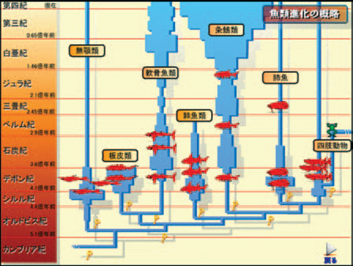
FIGURE 13-29 Dendrogram showing the evolution of fish.19
Unlike organization charts, the value at which a line crosses from one group or subgroup to another is generally proportional to the degree of similarity between the groups or subgroups.
For more information, see “Dendrogram” in Harris (1999, p. 133).
Software Design Diagrams
Software analysts and designers use a variety of diagrams, not for variety’s sake but because different types of diagrams highlight different aspects of a system. For example, data-flow diagrams show the functions of the system, state-transition diagrams show the timings in the system, and entity-relationship diagrams show the data relationships.
The diagrams software developers use will also depend on their development culture—in other words, what most people are familiar with, what your spec-writing guidelines say, whether the software company does mostly transactional systems or object-oriented systems, and so on.
The three most common software diagrams and a few of their variations are listed in this section. For information on other types of software diagrams, see Resources.
Data-Flow Diagram
The data-flow diagram (also known as the DFD, bubble chart, process model, business-flow model, workflow diagram, or function model) is good for displaying the functions of a system but not good for modeling databases or time-dependent behavior (Figure 13-30).

FIGURE 13-30 Data-flow diaqrarn.20
The data-flow diagram (DFD) pictures a system as a network of functional processes connected with flows, plus occasional collections (called stores) of data (Yourdon 2001, pp. 1–3).
Primary Symbols

Processes or functions are shown as circles or sometimes as rounded rectangles. A process shows a part of the system that transforms inputs into outputs. The label should be a word, phrase, or short sentence that says what the process does—for example, “Find information on DFDs.”
Flows are shown as arrowed lines (either straight or curved). The label should say what kind of information or item moves along the flow—for example, “Web link.”
Stores (places where data are stored) are shown as two parallel lines or an open-ended rectangle. Not all systems have stores.
The label is generally the plural of the name of the items carried by the flow into and out of the store—for example, “Web links.” (This implies that the same items go in and out, so the flows into and out of the store will have the same labels.)
Terminators, external entities or people with which the system communicates, are shown as rectangles. The label is the name of the terminating entity (for example, “Web application book”), person, or group of people.
Manage Complexity by Breaking the Diagrams into Levels
Because the diagrams can become as complex as the systems they describe, analysts have a method for breaking up a diagram into manageable pieces: They create levels. They start with one “context” diagram that shows the entire system at a glance, numbering the major functions—see, for instance, the numbered bubbles in Figure 13-30. Then, subsequent diagrams use subnumbers that refer back to the context diagram—“1.1 Receive orders via web site”; “1.2 Receive orders via phone”; and so on (Yourdon 2001, pp. 15, 19–20).
Entity-Relationship Diagram
The entity-relationship diagram (also known as the ERD or E-R diagram), is good for describing the layout of a stored-data system. It is not good for modeling functions or time-dependent behavior (Figure 13-31).

FIGURE 13-31 Entity-relationship diaqrarn.21
The entity-relationship diagram (ERD), because it is relatively simple and familiar, is a good communication tool. It can be shown to:
Primary Symbols

ERDs have two main components: object types and relationships. Object types are shown as rectangles. An object type represents a collection or set of objects in the real world. The label is a noun or name, usually singular.
Note that objects in an ERD can correspond to stores in a related DFD. For example, if there is a CUSTOMER object in the ERD, there should be a CUSTOMERS store on the DFD.
Relationships are indicated with lines (or diamond shapes). One-to-one and one- to- many relationships can be indicated using single-headed arrows (1 to 1) and double-headed arrows (1 to many). Direction (from Object 1 to Object 2) can be shown with the arrows as well. A required relationship can be shown with a short line; an optional relationship can be shown with an open circle.
Variations
Unified Modeling Language Logical and Physical Data Models
Unified Modeling Language (UML) logical and physical data models are good for modeling object-oriented databases. The diagrams can indicate inheritance as well as a wide variety of relationship types.
The diagrams can be used to show either logical (Figure 13-32) or physical models (Figure 13-33).
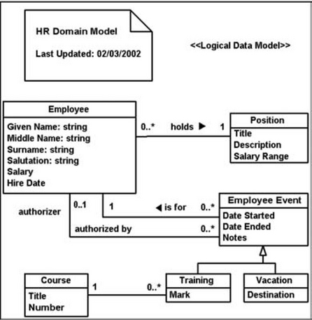
FIGURE 13-32 UML logical data model.22

FIGURE 13-33 UML physical data model.23
• Logical data models (LDMs) show the logical data entities, the attributes describing those entities, and the relationships between entities.
• Physical data models (PDMs) show the internal schema of a database, including the data tables, their data columns, and the relationships between tables.
The visual components are rectangles, with an area at the top for the object name, and lines that show the relationships between tables and sometimes also inheritances. For more information on notation and analysis, see the books listed in Resources.
State- Transition Diagram
The state-transition diagram (Figure 13-34) is good for showing a system’s time-dependent behaviors. Originally designed for real-time systems such as process control, telephone switching systems, high-speed data acquisition systems, and military command and control systems, state-transition diagrams are now used whenever timing might be an issue—for example, if thousands of terminals might hit a database at the same time or when activities occur in flurries, as shown in Figure 13-35.

FIGURE 13-34 State-transition diagrarn.24
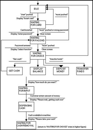
FIGURE 13-35 Complex state-transition diagrarm.25
Primary Symbols
State- transition diagrams have symbols for states, transitions, and conditions and actions.
States are shown as rectangles. Labels should describe the state the system can be in—for example, WAITING FOR CARD.
Transitions are shown as arrows connecting related pairs of states. Although the transitions are not labeled, rules about valid connections are implied by the arrows themselves. For example, in Figure 13-35 you can see that the WAITING FOR CARD state can return to IDLE or change to WAITING FOR PASSWORD. It cannot jump directly to DISPLAY BALANCE. You can also see that IDLE is the first state and WAITING FOR CASH REMOVAL is the last (at least in this transaction).
Conditions and actions are shown as a line and two short sentences, with conditions above the line and actions below it.
Time-and-Activity Charts
The time-and-activity chart (also known as the Gantt chart) is good for scheduling, assigning workloads, planning projects, and tracking activities (see Figure 13-36). Time is displayed on the horizontal axis. Horizontal bars and symbols are used to designate blocks of time.

Primary Symbols
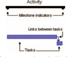
On Gantt charts, the most common time-and-activity chart, overall activities are indicated with horizontal bars; milestones are indicated with triangles or diamonds.
The individual tasks that make up the activity are shown below the activity. If tasks are dependent on one another, they are linked with arrowed lines.
For more symbols, see Harris (1999, “Time-and-Activity Bar Chart,” pp. 412–415).
Variations
CPM (Critical-Path Method)
The critical-path method (CPM) uses a chart with the critical path highlighted (Figure 13-37). The critical path is the series of tasks that dictates the finish date of the project. Visually, the critical path is the central line, with the dependent tasks or subtasks appearing above or below it.
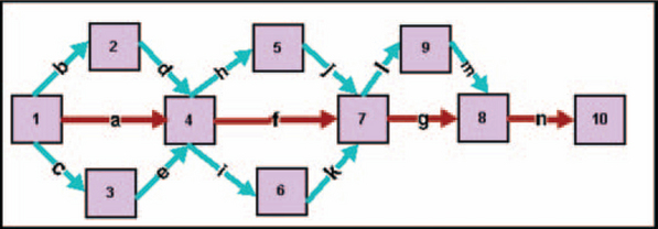
FIGURE 13-37 CPM chart.26
PERT (Program Evaluation and Review Technique)
The program evaluation and review technique (PERT) uses a chart that shows the major events and activities of a project and their interrelationships (Figure 13-38).
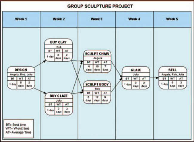
FIGURE 13-38 PERT chart.27
CPM charts focus on activities (“Pour the foundation”), while PERT charts focus on events (“Complete the foundation”). In neither diagram are there time scales, but numbers of days can be added to the shapes or lines (Figures 13-39 and 13-40).
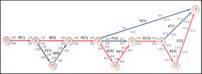
FIGURE 13-39 Numbers of days shown on the (CPM).28

FIGURE 13-40 Numbers of days shown in the (PERT).29
Two experts say that text versions of time-and-activity charts are often more useful than graphic versions. For example, Anna Baldino, a Wall Street project management specialist, says (Baldino 2003, personal email):
I prefer details in tabular form. Graphic-type charts are way too busy for me. Since I always break projects and deliverables into phases, I require very detailed tasks for only one phase at a time. In other words, my active phase is the only one I plan out in extreme detail.
Individual work groups focus primarily on their own task lists and plan subsets. Cross-group or component-integration discussions are usually held at more general levels, which results in each group going back and working out their specific details. Also, some tasks run in parallel with each other and actually only
integrate at the end of a phase, making the number of interdependencies in most projects much smaller than you might think. It’s often more important for everyone to understand how the “blocks” of a project need to integrate at a higher level.
The tasks for subsequent phases are less detailed because by the time I get to them, management has already reprioritized, or has modified requirements and/or budget for that phase, or a vendor is no longer supporting their platform or software and you need to convert in the middle, etc., etc.
I try to keep everyone, including my manager, very focused on the active phase only, with a detailed review of the next phase just before that part starts.
Why use charts at all, then? Well, as Anna says, “Senior managers hate details. They do like graphics. I have used summary-level graphics to make a point when necessary.”
Mary Anne Martucci (2003, personal email), a senior project manager in the insurance industry, adds, “I usually limit the amount of data being displayed on the Gantt chart. I look at the roll-up level information and find it helpful. The lower-level Gantts are visually cluttered. For resource allocation, I look at the information in a table format. For instance, I can review all of the allocated resources to see when they are on the schedule and to which tasks they are assigned.”
Edward Tufte (2000, pp. 4–5) agrees that most time-and-activity charts are not all they could be:
Computer screens are too small for an overview of big serious projects. Horizontal and vertical scrolling are necessary to see more than about 40 horizontal timelines for a reasonable period of time. Thus, for large projects, [you need to] print out the sequence on a big roll of paper and put it up on a wall.
The chart might be retrospective as well as prospective. That is, the chart should show actual dates of achieved goals, evidence which will continuously reinforce a reality principle on the mythical future dates of goal achievement.
Most of the Gantt charts are analytically thin, too simple, and lack substantive detail. The charts should be more intense. At a minimum, the charts should be annotated—for example, with to-do lists at particular points on the grid. Costs might also be included in appropriate cells of the table.
About half the charts show their thin data in heavy grid prisons. For these charts the main visual statement is the grid prison of administration, not the actual tasks contained by the grid. No explicitly expressed grid is necessary.
For examples of more elegantly designed Gantt charts, including an overview-plus-detail version, see Ask E.T. at Tufte’s website.
Create Live Time-and-Activity Charts
Time-and-activity charts can be made interactive. Here are some possibilities.
Hide details until the user holds the pointer over the element—see Figure 13-41.
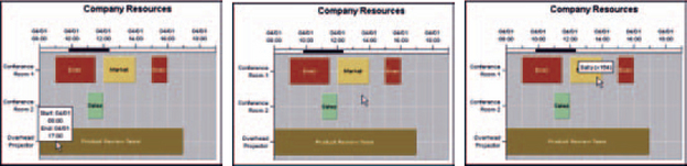
FIGURE 13-41 Hide details until the user asks for them.30
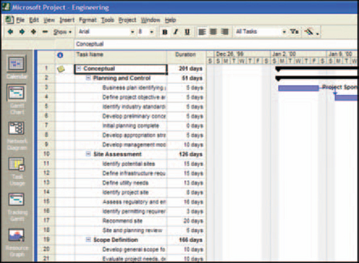
Let users transform charts from one form to another easily. For example, Microsoft Project lets users readily transform Gantt charts (the default style) into PERT charts and tables (see Figure 13-42).
Automatically send messages to managers and employees. Consider designing time-and-activity charts that will automatically send messages when key dates change, when teams have missed deadlines, when meetings are about to occur, and so on. But don’t overdo it—the messaging facility should support the project managers, not take over their jobs.
(Good project management requires at least as much negotiation and conversation as nagging—see Rothman (2003, pp. 48–49.)
Make the chart easily accessible. Provide a version on the intranet (or extranet if you have that type of relationship with your suppliers or customers) with various levels of read—write permissions. Large organizations already make their charts accessible via the corporate network or Lotus Notes; making them web accessible is just the next step in putting all the important information in the same place.
Treemaps
Treemaps, invented by Ben Shneiderman at the University of Maryland’s Human–Computer Interaction Lab, were originally designed to replace directory trees—the hierarchies used in directory programs like Microsoft Window’s “My Computer” to keep track of file folders (Shneiderman 2003). When there are hundreds or thousands of file folders or other elements in a tree, the trees become unwieldy. Shneiderman looked for a way to show the same information more compactly. The result was the treemap. Each rectangle’s area is proportional to some attribute in the hierarchy; in the case of file directories, they’re proportional to the size of the subdirectory.
In addition to representing file directories and hard-drive space allocations, treemaps have been adapted for the financial industry (Husmann 2002). In Figure 13-43, for example, the colors indicate price performance (yellow indicates positive numbers, blue indicates negative numbers, and dark colors are neutral) and the rectangle sizes indicate the companies’ market capitalization (total amount of stock). For more information about the company, users can click the rectangle to get a menu of research links. The SmartMoney treemap is live as well—it’s updated every 20 minutes with market data (there is a 20-minute delay in the data, however).
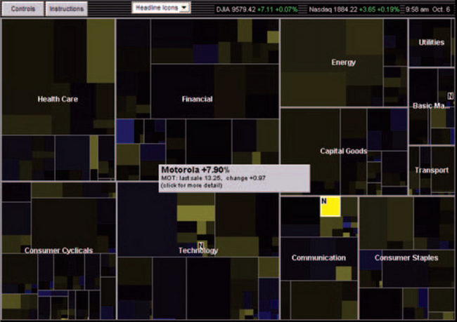
FIGURE 13-43 Treemap—a way to show hierarchical dimensions quickly.31
1From “Corvair Corsa Cutaway View and Production Figures,” © 2003 by Gary Aube, http://corvaircorsa.com/cutaway.html (accessed 23 April 2003).
2From the “Downloads, Research Institute for Networks and Communications Engineering,” © 2000 by Dublin City University http://www.eeng.dcu.ie/utill/servlet/page?url=/general/download.html (accessed 9 May 2003).
3Martin the Martian’s device in the 1948 Bugs Bunny cartoon “Haredevil Hare.”
5From “Prototype II Polarimeter Archive” by David J. Tedeschi, © 1999, the Board of Trustees of the University of South Carolina, http://solomon.physics.sc.edu/~tedeschi/research/strips/proto2-pics.html (accessed 9 May 2003).
4Excellent ideas courtesy of Chauncey Wilson, director of the Design and Usability Testing Center, Bentley College.
6From “D’versiBIT System,” © 2001 by Greenlee Textron, http://www.greenlee.textron.com/download/archive/69-71.pdf (accessed 14 May 2003).
7From “Necturus maculosus, Common Mudpuppy, with Skin/Matrix, Roll,” Dr. Susan Evans, University of London, © 2002 by UTCT/DigiMorph, http://digimorph.org/specimens/Necturus_maculosus/whole/ (accessed 4 October 2003).
8Or maybe not. This photo was taken in Madurodam, the Hague, in the Netherlands. See “Architecture of Madurodam,” http://glasssteelandstone.com/NL/HagueMadurodam.html, for more information.
9Well, maybe not that one.
10The fuse is blue (The fuses blew).
11For the ISO online catalog, see http://www.iso.ch/. Graphic standards are part of the 01.080 section.
12For the ANSI online catalog, see http://webstore.ansi.org/ansidocstore/find.asp?.lt is possible to search on “flowcharts.”
13From “Our Customers,” © 2003 by Tom Sawyer Software, http://www.tomsawyer.com/industry/communications.html (accessed 25 March 2003).
14From “TF-TANT: Differentiated Services Testing,” August 22, 2000, maintained by Tiziana Ferrari, http://www.cnaf.infn.it/~ferrari/tfug/ds/ (accessed 4 April 2003).
15From Datakey, © 2003 by Baltimore Technologies, Dublin, Ireland, http://www.datakey.com/partners/Partner_pages/Baltimore.shtml (accessed 9 May 2003).
16From Statistical Research & Applications Branch, National Cancer Institute, http://srab.cancer.gov/about/orgchart.html (accessed 7 April 2003).
17From Bonnie Nardi’s home page, http://www.darrouzet-nardi.net/bonnie/ContactMap.html (accessed 9 April 2003).
18From “Family Tree,” © 2002 by the Dwight D. Eisenhower Foundation, http://www.dwightdeisenhower.com/eisenhowers.html (accessed 9 April 2003).
19© 2003 by Gamagori Natural History Museum (Japan), http://www.museum.nrc.gamagori.aichi.jp/interfa/DENDRO/CDENDRJ.HTM (accessed 9 April 2003).
20From “9, Dataflow Diagrams,” Just Enough Structured Analysis, May 21,2001, © 2001 by Edward Yourdon, http://www.yourdon.com/books/msa2e/CH09/CH09.html (accessed 24 April 2003).
21From “Samples,” © 1996–2002 by RFF Electronics, http://www.rff.com/samples.htm (accessed 24 April 2003).
22From “A UML Profile for Data Modeling;’ © 2002 by Scott W. Ambler, http://www.agiledata.org/essays/umIDataModelingProfile.html (accessed 1 May 2003).
23Microsoft Visio sample.
24From “Samples;’ © 2002 RFF Electronics, http://www.rff.com/samples.htm (accessed 2 May 2003).
25From “13, State-Transition Diagrams,” © 2001 by Edward Yourdon, http://www.yourdon.com/books/msa2e/CH13/CH13.html (accessed 2 May 2003).
26From “Business & Charting![]() Gantt Charts & Time Lines, CPM Chart: Game Design
Gantt Charts & Time Lines, CPM Chart: Game Design![]() A Critical Path Method (CPM) or Critical Path Analysis (CPA) chart,” © 2003 by SmartDraw.com, http://www.smartdraw.com/resources/examples/business/gantt8.htm (accessed 10 April 2003).
A Critical Path Method (CPM) or Critical Path Analysis (CPA) chart,” © 2003 by SmartDraw.com, http://www.smartdraw.com/resources/examples/business/gantt8.htm (accessed 10 April 2003).
27From “Business & Charting—Gantt Charts & Time Lines, PERT Chart: Sculpture Project,” © 2003 by SmartDraw.com, http://www.smartdraw.com/resources/examples/business/gantt13.htm (accessed 10 April 2003).
28From “Introduction to Project Management,” St. Norbert College, http://www.snc.edu/socsci/chair/333/numbers.html (accessed 10 April 2003).
29From “Business & Charting—Gantt Charts & Time Lines: PERT Chart: Airplane Design,” © 2003 by SmartDraw.com, http://www.smartdraw.com/resources/examples/business/images/pert_chart_full.gif (accessed 10 April 2003).
30From “Time Chart Java Examples, Resource Allocation Chart with Scrollable Axis,” © 2003 by Visual Mining, Inc., http://www.visualmining.com/examples/javaexamples/TimeChart2.html (accessed 11 April 2003).
31From “Map of the Market,” © 2003 by SmartMoney, http://smartmoney.com/marketmap/ (accessed 6 October 2003).