
Data Output: Reports
• Tables and printouts from ad hoc database queries.
• Management reports, such as sales records for particular regions, employee lists, attendance records for school districts, and what-if analyses.
If the output is a list of records that match a query, people generally call the result a table.
If the output is a list that is designed to be printed out, they generally call the result a report.
If the output is one printed (or printable sheet) per record, they call the result a form. Examples include statements, shipping labels, and insurance forms. See Chapter 8 for more information.
Note that this chapter concentrates on the look and feel of reports. If your users need to create or change report parameters, change the generated report, and communicate the results to other people, see Chapter 9 for design ideas.
Also, much of the advice in this chapter is valid whether the reports are run locally in the office or remotely over the Internet. Complex reports are often generated using office servers but displayed via the Internet.
Let Users Print Ad Hoc Queries
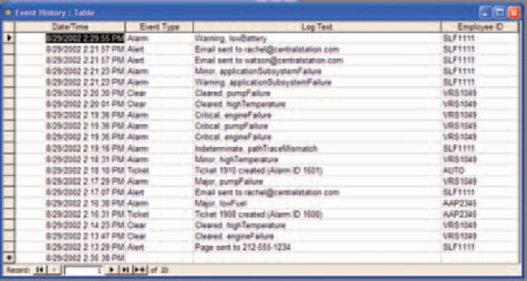
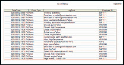
Figure 7-1 shows a list (the result of a database search) and Figure 7-2 shows a printout created from that list. Being able to print out lists is a common user requirement.
• It’s easier to check off items on a piece of paper than on a screen (although if checking off items is a requirement for the job, maybe it should be included in the application).
• It’s easier to see the entire list on paper. Onscreen, you have to scroll up and down, sometimes even side to side.
• It provides documentation and a sense of closure: “Okay, I’ve finished all these records today.” There are tricks to getting an ad hoc report right, however.
• Carefully consider the format, as described in “Ad Hoc Reports: Not Just Screenshots.”
• Watch how people set up queries and reports now. This will give you clues on how to set up the database as well as the reports—see “Start Database Designs from Reports.”
• Trees give up their lives for a good cause, as described in “Aren’t We Trying to Get Rid of Paper?”
Ad Hoc Reports: Not Just Screenshots
To be usable as a printed report, the onscreen query has to be reformatted slightly:
• The entire list must be printed, not just what’s currently visible.
• The printout must have a header and footer.
• Users must be able to manipulate the font size, font type, and/or column width so that the printout fits on the paper available in the printer (using either landscape or portrait orientation).
The changes can be automated using a cascading style sheet (CSS) and the MEDIA attribute (for more on CSSs, see Resources).
Note, however, that although the formatting of the headers, footers, spacing, fonts, and so on might change from screen to paper, the printout must retain the user’s choices of columns, column location, and sort. It should not reset the columns or sort to a default.
The reason is that users often create their own quick management reports just by rearranging or hiding columns, changing the sort, and printing the results. If you automatically change the columns and the sort, you’ve destroyed all their work.
Start Database Designs from Reports
Nearly every application has some sort of report facility. However, every time we’ve been involved in designing one, the whole design team seems to start from scratch. Part of the reason for this is that the reports do have to be rewritten for each new platform or toolkit. But another part, we suspect, is that reporting is seen as so mundane that no one bothers to remember the rules and strategies between one version and the next.
Nevertheless, the design issues are not trivial, as many designers and developers have found to their dismay.
From the point of view of interface design, specifying reports looks fairly easy. All you have to do is to give users a reasonably attractive printout with the right information on it and a few customization tools.
From the point of view of application design, however, reports are by no means trivial, and designers would do well to get involved from the very first database design meeting. Anna Baldino, a Wall Street project manager and application designer, explains why: Good database designers start with reports, not end with them. Customers don’t know how their databases should be set up or even where the data are coming from, she says, but they do know what they want to see (Baldino 2002, personal email):
Expert application and database designers start with the application outputs, most of which are reports or queries of one type or another [as with ad hoc reports]. (Some outputs are feeds to other applications and must be defined as well.)
The number of reports, the frequency of access, timing of access, and the average volume of data (rows) contained in each report or query type all have a major impact on the database design.
For example, in one application you may have many people all over the world doing random queries all day long, resulting in a few rows per query (small random hits to the database throughout the day), then, perhaps, some predefined reporting throughout the month. Another firm with the same data fields may have very few people accessing the data in an ad hoc way but has to print or view large reports once each month (a major dump of data a few times per month): Virtually the same data, but the design must support different type of access at different times throughout the month.
Just to round out the thought here, the volume and frequency of input similarly colors the design. One firm may receive or purchase most of their input as a large electronic feed a few times a month, while another may require manual data entry by individuals in remote locations throughout the day.
The bottom line is, the volume and frequency of the outputs and inputs must drive the design. Do not set up your database without going through this detailed specification and analysis. This would be analogous to purchasing a computer prior to determining what you need it for.
So the desired information drives the database design, but then the database design affects the interface design. “You can get exactly the same report from a flat file or a relational database,” Anna says. “But the flexibility of the database affects the flexibility of the output. With a flat file, what you get out is what you put in. With a relational database, on the other hand, you can retrieve different types of information in different configurations, and do more analysis” (Baldino 2002, personal email).
Aren’t We Trying to Get Rid of Paper?
In The Myth of the Paperless Office, Sellen and Harper talk about the prejudice that many companies hold against paper—that using paper is old-fashioned, that paper is wasteful of resources, that passing paper around is an inefficient way to distribute information, and so on.
However, by studying and questioning users in their own habitats, the authors found (among other things) that when people were trying to write a report, they used paper as a sort of external memory. They would study, highlight, and annotate the printouts, spread them out over their desks and work surfaces, work on a part of the report, and then refer back to the printouts as they finished that part and started the next. Printed copies accommodated these activities much more readily than onscreen versions did (Sellen and Harper 2002, pp. 94–100).
Heavy Lifting: Management Reports
Many management reports—also called “canned” reports—exist to be filed. They may be read or skimmed before they are filed, but their primary purpose is for recordkeeping. In regulated industries, these reports are often sent to government agencies, who then file them.
Other management reports, however, are widely read and well used. They may require extensive database access, data mining, and data manipulation. Of the three types of text output, they can be the most complicated to define and format.
Depending on the workflow, management reports may require many of the following features (see Figure 7-3).
• ummary versions—highlights, totals, statistical analysis.
• Detail versions—backup information for the summaries.
• Logical page breaks (formatting the report to break between records, for example, instead of every 40 rows).
• Subtotal or control breaks (breaking between subtotaled sections or between changes in key fields—for example, between customers).
• Charts generated from the information in the report (see later chapters for more information).
• Detailed headings and footers—report name, database name, generation date, and so on (see “Defining Complicated Reports” for more information) .
• Text copy and paste using the browser’s Copy and Paste functions.
• To let readers find a particular piece of text in the report. Find operations using the browser’s Find function.
• Printing individual pages or ranges of pages easily (on browsers, you can’t tell from the screen which page you’re on unless you use Print Preview or unless special cues are provided in the report itself).
• Security-based access to the reports, which is generally managed by security modules on corporate servers.
Other features, which are described in Chapter 9, “Interacting with Output,” are:
• Providing information about the selection process and sort criteria used when generating the report.
• Customization of the report formats.
• Customization of the generated report: rearranging or hiding columns, changing the sort order, and extracting particular chunks of information.
• Scheduling so that the report can be generated and run during off-hours.
• Extraction into spreadsheets or other types of files.
• Communication functions: an email, phone call (text message), fax, or pager message when the report has been generated or printed.
But before you can start designing a management report, you need to ask three questions:
• Do we have to develop the software ourselves?
• Should this be a summary or a detail report?
• Should the report compare information or let the readers figure it out themselves if they want to?
Home Grown or Store Bought?
The first question most development teams ask is: “Can we use someone else’s reporting utility, or do we have to create our own?”
There are advantages to using someone else’s package:1
• A commercial reporting tool will already have most of what you need.
• The report writer software firms have experts on staff who probably know more about coding reports than anyone in your company does.
• You don’t have to hire or train developers to code reports.
• The outside firm maintains, tests, and supports the product, not you.
• A good report writer package (and a good systems analyst) can support a good data architecture, in which the access, application, and presentation levels are separated. What this means is that the data can exist in any database management system on any operating system, and be manipulated using any application, yet be presented consistently on any browser (Vega 2001, pp. 275–278).
However, there are disadvantages as well.
• Although the packages will have most of what you need, they never seem to have all of it.
• Report writer packages should do graphs as well as text, but they are generally optimized for one or the other, not both.
• The package may not be open enough—it may be difficult or impossible to add that one last feature your customer really needs. (Packages usually become more open over time, but you might not be able to wait.)
• The package may be powerful and complete, but it might not meet your standards of usability. You may worry that your users will have trouble formatting and generating the reports they want.
• You can’t easily guarantee, or even know, how reliable the package is. For mission—critical software or for reports that have legal ramifications (monthly reports to the state’s Public Utilities Commission, for example), reliability and consistency are very serious issues.
• Your business domain may be so esoteric or so burdened with regulatory requirements that only a handful of experienced developers, who know both the industry and report programming, can be trusted to create the reports correctly.
• And finally, toolkit firms design for the masses, but you design for your customer. Trying to match users’ requirements to one package’s features can be impossible.
Is there a middle ground between writing your own and buying a package? You might be able to find a package that does one set of reports well and another package that does another set well, so you might get licenses for both. Or you might find a package that is almost good enough and seems more extensible than the others, and then add the last few features yourself. Whatever you decide, however, make sure that you start with very clear, very detailed requirements that are based on a big, fat, paper file full of sample reports, forms, and interviews with users.
Should This Be a Summary or a Detailed Report?
We have this experience every April (tax time in the United States) when we visit our accountant: We hand over the tax detail report, and he grumbles at us and asks if we have a summary. He wants to see details only when he has a question (“Are you sure you spent that much on books?”).
This is true in many lines of work: The summary provides an overview and, by being relatively short, lets users spot problems or outliers. Note, however, that the overview level should often be a chart, not a report. Then the next level should be a summary text report, and the third, the detailed report. For a description of levels of visualization, see Ben Shneiderman’s visualization mantra in “The Eyes Have It: A Task by Data Type Taxonomy for Information Visualizations” (1996, p. 2).
When you’re designing reports, therefore, keep in mind that managers will not thank you for stacks of details when what they need is an overview. However, they should be able to access the details when they spot a problem.
Should This Be a Comparison?
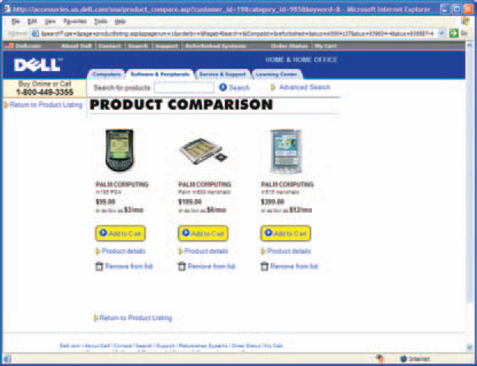
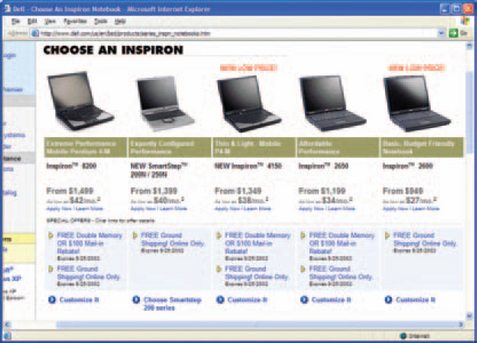
A few years ago, if you wanted to compare two or more products online, you had to open two browsers and flip between them (see Spool et al. 1999, pp. 59–68, for an eyewitness description of what people had to do). However, many e-commerce site designers have since wised up and now help users compare products. For example, PetSmart lets readers compare ingredients for up to four cat foods at a time (Figure 7-4). Dell Computer lets readers compare as many PDAs as they might like, although, since the comparison is limited to the price and a few details, the comparison is not as useful as it might be (Figures 7-5 and 7-6). However, Dell also structures many of its pages as comparisons—for example, see Figure 7-7.


Defining Management Reports
Reports have both “furniture” (or decorative elements) and data. Although the decorative elements (headers, footers) may seem less important than the data, they contain useful information—the date, the source, the file location, etc. They also help frame the live information so that readers can understand it better.
Reports generally have headers, footers, and, within the body of the report, table and column headings, columns, and rows. Within these elements, you can find variables (dates, file name, etc.), extracted and generated data (row and column numbers, calculations, etc.), labels or text strings, graphics (lines, logos, etc.), data, and displacements (spacing).
Following are descriptions of the processes you need to follow when designing reports.
Collect Requirements from Old Reports
When defining reports for customers, check the formats, columns, headers, and footers on their existing printouts or, if there are none, on sample reports you think might be similar to what they need.
However, keep in mind that some of the information on old reports may be irrelevant, their purposes lost in the mists of time. If no one knows what a label or field means, get rid of it. If it really is important, someone will pop out of the woodwork, screaming—then you can ask him or her to explain it to the design team.
Check for Data That Aren’t from the Database
Some columns contain constructed information—calculations, summaries—or software apparatus—row numbers, selection checkboxes—rather than database information.
When you’re specifying or developing a report, make sure that you look for columns of variable and generated information as well as of “real” data.
Rules for Headers
Headers usually contain information about the information in the printout. They should be repeated at the top of every page. Minimum requirements are:
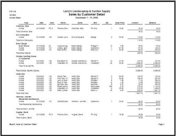
• Print date (in Figure 7-8, “12/15/03”) or, for onscreen reports, retrieval date.

• Who or what the report is for (“Larry’s Landscaping & Garden Supply”), wrapped if necessary on more than one line.
• Title of the report (“Sales by Customer Detail”), wrapped if necessary on more than one line. The following can also included.
• Report or file parameters (“Accrual Basis,” for example, describing the type of accounting used, and “December 1–15,2003” for the report’s range).
Rules for Footers
Footers usually contain information about the printout itself (number of pages in the report and the current page number, for example). Footers must be repeated at the bottom of every page.
Since footers are strictly reference, they shouldn’t draw attention to themselves. The size of the type should be smaller than anything else on the page, if possible, and regular style (roman), not italic or bold.
Note: If reports are rarely printed, consider not bothering with specialized footers. If the user needs to print the screen, the browser will add page numbers to the bottom and the URL to the top by default.

The minimum requirement for footers is the current page number. Additional requirements might include:
• Print date, if the date isn’t in the header.
• File, database, or table name (the source of the data).
• Report format name (so that you can find the same format later when you want to update the report).
• URL or other location information.
• Legal information—for example, copyrights, confidentiality statements, user agreements, and author credits.
Rules for the Report’s Body
The body of a report generally contains rows of data, divided into columns, plus column headings. If there are page breaks or control breaks, there may also be subheads, subtotals, or summaries for each section. Don’t forget white (empty) space—white space visually separates different elements.
Make Sure That Column Headings Are Clear
Column headings are usually field names. Depending on the report writer or the developer, these names may be the same cryptic names used to identify the data in the database or transformed names that readers can understand more easily. Figure 7-10 shows untransformed names as column headers.

For ad hoc reports requested by database administrators or other experts who work on the database rather than with it, untransformed names are not a problem. In fact, maintaining a one-to-one correspondence between the report names and the database names is helpful for these users.
However, for management reports, untransformed names are usually not appropriate. Your team will need to find a way to let users rename the columns, either by creating aliases in the database itself (consider using the same code as you use to make the database internationalizable) or by letting them save new column names on the report format.
Also, avoid using abbreviations in the column heads, even ones like “No.,” “Qty.,” and “#” (for number). Users for whom the interface’s language is a second language tend to have trouble with abbreviations.
Note, though, that you can use tooltips to spell out an abbreviation. Also, if you use Java to build the interface, tooltips with the entire label appear automatically on columns that are so narrow that the label can’t be read.
Make Sure the Report Shows Units of Measurement
Showing units of measurement is an important design issue. Some fields have more than one possible unit for the same data. For example, land surveyors in the United States sometimes use tenths of inches instead of sixteenths, depending on the job. In Canada, surveyors sometimes use metric measurements (centimeters, meters, kilometers) and sometimes imperial (inches, feet, miles). If you don’t put the unit of measurement in the column heading, the readers have no easy way of knowing what they are looking at.
In Figure 7-11, for example, X is the offset, Y is the distance, and Z is the altitude. In each case, the unit of measurement is feet, in tenths and hundredths, not meters. If there is any possibility of ambiguity, the column head had better show the units of measurement—see Figure 7-12.
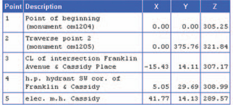

Another area of difficulty is angles. Scientific calculators let you enter angles numerically in two different ways—in degrees, minutes, and seconds; and degrees and decimal numbers. So if you want to enter 1800 30″ 30″, you can type “180.3030” if you’re using minutes and seconds or “180.5050” if you’re using degrees and decimals. You can display the angles either way, too. Without a good label, readers might not be able to tell what they’re looking at.
Use the Right Fonts
Alignment is important for financial reports, program listings, and other situations in which users look closely at numbers or eyeball the format to check for errors and outliers. In these circumstances, consider using monospaced(fixed-width) typefaces in the body of your report, as shown on Figure 7-13.

Note: Don’t use monospaced typefaces anywhere else, though. Because each letter is the same width, monospaced text as a whole takes up a third or more room on the window than proportional text.
To show reports in monospaced typefaces, use the “PRE” (preformatted) tag. To suggest a typeface to the browser, you can include a “font-family” parameter:
![]()
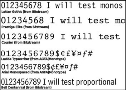
Courier is the standard PC monospaced typeface (Monaco is the standard on the Macintosh), but it is not necessarily the best choice, because it is very wide. Consider these other faces:
• Arial Monospaced and Lucida Sans Typewriter from AGFAIMonotype (use the Quick Search option on http://www.fonts.com/for samples and more information).
• Prestige Elite (and others) from Bitstream (search for Font Category equal to Monospaced at http://store.bitstream.com/).
Figure 7-14 shows five monospaced typefaces from two foundries, plus one proportional face for comparison. Each character in a monospaced face is the same width. However, between typefaces, the sizes of the characters vary dramatically—note that there are more characters in the Letter Gothic example than in the Courier example, even though both are the same point size.
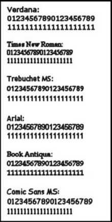
Note that numbers in some of the common software faces—for example, Verdana, Times New Roman, and Arial—are monospaced, even though the letters aren’t (see Figure 7-15). Type foundries have been optimizing typefaces for computer use over the last 10 or 15 years, and this may be one of the ways in which they have done so.
If your web application is open to nearly anyone, keep in mind that typefaces other than Courier and Monaco won’t be available on most of the users’ systems unless you embed the fonts. See “Technical Note: Do You Really Want to Embed Fonts in Web Pages?” in Chapter 8 for more information.
How to Separate Rows Visually without Cluttering the Screen
One of the questions that regularly come up in design meetings is whether to color every other row—to reproduce the “green bar” paper so popular in the computer industry on the screen and on the printouts.
The answer is yes, according to Tom Tullis, senior vice president of Human Interface Design, Fidelity Investments (Tullis 2003a, personal email):
A couple of years ago, our usability group at Fidelity Investments did a study comparing a variety of ways of presenting tabular data online. We specifically studied the presentation of mutual fund data (e.g., fund name, fund symbol, current price). We manipulated font size (Arial, size=1 or 2), spacing within the table (tight or loose), and the use of borders or delimiters (alternate-row shading, horizontal and vertical lines, horizontal lines only, and no borders).
I realize these last conditions are a little hard to visualize. ‘’Alternate-row shading” used light gray and white backgrounds in alternate rows of the table. “Horizontal and vertical lines” used lines to delineate both the rows and columns of the table (as in setting border=1 and cellspacing=O in the HTML properties of the table). “Horizontal lines only” was the same as horizontal and vertical, but without the vertical lines. And “No borders” was, as the name implies, using only space to delineate the rows and columns. The various combinations of these factors resulted in 16 different table designs studied.
We chose these conditions because they are ones you commonly see on the web for presenting tabular data. We conducted the study online on our intranet. A total of 1,474 people participated in the study (the most we’ve ever had for an online study)! Participants performed two visual search tasks using each of the 16 different tables (e.g., “What is the current price of XYZ fund?”).
We automatically recorded the speed and accuracy of their responses. We also asked the participants to give us a subjective rating of the “ease of use” of each table.
Somewhat surprisingly, we found that there was a clear “winner” out of the 16 tables. The same table design yielded both the best performance scores (speed and accuracy of response) and subjective ratings. That design was the one that used the larger font, looser spacing, and alternate-row shading (similar to Figure 7-16). Overall, alternate-row shading came out better than the other three border conditions in both the performance measures and subjective ratings.

FIGURE 7-16 Alternate rows are shaded.2
There was also a relatively clear “loser” out of the 16 tables, and that was the one that used a smaller font, tight spacing, and both horizontal and vertical lines. In addition, most of the conditions that used no borders fared poorly.
One caveat about the interpretation of these results is that we specifically designed all of our tables so they would not require vertical (or horizontal) scrolling.] With longer tables, the advantage that we found for the larger font and looser spacing might be outweighed by the increased need for scrolling.
Keep in mind that the bars don’t have to be green—blues and grays are also suitable. So if your web palette contains a green, blue, or gray, feel free to reuse it for the bars.
However, make sure that the bars are not so dark, either online or printed, that they create visual noise. For a helpful discussion of how to avoid clutter, see the examples in Edward Tufte’s book Envisioning Information, particularly Chapter 3, “Layering and Separation” (1990, pp. 53–65).
What to Do if the Report Is Too Wide
Some reports are too wide for the screen or for paper, landscape or not. However, a variety of solutions or strategies exist.
Let users move the columns: On screen, make sure that users can move, shrink, and expand columns so that they can view important information easily. Some columns may need to be fixed in place and size (a column of row numbers, for example, shouldn’t move), but most should be moveable and resizable. See Chapter 9 for more information.
Wrap cells. If the content of the cell is too big to fit on one line, the best idea is to wrap the text in each cell onto as many lines as you need, as shown in Figure 7-17.

Note that HTML and XML wrap cell text automatically, but you won’t be able to do this on Java reports. When users make columns too narrow, Java truncates—rather than wrapping—the column head and cell text, and then adds ellipses to indicate that text has been hidden. It will, however, show tooltips containing the full text if the user holds the pointer over the cell.
Make Reports Work with Screen-Reading Software
Consider making your reports accessible for people using screen readers. Do this for HTML tables with the SCOPE, ID, and HEADING variables, which marks column and row heads. For example, this is how you’d use SCOPE (Access Board 2001, pp. 6–7):


This table would appear as follows:
![]()
With the JAWS screen reader,3 if the user pressed ALT+CTRL+5 (on the number keypad) in a cell, the screen reader would read row 1, column 1, like this: “Row 2, column 2, Betty Spring 9 dash 5.”
Java also includes accessibility options for tables. For details, check the documentation for the version you’re using; start from http://java.sun.com/.
Break Up Pages Logically
Breaks fall into two categories: logical page breaks and control (or subtotal) breaks (see Figure 7-18).
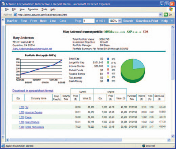
FIGURE 7-18 Report with a subtotal break on customer name.4
Reports are often longer than a page and therefore need to be broken across pages correctly. Logical page breaks are relatively simple; most report writer packages provide this facility automatically. The program looks at the number of lines on the page, checks for rules about what items to keep together (in JReport Designer, for example, there is a KeepGroupTogether property that prevents groups of records from being split up), and then pushes the text to the next page as needed.
Control breaks are more complicated because the breaks can occur for a variety of reasons—a sales region subtotal, a change in the first letter of the customer names, or a percent price change in a set of bond prices. Again, most report writing packages provide methods for setting control breaks.
Page breaks and control breaks can work together. Control breaks might force page breaks but don’t have to—for example, if two or more sets of records can fit on the same physical page, then there is no need for a page break.
In terms of formatting, subtotal or control breaks require a level of subheading to indicate the top of the set. Sets should be separated from one another with white space (generally a full blank line). Also:
• The subhead should show the key that forced the break—for example, if the break occurs on each change in company name, the company name should be in the subhead.
• If there are subtotals, these should appear in a section footer.
• The subheads and footers should look different from the body of the section—bold text in the same-size text is generally suitable.
Report Parameters Tell People How the Report Was Created
Reports may include a page that lists the report parameters in detail—the sortorder, the selection criteria, the control-break criteria, the number of records, the starting and ending times, and so on. This page can be at the front or the end, but the end may be a better spot. People reading reports tend to want to look at the live information first and then, if they have questions about how the report was generated, check the parameters.
1Note that this chapter and the next two chapters show examples from a number of different repor packages. However, we do not recommend any of these packages over the others—you’ll need tc do your own analyses against your own requirements. To get a list of available report packages, try searching for “report writer” at Knowledgestorm (http://www.knowledgestorm.com/) .
2From “Quotes & Research, Mutual Funds,” © 2003 by FMR Corporation, http://www.fidelity.com/ (accessed 18 September 2003).
3For a demo, go to “JAWS for Windows,” Freedom Scientific, http://www.freedomscientific.com/fs_products/software_jaws.asp.
4From “e-Report Designer” demo, © 2002 by Actuate Corporation, http://demo.actuate.com/live/direct/view.html (accessed 23 September 2002).