
Data Retrieval: Filtering and Browsing
Filtering and browsing are forms of data retrieval.
Filtering is searching in reverse. Whereas a search process looks through a database and displays only those records matching the query, a filter rejects all records that don’t meet certain criteria and displays the rest. Searches are usually initiated by users; filters are usually initiated automatically (after being set up by system or database administrators).
Browsing simply displays what’s in the database. Users move through the records at their own pace and according to their own interests. Browsing is described in “Use Browsing When the Query Is Fuzzy.”
Use Filtering to Control Overloads
Filters help control data overload. When there are so many records that users would be overwhelmed if they had to look through them unaided, a welldefined filter constrains the view to the records users really need.
For example, in a trouble-ticket system, records could be filtered by user ID (and sorted in reverse order by date) so each customer service representative sees only his or her own most recent tickets. Managers might have filters that show unassigned tickets as well as the tickets assigned to the representatives reporting to them. In Figure 6-1, system administrators filter out email messages that are likely to be spam or viruses, reducing employees’ email lists significantly.

FIGURE 6-1 A complex spam filter.1
Filtering uses many of the same controls and operations as searching and restricts the view of the underlying database like searching does, but it’s not searching per se. Rather, a filter is more passive.
• To start work in systems without filters, users will generally do a search (“find the Stanwick records”) as their first action. What they see depends on what they do.
• To start work in systems with filters, on the other hand, users will ask for the main window and get it immediately, already filtered (except on the first use of the system, in which case the filter window may appear first). What they see depends on what their managers or system administrators did.
Filters Can Be Dangerous
Filters help control the “too many records” problem (see “What to Do When You Retrieve Too Many Records” in Chapter 5 p. 164) and make the work environment more efficient. As useful as filtering is, it nevertheless has its dangers. For example, if a filter chokes down a list of trouble tickets too far, the operator in charge of the power plant may think nothing is wrong even while the plant is burning down around him.
To counteract this problem, expert designers recommend automatically reversing too-restrictive results. For example, if the system has automatically choked down trouble tickets because too many are due to the same problem (a switching center was flooded, for example, and all of the phone calls going through that center have failed), then the filter should automatically be returned to normal when the phone traffic has been switched to other centers. Or if an operator has filtered her list to show only messages from one town in her assigned area, the filter should go back to the default when she logs out for lunch or for the day.
Where to Put the Filter
In typical desktop applications, search and filter options are hidden away on Edit or Tool menus and appear as dialog boxes. In typical web pages, a search field and button appear at the top of the window or the navigation frame.
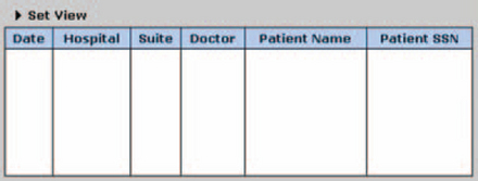
A web application offers the possibility of blending the two approaches into something potentially more useful and usable: the search or filter (or, in some cases, browse) frame. Instead of being hidden, the options are always there at the top of the window, and, unlike the simple search found on web pages, the frame can contain many fields. The filter can be hidden when necessary, by dragging the bottom of the frame up, by pressing a button, or, as shown in Figure 6-2, by toggling it off—the entry areas from “Date” to “Location” disappear when the twister is clicked, per Figure 6-3.
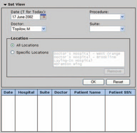
One can argue that putting many fields into a frame is a bad idea—it’s too complicated, perhaps, or you’re giving up too much space to a functionality unrelated to the function of the window itself. If a detailed search or filter is unnecessary, then it probably is.
However, think about a workshop (a real one, like a carpentry shop). In the workshop, the tools you use all day sit on the worktable surface, out in the open. The tools you use often sit in drawers. The tools you use weekly are in bins under the worktable and the tools you use once a month are in the cabinets a few steps away.
So the question is: Are people going to use the search or filter all the time? Search is one of the most popular operations on the web (as mentioned in the last chapter). Searching and filtering may be just as popular in data—oriented web applications. If they are, then the embedded search or filter may be appropriate.
However, you also need to consider whether some searches and filters require special authorizations—for example, there are systems in which only a manager can set up job-ticket filters for employees. If security is an issue, then it might be better to use a separate web window because the option is easier to hide when necessary. Or you can offer both: a secure filter window for managers and an embedded filter for anyone who wants to change the visible set of records temporarily.
How to Save the Filter
Once a filter becomes complex, don’t make users reproduce it every time they open the page. Either have the system save the criteria implicitly (the settings remain between sessions) or let the users save the criteria explicitly by name. You can also do both.
• Saving criteria automatically gets users up and running quickly. You can do this in at least two ways: by not clearing the entries in each field between sessions or by saving “histories” in each field, as described in Chapter 5.
• Saving criteria by name lets users switch between different searches or filters easily—for example, from “All Overdue Bills” to ‘’Appointment Reminders.” It also lets users share filters and searches, if the system allows it.
Use Browsing When the Ouery Is Fuzzy
Browsing is just as much a search operation as filling in a field and pressing the Search button. The difference is that the searchers, rather than a search engine, move through the database at their own pace.
Although browsing may seem relatively inefficient, User Interface Engineering found that it tends to lead readers to more pages and to find more content than search does (User Interface Engineering 2001):
In a recent study of 30 users, we found that if the users used Search to locate their target content on the site, only 20 percent of them continued looking at other content after they found the target content.
But if the users used the category links to find their target, 62 percent continued browsing the site. Users who started with the category links ended up looking at almost 10 times as many nontarget content pages as those who started with Search.
Search, even when designed well, only lets users see what they are looking for. You ask for shoes, you get shoes.
Depending on the type of product, users will browse instead of search e-commerce sites. Users tend to use search engines when looking for a book or CD (or if browsing doesn’t work) but to use links when looking for clothes (User Interface Engineering, 2001). They also appreciate reviews and recommendations when they’re browsing, as described in “Offer Better Information by Providing Ratings” below.
But what if your site has hundreds or thousands of pages, yet you still want to offer your users the benefits of browsing? Some researchers and practitioners have gone beyond linear navigation and developed intriguing graphical methods that provide clues to proximity, size of the information space, and memorability. These graphical systems:
• Provide better context by indicating the extent of the universe in which the user is searching. They do this in the same way that a book’s heft and the length of its index tell readers how much information it contains.
• Take advantage of our visual and kinesthetic abilities. We use many channels for recall and recognition, and visual and kinesthetic memory are two of the most powerful ones.
• Take advantage of our ability to grasp complex systems more quickly than simple ones.
Following are descriptions of some of the options.
Make the Most of People’s Spatial Abilities
Researchers at Microsoft’s Adaptive Systems and Interaction group have defined a new Favorites system that takes advantage of human spatial cognition. The system, called Data Mountain (Figure 6-4), lets web users arrange thumbnails of their favorite pages spatially on a plane that follows the rules of perspective (the plane is narrower in the back, and pages at the back are smaller than the ones at the front). The Data Mountain lets users put their often-accessed pages up front and their less popular pages toward the back.
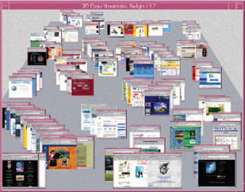
The group tested two versions of the Data Mountain and found that (a) people were taking advantage of spatial memory, (b) retrieval times were faster, and (c) there were fewer incorrect retrievals (G. Robertson et al. 1998).
However, part of what makes the Data Mountain effective is that the thumbnails are visually distinctive. If they aren’t, a Data Mountain would probably be unnecessary overhead. For example, since a hundred insurance forms look pretty much alike, there would be little point in trying to save or retrieve them visually. However, an intranet with many product brochures could use a Data Mountain to let marketing employees quickly retrieve the brochures they’re working on or that they distribute often.
Maintain an Overview with Fish-Eye Lenses
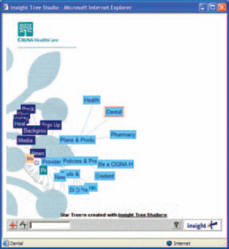
On the Internet, fish-eye lenses are sometimes used to move searchers through entire sites, starting with the home page in the center (for example, Figure 6-5). As searchers click on various topics (Figure 6-6 to Figure 6-7), the fish-eye lens moves over the new topic, magnifying the topics under the pointer. As the searcher focuses in on the desired topic, she eventually gets to the page she wants (shown in Figure 6-8) and can then open it.
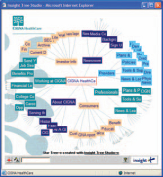
FIGURE 6-5 Four steps to a dental plan: starting page.2

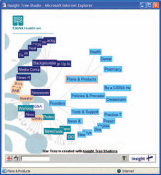
The fish-eye systems can also have text-search shortcuts, as shown in Figure 6-9. All of the pages with “he” in their titles are marked with red dots. The searcher can then click on the dots or add more letters to the search, restricting it further.

Fish-eye lenses have the advantage of providing a sense of the whole and letting searchers move at their own pace through the site. They would seem to be very appealing to people with strong spatial and/or kinesthetic intelligences (per the multiple intelligences made popular by Howard Gardner, 1993) and in cultures that prefer less linear representations.
However, they don’t show up on many U.S. web sites or applications. Perhaps the problem is that, because the picture is refreshed and reconstructed each time the searcher accesses it, the spatial memory is thrown away each time—you can’t learn implicitly where to find the page. Or perhaps the fish-eye lens is just too unfamiliar and will become more popular as more sites add them to their suite of navigation tools.
Provide Database Overviews
Query previews give searchers an overview of the universe in which they are surfing. As the researchers at the University of Maryland’s Human–Computer Interaction Lab (HCIL) say in their introduction to query previews (HCIL undated):
The traditional approach to querying is to use a form fill-in interface, but such an approach leads to user frustration when the query returns either zero hits or a very large number of hits. Often, users cannot even estimate the total number of hits their query would have returned as the system only returns the first 25–50
hits. It is difficult to estimate how much data is available on a given topic and how to increase or reduce result set sizes.
When you open a query preview for the first time, you are presented with the entire database (Figure 6-10). By selecting a part of the picture, you update other parts of the picture, narrowing or expanding the piece of the universe on which you want to concentrate.

FIGURE 6-10 Simple query preview, full dataset.3
For example, in Figure 6-11, when you select Russia on the right, the data on the left are restricted to the Russian census. When you then select “60–64” and click “Populations” at the top of the window, you zero in on the exact piece of data you want (Figure 6-12).
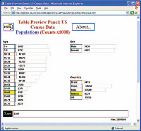

When “snapped together” with other HelL and Windows tools, the query preview is a very powerful way to give searchers both context and individual pieces of information. In Figure 6-13, for example, the searcher has selected a slice and an axis in the leftmost picture, then a particular area in the two center pictures, and finally a close-up of the selected area in the rightmost picture. Figure 6-14 shows the cross section snapped together with a navigational tree.
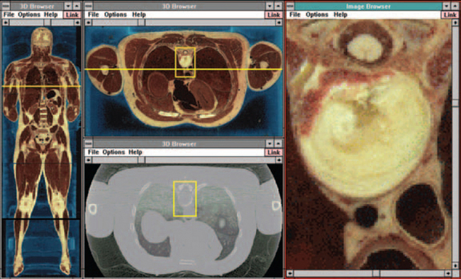
FIGURE 6-13 A snapped-together query + result system (all qraphics).4

For an overview of HelL’s query previews, see “Browsing Large Online Data Tables Using Generalized Query Previews” by Egemen Tanin and Ben Shneiderman (2002).
HCIL has other useful search visualization tools—for example, starfields, fish-eye menus (rather than lenses), AutoBAHN (a graphical bookmark/history companion to a traditional web browser that builds a navigation history as you browse the web), and photo browsers. See the Visualization page (http://www.cs.umd.edu/hcil!research/visualization.shtml) for more ideas.
Clustering and Concept Mapping Are Good for Visual Thinkers
The Kartoo search interface (http://www.kartoo.com looks superficially like a fish-eye lens system, but it is really more like concept mapping or clustering (for more on clustering, see Writing the Natural Way: Using Right-Brain Techniques to Release Your Expressive Powers, by Gabriele Rico, 2000).
All pages matching the search criteria appear, but pages with more hits are larger. Searchers can remove unrelated topics from the list using the plus and minus signs, shown on the left in Figure 6-15, or get more information about the page, as shown in Figure 6-16, before opening it.


Use Expanded Thumbnails to Make Information Pop Out
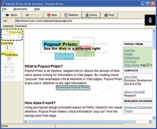
The Kartoo search engine provides one type of expanded thumbnails, and there are others. For example, Popout Prism, developed at Xerox PARC, makes critical information “pop out” from web pages, acting as a page-level browse tool. Figure 6-17 shows the Popout Prism browser. Figure 6-18 shows what happens if you type in a search term, in this case, “overview.” All instances of “overview” are highlighted on the visible area of the page and in the thumbnail of the page on the left.
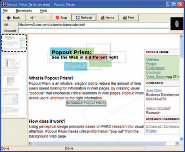
FIGURE 6-17 Page browsing with thumbnails,6
For a comparison of thumbnail techniques for effectiveness and usability, see “Using Thumbnails to Search the Web” by Allison Woodruff et al. (2001).
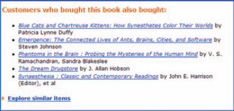
Offer Better Information by Providing Ratings
The browsing process lends itself to ratings, reviews, and recommendations. When users are trying to make up their minds about a book, a CD, or even an result system idea, information and opinions from other people can be helpful. For example, anyone who has looked for a book on Amazon.com has seen the site’s many recommendation methods (Figures 6-19 and 6-20): “Customers who bought this book also bought,” “Customer Reviews,” “Rate This Item,” and so on. Amazon covers nearly the entire taxonomy of recommendation systems available (Schafer et al. 1999).

Besides their usefulness in e-commerce, recommendation systems might be useful for web applications as well. For example, in corporate data-mining situations,5tables and reports from the mined databases might be rated by experts in the company. Repair techniques saved in a knowledge-management database might be rated by the technicians who try the solutions (Brown and Duguid 2002, pp. 112–113).
Offer “More Like This” Links
A second type of recommendation is a “More Like This” link that helps searchers find similar articles and sites without having to modify the query (Figure 6-21). Behind the scenes, the program is changing the query based on the index terms associated with the selected result. But to the searcher, the process has more the flavor of “Ah, keep scratching right there; okay, a little to the left.”

Consider Using Collective Intelligence
Another type of rating or recommendation system is an online forecasting exchange. Analysts have found that the collective forecasts are at least as accurate and reliable as those made by experts (Pennock et al. 2002). When people set up accounts on a forecasting exchange, they are given a starting amount of the site’s currency (no real cash is used). They can then make their own predictions and buy shares in other ideas or outcomes they think are correct. If they turn out to be right, they make more money and can invest in other ideas or futures.
• Hollywood Stock Exchange (www.hsx.com). shown in Figure 6-22.
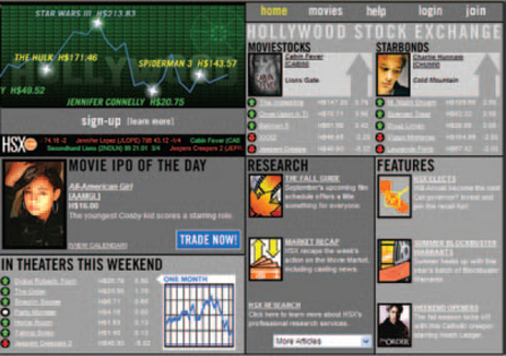
FIGURE 6-22 Forecasting how successful a film will be.7
• Foresight Exchange for predictions about nearly anything (www.ideafutures.com). shown in Figure 6-23.

FIGURE 6-23 Forecasting science, technology, and politics.8
• WhisperNumber for earnings information and market sentiment data (www.whispernumber.com).
• Formula One Pick Six Competition (www.motorsport.com/compete/p6) for predictions on car races.
Forecasting systems don’t provide recommendations per se, but rather point people to interesting and potentially valuable ideas. Consider adding one to your corporate intranet—collect predictions from all interested employees and pay off the good bets with extra vacation days or other incentives.
How to Index and Find Graphical Objects
How would you describe the picture in Figure 6-24 so that someone else would be able to retrieve the same picture from a picture database?

FIGURE 6-24 Mystery picture.9
Indexing text is hard enough, but indexing pictures is worse, as Paula Berinstein points out in her article “Do You See What I See?” (1999, p. 85). When you index text, she says, the text is self-explanatory—you can usually just copy the words to be indexed into the index file. Worst case, you can do an automatic concordance. The concordance won’t be reader friendly but it will at least be complete.
Pictures, however, do not describe themselves. Picture software might be able to tell you about an image’s creator, creation date, texture, color, and type, such as GIF, JPEG, or BMP, but it won’t tell you much about the content. Note: Fingerprint identification software and face recognition
Software are exceptions, but they work well because fingerprints and faces come in limited numbers of shapes and patterns.
Also, pictures can mean different things to different people. For example, most people would read Figure 6-25 as a picture of extremely large birds. Someone in the Netherlands, however, might recognize it as a picture from Madurodam, a 1:25 scale miniature town at Scheveningen, near the Hague.

Indexing for members of the general public is harder than indexing for specialists, since specialists know the domain’s vocabulary and what a “reqenerative blower” or “Christ Pantocrator icon” is supposed to look like (depending on their areas of expertise, of course). Nonspecialists, however, will not know the domain’s terminology, and their queries will seem vague or idiosyncratic to the experts.
Another difficulty is that pictures contain levels of meaning. A picture is both of something and about something. For example, Figure 6-25 is of birds, grass, and a miniature car, but it is about a contrast in scale.
Luckily, methods have been devised for indexing pictures. One method first classifies a picture according to who, what, when, and where and then divides each classification into “Of” and “about,” Finally, “Of” is divided into general and specific. So, for example, Figure 6-24 could be classified as shown in Table 6-1.
TABLE 6-1
Classification of the Siberian Memorial Photo.
| Who of Generally | Who of Specifically | Who About |
| Tunnel builders | Siberian tunnel builders (no people in the picture) | Tunneling, memorials, construction equipment |
| What of Generally | What of Specifically | What About |
| Memorial, railroad tunnels, abandoned equipment, garbage heap | Siberian tunnel builders memorial, Russian abandoned tunneling equipment, Siberian railroad | Contradictory messages, dishonored memorials, machines with their king |
| When of Generally | When of Specifically | When About |
| 2000 | 14 July 2000 | The end of building the Severobaikalsk railway tunnels (1989) |
| Where of Generally | Where of Specifically | Where About |
| Siberia, Russia _ | East of Severobaikalsk, Siberia | Route of the BAM railroad north of Lake Baikal |
If you also include a thesaurus in the search application, you won’t have to worry about synonyms (or controlling the user’s vocabulary by providing lists of “understood” words, which is a common informationdatabase strategy), since the thesaurus will automatically cross-reference the query to related words.
But once you’ve attached terms to pictures, you still have to retrieve and display them. Retrieval can be done using a search or filter. Once pictures are retrieved, however, browsing thumbnails seems to be the most efficient method for actually selecting pictures—an example is shown in Figure 6-26.

FIGURE 6-26 Standard thumbnail browser10 (Jasc Paintshop Pro, a desktop application).
In most thumbnail browsers, users have to open the picture if they want to see the picture’s details. With a zoomable image browser like the one shown in Figure 6-27, however, users can simply hover over the picture to get a larger view. Researchers at the University of Maryland Human–Computer Interaction Lab found that a system combining zoomable images with the table of thumbnail pictures was quickest to use, most satisfying to users, and least error prone (Combs and Bederson 1999, p. 135).

FIGURE 6-27 Zoomable Image Browser11 (PhotoMesa, a Java Application).
9Tunnel builders memorial, Severobaikalsk, Siberia; © 2000 by Nicholas Zvegintzov.
10Trial software available at http://www.jasc.com/.
11Demos available at http://www.windsorinterfaces.com/photomesa -download.shtml (accessec 8 July 2003).
1From “SpamPilter ISP,” © 2003 by LogSat Software LLC, http://www.logsat.com/spamfilter/ (accessed 3 September 2003).
2Figures 6-5–6-9 from “Star Tree Online Demos, CIGNA HealthCare,” © 2003 by Inxight Software, Inc., http://www.inxight.com/products/st_viewer/online_demos_st.html (accessed 24 June 2002).
3From “Dynamic queries and query previews for networked information systems: The case of NASA EOSDIS,” © 2003 by University of Maryland, http://www.cs.umd.edu/projects/hcil!eosdis/ (accessed 24 June 2002).
4Scrccnshots courtesy of the HCIL at the University of Maryland in College Park, http://www.cs.umd/hcil/pubs/screenshots (accessed 24 June 2002).
6Figures 6-17 and 6-18 from “Popout Prism,” © 2002 Palo Alto Research Center, http://www2.parc.com/csl/projects/popoutprism/ (accessed 3 September 2003).
5For more on the problems of data mining, see Usama Fayyad et al. (1996) and Brachman et al. (1996).
7From “Hollywood Stock Exchange,” © 2003 by Hollywood Stock Exchange, http://www.hsx.com/ (accessed 2 September 2003).
8From “Foresight Exchange,” © 2003 by Foresight Exchange Partnership, http://www.ideafutures.com/ (accessed 2 September 2003).