
Designing Geographic Maps
Geographical maps show relationships between geographical locations and information. They can be used to show quantitative and qualitative data, such as political boundaries and physical features (both natural and human), and to show comparative data, such as degrees of industrialization, population density, and birth and death rates.
In software, the picture is usually only the most surface level. When users see a map, they expect to be able to find more information by zooming in or drilling down, by adding and subtracting layers of information, and (if the application supports it) by running what-if analyses and modeling possible future events.
This chapter covers two main topics:
• Why you might want to use maps, described next.
• What maps are made of and, especially, what to watch out for when you’re designing map software. For this, see “Maps Are Data Made Visual.”
For information about viewing and acting on maps, see Chapter 15. For information about the types of maps available, see Chapter 16.
When to Use Maps
Use maps when geography affects or relates to the information being displayed (e.g., Figure 14-1). Geographical maps can serve as backgrounds for diagrams that have geographical components (for example, a telecommunications network) or as information systems in themselves (for example, census information that becomes more detailed as the user zooms in). There are also graph types that use maps to show quantities. And maps can serve in traditional ways, to find locations and to navigate from one point to another.
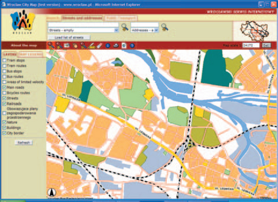
FIGURE 14-1 Wroclaw city map.1
Software-based maps have “smart” features, characteristics that end users might not notice except by their effects (Zeiler 1999, p. 6).
• Lines are connected so that you can, for example, trace a network along a set of associated lines.
• Areas can enclose and be enclosed by other areas; points can be defined as inside areas. For example, since schools are located in districts, the school district is one of the data attributes of a school.
• Relationships between, say, building lots and owners can exist in the map without being shown on it. Two physical items can be known to be related even when they aren’t touching. For example, a utility meter on the corner might be related to a nearby transformer even though the two items aren’t visually connected in any way. If a user investigating an outage queried for all related equipment in the area, both items would be highlighted.
• The objects on the map can have built-in display rules. For example, if two lines have the same coordinates and would otherwise overlay one another, line rules could separate them automatically.
Maps Are Data Made Visual
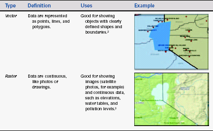
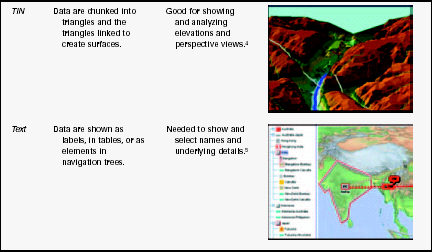
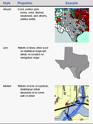
There are four types of map representations (see Table 14-1):
TABLE 14-1
2From “Explore our live Internet Map Server demos: ArcIMS Site Starter Applications-Viewer,” © 2003 by ESRI, http://maps.esri.com/website/Viewer (accessed 13 June 2003).
3From “Geography Network Explorer,” © 2003 by ESRI, http://www.geographynetwork.com/explorer/ (accessed 13 June 2003).
4From “Products & Services, Surface Modeling, Digital Terrain & Elevation Models,” © 2003 by Triathlon Ltd., http://www.triathloninc.com/surfaceModeling.shtml (accessed 12 June 2003).
5From “Telecommunications with JTGO, Web-enabled user interface,” © 2003 by ILOG, Inc., http://demo.ilog.com:8082/jtgo-webc/index.jsp (accessed 13 March 2003).
• Vector, for showing features such as cities, rivers, and boundaries.
• Raster, for showing images such as satellite photos; thematic data such as slopes, elevations, or the extent of a fire or a chemical spill; and surfaces (mountains, buildings, and so on) on plan views (i.e., a flat view, looking down).
• Triangulated irregular networks, or TINs, which are used to display surfaces and landscapes as elevations rather than as plan views.
• Text, such as addresses, coordinates, and other location devices. Text may be displayed as labels, in tree navigation frames, or as tables.
Keep in mind that, in addition to the maps themselves, you need software that lets users interact with them. However, the major map software companies—ESRI, ILOG, MapInfo, and so on—offer web-based viewers, so you don’t have to create your own.
If your users will be querying the underlying database, you also need something that interacts with databases—XML or active server pages, for example. Again, you don’t necessarily have to write all the code yourself, since Microsoft, Sun, Oracle, and other organizations provide map-related database APIs. See Resources for details.
Use Vector Maps to Show Points, Lines, and Areas
Maps based on scalable vector graphics (SVGs), Flash SWFs, and other vector pictures are good for showing objects with clearly defined shapes and boundaries—for example, cities or highway systems. Vector maps let you calculate length and area, identify overlaps and intersections (visually and mathematically), and find adjacent or nearby elements easily.
Both Macromedia Flash SWF (Shockwave Flash) and W3C standard SVG (scalable vector graphic) files are vector-based graphics viewable on your web browser using a downloadable plug-in. The similarities between the two formats are many.
• Both use embedded font information.
• Both are great for interactivity and animation.
• You can use either one to build entire custom web sites from soup to nuts using nonstandard buttons and other screen elements and widgets.
However, there is one very important difference: SVG is written in XML code, which means that it can be totally data driven in real time, connected to a living, breathing database, giving instant feedback to a user.
Why is this so important, you ask? Let’s say you want to buy tickets for an upcoming concert, and of course you want the best possible seats. You log on to the theatre’s web site, and you view a picture of the seating arrangement. Some of the seats appear to be folded and some appear normal. You see a couple of seats that you like and click on them, and then you click “BUY.” The system pops open a window into the payment section, you give them your credit card information, and the payment popup closes. The two seats you chose are now folded, meaning they’re reserved for you. As you watch the screen, you may even see other seats folding as music lovers reserve them.
Another reason to use SVG is that every SVG image is made up of text; unlike SWF, it is not compiled (Neumann 2002, pp. 2–4). The implications of this are:
• Text within the SVGs can be indexed for search engines.
• Screen readers can read any <desc> and <title> labels provided by the author.
• Any text in the labels or in the image itself can be easily internationalized.
• Text can be “reused” easily-it can be selected, copied, spoken aloud, transformed into Braille, and so on.
A Microsoft partner, ViewPlus Technologies, has taken advantage of these characteristics and designed a system that creates audible and tactile versions of maps, charts, and technical diagrams from SVG files (see Figure 14-2 for a tactile map example). Pressure-sensitive systems, via a special tablet and mouse, are also available.
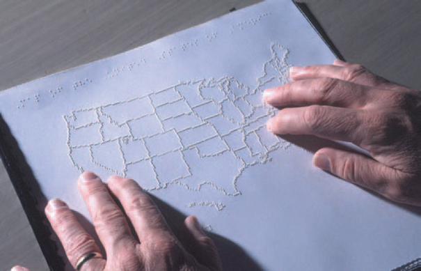
FIGURE 14-2 An SVG-based map.6
The system was driven first by the needs of blind or partially sighted users, but ViewPlus expects it to be helpful for people with dyslexia as well. Dyslexic readers understand material more easily when it is provided in multiple modes. For example, with the viewer software, users can make a raised printout on the Tiger embossing printer and then, using a touch pad, get a sound-enhanced version of the tactile image. lilt’s called trimodal access,” John Gardner, the company’s founder, says. “You’re going to be able to see it, you’re going to be able to touch it, and you’re going to be able to hear it.”
For blind users, however, the technology opens up an entirely new mode. ViewPlus Technologies office manager Carolyn Gardner recalled what happened when a blind student from Louisiana first got his hands on a map of the United States produced by the Tiger Embosser (Hall 2003, pp. 3–4):
“A friend of mine took some maps to a deaf-blind cemp” she said. “They were so excited–’This is where I live? This is what Louisiana looks like? And this is Texas? No wonder they’re such braggarts.’”
“Now,” said her husband, John Gardner, “blind people are realizing there’s more to life than words.”
6© 2003 by Oregon State University.
Because vectors are actually formulas that indicate the relationships between points, lines and curves can be resized quickly without losing quality. The geographical coordinates saved in the database are usually precise, and identifying and selecting elements is easier than when using raster images.
Vectors create flat, semi-abstract maps. Since these types of maps are familiar to most people, they are good choices for statistical-map backgrounds as well as for navigation and location tasks. However, they don’t represent actual surfaces well; rasters or TINs are better for that purpose.
Vector-based maps are made up of points, lines, and polygons.
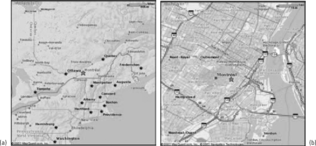
• Points are used to show geographic elements that are too small at a particular scale to be displayed as lines or areas—cities and towns, for example, on a country map. On a map of Canada, Montreal might be shown as a dot, but on a map of that city and its suburbs, it appears as a polygon containing many other polygons (see Figure 14-3).
• Lines are used to show elements that are too narrow at a particular scale to be displayed as areas (streets, for example, on a state map).
• Polygons are used to show large continuous geographic elements—countries, states, sales territories, types of rock and soil, and so on.
In a geographic database, points are stored as single X, Y coordinates. Lines are stored as paths of connected X, Y coordinates. Polygons are stored as closed paths. However, besides coordinates, each point, line, and polygon is associated with other data: a name, a symbol, demographic information, agricultural characteristics, sales data, its relationship with other elements, its behavior at various scales, and so on.
Note that commercial mapping packages come with palettes of symbols, lines, and polygon fills, as well as software for attaching symbols, line styles, and fills to the elements in the geographical database. The size, sophistication, and covered domains (weather, demographics, telecommunications, etc.) of the palettes vary, so make sure you look at the palettes when you select a mapping package.
Following are guidelines for handling points, lines, and polygons.
Pick the Right Symbols for Points
• Simple marker symbols such as circles and squares, optimized to appear quickly:![]()
• Small pictures, saved as bitmaps or metafiles, or simply drawn on the map:![]()
To pick the right symbols, check how quickly they’re rendered on the screen and whether they’re standard for the domain and/or for geographic maps. See Resources for more information.
Since not all symbols are standards, since many standard symbols are used inconsistently, and since people reading maps don’t know most of them anyway, remember to provide a legend for the symbols you use. Also keep in mind that some symbol sets have required colors—see Figure 14-4, for example. For more on color, see “Follow the Rules for Color on Maps.”
FIGURE 14-4 Symbols from the U.K. ordnance survev.7
Render Large Symbols Before Small Symbols
Note that if you use symbols in various sizes, the larger ones may hide some of the smaller ones if the small ones are rendered first. Make sure that the display software renders the large symbols first and then the smaller ones. If there is a conflict, the small ones will then overlay the large ones.
Pick the Right Styles for Lines
There are four basic line styles (Zeiler 1999, p. 30).
• Cartographic: Standard lines with properties of width, color, dash pattern, arrowhead type, cap type, and join type. The cap specifies whether the ends are drawn squared, butted, or rounded. The join specifies how corners look—square, rounded, or beveled. See Figure 14-5.
FIGURE 14-5 Cartographic and hashed line types.8
• Hash: Short segments that stand perpendicular to the path of a line. Alone, they are often used to show elevations or other geological elements. Joined with cartographic lines, they can indicate railroad tracks. See the railroad line on Figure 14-5.
• Marker: A string of symbols used to create a line. See Figure 14-6.
FIGURE 14-6 Markers (arrows) used to create lines.9
Identify Polygons with Boundaries and Fills
Polygons are used to indicate areas on maps. They have two characteristics: the boundary, usually a line, and the area on the inside, the fill. Note: If the fill is distinctive (green against beige, for example), you may not need an outline—if you don’t need it, reduce clutter by not using it.
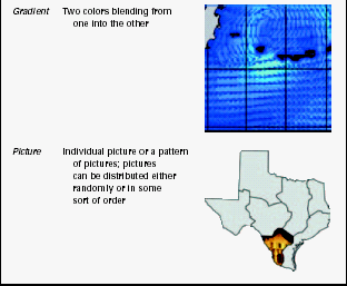
As Table 14-2 shows, there are five fill styles, any of which can be combined into a multiple-style fill (Zeiler 1999, p. 31).
Use Raster Data for Continuous Images and Photos
Raster data are photographic or continuous-tone drawings broken into bytes and saved in a database—bitmaps, in other words. Because rasters are bitmaps, they do not scale up or down easily. However, unlike vectors, which are always somewhat abstract, rasters provide realistic images.
Some raster maps are simply scanned printed maps. However, most are created from satellite or aerial images (e.g., Figure 14-7).
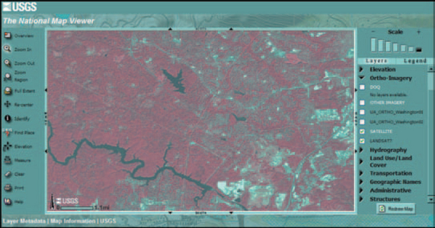
FIGURE 14-7 Sample raster map of an area near Washington, DC.10
Rasters have many uses (Zeiler 1999, pp. 150–151):
• As base maps–a bottom layer against which vector maps are drawn, as described in “How Photos Become Maps.” You can also check how accurate and current maps are by checking them against recent raster images.
• For modeling and mapping land use and environmental issues. Most land use and environmental studies start with an aerial or satellite photo that is categorized into urban, forest, or agricultural land. If the process is repeated over time, the analysts can easily see how one year differs from the next.
• For hydrological analysis. Some raster images contain information about elevations (these are called digital elevation models, or DEMs). Analysts can map floodplains, water sheds, and drainage basins and look at runoff predictions for storms.
• For terrain analysis. DEMs let analysts do such things as check how hilly an area is when they’re looking for a good office park location and check for visibility between two locations (“line of sight” information is important for siting telecommunications towers, for example).
Although they look like, and are usually based on, photographs, raster maps are two-dimensional grids of pixel locations. In a raster database, each cell (each pixel) will have, as a minimum, a color and an X, Y location that places it on the screen.
However, most raster elements hold many other attributes as well. Some typical ones are light reflectance (energy being reflected or emitted from the object being viewed), elevation, slope, aspect (which way the surface is pointing—north, south, east, or west), latitude and longitude, and descriptive attributes like vegetation type and census data. Because this additional information exists, analysts can run queries like “Find all locations between 2500 and 5000 feet in elevation” and “Find ZIP code 10301 on the map.”
How Photos Become Maps
Turning satellite and aerial photos into maps is a labor- intensive process.
• A series of photographs is taken, with each one overlapping the next on all four sides.
• Because the camera lens and the curvature of the Earth tend to spread out or enlarge items on the edges of the images, each photograph has to be corrected and these effects removed (USGS 2003, p. 1).
• The corrected photos are tiled into one big image and the overlaps removed.
• The raster’s grid coordinates (sometimes called the image space) have to be correlated with a real-world coordinate system (sometimes called the map space). This process is called georeferencing or rectifying.
Once the images are corrected and the georeferencing is finished, cartographers can start making additional maps or layers (see “Consider Showing Different Layers at Different Scales” below). They might draw outlines around visible features on the raster layer; label the roads, towns, buildings, and other features, often by referring to earlier maps; and add information not visible on the raster image, such as subways and sewer lines (Gopnik 2000, p. 56).
However, this process is less difficult and expensive than sending land surveyors out into the field to capture distances and elevations, especially in crowded cities and areas like the Badlands of the U.S. West that are difficult to traverse.
Output Depends on Input
The types of maps that can be made from the photos depend on the information that was collected—visible spectrum, infrared, radar, magnetic, electrical resistance, and/or three-dimensional (elevations). The more information captured, the more uses to which it can be put.
For example, Figure 14-8 shows two (of many) maps that started from the same aerial image. The first shows trees (captured with infrared) with a vector-style overlay of city parks. The second shows tax-lot polygons (vectors again) for the same area.
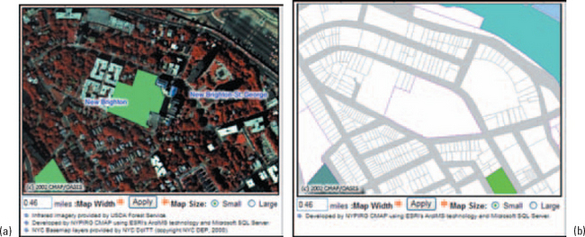
FIGURE 14-8 (a) Infrared raster image and (b) a property-data vector map.11
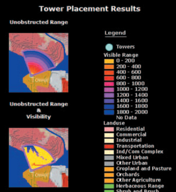
The raster image used for the map in Figure 14-9 must have captured elevations. The program using this map can check whether signals will be blocked by hills and buildings. Part of the results is shown in Figure 14-10.
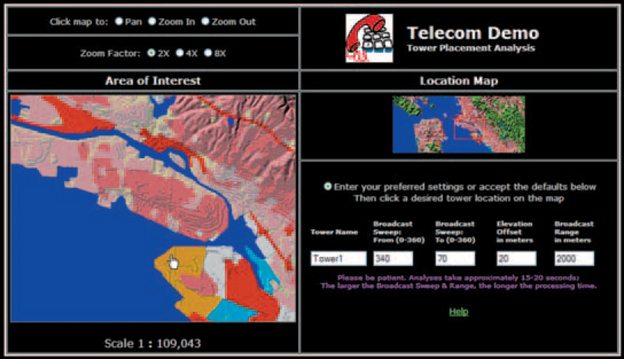
FIGURE 14-9 Line-of-sight study.12
Use Triangles to Analyze Surfaces
A triangulated irregular network, or TIN, is a representation of a surface created from triangles linked so that they form a network or mesh (Figure 14-11). Depending on how varied the terrain is, the triangles may be different sizes—ergo “irregular.”
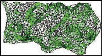
FIGURE 14-11 TIN-based map showing the triangles >(before smoothinq).13
TIN-based maps are not as common as vector- or raster-based maps, mostly because they are harder to create. They are usually made from stereoscopic photos—pairs of aerial photos taken in such a way that the cartographers can see the surface in three dimensions. However, they can also be generated from survey data, digitized contours, rasters with Z-values (height), and points in databases (Zeiler 1999, p. 164).
To create a TIN, a cartographer picks out various high and low points, called mass points, from a stereo photo of the terrain to be mapped. Once the mass points are collected, the cartographer (by eye and using mapping software) connects them into triangles. The triangles, now called faces, become planes in a three-dimensional file. The points are called nodes and the lines of the faces are called edges. All faces meet their neighbors precisely at each node and along each edge, and no face intersects another face.
Despite their expense, TIN-based maps are invaluable for calculating volume and analyzing line of sight, elevations, slopes, and aspects. Although users can analyze surfaces with raster maps, the accuracy of a raster depends on the size of the grid. If the grid cells are two miles square, you can’t be 100 percent sure of the location of a ten-by-ten-foot object. Peaks and valleys cannot be located more accurately than what can be seen at the grid resolution. TINs, on the other hand, are designed to capture surface features like peaks, ridges, and streams, so they store precise coordinates.
TINs are also used to design virtual landscapes for games, environmental what-if analyses (see Figure 14-12, for example), and military simulators.
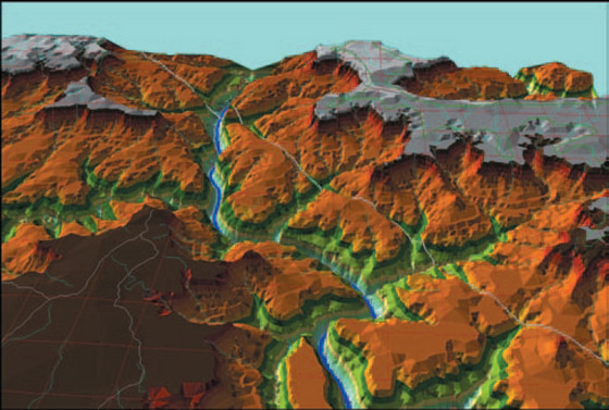
FIGURE 14-12 Sample TIN-based map.14
TIN information is also used in archeology and other remote sensing applications. At the Kerkenes Dag site in Turkey, for example, archeologists identified buildings in a Hittite city, destroyed in 547 B.C., without having to excavate. Instead, they used satellite and aerial photos, magnetic sensing, and land-based surveying techniques to create TINs. In Figure 14-13, for example, you can see the faint outlines of structures and the walls of the city.
FIGURE 14-13 TIN map of Kerkenes Dag.15
TINs Aren’t the Same as Three-Axis Maps
Don’t confuse three-axis (three-dimensional) maps with TIN maps. A three-axis map is simply a way of making a map look three dimensional; it can be generated from any other kind of map (Figure 14-14). TINs, in their raw states, use triangles; three-dimensional maps use rectangles.
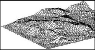
FIGURE 14-14 Sample three-axis map.16
Vertical Scale May Be Exaggerated on Terrain Maps
On maps showing contours and elevations, the vertical scale is sometimes exaggerated to show the changes in height and depth more easily (Figure 14-15). This is standard practice; if your design lets users manipulate maps, make sure they can exaggerate the scale if desired. However, also make sure the degree of exaggeration appears somewhere on the map, preferably both on the screen and on printouts.
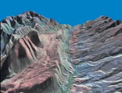
FIGURE 14-15 Vertical exaggeration of 10.17
Data About Data: How Places Are Identified and Shown
In addition to the geographical data, four other types of information are necessary to display maps correctly:
• Layers, which can be used to separate and display the different sets of data associated with the same geographical location.
• Scales, which (among other things) determine whether a feature appears as a point, line, or polygon on a particular view of the map. Zoomed out on England, you might see London as a dot; zoomed in, you might see it as an irregular polygon.
• Latitude and longitude, which locate places on a grid of the whole earth.
• Projections, which are the methods used to flatten a three-dimensional earth onto two-dimensional paper and screens.
Separate Information Using Layers
By assigning different drawing methods to different sets of geographic data, you can show different types of information—layers— based on various criteria.
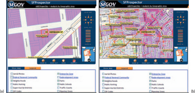
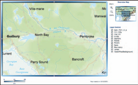
Different layers18can show different themes—for example, one layer might show population levels, another house prices, and a third schools and parks (Figures 14-16 and 14-17).
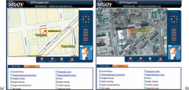
FIGURE 14-16 Different themes on different layers: (a) neighborhood and (b) aerial photo lavers.19
Layers can also be divided between representations. For example, some layers might show vector features, such as political boundaries, roads, rivers, and lakes. Others might show raster data, such as false color images of vegetation or geological formations. Still others might show surfaces using TIN data.
Consider Showing Different Layers at Different Scales
One common use of layers is to tie scale (or zoom level) to the level of detail. Zoomed out, you see state or province boundaries and maybe a dot for a large city. As you zoom in, more and more details appear. Figures 14-18 and 14-19 show the effect of scale changes on the amount of detail in the pictures.
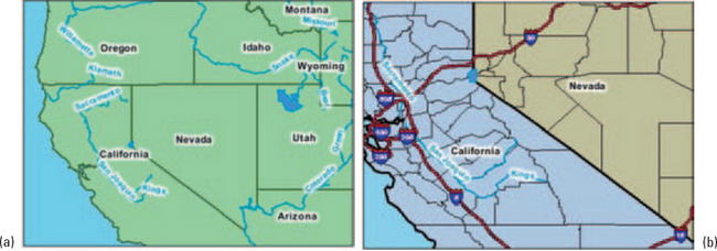
FIGURE 14-18 The first layer (a) shows states and major rivers, the second (b) shows hiqhwavs.20
As the designer, you get to choose which features appear automatically at which scale levels. You can also provide methods that let users add and remove layers at will (for example, see the checkboxes at the bottoms of Figures 14-16 and 14-17). However, make sure that your design analyses capture the degree to which users want to interact with the information on the map. Too many choices can be intimidating to casual users.
Make Sure You Know How Much Detail You Need
Some mapping software lets developers show more detail (additional layers, actually) when the user zooms in; others don’t. For example, when you compare Figure 14-20 to Figure 14-21, you can see that the symbols and text just get bigger as you zoom in; you don’t see more detail, as in Figure 14-19, for example.
FIGURE 14-20 At the 100 percent scale on a location map of Ontario.21
But you don’t always need more detail. For example, to see how a railroad traverses a province or city, an overview is fine. Also, details cost money—you have to buy more data to get more layers.
Suggestion: When you’re looking into map software development packages and data sources, make sure you know, first, whether the development package will support hiding and showing layers according to the scale and, second, how much detail you need. Also check whether users need to see more detail on the picture— a text report may be more helpful in some situations.
Beware of False Analogies
One way to think about layers is as plastic overlays—a photo on the bottom, say, then a sheet with streets overlaid on the photo, then a sheet with buildings overlaid on the streets and photo, and so on.
Although this may be a good way to describe a layered map to casual users, be aware that it can be misleading. The graphic designer’s notions of “transparency” and “translucency.” have nothing to do with software-based maps.
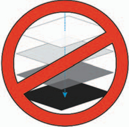
In reality, software maps are just data that can be drawn to look like, well, maps. So when you display another layer, you’re not displaying or laying one picture on top of another. Instead, you’re filtering data and drawing a new picture using the new data.
Get the Scales Right
A map scale is the stated correspondence between a measurement on a map and a measurement on the earth’s surface. However, since users can shrink and enlarge geographic information system (GIS) to any size on the screen or on a printout, geographic data in a GIS doesn’t really have a map scale. Rather, it has a display scale, the scale at which the map “looks right.” Looking right is defined by two factors:
• The amount of detail. The map should not be overwhelmed with detail.
• The size and placement of text and symbols. Labels and symbols need to be readable at the chosen scale and must not overlap one another (Province of British Columbia 2001, p. 1).
• The amount of detail. The map should not be overwhelmed with detail.
• The size and placement of text and symbols. Labels and symbols need to be readable at the chosen scale and must not overlap one another (Province of British Columbia 2001, p. 1).
Both factors can be managed with layers, as described earlier in “Consider Showing Different Layers at Different Scales.” For example, as the user zooms in, more symbols and details appear and the areas between points (cities, buildings, what have you) spread out and accommodate more labels.
How to Show Scales on GIS Maps
There are three ways to show scales, but only two work well on GIS maps:
Ratio: The scale of a map is most accurately expressed as a ratio—for example, 1:24,000 or 1/24,000, meaning one unit of distance on the map (centimeters, for example) represents 24,000 of the same units (centimeters again) on the ground. Note: Sometimes ratios are shown without the “1:” or “1/”—for example, 250000 instead of 1:250,000. This is not recommended since then the ratio aspect is lost.
Text: On printed maps, map scale is often expressed using more familiar units—for example, “1 inch on the map equals 1 mile on the ground” or “1 inch equals 2000 feet.” However, this method doesn’t work well onscreen—there are too many screen resolutions, so an “inch” on one screen will look like half an inch on another. The only real unit of measurement on a screen is the pixel, and they’re too small to count. Could anyone make sense of a statement like “1 pixel on the map equals 1 inch on the ground”?22
Scale bar: Many GIS maps use a graphic bar that shows distance by comparison to the width of a bar—see the bars at the lower left corners of Figures 14-22 and 14-23, for example. Software can easily recalculate the bar to fit the scale of the map.
Use both: GIS maps can accommodate both styles at the same time, as shown in Figure 14-24. Note that a bar scale and a ratio appear at the top of the map and that the ratio appears again in the status bar. Maps that show the ratio often seem to restrict it to the status bar, perhaps because the available application programming interfaces (APIs) make it easy to do or perhaps because it reduces clutter on the map itself.
Recognize the Standard Scales
When you’re designing a GIS map, you might start with a standard scale but then let users zoom in and out as needed.
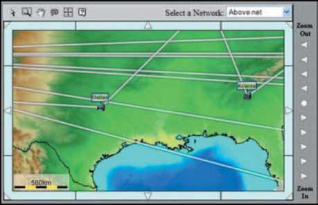
FIGURE 14-22 Scale bar, 500 km.23
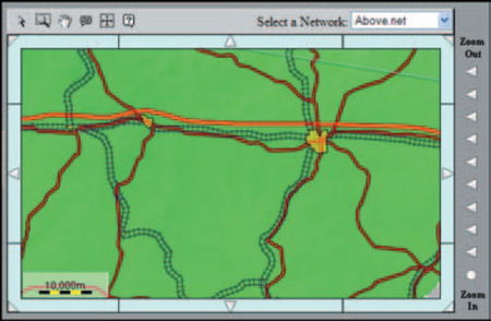
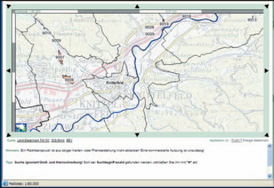
FIGURE 14-24 A ratio and a scale bar at the top and a ratio in the status bar.24
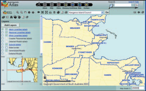
One of the cartography basics is the difference between large- and small-scale maps. A large-scale map shows a large amount of detail for a small area (Figure 14-25). A small-scale map shows a small amount of detail for a large area (Figure 14-26). Large-scale maps start at 1:24,000. Small-scale maps start at 1:250,000 (Monmonier 1993, p. 26).
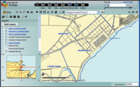
FIGURE 14-25 Large-scale map.25
Also, there are some national standards: The British often refer to their 1:250,000 map series as “four- miles-to-the-inch” maps or “quarter- inch” maps since one-fourth of an inch represents slightly less than one mile. Similarly, in the United States an inch represents exactly 2000 feet on the U.S. Geological Survey’s 1:24,000-scale topographic maps (Monmonier 1993, p. 25).
Pinpoint Locations by Latitude and Longitude
The geographic grid is a very old method for giving locations to places, going back to the third century B.C. in China and to the second century A.D. in the Middle East. The modern grid was formed by drawing a set of east—west rings around the globe, parallel to the equator (called latitude or parallels), and a set of north—south rings crossing the equator at right angles and converging at the poles (called longitude or meridians). Any point on the earth’s surface can be located using latitude and longitude coordinates (Figure 14-27).
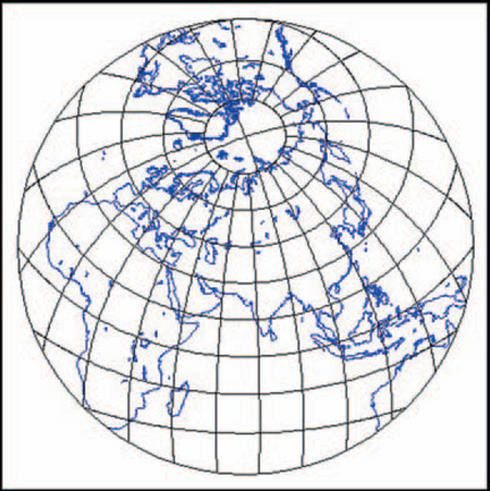
FIGURE 14-27 The earth, showing the latitude-and-longitude grid.26
These coordinates are expressed as parts of circles, in degrees (°), minutes ’), and seconds (“). The distance of a point north or south of the equator, its latitude, is measured in degrees between 0° (equator) and 90° (pole) N or S (north or south). The distance east or west of a meridian, its longitude, is measured in degrees between 0° (the prime meridian) and 180° E or W (east or west).
In terms of actual distances, one degree of latitude is about 111 kilometers, or 69 miles; a second is about 30 meters, or 100 feet. The size of one degree of longitude, however, varies north and south, since the distances between the meridians become smaller as they converge at the poles (see Figure 14-27). So, although a degree of longitude at the equator is about 111 kilometers, a degree north at Washington, DC, is only about 89 kilometers.
By convention, coordinates are written as latitude north and then longitude west—for example, 32°25’28” N x 84°55’56” W.
Watch for Variations
Some software applications use whole numbers and decimals instead of degrees. You may have to translate degrees (0° to 180°) to decimals.
Some software applications and maps use the minus sign (for example, −76°) to indicate locations south of the equator or west of the central meridian.
U.S. and British land surveyors sometimes use 10ths of inches (instead of 16ths) and 10ths of feet (instead of 12ths) on boundary maps. On boundary, county, city, and other ownership maps, check the legends before assuming that the units of measurement are standard inches and feet.
The United States, Great Britain, and many European nations use the Greenwich, England, meridian as their prime meridian. However, maps made by other nations may use the meridian that passes through them as their prime meridian.
The Universal Transverse Mercator (UTM) grid divides the earth into 60 longitudinal north—south strips, each 6° wide, between latitude 84° N and 80° S. Each of the 60 zones has its own origin at the intersection of its central meridian and the equator (its baselines). To maintain positive numbers below the equator and west of the central meridian (or to avoid having to append N, S, E, or W to every measurement), false values were assigned to the baselines. Therefore, distances on the UTM grid are always measured right and up from the southwest corner of each zone—no more negative numbers, but the location coordinates do not match standard latitudes or longitudes.
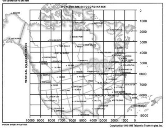
In the United States and Canada, telecommunications companies use V&H (vertical and horizontal) coordinates to find straight-line mileages between locations (Figure 14-28). The system was set up in the 1950s by AT&T and covers the United States and Canada. Formulas for translating between V&H coordinates and latitude and longitude are available. Telcordia Technologies offers a document called Telcordia Notes on V&H Coordinates: The Mystery Unveiled; see “Vertical and Horizontal Coordinates,” http://www.trainfo.com/products_services/tra/vhpage.html (accessed 14 July 2003).
The telecommunications industry also uses CLLI codes (Common Language Location Identification) to locate equipment. With CLLI codes, you can pinpoint the location of individual telephone poles. For more information, contact Common Language Products, http://www.commonlanguage.com/ (accessed 14 July 2003).
There are other grid systems as well, such as the U.S. State Plane Coordinate System from the 1930s and the Platte Carrée from the 1700s. For more information, see Department of the Army (1993, pp. 4–7 to 4–18), Snyder (1993, pp. 159–160), and Natural Resources Canada (2002).
Know Your Projections
Since the earth is a globe, latitude and longitude lines are really curves, not straight lines.27However, for convenience, mapmakers draw them as lines, creating regular grids with 90° angles, when they’re drawing large-scale maps on flat pieces of paper or on the screen.
For large-scale maps (high detail, small area), the rectangular grid and the illusion of flatness work just fine—after all, the surface of the earth can be treated as two dimensions. You can superimpose a rectangular grid and show places with only a little distortion in the distances between elements.
However, there is no way to show small-scale maps of large areas (entire continents, the whole earth) without flattening the globe. And, as many of us learned as children practicing on oranges, a round surface breaks and separates when you try to flatten it.
Hence the idea of projections. A projection is a mathematical formula used to convert the three-dimensional surface of the earth into the two-dimensional surface of a piece of paper or a screen. Because the earth’s surface is curved, it must be squeezed, stretched, or torn to fit into the same area on a map’s flat surface.
The projection process will always distort one or more of the four spatial properties of maps: shape, area, distance, and direction. However, each type of projection distorts different combinations of properties, and each has its sweet spot. Because map readers often use maps to make decisions, your design team needs to know which projection accommodates or distorts the properties in which they are most likely to be interested.
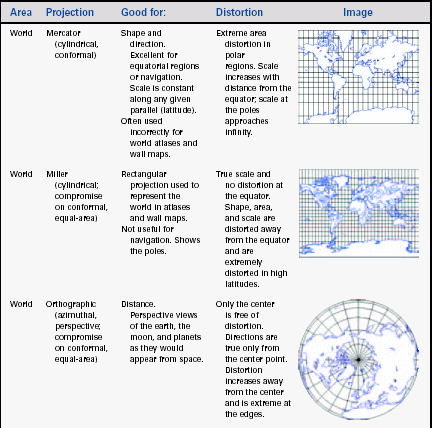
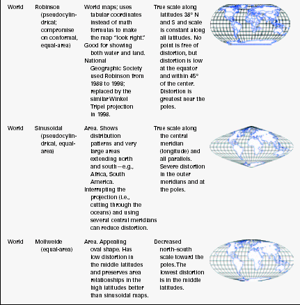
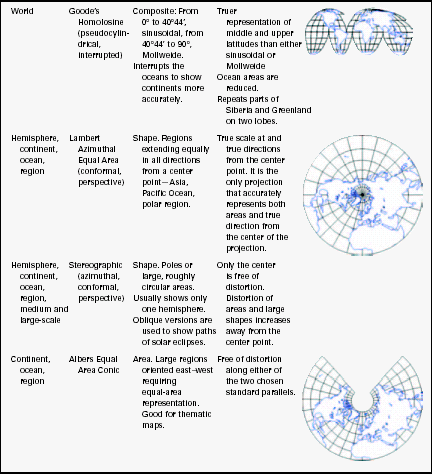
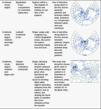
Map Projections Fall into Three Categories
In general, projected maps can be one of these, not all three:
• Equal area or equivalent. Areas on the map are proportional to the areas on the earth that they represent. However, shapes and angles are distorted, and the distortion increases with distance from the point of origin.
• Equidistant. The scale, and therefore distance, is constant only along all the great circles (the equator or the meridians, for example). The only correct distances on an equidistant map of New York, for example, would be between New York and other locations; distances between any two other locations would be incorrect. Area and direction are distorted.
• Conformal. All angles at any point are preserved and the scale is constant in every direction. Latitude and longitude lines intersect at right angles. The shapes of very small areas and angles with very short sides are preserved. However, the sizes of large areas are distorted.
Cartographers Use Three Solids to Create Most Projections
To create the most common types of projections, cartographers start with one of three solids, as shown in Figure 14-29:
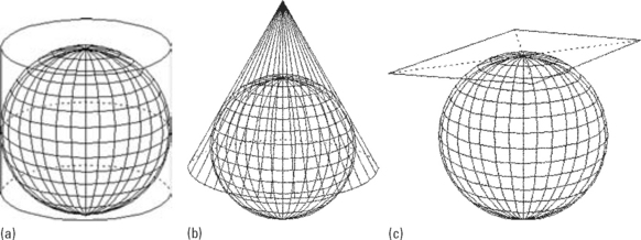
FIGURE 14-29 (a) Cylindrical, (b) conic, and (c) azimuthal projections.28
• Cylinder, in which the spherical surface is projected onto a cylinder.
First the cartographers project, then they flatten. Cylindrical maps, once the flat surface is opened out, look like the one in Figure 14-30. Note that, in this example, distances and areas are undistorted near the equator but distorted—stretched—near the poles.
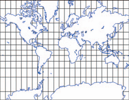
FIGURE 14-30 Mercator cylindrical conformal map.29
Conical projections, once flattened, look like the one in Figure 14-31. Conical projections tend to stretch the distances between latitudes.
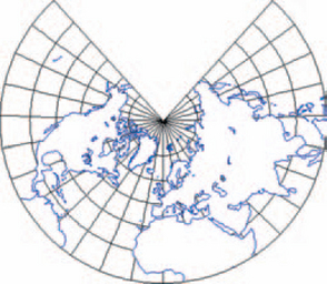
FIGURE 14-31 Conical conformal projection.30
Azimuthal projections look like the one in Figure 14-32. Straight lines through the center (in this case, the North Pole) represent shortest-distance routes along great circles. This characteristic is helpful for showing direct longdistance air routes or the spread of an epidemic from one point to many points in the larger world (Monmonier 1999, pp. 46–47).
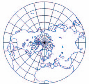
FIGURE 14-32 Azimuthal equidistant projection.31
Note that there are other types of projections as well—hundreds, in fact, each designed to show certain information better (J. Snyder 1993). For example, perspective views retain the picture of the sphere, so a perspective map isusually half the planet at a time. Large-scale maps often avoid projections but instead use regular rectangular grids like the Universal Transverse Mercator.
Also, if oceans are important in your application, keep in mind that most projections favor land masses and reduce the sizes of the oceans, sometimes dramatically. However, the Mercator projection, which is designed for ocean navigation, shows straight lines for constant compass bearings—since a straight line drawn between any two points on a Mercator map gives a true direction, navigators can use the map to set an accurate course and oceanographers can pinpoint their locations.
Place the Plane to Favor Your Continent
A projection is always more accurate nearest the point at which the flat plane meets the globe (the tangent point, in other words). As you get farther from the tangent point, the distortion grows. For this reason, cartographers recommend that you first center your map on the area of interest (a city, for example) and then pick the type of solid that more or less matches the shape and widest axis of the area to be mapped. So, for example, you’d pick:
• Cylindrical projections for continents such as Africa and South America, which straddle the equator and run north and south. Pseudocylindrical projections bend the meridians inward toward the poles to reduce distortion at northern and southern latitudes.
• Conical projections for midlatitude continents, such as Asia, Australia, Europe, and North America, which run east and west. Have the map straddle a specified standard parallel (latitude).
• Azimuthal projections for Antarctica and the northern polar region and for any other areas that are naturally or thematically shown as circles.
Keep in mind that you don’t always have to orient your map north and south. Transverse (the point O°E, 0°N on the equator takes over the role of the North Pole) and oblique (the point 160°E, 50°N takes over the role of the North Pole; see Figure 14-33) are also common orientations.

See the Degree to Which a Map Is Distorted
As mentioned earlier, projections introduce distortions in shape, area, distance, and/or direction. If you’d like to see which property is distorted, use Tissot’s indicatrices.
A Ttssot’s indicatrix is a circle (or actually an ellipse, of which a circle is one example), positioned at various points on a map. In the late 1800s, French mathematician Auguste Tissot plotted a series of small circles on a globe; on the globe, each was the same size and shape. But when he connected the same coordinates on maps, the circles went wild, varying in size and shape (National Geographic Society 1998).
Each ellipse’s shape indicates how much the map is distorted at that point. The elongation, or eccentricity, represents the degree of angular distortion, and its relative size reflects area distortion. In Figure 14-34, for example, you can see that the ellipses are undistorted along the equator and at the Greenwich prime meridian but becomes elongated as soon as you move north or south. Also, all the ellipses, though they have different shapes, have the same area, thereby showing that the Sanson’s projection is “area preserving” (Havlicek 2002, p. 1).
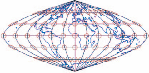
FIGURE 14-34 Tissot’s indicatrix on a Sanson’s (sinusoidal) projection.32
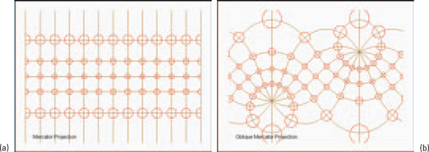
Compare the Sanson’s projection to the projections in Figures 14-35 and 14-36. The Lambert conformal conic projection distorts size, especially when moving south from the equator, but not shape. The perspective projection distorts shape and, to a lesser degree, size. Both Mercator projections distort size as you move north or south from the equator. On (b), the oblique version, the equator is the third curved line from the top.
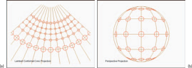
FIGURE 14-35 Tissot’s indicatrices on (a) conic and (b) perspective projections.33
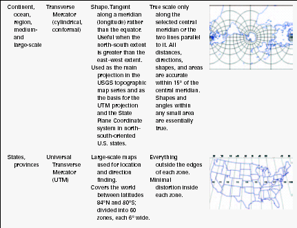
For representative projection styles, uses, typical distortions, and sample pictures, see Table 14-3. Keep in mind that, although the sample pictures showhow the entire world looks using the projection, actual maps may show smaller sections-a state, a region, a geological area. The smaller the region, the less distortion there will be in the area of interest.
Make Sure That Projections Are Matched or Transformed
If you are using information from more than one dataset to create your maps, your team needs to know which projections were used to create the source data. Latitudes and longitudes calculated with one type of projection will not necessarily be the same when calculated with another. There are a variety of reasons why coordinates don’t come out the same—rounding, calculating arcs versus lines, mistakes in older sets of known points, and so on. These are not small discrepancies (see Figure 14-37)—at certain points in California, the difference between the 1927 North American Datum (NAD27, the set of fixed, known points from which all other U.S. points can be found) and the 1983 North American Datum (NAD83) is as much as 100 meters, or 325 feet (Mentor Software 1998, p. 1). Here are some typical problems.
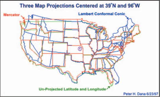
FIGURE 14-37 This is what happens when you don’t transform your projections correctly.34
• A map can be built using one projection but erroneously displayed using another. Distances, areas, shapes, and directions will be off, sometimes by hundreds of meters or yards. For a general navigation map, this might not matter very much. But if precision is important—for example, you need to know exactly where the wall between two mines is—the margin of error is too large.
• Good map software can combine two data sets built using different projections and transform the two sets into one accurate map. However, if the operator doesn’t know that the maps have different projections, buildings and points that are supposed to be in the same spots will show up in different spots.
Follow the Rules for Color on Maps
By the 15th century, European maps were carefully colored. Profile drawings of mountains and hills were shown in brown, rivers and lakes in blue, vegetation in green, roads in yellow, and special information in red. A look at the legend of a modern map confirms that the use of colors has not changed much over the past several hundred years.
These customary colors are shown in Table 14-4 (Department of the Army 1999, pp. 3–5). Note, however, that various organizations have their own standards for colors; see Resources for more information.
TABLE 14-4
| Black or gray | Man-made features, such as buildings and roads or surveyed spot elevations. Also used for labels. |
| Reddish brown | Cultural features, such as populated areas; all relief features; nonsurveyed spot elevations; and sometimes levations—for example, as contour lines on maps readable in red light (reds look white in red light). |
| Blue | Water features, such as lakes, swamps, rivers, and drainage. |
| Green | Vegetation, such as woods, orchards, and vineyards. |
| Brown | Relief features and elevations—on older maps, contours; on red-light readable maps, cultivated land. |
| Red | On older maps, cultural features such as populated areas; main roads; and boundaries. |
| Other | Special information. These uses must be described in the legend. |
There are also “false color” standards, described in the next section.
How False Colors Are Assigned on Satellite and Aerial Maps
Sometimes satellite and aerial maps are marked as “false color.” Sometimes you can tell a map is using false color just by looking at it—the trees are red, for example. The reason that false colors are used is simply that the photographs record wavelengths that are not visible to the human eye—usually infrared light but also radio waves, microwaves, ultraviolet light, X-rays, gamma rays, and other types of energy. Since these wavelength bands have no color (to humans, anyway), cartographers have to assign visible colors to them.
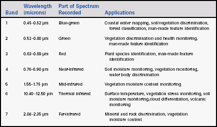
One of the most popular sources of satellite photos is Landsat 7, which records seven bands of visible and infrared light, as shown in Table 14-5 (Williams 2003, pp. 4–14).
Landsat 7 images are color composites, made by assigning red, green, or blue (RGB) to the infrared bands. A common assignment is RGB = 4, 3, 2. In other words, near-infrared (band 4) is assigned to and shown as red (“R”); red (band 3) is shown as green (“G”); and green (band 2) is shown as blue (“B”).
This combination makes vegetation appear red, because vegetation reflects near-infrared light. The brighter the red, the healthier the vegetation. Soils with little or no vegetation will range from white (for sand) to greens and browns, depending on moisture and organic matter content. Water will range from blue to black. Clear, deep water is dark, and sediment-laden or shallow water appears lighter. Urban areas look blue-gray. Clouds and snow are both white.
Published false color images should show the band assignments. For example, in Figure 14-38, the assignments are shown as “ETM+ Bands 4, 3, 2” (other maps may show the same assignments as “RGB 432”). Note: ETM+ stands for “Enhanced Thematic Mapper Plus,” which is the sensor aboard Landsat 7 that picks up solar radiation reflected by or emitted from the earth.
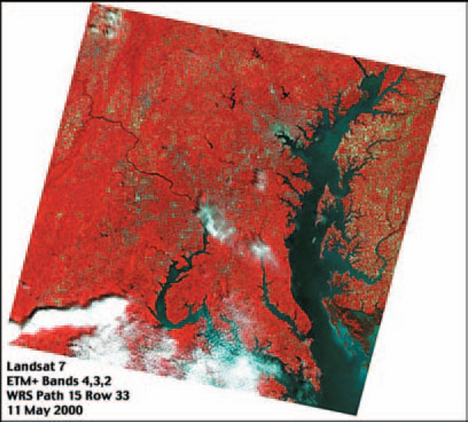
FIGURE 14-38 False color image showing band assiqnmants.35
Don’t Overdo Color
Edward Tufte (1990, Chapter 5, pp. 81–83) notes four uses for color on maps and other information graphics:
1. Labeling—for example, to distinguish water from land or healthy vegetation from dying vegetation.
2. Measuring and quantifying—for example, to indicate altitude using contours.
3. Representing or imitating reality—for example, by using blues for rivers or hachures (hatched lines) to show shadows on peaks.
4. Enlivening or decorating—color sparks up a map more than black and white could do.
Tufte’s rule for using color in any of these four ways could be summed up as, “Use only as much color as you need and no more.” Of course, defining “just right” and “too much” is difficult, but he does suggest that you limit strong, heavy, rich, and solid colors to small areas of extremes—for example, to the highest land zones or the deepest sea troughs. Figure 14-39 shows how changing the intensity of colors obscures rather than clarifies information. The rest of his Chapter 5, “Color and Information,” offers other good and bad examples.
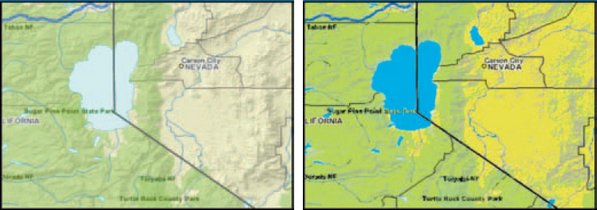
FIGURE 14-39 Muted colors (left) work better (riqht).36
Are Four Colors Enough?
Four colors may be all that you need if you’re using color to distinguish one area from another. The mapmakers’ rule for coloring a map is that no two regions sharing a boundary can be the same color, since the map would look ambiguous from a distance (Figure 14-40). Two regions that only meet at a single point can use the same color, however.
Since the 1800s, mathematicians have been trying, unsuccessfully, to prove that four colors are always enough. In 1976, the theorem was apparently proved by Wolfgang Haken and Kenneth Appel at the University of Illinois, who tested it with a program that took over 1200 hours to run. For more information, see Computer Research and Applications Group (undated) and Robertson et al. (1995). than bright ones
Know Your Map Data
Even when printed on paper, maps are neither mere pictures nor mere geography. Rather, maps encode large amounts of information—everything from latitude, longitude, projection, and scale to political, geological, and demographic boundaries and data points. Not all of this information is visible on every map, however. Only the information the user or the domain requires will appear on a well-designed map. For this reason, maps in one business domain (say, marketing) can look significantly different from those in another (for example, watersheds), even though both businesses may show the same geographic area and buy data from the same suppliers.
What Types of Data DO You Need?
Michael Zeiler, in Modeling Our World: The ESRI Guide to Geodatabase Design (1999, pp. 76–78, 88, 170), lists the types of information one can find in geographical databases. Since maps have both geographical and thematic information, map elements, he says, will have at least two characteristics—shape and location—and potentially many more:
• Shapes—points, lines, or polygons. Spatial references—X, Y coordinates, latitude and longitude, street addresses, postal codes, area codes, place names, route locations (for example, mile-posting systems on highways).
• Attributes, such as owner age and income, square footage, geological type.
• Subtypes (categories within attributes)—for example, a building lot can be zoned for residential, commercial, or industrial use.
• Relationships, either spatial (for example, lots that adjoin) or nonspatial (for example, who the owner is). Map attributes can be affected by rules. For example:
• Attributes can be constrained. For instance, “Residences must have at least 1 bedroom.”
• Attributes can be validated by rules. For example, “Residences must have at least 1 full bath for a certificate of occupancy” or “Pipe diameter can be 10, 15, 25, or 50 centimeters.”
• Elements can follow topology or connectivity rules. For example, “Parcels adjoin exactly; one line is sufficient to show the boundary between two lots” or “Networks are continuous, not disjointed, at repeaters or other line- related equipment.”
Be Careful What You Ask For
Once a database is set up and the data are collected and validated, then information can be analyzed and presented visually. However, unless you have really fast computers, unlimited space, piles of money, and high-speed connections to all your customers, remember that there will be trade-offs.
When you’re designing a system, be clear about what data you must have (versus what you’d like to have); what statistics and analyses you must show; and what information your customers are willing to wait for while it downloads.
Sources of Map Data
When you use maps in your web applications, you don’t have to collect any of the information yourself. Local, state or provincial, and federal governments and agencies offer hundreds of databases. Private organizations provide statistical data tied to the geographical data. For a starting point, see the section on geographic maps in Resources.
How to Manage Map Error
[T]he problem of error devolves from one of the greatest strengths of GIS. GISs gain much of their power from being able to collate and cross-reference many types of data by location. They are particularly useful because they can integrate many discrete datasets within a single system…. The key point is that even though error can disrupt GIS analyses, there are ways to keep error to a minimum through careful planning and methods for estimating its effects on GIS solutions. Awareness of the problem of error has also had the useful benefit of making GIS practitioners more sensitive to potential limitations of GIS to reach impossibly accurate and precise solutions.
Geographical mapping is not an exact science, nor can it be. Geography changes with floods, earthquakes, and tides. New roads are built, new highrises are added to the landscape, political borders change.
And even if you could survey plots to the centimeter (as archeologists and naturalists sometimes do), the costs would be astronomical if the area to be surveyed were any larger than a few meters. The degree of precision is directly related to the amount of money you are willing to spend collecting data points. However, although error on maps is unavoidable, it can be managed by looking carefully at accuracy and precision.
What Is Accuracy?
Accuracy describes how closely the map represents the real world and the degree to which information on the map matches true or accepted values. Here are some questions to ask about the accuracy of a map.
• What features have been omitted?
• What nonexistent features are shown (usually because of drawing errors)?
• How correctly were attributes classified?
• How far away is a map feature from its actual location in the world?
Positional accuracy, the last item on the list, is usually stated in terms of uncertainty.
• How close is the location on the map to its real location on the earth? For example, a map might state that “95% of the well locations are within 50 meters of their surveyed locations.” How similar is a shape on the map to the shape of the object on the earth? For example, a map might state that “City block boundaries do not vary by more than 10 meters from their actual shape.”
Shape and positional accuracy are treated separately because a map object can be the right shape but not at the right location, or vice versa (Province of British Columbia pp. 1–2). Note: See the earlier section “Know Your Projections” for some of the sources of shape and location inaccuracy.
When you buy map data, make sure the level of accuracy is documented (e.g., Figure 14-41). A good accuracy statement will include statistical measures of uncertainty and variation. For example, the United States National Map Accuracy Standards says, “For maps on publication scales larger than 1:20,000, not more than 10 percent of the points tested shall be in error by more than 1/30 inch [on the paper map], measured on the publication scale; for maps on publication scales of 1:20,000 or smaller, 1/50 inch” (U.S. Bureau of the Budget 1947, p. 1).
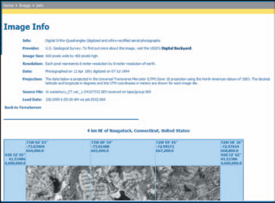
FIGURE 14-41 Information about the irnage.37
Table 14-6 lists, for some popular scales, how many feet or meters off a map can be and still be acceptable.
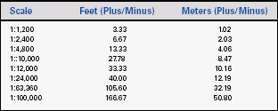
For example, at 1:24,000 scale, an error of 1/50 of an inch on the map is 40 feet, or 12.2 meters, on the ground (see Figure 14-42).
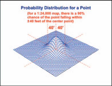
FIGURE 14-42 Forty feet of error.39
What Is Precision?
Data precision is the smallest difference between two positions that can be recorded and stored. Precise location data may measure position to a fraction of a unit. Precise thematic information may specify marketing, census, or other data in great detail.
The level of precision required for particular applications varies. Engineering applications (road and utility construction, for example) may require measurements to the millimeter or to the hundredth of a foot. On the other hand, location data for demographic analyses can be rather imprecise without losing value—e.g., for electoral trends, the nearest ZIP code or precinct boundary might be good enough.
However, remember that precise data—no matter how carefully measured—can still be inaccurate. Surveyors may make mistakes, data may be entered incorrectly, databases are not kept up-to-date, and so on.
Related to precision is data resolution, the degree to which closely related elements can be visually separated. Since a line cannot be drawn much narrower than about half a millimeter, the minimum resolution is about 10 meters, or about the width of a rural or suburban road, on a 1:20,000-scale paper map. On a 1:250,000-scale paper map, the resolution is about 125 meters (Province of British Columbia 1999, p. 2).
Watch Out for False Precision and False Accuracy
Beware of false precision. On a 1:2,400-scale map, just because you can zoom in to 1:200 scale, you’re not seeing any more detail than you would if you were at 1:2,400 scale. Precision is in the map, not in the display. At 1:2,400 scale, a point can be off by as much as 7 feet; you cannot pinpoint a telephone pole to within 14 feet on the ground even if you see it at a precise location on the map.
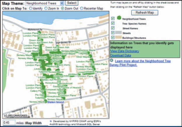
Here is a false accuracy example: If a city tree map shows trees on only a few blocks, it doesn’t mean there are no trees elsewhere in the neighborhood. It just means that the rest of the neighborhood wasn’t surveyed (Figure 14-43).
Although you cannot prevent error, you can recognize it. Table 14-7 lists various types of accuracy and precision problems as well as methods for accommodating uncertainty. Also see the earlier section “Make Sure That Projections Are Matched or Transformed” and, for quality-analysis suggestions,.
TABLE 14-7
Sources of geographical and statistical error.41
| Problem Area | Description | Tests or Solutions |
| Location, elevation precision | Location and elevation are onlyas precise as the scale at which the surveyors made the map. | Do not show more information zooming in than is actually on available. Suggestion: Display a warning note indicating the level of accuracy for the map, for example, “Elevations accurate only within 10 meters” |
| Scale | The level of detail in a map is determined by its scale. A map built to a 1:1,000 scale can show finer detail than a map with a 1:250,000 scale. | Make sure the scale matches the level of detail required for the users’ analyses. |
| Thematic data precision | Precise data describe phenomena in detail. For a person living at a location, precise data would include his or her age, gender, income, occupation, education level, and so on. Imprecise data would include only income, say, or only gender. Inaccuracies include typographical errors, duplicated data at the same geographical points, multiple similar addresses for the same location, and multiple names at the same address. | For precision, check the database’s documentation; make sure the database contains the information you need. Also check for data “scrubbing” information. Most data distributors eliminate multiple addresses and consolidate names into households. Distributors should also provide data auditing (statistical checks for probable data errors) and standardization services (for example, “Street,” “ST,” and “St” can be standardized to “St.”). For often-changed data, let users add or change the information themselves between official updates. |
| Data age | Thematic data easily gets out of date. For example, property records may be updated immediately in paper files but not in electronic ones. Changes in geographic mapping standards (e.g., degree of precision, projection type, large-scale scale revisions such as from NAD27 to NAD83), or corrections to bad reference points will change some coordinates. | Check the documentation for update guarantees and the last update dates. Check the mapping standard used when creating the data points, and convert coordinates to a more recent standard if necessary. |
| Categorization of data into class intervals | Categories may be misclassified. The class intervals may be set up wrong. For example, “males 10–30,31–35,36–100” would probably not be useful in any statistical analysis. The database may not contain the information needed to classify the information correctly. For example, if power lines are not classified by voltage, the data would be nearly useless for managing electric utility infrastructures. | Make sure the attributes the users need are in the database. Make sure the default class intervals are reasonable—for example, “males 21–30,31–40, 41–50,” and so on. Make sure users can set up their own class intervals if necessary. |
| Coverage | Data for an area may be missing or incomplete. For example, vegetation and soil maps may be incomplete at borders and transition zones. Some areas with almost continuous cloud cover may lack remote sensing data. | Check the documentation for coverage information. If coverage is incomplete, decide whether generalizing from a more complete area might be possible; decide at what point generalization might render analyses invalid. |
| Observational density | The number of observations is a guide to data reliability. Lines and features are created from points the surveyors collect; more points means more accurate lines and contours. Thematic data are created from information collected in the field. If census takers, for example, can’t reach a significant proportion of a population, that population will be underrepresented in the database. | Check the documentation for information about density—the number of points or observations collected per square unit of measurement. If the number of observations is low in certain areas, decide whether generalizing from a more complete area might be possible; decide at what point generalization might render analyses invalid. |
| Surrogate data | When certain types of data cannot be collected directly, sometimes surrogate data are substituted. For example, researchers studying a rare, shy bird might have to count the trees in which the birds live rather than invading their habitats and counting the birds directly. However, in reality there may be no birds in the trees or many more birds than the researchers expect. Also, satellite photos sometimes pick up signals indicating vegetation where there is none (false positives) or don’t pick up the signals where there is vegetation (false negatives). | Check the documentation for indications of surrogate data. If possible, check the data in the field—for example, check the amount of vegetation on the ground against what appears on the map. |
| Hidden relationships | If different types of information are separated into different layers, inexperienced users may not know that they should compare the layers before making decisions. For example, if a zoning layer shows residential zoning and a flood layer shows flood plains, a builder might get permission to build in floodplain if no one thinks to compare the two layers. | Expert systems based on rules can be designed to catch these types of errors. For example, “If zoning = residential, then check FEMA floodplain data before granting permission for a new subdivision.” |
| Access to data | Sometimes data just aren’t available. In the former USSR, for example, common highway maps were classified information and therefore unobtainable. Military restrictions, interagency rivalries, privacy laws, and economic factors can restrict access to data or to precise data. | Check the documentation for restrictions on the data and on levels of precision. Look for other sources for the same information. Show incomplete data in a different color or pattern, and mention it in the map’s legend. |
| Positional errors | Mapmakers can accurately position well-defined objects like roads, buildings, and boundary lines. However, the boundaries of less discrete elements, such as vegetation type, soil type, drainage, and climate, are subject to interpretation and estimation. | Check the documentation for information on assumptions made about borders. Warn users that some borders may be fuzzy. Provide a visual indicator (a broken line, for example) when borders are inexact. |
| Measurement | Measurement errors can be due to faulty observation, data-input errors, biased observers, or miscalibrated or inappropriate equipment. | Take the map into the field and check for inconsistencies. Check a new map against one or more older maps. |
| Content, labeling | Qualitative accuracy means that the labels are correct and specific elements appear on the map. For example, a spruce forest should not be labeled as an oak forest. “Marginal,” referring to an area (like a beach) that cannot be mapped, should not become “Marginal Street” on a later map. Quantitative accuracy means, for example, that all instruments were calibrated correctly, that land surveyors used equipment more accurate than the minimum error level, and that the census takers got answers to most of the questions on all census forms. | Take the map into the field and check for inconsistencies. Check a new map against one or more older maps. |
| Natural variation | Some data are naturally variable. For example, the proportions of fresh and salt waters in estuaries vary with the tide and the season. If the surveyor is unaware of the variation, the changes will not be captured and users may make the wrong decisions because of the missing information. | Check the documentation for anything related to seasonal or other natural changes. Have local experts review the information before anyone uses it in analyses. |
| Data-processing, numerical errors | Different computers and handheld calculators may perform complex mathematical operations differently and to different numbers of decimal places. Rounding results may be different on different calculators. | If possible, check calculations on the handhelds against the same calculations on the office computers, and vice versa. |
| Formatting, digitizing | Format errors can occur during scale conversions, changes in projections, conversions between raster, vector, DEM, and TIN formats, and when scanning and digitizing paper maps. The mouse can slip occasionally as CAD operators convert stereographic pictures intoTINs or DEMs or a paper map into a digital map. Multiple conversions from one format to another can make detail disappear (like when making copies of copies on a copy machine). | Check the documentation for records of format changes. For operator errors, check new maps against earlier maps or against different map layers. If a map has been converted multiple times, try to find the source. Do your own conversion if necessary. |
| Cost | Highly precise and reliable data are expensive to collect. | Balance the desire for accuracy against the cost of the information. |
Note that some of the problem areas and solutions are relevant for all statistical analyses, not just for statistical maps.
1From “Internet Map of Wroclaw,” © 2003 by Wroclaw Municipality, http://www.wroclaw.pl/ (accessed 5 August 2003).
7From “Land-Line® Standard Symbols,” © 2002 by the Crown, http://www.ordnancesurvey.co.uk/ productpages/landline/NTP-symbols/ntf-symbols-intro.htm (accessed 16 June 2003).
8From “Ontario: Location Map,” © 2003 by DBx GEOMATICS, Inc., http://www.dbxgeomatics.com/svgmapmaker/samples/ON_75M.htm (accessed 17 June 2003).
9From “Northern Pacific, Western Region,” © 2003 by Oceanweather, Inc., http://www.oceanweather.com/data/index.html (accessed 17 June 2003).
10From “The National Map Viewer;’ United States Geological Survey, http://nmviewogc.cr.usgs.gov/viewer.htm (accessed 18 June 2003).
11From “NYC OASIS Open Space Mapping Service,” NYC Oasis, © 2000 by New York City Department of Environmental Protection, http://www.oasisnyc.org/mapsearch.asp (accessed 17 July 2003).
12From “Telecom: Tower Placement Analysis,” © 2003 by ESRI, http://maps.esri.com/scripts/ esrimap.dll?name=wireless&cmd=Start (accessed 20 June 2003).
13From “tinShapeZ,” © 2003 by Geokinetic Systems, Inc., http://www.geokinetic.com/tinx%5Ctinx.htm (accessed 24 June 2003).
14From “Visualizing Realistic Landscapes,” Dr. Joseph K. Berry, David J. Buckley, and Craig Ulbricht, August 1998, © 2003 by Innovation GIS Solutions, Inc., http://www.innovativegis.com/basis/Vforest/contents/vfgisworld.htm (accessed 11 June 2003).
15From “GPS All Site,” © 2003 by Geoffrey Summers and Francoise Summers, Middle East Technical University, Musa Ozcan, Yozgat Museum, et al., http://www.metu.edu.tr/home/wwwkerk/05remote/gpss/allsite/tin/index.html (accessed 24 June 2003).
16From “Funky Gallery,” © 2003 by Geokinetic Systems, Inc., http://www.geokinetic.com/gallery.htm (accessed 24 June 2003).
17From “Camargo Syncline,” Image by K. Palaniappan, F. Hasler, and H. Pierce of NASA/Goddard, from data provided by T. Gubbels of Cornell University, http://rsd.gsfc.nasa.govlrsd/images/camargo_cp.html (accessed 27 June 2003).
18Note that the “layers” in maps are not the same as the layers in software architecture. In software design, layers refer to hierarchical subsystems that interact with one another—for example, a common setup would have a presentation layer, a business layer, and a data layer. In maps, however, layers refer to different types of information and pictures—typical layers might be a vector drawing of the streets in an area, a satellite photograph of the same area, watershed information about the area, and so on. There is no hierarchy and no particular relationship between the layers except for the geographical coordinates.
19From “SF Prospector,” © 2003 by City & County of San Francisco, http://gispub.sfgov.org/ website/sfprospector/ed.asp (accessed 26 June 2003).
20From “Sample Viewer Application: U.S. Places,” © 2003 by ESRI, http://maps.esri.com/website/ Viewer/presentation/compass/map.asp?Cmd=INIT (accessed 25 June 2003).
21Both maps (Figures 14-20 and 14-21) from “Ontario—Location Map,” © 2003 by DBx GEOMATICS, http://www.dbxgeomatics.com/svgmapmaker/samples/ON_75M.htm (accessed 26 June 2003).
22If you intend to provide a text key anyway, first check whether your development package has conversion formulas; if not, the formula is 1/ X = MD/GD, where X is the number of units on the ground, MD is map distance, and GD is ground distance. For conversions between English (feet, yards, miles, and so on) and metric units of measurement, see Department of the Army 1993, Appendix C.
23From “Digital mapping (thin client) demo,” © 2003 by ILOG, Inc., http://demo.ilog.com:8888/ maps/dhtml/index.html (accessed 30 June 2003).
24From “Digitaler Atlas 2—Naturschutz,” © 2003 by PLAN.T (Austria), http://gis2.stmk.gv.at/emap.tipps/gesamt.htm (accessed 30 June 2003).
25Both maps (Figures 14-25 and 14-26) from “South Australia Atlas,” © Government of South Australia, http://www.atlas.sa.gov.au/ (accessed 5 August 2003).
26From “Projections 2 Show, Airy,” 3Gon W3: The Great Globe Project on the World Wide Web, http://hum.amu.edu.pl/~zbzw/glob/km10.htm (accessed 2 July 2003).
27In reality (nature), there is no such thing as a straight line. See Leonard Mlodinow’s Euclid’s Window: The Story of Geometry from Parallel Lines to Hyperspace (2001) for a history of the delusion that there is.
28From “Explanation of the Projections,” © 2001 by John Olsson, http://www.lysator.liu.se/~johol/fwmg/projections.html (accessed 3 July 2003).
29From “Mercator’s cylindrical conformal projection (normal aspect),” The Website of Hans Havlicek, © 2003 by Hans Havlicek, Vienna University of Technology, http://www.geometrie.tuwien.ac.at/karto/norm03.html (accessed 3 July 2003).
30From “Conical conformal projection (normal aspect),” The Website of Hans Havlicek, © 2003 by Hans Havlicek, Vienna University of Technology, http://www.geometrie.tuwien.ac.at/karto/norm07.html (accessed 3 July 2003).
31From “Azimuthal equidistant projection (normal aspect),” The Website of Hans Havlicek, © 2003 by Hans Havlicek, Vienna University of Technology, http://www.geometrie.tuwien.ac.at/karto/norm11.html (accessed 3 July 2003).
32From “Mathematical Cartography,” The Website of Hans Havlicek, © 2003 by Hans Havlicek, Vienna University of Technology, http://www.geometrie.tuwien.ac.at/havlicek/karten.html (accessed 3 July 2003).
33From “MicroCAM Graphics, Tissot Indicatrix,” © 2000 by Dr. Scott A. Loomer, MicroCAM for Windows, http://www3.ftss.ilstu.edu/microcam/ (accessed 4 July 2003).
34From “Three Different Map Projections of the United States,” © 1999 by Peter H. Dana, http://www.colorado.edu/geography/gcraft/notes/mapproj/gif/threepro.gif (accessed 3 July 2003).
35From “How are satellite images different from photographs?” The Landsat 7 Compositor, NASA, http://landsat.gsfc.nasa.gov/education/compositor/graphics/baIt_432.jpg (accessed 5 August 2003).
36Adapted from “Geography Network Explorer,” © 2003 by ESRI, http://www.geographynetwork.com/explorer/ (accessed 13 June 2003).
37From TerraServer-USA, © 2003 by Microsoft Corporation, http://terraserver-usa.com/default.aspx (accessed 17 July 2003).
39From “Error, Accuracy, and Precision,” © 1995 by Kenneth E. Foote and Donald J. Huebner, The Geographer’s Craft Project, Department of Geography, The University of Colorado at Boulder, http://www.colorado.edu/geography/gcraft/notes/error/error_f.html (accessed 17 July 2003).
40From “Neighborhood Trees,” NYC Oasis, © 2000 by New York City Department of Environmental Protection, http://www.oasisnyc.org/OASISTree-default.asp (accessed 17 July 2003).
4From “Products & Services, Surface Modeling, Digital Terrain & Elevation Models,” © 2003 by Triathlon Ltd., http://www.triathloninc.com/surfaceModeling.shtml (accessed 12 June 2003).