24  OZ DESIGN
SÃO PAULO, BRAZIL
RONALD KAPAZ
Ronald Kapaz founded Oz Design in São Paulo, Brazil, with Giovanni Vanucchi and Andre Poppovic in 1978. As a senior strategist in corporate identity development, Ronald uses words and views to draw lines of thinking, plans of action, identity concepts, and visions of the world.
I PRACTICE PSYCHOGRAPHIC DESIGN, WHERE WE MAKE THE BRAND TALK ABOUT ITSELF.
I feel there are at least two different kinds of inspirational moments. One happens when I’m doing something unrelated to what I am currently working on, like shaving in the morning or driving to the office. To paraphrase Nietzsche, you need to be in motion to connect to the flux of life and have great ideas. The other happens when I receive the briefing from the client. I feel the excitement of the challenge, the focus in understanding the nature of the question, and watching every gesture in the client’s facial expressions. I feel that this is a powerful moment of concentration and inspiration. I compare it to a jam session, where I try to make the song flow in a beautiful mood so that, at the end, it becomes jazz. I call our method “jazz.” Every “song” is the result of this very moment and of the quality of the “musicians.”
I have lots of Moleskines, but I also believe in using memory and its power of keeping and refining what is relevant, which will then appear in my consciousness in the right moment. Memory is the first and most important sense, and I try to keep it in shape. The Moleskines are for written ideas and thoughts and for sketching and playing freely with paper—a kind of playground for my hands and my eyes. Besides that, I am a collector, and my house is a museum of objects, shapes, colors, materials, references, and memories. They are there, in front of me, to inspire and excite. Sometimes, I like to go back to them, but not with the purpose of recollecting something for a specific project; it’s more like a register of my journey and discoveries.
I think a process of nurturing your skills follows your process of professional maturity. I see young designers running to books and annuals, as I did once. But I moved away from that because of a decreasing interest in the work of others and an increasing interest in what blossoms from my own fight with the white paper. It’s the excitement of the free run of the hand and the flux of fresh drawings that surprises me as they appear out of nothing.
As I focus on helping clients build brand identities, I discover that clients love answers and hate questions, and they want us to be “problem-solving” professionals. I like to be a “problem-creating” one first. By this, I mean that, many times, the client comes with a simple question: “How can I grow and sell more stuff?” The client isn’t asking the right question. They are asking the same question everyone else does. I try to put them in a questioning mode so that they can start thinking about who they are and what they’re doing. In this way, they can move beyond the “sell more” perspective. I try to confuse the client (in a productive way) in the beginning by posing questions about their values instead of focusing on just selling more. That way, we can help the client discover who they are and how they can be relevant and unique. I call it psychographic design, where we make the brand talk about itself, where we start with an investigating state of mind, because in the end, design starts in the self-image of the client.
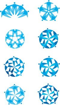
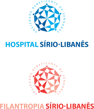
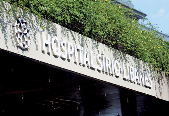
I had the opportunity to donate my liver to my daughter. In meeting with the doctor afterward, I told him the hospital branding wasn’t equal to the quality of the service I received as a patient. We scheduled a meeting to talk about the hospital and its values and about how we could express the value of this hospital that had been around for eighty-eight years. When exploring the context of hospitals in Brazil, I realized one curious fact: They are organized in terms of cultural communities and origins. The hospital I stayed at was founded in 1921 by the Syrian-Lebanese Community of Women, so I wanted to explore the idea of a community gathered around an ideal, and a Syrian-Lebanese community in particular. There was also an emotional element at play as the original identity was designed by the daughter of the founder of the hospital in 1921. As we started to explore the identity, I was looking for a symbol that was an expression of this community of ladies, something that reflected the pillar of philanthropy.
My first thinking was with the human element, using dots to express a person and revealing how the man evolved into this diamond symbol. When you focus on philanthropy, your design mind goes to round shapes that express technology and excellence. But the round shapes started evolving into shaped forms that ended in a powerful mandala with a structure of connection, the idea of community that the client was looking for.