
30 ![]() CRAMA DESIGN ESTRATÉGICO
CRAMA DESIGN ESTRATÉGICO
RIO DE JANEIRO, BRAZIL
RICARDO LEITE
Ricardo Leite is partner and creative director of Crama Design Estratégico, a Brazilian design agency founded in 1991 and based in Rio de Janeiro. As one of the biggest design agencies of Brazil, Crama’s team works across all design disciplines. Ricardo teaches design at UniverCidade (University Center at Rio de Janeiro).
OUR JOB IS ABOUT FINDING A VISUALLY INTERESTING WAY TO TELL A STORY.
Creative inspirations come from anywhere and at any time for me. Once, I found what I wanted when I saw the cover of a book about Frank Gehry in the window of a bookstore. It was a close-up photo of Bilbao’s Guggenheim, and I saw shadows and lights, black and white, in a very interesting composition. I saw my graphic elements in that photo. I find inspirations for graphic compositions everywhere, but finding the idea inspirations is harder, because I have to look for associations with the subject.
Sometimes, I go to a magazine store and just thumb through lots of magazines. I’m not looking at specific images, but for the ideas that come from something the image triggers for me. It’s like a mystical trance. Flipping through magazines is a way to free my mind, a stimulating tool. Sometimes, I go to a dictionary and look for a key word associated with the main idea, and I find relationships with the subject. Usually, I find interesting connections that help stimulate new ideas.
We are surrounded by the same solutions everywhere. People gravitate toward what they already know. It’s like a child wanting to listen to the same story again and again. Something new takes a lot more work. It makes our mind work harder to fill new connections. That’s why we see the same movies; tell the same stories; listen to the same music. It’s hard for the client to take risks, especially if he is not the CEO—he has a job to keep. It’s safer to go where everybody else is going.
Our job is about finding a visually interesting way to tell a story. We can categorize innovation in two parts: radical innovation and incremental innovation. Most of the time, we are reshaping things. It’s like sampling music. We mix a lot of ideas we see, imagine, or create. Once in a while we find something really new. I’m not sure if in a pure sense this is possible because we all live inside our cultural influences. It’s very difficult to find something disconnected to what is happening. Artists, designers, musicians, moviemakers, and writers have always looked for what others were doing. Although this has always happened, we now have the technology that lets us know what everybody is doing on any subject, in quantity and velocity, around the world. We are influenced and inspired by all that is around us. The question is the difference between influence and copy. For example, Picasso got inspired by African art, but he didn’t copy it; he interpreted it in a new way.
I work with solutions and ideas for many mediums. I draw a store, a display system, or a book cover thinking the same way. What does this store say to the consumer? How can it be more intelligent? How can I create an emotional connection with the public? How can I materialize the core idea of the brand? We work in a very similar way for editorial design. Of course, there are the technical aspects that come with all platforms. Shouldn’t it just be visual design? Maybe just design? No one in Crama Design Estratégico works alone. Even the client participates when he refuses or approves things, as does the public. Design is teamwork.

We were asked to design a cover solution for a book collection of a famous Brazilian writer, Luis Fernando Verissimo. His writing is about the everyman’s day-by-day life, written in a humorous way. Our big challenge was to make about twenty different books, but with a collective identity.

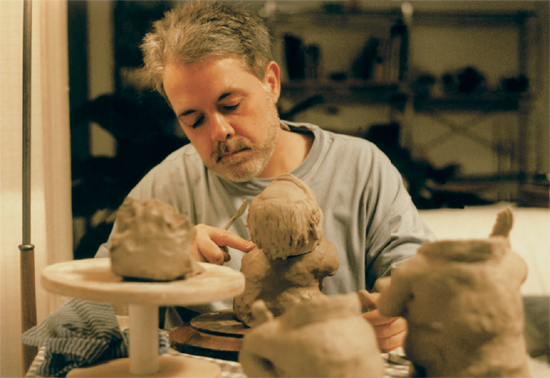
Someone on the team came up with a Woody Allen caricature sculpture. That was when we knew we had it. We knew we should use a sculpture. This 3-D solution would be real and friendly. I ended up creating little sculptures of Verissimo and we put him in various scenarios for each book, and it was a big hit.
Zé Ramalho is a popular Brazilian musician from the Northeast region of Brazil. His music mixes popular and regional singing with pop rock style. This record is a twenty-year anthology, in which he rerecorded his most famous songs with new arrangements. I decided to make a resume of his career showing his regional roots from the popular regional scene.
Zé Ramalho has a very personal style of composing and singing inspired by the folk singers from the Northeast region of Brazil. I felt this album was a very important moment in his career, when he was reprising all his big hits, with different arrangements, mixing all kinds of influences—popular Brazilian music, Indian, some Arabian musical references, and pop rock American and English music from the Beatles, Dylan, and Pink Floyd.
When we had our first conversation, he told me this was a three-album project. The first of the trilogy, 20 Years—Acoustic Anthology, would be an anthology comprising songs he chose. The second album, Northeast Nation, would consist of songs with influences from the Northeast region of Brazil that he had listened to all his life and that had influenced his musical style. In the third album, Brazil Station, he would re-create musical influences from composers all over Brazil in a clear reference of a long journey around the country. These three albums were deluxe editions inside boxes with a double CD and a forty-page booklet with writings, photos, and illustrations.
When I started working on the design for the first album, I already had a good idea of what we could do for the other two. Zé Ramalho loves album covers, and I worked closely with him on his. I listened to the recordings and we talked about music and design in the old way of making record covers that is not usual today. It was clear he is a big Beatles fan, and the folk music of Bob Dylan and the magical and surreal covers of Pink Floyd from Hypnosis were always a subject of conversation, as was, of course, his Brazilian roots, where singing is storytelling.
For the first album, 20 Years—Acoustic Anthology , I wanted to show Zé Ramalho on the cover because it was a twenty-year retrospective and his fans would like to see him. The main idea was to show him with all the musical influences he had behind him. We tried a few alternative cover concepts first.
For the second album, we were inspired by the Beatles’ Sgt. Pepper’s Lonely Hearts Club Band. I knew it would be a nice opportunity to show his Beatles influence.
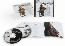
Zé Ramalho’s 20 Years—Acoustic Anthology album sold more than a million copies, and for the cover design we won the Brazilian best album cover prize. The challenge was how to pull all the elements together. We decided to make a clean, simple cover because the popular art in the Northeast region of Brazil is mostly black and white, for economic reasons. We decided to mix his photographs with the xilo style. For the title, we made some wood backgrounds and worked in a nice composition. Inside the booklet, we decided to put a few color photos so that it would contrast with the black-and-white work.
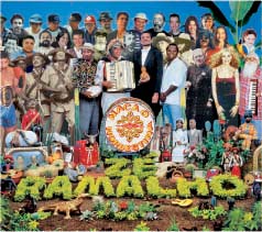
We had a lot of fun finding regional historical celebrities to put in place of the people on the Sgt. Pepper album. It was a creative game to fill the scenario with objects, animals, plants, and so on from the Northeast region of Brazil. In place of the other three Beatles, we picked the three most important regional popular artists. And inside the booklet we re-created the famous photo of Paul McCartney on the back of Sgt. Pepper but with Zé Ramalho in the same position. It was a big hit, with newspapers giving it lots of coverage.
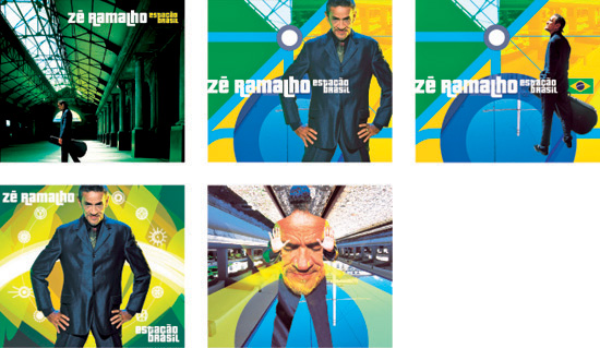
For the third album, we found inspiration in the title, Brazil Station. We wanted to show a big station mixed with the colors of the Brazilian flag, symbolizing his long journey around the country.

The first idea we had for Brazil Station was to put a map with the names of cities substituted with the names of the composers whose songs Zé Ramalho was singing. He didn’t like this idea.

After Zé Ramalho rejected the initial direction of the map with the names of the cities, we started working on a graphic solution with the station overprinted with the colors of the Brazilian flag. Even though this was the final album of the trilogy, we did more explorations for this than for any of the others.