
18  STARBUCKS GLOBAL CREATIVE
SEATTLE, WA, USA
FUMI WATANABE
Fumi Watanabe is a designer, painter, illustrator, and conceptual thinker who grew up in Japan. After earning her design degree, she started working in the in-house design group at Starbucks. Fumi combines her graphic design training with her passion for illustration and art in both her work and her personal projects.
I QUICKLY LEARNED THAT MY DIFFERENCE IS ALSO MY SELLING POINT.
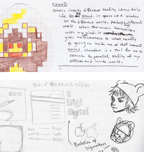
The best way for me to get inspired is to stop, move away from the computer, and start writing in my sketchbook. After a while, the new ideas come to me. I also keep folders of projects—all my processes, sketches, thoughts, references, articles, everything goes in those folders.
I was a bookworm growing up in Japan, and I was always drawing, but I never thought that drawing was accepted as a career. So, I thought I was going to study literature. When I came to the United States, art was more accepted as an area of study. I went crazy when I found out that this could be a career.
I’ve always thought that my advantage as a designer was my difference, or maybe it was my disadvantage. It was a bit of a handicap, not knowing the cultural background, including all the TV shows that most people grew up with. But then this became an advantage because everybody’s looking to be different and memorable and I found that being a foreigner is really a good thing. I quickly learned that my difference is also my selling point. My background and sensibilities subconsciously come through in my design and in how I contribute to a team. For example, because I work on a lot of team projects I especially get pulled into the brainstorming process where all ideas are accepted. I probably bring a lot to the table for that kind of thinking because of my background.
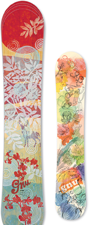
I used to be a fine artist, but I stopped because it was so emotional, and I didn’t think I could make it in that career because you have to be a little bit detached from what you do. I hadn’t painted for a long time, so when I was working with Gnu for a line of snowboards for Barrett Christie, I picked up my paintbrush again and started experimenting. Because I had been illustrating and designing, I approached art in a different way. I started making a collage that I wanted to have in my house and that my friends would want. I started making art where the process is a lot like design.
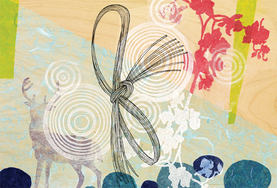
I don’t want to generalize Japanese culture because I think that in modern Japan, everybody has different experiences, but my background plays into everything I do. I grew up with lots of Japanese books, which influenced me greatly. Also, Japanese is a gifting culture; so many things are gift wrapped in neat little packages. All these things influence the way I think and the designs I create.
I keep a reference folder with all my sketches for various projects. Some of them are so good that I haven’t thrown them away. I think one of the reasons I can’t use design annuals for inspiration is that it’s all in a neat, even package. But if it’s in an object form or in a loose file that I can manipulate and move things around, I’ll use it.
Travel really inspires me, not because of where I go, but because I can remove myself from the pile of stuff that I build up. It also gives me a chance to look at new things. It’s a cleansing process for me. Sometimes, it’s not even looking at beautifully designed objects; it could be observing how people do things differently in different places. Maybe it’s looking at the repetition of mops and brooms lined up alongside a house or something similarly random.
When I see an extremely well-designed piece, I think it’s great, but somebody did it, and it’s done. I’m not going to do it or do it better. It’s more beneficial for me to find out how it works or the reason behind it.
I feel that if I unload my ideas, new ideas will come. If I share my ideas with others, somebody might take them and do something else with them, or get inspired. Usually, I get refueled from somewhere and maybe even get a better idea.
I get really inspired by how people interact with things. As I work on packaging a lot, I’ll put stuff in different piles to see how people interact with it or to see how it would ship. Packaging is a crazy, multilayered thing. You have to start with the way people interact with the package, how they open it, or how they use it daily if it’s a multiple-use type of product—how they can keep using it and keep getting pleasure out of opening this box or tab or whatever it might be. Maybe the break in the seal could symbolize the ritual. There’s a lot of emotion associated with how people interact with their stuff.
For example, with a soda can, you pull the tab open. Whether it’s a little snap or crack or rip—different things cause different emotional reactions in people. I also think about how something prints or ships, because by the time it gets to people’s hands, it can’t be mangled. The hand-to-product moment is everything. We can design something that’s really cool, but if it can’t be manufactured or filled or shipped, or if it’s really bad for the environment, I can’t be proud of my work.
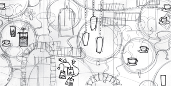
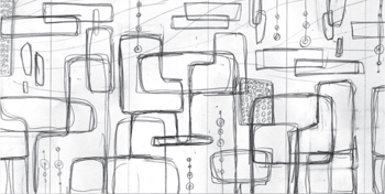
For a mural for the Starbucks cafés, I didn’t want to re-create the scene of the coffeehouse because the people looking at it would already be in that setting. So, I initially sketched the café scene and then I abstracted and deconstructed it. Everything was in these big chunks of modern, bubblelike shapes. At first, you might not know what it was, but then when you knew, you started seeing the shapes. There are tables and chairs, and so on.
Murals are huge and you can hide fun things in them, so I had lots of fun adding the doodles that were in the corner of my notebook. I created them with watercolor and then cut them out and layered them. The act of making it was gestural and abstract, but the concept behind it was the coffeehouse.
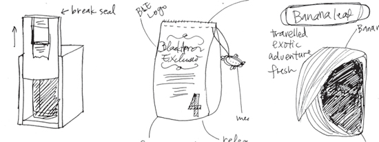
Black Apron produces specialty coffees and they needed a flexible package design that would distinguish their different coffees, which are often distributed in small batches. The challenge was that we couldn’t print on the roll stock every time we had a new coffee. And because the coffee was so expensive and packaged in such small quantities it had to be a premium, giftable experience. We explored different structures, from a brown paper bag, which is really mercantile and fresh, compared to tin containers, where the product is sealed and doesn’t have the perception of freshness. Again, the challenge was that we couldn’t switch the packaging every time, but we wanted to show newness. We sketched and then mocked up several options to show the client.

We ended up using an artist, Lane Twitchell, who does cut-paper art, to create a visual story about the coffee. Then we created a diecut with this art on the box to reveal the interior bag. We found the right balance of the exterior story and the interior look to show something new and exciting. We also created a bellyband featuring the name of the coffee in the package.
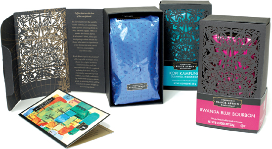
Every time a new Black Apron coffee is launched, we would switch the different color interior bag and the bellyband. So, it was just one plate switch, with the bellyband switching out with a dramatic color change so that you could immediately tell there was something new. We also included a little “love note’” inside featuring original art so that there was a little surprise when consumers opened the package.