
09  ADAMS/MORIOKA
BEVERLY HILLS, CA, USA
SEAN ADAMS
Sean Adams is founding partner with Noreen Morioka of AdamsMorioka. He has been recognized by every major competition and publication. A solo exhibition on AdamsMorioka was held at the San Francisco Museum of Modern Art. He has been cited as one of the forty most important people shaping design internationally in the ID40. AdamsMorioka’s clients include the Academy of Motion Picture Arts and Sciences, Adobe, Gap, Frank Gehry Partners, Nickelodeon, Sundance, Target, USC, and the Walt Disney Company.
WHENEVER WE COMPLAIN THAT THE BIGGEST ISSUE IS THE SIZE OF GARAMOND OR WHY THE CLIENT INSISTS WE USE THEIR CORPORATE BLUE, THE WHOLE PROFESSION BECOMES ABOUT SOMETHING SMALL.
Fifteen years ago, I was so clear in my direction and goal to clean up the world, and finding inspiration was so easy. Maybe it’s because I’m older, or busier, or jaded, but finding inspiration is more difficult for me now. Finding a wonderful booklet at a used bookstore, or discovering a graphic novel in a Japanese department store, was endlessly exciting. Today, the process is less about seeing and more about learning. Reading about history, specifically sociological history, is inspiring to me now. How did humans relate to one another in seventeenth-century Virginia, or what political issues informed the Cold War, or how did photography impact the Civil War? These discoveries don’t lend themselves to the kind of inspiration that is about seeing, but they move me to reconsider why I do something. But I am a visual person, and I still love finding that odd magazine cover from 1967, or riding through “It’s a Small World,” or discovering the color palette from Bye Bye Birdie.
Like most designers, I endlessly sketch in my notebook, and I have hundreds of historical images in my iPhoto file. All that input seems to get mixed up in my head and comes out when I don’t expect it. It’s usually a few months after we’ve completed a project that I’ll run across something and say, “That’s where the color palette came from.” I rarely look at my notebooks, but the process of drawing something burns it into my brain. I would love to say I’m an avid user of design magazines and annuals. But I’m not. I’m happy to read an article, but I don’t thumb through them looking for ideas. In the interest of full disclosure, I will admit I spend time looking at our collection of Graphis annuals from 1953 to 1970. I’m not looking at them to copy a poster or book cover. I’m more interested in the way designers during that time utilized symbol and metaphor. It’s a good prompter to start thinking. For example, I might be working on a piece that needs to talk about “new.” I start a list of words that relate: egg, stork, and so on. Then I might come across an image of a gift box for an old ad for Bonwit Teller, so I add gift box to the list. I’m not interested in replicating that Bonwit Teller ad’s look and feel, but I’m willing to let the idea of a gift box represent “new.”
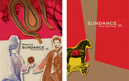
The concept for the Sundance Film Festival came together when I decided to re-create myths that we all know, but recast them with our own actors, and build new sets using engravings and flat art. I presented the idea, Robert [Redford] was thrilled, and we began brainstorming which myths could work.

Determining which stories would be recognizable became the biggest challenge. We knew we wanted a singular image that illustrated a myth that had components related to filmmaking and the Sundance experience.
I think about the redefinition of design all the time. Whether it’s working on the meaning and definition of this for AIGA or dealing with the direction of AdamsMorioka with Noreen [Morioka]. It’s clearly a field that is fracturing into many pieces. This is good, because it forces us to be communicators, not merely form-makers. And it’s bad, because without guidance, the profession can lose all power and become a million tiny tribes. But I’m more concerned about design’s standing with the business world. We want to be respected and have a seat at the big table, and we should. We know that design will be the force that pulls all of the pieces together and makes something a success. But we are our own worst enemy. Whenever we complain that the biggest issue is the size of Garamond or why the client insists we use their corporate blue, the whole profession becomes about something small. We need to be immaculate and skilled at our craft, and we also need to think big.
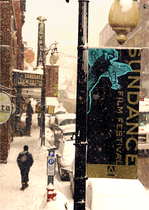
We’ve worked with the Sundance brand for almost a decade. There are basic issues that drive all of the communication. The festival is one component that is highly visible. The process begins with us sitting down with Robert Redford and discussing his thoughts. We ask him if there are any big ideas he wants to explore, or any issues he feels are pertinent. For the 2006 festival, he talked about storytelling being the basis of all filmmaking. We took that conversation and started sketching.
We wondered whether the myth of Icarus flying too close to the Sun would be known to a twenty-first-century audience. In the end, we used several stories: Moby Dick and the idea of obsession; Adam and Eve, which is about temptation and knowledge; the Trojan Horse, for deception; and Icarus, which is about ambition and failure.
At the time, I was reading a book by Graham Hancock, Heaven’s Mirror, which, among other things, talked about the power and longevity of myths. During our first meeting, I found myself sketching little thumbnails of different myths. I didn’t take them seriously, because I thought, “Nobody really wants to hear about the Trojan War after high school.”
We tried many ideas that were all pretty awful. This was the fifth Sundance Film Festival we would be doing, and there are only so many ways to say film and Park City. At one point, I thought about hiring a design firm, and then I thought, “Wait, I have one of those.”
After presenting several variations and feeling stuck, Robert said, “Don’t worry about me, or what I think. What would you do if I weren’t involved and you didn’t have to worry about what I wanted, or the marketing team, or anyone else?” I immediately thought about my little sketches of myths. Fortuitously, I was looking through Saul Bass’s title work for my class at Art Center College of Design and I came across his work for Around the World in 80 Days. There was something wonderful about this sequence that used illustration and engravings. In the end, this experience reminded me to trust my own instincts and not pre-edit my ideas.
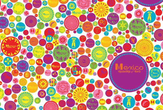
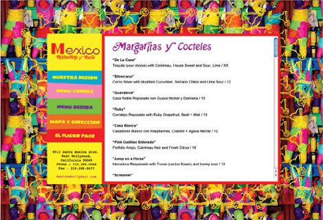
Another great client of ours is Larry Nicola, one of the foremost chefs and restaurateurs in the United States. We had worked with Larry for more than fifteen years on several of his restaurants. When he asked us to work on his next restaurant, Mexico, I expected it to follow the idea of Larry’s other restaurants that have needed a high-end and high-quality attitude. In our first meeting, he said he wanted Mexico to feel like a vacation, and be fun and energetic.
The key word that Larry used was low tech. This was the starting point. As designers, we are committed to perfection. The printing must be the highest quality, the typography must be flawless, and the forms should be precise. Now, typically, the inspiration point for this project should have been a visit to Tijuana, but this wasn’t the case. I was cleaning out a drawer at my grandparents’ house and found the operations manual for their Whirlpool dryer, circa 1970. The headline type was a remarkably ugly version of Modern No. 20 with added swashes. “Could we make the ugliest typeface ever?” I asked.
Early versions were abandoned for being too precise. Each step was augmented by the low-cost solutions of our designers.
Years ago, we worked with David Hockney on several books. Spending time in David’s studio taught me to work in broad strokes, fearlessly. The Mexico project reminded me of that. The joy and delight we have felt working on it comes through on each piece.
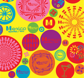
When I returned to the office after finding the Whirlpool manual, we started drawing Hobo Italic Swash. This seemed like the perfect font for Mexico. We determined then to use only low-tech materials. The forms and icons are all hand painted, the typography is Courier, the hand-drawn type is Hobo Italic Swash, and the production techniques are the least expensive possible.
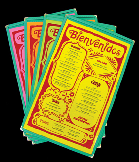
Menus are typically costly and custom. Our creative director, Monica Schlaug, found an off-the-shelf vinyl menu and convinced the manufacturer to make it with turquoise vinyl, which he hadn’t used in decades.
When designing the website, Monica came across a homemade website using a repeat tiled image, so we applied this to Mexico’s site.
Whenever we have abandoned any part of the project, it’s been because the form or design was too well considered. In each instance, we’ve repainted the image or messed up the composition further. Strangely, it’s hard to untrain yourself from making good composition and subtle color distinctions.