
28 ![]() DUFFY + PARTNERS
DUFFY + PARTNERS
MINNEAPOLIS, MN, USA
Joe Duffy, the chairman of Duffy & Partners, is a much-admired creative director and an expert in branding and design. When he started Duffy & Partners predecessor Duffy Design in 1984, in association with creative advertising agency Fallon Worldwide, he broke new ground for the collaborative integration of branding and design with advertising. Duffy’s work includes brand and corporate identity and design development for leading global companies such as BMW, Coca-Cola, McDonald’s, Starbucks, and Sony. His understanding of how design affects consumer attitudes has led to many big ideas executed in advertising as well as design.
I THINK THAT AS DESIGNERS, WE NEED TO LIVE OUR LIVES WITH OUR EYES OPEN MUCH WIDER THAN NON-DESIGNERS.
As designers, we need to be social anthropologists studying what’s going on in culture. Then we can turn that information into an inspiring message that will attract people to whatever we have to offer.
It’s important to develop ideas that pertain directly to the issue at hand. What do you want to convince people to do or be a part of? Who are we trying to attract, what are their interests, and what will attract them to our design message?
Find out what’s going on in popular culture, in the streets. Experience life, not relative to design specifically, but more importantly, find out why people are attracted to certain kinds of messages at that point in time. That’s all infinitely more valuable than spending your time digging through design annuals.
For example, we’re obviously in the depths of a very serious recession, and that is a much more important factor in attracting an audience’s attention than what is currently hot in design.
Virtually every project we’re working on today is about an experience as opposed to a one-off encounter such as a package, a website, a logo, a brochure, a commercial, or anything else. This reflects the melding of vertical disciplines within graphic design, environmental design, and Web design.
If we’re developing an identity for a chain of restaurants, we need to understand what the target audience is interested in, what the competitive set is up to, and most importantly, what differentiates the chain from the competition. We need to establish a brand language as opposed to just a logo or a store design or package. But this brand language needs to be broad enough, multi-faceted enough, and compelling enough so that we can apply it in various ways to every point of contact with the target audience.
If the language is based on colors, type, photographs, materials, and architecture, it can be unified by a single-minded notion of what makes the plan special, and it can be diverse enough to apply in all of those ways. If all of those ways relate to why this brand is special and important for the target audience, you have the identity in all its appropriate touch points.
Apple is a good example of this, because whether you come across products from Apple via its packaging or its television commercials, the in-store experience, the point of sale, all the way down to things like the instruction manual, are delivered in a unified way. It’s almost like a person. Obviously, they dress differently at different times, speak differently at different times, enjoy themselves in different ways, and express themselves in lots of different ways, but they are one person. And they are multifaceted and complex, and so are most brands.
We all like to think of ourselves as renaissance people, but few of us are graphic designers, filmmakers, advertising creatives, architects, interior designers, and so on. I always love when a client comes to us and says, “We want you to do design, but we want to establish this brand in a holistic way. We’d like you to work with our architects, our advertising agency, and other people to make sure we’re covering all the ground to revitalize this brand and send it out to the world new and fresh or to literally create this new brand in a powerful way.”
I think as designers we need to live our lives with our eyes open much wider than nondesigners. I always have a digital camera on me, and if I see something interesting in the street, someone wearing something I’ve never seen before, or a sign, or just a gathering of kids on the street, I shoot it.
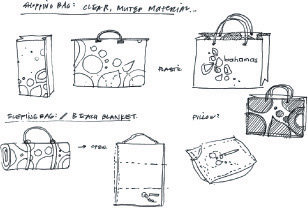
After we do the visual brief, it’s time to draw. I feel it’s essential that designers draw first and get on the computer after we see the sketches. All of our designers have sketchbooks that have thousands of little sketches in them.
The young designer who came up with this idea had cut out a map of the Bahamas and stuck it on a page in his sketchbook, and then he started simplifying that map. It started with sketches and little scraps that the designer came up with.
We have a wealth of interesting images in our studio, and we always start a project by pulling from all of those images, some of which we may find on the Internet, some in stock photo books, but most from digital files that we’ve taken individually.
We take a verbal brief from the client, and we visualize that brief in the form of a collage. In the best instances, our clients do that with us, which I think scares a lot of creative people. But I’ve found that if we include them in this important first phase of creative development, we get further along more quickly. We create beautifully designed collages, making sure each image is appropriate for what we’re being asked to do in answering the brief.
When we build the collage together and use it as a springboard for design ideas, those ideas are going to look like they came directly from our visual brief. And they’re not going to be a surprise to the client, because they helped define the visual brief and were part of the creative process. It helps avoid that point that all designers know where the client says, no, I like black better than brown, or I like this typeface or that photograph better, and you’ve got a collaboration that is very unhealthy and typically leads to bad design.
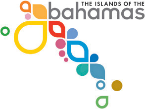
For our research for the Bahamas identity, we went to the Bahamas and shot pictures of flora, fauna, native dress, the people, and the beautiful environment. We used that inspiration and imagery to build the collages. One of the collages features a point of difference of fourteen destinations. There’s a stylized bird in the collage, some photographs of flowers, some stylized flowers, a hand-scrawled sign from a street vendor in Nassau, pictures of people who had brightly colored clothes on, and some stylized illustrations of the water.
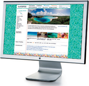
The logo and concept become functional when you go on the website and click on each island. Information pops up telling you what you can do on that island.
Our concept and the resulting website for the fourteen islands of the Bahamas played to the position that we developed in the design and advertising, which was island hopping. If you want to golf, you can go to this island. If you want to fish, go to that island. If you want to snorkel and be away from the world, you can go to this other island. If you want to gamble and stay at the luxury hotel, you can stay at that island.
Bahamas Air now uses the identity, and people in the Bahamas use it in different ways to express their nation’s brand. We established the language and the standard, but now everyone who is expressing anything about the Bahamas uses that language.
If you squint and plop the finished design into the middle of the collage, it should look like it is born of that. The visual collage becomes a filter, and it helps you decide which design elements are appropriate or what the home page should look like. It’s not just the look of that collection of images; it’s what those images say about the differentiating mood or point of view of this brand.
If you look at the variations that led to the final design, you’ll see that there were various phases of development. It always looks a lot simpler in its finished form than it was in development and refinement, but the germ of the idea was appropriate because it was based on the visual brief that was created with the client.
When the client saw it, it was a slam dunk. The director of tourism said, “Of course, that’s what we are.” But no one had ever done the obvious before. Now they had something that really made them different.
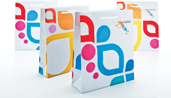
Everything from the advertising to the website to items like beach bags and luggage tags hangs together for this branding execution.