
04  HATCH DESIGN
SAN FRANCISCO, CA, USA
KATIE JAIN + JOEL TEMPLIN
Joel Templin and Katie Jain founded Hatch Design in 2007. Since then, they’ve attracted great clients and have gained critical acclaim for their design and branding work. But this new entity, Hatch, was born to enable them to do more than help clients build brands; it was designed to allow them to create and grow their own brands, as well. JAQK Cellars is the first idea to crack out of the egg, and it couldn’t be a more beloved first hatchling.
WHEN YOU’RE LOOKING FOR IDEAS, IT’S IMPORTANT THAT YOU GO SOMEPLACE TOTALLY RANDOM.
JT: Inspiration comes from so many places. We never go to design annuals for inspiration. We’ll look at old annuals from the 1940s or 1950s for reference because we are attracted to that craft sensibility.
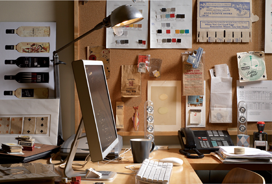
KJ: We have a cool library that we reference every day.
JT: Starting a project is an organic process. We start with everyone pulling scrap imagery and talking about it. Everyone chimes in with several sets of eyes looking at things. Some happy accidents happen along the way. It’s an “if they’re zigging, we’re zagging” kind of thing.
KJ: It’s like we put up the pages from the design annuals and say, “Don’t do this. Let’s do something new.” The things from our collections are from places like the bookstores in Japantown in San Francisco, where we look at imported product packaging to get a good range of ideas and get inspired. Then we start looking at everything as a collective and start grouping things together to see a potential path that the project might take.
JT: It’s important that you go someplace totally random. Say you’re doing beauty packaging, and you look at those security patterns from the inside of envelopes for inspiration, and they end up on the packaging for a high-end skin care product. When you juxtapose things and objects in an unexpected way, you end up with unexpected results.
KJ: We started the wine project, where we created the identity and packaging, as a creative outlet for ourselves and our designers so that we could have complete control over the project. We didn’t have to go through focus groups or be second-guessed by multilayered corporations. We had ultimate creative control over every single touch point. It was a dream to design our own thing. Because we were 100 percent committed to every little thing it has become an important case study for other client work. The product is successful and is taking off and becoming a great self-promotion for Hatch.
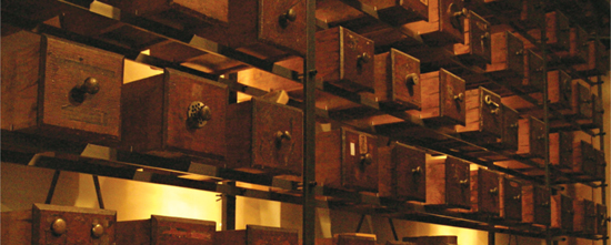
JT: We have 140 drawers from an old hardware store. Each drawer contains one to three found objects: canceled checks, stock certificates, old packaging, old fishing lures, old matchbooks, a mixed bag of anything and everything. When we travel, we always hit up antique stores or flea markets to add to our collections.
JT: The wine project started a long time ago while I was having lunch with a friend. My friend’s uncle was a wine distributor and I was looking for something new to work on. He said we could buy 100 cases of wine, and we could design the label and his uncle would distribute the wine. Because his uncle was in Nevada, we said we could call it Snake Eyes or something that related to casinos and gambling. That idea passed with time, but then we started Hatch and we brought it up again. We started brainstorming names like High Rollers, Snake Eyes, Full House, and Royal Flush.
KJ: Then we thought, let’s put a card on a bottle of white wine so that you can see the back of it through the bottle. We wanted to create our own products and that was the vision when we started Hatch, but it’s tough to find the right product. We got so fired up about this wine. We decided that maybe we were on to something.
Then we partnered with a phenomenal winemaker. It took us to a whole new level where the quality of the wine stands on its own, and when paired with the packaging, it made it really successful.
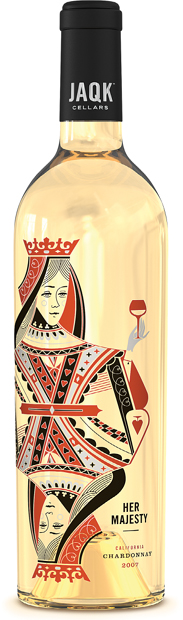
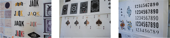
JT: We were going to call our new wine concept High Roller, but then we brought in a writer and he came up with the name JAQK. It was a higher idea of Jack/Ace/Queen/King. It evolved into JAQK Cellars, and the creative started evolving from there.
KJ: It’s an interesting market. We’ve done a lot of work in the wine industry over the years, and we’ve realized how little the big companies spend on brand. We saw the opportunity when we started this because we were just donating our time to our company.
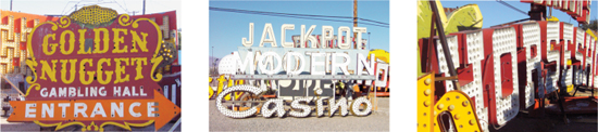
KJ: Through research, we found out how huge poker is—80 million Americans go to Las Vegas every year. We were inspired by the storytelling and tradition of gaming and wanted to incorporate that into our designs.
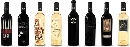
JT: In the wine industry, it’s all about what’s in the bottle. We almost did too good a job with the packaging because of how beautiful it is. Everyone was used to what exists in the industry, so when they saw this beautiful packaging, they thought it might be a gimmick or a novelty.
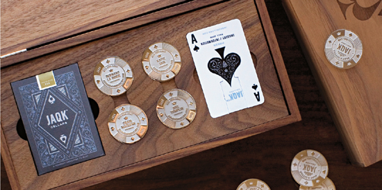
JT: Even our business cards are minted metal poker chips. When we give our cards out to people they say, “Can I keep it?” and we say yes, and then they say, “Thank you.” How often does that happen to you?
JT: As designers, and because we are our own clients, we’ll always be able to evolve the design and do anything we want. For example, we decided we wanted to incorporate real poker chips into the design of our labels, so we did. We even had a custom jig made so that someone could screen-print the poker chips by hand.
KJ: We invited our friends to the warehouse and offered them some wine in one hand and a glue gun in the other hand, and we had a party gluing poker chips to the bottles.
JT: We used top-of-the-line foil and cork. We stamped the end of the cork with different messages so that you have a little surprise when you open the bottle.
KJ: The goal for this company is to prove that you can have high-quality, fine wine and playful, interesting packaging at the same time. People enjoy it before they drink it and enjoy it even more after they try it.
JT: We’ve had tastings, and afterward people ask if they can take the empty bottles home with them. People don’t want to throw them away. Our opportunities for the future are very exciting with line extensions that could make it bigger than just wine.