Figure 2.2. A scattergram of women’s clothing sales versus personal income. Women’s clothing sales (in M$) is on the vertical (Y) axis and personal income (in B$) is on the horizontal (X) axis.
Introduction to Regression Analysis
Chapter 2 Preview
When you have completed reading this chapter you will be able to:
• Understand what simple linear regression equations look like.
• See that you can form a general hypothesis (guess) about a relationship based on your knowledge of the situation being investigated.
• Know how to use a regression equation to make an estimate of the value of the variable you have modeled.
• See that line plots and scattergrams from Excel can be useful in using regression analysis.
• Understand how both time-series and cross-sectional data can be used in regression analysis.
Introduction
Regression analysis is a statistical tool that allows us to describe the way in which one variable is related to another. This description may be a simple one involving just two variables in a single equation, or it may be very complex, having many variables and even many equations, perhaps hundreds of each. From the simplest relationships to the most complex, regression analysis is useful in determining the way in which one variable is affected by one or more other variables. You will start to learn about the formal statistical aspects of regression in chapter 3. However, before looking at formal models we will look at some examples to help you see the usefulness of regression in developing mathematical models.
One Example: Women’s Clothing Sales
A relatively simple kind of model that can be specified using regression analysis is the relationship between some types of retail sales and personal income. We know from marketing and economics that retail sales of most (maybe all) products/services are dependent on the purchasing power of consumers. In the model used here you will see how personal income (a common measure of purchasing power) may influence the retail sales of women’s clothing. The monthly level of women’s clothing sales (in millions of dollars) is hypothesized to be a function of (depend on) the level of personal income (in billions of dollars).
When you construct such a hypothesis, you take the first step in building a model.1 You must define the variables used in the model carefully so that the model can be tested and evaluated in a formal manner. Retail sales of women’s clothing is a clearly defined statistical series that is published regularly, so there is little problem in defining that variable. The same can be said for personal income, which is regularly published in a number of places.2 Both of these variables are examples of ratio data. For both variables, the distance between dollar amounts is constant no matter what the amounts are, and for both zero means the absence of that measure. We do not observe zero for either variable but zero would mean no sales or no income.
Women’s Clothing Sales Data
To develop this model data for women’s clothing sales, data are used starting with January 2000 and continuing through March 2011. Thus, there are 135 values for each variable. Each of these 135 months represents one observation. It is not necessary to have this many observations but since all the calculations are performed in Excel you can use large data sets without any problem.3 A shortened section of the data is shown in Table 2.1. You see that each row represents an observation (24 observations in this shortened data set) and each column represents a variable (the date column plus two variables). It is common in a data file to use the first column for dates when using time-series data or for observation labels when using cross-sectional data. You will see a table of cross-sectional data for the basketball team’s example in Table 2.2.
Table 2.1. Monthly data for women’s clothing sales and personal income (the first two years only, 2000 and 2001)
|
Date |
Women’s clothing sales (M$) |
Personal income(B$) |
|
Jan-00 |
1,683 |
8,313.0 |
|
Feb-00 |
1,993 |
8,385.8 |
|
Mar-00 |
2,673 |
8,440.0 |
|
Apr-00 |
2,709 |
8,470.8 |
|
May-00 |
2,812 |
8,501.3 |
|
Jun-00 |
2,567 |
8,547.6 |
|
Jul-00 |
2,385 |
8,607.7 |
|
Aug-00 |
2,643 |
8,641.3 |
|
Sep-00 |
2,660 |
8,683.6 |
|
Oct-00 |
2,651 |
8,693.6 |
|
Nov-00 |
2,826 |
8,698.0 |
|
Dec-00 |
3,878 |
8,730.4 |
|
Jan-01 |
1,948 |
8,825.6 |
|
Feb-01 |
2,156 |
8,862.0 |
|
Mar-01 |
2,673 |
8,889.4 |
|
Apr-01 |
2,804 |
8,878.4 |
|
May-01 |
2,750 |
8,878.6 |
|
Jun-01 |
2,510 |
8,886.8 |
|
Jul-01 |
2,313 |
8,887.3 |
|
Aug-01 |
2,663 |
8,883.0 |
|
Sep-01 |
2,397 |
8,871.6 |
|
Oct-01 |
2,618 |
8,896.3 |
|
Nov-01 |
2,790 |
8,909.8 |
|
Dec-01 |
3,865 |
8,930.7 |
Source: economagic.com.
Table 2.2. Conferences included in the Data Set, a representative School for Each conference, and values of the variables for those schools
|
Conference |
Team |
Conference win % |
Field goal % |
|
ACC |
Wake Forest |
6.3 |
39.5 |
|
B12 |
Texas |
81.3 |
45.6 |
|
Big East |
Villanova |
50.0 |
43.4 |
|
Big Ten |
Wisconsin |
72.2 |
44.5 |
|
Mountain West |
UNLV |
68.8 |
43.6 |
|
PAC 10 |
Arizona |
77.8 |
46.5 |
|
SEC |
South Carolina |
31.3 |
37.1 |
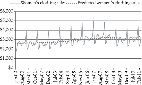
You know from chapter 1 that the data shown in Table 2.1 are called time-series data because they represent values taken over a period of time for each of the variables involved in the model. In our example, the data are monthly time-series data. If you have a value for each variable by quarters, you would have a quarterly time series. Sometimes you might use values on a yearly basis, in which case your data would be an annual time series. The women’s clothing sales data for the entire time period are shown graphically in Figure 2.1.
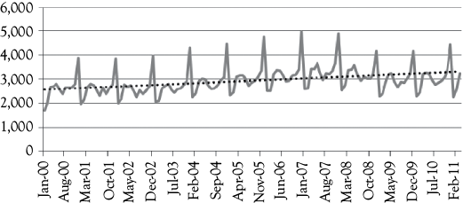
You notice in Figure 2.1 that women’s clothing sales appears to have a seasonal pattern. Note the sharp peaks in the series that occur at regular intervals. These peaks are always in the month of December in each year. This seasonality is due to holiday shopping and gift giving, which you would expect to see for women’s clothing sales. The dotted line added to the graph shows the long-term trend. You see that this trend is positive (slightly upward sloping). This means that over the period shown women’s clothing sales have generally been increasing.
The Relationship Between Women’s Clothing Sales and Income
A type of graph known as a “scattergram” allows for visual feel for the relationship between two variables. In a scattergram, the variable you are trying to model, or predict, is on the vertical (Y) axis (women’s clothing sales) and the variable that you are using to help make a good prediction is on the horizontal (X) axis (personal income). Figure 2.2 shows the scattergram for this example.
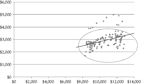
You see that as income increases women’s clothing sales also appear to increase. The solid line through the scatter of points illustrates this relationship. The majority of the observations lie within the oval represented by the dotted line. However, you do see some values that stand out above the oval. The relatively regular pattern of these observations that are outside the oval again suggest that there is seasonality in women’s clothing sales.
Based on business/economic reasoning you might hypothesize that women’s clothing sales would be related to the level of personal income. You would expect that as personal income increases sales would also increase. Such reasoning is certainly consistent with what you see in Figure 2.2. To state this relationship mathematically, you might write
![]()
where WCS represents women’s clothing sales (measured in millions of dollars) and PI represents personal income (measured in billions of dollars). The business/economic assumption (or hypothesis) is that PI is influential in determining the level of WCS. For this reason, WCS is referred to as the dependent variable, while PI is the independent, or explanatory, variable.
On the basis of the scatterplot in Figure 2.2, you might want to see whether a linear equation might fit these data well. You might be specific in writing the mathematical model as:

In the second form, you not only are hypothesizing that there is some functional relationship between WCS and PI but you are also stating that you expect the relationship to be linear. The obvious question you have now is: What are the appropriate values of a and b? Once you know these values, you will have made the model very specific. You can find the appropriate values for a and b using regression analysis.
Regression Results for Women’s Clothing Sales
Using regression analysis for these data, you get the following mathematical relationship between women’s clothing sales and personal income:
![]()
If you put a value for personal income into this equation, you get an estimate of women’s clothing sales for that level of personal income. Suppose that you want to estimate the dollar amount of women’s clothing sales if personal income is 9,000 (billion dollars). You would have:

Thus, your estimate of woman’s clothing sales if personal income is 9,000 (billion dollars) is $2,672.123 (million dollars) or $2,672,123,000.
If you were to put all 135 observations of personal income from the data into the equation above you would see how well this model does in predicting women’s clothing sales at each of those income levels. You would find that personal income has a significant impact on women’s clothing sales but that this model only explains about 17% of all the variation in women’s clothing sales. It is likely that there are other variables that also have an influence on women’s clothing sales. In chapter 6, you will see that unemployment rate will be of some help in explaining more of the variation in those sales.
Figure 2.3 shows a graphic representation of the actual value of sales for each month along with the values predicted by the simple model used in this chapter. You see that this model fails to account for the seasonal peaks in the data. In chapter 8, you will learn about a method to include the seasonality in the model and you will get much better predictions of monthly women’s clothing sales. You will find that it is difficult to do a good job of modeling any business/economic activity using just one causal factor. However, using one causal variable is a good starting point to learn about regression analysis.
The simple model [WCS = 1,187.123 + 0.165(PI)] shows how women’s clothing sales are related to personal income. Clearly, this model can be improved upon.
Another Example: Conference Winning Percentagefor College Basketball Teams
What should a college basketball coach focus on when trying to put together a winning team? Given what many big time college basketball coaches earn this is indeed a “million dollar” question. You may have seen the movie MONEYBALL in which “Data Analysis”was used to help a baseball team (the Oakland Athletics) improve their ability to win even though they had a low budget compared with other teams, such as the New York Yankees.4 In the book and the movie, which was based on a real life situation, “Data Analysis” did indeed prove successful. The type of “Data Analysis” used in MONEYBALL was more advanced than regression analysis, but regression analysis is a good starting point and is the basis upon which the more advanced analyses are built.
Basketball Winning Percentage Data
Based on the basketball teams’ data described in chapter 1 you can create models using Excel to predict the WP for college teams in the conferences represented in the data. Certainly, one factor you might think of as being important is the ability to make shots. From observing games, you could calculate the percentage of field goal (FG), attempts that are successful. Such data are available on the Internet (see StatSheet at http://statsheet.com/mcb). Using these data, you can estimate the relationship between WP and percentage of FG made.
The data used in this example are cross-sectional data because the data are all for the same season based on the results for 82 basketball teams from 7 major collegiate basketball conferences. The conferences, a sample of schools, and the two variables for those schools are shown in Table 2.2.
The range of WPs used for the schools was from 5.6% to 88.9%. DePaul (5.6%) happened to have a bad conference year and Ohio state (88.9%) had a very good year. In that year, DePaul averaged 41.2% in FG percentage while Ohio state averaged 50%.
The Basketball Winning Percentage Regression Model
You might guess (hypothesize) that WP is determined, at least in part, by the percentage of FG a team makes. Thus, you think perhaps:

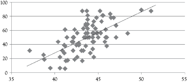
The scatterplot in Figure 2.4 helps you to see this relationship. As indicated by the dotted line through the observations, it appears that WPs are associated with higher percentages of FGs made. The equation for this relationship is obtained by using regression in Excel:
![]()
You see that there is a positive relationship between WP in conference games and the percentage of FGs completed. In fact, more detailed analysis of the results shows that about 40% of the variation in WP is explained by FG percentage. To a coach this probably seems obvious, but the analysis does provide support for using practice time to work on successful shooting of FGs.
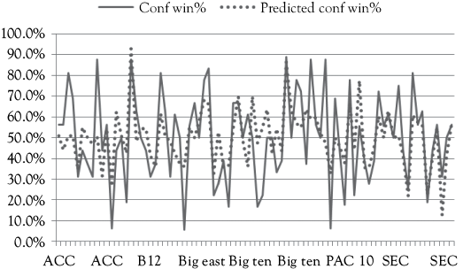
In Figure 2.5, you see a graph which shows how well this regression model actually fits the original data. In this graph, the teams are arranged in conferences starting with the ACC and ending with the SEC. The solid line represents the actual WPs and the dotted line represents the WPs that would be predicted by the regression equation. While there are some big gaps overall it is not a bad model.
If you put a value of FG percentage into this equation you get an estimate of the team’s WP for the season. Suppose that you want to estimate a team’s WP if their FG percentage is 45%. You get:

Thus, your estimate of a team’s WP in their conference games if they make 45% of their FG attempts would be 57.9%.
A Warning About Applying a Regression Model
You should only use a regression model for values of the variables that are within, or close to being within, the range of values in your data set. Consider the basketball team’s WP example. In the sample of data used to develop the regression model, the lowest FG goal percentage was 37.1% and the highest was 51.1%. Now suppose that you tried to estimate the conference WP of a team that had a FG success rate of 80%. You would get the following result:
![]()
This would mean that this team would be predicted to win 257.7% of their games. This is clearly not possible. There are advanced forms of regression analysis that can constrain predictions to be no more than 100%. However, the most common type of regression analysis cannot do so. Thus, you need to be careful to only apply regression results within the scope of the data used to estimate your equation. The most common type of regression is called “ordinary least squares regression,” which was used in this chapter and about which you will learn more in the next chapter.
Summary and Looking Ahead
In this chapter, you have started to get some feel for what regression analysis is all about. The examples should be viewed with a little skepticism because the models have not been evaluated to determine how good and how reasonable they really are. Nor have you learned how Excel gets the equations you have seen. In the next chapter, you will learn more about the statistical foundations of regression analysis. Then as you read through the rest of the book, you will build on your knowledge and understanding in each successive chapter. You will see how to evaluate regression models and how to expand beyond the use of one causal variable (such as personal income and FG percentage).
What You Have Learned in Chapter 2
• You understand what simple linear regression equations look like.
• You see that you can form a general hypothesis (guess) about a relationship based on your knowledge of the situation being investigated.
• You know how to use a regression equation to make an estimate of the value of the variable you have modeled.
• You see that line plots and scattergrams from Excel can be useful in using regression analysis
• You understand how both time-series and cross-sectional data can be used in regression analysis.
• You know to only apply a regression model for data within, or close to, the observations used to develop the model
NOTES
2 The data used in this example come from the economagic.com web site.
3 One rule of thumb for the number of observations (sample size) is to have 10 times the number of independent (causal) variables. So, if you want to model sales as a function of income, the unemployment rate, and an interest rate you would need 30 observations (10×3). There is a mathematical constraint but it is not usually relevant for business applications.
4 You may also read the book MONEYBALL, by Michael Lewis.

