Overview of Oneway Analysis
A one-way analysis of variance tests for differences between group means. The total variability in the response is partitioned into two parts: within-group variability and between-group variability. If the between-group variability is large relative to the within-group variability, then the differences between the group means are considered to be significant.
Example of Oneway Analysis
This example uses the Analgesics.jmp sample data table. Thirty-three subjects were administered three different types of analgesics (A, B, and C). The subjects were asked to rate their pain levels on a sliding scale. You want to find out if the means for A, B, and C are significantly different.
1. Open the Analgesics.jmp sample data table.
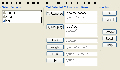
2. Select Analyze > Fit Y by X.
3. Select pain and click Y, Response.
4. Select drug and click X, Factor.
5. Click OK.
Figure 6.2 Example of Oneway Analysis
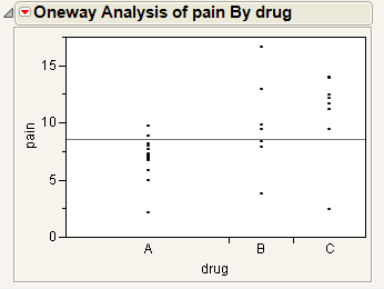
You notice that one drug (A) has consistently lower scores than the other drugs. You also notice that the x-axis ticks are unequally spaced. The length between the ticks is proportional to the number of scores (observations) for each drug.
Perform an analysis of variance on the data.
6. From the red triangle menu for Oneway Analysis, select Means/Anova.
Note: If the X factor has only two levels, the Means/Anova option appears as Means/Anova/Pooled t, and adds a pooled t-test report to the report window.
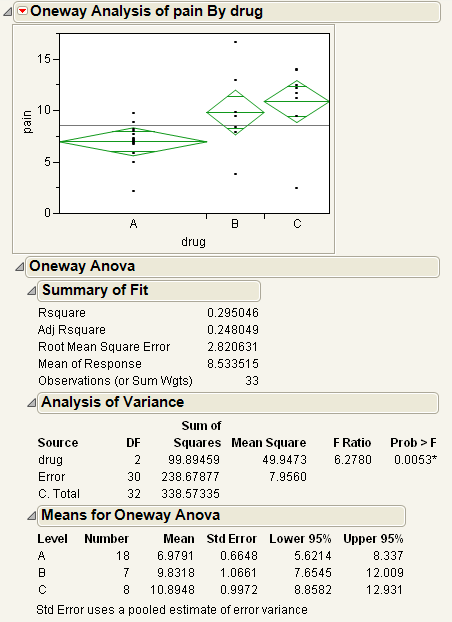
Figure 6.3 Example of the Means/Anova Option
Note the following observations:
• Mean diamonds representing confidence intervals appear.
‒ The line near the center of each diamond represents the group mean. At a glance, you can see that the mean for each drug looks significantly different.
‒ The vertical span of each diamond represents the 95% confidence interval for the mean of each group.
• The Summary of Fit table provides overall summary information about the analysis.
• The Analysis of Variance report shows the standard anova information. You notice that the Prob > F (the p-value) is 0.0053, which supports your visual conclusion that there are significant differences between the drugs.
• The Means for Oneway Anova report shows the mean, sample size, and standard error for each level of the categorical factor.
Launch the Oneway Platform
You can perform a Oneway analysis using either the Fit Y by X platform or the Oneway platform. The two approaches are equivalent.
• To launch the Fit Y by X platform, select Analyze > Fit Y by X.
or
• To launch the Oneway platform, from the JMP Starter window, click on the Basic category and click Oneway.
Figure 6.4 The Oneway Launch Window
For more information about this launch window, see “Introduction to Fit Y by X” chapter.
The Oneway Plot
The Oneway plot shows the response points for each X factor value. You can compare the distribution of the response across the levels of the X factor. The distinct values of X are sometimes called levels.
Replace variables in the plot in one of two ways: swap existing variables by dragging and dropping a variable from one axis to the other axis; or, click on a variable in the Columns panel of the associated data table and drag it onto an axis.
You can add reports, additional plots, and tests to the report window using the options in the red triangle menu for Oneway Analysis. See “Oneway Platform Options”.
To produce the plot shown in Figure 6.5, follow the instructions in “Example of Oneway Analysis”.
Figure 6.5 The Oneway Plot
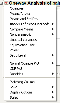
Oneway Platform Options
Note: The Fit Group menu appears if you have specified multiple Y variables. Menu options allow you to arrange reports or order them by RSquare. See the Fitting Linear Models book for more information.
Figure 6.6 shows an example of the platform options in the red triangle menu for Oneway Analysis.
Figure 6.6 Example of Oneway Platform Options
When you select a platform option, objects might be added to the plot, and a report is added to the report window.
|
Platform Option
|
Object Added to Plot
|
Report Added to Report Window
|
|
Quantiles
|
Box plots
|
Quantiles report
|
|
Means/Anova
|
Mean diamonds
|
Oneway anova reports
|
|
Means and Std Dev
|
Mean lines, error bars, and standard deviation lines
|
Means and Std Deviations report
|
|
Compare Means
|
Comparison circles
(except Nonparametric Multiple Comparisons option)
|
Means Comparison reports
|
The following table describes all of the platform options in the red triangle menu for Oneway Analysis. Some options might not appear unless specific conditions are met.
|
Quantiles
|
Lists the following quantiles for each group:
• 0% (Minimum)
• 10%
• 25%
• 50% (Median)
• 75%
• 90%
• 100% (Maximum)
Activates Box Plots from the Display Options menu.
See “Quantiles”.
|
|
Means/Anova
or
Means/Anova/Pooled t
|
Fits means for each group and performs a one-way analysis of variance to test if there are differences among the means. See “Means/Anova and Means/Anova/Pooled t”.
The Means/Anova/Pooled t option appears only if the X factor has two levels.
|
|
Means and Std Dev
|
Gives summary statistics for each group. The standard errors for the means use individual group standard deviations rather than the pooled estimate of the standard deviation.
The plot now contains mean lines, error bars, and standard deviation lines. For a brief description of these elements, see “Display Options”. For more details about these elements, see “Mean Lines, Error Bars, and Standard Deviation Lines”.
|
|
t test
|
Produces a t-test report assuming that the variances are not equal. See “The t-test Report”.
This option appears only if the X factor has two levels.
|
|
Analysis of Means Methods
|
Provides four commands for performing Analysis of Means (ANOM) procedures. There are commands for comparing both means and variances. See “Analysis of Means Methods”.
|
|
Compare Means
|
Provides multiple-comparison methods for comparing sets of group means. See “Compare Means”.
|
|
Nonparametric
|
Provides nonparametric comparisons of group means. See “Nonparametric”.
|
|
Unequal Variances
|
Performs four tests for equality of group variances. Also gives the Welch test, which is an anova test for comparing means when the variances within groups are not equal. See “Unequal Variances”.
|
|
Equivalence Test
|
Tests that a difference is less than a threshold value. See “Equivalence Test”.
|
|
Power
|
Provides calculations of statistical power and other details about a given hypothesis test. See “Power”.
The Power Details window and reports also appear within the Fit Model platform. For further discussion and examples of power calculations, see the Fitting Linear Models book.
|
|
Set a Level
|
You can select an option from the most common alpha levels or specify any level with the Other selection. Changing the alpha level results in the following actions:
• recalculates confidence limits
• adjusts the mean diamonds on the plot (if they are showing)
• modifies the upper and lower confidence level values in reports
• changes the critical number and comparison circles for all Compare Means reports
• changes the critical number for all Nonparametric Multiple Comparison reports
|
|
Normal Quantile Plot
|
Provides the following options for plotting the quantiles of the data in each group:
• Plot Actual by Quantile generates a quantile plot with the response variable on the y-axis and quantiles on the x-axis. The plot shows quantiles computed within each level of the categorical X factor.
• Plot Quantile by Actual reverses the x- and y-axes.
• Line of Fit draws straight diagonal reference lines on the plot for each level of the X variable. This option is available only once you have created a plot (Actual by Quantile or Quantile by Actual).
|
|
CDF Plot
|
Plots the cumulative distribution function for all of the groups in the Oneway report. See “CDF Plot”.
|
|
Densities
|
Compares densities across groups. See “Densities”.
|
|
Matching Column
|
Specify a matching variable to perform a matching model analysis. Use this option when the data in your Oneway analysis comes from matched (paired) data, such as when observations in different groups come from the same subject.
The plot now contains matching lines that connect the matching points.
See “Matching Column”.
|
|
Save
|
Saves the following quantities as new columns in the current data table:
• Save Residuals saves values computed as the response variable minus the mean of the response variable within each level of the factor variable.
• Save Standardized saves standardized values of the response variable computed within each level of the factor variable. This is the centered response divided by the standard deviation within each level.
• Save Normal Quantiles saves normal quantile values computed within each level of the categorical factor variable.
• Save Predicted saves the predicted mean of the response variable for each level of the factor variable.
|
|
Display Options
|
Adds or removes elements from the plot. See “Display Options”.
|
|
Script
|
This menu contains options that are available to all platforms. They enable you to redo the analysis or save the JSL commands for the analysis to a window or a file. For more information, see Using JMP.
|
Display Options
Using Display Options, you can add or remove elements from a plot. Some options might not appear unless they are relevant.
|
All Graphs
|
Shows or hides all graphs.
|
|
Points
|
Shows or hides data points on the plot.
|
|
Box Plots
|
Shows or hides outlier box plots for each group.
|
|
Mean Diamonds
|
Draws a horizontal line through the mean of each group proportional to its x-axis. The top and bottom points of the mean diamond show the upper and lower 95% confidence points for each group. See “Mean Diamonds and X-Axis Proportional”.
|
|
Mean Lines
|
Draws a line at the mean of each group. See “Mean Lines, Error Bars, and Standard Deviation Lines”.
|
|
Mean CI Lines
|
Draws lines at the upper and lower 95% confidence levels for each group.
|
|
Mean Error Bars
|
Identifies the mean of each group and shows error bars one standard error above and below the mean. See “Mean Lines, Error Bars, and Standard Deviation Lines”.
|
|
Grand Mean
|
Draws the overall mean of the Y variable on the plot.
|
|
Std Dev Lines
|
Shows lines one standard deviation above and below the mean of each group. See “Mean Lines, Error Bars, and Standard Deviation Lines”.
|
|
Comparison Circles
|
Shows or hides comparison circles. This option is available only when one of the Compare Means options is selected. See “Statistical Details for Comparison Circles”.
|
|
Connect Means
|
Connects the group means with a straight line.
|
|
Mean of Means
|
Draws a line at the mean of the group means.
|
|
X-Axis proportional
|
Makes the spacing on the x-axis proportional to the sample size of each level. See “Mean Diamonds and X-Axis Proportional”.
|
|
Points Spread
|
Spreads points over the width of the interval
|
|
Points Jittered
|
Adds small spaces between points that overlay on the same y value. The horizontal adjustment of points varies from 0.375 to 0.625 with a 4*(Uniform-0.5)5 distribution.
|
|
Matching Lines
|
(Only appears when the Matching Column option is selected.) Connects matching points.
|
|
Matching Dotted Lines
|
Only appears when the Matching Column option is selected.) Draws dotted lines to connect cell means from missing cells in the table. The values used as the endpoints of the lines are obtained using a two-way anova model.
|
|
Histograms
|
Draws side-by-side histograms to the right of the original plot.
|
Quantiles
The Quantiles report lists selected percentiles for each level of the X factor variable. The median is the 50th percentile, and the 25th and 75th percentiles are called the quartiles.
The Quantiles option adds the following elements to the plot:
• the grand mean representing the overall mean of the Y variable
• outlier box plots summarizing the distribution of points at each factor level
Figure 6.7 Outlier Box Plot and Grand Mean
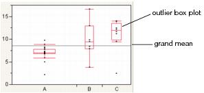
Note: To hide these elements, click the red triangle next to Oneway Analysis and select Display Options > Box Plots or Grand Mean.
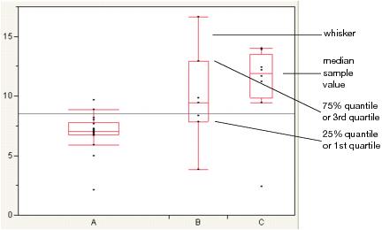
Outlier Box Plots
The outlier box plot is a graphical summary of the distribution of data. Note the following aspects about outlier box plots (see Figure 6.8):
• The vertical line within the box represents the median sample value.
• The ends of the box represent the 75th and 25th quantiles, also expressed as the 3rd and 1st quartile, respectively.
• The difference between the 1st and 3rd quartiles is called the interquartile range.
• Each box has lines, sometimes called whiskers, that extend from each end. The whiskers extend from the ends of the box to the outermost data point that falls within the distances computed as follows:
3rd quartile + 1.5*(interquartile range)
1st quartile - 1.5*(interquartile range)
If the data points do not reach the computed ranges, then the whiskers are determined by the upper and lower data point values (not including outliers).
Figure 6.8 Examples of Outlier Box Plots
Means/Anova and Means/Anova/Pooled t
The Means/Anova option performs an analysis of variance. If the X factor contains exactly two levels, this option appears as Means/Anova/Pooled t. In addition to the other reports, a t-test report assuming pooled (or equal) variances appears.
|
Element
|
Reference
|
|
Mean diamonds are added to the Oneway plot
|
|
|
Reports
|
|
|
See “The t-test Report”.
Note: This report appears only if the Means/Anova/Pooled t option is selected.
|
|
|
Note: This report appears only if you have specified a Block variable in the launch window.
|
The Summary of Fit Report
The Summary of Fit report shows a summary for a one-way analysis of variance.
The report lists the following quantities:
|
Rsquare
|
Measures the proportion of the variation accounted for by fitting means to each factor level. The remaining variation is attributed to random error. The R2 value is 1 if fitting the group means accounts for all the variation with no error. An R2 of 0 indicates that the fit serves no better as a prediction model than the overall response mean. For more information, see “Statistical Details for the Summary of Fit Report”.
R2 is also called the coefficient of determination.
|
|
Adj Rsquare
|
Adjusts R2 to make it more comparable over models with different numbers of parameters by using the degrees of freedom in its computation. For more information, see “Statistical Details for the Summary of Fit Report”.
|
|
Root Mean Square Error
|
Estimates the standard deviation of the random error. It is the square root of the mean square for Error found in the Analysis of Variance report.
|
|
Mean of Response
|
Overall mean (arithmetic average) of the response variable.
|
|
Observations (or Sum Wgts)
|
Number of observations used in estimating the fit. If weights are used, this is the sum of the weights.
|
The t-test Report
Note: This option is applicable only for the Means/Anova/Pooled t option.
There are two types of t-Tests:
• Equal variances. If you select the Means/Anova/Pooled t option, a t-Test report appears. This t-Test assumes equal variances.
• Unequal variances. If you select the t-Test option from the red triangle menu, a t-Test report appears. This t-Test assumes unequal variances.
The report shows the following information:
|
t Test plot
|
Shows the sampling distribution of the difference in the means, assuming the null hypothesis is true. The vertical red line is the actual difference in the means. The shaded areas correspond to the p-values.
|
|
Difference
|
Shows the estimated difference between the two X levels. In the plots, the Difference value appears as a red line that compares the two levels.
|
|
Std Err Dif
|
Shows the standard error of the difference.
|
|
Upper CL Dif
|
Shows the upper confidence limit for the difference.
|
|
Lower CL Dif
|
Shows the lower confidence limit for the difference.
|
|
Confidence
|
Shows the level of confidence (1-alpha). To change the level of confidence, select a new alpha level from the Set α Level command from the platform red triangle menu.
|
|
t Ratio
|
Value of the t-statistic.
|
|
DF
|
The degrees of freedom used in the t-test.
|
|
Prob > |t|
|
The p-value associated with a two-tailed test.
|
|
Prob > t
|
The p-value associated with a lower-tailed test.
|
|
Prob < t
|
The p-value associated with an upper-tailed test.
|
The Analysis of Variance Report
The Analysis of Variance report partitions the total variation of a sample into two components. The ratio of the two mean squares forms the F ratio. If the probability associated with the F ratio is small, then the model is a better fit statistically than the overall response mean.
Note: If you specified a Block column, then the Analysis of Variance report includes the Block variable.
The Analysis of Variance report shows the following information:
|
Source
|
Lists the three sources of variation, which are the model source, Error, and C. Total (corrected total).
|
|
DF
|
Records an associated degrees of freedom (DF for short) for each source of variation:
• The degrees of freedom for C. Total are N - 1, where N is the total number of observations used in the analysis.
• If the X factor has k levels, then the model has k - 1 degrees of freedom.
The Error degrees of freedom is the difference between the C. Total degrees of freedom and the Model degrees of freedom (in other words, N - k).
|
|
Sum of Squares
|
Records a sum of squares (SS for short) for each source of variation:
• The total (C. Total) sum of squares of each response from the overall response mean. The C. Total sum of squares is the base model used for comparison with all other models.
• The sum of squared distances from each point to its respective group mean. This is the remaining unexplained Error (residual) SS after fitting the analysis of variance model.
The total SS minus the error SS gives the sum of squares attributed to the model. This tells you how much of the total variation is explained by the model.
|
|
Mean Square
|
Is a sum of squares divided by its associated degrees of freedom:
• The Model mean square estimates the variance of the error, but only under the hypothesis that the group means are equal.
• The Error mean square estimates the variance of the error term independently of the model mean square and is unconditioned by any model hypothesis.
|
|
F Ratio
|
Model mean square divided by the error mean square. If the hypothesis that the group means are equal (there is no real difference between them) is true, then both the mean square for error and the mean square for model estimate the error variance. Their ratio has an F distribution. If the analysis of variance model results in a significant reduction of variation from the total, the F ratio is higher than expected.
|
|
Prob>F
|
Probability of obtaining (by chance alone) an F value greater than the one calculated if, in reality, there is no difference in the population group means. Observed significance probabilities of 0.05 or less are often considered evidence that there are differences in the group means.
|
The Means for Oneway Anova Report
The Means for Oneway Anova report summarizes response information for each level of the nominal or ordinal factor.
The Means for Oneway Anova report shows the following information:
|
Level
|
Lists the levels of the X variable.
|
|
Number
|
Lists the number of observations in each group.
|
|
Mean
|
Lists the mean of each group.
|
|
Std Error
|
Lists the estimates of the standard deviations for the group means. This standard error is estimated assuming that the variance of the response is the same in each level. It is the root mean square error found in the Summary of Fit report divided by the square root of the number of values used to compute the group mean.
|
|
Lower 95% and Upper 95%
|
Lists the lower and upper 95% confidence interval for the group means.
|
The Block Means Report
If you have specified a Block variable on the launch window, the Means/Anova and Means/Anova/Pooled t commands produce a Block Means report. This report shows the means for each block and the number of observations in each block.
Mean Diamonds and X-Axis Proportional
A mean diamond illustrates a sample mean and confidence interval.
Figure 6.9 Examples of Mean Diamonds and X-Axis Proportional Options
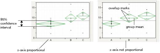
Note the following observations:
• The top and bottom of each diamond represent the (1-alpha)x100 confidence interval for each group. The confidence interval computation assumes that the variances are equal across observations. Therefore, the height of the diamond is proportional to the reciprocal of the square root of the number of observations in the group.
• If the X-Axis proportional option is selected, the horizontal extent of each group along the x-axis (the horizontal size of the diamond) is proportional to the sample size for each level of the X variable. Therefore, the narrower diamonds are usually taller, because fewer data points results in a wider confidence interval.
• The mean line across the middle of each diamond represents the group mean.
• Overlap marks appear as lines above and below the group mean. For groups with equal sample sizes, overlapping marks indicate that the two group means are not significantly different at the given confidence level. Overlap marks are computed as group mean ±  . Overlap marks in one diamond that are closer to the mean of another diamond than that diamond’s overlap marks indicate that those two groups are not different at the given confidence level.
• The mean diamonds automatically appear when you select the Means/Anova/Pooled t or Means/Anova option from the platform menu. However, you can show or hide them at any time by selecting Display Options > Mean Diamonds from the red triangle menu.
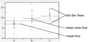
Mean Lines, Error Bars, and Standard Deviation Lines
Show mean lines by selecting Display Options > Mean Lines. Mean lines indicate the mean of the response for each level of the X variable.
Mean error bars and standard deviation lines appear when you select the Means and Std Dev option from the red triangle menu. See Figure 6.10. To turn each option on or off singly, select Display Options > Mean Error Bars or Std Dev Lines.
Figure 6.10 Mean Lines, Mean Error Bars, and Std Dev Lines
Analysis of Means Methods
Note: For a description of ANOM methods, see the document by Nelson, Wludyka, and Copeland (2005). For a description of the specific ANOM for Variances method, see the paper by Wludyka and Nelson (1997).
Analysis of means (ANOM) methods compare means and variances across several groups. You might want to use these methods under these circumstances:
• if you want to test whether any of the group means are statistically different from the overall mean
• if you want to test whether any of the group standard deviations are statistically different from the root mean square error (RMSE)
Note: Within the Contingency platform, you can use the Analysis of Means for Proportions when the response has two categories. For details, see the “Contingency Analysis” chapter.
Compare Means
Use the ANOM and ANOM with Transformed Ranks options to compare group means to the overall mean.
|
ANOM
|
Compares group means to the overall mean. This method assumes that your data is approximately normally distributed. See “Example of an Analysis of Means Chart”.
|
|
ANOM with Transformed Ranks
|
This is the nonparametric version of the ANOM analysis. Use this method if your data is clearly non-normal and cannot be transformed to normality. Compares each group mean transformed rank to the overall mean transformed rank.
|
Compare Standard Deviations (or Variances)
Use the ANOM for Variances and ANOM for Variances with Levene (ADM) options to compare group standard deviations to the root mean square error. This is a type of variance heterogeneity test.
|
ANOM for Variances
|
Compares group standard deviations to the root mean square error. This method assumes that your data is approximately normally distributed. To use this method, each group must have at least four observations. See “Example of an Analysis of Means for Variances Chart”.
|
|
ANOM for Variances with Levene (ADM)
|
This is the nonparametric version of the ANOM for Variances analysis. Use this method if you suspect your data is non-normal and cannot be transformed to normality. Compares the group means of the absolute deviation from the median (ADM) to the overall mean ADM.
|
Analysis of Means Charts
Each Analysis of Means Methods option adds a chart to the report window, that shows the following:
• a center line indicating the overall mean or root mean square error (or MSE when in variance scale)
• upper decision limits (UDL)
• lower decision limits (LDL)
If a group mean falls outside of the decision limits, then that mean is significantly different from the overall mean. If a group standard deviation falls outside of the decision limits, then that standard deviation is significantly different from the root mean square error.
Analysis of Means Options
Each Analysis of Means Methods option adds an Analysis of Means red triangle menu to the report window.
|
Set Alpha Level
|
Select an option from the most common alpha levels or specify any level with the Other selection. Changing the alpha level modifies the upper and lower decision limits.
|
|
Show Summary Report
|
For ANOM, creates a report showing group means and decision limits.
• For ANOM with Transformed Ranks, creates a report showing group mean transformed ranks and decision limits.
• For ANOM for Variances, creates a report showing group standard deviations (or variances) and decision limits.
• For ANOM for Variances with Levene (ADM), creates a report showing group mean ADMs and decision limits.
|
|
Graph in Variance Scale
|
(Only for ANOM for Variances) Changes the scale of the y-axis from standard deviations to variances.
|
|
Display Options
|
Display options include the following:
• Show Decision Limits shows or hides decision limit lines.
• Show Decision Limit Shading shows or hides decision limit shading.
• Show Center Line shows or hides the center line statistic.
• Show Needles shows or hides the needles.
|
Compare Means
Note: Another method for comparing means is ANOM. See “Analysis of Means Methods”.
Use the Compare Means options to perform multiple comparisons of group means. All of these methods use pooled variance estimates for the means. Each Compare Means option adds comparison circles next to the plot and specific reports to the report window. For details about comparison circles, see “Using Comparison Circles”.
|
Option
|
Description
|
Reference
|
Nonparametric Menu Option
|
|
Each Pair, Student’s t
|
Computes individual pairwise comparisons using Student’s t-tests. If you make many pairwise tests, there is no protection across the inferences. Therefore, the alpha-size (Type I error rate) across the hypothesis tests is higher than that for individual tests.
|
Nonparametric > Nonparametric Multiple Comparisons > Wilcoxon Each Pair
|
|
|
All Pairs, Tukey HSD
|
Shows a test that is sized for all differences among the means. This is the Tukey or Tukey-Kramer HSD (honestly significant difference) test. (Tukey 1953, Kramer 1956). This test is an exact alpha-level test if the sample sizes are the same, and conservative if the sample sizes are different (Hayter 1984).
|
Nonparametric > Nonparametric Multiple Comparisons > Steel-Dwass All Pairs
|
|
|
With Best, Hsu MCB
|
Tests whether the means are less than the unknown maximum or greater than the unknown minimum. This is the Hsu MCB test (Hsu 1981).
|
See “With Best, Hsu MCB”.
|
none
|
|
With Control, Dunnett’s
|
Tests whether the means are different from the mean of a control group. This is Dunnett’s test (Dunnett 1955).
|
Nonparametric > Nonparametric Multiple Comparisons > Steel With Control
|
Note: If you have specified a Block column, then the multiple comparison methods are performed on data that has been adjusted for the Block means.
Using Comparison Circles
Each multiple comparison test begins with a comparison circles plot, which is a visual representation of group mean comparisons. Figure 6.11 shows the comparison circles for the All Pairs, Tukey HSD method. Other comparison tests lengthen or shorten the radii of the circles.
Figure 6.11 Visual Comparison of Group Means
Compare each pair of group means visually by examining the intersection of the comparison circles. The outside angle of intersection tells you whether the group means are significantly different. See Figure 6.12.
• Circles for means that are significantly different either do not intersect, or intersect slightly, so that the outside angle of intersection is less than 90 degrees.
• If the circles intersect by an angle of more than 90 degrees, or if they are nested, the means are not significantly different.
Figure 6.12 Angles of Intersection and Significance
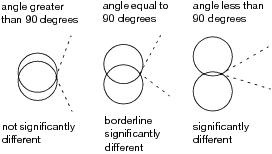
If the intersection angle is close to 90 degrees, you can verify whether the means are significantly different by clicking on the comparison circle to select it. See Figure 6.13. To deselect circles, click in the white space outside the circles.
Figure 6.13 Highlighting Comparison Circles
Each Pair, Student’s t
The Each Pair, Student’s t test shows the Student’s t-test for each pair of group levels and tests only individual comparisons.
All Pairs, Tukey HSD
The All Pairs, Tukey HSD test (also called Tukey-Kramer) protects the significance tests of all combinations of pairs, and the HSD intervals become greater than the Student’s t pairwise LSDs. Graphically, the comparison circles become larger and differences are less significant.
The Q statistic is calculated as follows: q* = (1/sqrt(2)) * q where q is the required percentile of the studentized range distribution. For more details, see the description of the T statistic by Neter, Wasserman, and Kutner (1990).
With Best, Hsu MCB
The With Best, Hsu MCB test determines whether a mean can be rejected as the maximum or minimum among the means. The Hsu’s MCB test is given for each level versus the maximum, and each level versus the minimum.
The quantile that scales the LSD is not the same for each level. Therefore, the comparison circles technique does not work as well, because the circles must be rescaled according to the level being tested (unless the sample sizes are equal). The comparison circles plot uses the largest quantiles value shown to make the circles. Use the p-values of the tests to obtain precise assessments of significant differences.
Note the following:
• If a mean has means significantly separated above it, it is not regarded as the maximum.
• If a mean has means significantly separated below it, it is not regarded as the minimum.
• If a mean is significantly separated above all other means, it is regarded as the maximum.
• If a mean is significantly separated below all other means, it is regarded as the minimum.
Note: Means that are not regarded as the maximum or the minimum by MCB are also the means that are not contained in the selected subset of Gupta (1965) of potential maximums or minimum means.
For the maximum report, a column shows the row mean minus the column mean minus the LSD. If a value is positive, the row mean is significantly higher than the mean for the column, and the mean for the column is not the maximum.
For the minimum report, a column shows the row mean minus the column mean plus the LSD. If a value is negative, the row mean is significantly less than the mean for the column, and the mean for the column is not the minimum.
With Control, Dunnett’s
The With Control, Dunnett’s test compares a set of means against the mean of a control group. The LSDs that it produces are between the Student’s t and Tukey-Kramer LSDs, because they are sized to refrain from an intermediate number of comparisons.
In the Dunnett’s report, the  quantile appears, and can be used in a manner similar to a Student’s t-statistic. The LSD threshold matrix shows the absolute value of the difference minus the LSD. If a value is positive, its mean is more than the LSD apart from the control group mean and is therefore significantly different.
Compare Means Options
The Means Comparisons reports for all four tests contain a red triangle menu with customization options.
|
Difference Matrix
|
Shows a table of all differences of means.
|
|
Confidence Quantile
|
Shows the t-value or other corresponding quantiles used for confidence intervals.
|
|
LSD Threshold Matrix
|
Shows a matrix showing if a difference exceeds the least significant difference for all comparisons.
Note: For Hsu’s MCB and Dunnett’s test, only Difference Matrix, Confidence Quantile, and LSD Threshold Matrix are applicable.
|
|
Connecting Letters Report
|
Shows the traditional letter-coded report where means that are not sharing a letter are significantly different.
|
|
Ordered Differences Report
|
Shows all the positive-side differences with their confidence interval in sorted order. For the Student’s t and Tukey-Kramer comparisons, an Ordered Difference report appears below the text reports.
This report shows the ranked differences, from highest to lowest, with a confidence interval band overlaid on the plot. Confidence intervals that do not fully contain their corresponding bar are significantly different from each other.
|
|
Detailed Comparisons Report
|
Shows a detailed report for each comparison. Each section shows the difference between the levels, standard error and confidence intervals, t-ratios, p-values, and degrees of freedom. A plot illustrating the comparison appears on the right of each report.
This option is not available for All Pairs, Tukey’s HSD, and Nonparametric Multiple Comparisons.
|
Nonparametric
Nonparametric tests are useful for testing whether group means or medians are located the same across groups. However, the usual analysis of variance assumption of normality is not made. Nonparametric tests use functions of the response ranks, called rank scores (Hajek 1969).
Note: If you have specified a Block column, then the nonparametric tests are performed on data that has been adjusted for the Block means.
|
Wilcoxon Test1
|
Performs the test based on Wilcoxon rank scores. The Wilcoxon rank scores are the simple ranks of the data. The Wilcoxon test is the most powerful rank test for errors with logistic distributions. If the factor has two or more levels, the Kruskal-Wallis test is performed.
The Wilcoxon test is also called the Mann-Whitney test.
|
|
Median Test
|
Performs the test based on Median rank scores. The Median rank scores are either 1 or 0, depending on whether a rank is above or below the median rank. The Median test is the most powerful rank test for errors with double-exponential distributions.
|
|
van der Waerden Test
|
Performs the test based on Van der Waerden rank scores. The Van der Waerden rank scores are the ranks of the data divided by one plus the number of observations transformed to a normal score by applying the inverse of the normal distribution function. The Van der Waerden test is the most powerful rank test for errors with normal distributions.
|
|
Kolmogorov-Smirnov Test
|
Performs the test based on the empirical distribution function, which tests whether the distribution of the response is the same across the groups. Both an approximate and an exact test are given. This test is available only when the X factor has two levels.
|
|
Exact Test
|
Provides options for performing exact versions of the Wilcoxon, Median, van der Waerden, and Kolmogorov-Smirnov tests. These options are available only when the X factor has two levels, and after the approximate test is requested.
|
|
Nonparametric Multiple Comparisons
|
Provides several options for performing nonparametric multiple comparisons. These tests are based on ranks, and control for the overall alpha level, except for the Wilcoxon Each Pair test. The following tests are available:
Wilcoxon Each Pair
performs the Wilcoxon test on each pair, and does not control for the overall alpha level. This is the nonparametric version of the Each Pair, Student’s t option found on the Compare Means menu.
Steel-Dwass All Pairs
performs the Steel-Dwass test on each pair. This is the nonparametric version of the All Pairs, Tukey HSD option found on the Compare Means menu.
Steel With Control
compares each level to a control level. This is the nonparametric version of the With Control, Dunnett’s option found on the Compare Means menu.
Dunn With Control for Joint Ranks
compares each level to a control level, similar to the Steel With Control option. The Dunn method is different in that it computes ranks on all the data, not just the pair being compared.
Dunn All Pairs for Joint Ranks
performs a comparison of each pair, similar to the Steel-Dwass All Pairs option. The Dunn method is different in that it computes ranks on all the data, not just the pair being compared.
See Dunn (1964) and Hsu (1996).
|
1 For the Wilcoxon, Median, and Van der Waerden tests, if the X factor has more than two levels, a chi-square approximation to the one-way test is performed. If the X factor has two levels, a normal approximation to the two-sample test is performed, in addition to the chi-square approximation to the one-way test.
Nonparametric Report Descriptions
All nonparametric reports are described in the following tables:
|
Level
|
Lists the factor levels occurring in the data.
|
|
Count
|
Records the frequencies of each level.
|
|
Score Sum
|
Records the sum of the rank score for each level.
|
|
Expected Score
|
Records the expected score under the null hypothesis that there is no difference among class levels.
|
|
Score Mean
|
Records the mean rank score for each level.
|
|
(Mean-Mean0)/Std0
|
Records the standardized score. Mean0 is the mean score expected under the null hypothesis. Std0 is the standard deviation of the score sum expected under the null hypothesis. The null hypothesis is that the group means or medians are in the same location across groups.
|
|
ChiSquare
|
Gives the values of the chi-square test statistic.
|
|
DF
|
Gives the degrees of freedom for the test.
|
|
Prob>ChiSq
|
Gives the p-value for the test.
|
|
S
|
Gives the sum of the rank scores. This is reported only when the X factor has two levels.
|
|
Z
|
Gives the test statistic for the normal approximation test. This is reported only when the X factor has two levels.
|
|
Prob>|Z|
|
Gives the p-value for the normal approximation test. This is reported only when the X factor has two levels.
|
|
Prob≥S
|
Gives a one-sided p-value for the test. This is reported only when the X factor has two levels, and the exact version of the test is requested.
|
|
Prob≥|S-Mean|
|
Gives a two-sided p-value for the test. This is reported only when the X factor has two levels, and the exact version of the test is requested.
|
|
Level
|
Lists the factor levels occurring in the data.
|
|
Count
|
Records the frequencies of each level.
|
|
EDF at Maximum
|
Lists the value at which the maximum deviation from the empirical distribution function (EDF) of each level and the overall EDF occurs.
|
|
Deviation from Mean at Maximum
|
Lists the value of the EDF of a sample at the maximum deviation from the mean of the EDF for the overall sample.
|
|
KS
|
A Kolmogorov-Smirnov statistic.
|
|
KSa
|
An asymptotic Kolmogorov-Smirnov statistic.
|
|
D=max|F1-F2|
|
Lists the maximum absolute deviation between the EDF of two class levels.
|
|
Prob > D
|
Lists the p-value for the test. In other words, the probability that D is greater than the observed value d, under the null hypothesis of no difference between class levels or samples.
|
|
D+=max(F1-F2)
|
Lists a one-sided test statistic that max deviation between the EDF of two class levels is positive.
|
|
Prob > D+
|
Lists the probability that D+ is greater than the observed value d+, under the null hypothesis of no difference between the two class levels.
|
|
D-=max(F2-F1)
|
Lists a one-sided test statistic that max deviation between the EDF of two class levels is negative.
|
|
Prob > D-
|
Lists the probability that D- is greater than the observed value for d-.
|
|
q*
|
Gives the quantile value used in the confidence intervals.
|
|
Alpha
|
Gives the alpha level used in the confidence intervals
|
|
Level
|
Gives the pair used in the current comparison
|
|
Score Mean Diff
|
Gives the difference of the score means.
|
|
Std Err Dif
|
Gives the standard error of the difference between the score means.
|
|
Z
|
Gives the standardized test statistic, which has an asymptotic standard normal deviation under the null hypothesis.
|
|
p-Value
|
Gives the asymptotic two-sided p-value for Z.
|
|
Hodges-Lehmann
|
Gives the Hodges-Lehmann estimator of location shift. It is the median of all paired differences between observations in the two samples.
|
|
Lower CL
|
Gives the lower confidence limit for the Hodges-Lehmann statistic.
|
|
Upper CL
|
Gives the upper confidence limit for the Hodges-Lehmann statistic.
|
Unequal Variances
When the variances across groups are not equal, the usual analysis of variance assumptions are not satisfied and the anova F test is not valid. JMP provides four tests for equality of group variances and an anova that is valid when the group sample variances are unequal. The concept behind the first three tests of equal variances is to perform an analysis of variance on a new response variable constructed to measure the spread in each group. The fourth test is Bartlett’s test, which is similar to the likelihood-ratio test under normal distributions.
Note: Another method to test for unequal variances is ANOMV. See “Analysis of Means Methods”.
|
O’Brien
|
Constructs a dependent variable so that the group means of the new variable equal the group sample variances of the original response. An anova on the O’Brien variable is actually an anova on the group sample variances (O’Brien 1979, Olejnik, and Algina 1987).
|
|
Brown-Forsythe
|
Shows the F test from an anova where the response is the absolute value of the difference of each observation and the group median (Brown and Forsythe 1974a).
|
|
Levene
|
Shows the F test from an anova where the response is the absolute value of the difference of each observation and the group mean (Levene 1960). The spread is measured as
|
|
Bartlett
|
Compares the weighted arithmetic average of the sample variances to the weighted geometric average of the sample variances. The geometric average is always less than or equal to the arithmetic average with equality holding only when all sample variances are equal. The more variation there is among the group variances, the more these two averages differ. A function of these two averages is created, which approximates a χ2-distribution (or, in fact, an F distribution under a certain formulation). Large values correspond to large values of the arithmetic or geometric ratio, and therefore to widely varying group variances. Dividing the Bartlett Chi-square test statistic by the degrees of freedom gives the F value shown in the table. Bartlett’s test is not very robust to violations of the normality assumption (Bartlett and Kendall 1946).
|
If there are only two groups tested, then a standard F test for unequal variances is also performed. The F test is the ratio of the larger to the smaller variance estimate. The p-value from the F distribution is doubled to make it a two-sided test.
Note: If you have specified a Block column, then the variance tests are performed on data after it has been adjusted for the Block means.
Tests That the Variances Are Equal Report
The Tests That the Variances Are Equal report shows the differences between group means to the grand mean and to the median, and gives a summary of testing procedures.
If the equal variances test reveals that the group variances are significantly different, use Welch’s test instead of the regular anova test. The Welch statistic is based on the usual anova F test. However, the means are weighted by the reciprocal of the group mean variances (Welch 1951; Brown and Forsythe 1974b; Asiribo, Osebekwin, and Gurland 1990). If there are only two levels, the Welch anova is equivalent to an unequal variance t-test.
|
Level
|
Lists the factor levels occurring in the data.
|
|
Count
|
Records the frequencies of each level.
|
|
Std Dev
|
Records the standard deviations of the response for each factor level. The standard deviations are equal to the means of the O’Brien variable. If a level occurs only once in the data, no standard deviation is calculated.
|
|
MeanAbsDif to Mean
|
Records the mean absolute difference of the response and group mean. The mean absolute differences are equal to the group means of the Levene variable.
|
|
MeanAbsDif to Median
|
Records the absolute difference of the response and group median. The mean absolute differences are equal to the group means of the Brown-Forsythe variable.
|
|
Test
|
Lists the names of the tests performed.
|
|
F Ratio
|
Records a calculated F statistic for each test.
|
|
DFNum
|
Records the degrees of freedom in the numerator for each test. If a factor has k levels, the numerator has k - 1 degrees of freedom. Levels occurring only once in the data are not used in calculating test statistics for O’Brien, Brown-Forsythe, or Levene. The numerator degrees of freedom in this situation is the number of levels used in calculations minus one.
|
|
DFDen
|
Records the degrees of freedom used in the denominator for each test. For O’Brien, Brown-Forsythe, and Levene, a degree of freedom is subtracted for each factor level used in calculating the test statistic. One more degree of freedom is subtracted for the overall mean. If a factor has k levels, the denominator degrees of freedom is n - k - 1.
|
|
p-Value
|
Probability of obtaining, by chance alone, an F value larger than the one calculated if in reality the variances are equal across all levels.
|
|
F Ratio
|
Shows the F test statistic for the equal variance test.
|
|
DFNum
|
Records the degrees of freedom in the numerator of the test. If a factor has k levels, the numerator has k - 1 degrees of freedom. Levels occurring only once in the data are not used in calculating the Welch anova. The numerator degrees of freedom in this situation is the number of levels used in calculations minus one.
|
|
DFDen
|
Records the degrees of freedom in the denominator of the test.
|
|
Prob>F
|
Probability of obtaining, by chance alone, an F value larger than the one calculated if in reality the means are equal across all levels. Observed significance probabilities of 0.05 or less are considered evidence of unequal means across the levels.
|
|
t Test
|
Shows the relationship between the F ratio and the t Test. Calculated as the square root of the F ratio. Appears only if the X factor has two levels.
|
Equivalence Test
Equivalence tests assess whether there is a practical difference in means. You must pick a threshold difference for which smaller differences are considered practically equivalent. The most straightforward test to construct uses two one-sided t-tests from both sides of the difference interval. If both tests reject (or conclude that the difference in the means differs significantly from the threshold), then the groups are practically equivalent. The Equivalence Test option uses the Two One-Sided Tests (TOST) approach.
Robust Fit
Note: For more details about robust fitting, see Huber, 1973.
The Robust Fit option attempts to reduce the influence of outliers in your data set. In this instance, outliers are an observation that does not come from the “true” underlying distribution of the data. For example, if weight measurements were being taken in pounds for a sample of individuals, but one of the individuals accidentally recorded their weight in kilograms instead of pounds, this would be a deviation from the true distribution of the data. Outliers such as this could lead you into making incorrect decisions because of their influence on the data. The Robust Fit option reduces the influence of these types of outliers.
Power
The Power option calculates statistical power and other details about a given hypothesis test.
• LSV (the Least Significant Value) is the value of some parameter or function of parameters that would produce a certain p-value alpha. Said another way, you want to know how small an effect would be declared significant at some p-value alpha. The LSV provides a measuring stick for significance on the scale of the parameter, rather than on a probability scale. It shows how sensitive the design and data are.
• LSN (the Least Significant Number) is the total number of observations that would produce a specified p-value alpha given that the data has the same form. The LSN is defined as the number of observations needed to reduce the variance of the estimates enough to achieve a significant result with the given values of alpha, sigma, and delta (the significance level, the standard deviation of the error, and the effect size). If you need more data to achieve significance, the LSN helps tell you how many more. The LSN is the total number of observations that yields approximately 50% power.
• Power is the probability of getting significance (p-value < alpha) when a real difference exists between groups. It is a function of the sample size, the effect size, the standard deviation of the error, and the significance level. The power tells you how likely your experiment is to detect a difference (effect size), at a given alpha level.
Note: When there are only two groups in a one-way layout, the LSV computed by the power facility is the same as the least significant difference (LSD) shown in the multiple-comparison tables.
Power Details Window and Reports
The Power Details window and reports are the same as those in the general fitting platform launched by the Fit Model platform. For more details about power calculation, see the Fitting Linear Models book.
For each of four columns Alpha, Sigma, Delta, and Number, fill in a single value, two values, or the start, stop, and increment for a sequence of values. See Figure 6.27. Power calculations are performed on all possible combinations of the values that you specify.
|
Alpha (α)
|
Significance level, between 0 and 1 (usually 0.05, 0.01, or 0.10). Initially, a value of 0.05 shows.
|
|
Sigma (σ)
|
Standard error of the residual error in the model. Initially, RMSE, the estimate from the square root of the mean square error is supplied here.
|
|
Delta (δ)
|
Raw effect size. For details about effect size computations, see the Fitting Linear Models book. The first position is initially set to the square root of the sums of squares for the hypothesis divided by n; that is,
|
|
Number (n)
|
Total sample size across all groups. Initially, the actual sample size is put in the first position.
|
|
Solve for Power
|
Solves for the power (the probability of a significant result) as a function of all four values: α, σ, δ, and n.
|
|
Solve for Least Significant Number
|
Solves for the number of observations needed to achieve approximately 50% power given α, σ, and δ.
|
|
Solve for Least Significant Value
|
Solves for the value of the parameter or linear test that produces a p-value of α. This is a function of α, σ, n, and the standard error of the estimate. This feature is available only when the X factor has two levels and is usually used for individual parameters.
|
|
Adjusted Power and Confidence Interval
|
When you look at power retrospectively, you use estimates of the standard error and the test parameters.
• Adjusted power is the power calculated from a more unbiased estimate of the non-centrality parameter.
• The confidence interval for the adjusted power is based on the confidence interval for the non-centrality estimate.
Adjusted power and confidence limits are computed only for the original Delta, because that is where the random variation is.
|
Normal Quantile Plot
You can create two types of normal quantile plots:
• Plot Actual by Quantile creates a plot of the response values versus the normal quantile values. The quantiles are computed and plotted separately for each level of the X variable.
• Plot Quantile by Actual creates a plot of the normal quantile values versus the response values. The quantiles are computed and plotted separately for each level of the X variable.
The Line of Fit option shows or hides the lines of fit on the quantile plots.
CDF Plot
A CDF plot shows the cumulative distribution function for all of the groups in the Oneway report. CDF plots are useful if you want to compare the distributions of the response across levels of the X factor.
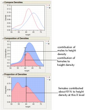
Densities
The Densities options provide several ways to compare the distribution and composition of the response across the levels of the X factor. There are three density options:
• Compare Densities shows a smooth curve estimating the density of each group. The smooth curve is the kernel density estimate for each group.
• Composition of Densities shows the summed densities, weighted by each group’s counts. At each X value, the Composition of Densities plot shows how each group contributes to the total.
• Proportion of Densities shows the contribution of the group as a proportion of the total at each X level.
Matching Column
Use the Matching Column option to specify a matching (ID) variable for a matching model analysis. The Matching Column option addresses the case when the data in a one-way analysis come from matched (paired) data, such as when observations in different groups come from the same subject.
Note: A special case of matching leads to the paired t-test. The Matched Pairs platform handles this type of data, but the data must be organized with the pairs in different columns, not in different rows.
The Matching Column option performs two primary actions:
• It fits an additive model (using an iterative proportional fitting algorithm) that includes both the grouping variable (the X variable in the Fit Y by X analysis) and the matching variable that you select. The iterative proportional fitting algorithm makes a difference if there are hundreds of subjects, because the equivalent linear model would be very slow and would require huge memory resources.
• It draws lines between the points that match across the groups. If there are multiple observations with the same matching ID value, lines are drawn from the mean of the group of observations.
The Matching Column option automatically activates the Matching Lines option connecting the matching points. To turn the lines off, select Display Options > Matching Lines.
The Matching Fit report shows the effects with F tests. These are equivalent to the tests that you get with the Fit Model platform if you run two models, one with the interaction term and one without. If there are only two levels, then the F test is equivalent to the paired t-test.
Note: For details about the Fit Model platform, see the Fitting Linear Models book.
Additional Examples of the Oneway Platform
This section contains additional examples of selected options and reports in the Oneway platform.
Example of an Analysis of Means Chart
1. Open the Analgesics.jmp sample data table.
2. Select Analyze > Fit Y by X.
3. Select pain and click Y, Response.
4. Select drug and click X, Factor.
5. Click OK.
6. From the red triangle menu, select Analysis of Means Methods > ANOM.
Figure 6.14 Example of Analysis of Means Chart
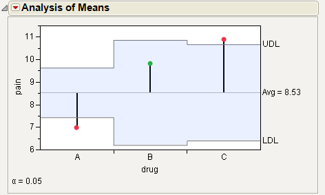
For the example in Figure 6.14, the means for drug A and C are statistically different from the overall mean. The drug A mean is lower and the drug C mean is higher. Note the decision limits for the drug types are not the same, due to different sample sizes.
Example of an Analysis of Means for Variances Chart
This example uses the Spring Data.jmp sample data table. Four different brands of springs were tested to see what weight is required to extend a spring 0.10 inches. Six springs of each brand were tested. The data was checked for normality, since the ANOMV test is not robust to non-normality. Examine the brands to determine whether the variability is significantly different between brands.
1. Open the Spring Data.jmp sample data table.
2. Select Analyze > Fit Y by X.
3. Select Weight and click Y, Response.
4. Select Brand and click X, Factor.
5. Click OK.
6. From the red triangle menu, select Analysis of Means Methods > ANOM for Variances.
7. From the red triangle menu next to Analysis of Means for Variances, select Show Summary Report.
Figure 6.15 Example of Analysis of Means for Variances Chart
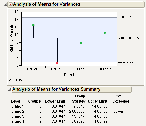
From Figure 6.15, notice that the standard deviation for Brand 2 exceeds the lower decision limit. Therefore, Brand 2 has significantly lower variance than the other brands.
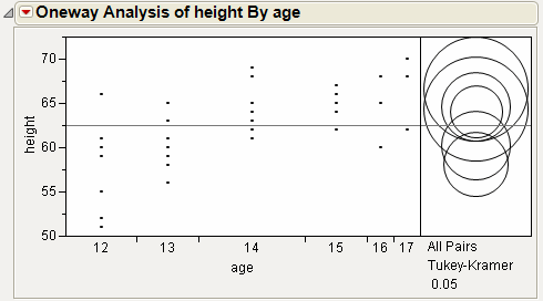
Example of the Each Pair, Student’s t Test
This example uses the Big Class.jmp sample data table. It shows a one-way layout of weight by age, and shows the group comparison using comparison circles that illustrate all possible t-tests.
1. Open the Big Class.jmp sample data table.
2. Select Analyze > Fit Y by X.
3. Select weight and click Y, Response.
4. Select age and click X, Factor.
5. Click OK.
6. From the red triangle menu, select Compare Means > Each Pair, Student’s t.
Figure 6.16 Example of Each Pair, Student’s t Comparison Circles
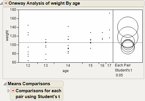
The means comparison method can be thought of as seeing if the actual difference in the means is greater than the difference that would be significant. This difference is called the LSD (least significant difference). The LSD term is used for Student’s t intervals and in context with intervals for other tests. In the comparison circles graph, the distance between the circles’ centers represent the actual difference. The LSD is what the distance would be if the circles intersected at right angles.
Figure 6.17 Example of Means Comparisons Report for Each Pair, Student’s t
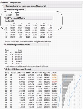
In Figure 6.17, the LSD threshold table shows the difference between the absolute difference in the means and the LSD (least significant difference). If the values are positive, the difference in the two means is larger than the LSD, and the two groups are significantly different.
Example of the All Pairs, Tukey HSD Test
1. Open the Big Class.jmp sample data table.
2. Select Analyze > Fit Y by X.
3. Select weight and click Y, Response.
4. Select age and click X, Factor.
5. Click OK.
6. From the red triangle menu, select Compare Means > All Pairs, Tukey HSD.
Figure 6.18 Example of All Pairs, Tukey HSD Comparison Circles
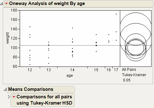
Figure 6.19 Example of Means Comparisons Report for All Pairs, Tukey HSD
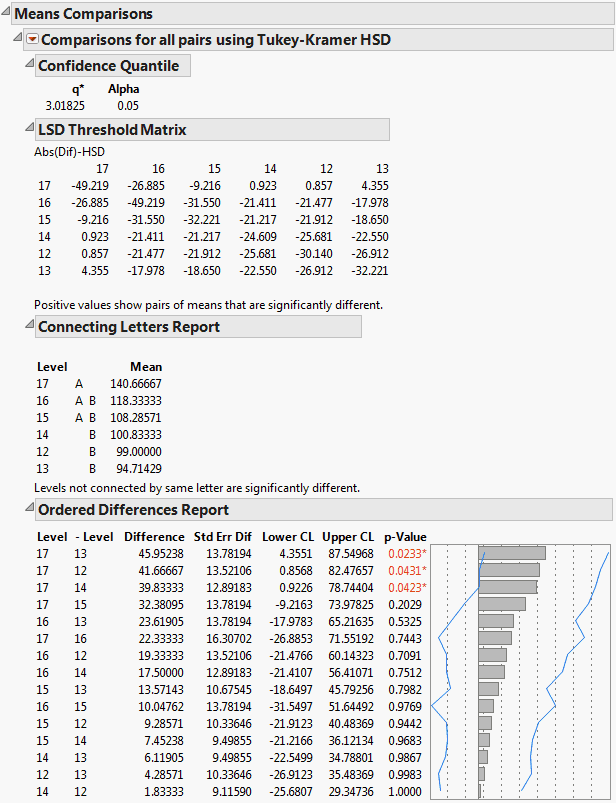
In Figure 6.19, the Tukey-Kramer HSD Threshold matrix shows the actual absolute difference in the means minus the HSD, which is the difference that would be significant. Pairs with a positive value are significantly different. The q* (appearing above the HSD Threshold Matrix table) is the quantile that is used to scale the HSDs. It has a computational role comparable to a Student’s t.
Example of the With Best, Hsu MCB Test
1. Open the Big Class.jmp sample data table.
2. Select Analyze > Fit Y by X.
3. Select weight and click Y, Response.
4. Select age and click X, Factor.
5. Click OK.
6. From the red triangle menu, select Compare Means > With Best, Hsu MCB.
Figure 6.20 Examples of With Best, Hsu MCB Comparison Circles
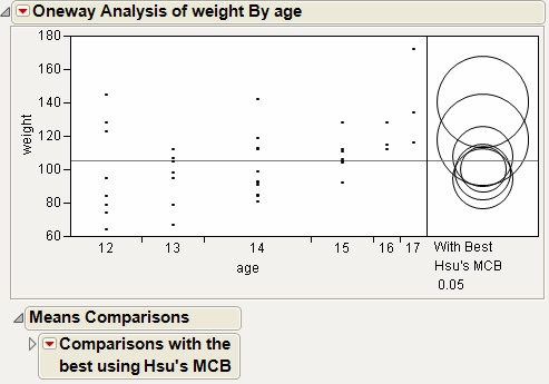
Figure 6.21 Example of Means Comparisons Report for With Best, Hsu MCB
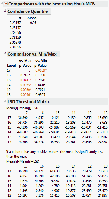
The Comparison vs. Min/Max report compares each level to the minimum and the maximum level. For example, level 17 is the only level that is significantly different from the minimum level.
Example of the With Control, Dunnett’s Test
1. Open the Big Class.jmp sample data table.
2. Select Analyze > Fit Y by X.
3. Select weight and click Y, Response.
4. Select age and click X, Factor.
5. Click OK.
6. From the red triangle menu, select Compare Means > With Control, Dunnett’s.
7. Select the group to use as the control group. In this example, select age 12.
Alternatively, click on a row to highlight it in the scatterplot before selecting the Compare Means > With Control, Dunnett’s option. The test uses the selected row as the control group.
8. Click OK.
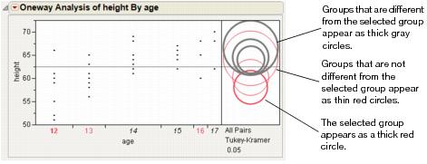
Figure 6.22 Example of With Control, Dunnett’s Comparison Circles
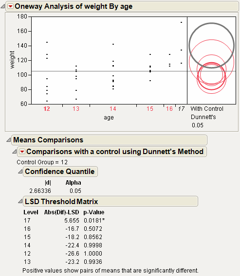
Using the comparison circles in Figure 6.22, you can conclude that level 17 is the only level that is significantly different from the control level of 12.
Example Contrasting All of the Compare Means Tests
1. Open the Big Class.jmp sample data table.
2. Select Analyze > Fit Y by X.
3. Select weight and click Y, Response.
4. Select age and click X, Factor.
5. Click OK.
6. From the red triangle menu, select each one of the Compare Means options.
Although the four methods all test differences between group means, different results can occur. Figure 6.23 shows the comparison circles for all four tests, with the age 17 group as the control group.
Figure 6.23 Comparison Circles for Four Multiple Comparison Tests
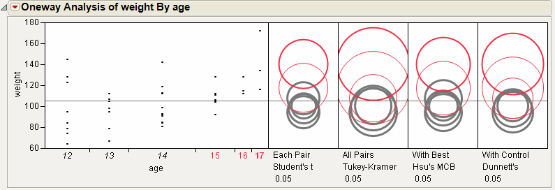
From Figure 6.23, notice that for the Student’s t and Hsu methods, age group 15 (the third circle from the top) is significantly different from the control group and appears gray. But, for the Tukey and Dunnett method, age group 15 is not significantly different, and appears red.
Example of the Unequal Variances Option
Suppose you want to test whether two variances (males and females) are equal, instead of two means.
1. Open the Big Class.jmp sample data table.
2. Select Analyze > Fit Y by X.
3. Select height and click Y, Response.
4. Select sex and click X, Factor.
5. Click OK.
6. From the red triangle menu, select Unequal Variances.
Figure 6.24 Example of the Unequal Variances Report
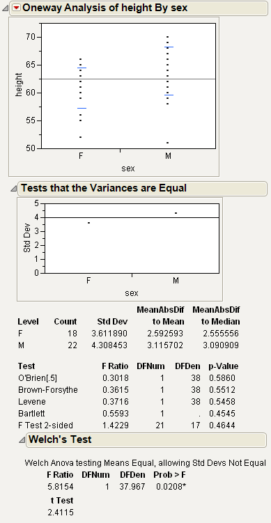
Since the p-value from the 2-sided F-Test is large, you can conclude that the variances are equal.
Example of an Equivalence Test
This example uses the Big Class.jmp sample data table. Examine if the difference in height between males and females is less than 6 inches.
1. Open the Big Class.jmp sample data table.
2. Select Analyze > Fit Y by X.
3. Select height and click Y, Response.
4. Select sex and click X, Factor.
5. Click OK.
6. From the red triangle menu, select Equivalence Test.
7. Type 6 as the difference considered practically zero.
8. Click OK.
Figure 6.25 Example of an Equivalence Test
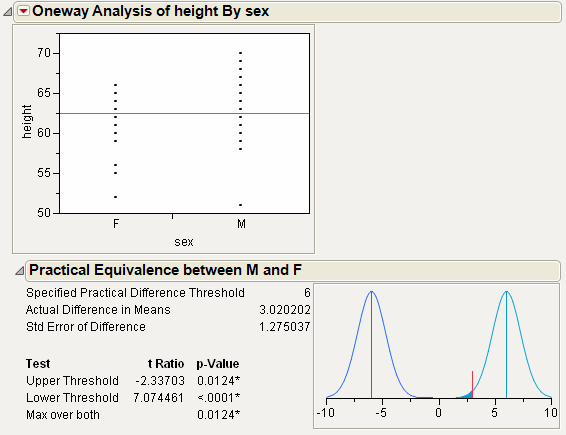
From Figure 6.25, notice the following:
• The Upper Threshold test compares the actual difference to 6.
• The Lower Threshold test compares the actual difference to -6.
• For both tests, the p-value is small. Therefore, you can conclude that the actual difference in means (3.02) is significantly different from 6 and -6. For your purposes, you can declare the means to be practically equivalent.
Example of the Robust Fit Option
The data in the Drug Toxicity.jmp sample data table shows the toxicity levels for three different formulations of a drug.
1. Open the Drug Toxicity.jmp sample data table.
2. Select Analyze > Fit Y by X.
3. Select Toxicity and click Y, Response.
4. Select Formulation and click X, Factor.
5. Click OK.
6. From the red triangle menu, select Means/Anova.
7. From the red triangle menu, select Robust Fit.
Figure 6.26 Example of Robust Fit
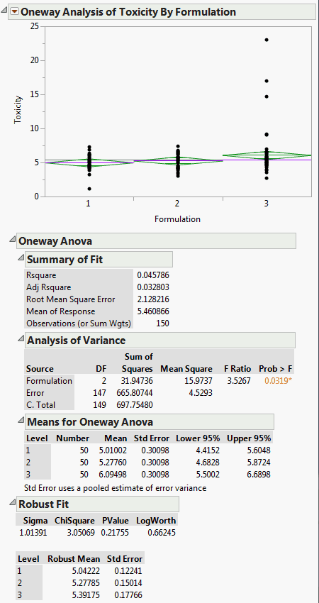
If you look at the standard Analysis of Variance report, you might wrongly conclude that there is a difference between the three formulations, since the p-value is .0319. However, when you look at the Robust Fit report, you would not conclude that the three formulations are significantly different, because the p-value there is .21755. It appears that the toxicity for a few of the observations is unusually high, creating the undue influence on the data.
Example of the Power Option
1. Open the Typing Data.jmp sample data table.
2. Select Analyze > Fit Y by X.
3. Select speed and click Y, Response.
4. Select brand and click X, Factor.
5. Click OK.
6. From the red triangle menu, select Power.
7. Within the From row, type 2 for Delta (the third box) and type 11 for Number.
8. Within the To row, type 6 for Delta, and type 17 in the Number box.
9. Within the By row, type 2 for both Delta and Number.
10. Select the Solve for Power check box.
Figure 6.27 Example of the Power Details Window
11. Click Done.
Power is computed for each combination of Delta and Number, and appears in the Power report.
To plot the Power values:
12. From the red triangle menu at the bottom of the report, select Power Plot.
Figure 6.28 Example of the Power Report
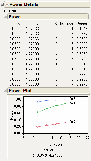
13. You might need to click and drag vertically on the Power axis to see all of the data in the plot.
Power is plotted for each combination of Delta and Number. As you might expect, the power rises for larger Number (sample sizes) values and for larger Delta values (difference in means).
Example of a Normal Quantile Plot
1. Open the Big Class.jmp sample data table.
2. Select Analyze > Fit Y by X.
3. Select height and click Y, Response.
4. Select sex and click X, Factor.
5. Click OK.
6. From the red triangle menu, select Normal Quantile Plot > Plot Actual by Quantile.
Figure 6.29 Example of a Normal Quantile Plot
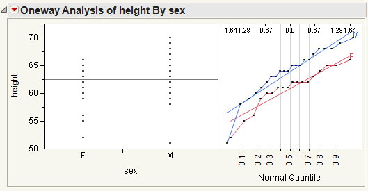
From Figure 6.29, notice the following:
• The Line of Fit appears by default.
• The data points track very closely to the line of fit, indicating a normal distribution.
Example of a CDF Plot
1. Open the Analgesics.jmp sample data table.
2. Select Analyze > Fit Y by X.
3. Select pain and click Y, Response.
4. Select drug and click X, Factor.
5. Click OK.
6. From the red triangle menu, select CDF Plot.
Figure 6.30 Example of a CDF Plot
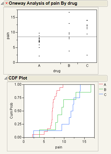
The levels of the X variables in the initial Oneway analysis appear in the CDF plot as different curves. The horizontal axis of the CDF plot uses the y value in the initial Oneway analysis.
Example of the Densities Options
1. Open the Big Class.jmp sample data table.
2. Select Analyze > Fit Y by X.
3. Select height and click Y, Response.
4. Select sex and click X, Factor.
5. Click OK.
6. From the red triangle menu, select Densities > Compare Densities, Densities > Composition of Densities, and Densities > Proportion of Densities.
Figure 6.31 Example of the Densities Options
Example of the Matching Column Option
This example uses the Matching.jmp sample data table, which contains data on six animals and the miles that they travel during different seasons.
1. Open the Matching.jmp sample data table.
2. Select Analyze > Fit Y by X.
3. Select miles and click Y, Response.
4. Select season and click X, Factor.
5. Click OK.
6. From the red triangle menu, select Matching Column.
7. Select subject as the matching column.
8. Click OK.
Figure 6.32 Example of the Matching Column Report
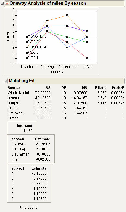
The plot graphs the miles traveled by season, with subject as the matching variable. The labels next to the first measurement for each subject on the graph are determined by the species and subject variables.
The Matching Fit report shows the season and subject effects with F tests. These are equivalent to the tests that you get with the Fit Model platform if you run two models, one with the interaction term and one without. If there are only two levels, then the F test is equivalent to the paired t-test.
Note: For details about the Fit Model platform, see the Fitting Linear Models book.
Statistical Details for the Oneway Platform
The following sections provide statistical details for selected options and reports.
Statistical Details for Comparison Circles
One approach to comparing two means is to determine whether their actual difference is greater than their least significant difference (LSD). This least significant difference is a Student’s t-statistic multiplied by the standard error of the difference of the two means and is written as follows:
The standard error of the difference of two independent means is calculated from the following relationship:
When the means are un correlated, these quantities have the following relationship:
These squared values form a Pythagorean relationship, illustrated graphically by the right triangle shown in Figure 6.33.
Figure 6.33 Relationship of the Difference between Two Means
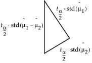
The hypotenuse of this triangle is a measuring stick for comparing means. The means are significantly different if and only if the actual difference is greater than the hypotenuse (LSD).
Suppose that you have two means that are exactly on the borderline, where the actual difference is the same as the least significant difference. Draw the triangle with vertices at the means measured on a vertical scale. Also, draw circles around each mean so that the diameter of each is equal to the confidence interval for that mean.
Figure 6.34 Geometric Relationship of t-test Statistics
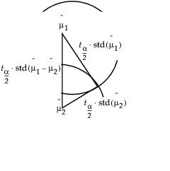
The radius of each circle is the length of the corresponding leg of the triangle, which is  .
.
The circles must intersect at the same right angle as the triangle legs, giving the following relationship:
• If the means differ exactly by their least significant difference, then the confidence interval circles around each mean intersect at a right angle. That is, the angle of the tangents is a right angle.
Now, consider the way that these circles must intersect if the means are different by greater than or less than the least significant difference:
• If the circles intersect so that the outside angle is greater than a right angle, then the means are not significantly different. If the circles intersect so that the outside angle is less than a right angle, then the means are significantly different. An outside angle of less than 90 degrees indicates that the means are farther apart than the least significant difference.
• If the circles do not intersect, then they are significantly different. If they nest, they are not significantly different. See Figure 6.12.
The same graphical technique works for many multiple-comparison tests, substituting a different probability quantile value for the Student’s t.
Statistical Details for Power
To compute power, you make use of the noncentral F distribution. The formula (O’Brien and Lohr 1984) is given as follows:
Power = Prob(F > Fcrit, ν1, ν2, nc)
where:
• F is distributed as the noncentral F(nc, ν1, ν2)and Fcrit = F(1 - α, ν1, ν2) is the 1 - α quantile of the F distribution with ν1 and ν2 degrees of freedom.
• ν1 = r -1 is the numerator df.
• ν2 = r(n -1) is the denominator df.
• n is the number per group.
• r is the number of groups.
• nc = n(CSS)/σ2 is the non-centrality parameter.
 is the corrected sum of squares.
• μg is the mean of the gth group.
• μ is the overall mean.
• σ2 is estimated by the mean squared error (MSE).
Statistical Details for the Summary of Fit Report
Rsquare
Using quantities from the Analysis of Variance report for the model, the R2 for any continuous response fit is always calculated as follows:
Adj Rsquare
Adj Rsquare is a ratio of mean squares instead of sums of squares and is calculated as follows:
The mean square for Error is found in the Analysis of Variance report and the mean square for C. Total can be computed as the C. Total Sum of Squares divided by its respective degrees of freedom. See “The Analysis of Variance Report”.
Statistical Details for the Tests That the Variances Are Equal Report
F Ratio
O’Brien’s test constructs a dependent variable so that the group means of the new variable equal the group sample variances of the original response. The O’Brien variable is computed as follows:
where n represents the number of yijk observations.
Brown-Forsythe is the model F statistic from an anova on  where
where  is the median response for the ith level. If any zij is zero, then it is replaced with the next smallest zij in the same level. This corrects for the artificial zeros occurring in levels with odd numbers of observations.
The Levene F is the model F statistic from an anova on  where
where  is the mean response for the ith level.
Bartlett’s test is calculated as follows:
 where
where and ni is the count on the ith level and si2 is the response sample variance on the ith level. The Bartlett statistic has a χ2-distribution. Dividing the Chi-square test statistic by the degrees of freedom results in the reported F value.
Welch’s Test F Ratio
The Welch’s Test F Ratio is computed as follows:
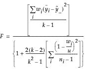 where
where and ni is the count on the ith level,  is the mean response for the ith level, and si2 is the response sample variance for the ith level.
Welch’s Test DF Den
The Welch approximation for the denominator degrees of freedom is as follows:
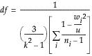
where wi, ni, and u are defined as in the F ratio formula.
..................Content has been hidden....................
You can't read the all page of ebook, please click here login for view all page.