Overview of the Distribution Platform
The treatment of variables in the Distribution platform is different, depending on the modeling type of variable, which can be categorical (nominal or ordinal) or continuous.
Categorical Variables
For categorical variables, the initial graph that appears is a histogram. The histogram shows a bar for each level of the ordinal or nominal variable. You can also add a divided (mosaic) bar chart.
The reports show counts and proportions. You can add confidence intervals and test the probabilities.
Continuous Variables
For numeric continuous variables, the initial graphs show a histogram and an outlier box plot. The histogram shows a bar for grouped values of the continuous variable. The following options are also available:
• quantile box plot
• normal quantile plot
• stem and leaf plot
• CDF plot
The reports show selected quantiles and summary statistics. Report options are available for the following:
• saving ranks, probability scores, normal quantile values, and so on, as new columns in the data table
• testing the mean and standard deviation of the column against a constant you specify
• fitting various distributions and nonparametric smoothing curves
• performing a capability analysis for a quality control application
• confidence intervals, prediction intervals, and tolerance intervals
Example of the Distribution Platform
Suppose that you have data on 40 students, and you want to see the distribution of age and height among the students.
1. Open the Big Class.jmp sample data table.
2. Select Analyze > Distribution.
3. Select age and height and click Y, Columns.
4. Click OK.
Figure 3.2 Example of the Distribution Platform
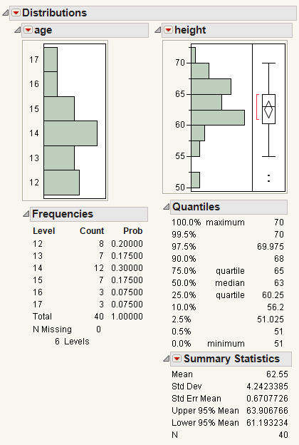
From the histograms, you notice the following:
• The ages are not uniformly distributed.
• For height, there are two points with extreme values (that might be outliers).
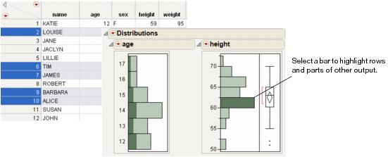
Click on the bar for 50 in the height histogram to take a closer look at the potential outliers.
• The corresponding ages are highlighted in the age histogram. The potential outliers are age 12.
• The corresponding rows are highlighted in the data table. The names of the potential outliers are Lillie and Robert.
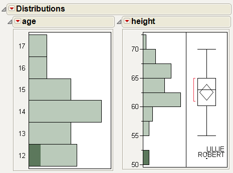
Add labels to the potential outliers in the height histogram.
1. Select both outliers.
2. Right-click on one of the outliers and select Row Label.
Label icons are added to these rows in the data table.
3. (Optional) Resize the box plot wider to see the full labels.
Figure 3.3 Potential Outliers Labeled
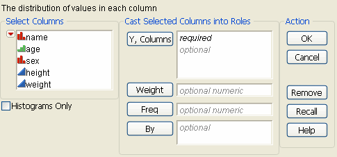
Launch the Distribution Platform
Launch the Distribution platform by selecting Analyze > Distribution.
Figure 3.4 The Distribution Launch Window
|
Y, Columns
|
Assigns the variables that you want to analyze. A histogram and associated reports appear for each variable.
|
|
Weight
|
Assigns a variable to give the observations different weights. Any moment that is based on the Sum Wgts is affected by weights.
|
|
Freq
|
Assigns a frequency variable to this role. This is useful if you have summarized data. In this instance, you have one column for the Y values and another column for the frequency of occurrence of the Y values. The sum of this variable is included in the overall count appearing in the Summary Statistics report (represented by N). All other moment statistics (mean, standard deviation, and so on) are also affected by the Freq variable.
|
|
By
|
Produces a separate report for each level of the By variable. If more than one By variable is assigned, a separate report is produced for each possible combination of the levels of the By variables.
|
|
Histograms Only
|
Removes everything except the histograms from the report window.
|
For general information about launch windows, see Using JMP.
The Distribution Report
Follow the instructions in “Example of the Distribution Platform” to produce the report shown in Figure 3.5.
Figure 3.5 The Initial Distribution Report Window
Note: Any rows that are excluded in the data table are also hidden in the histogram.
The initial Distribution report contains a histogram and reports for each variable. Note the following:
• To replace a variable in a report, from the Columns panel of the associated data table, drag and drop the variable into the axis of the histogram.
• To insert a new variable into a report, creating a new histogram, drag and drop the variable outside of an existing histogram. The new variable can be placed before, between, or after the existing histograms.
Note: To remove a variable, select Remove from the red triangle menu.
• The red triangle menu next to Distributions contains options that affect all of the variables. See “Distribution Platform Options”.
• The red triangle menu next to each variable contains options that affect only that variable. See “Options for Categorical Variables” or “Options for Continuous Variables”. If you hold down the CTRL key and select a variable option, the option applies to all of the variables that have the same modeling type.
• Histograms visually display your data. See “Histograms”.
• The initial report for a categorical variable contains a Frequencies report. See “The Frequencies Report”.
• The initial report for a continuous variable contains a Quantiles and a Summary Statistics report. See “The Quantiles Report” and “The Summary Statistics Report”.
Histograms
Histograms visually display your data. For categorical (nominal or ordinal) variables, the histogram shows a bar for each level of the ordinal or nominal variable. For continuous variables, the histogram shows a bar for grouped values of the continuous variable.
|
Highlighting data
|
Click on a histogram bar or an outlying point in the graph. The corresponding rows are highlighted in the data table, and corresponding sections of other histograms are also highlighted, if applicable. See “Highlight Bars and Select Rows”.
|
|
Creating a subset
|
Double-click on a histogram bar, or right-click on a histogram bar and select Subset. A new data table is created that contains only the selected data.
|
|
Resizing the entire histogram
|
Hover over the histogram borders until you see a double-sided arrow. Then click and drag the borders. For more details, see the Using JMP book.
|
|
Rescaling the axis
|
(Continuous variables only) Click and drag on an axis to rescale it.
Alternatively, hover over the axis until you see a hand. Then, double-click on the axis and set the parameters in the Axis Specification window.
|
|
Resizing histogram bars
|
(Continuous variables only) There are multiple options to resize histogram bars. See “Resize Histogram Bars for Continuous Variables”.
|
|
Specifying your selection
|
Specify the data that you select in multiple histograms. See “Specify Your Selection in Multiple Histograms”.
|
To see additional options for the histogram or the associated data table:
• Right-click on a histogram. See the Using JMP book.
• Click on the red triangle next to the variable, and select Histogram Options. Options are slightly different depending on the variable modeling type. See “Options for Categorical Variables” or “Options for Continuous Variables”.
Resize Histogram Bars for Continuous Variables
Resize histogram bars for continuous variables by using the following:
• the Grabber (hand) tool
• the Set Bin Width option
• the Increment option
Use the Grabber Tool
The Grabber tool is a quick way to explore your data.
1. Select Tools > Grabber.
Note: (Windows only) To see the menu bar, you might need to hover over the bar below the window title. You can also change this setting in File > Preferences > Windows Specific.
2. Place the grabber tool anywhere in the histogram.
3. Click and drag the histogram bars.
Think of each bar as a bin that holds a number of observations:
• Moving the hand to the left increases the bin width and combines intervals. The number of bars decreases as the bar size increases.
• Moving the hand to the right decreases the bin width, producing more bars.
• Moving the hand up or down shifts the bin locations on the axis, which changes the contents and size of each bin.
Use the Set Bin Width Option
The Set Bin Width option is a more precise way to set the width for all bars in a histogram. To use the Set Bin Width option, from the red triangle menu for the variable, select Histogram Options > Set Bin Width. Change the bin width value.
Use the Increment Option
The Increment option is another precise way to set the bar width. To use the Increment option, double-click on the axis, and change the Increment value.
Highlight Bars and Select Rows
Clicking on a histogram bar highlights the bar and selects the corresponding rows in the data table. The appropriate portions of all other graphical displays also highlight the selection. Figure 3.6 shows the results of highlighting a bar in the height histogram. The corresponding rows are selected in the data table.
Tip: To deselect histogram bars, press the CTRL key and click on the highlighted bars.
Figure 3.6 Highlighting Bars and Rows
Specify Your Selection in Multiple Histograms
Extend or narrow your selection in histograms as follows:
• To extend your selection, hold down the SHIFT key and select another bar. This is the equivalent of using an or operator.
• To narrow your selection, hold down the ALT key and select another bar. This is the equivalent of using an and operator.
The Frequencies Report
For nominal and ordinal variables, the Frequencies report lists the levels of the variables, along with the associated frequency of occurrence and probabilities.
For each level of a categorical (nominal or ordinal) variable, the Frequencies report contains the information described in Table 3.3. Missing values are omitted from the analysis.
|
Level
|
Lists each value found for a response variable.
|
|
Count
|
Lists the number of rows found for each level of a response variable. If you use a Freq variable, the Count is the sum of the Freq variables for each level of the response variable.
|
|
Prob
|
Lists the probability (or proportion) of occurrence for each level of a response variable. The probability is computed as the count divided by the total frequency of the variable, shown at the bottom of the table.
|
|
StdErr Prob
|
Lists the standard error of the probabilities. This column might be hidden. To show the column, right-click in the table and select Columns > StdErr Prob.
|
|
Cum Prob
|
Contains the cumulative sum of the column of probabilities. This column might be hidden. To show the column, right-click in the table and select Columns > Cum Prob.
|
The Quantiles Report
For continuous variables, the Quantiles report lists the values of selected quantiles (sometimes called percentiles).
The Summary Statistics Report
For continuous variables, the Summary Statistics report displays the mean, standard deviation, and other summary statistics. You can control which statistics appear in this report by selecting Customize Summary Statistics from the red triangle menu next to Summary Statistics.
• Table 3.4 describes the statistics that appear by default.
• Table 3.5 describes additional statistics that you can add to the report using the Customize Summary Statistics window.
|
Mean
|
Estimates the expected value of the underlying distribution for the response variable, which is the arithmetic average of the column’s values. It is the sum of the non-missing values divided by the number of non-missing values.
|
|
Std Dev
|
The normal distribution is mainly defined by the mean and standard deviation. These parameters provide an easy way to summarize data as the sample becomes large:
• 68% of the values are within one standard deviation of the mean
• 95% of the values are within two standard deviations of the mean
• 99.7% of the values are within three standard deviations of the mean
|
|
Std Err Mean
|
The standard error of the mean, which estimates the standard deviation of the distribution of the mean.
|
|
Upper 95% Mean and Lower 95% Mean
|
Are 95% confidence limits about the mean. They define an interval that is very likely to contain the true population mean.
|
|
N
|
Is the total number of nonmissing values.
|
|
Sum Weight
|
The sum of a column assigned to the role of Weight (in the launch window). Sum Wgt is used in the denominator for computations of the mean instead of N.
|
|
Sum
|
The sum of the response values.
|
|
Variance
|
The sample variance, and the square of the sample standard deviation.
|
|
Skewness
|
Measures sidedness or symmetry.
|
|
Kurtosis
|
Measures peakedness or heaviness of tails.
|
|
CV
|
The percent coefficient of variation. It is computed as the standard deviation divided by the mean and multiplied by 100. The coefficient of variation can be used to assess relative variation, for example when comparing the variation in data measured in different units or with different magnitudes.
|
|
N Missing
|
The number of missing observations.
|
|
N Zero
|
The number of zero values.
|
|
N Unique
|
The number of unique values.
|
|
Uncorrected SS
|
The uncorrected sum of squares or sum of values squared.
|
|
Corrected SS
|
The corrected sum of squares or sum of squares of deviations from the mean.
|
|
Autocorrelation
|
(Appears only if you have not specified a Frequency variable.) First autocorrelation that tests if the residuals are correlated across the rows. This test helps detect non-randomness in the data.
|
|
Minimum
|
Represents the 0 percentile of the data.
|
|
Maximum
|
Represents the 100 percentile of the data.
|
|
Median
|
Represents the 50th percentile of the data.
|
|
Mode
|
The value that occurs most often in the data. If there are multiple modes, the smallest mode appears.
|
|
Trimmed Mean
|
(Does not appear if you have specified a Weight variable.)The mean calculated after removing the smallest p% and the largest p% of the data.
|
|
Geometric Mean
|
The nth root of the product of the data.
|
|
Range
|
The difference between the maximum and minimum of the data.
|
|
Interquartile Range
|
The difference between the 3rd and 1st quartiles.
|
|
Median Absolute Deviation
|
(Does not appear if you have specified a Weight variable.) The median of the absolute deviations from the median.
|
|
Robust Mean
|
The robust mean, calculated in a way that is resistant to outliers, using Huber's M-estimation. See Huber and Ronchetti, 2009.
|
|
Robust Std Dev
|
The robust standard deviation, calculated in a way that is resistant to outliers, using Huber's M-estimation. See Huber and Ronchetti, 2009.
|
|
Enter (1-alpha) for mean confidence interval
|
Specify the alpha level for the mean confidence interval.
|
|
Enter trimmed mean percent
|
Specify the trimmed mean percentage. The percentage is trimmed off each side of the data.
|
Summary Statistics Options
The red triangle menu next to Summary Statistics contains these options:
Customize Summary Statistics
Select which statistics you want to appear from the list. You can select or deselect all summary statistics. See Table 3.5.
Show All Modes
Shows all of the modes if there are multiple modes.
Distribution Platform Options
The red triangle menu next to Distributions contains options that affect all of the reports and graphs in the Distribution platform.
|
Uniform Scaling
|
Scales all axes with the same minimum, maximum, and intervals so that the distributions can be easily compared.
|
|
Stack
|
Changes the orientation of the histogram and the reports to horizontal and stacks the individual distribution reports vertically. Deselect this option to return the report window to its original layout.
|
|
Arrange in Rows
|
Enter the number of plots that appear in a row. This option helps you view plots vertically rather than in one wide row.
|
|
Save for Adobe Flash platform (.SWF)
|
Saves the histograms as .swf files that are Adobe Flash player compatible. Use these files in presentations and in Web pages. An HTML page is also saved that shows you the correct code for using the resulting .swf file.
For more information about this option, go to http://www.jmp.com/support/swfhelp/en.
|
|
Script
|
This menu contains options that are available to all platforms. They enable you to redo the analysis or save the JSL commands for the analysis to a window or a file. For more information, see Using JMP.
|
Options for Categorical Variables
The red triangle menus next to each variable in the report window contain additional options that apply to the variable. This section describes the options that are available for categorical (nominal or ordinal) variables.
To see the options that are available for continuous variables, see “Options for Continuous Variables”.
|
The Display Options sub-menu contains the following options:
|
|
|
Frequencies
|
Shows or hides the Frequencies report. See “The Frequencies Report”.
|
|
Horizontal Layout
|
Changes the orientation of the histogram and the reports to vertical or horizontal.
|
|
Axes on Left
|
Moves the Count, Prob, and Density axes to the left instead of the right.
This option is applicable only if Horizontal Layout is selected.
|
|
The Histograms sub-menu contains the following options:
|
|
|
Histogram
|
Shows or hides the histogram. See “Histograms”.
|
|
Vertical
|
Changes the orientation of the histogram from a vertical to a horizontal orientation.
|
|
Std Error Bars
|
Draws the standard error bar on each level of the histogram.
|
|
Separate Bars
|
Separates the histogram bars.
|
|
Histogram Color
|
Changes the color of the histogram bars.
|
|
Count Axis
|
Adds an axis that shows the frequency of column values represented by the histogram bars.
|
|
Prob Axis
|
Adds an axis that shows the proportion of column values represented by histogram bars.
|
|
Density Axis
|
Adds an axis that shows the length of the bars in the histogram.
The count and probability axes are based on the following calculations:
prob = (bar width)*density
count = (bar width)*density*(total count)
|
|
Show Percents
|
Labels the percent of column values represented by each histogram bar.
|
|
Show Counts
|
Labels the frequency of column values represented by each histogram bar.
|
|
|
|
|
Mosaic Plot
|
Displays a mosaic bar chart for each nominal or ordinal response variable. A mosaic plot is a stacked bar chart where each segment is proportional to its group’s frequency count.
|
|
Order By
|
Reorders the histogram, mosaic plot, and Frequencies report in ascending or descending order, by count. To save the new order as a column property, use the Save > Value Ordering option.
|
|
Test Probabilities
|
Displays a report that tests hypothesized probabilities. See “Examples of the Test Probabilities Option” for more details.
|
|
Confidence Interval
|
This menu contains confidence levels. Select a value that is listed, or select Other to enter your own. JMP computes score confidence intervals.
|
|
The Save sub-menu contains the following options:
|
|
|
Level Numbers
|
Creates a new column in the data table called Level <colname>. The level number of each observation corresponds to the histogram bar that contains the observation.
|
|
Value Ordering
|
(Use with the Order By option) Creates a new value ordering column property in the data table, reflecting the new order.
|
|
Script to log
|
Displays the script commands to generate the current report in the log window. Select View > Log to see the log window.
|
|
|
|
|
Remove
|
Permanently removes the variable and all its reports from the Distribution report.
|
Options for Continuous Variables
The red triangle menus next to each variable in the report window contain additional options that apply to the variable. This section describes the options that are available for continuous variables.
To see the options that are available for categorical (nominal and ordinal) variables, see “Options for Categorical Variables”.
|
The Display Options sub-menu contains the following options:
|
|
|
Quantiles
|
Shows or hides the Quantiles report. See “The Quantiles Report”.
|
|
Set Quantile Increment
|
Changes the quantile increment or revert back to the default quantile increment.
|
|
Custom Quantiles
|
Sets custom quantiles by values or by increments. You can also specify the confidence level. Smoothed empirical likelihood quantile estimates, based on a kernel density estimate, are added to the report. The confidence intervals for these quantile estimates tend to contain the true quantile with the promised confidence level.
|
|
Summary Statistics
|
Shows or hides the Summary Statistics report. See “The Summary Statistics Report”.
|
|
Customize Summary Statistics
|
Adds or removes statistics from the Summary Statistics report. See “The Summary Statistics Report”.
|
|
Horizontal Layout
|
Changes the orientation of the histogram and the reports to vertical or horizontal.
|
|
Axes on Left
|
Moves the Count, Prob, Density, and Normal Quantile Plot axes to the left instead of the right.
This option is applicable only if Horizontal Layout is selected.
|
|
The Histograms sub-menu contains the following options:
|
|
|
Histogram
|
Shows or hides the histogram. See “Histograms”.
|
|
Shadowgram
|
Replaces the histogram with a shadowgram. To understand a shadowgram, consider that if the bin width of a histogram is changed, the appearance of the histogram changes. A shadowgram overlays histograms with different bin widths. Dominant features of a distribution are less transparent on the shadowgram.
Note that the following options are not available for shadowgrams:
• Std Error Bars
• Show Counts
• Show Percents
|
|
Vertical
|
Changes the orientation of the histogram from a vertical to a horizontal orientation.
|
|
Std Error Bars
|
Draws the standard error bar on each level of the histogram using the standard error. The standard error bar adjusts automatically when you adjust the number of bars with the hand tool. See “Resize Histogram Bars for Continuous Variables”, and “Statistical Details for Standard Error Bars”.
|
|
Set Bin Width
|
Changes the bin width of the histogram bars. See “Resize Histogram Bars for Continuous Variables”.
|
|
Histogram Color
|
Changes the color of the histogram bars.
|
|
Count Axis
|
Adds an axis that shows the frequency of column values represented by the histogram bars.
Note: If you resize the histogram bars, the count axis also resizes.
|
|
Prob Axis
|
Adds an axis that shows the proportion of column values represented by histogram bars.
Note: If you resize the histogram bars, the probability axis also resizes.
|
|
Density Axis
|
The density is the length of the bars in the histogram. Both the count and probability are based on the following calculations:
prob = (bar width)*density
count = (bar width)*density*(total count)
When looking at density curves that are added by the Fit Distribution option, the density axis shows the point estimates of the curves.
Note: If you resize the histogram bars, the density axis remains constant.
|
|
Show Percents
|
Labels the proportion of column values represented by each histogram bar.
|
|
Show Counts
|
Labels the frequency of column values represented by each histogram bar.
|
|
|
|
|
Normal Quantile Plot
|
Adds a normal quantile plot that shows the extent to which the variable is normally distributed. See “Normal Quantile Plot”.
|
|
Outlier Box Plot
|
Adds an outlier box plot that shows the outliers in your data. See “Outlier Box Plot”.
|
|
Stem and Leaf
|
Adds a stem and leaf report, which is a variation of the histogram. See “Stem and Leaf”.
|
|
CDF Plot
|
Adds a plot of the empirical cumulative distribution function. See “CDF Plot”.
|
|
Test Mean
|
Performs a one-sample test for the mean. See “Test Mean”.
|
|
Test Std Dev
|
Performs a one-sample test for the standard deviation. See “Test Std Dev”.
|
|
Confidence Interval
|
Choose confidence intervals for the mean and standard deviation. See “Confidence Intervals for Continuous Variables”.
|
|
Prediction Interval
|
Choose prediction intervals for a single observation, or for the mean and standard deviation of the next randomly selected sample. See “Prediction Intervals”.
|
|
Tolerance Interval
|
Computes an interval to contain at least a specified proportion of the population. See “Tolerance Intervals”.
|
|
Capability Analysis
|
Measures the conformance of a process to given specification limits. See “Capability Analysis”.
|
|
Continuous Fit
|
Fits distributions to continuous variables. See “Fit Distributions”.
|
|
Discrete Fit
|
Fits distributions to discrete variables. See “Fit Distributions”.
|
|
Save
|
Saves information about continuous or categorical variables. See “Save Commands for Continuous Variables”.
|
|
|
|
|
Remove
|
Permanently removes the variable and all its reports from the Distribution report.
|
Normal Quantile Plot
Use the Normal Quantile Plot option to visualize the extent to which the variable is normally distributed. If a variable is normally distributed, the normal quantile plot approximates a diagonal straight line. This type of plot is also called a quantile-quantile plot, or Q-Q plot.
The normal quantile plot also shows Lilliefors confidence bounds (Conover 1980) and probability and normal quantile scales.
Figure 3.7 Normal Quantile Plot
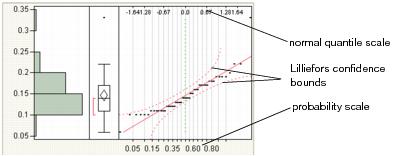
Note the following information:
• The y-axis shows the column values.
• The x-axis shows the empirical cumulative probability for each value.
Outlier Box Plot
Use the outlier box plot (also called a Tukey outlier box plot) to see the distribution and identify possible outliers. Generally, box plots show selected quantiles of continuous distributions.
Figure 3.8 Outlier Box Plot
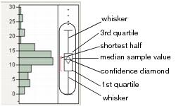
Note the following aspects about outlier box plots:
• The vertical line within the box represents the median sample value.
• The confidence diamond contains the mean and the upper and lower 95% of the mean. If you drew a line through the middle of the diamond, you would have the mean. The top and bottom points of the diamond represent the upper and lower 95% of the mean.
• The ends of the box represent the 25th and 75th quantiles, also expressed as the 1st and 3rd quartile, respectively.
• The difference between the 1st and 3rd quartiles is called the interquartile range.
• The box has lines that extend from each end, sometimes called whiskers. The whiskers extend from the ends of the box to the outermost data point that falls within the distances computed as follows:
1st quartile - 1.5*(interquartile range)
3rd quartile + 1.5*(interquartile range)
If the data points do not reach the computed ranges, then the whiskers are determined by the upper and lower data point values (not including outliers).
• The bracket outside of the box identifies the shortest half, which is the most dense 50% of the observations (Rousseuw and Leroy 1987).
Remove Objects from the Outlier Box Plot
To remove the confidence diamond or the shortest half, proceed as follows:
1. Right-click on the outlier box plot and select Customize.
2. Click Box Plot.
3. Deselect the check box next to Confidence Diamond or Shortest Half.
For more details about the Customize Graph window, see the Using JMP book.
Quantile Box Plot
The Quantile Box Plot displays specific quantiles from the Quantiles report. If the distribution is symmetric, the quantiles in the box plot are approximately equidistant from each other. At a glance, you can see whether the distribution is symmetric. For example, if the quantile marks are grouped closely at one end, but have greater spacing at the other end, the distribution is skewed toward the end with more spacing. See Figure 3.9.
Figure 3.9 Quantile Box Plot
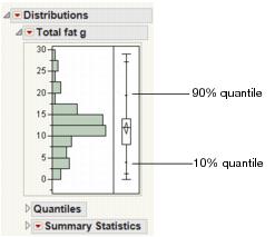
Quantiles are values where the pth quantile is larger than p% of the values. For example, 10% of the data lies below the 10th quantile, and 90% of the data lies below the 90th quantile.
Stem and Leaf
Each line of the plot has a Stem value that is the leading digit of a range of column values. The Leaf values are made from the next-in-line digits of the values. You can see the data point by joining the stem and leaf. In some cases, the numbers on the stem and leaf plot are rounded versions of the actual data in the table. The stem-and-leaf plot actively responds to clicking and the brush tool.
Note: The stem-and-leaf plot does not support fractional frequencies.
CDF Plot
The CDF plot creates a plot of the empirical cumulative distribution function. Use the CDF plot to determine the percent of data that is at or below a given value on the x-axis.
Figure 3.10 CDF Plot
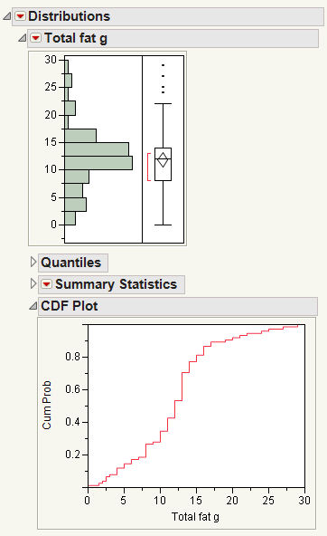
For example, in this CDF plot, approximately 30% of the data is less than a total fat value of 10 grams.
Test Mean
Use the Test Mean window to specify options for and perform a one-sample test for the mean. If you specify a value for the standard deviation, a z-test is performed. Otherwise, the sample standard deviation is used to perform a t-test. You can also request the nonparametric Wilcoxon Signed-Rank test.
Use the Test Mean option repeatedly to test different values. Each time you test the mean, a new Test Mean report appears.
|
Statistics that are calculated for Test Mean:
|
|
|
t Test (or z Test)
|
Lists the value of the test statistic and the p-values for the two-sided and one-sided alternatives.
|
|
Signed-Rank
|
(Only appears for the Wilcoxon Signed-Rank test) Lists the value of the Wilcoxon signed-rank statistic followed by the p-values for the two-sided and one-sided alternatives. The test assumes only that the distribution is symmetric. See “Statistical Details for the Wilcoxon Signed Rank Test”.
|
|
Probability values:
|
|
|
Prob>|t|
|
The probability of obtaining an absolute t-value by chance alone that is greater than the observed t-value when the population mean is equal to the hypothesized value. This is the p-value for observed significance of the two-tailed t-test.
|
|
Prob>t
|
The probability of obtaining a t-value greater than the computed sample t ratio by chance alone when the population mean is not different from the hypothesized value. This is the p-value for an upper-tailed test.
|
|
Prob<t
|
The probability of obtaining a t-value less than the computed sample t ratio by chance alone when the population mean is not different from the hypothesized value. This is the p-value for a lower-tailed test.
|
|
PValue animation
|
Starts an interactive visual representation of the p-value. Enables you to change the hypothesized mean value while watching how the change affects the p-value.
|
|
Power animation
|
Starts an interactive visual representation of power and beta. You can change the hypothesized mean and sample mean while watching how the changes affect power and beta.
|
|
Remove Test
|
Removes the mean test.
|
Test Std Dev
Use the Test Std Dev option to perform a one-sample test for the standard deviation (details in Neter, Wasserman, and Kutner 1990). Use the Test Std Dev option repeatedly to test different values. Each time you test the standard deviation, a new Test Standard Deviation report appears.
|
Test Statistic
|
Provides the value of the Chi-square test statistic. See “Statistical Details for the Standard Deviation Test”.
|
|
Min PValue
|
The probability of obtaining a greater Chi-square value by chance alone when the population standard deviation is not different from the hypothesized value. See “Statistical Details for the Standard Deviation Test”.
|
|
Prob>ChiSq
|
The probability of obtaining a Chi-square value greater than the computed sample Chi-square by chance alone when the population standard deviation is not different from the hypothesized value. This is the p-value for observed significance of a one-tailed t-test.
|
|
Prob<ChiSq
|
The probability of obtaining a Chi-square value less than the computed sample Chi-square by chance alone when the population standard deviation is not different from the hypothesized value. This is the p-value for observed significance of a one-tailed t-test.
|
Confidence Intervals for Continuous Variables
The Confidence Interval options display confidence intervals for the mean and standard deviation. The 0.90, 0.95, and 0.99 options compute two-sided confidence intervals for the mean and standard deviation. Use the Confidence Interval > Other option to select a confidence level, and select one-sided or two-sided confidence intervals. You can also type a known sigma. If you use a known sigma, the confidence interval for the mean is based on z-values rather than t-values.
The Confidence Intervals report shows the mean and standard deviation parameter estimates with upper and lower confidence limits for 1 - α.
Save Commands for Continuous Variables
Use the Save menu commands to save information about continuous variables. Each Save command generates a new column in the current data table. The new column is named by appending the variable name (denoted <colname> in the following definitions) to the Save command name. See Table 3.12.
Select the Save commands repeatedly to save the same information multiple times under different circumstances, such as before and after combining histogram bars. If you use a Save command multiple times, the column name is numbered (name1, name2, and so on) to ensure unique column names.
|
Command
|
Column Added to Data Table
|
Description
|
|
Level Numbers
|
Level <colname>
|
The level number of each observation corresponds to the histogram bar that contains the observation. The histogram bars are numbered from low to high, beginning with 1.
|
|
Level Midpoints
|
Midpoint <colname>
|
The midpoint value for each observation is computed by adding half the level width to the lower level bound.
|
|
Ranks
|
Ranked <colname>
|
Provides a ranking for each of the corresponding column’s values starting at 1. Duplicate response values are assigned consecutive ranks in order of their occurrence in the data table.
|
|
Ranks Averaged
|
RankAvgd <colname>
|
If a value is unique, then the averaged rank is the same as the rank. If a value occurs k times, the average rank is computed as the sum of the value’s ranks divided by k.
|
|
Prob Scores
|
Prob <colname>
|
For N nonmissing scores, the probability score of a value is computed as the averaged rank of that value divided by N + 1. This column is similar to the empirical cumulative distribution function.
|
|
Normal Quantiles
|
N-Quantile <colname>
|
Saves the Normal quantiles to the data table. See “Statistical Details for the Normal Quantile Plot”.
|
|
Standardized
|
Std <colname>
|
Saves standardized values to the data table. See “Statistical Details for Saving Standardized Data”.
|
|
Centered
|
Centered <colname>
|
Saves values for centering on zero.
|
|
Spec Limits
|
(none)
|
Stores the specification limits applied in a capability analysis as a column property of the corresponding column in the current data table. Automatically retrieves and displays the specification limits when you repeat the capability analysis.
|
|
Script to Log
|
(none)
|
Prints the script to the log window. Run the script to recreate the analysis.
|
Prediction Intervals
Prediction intervals concern a single observation, or the mean and standard deviation of the next randomly selected sample. The calculations assume that the given sample is selected randomly from a normal distribution. Select one-sided or two-sided prediction intervals.
When you select the Prediction Interval option for a variable, the Prediction Intervals window appears. Use the window to specify the confidence level, the number of future samples, and either a one-sided or two-sided limit.
Tolerance Intervals
A tolerance interval contains at least a specified proportion of the population. It is a confidence interval for a specified proportion of the population, not the mean, or standard deviation. Complete discussions of tolerance intervals are found in Hahn and Meeker (1991) and in Tamhane and Dunlop (2000).
When you select the Tolerance Interval option for a variable, the Tolerance Intervals window appears. Use the window to specify the confidence level, the proportion to cover, and either a one-sided or two-sided limit. The calculations are based on the assumption that the given sample is selected randomly from a normal distribution.
Capability Analysis
The Capability Analysis option measures the conformance of a process to given specification limits. When you select the Capability Analysis option for a variable, the Capability Analysis window appears. Use the window to enter specification limits, distribution type, and information about sigma.
Note: To save the specification limits to the data table as a column property, select Save > Spec Limits. When you repeat the capability analysis, the saved specification limits are automatically retrieved.
The Capability Analysis report is organized into two sections: Capability Analysis and the distribution type (Long Term Sigma, Specified Sigma, and so on).
Capability Analysis Descriptions
The Capability Analysis window, report, and options are described in the following tables.
|
<Distribution type>
|
By default, the normal distribution is assumed when calculating the capability statistics and the percent out of the specification limits. To perform a capability analysis on non-normal distributions, see the description of Spec Limits under “Fit Distribution Options”.
|
|
<Sigma type>
|
Estimates sigma (σ) using the selected methods. See “Statistical Details for Capability Analysis”.
|
|
Specification
|
Lists the specification limits.
|
|
Value
|
Lists the values that you specified for each specification limit and the target.
|
|
Portion and % Actual
|
Portion labels describe the numbers in the % Actual column, as follows:
• Below LSL gives the percentage of the data that is below the lower specification limit.
• Above USL gives the percentage of the data that is above the upper specification limit.
• Total Outside gives the total percentage of the data that is either below LSL or above USL.
|
|
Capability
|
Type of process capability indices. See Table 3.19.
Note: There is a preference for Capability called Ppk Capability Labeling that labels the long-term capability output with Ppk labels. Open the Preference window (File > Preferences), then select Platforms > Distribution to see this preference.
|
|
Index
|
Process capability index values.
|
|
Upper CI
|
Upper confidence interval.
|
|
Lower CI
|
Lower confidence interval.
|
|
Portion and Percent
|
Portion labels describe the numbers in the Percent column, as follows:
• Below LSL gives the percentage of the fitted distribution that is below the lower specification limit.
• Above USL gives the percentage of the fitted distribution that is above the upper specification limit.
• Total Outside gives the total percentage of the fitted distribution that is either below LSL or above USL.
|
|
PPM (parts per million)
|
The PPM value is the Percent column multiplied by 10,000.
|
|
Sigma Quality
|
Sigma Quality is frequently used in Six Sigma methods, and is also referred to as the process sigma. See “Statistical Details for Capability Analysis”.
|
|
Z Bench
|
Shows the values (represented by Index) of the Benchmark Z statistics. According to the AIAG Statistical Process Control manual, Z represents the number of standard deviation units from the process average to a value of interest such as an engineering specification. When used in capability assessment, Z USL is the distance to the upper specification limit and Z LSL is the distance to the lower specification limit. See “Statistical Details for Capability Analysis”.
|
|
Capability Animation
|
Interactively change the specification limits and the process mean to see the effects on the capability statistics. This option is available only for capability analyses based on the Normal distribution.
|
Fit Distributions
Use the Continuous or Discrete Fit options to fit a distribution to a continuous or discrete variable.
A curve is overlaid on the histogram, and a Parameter Estimates report is added to the report window. A red triangle menu contains additional options. See “Fit Distribution Options”.
Note: The Life Distribution platform also contains options for distribution fitting that might use different parameterizations and allow for censoring. See the Quality and Reliability Methods book.
Continuous Fit
Use the Continuous Fit options to fit the following distributions to a continuous variable.
• The Normal distribution is often used to model measures that are symmetric with most of the values falling in the middle of the curve.
• The LogNormal distribution is often used to model values that are constrained by zero but have a few very large values. The LogNormal distribution can be obtained by exponentiating the Normal distribution.
• The Weibull, Weibull with threshold, and Extreme Value distributions often provide a good model for estimating the length of life, especially for mechanical devices and in biology.
• The Exponential distribution is especially useful for describing events that randomly occur over time, such as survival data. The exponential distribution might also be useful for modeling elapsed time between the occurrence of non-overlapping events, such as the time between a user’s computer query and response of the server, the arrival of customers at a service desk, or calls coming in at a switchboard.
• The Gamma distribution is bound by zero and has a flexible shape.
• The Beta distribution is useful for modeling the behavior of random variables that are constrained to fall in the interval 0,1. For example, proportions always fall between 0 and 1.
• The Normal Mixtures distribution fits a mixture of normal distributions. This flexible distribution is capable of fitting multi-modal data. You can also fit two or more distributions by selecting the Normal 2 Mixture, Normal 3 Mixture, or Other options.
• The Smooth Curve distribution... A smooth curve is fit using nonparametric density estimation (kernel density estimation). The smooth curve is overlaid on the histogram and a slider appears beneath the plot. Control the amount of smoothing by changing the kernel standard deviation with the slider. The initial Kernel Std estimate is formed by summing the normal densities of the kernel standard deviation located at each data point.
• The Johnson Su, Johnson Sb, and Johnson Sl Distributions are useful for its data-fitting capabilities because it supports every possible combination of skewness and kurtosis.
• The Generalized Log (Glog) distribution is useful for fitting data that are rarely normally distributed and often have non-constant variance, like biological assay data.
Comparing All Distributions
The All option fits all applicable continuous distributions to a variable. The Compare Distributions report contains statistics about each fitted distribution. Use the check boxes to show or hide a fit report and overlay curve for the selected distribution. By default, the best fit distribution is selected.
The Show Distribution list is sorted by AICc in ascending order.
If your data has negative values, the Show Distribution list does not include those distributions that require data with positive values. If your data has non-integer values, the list of distributions does not include discrete distributions. Distributions with threshold parameters, like Beta and Johnson Sb, are not included in the list of possible distributions.
Discrete Fit
Use the Discrete Fit options to fit a distribution (such as Poisson or Binomial) to a discrete variable. The available distributions are as follows:
• Poisson
• Binomial
• Gamma Poisson
• Beta Binomial
Fit Distribution Options
Each fitted distribution report has a red triangle menu that contains additional options.
|
Diagnostic Plot
|
Creates a quantile or a probability plot. See “Diagnostic Plot”.
|
|
Density Curve
|
Uses the estimated parameters of the distribution to overlay a density curve on the histogram.
|
|
Goodness of Fit
|
Computes the goodness of fit test for the fitted distribution. See “Goodness of Fit”.
|
|
Fix Parameters
|
Enables you to fix parameters and re-estimate the non-fixed parameters. An Adequacy LR (likelihood ratio) Test report also appears, which tests your new parameters to determine whether they fit the data.
|
|
Quantiles
|
Returns the un scaled and un centered quantiles for the specific lower probability values that you specify.
|
|
Set Spec Limits for K Sigma
|
Use this option when you do not know the specification limits for a process and you want to use its distribution as a guideline for setting specification limits.
Usually specification limits are derived using engineering considerations. If there are no engineering considerations, and if the data represents a trusted benchmark (well behaved process), then quantiles from a fitted distribution are often used to help set specification limits. See “Statistical Details for Fit Distribution Options”.
|
|
Spec Limits
|
Computes generalizations of the standard capability indices, based on the specification limits and target you specify. See “Spec Limits”.
|
|
Save Fitted Quantiles
|
Saves the fitted quantile values as a new column in the current data table. See “Statistical Details for Fitted Quantiles”.
|
|
Save Density Formula
|
Creates a new column in the current data table that contains fitted values that have been computed by the density formula. The density formula uses the estimated parameter values.
|
|
Save Spec Limits
|
Saves the specification limits as a column property. See “Statistical Details for Fit Distribution Options”.
|
|
Save Transformed
|
Creates a new column and saves a formula. The formula can transform the column to normality using the fitted distribution. This option is available only when one of the Johnson distributions or the Glog distribution is fit.
|
|
Remove Fit
|
Removes the distribution fit from the report window.
|
Diagnostic Plot
The Diagnostic Plot option creates a quantile or a probability plot. Depending on the fitted distribution, the plot is one of four formats.
|
Plot Format
|
Applicable Distributions
|
|
The fitted quantiles versus the data
|
• Weibull with threshold
• Gamma
• Beta
• Poisson
• GammaPoisson
• Binomial
• BetaBinomial
|
|
The fitted probability versus the data
|
• Normal
• Normal Mixtures
• Exponential
|
|
The fitted probability versus the data on log scale
|
• Weibull
• LogNormal
• Extreme Value
|
|
The fitted probability versus the standard normal quantile
|
• Johnson Sl
• Johnson Sb
• Johnson Su
• Glog
|
Table 3.18 describes the options in the red triangle menu next to Diagnostic Plot.
|
Rotate
|
Reverses the x- and y-axes.
|
|
Confidence Limits
|
Draws Lilliefors 95% confidence limits for the Normal Quantile plot, and 95% equal precision bands with a = 0.001 and b = 0.99 for all other quantile plots (Meeker and Escobar (1998)).
|
|
Line of Fit
|
Draws the straight diagonal reference line. If a variable fits the selected distribution, the values fall approximately on the reference line.
|
|
Median Reference Line
|
Draws a horizontal line at the median of the response.
|
Goodness of Fit
The Goodness of Fit option computes the goodness of fit test for the fitted distribution. The goodness of fit tests are not Chi-square tests, but are EDF (Empirical Distribution Function) tests. EDF tests offer advantages over the Chi-square tests, including improved power and invariance with respect to histogram midpoints.
• For Normal distributions, the Shapiro-Wilk test for normality is reported when the sample size is less than or equal to 2000, and the KSL test is computed for samples that are greater than 2000.
• For discrete distributions (such as Poisson distributions) that have sample sizes less than or equal to 30, the Goodness of Fit test is formed using two one-sided exact Kolmogorov tests combined to form a near exact test. For details, see Conover 1972. For sample sizes greater than 30, a Pearson Chi-squared goodness of fit test is performed.
Spec Limits
The Spec Limits option launches a window requesting specification limits and target, and then computes generalizations of the standard capability indices. This is done using the fact that for the normal distribution, 3σ is both the distance from the lower 0.135 percentile to median (or mean) and the distance from the median (or mean) to the upper 99.865 percentile. These percentiles are estimated from the fitted distribution, and the appropriate percentile-to-median distances are substituted for 3σ in the standard formulas.
Additional Examples of the Distribution Platform
This section contains additional examples using the Distribution platform.
Example of Selecting Data in Multiple Histograms
1. Open the Companies.jmp sample data table.
2. Select Analyze > Distribution.
3. Select Type and Size Co and click Y, Columns.
4. Click OK.
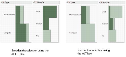
You want to see the type distribution of companies that are small.
5. Click on the bar next to small.
You can see that there are more small computer companies than there are pharmaceutical companies. To broaden your selection, add medium companies.
6. Hold down the SHIFT key. In the Size Co histogram, click on the bar next to medium.
You can see the type distribution of small and medium sized companies. See Figure 3.11 at left. To narrow down your selection, you want to see the small and medium pharmaceutical companies only.
7. Hold down the ALT key. In the Type histogram, click in the Pharmaceutical bar.
You can see how many of the small and medium companies are pharmaceutical companies. See Figure 3.11 at right.
Figure 3.11 Selecting Data in Multiple Histograms
Examples of the Test Probabilities Option
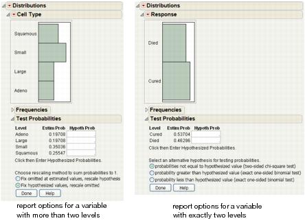
Initiate a test probability report for a variable with more than two levels:
1. Open the VA Lung Cancer.jmp sample data table.
2. Select Analyze > Distribution.
3. Select Cell Type and click Y, Columns.
4. Click OK.
5. From the red triangle menu next to Cell Type, select Test Probabilities.
See Figure 3.12 at left.
Initiate a test probability report for a variable with exactly two levels:
1. Open the Penicillin.jmp sample data table.
2. Select Analyze > Distribution.
3. Select Response and click Y, Columns.
4. Click OK.
5. From the red triangle menu next to Response, select Test Probabilities.
See Figure 3.12 at right.
Figure 3.12 Examples of Test Probabilities Options
Example of Generating the Test Probabilities Report
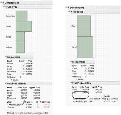
To generate a test probabilities report for a variable with more than two levels:
1. Refer to Figure 3.12 at left. Type 0.25 in all four Hypoth Prob fields.
2. Click the Fix hypothesized values, rescale omitted button.
3. Click Done.
Likelihood Ratio and Pearson Chi-square tests are calculated. See Figure 3.13 at left.
To generate a test probabilities report for a variable with exactly two levels:
1. Refer to Figure 3.12 at right. Type 0.5 in both Hypoth Prob fields.
2. Click the probability less than hypothesized value button.
3. Click Done.
Exact probabilities are calculated for the binomial test. See Figure 3.13 at right.
Figure 3.13 Examples of Test Probabilities Reports
Example of Prediction Intervals
Suppose you are interested in computing prediction intervals for the next 10 observations of ozone level.
1. Open the Cities.jmp sample data table.
2. Select Analyze > Distribution.
3. Select OZONE and click Y, Columns.
4. Click OK.
5. From the red triangle next to OZONE, select Prediction Interval.
Figure 3.14 The Prediction Intervals Window
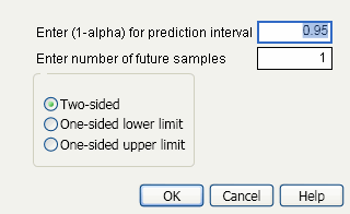
6. In the Prediction Intervals window, type 10 next to Enter number of future samples.
7. Click OK.
Figure 3.15 Example of a Prediction Interval Report
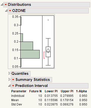
In this example, you can be 95% confident about the following:
• Each of the next 10 observations will be between 0.013755 and 0.279995.
• The mean of the next 10 observations will be between 0.115596 and 0.178154.
• The standard deviation of the next 10 observations will be between 0.023975 and 0.069276.
Example of Tolerance Intervals
Suppose you want to estimate an interval that contains 90% of ozone level measurements.
1. Open the Cities.jmp sample data table.
2. Select Analyze > Distribution.
3. Select OZONE and click Y, Columns.
4. Click OK.
5. From the red triangle menu next to OZONE, select Tolerance Interval.
Figure 3.16 The Tolerance Intervals Window
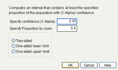
6. Keep the default selections, and click OK.
Figure 3.17 Example of a Tolerance Interval Report
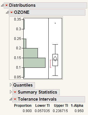
In this example, you can be 95% confident that at least 90% of the population lie between 0.057035 and 0.236715, based on the Lower TI (tolerance interval) and Upper TI values.
Example of Capability Analysis
Suppose you want to characterize the abrasion levels of the tires your company manufactures. The lower and upper specification limits are 100 and 200, respectively.
1. Open the Tiretread.jmp sample data table.
2. Select Analyze > Distribution.
3. Select ABRASION and click Y, Columns.
4. Click OK.
5. From the red triangle menu next to ABRASION, select Capability Analysis.
6. Type 100 for the Lower Spec Limit.
7. Type 200 for the Upper Spec Limit.
8. Keep the rest of the default selections, and click OK.
9. From the red triangle menu next to ABRASION, select Histogram Options > Vertical.
Figure 3.18 Example of the Capability Analysis Report
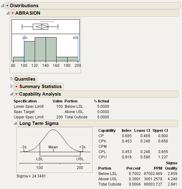
The spec limits are added to the histogram so that the data can be visually compared to the limits. As you can see, some of the abrasion levels are below the lower spec limit, and some are very close to the upper spec limit. The Capability Analysis results are added to the report. The Cpk value is 0.453, indicating a process that is not capable, relative to the given specification limits.
Statistical Details for the Distribution Platform
This section contains statistical details for Distribution options and reports.
Statistical Details for Standard Error Bars
Standard errors bars are calculated using the standard error  where pi=ni/n.
Statistical Details for Quantiles
This section describes how quantiles are computed.
To compute the pth quantile of N non-missing values in a column, arrange the N values in ascending order and call these column values y1, y2, ..., yN. Compute the rank number for the pth quantile as p / 100(N + 1).
• If the result is an integer, the pth quantile is that rank’s corresponding value.
• If the result is not an integer, the pth quantile is found by interpolation. The pth quantile, denoted qp, is computed as follows:
where:
‒ n is the number of non-missing values for a variable
‒ y1, y2, ..., yn represents the ordered values of the variable
‒ yn+1 is taken to be yn
‒ i is the integer part and f is the fractional part of (n+1)p.
‒ (n + 1)p = i + f
For example, suppose a data table has 15 rows and you want to find the 75th and 90th quantile values of a continuous column. After the column is arranged in ascending order, the ranks that contain these quantiles are computed as follows:
The value y12 is the 75th quantile. The 90th quantile is interpolated by computing a weighted average of the 14th and 15th ranked values as y90 = 0.6y14 + 0.4y15.
Statistical Details for Summary Statistics
This section contains statistical details for specific statistics in the Summary Statistics report.
Mean
The mean is the sum of the non-missing values divided by the number of non-missing values. If you assigned a Weight or Freq variable, the mean is computed by JMP as follows:
1. Each column value is multiplied by its corresponding weight or frequency.
2. These values are added and divided by the sum of the weights or frequencies.
Std Dev
The standard deviation measures the spread of a distribution around the mean. It is often denoted as s and is the square root of the sample variance, denoted s2.
Std Err Mean
The standard error means is computed by dividing the sample standard deviation, s, by the square root of N. In the launch window, if you specified a column for Weight or Freq, then the denominator is the square root of the sum of the weights or frequencies.
Skewness
Skewness is based on the third moment about the mean and is computed as follows:
and wi is a weight term (= 1 for equally weighted items)
Kurtosis
Kurtosis is based on the fourth moment about the mean and is computed as follows:
where wi is a weight term (= 1 for equally weighted items). Using this formula, the Normal distribution has a kurtosis of 0.
Statistical Details for the Normal Quantile Plot
The empirical cumulative probability for each value is computed as follows:
where ri is the rank of the ith observation, and N is the number of non-missing (and nonexcluded) observations.
The normal quantile values are computed as follows:
where Φ is the cumulative probability distribution function for the normal distribution.
These normal quantile values are Van Der Waerden approximations to the order statistics that are expected for the normal distribution.
Statistical Details for the Wilcoxon Signed Rank Test
The Wilcoxon signed-rank test uses average ranks for ties. The p-values are exact for  where n is the number of values not equal to the hypothesized value. For n > 20 a Student’s t approximation given by Iman (1974) is used.
Statistical Details for the Standard Deviation Test
Here is the formula for calculating the Test Statistic:
The Test Statistic is distributed as a Chi-square variable with n - 1 degrees of freedom when the population is normal.
The Min PValue is the p-value of the two-tailed test, and is calculated as follows:
2*min(p1,p2)
where p1 is the lower one-tail p-value and p2 is the upper one-tail p-value.
Statistical Details for Normal Quantiles
The normal quantile values are computed as follows:
•  is the cumulative probability distribution function for the normal distribution
• ri is the rank of the ith observation
• N is the number of non-missing observations
Statistical Details for Saving Standardized Data
The standardized values are computed using the following formula:
• X is the original column
•  is the mean of column X
• SX is the standard deviation of column X
Statistical Details for Prediction Intervals
The formulas that JMP uses for computing prediction intervals are as follows:
• For m future observations:
• For the mean of m future observations:
• For the standard deviation of m future observations:
where m = number of future observations, and n = number of points in current analysis sample.
• The one-sided intervals are formed by using 1-α in the quantile functions.
For references, see Hahn and Meeker (1991), pages 61-64.
Statistical Details for Tolerance Intervals
This section contains statistical details for one-sided and two-sided tolerance intervals.
One-Sided Interval
The one-sided interval is computed as follows:
Upper Limit =
Lower Limit =
where
t is the quantile from the non-central t-distribution, and  is the standard normal quantile.
Two-Sided Interval
The two-sided interval is computed as follows:
where
s = standard deviation and  is a constant that can be found in Table 4 of Odeh and Owen 1980).
To determine g, consider the fraction of the population captured by the tolerance interval. Tamhane and Dunlop (2000) give this fraction as follows:
where Φ denotes the standard normal c.d.f. (cumulative distribution function). Therefore, g solves the following equation:
where 1-γ is the fraction of all future observations contained in the tolerance interval.
More information is given in Tables A.1a, A.1b, A.11a, and A.11b of Hahn and Meeker (1991).
Statistical Details for Capability Analysis
All capability analyses use the same formulas. Options differ in how sigma (σ) is computed:
• Long-term uses the overall sigma. This option is used for Ppk statistics, and computes sigma as follows:
Note: There is a preference for Distribution called Ppk Capability Labeling that labels the long-term capability output with Ppk labels. This option is found using File > Preferences, then select Platforms > Distribution.
• Specified Sigma enables you to type a specific, known sigma used for computing capability analyses. Sigma is user-specified, and is therefore not computed.
• Moving Range enables you to enter a range span, which computes sigma as follows:
d2(n) is the expected value of the range of n independent normally distributed variables with unit standard deviation.
• Short Term Sigma, Group by Fixed Subgroup Size if r is the number of subgroups of size nj and each ith subgroup is defined by the order of the data, sigma is computed as follows:
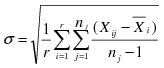 where
where 
• This formula is commonly referred to as the Root Mean Square Error, or RMSE.
|
Index
|
Index Name
|
Formula
|
|
CP
|
process capability ratio, Cp
|
(USL - LSL)/6s where:
• USL is the upper spec limit
• LSL is the lower spec limit
|
|
CIs for CP
|
Lower CI on CP
|
|
|
Upper CI on CP
|
|
|
|
CPK (PPK for AIAG)
|
process capability index, Cpk
|
min(CPL, CPU)
|
|
CIs for CPK
See Bissell (1990)
|
Lower CI
|
 |
|
Upper CI
|
 |
|
|
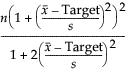
CPM
|
process capability index, Cpm
|
Note: CPM confidence intervals are not reported when the target is not within the Lower and Upper Spec Limits range. CPM intervals are only reported when the target is within this range. JMP writes a message to the log to note why the CPM confidence intervals are missing.
|
|
CIs for CPM
|
Lower CI on CPM
|
 |
|
Upper CI on CPM
|
where γ = same as above.
|
|
|
CPL
|
process capability ratio of one-sided lower spec
|
(mean - LSL)/3s
|
|
CPU
|
process capability ratio of one-sided upper spec
|
(USL - mean)/3s
|
• A capability index of 1.33 is considered to be the minimum acceptable. For a normal distribution, this gives an expected number of nonconforming units of about 6 per 100,000.
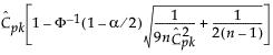
• Exact 100(1 - α)% lower and upper confidence limits for CPL are computed using a generalization of the method of Chou et al. (1990), who point out that the 100(1 - α) lower confidence limit for CPL (denoted by CPLLCL) satisfies the following equation:
where Tn-1(δ) has a non-central t-distribution with n - 1 degrees of freedom and noncentrality parameter δ.
• Exact 100(1 - α)% lower and upper confidence limits for CPU are also computed using a generalization of the method of Chou et al. (1990), who point out that the 100(1 - α) lower confidence limit for CPU (denoted CPULCL) satisfies the following equation:
where Tn-1(δ) has a non-central t-distribution with n - 1 degrees of freedom and noncentrality parameter δ.
Note: Because of a lack of supporting research at the time of this writing, computing confidence intervals for capability indices is not recommended, except for cases when the capability indices are based on the standard deviation.
• Sigma Quality is defined as the following
For example, if there are 3 defects in n=1,000,000 observations, the formula yields 6.03, or a 6.03 sigma process. The results of the computations of the Sigma Quality Above USL and Sigma Quality Below LSL column values do not sum to the Sigma Quality Total Outside column value because calculating Sigma Quality involves finding normal distribution quantiles, and is therefore not additive.
• Here are the Benchmark Z formulas:
Z USL = (USL-Xbar)/sigma = 3 * CPU
Z LSL = (Xbar-LSL)/sigma = 3 * CPL
Z Bench = Inverse Cumulative Prob(1 - P(LSL) - P(USL))
where:
P(LSL) = Prob(X < LSL) = 1 - Cum Prob(Z LSL)
P(USL) = Prob(X > USL) = 1 - Cum Prob(Z USL).
Statistical Details for Continuous Fit Distributions
This section contains statistical details for the options in the Continuous Fit menu.
Normal
The Normal fitting option estimates the parameters of the normal distribution. The normal distribution is often used to model measures that are symmetric with most of the values falling in the middle of the curve. Select the Normal fitting for any set of data and test how well a normal distribution fits your data.
The parameters for the normal distribution are as follows:
• μ (the mean) defines the location of the distribution on the x-axis
• σ (standard deviation) defines the dispersion or spread of the distribution
The standard normal distribution occurs when  and
and  . The Parameter Estimates table shows estimates of μ and σ, with upper and lower 95% confidence limits.
pdf: 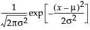 for
for  ;
;  ; 0 < σ
E(x) = μ
Var(x) = σ2
LogNormal
The LogNormal fitting option estimates the parameters μ (scale) and σ (shape) for the two-parameter lognormal distribution. A variable Y is lognormal if and only if  is normal. The data must be greater than zero.
pdf: 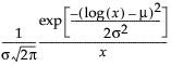 for
for  ;
;  ; 0 < σ
for E(x) =
Var(x) =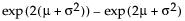
Weibull, Weibull with Threshold, and Extreme Value
The Weibull distribution has different shapes depending on the values of α (scale) and β (shape). It often provides a good model for estimating the length of life, especially for mechanical devices and in biology. The Weibull option is the same as the Weibull with threshold option, with a threshold (θ) parameter of zero. For the Weibull with threshold option, JMP estimates the threshold as the minimum value. If you know what the threshold should be, set it by using the Fix Parameters option. See “Fit Distribution Options”.
The pdf for the Weibull with threshold is as follows:
pdf: 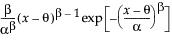 for α,β > 0;
E(x) =
Var(x) =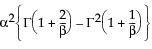
where  is the Gamma function.
The Extreme Value distribution is a two parameter Weibull (α, β) distribution with the transformed parameters δ = 1 / β and λ = ln(α).
Exponential
The exponential distribution is especially useful for describing events that randomly occur over time, such as survival data. The exponential distribution might also be useful for modeling elapsed time between the occurrence of non-overlapping events, such as the time between a user’s computer query and response of the server, the arrival of customers at a service desk, or calls coming in at a switchboard.
The Exponential distribution is a special case of the two-parameter Weibull when β = 1 and α = σ, and also a special case of the Gamma distribution when α = 1.
pdf:  for 0 < σ;
E(x) = σ
Var(x) = σ2
Devore (1995) notes that an exponential distribution is memoryless. Memoryless means that if you check a component after t hours and it is still working, the distribution of additional lifetime (the conditional probability of additional life given that the component has lived until t) is the same as the original distribution.
Gamma
The Gamma fitting option estimates the gamma distribution parameters, α > 0 and σ > 0. The parameter α, called alpha in the fitted gamma report, describes shape or curvature. The parameter σ, called sigma, is the scale parameter of the distribution. A third parameter, θ, called the Threshold, is the lower endpoint parameter. It is set to zero by default, unless there are negative values. You can also set its value by using the Fix Parameters option. See “Fit Distribution Options”.
pdf: 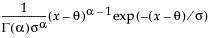 for
for  ; 0 < α,σ
E(x) = ασ + θ
Var(x) = ασ2
• The standard gamma distribution has σ = 1. Sigma is called the scale parameter because values other than 1 stretch or compress the distribution along the x-axis.
• The Chi-square  distribution occurs when σ = 2, α = ν/2, and θ = 0.
• The exponential distribution is the family of gamma curves that occur when α = 1 and θ = 0.
The standard gamma density function is strictly decreasing when  . When
  , the density function begins at zero, increases to a maximum, and then decreases.
Beta
The standard beta distribution is useful for modeling the behavior of random variables that are constrained to fall in the interval 0,1. For example, proportions always fall between 0 and 1. The Beta fitting option estimates two shape parameters, α > 0 and β > 0. There are also θ and σ, which are used to define the lower threshold as θ, and the upper threshold as θ + σ. The beta distribution has values only for the interval defined by  . The θ is estimated as the minimum value, and σ is estimated as the range. The standard beta distribution occurs when θ = 0 and σ = 1.
Set parameters to fixed values by using the Fix Parameters option. The upper threshold must be greater than or equal to the maximum data value, and the lower threshold must be less than or equal to the minimum data value. For details about the Fix Parameters option, see “Fit Distribution Options”.
pdf: 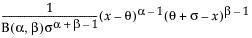 for
for  ; 0 < σ,α,β
E(x) =
Var(x) =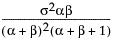
where  is the Beta function.
Normal Mixtures
The Normal Mixtures option fits a mixture of normal distributions. This flexible distribution is capable of fitting multi-modal data.
Fit a mixture of two or three normal distributions by selecting the Normal 2 Mixture or Normal 3 Mixture options. Alternatively, you can fit a mixture of k normal distributions by selecting the Other option. A separate mean, standard deviation, and proportion of the whole is estimated for each group.
pdf: 
E(x) =
Var(x) =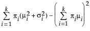
where μi, σi, and πi are the respective mean, standard deviation, and proportion for the ith group, and  is the standard normal pdf.
Smooth Curve
The Smooth Curve option fits a smooth curve using nonparametric density estimation (kernel density estimation). The smooth curve is overlaid on the histogram and a slider appears beneath the plot. Control the amount of smoothing by changing the kernel standard deviation with the slider. The initial Kernel Std estimate is formed by summing the normal densities of the kernel standard deviation located at each data point.
Johnson Su, Johnson Sb, Johnson Sl
The Johnson system of distributions contains three distributions that are all based on a transformed normal distribution. These three distributions are the Johnson Su, which is unbounded for Y; the Johnson Sb, which is bounded on both tails (0 < Y < 1); and the Johnson Sl, leading to the lognormal family of distributions.
Note: The S refers to system, the subscript of the range. Although we implement a different method, information about selection criteria for a particular Johnson system can be found in Slifker and Shapiro (1980).
Johnson distributions are popular because of their flexibility. In particular, the Johnson distribution system is noted for its data-fitting capabilities because it supports every possible combination of skewness and kurtosis.
If Z is a standard normal variate, then the system is defined as follows:
where, for the Johnson Su:
where, for the Johnson Sb:
and for the Johnson Sl, where  .
.
Johnson Su
pdf:  for
for  ; 0 < θ,δ
Johnson Sb
pdf:  for θ < x < θ+σ; 0 < σ
Johnson Sl
pdf:  for θ < x if σ = 1; θ > x if σ = -1
where  is the standard normal pdf.
Note: The parameter confidence intervals are hidden in the default report. Parameter confidence intervals are not very meaningful for Johnson distributions, because they are transformations to normality. To show parameter confidence intervals, right-click in the report and select Columns > Lower 95% and Upper 95%.
Generalized Log (Glog)
This distribution is useful for fitting data that are rarely normally distributed and often have non-constant variance, like biological assay data. The Glog distribution is described with the parameters μ (location), σ (scale), and λ (shape).
pdf: 
for  ; 0 < σ;
The Glog distribution is a transformation to normality, and comes from the following relationship:
If z = 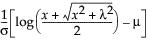 ~ N(0,1), then x ~ Glog(μ,σ,λ).
When λ = 0, the Glog reduces to the LogNormal (μ,σ).
Note: The parameter confidence intervals are hidden in the default report. Parameter confidence intervals are not very meaningful for the GLog distribution, because it is a transformation to normality. To show parameter confidence intervals, right-click in the report and select Columns > Lower 95% and Upper 95%.
All
In the Compare Distributions report, the ShowDistribution list is sorted by AICc in ascending order.
The formula for AICc is as follows:
AICc =
where:
‒ logL is the logLikelihood
‒ n is the sample size
‒ ν is the number of parameters
If your data has negative values, the ShowDistribution list does not include those distributions that require data with positive values. If your data has non-integer values, the list of distributions does not include discrete distributions. Distributions with threshold parameters, like Beta and Johnson Sb, are not included in the list of possible distributions.
Statistical Details for Discrete Fit Distributions
This section contains statistical details for the options in the Discrete Fit menu.
Poisson
The Poisson distribution has a single scale parameter λ > 0.
pmf:  for
for  ; x = 0,1,2,...
E(x) = λ
Var(x) = λ
Since the Poisson distribution is a discrete distribution, the overlaid curve is a step function, with jumps occurring at every integer.
Gamma Poisson
This distribution is useful when the data is a combination of several Poisson(μ) distributions, each with a different μ. One example is the overall number of accidents combined from multiple intersections, when the mean number of accidents (μ) varies between the intersections.
The Gamma Poisson distribution results from assuming that x|μ follows a Poisson distribution and μ follows a Gamma(α,τ). The Gamma Poisson has parameters λ = ατ and σ = τ+1. The σ is a dispersion parameter. If σ > 1, there is over dispersion, meaning there is more variation in x than explained by the Poisson alone. If σ = 1, x reduces to Poisson(λ).
pmf: 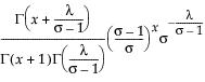 for
for  ;
;  ; x = 0,1,2,...
for E(x) = λ
Var(x) = λσ
where  is the Gamma function.
Remember that x|μ ~ Poisson(μ), while μ~ Gamma(α,τ). The platform estimates λ = ατ and σ = τ+1. To obtain estimates for α and τ, use the following formulas:
If the estimate of σ is 1, the formulas do not work. In that case, the Gamma Poisson has reduced to the Poisson(λ), and  is the estimate of λ.
If the estimate for α is an integer, the Gamma Poisson is equivalent to a Negative Binomial with the following pmf:
with r = α and (1-p)/p = τ.
Binomial
The Binomial option accepts data in two formats: a constant sample size, or a column containing sample sizes.
pmf:  for
for  ; x = 0,1,2,...,n
E(x) = np
Var(x) = np(1-p)
where n is the number of independent trials.
Note: The confidence interval for the binomial parameter is a Score interval. See Agresti (1998).
Beta Binomial
This distribution is useful when the data is a combination of several Binomial(p) distributions, each with a different p. One example is the overall number of defects combined from multiple manufacturing lines, when the mean number of defects (p) varies between the lines.
The Beta Binomial distribution results from assuming that x|π follows a Binomial(n,π) distribution and π follows a Beta(α,β). The Beta Binomial has parameters p = α/(α+β) and δ = 1/(α+β+1). The δ is a dispersion parameter. When δ > 0, there is over dispersion, meaning there is more variation in x than explained by the Binomial alone. When δ < 0, there is under dispersion. When δ = 0, x is distributed as Binomial(n,p). The Beta Binomial only exists when  .
.
pmf: 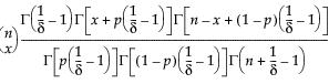
for  ;
; 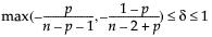 ; x = 0,1,2,...,n
E(x) = np
Var(x) = np(1-p)[1+(n-1)δ]
where  is the Gamma function.
Remember that x|π ~ Binomial(n,π), while π ~ Beta(α,β). The parameters p = α/(α+β) and δ = 1/(α+β+1) are estimated by the platform. To obtain estimates of α and β, use the following formulas:
If the estimate of δ is 0, the formulas do not work. In that case, the Beta Binomial has reduced to the Binomial(n,p), and  is the estimate of p.
The confidence intervals for the Beta Binomial parameters are profile likelihood intervals.
Comparing All Distributions
The ShowDistribution list is sorted by AICc in ascending order.
The formula for AICc is as follows:
AICc =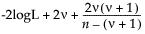
where:
‒ logL is the logLikelihood
‒ n is the sample size
‒ ν is the number of parameters
Statistical Details for Fitted Quantiles
The fitted quantiles in the Diagnostic Plot and the fitted quantiles saved with the Save Fitted Quantiles command are formed using the following method:
1. The data are sorted and ranked. Ties are assigned different ranks.
2. Compute the p[i] = rank[i]/(n+1).
3. Compute the quantile[i] = Quantiled(p[i]) where Quantiled is the quantile function for the specific fitted distribution, and i = 1,2,...,n.
Statistical Details for Fit Distribution Options
This section describes Goodness of Fit tests for fitting distributions and statistical details for specification limits pertaining to fitted distributions.
Goodness of Fit
|
Distribution
|
Parameters
|
Goodness of Fit Test
|
|
Normal1
|
μ and σ are unknown
|
Shapiro-Wilk (for n ≤ 2000) Kolmogorov-Smirnov-Lillefors (for n > 2000)
|
|
μ and σ are both known
|
Kolmogorov-Smirnov-Lillefors
|
|
|
either μ or σ is known
|
(none)
|
|
|
LogNormal
|
μ and σ are known or unknown
|
Kolmogorov's D
|
|
Weibull
|
α and β known or unknown
|
Cramér-von Mises W2
|
|
Weibull with threshold
|
α, β and θ known or unknown
|
Cramér-von Mises W2
|
|
Extreme Value
|
α and β known or unknown
|
Cramér-von Mises W2
|
|
Exponential
|
σ is known or unknown
|
Kolmogorov's D
|
|
Gamma
|
α and σ are known
|
Cramér-von Mises W2
|
|
either α or σ is unknown
|
(none)
|
|
|
Beta
|
α and β are known
|
Kolmogorov's D
|
|
either α or β is unknown
|
(none)
|
|
|
Binomial
|
ρ is known or unknown and n is known
|
Kolmogorov's D (for n ≤ 30) Pearson χ2 (for n > 30)
|
|
Beta Binomial
|
ρ and δ known or unknown
|
Kolmogorov's D (for n ≤ 30) Pearson χ2 (for n > 30)
|
|
Poisson
|
λ known or unknown
|
Kolmogorov's D (for n ≤ 30) Pearson χ2 (for n > 30)
|
|
Gamma Poisson
|
λ or σ known or unknown
|
Kolmogorov's D (for n ≤ 30) Pearson χ2 (for n > 30)
|
1 For the three Johnson distributions and the Glog distribution, the data are transformed to Normal, then the appropriate test of normality is performed.
Spec Limits
Writing T for the target, LSL, and USL for the lower and upper specification limits, and Pα for the α*100th percentile, the generalized capability indices are as follows:
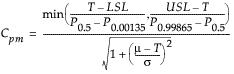
If the data are normally distributed, these formulas reduce to the formulas for standard capability indices. See Table 3.19.
Set Spec Limits for K Sigma
Type a K value and select one-sided or two-sided for your capability analysis. Tail probabilities corresponding to K standard deviations are computed from the Normal distribution. The probabilities are converted to quantiles for the specific distribution that you have fitted. The resulting quantiles are used for specification limits in the capability analysis. This option is similar to the Quantiles option, but you provide K instead of probabilities. K corresponds to the number of standard deviations that the specification limits are away from the mean.
For example, for a Normal distribution, where K=3, the 3 standard deviations below and above the mean correspond to the 0.00135th quantile and 0.99865th quantile, respectively. The lower specification limit is set at the 0.00135th quantile, and the upper specification limit is set at the 0.99865th quantile of the fitted distribution. A capability analysis is returned based on those specification limits.
..................Content has been hidden....................
You can't read the all page of ebook, please click here login for view all page.